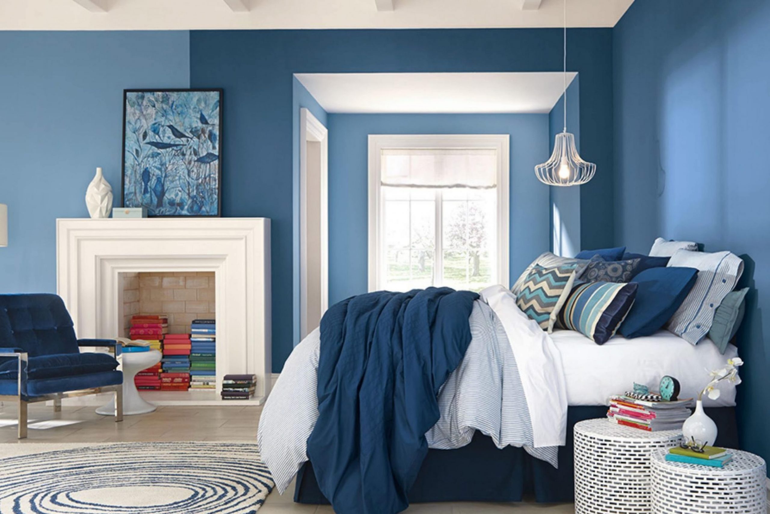
Before you choose SW 9149 Inky Blue by Sherwin Williams for your next painting project, there are a few key things you should know. Paint colors have a powerful impact on the mood and style of any room, and Inky Blue is no exception. It’s a deep, rich color that can add a lot of character and depth to a room. From my experience, preparation is crucial when working with a shade as bold as Inky Blue.
Firstly, consider the lighting in your room. Inky Blue can look quite different under natural light compared to artificial lighting. Testing it out on a small area of your wall during different times of the day can give you a good idea of how it will truly appear.
Secondly, think about the existing colors in your room. Inky Blue pairs well with a range of shades, but it’s particularly striking when contrasted with light neutrals or warm tones. Lastly, think about the finish. A matte finish can make the color appear softer, while a gloss finish can bring out its vibrancy.
You’ll want to ensure you have the right tools and enough paint to cover your desired area. Running out mid-project can be frustrating! Also, don’t shy away from asking for help or advice at your local paint store. They can offer useful tips on how to achieve the best results with Inky Blue.
Is Inky Blue SW 9149 Right for My Home?
Inky Blue has always been one of my go-to shades for rooms where I want a strong, confident vibe. It’s a deep, rich blue that somewhat reminds me of the ocean at night, offering both a sense of mystery and comfort. The color brings depth to any room, making it appear more polished without feeling too intense.
In terms of interior styles, this shade works wonders in modern and minimalist decor due to its simplicity and ability to pair well with crisp lines and subtle designs. It’s also beautiful in coastal settings, where its deep blue tones complement themes of water and sky.
When I’m thinking about materials and textures that pair well with this deep blue, natural wood comes immediately to mind. The warmth of wood, whether it’s a light oak or a rich walnut, balances the coolness of the blue. Metallic finishes like copper or brass offer a striking contrast that really brings out the depth of the blue, adding a touch of luxury without being too flashy.
For textiles, I prefer to go with soft, plush fabrics like velvet or silk in lighter shades to create a balance. This not only brightens the room but also adds a level of coziness that makes the room inviting. Linen in white or light gray also works beautifully for a lighter, airier feel, especially in more casual or beachy environments.
decorcreek.com
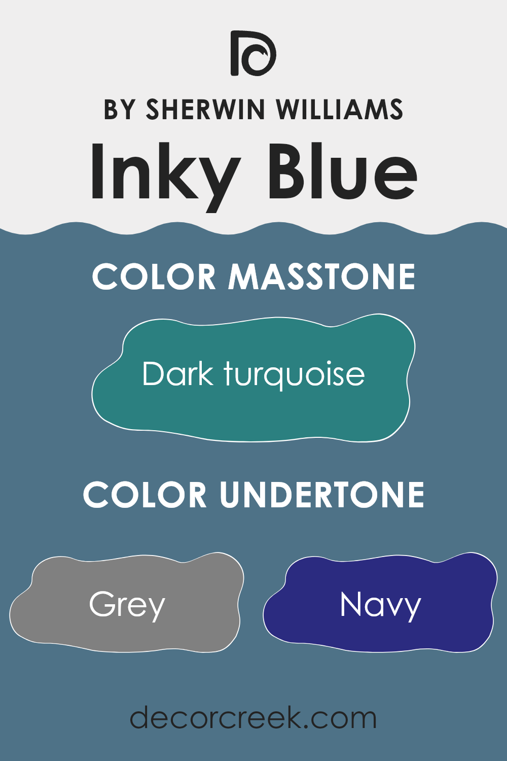
What are the right undertones of Inky Blue SW 9149 ?
Inky Blue is an adaptable paint color that brings depth and character to any room. When used on interior walls, this color can create a range of atmospheres thanks to its complex mix of undertones. Undertones are subtle colors that influence the main hue, affecting how the color appears under different lighting conditions and when paired with various decor elements.
Inky Blue contains undertones such as grey, navy, and blue, which can make a room feel calm and steady. Purple and lilac undertones add a touch of softness and creativity, often giving the room a more inviting vibe. Dark green and olive undertones bring in elements of nature, which can help a room feel grounded and connected to the outdoors.
When this color is applied to walls, the varying lighting throughout the day can highlight different undertones, changing the room’s mood. For instance, natural light may enhance its blue and turquoise undertones, making the room feel fresh and lively. In contrast, artificial lighting in the evening might draw out darker undertones like navy and dark grey, creating a more cozy and relaxed environment.
Overall, the undertones of Inky Blue make it more than just a simple paint color. They allow the color to interact dynamically with a room’s lighting and furnishings, making it an excellent choice for anyone looking to add some depth and character to their interior rooms.
decorcreek.com
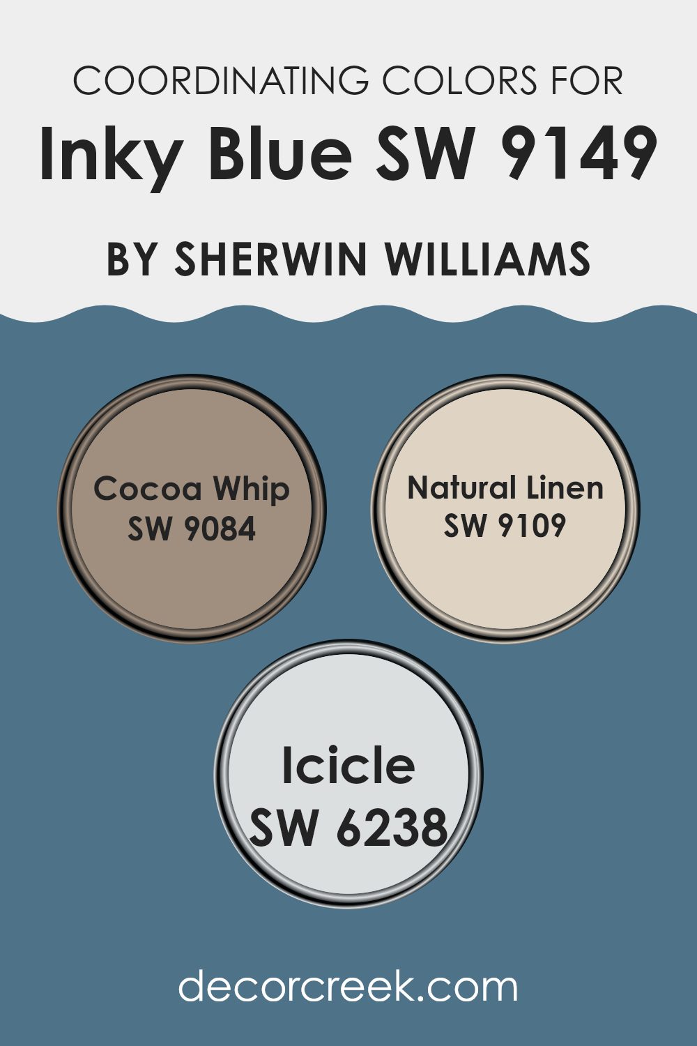
Best Coordinating Colors to use with Inky Blue SW 9149 by Sherwin Williams this year.
Coordinating colors are those that enhance or complement each other, creating a visually appealing palette when used together in a room. These colors can be used in various ways, such as on walls, furnishings, or accents, to achieve a harmonious look. For instance, Inky Blue by Sherwin Williams works wonderfully with several coordinating hues that together offer adaptable options for decorating.
SW 9084 – Cocoa Whip is a soft, creamy color, perfect for creating a gentle contrast against the darker Inky Blue, adding a warm and inviting touch to any room. SW 9109 – Natural Linen is another excellent complement, providing a neutral, airy feel that adds lightness and a sense of calm without creating an intense feeling.
Lastly, SW 6238 – Icicle brings a fresh, crisp element to the mix, its light, almost white shade making it ideal for offering a bright contrast that can help make the richer tones of Inky Blue stand out, lending a fresh and cohesive look to the overall design. Each of these colors works with Inky Blue to create a balanced and appealing color scheme that can be used in various décor styles and settings.
You can see recommended paint colors below:
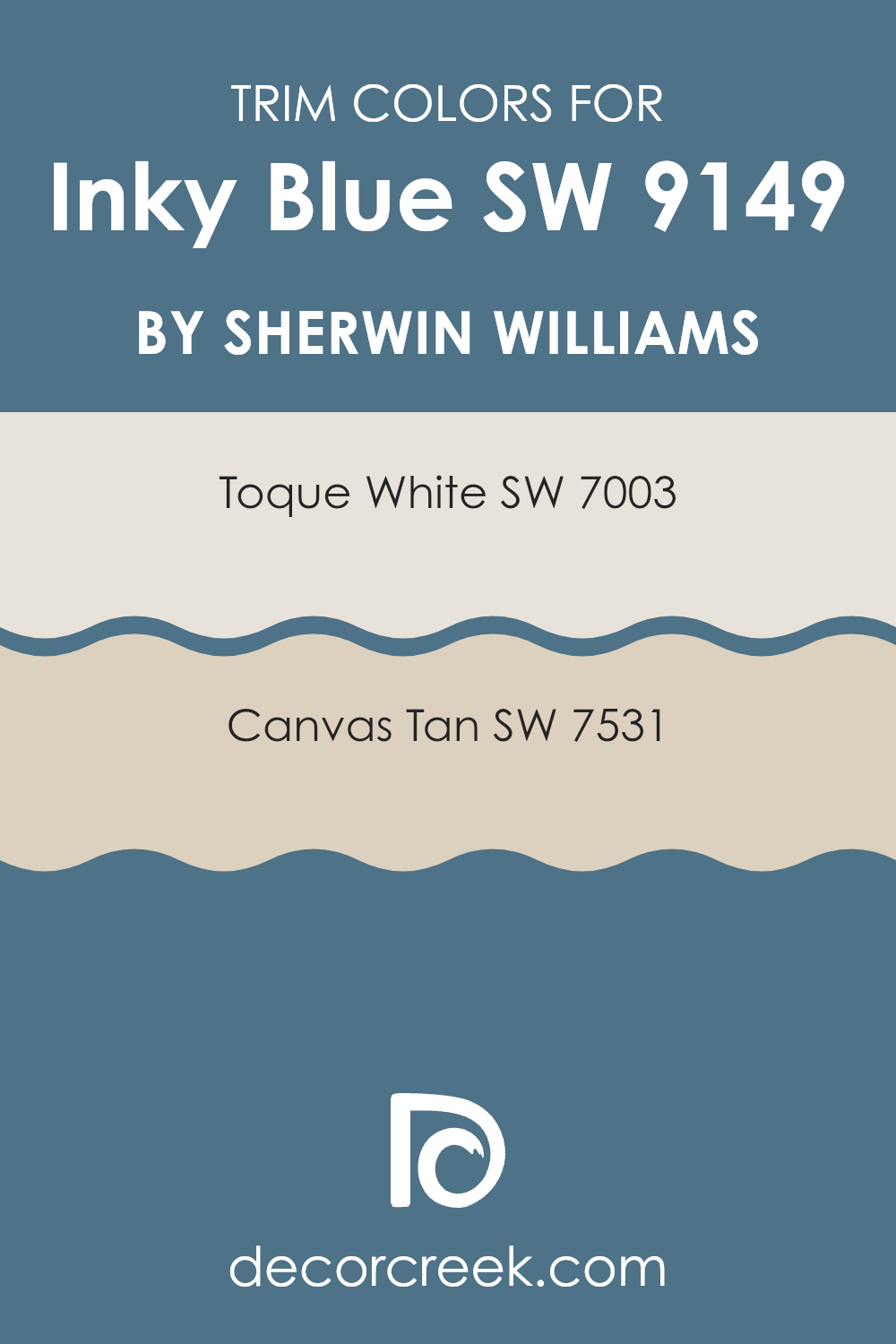
Trendy Trim Colors of Inky Blue SW 9149 by Sherwin Williams to use this year.
Trim colors are used to accentuate the architectural details of a room, such as door frames, window sills, and baseboards, thereby defining the room and complementing the wall colors. In the case of a rich, dark hue like Inky Blue by Sherwin Williams, choosing the right trim colors is essential to create a balanced and harmonious look. Toque White and Canvas Tan are great choices for this purpose as they offer a subtle contrast that highlights the depth of Inky Blue without competing for attention.
Toque White, a soft and neutral white shade, is ideal for trims as it provides a clean and fresh look that effectively outlines darker colors, making them stand out while still maintaining a gentle and inviting ambiance.
Canvas Tan, on the other hand, offers a warmer option with its beige undertone, adding a hint of warmth to the surroundings and softening the impact of the intense blue, resulting in a cozy and appealing environment. Both colors support the main shade by brightening or warming the room subtly, enhancing the overall aesthetic without overpowering the primary color.
You can see recommended paint colors below:
- SW 7003 Toque White
- SW 7531 Canvas Tan
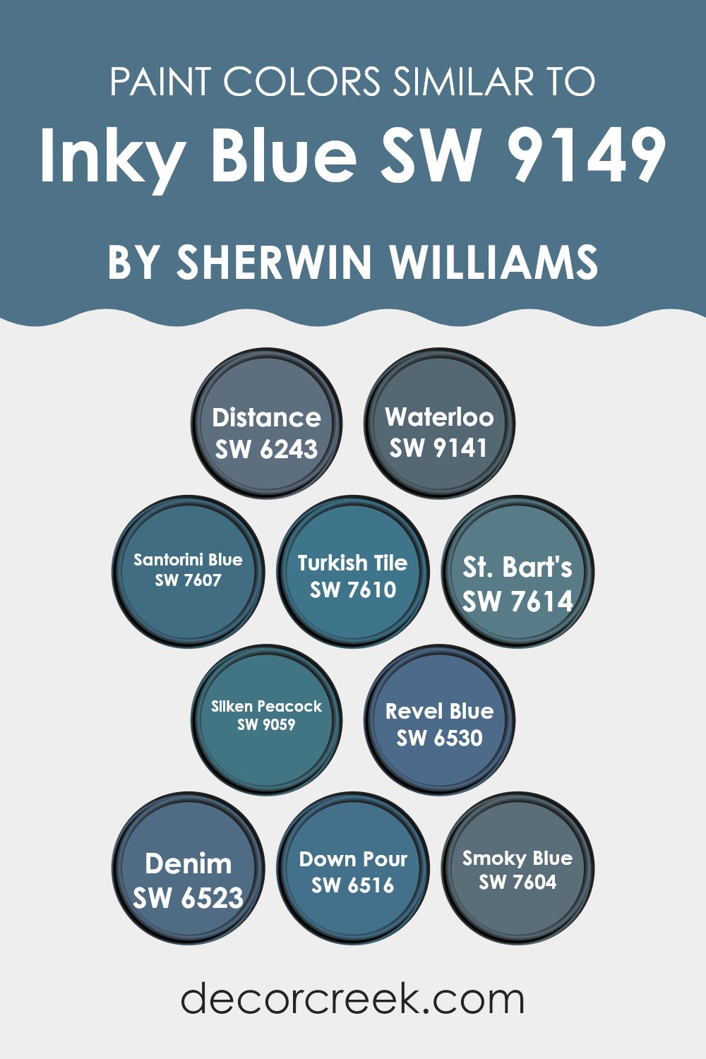
Evergreen Colors Similar to Inky Blue SW 9149 by Sherwin Williams
Similar colors play a crucial role in interior design and aesthetics as they create a harmonious and cohesive visual experience. Colors like SW 6243 Distance and SW 9141 Waterloo share a kinship with Inky Blue by offering subtly different shades that can highlight different aspects or features of a room while maintaining a cohesive feel.
For instance, Distance brings a slightly lighter tone that can make a small room feel more open, while Waterloo presents a deeper hue that might add a hint of drama. Using colors like SW 7607 Santorini Blue or SW 7610 Turkish Tile can keep the theme consistent but distinct, providing adaptable options for different rooms or moods.
The beauty of choosing colors from a similar palette, such as SW 7614 St. Bart’s or SW 9059 Silken Peacock, lies in their ability to complement each other without clashing. St. Bart’s has a calming quality that is ideal for a relaxing bedroom, while Silken Peacock has a more vibrant energy that could energize a living area. Colors like SW 6530 Revel Blue and SW 6523 Denim work well for creating depth and interest, as they can be used to accentuate focal points without creating an intense feeling.
Lastly, shades like SW 6516 Down Pour and SW 7604 Smoky Blue can seamlessly integrate with others, ensuring a smooth visual transition across different areas of a home or workspace. These similar colors collectively enhance the design by building upon the base tone set by Inky Blue, ensuring each room achieves both individuality and a unified look.
You can see recommended paint colors below:
- SW 6243 Distance
- SW 9141 Waterloo
- SW 7607 Santorini Blue
- SW 7610 Turkish Tile
- SW 7614 St. Bart’s
- SW 9059 Silken Peacock
- SW 6530 Revel Blue
- SW 6523 Denim
- SW 6516 Down Pour
- SW 7604 Smoky Blue
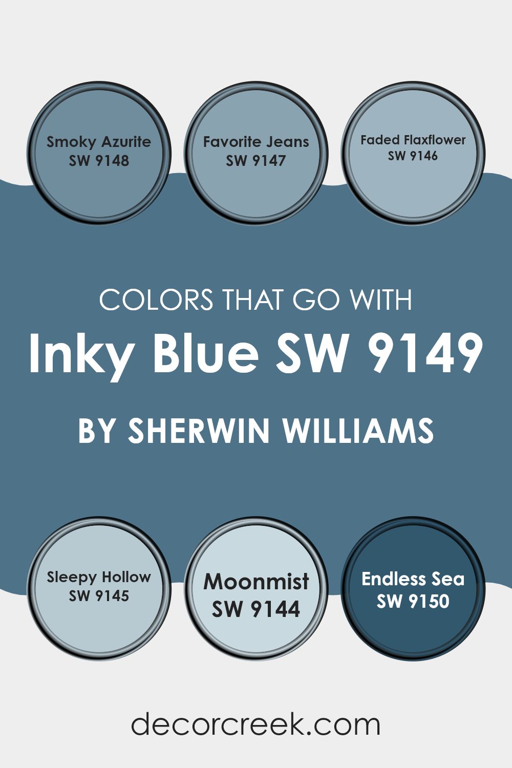
Colors that Go With Inky Blue SW 9149 by Sherwin Williams
Colors that beautifully complement Inky Blue SW 9149 by Sherwin Williams play a crucial role in interior design as they allow for creating a harmonious and appealing atmosphere in any room. Choosing the right colors to go with Inky Blue can enhance the appeal of a room, making it more welcoming and balanced.
For example, Smoky Azurite SW 9148 is a subtle, slightly muted blue that can seamlessly blend with Inky Blue, offering a polished look without creating an intense feeling. This kind of pairing is perfect for achieving a cohesive look in a room that feels connected and thoughtfully designed.
In contrast, Favorite Jeans SW 9147 offers a livelier, more vibrant blue that adds a splash of brightness when used with Inky Blue, ideal for adding character and a playful element to a room. Faded Flaxflower SW 9146, with its soft and gentle gray-blue tone, provides a soothing contrast that can help soften a room, making it ideal for bedrooms or quiet areas.
Sleepy Hollow SW 9145, another great complement, brings a deeper, more intense blue that enriches the overall ambiance without overpowering. Moonmist SW 9144 provides a light, airy feel with its subtle greenish undertone, ideal for opening up a room and injecting a fresh vibe.
Lastly, Endless Sea SW 9150, as a darker and more dramatic hue, pairs magnificently with Inky Blue for a bolder statement, perfect for accent walls or artistic rooms. Combining these colors with Inky Blue not only ensures visual depth but also enhances the flexibility in decor styles and themes.
You can see recommended paint colors below:
- SW 9148 Smoky Azurite
- SW 9147 Favorite Jeans
- SW 9146 Faded Flaxflower
- SW 9145 Sleepy Hollow
- SW 9144 Moonmist
- SW 9150 Endless Sea
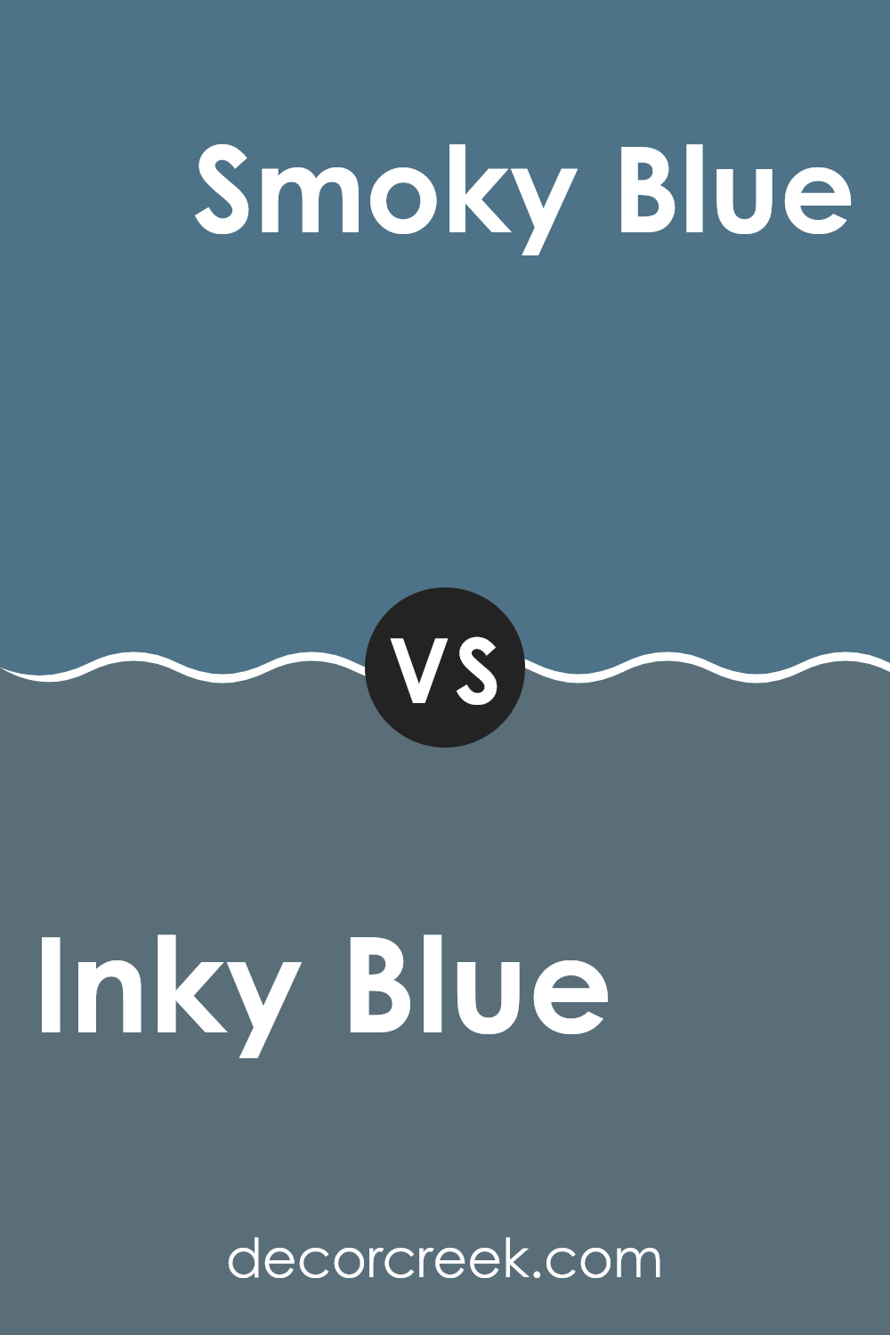
Inky Blue SW 9149 by Sherwin Williams vs Smoky Blue SW 7604 by Sherwin Williams
Sherwin Williams’ Inky Blue and Smoky Blue are two distinct shades, each with its unique appeal. Inky Blue is a deep, dark blue that brings to mind the night sky just before it turns completely black. It’s a strong color that makes a bold statement and is perfect for creating a cozy, intimate atmosphere in rooms like living rooms or bedrooms.
On the other hand, Smoky Blue is a lighter, more muted blue with a hint of gray. This color feels more laid-back and is easier to blend into various decor styles. It can brighten up a room while still adding a touch of color and is adaptable enough to be used in many different rooms, from kitchens to bathrooms.
Both colors offer a sense of calmness and can easily pair with neutral tones, but Inky Blue tends to pull more attention due to its deep hue, while Smoky Blue provides a more subtle option, adding a gentle splash of color without creating an intense feeling.
You can see recommended paint color below:
Inky Blue SW 9149 by Sherwin Williams vs Denim SW 6523 by Sherwin Williams
Inky Blue and Denim, both offered by Sherwin Williams, present unique shades of blue ideal for different decorating styles. Inky Blue is a deep, dark blue that closely resembles the color of a night sky. It’s perfect for creating a cozy, intimate feel in a room, and it tends to make rooms feel more enclosed and snug.
On the other hand, Denim is a lighter, more vibrant shade that mimics the classic look of blue jeans. This color is more laid-back and casual, providing a fresh and airy feel to rooms. It works well in areas that benefit from a brighter, more cheerful ambiance, such as kitchens, bathrooms, or children’s rooms.
While both colors share a blue base, Inky Blue leans towards a more dramatic and moody tone, whereas Denim offers a cheerful and open sense. Choosing between them depends on the atmosphere you want to achieve and how the room is used.
You can see recommended paint color below:
Inky Blue SW 9149 by Sherwin Williams vs Turkish Tile SW 7610 by Sherwin Williams
Inky Blue and Turkish Tile, both by Sherwin Williams, are distinctly different shades that can create varied moods in a room. Inky Blue is a deep, dark blue with a hint of gray that gives it a muted, classic presence in a room. This color tends to make rooms feel more cozy and enclosed, making it perfect for creating a snug, comfortable atmosphere in places like a study room or a bedroom.
On the other hand, Turkish Tile is a vibrant, bright blue with a lot of life to it. It’s lighter than Inky Blue and leans towards a slightly greenish hue, reminiscent of the beautiful ocean in sunlight.
This color works well in areas that benefit from a fresh, lively look such as bathrooms or kitchens, where it can help to brighten the room and give it a clean, welcoming vibe. Both colors offer unique aesthetics but serve different purposes depending on the feeling you want to bring into your rooms.
You can see recommended paint color below:
- SW 7610 Turkish Tile
Inky Blue SW 9149 by Sherwin Williams vs Revel Blue SW 6530 by Sherwin Williams
Inky Blue SW 9149 is a dark, intense blue that almost borders on black, giving it a deep, rich tone. This color is great for creating a strong presence in a room and is often used for accent walls or furniture to add depth and a sense of drama.
On the other hand, Revel Blue SW 6530 is lighter and more vibrant. It leans more towards a true blue, with a lively and energetic feel. Revel Blue is perfect for energizing a room, making it ideal for areas that benefit from a splash of color, such as a kid’s room or a creative workspace.
When comparing these two shades, it’s clear that Inky Blue is more about adding a bold, moody vibe, while Revel Blue provides a cheerful and fresh atmosphere. Both colors offer unique qualities, but your choice might depend on the feel you want for your room and how much light the room gets.
You can see recommended paint color below:
- SW 6530 Revel Blue
Inky Blue SW 9149 by Sherwin Williams vs Down Pour SW 6516 by Sherwin Williams
Inky Blue and Down Pour are both blues from Sherwin Williams, but they have distinct vibes. Inky Blue is a deep, dark blue that can feel bold and sturdy, almost like the color of a deep ocean or a night sky. It’s a great pick if you want a strong presence in your room.
On the other hand, Down Pour is lighter and leans slightly towards teal. It’s vibrant and lively, which can add a fresh, energetic look to a room. Down Pour could help brighten up a room, while Inky Blue might make a room feel more closed in but cozy.
Both colors are adaptable and can work well in a variety of decorating styles, but your choice will depend on the mood you want to set. Inky Blue brings a more grounded, anchoring feel, whereas Down Pour brings a cheerful burst of color.
You can see recommended paint color below:
- SW 6516 Down Pour
Inky Blue SW 9149 by Sherwin Williams vs Waterloo SW 9141 by Sherwin Williams
Inky Blue SW 9149 and Waterloo SW 9141 are two colors by Sherwin Williams that have distinct yet related tones.
Inky Blue is a deeper, more saturated color that closely resembles the classic look of navy. It gives off a strong, bold feel, making it perfect for rooms where you want to make a statement or add a sense of sturdiness.
On the other hand, Waterloo is a bit lighter compared to Inky Blue. It has a softer presence, which makes it more adaptable for various rooms without overpowering them with darkness. Waterloo is ideal for creating a subtle, calming atmosphere in a room.
Both colors can work well in a variety of settings like living rooms or bedrooms, depending on the vibe you’re going for. Inky Blue, with its deeper tone, might be better suited for an accent wall or furniture pieces, while Waterloo could be an excellent choice for larger wall areas due to its lighter and softer appeal.
You can see recommended paint color below:
Inky Blue SW 9149 by Sherwin Williams vs Santorini Blue SW 7607 by Sherwin Williams
Inky Blue and Santorini Blue by Sherwin Williams are both unique but lovely shades. Inky Blue is a dark, rich blue that may remind you of a deep ocean or a dark night sky. It’s a strong color that could make a bold statement in a room or on an accent wall.
On the other hand, Santorini Blue is lighter and has a fresh, cheerful vibe. It’s similar to the famous blue rooftops you might see in photos of Greece, particularly Santorini. This color could brighten up a room and has a more relaxed feel compared to the deeper Inky Blue.
While Inky Blue offers drama and intensity, Santorini Blue provides a lighter, more soothing look, making it ideal for a calming bedroom or bathroom. Each has its own charm and potential uses in different rooms depending on the atmosphere you want to create.
You can see recommended paint color below:
- SW 7607 Santorini Blue
Inky Blue SW 9149 by Sherwin Williams vs Distance SW 6243 by Sherwin Williams
Inky Blue and Distance are both colors by Sherwin Williams that add a unique touch to any room. Inky Blue is a deep, rich blue that carries a strong presence, perfect for making a bold statement in a room. It evokes a sense of strength and depth, making it ideal for accent walls or furniture pieces.
On the other hand, Distance is a softer, more muted blue with gray undertones. This color is adaptable and easy to integrate into various decor styles, offering a more subtle and understated look. It works well in peaceful settings like bedrooms and bathrooms where you want a calming effect.
When you compare the two, Inky Blue stands out as the darker and more intense color, while Distance provides a gentle, soothing feel due to its lighter and airier qualities. Choosing between them depends on the mood you want to create in your room and how much of a visual impact you desire.
You can see recommended paint color below:
Inky Blue SW 9149 by Sherwin Williams vs St. Bart’s SW 7614 by Sherwin Williams
The main color, Inky Blue, is a deep, rich blue that almost borders on black. It’s a bold choice, perfect for creating a striking statement in a room. This color can make rooms feel cozy but also dramatic, based on how it’s used and the lighting.
On the other hand, St. Bart’s is a lighter teal-like shade. It brings a fresher, more energetic vibe compared to Inky Blue. It combines elements of both blue and green, offering a lively splash of color that is still soothing but with more vibrancy. This color works well in areas where you want to add some brightness while maintaining a relaxed atmosphere.
So, while both colors belong to the blue family, Inky Blue is deeper and more intense, and St. Bart’s is lighter and more refreshing. The choice between them depends on whether you want your room to feel more grounded and dramatic or bright and lively.
You can see recommended paint color below:
- SW 7614 St. Bart’s
Inky Blue SW 9149 by Sherwin Williams vs Silken Peacock SW 9059 by Sherwin Williams
Inky Blue and Silken Peacock by Sherwin Williams are two distinctive shades, but they both belong to the blue color family. Inky Blue is a deep, almost navy shade that brings a sense of strength and dependability to a room.
It’s a classic color that can make any room feel grounded. On the other hand, Silken Peacock is a brighter, more vibrant shade. It’s a cheerful blue with a hint of green, giving it a more lively and fresh look compared to the darker Inky Blue.
While Inky Blue can work well in a professional or formal setting to create a strong impression, Silken Peacock is ideal for rooms that aim for a playful and refreshing atmosphere. These colors can be used separately or even together to create an interesting contrast in any decorating scheme.
You can see recommended paint color below:
- SW 9059 Silken Peacock
After reading all about SW 9149 Inky Blue by Sherwin Williams, I’ve learned quite a bit about this unique paint color. Inky Blue is a really cool color because it’s so deep and rich, kind of like the ocean at night. It’s perfect for someone who wants to make a room feel cozy and inviting. When you paint a room this color, it seems like a perfect spot to cuddle up with a good book or watch movies.
I also found out that Inky Blue goes well with lots of other colors. You can pair it with light colors like white or gray to make a room feel more open and bright, or you can match it with other dark colors for a more snug and secure feeling.
One of the best things about Inky Blue is that it fits in anywhere – in a bedroom, living room, or even a kitchen, making everything look nicer. Plus, it has a cool, calming effect, which makes it great for rooms where you want to relax.
I think SW 9149 Inky Blue is a great choice if someone wants to add a touch of mystery and comfort to their home without making it too dark. It’s a wonderful color that makes any room look and feel special.
decorcreek.com
Ever wished paint sampling was as easy as sticking a sticker? Guess what? Now it is! Discover Samplize's unique Peel & Stick samples.
Get paint samples

