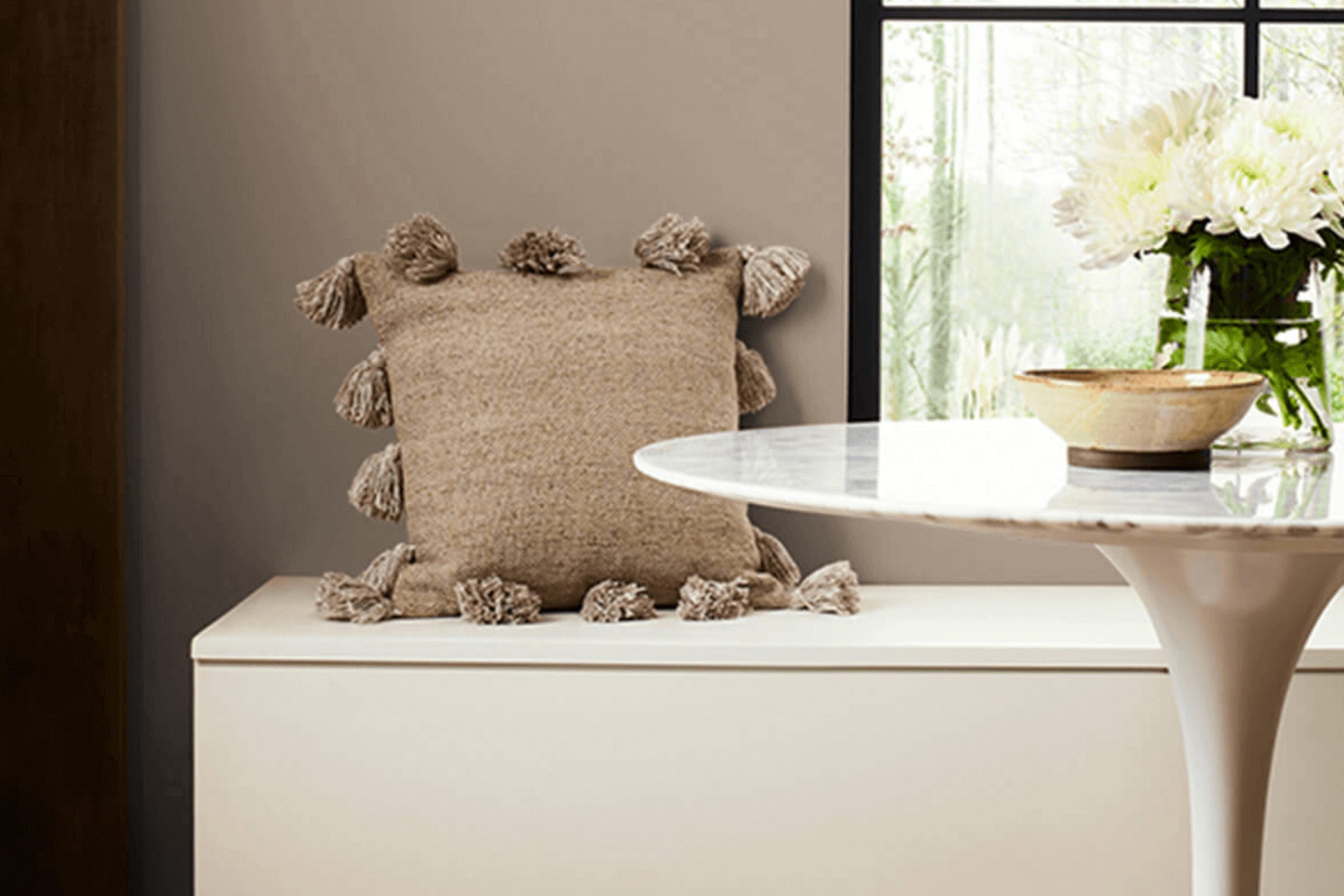
When you choose a paint color for your room, the impact can be significant. Recently, I stumbled across SW 9084 Cocoa Whip by Sherwin Williams and I was struck by its soft, welcoming presence. As a color, Cocoa Whip exudes a soothing neutrality, offering a perfect balance between warmth and light.
Its creamy, almost latte-like hue provides a flexible backdrop that can be easily coupled with various decor styles, from modern minimalism to rustic charm. If you’re planning to refresh your living room, bedroom, or even your office, this color can introduce a subtle elegance without making your existing furnishings and accents feel too strong.
In my experience, selecting the right paint color involves considering the light in your room, the furniture you love, and the overall ambiance you aim to achieve.
Cocoa Whip does well on all these fronts, playing beautifully with both natural and artificial lighting while enhancing other colors and textures in your room.
What Color Is Cocoa Whip SW 9084 by Sherwin Williams?
Cocoa Whip SW 9084 by Sherwin Williams is a warm and inviting beige hue with a slight, creamy undertone that evokes a sense of comfort and simplicity. This color is incredibly adaptable, making it an excellent choice for various interior styles, particularly those that aim to create a cozy and welcoming atmosphere such as contemporary, rustic, and farmhouse designs. It also works wonderfully in Scandinavian themes, where minimalism and warmth are key.
Cocoa Whip is perfect for living rooms, bedrooms, and kitchens where its warm undertone contributes to a relaxed and homely feel. This shade pairs exceptionally well with natural materials such as wood, stone, and linen, enhancing the organic essence of these textures. In rooms with hardwood flooring or wooden furniture, Cocoa Whip can help highlight the natural beauty of the wood grains, promoting a cohesive aesthetic.
Additionally, this color works well with softer textures like plush wool or cotton throws and cushions, creating a layered, cozy feel that’s ideal for rooms intended for rest and gatherings. For those looking to add a bit of contrast, pairing Cocoa Whip with accents in darker shades like navy or forest green can add a delightful pop of color without making the area feel too heavy.
This nuanced beige is truly a flexible color choice that works beautifully across a wide range of design preferences and can help tie a room together with warmth and style.
Is Cocoa Whip SW 9084 by Sherwin Williams Warm or Cool color?
Cocoa Whip by Sherwin Williams is a soft and creamy white that has a warm undertone, making it very adaptable for use in homes. This color can add a gentle, inviting touch to any room. Its lightness helps to make small areas appear bigger and brighter, which is great for rooms like bathrooms or small kitchens.
In larger rooms, Cocoa Whip provides a smooth backdrop, allowing furniture and decor to stand out. This color is also excellent for creating a cozy vibe in living areas and bedrooms where comfort is key.
Being a neutral shade, it pairs easily with other colors, whether you want to keep things calm with earth tones or add a splash of brightness with bold shades. Cocoa Whip is also forgiving when it comes to marks and scuffs, which is helpful for high-traffic areas. Overall, it’s a great choice for anyone looking to refresh their home with a new paint color.
Undertones of Cocoa Whip SW 9084 by Sherwin Williams
Cocoa Whip is a unique paint color because it contains a mixture of different undertones. These undertones are subtle colors that lie beneath the primary color of the paint. They can influence the way the main color appears in different lighting conditions and can affect the mood of a room.
For example, Cocoa Whip has undertones like pale pink and mint, which can give it a slightly warmer and more inviting feel in bright light. On the other hand, undertones like dark green and navy might make the color appear richer and deeper in areas with less light. This variety makes Cocoa Whip a flexible color for interior walls, as it can adapt to different settings and decor styles.
When used on interior walls, these undertones interact with the room’s lighting and furnishings. In natural light, lighter undertones like pale yellow and light gray might become more prominent, making the room feel brighter. In artificial lighting, darker undertones like brown and dark grey might stand out, giving the room a cozy and grounded atmosphere.
Overall, the wide range of undertones in Cocoa Whip means it can complement various interior themes, from modern to rustic. This paint can subtly shift in appearance, harmonizing with different decor elements and changing throughout the day with the light. Choosing this color for walls can add depth and interest to the area, making it a dynamic backdrop for everyday life.
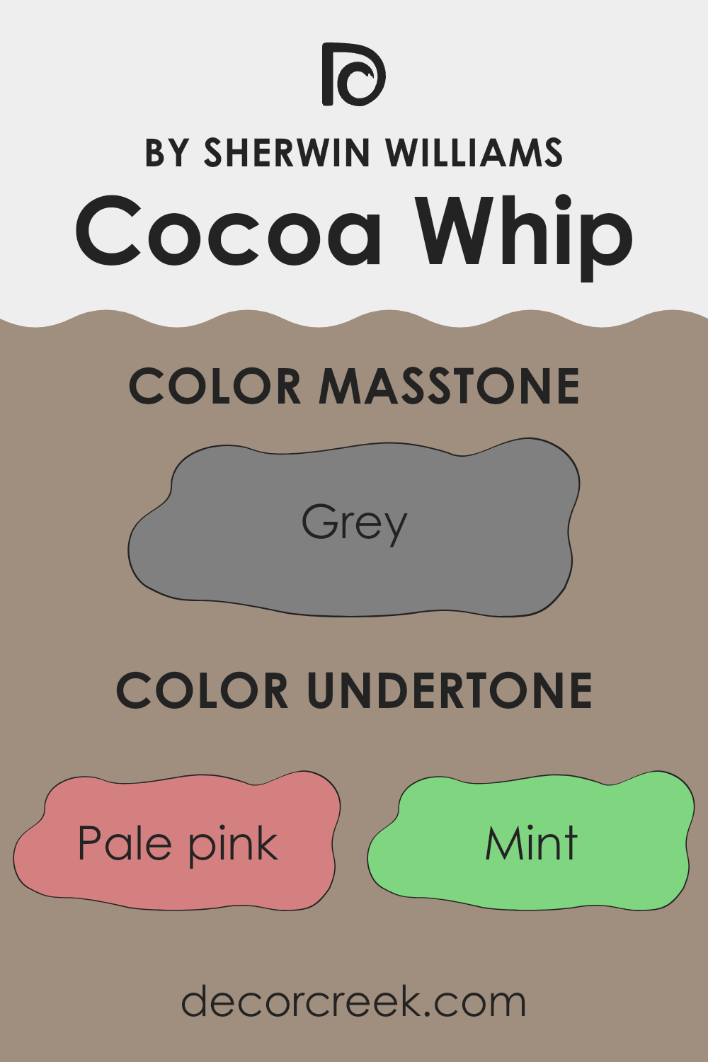
What is the Masstone of the Cocoa Whip SW 9084 by Sherwin Williams?
Cocoa Whip SW 9084 is an interesting color from Sherwin Williams with a masstone of gray. This particular gray shade makes it adaptable for home use. In rooms with less natural light, Cocoa Whip can look more subtle and understated, which helps make small areas feel bigger and less crowded.
In well-lit rooms, the same color can have a warm undercurrent that adds a cozy, welcoming vibe to the area. The neutrality of gray in Cocoa Whip means it pairs well with a wide range of colors, from bright and bold to soft and muted. This flexibility makes it easy to use in various decor styles, whether it’s a modern minimalist living room or a comfy, traditional bedroom.
It’s also practical because it can hide small marks or smudges better than lighter colors, which is great for homes with kids or pets. In summary, Cocoa Whip’s gray foundation is a practical choice that works beautifully across different settings and styles in a home.

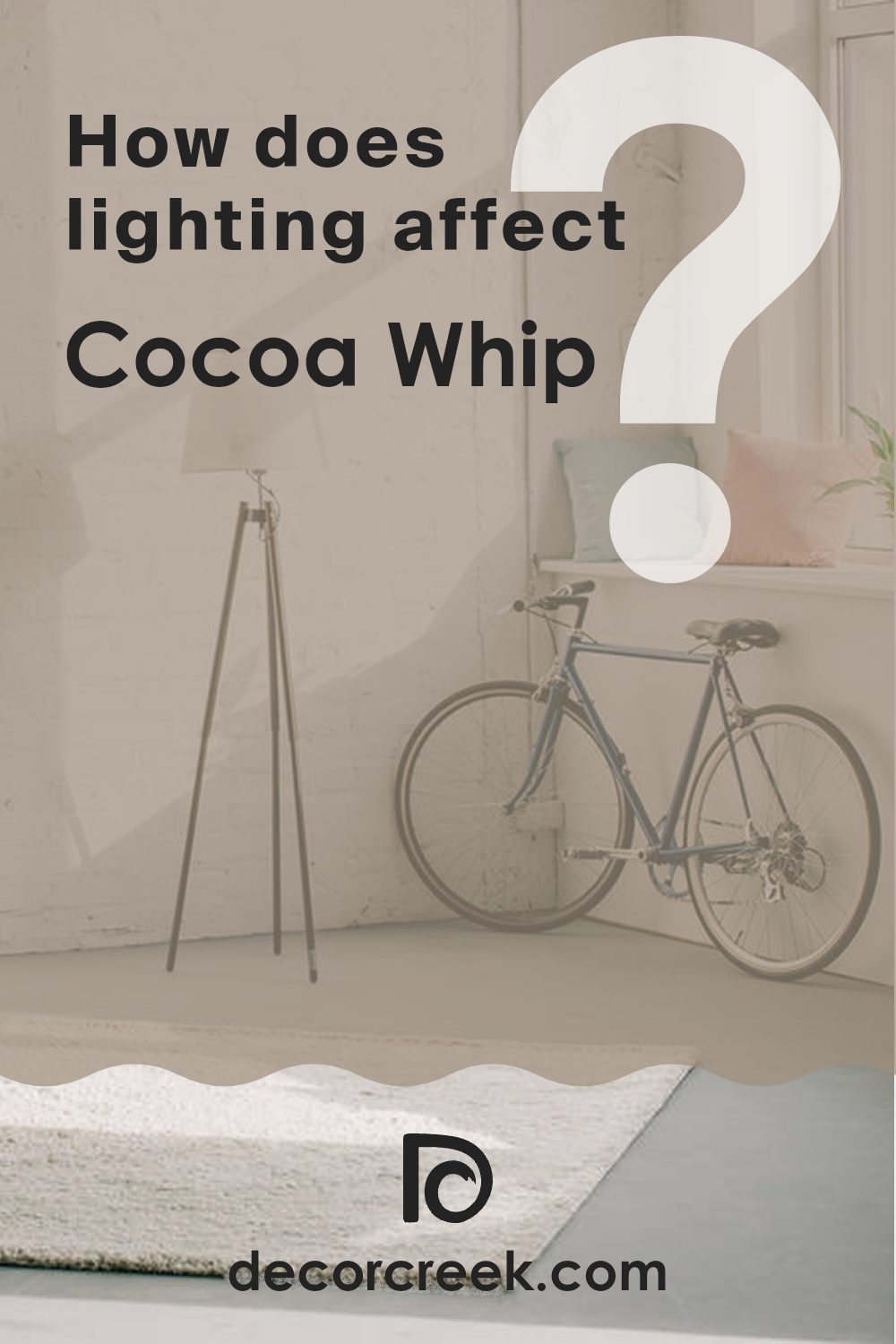
How Does Lighting Affect Cocoa Whip SW 9084 by Sherwin Williams?
Lighting plays a crucial role in how we perceive colors in a room, affecting everything from mood to the visual dimensions of an area. Different light sources can greatly alter the appearance of a paint color on your walls.
Take the color Cocoa Whip by Sherwin Williams as an example. This shade is a soft neutral with warm undertones, making it adaptable in various lighting conditions. However, its look can shift noticeably based on the type of light it receives.
In artificial light, such as that from LED or fluorescent bulbs, Cocoa Whip tends to appear slightly warmer. This happens because artificial lighting often enhances the warmer tones in paint colors. Under incandescent light, Cocoa Whip might look even cozier, drawing out its creamy, warm qualities.
In natural light, the time of day and the direction your room faces affect how Cocoa Whip appears. In north-facing rooms, which get less direct sunlight and tend to have cooler, bluer light, Cocoa Whip can look a bit more muted and understated. This softer look works well in rooms meant for relaxation.
In south-facing rooms, where light is abundant and warmer for most of the day, Cocoa Whip radiates warmth and can look vibrant and airy. Its creamy qualities are enhanced, making the area feel welcoming.East-facing rooms get plenty of light in the morning, making Cocoa Whip look bright and cheerful. As the day progresses and the natural light dims, the color takes on a gentler, more subtle tone.
West-facing rooms benefit from the warm, golden tones of the afternoon and evening light. Here, Cocoa Whip can appear especially warm and inviting, perfect for rooms used more in the later part of the day.Overall, Cocoa Whip’s adaptability in different lighting and orientations makes it a flexible choice for a range of settings and moods.
decorcreek.com
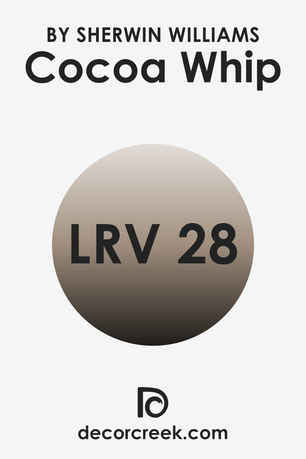
What is the LRV of Cocoa Whip SW 9084 by Sherwin Williams?
LRV stands for Light Reflectance Value, which is a measure of the amount of visible and usable light that gets reflected from a surface when light shines on it. The value is given as a percentage, with higher numbers reflecting more light and lower numbers less.
LRV helps in deciding which paint colors might suit different areas depending on how much natural or artificial light these rooms receive. The scale ranges from very low reflection, which makes a room feel darker, to the highest possible reflection, which can make an area feel brighter and more open.
For the color with an LRV of 28.265, like Sherwin Williams’ shade, this means it falls on the darker side of the scale and might be better suited for rooms that are well-lit or large enough to handle a deeper color without feeling too confined.
In areas with less natural light, this color could make the room appear darker and cozier, which might be desirable in some decorating scenarios, such as creating a more intimate and comfortable atmosphere. However, in a small, dimly lit room, it might make the area feel smaller and more closed in. Therefore, it’s important to consider the amount of light a room receives before choosing a lower LRV color like this one.
decorcreek.com
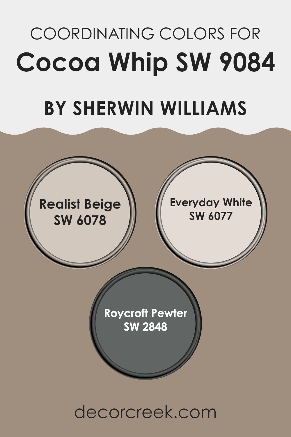
Coordinating Colors of Cocoa Whip SW 9084 by Sherwin Williams
Coordinating colors are those that complement each other and bring harmony to a room. When working with a base color, such as a rich neutral like Cocoa Whip, choosing coordinating colors involves selecting shades that either create a subtle contrast or aesthetically enhance the main color.
The chosen coordinating colors can vary in hues and saturations but should work effortlessly together to produce a balanced and inviting look. This method can effectively enhance the overall aesthetic of a room, making it look well thought out and consistently appealing.
For instance, Realist Beige is a gentle neutral that pairs beautifully with darker shades like Cocoa Whip. It offers a soft backdrop that allows deeper tones to stand out without overpowering the room. On the other hand, Everyday White is a clean and bright shade that can help to refresh and lighten a room dominated by darker tones, providing a crisp contrast that accentuates the depth of Cocoa Whip.
Lastly, Roycroft Pewter is a deeper, grayish hue that complements Cocoa Whip by adding a robust and grounding effect to the environment. This combination can add a layer of sophistication, making the room feel cozy and well-coordinated. Together, these colors support each other in creating a cohesive interior design.
You can see recommended paint colors below:
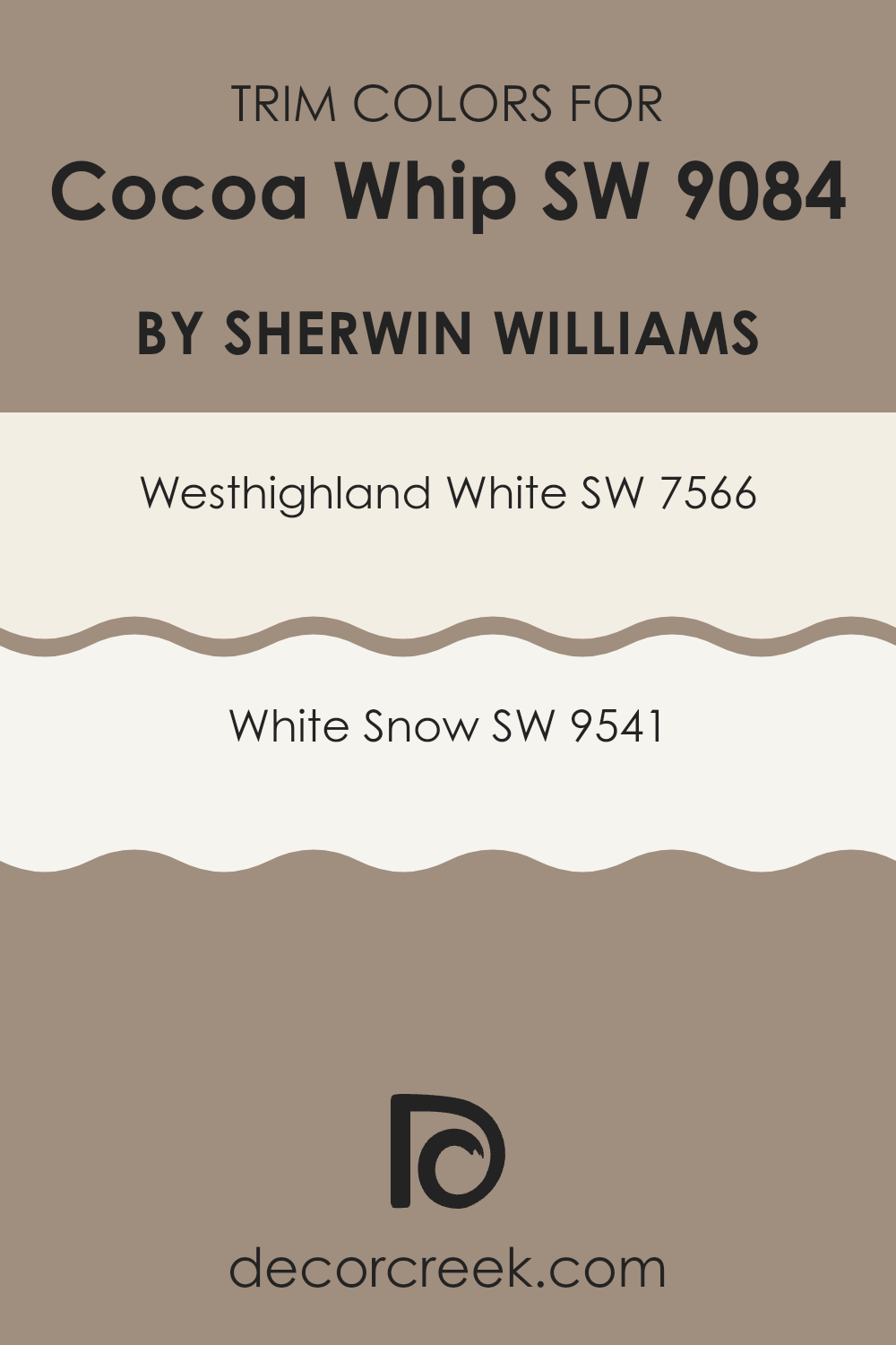
What are the Trim colors of Cocoa Whip SW 9084 by Sherwin Williams?
Trim colors are specific paint hues used to accentuate or outline the edges, frames, and features of a room or a building, like door frames, window sills, and baseboards. They play a significant role in defining the architectural details of a room, creating contrast, and enhancing the overall aesthetic appeal.
For example, when paired with Cocoa Whip SW 9084 by Sherwin Williams, the use of trim colors can highlight the unique aspects of a room, making the wall color stand out more prominently and giving the room a more polished look. Westhighland White SW 7566 is a warm white that offers a softness to edges and corners when used as a trim, complementing richer, darker wall colors like Cocoa Whip.
It can add a gentle contrast that is pleasing to the eye without overpowering the main color. On the other hand, White Snow SW 9541 is a brighter, cleaner white with a crisp finish that can provide a more striking contrast, making it perfect for use in areas that benefit from a sharper definition. Using White Snow as a trim color can inject a fresh and clean boundary that frames the subtler tones of Cocoa Whip effectively.
You can see recommended paint colors below:
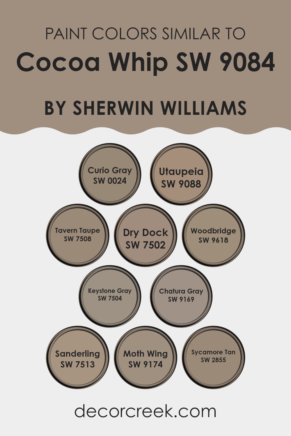
Colors Similar to Cocoa Whip SW 9084 by Sherwin Williams
Choosing similar colors in interior design is essential for creating a harmonious and visually appealing room. Colors that blend well together help achieve a balanced look, making an area feel cohesive and thoughtfully designed. For example, colors like SW 0024 – Curio Gray and SW 9169 – Chatura Gray both offer subtle, understated hues that work seamlessly with warmer tones.
Their gray shades can form a solid, neutral base that allows other elements in a room to stand out without making the overall aesthetic feel too strong. Meanwhile, colors such as SW 9088 – Utaupeia and SW 7508 – Tavern Taupe lend a warmer, richer feel, ideal for cozy, inviting areas. These taupe shades tie in beautifully with natural materials like wood and leather, enhancing earthy textures in a room.
On the other hand, SW 7502 – Dry Dock and SW 9618 – Woodbridge add a slightly more intense depth to areas, which is great for adding a touch of drama without going too dark. SW 7504 – Keystone Gray works similarly but with a balance that strikes between too stark and overly mild, making it perfect for modern interiors that aim for a chic yet approachable atmosphere.
SW 7513 – Sanderling and SW 9174 – Moth Wing, with their unique blends of beige and gray, offer adaptability and warmth, suitable for various decorating themes from rustic to contemporary. Lastly, SW 2855 – Sycamore Tan offers a dusky, earth-toned hue that pairs wonderfully with greens and blues, making it perfect for a nature-inspired palette. Using colors like these ensures design cohesion and provides a strong base for layering additional hues or textures for a dynamic yet unified interior.
You can see recommended paint colors below:
- SW 0024 Curio Gray
- SW 9088 Utaupeia
- SW 7508 Tavern Taupe
- SW 7502 Dry Dock
- SW 9618 Woodbridge
- SW 7504 Keystone Gray
- SW 9169 Chatura Gray
- SW 7513 Sanderling
- SW 9174 Moth Wing
- SW 2855 Sycamore Tan
Colors that Go With Cocoa Whip SW 9084 by Sherwin Williams
Choosing the right colors that complement Cocoa Whip SW 9084 by Sherwin Williams is crucial for creating an appealing and cohesive color scheme in your home. These colors, like Utterly Beige, Down Home, Realist Beige, Cobble Brown, Diverse Beige, and Sable, are all harmonious choices that can enhance the warm, comforting undertone of Cocoa Whip. Harmonizing colors create a balanced aesthetic and ensure that the rooms feel connected and thoughtfully designed.
Utterly Beige is a soft, gentle beige that gives a room a calm and welcoming feel. It works well in light-filled areas or as a backdrop for vibrant accents. Down Home is richer and brings a cozy depth to interiors, perfect for adding warmth. Realist Beige is a neutral beige that provides a subtle, clean look, making it highly adaptable for different decorative styles.
Cobble Brown has a stronger, darker tone that anchors lighter shades and adds a sense of solidity to a room. Diverse Beige offers a slightly grayer tone, making it ideal for contemporary rooms that aim for a modern yet warm atmosphere. Lastly, Sable is the darkest, providing a striking contrast which can be used to highlight architectural features or furniture, creating dynamic and visually interesting rooms. These colors together offer multiple design opportunities, ensuring every room feels complete.
You can see recommended paint colors below:
- SW 6080 Utterly Beige
- SW 6081 Down Home
- SW 6078 Realist Beige
- SW 6082 Cobble Brown
- SW 6079 Diverse Beige
- SW 6083 Sable

How to Use Cocoa Whip SW 9084 by Sherwin Williams In Your Home?
Cocoa Whip SW 9084 by Sherwin Williams is a warm and inviting paint color. It’s a soft brown that can bring a cozy feel to any room in your home. This color works well in living rooms and bedrooms because it creates a comforting atmosphere. It’s not too dark, making it perfect for areas where you want to relax and feel at ease.
You can use Cocoa Whip on all the walls in a room or just one as an accent wall. Pairing it with lighter colors like creams or soft beiges can keep the room light and airy. If you prefer a more modern look, combining it with bold colors like deep blues or greens can make it stand out more.
It’s also a great choice for furniture or cabinets. Painting bookshelves or kitchen cabinets in Cocoa Whip can add a gentle touch of color that’s easy on the eyes. Whether you want a full makeover or just a small update, this color is adaptable for any decorating style.
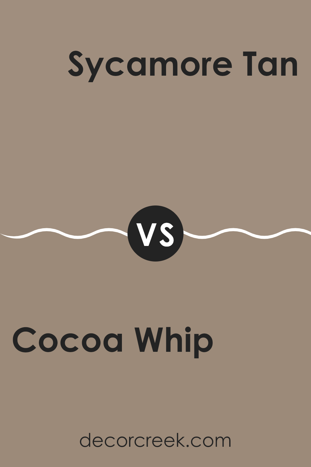
Cocoa Whip SW 9084 by Sherwin Williams vs Sycamore Tan SW 2855 by Sherwin Williams
Cocoa Whip and Sycamore Tan are two warm, inviting paint colors from Sherwin Williams, each offering its own unique charm for interior areas. Cocoa Whip is a gentle beige with a soft, creamy aspect that brings a light and airy feel to any room. It’s perfect for creating a cozy and comforting backdrop that pairs well with both bright and dark accents.
On the other hand, Sycamore Tan leans a bit darker, incorporating golden undertones that add a touch of warmth. This color is adaptable and provides a welcoming atmosphere, making it ideal for common areas like living rooms or entryways where a slightly richer shade helps make the area more appealing.
When comparing the two, Cocoa Whip is lighter and might make a room appear larger and brighter, while Sycamore Tan, with its deeper, toastier feel, can give rooms an earthy, grounded look. Deciding between them depends largely on the desired mood and size of your room, as each color sets a distinct tone.
You can see recommended paint color below:
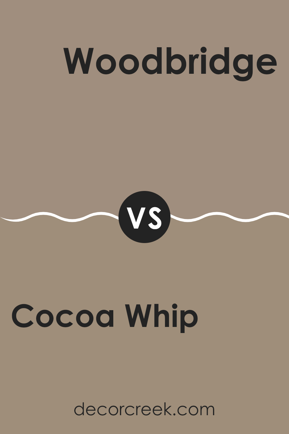
Cocoa Whip SW 9084 by Sherwin Williams vs Woodbridge SW 9618 by Sherwin Williams
Cocoa Whip and Woodbridge, both from Sherwin Williams, present unique shades ideal for different settings. Cocoa Whip has a light, creamy brown tone that feels warm and welcoming, making it perfect for creating a cozy atmosphere in living rooms or bedrooms. It reflects light beautifully, helping to brighten areas that don’t get much natural sunlight.
On the other hand, Woodbridge is a darker, more earthy brown. This shade is richer and can be used effectively to add depth and warmth to an area. It works well in larger rooms or as an accent wall, where its depth can be appreciated without making the room feel too heavy.
While Cocoa Whip adds a gentle brightness and softness, Woodbridge offers a bold, grounding effect. Both colors complement various decor styles and preferences, but the choice between them depends on the desired mood and the specific qualities of the room.
You can see recommended paint color below:
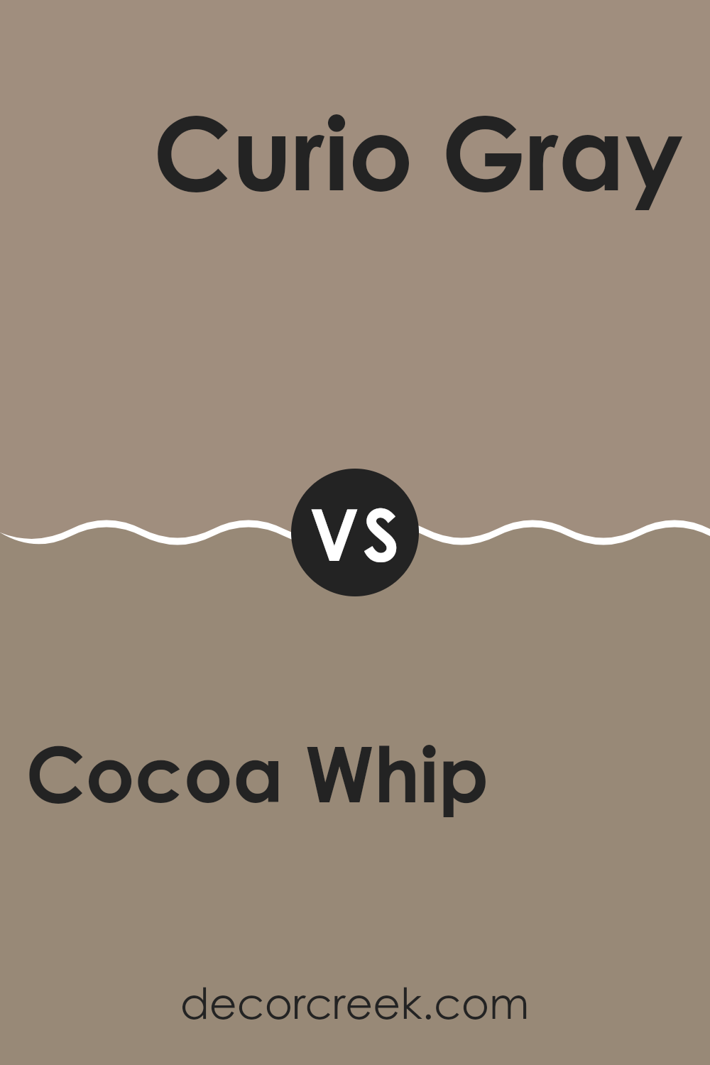
Cocoa Whip SW 9084 by Sherwin Williams vs Curio Gray SW 0024 by Sherwin Williams
Cocoa Whip and Curio Gray, both by Sherwin Williams, are distinctly different colors that can set varied moods in any room. Cocoa Whip is a warm, cozy beige that offers a soft, welcoming feel, ideal for living rooms or bedrooms where you might want a calm and relaxing atmosphere. It pairs beautifully with natural materials and textures like wood or linen, enhancing a relaxed, homely vibe.
On the other hand, Curio Gray stands out as a cooler, mid-tone gray with subtle hints of blue, which can give a more polished or modern look. This shade works well in areas that aim for a clean and contemporary style, such as kitchens, bathrooms, or minimalist living rooms. Curio Gray can also make vibrant accent colors stand out, such as reds or yellows.
Together, these colors can complement each other nicely in a home where you want varied moods across different rooms, maintaining a balance between warmth and refinement.
You can see recommended paint color below:
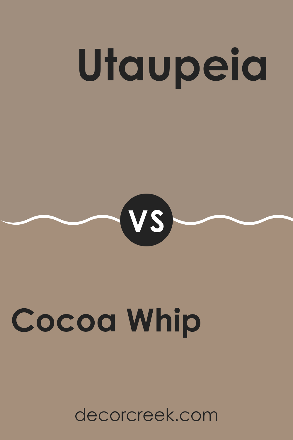
Cocoa Whip SW 9084 by Sherwin Williams vs Utaupeia SW 9088 by Sherwin Williams
Cocoa Whip and Utaupeia, both from Sherwin Williams, present nuanced shades of brown but differ in their tones and warmth. Cocoa Whip is lighter and carries a creamy feel, making it an excellent choice for creating a cozy, welcoming atmosphere in areas like living rooms or bedrooms.
It’s particularly good for rooms where natural light is abundant, as the light highlights the softness of the color. On the other hand, Utaupeia is a deeper taupe that leans toward a more grayish-brown hue.
This shade brings a sense of depth and refinement, making it suitable for areas that need a touch of polish or grace, like dining rooms or home offices. While both colors provide a neutral palette, Cocoa Whip offers a gentler warmth, ideal for more relaxed settings, whereas Utaupeia works beautifully in creating defined, stylish rooms in a home.
You can see recommended paint color below:
- SW 9088 Utaupeia
Cocoa Whip SW 9084 by Sherwin Williams vs Moth Wing SW 9174 by Sherwin Williams
Cocoa Whip and Moth Wing are two distinct hues from Sherwin Williams, each offering a unique vibe. Cocoa Whip is a lighter, creamier color that brings a soft, warm touch to any room. It’s like a gentle beige with a hint of warmth, perfect for creating a cozy and welcoming atmosphere.
On the other hand, Moth Wing is a darker shade, resembling the color of a moth’s wing, as the name suggests. This hue is deeper and closer to a dusty brown, providing a grounded, earthy feel that makes it ideal for areas where you want a more muted, subtle look.
Pairing these two colors can result in a balanced aesthetic. Cocoa Whip can brighten a room, making it feel more open and airy, while Moth Wing can serve as a perfect accent, adding depth and character without making the area feel too dark. Together, they offer a modern look that works well across a range of decorating styles, from casual to contemporary.
You can see recommended paint color below:
Cocoa Whip SW 9084 by Sherwin Williams vs Dry Dock SW 7502 by Sherwin Williams
Cocoa Whip and Dry Dock are two different shades of brown from Sherwin Williams. Cocoa Whip is a lighter, softer brown with a creamy tone to it. It brings a warm and cozy feel to a room, making it perfect for creating a comforting atmosphere. On the other hand, Dry Dock is a darker, more muted brown.
It has a stronger presence because of its deeper tone, giving a room a more grounded and steady feel. When you put Cocoa Whip and Dry Dock together, you see a clear contrast. Cocoa Whip can be great for highlighting walls or areas where you want a touch of brightness, while Dry Dock works well in areas where a more substantial, solid mood is desired.
Both colors can work beautifully in different settings but appeal to different design preferences. If you prefer a lighter, airier room, Cocoa Whip would be the right choice. For a more classic, grounded look, Dry Dock is likely the better option.
You can see recommended paint color below:
Cocoa Whip SW 9084 by Sherwin Williams vs Keystone Gray SW 7504 by Sherwin Williams
Cocoa Whip and Keystone Gray are both warm, inviting colors from Sherwin Williams, but they bring different moods and styles to interior design. Cocoa Whip is a lighter, creamy brown that gives off a soft and cozy vibe, making it ideal for creating a comforting and gentle atmosphere.
It pairs beautifully with other neutrals and can brighten a room without feeling too strong. On the other hand, Keystone Gray is a deeper, mid-tone gray with a touch of brown, offering a more grounded and steady presence. This color is perfect for adding depth and warmth to an area without making it feel too dark.
Keystone Gray works well in rooms where you want a bit more character and refinement but still want to keep a welcoming feel. Both colors complement a wide range of decor styles, though Keystone Gray leans toward a more defined and warm appearance compared to the lighter, softer charm of Cocoa Whip.
You can see recommended paint color below:
Cocoa Whip SW 9084 by Sherwin Williams vs Tavern Taupe SW 7508 by Sherwin Williams
Cocoa Whip and Tavern Taupe are both neutral colors from Sherwin Williams, but they have distinct tones that set them apart. Cocoa Whip is a lighter shade, leaning toward a soft, creamy beige. It gives off a warm, welcoming feel that can make rooms appear cozy and open. It’s ideal for areas where you want a subtle, calming backdrop.
On the other hand, Tavern Taupe is a deeper, warmer taupe. This color has more richness and depth compared to Cocoa Whip, offering a stronger presence that can anchor a room with a touch of warmth. Its deeper hue is perfect for creating a comfortable vibe, especially in larger rooms or rooms with plenty of natural light.
In practical terms, Cocoa Whip can help smaller rooms feel more open, while Tavern Taupe works beautifully in areas that benefit from a grounded, secure feel. Both shades pair well with a variety of decor styles, from modern to rustic, depending on how they’re styled.
You can see recommended paint color below:
Cocoa Whip SW 9084 by Sherwin Williams vs Sanderling SW 7513 by Sherwin Williams
Cocoa Whip and Sanderling are two unique paint colors from Sherwin Williams, each with its own distinct character. Cocoa Whip is a deep, warm beige that gives off a cozy, welcoming feel. It’s perfect for rooms where you want a touch of warmth without making the area feel too heavy. This color works beautifully in living areas or bedrooms, offering a comforting backdrop.
On the other hand, Sanderling is a lighter, neutral beige that leans toward a softer and more understated look. It’s ideal for creating a fresh and open feel in any room. Because of its lighter tone, Sanderling can help smaller areas appear larger and brighter. It pairs easily with many decor styles, from modern to traditional.
Both colors are adaptable, but Cocoa Whip adds warmth and depth, while Sanderling brings a light, airy touch to interiors. Depending on the atmosphere you want to create, each shade has its own way of enhancing the room.
You can see recommended paint color below:
Cocoa Whip SW 9084 by Sherwin Williams vs Chatura Gray SW 9169 by Sherwin Williams
Cocoa Whip is a soft, creamy beige with a warm undertone, making it cozy and inviting. It’s an adaptable color that works beautifully in living rooms or bedrooms where a gentle, comforting atmosphere is desired. On the other hand, Chatura Gray is a deeper, more solid gray shade that leans toward the cooler side. This color is excellent for creating a modern and refined look, especially in areas like kitchens or home offices where a more focused, structured feel is preferred.
When comparing the two, Cocoa Whip brings a light, airy quality to a room, often making areas seem larger and brighter. Chatura Gray, while also neutral, carries a stronger presence due to its depth, offering a grounding effect that can make large, open rooms feel more balanced and intimate.
Choosing between them depends largely on the mood and purpose of the room you’re designing. Cocoa Whip is ideal for a soft, warm backdrop, while Chatura Gray is perfect for adding a hint of modern polish without feeling too dark.
You can see recommended paint color below:
In conclusion, SW 9084 Cocoa Whip by Sherwin Williams is a paint color that reminds me of a warm cup of hot chocolate. It has a cozy, comforting feeling, just like wrapping up in a soft blanket. This color can make your rooms feel friendly and inviting, and it works beautifully almost anywhere in your home.
When I used Cocoa Whip in my living room, it made the area feel more like a family gathering spot. It also looked wonderful in my bedroom, adding a calming touch that makes it easy to unwind. Cocoa Whip isn’t just another brown paint — it has a special softness that can make a house truly feel like home.
Whether you want to make your living room more welcoming for guests or create a peaceful spot to read or relax, this shade is a great choice. It’s important to pair it with the right furniture and decor to bring out its full charm. Plus, if you’re painting a wall for the first time, this color is simple to apply and very forgiving. Overall, Cocoa Whip is a beautiful and practical option for anyone who loves colors that bring warmth, comfort, and a welcoming mood to their home.

Ever wished paint sampling was as easy as sticking a sticker? Guess what? Now it is! Discover Samplize's unique Peel & Stick samples.
Get paint samples

