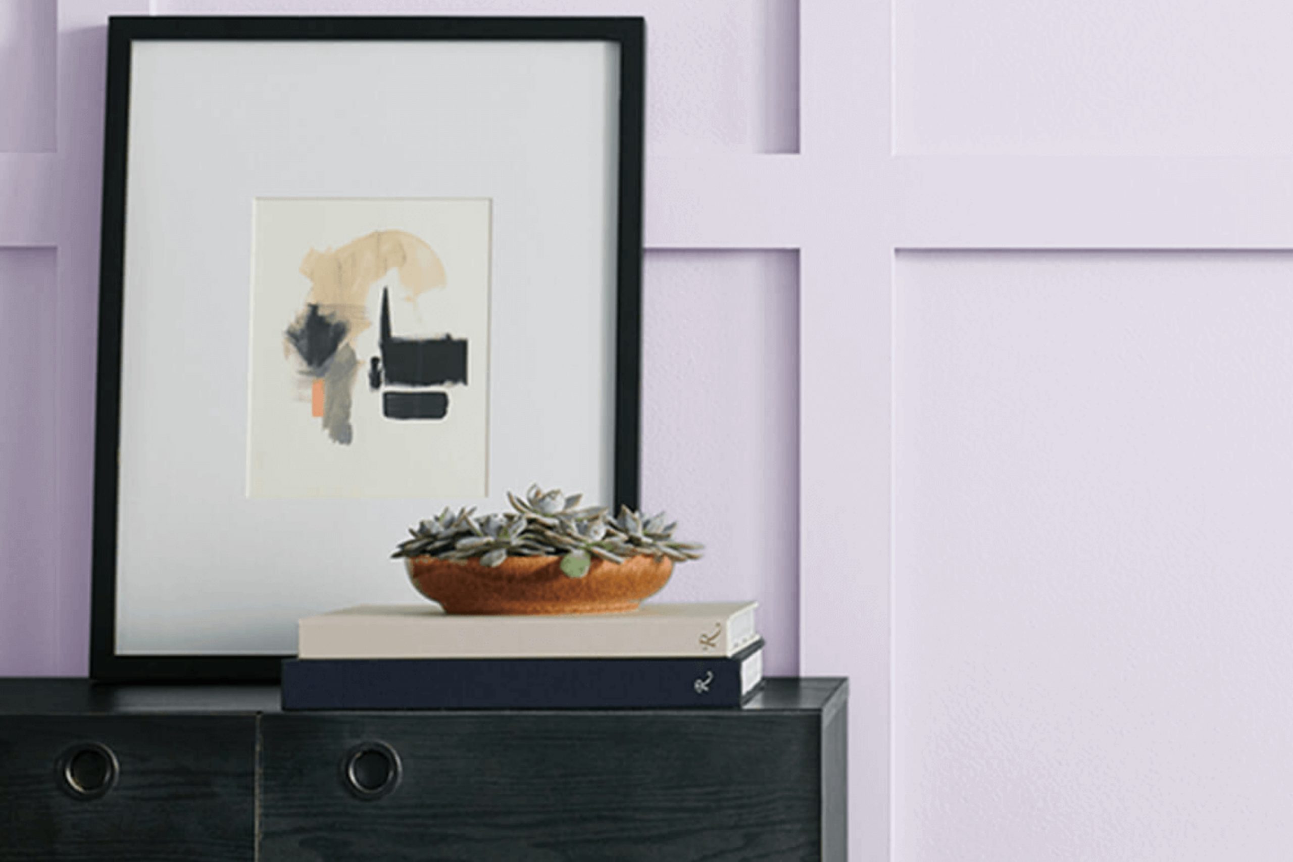
As I began my search for the perfect wall color for my reading nook, I stumbled upon SW 6820 Inspired Lilac by Sherwin Williams. This soothing lilac shade offers a gentle touch of color, subtle yet powerful enough to influence any room’s ambiance positively. It sits right at the crossroads of calm and cheerful, appealing to those who appreciate a hint of whimsy in their decor.
In your quest for a paint that not only looks beautiful but also enhances the mood of a room, Inspired Lilac might just be your ideal pick. It pairs well with soft whites and robust grays, allowing for adaptable design choices that can evolve with changing trends and personal tastes.
Through my experience, I found that this color brings a fresh and airy feel to rooms, making them feel more open and inviting.
If you’re considering a makeover for a specific area or planning to refresh your entire home, Inspired Lilac could provide that subtle shift in dynamics you’re looking for, without being too strong on your senses.
What Color Is Inspired Lilac SW 6820 by Sherwin Williams?
Inspired Lilac by Sherwin Williams is a gentle, refreshing hue that brings a hint of playfulness and warmth to any room. This color has a certain lightness that can make small rooms feel larger and airy. Its soft purple tone is adaptable, blending well with both modern and traditional interiors.
This color works beautifully in styles like shabby chic, where its subtle charm complements distressed furniture and vintage decor. It also matches well with minimalist designs, providing a splash of color without being too strong. For a more classical setting, Inspired Lilac can add a touch of gentle warmth to create a welcoming environment.
When it comes to materials, Inspired Lilac pairs well with light woods such as pine or birch that highlight its softness. Glossy finishes or metallic accents in silver or chrome can provide a lovely contrast, adding a bit of shine and refinement. In terms of textures, consider soft, plush fabrics like velvet or silk to enhance the cozy, inviting feel of the color.
Natural textiles such as linen or cotton also work well, maintaining the simplicity and lightness of the room. Overall, Inspired Lilac offers a fresh and airy feel that is adaptable across various interior styles, making it a charming choice for those looking to refresh their room with a touch of gentle color.
Is Inspired Lilac SW 6820 by Sherwin Williams Warm or Cool color?
Inspired Lilac is a soft and gentle purple shade that’s great for adding a light, cheerful touch to any room in your home. This color has a way of making rooms feel welcoming and cozy. When you paint a room with Inspired Lilac, it instantly gives off a friendly and warm vibe, which is perfect for places where you relax or host guests.
This shade works particularly well in bedrooms due to its calming effect. It also looks beautiful in living rooms as it pairs nicely with a variety of décor styles and colors, including whites, greys, and even more vibrant hues. Adding this paint to smaller rooms, like bathrooms or hallways, can make them appear brighter and bigger.
Overall, Inspired Lilac is adaptable and can be the background for modern or traditional home designs. It’s a subtle way to add some personality to your walls without being too strong on your senses. A dash of such a pleasant color can make your everyday surroundings a bit more special.
Undertones of Inspired Lilac SW 6820 by Sherwin Williams
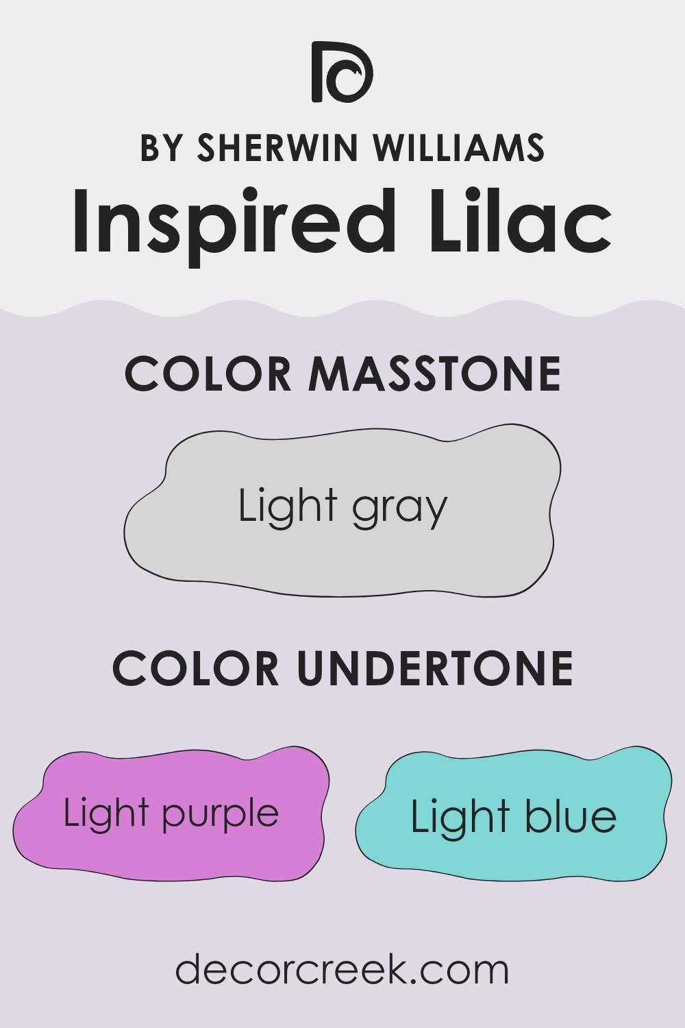
Inspired Lilac is a unique paint color that brings a subtle complexity to any room. The undertones in Inspired Lilac play a big role in how it looks once on the walls. Undertones are the hints of color that emerge under different lighting conditions. For this particular color, the light purple, light blue, pale yellow, lilac, pale pink, mint, and grey undertones all influence what you ultimately see.
For example, in a room with plenty of natural light, the light blue and pale yellow undertones might make the walls appear slightly more vibrant and lively. On cloudy days or in rooms with less sunlight, the grey undertone could make the color appear a bit more muted. Meanwhile, the mint and pale pink can bring a soft warmth to rooms, ideal for creating a welcoming vibe.
The light purple and lilac undertones ensure that the base character of the color stays true to its lilac nature, giving a gentle nod to a floral, soothing feel. This makes Inspired Lilac a flexible choice for bedrooms, bathrooms, and even living rooms, as it can subtly alter its appearance and mood in sync with the changing light throughout the day.
What is the Masstone of the Inspired Lilac SW 6820 by Sherwin Williams?
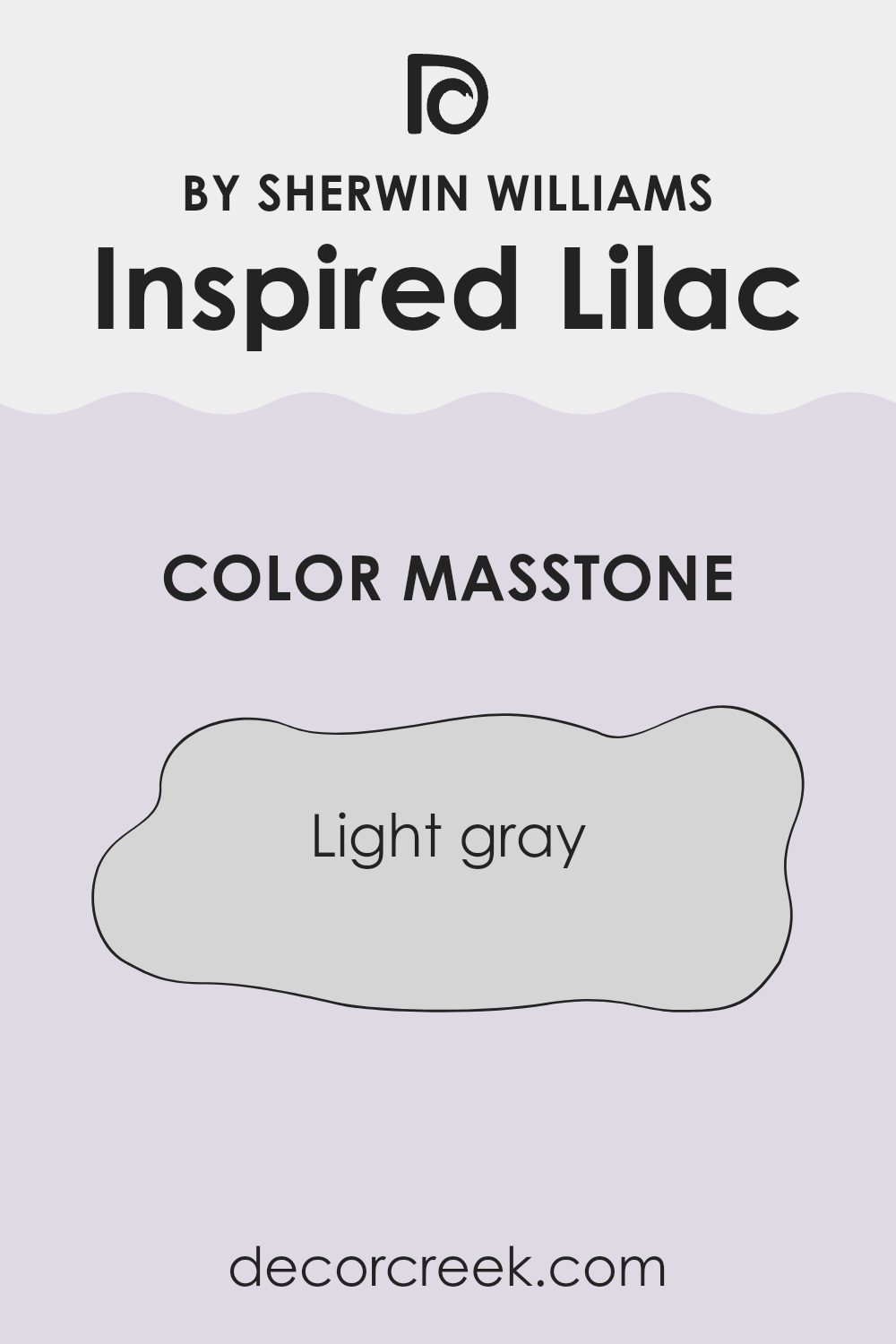
Inspired Lilac is a unique paint color that gives off a light gray tone. Its subtlety allows it to blend well with different designs and styles in a home. Because it’s so understated, it doesn’t overpower other colors or decor but instead works with them.
This makes it easy to pair with both bright accents or more muted furnishings, creating a cozy and inviting room. Additionally, this color is great for rooms that don’t get a lot of natural light. It can brighten up these rooms without feeling too harsh, unlike some bolder colors that might be too strong in those areas.
Overall, Inspired Lilac is a flexible choice that can help make a home look fresh and clean, while still adding a touch of gentleness to any room. This balance makes it a fit for many homes, matching well with multiple interior styles.
How Does Lighting Affect Inspired Lilac SW 6820 by Sherwin Williams?
Lighting plays a crucial role in how colors are perceived in a room. Different light sources can dramatically change the way a color appears. Natural light, for example, brings out the truest version of a color, while artificial light can alter how a color is viewed.
Taking a specific shade like Inspired Lilac as an example, its appearance can vary significantly under different lighting conditions. Inspired Lilac is a gentle and subtle purple hue that can create a calming atmosphere in a room.
In a room with natural light, Inspired Lilac will show its true color during the day. However, the quality and direction of the natural light will affect its appearance. Rooms that face north often receive less direct sunlight, making colors appear cooler and slightly more muted. In this context, Inspired Lilac might look more subdued and less vibrant. South-facing rooms, on the other hand, get ample sunlight; here, Inspired Lilac can appear brighter and more lively, enhancing its warm undertones.
East-facing rooms receive morning light, which is generally bright and warm. Inspired Lilac in an east-facing room will appear more vibrant and cheerful in the morning, fading to a softer tone in the afternoon.
West-facing rooms experience the opposite, with softer morning light that becomes golden and intense in the late afternoon. In these rooms, Inspired Lilac might look soft and delicate in the morning and become richer and warmer in the evening.Artificial lighting can also impact how Inspired Lilac is perceived. Fluorescent lights tend to cast a cooler tone, potentially making Inspired Lilac look sharper and bluer.
Meanwhile, incandescent lighting emits a warmer glow, enhancing the purple’s warmer, softer qualities. Understanding how different light sources affect colors like Inspired Lilac helps in making informed decisions about paint choices based on the room’s orientation and the type of lighting available.
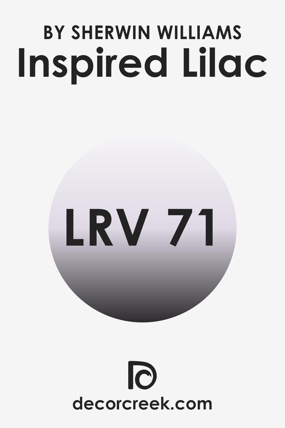
What is the LRV of Inspired Lilac SW 6820 by Sherwin Williams?
LRV, or Light Reflectance Value, is a scale that measures the percentage of light a paint color reflects back into the room compared to the amount of light that hits the surface. This value is particularly useful when choosing colors for your home because it gives you an idea of how light or dark a color might appear once it’s on your walls.
A higher LRV means the color reflects more light, making the room feel brighter and more open, while a lower LRV indicates that the color absorbs more light, potentially making a room feel cozier but also smaller.
In the case of the color “Inspired Lilac,” the LRV is 70.731. This means it is a fairly light color that will reflect a good amount of light, contributing to a brighter appearance in any room it’s used. Such a high LRV makes this paint color a great choice for rooms that might not receive a lot of natural sunlight, helping to make them appear lighter and more inviting. It can also be beneficial for smaller rooms or rooms with limited lighting, as it will help to visually expand the area and make it feel less cramped.
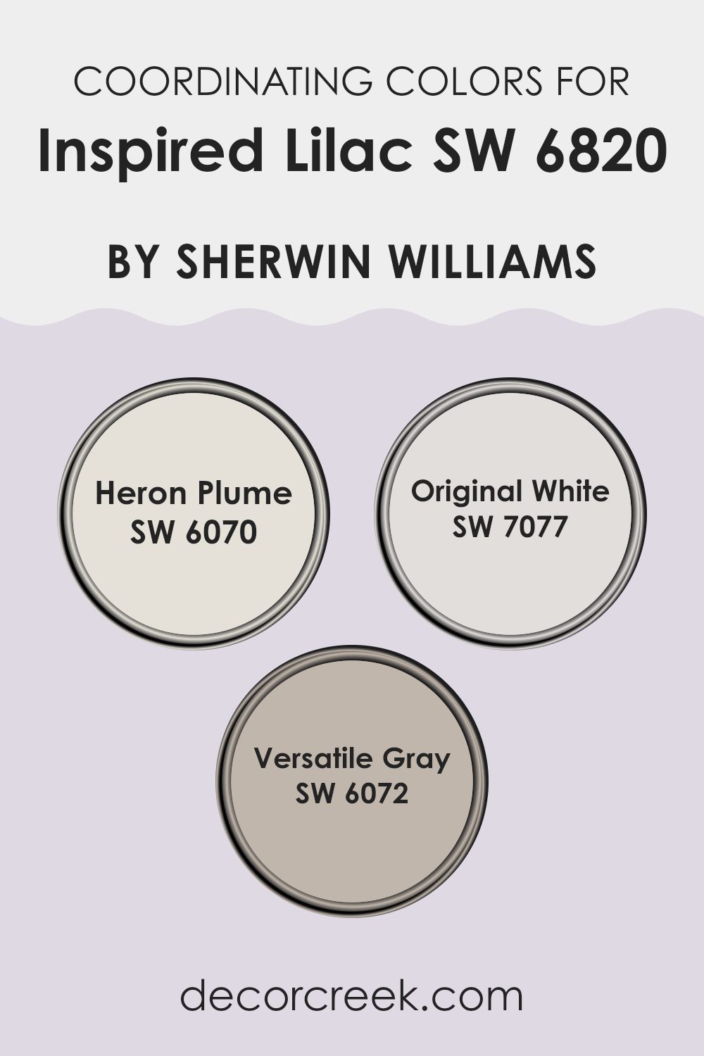
Coordinating Colors of Inspired Lilac SW 6820 by Sherwin Williams
Coordinating colors are shades that complement each other well and can be used together harmoniously in a design scheme. When you select a primary color like a soft purple, finding the right coordinating colors can help create a balanced and appealing look. Such a coordinated palette usually involves selecting hues that either contrast or blend smoothly with the primary color. This approach ensures that the overall appearance of a room or an outfit is pleasant and not too strong or disjointed.
For instance, Heron Plume is a light, almost ethereal neutral tone that adds a touch of cleanliness without overpowering the main hue. It works well to soften more vibrant colors or to serve as a bridge between different elements in a design, ensuring that everything flows together seamlessly.
Original White is a pure, crisp white that offers a fresh and clean background, allowing more vibrant colors to stand out vividly. It’s perfect for trim or accents that catch the eye and give a neat finish. Finally, Adaptable Gray is a deeper neutral with an ability to adjust to various settings, providing a sturdy anchor for the more lively or delicate colors and balancing the overall palette. This color can give depth and a bit of gravity to rooms or design elements, paving the way for a harmonious aesthetic.
You can see recommended paint colors below:
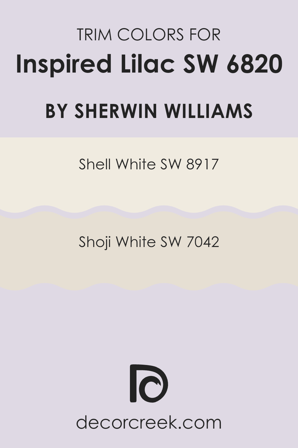
What are the Trim colors of Inspired Lilac SW 6820 by Sherwin Williams?
Trim colors are an essential aspect of paint selection, providing a contrasting or complementary accent to the main wall color. They help to define and emphasize architectural features like window frames, doors, and baseboards, enhancing the overall aesthetic of a room. When paired with Inspired Lilac by Sherwin Williams, choosing the right trim color can make a significant difference.
The delicate toned trim colors like SW 8917 – Shell White and SW 7042 – Shoji White offer subtle variations that synchronize beautifully with this vibrant hue. These colors can make the lilac stand out more prominently or blend smoothly depending on the atmosphere and lighting in your room.
Shell White, SW 8917, is a light, creamy white that provides a gentle contrast to brighter and deeper tones such as Inspired Lilac, giving a soft delineation without being too strong against the primary color. Conversely, Shoji White, SW 7042, which is a warmer, beige-tinted white, offers a subtle warmth to rooms, enhancing the coziness while still maintaining a clean and fresh appearance beside more vivid shades. Both colors are adaptable for various decor styles, allowing for a professional yet personal touch to any room.
You can see recommended paint colors below:
Colors Similar to Inspired Lilac SW 6820 by Sherwin Williams
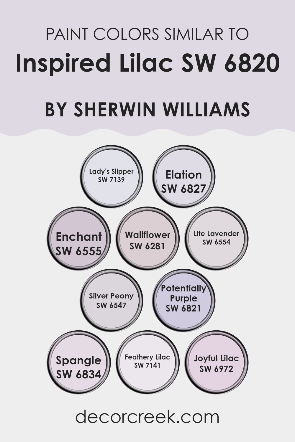
Similar colors play a vital role in creating a harmonious and visually appealing room. They have a natural affinity for each other, which helps to create a cohesive look that is pleasing to the eye. Using shades like Lady’s Slipper, a gentle pink with a hint of lavender, or Elation, a soft, almost ethereal light purple, enhances the main color by providing subtle variations that add depth and interest without being too strong.
Colors such as Enchant, a bolder pink-purple, and Wallflower, a muted purple, complement each other well, sharing undertones that tie them beautifully together. Lite Lavender and Silver Peony are lighter, softer variations that can brighten a room while still maintaining the calm, cohesive feel established by related hues.
Moreover, Potentially Purple adds a slightly deeper tone that can be used for accentuating features or focal points in a room, providing just the right amount of contrast within the same color family. Spangle, a playful light lavender, brings a lively yet gentle character to the mix. Feathery Lilac and Joyful Lilac, both variations of the original lilac shade, offer a vibrant yet soft presence, allowing for design flexibility in a room’s decor. These colors, when used together, allow for an adaptable palette that can create a fresh, inviting, and harmonious environment.
You can see recommended paint colors below:
- SW 7139 Lady’s Slipper
- SW 6827 Elation
- SW 6555 Enchant
- SW 6281 Wallflower
- SW 6554 Lite Lavender
- SW 6547 Silver Peony
- SW 6821 Potentially Purple
- SW 6834 Spangle
- SW 7141 Feathery Lilac
- SW 6972 Joyful Lilac
Colors that Go With Inspired Lilac SW 6820 by Sherwin Williams
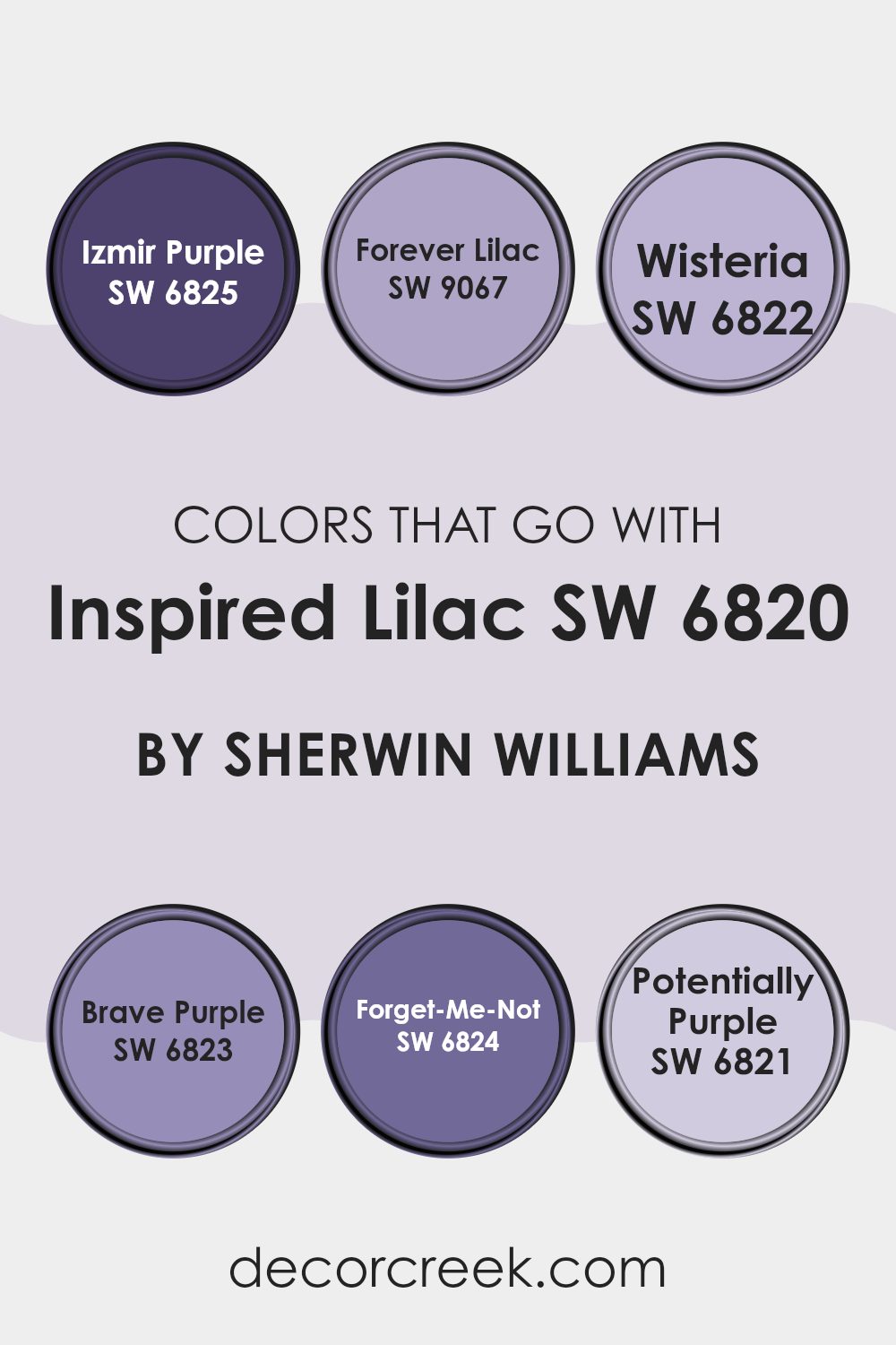
When choosing colors to pair with Inspired Lilac SW 6820 by Sherwin Williams, it’s crucial to consider the overall feel and theme you want to achieve. These companion colors like Izmir Purple, Forever Lilac, Wisteria, Brave Purple, Forget-Me-Not, and Potentially Purple, each play a unique role in harmonizing or creating contrast. Matching these colors appropriately can greatly enhance the aesthetic appeal of any room, making rooms feel more cohesive or dynamic depending on the combination used.
Izmir Purple boasts a deep, bold hue that provides a strong contrast to the softer Inspired Lilac, making it ideal for accent walls or decorative elements that command attention. Forever Lilac, slightly lighter than Inspired Lilac, offers a subtle variation in shade that can help in creating a gradient or ombre effect, softening transitions between colors.
Wisteria lends a touch of gentle charm with its muted quality, perfect for a comforting and soft environment. On the other hand, Brave Purple introduces a vivid vibrancy that can invigorate a room, making it pop with energy. Forget-Me-Not is fresh and airy, offering a crisp contrast that can refresh a room and complement darker furnishings.
Lastly, Potentially Purple strikes a happy medium with a tone that leans neither too light nor too dark, providing flexibility in design choices and usage across various decor styles. Together, these colors create a palette that allows personal expression and stylistic adaptability in enhancing a home’s visual harmony.
You can see recommended paint colors below:
- SW 6825 Izmir Purple
- SW 9067 Forever Lilac
- SW 6822 Wisteria
- SW 6823 Brave Purple
- SW 6824 Forget-Me-Not
- SW 6821 Potentially Purple
How to Use Inspired Lilac SW 6820 by Sherwin Williams In Your Home?
Inspired Lilac by Sherwin Williams is a soft and subtle shade of purple that brings a gentle charm and freshness to any room in your house. If you’re thinking about giving your room a little update, this color could be the perfect choice.
In a bedroom, Inspired Lilac adds a cozy and calming feel, making it a great backdrop for relaxing and unwinding after a busy day. In living rooms, like the living room or kitchen, it works well when used on an accent wall or for cabinets to add a hint of playful personality without being too strong.
This color pairs beautifully with light neutrals, like whites or grays, which can help keep the overall look light and airy. You can also match it with deeper greens or blues for a bit of contrast that still feels harmonious. Whether you’re painting an entire room or just looking for a fresh look for a furniture piece, Inspired Lilac offers a unique yet flexible option for adding a touch of color to your home.
Inspired Lilac SW 6820 by Sherwin Williams vs Silver Peony SW 6547 by Sherwin Williams
Inspired Lilac and Silver Peony, both by Sherwin Williams, offer distinct visual experiences. Inspired Lilac presents a bright, cheerful purple with a vivid touch that can add a sense of fun and energy to a room. It’s the kind of color that works well in creative rooms or anywhere you want to inject a playful yet calming atmosphere.
On the other hand, Silver Peony is a gentle, soft gray with subtle pink undertones, giving it a warm and inviting feel. This color is perfect for rooms where you want to promote a relaxed and welcoming environment, such as bedrooms or living rooms. It pairs beautifully with various decor styles, enhancing rooms with a subtle touch of warmth.
Both colors are adaptable but serve different moods and settings; Inspired Lilac for vibrant and stimulating areas, and Silver Peony for calm and cozy rooms.
You can see recommended paint color below:
- SW 6547 Silver Peony
Inspired Lilac SW 6820 by Sherwin Williams vs Spangle SW 6834 by Sherwin Williams
Inspired Lilac and Spangle both offer unique shades that could enhance any room. Inspired Lilac has a soft, gentle purple tone that feels very light and airy. It’s a great choice if you’re looking for a subtle hint of color that isn’t too bold but still adds personality to a room.
On the other hand, Spangle is a brighter, more upbeat color with its light and lively pink hue. It brings a cheerful vibe that could liven up a room and make it feel more inviting and warm.
Both colors are suitable for adding a touch of freshness to a room, but Inspired Lilac leans towards a more understated elegance, while Spangle offers a pop of fun and brightness, making it great for more energetic rooms. Each has its charm and can be used effectively depending on the mood and atmosphere you want to create.
You can see recommended paint color below:
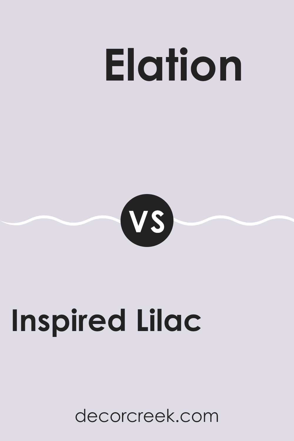
Inspired Lilac SW 6820 by Sherwin Williams vs Elation SW 6827 by Sherwin Williams
Inspired Lilac and Elation, both by Sherwin Williams, are colors that could create interesting moods in any room. Inspired Lilac has a soft, light purple shade that gives off a gentle and inviting feel. This color would work well in rooms meant for relaxation, like bedrooms or quiet sitting areas. It’s light enough to help small rooms feel a bit larger and more open.
On the other hand, Elation is a subtle off-white with hints of pink, adding a warm touch to it. This color is adaptable, making it perfect for any room in the house as it helps create a bright and welcoming atmosphere. It pairs nicely with darker colors for a nice contrast or can blend smoothly with softer hues for a low-contrast, soothing palette.
Both colors provide rooms with a fresh look but in different ways. Inspired Lilac adds a hint of cheerful color, while Elation keeps things calm with its near-neutral tone. Choosing between them depends on the room’s purpose and the mood you want to set.
You can see recommended paint color below:
- SW 6827 Elation
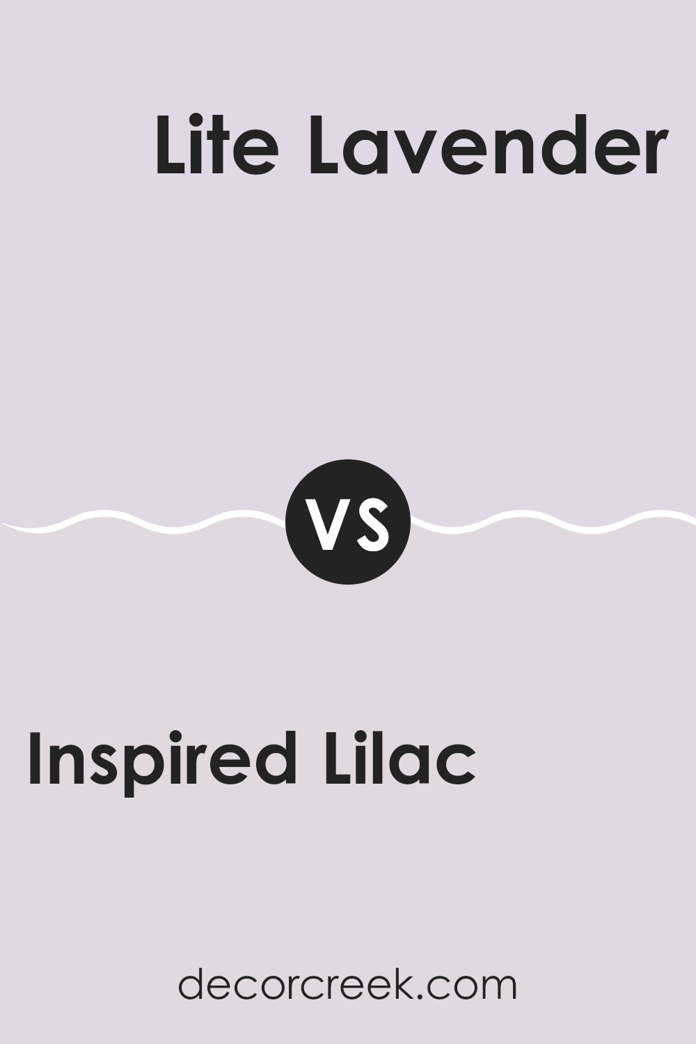
Inspired Lilac SW 6820 by Sherwin Williams vs Lite Lavender SW 6554 by Sherwin Williams
Inspired Lilac and Lite Lavender are both beautiful shades by Sherwin Williams, yet they have distinct tones that set them apart. Inspired Lilac is a deeper, richer purple with a bold presence that can make walls or accents stand out. It’s perfect for those looking to add a splash of personality to their room.
On the other hand, Lite Lavender has a lighter, more subtle hue. This color is great for creating a soft, calming atmosphere in a room, suitable for places where you want to relax such as bedrooms or bathrooms.
While Inspired Lilac brings a more noticeable pop of color, Lite Lavender is understated and provides a gentle background tone. Each color has its unique charm and the choice between them depends greatly on the mood or style you wish to achieve in your decorating project.
You can see recommended paint color below:
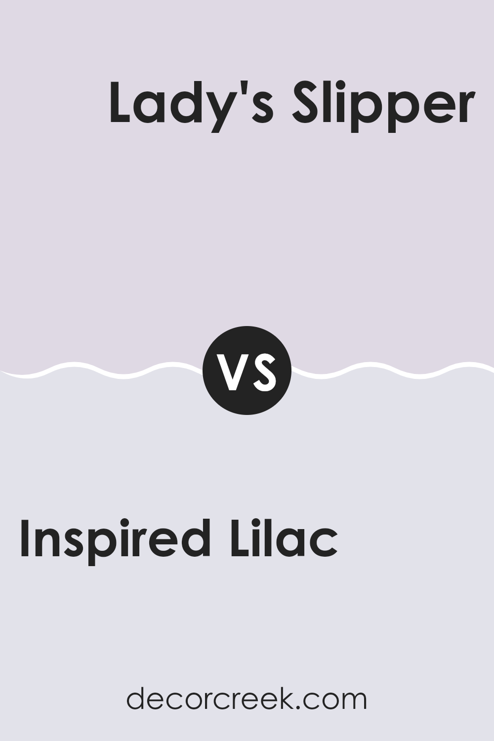
Inspired Lilac SW 6820 by Sherwin Williams vs Lady’s Slipper SW 7139 by Sherwin Williams
Inspired Lilac and Lady’s Slipper by Sherwin Williams are both unique shades, but they offer distinct vibes for decorating rooms. Inspired Lilac is a vibrant purple with a playful and lively feel. It’s a color that stands out and can add a pop of brightness to a room, perfect for rooms that need a dash of fun.
On the other hand, Lady’s Slipper is a softer, more muted pinkish purple. This color is more subdued and gentle, making it great for those who want to bring a calming and soothing atmosphere to their room. It’s ideal for bedrooms or areas where you want a touch of color without being too strong.
Both colors are adaptable and can be used in various settings, but Inspired Lilac would be more suited for energetic or creative rooms, while Lady’s Slipper would work well in places where you prefer a more relaxed, calming vibe.
You can see recommended paint color below:
- SW 7139 Lady’s Slipper
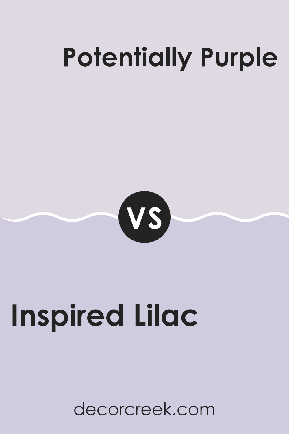
Inspired Lilac SW 6820 by Sherwin Williams vs Potentially Purple SW 6821 by Sherwin Williams
Inspired Lilac and Potentially Purple are two unique hues from Sherwin Williams. Inspired Lilac is a softer, more subdued shade. It leans toward a gentle, calm vibe that makes it perfect for rooms meant for relaxation like bedrooms or quiet reading corners.
On the other hand, Potentially Purple presents a slightly deeper and more pronounced purple tone that can add a touch of boldness without being too strong. It works well if you want to add a bit more drama or distinctiveness to a room, making it great for accent walls or decor items.
While both colors share a purple base, Inspired Lilac offers a lighter, airier feel, whereas Potentially Purple provides a richer, more noticeable presence, giving you options depending on the mood and character you want to bring into your room.
You can see recommended paint color below:
- SW 6821 Potentially Purple
Inspired Lilac SW 6820 by Sherwin Williams vs Feathery Lilac SW 7141 by Sherwin Williams
The color Inspired Lilac has a vibrant, slightly richer hue that has a punchy, energetic feel suitable for rooms where you want to add some cheerful character. Feathery Lilac, on the other hand, is softer and more subdued. This color is gentler and brings a calming atmosphere, making it ideal for areas where relaxation is desired, like bedrooms or bathrooms.
While both shades belong to the purple family, Inspired Lilac is slightly deeper, leaning towards a more visible purple presence. Feathery Lilac, having a more muted appearance, leans towards a pastel, almost whisper-like presence in its environment.
In terms of coordinating with other colors, Inspired Lilac works well with bright whites or bold colors for an exciting contrast, whereas Feathery Lilac pairs beautifully with soft neutrals for a lighter, airy feel. Depending on the vibe you want for the room, either shade can be a great choice, with each offering its unique mood and style influence.
You can see recommended paint color below:
- SW 7141 Feathery Lilac
Inspired Lilac SW 6820 by Sherwin Williams vs Joyful Lilac SW 6972 by Sherwin Williams
Inspired Lilac and Joyful Lilac, both by Sherwin Williams, offer two distinctive takes on the lilac hue. Inspired Lilac presents a deeper, richer tone that adds a subtle depth to rooms, making it ideal for creating a cozy and warm atmosphere in rooms that need a touch of quiet elegance. This color tends to work well in bedrooms or living areas where a calming presence is valued.
On the other hand, Joyful Lilac is lighter and brighter, which brings a more lively and energetic vibe to a room. It’s perfect for areas that could use a boost of cheerfulness, such as bathrooms or children’s rooms. This shade can also make small rooms feel larger and more open due to its lighter tone.
Both shades, while based in the purple family, serve different moods and atmospheres. Inspired Lilac, with its muted and dusky quality, suits subdued or classic styles, whereas Joyful Lilac, with its uplifting and vibrant character, is fitting for more playful or dynamic environments.
You can see recommended paint color below:
- SW 6972 Joyful Lilac
Inspired Lilac SW 6820 by Sherwin Williams vs Wallflower SW 6281 by Sherwin Williams
Inspired Lilac and Wallflower are two interesting colors by Sherwin Williams that offer subtle yet distinct vibes for any room. Inspired Lilac is a gentle, soft purple with a cheerful and warm essence, making it great for creating a cozy, inviting atmosphere. It works well in bedrooms or living rooms where a touch of calmness is desired, without being too bold or overpowering.
Wallflower, on the other hand, is a deeper, more reserved purple with gray undertones, giving it a more muted and understated look. This color suits rooms that are designed for focus and reflection, like studies or home offices. It pairs well with modern decor and can help ground a room with its solid, calming presence.
Both colors are adaptable but serve different purposes based on their brightness and undertones. Inspired Lilac adds a lighter, uplifting feel, while Wallflower offers a more grounded, subtle approach. Choosing between them depends on the mood and function you want for your room.
You can see recommended paint color below:
Inspired Lilac SW 6820 by Sherwin Williams vs Enchant SW 6555 by Sherwin Williams
Inspired Lilac and Enchant are both colors from Sherwin Williams, each bringing a unique flair to any room. Inspired Lilac is a soft, gentle purple with a subtle gray undertone that gives it a calm and soothing feel. It’s light enough to make a room feel airy while still adding a touch of color.
Enchant, on the other hand, is a deeper and more vivid purple. It has a richness that makes it stand out more, especially when used as an accent wall or in decorative elements. Enchant is bolder and more dramatic, offering a strong presence that can make rooms look more lively and inviting.
When comparing these two, Inspired Lilac is perfect for those who prefer a more understated look, while Enchant is ideal for creating more of a statement. Depending on your room’s purpose and your personal taste, each color has the potential to enhance your home beautifully.
You can see recommended paint color below:
- SW 6555 Enchant
After studying SW 6820 Inspired Lilac by Sherwin Williams, I learned quite a bit about this lovely paint color. Inspired Lilac is not just a regular purple; it has a unique charm that can make any room feel special. If you’re thinking of adding a splash of color to your room, this might be the perfect choice. It’s soft enough to make your room feel cozy but also bright enough to add a bit of fun.
This color is great for places like bedrooms or even living rooms, where you want to feel relaxed and happy. It can also make small rooms look bigger and more inviting. One of the best things about Inspired Lilac is that it goes well with lots of other colors. Whether you pair it with soft whites or even bold greens, it can really make a room look nice.
Choosing the right color for your room is important because it can affect how you feel when you are in that room. Inspired Lilac by Sherwin Williams is a friendly and warm color that can help make your room a nicer place to be. It’s a color that can cheer you up and make you feel comfortable at home.
So, if you’re thinking about giving your room a new look, consider Inspired Lilac; it might just be the perfect color for you!
Ever wished paint sampling was as easy as sticking a sticker? Guess what? Now it is! Discover Samplize's unique Peel & Stick samples.
Get paint samples

