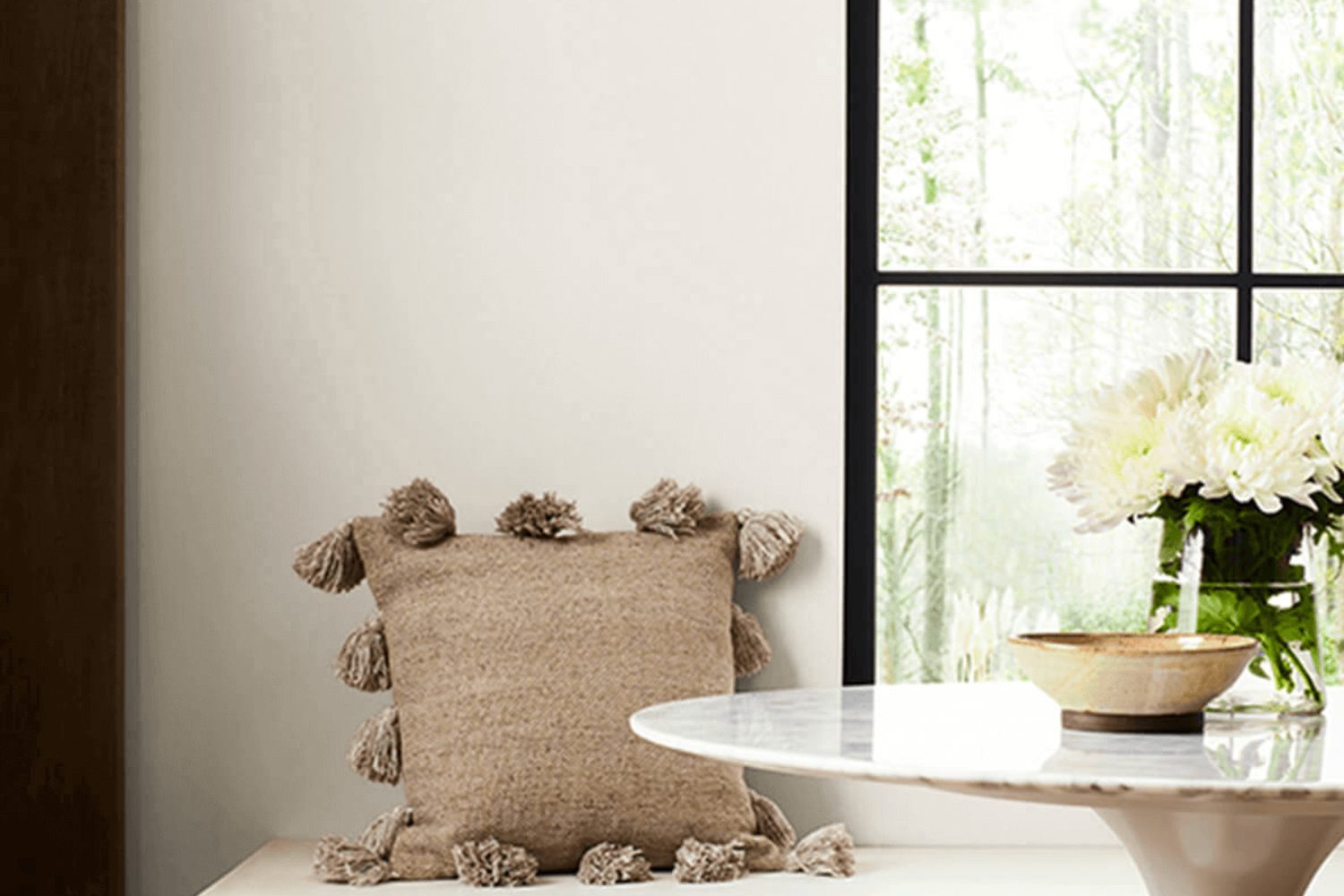
Introducing SW 6070 Heron Plume by Sherwin Williams, a paint color that’s making waves in the world of interior decoration. If you’re on the lookout for a soft, neutral shade that brings a fresh and airy feel to any room, Heron Plume might just be your perfect match.
This color is all about creating a serene and inviting environment. It’s not just any shade of off-white. It’s a meticulously curated tone that stands out for its ability to blend seamlessly with different styles and palettes.
When planning a home makeover, selecting the right color can be overwhelming. But with Heron Plume, you get a versatile backdrop that makes everything around it shine. Whether you’re aiming for a minimalist look, a cozy cottage vibe, or a modern aesthetic, this paint color adjusts to your vision like a chameleon.
It’s especially splendid in spaces where natural light pours in, highlighting its unique qualities and transforming the ambiance from simple to simply breathtaking.
Beyond its visual appeal, Heron Plume is also about creating a sense of warmth and comfort. It’s a color that says “welcome” in the most understated yet profound way, inviting you to relax and feel at home. As we explore what makes SW 6070 Heron Plume by Sherwin Williams a standout choice for decorators and homeowners alike, let’s discover how this beautiful shade can elevate your space without overwhelming it.
What Color Is Heron Plume SW 6070 by Sherwin Williams?
Heron Plume by Sherwin Williams is a soft, warm, and versatile neutral paint color. It’s like the gentlest hug from the sunlight on a serene morning. This color has a way of making spaces feel more open and airy, providing a subtle backdrop that can either stand alone or complement other colors and design elements in a room.
This color works wonderfully with a variety of interior styles, especially those leaning towards minimalism, modern farmhouse, Scandinavian, and traditional designs. Its understated elegance provides a timeless foundation, allowing for flexibility in decor changes over the years.
When it comes to pairing Heron Plume with materials and textures, think of natural elements to bring out its warmth. Light woods, such as oak or birch, enhance its cozy feel. Linen, cotton, and wool fabrics in neutral or muted tones work beautifully to create a layered, inviting space. For a bit of contrast, incorporate matte black or brushed nickel finishes in hardware and fixtures. Adding elements with a slight sheen, such as silk pillows or ceramics, can add depth and interest, ensuring that spaces feel balanced and well-rounded.
Heron Plume’s strength lies in its ability to blend harmoniously with a range of materials and textures, making it a go-to color for creating tranquil, welcoming environments.
Is Heron Plume SW 6070 by Sherwin Williams Warm or Cool color?
Heron Plume SW 6070 by Sherwin Williams is a light, airy shade of paint that brings a touch of calmness and serenity to any room. Its subtle warmth makes it incredibly versatile, fitting seamlessly into various home decors. Think of it as a soft backdrop that allows your furniture, artwork, and personal touches to stand out. Unlike stark white, Heron Plume has a gentle warmth to it, ensuring spaces feel welcoming rather than cold or clinical.
This color works well in rooms that get a lot of natural light, as it reflects the light beautifully, making spaces appear larger and more inviting. It’s also a great choice for small rooms or areas with limited light, as its light-reflecting properties can help brighten the space.
In terms of styling, Heron Plume is a chameleon. It can support bold and vibrant colors, providing a balanced environment that feels neither too overwhelming nor too bland. Whether you’re aiming for a modern minimalist look, a cozy cottage feel, or something in between, this color can help you achieve your desired aesthetic. It’s no wonder that homeowners love using it to create a peaceful and inviting home environment.
Undertones of Heron Plume SW 6070 by Sherwin Williams
Heron Plume is a unique paint color that brings a subtle and soft ambiance to any room. The magic behind its versatility and charm lies in its undertones. Undertones are the hidden colors that emerge under different lighting conditions, and they play a crucial role in how we perceive the main color. For Heron Plume, these undertones are a mix of pale yellow, light purple, light blue, pale pink, mint, lilac, and grey.
These undertones add depth and complexity to the color, making it adapt to various decor styles and preferences. In bright sunlight, you might notice the pale yellow or light blue undertones making the room feel airy and vibrant. On cloudy days, the grey or light purple might stand out, adding a cozy and serene feel to the space.
When applied to interior walls, Heron Plume transforms the room based on its lighting and the colors around it. The pale pink or lilac undertones might catch your eye, creating a soft, welcoming vibe, perfect for bedrooms or living rooms. In spaces with natural greenery, the mint undertones could become more noticeable, enhancing a feeling of freshness and connection with nature.
Overall, the undertones in Heron Plume make it more than just a simple paint color. They allow the color to interact with its surroundings, offering a chameleon-like ability to fit into a wide range of interior styles and atmospheres. Whether you’re aiming for a calm retreat or a bright and lively space, Heron Plume, with its rich undertones, can help you achieve the look and feel you desire.
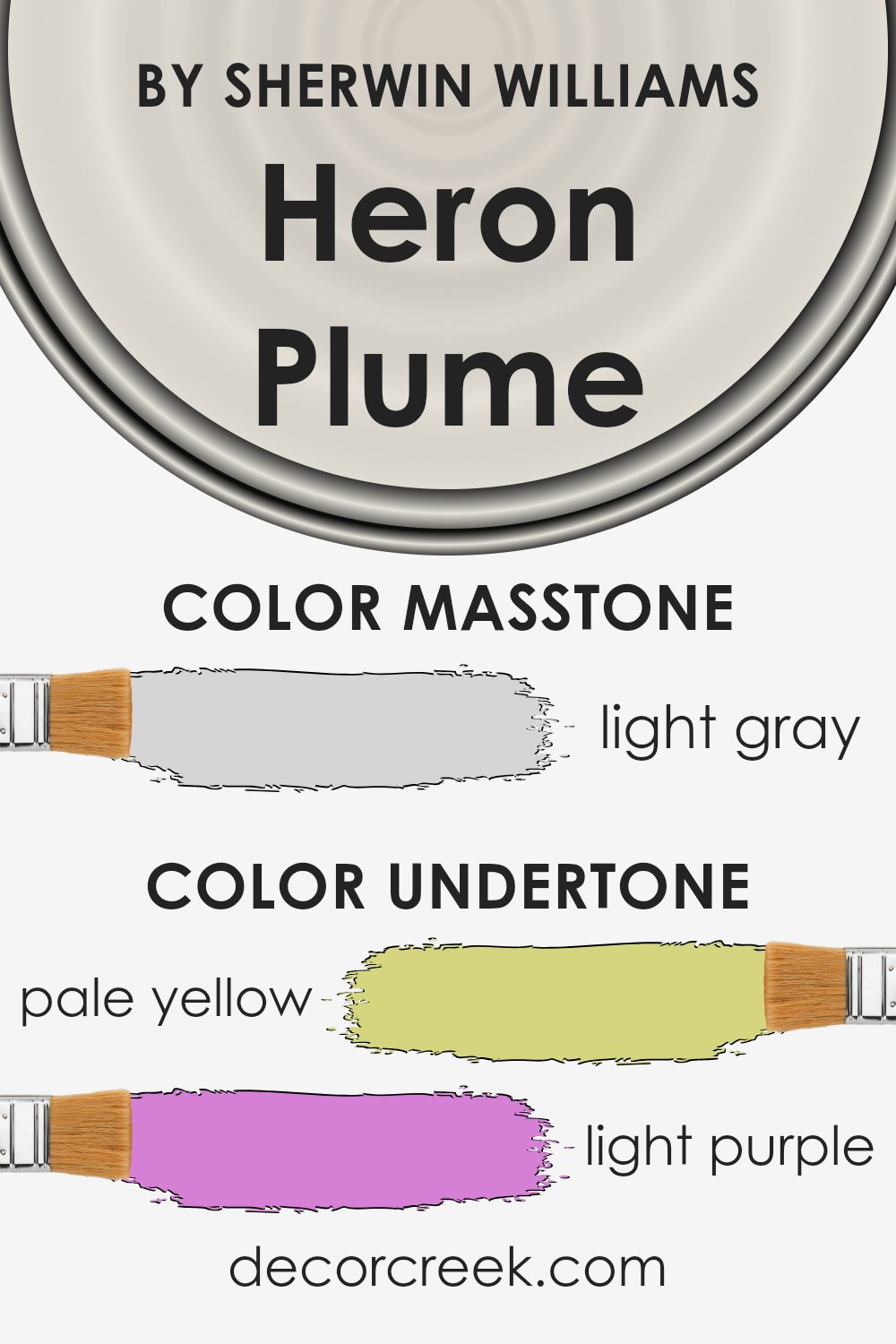
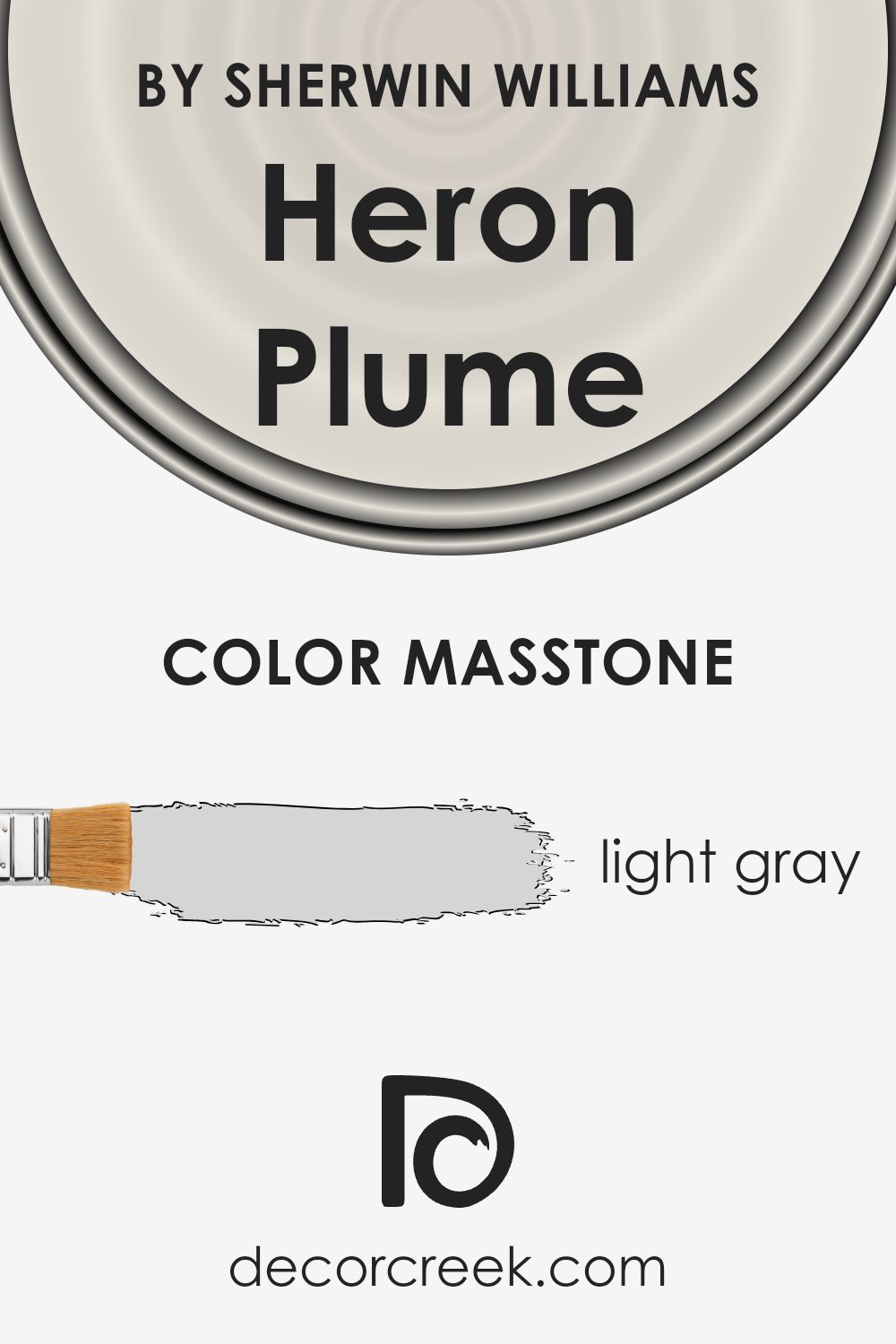
What is the Masstone of the Heron Plume SW 6070 by Sherwin Williams?
Heron Plume SW 6070 by Sherwin Williams has a masstone of light gray, sporting a subtle shade that comes across as both soft and inviting. When this color is applied to the walls of a home, it creates a serene and welcoming atmosphere, transforming spaces into tranquil retreats. The shade is incredibly versatile, making it easy to match with a wide range of decor styles and color schemes.
Whether your home features classic furniture or more contemporary pieces, Heron Plume’s light gray tone serves as a perfect backdrop, highlighting furnishings without overpowering them.
This color’s ability to reflect natural light enhances its appeal, making rooms appear larger and more open. It’s an excellent choice for small spaces or any area that could benefit from a visual expansion. Additionally, the calmness of Heron Plume promotes a relaxed vibe, making it an ideal color for bedrooms and living areas where comfort is key. Its subtle elegance adds a touch of sophistication without being too bold, ensuring that homes feel warm and inviting.
How Does Lighting Affect Heron Plume SW 6070 by Sherwin Williams?
Lighting plays a significant role in how we perceive color in our surroundings, affecting everything from the mood of a room to the perceived size of a space. The color on the wall, such as Heron Plume by Sherwin Williams, can look different depending on the light source.
In natural light, colors can show their truest form, but the direction of the light can alter this perception. For a color like Heron Plume, a soft, warm neutral, natural light can enhance its warmth, making it feel cozy and inviting.
Rooms that face north often receive cooler, more consistent natural light. In these rooms, Heron Plume may appear slightly more muted and cooler, leaning towards a more subtle, sophisticated look. The natural brightness of northern light can soften the color, making it perfect for creating a serene, calm space.
- South-facing rooms enjoy warm, bright light throughout the day. Here, Heron Plume can truly shine, its warm undertones enhanced by the abundant sunshine, giving the room a bright, airy feel. The color can seem warmer and more vibrant, adding to the welcoming ambiance of the space.
- East-facing rooms get the most light in the morning when the light is warmer. This morning light can make Heron Plume look soft and warm, creating a comforting environment that’s perfect for starting the day. As the day progresses and the natural light diminishes, the color might appear more neutral and subdued.
- West-facing rooms receive intense evening light, which can bring out the warmer tones in the paint. During the afternoon and evening, as the sun sets, Heron Plume can appear more golden and rich, offering a cozy and warm atmosphere that’s particularly inviting for relaxing in the evening.
- Artificial lighting, such as LEDs or incandescent bulbs, can also affect how Heron Plume looks. LEDs can make it look cooler, especially if they mimic daylight, while incandescent bulbs can enhance its warmth, making the space feel cozier.
Understanding how lighting affects Heron Plume can help in choosing the right room and conditions to use it, ensuring that its beauty and versatility are fully appreciated no matter the time of day or the direction of the window.
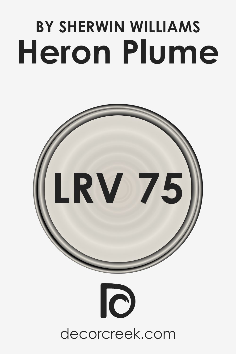
What is the LRV of Heron Plume SW 6070 by Sherwin Williams?
The LRV of 75.374 for Heron Plume means it’s a light color that will reflect a lot of light, making it a great choice for making spaces feel airy and larger. Because it reflects a majority of light, it will significantly brighten up a room, especially one with plenty of natural sunlight.
This characteristic makes it versatile for use in various settings, from living rooms and kitchens to bedrooms, enhancing the feeling of space. Moreover, being such a light shade, it can help in creating a neutral backdrop that’s easy to match with various decor styles and colors.
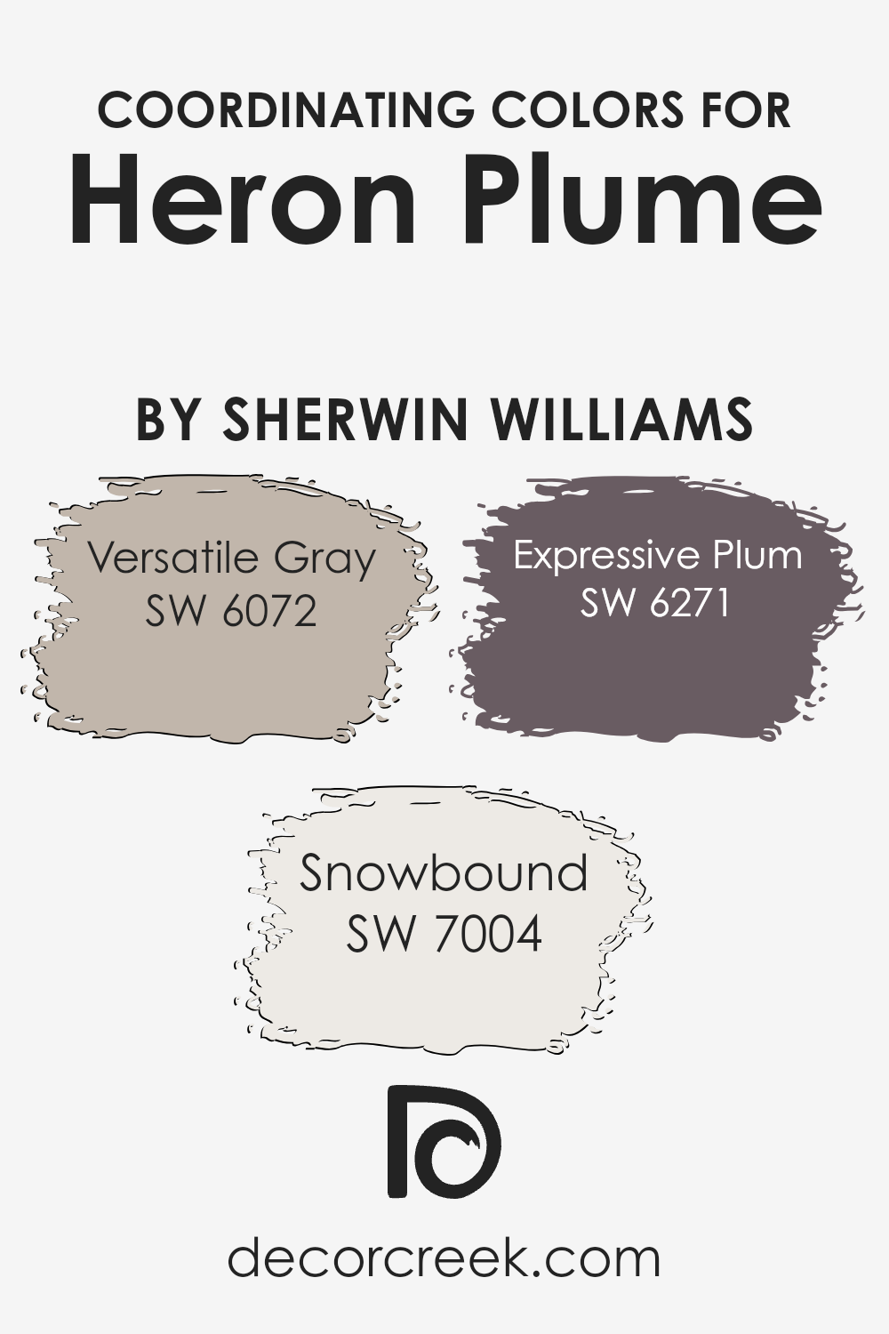
Coordinating Colors of Heron Plume SW 6070 by Sherwin Williams
Coordinating colors are essentially hues that work well together to create a harmonious and visually appealing palette. When selecting coordinating colors for a paint color like Heron Plume from Sherwin Williams, the goal is to choose shades that complement or contrast beautifully without clashing, enhancing the overall aesthetic of the space. These chosen colors should balance the room’s atmosphere, either by creating a sense of calm, adding a pop of color for interest, or achieving a refined and cohesive look.
For instance, SW 6072 – Versatile Gray, is a subtle gray that acts as a neutral backdrop, making it a perfect coordinating color. It’s soft enough to blend seamlessly with other hues while still adding depth and interest to the space.
On the other hand, SW 7004 – Snowbound, is a crisp and clean white with a slightly warm undertone that radiates a fresh and airy feel, making spaces appear larger and brighter. It pairs well with the lightness of Heron Plume for a refined look.
Lastly, SW 6271 – Expressive Plum, offers a bold and rich contrast, adding a touch of drama and sophistication. This deep plum color introduces an element of surprise and creativity, making it an ideal choice for accentuating features or for dramatic statements within the room. Together, these colors work in harmony to create beautiful, balanced, and engaging spaces.
You can see recommended paint colors below:
- SW 6072 Versatile Gray
- SW 7004 Snowbound
- SW 6271 Expressive Plum
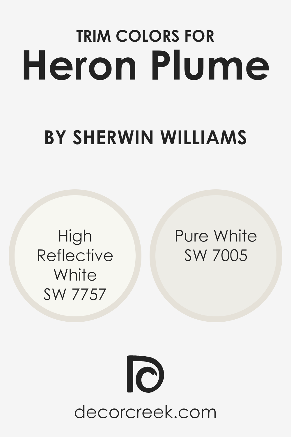
What are the Trim colors of Heron Plume SW 6070 by Sherwin Williams?
Trim colors are essentially the hues used for the architectural elements that frame or outline spaces in a home, such as window frames, doors, baseboards, and moldings. They play a crucial role in interior design by adding contrast or cohesion, enhancing the overall aesthetic, and highlighting the structural features of a room.
For a soft, warm neutral like Heron Plume by Sherwin Williams, selecting the right trim color is important to either subtly complement the main color or create a striking boundary that adds depth and interest to the space. Trim colors can dramatically affect the perception of the main wall color, influencing how it’s seen in relation to the rest of the room’s design elements.
High Reflective White SW 7757 is an excellent choice for trim, offering a bright, clean look that can make the subtle tones of Heron Plume pop while giving the space a more open and airy feel. Its reflective quality maximizes natural light, enhancing the room’s overall brightness and giving an illusion of more space.
On the other hand, Pure White SW 7005 provides a slightly softer approach. It’s not as stark, lending a more cohesive transition between Heron Plume walls and the trim. The creamy undertones of Pure White can enrich the warmth of Heron Plume, ensuring the room feels welcoming and balanced.
You can see recommended paint colors below:
- SW 7757 High Reflective White
- SW 7005 Pure White
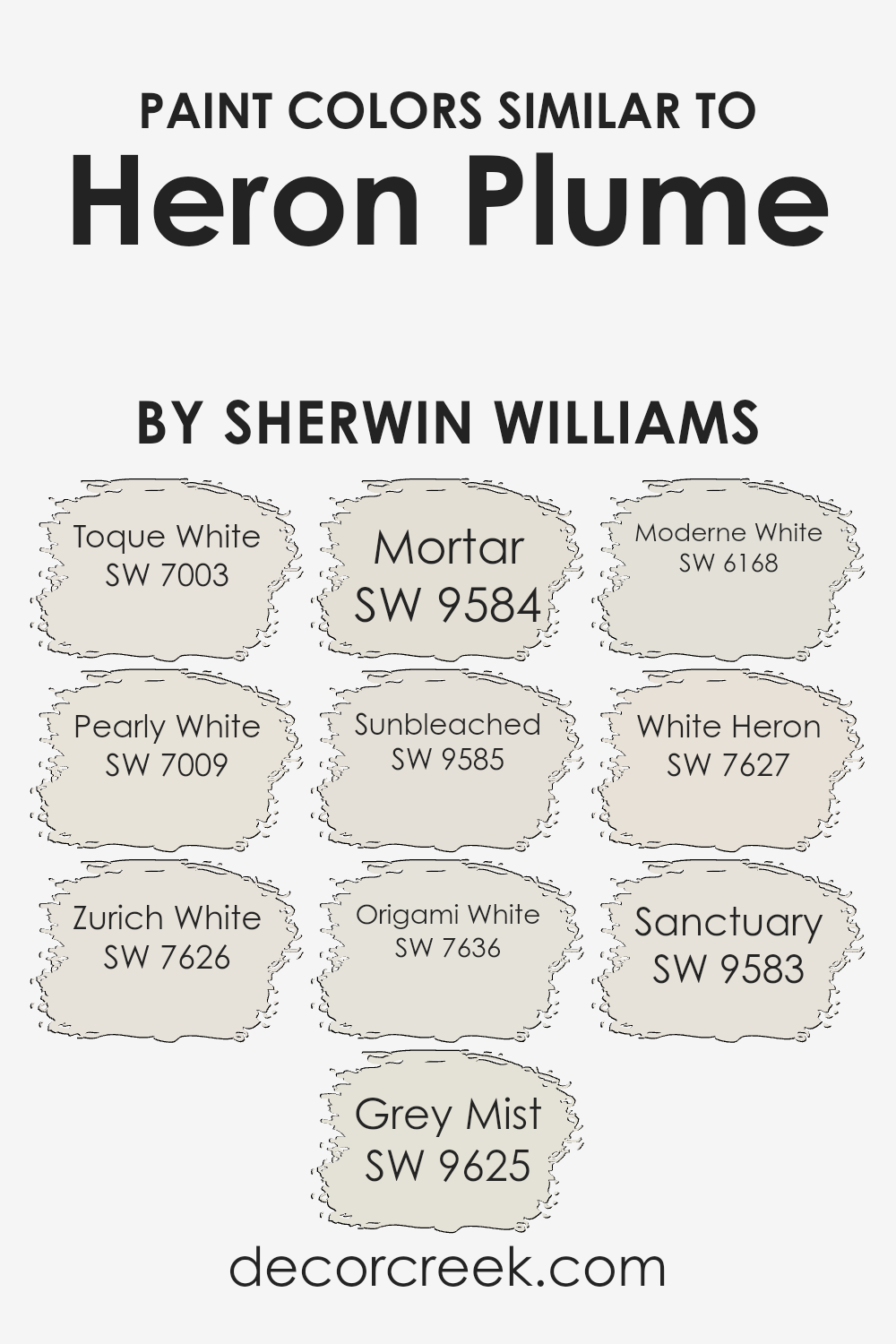
Colors Similar to Heron Plume SW 6070 by Sherwin Williams
Similar colors are crucial in design for creating a harmonious and well-blended space. They share a common hue but differ slightly in shade, tone, or saturation, making them work together seamlessly. When colors, like those similar to Sherwin Williams’ Heron Plume, are used together, they provide a subtle variation that adds depth and interest without overwhelming the eye.
This technique is especially useful in achieving a sophisticated and cohesive look in any interior or exterior space. By utilizing shades like Toque White, Pearly White, and others in the same color family, designers can craft spaces that feel intentionally designed and aesthetically pleasing.
- For instance, Toque White is a soft, warm white that brings a gentle brightness to spaces, making it ideal for creating a cozy atmosphere.
- Pearly White, with its slightly reflective quality, offers a hint of elegance and sophistication.
- Zurich White leans towards a neutral palette, providing a perfect backdrop for bolder colors or designs.
- Grey Mist adds a touch of softness and versatility, being easily paired with both warm and cool tones.
- Mortar, with its deeper tone, anchors spaces with a sense of solidity. Sunbleached offers a faded, comfortable feel that’s reminiscent of well-loved spaces.
- Origami White strikes a balance between warm and cool tones, making it incredibly adaptable.
- Moderne White introduces a crisp, modern aesthetic.
- White Heron is clean and airy, offering a sense of freshness.
- Finally, Sanctuary rounds out the collection by offering a peaceful and calm quality, ideal for creating serene environments.
Each of these colors, while maintaining their unique characteristics, collectively contributes to creating spaces that are both inviting and visually cohesive.
You can see recommended paint colors below:
- SW 7003 Toque White
- SW 7009 Pearly White
- SW 7626 Zurich White
- SW 9625 Grey Mist
- SW 9584 Mortar
- SW 9585 Sunbleached
- SW 7636 Origami White
- SW 6168 Moderne White
- SW 7627 White Heron
- SW 9583 Sanctuary
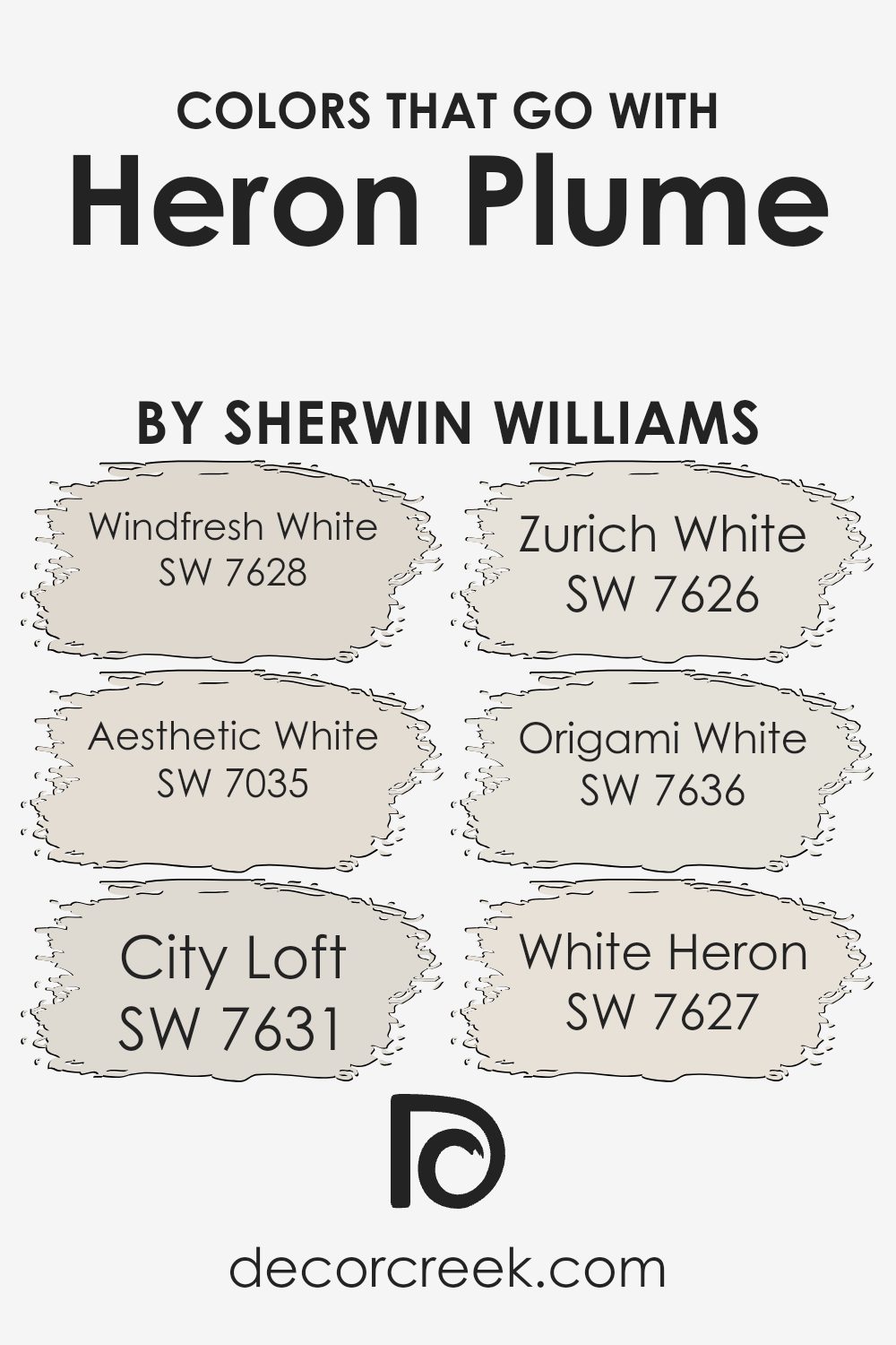
Colors that Go With Heron Plume SW 6070 by Sherwin Williams
Choosing the right colors to complement Heron Plume SW 6070 by Sherwin Williams is crucial for creating harmonious and appealing spaces. These colors have been carefully selected to enhance the unique qualities of Heron Plume, ensuring that interiors feel balanced and thoughtfully designed.
- For instance, Windfresh White SW 7628 provides a crisp and clean backdrop that amplifies the soft warmth of Heron Plume, making spaces feel more open and airy.
- On the other hand, Aesthetic White SW 7035 offers a slightly warmer tone that enriches the environment without overpowering it, perfect for adding a cozy yet sophisticated touch.
- Then there’s City Loft SW 7631, a light, neutral grey that brings a modern and subtle contrast to the warmth of Heron Plume, making it ideal for contemporary settings.
- Zurich White SW 7626 leans towards a soft, creamy hue that blends seamlessly with Heron Plume, creating a soothing and cohesive look.
- Origami White SW 7636, with its hint of grey, offers a fresh perspective that enhances the visual texture of the space.
- Lastly, White Heron SW 7627, with its pure and bright character, pairs wonderfully with Heron Plume to create spaces that feel vibrant yet calming.
Together, these colors harmonize with Heron Plume, providing a versatile palette for creating beautiful and inviting interiors.
You can see recommended paint colors below:
- SW 7628 Windfresh White
- SW 7035 Aesthetic White
- SW 7631 City Loft
- SW 7626 Zurich White
- SW 7636 Origami White
- SW 7627 White Heron
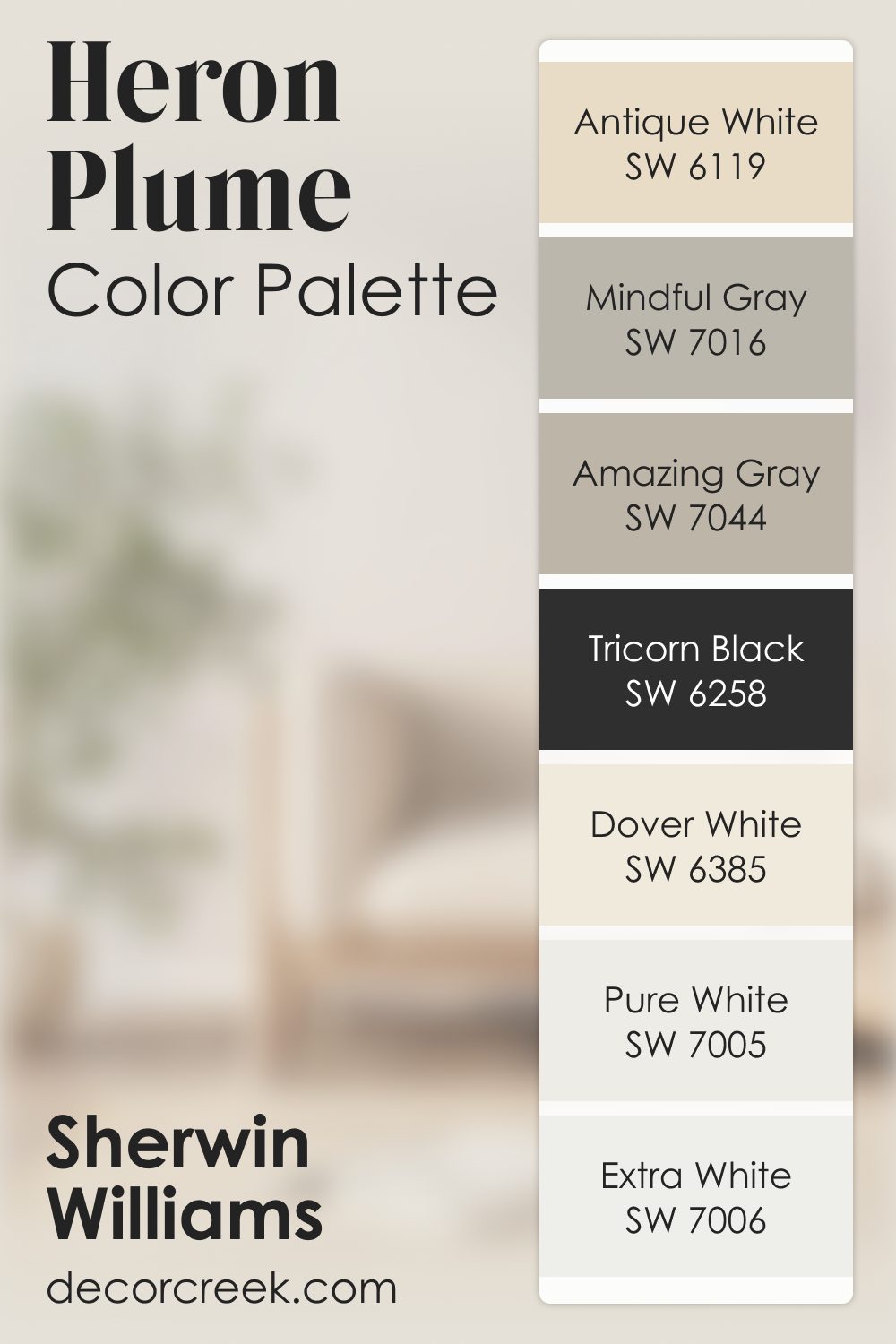
Heron Plume SW 6070 by Sherwin Williams Color Palette
Heron Plume SW 6070 offers a light, graceful touch, and this palette gives it the perfect company. Pure White, Dover White, Antique White, and Extra White help build a clean foundation with small shifts in warmth that make rooms feel inviting.
Amazing Gray and Mindful Gray introduce subtle depth, giving your design more interest while still keeping things soft.
Tricorn Black serves as the striking accent, adding crisp lines and a sense of definition that pairs beautifully with the lighter shades.
Together, this palette brings a gentle brightness that works wonderfully in bathrooms, bedrooms, living areas, or entryways.
It’s a calming mix that helps your home feel organized, fresh, and thoughtfully put together.
How to Use Heron Plume SW 6070 by Sherwin Williams In Your Home?
Heron Plume by Sherwin Williams is a versatile paint color that brings a touch of warmth and softness into any room. Its light, almost neutral hue, makes it perfect for creating a calm and welcoming atmosphere. This color can easily blend with different styles and preferences, making it ideal for anyone wanting to refresh their space without making a bold statement.
Imagine using Heron Plume in your living room or bedroom. It can serve as a gentle backdrop, allowing your furniture and decor to shine. For those who love a bit of creativity, it’s also a fantastic base color for adding pops of brighter colors through accessories like cushions, rugs, or artworks.
In rooms with less natural light, Heron Plume can help brighten the space, making it feel airier and more open. It’s also great for smaller rooms, as the light color can make areas seem larger than they are. So, if you’re looking for a paint color that provides flexibility, warmth, and a fresh feel, Heron Plume is worth considering for your next home makeover.
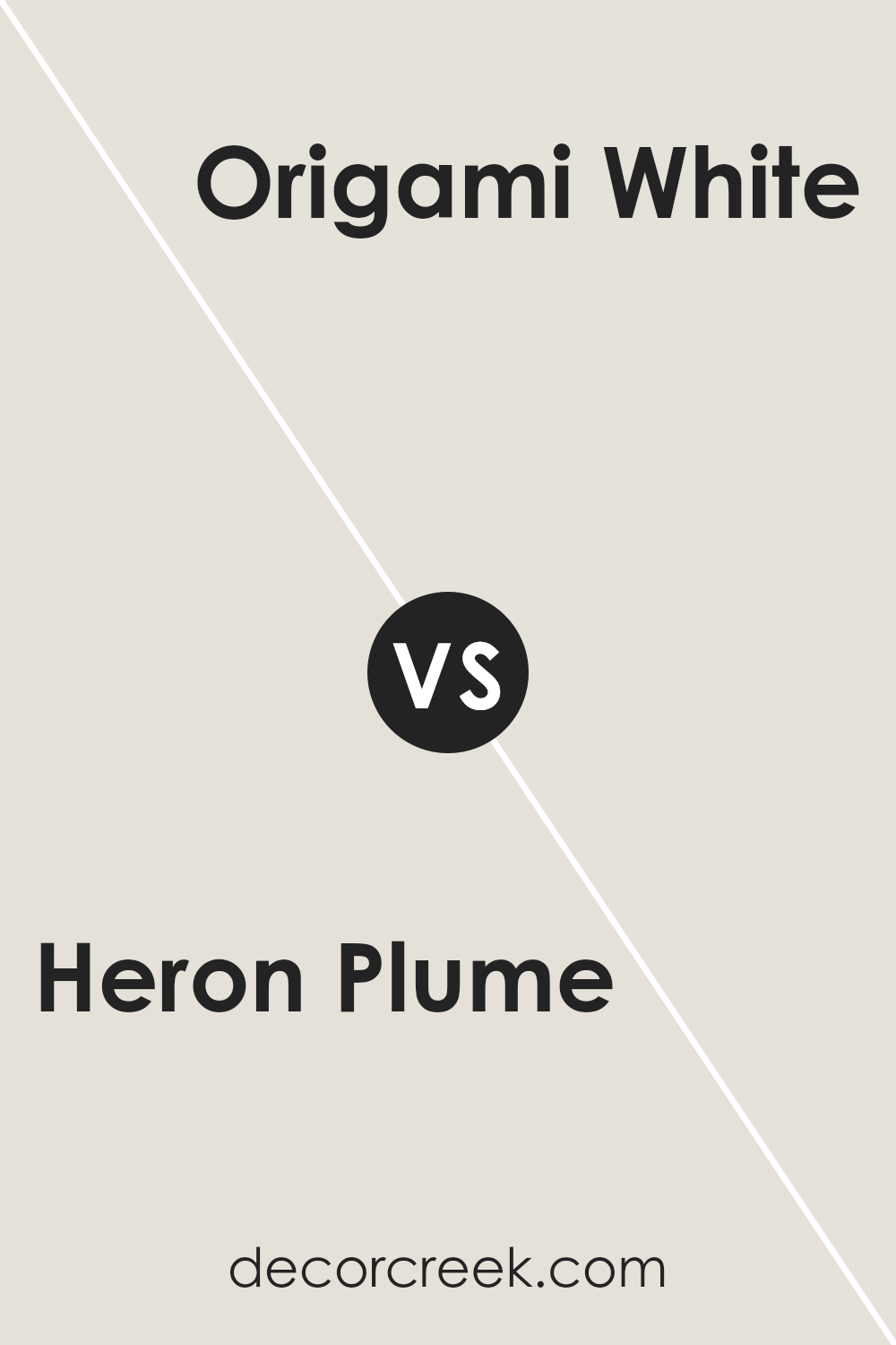
Heron Plume SW 6070 by Sherwin Williams vs Origami White SW 7636 by Sherwin Williams
Heron Plume and Origami White by Sherwin Williams are both neutral, but they bring different vibes to spaces. Heron Plume is a soft, warm grey with a hint of beige, making it feel cozy and inviting. It’s like a gentle hug for your walls, offering a soothing backdrop that’s easy on the eyes. On the other hand, Origami White leans a bit cooler compared to Heron Plume.
It’s a clean, crisp white with a slight grey undertone, giving it a fresh and airy feel. This color can make rooms appear brighter and more spacious. While both shades are great for creating a neutral palette, Heron Plume offers a touch of warmth, making spaces feel more intimate. Origami White, however, is your go-to for a more open and pure look. Depending on the mood you want to set, either color can transform your space beautifully.
You can see recommended paint color below:
Heron Plume SW 6070 by Sherwin Williams vs Grey Mist SW 9625 by Sherwin Williams
Heron Plume and Grey Mist are two soft, subtle colors by Sherwin Williams that offer a quiet, serene backdrop for any space. Heron Plume is a light, airy color with a warm undertone that brings a cozy and inviting feel. It’s perfect for creating a gentle, soft look in a room, almost like the light touch of dawn. On the other hand, Grey Mist has a cooler vibe, leaning towards a subtle, misty morning feel.
This color is excellent for those looking to add a hint of calmness and tranquility to their room, without it feeling cold or stark. Both colors are incredibly versatile and can work well in various settings, from modern to traditional. While Heron Plume adds warmth and a whisper of sunlit elegance, Grey Mist offers a fresh, peaceful essence. Together or individually, these colors can create a soothing, harmonious environment.
You can see recommended paint color below:
- SW 9625 Grey Mist
Heron Plume SW 6070 by Sherwin Williams vs Moderne White SW 6168 by Sherwin Williams
Heron Plume and Moderne White, both by Sherwin Williams, are two neutral shades with their own unique qualities. Heron Plume has a soft, almost creamy feel to it, making it a great choice for creating a cozy and welcoming atmosphere. It’s like the gentle color you see on a well-loved antique, warm and inviting. On the other hand, Moderne White leans towards a clean, more straightforward white.
It’s the kind of color that brings a fresh, airy feel to a room, making it seem more open and bright. While Heron Plume adds warmth to a space, Moderne White offers a crisp background that can easily complement a wide range of décor. Both colors can serve as versatile backdrops in your home, but the choice between them depends on the vibe you’re going for: Heron Plume for a softer, warmer setting, and Moderne White for a clearer, more vibrant space.
You can see recommended paint color below:
- SW 6168 Moderne White
Heron Plume SW 6070 by Sherwin Williams vs Zurich White SW 7626 by Sherwin Williams
Heron Plume and Zurich White, both from Sherwin Williams, are calm, neutral colors that offer a minimalistic charm. Heron Plume is a soft, warm gray with a subtle hint of pink, making it a cozy choice for spaces where you seek relaxation and comfort. On the other hand, Zurich White leans more towards a light, airy gray with a touch of warmth, making it incredibly versatile for any room.
While both colors are neutral, Heron Plume’s slightly warmer tones provide a nurturing atmosphere, making it ideal for living rooms or bedrooms where a cozy vibe is desired. Zurich White, with its ability to reflect light beautifully, is perfect for creating a spacious and open feeling, which works well in smaller spaces or rooms that don’t get a lot of natural light.
Although both shades share a base of gray, the distinct undertones in Heron Plume and Zurich White allow them to stand on their own, catering to different aesthetic preferences and room functionalities.
You can see recommended paint color below:

Heron Plume SW 6070 by Sherwin Williams vs Mortar SW 9584 by Sherwin Williams
Heron Plume and Mortar by Sherwin Williams are two distinct colors with their unique appeal. Heron Plume is a soft, light gray with hints of warmth, giving off a cozy yet bright vibe. It’s perfect for making small spaces appear larger and is versatile enough to work in almost any room.
On the other hand, Mortar is a deeper, more grounded gray. It has a richer tone that feels more anchored and substantial. This color can add a sense of sophistication and depth to spaces, making it ideal for creating a statement wall or adding character to a room.
While Heron Plume reflects light and adds a sense of airiness, Mortar absorbs light, offering a more muted, refined backdrop. Both colors offer unique possibilities for home décor, allowing for either a light and inviting atmosphere or a more dramatic and elegant setting.
Choosing between them depends on the mood and style you wish to achieve in your space.
You can see recommended paint color below:
- SW 9584 Mortar
Heron Plume SW 6070 by Sherwin Williams vs Sanctuary SW 9583 by Sherwin Williams
Heron Plume and Sanctuary by Sherwin Williams are both unique colors, but they offer different vibes for any space. Heron Plume is a very light, almost white color with a hint of warm undertones. It’s perfect for making a room feel bigger and brighter, like opening a window to let sunlight in. This color works well in almost any room, giving a clean and peaceful atmosphere.
On the other hand, Sanctuary is a deeper, more grounded color. It’s a soothing, nature-inspired green with a soft, earthy feel to it. This color brings the calmness of a lush forest into your home, creating a relaxing and serene environment. It’s ideal for spaces where you want to unwind and feels more like a quiet retreat.
While Heron Plume adds brightness and a sense of openness, Sanctuary offers a cozy and tranquil vibe. Both colors have their charm and can transform a space depending on what mood you’re aiming for.
You can see recommended paint color below:
- SW 9583 Sanctuary
Heron Plume SW 6070 by Sherwin Williams vs Toque White SW 7003 by Sherwin Williams
Heron Plume and Toque White are two soft, subtle colors by Sherwin Williams, but each has its unique character. Heron Plume is a light, airy shade that leans towards a warm off-white with a hint of pink undertone. It’s a very soft and inviting color, perfect for creating a cozy and serene space. It’s like the color of a gentle morning sky, offering a peaceful backdrop that can easily complement various decor styles.
On the other hand, Toque White is a bit cooler compared to Heron Plume. It’s a neutral off-white with a slight grey undertone, making it a great option for those who prefer a color that can bridge between warm and cool tones seamlessly. It feels like the color of soft clouds on a bright day, providing a clean and calm atmosphere.
While both colors are excellent choices for creating a relaxed and welcoming environment, Heron Plume brings a touch of warmth and softness, whereas Toque White offers a clean, neutral base that works well in a variety of settings. Choosing between them comes down to personal preference on whether you lean towards a warmer or cooler hue.
You can see recommended paint color below:
- SW 7003 Toque White
Heron Plume SW 6070 by Sherwin Williams vs Sunbleached SW 9585 by Sherwin Williams
Heron Plume and Sunbleached are two paint colors by Sherwin Williams that offer a warm and inviting feel to any space. Heron Plume is a soft, subdued shade that leans towards a light, neutral grey with a hint of warmth. This makes it versatile for use in many different room settings, acting as a gentle backdrop that complements a wide range of decor styles and colors.
On the other hand, Sunbleached is a lighter, more pastel tone that suggests the look of wood or fabric faded by the sun. It has a more pronounced warm undertone, reminiscent of a sunny day, which can bring a cozy and airy feel to interiors.
While it provides a slightly brighter atmosphere than Heron Plume, it still maintains a softness that is calming and easy on the eyes.
Comparing the two, Heron Plume offers a more neutral base, perfect for those seeking a subtle elegance, whereas Sunbleached invites a cheerier, more sun-kissed aesthetic into the room. Both colors are excellent choices for creating a tranquil and welcoming space, but the selection between them would depend on the desired warmth and lightness in the room.
You can see recommended paint color below:
- SW 9585 Sunbleached
Heron Plume SW 6070 by Sherwin Williams vs White Heron SW 7627 by Sherwin Williams
Heron Plume and White Heron are two paint colors offered by Sherwin Williams, each presenting its unique shade. Heron Plume has a soft, warm undertone that makes it versatile for any space, offering a cozy yet light feel. It’s like a gentle hug from a room, making spaces feel inviting without overwhelming them with color.
On the other hand, White Heron offers a cleaner, brighter look. It leans more towards a true white but still holds a touch of warmth. This means it can brighten up a room significantly while still maintaining a softness that prevents it from feeling too stark or clinical.
In comparison, while both colors are excellent for creating a serene and welcoming atmosphere, Heron Plume provides a hint of warmth and coziness, making it suitable for living spaces or bedrooms that benefit from a soft, inviting vibe. White Heron, conversely, is perfect for spaces that need to feel more open and airy, thanks to its brighter and cleaner appearance. Choosing between them depends on how much warmth or brightness you’re looking to add to your space.
You can see recommended paint color below:
- SW 7627 White Heron
Heron Plume SW 6070 by Sherwin Williams vs Pearly White SW 7009 by Sherwin Williams
Heron Plume and Pearly White are both colors from Sherwin Williams, offering subtle elegance for any space. Heron Plume has a soft, warm vibe, acting like a gentle hug for the walls of any room. It stands out for its inviting warmth that makes spaces feel cozy and welcoming without being overpowering.
On the other side, Pearly White is like Heron Plume’s cooler cousin. It has a hint of freshness, lending a serene and tranquil feel to any environment. Think of Pearly White as a calm breath of air, offering a backdrop that feels both clean and comforting.
While they share a lightness and subtlety, Heron Plume leans more towards a creamy warmth, making it ideal for creating a snug ambiance. Pearly White, in contrast, offers a bit of a cooler touch, almost like the first light of dawn, which can help in making a space feel more spacious and airy.
Deciding between the two depends on the mood you want to set: warm and cozy with Heron Plume or fresh and serene with Pearly White.
You can see recommended paint color below:
Conclusion
Heron Plume by Sherwin Williams is a subtle and versatile paint color that brings a soft, warm atmosphere to any room. Its understated elegance allows it to work beautifully in various spaces, complementing a wide range of decor styles. This paint color is particularly effective in areas that could benefit from a light, airy feel, making small spaces appear larger and more inviting.
Its adaptability means it can be paired with bolder colors for a striking contrast or with similar tones for a serene, cohesive look.
The popularity of Heron Plume lies in its ability to enhance the natural light in a room, creating a pleasant, calming environment. This makes it a great choice for living rooms, bedrooms, and even kitchens, where a touch of warmth is often welcome.
Whether you’re looking to refresh your home with a new look or seeking a reliable base color for creative decorating, Heron Plume offers a sophisticated foundation that can support a variety of designs and preferences. Its broad appeal confirms its status as a go-to choice for those seeking a timeless, inviting atmosphere in their living spaces.
Ever wished paint sampling was as easy as sticking a sticker? Guess what? Now it is! Discover Samplize's unique Peel & Stick samples.
Get paint samples

