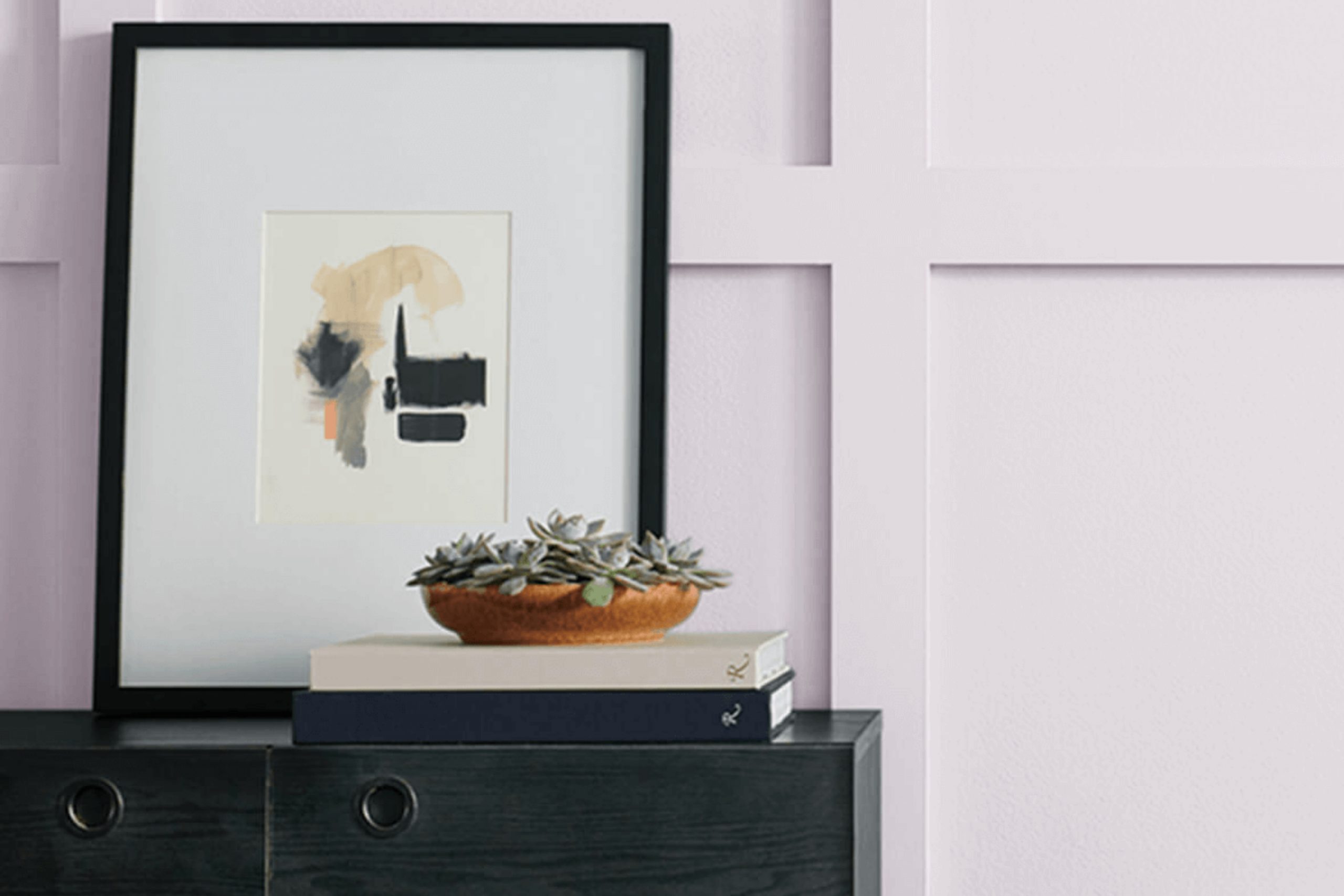
When I think of calming colors, SW 6554 Lite Lavender from Sherwin Williams immediately comes to mind. This gentle shade of lavender exudes a sense of peace and relaxation that’s perfect for any room in need of a soothing atmosphere. The soft, muted purple carries a hint of gray, making it flexible enough to complement various design styles, from modern to classic.
Lite Lavender creates an inviting environment without feeling too intense. Its subtlety allows you to feel at ease, providing a backdrop that encourages reflection and calmness. Whether you’re painting a bedroom to create a cozy retreat or adding a touch of calm to a bustling living area, this color has a way of mellowing the mood.
I appreciate how effortlessly it pairs with neutral tones or other pastels, allowing you to experiment with different color combinations. It’s a paint color that doesn’t demand attention but instead gently enhances the overall ambiance of a room.
Small accents and décor details pop against its understated elegance, offering a perfect canvas for personal expression. Lite Lavender isn’t just a color; it’s an invitation to feel at peace within your room.
What Color Is Lite Lavender SW 6554 by Sherwin Williams?
Lite Lavender by Sherwin Williams is a soft and gentle shade of purple that brings a touch of freshness to any room. This color is light and airy, making it feel welcoming and inviting. It works well in areas where you want a calm and comfortable mood, such as bedrooms or living rooms.
Lite Lavender fits beautifully in traditional and modern interior styles. In traditional rooms, it can add a hint of color while keeping the overall look classic. In modern interiors, it provides a lovely contrast to sleek lines and minimalist designs. It’s also wonderful in shabby chic or cottage-style rooms where its softness ties in with delicate patterns and vintage pieces.
This color pairs nicely with a variety of materials and textures. It complements natural woods, adding warmth to the cool tones of lavender. It also looks great with white or cream-colored fabrics, creating a fresh and clean look.
Consider pairing it with soft textiles like cotton or linen for curtains and cushions to enhance its cozy feel. Metallic accents, such as silver or brushed nickel, can add a touch of elegance and contrast to the Lavender’s softness. Overall, it’s a flexible color that works well in different contexts and with various design elements.
Is Lite Lavender SW 6554 by Sherwin Williams Warm or Cool color?
Lite Lavender (SW 6554) by Sherwin Williams is a soft, pale purple shade that brings a gentle and calming vibe to any room. This color works well in homes by creating a light and airy feel in interiors. It’s especially nice for bedrooms, bathrooms, or living areas where you want a peaceful mood.
The light tone of this lavender helps make small areas feel larger and more open. It pairs well with neutral colors like whites and grays but can also complement darker shades, adding a touch of elegance.
When used as an accent wall, it adds subtle interest without feeling too intense. The softness of Lite Lavender can also be enhanced with natural light, making it a great choice for rooms with lots of windows. Overall, Lite Lavender is a flexible color that adds a gentle and soothing touch to home interiors, making rooms feel inviting and pleasant.
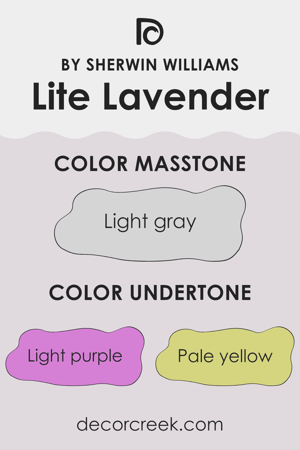
Undertones of Lite Lavender SW 6554 by Sherwin Williams
Lite Lavender by Sherwin Williams is a gentle and inviting color that brings peace to any room. It has several undertones that shape how we perceive it. The soft appearance of light purple adds a bit of calm, while pale yellow gives it a hint of warmth, making it feel welcoming. Light blue brings a cool freshness, which can make a room feel airy and open. The pale pink undertone introduces a subtle hint of sweetness, adding to its charm.
Lilac, being close to the main color, reinforces the lavender effect, adding a bit of richness. The mint undertone provides a slight earthy touch that can make the overall color feel grounded. Grey adds neutrality, balancing out the brighter and softer tones, ensuring the color doesn’t become too intense.
When applied to interior walls, these undertones can significantly influence the mood of a room. The light purple and pink together can make a bedroom feel soothing and personal. The pale yellow and grey balance can create a refined and welcoming living area. In a kitchen or bathroom, the light blue and mint can introduce a refreshing feel.
Overall, these undertones help Lite Lavender adapt well to different settings, highlighting its flexibility.
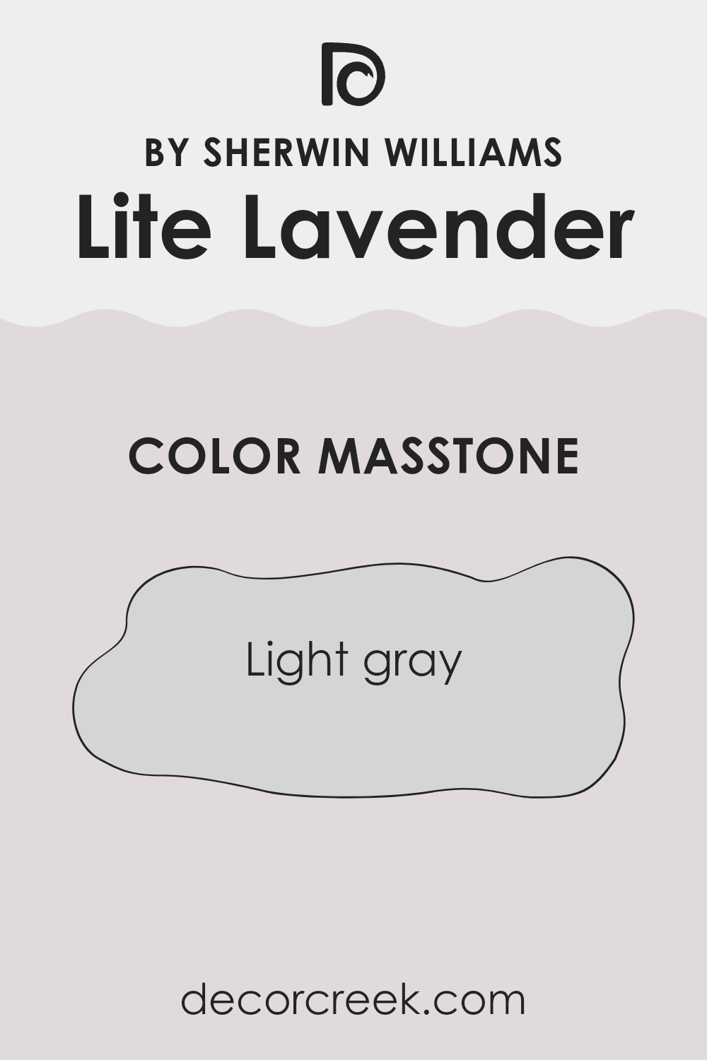
What is the Masstone of the Lite Lavender SW 6554 by Sherwin Williams?
Lite Lavender SW 6554 by Sherwin-Williams is a soft lavender shade with a light gray undertone, making it flexible for home decor. The light gray masstone (#D5D5D5) helps balance the lavender, giving it a gentle and calming effect without being too bold or intense.
This makes the color suitable for various rooms, such as bedrooms, bathrooms, or living areas, where a relaxing atmosphere is desired. The light gray element allows it to pair well with neutrals, whites, or even darker purples and blues, making coordination with existing decor easy.
Because of its subtle nature, it can be used either as an accent color or a main wall color in a room. The result is a light and airy feel that doesn’t dominate the area but instead provides a light and cozy backdrop for furniture and decorations. This balance helps to create a welcoming and harmonious environment.
How Does Lighting Affect Lite Lavender SW 6554 by Sherwin Williams?
Lighting plays a critical role in how we perceive color. Both natural and artificial light can change the appearance of a color depending on its source and intensity. This is particularly true for colors that are light or pastel, such as Lite Lavender by Sherwin Williams.
In artificial lighting, Lite Lavender can appear different based on the type of bulb used. Incandescent bulbs tend to give off a warm, yellowish light, which can make Lite Lavender seem warmer and more pinkish. Fluorescent lights, often cooler and slightly bluish, might emphasize its cooler tones, making it look more like a muted purple.
Under natural light, Lite Lavender will change throughout the day. In a north-facing room, where the light is usually cooler and more consistent, Lite Lavender can appear slightly darker and more muted, emphasizing its cooler hues. North-facing rooms don’t get direct sunlight, so colors might seem more subdued.
In a south-facing room, the color benefits from bright, warm light throughout the day. This lighting can highlight the warmer undertones of Lite Lavender, making the room feel brighter and the color more vibrant.
East-facing rooms get plenty of morning sun, which can make Lite Lavender look brighter and slightly pinkish during the morning hours. However, as the light becomes more indirect in the afternoon, the color might look cooler and softer.
West-facing rooms receive the warm glow of the setting sun in the late afternoon and evening. During these hours, Lite Lavender might appear warmer and more saturated, taking on a soft, welcoming feel.
Overall, how Lite Lavender looks can greatly depend on the room’s lighting. It’s always a good idea to test a sample in various lighting conditions before painting an entire room. This will help ensure that the color meets your expectations no matter the time of day or type of light.
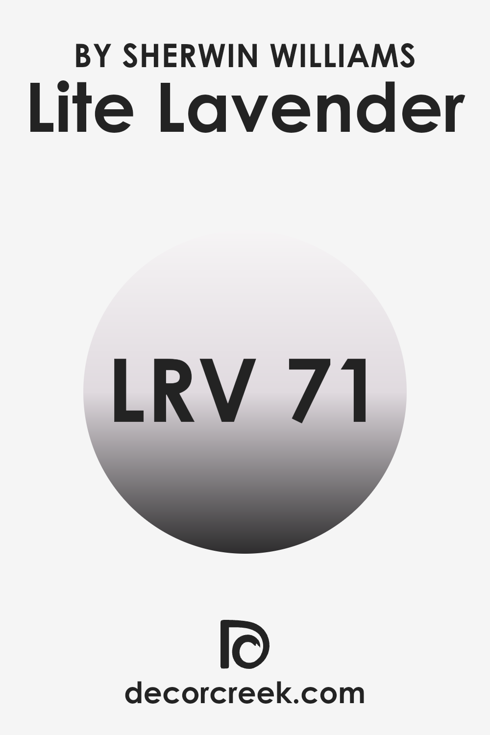
What is the LRV of Lite Lavender SW 6554 by Sherwin Williams?
Light Reflectance Value, or LRV, is a measure that describes the percentage of light a color reflects. On a scale of 0 to 100, a color with an LRV of 0 absorbs all light, while a color with an LRV of 100 reflects all light. Essentially, the higher the LRV, the lighter the color will appear on the walls, and the more it will brighten up a room.
Colors with higher LRV values can help make a room feel larger and more open by reflecting more light, while colors with lower values absorb more light and can make a room feel smaller and cozier. For a color like Lite Lavender with an LRV of 71.398, it reflects a significant amount of light, which will make it appear bright on the walls.
This makes Lite Lavender a great choice for rooms where you want to maintain a light and airy feeling. It can help bounce natural and artificial light around the room, enhancing the overall brightness and creating an inviting atmosphere. Such a color is suitable for rooms that may lack natural light or for areas where you want to maintain a fresh and open ambiance.
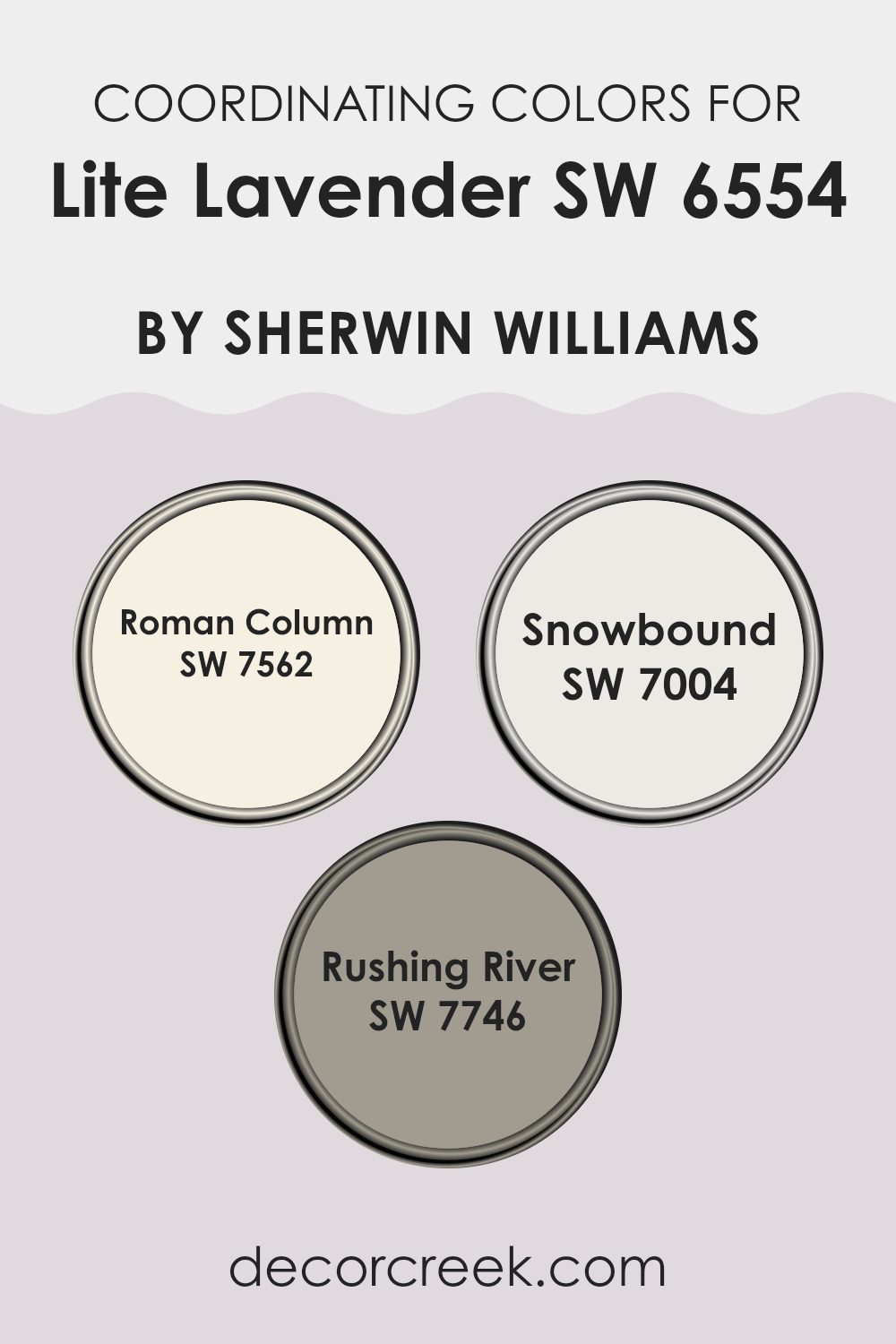
Coordinating Colors of Lite Lavender SW 6554 by Sherwin Williams
Coordinating colors are hues that complement each other to create a balanced and visually appealing color scheme. They work together to enhance the overall aesthetic of a room by providing contrast, harmony, or an accent to the main color. In this case, Lite Lavender is the main color, a soft and calm shade of purple.
The coordinating colors selected for it by Sherwin Williams add depth and interest to a room, without clashing or overpowering the primary color. These coordinating hues can be used in various elements of interior design, such as walls, furniture, decorative items, or textiles, to create a cohesive look.
Roman Column is a warm, off-white color that adds a touch of elegance and brightness to any area, perfectly softening the presence of Lite Lavender. Snowbound, on the other hand, is a crisp, clean white that creates a fresh and airy feel, making it an excellent backdrop that allows lighter shades to stand out gracefully. Rushing River introduces a cool, earthy green that can bring a sense of nature indoors, providing a natural balance to the softness of Lite Lavender. Together, these colors improve the room’s aesthetics, creating a pleasant and harmonious environment.
You can see recommended paint colors below:
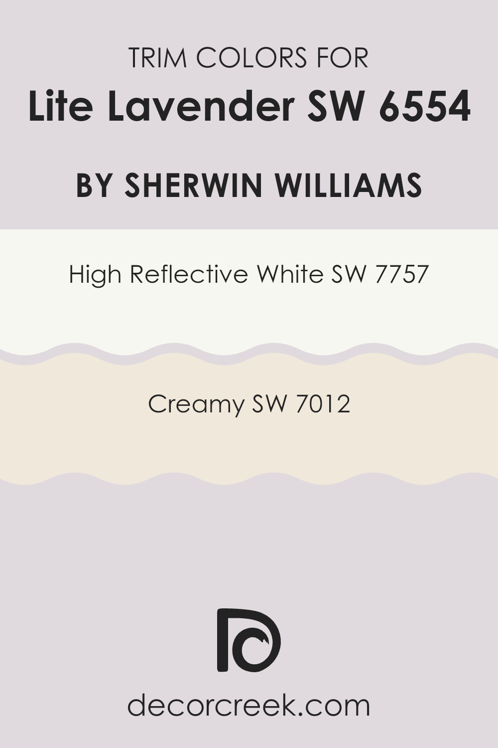
What are the Trim colors of Lite Lavender SW 6554 by Sherwin Williams?
Trim colors are the colors used around the edges of rooms, such as baseboards, moldings, and door frames, to create a defined border and finish. Choosing the right trim is crucial for Lite Lavender because it helps highlight and complement the main wall color without overpowering it.
The subtle contrast provided by trim colors brings out the gentle tones of the lavender, making the room feel more cohesive and balanced. A well-chosen trim can brighten a room, add depth, and help the main color stand out. High Reflective White is a bright, clean white that offers a crisp and sharp finish, making it an excellent choice for trim.
Its purity and brightness allow it to stand out against the softer, muted Lite Lavender, giving areas an airy and open feel. Creamy, on the other hand, is a soft, warm off-white that offers a subtle difference when used as a trim. It pairs beautifully with Lite Lavender by adding a touch of warmth and comfort to both the walls and the overall room ambiance. Both trim colors play a vital role in enhancing the beauty and harmony of a room with Lite Lavender walls.
You can see recommended paint colors below:
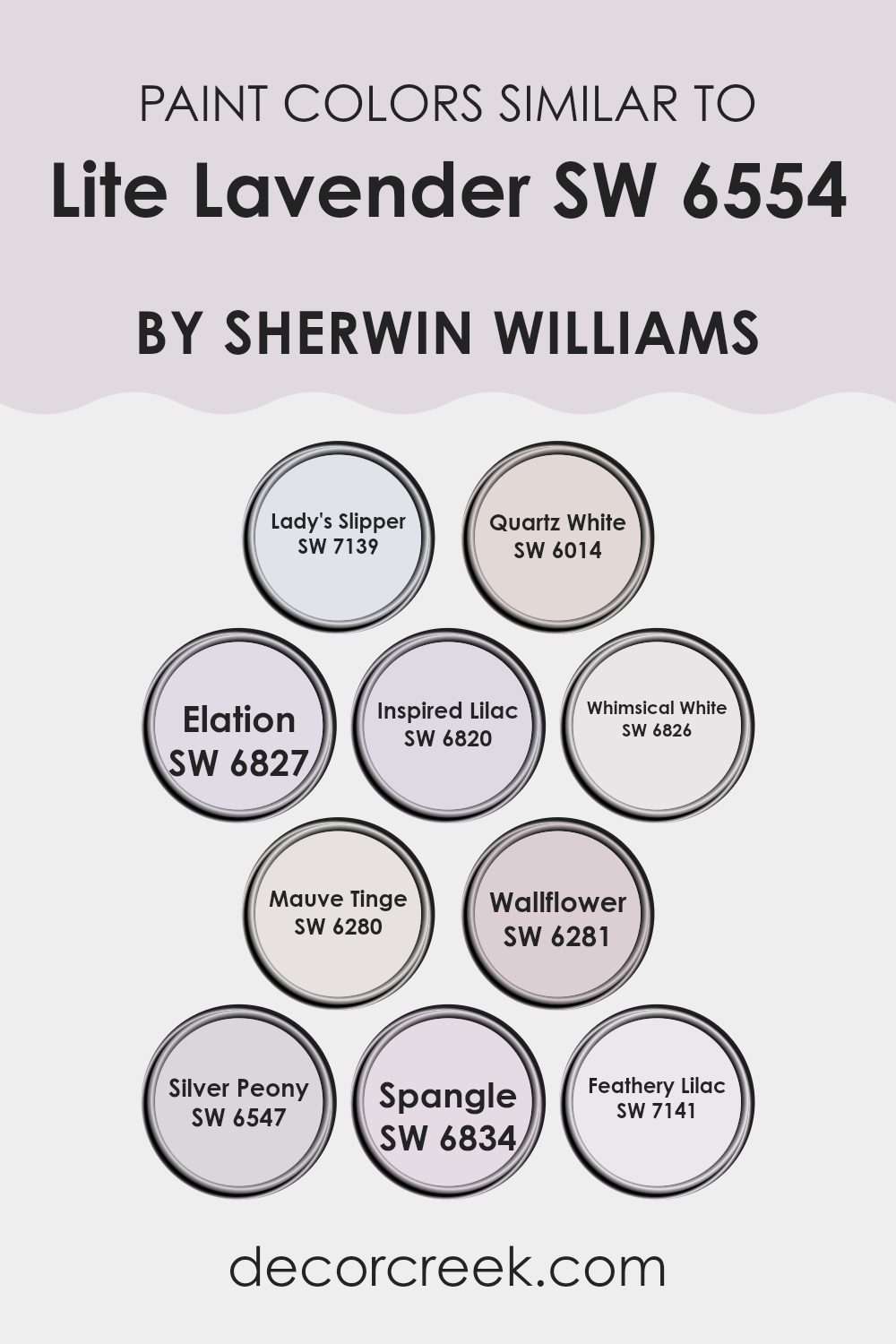
Colors Similar to Lite Lavender SW 6554 by Sherwin Williams
When picking out colors for a room or a project, it’s useful to choose shades that are similar to create a harmonious and cohesive look. Colors like Lady’s Slipper, Quartz White, and Elation, which are all related to Lite Lavender, work together seamlessly due to their soft and calming nature. Lady’s Slipper is a gentle pink that adds a subtle warmth, while Quartz White offers a clean and airy feel.
Elation, with its soft lavender tones, can enhance the room with a lighthearted touch. Together, these colors create a soothing environment that feels naturally connected. Inspired Lilac is a dreamy hue, reminiscent of early evening skies, while Whimsical White adds a touch of brightness without being stark.
Mauve Tinge, a shade with a hint of purple, pairs beautifully with Wallflower, which has a more muted, grounded presence. Silver Peony softly hints at silver undertones, lending a refined quality, while Spangle introduces a cheerful yet gentle purple. Finally, Feathery Lilac rounds out the palette with its airy, light composition. Each of these colors complements each other, creating a gentle and inviting atmosphere that is visually pleasing, offering a consistent theme without feeling too intense.
You can see recommended paint colors below:
- SW 7139 Lady’s Slipper
- SW 6014 Quartz White
- SW 6827 Elation
- SW 6820 Inspired Lilac
- SW 6826 Whimsical White
- SW 6280 Mauve Tinge
- SW 6281 Wallflower
- SW 6547 Silver Peony
- SW 6834 Spangle
- SW 7141 Feathery Lilac
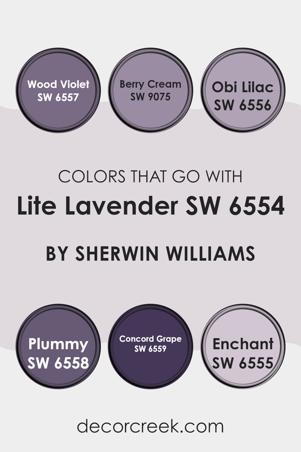
Colors that Go With Lite Lavender SW 6554 by Sherwin Williams
When decorating with Lite Lavender SW 6554 by Sherwin Williams, selecting complementary colors is important to create a harmonious and visually appealing room. These colors enhance the light and airy feel of Lite Lavender while adding depth and richness. SW 6557 – Wood Violet is a deeper, more intense purple that creates a bold contrast with Lite Lavender, adding drama and interest. SW 9075 – Berry Cream brings a soft, muted pinkish hue that complements the lavender’s lightness without overpowering it. These colors together produce a balanced and inviting setting.
SW 6556 – Obi Lilac is another shade that pairs beautifully with Lite Lavender; it’s slightly more subdued and brings a gentle, calming influence. SW 6558 – Plummy offers a stronger, darker purple that adds a sense of coziness and warmth, perfect for creating a comforting atmosphere.
SW 6559 – Concord Grape introduces a deep, rich element that further grounds the lighter lavender tones, making the room feel more cohesive. Finally, SW 6555 – Enchant adds a touch of playful pink that works well to soften and brighten the overall theme. Together, these colors create a layered, harmonious setting that makes anyone feel welcomed and at ease.
You can see recommended paint colors below:
- SW 6557 Wood Violet
- SW 9075 Berry Cream
- SW 6556 Obi Lilac
- SW 6558 Plummy
- SW 6559 Concord Grape
- SW 6555 Enchant
How to Use Lite Lavender SW 6554 by Sherwin Williams In Your Home?
Lite Lavender SW 6554 by Sherwin Williams is a soft and gentle color that can bring a feeling of calm to a home. This light shade of purple works well in bedrooms, as it creates a peaceful setting that’s perfect for relaxation. In living rooms, it pairs nicely with neutral colors like white, gray, or soft beige, adding a subtle touch of color without overpowering the room.
For a child’s room, Lite Lavender can be paired with fun, brighter accents such as yellow or mint green to create a cheerful and inviting atmosphere. In bathrooms, this color can make the room feel fresh and clean.
Additionally, Lite Lavender is a good choice for small rooms, as its light hue can help open up the area, making it feel more spacious. Whether used on all walls or as an accent, this color adds a lovely, calming touch to any home.
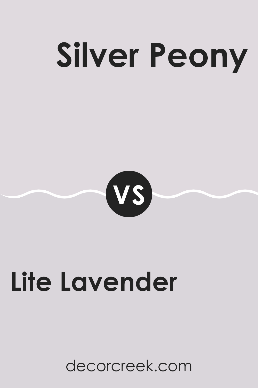
Lite Lavender SW 6554 by Sherwin Williams vs Silver Peony SW 6547 by Sherwin Williams
Lite Lavender SW 6554 and Silver Peony SW 6547 by Sherwin Williams are both soft, pastel shades that can add a gentle touch to any room. Lite Lavender is a pale purple that brings a hint of color, offering a soothing and calming atmosphere. It has a subtle cool undertone that pairs well with whites and grays.
On the other hand, Silver Peony is a very pale pink, almost bordering on a neutral. It has a warmer undertone, which can make a room feel cozy and inviting. When comparing the two, Lite Lavender leans more toward a cool, relaxed vibe, while Silver Peony gives off a warm, delicate charm.
Both colors are flexible and work well in bedrooms or living areas. They can be used as main wall colors or accents, depending on the desired effect. Either choice will create a light and airy feeling, perfect for creating a peaceful setting.
You can see recommended paint color below:
- SW 6547 Silver Peony
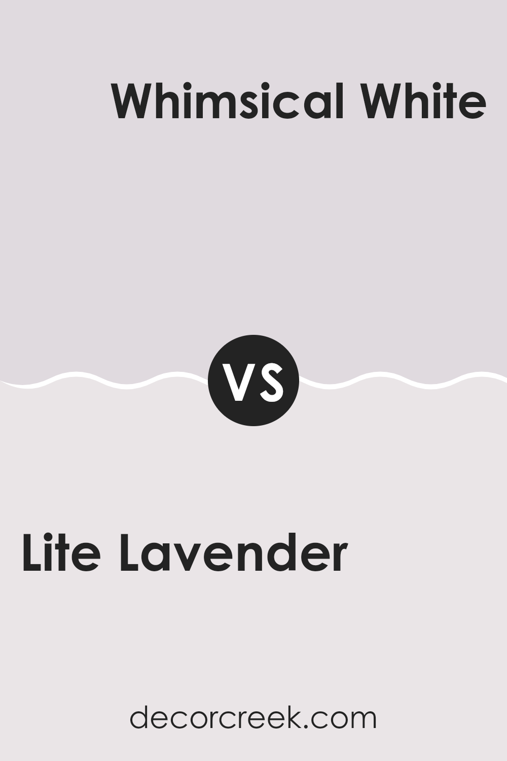
Lite Lavender SW 6554 by Sherwin Williams vs Whimsical White SW 6826 by Sherwin Williams
Lite Lavender SW 6554 by Sherwin Williams is a soft, muted purple with a calming presence. It brings to mind gentle spring breezes, making a room feel cozy yet airy. This color adds a touch of warmth and comfort, creating a welcoming atmosphere.
On the other hand, Whimsical White SW 6826 by Sherwin Williams is a bright, clean white with a subtle hint of pink. It’s crisp and fresh, perfect for areas where you want to enhance light and create a sense of openness. Whimsical White acts as a flexible backdrop, pairing well with both bold and subdued colors.
When you compare the two, Lite Lavender offers warmth and a hint of color, making it ideal for rooms where you want a bit of personality without feeling too intense. Whimsical White is perfect for creating a minimalist and clean look, bringing in maximum light and giving a room an airy feel. Both colors can complement each other beautifully.
You can see recommended paint color below:
- SW 6826 Whimsical White
Lite Lavender SW 6554 by Sherwin Williams vs Lady’s Slipper SW 7139 by Sherwin Williams
Lite Lavender SW 6554 and Lady’s Slipper SW 7139 are both soft, pastel colors by Sherwin Williams. Lite Lavender is a gentle, cool-toned hue with a hint of purple, giving it a subtle and calming appearance. It’s a great choice for creating a light and airy atmosphere in any room.
On the other hand, Lady’s Slipper is a very light pink with warm undertones. It adds a touch of warmth and sweetness, making rooms feel cozy and inviting. While Lite Lavender leans towards a cooler and more relaxing vibe, Lady’s Slipper brings warmth and a hint of playfulness.
Both colors are flexible and can be used in various settings, but the choice between the two depends on whether you prefer a cooler purple undertone or a warmer pinkish feel. These shades work well in bedrooms, nurseries, or any area where a soft touch is desired.
You can see recommended paint color below:
- SW 7139 Lady’s Slipper
Lite Lavender SW 6554 by Sherwin Williams vs Quartz White SW 6014 by Sherwin Williams
Lite Lavender (SW 6554) and Quartz White (SW 6014) by Sherwin Williams are two soft, gentle colors that can create a soothing environment. Lite Lavender is a light pastel purple with a hint of blue, which can add a touch of subtle color and calmness to a room.
It’s perfect for bedrooms or living rooms where you want a peaceful vibe. On the other hand, Quartz White is more of an off-white shade with a very slight pink undertone. It’s flexible and can complement almost any design style, making the room feel clean and spacious.
When you compare them, Lite Lavender brings a bit more personality and color, while Quartz White serves as a neutral, understated background. Together, they can work well in a color scheme, with Quartz White balancing the gentle richness of Lite Lavender.
You can see recommended paint color below:
- SW 6014 Quartz White
Lite Lavender SW 6554 by Sherwin Williams vs Mauve Tinge SW 6280 by Sherwin Williams
Lite Lavender SW 6554 and Mauve Tinge SW 6280, both from Sherwin Williams, bring a soft touch to any room but have distinct characteristics. Lite Lavender is a light purple with a gentle blue undertone, offering a calm and airy feel.
It’s perfect for areas where you want a relaxed and open atmosphere without feeling too strong. On the other hand, Mauve Tinge is a richer, deeper color with more warmth. It incorporates subtle pink tones, giving it an inviting and cozy vibe.
While Lite Lavender feels fresh and light, Mauve Tinge adds a bit more depth and richness, making it a great choice for areas that benefit from warmth and a touch of elegance. Both colors can complement each other well in a design, with one being light and bright, while the other provides warmth and depth.
You can see recommended paint color below:
- SW 6280 Mauve Tinge
Lite Lavender SW 6554 by Sherwin Williams vs Wallflower SW 6281 by Sherwin Williams
Lite Lavender SW 6554 and Wallflower SW 6281 by Sherwin Williams are both soft purples, but they each give a different feel. Lite Lavender is a gentle, light purple with a subtle warmth, making it pleasant and airy.
It works well in area where you want a light and refreshing atmosphere. On the other hand, Wallflower is a bit deeper and has cooler undertones, giving it a slightly more muted and calming vibe. While Lite Lavender is bright and uplifting, Wallflower feels more enclosed and intimate.
Both colors fit well in bedrooms or living rooms, bringing a sense of relaxation, but the choice between them depends on whether you prefer a brighter or more subdued hue. Lite Lavender leans towards a fresh, cheerful look, while Wallflower offers a cozy, quiet presence. Both colors are flexible, each adding their own unique touch to a room.
You can see recommended paint color below:
Lite Lavender SW 6554 by Sherwin Williams vs Feathery Lilac SW 7141 by Sherwin Williams
Lite Lavender and Feathery Lilac are both beautiful shades of purple from Sherwin Williams, but they have their own unique characters. Lite Lavender is a soft, muted color that brings a touch of gentle calm to any room.
It feels light and airy, creating an open and welcoming room. On the other hand, Feathery Lilac is slightly warmer and has a hint of pink. This gives it a cozy, inviting feel that can make a room feel more intimate. While Lite Lavender is more subdued, Feathery Lilac adds a bit of warmth and playfulness.
Both colors work well in bedrooms, living rooms, or any area where you want to feel relaxed. They pair nicely with neutral colors, whites, and even some darker, contrasting shades. Whether you prefer the cooler Lite Lavender or the warmer Feathery Lilac, both offer a beautiful way to add a touch of color to your home.
You can see recommended paint color below:
- SW 7141 Feathery Lilac
Lite Lavender SW 6554 by Sherwin Williams vs Elation SW 6827 by Sherwin Williams
Lite Lavender (SW 6554) and Elation (SW 6827) are two lovely shades from Sherwin Williams, each bringing its unique vibe to a room. Lite Lavender is a soft purple with a gentle touch of gray, creating a peaceful and calming atmosphere. It’s perfect for bedrooms or areas where relaxation is key.
On the other hand, Elation is a brighter, more vibrant color with a rosy undertone. It adds energy and fun to any room, making it great for areas where you want to feel cheerful and lively, like a playroom or living area.
While Lite Lavender leans towards a cooler palette, often associated with calmness, Elation is warmer and more playful. When deciding between these colors, consider the mood you want to set; Lite Lavender gives a subtle, calming backdrop, whereas Elation offers a brighter, spirited feel. Both colors can beautifully enhance a home, each in its way.
You can see recommended paint color below:
- SW 6827 Elation
Lite Lavender SW 6554 by Sherwin Williams vs Inspired Lilac SW 6820 by Sherwin Williams
Lite Lavender SW 6554 and Inspired Lilac SW 6820 are two lovely colors from Sherwin Williams that can bring a touch of purple to your area. Lite Lavender is a soft and gentle hue, giving off a calm and peaceful vibe. It’s a light lavender shade that feels almost airy and delicate, perfect for creating a soothing backdrop in any room.
Inspired Lilac, on the other hand, is a bit more vibrant and lively. This color leans a little more towards a pinkish-purple, giving it a more energetic feel compared to Lite Lavender. It adds a cheerful touch with its brighter appearance, making it ideal for adding a fun contrast to neutral tones.
Both colors share a purple base, but Lite Lavender brings calmness, while Inspired Lilac offers a splash of brightness. Whether you’re looking for peace or a boost of energy, each color can set a different mood in your home.
You can see recommended paint color below:
- SW 6820 Inspired Lilac
Lite Lavender SW 6554 by Sherwin Williams vs Spangle SW 6834 by Sherwin Williams
Lite Lavender and Spangle are both colors from Sherwin Williams, but they offer different vibes. Lite Lavender is a soft, gentle shade of purple with cool undertones. It feels light and calming, making it a great choice for bedrooms or rooms where relaxation is key. It pairs well with neutrals like white or gray, adding a touch of color without feeling too strong.
On the other hand, Spangle is a bright, energetic pink that stands out. It’s vibrant and full of life, making it perfect for accent walls or playful rooms like a child’s room or a creative studio. Spangle commands attention and can add a fun, lively atmosphere to any room.
When comparing the two, Lite Lavender is more subtle and soothing, while Spangle is bold and lively. Choosing between them depends on your desired mood: calm and peaceful with Lite Lavender, or energetic and cheerful with Spangle.
You can see recommended paint color below:
- SW 6834 Spangle
After spending some time with SW 6554 Lite Lavender by Sherwin Williams, I feel like I’ve just found the color equivalent of a soft lullaby. It’s a gentle purple that’s like a warm hug for your room. When you look at it, it brings a sense of calm that can make any house feel more like a cozy home. Imagine having a piece of the lavender fields right on your walls.
Lite Lavender is a color that can work with many others, like whites and grays, and maybe even some soft greens. It’s a color that feels pleasant to have around because it’s not too bright and not too dull. It’s just right. Whether you’re painting a bedroom, a living room, or even a quiet reading nook, this shade can make it feel special.
I think Lite Lavender can make everyone happy and comfortable, whether you’re playing with your toys, reading a book, or just relaxing. It’s also great for both kids and grown-ups because it’s not just for one type of person. It’s perfect for adding some gentle color to your life and making everything feel a little nicer. So, if you’re looking for a color to paint your room, Lite Lavender might just be the friendly choice you want.
Ever wished paint sampling was as easy as sticking a sticker? Guess what? Now it is! Discover Samplize's unique Peel & Stick samples.
Get paint samples

