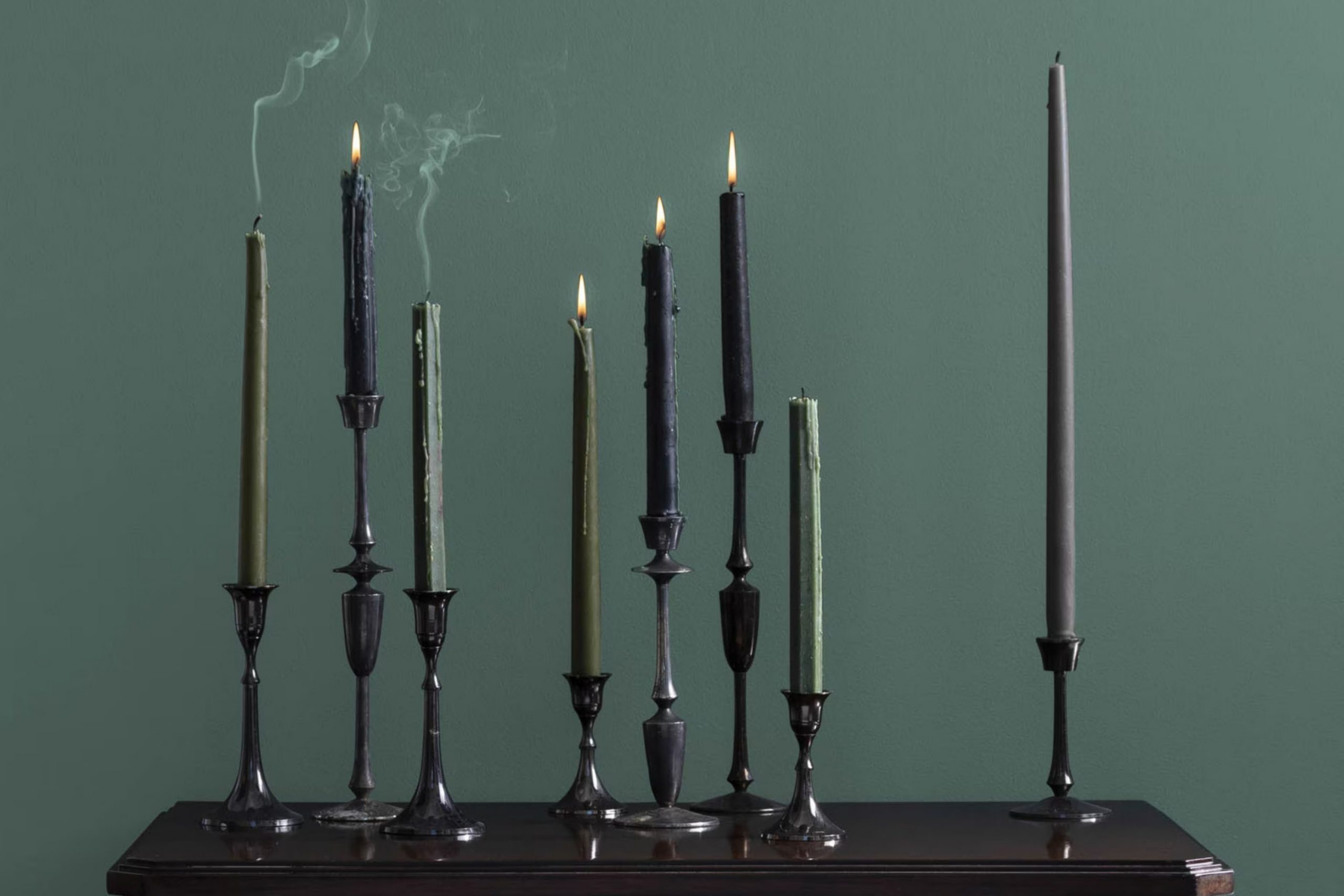
When you first see 692 Jack Pine by Benjamin Moore, you might think it’s just another green. But give it a moment. This shade has a quiet charm that grows on you, gently blending the zest of fresh pine with the depth of a shadowy forest. It’s a color that brings a touch of nature into any room without overpowering it.
If you’re thinking about refreshing your room or just adding a splash of new color, 692 Jack Pine offers a flexible backdrop for both bold and subdued decorating styles. It pairs beautifully with natural elements like wood or stone, and it really pops when contrasted with light, neutral tones or metallic accents.
Whether you’re up for repainting an entire room, or just looking to liven up a furniture piece, this hue maintains a balance between standing out and blending in, making it easy to work with in various settings.
This shade isn’t just paint; it’s a subtle nod to the outdoors, perfect for creating a peaceful, grounded atmosphere in your home.
What Color Is Jack Pine 692 by Benjamin Moore?
Jack Pine by Benjamin Moore is a rich, dark green hue that resembles the lush greenery of a forest. Its deep tones provide a sense of coziness and warmth, making it perfect for creating a welcoming atmosphere in any room. The color is adaptable enough to work well in a variety of interior styles, particularly those that lean towards natural aesthetics, such as rustic, bohemian, or traditional designs.
This shade pairs beautifully with natural wood tones, from light pine to dark walnut, enhancing the warmth of the green with the organic textures of the wood. It also matches well with metallic finishes like brass or copper, which add a touch of warmth and reflection to the depth of the color. When combined with materials like leather or linen, Jack Pine brings out their natural textures, creating an inviting and comfortable room.
For walls, Jack Pine works exceptionally well as an accent wall color in a bedroom or living room, providing a stunning backdrop for art and other decor. In terms of fabrics, plush velvets or soft wools in neutral shades complement the depth of Jack Pine, adding layers of texture and color contrast that draw the eye and create a rich, engaging environment.
Whether for a full room or a single focal point, this color is a classic choice that brings the beauty of nature indoors.
decorcreek.com
Is Jack Pine 692 by Benjamin Moore Warm or Cool color?
Jack Pine 692 by Benjamin Moore is a bold and vibrant green paint that brings a fresh, natural feel to any room in the house. It resembles the greenery of pine trees, making it a perfect choice for those looking to add a touch of nature to their interiors.
This color works particularly well in rooms that receive a lot of natural light as it complements the sunlight, creating a lively and inviting atmosphere. However, in rooms with less natural light, Jack Pine can make the room feel a bit darker, so it’s good to balance it with lighter colors or reflective surfaces.
It’s great for accent walls or for an all-over color if you’re going for a more immersive environment. You can also pair it with neutral tones like whites or light grays; this helps to soften the impact of the intense green and creates a harmonious color scheme.
Thus, Jack Pine by Benjamin Moore offers a flexible option that can be adapted to various design needs.
Undertones of Jack Pine 692 by Benjamin Moore
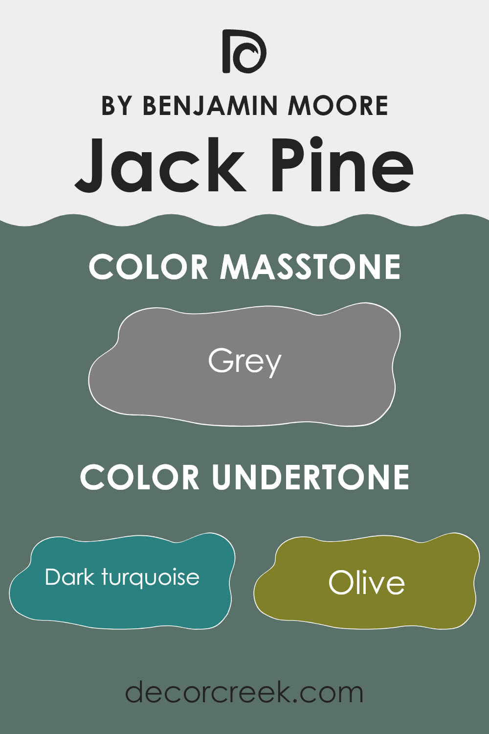
Jack Pine by Benjamin Moore is a unique paint color that subtly incorporates a variety of undertones. These undertones range from dark and moody shades like dark turquoise, navy, and purple to more vibrant and lighter hues like mint, pale pink, and light green. Undertones are the secondary colors that lie beneath the primary surface color, influencing how it looks in different lighting conditions and surroundings. They can add depth and complexity to the primary color, affecting the overall atmosphere of a room.
When applied to interior walls, the undertones of Jack Pine have a significant impact. In a room with plenty of natural light, lighter and vibrant undertones such as light turquoise, mint, and pale yellow might become more pronounced, giving the walls a lively and fresh appearance. Conversely, in rooms with limited natural light or during the evening under artificial lighting, darker undertones like dark green, brown, and navy might dominate, creating a more grounded and cozy feel.
The variety of undertones in Jack Pine makes it a flexible choice for different rooms and styles. It can harmonize with a wide range of decor elements, from natural wood and metallic finishes to various fabric textures.
The color’s adaptability makes it suitable for many areas, including living rooms, bedrooms, and home offices, where the mood can shift from energizing to soothing based on the interplay of undertones and lighting.
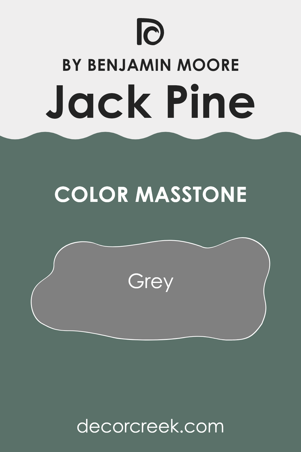
What is the Masstone of the Jack Pine 692 by Benjamin Moore?
Jack Pine 692 by Benjamin Moore appears as a solid grey shade in its masstone, specifically akin to the color grey denoted by the hex code #808080. This subtle and neutral grey tone forms a flexible base that works well in various home settings. It provides a calming backdrop that does not overpower interior rooms, making it easy to pair with other colors whether bright, pastel, or other neutrals.
In rooms where natural light is abundant, Jack Pine’s grey masstone can appear slightly lighter, creating a fresh and airy feel. Conversely, in rooms with less light, it might give off a cozier vibe, ideal for creating a comfortable, nestled-in atmosphere.
This color’s adaptability makes it suitable for living rooms, bedrooms, and even kitchens, where it can complement different decor styles from modern to rustic. Additionally, maintenance and touch-ups are straightforward due to its neutral nature, helping to keep homes looking neat and tidy.
How Does Lighting Affect Jack Pine 692 by Benjamin Moore?
Lighting plays a crucial role in how we perceive colors. Different light sources can make the same paint color look different in various environments. For instance, Jack Pine, a color by Benjamin Moore, is a rich and deep green that can appear uniquely under different lighting conditions.
In artificial light, colors generally appear warmer due to the yellowish tint that many indoor bulbs cast. Jack Pine could look darker and more intense under warm artificial lighting, potentially bringing out more of its yellow or brown undertones. This provides a cozy and inviting atmosphere, ideal for living rooms or bedrooms where soft lighting is common.
In natural light, colors tend to show their truest form. Jack Pine, when exposed to natural sunlight, may have a vibrant quality with its green undertones becoming more pronounced. This makes natural light ideal for evaluating this true color during the paint selection process.
The direction a room faces also affects how colors like Jack Pine manifest. North-facing rooms get less direct sunlight, so they tend to have cooler and softer light. In these rooms, Jack Pine might appear darker and more muted, making it suitable for creating a calm, grounding area.
South-facing rooms, however, receive more intense sunlight throughout the day, which can make Jack Pine look brighter and more dynamic. This can be perfect for areas where you want a lively but natural feel.
East-facing rooms enjoy bright light in the morning, which then softens through the day. Jack Pine in these rooms will seem lively and fresh in the morning, gradually becoming more subdued. It’s an excellent choice for bedrooms and breakfast nooks.
West-facing rooms receive the evening sun, which casts a warm glow. In these rooms, Jack Pine will reflect this warmth later in the day, creating a welcoming and comfortable area that maximizes the color’s depth in the afternoon and evening.
Understanding how lighting affects colors like Jack Pine can help you decide which rooms are best for this kind of color, leading to desired ambiance and mood.
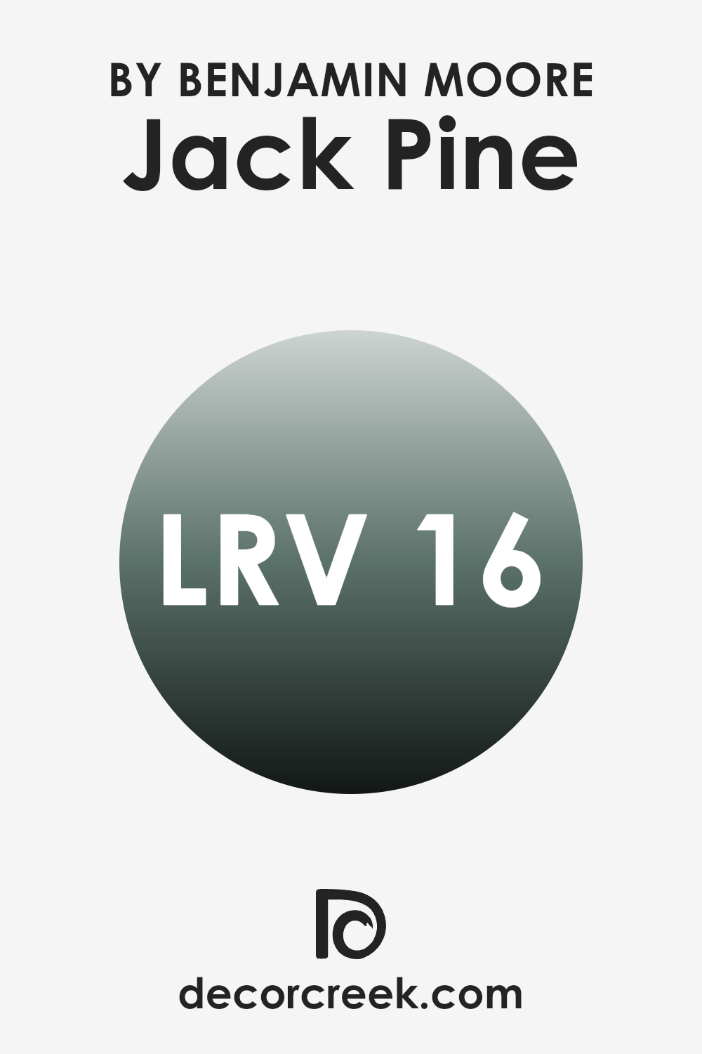
What is the LRV of Jack Pine 692 by Benjamin Moore?
LRV stands for Light Reflectance Value, which is a measure of how much light a paint color reflects or absorbs when it’s applied to a wall. This value is given on a scale where the higher the number, the more light the color reflects. Lighter colors tend to have higher LRVs because they reflect more light, making a room feel brighter.
On the other hand, darker colors have lower LRVs because they absorb more light, which can make a room feel cozier but smaller and darker. Understanding LRV can be very helpful when choosing paint colors, especially if you are trying to make a small room appear larger or light a room that doesn’t receive much natural sunlight.
In the case of the color Jack Pine by Benjamin Moore with an LRV of 16.45, it is a darker shade that absorbs a good amount of light rather than reflecting it. This means it might not be the best choice for a small, dark room as it could make the room appear even smaller and less illuminated.
However, in a well-lit area or a larger room, using this color could add a rich, deep tone to the walls, creating a cozy and intimate atmosphere. When using darker colors with lower LRVs, good lighting and contrasting lighter accents can help balance the visual impact of the color, preventing it from creating an overpowering effect in the room.
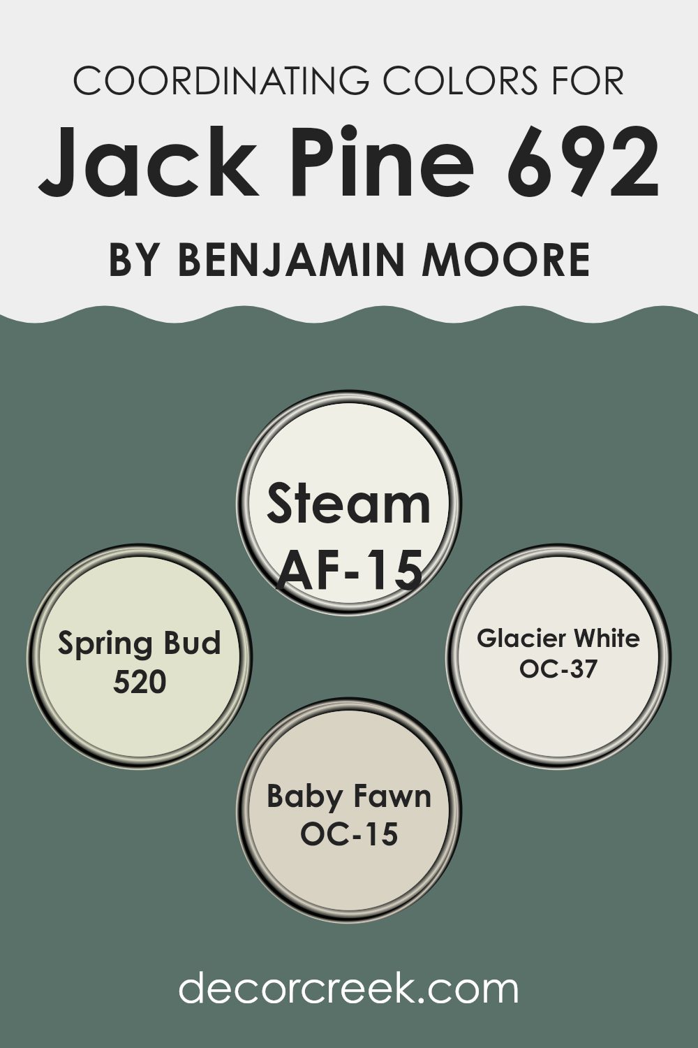
Coordinating Colors of Jack Pine 692 by Benjamin Moore
Coordinating colors are specifically selected shades that complement a main color, enhancing the overall aesthetic of a room by creating a balanced and harmonious look. When you choose a paint like Jack Pine by Benjamin Moore, you often have the option to pick coordinating colors that work well with it to design a cohesive palette for decorating a room. These coordinating colors can be used for trim, accent walls, or even in decor items to tie the room together visually.
One of the coordinating colors for Jack Pine is AF-15 – Steam, a subtle and neutral tone that can brighten areas or provide a soft contrast when paired with bolder hues. It’s great for creating a calm and inviting atmosphere.
Another complementary color is 520 – Spring Bud, a fresh and light green that adds a touch of nature’s freshness to rooms, perfect for enhancing areas that receive a lot of natural light. OC-37 – Glacier White offers a clean and crisp look, ideal for trim or ceilings to give a room a more open and airy feel.
Lastly, OC-15 – Baby Fawn, is a warm and gentle beige that provides a cozy and welcoming vibe, excellent for larger surfaces that need a touch of warmth. Each of these colors supports and enhances the primary color to create a beautifully coordinated color scheme.
You can see recommended paint colors below:
- AF-15 Steam
- 520 Spring Bud
- OC-37 Glacier White
- OC-15 Baby Fawn
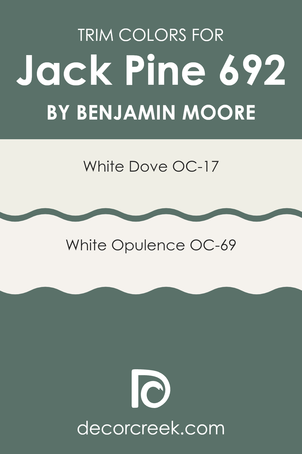
What are the Trim colors of Jack Pine 692 by Benjamin Moore?
Trim colors are specific shades selected for features like door frames, baseboards, crown moldings, and window sills in a room, distinct from the main wall colors. These colors help in defining the architectural details of a room, making features stand out while providing a clean, finished look. For a shade like Jack Pine by Benjamin Moore, choosing the right trim color is crucial to enhance its visual impact.
Light trim colors such as OC-17 White Dove and OC-69 White Opulence are excellent choices as they can add a bright, crisp border that complements the richer hue of Jack Pine. This contrast not only highlights the trim but also grounds the deeper green, making the whole room appear more cohesive and pleasing.
OC-17 White Dove is a soft and creamy white that exudes a sense of warmth without overpowering the main color it borders. It pairs beautifully with darker tones, providing a gentle transition between colors that can make rooms feel larger and more open.
On the other hand, OC-69 White Opulence has a slight luminosity that reflects light, helping to brighten areas that might otherwise feel too dim with darker wall colors. This shade is particularly effective in adding a subtle highlight to the edges, making them pop against the deep background of Jack Pine.
You can see recommended paint colors below:
- OC-17 White Dove
- OC-69 White Opulence
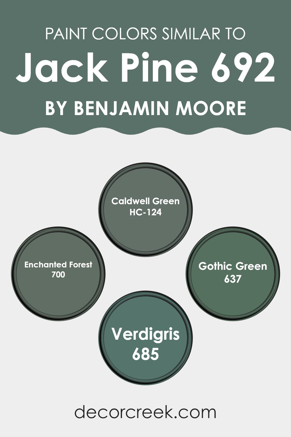
Colors Similar to Jack Pine 692 by Benjamin Moore
Choosing similar colors can significantly impact the aesthetic and mood of a room, creating a harmonious and cohesive look. Colors like HC-124 Caldwell Green, 700 Enchanted Forest, 637 Gothic Green, and 685 Verdigris are excellent choices that complement each other well, forming a palette that seamlessly blends with the base color of Jack Pine.
This blend of greens can create a sense of continuity and flow in a design, making the room feel unified and thoughtfully curated. When these shades are used together, they allow for a decor that is cohesive yet varied, providing just enough contrast to enrich the visual experience without creating an overpowering effect.
HC-124 Caldwell Green has a deep, earthy quality that recalls the dense foliage of a forest, making it ideal for settings that aim for a naturalistic or calming vibe. 700 Enchanted Forest is slightly richer and darker, adding depth and intrigue to rooms that benefit from a touch of mystery. Then, 637 Gothic Green offers a more traditional feel, reminiscent of ancient woods and classic design, which can add character and enduring appeal to a room.
Finally, 685 Verdigris stands out with its unique blend of green and gray tones, lending an aged look that is both stylish and memorable, suitable for adding a vintage or antique touch to modern rooms. Together, these colors work synergistically to create dynamic interiors that are both inviting and visually appealing.
You can see recommended paint colors below:
- HC-124 Caldwell Green
- 700 Enchanted Forest
- 637 Gothic Green
- 685 Verdigris
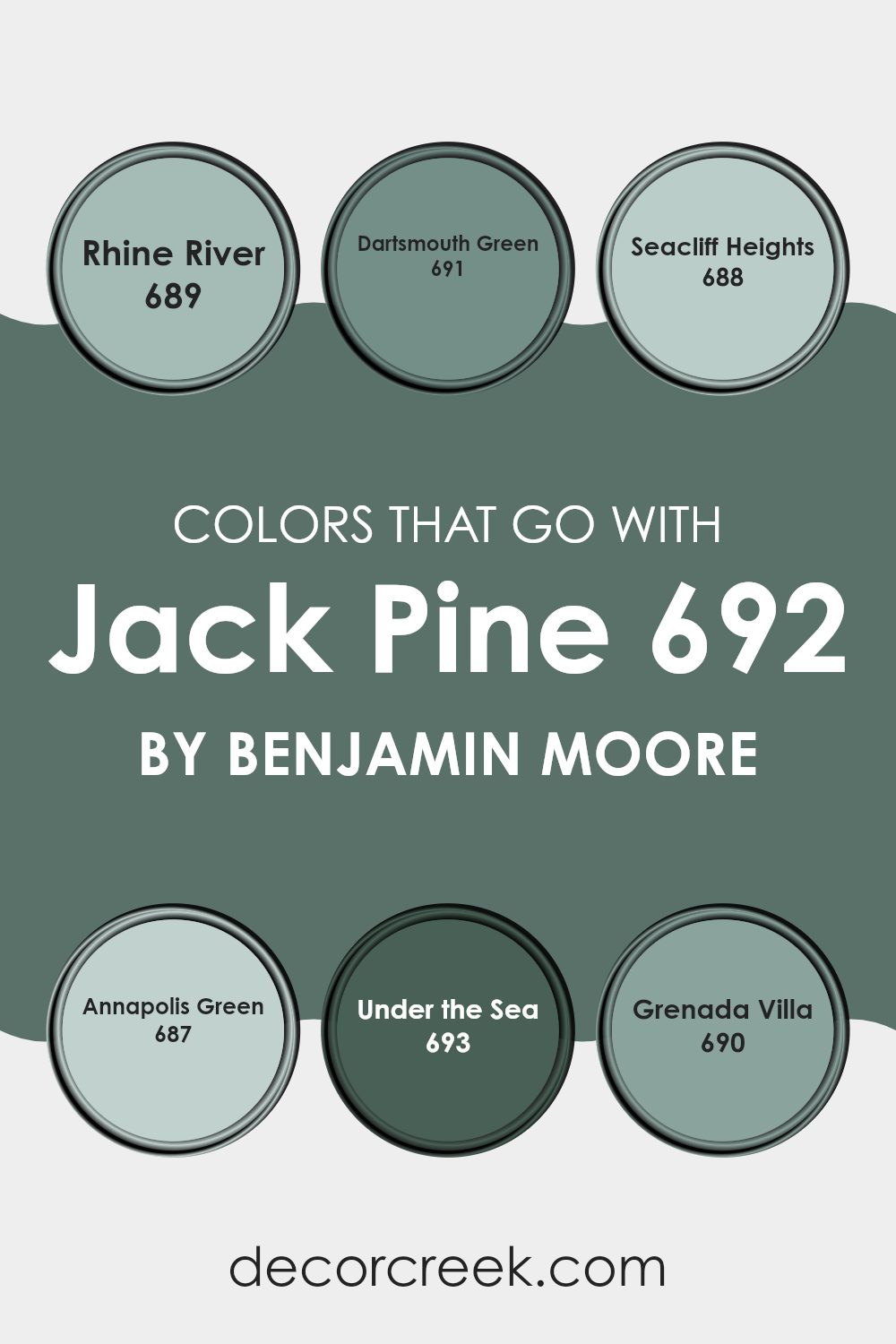
Colors that Go With Jack Pine 692 by Benjamin Moore
Selecting complementary colors that go with Jack Pine 692 by Benjamin Moore is crucial as it helps create a harmonious and visually appealing room. Each color in the palette including Rhine River, Dartsmouth Green, Seacliff Heights, Annapolis Green, Under the Sea, and Grenada Villa, plays a unique role in enhancing the overall aesthetic, ensuring the design feels cohesive yet dynamic.
Rhine River is a soft and soothing blue that brings a gentle freshness to any room, making it a perfect contrast to the bolder Jack Pine. Dartsmouth Green, a deeper and rich shade, adds a dash of earthiness, grounding the lighter tones in the palette. Seacliff Heights offers a muted teal that reflects a calm ocean feel, pairing beautifully with the natural vibe of Jack Pine.
Annapolis Green, slightly lighter than Dartsmouth, gives off a more youthful energy while still feeling connected to nature. Under the Sea is a vivid, cheerful blue that injects vibrancy and fun into the mix, and Grenada Villa, with its tropical aura, introduces a sun-kissed, warm yellow tint that balances cooler shades. Together, these colors create a flexible and inviting atmosphere that enhances the beauty of Jack Pine, making any room cozy and stylish.
You can see recommended paint colors below:
- 689 Rhine River
- 691 Dartsmouth Green
- 688 Seacliff Heights
- 687 Annapolis Green
- 693 Under the Sea
- 690 Grenada Villa
How to Use Jack Pine 692 by Benjamin Moore In Your Home?
Jack Pine 692 by Benjamin Moore is a lively and fresh green paint that adds a touch of nature to any room. It is perfect for those looking to bring the outdoors inside and add a vibrant splash of color to their home. This shade can be used in different ways around the house.
In the living room, Jack Pine can be painted on one accent wall to create a focal point and add some extra cheer. In a bedroom, using this color on walls can create a cozy and inviting room, perfect for relaxing after a long day. For the kitchen, incorporating Jack Pine on cabinets or an island can modernize the room while keeping it warm and welcoming.
It also works well in bathrooms, where it pairs nicely with whites and grays for a clean, fresh look. Additionally, this shade is great for small rooms like a hallway or a powder room to make them appear more vibrant and roomy. Overall, Jack Pine offers a fresh way to brighten up your home with a splash of color.
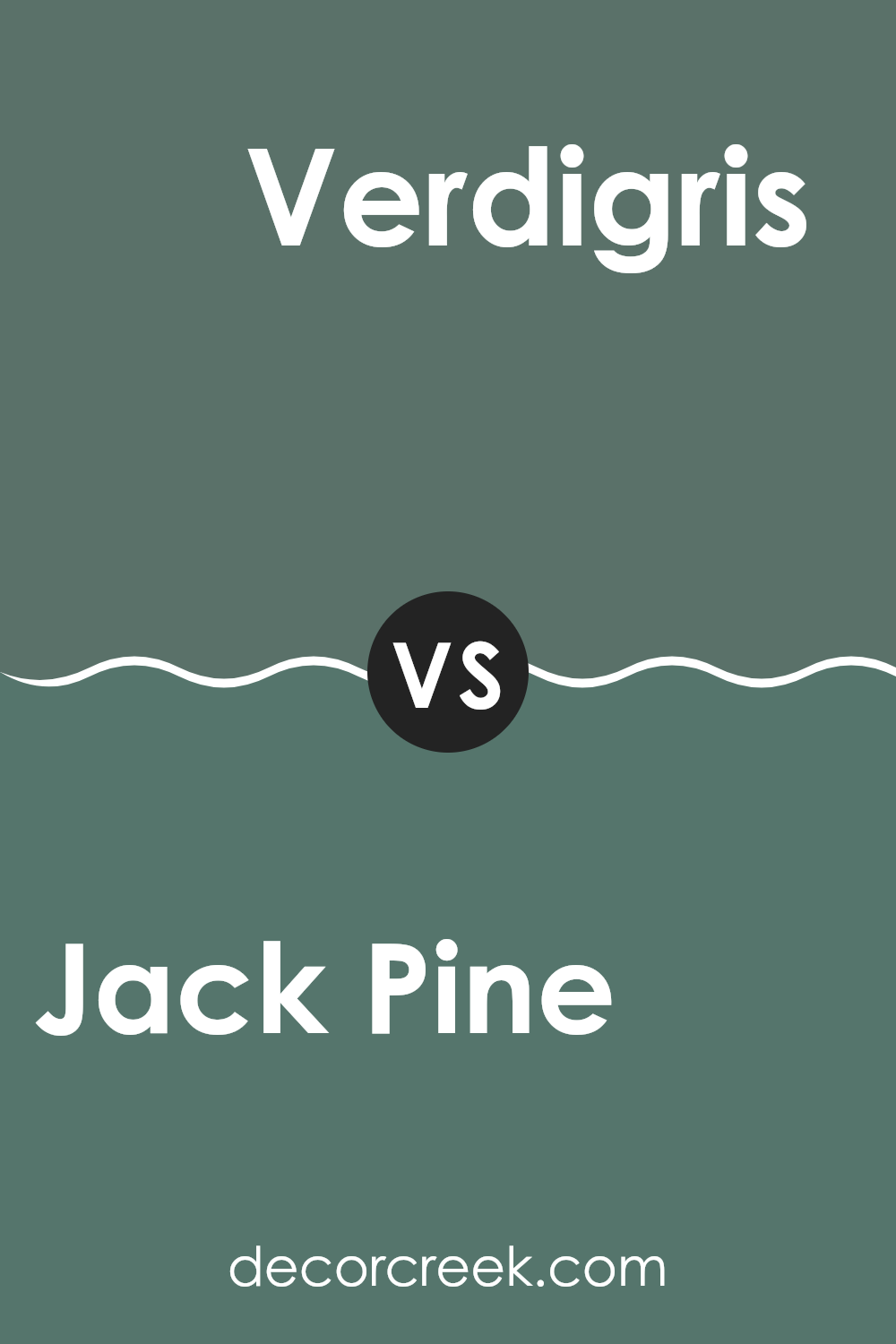
Jack Pine 692 by Benjamin Moore vs Verdigris 685 by Benjamin Moore
Jack Pine and Verdigris are both green hues by Benjamin Moore, each offering a unique shade for different decorative tastes. Jack Pine is a deeper, darker green that mimics the rich tones of a dense forest.
It’s perfect for creating a cozy and inviting atmosphere in a room, making rooms feel more enclosed and warm. On the other hand, Verdigris is a lighter and brighter green. It reflects more light, making it an excellent choice for smaller rooms or rooms that you want to appear more open and airy.
While Jack Pine provides a feeling of snugness and warmth, Verdigris leans towards giving a room a fresh and lively vibe. Both colors can enhance a room’s decor, but your choice would depend on the mood and function you want for your room.
You can see recommended paint color below:
- 685 Verdigris
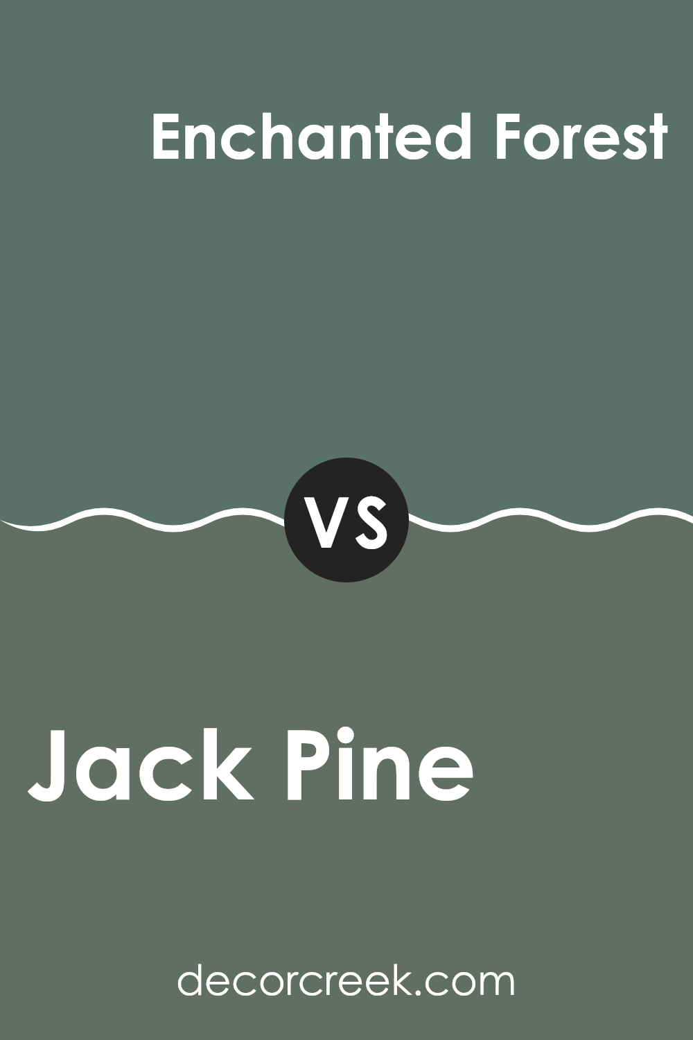
Jack Pine 692 by Benjamin Moore vs Enchanted Forest 700 by Benjamin Moore
Jack Pine and Enchanted Forest, both by Benjamin Moore, are beautiful shades of green that each set a unique mood for a room. Jack Pine is a deep, rich green that brings to mind the dense foliage of a forest. It has a smoky undertone that makes it perfect for creating a cozy, enveloping feel in a room.
On the other hand, Enchanted Forest is a brighter, more vivid green. It sparkles with a bit more life and energy compared to Jack Pine. This color can really make a room feel fresh and lively, adding a punch of nature-inspired vibrancy.
While both colors share a green base, the darker, more subdued tone of Jack Pine offers a more reserved and grounding atmosphere. Enchanted Forest, with its brighter and more dynamic hue, provides a refreshing and lively vibe. Depending on what mood you want to set in a room, these greens could serve different purposes beautifully.
You can see recommended paint color below:
Jack Pine 692 by Benjamin Moore vs Gothic Green 637 by Benjamin Moore
Jack Pine and Gothic Green, both from Benjamin Moore, offer unique green shades, each creating a different mood. Jack Pine is a subtle, darker green that leans slightly towards a mossy tone. This color is great for rooms where a calm, grounding effect is desired, such as bedrooms or offices. It pairs well with natural wood and can suit a traditional or a rustic décor style.
On the other hand, Gothic Green is a brighter, more vivid green. It has a freshness to it that can invigorate a room, making it ideal for areas like kitchens or bathrooms where a clean, energetic ambiance is beneficial. Because of its brightness, Gothic Green can make small rooms appear larger and more open.
Both colors work well in different settings, but the choice largely depends on the kind of atmosphere you’re aiming for—cozy and subdued with Jack Pine or lively and cheerful with Gothic Green.
You can see recommended paint color below:
- 637 Gothic Green
Jack Pine 692 by Benjamin Moore vs Caldwell Green HC-124 by Benjamin Moore
Jack Pine and Caldwell Green, both by Benjamin Moore, are similar but have distinct differences. Jack Pine is a deep, dark green that provides a strong, bold backdrop, reminiscent of dense, shadowy pine forests. This color tends to add drama and intensity to rooms, making it ideal for creating a strong visual impact.
Caldwell Green, on the other hand, is a slightly lighter shade of green with a more noticeable gray undertone. This gives it a more muted, subtle appearance compared to Jack Pine. Caldwell Green is flexible and tends to blend more seamlessly into a variety of decor styles, providing a soothing, neutral backdrop that’s still rich in color.
Both colors are grounded in nature which makes them perfect for bringing the outdoors inside and fostering a cozy, inviting atmosphere. Choosing between them depends on how bold or subdued you want the room’s atmosphere to be. Jack Pine stands out more, while Caldwell Green integrates gently with its surroundings.
You can see recommended paint color below:
After reading about 692 Jack Pine by Benjamin Moore, I’ve really come to appreciate what a great choice this paint color can be for someone wanting to freshen up their room! This shade of green is calming, like the color of pine trees you might see on a calm, sunny day. It’s not too bright, but it’s cheerful enough to make a room feel cozy and welcoming.
The best part about 692 Jack Pine is how well it works with different colors and room styles. Whether you’re painting a bedroom to make it feel more relaxing or sprucing up your living room, this color fits right in. It’s also really good for people who like nature and want to bring a bit of the outdoors inside their home.
So, if you’re thinking about picking a new paint color, 692 Jack Pine might be just what you need. It’s got a gentle vibe that makes any room nicer to be in, without making things look too flashy.
I think it would make anyone’s home a bit more special without too much fuss.
Ever wished paint sampling was as easy as sticking a sticker? Guess what? Now it is! Discover Samplize's unique Peel & Stick samples.
Get paint samples

