Choosing the right color for your room can be challenging, but if you’re considering SW 6248 Jubilee by Sherwin Williams, you’re in for a treat. As someone who has experience with various paints and colors, I want to share some essential insights about Jubilee that might help you in your decision-making process.
First, understand that Jubilee is not just any gray – it has a unique undertone that can look differently depending on the light and surrounding elements. This means that a spot test in the area you plan to paint is crucial.
Think about the natural and artificial light your room receives throughout the day, as this influences how Jubilee will appear. Moreover, consider what other colors will be present in the room. Jubilee pairs wonderfully with a wide range of hues, but it’s important to align it with your decor to ensure it complements the overall look.
By arming yourself with this knowledge, you’re better prepared to decide if SW 6248 Jubilee is the perfect fit for your decorating needs.
Is Jubilee SW 6248 Right for My Home?
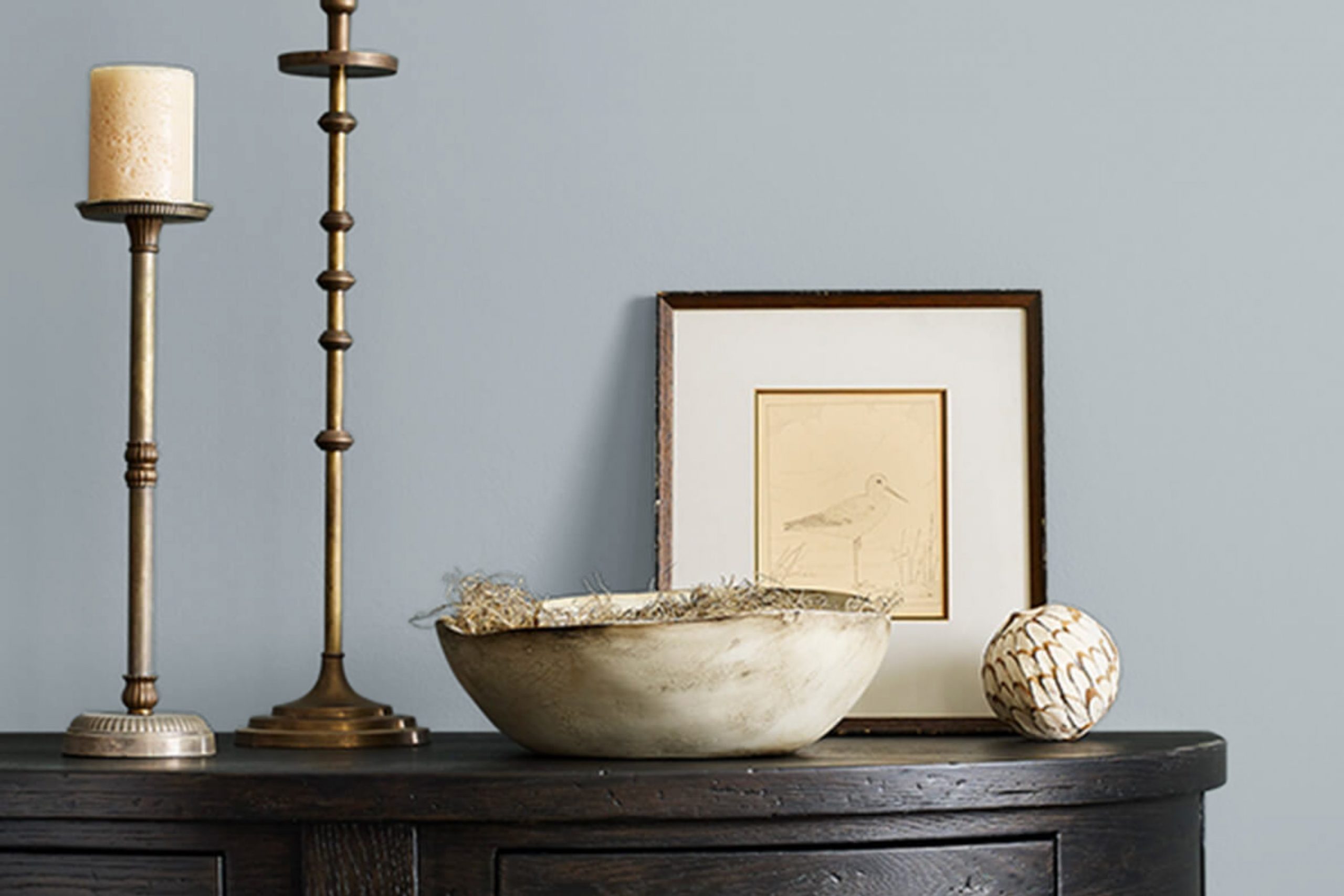
When I came across the color Jubilee by Sherwin Williams, it caught my attention with its unique blend of gray and subtle blue tones. This hue is flexible and calm, often reminding me of a quiet, cloudy day. It’s not too bold, making it perfect for someone like me who appreciates a more understated style in home decor.
In my home, I’ve found that Jubilee works exceptionally well with modern and minimalist interiors. Its cool undertones provide a crisp, clean backdrop that allows my furniture and decor pieces to really stand out. I love pairing it with white trims for a fresh and airy feel in my living room. Its adaptability is one of its best features, as it blends smoothly with various textures and materials.
For instance, natural wood elements, whether light oak or darker walnut, seem to warm up the coolness of Jubilee, creating a nice balance in my rooms. I also find that metallic accents in silver or brushed nickel complement the color’s cool palette, bringing in just the right amount of shimmer.
Furthermore, textures like linen or chunky wool throws add a tactile dimension that makes my interiors feel cozy and inviting against the calm nature of the walls painted in Jubilee. It’s an ideal backdrop for my love of mixing textures and styles, keeping everything harmonious yet interesting. Whether it’s my leather chairs or my glass coffee table, everything sits well against this flexible color.
decorcreek.com
What are the right undertones of Jubilee SW 6248 ?
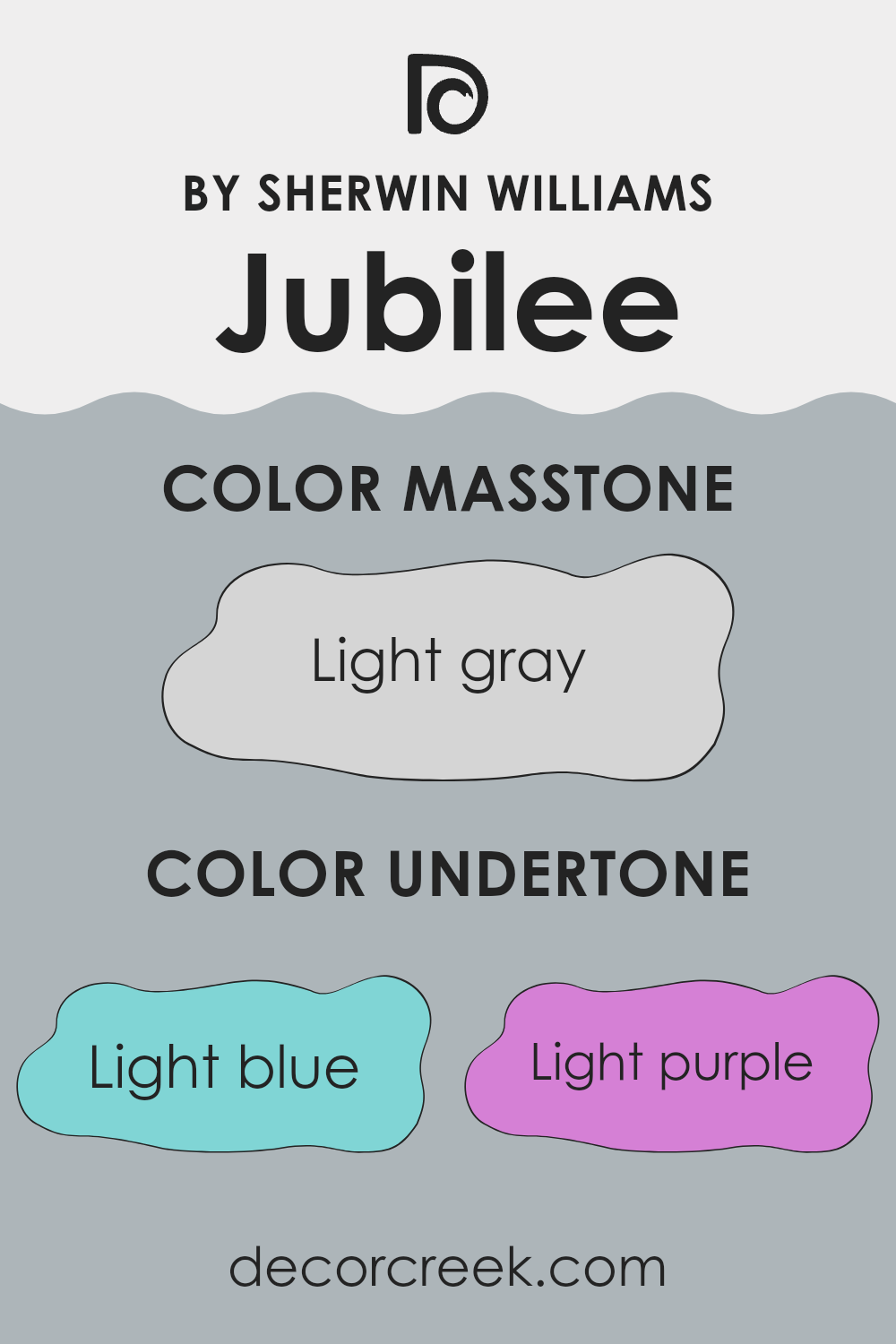
Jubilee SW 6248 by Sherwin Williams is a flexible color that carries a complex mix of undertones, influencing how it appears in various lighting conditions and alongside different decor. Understanding undertones is important because they subtly affect the primary color’s hue, changing how it’s perceived in a room.
This paint color includes undertones of light blue, light purple, lilac, pale yellow, mint, pale pink, and gray. These undertones can make the main color look cooler or warmer depending on the lighting and surrounding colors. For example, light blue and mint bring a touch of freshness, making the room feel airy. In contrast, pale pink and lilac add a gentle warmth that can make a room feel more welcoming.
When applied to interior walls, these undertones interact with both natural and artificial light. During the day, natural light might highlight the cooler blue and mint undertones, giving the room a calm, refreshing feel. In the evening, artificial lighting could draw out warmer pink and lilac tones, making the room feel cozier.
The presence of gray as an undertone helps balance the color, ensuring that it doesn’t lean too far in any direction. This balance makes Jubilee a great choice for those looking to achieve a subtle yet effective impact in their decorating, suitable for various styles and tastes.
decorcreek.com
Best Coordinating Colors to use with Jubilee SW 6248 by Sherwin Williams this year.
Coordinating colors are shades that complement each other and work together to create a harmonious look in your design or decor. These colors usually either contrast or blend smoothly, enhancing the overall aesthetic of a room. Coordinating colors for Jubilee SW 6248 by Sherwin Williams help highlight its unique tone while adding depth and variety to the visual effect.
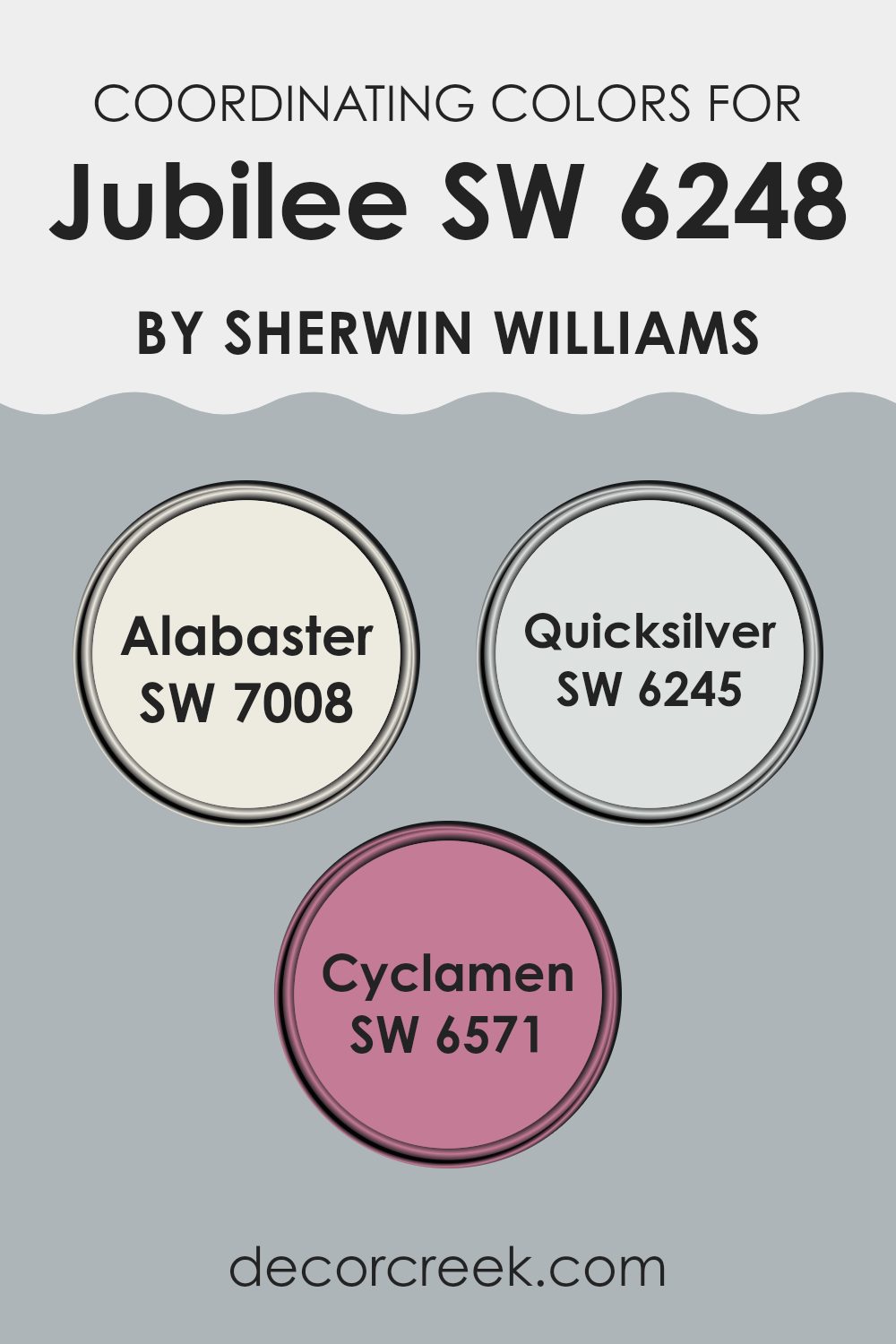
One of the coordinating colors is Alabaster SW 7008, a soft, warm white that provides a calm backdrop, making it an excellent choice for creating a light, airy feel when paired with deeper hues. Then there’s Quicksilver SW 6245, a light gray with blue undertones, offering a fresh, modern look that complements Jubilee by adding a subtle contrast without dominating the room.
Lastly, Cyclamen SW 6571 introduces a vibrant pop of color. This rich pink brings a lively and playful element to the palette, ensuring that the overall scheme remains bright and enjoyable. Together, these coordinating colors offer flexibility in design, allowing for either a subdued, gentle environment or a more dynamic, cheerful room.
You can see recommended paint colors below:
- SW 7008 Alabaster
- SW 6245 Quicksilver
- SW 6571 Cyclamen
Trendy Trim Colors of Jubilee SW 6248 by Sherwin Williams to use this year.
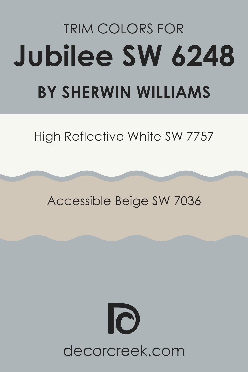
Trim colors are accent colors used on elements such as door frames, molding, and skirting boards to enhance the overall look of a room. Using colors like SW 7757 High Reflective White or SW 7036 Accessible Beige as trim can greatly impact the aesthetic appeal and complement main wall colors like Jubilee by Sherwin Williams.
High Reflective White is a brilliant, clean white that brings a fresh and crisp edge to the room, making it ideal for helping Jubilee stand out and giving a sharper, more defined look to the architectural elements in any room. On the other hand, Accessible Beige is a warm, neutral shade that provides a subtle contrast, softening the transitions between the walls and the trim, which creates a harmonious and inviting atmosphere.
Choosing the right trim color is important because it frames the walls and can alter the perception of a room’s size and shape. High Reflective White tends to enhance natural and artificial light reflections, which can make a room appear larger and more open, making it a great choice to pair with the calming blue of Jubilee. Accessible Beige, with its refined appearance, complements the gentle tone of Jubilee by adding warmth, ensuring the room remains cozy and appealing. Both trim colors help maintain a cohesive yet distinct design, allowing each element to come together for a finished look.
You can see recommended paint colors below:
- SW 7757 High Reflective White
- SW 7036 Accessible Beige
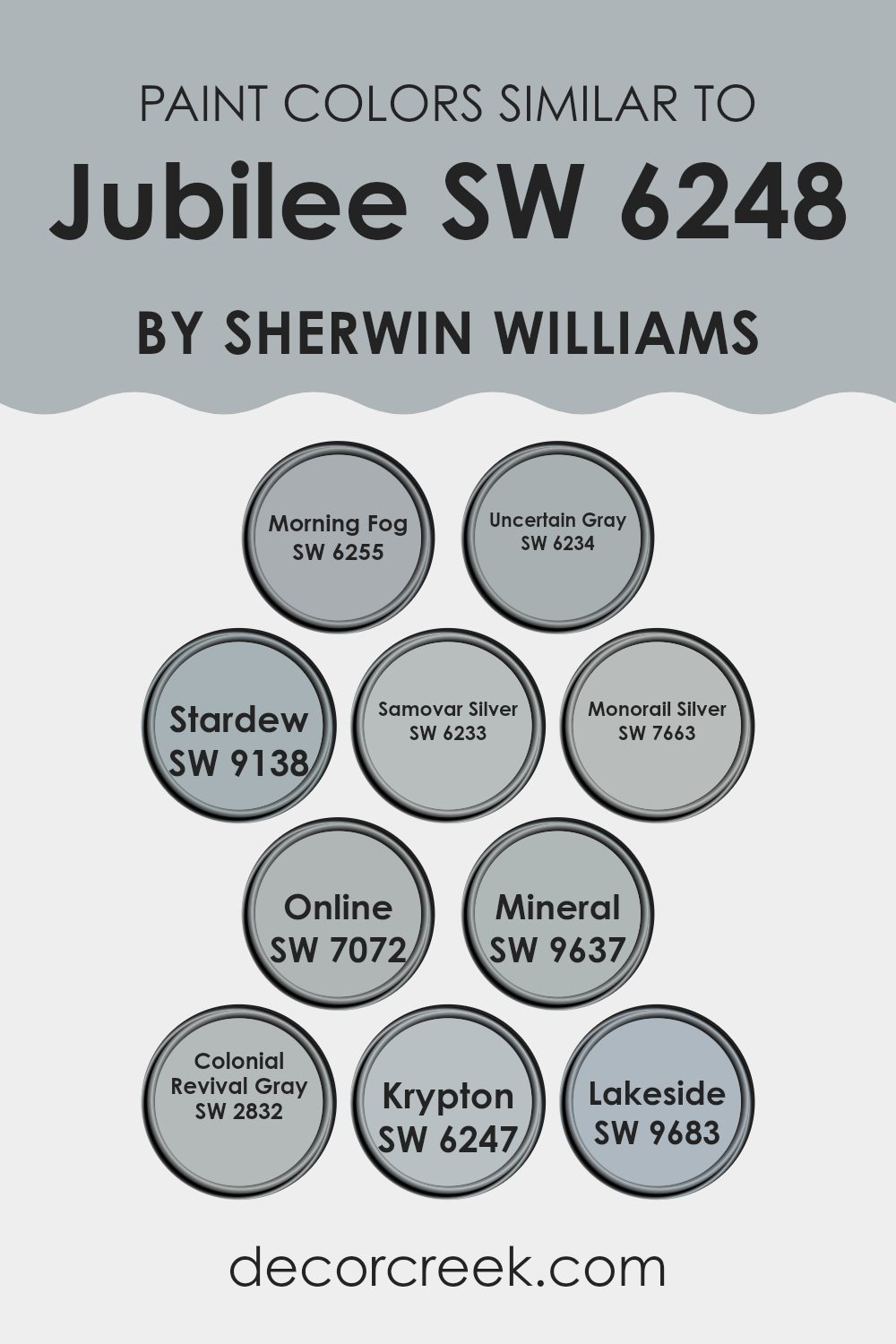
Evergreen Colors Similar to Jubilee SW 6248 by Sherwin Williams
Choosing similar colors when planning a room’s color scheme is important because it creates a harmonious and cohesive look. These colors, such as those similar to Sherwin Williams’ Jubilee, work together by sharing a common palette or undertone, which helps balance the visual appeal of a room. Such colors can be used in different aspects of interior design, including walls, trims, and accents, offering a subtle variety that’s pleasing to the eye without creating strong contrasts.
Morning Fog is a gentle gray that evokes the soft, diffuse atmosphere of an early dawn sky, perfect for creating a calm and inviting ambiance in any room. Uncertain Gray has a slightly more pronounced feel than Morning Fog, hinting at stormier skies but still soft enough to blend effortlessly with gentler hues.
Stardew offers a touch of blue, reminiscent of a clear, refreshing morning, ideal for a peaceful retreat or study. Samovar Silver is another understated option that has a hint of metallic character, lending a slight shimmer to an otherwise muted palette. Monorail Silver is darker, almost industrial, but still manages to remain light enough to blend well in a modern decor style.
Online, with its cool, digital-age vibe, brings a contemporary edge that’s sleek and almost minimalist. Mineral provides a touch of earthy tones, grounding the otherwise airy selection of colors. Colonial Revival Gray draws from historical influences, offering depth to a room without dominating it.
Krypton, closely resembling a faintly stormy sky, works beautifully in rooms that aim for a touch of drama without committing to darker colors. Lastly, Lakeside is reminiscent of a fresh, clear day by the water, perfect for bringing a sense of freshness into any home. Each of these colors offers unique yet cohesive options to design a room that feels both unified and interesting.
You can see recommended paint colors below:
- SW 6255 Morning Fog
- SW 6234 Uncertain Gray
- SW 9138 Stardew
- SW 6233 Samovar Silver
- SW 7663 Monorail Silver
- SW 7072 Online
- SW 9637 Mineral
- SW 2832 Colonial Revival Gray
- SW 6247 Krypton
- SW 9683 Lakeside
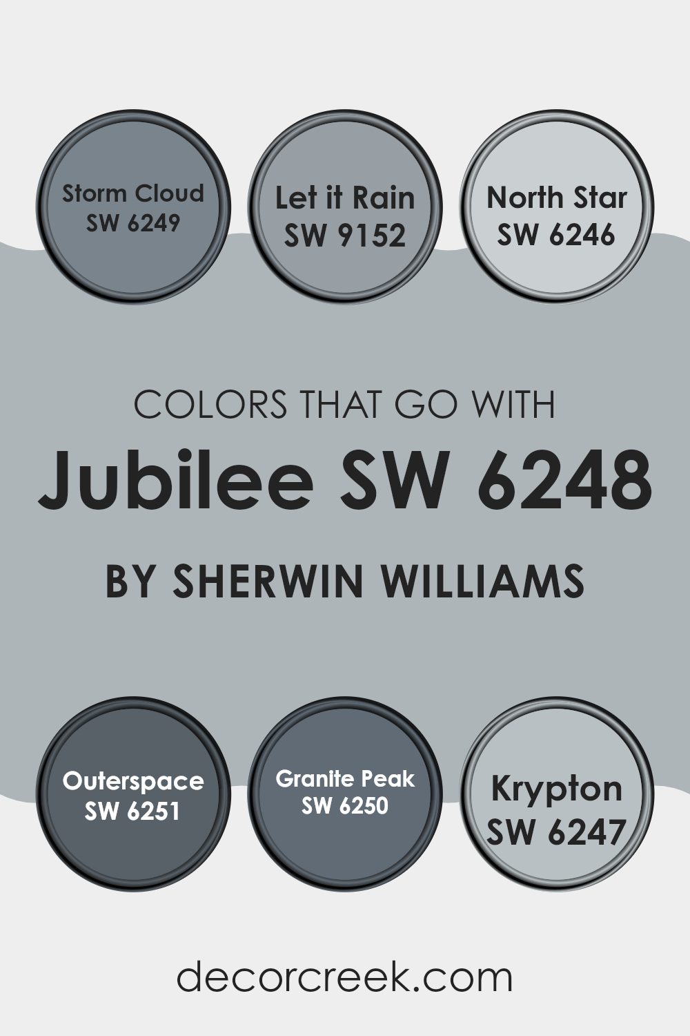
Colors that Go With Jubilee SW 6248 by Sherwin Williams
Selecting the right colors to pair with Jubilee SW 6248 by Sherwin Williams can enhance the aesthetics of any room, ensuring that the colors complement each other rather than clash. Jubilee itself is a flexible medium-tone gray, offering a balanced backdrop that can be accented with darker or lighter shades. It’s important to choose coordinating colors carefully to create a harmonious look.
Storm Cloud SW 6249, a deep, moody gray-blue, provides a strong contrast to Jubilee, adding depth and interest to interiors. On the other hand, Let it Rain SW 9152 is a softer gray with a hint of blue, introducing a soothing feel when used alongside Jubilee. North Star SW 6246 is much lighter, almost a pale silver, which can brighten rooms and give a light, airy feel.
For a bolder look, Outerspace SW 6251, with its dark charcoal hue, makes a dramatic statement and adds a touch of mystery. Granite Peak SW 6250, a solid mid-tone gray, harmonizes well with Jubilee, maintaining a balanced color scheme without strong contrast. Lastly, Krypton SW 6247 offers a light, refreshing blue-gray tone that can enhance open rooms and bring a sense of calm. Each of these shades works beautifully with Jubilee, helping to create environments that are pleasing to the eye and comfortable for living or working.
You can see recommended paint colors below:
- SW 6249 Storm Cloud
- SW 9152 Let it Rain
- SW 6246 North Star
- SW 6251 Outerspace
- SW 6250 Granite Peak
- SW 6247 Krypton
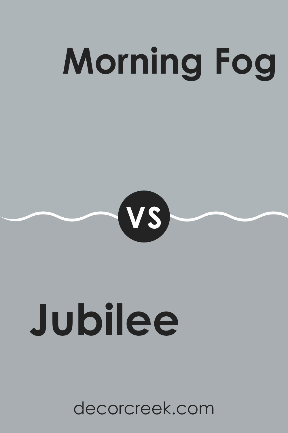
Jubilee SW 6248 by Sherwin Williams vs Morning Fog SW 6255 by Sherwin Williams
Jubilee and Morning Fog are both beautiful paint colors from Sherwin Williams, each offering a unique charm. Jubilee is a deeper, blue-gray shade that has a calming effect in any room. It’s perfect if you’re aiming for a cozy, welcoming feel in areas like the living room or bedroom.
On the other hand, Morning Fog is a lighter gray with subtle blue undertones, giving it a fresher, airier feel. This color works beautifully in kitchens and bathrooms, where you might want a cleaner, more open look.
Both colors pair well with a variety of decor styles, but Jubilee leans toward a warmer, cozier atmosphere, while Morning Fog keeps things light and breezy. Each color has its own way of enhancing the look of a room, depending on the mood you’re trying to create.
You can see recommended paint color below:
- SW 6255 Morning Fog
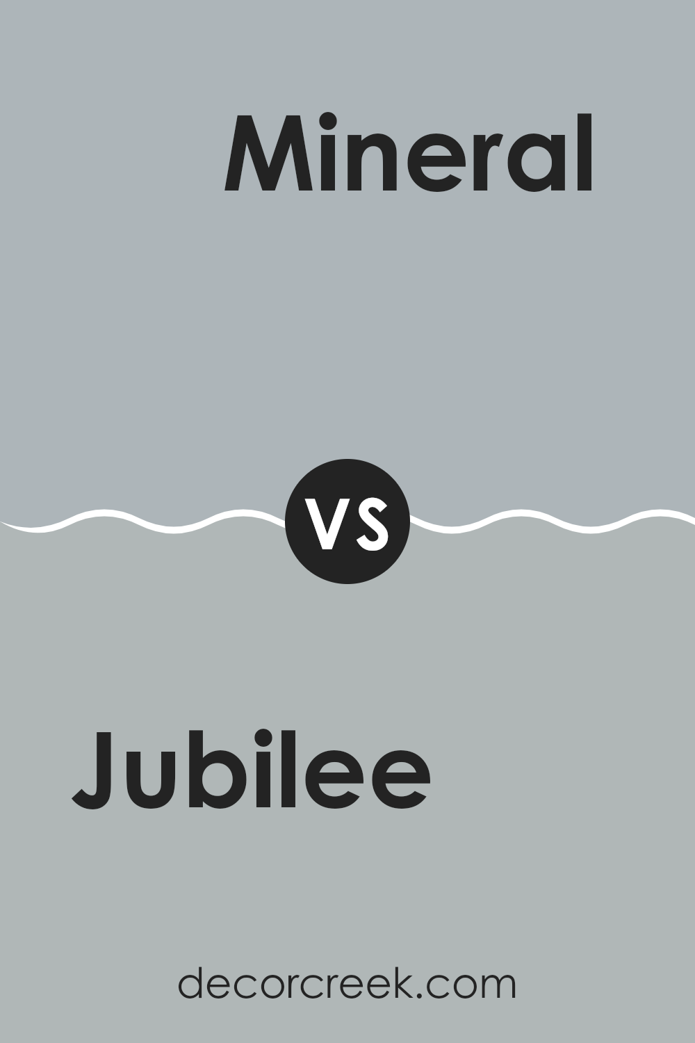
Jubilee SW 6248 by Sherwin Williams vs Mineral SW 9637 by Sherwin Williams
“Jubilee” and “Mineral” are two paint colors by Sherwin Williams with distinct tones. Jubilee is more of a deep blue, leaning toward a navy feel that adds richness to any room. It’s bold yet flexible, which allows it to be used in various settings, whether it’s a cozy reading nook or a formal dining area.
On the other hand, Mineral is a subtle gray with a whisper of green. This color is lighter and brings a fresh, calm vibe to rooms. It’s perfect for those looking to create a neutral backdrop that still has a hint of personality.
While Jubilee makes a statement with its depth, Mineral offers a soothing touch, making it ideal for relaxed environments. Both colors create unique atmospheres, and deciding between them depends on the mood you’re looking to achieve in your room.
You can see recommended paint color below:
- SW 9637 Mineral
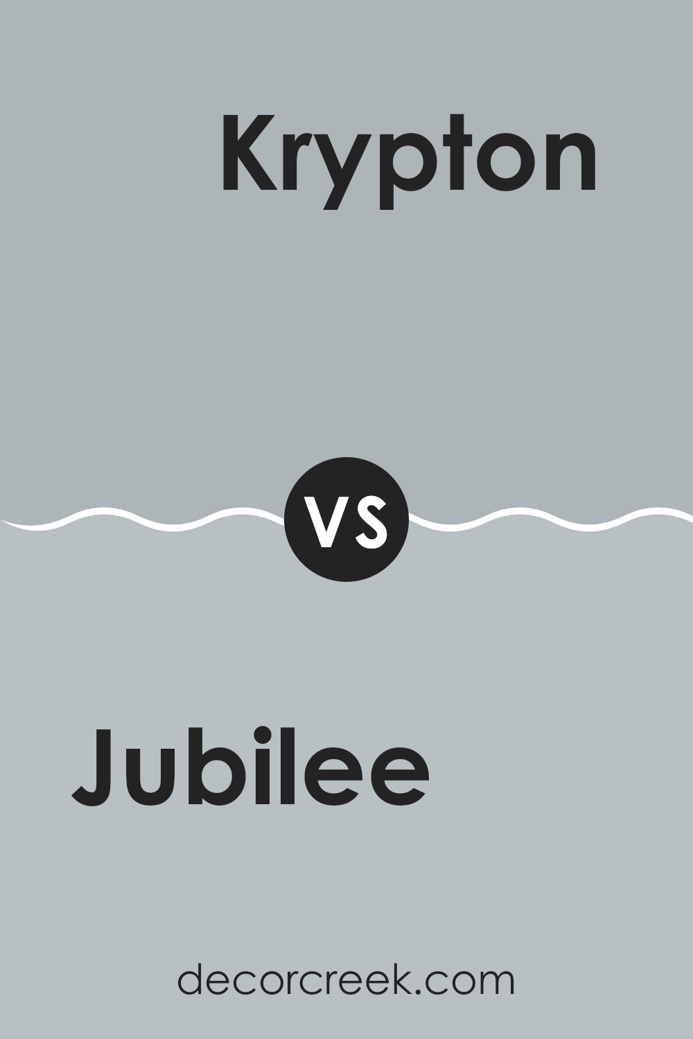
Jubilee SW 6248 by Sherwin Williams vs Krypton SW 6247 by Sherwin Williams
Jubilee and Krypton are two shades by Sherwin Williams that differ subtly but noticeably. Jubilee is a deeper gray color that might remind you of a stormy sky.
It has a hint of navy blue, which adds some depth and makes it a good choice for creating a cozy or moody atmosphere in a room. On the other hand, Krypton is lighter and leans toward a soft, silvery blue-gray.
It has a more airy feel, great for making smaller rooms appear larger or for areas where you want a fresh, calm vibe. Both colors are neutral and flexible, working well in various decor styles, but Jubilee offers a bolder statement while Krypton keeps things light and breezy.
You can see recommended paint color below:
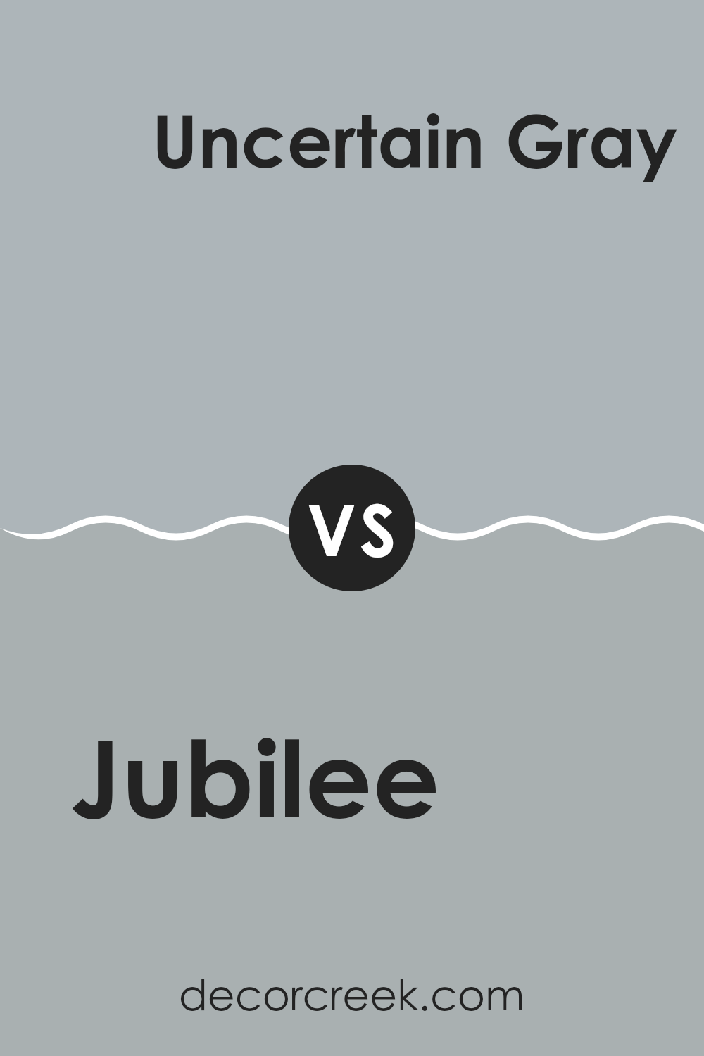
Jubilee SW 6248 by Sherwin Williams vs Uncertain Gray SW 6234 by Sherwin Williams
Jubilee and Uncertain Gray by Sherwin Williams are two distinct shades that offer different vibes for room decor. Jubilee is a deeper, more intense color, tending toward a navy tone. This makes it a great choice if you want a strong presence and maybe a bit of a mysterious feel in your room. It pairs well with bright accents and can make large rooms feel cozier.
On the other hand, Uncertain Gray is lighter and leans toward a softer, subtler gray with hints of blue. It’s quite flexible and can be a good fit for any room, giving off a relaxed and calm atmosphere. This color works well in rooms that get a lot of natural light, as it can help make the area feel more open and airy.
In contrast, Jubilee might be preferable for creating a bold statement or a focal point in a room, while Uncertain Gray could be better for overall coverage in various types of living areas.
You can see recommended paint color below:
- SW 6234 Uncertain Gray
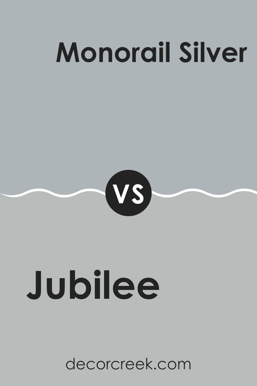
Jubilee SW 6248 by Sherwin Williams vs Monorail Silver SW 7663 by Sherwin Williams
Jubilee and Monorail Silver, both from Sherwin Williams, offer unique shades for different decorating styles. Jubilee is a subtle, soft gray with a hint of blue, making it ideal for creating a calm, cozy atmosphere in rooms like bedrooms or living areas. Its light undertone ensures it pairs well with both bright and muted colors, adding a gentle, fresh look to any room.
On the other hand, Monorail Silver is a deeper, more pronounced gray that leans toward a cool, metallic tone. This color is perfect for modern settings or when you want to give a room a more defined, striking appearance. It works exceptionally well in kitchens, bathrooms, and minimalist interiors, offering a sleek, contemporary feel.
Both colors reflect light differently, with Jubilee providing a lighter, airier feel, while Monorail Silver offers a bolder, more dramatic effect. Depending on the mood you want to create and the light in your rooms, either can be a great choice, contributing to the overall character of your interior.
You can see recommended paint color below:
- SW 7663 Monorail Silver
Jubilee SW 6248 by Sherwin Williams vs Lakeside SW 9683 by Sherwin Williams
Jubilee and Lakeside are two distinctive shades that carry their own unique character. Jubilee is a deep, smoky blue with a hint of gray, making it perfect for creating a cozy and calming atmosphere in rooms like bedrooms or living rooms. It pairs beautifully with soft whites and natural wood tones, giving a grounded and peaceful feel.
Lakeside, on the other hand, is a vibrant teal that leans toward a light, refreshing blue. This color is more energetic and is great for adding a pop of brightness to areas like bathrooms or kitchens. It works well with crisp whites and can make rooms appear livelier and more inviting.
Both colors offer a way to refresh your home, but Jubilee leans toward a more muted, subtle look, while Lakeside brings a cheerful and bright energy to the room.
You can see recommended paint color below:
- SW 9683 Lakeside
Jubilee SW 6248 by Sherwin Williams vs Stardew SW 9138 by Sherwin Williams
Jubilee and Stardew are two unique shades offered by Sherwin Williams that each bring their own distinct vibe to a room. Jubilee is a darker blue-gray color that gives off a steady, calm feeling, making it great for creating a cozy and stable environment.
On the other hand, Stardew is a lighter, dusty blue that has a fresh and airy quality, perfect for brightening up a room and giving it a more open feel. While both colors share a blue base, Jubilee leans more toward gray, providing a more muted and neutral background that’s adaptable for many settings.
Stardew, with its lighter tone, can make smaller rooms appear larger and more welcoming. These colors work well on their own but can also complement each other nicely in a room that aims to balance depth with lightness.
You can see recommended paint color below:
Jubilee SW 6248 by Sherwin Williams vs Samovar Silver SW 6233 by Sherwin Williams
Jubilee and Samovar Silver, both by Sherwin Williams, are distinct shades that can give a room very different vibes. Jubilee is a deeper color, veering toward a subtle navy with hints of gray. It’s ideal for rooms where you want a touch of formality without going too dark, making it a solid choice for both living areas and offices.
On the other hand, Samovar Silver is much lighter, falling into the category of soft, silvery grays. It’s a great option if you’re aiming for a room that feels open and airy. This color works wonderfully in smaller rooms or areas with less natural light, as it can help make the room seem larger and more welcoming.
Both colors pair well with a wide range of décor styles and are adaptable enough to be used in various rooms. Whether you choose the darker Jubilee or the lighter Samovar Silver depends on your desired mood and the specific characteristics of the room.
You can see recommended paint color below:
- SW 6233 Samovar Silver
Jubilee SW 6248 by Sherwin Williams vs Colonial Revival Gray SW 2832 by Sherwin Williams
Jubilee and Colonial Revival Gray are two distinct colors by Sherwin Williams that offer subtle yet different effects in a room. Jubilee is a deep, muted blue with a grayish tone, making it adaptable enough to work well in various settings, from kitchens to bedrooms. It creates a calm, soothing atmosphere while still providing enough depth to make a strong visual impression.
On the other hand, Colonial Revival Gray leans more toward a classic gray with a soft, warm undertone. This color is perfect for those looking to create a cozy and inviting environment. It’s lighter than Jubilee, providing a gentle backdrop that pairs easily with a wide range of decor styles and colors.
When used together, these colors can complement each other beautifully, offering a balanced contrast that enhances the overall look of a room. While Jubilee brings depth and focus, Colonial Revival Gray softens the room, creating an inviting and comfortable atmosphere.
You can see recommended paint color below:
- SW 2832 Colonial Revival Gray
Jubilee SW 6248 by Sherwin Williams vs Online SW 7072 by Sherwin Williams
“Jubilee” and “Online” are two paint colors by Sherwin Williams that each bring their own unique vibe to a room. “Jubilee” is a deep, smoky blue with hints of gray, giving it a calm and steady presence. This color works really well in areas where you want a soothing and grounding atmosphere, like bedrooms or cozy reading nooks.
On the other hand, “Online” leans more toward a cooler, medium gray tone with hints of blue. It’s a flexible shade that fits nicely in modern rooms or offices, offering a clean and crisp backdrop that pairs well with a wide range of decor elements. This color can make smaller rooms appear more spacious and reflective.
Overall, while both colors have blue and gray elements, “Jubilee” offers a darker, more muted feel ideal for warm, intimate settings. In contrast, “Online” provides a lighter, brighter look, great for creating a fresh and open environment.
You can see recommended paint color below:
After getting to know SW 6248 Jubilee by Sherwin Williams, I can definitely say it’s a great paint color. It’s a light grayish-blue shade that is calm and pleasant, much like a quiet day at the beach. It works really well in almost any room, whether it’s your bedroom where you sleep or your living room where you relax and watch TV.
Using Jubilee on the walls makes the room feel fresh and clean, kind of like when you open the windows on a sunny day. It’s not too dark or too light, which is nice because it won’t make your room feel too small or too large, but just right. Plus, it is easy to pair with lots of different colors for furniture and decorations, whether you love reds, yellows, or even more blues.
Whether you live in a house that’s big or small, or if you just want to make your home look nicer, Jubilee is a solid choice because it’s simple but still very attractive. It’s the kind of color that can make you feel happy and calm when you walk into the room. I’m glad I learned about this color because now I have a great option for the next time I want to refresh a room in my house!
decorcreek.com
Ever wished paint sampling was as easy as sticking a sticker? Guess what? Now it is! Discover Samplize's unique Peel & Stick samples.
Get paint samples

