Choosing the right paint color for your home can be a daunting task, but if you’re considering SW 7008 Alabaster by Sherwin Williams, you’re on a promising path. As someone who knows the challenges of picking the perfect hue, I’m here to help you understand what makes Alabaster a popular choice. This warm, creamy white offers a soft ambiance without the starkness that some whites have. It’s particularly adaptable, blending well with various decor styles and color palettes, making it an excellent choice for any room.
From the freshness it brings to kitchens and living rooms, to the soothing environment it creates in bedrooms, Alabaster adjusts to its surroundings beautifully. Whether you have a house full of bold colors or neutral tones, it complements them effortlessly.
As we go on, I’ll guide you through the practical considerations, like lighting and finishes, to ensure Alabaster works perfectly in your setting.
With these insights, you’ll feel more confident in your decision to go with Alabaster for a calm and welcoming atmosphere.
Is Alabaster SW 7008 Right for My Home?
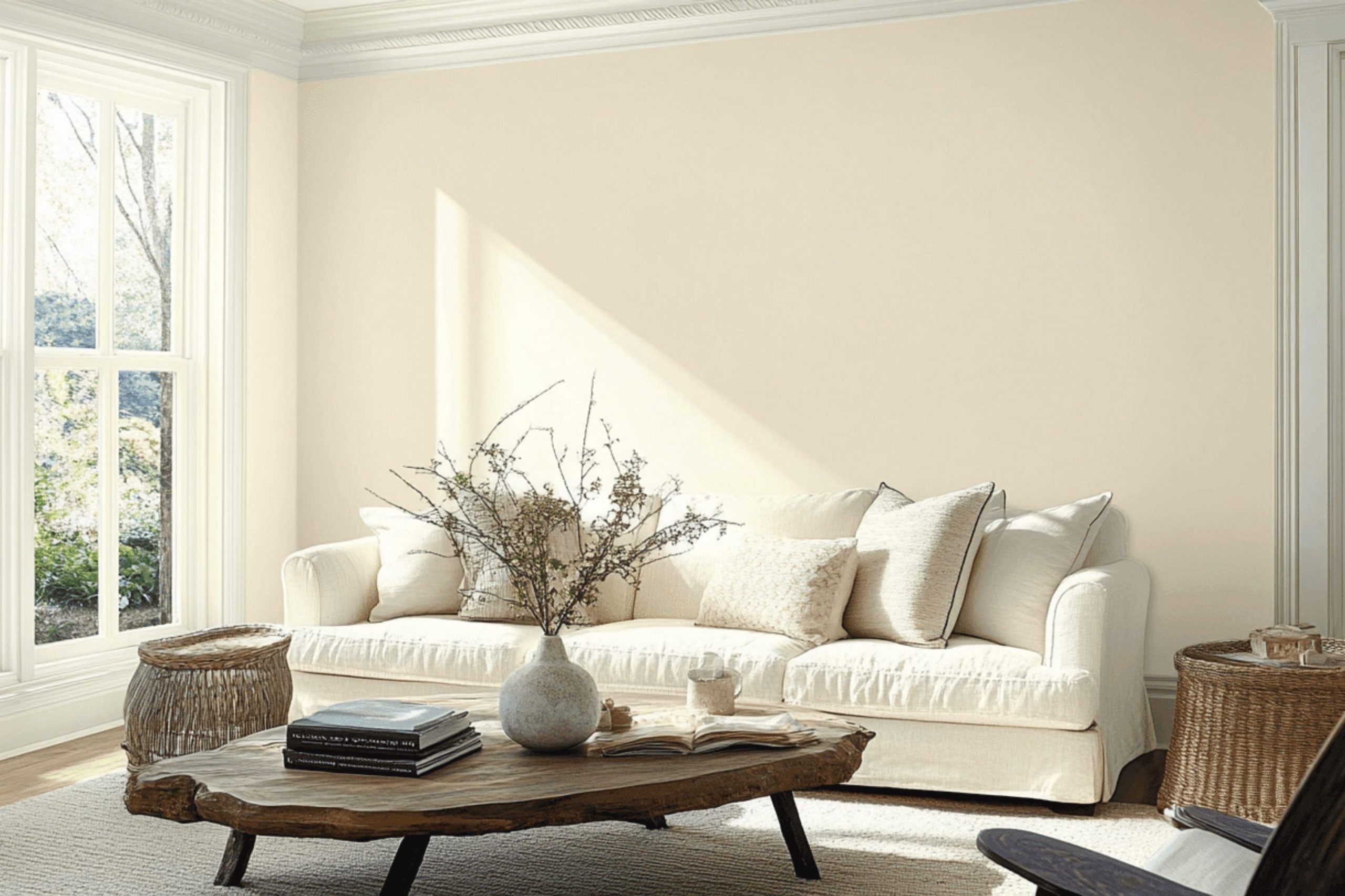
I recently came across a beautiful paint color called Alabaster by Sherwin Williams. It’s a soft, creamy white that isn’t stark or cold; rather, it has a warm, inviting tone. It’s like the gentlest hint of ivory, which makes it very flexible and easy to use in many different home styles.
In my experience, Alabaster works wonderfully in areas that aim for a relaxed and cozy atmosphere, such as modern farmhouse, minimalist, and even traditional interiors. I’ve found it to be particularly effective in living rooms and bedrooms where a gentle backdrop encourages relaxation and comfort.
This color looks amazing when paired with natural materials like wood and stone. In my living room, I paired Alabaster walls with oak flooring and a stone fireplace, which really brought the room together, giving it a cohesive and warm feel. Textures like linen or cotton in neutral tones also match beautifully, enhancing that soft, cozy vibe.
Additionally, this shade of white allows me to play around with different accent colors. I personally love adding splashes of navy or soft sage for a bit of contrast. It definitely helps in creating an interior that feels welcoming and lived-in. Overall, choosing Alabaster has made my home feel more connected to my personal style.

What are the right undertones of Alabaster SW 7008 ?
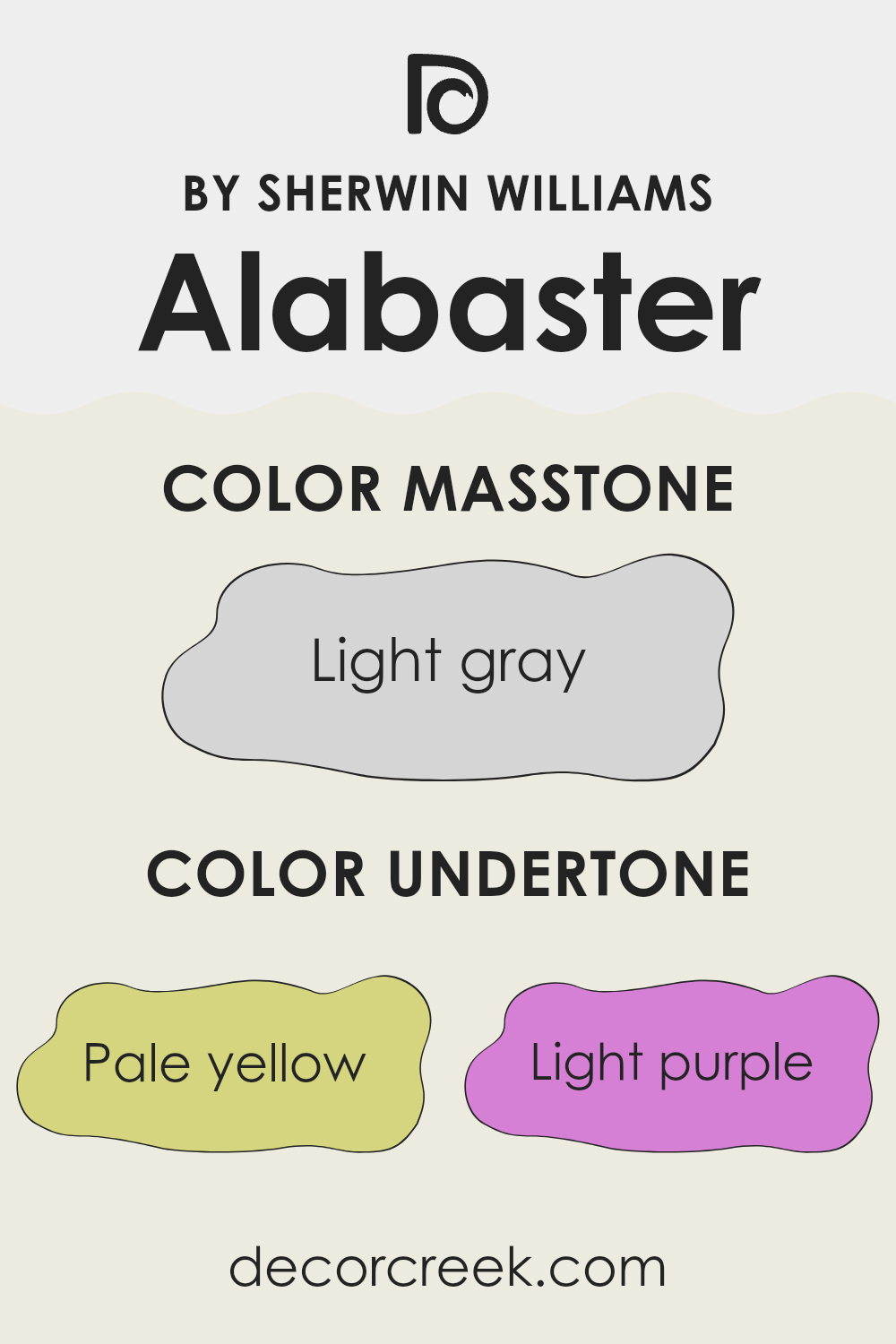
Alabaster is a popular paint color known for its soft, warm quality that makes interior rooms feel inviting and cozy. The unique undertones of this color greatly influence how it is perceived in different lighting and surroundings. With undertones including pale yellow, light purple, light blue, pale pink, mint, lilac, and gray, Alabaster offers a complex visual experience that can subtly shift depending on the environment.
For instance, the pale yellow undertone adds a soft warmth, making a room feel more welcoming. The light blue and mint undertones bring a sense of freshness, almost giving a breathable quality to the interior. Light purple and lilac add a hint of coolness, which can help balance the warmth in brightly lit areas. The pale pink undertone gives a gentle, soothing touch, while the gray undertone provides a neutral base, helping the color stay grounded without becoming too vibrant.
When applied to interior walls, these undertones mingle to affect the overall ambiance of a room. In natural daylight, the warmer undertones might be more noticeable, making the area feel lighter and airy. In artificial lighting, the cooler undertones could become more apparent, adding a subtle depth to the surroundings.
Understanding the impact of these undertones can help in selecting decor and accents that either complement or contrast with the walls, depending on the desired effect. Overall, Alabaster’s complex undertone mix allows it to adjust beautifully across various settings, enhancing the overall aesthetic of a home.
Best Coordinating Colors to use with Alabaster SW 7008 by Sherwin Williams this year.
Coordinating colors are shades that complement a primary color, enhancing the overall look of a room without overpowering it. For example, when you have a neutral base like a light creamy shade, adding coordinating colors can bring warmth and depth to your design. These coordinating shades work by balancing out the primary color with their tones, either by being on the opposite end of the color wheel for a vibrant contrast or close to the primary color for a subtle and harmonious look.
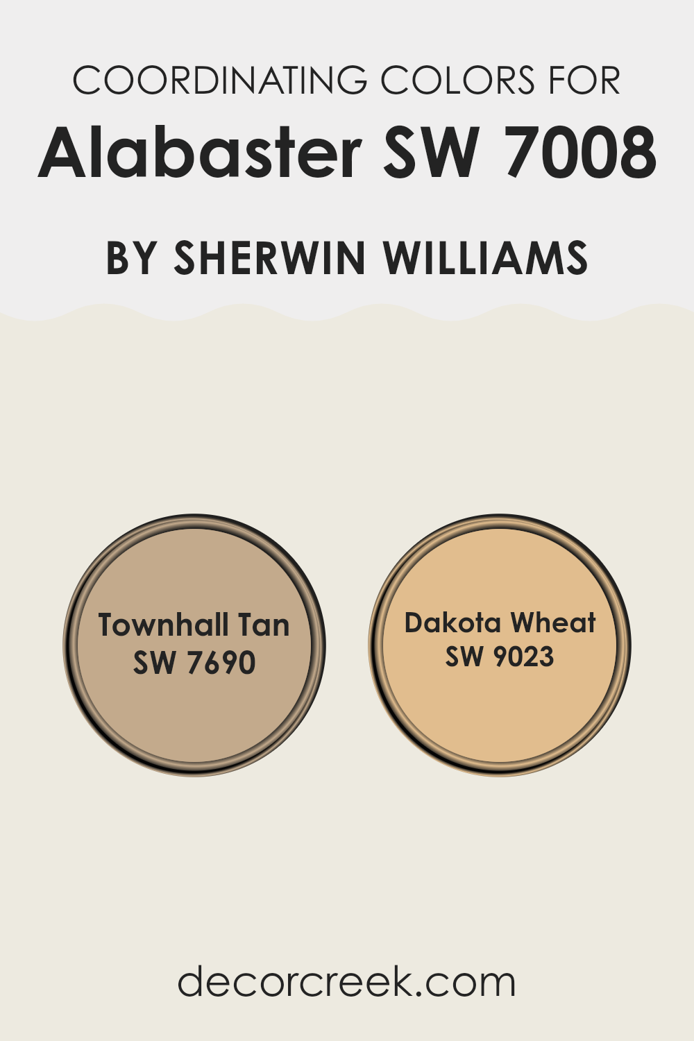
For the color Alabaster by Sherwin Williams, two beautiful coordinating colors are SW 7690 – Townhall Tan and SW 9023 – Dakota Wheat. Townhall Tan is a warm beige with slight reddish undertones, perfect for creating a cozy and inviting environment. It pairs beautifully with the softness of Alabaster to give any room a grounded, earthy feel.
On the other hand, Dakota Wheat has a golden hue that offers a sunny, cheerful complement to the cooler tones of Alabaster. It helps to create a light and airy feel in any room, while adding just the right amount of warmth to the surroundings. These complementary shades work together seamlessly to enhance the beauty and balance in your decor.
You can see recommended paint colors below:
Trendy Trim Colors of Alabaster SW 7008 by Sherwin Williams to use this year.
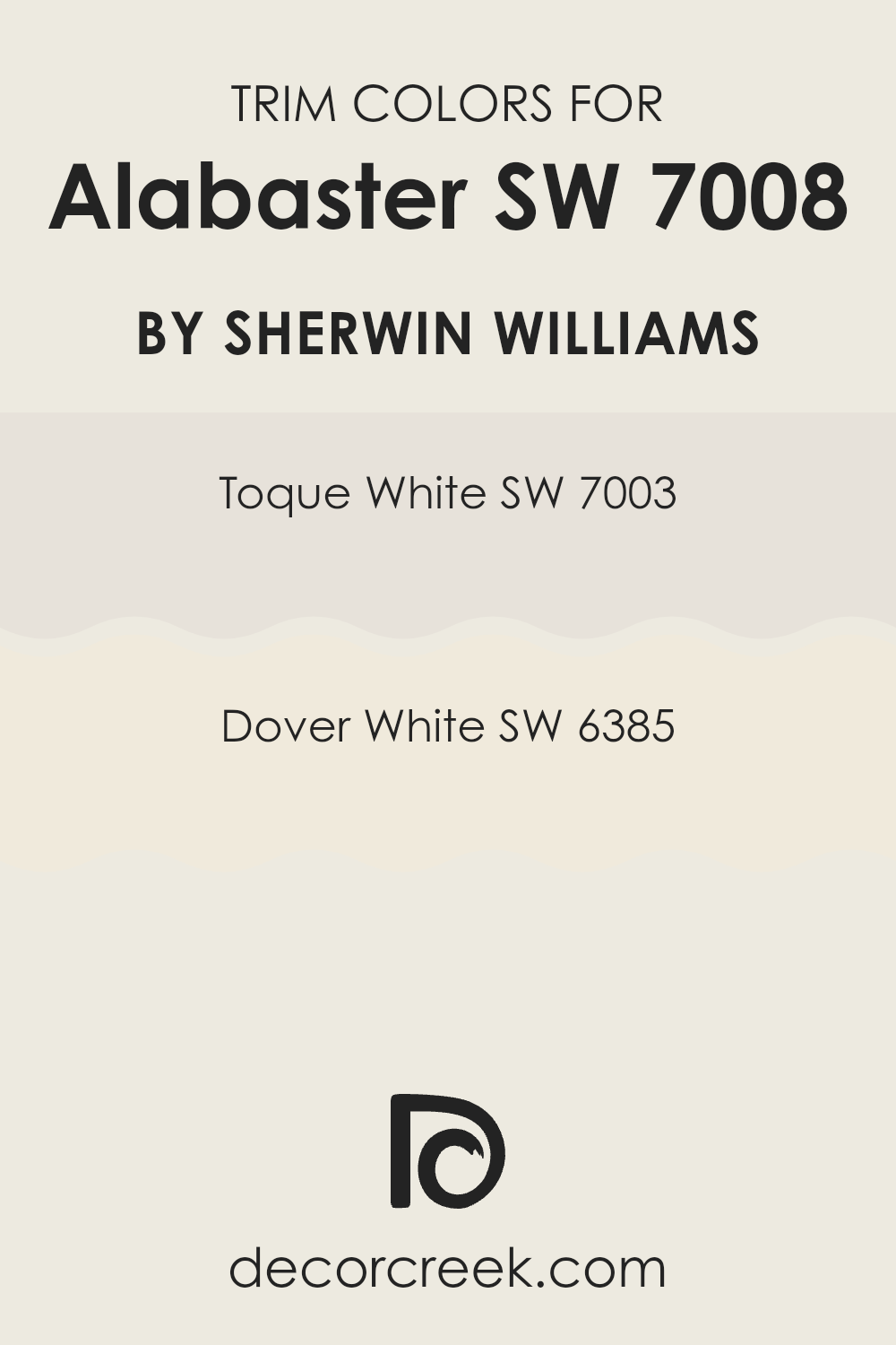
Trim colors, such as SW 7003 – Toque White and SW 6385 – Dover White, serve a vital role in home decoration by framing and highlighting the features of a main wall color, like Alabaster by Sherwin Williams.
Trim colors are applied to moldings, door frames, window frames, and baseboards. They create visual boundaries that enhance architectural details, making the walls pop and giving the room a finished look. When used effectively, the right trim color can highlight the beauty of the main wall color and bring a cohesive feel to the interior.
For instance, SW 7003 – Toque White is a subtly warm white that offers a gentle contrast against the soft creamy hue of Alabaster. This color is ideal for creating a smooth transition between the walls and trim, lending a discreet outline without overpowering the main color. On the other hand, SW 6385 – Dover White has a slightly creamier base, providing a stronger contrast that elegantly frames Alabaster, adding depth and interest to the room. This approach allows each element within the interior to stand out, contributing to an overall harmonized look.
You can see recommended paint colors below:
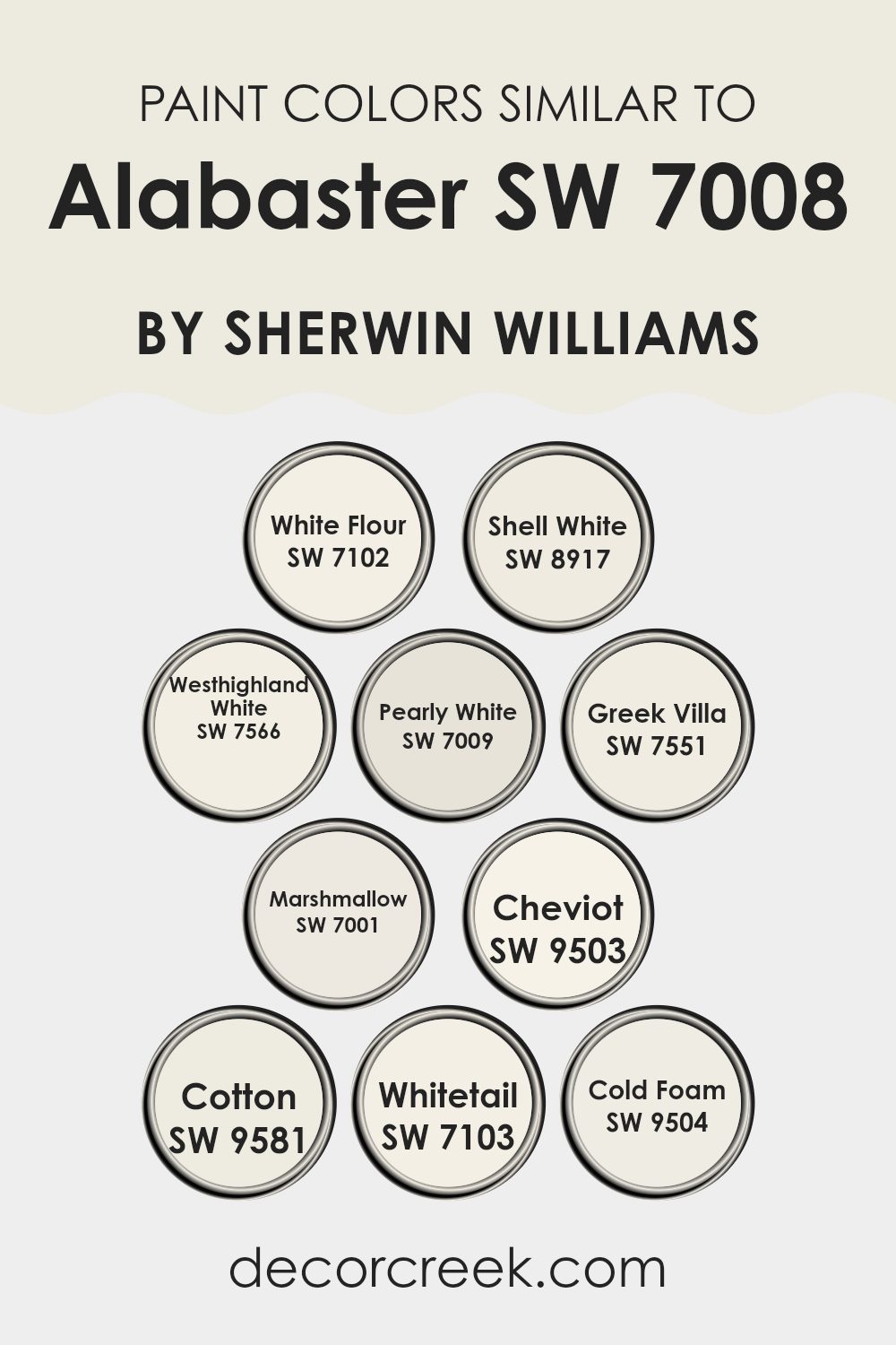
Evergreen Colors Similar to Alabaster SW 7008 by Sherwin Williams
Similar colors play a crucial role in design, offering subtle nuances that help to create a cohesive and harmonious environment. Colors like Alabaster and its similar counterparts work effectively together by providing slight variations in hue and saturation that can enhance the overall aesthetic without creating a jarring contrast. These variations allow for an interior to feel unified and fluid, giving an elegant and understated look that is pleasing to the eye.
For example, White Flour is a soft white that has a hint of creaminess, making it an excellent choice for a warm and welcoming interior. Shell White leans slightly towards a beige tone, offering a warmer alternative that still maintains a clean look. Westhighland White is a bright yet warm white, which makes it adaptable for interiors that aim to be both inviting and airy. Pearly White has a subtle pearl-like finish that adds a gentle refinement to any room.
Greek Villa presents as a slightly off-white with warm undertones, ideal for those looking for something between pure white and cream. Meanwhile, Marshmallow is as close to pure white as you can get, providing a crisp freshness to any design. Cheviot introduces a chalky softness into the mix, perfect for achieving a more relaxed atmosphere. Cotton is another clean and pure white, which works superbly in modern interiors.
Whitetail offers a clean, snow-white that reflects a lot of light, making rooms appear larger. Lastly, Cold Foam brings in a touch of gray to its white, making it excellent for contemporary interiors that demand a sharp, modern look. Each of these colors, while remaining in the same family, provides a unique touch that can subtly alter the mood and style of a room, proving that even the smallest change in hue or saturation can have a significant impact on design aesthetics.
You can see recommended paint colors below:
- SW 7102 White Flour
- SW 8917 Shell White
- SW 7566 Westhighland White
- SW 7009 Pearly White
- SW 7551 Greek Villa
- SW 7001 Marshmallow
- SW 9503 Cheviot
- SW 9581 Cotton
- SW 7103 Whitetail
- SW 9504 Cold Foam
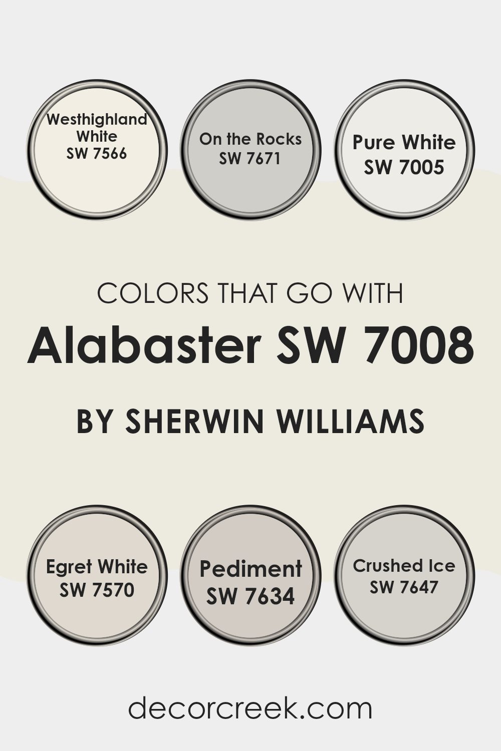
Colors that Go With Alabaster SW 7008 by Sherwin Williams
Choosing the right combination of colors to pair with Alabaster SW 7008 by Sherwin Williams can strongly influence the feel and aesthetics of a room. Since Alabaster is a warm, soft white, it serves as a perfect backdrop for both neutral tones and more pronounced colors, allowing for a seamless blend throughout your interior.
Colors like Westhighland White SW 7566 provide a slightly creamier tone that complements Alabaster by enhancing its warmth without overpowering it. On the Rocks SW 7671, on the other hand, introduces a subtle gray that can add depth and contrast to rooms that are dominated by softer, white hues. Another great match is Pure White SW 7005, which is a clean and neutral white that can brighten and open up a room, working harmoniously beside Alabaster for a pure and fresh look.
Then, there’s Egret White SW 7570, offering a touch of beige, perfect for creating a cozy and inviting environment when used with Alabaster. Pediment SW 7634 leans into a gentle taupe, bringing in a hint of earthiness that grounds the airy Alabaster, making the room feel stable and welcoming. Lastly, Crushed Ice SW 7647 has a cool undertone that gives a calming contrast to the warm white of Alabaster, making it ideal for achieving a balanced decor.
You can see recommended paint colors below:
- SW 7566 Westhighland White
- SW 7671 On the Rocks
- SW 7005 Pure White
- SW 7570 Egret White
- SW 7634 Pediment
- SW 7647 Crushed Ice
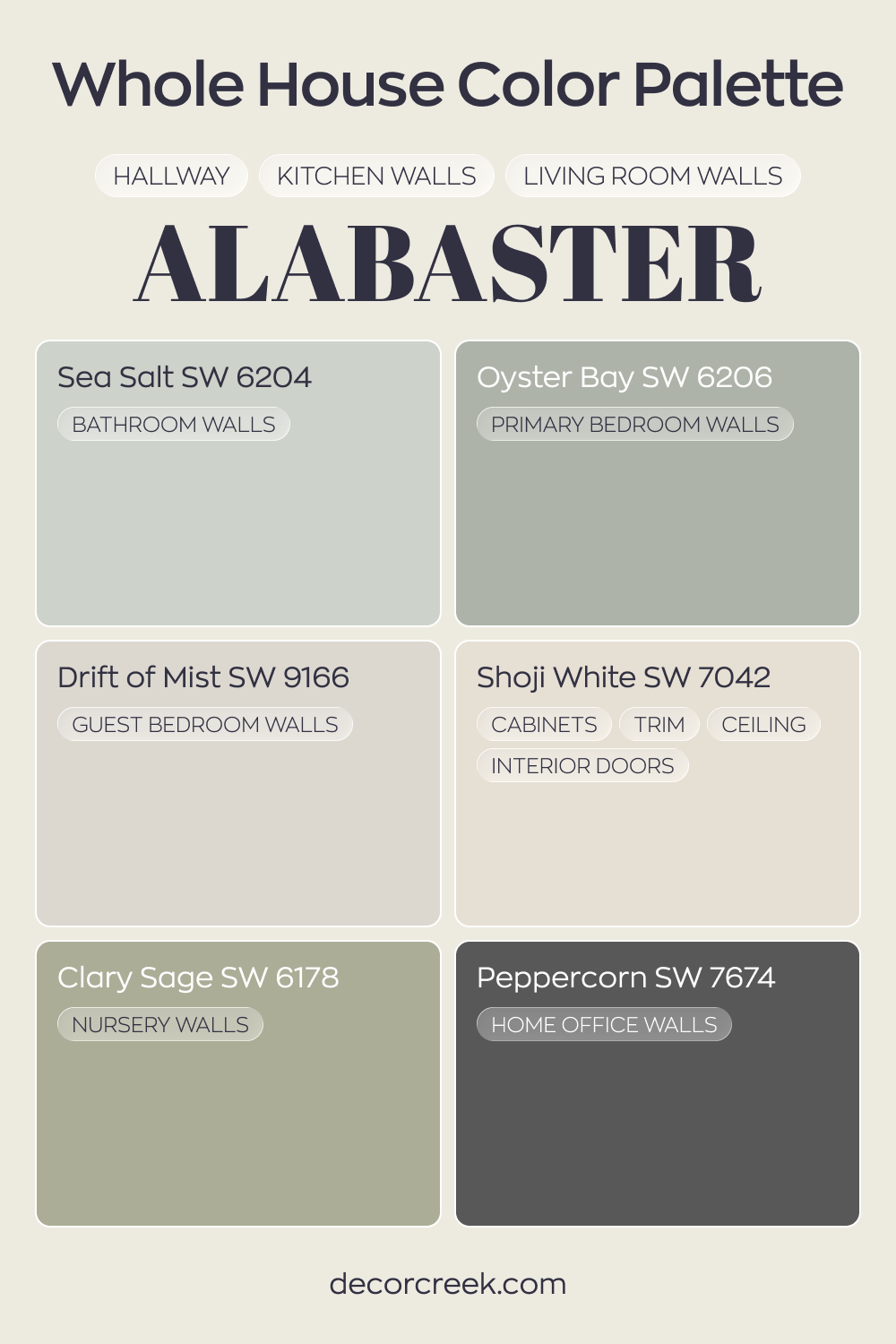
Whole House Paint Color Palette Designed Around Alabaster SW 7008
Alabaster SW 7008 flows through the hallway, kitchen, and living room with a soft creamy glow. Shoji White on cabinets, trim, ceilings, and interior doors keeps everything crisp while staying in the same warm family. The result feels bright and cohesive from the moment you walk in.
Sea Salt in the bathroom and Oyster Bay in the primary bedroom introduce gentle green-blue tones that pair beautifully with Alabaster.
Drift of Mist in the guest bedroom keeps the palette light and airy. Clary Sage in the nursery adds a fresh botanical note that builds on the soft greens.
Peppercorn in the house office grounds the entire design with rich contrast. The deeper shade adds strength and balance to the lighter, nature-inspired tones throughout the house.
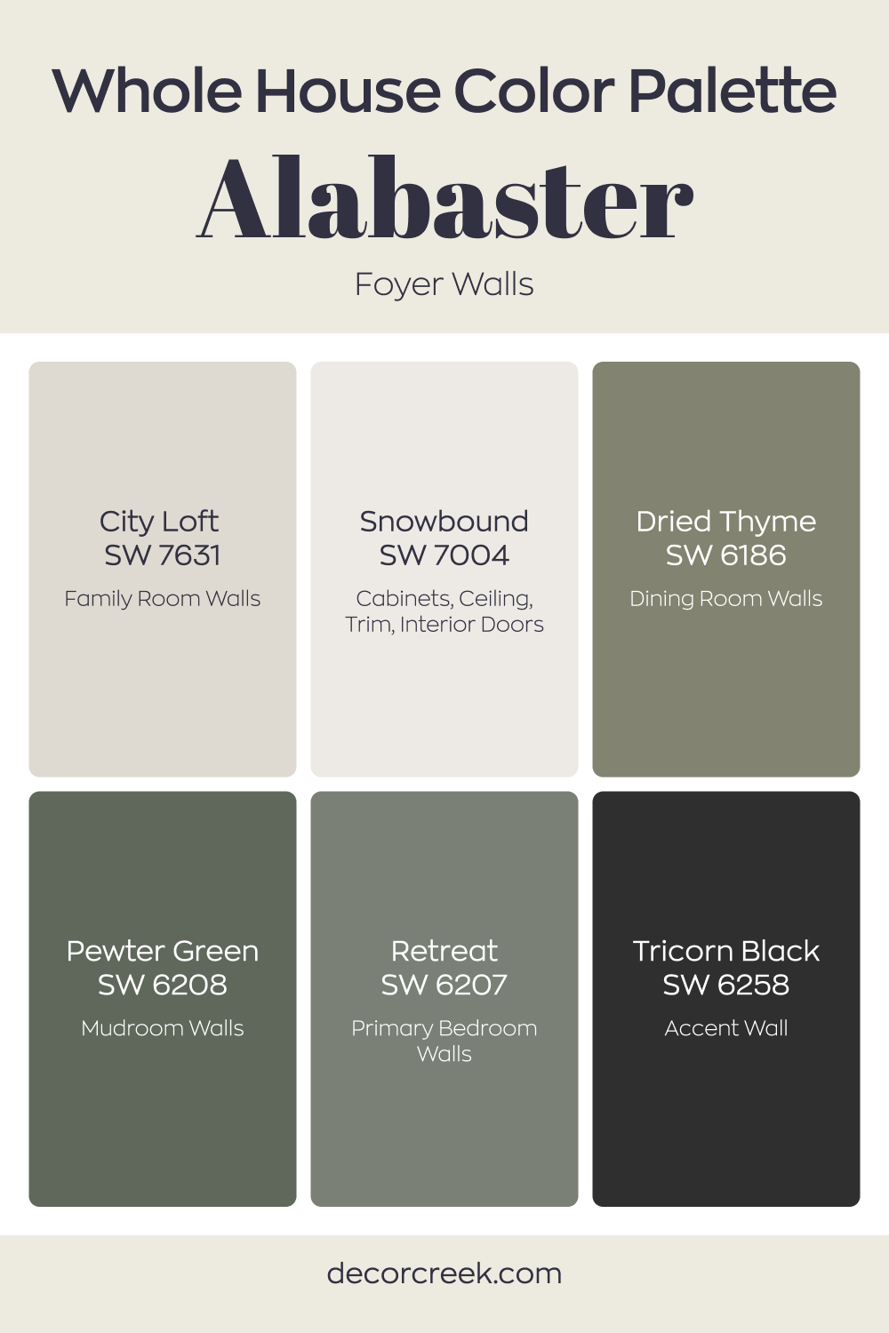
Whole House Paint Color Palette Centered On Alabaster SW 7008
Alabaster SW 7008 sets a soft, welcoming tone on the foyer walls, creating a bright first impression. Snowbound on cabinets, trim, ceilings, and interior doors keeps the look crisp and clean while staying in the same white family. The pairing feels light, fresh, and beautifully cohesive from the start.
City Loft in the family room introduces a gentle greige contrast that blends smoothly with Alabaster. Dried Thyme in the dining room and Pewter Green in the mudroom bring earthy green depth, adding richness without feeling heavy. These tones layer natural warmth throughout the house.
Retreat in the primary bedroom deepens the green story with a grounded, restful feel. Tricorn Black on an accent wall adds bold definition and sharp contrast. Together, the palette balances soft whites, muted greens, and strong dark accents for a connected whole-house design.
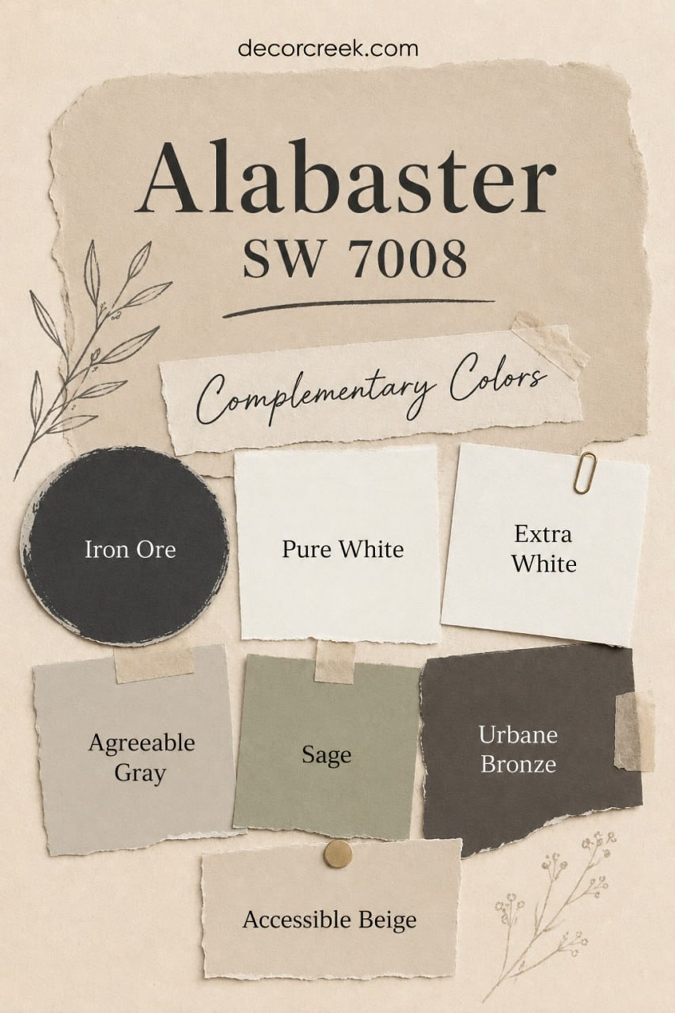
Best Complementary Colors for Alabaster SW 7008
Alabaster SW 7008 looks soft, warm, and welcoming, so I always like pairing it with shades that keep that calm feeling while adding depth to the room. For a crisp and clean contrast, Pure White and Extra White work beautifully on trim, ceilings, and doors.
If you want a richer and more dramatic look, Iron Ore and Urbane Bronze create a stunning balance against the creamy warmth of Alabaster.
For a softer and more natural palette, I often combine it with Agreeable Gray, Accessible Beige, and muted green tones like Sage.
These colors help Alabaster feel layered, cozy, and timeless without making the space feel heavy. Together, they create a palette that works beautifully in modern, farmhouse, transitional, and classic homes.
Alabaster SW 7008 by Sherwin Williams vs Marshmallow SW 7001 by Sherwin Williams
Alabaster and Marshmallow are two popular white colors by Sherwin Williams, each offering a unique vibe. Alabaster has a warm, soft quality that makes it feel cozy and inviting, great for any room that aims for a comfortable, welcoming atmosphere.
It has subtle creamy undertones that prevent it from feeling too stark. On the other hand, Marshmallow is slightly cooler compared to Alabaster. It’s still a very soft white but leans toward a purer white with a neutral base, making it a more flexible option that can easily match with various decor styles and colors.
Both colors are light and airy, perfect for making small rooms appear bigger and brighter. While Alabaster adds warmth, Marshmallow offers a more neutral, clean backdrop, suitable for contemporary interiors.
You can see recommended paint color below:
Alabaster SW 7008 by Sherwin Williams vs Pearly White SW 7009 by Sherwin Williams
Alabaster and Pearly White are two shades by Sherwin Williams that may look similar at first glance but have subtle differences. Alabaster is a soft, warm white with a creamy texture that feels cozy and inviting in most rooms.
Its warmth makes it great for interiors that need a touch of coziness without feeling too stark. In contrast, Pearly White leans slightly toward a cooler tone, with hints of gray that give it a fresher, crisper appearance.
This color works well in areas that get a lot of natural light, as it reflects the light beautifully, enhancing the room’s openness and brightness. While Alabaster offers a hint of warmth, Pearly White provides a clean and fresh backdrop, making both colors flexible for different settings and preferences.
You can see recommended paint color below:
Alabaster SW 7008 by Sherwin Williams vs White Flour SW 7102 by Sherwin Williams
Both Alabaster and White Flour from Sherwin Williams are popular choices for a light, neutral paint. Alabaster has a warm, slightly creamy tone, making it great for adding a gentle, welcoming feel to a room. It can soften the sharp edges and bright lights in a room without feeling too intense with color.
On the other hand, White Flour is a cleaner white, with just a hint of softness, which prevents it from feeling too stark. It’s excellent for areas where you want a bright and airy feel, as it reflects more light, making rooms appear larger and more open.
When comparing these two, the choice often comes down to the mood and size of your room. Alabaster works well in rooms where you want a cozy, slightly warmer atmosphere. White Flour is better for creating a clear, crisp backdrop, particularly in modern settings or smaller rooms that you want to feel more expansive. Both colors are highly adaptable, but the selection might hinge on the specific aesthetic and functional needs of the room.
You can see recommended paint color below:
Alabaster SW 7008 by Sherwin Williams vs Shell White SW 8917 by Sherwin Williams
Alabaster and Shell White are both popular paint colors from Sherwin Williams, but they offer different vibes. Alabaster is a warm neutral with a slightly creamy feel, making it cozy and inviting.
It works well in rooms where you want a soft backdrop that complements various decor styles and colors. Shell White, on the other hand, is cooler and clearer compared to Alabaster. It’s closer to pure white, giving a fresher, cleaner look.
This makes it excellent for modern interiors or areas where you want to create more light and openness. Essentially, if you’re looking for a hint of warmth, Alabaster is the go-to, while Shell White is ideal for a crisp, clean aesthetic. Both are flexible choices, but the decision depends on the mood you want to set in your room.
You can see recommended paint color below:
Alabaster SW 7008 by Sherwin Williams vs Westhighland White SW 7566 by Sherwin Williams
Alabaster and Westhighland White by Sherwin Williams are both popular shades of white, but they have subtle differences. Alabaster has a warm, soft tone with a hint of beige, making it a cozy and inviting color.
It’s a great choice for living areas and bedrooms where you want a comforting atmosphere. On the other hand, Westhighland White is cooler compared to Alabaster and contains more gray undertones. This color is crisper and gives a cleaner look, perfect for modern interiors or highlighting trim and other architectural details.
Both shades are flexible and blend well with other colors, but your choice between them would depend on the feeling you want to create in your room and the lighting conditions. Alabaster works well in rooms with less natural light, whereas Westhighland White is ideal for brighter rooms.
You can see recommended paint color below:
Alabaster SW 7008 by Sherwin Williams vs Cold Foam SW 9504 by Sherwin Williams
Alabaster and Cold Foam are two distinct shades offered by Sherwin Williams. Alabaster is a warm, creamy white, often favored for creating a welcoming and cozy feel in a room.
It has a slight hint of yellow, which makes it a great choice for rooms that need a soft, inviting atmosphere. On the other hand, Cold Foam is cooler and has a crisp, clean look.
It leans toward a pale gray rather than a pure stark white, making it ideal for modern interiors that require a subtle touch of color without overpowering the senses. When compared, Alabaster brings warmth to a room, while Cold Foam offers a fresher, more neutral backdrop. Depending on your room’s lighting and style, you might choose Alabaster for a softer, warmer effect or Cold Foam for a sleek, minimalist vibe.
You can see recommended paint color below:
Alabaster SW 7008 by Sherwin Williams vs Cheviot SW 9503 by Sherwin Williams
Alabaster and Cheviot by Sherwin Williams are two distinctive shades that each bring their own unique vibe to a room. Alabaster is a soft, creamy white that’s perfect for creating a light and airy feel in an interior. It has a warm undertone that makes it feel cozy and inviting, ideal for living rooms and bedrooms where you want a calming atmosphere.
Cheviot, on the other hand, is a deeper, grayish beige that offers a more grounded look. It’s a flexible color that pairs well with a wide range of decor styles, especially in rooms that aim for a more modern and minimal feel. It can also help in making large rooms feel more composed and smaller rooms appear more open because of its mid-tone quality.
Both colors are quite neutral, but while Alabaster leans toward a lighter, more luminous finish, Cheviot provides a stronger statement with its rich, earthy quality. Depending on what mood or style you’re going for, either color could be the perfect choice.
You can see recommended paint color below:
Alabaster SW 7008 by Sherwin Williams vs Cotton SW 9581 by Sherwin Williams
Alabaster and Cotton, both by Sherwin Williams, are two shades of white with subtle differences. Alabaster has a warm, creamy tone that offers a soft and inviting feel to any room. It’s perfect for interiors where you want a cozy, welcoming atmosphere. On the other hand, Cotton is a cooler white, almost giving off a crisp, clean vibe. This makes it great for a more modern look or interiors that aim for a sharp, fresh ambiance.
When you compare the two, Alabaster works well in rooms that get a lot of natural light, as its creamy undertone turns more luminous. Cotton, being a cooler shade, is ideal for balancing out rooms that have a lot of bright colors or in interiors that use a lot of artificial light, making the area feel more open.
Choosing between them depends on the room’s style and the mood you want to create. Cotton will give you a more straightforward, neat look, while Alabaster adds a hint of warmth and coziness.
You can see recommended paint color below:
Alabaster SW 7008 by Sherwin Williams vs Whitetail SW 7103 by Sherwin Williams
Alabaster and Whitetail, both by Sherwin Williams, are popular neutral paint colors. Alabaster is a soft, warm white with a hint of beige, making it slightly creamier than pure white. It creates a cozy and inviting atmosphere, ideal for any room seeking a subtle warmth without overpowering the room.
On the other hand, Whitetail is brighter and purer, leaning closer to a true white. Its crisp and clean appearance gives a room a more open and light feel, making it a great choice for smaller areas or rooms that could use a little more light.
Both colors pair well with a variety of decor styles and other hues, but the choice between them depends largely on the mood and brightness you want to bring into the room. Alabaster’s slight warmth is better for a relaxed, welcoming atmosphere, while Whitetail serves well in creating a sharp, clear backdrop for bolder colors or accent pieces.
You can see recommended paint color below:
Alabaster SW 7008 by Sherwin Williams vs Greek Villa SW 7551 by Sherwin Williams
Alabaster and Greek Villa are both popular white shades from Sherwin Williams, but they have subtle differences. Alabaster has a slightly warmer tone, making it a cozy choice for rooms where you want a soft, inviting atmosphere. It has a hint of creaminess, which adds a gentle richness to its color profile, avoiding a stark or cold feel.
On the other hand, Greek Villa leans slightly cooler compared to Alabaster, though it still maintains a warm undertone, making it more adaptable and slightly brighter. This makes Greek Villa an excellent choice for brightening up a room while keeping a warm and welcoming vibe.
Both colors work well in various settings, offering a clean backdrop that allows other decor elements to stand out. However, the choice between them might come down to the specific lighting and aesthetic needs of your room, with Alabaster fitting better in settings where a softer warmth is desired and Greek Villa in environments where a crisper yet still warm backdrop is preferred.
You can see recommended paint color below:
To sum up my thoughts about SW 7008 Alabaster by Sherwin Williams, I truly believe it’s a wonderful paint color to choose. This shade of white feels like a soft blanket, giving any room a clean and cozy feel without being too bright or flashy. What’s great about Alabaster is that it works well in many different rooms. Whether it’s your living room, bedroom, or even the kitchen, it adds a gentle touch that makes everything look clean and inviting.
Alabaster also pairs well with many other colors. Whether you combine it with dark blues for a bold look or soft pinks for a gentle vibe, it holds its own and allows other colors to shine. It’s like a good companion for every other color in your home!
I’ve noticed that it makes small rooms look a bit bigger and more open too. This is really helpful if you’re trying to make the most of a smaller room. It’s easy to apply, goes on smoothly, and has a solid quality that helps it last a long time. Plus, cleaning marks off this paint is fairly easy, which is perfect if you have kids around.
So, if you’re thinking about giving your room a new look or simply want to freshen things up, Alabaster is definitely a color worth considering. It’s simple, attractive, and does a great job of making your home feel welcoming.

Ever wished paint sampling was as easy as sticking a sticker? Guess what? Now it is! Discover Samplize's unique Peel & Stick samples.
Get paint samples

