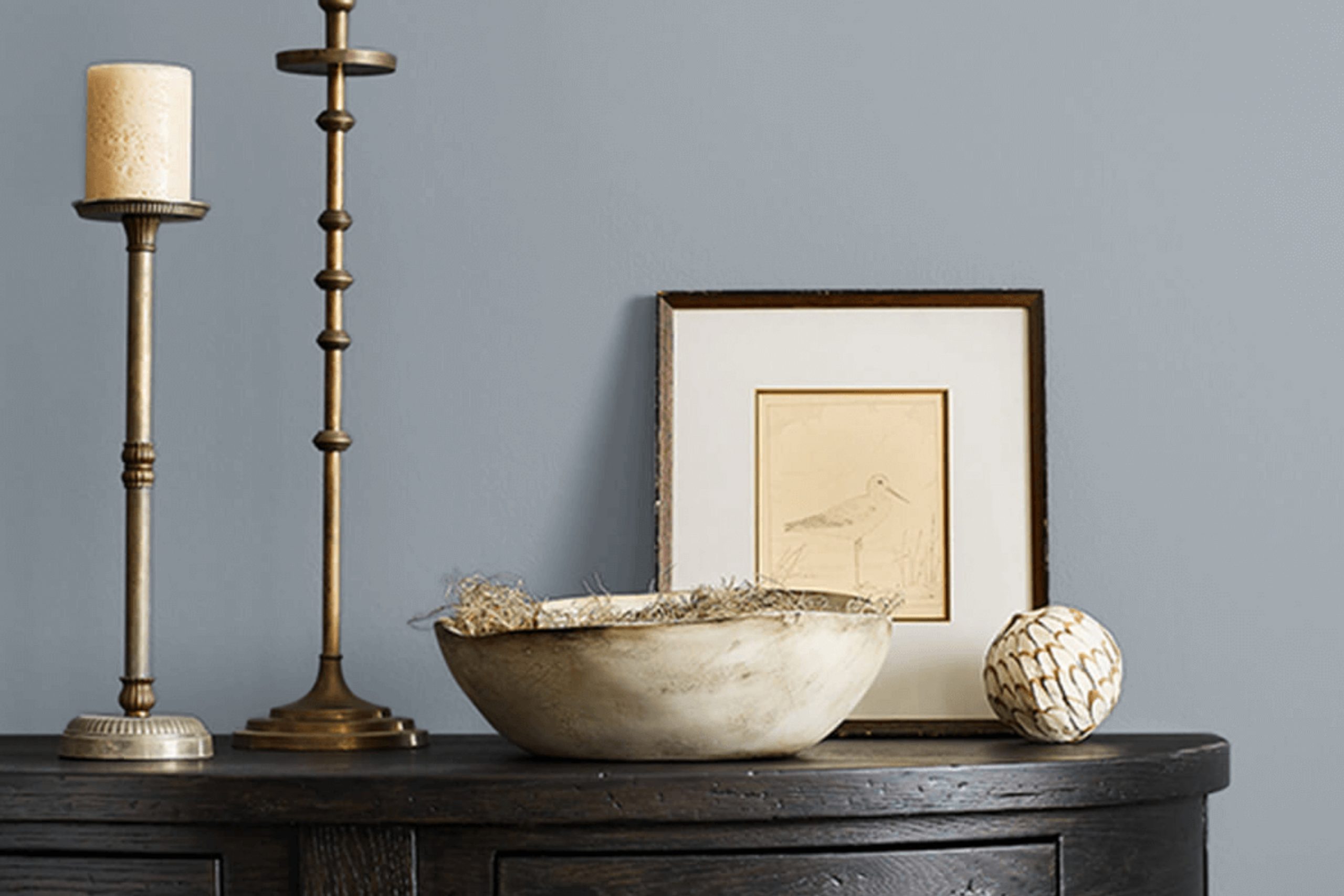
I recently stumbled upon the color SW 9152 Let it Rain by Sherwin Williams, and I found it both unique and appealing. As soon as you see it, you might notice that it blends a sense of calm with a subtle vitality.
This shade works incredibly well in spaces where you want to encourage relaxation, like bedrooms or quiet study areas. It has a way of making you feel at ease, almost as if it mirrors a gentle rainfall on a spring morning. For those looking to refresh their home’s color scheme, Let it Rain offers a breath of fresh air.
It pairs well with both dark and light furniture, making it versatile for various decorating styles. Whether your home features modern minimalism or cozy countryside elements, this color provides a beautiful backdrop. It also supports natural light beautifully, enhancing its soothing effect throughout the day.
If you’re considering a new paint color, I would recommend looking at Let it Rain for its peaceful yet resilient ambiance.
What Color Is Let it Rain SW 9152 by Sherwin Williams?
Let it Rain by Sherwin Williams is a refreshing and versatile shade of blue that carries a subtle gray undertone. This cool and calming color strikes a beautiful balance, making it suitable for various interior design styles, particularly modern, coastal, and Scandinavian decor. Such adaptability makes it a favored choice for living rooms, bathrooms, and bedrooms, where a touch of softness and calm is often desired.
This color works incredibly well with natural materials and textures. Pairing it with light woods, such as oak or maple, brings out the warmth of the wood, creating a cozy yet airy atmosphere. The coolness of the blue also complements metallic finishes like brushed silver or chrome, which can be introduced through light fixtures or furniture accents, adding a crisp, modern touch to the space.
Textiles in white or light gray create a clean and inviting look when used alongside Let it Rain. Adding fabrics like linen or cotton keeps the space feeling light and breathable, perfect for a relaxed setting. For a hint of contrast, incorporate elements in dark navy or black, which will stand out against the light blue, enhancing the overall aesthetic without overpowering it.
This color is effective in achieving a balance between comfort and aesthetic appeal in home interiors.

Is Let it Rain SW 9152 by Sherwin Williams Warm or Cool color?
Let it Rain by Sherwin Williams is a soothing blue-gray shade that offers a fresh and contemporary look to any room in the house. This color has a calming effect, making it perfect for bedrooms and bathrooms where a relaxing atmosphere is essential. It’s also versatile enough to work well in living areas and kitchens, brightening up spaces while maintaining a cozy feel.
The soft gray undertones in this paint make it quite adaptable, allowing it to blend seamlessly with various decor styles and color schemes. Whether your home features modern, minimalist furnishings or more traditional pieces, Let it Rain can complement your existing interiors beautifully.
It’s especially effective in rooms that get a lot of natural light, as the color can appear subtly different depending on the lighting conditions—ranging from a lighter, airy feel during the day to a more subdued and intimate vibe in the evening.
This color is also practical. It doesn’t show smudges or dirt easily, making it a great choice for busy households.
Its neutral yet distinct hue can help smaller spaces appear larger, adding a breath of fresh air to your home without overpowering it with bold color.
Undertones of Let it Rain SW 9152 by Sherwin Williams
“Let it Rain” by Sherwin Williams is a versatile paint color that has a mixture of underlying tones which influence how it is perceived in various environments. The undertones of a color are subtle hues that emerge under different lighting conditions or when paired with other colors. For “Let it Rain,” these undertones include shades like lilac, mint, light blue, and pale pink, among others. Each undertone plays a role in how the main color appears.
When applied to interior walls, the presence of these undertones can affect the ambiance of a room. For instance, lilac and light purple undertones bring a gentle hint of warmth which makes the space feel welcoming. Mint and light blue can give a sense of freshness, ideal for creating a calm and relaxing atmosphere.
Moreover, how these undertones react to lighting is crucial. In natural light, lighter undertones like pale yellow and light gray might make the walls appear brighter and more airy. In contrast, darker undertones like navy or dark green can make the space feel more grounded and cozy, especially in rooms with less natural light.
The effect of “Let it Rain” on your walls also depends on the room’s decor and other colors present. For example, pairing it with furnishings that complement its mint or turquoise undertones could enhance the overall aesthetic coherence, making the room look more put-together.
In sum, the various undertones of “Let it Rain” make it a highly adaptive color that can bring different moods to a room, influenced by both its surroundings and lighting conditions.

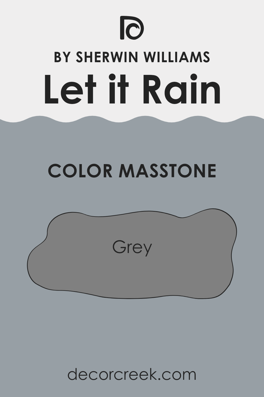
What is the Masstone of the Let it Rain SW 9152 by Sherwin Williams?
Let it Rain SW 9152 by Sherwin Williams, with a masstone of grey, brings a practical touch to any home’s interior. This neutral toned grey is quite versatile, creating a calm background that allows other colors in furniture and decor to really pop.
It’s a great choice for anyone who wants to keep their walls simple while experimenting with brighter colors through accessories like throw pillows, artwork, and curtains. Another advantage of this grey shade is that it blends smoothly with any lighting, looking steady and uniform from daylight to artificial light.
This aspect makes it an excellent choice for living rooms and bedrooms where consistent ambiance is key. The muted quality of Let it Rain also helps in hiding small wall imperfections, making it practical for busy areas in the home that might get a lot of wear and tear. All in all, this grey shade works well to support a variety of home styles without overpowering the space.
How Does Lighting Affect Let it Rain SW 9152 by Sherwin Williams?
Lighting can significantly impact the way colors appear in a room because it influences how we perceive hues and shades. Depending on the type of light—whether it’s artificial or natural—the same paint color can look different. For example, “Let it Rain” by Sherwin Williams tends to provide a versatile backdrop in various lighting conditions.
In artificial lighting, “Let it Rain” often appears slightly cooler. This means the bluish undertones of the color might become more prominent, especially under fluorescent lights that emit a bluer spectrum. This color can make spaces feel fresh and clean under such conditions, providing a calm atmosphere to areas like kitchens or bathrooms.
Natural light, on the other hand, reveals the truest color of the paint. “Let it Rain” reflects more of its base colors when illuminated by sunlight. Depending on the time of the day and the angle of the sun, this color can shift from looking soft and gentle in the morning to slightly bolder and more defined near noon.
In rooms that face north, “Let it Rain” may appear slightly darker and more muted. North-facing rooms typically get less direct sunlight, which can cause colors to look cooler and shadows to be more pronounced. In south-facing rooms, however, the color can look lighter and warmer due to the abundance of direct, bright sunlight throughout the day.
East-facing rooms receive warm, yellow light in the morning, making “Let it Rain” appear soft and warm initially, but it could turn cooler and more subdued as the day progresses. West-facing rooms experience the reverse; the color may start off cooler in the morning and become warmly lit by the evening sun, enhancing the paint’s soothing qualities.
Overall, “Let it Rain” adapts well to different lighting scenarios, making it a flexible option for various spaces and orientations.

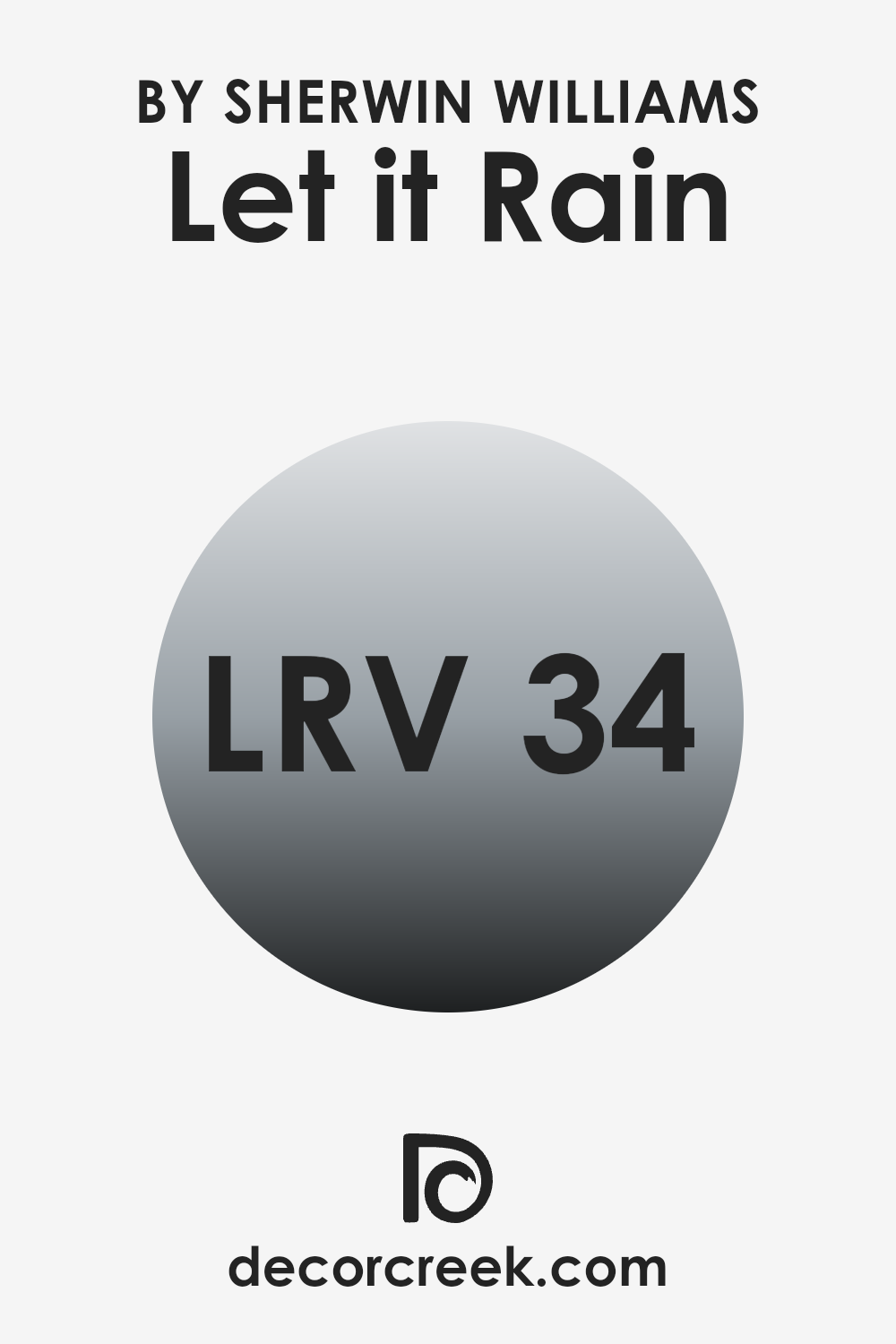
What is the LRV of Let it Rain SW 9152 by Sherwin Williams?
LRV, or Light Reflectance Value, is a measurement that tells us how much light a color reflects back into a room. Every paint color has an LRV scale rating that ranges from a top value of a hundred, which means it reflects all light, to a low of zero, indicating it absorbs all light.
The higher the LRV number, the lighter the color appears; conversely, lower numbers mean the color looks darker. This value helps in choosing paint colors for a space based on how much natural or artificial light that space receives. It’s a crucial guideline for designers and homeowners because it impacts how bright or dark a room feels once painted.
The LRV for the color mentioned is 34.288, which places it in the darker half of the scale, though it isn’t deeply dark. This means it will absorb more light than it reflects, potentially making a small room look smaller or cozier depending on the lighting condition. In spaces with limited natural light, this color could make the space appear somewhat gloomy.
However, in well-lit areas, or when used on an accent wall or paired with lighter colors, it can add depth and character without overwhelming the space.
This level on the LRV scale offers flexibility, compatible with different lighting scenarios but best used in rooms with at least moderate light.
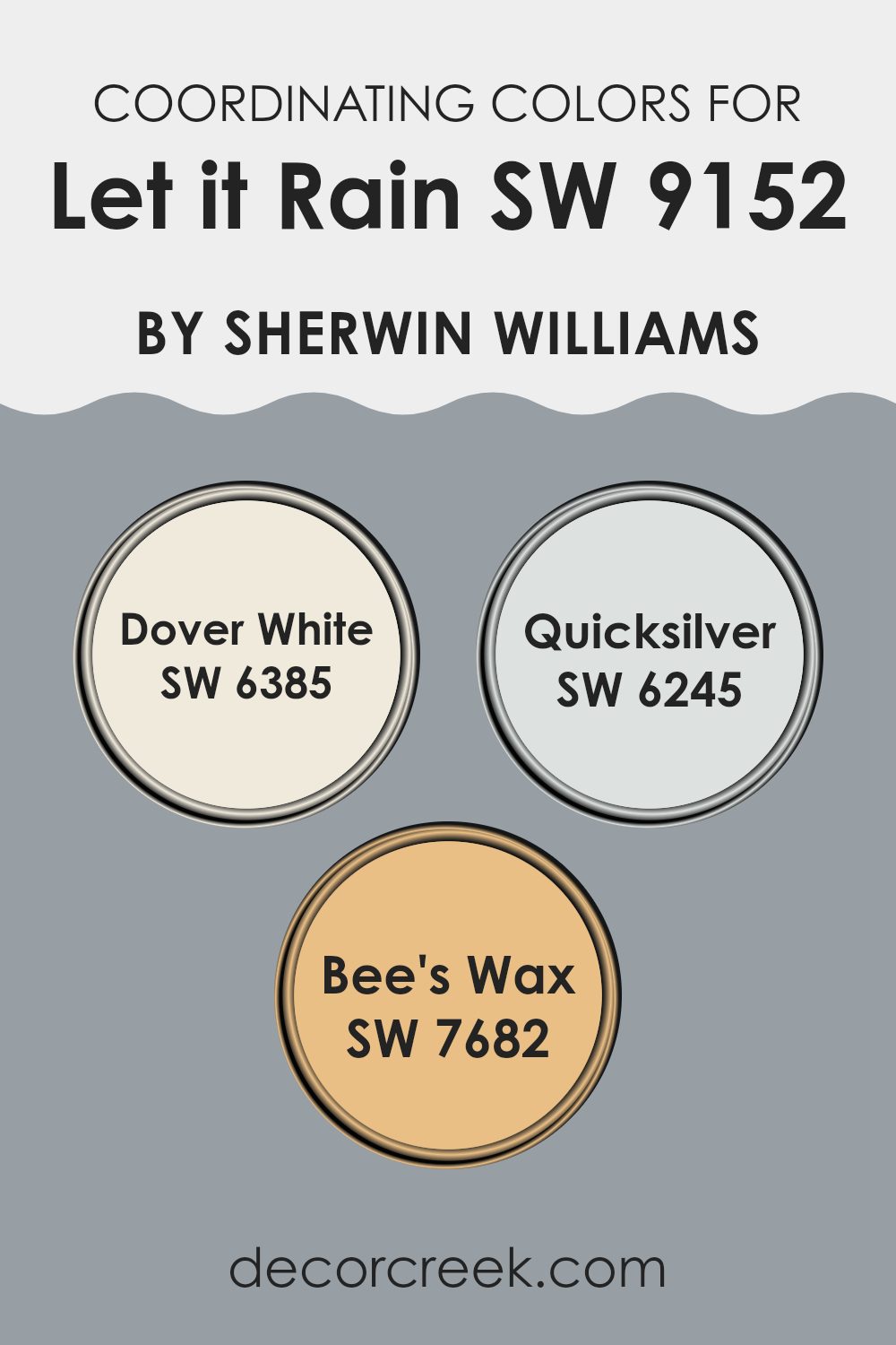
Coordinating Colors of Let it Rain SW 9152 by Sherwin Williams
Coordinating colors are chosen to complement each other and create a harmonious look in a space. These colors, when paired correctly, highlight each other’s tones and can enhance the overall aesthetic of a room. For example, when you select a calming blue like “Let it Rain” from Sherwin Williams, finding the right coordinating colors can be key to achieving a balanced and appealing design. Colors like Dover White, Quicksilver, and Bee’s Wax serve as excellent companions to this gentle blue, as they bring out its subtle qualities without overwhelming it.
Dover White is a warm, creamy off-white that has a welcoming and soft presence in any room. It’s an excellent choice for trims, ceilings, or even as a main color in a space to provide a gentle contrast to deeper hues like Let it Rain.
On the other hand, Quicksilver is a light, muted gray with a hint of blue undertone that complements cooler color schemes and adds a sleek, modern touch to any interior. Lastly, Bee’s Wax is a rich, golden yellow that provides a vibrant pop of warmth that can energize a room. It pairs beautifully with Let it Rain by adding a sunny brightness that balances cooler tones.
You can see recommended paint colors below:
- SW 6385 Dover White
- SW 6245 Quicksilver
- SW 7682 Bee’s Wax
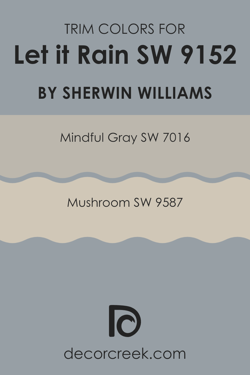
What are the Trim colors of Let it Rain SW 9152 by Sherwin Williams?
Trim colors are the accents used on features like door frames, moldings, and window sills to enhance the overall appearance of a room. When paired with a wall color like Let it Rain by Sherwin Williams, choosing the right trim color can define edges, highlight architectural features, and add a distinct contrast or complement to the walls.
The role of trim colors is crucial because they help to frame the space, adding depth and dimension to the room. By selecting appropriate trim colors, you ensure that each element in a room connects visually, providing a clean and finished look.
Mindful Gray SW 7016 is a versatile shade that subtly stands out against softer tones such as Let it Rain. It’s a balanced gray that offers a calm presence, making it a wonderful choice for trim, providing a slight contrast without overwhelming the senses.
SW 9587, on the other hand, is a warmer color, leaning towards beige with a hint of gray, ideal for creating a soft transition between the wall color and the trim. This warmer hue can help in achieving a seamless look that ties the elements of the room together harmoniously.
Using these colors as trims provides a well-thought-out aesthetic that complements the main paint color while enhancing the overall spatial perception.
You can see recommended paint colors below:
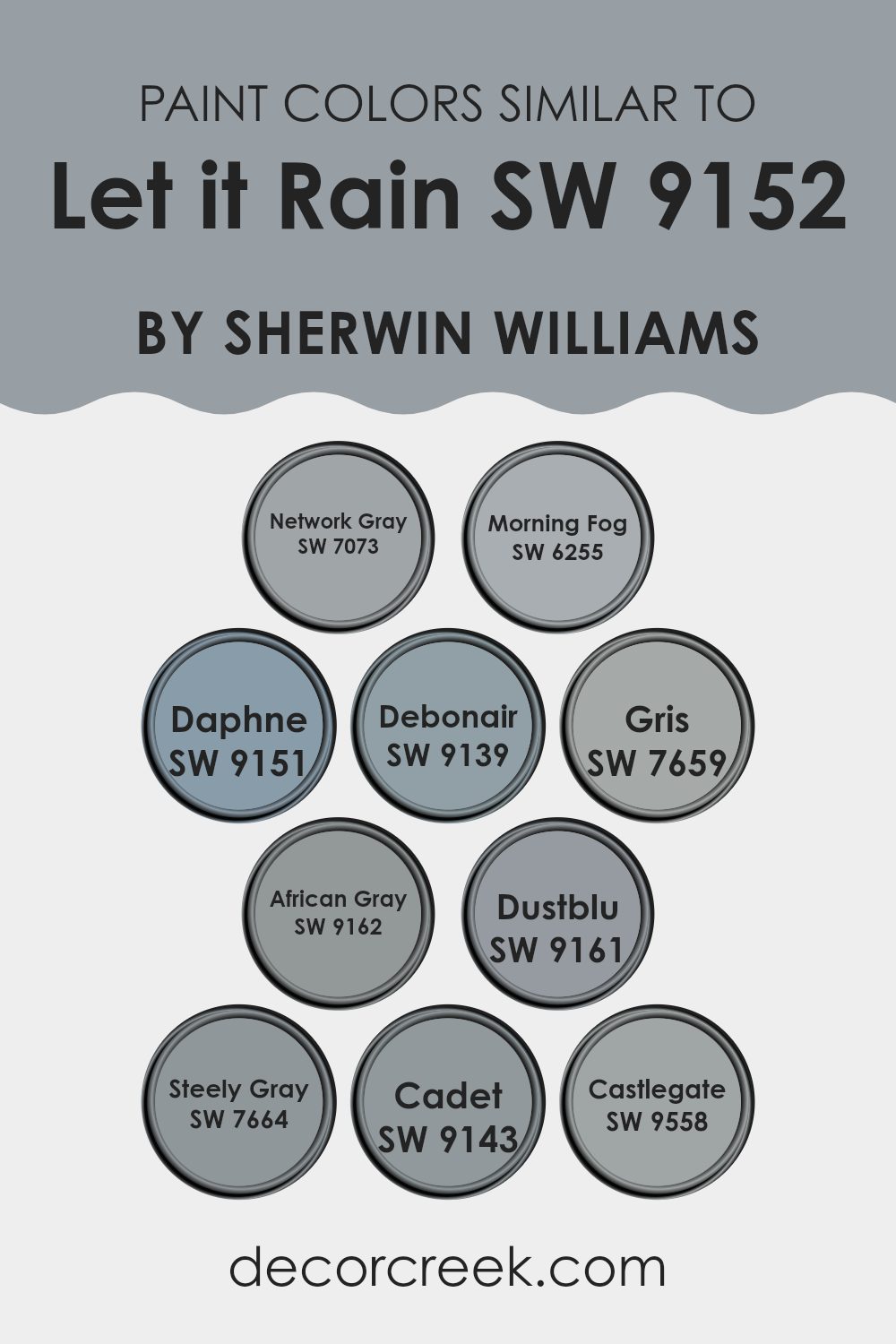
Colors Similar to Let it Rain SW 9152 by Sherwin Williams
Choosing similar colors is essential in design because it ensures a harmonious and balanced look. Colors that share a similar tone or intensity can help to create a cohesive atmosphere in a space, making it more pleasant and visually appealing. For example, when decorating a room, using colors that are tonally aligned can help the elements blend seamlessly, resulting in a more organized appearance.
Network Gray is a versatile shade that offers a neutral backdrop, suitable for modern and minimalist spaces. Morning Fog is slightly lighter, introducing a subtle, airy feel to the environment. Daphne, on the other hand, adds a hint of soft, muted purple, giving a gentle touch of color without overwhelming the senses.
Debonair is a deeper blue, providing a more pronounced, but still soft, color influence. Gris is a middle-ground option, striking a nice balance between light and dark in neutral gray spaces. African Gray leans more towards a comforting, slightly warmer tone of gray, making spaces feel cozy. Dustblu is unique for its bluish-gray hue, which can offer a cool and calm effect, ideal for a peaceful setting.
Steely Gray brings in a stronger presence with its richer and more intense shades, perfect for making a subtle statement. Cadet introduces a faded navy tone, adding depth and interest to areas without using vibrant colors. Lastly, Castlegate steps in as a much darker gray, excellent for creating depth or accentuating specific areas within a decor scheme.
All these colors work well with each other, promoting an aesthetic flow that is pleasing to the eye.
You can see recommended paint colors below:
- SW 7073 Network Gray
- SW 6255 Morning Fog
- SW 9151 Daphne
- SW 9139 Debonair
- SW 7659 Gris
- SW 9162 African Gray
- SW 9161 Dustblu
- SW 7664 Steely Gray
- SW 9143 Cadet
- SW 9558 Castlegate
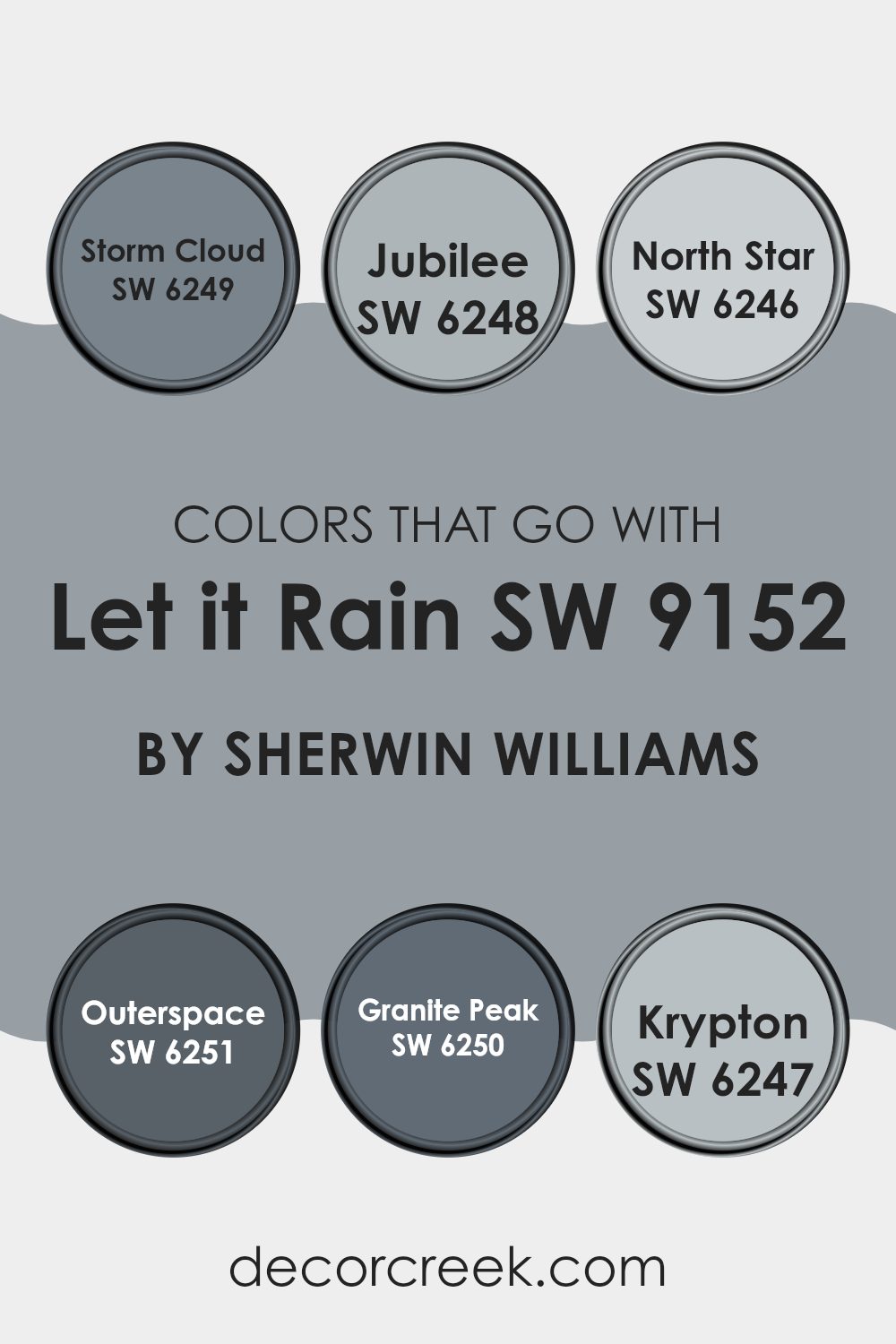
Colors that Go With Let it Rain SW 9152 by Sherwin Williams
Choosing the right colors to complement Let it Rain SW 9152 by Sherwin Williams is essential for creating a harmonious and attractive look in any space. These colors, ranging from deeper hues to soft greys, work together to provide a balanced and inviting atmosphere. This color selection covers a spectrum that ensures versatility and nuanced visual appeal.
For instance, Storm Cloud SW 6249 presents a deeper, almost mystical grey that adds a strong foundational tone, working perfectly in contrast to the lighter shades. Jubilee SW 6248 is a muted lavender-grey, giving a gentle wash of color that is soothing and simple.
A lighter option, North Star SW 6246, offers a soft, pale grey with a touch of blue, which works wonderfully in brighter, airier rooms. Moving deeper, Outerspace SW 6251 brings a dark charcoal that provides a bold accent, ideal for making statements in specific areas. Granite Peak SW 6250 features a mid-tone grey that strikes a balance between light and dark, making it a versatile choice for any decorating style.
Lastly, Krypton SW 6247 is a cool, airy grey with blue undertones that freshens up a space instantly. Each of these colors supports Let it Rain by either contrasting beautifully or complementing it subtly, depending on what your room needs.
You can see recommended paint colors below:
- SW 6249 Storm Cloud
- SW 6248 Jubilee
- SW 6246 North Star
- SW 6251 Outerspace
- SW 6250 Granite Peak
- SW 6247 Krypton
How to Use Let it Rain SW 9152 by Sherwin Williams In Your Home?
“Let it Rain” by Sherwin Williams is a gentle blue-gray paint color that adds a calm and cozy feel to any room. It’s perfect for those looking to create a peaceful atmosphere in their home without using overly bright colors.
This shade works beautifully in bedrooms, where you want to promote rest, or in bathrooms for a clean and refreshing look. It complements white trim and cabinets well, making it a great choice for kitchens too.
“Let it Rain” is also versatile for living rooms; pair it with soft textiles and light woods for a relaxed vibe. If you’re aiming for a subtle yet inviting space, this color provides just the right touch of softness and depth, enhancing your home with its understated beauty without being too bold or overpowering.
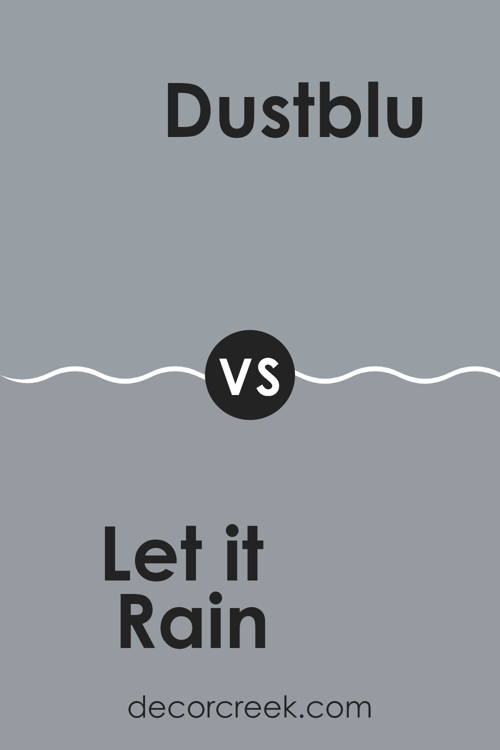
Let it Rain SW 9152 by Sherwin Williams vs Dustblu SW 9161 by Sherwin Williams
“Let it Rain” and “Dustblu” by Sherwin Williams are two unique shades that offer different vibes for any space. “Let it Rain” is a cooler, soft gray with hints of blue, giving a fresh and calming feel to walls without being too bold.
It’s versatile for various rooms, working well in bedrooms or bathrooms for a gentle and clean look. On the other hand, “Dustblu” takes a step deeper into the blue spectrum, presenting a muted blue that leans towards a subtle grayish tone. This color is perfect for creating a laid-back and cozy atmosphere in spaces like living rooms or studies.
While both colors share a cool base, “Let it Rain” is lighter and airier, making spaces feel more open. “Dustblu,” with its duskier depth, offers a more enclosed, snug feel. When deciding between the two, consider the amount of natural light in your room and the mood you want to set.
You can see recommended paint color below:
Let it Rain SW 9152 by Sherwin Williams vs Cadet SW 9143 by Sherwin Williams
Both “Let it Rain” and “Cadet” by Sherwin Williams are shades of blue-green, but they differ in tone and lightness. “Let it Rain” appears as a soft, muted color, providing a calm and subtle vibe that can make small spaces feel larger and airy.
It’s excellent for creating a peaceful background in a room. On the other hand, “Cadet” is a deeper, more pronounced shade that leans more towards blue with gray undertones. This color has a stronger presence and is ideal for areas where a bolder statement is desired without overwhelming the space with too dark a shade.
In terms of application, “Let it Rain” would work well in bedrooms and bathrooms, while “Cadet” could be a good choice for accent walls or lower cabinets in a kitchen to add depth. Both colors coordinate well with neutral whites and grays, providing a fresh and contemporary look.
You can see recommended paint color below:
- SW 9143 Cadet
Let it Rain SW 9152 by Sherwin Williams vs Gris SW 7659 by Sherwin Williams
The main color, Let it Rain, and the second color, Gris, are both shades of gray from Sherwin Williams’ paint collection. Let it Rain is a cooler gray that somewhat mimics the subtle and soft tones of a rainy sky, adding a fresh and soothing feel to any room.
On the other hand, Gris falls into the category of mid-tone grays. It is a warmer gray compared to Let it Rain, providing a neutral yet inviting background that can easily blend with various decor styles.
Both colors are versatile and can work well in many spaces, but Let it Rain may be better suited for creating a slightly more modern and airy atmosphere, while Gris is excellent for grounding a space with its warmer undertones. They can also complement each other when used in the same area, offering a harmonious blend of warm and cool grays.
You can see recommended paint color below:

Let it Rain SW 9152 by Sherwin Williams vs Castlegate SW 9558 by Sherwin Williams
“Let it Rain” and “Castlegate” are two different shades by Sherwin Williams. “Let it Rain” is a light, soft gray with a hint of blue, creating a calm and gentle atmosphere. It’s perfect for spaces where you want a neutral backdrop that still offers a touch of color.
On the other hand, “Castlegate” is a deeper, smoky gray with warm undertones. Despite being darker, it maintains a welcoming vibe, making it suitable for cozy areas like living rooms or bedrooms. This color can add depth and character to a space without overpowering it.
Both these colors can complement each other well in a home, depending on how you want the room to feel—light and airy with “Let it Rain” or more grounded and intimate with “Castlegate”. Either choice offers its own unique appeal, allowing for personal expression in your decorating.
You can see recommended paint color below:
Let it Rain SW 9152 by Sherwin Williams vs Network Gray SW 7073 by Sherwin Williams
Let It Rain SW 9152 and Network Gray SW 7073, both by Sherwin Williams, offer unique shades that can significantly influence the mood and style of a space. Let It Rain is a soft, muted blue that carries a light, breezy feel, making it perfect for creating a relaxed and cozy atmosphere in rooms. This color works well in spaces designed for calm and collected activities like reading or meditating.
On the other hand, Network Gray is a deeper, more robust gray. It’s a versatile color that fits well in many settings, from modern kitchens to chic offices. Its depth adds a sturdy, grounding effect, which helps in areas that require focus and solidity.
While both colors lend themselves well to various decorative styles, the choice between them depends on the desired ambiance. Let It Rain invites lightness into a space, whereas Network Gray provides a strong foundational look. Both colors coordinate well with contrasting hues and materials, making them practical choices for interior design.
You can see recommended paint color below:
Let it Rain SW 9152 by Sherwin Williams vs Daphne SW 9151 by Sherwin Williams
“Let it Rain” (SW 9152) and “Daphne” (SW 9151) are two paint colors by Sherwin Williams that have distinct tones and moods. “Let it Rain” is a smooth, medium gray with a cool undertone, making it perfect for a calm and collected feel in any room. This color is versatile and fits well in spaces like living rooms or bedrooms where you want a neutral backdrop that’s easy on the eyes.
On the other hand, “Daphne” is a shade darker and leans more towards an intriguing gray-blue mix. This color has a deeper and slightly more vibrant tone compared to “Let it Rain.” It’s ideal for creating a more striking appearance in a space, suitable for accent walls or bathroom cabinets for an added touch of personality.
Both colors offer unique vibes: “Let it Rain” is more subtle and understated, while “Daphne” offers a touch of drama without overpowering. They could even complement each other well in a single area, using “Daphne” as an accent to the lighter “Let it Rain.”
You can see recommended paint color below:
Let it Rain SW 9152 by Sherwin Williams vs African Gray SW 9162 by Sherwin Williams
“Let it Rain” is a subtle color with a blend of blue and grey, creating a fresh and calming atmosphere in any room. It reflects light beautifully, making spaces appear larger and more open.
“African Gray,” on the other hand, leans more towards a traditional gray with hints of brown. This color exudes a warm and cozy feel, making it perfect for spaces where you want to relax, like living rooms or bedrooms.
When comparing the two, “Let it Rain” offers a cooler tone that is versatile for various settings, including bathrooms and kitchens. “African Gray” provides a richer, warmer hue that works well in areas with lots of wooden furniture or natural elements.
While both colors are neutral, “Let it Rain” has a more modern vibe, whereas “African Gray” embraces a classic, timeless look. Choosing between them depends on the mood and style you want to achieve in your space.
You can see recommended paint color below:

Let it Rain SW 9152 by Sherwin Williams vs Morning Fog SW 6255 by Sherwin Williams
Let it Rain and Morning Fog are two paint colors that both offer a subdued and calming vibe, but they differ slightly in their tones and atmospheres. Let it Rain is a soft blue with a hint of gray, giving a gentle and understated touch wherever it is applied.
It works well in spaces meant for relaxation and calmness, like bedrooms or quiet study areas. On the other hand, Morning Fog is a pure, light gray that provides a clean and neutral backdrop. It’s excellent for modern settings and areas that require a versatile backdrop for various decor styles.
While Let it Rain adds a cooler, subtle blue tone to rooms, suggesting a soothing effect, Morning Fog tends to keep things simple and open, making spaces feel larger and more open. Both colors are subtle but can significantly influence the mood and overall look of your room.
You can see recommended paint color below:
Let it Rain SW 9152 by Sherwin Williams vs Steely Gray SW 7664 by Sherwin Williams
Let it Rain and Steely Gray are both cool, soothing colors that bring a calm feel to any space. “Let it Rain” is a lighter, softer gray with a hint of blue. It’s perfect for giving a room an airy, open feeling. “Steely Gray,” on the other hand, is a deeper gray that leans a bit more towards a traditional gray color. It’s great for adding a bit of drama or depth without making a space feel too dark.
Both colors are versatile and can work well in a variety of spaces, from bedrooms to offices. “Let it Rain” is a good choice if you want to lighten a room or give it a refreshing, gentle vibe. “Steely Gray” is better for those looking to make a stronger statement with a bolder, more pronounced gray.
When choosing between them, consider the mood you want to create and the amount of natural light in your room. Lighter “Let it Rain” can help make a smaller or darker room feel bigger and brighter, while “Steely Gray” can add a touch of gravity and focus to a larger or brightly lit space.
You can see recommended paint color below:

Let it Rain SW 9152 by Sherwin Williams vs Debonair SW 9139 by Sherwin Williams
Let it Rainand Debonair by Sherwin Williams are both soothing shades, but they have distinct tones that set them apart. “Let it Rain” is a cool, soft gray that has a gentle feel, making it ideal for creating a relaxed atmosphere in spaces like bedrooms or bathrooms. It has subtle blue undertones that can make a room feel more airy and fresh.
On the other hand, “Debonair” is a darker, more muted shade that leans towards a deep blue-gray. This color is perfect for adding a bit of drama and depth to an area without overwhelming it. It’s a great choice for accent walls or for rooms that need a bit of a grounding effect.
Both colors work well in modern homes and can complement a variety of decor styles, but “Let it Rain” reflects more light, giving a brighter appearance, while “Debonair” offers a more cozy and enveloped feeling. Depending on the mood you want to set, each color has its unique appeal.
You can see recommended paint color below:

Conclusion
This color is like a mix between blue and gray, and it reminds me of a stormy sky which feels both calm and interesting. One of the best things about Let it Rain is how well it works in almost any room. Whether it’s for a cozy bedroom, a relaxing living room, or even a bathroom, this color fits right in and makes the place look pretty and inviting.
I really like that this paint isn’t just nice to look at but also practical. It can hide little marks or dirt, which makes it a good choice for busy areas. It’s also easy to find decorations that match with it because it goes well with many other colors.
In conclusion, SW 9152 Let it Rain by Sherwin Williams is a great choice if you want to make your room look nice without too much fuss. It’s easy to use, works well with other colors, and can help hide everyday wear and tear. I’d recommend this paint to anyone thinking about giving their room a new look without making things too complicated.
It’s straightforward, looks great, and very practical – just what a lot of people need for their homes.
Ever wished paint sampling was as easy as sticking a sticker? Guess what? Now it is! Discover Samplize's unique Peel & Stick samples.
Get paint samples

