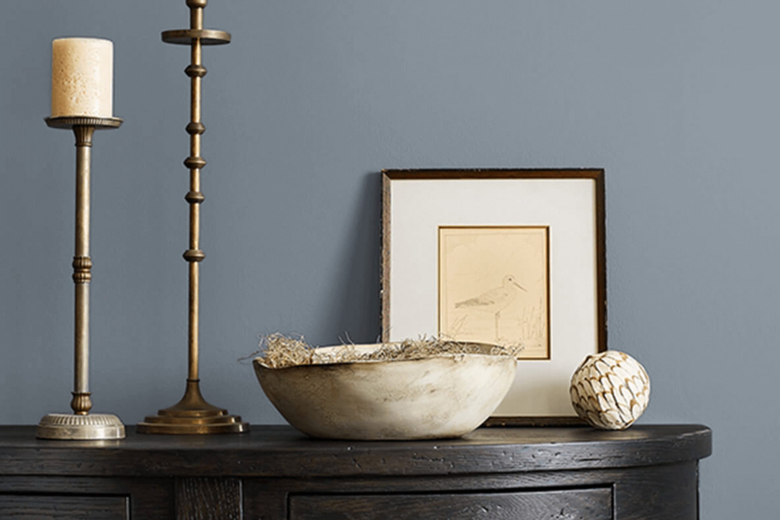
Have you ever stood beneath an overcast sky, feeling the cool, moody vibes it casts? That’s the essence of SW 6249 Storm Cloud by Sherwin Williams. This color envelops your area in a dusky, grey shade that whispers of impending rainstorms and the quiet moments before a downpour. It’s a unique blend of blue and gray tones that achieves a balance perfect for anyone looking to add a bit of drama and refinement to their area without making it feel too much.
As a fan of calm, thoughtful color palettes, I appreciate how Storm Cloud can change a room into a reflective retreat. It pairs well with both bright whites and soft creams, allowing for flexibility in design choices. Whether you’re considering a new color for your living room or thinking about adding a somber tone to your bedroom, Storm Cloud offers a flexible backdrop for your furnishings and decor.
This shade isn’t just about aesthetics; it also sets a specific mood. It’s ideal for areas where calm and concentration are needed, like home offices or reading nooks.
If you’re looking for a color that provides a peaceful yet profound impact, SW 6249 Storm Cloud might just be the one you need.
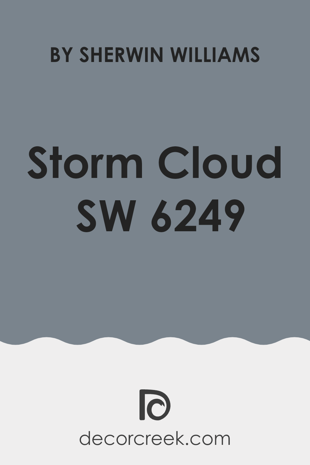
What Color Is Storm Cloud SW 6249 by Sherwin Williams?
Storm Cloud by Sherwin Williams is a rich, deep gray color with blue undertones that bring a sense of calm and steadiness to any area. This color is flexible and works well in various interior styles, particularly in modern and transitional homes. It also fits beautifully in coastal settings, thanks to its nautical vibe, and in industrial designs because of its bold, strong presence.
The depth of Storm Cloud makes it an excellent choice for living rooms or bedrooms, providing a backdrop that complements a wide range of materials and textures. It pairs particularly well with natural wood, helping to warm up the coolness of the gray, while highlighting the rich, organic texture of the wood. Metallic finishes like brass or copper also go well with this color, adding a touch of glamour without overpowering the room.
For textiles, Storm Cloud coordinates well with soft, plush fabrics like velvet or wool in lighter shades such as creamy whites or soft beiges, which can help soften the overall look and feel. It also looks striking with leather, offering a more masculine, sturdy aesthetic. In sum, Storm Cloud is a flexible color choice that supports a variety of tastes and styles, making it a reliable option for those looking to refresh their homes.
decorcreek.com
Is Storm Cloud SW 6249 by Sherwin Williams Warm or Cool color?
Storm Cloud by Sherwin Williams is a rich, deep gray shade with blue undertones that brings a cozy and calming feel to any room. This color is flexible enough to be used in various areas around the home, from living rooms to bedrooms. Its somber hue makes it great for creating a focused atmosphere in a home office, or a restful vibe in a bedroom.
This color works well with both bright whites and softer, warm tones, allowing for a wide range of decorating schemes. It can act as a striking contrast against white trim or furniture, which helps to define an area clearly and beautifully. In rooms with plenty of natural light, Storm Cloud turns slightly lighter, showing off its blue undertones.
In dimmer, more intimate areas, it appears darker, providing a sense of coziness and comfort. Overall, Storm Cloud is a strong choice for those looking to add depth and interest to their interiors without making their aesthetic feel too much with bold color.
Undertones of Storm Cloud SW 6249 by Sherwin Williams
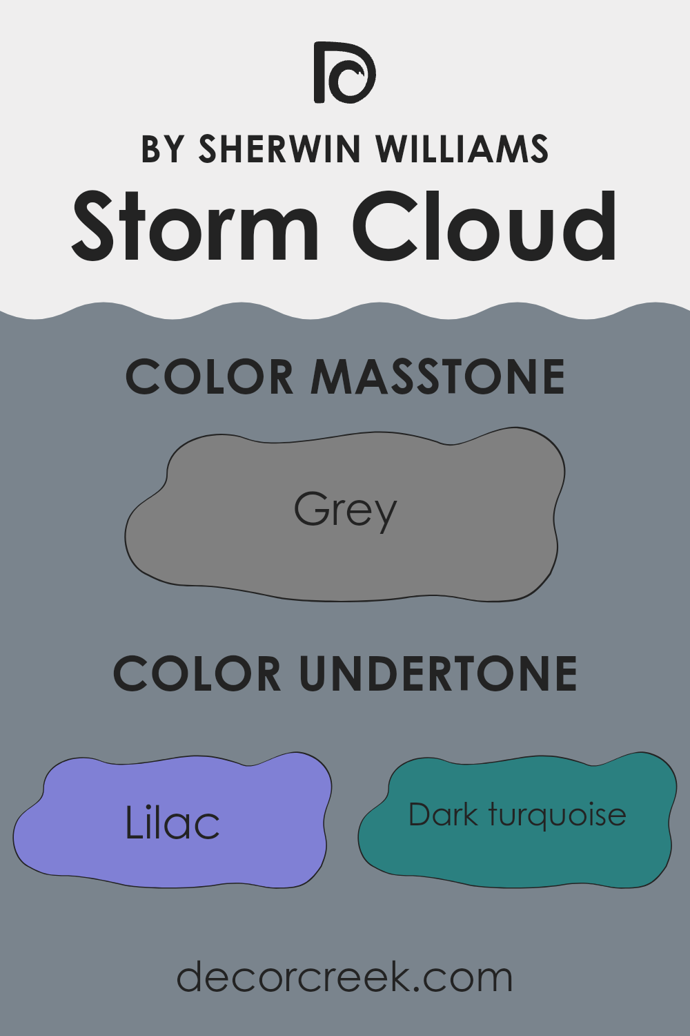
Storm Cloud (SW 6249) by Sherwin Williams is a complex and flexible paint color that includes several undertones. These undertones influence how the color is perceived in different settings and lighting conditions. The primary undertones of this color include hues such as lilac, dark turquoise, and mint, which can add subtle hints of color that enhance the main shade.
Undertones are the colors that lurk beneath the surface of the paint. They can change the way a paint looks depending on the light, the size of the room, and even the colors of furniture and décor. For instance, in a room with lots of natural light, the lilac undertone of Storm Cloud might become more visible, giving the walls a gentler, more nuanced appearance. In a darker room, darker tones like dark turquoise might stand out, giving the area a more grounded feel.
When used on interior walls, the complexity of Storm Cloud’s undertones makes it a dynamic choice for home decor. It can appear more blue or gray depending on its surroundings and lighting. This adaptability makes it suitable for many rooms, from creating a cozy, reflective atmosphere in a bedroom to offering a striking backdrop in a more formal living room.
Moreover, additional undertones like purple, pale pink, pale yellow, and light turquoise add depth and allow for easier coordination with different interior design elements. For example, pairing this paint with fabrics or accessories that highlight one of its undertones could pull a room together in a pleasing way. This strategy can also mitigate the risk of the color appearing too dark or too much in smaller areas.
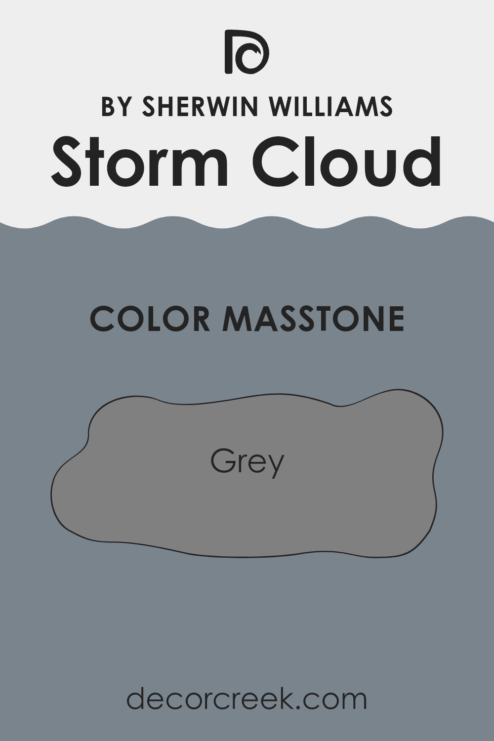
What is the Masstone of the Storm Cloud SW 6249 by Sherwin Williams?
The Storm Cloud color with a masstone of grey from Sherwin Williams is a flexible shade that can dramatically affect the ambiance in a home. Its grey base allows it to blend well with various decor styles and color schemes, making it a popular choice for those looking to refresh their living areas.
This shade provides a neutral backdrop that can make other colors in a room stand out, or it can stand alone to give a clean and subtle look. In homes, this color works well in living rooms, bedrooms, and bathrooms, providing a calming effect without making areas feel too dark.
Its ability to reflect light slightly varies depending on the lighting, time of day, and accompanying colors, meaning it can appear more dynamic than a standard grey. This adaptability makes it an excellent choice for homeowners wanting a color that is both stylish and practical, fitting seamlessly into most home environments.
How Does Lighting Affect Storm Cloud SW 6249 by Sherwin Williams?
Lighting plays a crucial role in how colors appear in an area. Different light sources can dramatically change the way a color looks on your walls. For example, Storm Cloud, a deep, moody gray with blue undertones, can look vastly different under various lighting conditions.
In natural light, the true color of the paint is typically more visible. For a color like Storm Cloud, natural sunlight can bring out its subtle blue undertones, making the color appear softer and more dynamic. The quality of natural light, however, depends on the direction of the room.
In north-facing rooms, light tends to be cooler and can make Storm Cloud look more intense and slightly darker, enhancing its gray qualities while slightly muting the blue undertones. This can be perfect for creating a more dramatic and cozy atmosphere.
South-facing rooms, conversely, receive plenty of warm light throughout the day. This type of light tends to make Storm Cloud warmer and lighter, softening its appearance and allowing the color to show a more balanced blend of gray and blue.
In east-facing rooms, the light is warmer in the morning and cooler in the evening. Storm Cloud will look brighter and more vibrant in the morning light but will take on a more subdued, cooler tone in the evening.
West-facing rooms have the opposite effect: cooler in the morning and warmer in the later parts of the day. Here, Storm Cloud will start the day showing more of its stark, gray characteristics and gradually warm up as the day progresses, revealing a more complex interplay of gray and blue by the afternoon.
Artificial lighting, such as LED or incandescent bulbs, also affects how Storm Cloud is perceived. Incandescent lighting can make it look warmer and more inviting, whereas fluorescent lighting might enhance its cooler tones, making the room feel crisp and focused.
Understanding how different lighting affects a color like Storm Cloud can help in deciding where to use it effectively in your home for the desired effect.
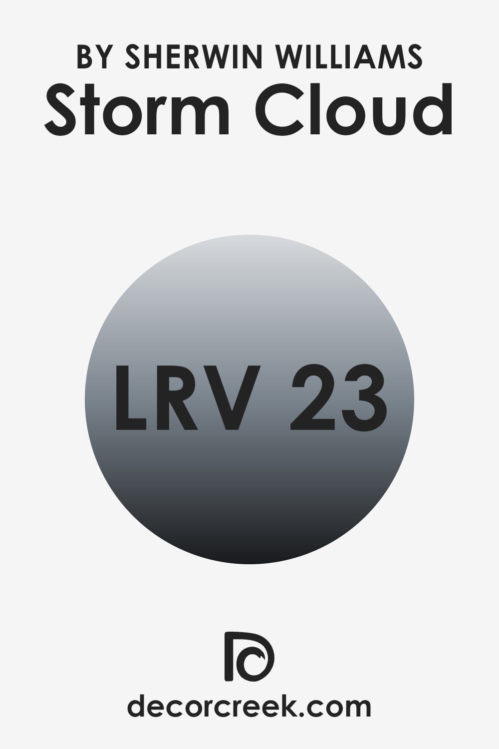
What is the LRV of Storm Cloud SW 6249 by Sherwin Williams?
LRV stands for Light Reflectance Value, which is a measurement indicating how much light a paint color reflects or absorbs. Essentially, this value ranges from 1 to 99, where a lower number means the color is darker and absorbs more light, while a higher number indicates a lighter color that reflects more light.
The importance of LRV lies in how it influences the perception and ambiance of a room. Lighter colors can make small areas appear larger and are generally better at hiding imperfections, while darker colors tend to make rooms feel cozier but can highlight flaws in walls.
The LRV of Storm Cloud, which is 22.67, suggests that it is a relatively dark color. This means it absorbs more light than it reflects, which can have a dramatic impact on the feel of an area. Such a color is ideal for creating a more intimate and enclosed feeling, making it suitable for large rooms or areas that you want to feel more compact and cozy. However, it is important to consider lighting when using darker shades like this one; insufficient lighting can make the area feel too dark or smaller than it is. Optimal use of lighting fixtures can balance out the darker tone, ensuring the area maintains a balanced aesthetic.
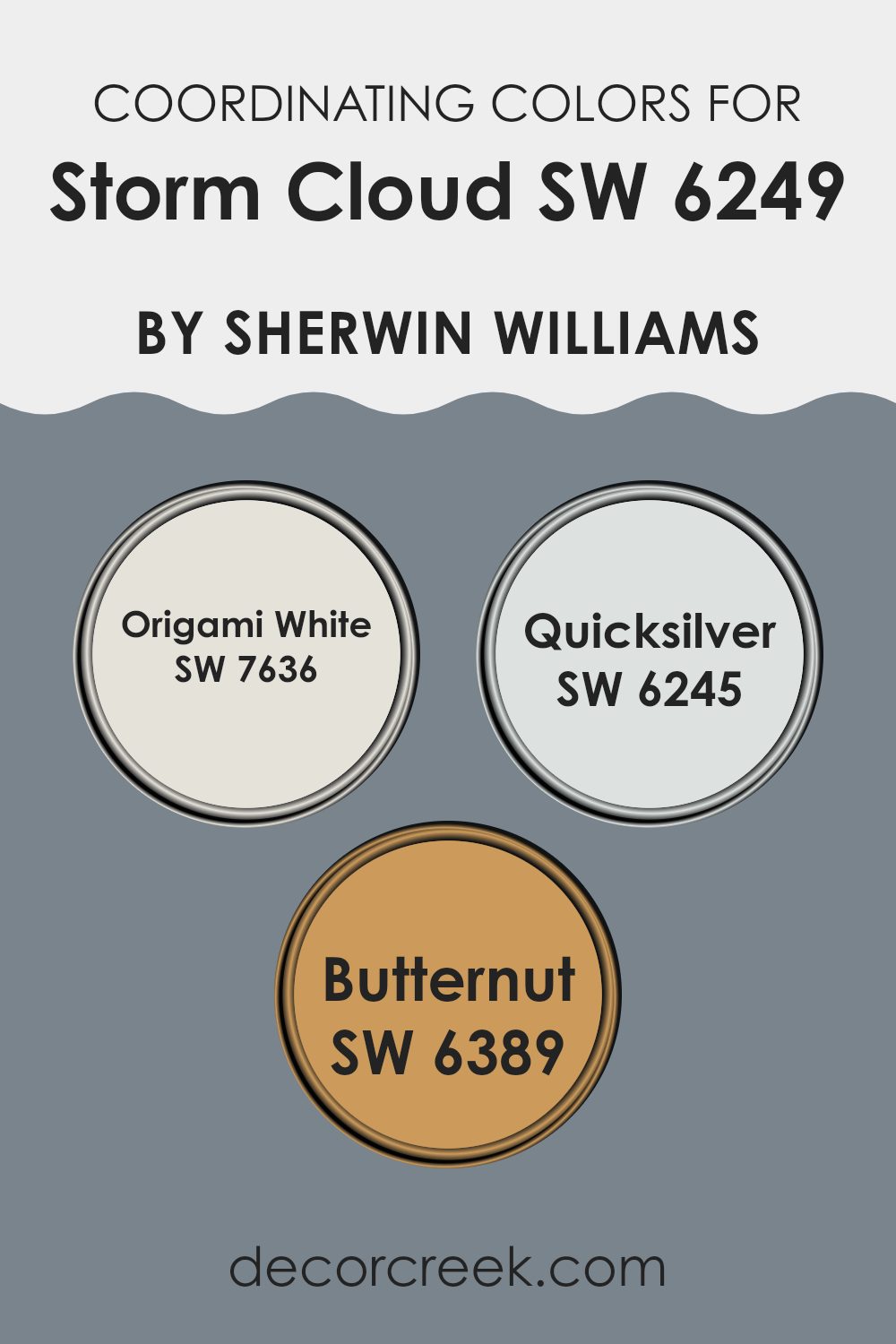
Coordinating Colors of Storm Cloud SW 6249 by Sherwin Williams
Coordinating colors are shades that complement each other while sharing common hues that create a harmonious balance when used together in interior design. When choosing coordinating colors, it’s important to consider how each color interacts with others to achieve a desired atmosphere or mood in an area. For instance, when pairing colors with a deep and moody hue like Storm Cloud, a darker shade of blue-gray, the goal is often to find colors that either soften or enrich the environment without competing for attention.
Origami White serves as a soft, slightly warm white that provides a clean and calm backdrop, making it a flexible partner for Storm Cloud’s more intense tones. This light color relieves areas and offers a fresh canvas that highlights darker colors and decorative elements effortlessly.
Quicksilver is a subtle and light gray with a slightly blue undertone that echoes the cool depth of Storm Cloud, promoting a sense of continuity and flow in the area. It’s ideal for creating a smooth transition between the darker hues and the lighter tones. Butternut, a warm, muted yellow, offers a distinct contrast to Storm Cloud, injecting a gentle energy and warmth into areas that primarily feature cooler tones. This warm shade works well to add a touch of coziness and cheerfulness to the overall color scheme.
You can see recommended paint colors below:
- SW 7636 Origami White
- SW 6245 Quicksilver
- SW 6389 Butternut
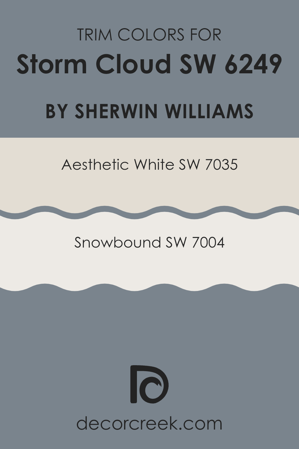
What are the Trim colors of Storm Cloud SW 6249 by Sherwin Williams?
Trim colors are used to accentuate the architectural details and edges of a room, such as door frames, window frames, and skirting boards. Choosing the right trim color can either subtly complement the main wall colors or create a bold contrast, enhancing the overall aesthetics of an area. For instance, when paired with a deeper hue like the cool-gray of Storm Cloud, lighter trim colors can help to create a clean and crisp appearance that highlights these architectural features effectively.
Aesthetic White (SW 7035) is a soothing light beige that offers a warm and inviting backdrop, perfect for use as a trim color with darker shades like Storm Cloud.
It’s light enough to provide a noticeable contrast yet warm enough to keep the area feeling cozy and unified. Snowbound (SW 7004) is a brighter, almost pure white, which brings a sharp and fresh look to an area when used as a trim color. It effectively outlines doors and windows, making them pop against darker-colored walls, enhancing both the light in the room and the feeling of area.
You can see recommended paint colors below:
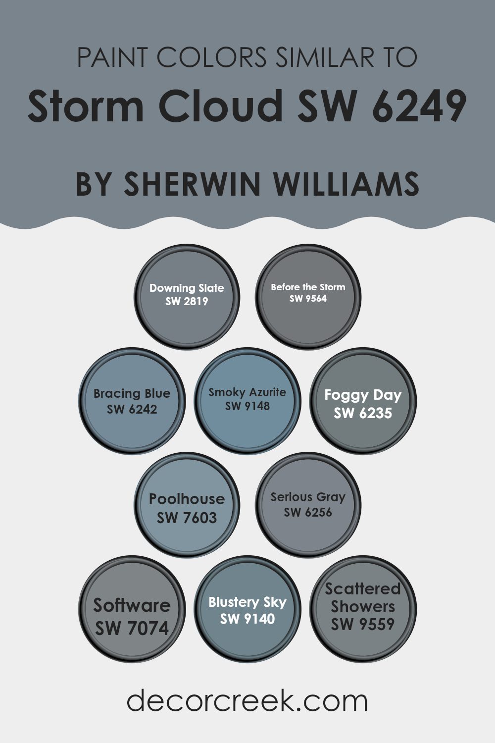
Colors Similar to Storm Cloud SW 6249 by Sherwin Williams
Similar colors create a cohesive and harmonious look in any area, making them a popular choice in home decor. By using shades that are close on the color spectrum, such as variations inspired by Storm Cloud by Sherwin Williams, you can achieve a seamless transition between rooms or create a subtle yet effective change in atmosphere within a single area. These similar colors, ranging from deeper blues to soft grays, work together by complementing each other, rather than competing for attention, ensuring a unified aesthetic.
Starting with Downing Slate, it’s a robust slate blue that gives a calm yet impactful presence. Before the Storm, another shade in the series, brings a darker, more profound hue that mirrors the depths of an impending storm’s clouds. Moving to Bracing Blue, this color offers a vibrant and energizing shade, perfect for bringing a lively yet peaceful feel to interiors.
Smoky Azurite follows, with its deep, dusky blue capturing the essence of twilight. Foggy Day softens the palette, providing a lighter, mistier feel similar to a soft morning haze. Poolhouse is slightly brighter, lending an airy and open atmosphere with its cheerful yet subdued bluish tint. Serious Gray adds a strong, steady foundation to areas, being both commanding and discreet.
Software, a sleek gray, supports contemporary styling by acting as a flexible and modern neutral. Blustery Sky presents a dynamic blend of gray and blue tones, reminiscent of a brisk, windy day. Lastly, Scattered Showers has a muted, gentle blue that mirrors a rainy sky, ideal for areas intended to be soothing and understated. Each of these colors supports the next, creating a flexible palette that effortlessly adapts to different styles and tastes.
You can see recommended paint colors below:
- SW 2819 Downing Slate
- SW 9564 Before the Storm
- SW 6242 Bracing Blue
- SW 9148 Smoky Azurite
- SW 6235 Foggy Day
- SW 7603 Poolhouse
- SW 6256 Serious Gray
- SW 7074 Software
- SW 9140 Blustery Sky
- SW 9559 Scattered Showers
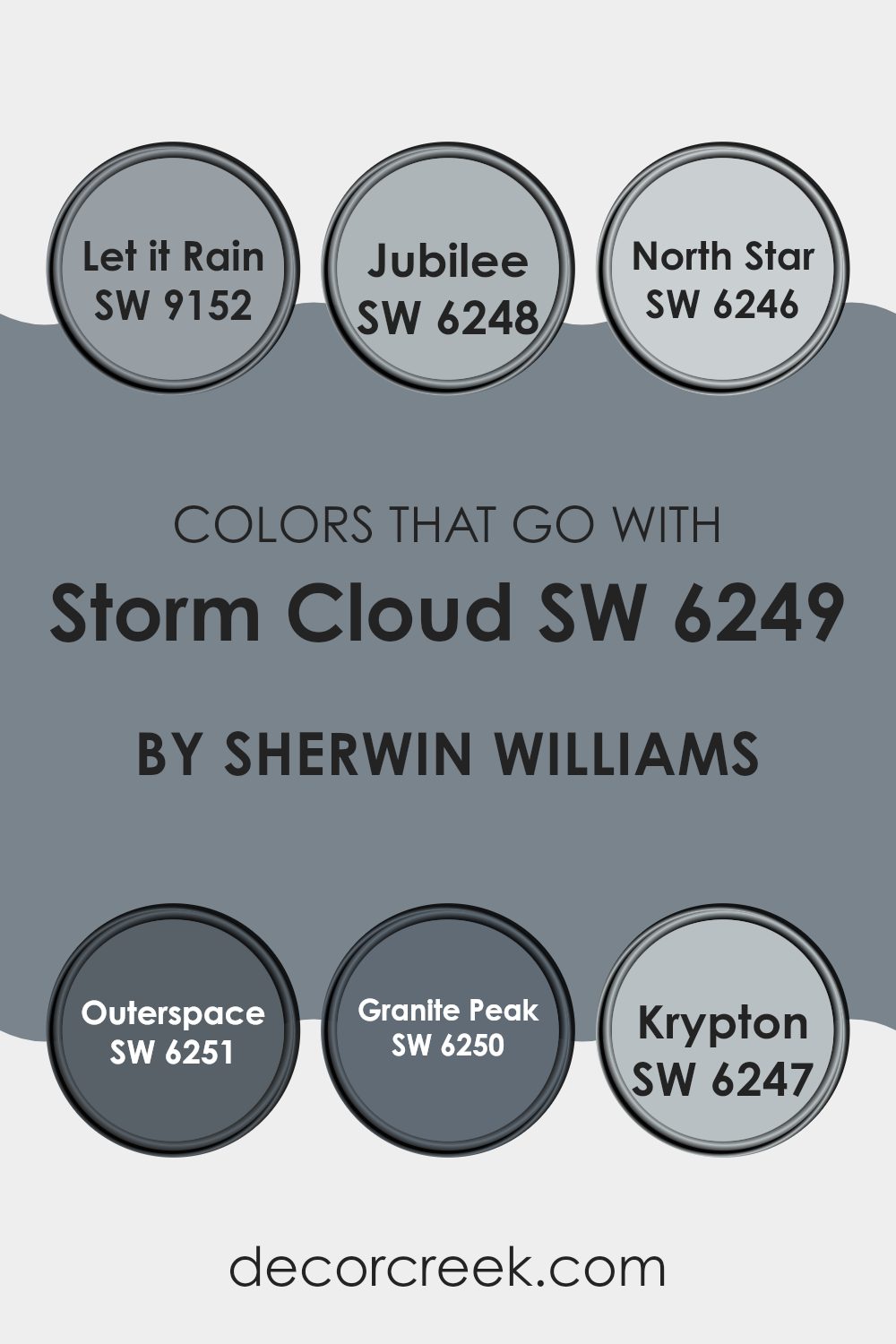
Colors that Go With Storm Cloud SW 6249 by Sherwin Williams
Choosing the right colors to complement Storm Cloud SW 6249 by Sherwin Williams is crucial for achieving a harmonious and appealing aesthetic in your area. The colors that pair well with Storm Cloud, such as Let it Rain, Jubilee, North Star, Outerspace, Granite Peak, and Krypton, all share a unique ability to create a cohesive look that enhances the overall mood and style of a room.
Let it Rain is a gentle grayish-blue that mirrors a rainy sky, providing a calm and collected feel that works nicely with the deeper tone of Storm Cloud. Jubilee is a subtle lavender-gray that adds a touch of softness and quietude, making it perfect for bedrooms or calm areas. North Star is a light, airy gray with a hint of blue, offering a fresh and clean look that brightens areas without making them feel too much.
Outerspace brings a more intense and mysterious vibe with its dark navy tone, making it an excellent choice for dramatic accents or focal points. Granite Peak is a strong, stony gray that gives a solid and reassuring presence, ideal for grounding lighter or more vibrant décor elements. Lastly, Krypton offers a cool, refreshing light blue that mimics the sky on a clear day, excellent for adding a breezy and refreshing touch to any room. Together, these colors work with Storm Cloud to create a balanced palette that is both inviting and visually appealing.
You can see recommended paint colors below:
- SW 9152 Let it Rain
- SW 6248 Jubilee
- SW 6246 North Star
- SW 6251 Outerspace
- SW 6250 Granite Peak
- SW 6247 Krypton
How to Use Storm Cloud SW 6249 by Sherwin Williams In Your Home?
Storm Cloud SW 6249 by Sherwin Williams is a rich, deep blue-gray paint color that brings a strong and cozy feel to any room. Perfect for creating a striking accent wall, it also works well on kitchen cabinets for a touch of drama.
This color pairs nicely with lighter shades, such as creamy whites or soft grays, allowing you to create a balanced and inviting atmosphere in areas like living rooms or bedrooms.
Additionally, Storm Cloud can add a modern twist to exterior elements like front doors or shutters, complementing natural outdoor greens and boosting curb appeal. Easy to apply, this durable paint holds up well over time, making it a practical choice for busy areas in your home. Whether you’re looking to jazz up a single room or refresh your entire house, Storm Cloud offers a stylish yet cozy vibe.
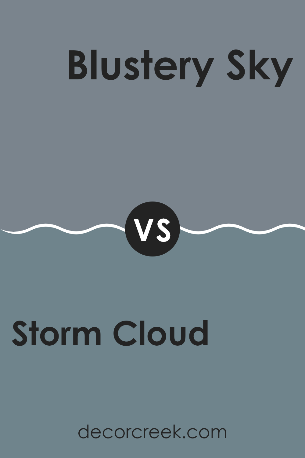
Storm Cloud SW 6249 by Sherwin Williams vs Blustery Sky SW 9140 by Sherwin Williams
Storm Cloud and Blustery Sky are both paints offered by Sherwin Williams, but they each create a distinct look. Storm Cloud has a deeper, more saturated gray tone that can give a room a rich, elegant feel without being too dark.
Its gray is intense, providing a solid backdrop that highlights other colors and decor in an area. On the other hand, Blustery Sky has a lighter and slightly more blueish touch, giving it an airy feel.
This color can make an area feel more open and relaxed, and works especially well in smaller rooms or areas with less natural light, as it helps brighten the area. Both colors work well in various settings, from modern kitchens to cozy bedroom areas, but your choice between them would depend on the mood or atmosphere you wish to create.
You can see recommended paint color below:
- SW 9140 Blustery Sky
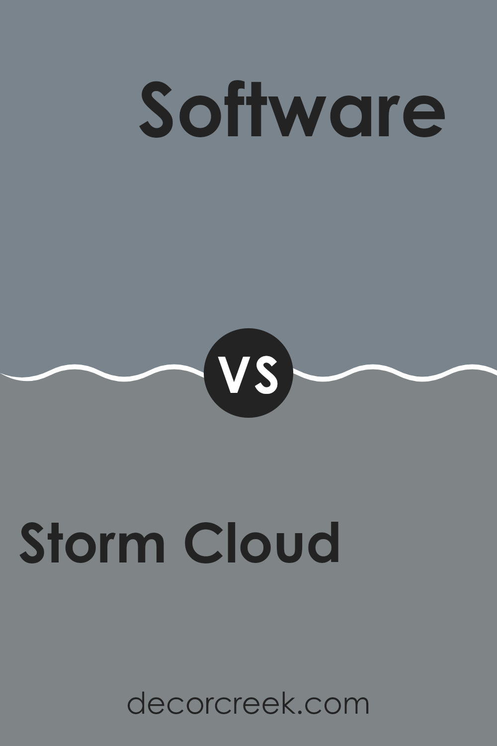
Storm Cloud SW 6249 by Sherwin Williams vs Software SW 7074 by Sherwin Williams
Storm Cloud and Software are both gray shades from Sherwin Williams, but they convey different vibes due to their tones. Storm Cloud is a deep, charcoal gray that mirrors the intensity of a stormy sky. It evokes strength and could make a bold statement wherever it’s used. It’s particularly fitting for creating a strong, grounded look in an area.
On the other hand, Software leans towards a softer, lighter gray, offering a more subtle and gentle appearance. This color is flexible and works well in various settings, giving rooms a fresh, clean look without feeling too heavy or too much.
Both colors are quite adaptable and could work well in modern décor styles, but your choice would depend on the atmosphere you want to create. Storm Cloud would be great for a dramatic impact, while Software would suit those looking for a lighter touch.
You can see recommended paint color below:
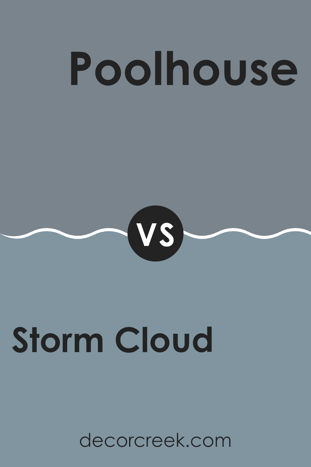
Storm Cloud SW 6249 by Sherwin Williams vs Poolhouse SW 7603 by Sherwin Williams
Storm Cloud and Poolhouse are both unique colors from Sherwin Williams, each offering its own charm. Storm Cloud is a deep, moody gray with blue undertones. It’s perfect for creating a cozy and somewhat dramatic ambiance in any area. On the other hand, Poolhouse stands out with its lighter, aqua blue hue that feels fresh and vibrant. This color can brighten up rooms and give a cheerful, welcoming vibe.
While Storm Cloud works well in an area that needs a strong, defining base color to pair with lighter or brighter accents, Poolhouse is fantastic for delivering a splash of freshness that pairs nicely with both neutral and bold color palettes.
These colors could be used together for a balanced contrast; Storm Cloud can ground an area while Poolhouse adds a lively spark. Each has its own personality, offering adaptability depending on the mood or atmosphere you’re aiming to achieve in your decorating projects.
You can see recommended paint color below:
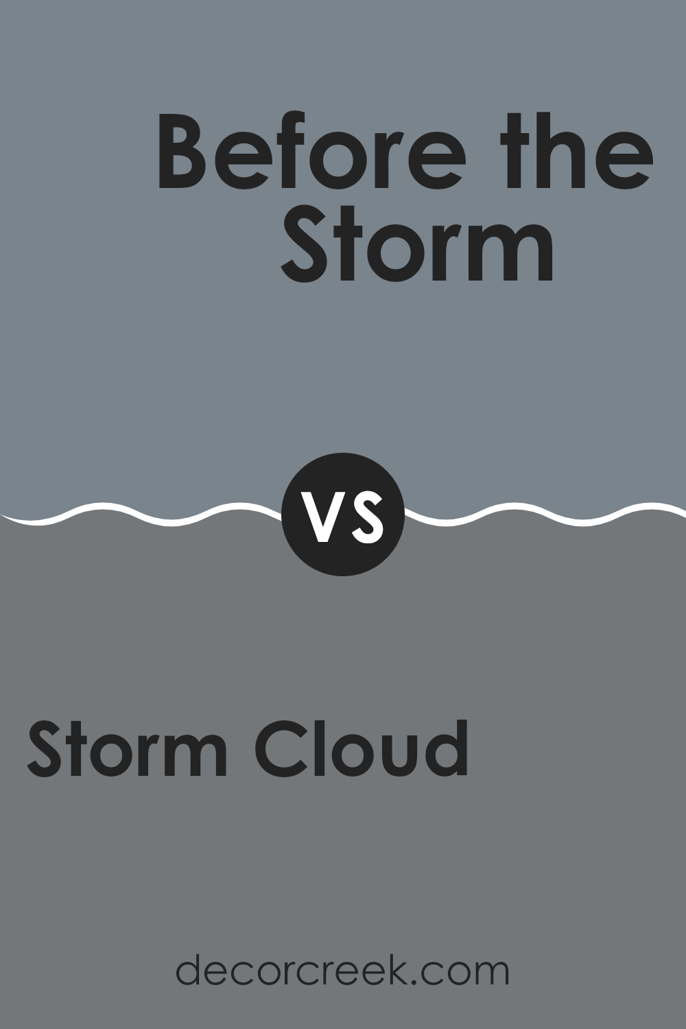
Storm Cloud SW 6249 by Sherwin Williams vs Before the Storm SW 9564 by Sherwin Williams
Storm Cloud and Before the Storm by Sherwin Williams are both gray colors but have different qualities. Storm Cloud is a deeper gray, giving a strong and bold feel which makes it great for creating a solid, grounding effect in an area.
On the other hand, Before the Storm is lighter and softer. This makes it ideal for those who want a gentler gray that still provides a sense of calm without being too dark.
While Storm Cloud can make a dramatic statement and works well in an area that needs a touch of drama, Before the Storm is better suited for areas where a lighter touch is preferred. Both colors can work beautifully in a variety of decorating styles, but your choice will depend on the mood you want to set in your room.
You can see recommended paint color below:
Storm Cloud SW 6249 by Sherwin Williams vs Serious Gray SW 6256 by Sherwin Williams
Storm Cloud and Serious Gray, both by Sherwin Williams, offer distinct yet subtle moods for interior areas. Storm Cloud, a deeper shade, carries a stronger presence due to its intense blue-gray tones.
This color can bring a noticeable depth to a room, making it a good choice for those looking to make a more vivid statement within their decorating scheme. On the other hand, Serious Gray is lighter and leans more towards a true gray. This makes it incredibly adaptable and easier to pair with a wider range of decor elements.
It’s great for creating a calm, neutral backdrop that complements various styles and colors. Both colors work well in modern interiors but their impact differs: Storm Cloud draws more attention while Serious Gray blends smoothly into surrounding elements. Choosing between them depends on how much you want the color to stand out in your area.
You can see recommended paint color below:

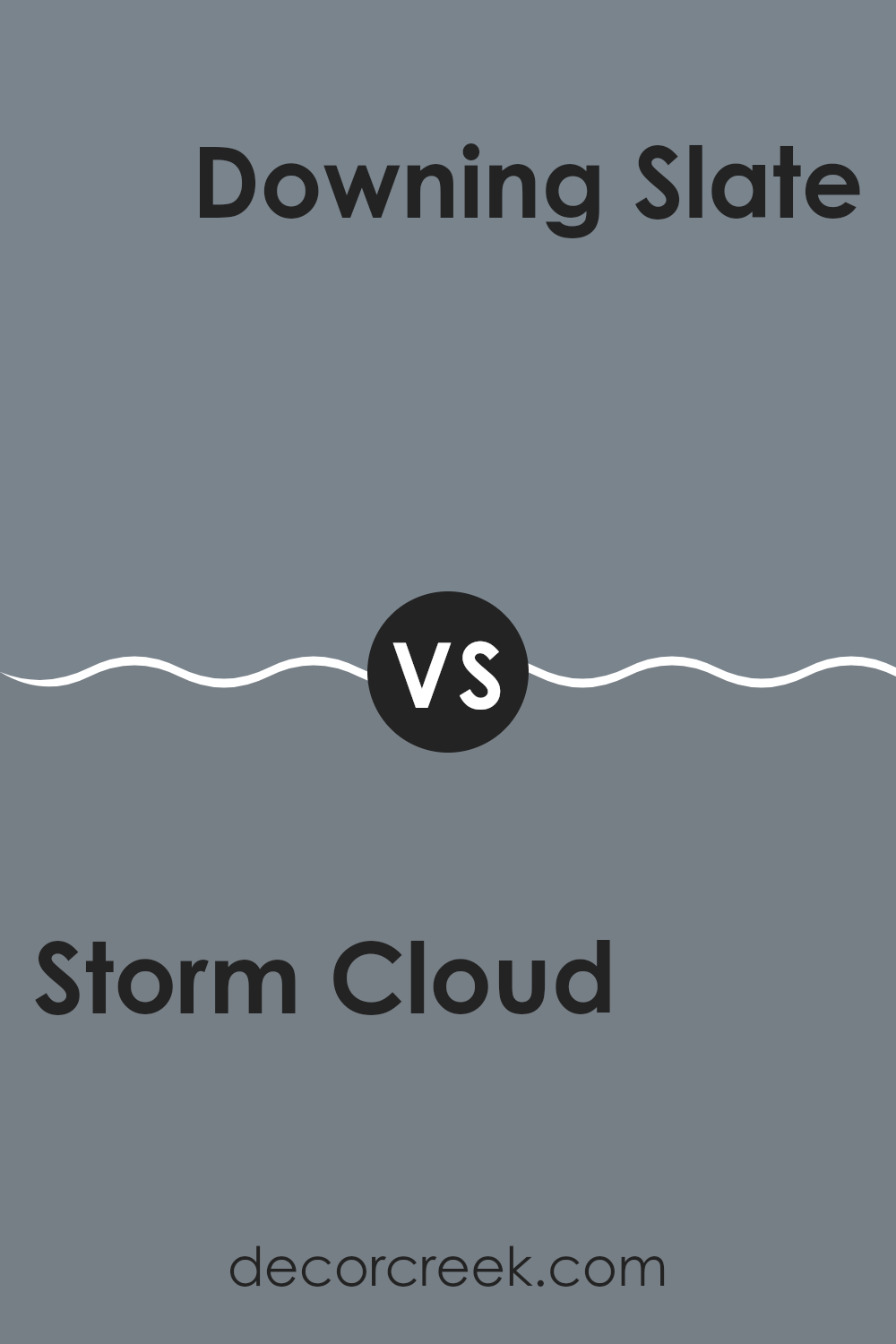
Storm Cloud SW 6249 by Sherwin Williams vs Downing Slate SW 2819 by Sherwin Williams
Storm Cloud and Downing Slate are two colors from Sherwin Williams that offer distinct vibes for any room. Storm Cloud is a deep grey with a hint of blue. This shade is adaptable and goes well in areas that aim for a calm and subtle tone. It pairs nicely with lighter shades, helping to create a balanced look.
On the other hand, Downing Slate is a darker, charcoal-like color that leans more towards a traditional grey. It’s perfect for anyone wanting to add a bit of drama or a bold statement to their room, providing a strong backdrop that makes lighter or brighter colors pop.
Overall, while both colors are forms of grey, Storm Cloud has a softer presence due to its blue undertone, making it more relaxed. Downing Slate, being closer to true grey, offers a more striking and pronounced appearance, suitable for more formal or defined areas.
You can see recommended paint color below:
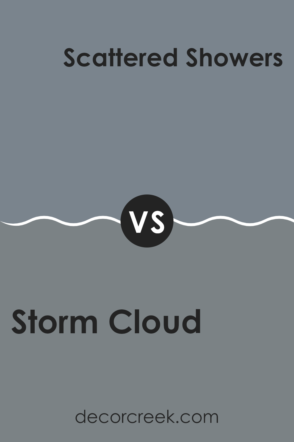
Storm Cloud SW 6249 by Sherwin Williams vs Scattered Showers SW 9559 by Sherwin Williams
Storm Cloud is a richer, darker shade, presenting a strong, bold look perfect for areas where you want to make a statement. It has deep blue and gray undertones, which bring a sense of stability and sturdiness to any area. This color pairs well with light tones for a striking contrast or darker woods for a more cohesive feel.
Scattered Showers, on the other hand, is a much lighter gray, offering a fresher, airier feel. This color is adaptable, fitting well in small areas to give an illusion of more room, or in larger areas where a neutral, calming backdrop is needed. It carries subtle blue undertones, making it cool and soothing, ideal for a modern look that’s easy on the eyes.
Both colors provide unique possibilities depending on the atmosphere you wish to create. Storm Cloud makes a bolder statement, while Scattered Showers provides a cleaner, open feel.
You can see recommended paint color below:
Storm Cloud SW 6249 by Sherwin Williams vs Bracing Blue SW 6242 by Sherwin Williams
Storm Cloud and Bracing Blue, both by Sherwin Williams, are hues that provide distinct vibes for any area. Storm Cloud is a deep, moody gray with blue undertones, giving it a strong presence that works well in areas where a bold yet neutral tone is desired. This color can be quite adaptable, acting as either a soothing background or as a statement, depending on the decor surrounding it.
In contrast, Bracing Blue has a clearer, more pronounced blue shade that holds a fresher, brighter feel. It tends to evoke an airy, open atmosphere, making rooms feel more expansive and light. This color is perfect for areas intended to have a calming and refreshing effect, like bathrooms or bedrooms.
Comparing the two, Storm Cloud serves well in providing depth and a grounding effect, whereas Bracing Blue offers a lift and a breath of fresh air to a room’s aesthetic. Both colors can effectively enrich a design scheme but cater to different stylistic needs.
You can see recommended paint color below:

Storm Cloud SW 6249 by Sherwin Williams vs Foggy Day SW 6235 by Sherwin Williams
Storm Cloud and Foggy Day are both shades by Sherwin Williams, but they offer distinct vibes. Storm Cloud is a deeper, more intense gray that has a bold presence. It’s a great choice if you want a color that makes a strong statement in an area. It can work well in areas like living rooms or bedrooms where a touch of drama is desired.
Foggy Day, on the other hand, is lighter and subtler. This color provides a more laid-back feel, making it ideal for creating a relaxed atmosphere. It’s perfect for areas where you want a gentle background, such as in bathrooms or kitchens.
Overall, if you’re looking for a color that’s striking and can act as a focal point, Storm Cloud is the way to go. If you prefer something lighter and more understated, Foggy Day would be a better choice. Both colors have their unique charm and can beautifully define an area depending on what mood you’re aiming to achieve.
You can see recommended paint color below:
Storm Cloud SW 6249 by Sherwin Williams vs Smoky Azurite SW 9148 by Sherwin Williams
Storm Cloud and Smoky Azurite are two colors by Sherwin Williams that each bring their unique charm to an area. Storm Cloud is a deep gray that has a strong presence, giving a bold and sturdy feel to any room. It’s the kind of color that pairs well with various decor styles, adding a solid, grounding effect.
On the other hand, Smoky Azurite has a bluish tint that offers a slightly cooler and more refreshing feel. It’s lighter than Storm Cloud and brings a calm, airy quality to interiors, which might be more appealing for those who prefer a gentler touch in their color scheme.
While both colors are quite different, they could complement each other well in a single area or be used in separate areas depending on the mood you want to create. Storm Cloud works great for creating a cozy, secure ambiance, whereas Smoky Azurite can lighten and brighten rooms beautifully.
You can see recommended paint color below:

After learning more about SW 6249 Storm Cloud by Sherwin Williams, I think it’s a really great paint color for rooms. It’s a blue-gray color that looks a bit like the sky on a stormy day, which gives it a cool and calm feeling. This color works well in places like the living room or the bedroom because it’s not too bright or too dark. It’s just right to make the room feel cozy.
I also found out that this color matches well with different decorations. Whether you have light-colored furniture or dark, Storm Cloud seems to go well with everything. Plus, it can help smaller rooms look a bit bigger and more inviting.
So, if someone is trying to decide what color to paint their room, I would definitely suggest considering Storm Cloud. It can make any room look nicer and it’s easy to find things that go with it. It’s a good choice for making your room look pretty without too much extra work.
Ever wished paint sampling was as easy as sticking a sticker? Guess what? Now it is! Discover Samplize's unique Peel & Stick samples.
Get paint samples

