Black
Black Blue
Blue Brown
Brown Gray
Gray Green
Green Neutral
 Orange
 White
White Yellow
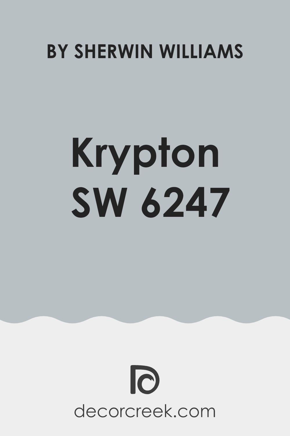
Choosing the perfect paint color for your home can be a tough decision. If you’re considering SW 6247 Krypton by Sherwin Williams, it’s important to consider how it will fit into your home. Krypton is a soft, cool gray that carries a subtle blue undertone. This unique blend can create a peaceful atmosphere in well-lit rooms but might appear slightly darker in areas with less natural light.
From my experience, it’s essential to pay attention to the lighting conditions in your room when evaluating this color. Krypton can look quite different depending on the amount of natural or artificial light it’s exposed to.
Before making a decision, I recommend testing the paint on a large patch of your wall and observing it at different times of the day. This approach will give you a real sense of how the paint will interact with the light in your room and help you avoid any surprises after you’ve committed to a full room makeover.
Additionally, consider your room’s existing decor and furniture. Krypton pairs beautifully with crisp whites or deep charcoals for a modern contrast, but be mindful of how it will complement the textures and colors already in your room. Personal taste plays a significant role here, so go with what feels right for you.
Is Krypton SW 6247 Right for My Home?
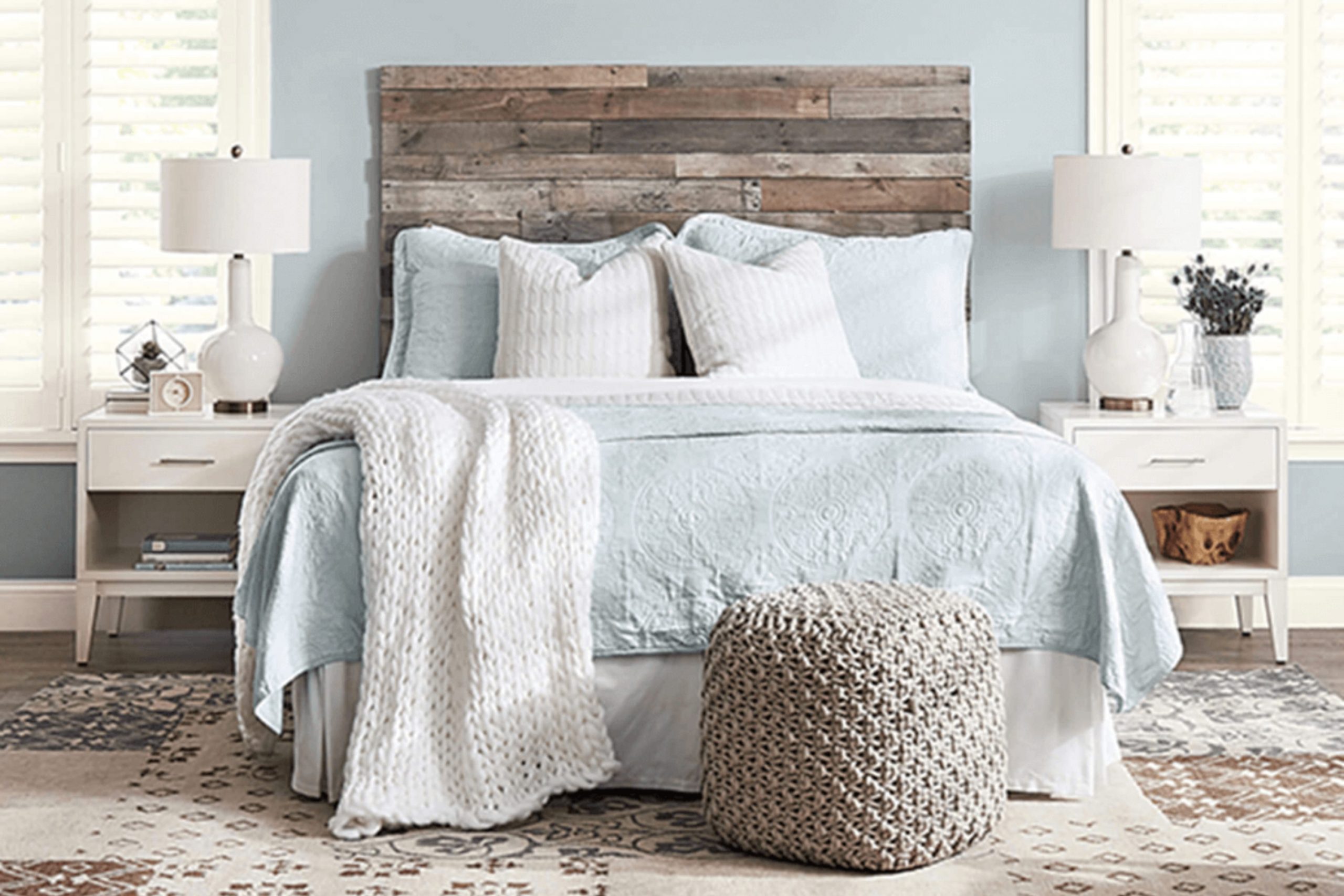
I recently came across Krypton SW 6247 by Sherwin Williams, and I must say, it’s a lovely shade that instantly caught my eye. It’s a gentle blue with hints of gray, quiet and subtle, and works beautifully in creating a calming atmosphere without making a room feel cold or uninviting.
In terms of interior styles, I find that Krypton fits perfectly within contemporary settings due to its clean and modern vibe. However, it also looks fantastic in coastal designs where soft blues are often favored for their light and airy qualities, reminiscent of the sea and sky. It pairs particularly well with natural materials like light woods, which complement its cool tones, and linen fabrics that add a touch of warmth and texture to the room.
Generally, I like using Krypton in rooms where I want a touch of color without being too bold. It works particularly well in bedrooms and bathrooms where creating a calm, relaxing atmosphere is key. It’s not just limited to walls.
Consider using it on cabinetry or furniture pieces to add a subtle yet distinctive touch to your home pairing well with materials like brushed nickel or soft gold finishes, enhancing its subtle elegance without competing for attention. Overall, Krypton is wonderfully adaptable and easy to work with, blending nicely with various textures and materials to create a harmonious room that feels both refreshing and cozy.
decorcreek.com
What are the right undertones of Krypton SW 6247 ?
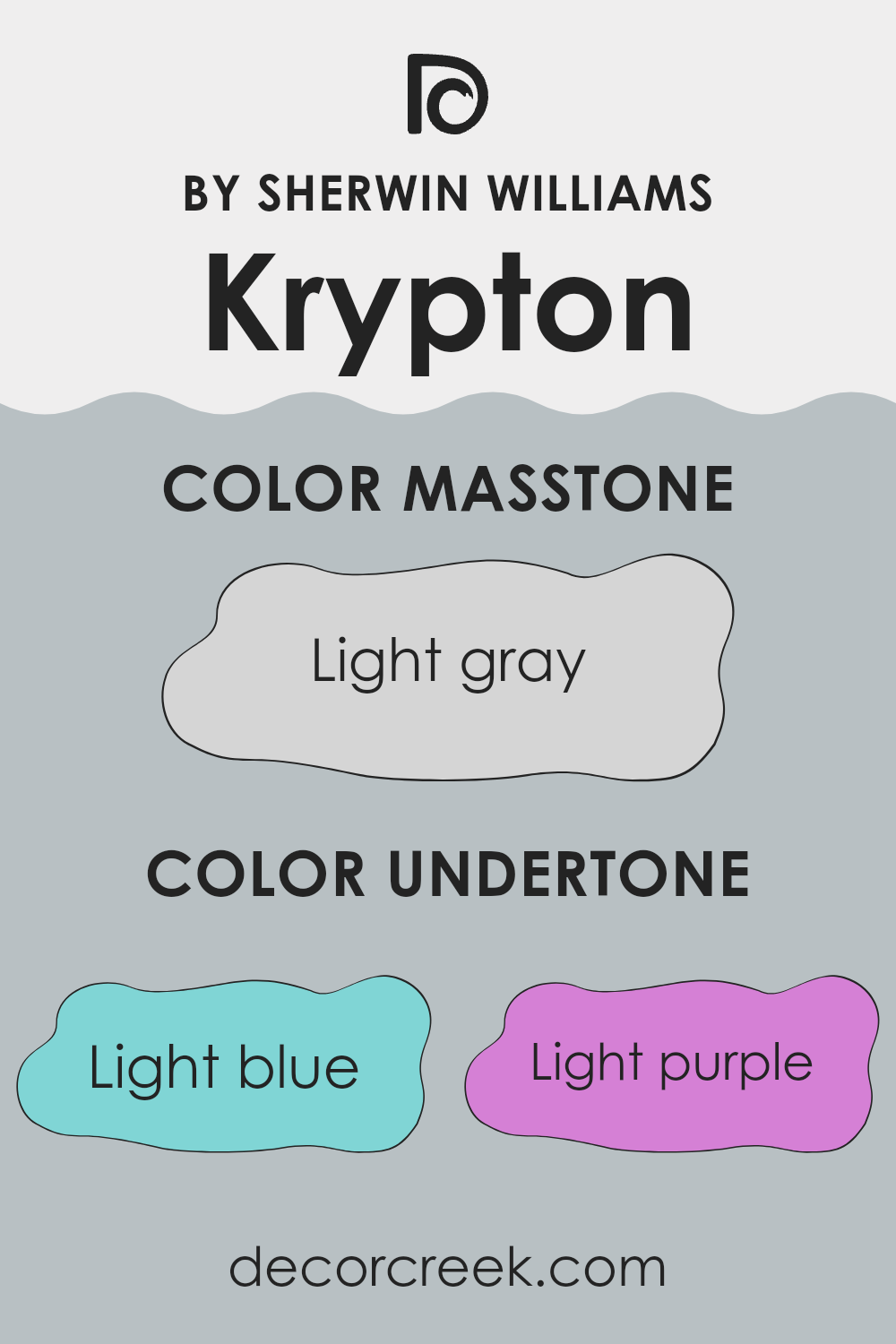
KryptonSW 6247 by Sherwin Williams is an adaptable paint color, much loved for its unique blend of undertones. This paint doesn’t just present as a simple gray; it encompasses a spectrum of subtle hues that influence how it appears in different settings. These undertones include light blue, light purple, pale yellow, lilac, mint, pale pink, and grey.
The concept of undertones refers to the hint of color that can be seen beneath the surface of the main color. These underlying shades can greatly affect the perception of the color. For instance, a grey with a blue undertone might appear cooler, making it a good choice for a calming environment, while a grey with a yellow undertone may feel warmer and more inviting.
In the case of KryptonSW 6247, the light blue and lilac undertones give it a slightly cool yet welcoming feel. These cooler undertones can make a room feel more open and airy. On the other hand, the warmer undertones like pale yellow and pale pink add a subtle warmth, making the room feel cozy without overpowering the coolness.
This balance makes KryptonSW 6247 an excellent choice for a variety of interior walls. It can adjust its tone depending on the light and furnishings, providing flexibility in decor options. This ability to both adapt and subtly shift its presentation makes this color a popular choice for those looking to paint their interior walls.
decorcreek.com
Best Coordinating Colors to use with Krypton SW 6247 by Sherwin Williams this year.
Coordinating colors are essentially a palette of hues that work harmoniously together to create a pleasing aesthetic in any room. When these hues complement each other effectively, they enhance the overall atmosphere of a room without creating too much contrast.
For example, a color like Krypton works well with a range of coordinating colors that bring out its unique tones. These coordinated shades can either be similar to create a subtle, harmonious look, or they can be contrasting to make each other pop, all while keeping a balanced visual statement.
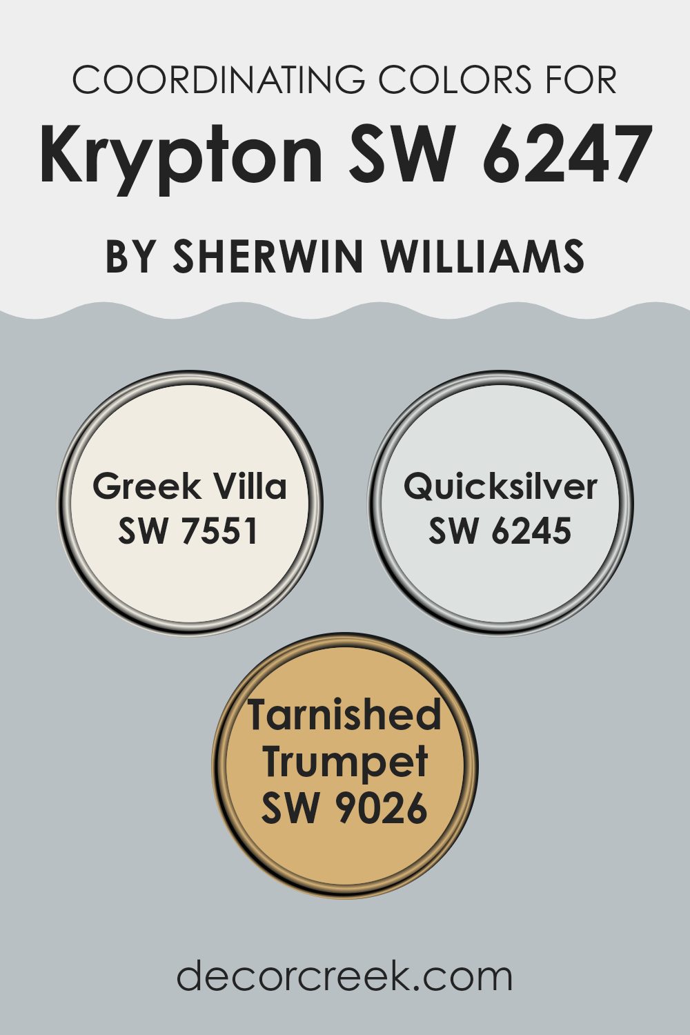
One of the coordinating colors for Krypton is Greek Villa, which is a soft, warm white with a hint of creaminess, making it a popular choice for adding a bright yet inviting feel to any room. It pairs beautifully with Krypton by providing a gentle contrast that highlights its cooler tones. Another great match is Quicksilver, a light gray that has a slightly blue undertone.
This color keeps the coolness of the scheme but adds some depth to the palette. Lastly, Tarnished Trumpet offers a bold mustard yellow that adds a splash of lively color, which injects personality and zest without clashing, making it a stunning choice for accents or focal points in a room designed with Krypton. Together, these three shades offer a balanced and appealing mix that can enhance the look of any room.
You can see recommended paint colors below:
- SW 7551 Greek Villa
- SW 6245 Quicksilver
- SW 9026 Tarnished Trumpet
Trendy Trim Colors of Krypton SW 6247 by Sherwin Williams to use this year.
Trim colors are specific hues selected to accentuate or offset the main colors used on walls and larger surfaces, and they play a crucial role in defining distinct features like door frames, moldings, and skirting boards.
By using trim colors effectively, you can create subtle contrasts that highlight architectural details or add a sense of completeness to a decorating scheme. For instance, if you’re working with a primary color such as Krypton SW 6247 by Sherwin Williams, choosing the right trim color can significantly influence the room’s aesthetic and vibe.
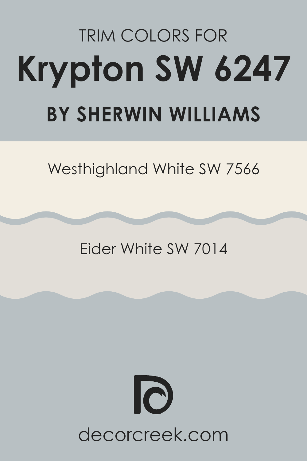
Westhighland White SW 7566 and Eider White SW 7014 are excellent choices for trim colors when paired with darker shades like Krypton. Westhighland White is a warm, creamy white that brings a soft, welcoming contrast to richer, darker colors, making it ideal for creating a gentle transition between wall colors and trim.
On the other hand, Eider White has a slightly cooler undertone, offering a subtle differentiation that maintains a clean and crisp boundary with darker hues, which can make the deeper color stand out more vividly against trim elements. Both colors serve to enhance the overall appearance by adding depth and definition without overshadowing the primary color palette.
You can see recommended paint colors below:
- SW 7566 Westhighland White
- SW 7014 Eider White
Evergreen Colors Similar to Krypton SW 6247 by Sherwin Williams
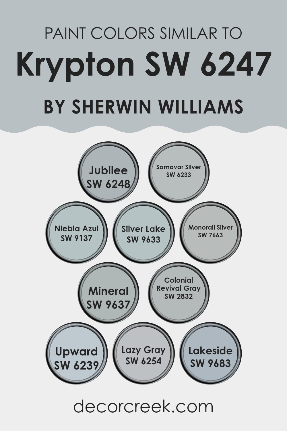
Choosing the right colors for your room is crucial, and sticking to similar shades can create a harmonious atmosphere. Similar colors, such as those akin to Krypton SW 6247 by Sherwin Williams, share a close relationship on the color wheel, providing a subtle variation that enhances the aesthetic without being too bold.
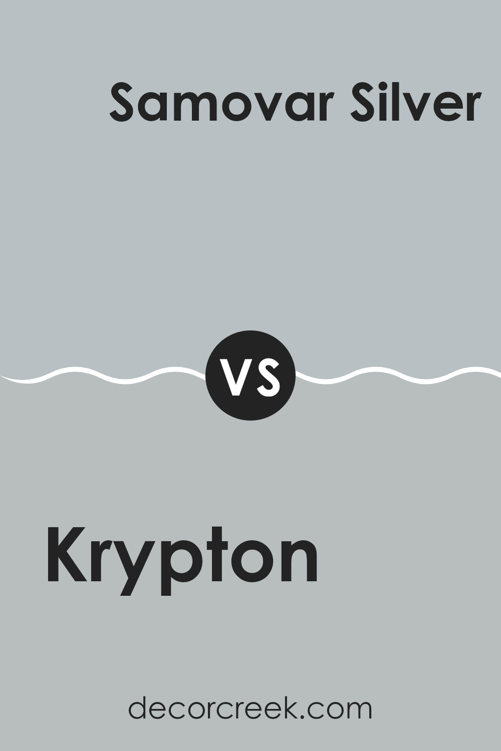
Colors like Jubilee SW 6248 add a gentle neutrality, perfect for creating calm, understated elegance. Similarly, Samovar Silver SW 6233 offers a light, airy feel with its hint of silver, adding just enough interest to keep the visual palette engaging.
Niebla Azul SW 9137 introduces a soft, cloudy blue that gives a sense of openness and lightness, ideal for rooms that benefit from a fresh, airy feel. Silver Lake SW 9633, and Monorail Silver SW 7663 both bring in elements of silver with a slightly more pronounced depth, making them perfect for adding a bit of drama without straying too far from the original palette.
Mineral SW 9637 offers a touch of earthiness, grounding the surrounding lighter shades. Colonial Revival Gray SW 2832 serves as a classic gray that pairs well with both contemporary and traditional decor.
Upward SW 6239 and Lazy Gray SW 6254 are similar in that they provide a backdrop of soft, soothing gray, enabling other design elements to stand out. Lastly, Lakeside SW 9683 rounds out the palette with a hint of blue, reminiscent of a peaceful lakeside retreat. These colors work together to create a cohesive and inviting room.
You can see recommended paint colors below:
- SW 6248 Jubilee
- SW 6233 Samovar Silver
- SW 9137 Niebla Azul
- SW 9633 Silver Lake
- SW 7663 Monorail Silver
- SW 9637 Mineral
- SW 2832 Colonial Revival Gray
- SW 6239 Upward
- SW 6254 Lazy Gray
- SW 9683 Lakeside
Colors that Go With Krypton SW 6247 by Sherwin Williams
Choosing the right colors that coordinate with Krypton SW 6247 by Sherwin Williams is crucial in achieving a harmonious and visually appealing room. These coordinating colors are particularly important because they help create a balanced and cohesive look, allowing Krypton, a soft, neutral gray, to shine without dominating the room.
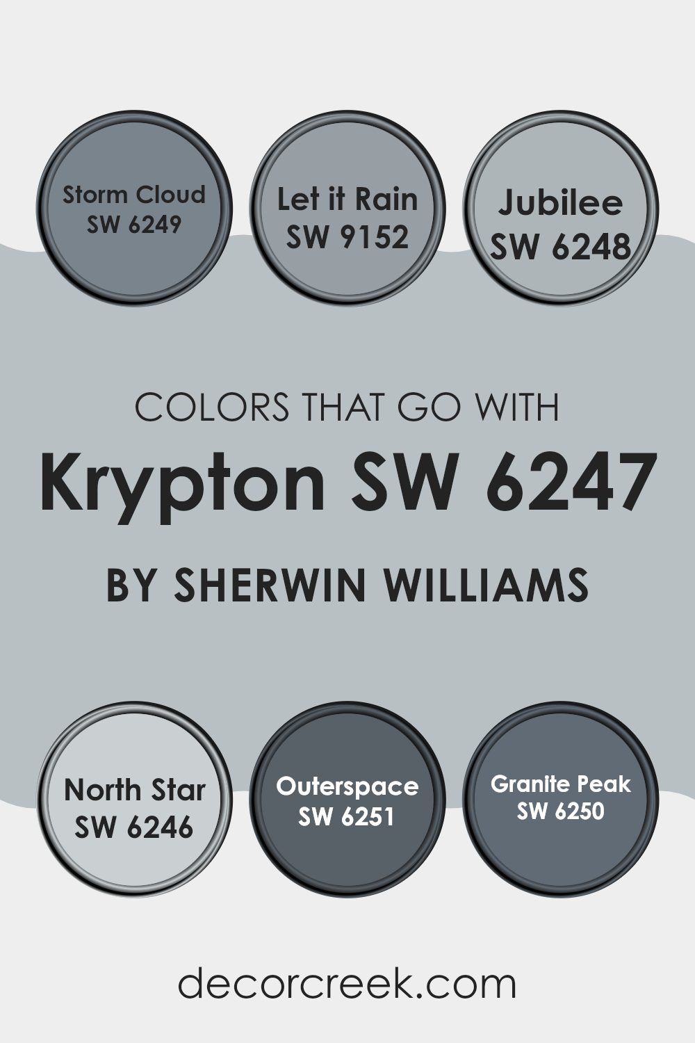
Colors like Storm Cloud, Let it Rain, Jubilee, North Star, Outerspace, and Granite Peak each play a unique role in either complementing or providing a striking contrast to Krypton, depending on the desired effect.
Storm Cloud is a deeper, brooding gray that adds a strong, grounding presence when used alongside the lighter gray of Krypton. Let it Rain is similar but with a slightly bluer undertone, providing a calm, cohesive look. Jubilee, a muted lavender-gray, introduces a subtle touch of color that is neither overpowering nor too distinct from Krypton, making it perfect for a gentle contrast within neutral themes.
North Star, the lightest color among these options, offers a near-white simplicity that brightens rooms and pairs effortlessly with the cool undertones of Krypton. Outerspace brings a charcoal-like depth that can be used to accent more significant features or furniture, anchoring the room’s overall aesthetic.
Finally, Granite Peak features a robust, slate-like hue that works well in providing a bold yet balanced contrast to the softer gray of Krypton, perfect for creating focal points or accent walls. Using these colors together ensures a stylish and cohesive color scheme that can enhance any living room.
You can see recommended paint colors below:
- SW 6249 Storm Cloud
- SW 9152 Let it Rain
- SW 6248 Jubilee
- SW 6246 North Star
- SW 6251 Outerspace
- SW 6250 Granite Peak
Krypton SW 6247 by Sherwin Williams vs Colonial Revival Gray SW 2832 by Sherwin Williams
Krypton SW 6247 and Colonial Revival Gray SW 2832 by Sherwin Williams are both unique shades of gray that offer different vibes for room settings. Krypton is a lighter, almost silvery gray with slight blue undertones that give it a fresh and airy feel. This color is great for rooms aimed at achieving a bright and open look. It works well in areas with plenty of natural light, as the light plays off its subtle blue tones.
On the other hand, Colonial Revival Gray is a deeper, warmer gray that conveys a more traditional appearance. It has a solid, earthy base that pairs well with wood finishes and classic decor. This shade is ideal for those wanting a more grounded and cozy atmosphere in their room.
Whether choosing Krypton for a modern, light room, or Colonial Revival Gray for a warm traditional setting, both colors offer distinct aesthetics to enhance any room’s character.
You can see recommended paint color below:
- SW 2832 Colonial Revival Gray
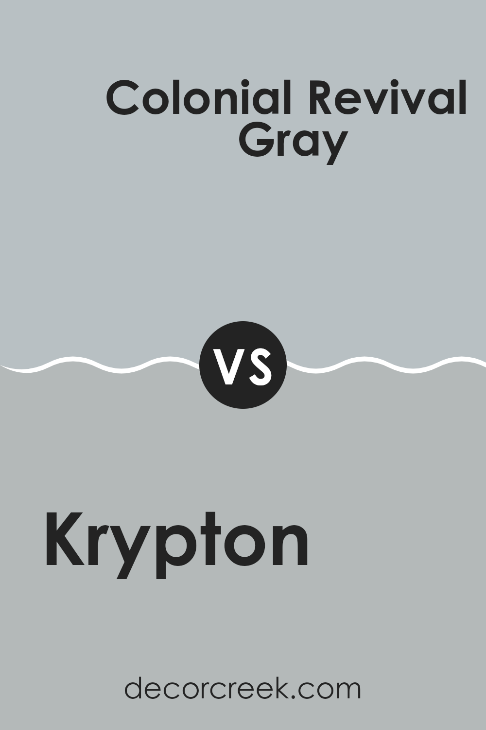
Krypton SW 6247 by Sherwin Williams vs Monorail Silver SW 7663 by Sherwin Williams
Krypton SW 6247 and Monorail Silver SW 7663, both by Sherwin Williams, are distinct shades with unique feels. Krypton has a cool, soft blue hue that gives a calming effect to any room. It resembles a light, muted sky blue and is ideal for creating a fresh and airy atmosphere in rooms. This makes it suitable for areas like bedrooms and bathrooms where you seek a peaceful setting.
On the other hand, Monorail Silver is a warmer gray with slight blue undertones. This color is adaptable and grounded, making it a good choice for both modern and traditional rooms. It works well in living rooms and kitchens as it complements a wide range of decor styles and colors.
Choosing between Krypton and Monorail Silver depends on the mood you want to set. Krypton imparts a light, breezy feel perfect for relaxed rooms, while Monorail Silver offers a more understated, solid backdrop, suitable for dynamic and frequently used areas.
You can see recommended paint color below:
- SW 7663 Monorail Silver
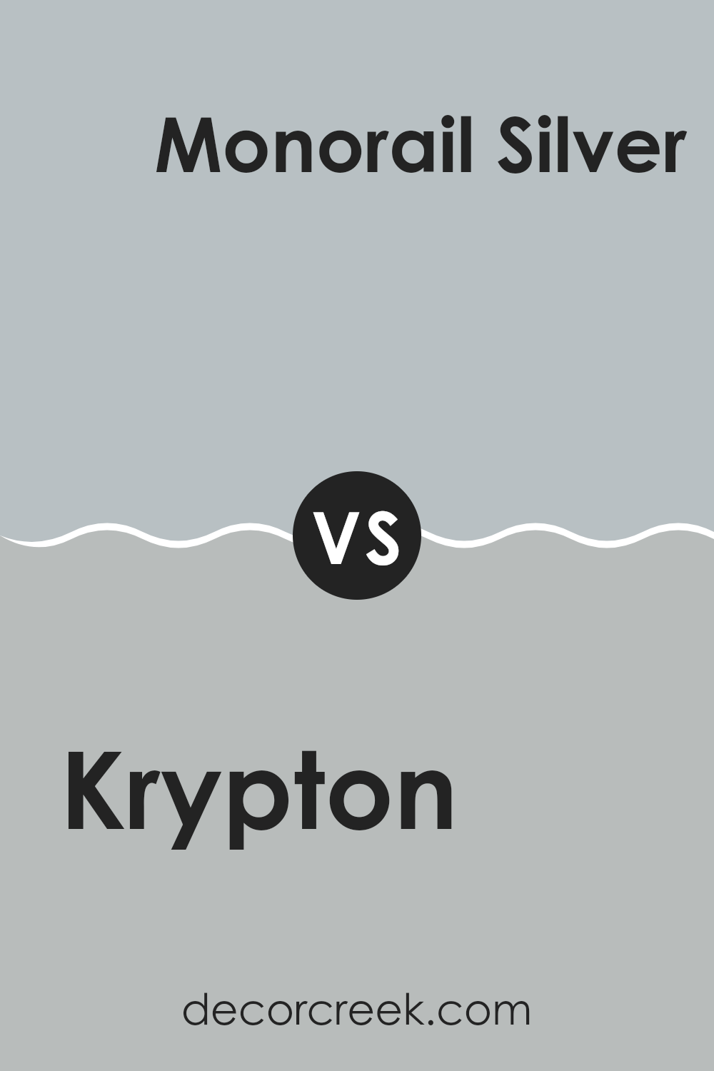
Krypton SW 6247 by Sherwin Williams vs Lakeside SW 9683 by Sherwin Williams
Krypton and Lakeside, both by Sherwin Williams, offer distinct vibes for any room. Krypton is a soft, muted gray with a hint of blue that gives a calm and gentle feel to a room. It’s perfect for creating a peaceful, quiet atmosphere, ideal for bedrooms or offices where you want to keep things subtle and soothing.
On the other hand, Lakeside is a deeper, more intense blue. This color can add a striking touch to a room, making it feel more lively and vibrant. It works well in areas where you want to add some energy or a splash of personality, like a kitchen or a bathroom.
Comparing the two, Krypton provides a neutral backdrop that’s easy to match with other colors and decorations. Lakeside, being bolder, requires a bit more thought when pairing with other colors but can make a stronger statement. Both colors have their unique appeal, depending on what mood or style you’re aiming for in a room.
You can see recommended paint color below:
- SW 9683 Lakeside
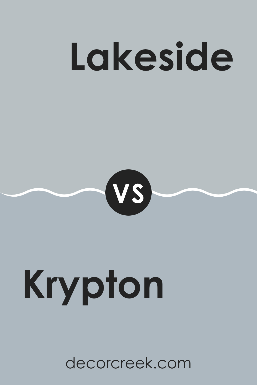
Krypton SW 6247 by Sherwin Williams vs Samovar Silver SW 6233 by Sherwin Williams
The two colors, Krypton and Samovar Silver from Sherwin Williams, offer distinct yet subtle differences in tone and mood. Krypton is a soft, soothing gray with blue undertones, giving it a clean and airy feel. It’s ideal for creating a calm, refreshing environment in places like bedrooms or bathrooms.
On the other hand, Samovar Silver is a slightly lighter gray that leans towards silver, bringing a brighter and more open feel to rooms. This color works well in areas where you want to promote a light, welcoming atmosphere, such as kitchens and living rooms.
Both colors are adaptable and can work beautifully in various settings, from modern to traditional, depending on the furnishings and accents used with them. They provide a neutral backdrop that allows for flexibility in decorating with different colors and textures.
You can see recommended paint color below:
- SW 6233 Samovar Silver
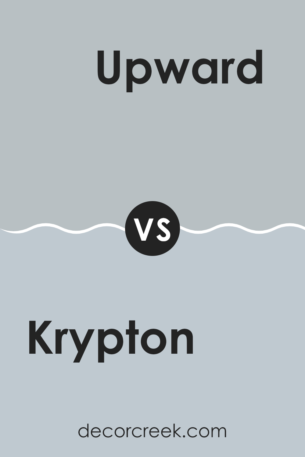
Krypton SW 6247 by Sherwin Williams vs Upward SW 6239 by Sherwin Williams
Krypton and Upward, both by Sherwin Williams, are soothing shades of blue. Krypton is a cooler, muted blue with gray undertones, giving it a calm and understated look. It’s great for rooms where you want a hint of color without being too bold.
On the other hand, Upward is a lighter blue. It has a softer appearance and reflects more light, making it feel airy and open. This color works well in small rooms or areas with limited natural light to make them appear larger.
Both colors pair well with white trim and can be used for a relaxed and peaceful atmosphere in your home. Each brings its own unique feel, with Krypton being slightly more grounded and Upward offering a more open and light vibe.
You can see recommended paint color below:
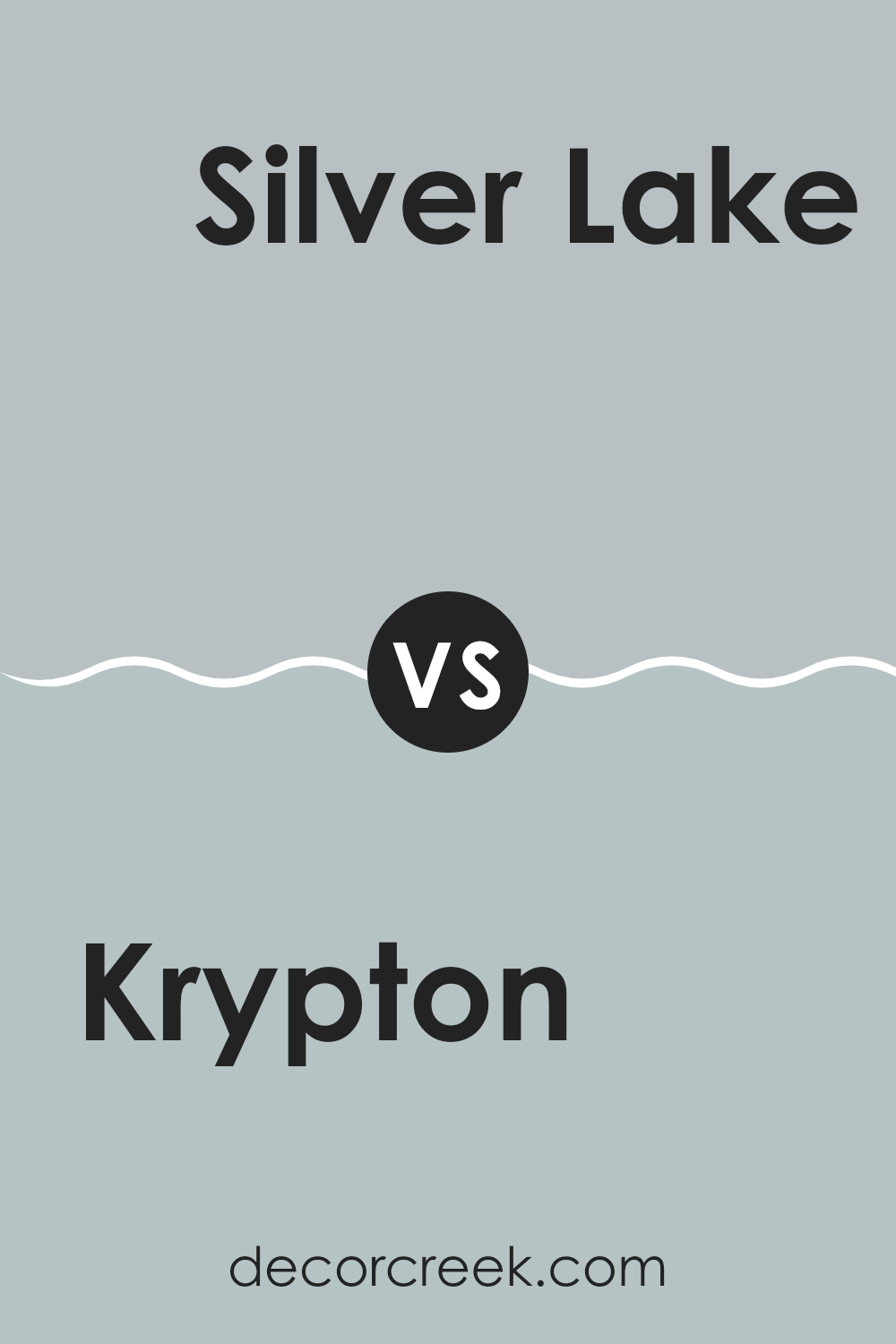
Krypton SW 6247 by Sherwin Williams vs Silver Lake SW 9633 by Sherwin Williams
The main color, Krypton, and the second color, Silver Lake, both by Sherwin Williams, have unique shades that cater to different tastes and design needs. Krypton is a soft, cool gray with blue undertones that gives a fresh and clean look to any room.
It pairs well with brighter colors if you want some contrast, or with other neutrals for a more subdued setting. On the other hand, Silver Lake is a slightly warmer gray that leans towards a silver-blue tone, offering a gentle and calming appearance that works beautifully in bedrooms and living areas. It’s less chilly than Krypton and adds a touch of warmth to the rooms.
While Krypton is ideal for a modern feel that keeps rooms open and airy, Silver Lake provides a cozy warmth that can make larger rooms feel more intimate. Both colors support various decor styles, from contemporary to traditional, depending on how they’re applied and what they’re paired with.
You can see recommended paint color below:
- SW 9633 Silver Lake
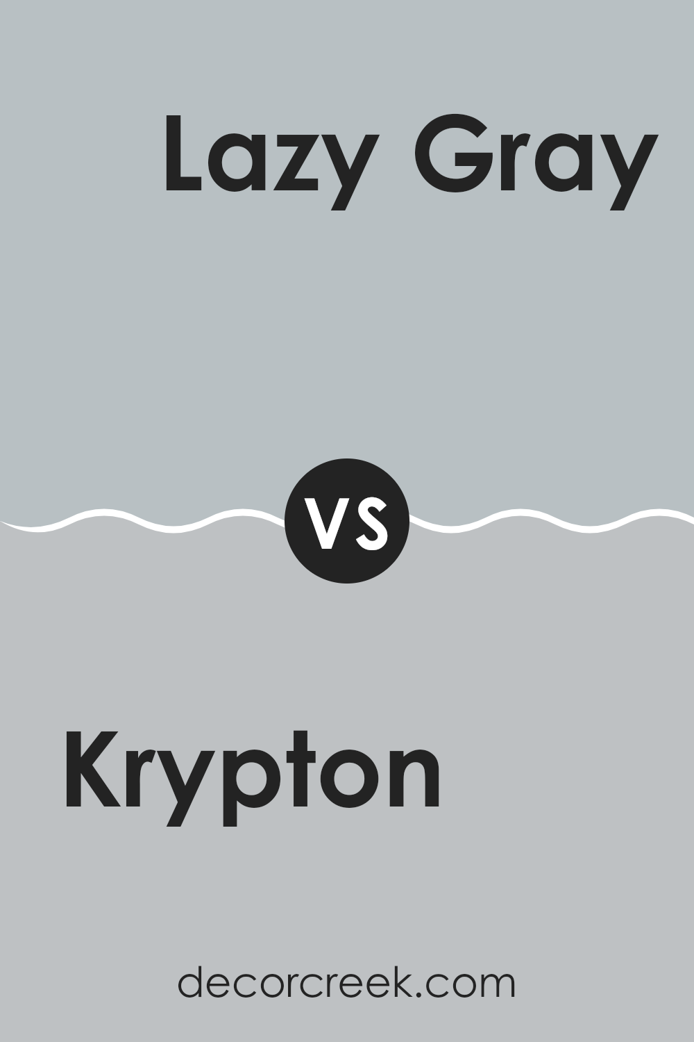
Krypton SW 6247 by Sherwin Williams vs Lazy Gray SW 6254 by Sherwin Williams
Krypton and Lazy Gray, both by Sherwin Williams, present cool, soft gray tones that are quite popular in modern color schemes. Krypton is a lighter shade with blue undertones that gives a fresh and airy feel to any room. It is especially suitable for creating a calm, muted atmosphere where relaxation is a priority, such as in bedrooms or bathrooms.
On the other hand, Lazy Gray is a bit darker and has undertones that lean slightly towards blue-green. This color is excellent for rooms where you want a peaceful feel, but with a bit more depth and fullness compared to the lighter Krypton. Lazy Gray works well in living areas and kitchens where a cozy yet open feel is desired.
Both colors are adaptable and can be coordinated with a variety of decor styles and other hues, providing a clean, contemporary look. Depending on the lighting and accompanying decor, each can vary in appearance, adding subtle uniqueness to a room.
You can see recommended paint color below:
- SW 6254 Lazy Gray
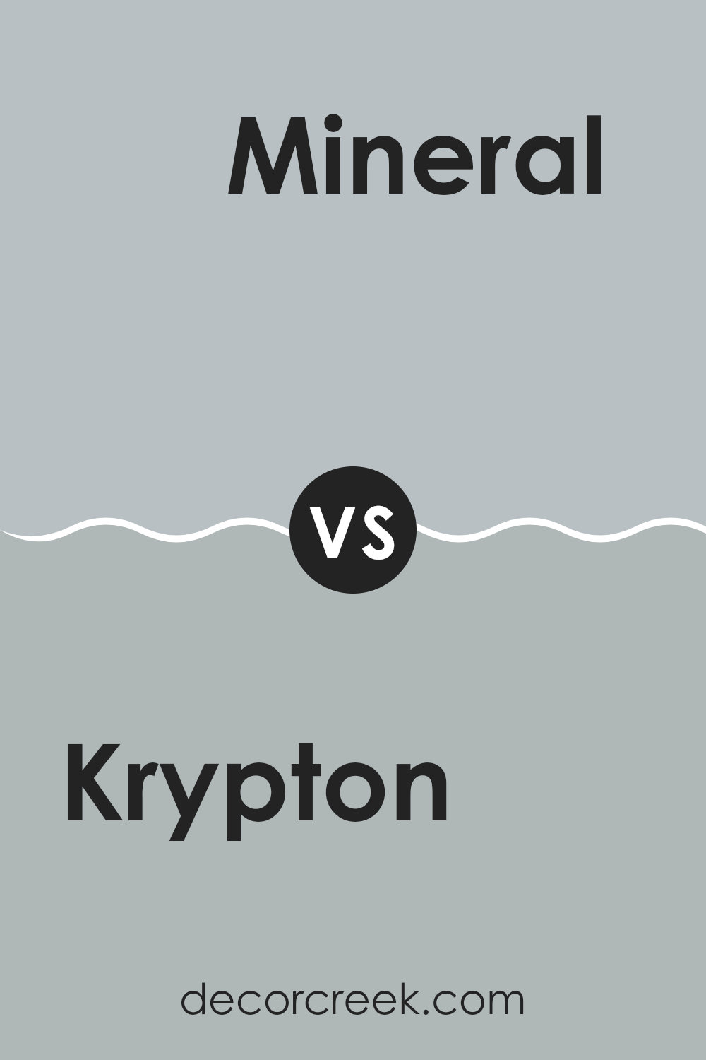
Krypton SW 6247 by Sherwin Williams vs Mineral SW 9637 by Sherwin Williams
Krypton SW 6247 and Mineral SW 9637, both by Sherwin Williams, are distinct in their hues and the atmospheres they create in a room. Krypton is a cool, light gray with blue undertones, giving it a fresh and calm appearance. This color works well in rooms meant to feel airy and open, making it ideal for bedrooms or bathrooms where a peaceful vibe is desired.
On the other hand, Mineral SW 9637 is a warmer tone, leaning towards a soft beige with slight gray undertones. This color provides a cozy and inviting feel, perfect for living rooms or entryways where a welcoming atmosphere is important.
Both colors are adaptable and can complement various decor styles, but Krypton leans towards a more modern, clean look while Mineral suits a traditional or rustic aesthetic better. Each paint color offers its unique charm, depending on what feeling you want to achieve in your home.
You can see recommended paint color below:
- SW 9637 Mineral
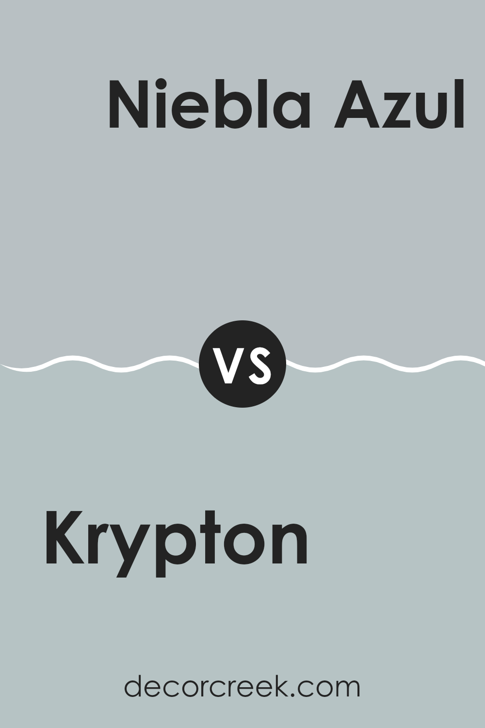
Krypton SW 6247 by Sherwin Williams vs Niebla Azul SW 9137 by Sherwin Williams
Krypton SW 6247 and Niebla Azul SW 9137 by Sherwin Williams are two distinct shades that each offer a unique atmosphere. Krypton is a soft, subtle gray with a hint of blue, giving it a cool and calming presence that’s adaptable for many rooms. It works well in areas where a light, peaceful feel is desired, such as bedrooms or bathrooms.
On the other hand, Niebla Azul is a deeper, more pronounced blue with gray undertones. This color provides a stronger visual impact while maintaining a relaxed vibe. It’s great for creating a focal point in a room or adding depth, particularly in living areas or studies.
While both colors share a blend of blue and gray, Krypton is lighter and more understated, making it better for smaller or brighter areas to keep the room feeling open. Niebla Azul, with its richer tone, suits larger rooms or as an accent wall, adding character without being too bold. Both colors can work beautifully in a modern home decor scheme, offering clean, fresh backdrops that complement various styles of furnishing and decor.
You can see recommended paint color below:
- SW 9137 Niebla Azul
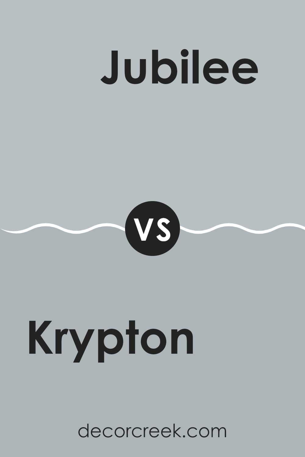
Krypton SW 6247 by Sherwin Williams vs Jubilee SW 6248 by Sherwin Williams
Krypton (SW 6247) and Jubilee (SW 6248) by Sherwin Williams are two shades that provide subtly different vibes for room decor. Krypton is a lighter, soft gray with a hint of blue undertones, offering a fresh and airy feel to any room. It works well in areas with plenty of natural light, making the room feel open and spacious.
Jubilee, as the next step up, is slightly deeper and also blends gray with blue. However, its blue undertones are more pronounced than in Krypton, giving it a more defined but still gentle character. This color can help add a bit of warmth to a room while maintaining a cool, calming presence.
Both colors are quite neutral and adaptable, making them easy to match with various decor styles and furniture pieces. Whether you’re looking to create a soothing bedroom atmosphere or a welcoming living area, either Krypton or Jubilee could be a great choice. Their subtle differences allow you to choose based on how prominent you want the blue undertone to be.
You can see recommended paint color below:
Having taken a close look at SW 6247 Krypton by Sherwin Williams, I think it’s a fantastic paint choice for anyone wanting to freshen up their home with a new color. Krypton is a gentle, soft gray that adds a calm feeling to any room without making it too dark or too bright. It seems just right for creating a cozy but cheerful room.
What really stands out about Krypton is how well it works with different styles and furniture. Whether your room has a modern look or more traditional pieces, this color fits right in. It works wonderfully in busy areas of the house like the living room or kitchen, as well as in quiet rooms like the bedroom.
Moreover, the quality of the paint is impressive. It goes on the wall smoothly, covers well, and lasts a long time. For families or anyone who has a lot of activity in their home, this paint can handle everyday wear and still look good.
So, if you’re thinking about giving a room a new look, SW 6247 Krypton by Sherwin Williams is a choice you might really like. It’s easy to apply, durable, and has a lovely hue that makes your home feel welcoming and fresh.
decorcreek.com
Ever wished paint sampling was as easy as sticking a sticker? Guess what? Now it is! Discover Samplize's unique Peel & Stick samples.
Get paint samples