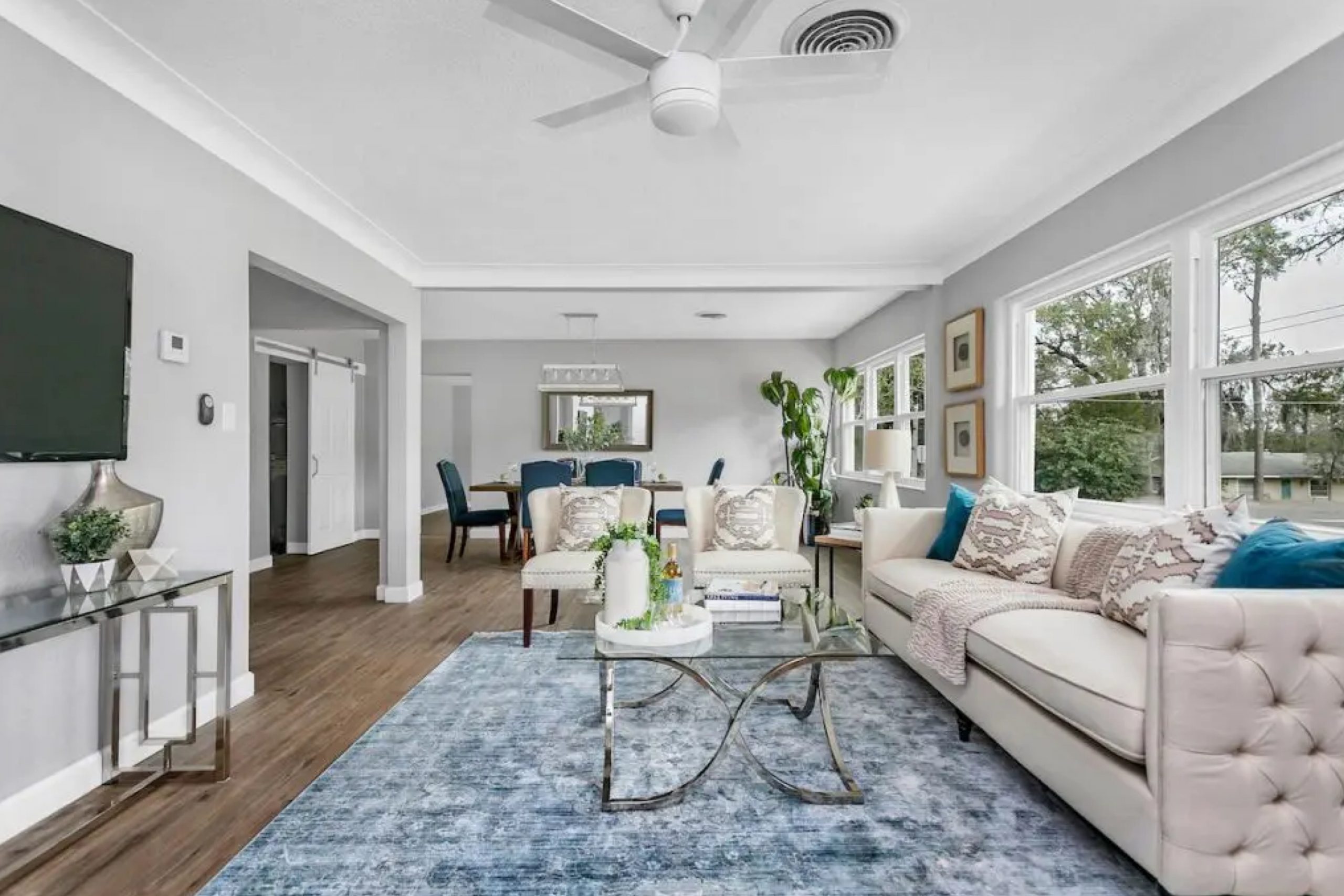
When you’re searching for a paint color that strikes the perfect balance between cool and calming, you might want to consider SW 6245 Quicksilver by Sherwin Williams. I recently had the opportunity to use this shade in a friend’s small home office, and I was impressed by its subtle impact.
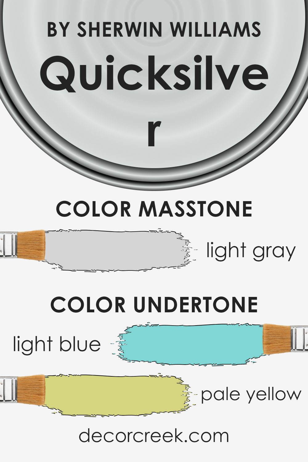
Quicksilver is a light gray with blue undertones, ideal for spaces where you want to create a fresh and serene atmosphere. What sets it apart is its ability to shift tones depending on the lighting, sometimes appearing more blue, and at other times, more like a pure, soft gray.
This versatility makes Quicksilver a great choice for almost any room, adapting beautifully to different styles and decors.
Whether you’re updating your living room or giving your kitchen a new look, SW 6245 Quicksilver can help in adding a touch of modernity without overwhelming the senses. It pairs well with various colors, making it easy for you to integrate into your existing decor or to start a new design palette.
If you’re considering repainting, you might find that this particular shade provides just the right amount of neutrality and interest to your walls.
What Color Is Quicksilver SW 6245 by Sherwin Williams?
Quicksilver by Sherwin Williams is a muted gray shade that brings a modern and clean feel to any space. This color leans towards a cooler palette and has a subtle hint of blue, giving it a crisp appearance. It’s versatile enough to work in various settings, though it truly shines in contemporary and minimalist interior styles.
The color is perfect for creating a sleek, understated look in living rooms, kitchens, or bedrooms. It’s also an excellent choice for bathrooms, providing a refreshing and light atmosphere. Quicksilver pairs beautifully with white trim and cabinetry, allowing the color to stand out and give a room a fresh, polished look.
When it comes to materials, this shade complements natural wood tones from light beech to rich walnut, creating a pleasing contrast. It also works well with metallic finishes like brushed nickel or stainless steel, enhancing the modern vibe of the space.
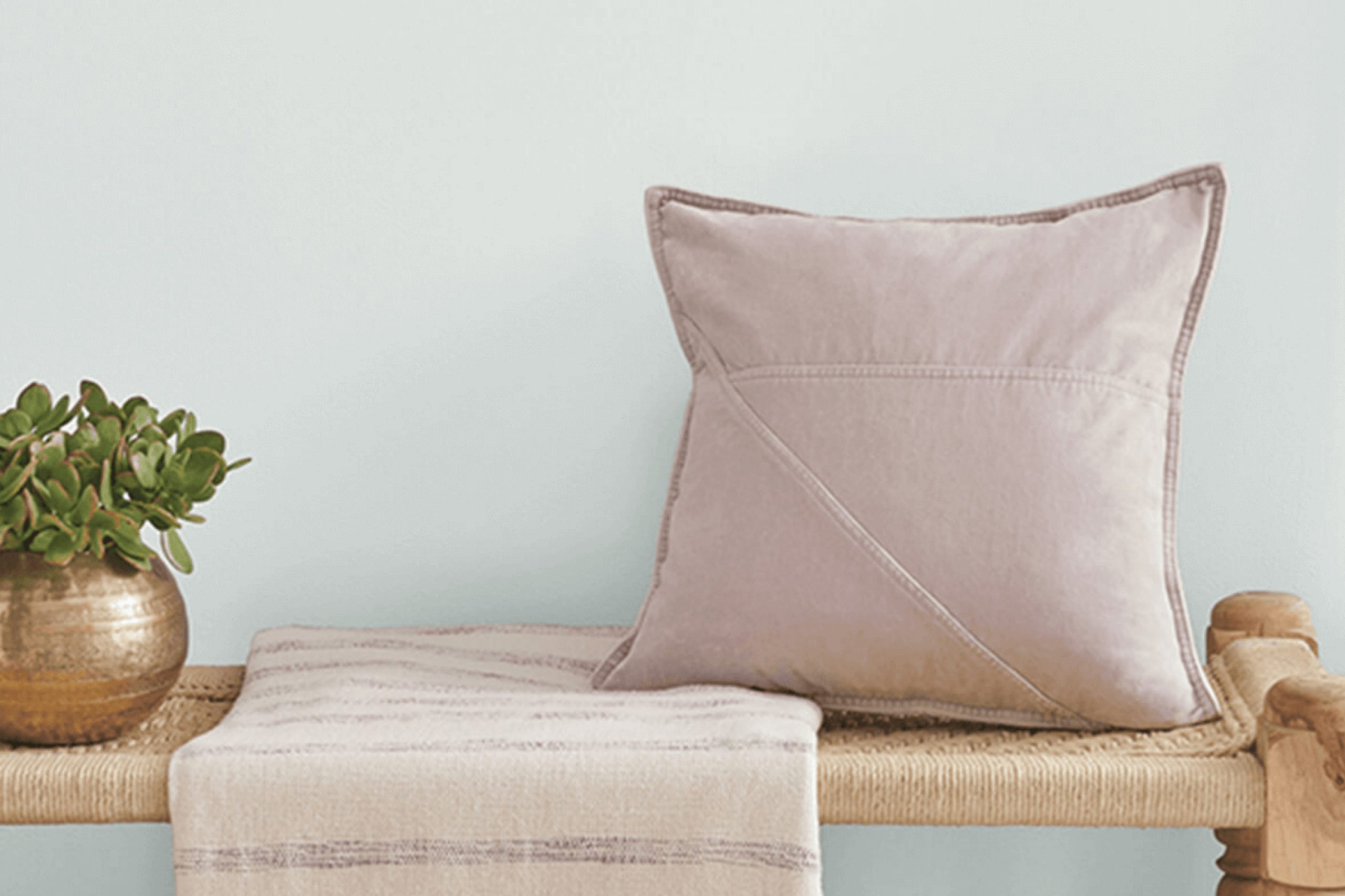
For textures, Quicksilver pairs well with smooth, matte surfaces for a clean look or with soft, plush textiles like velvet or wool to add a touch of warmth to the cool tone of the walls.
Overall, Quicksilver is a great choice for those looking to achieve a modern and airy feel in their space without going too bold.
Is Quicksilver SW 6245 by Sherwin Williams Warm or Cool color?
Quicksilver is a paint color produced by Sherwin Williams, known for its cool gray tone with slight blue undertones. This shade is versatile, fitting well in various home environments, from modern to traditional. Its lightness helps make small rooms appear more spacious, making it a great choice for bedrooms or bathrooms that you want to feel more open and airy.
This color works particularly well in spaces with plenty of natural light, where it can show off its subtle blue hues that add a refreshing vibe without being overpowering.
Quicksilver is also a practical choice for living areas or kitchens as it complements both warm wood tones and metallic finishes, providing a calm backdrop that allows other decor elements to stand out.
Easy to match with a range of styles and accessories, Quicksilver ensures decorating flexibility, making it a homeowner favorite for creating a cool, coherent look in their space.
Undertones of Quicksilver SW 6245 by Sherwin Williams
Quicksilver is a versatile gray paint color that can subtly shift in appearance depending on its undertones and the lighting in a room. An undertone is the underlying quality of a color that surfaces subtly beneath the primary color. For Quicksilver, noticeable undertones include light blue, pale yellow, light purple, mint, lilac, pale pink, and gray. These undertones can make the main gray color appear cooler or warmer.
For instance, in a room with plenty of natural light, the light blue or mint undertones might make the walls seem more vibrant and fresh. In contrast, in a room with less natural light, the pale yellow or light purple undertones might become more noticeable, giving the walls a softer and cozier feel.
The addition of furniture and decor can also impact how these undertones play off against the gray base. Metallic finishes or cool-colored textiles might bring out the cooler undertones like lilac and light blue, while wooden elements or warm-colored fabrics could highlight the warmer tones such as pale yellow or pale pink.
In essence, the way we perceive the color of the walls can change based on these subtle undertones.
This adaptability makes Quicksilver a practical choice for interior walls, as it can complement a wide range of decors and styles, adjusting its feel according to the room’s specific conditions and accompanying design elements.
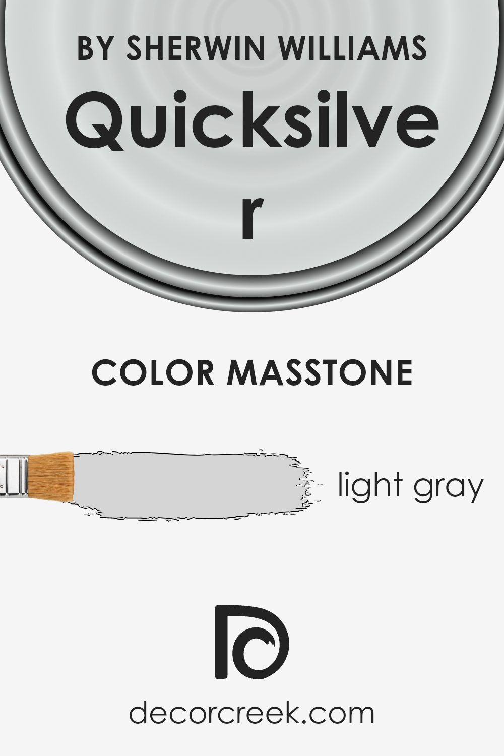
What is the Masstone of the Quicksilver SW 6245 by Sherwin Williams?
Quicksilver SW 6245 by Sherwin Williams has a masstone of light gray, visually similar to the hex code #D5D5D5. This neutral hue makes it incredibly versatile in various home environments. Light gray is effective in making small rooms appear larger and more open because it doesn’t absorb much light. It’s also low-key, ensuring that it won’t clash with other colors you might choose for furniture and decorations.
This simplicity allows for a wide range of decor styles, from modern to rustic, without the color feeling out of place.
Additionally, light gray can help bring a calm and relaxed atmosphere to a space, making it suitable for bedrooms and living areas where comfort is key. It’s perfect for those looking to create a fresh and clean look in their home without opting for stark whites.
Quicksilver SW 6245 serves as a gentle backdrop that pairs well with vibrant colors for a lively contrast or soft hues for a harmonious look.
How Does Lighting Affect Quicksilver SW 6245 by Sherwin Williams?
Lighting plays a crucial role in how colors appear in different environments, heavily influencing their perception and impact. Color can look dramatically different under artificial light compared to natural light. This is important to consider when choosing paint colors for a room.
Taking Quicksilver, a cool, subtle shade of gray with a slight blue undertone, as an example, we see various effects under different lighting conditions. Under artificial light, such as LED or fluorescent bulbs, Quicksilver might lean towards a sharper, more defined gray. This is because many types of artificial light have a bluish tone, which can enhance the blue undertone in the paint.
In contrast, natural sunlight brings out the truest color of paint. In a room with lots of natural light, Quicksilver would appear more vibrant and dynamic, reflecting its true color depending on the time of the day and the weather conditions.
For instance, on a bright sunny day, the color could look lighter and slightly bluish, while on a cloudy day, it might appear as a more muted gray.
The orientation of the room also affects how Quicksilver appears:
– North-faced rooms: These rooms get less direct sunlight, so the color might look cooler and slightly darker, emphasizing the gray’s crispness.
– South-faced rooms: With more exposure to direct sunlight, Quicksilver will appear lighter and brighter, often bringing out its subtle blue undertones more prominently.
– East-faced rooms: Morning light can make Quicksilver look soft and slightly blue-toned in the mornings, reverting to a true gray as the light fades.
– West-faced rooms: Here, the color will experience the opposite effect of east-facing rooms, starting grayer in the morning and gaining a bluer, brighter tint as sunlight becomes stronger in the afternoon.
Understanding these differences can help in making informed decisions about which rooms to paint and what accompanying décor to choose, ensuring that the color matches your vision throughout the day.

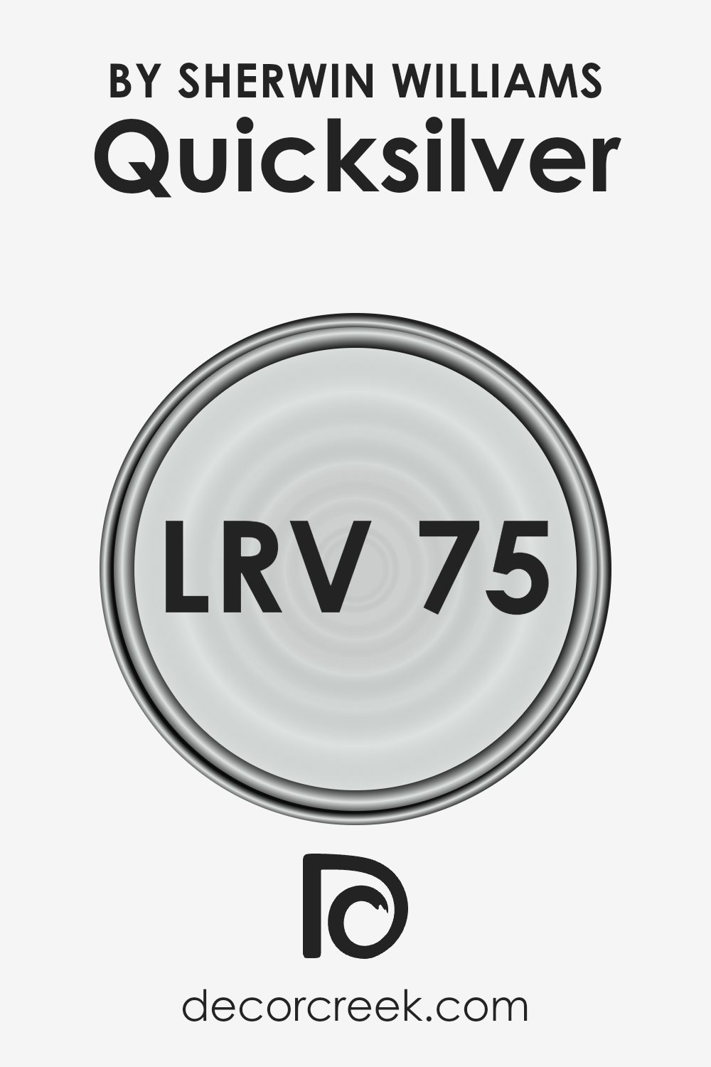
What is the LRV of Quicksilver SW 6245 by Sherwin Williams?
Light Reflectance Value (LRV) measures the percentage of light a paint color reflects back into a room. Essentially, LRV scales from 1 to 100, with lower values indicative of darker shades that absorb more light and higher values pointing to lighter shades that reflect more light.
Understanding LRV is crucial when choosing paint as it significantly affects how bright a space feels. Darker colors make rooms appear smaller and cozier because they absorb light, while lighter tones can make a space seem more open and airier by reflecting light around the room.
For the color Quicksilver SW 6245 by Sherwin Williams which has an LRV of approximately 75, it is quite a light shade. This means it does a great job at making spaces feel more expansive and well-lit, as it reflects most of the light that hits it, rather than absorbing it.
This characteristic can be particularly advantageous in naturally darker spaces or smaller rooms where you wish to create a perception of more space. Since Quicksilver SW 6245 is on the lighter end of the spectrum, it can also help in reducing the need for artificial lighting during the day, making it a good choice for both aesthetic and energy efficiency reasons.
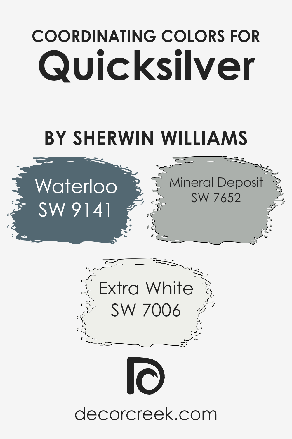
Coordinating Colors of Quicksilver SW 6245 by Sherwin Williams
Coordinating colors are those that complement or enhance each other when used together in a space, creating a harmonious design. For instance, Quicksilver by Sherwin Williams, a muted silver-gray, can be significantly accentuated by carefully selected coordinating colors.
These colors are chosen based on their ability to balance or complement the main hue without overwhelming it, ensuring a visually appealing and cohesive look.
One of the coordinating colors is Waterloo, a deep, smoky blue that creates a striking contrast with Quicksilver, bringing depth and interest to the palette. This color works particularly well in adding a touch of elegance and drama, making it perfect for accents like cushions or a feature wall.
Extra White, another coordinating color, offers a clean and crisp look that adds brightness and opens up spaces when paired alongside Quicksilver. Its pure and simple shade makes it an excellent choice for trim or ceilings, helping to enhance the lighter tones within the gray of Quicksilver.
Mineral Deposit offers a subtle blend of blue-gray, standing as a bridge between the contrasting tones of Quicksilver and Waterloo. It is an ideal choice for creating a seamless color transition in spaces that wish to combine both cool and warm elements.
You can see recommended paint colors below:
- SW 9141 Waterloo
- SW 7006 Extra White
- SW 7652 Mineral Deposit
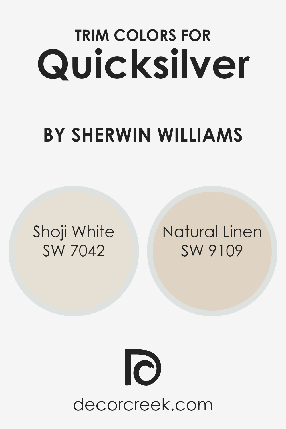
What are the Trim colors of Quicksilver SW 6245 by Sherwin Williams?
Trim colors, such as SW 7042 – Shoji White and SW 9109 – Natural Linen by Sherwin Williams, play a crucial role in defining the aesthetic and visual coherence of a space. When paired with a wall color like Quicksilver, trim colors help to frame and accentuate the walls, creating a tidy and finished look.
They also serve to highlight the architectural details of the room, such as molding, door frames, and window sills, allowing these features to stand out against the broader wall color. Choosing the right trim color can significantly affect how light or dark a room appears and influences the overall atmosphere by adding contrast or softness to the color scheme.
Shoji White SW 7042 is a soft, off-white color with warm undertones that offers a subtle contrast when used as a trim, bringing a light and airy feel to the room. This shade complements the cooler tones of Quicksilver, ensuring that the environment feels balanced and pleasantly inviting.
On the other hand, Natural Linen SW 9109 has a slightly deeper, beige tone that provides a warm, welcoming feel when used as trim. This color adds a hint of warmth to the space, and enriches the environment, making it feel cozy and well-coordinated.
You can see recommended paint colors below:
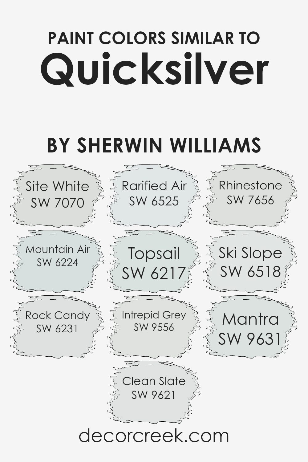
Colors Similar to Quicksilver SW 6245 by Sherwin Williams
Similar colors play an integral role in interior design by allowing for subtle variations that can enhance the overall aesthetic of a space without overwhelming it. Choosing shades like Site White, a soft, muted white with a hint of gray, or Mountain Air, which evokes the crisp freshness of an elevated landscape, can create a calm and cohesive look.
Rock Candy offers a light grey tone that appears almost ethereal, providing a clean backdrop for bolder colors or design elements. Alternatively, Clean Slate steps it slightly darker, giving just enough depth for visual interest amidst more neutral surroundings.
Rarified Air and Topsail both lend a breezy, airy quality with their lighter blue hues, reminiscent of a clear sky or gentle sea, ideal for opening up a smaller room or complementing a coastal theme. Intrepid Grey adds a touch of mystery with its deeper, moody gray, perfect for creating a focal point or adding warmth.
Rhinestone is another light gray that works well to subtly differentiate spaces without stark contrasts. Ski Slope brings a touch of wintry freshness, ideal for reflecting natural light in a room. Lastly, Mantra ties these themes together with a slightly greenish-gray tint, offering a hint of natural elements and grounding the space in comfort and style.
These colors, each with their own unique qualities, collectively provide a palette that allows for versatile design solutions that are both appealing and functional.
You can see recommended paint colors below:
- SW 7070 Site White
- SW 6224 Mountain Air
- SW 6231 Rock Candy
- SW 9621 Clean Slate
- SW 6525 Rarified Air
- SW 6217 Topsail
- SW 9556 Intrepid Grey
- SW 7656 Rhinestone
- SW 6518 Ski Slope
- SW 9631 Mantra
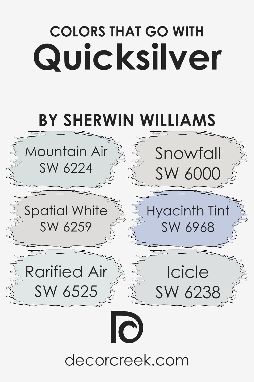
Colors that Go With Quicksilver SW 6245 by Sherwin Williams
Choosing the right colors to complement Quicksilver SW 6245 by Sherwin Williams is crucial because it helps create a cohesive and aesthetic color scheme in your spaces. Quicksilver, a subtle gray with blue undertones, is versatile, but pairing it with the right shades can enhance the overall mood and feel of a room.
For instance, pairing it with colors like Mountain Air SW 6224, which is a soft, refreshing blue, adds a peaceful touch to any room. On the other hand, Spatial White SW 6259 is a clean and crisp white that brings a sense of clarity and brightness, making it perfect for creating a relaxed, airy feeling when combined with the cool tones of Quicksilver.
Other complementary colors include Rarified Air SW 6525, a lighter and gentle blue that keeps the space feeling open and light. Snowfall SW 6000, a delicate white with a mild cool undertone, helps in maintaining a fresh and open ambiance.
Hyacinth Tint SW 6968, a soft violet, introduces a subtle splash of color that is soft and not overpowering, suitable for adding a unique character without dominating. Lastly, Icicle SW 6238, a pale gray-blue, matches well with Quicksilver, reinforcing a harmonious and gentle environment.
These companions to Quicksilver help in achieving a balanced and pleasing look, making any room look well thought out and pleasant.
You can see recommended paint colors below:
- SW 6224 Mountain Air
- SW 6259 Spatial White
- SW 6525 Rarified Air
- SW 6000 Snowfall
- SW 6968 Hyacinth Tint
- SW 6238 Icicle
How to Use Quicksilver SW 6245 by Sherwin Williams In Your Home?
Quicksilver SW 6245 by Sherwin Williams is a soft gray paint color with cool bluish undertones, making it a versatile choice for various spaces in your home. This color works wonderfully in rooms like the living room or bedroom where you might want a calm, soothing backdrop. Since it’s a neutral shade, Quicksilver pairs well with many other colors. It can complement bolder hues on furniture or accents, or create a peaceful, cohesive look with other neutrals.
In smaller spaces, such as a bathroom or hallway, Quicksilver can help make the area seem larger and more open. It also serves well as a base color for a gallery wall or can highlight artwork and photographs without overpowering them.
For those who like a modern touch, using Quicksilver on kitchen cabinets or a dining room can offer a fresh and clean look. Pair it with metallic fixtures like stainless steel or brushed nickel for a crisp, finished style in these functional areas.
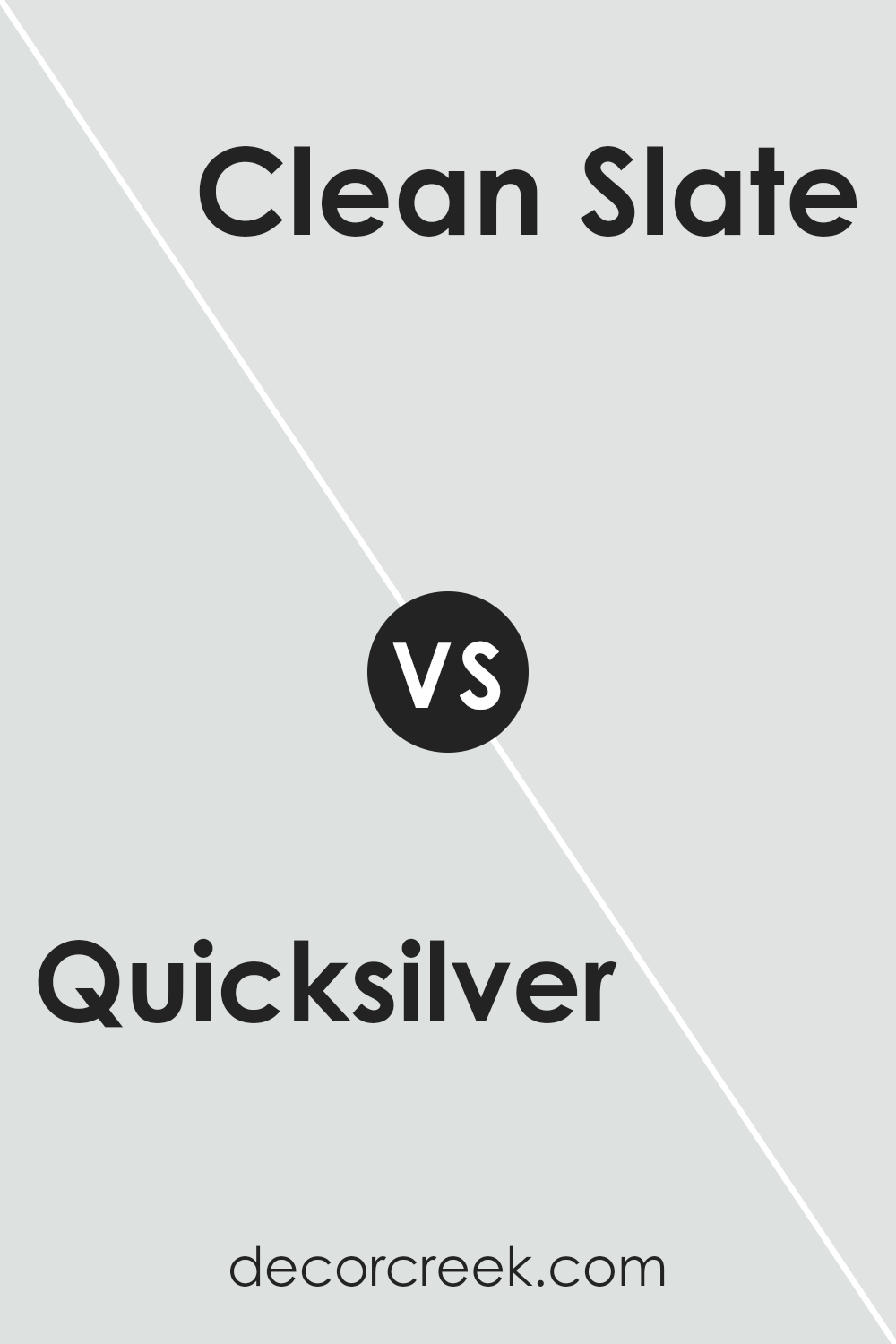
Quicksilver SW 6245 by Sherwin Williams vs Clean Slate SW 9621 by Sherwin Williams
Quicksilver is a lighter shade, leaning towards a soft, pale gray. Its subtle brightness makes it versatile, perfect for spaces you want to appear airy and bigger. On the other hand, Clean Slate offers a deeper, more assertive gray tone, which can give a room a more grounded, solid feel.
Both colors are neutral, so they work well in various settings and pair easily with other hues. However, Quicksilver is better for achieving a more open, refreshing look, while Clean Slate is ideal if you’re aiming for a stronger, more pronounced presence in your décor.
Essentially, the choice between them comes down to how you want the room to feel—light and expansive with Quicksilver, or more enclosed and cozy with Clean Slate.
You can see recommended paint color below:
- SW 9621 Clean Slate
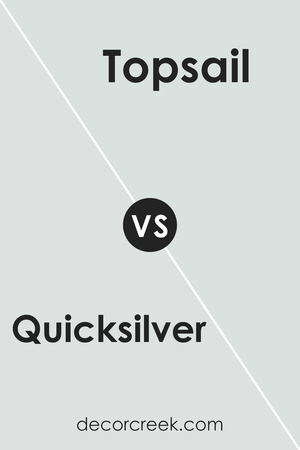
Quicksilver SW 6245 by Sherwin Williams vs Topsail SW 6217 by Sherwin Williams
Quicksilver and Topsail by Sherwin Williams are two distinct paint colors with their own unique appeal. Quicksilver is a light gray hue that offers a clean and neutral backdrop, making it highly versatile for any space in the home. It can give rooms a modern feel and works well in spaces that aim for a minimalist or industrial aesthetic.
On the other hand, Topsail is a softer and lighter color with a hint of green, giving it a more airy and fresh vibe. This color is ideal for creating a relaxed atmosphere, especially in areas like bathrooms or bedrooms where a calm environment is desired.
Both colors reflect a considerable amount of light and can make small rooms appear larger. However, while Quicksilver maintains a stark simplicity, Topsail brings a gentle warmth that can soften the edges of a space. When choosing between the two, consider the mood and functional use of the room.
You can see recommended paint color below:
Quicksilver SW 6245 by Sherwin Williams vs Ski Slope SW 6518 by Sherwin Williams
Quicksilver by Sherwin Williams is a soothing light gray that carries a cool undertone, making it a versatile choice for rooms needing a gentle, neutral backdrop. It reflects light well, brightening spaces effectively.
This color is subtle enough to work in almost any area of a home, from living rooms to bedrooms, without overpowering the room’s other design elements.
In contrast, Ski Slope by Sherwin Williams is a muted blue with gray undertones. This hue tends to add a calm, gentle vibe but brings with it a bit more color compared to Quicksilver. The slight blue tone of Ski Slope is best for those looking to add a touch of color while maintaining a soft and airy feel in their space.
Both colors provide a peaceful atmosphere, but Ski Slope leans toward a cooler, more colorful look which might influence the mood more than the near-neutral Quicksilver.
You can see recommended paint color below:
- SW 6518 Ski Slope
Quicksilver SW 6245 by Sherwin Williams vs Rhinestone SW 7656 by Sherwin Williams
Quicksilver and Rhinestone are two paint colors from Sherwin Williams that look quite similar at first glance, but they have subtle differences. Quicksilver has a lighter, slightly warmer tone compared to Rhinestone. It gives a room a calm, soothing feel without being too bold. Rhinestone, on the other hand, is cooler and reflects light a bit more, which can make a space seem brighter and slightly more spacious.
These characteristics make Quicksilver a better choice for areas where a soft, warm look is desired, while Rhinestone works well in spaces that benefit from a crisper, cleaner appearance. Both colors are quite neutral and versatile, making them easy to integrate into various decor styles and palettes.
Choosing between the two depends largely on the specific mood or atmosphere you want to create in your space.
You can see recommended paint color below:
- SW 7656 Rhinestone
Quicksilver SW 6245 by Sherwin Williams vs Site White SW 7070 by Sherwin Williams
Quicksilver SW 6245 and Site White SW 7070 are two distinct paint colors by Sherwin Williams, each bringing its own unique vibe to a space. Quicksilver is a deep gray with a hint of blue, giving it a cool and modern feel. It’s perfect for creating a minimalistic, clean look in a room, especially in spaces that aim for a contemporary style.
On the other hand, Site White is a softer, lighter gray. It offers a more neutral backdrop, making it easier to pair with a wide range of decor styles and colors. Site White can brighten up a space while still keeping things calm and understated, providing a subtle elegance without overpowering a room.
Both colors are versatile but serve different purposes based on the mood and style you want to achieve. Quicksilver, being the darker of the two, makes a bolder statement and is ideal for accent walls or furniture, whereas Site White is better suited for larger areas and can help make a small room appear more spacious and open.
You can see recommended paint color below:
- SW 7070 Site White
Quicksilver SW 6245 by Sherwin Williams vs Rarified Air SW 6525 by Sherwin Williams
Quicksilver and Rarified Air, both by Sherwin Williams, offer unique tones for different decorating needs. Quicksilver is a muted gray with hints of blue. This color is versatile and can be used in many areas of a home, providing a calm, neutral backdrop that complements various decor styles. It works brilliantly in spaces that need a touch of modernity without becoming too cold or stark.
On the other hand, Rarified Air presents a much lighter and airier shade. It’s a soft, pale blue that feels fresh and clean. This color is perfect for creating a light, open feel in a room. It pairs well with whites and other light neutrals for a gentle, visually soothing environment.
Both colors are quite neutral, but while Quicksilver leans towards a subtler, more shadowed hue, Rarified Air brings in more brightness and has a more noticeable blue tone. Each offers its own distinct mood and can effectively set the tone of a room depending on what atmosphere you want to achieve.
You can see recommended paint color below:
Quicksilver SW 6245 by Sherwin Williams vs Intrepid Grey SW 9556 by Sherwin Williams
Quicksilver SW 6245 and Intrepid Grey SW 9556, both by Sherwin Williams, are unique shades of gray, each bringing its own character to spaces. Quicksilver is a lighter gray with a soft, neutral tone that reflects light well, making it ideal for smaller or darker rooms to appear more open and airy. It pairs well with both bright accents and subdued decor, offering versatility in design choices.
On the other hand, Intrepid Grey is a deeper, bolder gray that makes a stronger statement. It works excellently in areas where a more defined, striking look is desired. Its depth enriches larger spaces and complements a modern aesthetic with sharp, clean lines. While less reflective than Quicksilver, it provides a grounding effect that anchors a room’s decor.
Overall, both colors serve different purposes but are equally effective in their roles. Quicksilver enhances lightness and flexibility in decorating, whereas Intrepid Grey lends weight and drama to a space.
You can see recommended paint color below:
Quicksilver SW 6245 by Sherwin Williams vs Rock Candy SW 6231 by Sherwin Williams
Quicksilver SW 6245 and Rock Candy SW 6231 are both colors offered by Sherwin Williams that bring a subtle and clean feel to any space. Quicksilver is a light gray with a slight hint of blue, giving it a cool and airy look. It works beautifully in spaces that require a touch of modern flair without overwhelming the senses. It pairs well with a variety of decor styles and adds a fresh touch to any room.
On the other hand, Rock Candy SW 6231 is a much softer shade, leaning more towards a very pale gray or off-white. This color is perfect for those seeking a minimalistic look, as it offers a nearly neutral backdrop that can easily support bolder colors or stand elegantly on its own.
Rock Candy is ideal for creating a calm and inviting environment, especially in small spaces or rooms with plenty of natural light.
Both colors offer distinct vibes and can help to define different moods within a living space depending on individual style preferences and the function of the room.
You can see recommended paint color below:
Quicksilver SW 6245 by Sherwin Williams vs Mantra SW 9631 by Sherwin Williams
Quicksilver SW 6245 and Mantra SW 9631, both by Sherwin Williams, offer distinct vibes for any space. Quicksilver is a light, almost silvery gray that gives a room a fresh and airy feel. It reflects light well, making spaces appear larger and more open. This color works great in small rooms or areas with limited natural light.
On the other hand, Mantra is a softer, muted gray with hints of green. This color can make a space feel cozy and welcoming. It’s perfect for creating a calm and relaxed atmosphere, ideal for bedrooms or quiet areas of a home.
While both colors are grays, Quicksilver is cooler and brighter, whereas Mantra leans towards a warmer tone with its subtle green undertones. Depending on the mood you want to set or the size of your room, you might choose one over the other. Quicksilver can help make a statement in a modern setting, while Mantra is better for a subdued and inviting look.
You can see recommended paint color below:
- SW 9631 Mantra
Quicksilver SW 6245 by Sherwin Williams vs Mountain Air SW 6224 by Sherwin Williams
Quicksilver and Mountain Air, both by Sherwin Williams, offer distinct vibes for any space. Quicksilver is a light gray with a cool undertone, making it a sharp choice for a modern look. It’s great if you’re aiming for a clean and crisp room aesthetic.
On the other hand, Mountain Air has a softer touch, with its pale blue tint providing a refreshing and airy feel. This color adds a gentle breath of freshness to any area, perfect for creating a relaxed atmosphere.
When paired together, these two colors complement each other beautifully. The neutrality of Quicksilver balances the light blue of Mountain Air, making them a smart duo for a room that feels both open and contemporary.
Whether for a living room or a study, this combination can enhance the area without overwhelming it with boldness. Therefore, these two hues can work well in a variety of settings, each bringing its unique character to the decor.
You can see recommended paint color below:
Conclusion
Think of it like a magic shade of gray that can make small places feel bigger and can also hide marks or dirt on walls better than really light colors. That’s really handy!
What’s more, this color plays well with others. It means that whether you have a room with lots of sunlight or a little darker corner, Quicksilver adjusts nicely and always looks good.
It’s kind of like a chameleon, but for walls! And, no matter what stuff (like furniture or curtains) you already have in your room, Quicksilver will likely go great with it.
In conclusion, Quicksilver by Sherwin Williams seems like a smart choice if you’re thinking of giving your room a new paint job. It’s friendly, hides small flaws, and gets along well with different lights and furniture.
So, whether you’re fixing up a study room, your bedroom, or even the living room, Quicksilver can make it look fresh and nice. This makes me feel pretty excited to see how it’ll turn out if I decide to use it in my room!
Ever wished paint sampling was as easy as sticking a sticker? Guess what? Now it is! Discover Samplize's unique Peel & Stick samples.
Get paint samples

