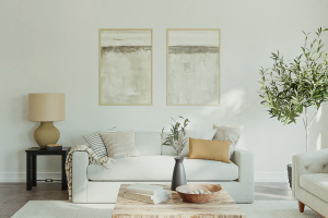
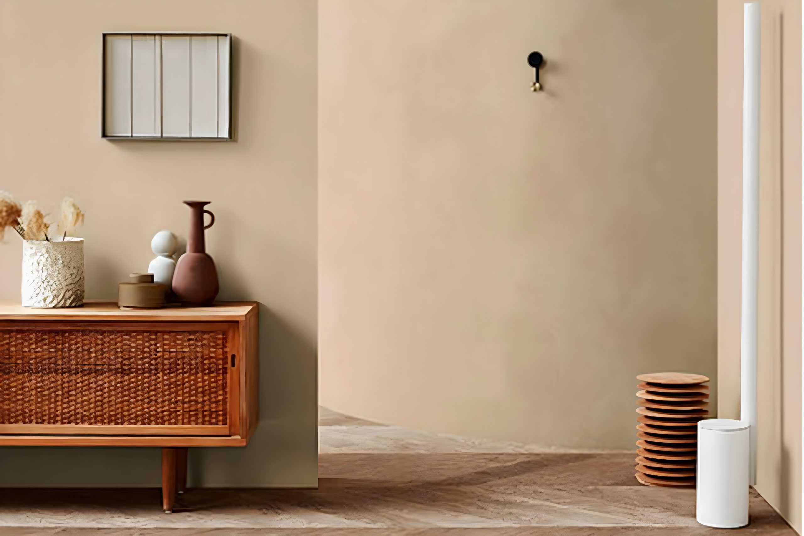
When it comes to giving your space a warm and inviting look, SW 9536 Lamb’s Wool by Sherwin Williams stands out as a top choice. This particular shade is a testament to the cozy and comforting vibe that many homeowners seek.
Lamb’s Wool is more than just a paint color; it’s a feeling of calm and serenity that can transform any room into a peaceful retreat.
Whether you’re looking to refresh your living room, bedroom, or any part of your house, this color brings a sense of soft warmth that’s both subtle and impactful.
One of the best qualities about Lamb’s Wool is its versatility. This paint color works beautifully with a wide range of decor styles, from modern to rustic and everything in between.
It pairs well with natural elements like wood and stone, enhancing the overall aesthetic of your space. Moreover, its ability to complement other colors allows for endless creativity in designing your home’s interior.
Choosing Lamb’s Wool by Sherwin Williams means opting for a hue that will make your home feel more welcoming and comfortable.
It’s a shade that resonates with a sense of simplicity and elegance, making it a fantastic choice for anyone looking to update their space with a timeless and cozy appeal.
What Color Is Lamb’s Wool SW 9536 by Sherwin Williams?
Lamb’s Wool by Sherwin Williams is a warm, inviting hue that brings a cozy, comforting atmosphere to any room. Picture the soft, gentle light of early morning filling your space—this color encapsulates that feeling perfectly.
It’s a nuanced blend of beige and cream, creating a versatile backdrop that complements a wide range of decor styles and color palettes.
This color shines in interior styles that prioritize warmth and natural light, such as modern farmhouse, rustic, and contemporary settings.
Its understated elegance also makes it a great fit for more traditional or classic environments.
Additionally, its softness works wonders in creating serene and peaceful spaces, ideal for bedrooms, living rooms, and home offices.
Lamb’s Wool pairs exceptionally well with natural materials and textures, enhancing its earthy vibe. Think of combining it with rich wooden furnishings, woven wicker baskets, or linen fabrics to amplify its cozy feel.
Stone accents, like a granite countertop or a slate fireplace, can also complement this color, adding a layer of natural elegance.
Metals like brass and copper offer a lovely contrast with their warm tones, bringing a touch of sophistication to the mix.
In summary, Lamb’s Wool is a harmonious choice for those looking to create a warm, welcoming space.
Its versatility and ease of pairing with various materials make it a go-to color for anyone aiming to achieve a balanced, inviting interior.
Ever wished paint sampling was as easy as sticking a sticker? Guess what? Now it is! Discover Samplize's unique Peel & Stick samples.
Get paint samples

Is Lamb’s Wool SW 9536 by Sherwin Williams Warm or Cool color?
Lamb’s Wool by Sherwin Williams is a gentle, warm beige paint color that brings a sense of calmness and simplicity to any room. This color has a cozy vibe, making it perfect for creating inviting spaces in homes.
Whether it’s applied in a living room, bedroom, or even a kitchen, Lamb’s Wool has a versatile appeal that works well with various decor styles, from modern to traditional.
Its soft, neutral tone serves as an excellent backdrop for both bold and muted accents, allowing homeowners to experiment with different textures and accessories without overwhelming the space.
The beauty of Lamb’s Wool lies in its ability to enhance the natural light in a room, making spaces feel more open and airy.
This quality is particularly beneficial in smaller rooms or areas with limited natural light, as it can help make them appear brighter and more spacious.
Overall, Lamb’s Wool is a fantastic choice for those looking to add warmth and a welcoming atmosphere to their home.
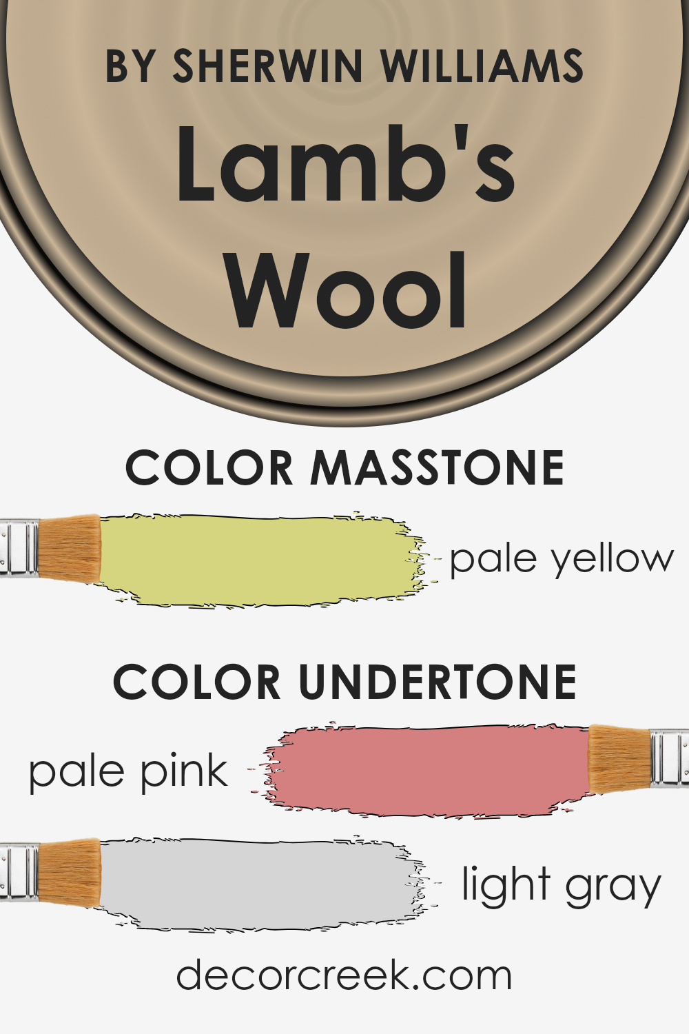
Undertones of Lamb’s Wool SW 9536 by Sherwin Williams
Lamb’s Wool is a unique color that brings warmth and softness to any space. It’s not just a simple shade; the beauty of it comes from its subtle undertones. Think of undertones like a secret layer of color.
They can change how the main color looks under different lights or next to other colors.
This color has pale pink and light gray undertones. These undertones are like magic ingredients that influence our perception of the color. Pale pink adds a gentle warmth, making the space feel cozy and welcoming.
Light gray brings a sense of calm and balance, ensuring the color doesn’t feel too warm or overwhelming.
When you paint your walls with this color, these undertones play a significant role. In the sunlight, the pale pink might glow softly, giving the room a cheerful yet subtle warmth.
At night or in artificial light, the light gray might become more noticeable, providing a soothing and neutral backdrop. This makes the color very versatile, fitting various moods and settings.
Understanding undertones helps in choosing colors that complement your space and lighting. With its pale pink and light gray undertones, Lamb’s Wool creates an inviting atmosphere, perfect for making a room feel like home.
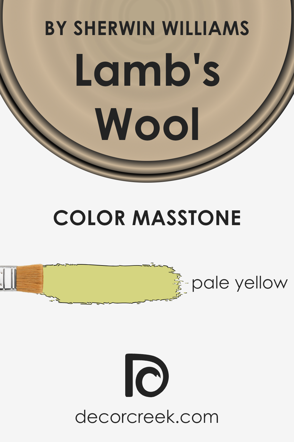
What is the Masstone of the Lamb’s Wool SW 9536 by Sherwin Williams?
Lamb’s Wool by Sherwin Williams, identifiable by its color code SW 9536, has a masstone with a pale yellow hue, closely resembling the color code #D5D580.
This soft, gentle yellow brings a touch of warmth and light into any space it graces.
Ideal for creating a cozy and inviting atmosphere, Lamb’s Wool can make rooms feel more open and airy, especially beneficial in spaces that receive limited natural sunlight.
Its pale yellow tone works wonders in adding a subtle hint of color without overwhelming a room, making it a versatile choice for walls in living areas, bedrooms, and even kitchens.
Additionally, being a neutral yet uplifting color, it pairs beautifully with a wide range of decor styles and colors, from modern minimalist to rustic charm, enabling homeowners to easily integrate it into their homes.
Its ability to evoke a sense of calm and positivity makes Lamb’s Wool a preferred choice for creating a serene and cheerful living environment.
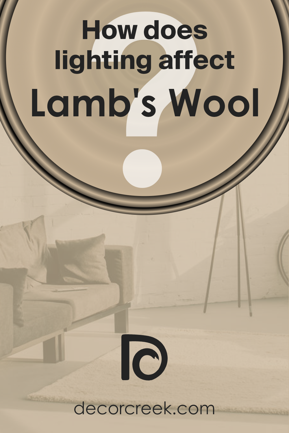
How Does Lighting Affect Lamb’s Wool SW 9536 by Sherwin Williams?
Lighting plays a crucial role in how we perceive colors, and this concept is particularly vital when it comes to choosing paint for our homes.
The color in question, a nuanced hue from Sherwin Williams known as Lamb’s Wool, is no exception.
Its appearance can dramatically shift depending on the light source, revealing the multifaceted nature of its beauty in different settings.
In artificial light, such as that from LED or incandescent bulbs, this particular color tends to emit warmth, making spaces feel cozy and inviting.
The yellow and soft brown undertones of Lamb’s Wool can become more pronounced, offering a rich and comforting ambiance to any room. It pairs well with soft, warm lighting, enhancing the paint’s natural warmth.
Natural light brings a whole different experience to this color. Under the sun’s rays, which change in color temperature throughout the day, Lamb’s Wool can shift from a bright, warm beige in the morning to a more muted, subtle tone by dusk.
The quality of natural light it receives, therefore, greatly influences its perception.
For rooms facing north, which receive less direct sunlight, Lamb’s Wool may appear slightly cooler and more understated, yet still maintaining its warmth compared to true neutrals.
This subtle transformation adds depth and character to north-facing rooms.
In contrast, south-facing rooms bask in abundant natural light for most of the day, which can amplify the paint’s warmth, making the room feel brighter and more inviting.
Here, Lamb’s Wool takes on a vibrant yet comforting quality, showcasing its adaptability to different lighting conditions.
East-facing rooms enjoy the morning light, which can make this color look very lively and bright in the morning, while transitioning to a softer tone by the afternoon.
This dynamic change highlights the color’s versatility throughout the day.
West-facing rooms, on the other hand, might see this color in a more subdued light during the morning, gradually warming up as the day progresses to evening, when the setting sun casts a golden hue, enriching the color with a cozy glow.
In summary, Lamb’s Wool by Sherwin Williams is a chameleon of sorts, adapting its appearance and ambiance in response to the lighting around it, from the subtle hues under artificial lighting to the vibrant warmth it exudes under natural light, reflecting beautifully in rooms facing any direction.
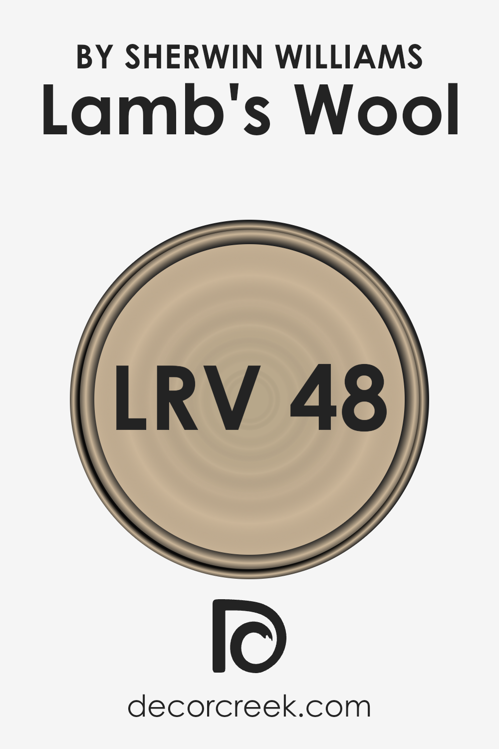
What is the LRV of Lamb’s Wool SW 9536 by Sherwin Williams?
Light Reflectance Value, or LRV, is a measurement that tells us how much light a color reflects or absorbs. It’s a scale that goes from 0 to 100, where 0 is pure black (which absorbs all light) and 100 is pure white (which reflects all light).
This value is super important when choosing paint colors because it can significantly impact how light or dark a room feels. A high LRV means the color reflects more light, making a room look brighter and more open.
On the other hand, a low LRV means the color absorbs more light, which can make a space feel cozier but also smaller and darker.
With an LRV of 47.89, the color Lamb’s Wool falls in the middle range.
This means it has a balance of reflecting and absorbing light. In practical terms, this color can bring warmth to a room without making it feel too bright or too dark.
It’s versatile, working well in spaces that get a lot of natural light as well as in those that might not get as much.
In rooms with plenty of sunlight, this color will appear lighter and more vibrant, while in lower light, it will present a richer and more subdued look.
This balance makes it a good choice for various spaces, adapting well to different levels of lighting and changing moods throughout the day.
LRV – what does it mean? Read This Before Finding Your Perfect Paint Color
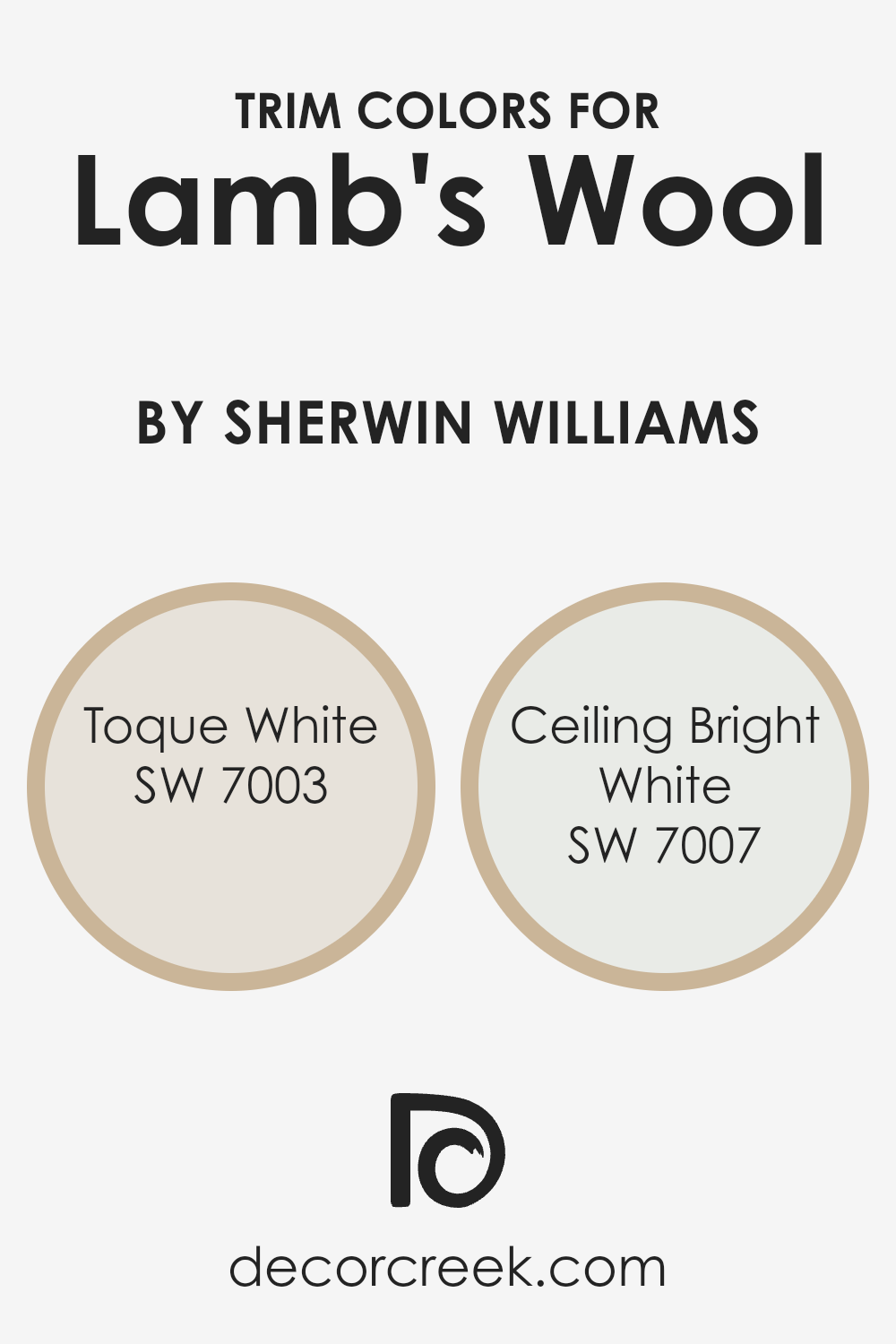
What are the Trim colors of Lamb’s Wool SW 9536 by Sherwin Williams?
Trim colors are essentially the colors chosen for the architectural elements in a room or on the exterior of a building, like door frames, window frames, baseboards, and moldings.
For a color like Lamb’s Wool by Sherwin Williams, selecting the right trim color is crucial because it helps to frame the wall color, enhancing its natural warmth and sophistication.
The trim acts like a picture frame, drawing the eye to the color and making it stand out. It also provides a clean, finished look that can make architectural details pop and give the space a more cohesive appearance.
Choosing SW 7003 – Toque White as a trim color for Lamb’s Wool walls brings a subtle, warm contrast that complements the cozy feel of the wall color without overpowering it.
Toque White has a gentle, creamy quality that bridges the gap between stark whites and deeper hues, making it a versatile choice for many spaces.
On the other hand, SW 7007 – Ceiling Bright White offers a crisper, more pronounced contrast against Lamb’s Wool, highlighting the trim with a sharper edge and bringing a sense of freshness and brightness to the room.
This color can help to make a room feel more spacious and is particularly effective in areas with plenty of natural light, where its radiant vibe is fully appreciated.
You can see recommended paint colors below:
- SW 7003 Toque White
- SW 7007 Ceiling Bright White
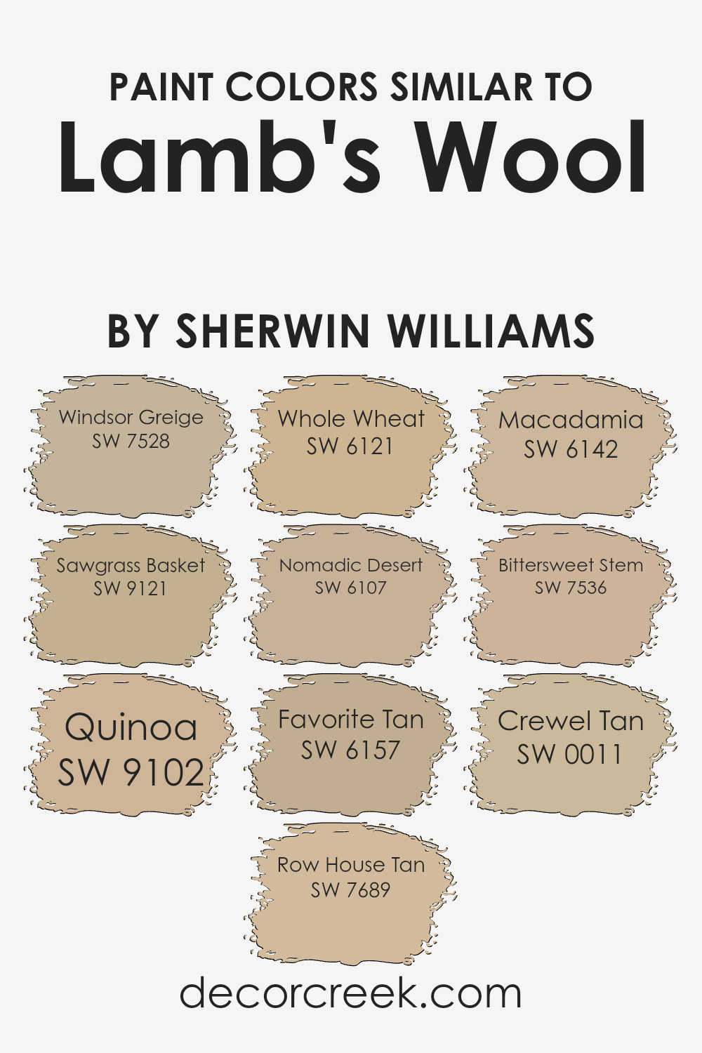
Colors Similar to Lamb’s Wool SW 9536 by Sherwin Williams
Using similar colors, like those akin to Lamb’s Wool by Sherwin Williams, is vital in design for creating a harmonious and visually appealing space.
These colors share a common hue base, making them effortlessly blend with each other while providing subtle differences that add depth and interest to any room.
This family of colors can soften the transitions between walls and furnishings or build a nuanced palette that adds sophistication without the stark contrasts that come from more divergent colors.
Among the colors similar to Lamb’s Wool, we have Windsor Greige, which offers a balanced blend of gray and beige, imparting a warm, sophisticated base that can complement various decor styles.
Sawgrass Basket introduces a slightly deeper, earthy quality that recalls the natural elegance of woven materials, adding a textured appearance in a smooth finish.
Quinoa is a soft, nurturing neutral with a hint of warmth, making it perfect for creating cozy, inviting spaces. Row House Tan provides a more grounded, traditional feel, an excellent choice for those seeking a sense of stability and comfort.
Whole Wheat is a heartier, darker shade that brings warmth and richness, ideal for adding a sense of depth. Nomadic Desert veers towards a more sun-baked quality, reminiscent of vast, open landscapes and providing a subtle, earthy backdrop.
Favorite Tan is a lighter, more subdued option, offering a gentle wash of color for spaces that aim for a softer, more minimalist aesthetic.
Macadamia straddles the line between beige and light brown, offering a nutty, warm hue that’s versatile and welcoming. Bittersweet Stem moves in a slightly different direction with a hint of green, giving it a fresh, organic quality unique among neutrals.
Lastly, Crewel Tan is a pale, creamy option that illuminates spaces with its soft glow, making it ideal for creating a serene, calming environment.
Together, these colors work to create spaces that feel cohesive, grounded, and infused with subtle variations that make each room visually interesting.
You can see recommended paint colors below:
- SW 7528 Windsor Greige
- SW 9121 Sawgrass Basket
- SW 9102 Quinoa
- SW 7689 Row House Tan
- SW 6121 Whole Wheat
- SW 6107 Nomadic Desert
- SW 6157 Favorite Tan
- SW 6142 Macadamia
- SW 7536 Bittersweet Stem
- SW 0011 Crewel Tan
How to Use Lamb’s Wool SW 9536 by Sherwin Williams In Your Home?
Lamb’s Wool by Sherwin Williams is a cozy and welcoming paint color that can truly make a house feel like a home. Its soft, neutral tone makes it incredibly versatile, fitting well with various decorating styles, from modern to rustic.
One of the best ways to use this color is in living rooms or bedrooms, where it adds warmth and creates a relaxing ambiance.
It pairs beautifully with both light and dark furniture, allowing for flexibility in interior design choices.
For those looking to refresh their kitchen or dining area, Lamb’s Wool can bring a sense of brightness and openness, making these spaces more inviting.
Applying it as a base color on walls gives you the freedom to accessorize with vibrant colors through decorations like vases, cushions, or artwork, which stand out against its subtle backdrop.
Even in smaller spaces, such as bathrooms or entryways, Lamb’s Wool can help to make the area appear larger and more welcoming, thanks to its light-reflecting properties.
Its elegant simplicity allows for creative freedom in choosing complementary colors for accents and trims, creating a cohesive look throughout your home.
Lamb’s Wool SW 9536 by Sherwin Williams vs Whole Wheat SW 6121 by Sherwin Williams
Lamb’s Wool and Whole Wheat by Sherwin Williams are two warm, inviting hues, but they bring distinct vibes to a space. Lamb’s Wool is a soft, gentle color, akin to the light, fuzzy coat of a lamb.
It’s a muted beige with a hint of creaminess, offering a subtle, soothing backdrop to any room. It’s perfect for creating a cozy, light, and airy environment, making spaces feel more open and tranquil.
On the other hand, Whole Wheat is a deeper, richer shade. This color has a golden undertone that adds warmth and depth to walls. It’s more pronounced than Lamb’s Wool, giving a room a strong presence of comfort and earthiness.
Whole Wheat works well in spaces that aim to feel grounded and enveloped in warmth, making it ideal for welcoming living areas or cozy dining rooms.
In essence, while both colors add warmth and comfort, Lamb’s Wool is lighter and softer, excellent for a serene, peaceful ambiance.
Whole Wheat, with its deeper, golden tones, offers a more robust, hearty feel, perfect for embracing warmth and creating a snug, inviting environment.
You can see recommended paint color below:
- SW 6121 Whole Wheat
Lamb’s Wool SW 9536 by Sherwin Williams vs Crewel Tan SW 0011 by Sherwin Williams
Lamb’s Wool and Crewel Tan by Sherwin Williams are both warm, inviting colors, but they bring their own unique vibes to a space.
Lamb’s Wool is a soft, pale beige that has a comforting, cozy feel to it, much like the material it’s named after.
It’s the kind of color that can lighten up a room, making it feel open and airy, yet warm at the same time. On the other hand, Crewel Tan has a deeper, richer tone, reminiscent of a creamy latte.
It’s definitely warmer and has more depth to it, creating a more intimate and snug atmosphere.
While Lamb’s Wool works great in spaces where you want a light, neutral backdrop that makes the room feel larger, Crewel Tan is perfect for creating a cozy, welcoming space, full of warmth.
Both colors are versatile and work well in many settings, but the choice between them really depends on the mood you’re aiming to achieve.
You can see recommended paint color below:
- SW 0011 Crewel Tan
Lamb’s Wool SW 9536 by Sherwin Williams vs Nomadic Desert SW 6107 by Sherwin Williams
Let’s look at Lamb’s Wool and Nomadic Desert, both shades from Sherwin Williams. Starting with Lamb’s Wool, this color is light and airy, sort of like a soft beige that’s almost peachy.
It brings a warm, cozy vibe to a room without overwhelming it. It’s the kind of color that pairs well with natural light, making spaces feel open and breathable.
On the other hand, Nomadic Desert is deeper, richer, leaning more towards a tan or a light brown. It’s a warm hue, yes, but in a way that feels more grounded and earthy compared to Lamb’s Wool.
It has the power to make a room feel snug and inviting, thanks to its slightly darker tone.
While both colors are warm and make spaces welcoming, Lamb’s Wool is lighter, adding a subtle, soft touch. Nomadic Desert, however, offers more depth and warmth, potentially making a stronger statement in a room.
They could complement each other well in a space, with Lamb’s Wool brightening it up and Nomadic Desert grounding it.
You can see recommended paint color below:
- SW 6107 Nomadic Desert
Lamb’s Wool SW 9536 by Sherwin Williams vs Favorite Tan SW 6157 by Sherwin Williams
The main color, Lamb’s Wool, presents itself as a gentle, warm beige with a soft, inviting tone. It carries a subtle coziness that seems to light up spaces with a welcoming glow.
This color is versatile, easily matching with a wide range of decor styles, making it a go-to choice for anyone looking to create a calming and pleasant atmosphere in their home.
On the other hand, Favorite Tan leans into a slightly richer and deeper shade of beige. While still warm, this color has a more pronounced presence, bringing a sense of earthiness and grounding to a room.
It offers a robust foundation for rooms that aim for a bit more character without overwhelming the senses. This tan can serve well in spaces that get a lot of light, where its full depth and strength can be appreciated.
Comparing the two, Lamb’s Wool is lighter and tends to blend smoothly into backgrounds, offering a subtle elegance.
Favorite Tan, with its stronger hue, commands more attention and anchors a room’s decor.
Both colors offer warmth but differ in intensity and impact, providing options for varying tastes and design needs.
You can see recommended paint color below:
- SW 6157 Favorite Tan
Lamb’s Wool SW 9536 by Sherwin Williams vs Sawgrass Basket SW 9121 by Sherwin Williams
Lamb’s Wool and Sawgrass Basket, both by Sherwin Williams, are two distinct colors that offer their own unique vibe to any space. Lamb’s Wool is like a soft, cozy blanket, with its warm, creamy hue that radiates comfort and simplicity.
It’s a color that feels like a gentle hug, perfect for creating a relaxed and welcoming atmosphere in any room. On the other hand, Sawgrass Basket takes a step into the natural, earthy side of the color spectrum.
It’s deeper, with a tone that suggests an elegant blend of nature and sophistication. This color can ground a space, providing a rich backdrop that complements and enhances a variety of decor styles.
While Lamb’s Wool brings a light, airy feel, Sawgrass Basket offers depth and an anchoring presence. Together, these colors could create a harmonious balance, uniting warmth and earthiness in a seamless fashion.
Each has its charm, catering to different moods and aesthetics within a home.
You can see recommended paint color below:
- SW 9121 Sawgrass Basket
Lamb’s Wool SW 9536 by Sherwin Williams vs Quinoa SW 9102 by Sherwin Williams
Lamb’s Wool and Quinoa, both by Sherwin Williams, offer a warm touch to any space but in subtly different ways. Lamb’s Wool is a soft, comforting hue that brings to mind the gentle embrace of a cozy, knitted sweater.
Its lightness fosters a sense of calm and serenity, making it a perfect choice for creating a tranquil and inviting atmosphere. On the other hand, Quinoa steps in with a slightly deeper tone, reminiscent of the natural earthiness found in the grain it’s named after.
This color brings a richer, more grounded feel to a room, providing a sturdy base that complements a wide range of decor styles.
While both colors share a warm base, Lamb’s Wool leans more towards a delicate, airy feel, whereas Quinoa offers more depth, grounding spaces with its robust essence.
Together, they form a harmonious duo, each with its unique charm, but equally capable of making any room feel like home.
You can see recommended paint color below:
- SW 9102 Quinoa
Lamb’s Wool SW 9536 by Sherwin Williams vs Windsor Greige SW 7528 by Sherwin Williams
Lamb’s Wool and Windsor Greige, both by Sherwin Williams, are two popular colors, each offering a distinct vibe for home interiors. Lamb’s Wool is a soft, warm beige that reminds you of a cozy, comforting space.
It has a light, airy feel, perfect for making rooms feel welcoming and relaxed. Think of gentle sunlight in your living room or a cozy nook that invites you to unwind.
On the other hand, Windsor Greige is a deeper, more grounded color. It’s a mix between gray and beige, delivering a sophisticated neutrality that works well in various spaces.
This color brings a sense of elegance and modernity, making it ideal for those who prefer a more contemporary look. It beautifully complements spaces aiming for a chic, timeless appeal.
When comparing the two, Lamb’s Wool offers a brighter, warmer touch, making spaces feel homely and sunlit. Windsor Greige, meanwhile, provides a stylish, refined backdrop that’s incredibly versatile.
Depending on the atmosphere you’re aiming for, either of these colors could be the perfect choice for your home.
You can see recommended paint color below:
- SW 7528 Windsor Greige
Lamb’s Wool SW 9536 by Sherwin Williams vs Bittersweet Stem SW 7536 by Sherwin Williams
Lamb’s Wool and Bittersweet Stem, both from Sherwin Williams, are two distinct colors that cater to different tastes and styles. Lamb’s Wool is a warm, inviting hue reminiscent of the soft, comforting texture its name suggests.
It’s a neutral, beige color with a hint of creaminess, making spaces feel cozy and welcoming. It’s versatile, working well in various rooms, whether you’re aiming for a relaxed living room atmosphere or a serene bedroom vibe.
On the other hand, Bittersweet Stem offers a deeper, earthier tone. It’s a muted green with gray undertones, grounding and nature-inspired.
This color brings the outdoors in, creating a calming, restorative environment. It pairs beautifully with wood finishes and natural materials, perfect for adding depth and interest to spaces without overwhelming them.
While Lamb’s Wool brightens rooms with its soft warmth, Bittersweet Stem adds sophistication and a touch of the natural world.
Both colors reflect Sherwin Williams’ expertise in creating paint colors that transform spaces, but the choice between them depends on the mood and atmosphere you wish to achieve.
You can see recommended paint color below:
- SW 7536 Bittersweet Stem
Lamb’s Wool SW 9536 by Sherwin Williams vs Row House Tan SW 7689 by Sherwin Williams
Lamb’s Wool and Row House Tan are two distinct colors by Sherwin Williams, each bringing its unique warmth to spaces. Lamb’s Wool is a soft, muted beige with a creamy undertone, making it perfect for creating a cozy and inviting ambiance.
It’s like wrapping your room in the gentle embrace of a comfortable, well-loved sweater. This color shines in spaces where you want a hint of warmth without overpowering the senses.
On the other hand, Row House Tan steps it up a notch with a deeper, richer tan that brings a robust warmth to the table. It’s akin to the color of a well-steeped tea, offering a stronger color presence while still maintaining a certain softness.
Row House Tan is ideal for those looking to infuse their space with a bit more personality and depth, without crossing into the realm of dark colors.
Both colors work beautifully in a variety of settings, from living rooms to bedrooms, offering versatility and warmth.
Whether you prefer a lighter touch with Lamb’s Wool or a bolder statement with Row House Tan, each color has its charm, capable of transforming a house into a home.
You can see recommended paint color below:
- SW 7689 Row House Tan
Lamb’s Wool SW 9536 by Sherwin Williams vs Macadamia SW 6142 by Sherwin Williams
Lamb’s Wool and Macadamia by Sherwin Williams are two unique colors, each with its own special charm. Lamb’s Wool is a lighter, creamy shade that brings a sense of calm and warmth to any space.
It’s like a soft, cozy blanket on a chilly day, making rooms feel more open and inviting. On the other hand, Macadamia has a richer, more golden tone.
It’s a bit deeper than Lamb’s Wool, offering a warm embrace without overwhelming a room. It works well in spaces where you want a touch of coziness but with a bit more depth and character.
Comparing the two, Lamb’s Wool shines best in areas where you want to maximize natural light and create an airy, spacious feel. Macadamia, however, is perfect for adding a little more warmth and sophistication.
While both colors promote a welcoming atmosphere, Lamb’s Wool is more about light and softness, whereas Macadamia brings warmth and a hint of earthiness.
Your choice between them would depend on the mood you’re aiming to achieve in your space.
You can see recommended paint color below:
- SW 6142 Macadamia
Conclusion
In summarizing the article on the paint color Lamb’s Wool SW 9536 by Sherwin Williams, it’s clear that this hue offers a cozy and inviting atmosphere to any space it adorns.
The color, described as a gentle blend of warmth and softness, mimics the natural comfort of a lamb’s wool, creating a sense of calm and serenity in homes.
Its versatility allows it to be paired with a wide range of decor styles, from modern to rustic, making it a popular choice among homeowners looking to add a touch of understated elegance to their interiors.
Lamb’s Wool SW 9536 stands out for its ability to bring a bright, yet cozy feel to a room without overwhelming the senses.
It strikes the perfect balance between being neutral enough to serve as a background color while also having enough depth to act as an accent if desired.
The article highlights its popularity in living spaces, bedrooms, and even kitchens, where it brings a soft, welcoming vibe.
This paint color is a go-to for those wishing to create a peaceful and comfortable home environment, proving its worth as a timeless choice in interior design.
Ever wished paint sampling was as easy as sticking a sticker? Guess what? Now it is! Discover Samplize's unique Peel & Stick samples.
Get paint samples