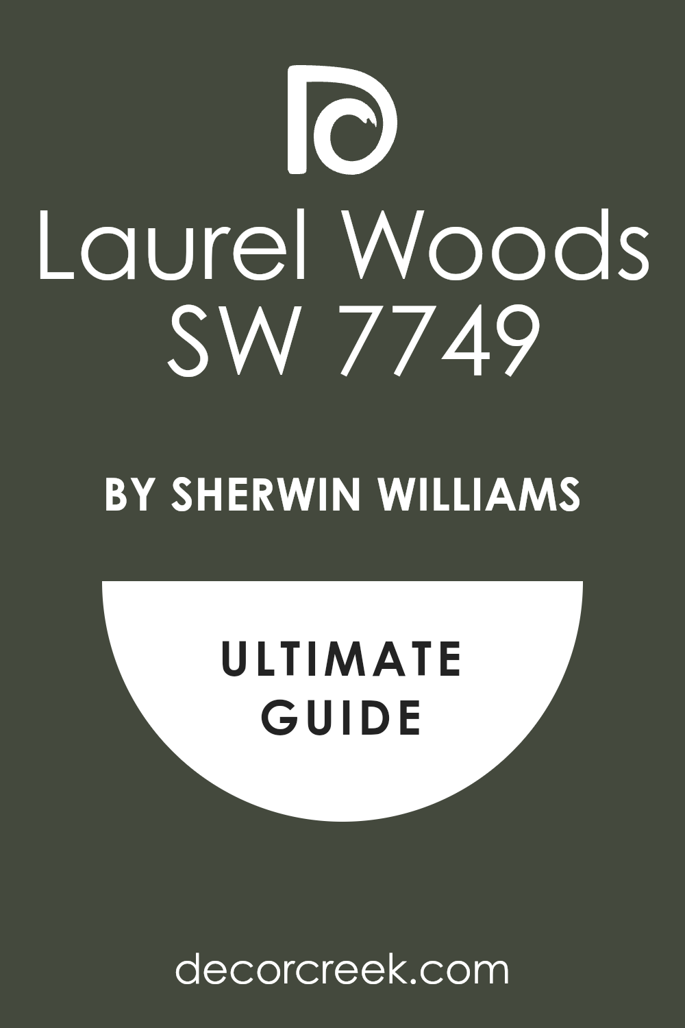
If you’re looking to refresh your space with a sense of nature and warmth, you might want to consider the color SW 7749, Laurel Woods by Sherwin Williams. This unique shade, drawn from the deeper tones of the forest, beautifully brings the calmness and serenity of nature into any room.
The rich, earthy green color has a sophisticated vibe, making it a perfect fit for spaces where you want to add a touch of elegance yet maintain a cozy and inviting atmosphere.
Laurel Woods pairs wonderfully with a range of materials and colors, from warm wooden furniture to light and airy fabrics, enhancing the overall feel of any space. It’s particularly striking in living areas and bedrooms, where its deep tone helps to create a peaceful and restful environment.
If you are considering a new color for your walls, I find that SW 7749 Laurel Woods offers a beautiful and timeless appeal that might just be the perfect choice for you. Feel free to try it in different lighting conditions to see how it transforms your space and complements your style.
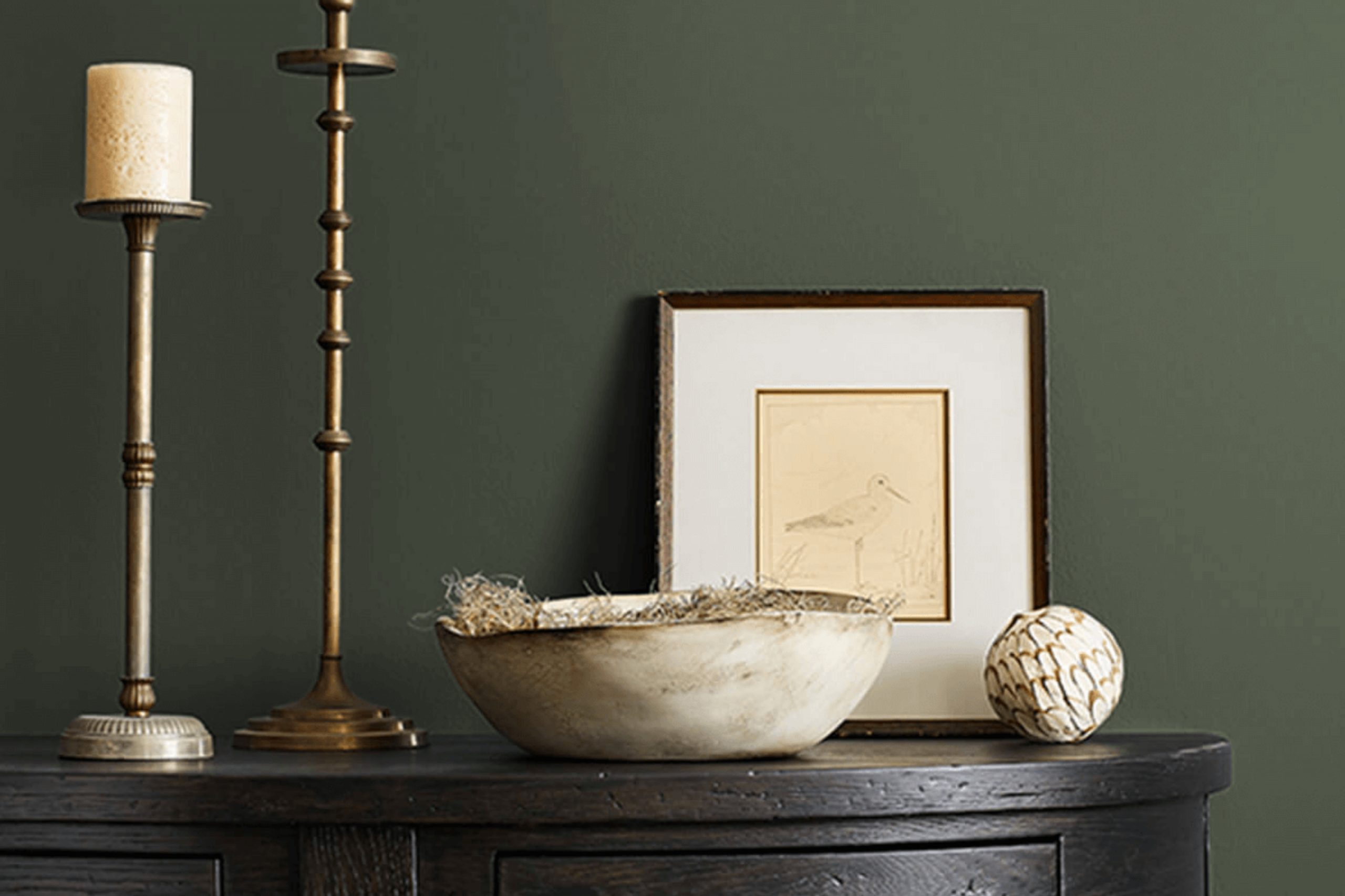
What Color Is Laurel Woods SW 7749 by Sherwin Williams?
Laurel Woods by Sherwin Williams is a deep, rich green color that draws inspiration from nature. This hue resembles lush foliage and carries an earthy vibe, making it an excellent choice for creating a cozy yet striking atmosphere in any room. It has a warm, slightly muted tone that can act as a statement wall or accent color, providing a bold backdrop without overpowering the space.
When considering interior styles, Laurel Woods works exceptionally well in rustic and traditional settings. Its nature-inspired essence can also complement modern farmhouse and bohemian decors that focus on bringing outdoor elements inside.
This color pairs beautifully with natural materials such as wood, stone, and linen, enhancing the organic feel of the space. Textures like jute or wool in area rugs and throws also work well with this color, adding layers of interest and comfort.
For a harmonious color scheme, Laurel Woods pairs seamlessly with creams, beiges, and other soft neutrals. These combinations can soften the intensity of the green, creating a balanced and inviting look. Metal finishes, especially in brass or gold, can add a touch of luxury to the rich green backdrop, making it ideal for offices or formal living areas.
Whether used in large doses or small accents, Laurel Woods by Sherwin Williams can energize a room while keeping it grounded and delightful.
Is Laurel Woods SW 7749 by Sherwin Williams Warm or Cool color?
Laurel WoodsSW 7749 is a rich, deep green paint color from Sherwin Williams that brings a sense of nature and freshness into any home. This shade is perfect for creating a cozy, welcoming atmosphere in spaces like living rooms or bedrooms. Its deep tones provide a comforting feeling while still making a room feel grounded and connected to the outdoors.
Because Laurel WoodsSW 7749 is such a versatile color, it works well with both modern and traditional decor. It pairs beautifully with natural elements like wood or stone, enhancing the overall warmth of a space. This color also contrasts nicely with lighter colors, which can help to brighten a room and make it appear more spacious.
Using Laurel WoodsSW 7749 in a home can also help to hide smudges or marks on walls due to its darker shade, making it an excellent choice for high-traffic areas or homes with young children. Overall, it’s a practical yet stylish color choice that can suit various decorating styles and preferences.
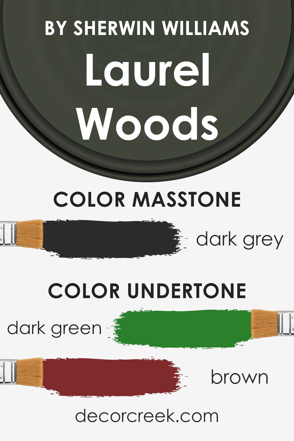
Undertones of Laurel Woods SW 7749 by Sherwin Williams
The paint color Laurel Woods has subtle undertones that can significantly influence the feel of a room. Since it combines hints of dark green, brown, navy, olive, dark turquoise, purple, and grey, this color is very versatile and complex. Each undertone plays a role in how the color appears under different lighting conditions and when paired with various decor elements.
When used on interior walls, Laurel Woods can create a dynamic environment. The dark green and olive undertones bring a touch of nature indoors, making the space feel grounded and fresh. The brown undertone adds warmth, which can make a room feel cozy and inviting. Navy and dark turquoise provide a depth that enriches the space, making it seem more robust and comforting.
The purple undertone adds a subtle hint of creativity and uniqueness, making the space stand out without overwhelming. The grey undertone ensures that the color remains muted and versatile, making it easy to match with a wide range of furniture and decoration styles.
Overall, the undertones of Laurel Woods make it an excellent choice for those looking to add a bit of complexity and variety to their living spaces without going too bold. The interplay of its undertones means that it can adapt to different styles and preferences, enhancing the space subtly but effectively.
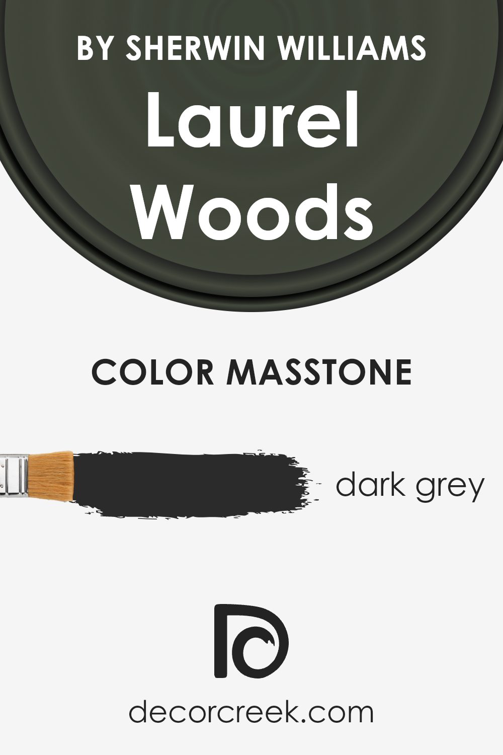
What is the Masstone of the Laurel Woods SW 7749 by Sherwin Williams?
Laurel Woods, with its masstone of dark grey, brings a strong and grounding presence into homes. This dark grey shade can make large spaces feel more intimate and cozily enclosed, while in small rooms, it adds a touch of drama and depth.
When used in living areas or bedrooms, it pairs well with a range of colors, from vibrant hues to soft pastels, allowing a flexible palette. This dark grey can also serve to highlight artwork or furniture, making it a practical choice for those who wish to draw attention to specific elements in their décor.
Moreover, its neutrality helps in creating a stable backdrop that can endure changing trends, making it a smart choice for those who prefer a timeless look rather than changing their space frequently. Overall, this particular shade works well for providing both style and functionality in various home settings.
How Does Lighting Affect Laurel Woods SW 7749 by Sherwin Williams?
Lighting plays a crucial role in how colors are perceived in different environments. The way a room is lit can significantly affect the appearance of its colors. For instance, Laurel Woods, a rich, deep green by Sherwin Williams, can look quite different under various lighting conditions and in different room orientations.
In natural light, this deep green appears vibrant and lively. Rooms facing south receive the most sunlight throughout the day, which means Laurel Woods will show its most dynamic and lively green in these spaces, especially during the middle of the day when the sun is brightest. This can make the room feel refreshed and invigorating.
North-facing rooms, however, get less direct sunlight, which can cause colors to appear more muted. In such conditions, Laurel Woods might look more subdued and shadowy, lending a more reserved but still rich ambiance to the space. This can be ideal for creating a cozy and contemplative area.
East-facing rooms see the most light in the morning. Here, Laurel Woods will look particularly warm and inviting in the morning, with the early sunlight making the color appear softer and slightly brighter than at other times. As the day progresses and the natural light diminishes, the color will become deeper and more profound.
Rooms that face west get the evening light, which can cast a golden glow, making Laurel Woods appear warmer and more welcoming towards the end of the day. During sunrise, the light is limited, causing the color to appear darker and more intense.
In the case of artificial lighting, different bulbs can influence how Laurel Woods is perceived. Warm lights, like warm LEDs or incandescent bulbs, can enhance its welcoming and cozy green tones. On the other hand, cooler lights like fluorescent bulbs might bring out more of its underlying cool tones, making it appear slightly starker and more formal.
Understanding these nuances can help in deciding paint colors and lighting options to achieve the desired mood and look in a space.
What is the LRV of Laurel Woods SW 7749 by Sherwin Williams?
LRV stands for Light Reflectance Value, which is a measure of the amount of visible light a paint color reflects when it’s on the walls. This scale typically ranges between 0 and 100, where 0 absorbs all light and is the darkest, while 100 reflects all light and is the brightest.
The LRV helps you understand how light or dark a color might look once applied to your walls. Higher LRV values make a room feel brighter and more open, because they reflect more light. On the other hand, lower LRV values result in a color that makes a room feel cozier or more enclosed, since less light is reflected back into the room.
The color Laurel Woods has an LRV of 6.281, which means it’s on the darker end of the scale. When this color is used on walls, it will absorb much of the light, rather than reflecting it. This can create a rich, deep ambiance in a space but might also make a smaller room feel even smaller.
Since it doesn’t reflect much light, lighting choices and placement become more important in rooms painted with lower LRV colors like this one. You’d want to ensure enough light sources to brighten the space effectively, especially in areas without natural light.
Coordinating Colors of Laurel Woods SW 7749 by Sherwin Williams
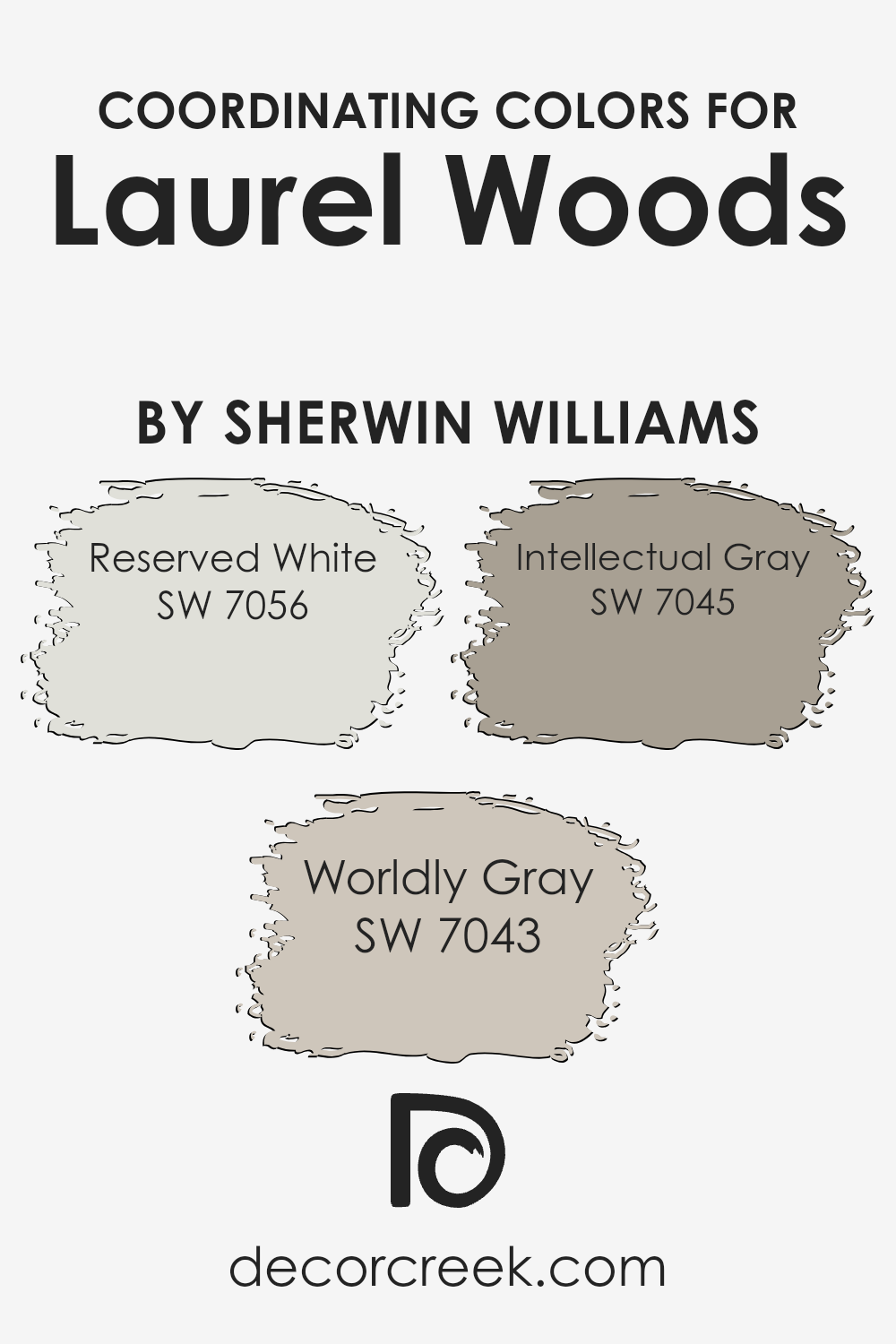
Coordinating colors are hues that complement one another on the color palette, working together to achieve a balanced and harmonious look. For example, pairing a strong color like a deep green will work well with neutral or similar undertones, ensuring that no element in the room overwhelms another. Choosing the right coordinating colors enhances the aesthetic and mood of a space without causing visual discord.
Reserved White SW 7056 is a light, neutral color that offers a fresh and clean look, making it an excellent background for more dominant colors. It helps in creating a subtle contrast while maintaining a soft harmony in the decor.
Worldly Gray SW 7043 is a mid-tone gray with warm undertones that provides a cozy and inviting atmosphere. This color is versatile, working well in almost any space as it complements both light and dark hues.
Lastly, Intellectual Gray SW 7045 is a darker gray that adds depth and definition. It beautifully frames spaces, allowing features and furniture to stand out, yet integrates smoothly within a variety of color schemes. Together, these colors support and enhance each other, creating a cohesive and attractive environment.
You can see recommended paint colors below:
- SW 7056 Reserved White (CHECK A SAMPLE)
- SW 7043 Worldly Gray (CHECK A SAMPLE)
- SW 7045 Intellectual Gray (CHECK A SAMPLE)
What are the Trim colors of Laurel Woods SW 7749 by Sherwin Williams?
Trim colors are essential accents in interior and exterior design, serving as a complementary or contrasting outline that highlights architectural features and defines spaces. Particularly for a deep, rich hue like Laurel Woods by Sherwin Williams, choosing the right trim color can significantly enhance the overall appearance and appeal of a room or a façade.
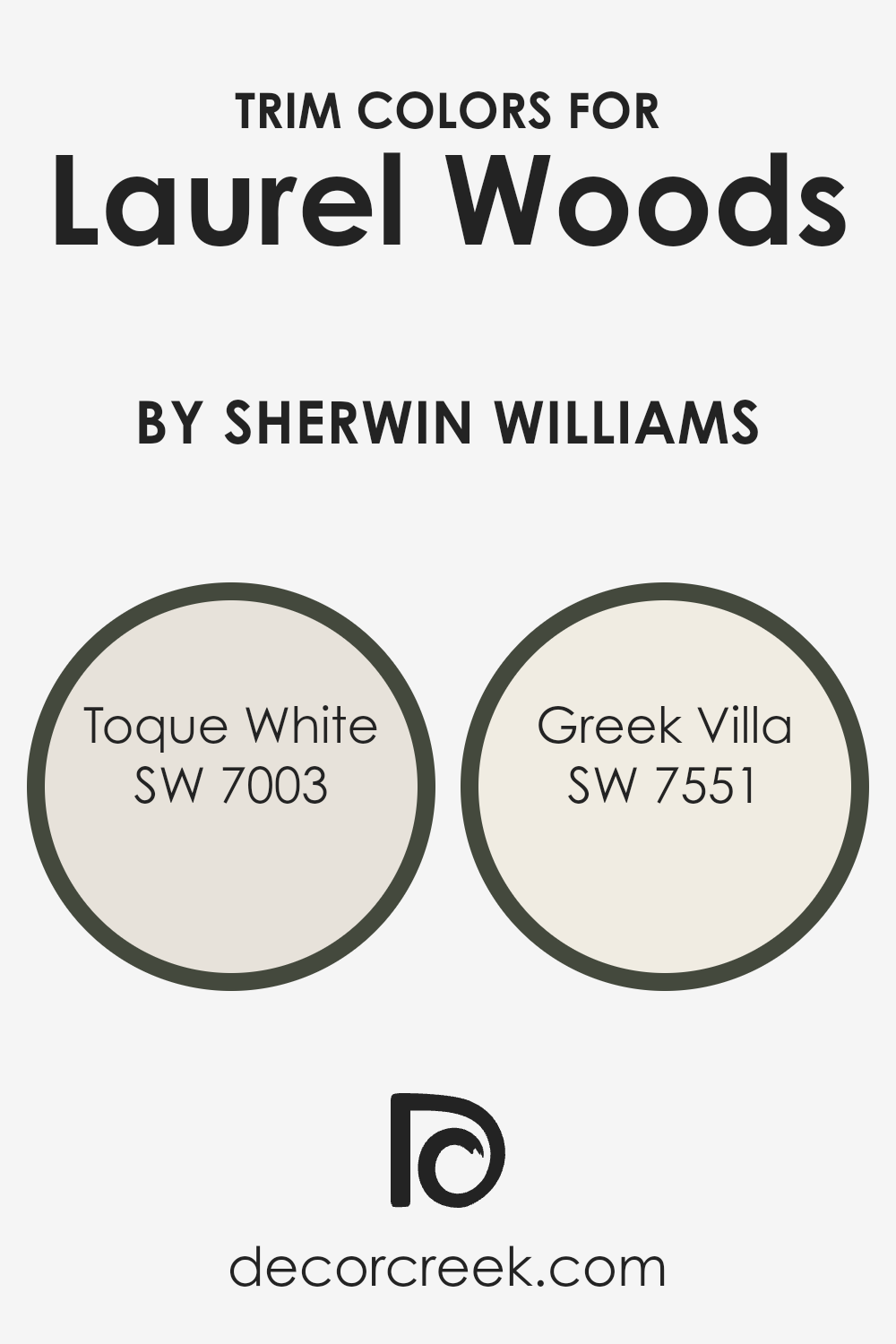
SW 7003 – Toque White, and SW 7551 – Greek Villa are two trim colors that can beautifully frame Laurel Woods, providing a crisp, clean border that draws attention to the main color.
Toque White is a soft, neutral white that doesn’t overpower but rather gently supports the dominant shades it surrounds. This color is ideal for trim because it subtly separates different colors or connects adjoining rooms with a seamless flow.
On the other hand, Greek Villa is slightly warmer with a creamy undertone, giving it a cozy and inviting feel that complements darker, rich colors like Laurel Woods. It adds a hint of warmth to the edges, making the space feel more cohesive and well-rounded.
These trim colors not only highlight the beauty of Laurel Woods but also play a crucial role in achieving a harmonious color scheme.
You can see recommended paint colors below:
Colors Similar to Laurel Woods SW 7749 by Sherwin Williams
Similar colors are important in design because they create a harmonious and cohesive look. Using shades that are close to each other on the color spectrum can make a space feel balanced and aesthetically pleasing.
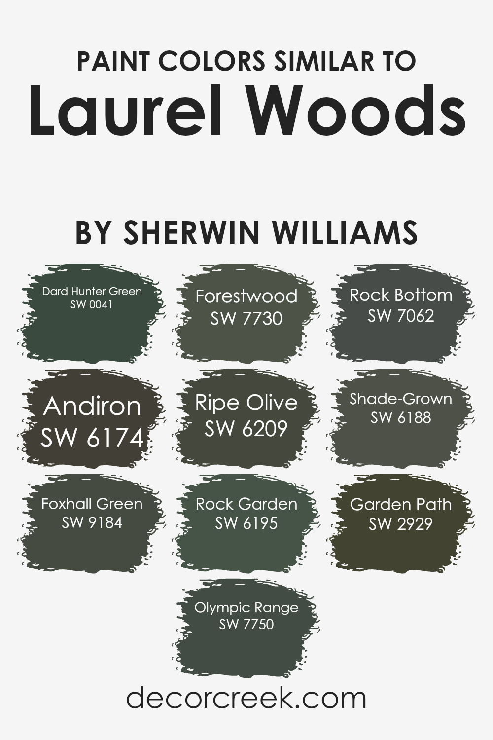
These colors often share a common hue but differ in tones, shades, or saturations, making it easy to combine them in various ways without clashing. For instance, colors like Dard Hunter Green and Olympic Range subtly vary from Laurel Woods, offering a tight visual connection that enhances the overall ambiance of a room while maintaining a unique character.
When considering the similar colors of Laurel Woods by Sherwin Williams, each one has its unique charm. Dard Hunter Green is a deep, rich green that evokes the sense of dense foliage. Andiron offers a striking charcoal gray that can provide a strong visual anchor in a color scheme.
Foxhall Green is slightly brighter, adding a touch of vibrancy without overwhelming the senses. Olympic Range leans towards a muted green with hints of slate, offering a calm backdrop perfect for numerous settings.
Forestwood is a tad lighter than Laurel Woods, providing a touch of softness to the design. Ripe Olive carries a deep, earthy tone that works well in a variety of spaces. Rock Garden is a slightly grayish green that suits more subdued design desires.
Rock Bottom provides a deep gray, almost black, adding dramatically to a color palette. Shade-Grown is a lush, dark green that acts almost as a neutral. Lastly, Garden Path is a mellow, subdued green that can make any space feel grounded and connected to the natural world.
These similar colors work together to create rich, layered interior designs that are aesthetically soothing and universally appealing.
You can see recommended paint colors below:
- SW 0041 Dard Hunter Green (CHECK A SAMPLE)
- SW 6174 Andiron (CHECK A SAMPLE)
- SW 9184 Foxhall Green (CHECK A SAMPLE)
- SW 7750 Olympic Range (CHECK A SAMPLE)
- SW 7730 Forestwood (CHECK A SAMPLE)
- SW 6209 Ripe Olive
- SW 6195 Rock Garden (CHECK A SAMPLE)
- SW 7062 Rock Bottom (CHECK A SAMPLE)
- SW 6188 Shade-Grown (CHECK A SAMPLE)
- SW 2929 Garden Path
Colors that Go With Laurel Woods SW 7749 by Sherwin Williams
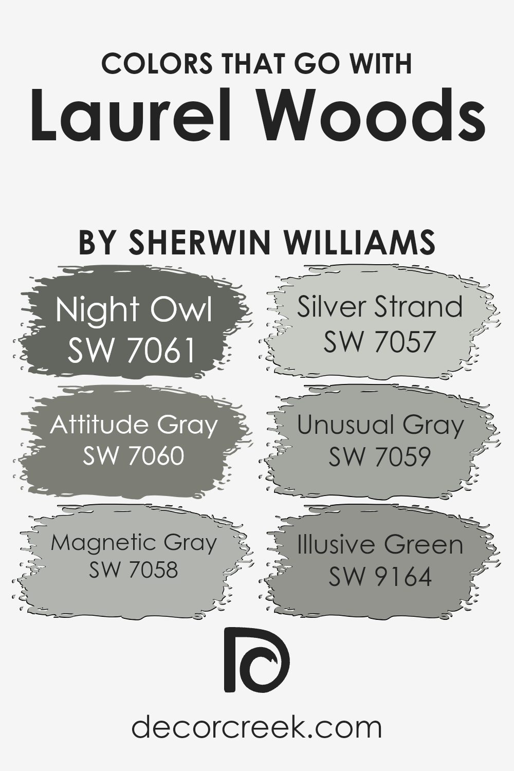
Choosing the right colors to complement Laurel Woods SW 7749 by Sherwin Williams is essential for creating a cohesive and appealing color scheme in any space. Laurel Woods is a deep, rich green that evokes the feeling of dense forest foliage.
It pairs beautifully with a variety of grays and softer hues that can help balance its intensity. By selecting compatible colors, you can achieve a harmonious look that enhances both the beauty and the mood of a room.
SW 7061 – Night Owl is a dramatic dark gray with hints of blue undertones, perfect for adding depth and contrast against the earthy Laurel Woods. SW 7060 – Attitude Gray offers a cooler, medium shade that bridges the gap between light and dark, facilitating a smooth transition in rooms with varying light conditions. SW 7058 – Magnetic Gray is lighter and neutral, providing a soft backdrop that allows Laurel Woods to stand out without overwhelming the space. SW 7057 – Silver Strand is a muted silver-gray with a slight green undertone that complements Laurel Woods without clashing. SW 7059 – Unusual Gray has a unique blend of green and gray, echoing the natural vibes of Laurel Woods and ensuring a rooted, organic feel.
Lastly, SW 9164 – Illusive Green is a subtle green-gray that whispers of natural elements, pairing seamlessly with Laurel Woods for a gentle, cohesive environment. Together, these colors work to create a balanced and inviting atmosphere, making any room feel comfortable and well-designed.
You can see recommended paint colors below:
- SW 7061 Night Owl (CHECK A SAMPLE)
- SW 7060 Attitude Gray (CHECK A SAMPLE)
- SW 7058 Magnetic Gray (CHECK A SAMPLE)
- SW 7057 Silver Strand (CHECK A SAMPLE)
- SW 7059 Unusual Gray (CHECK A SAMPLE)
- SW 9164 Illusive Green (CHECK A SAMPLE)
How to Use Laurel Woods SW 7749 by Sherwin Williams In Your Home?
Laurel Woods by Sherwin Williams is a deep, earthy green paint color that can bring a touch of nature into your home. It’s perfect for creating a cozy and inviting atmosphere in any room. You can use this color in your living room on an accent wall to add depth and a focal point to the space. It pairs beautifully with light woods and neutral tones, making it easy to match with your existing decor.
In the bedroom, painting all walls with Laurel Woods can create a cozy, nest-like feel, perfect for relaxing at the end of the day. It’s also a great choice for a home office, where the richness of the color can help you focus and feel grounded as you work.
Additionally, Laurel Woods works well on exterior trim or doors for a stylish, standout look. This color is versatile enough to be used in many different ways around your house, each bringing a sense of warmth and nature indoors.
Laurel Woods SW 7749 by Sherwin Williams vs Shade-Grown SW 6188 by Sherwin Williams
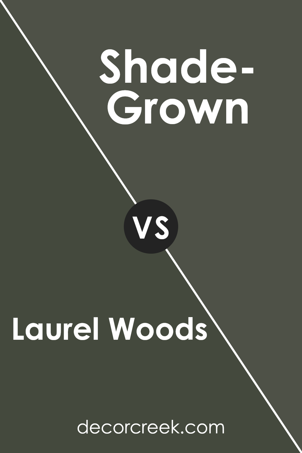
Laurel Woods and Shade-Grown are two distinct colors from Sherwin Williams. Laurel Woods is a deep green that leans towards a muted, earthy tone. It’s a versatile shade that can add a sense of grounding and calm to a space without feeling overpowering.
On the other hand, Shade-Grown is darker and has more intensity in its green hue, approaching almost a black-green under certain lighting. It’s perfect for creating a bold statement in a room, providing a rich backdrop that highlights other colors or decor elements.
Both colors share a natural inspiration but differ significantly in their darkness and mood impact. Laurel Woods is more subdued and can work well in various settings, while Shade-Grown is ideal for specific areas where a dramatic effect is desired.
You can see recommended paint color below:
Laurel Woods SW 7749 by Sherwin Williams vs Forestwood SW 7730 by Sherwin Williams
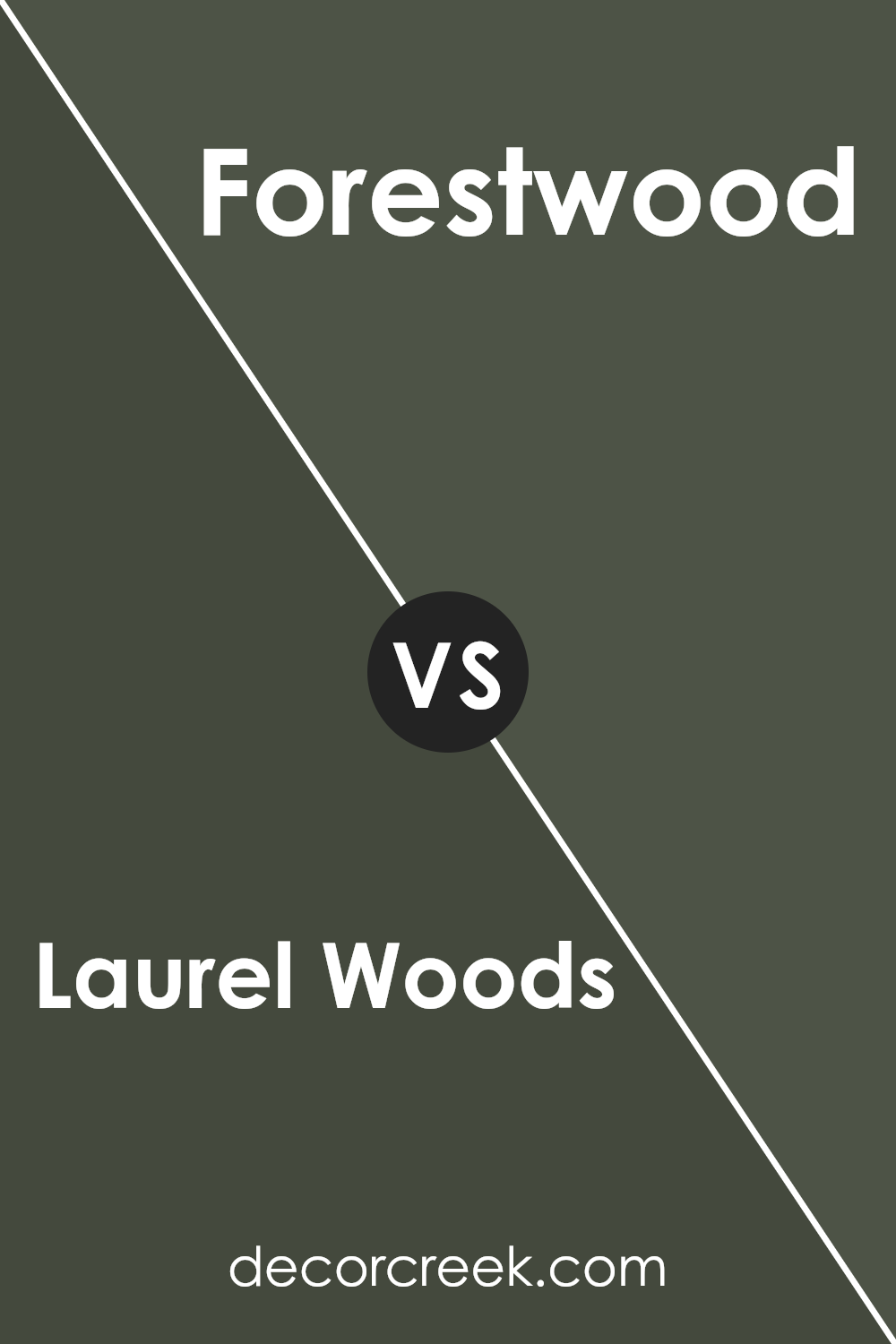
Laurel Woods and Forestwood are two dark green colors from Sherwin Williams, but they have distinct differences in tone. Laurel Woods has a deeper, brownish-green hue that lends a cozy, earthy feel to spaces. It makes rooms feel snug and inviting, perfect for creating a retreat-like atmosphere.
On the other hand, Forestwood features a more traditional green shade that feels like the natural colors of a dense evergreen forest. It is fresher and brighter compared to Laurel Woods, offering a lively yet relaxed vibe.
While Laurel Woods is ideal for those who prefer a warmer, more muted color, Forestwood suits spaces where a vibrant, natural green is desired without being too bold. Both colors work well for adding depth and interest to interiors but cater to different aesthetic preferences.
You can see recommended paint color below:
- SW 7730 Forestwood (CHECK A SAMPLE)
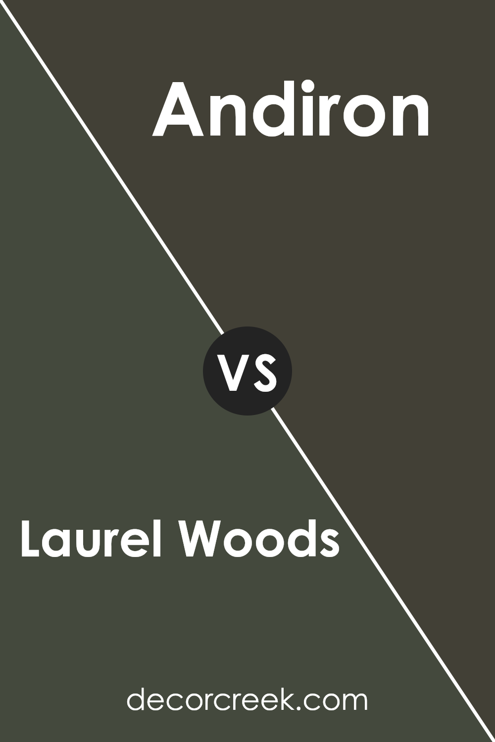
Laurel Woods SW 7749 by Sherwin Williams vs Andiron SW 6174 by Sherwin Williams
Laurel Woods and Andiron, both from Sherwin Williams, offer distinct tones that can significantly influence the ambiance of any space. Laurel Woods is a deep, rich green that resembles a dense forest canopy. It brings a natural and grounding feel to a room, making it ideal for spaces where you want a touch of nature’s calmness without overwhelming the senses.
On the other hand, Andiron is a solid, dark gray that provides a more neutral and muted background. This color is perfect for those who prefer a minimalist or modern look, as it pairs well with various decor styles and colors. It’s particularly effective in areas where you want to highlight artwork or furniture, as it doesn’t compete for attention.
In summary, Laurel Woods adds a lush, vibrant touch, while Andiron offers a sleek, understated backdrop. Both colors have their unique appeal, depending on the mood and style you wish to achieve in your home.
You can see recommended paint color below:
- SW 6174 Andiron (CHECK A SAMPLE)
Laurel Woods SW 7749 by Sherwin Williams vs Rock Garden SW 6195 by Sherwin Williams
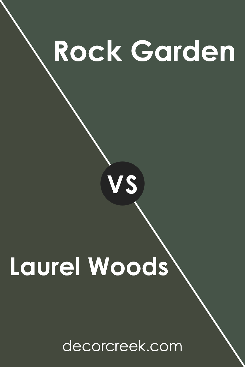
Laurel Woods and Rock Garden by Sherwin Williams are two distinct shades that bring their unique touch to spaces. Laurel Woods is a deep, rich green with a hint of gray, making it perfect for cozy, grounded environments. It often mimics the shade of dense forest foliage and is ideal for areas where you want to create a nature-inspired, calming atmosphere without being too dark.
On the other hand, Rock Garden is a lighter, softer shade of green with noticeable gray undertones. This color leans more towards a muted sage and is excellent for spaces that need a light, airy feel but still wish to retain an element of earthy green vibes. Rock Garden could make small spaces appear larger while maintaining a connection to natural elements.
Both colors offer a taste of the outdoors, but while Laurel Woods adds depth and drama, Rock Garden brings in a more gentle and open feel. This makes each suitable for different types of rooms depending on the mood you want to achieve.
You can see recommended paint color below:
- SW 6195 Rock Garden (CHECK A SAMPLE)
Laurel Woods SW 7749 by Sherwin Williams vs Rock Bottom SW 7062 by Sherwin Williams
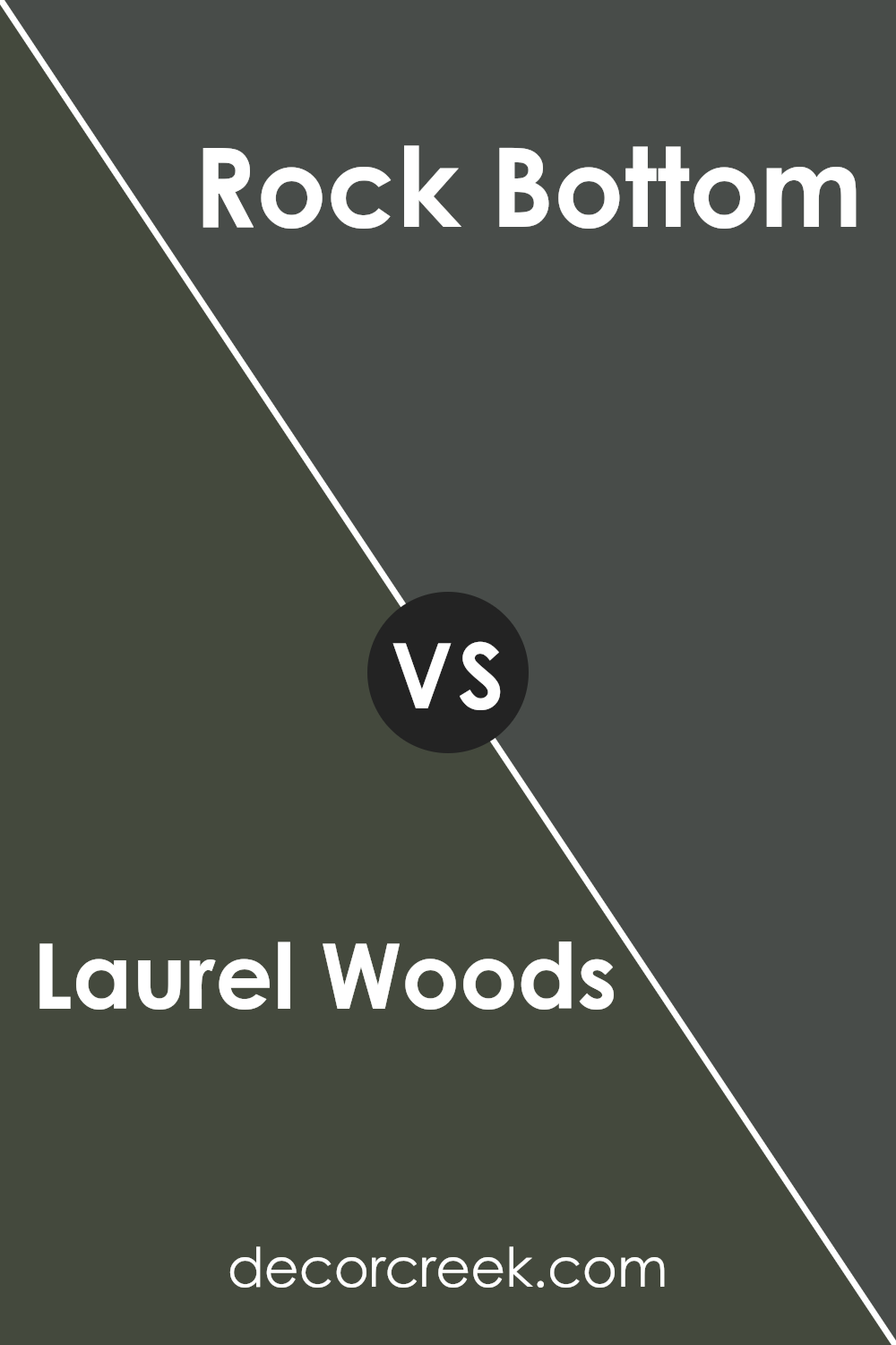
Laurel Woods and Rock Bottom, both by Sherwin Williams, are distinct shades that can serve different decorative preferences. Laurel Woods is a deep, rich green with hints of earthy tones, which gives it a grounding and natural feel. It can be ideal for spaces where you want to bring in elements of the outdoors, offering a cozy, forest-like atmosphere.
On the other hand, Rock Bottom is a dark gray with slightly cooler undertones. This shade works well as a strong, neutral base, making it great for modern and industrial settings. It’s particularly effective in achieving a bold, standout look without being overly dramatic.
Both colors can dramatically alter the ambiance of a room, depending on how they are used. Laurel Woods typically warms a space, inviting a sense of calm and closeness to nature. In contrast, Rock Bottom offers a sharp, clean look that can make other colors in the room pop, providing a versatile backdrop for various design elements.
You can see recommended paint color below:
- SW 7062 Rock Bottom (CHECK A SAMPLE)
Laurel Woods SW 7749 by Sherwin Williams vs Dard Hunter Green SW 0041 by Sherwin Williams
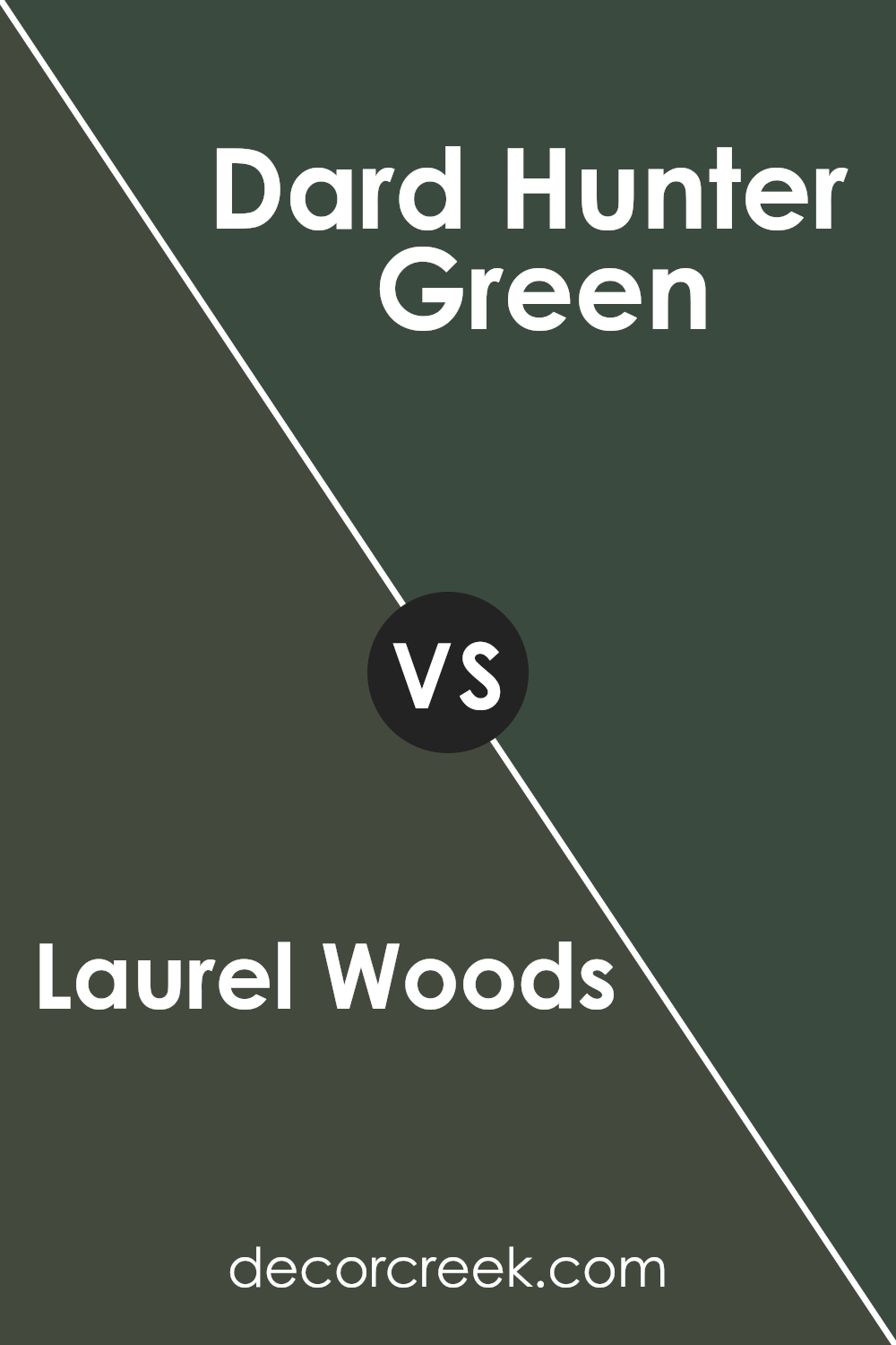
Comparing Laurel Woods and Dard Hunter Green, both by Sherwin Williams, we see some distinct differences. Laurel Woods is a deep, rich green with gray undertones, offering a muted and earthy feel. This color is versatile and works well in spaces aiming for a cozy and grounded ambiance.
On the other hand, Dard Hunter Green is a much darker shade. It leans towards a classic green with a touch of sophistication, perfect for creating a bold statement in any room. The color is reminiscent of lush forests and can bring a strong sense of nature into any space.
While Laurel Woods leans towards a more neutral and subtle appearance, Dard Hunter Green stands out with its deeper and more traditional green hue. The choice between them depends on whether you want a hint of color or a dramatic splash.
Both shades can create beautiful, natural-themed spaces, but your selection will depend on the impact you want to achieve.
You can see recommended paint color below:
- SW 0041 Dard Hunter Green (CHECK A SAMPLE)
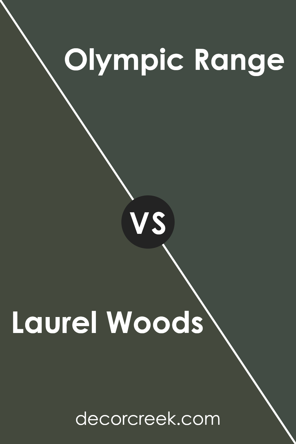
Laurel Woods SW 7749 by Sherwin Williams vs Garden Path SW 2929 by Sherwin Williams
Laurel Woods is a deep, rich green that brings to mind dense forest or pine trees. This color is perfect if you want to add a natural, earthy touch to a space, giving it a cozy and inviting feel. It works well in areas where you might want some comfort and peace, like living rooms or bedrooms.
Garden Path, on the other hand, is a lighter, softer green. It’s more subtle and has a fresh, springtime vibe that brightens any room. This shade would be great in spaces that get a lot of light, as it can make the space feel airy and open.
Both colors reflect nature but in different ways. Laurel Woods is like the shadowy depths of an old forest, whereas Garden Path reminds you of a cheerful stroll through a sunny garden. Depending on the mood you want to set, either color can significantly enhance the aesthetic of a room.
You can see recommended paint color below:
- SW 2929 Garden Path
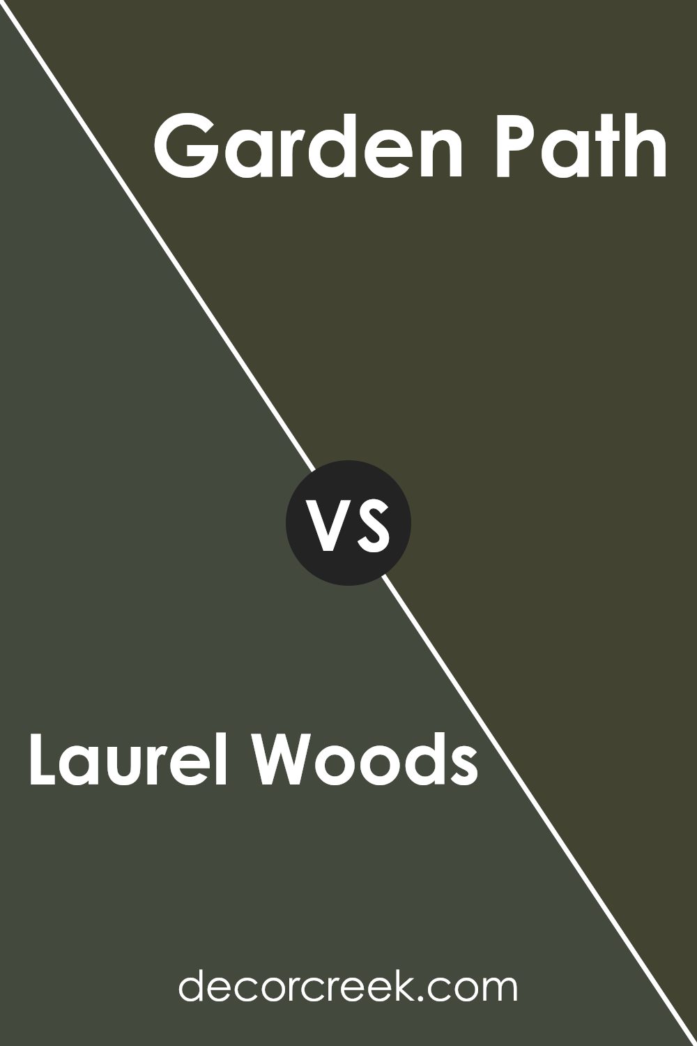
Laurel Woods SW 7749 by Sherwin Williams vs Foxhall Green SW 9184 by Sherwin Williams
Laurel Woods is a deep, rich green with a muted, almost gray undertone, giving it a sturdy, grounded feel. This color is reminiscent of dense forest foliage and has a comforting, sheltering effect. It’s perfect for spaces where you want to create a sense of calm and closeness to nature.
On the other hand, Foxhall Green is a lighter, softer green with a subtle yellow undertone, making it feel warmer and more inviting. This color evokes the fresh, lively hues of spring leaves and is ideal for brightening up a room and giving it a more open, airy feel.
Both colors belong to the green family but serve different purposes due to their tones and depths. While Laurel Woods is great for creating a cozy, secluded spot, Foxhall Green works well in spaces that aim for a cheerful, welcoming atmosphere.
These colors can also work beautifully together in the same home, providing a nice contrast and variety while staying within a harmonious color palette.
You can see recommended paint color below:
- SW 9184 Foxhall Green (CHECK A SAMPLE)
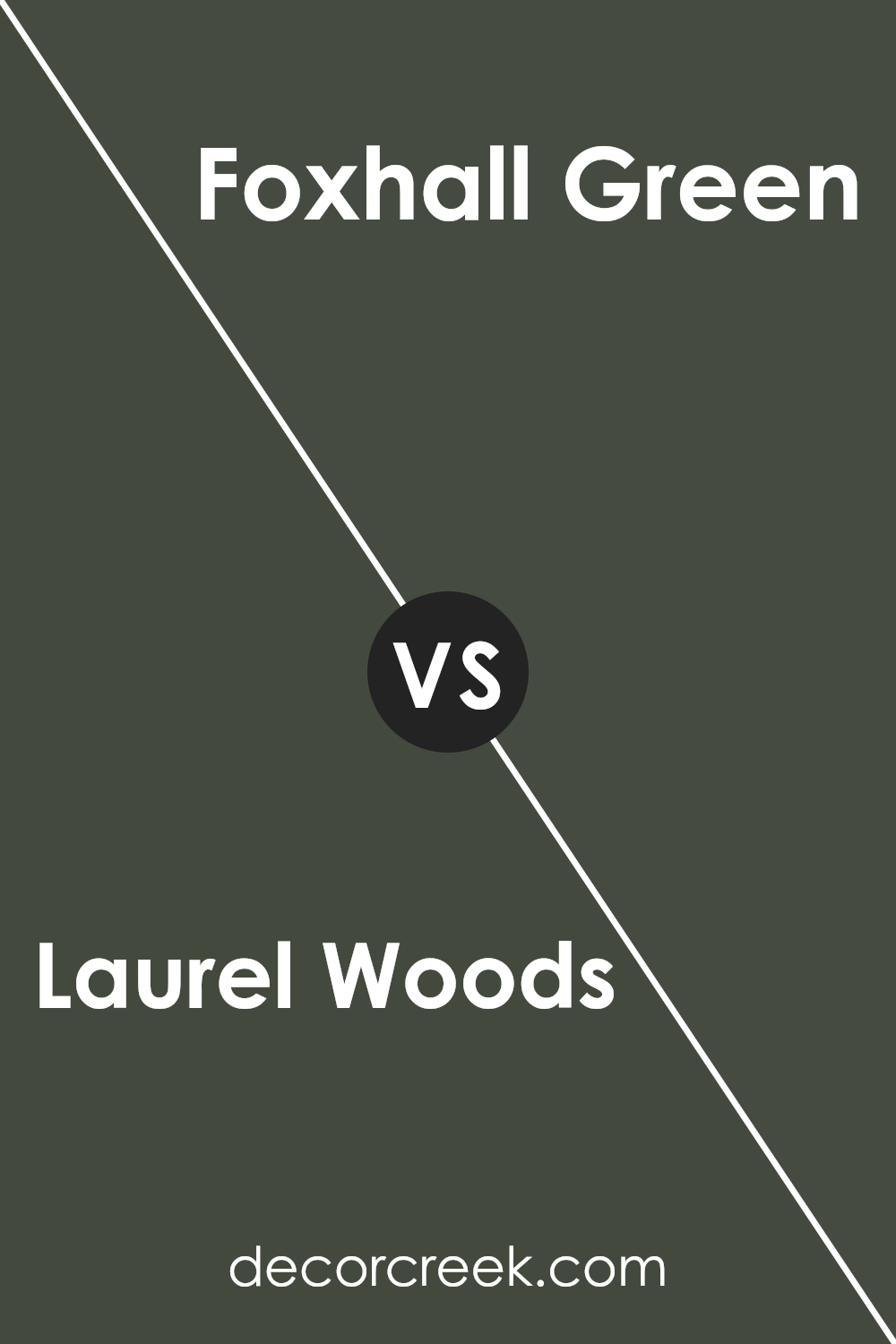
Laurel Woods SW 7749 by Sherwin Williams vs Ripe Olive SW 6209 by Sherwin Williams
Laurel Woods and Ripe Olive by Sherwin Williams are two rich, dark green shades, each with a distinct mood and style. Laurel Woods has a deep, earthy tone that conveys a cozy and welcoming atmosphere, ideal for spaces where you want to feel relaxed and comfortable.
It has a slightly brownish tint, making it feel warm and inviting. On the other hand, Ripe Olive presents a cooler, more subdued green, leaning slightly towards a grayish tone. This color is perfect for adding a touch of calm elegance to any space without being too bold.
While both colors can enhance a room’s aesthetic in their unique ways, Laurel Woods offers warmth and snugness, whereas Ripe Olive provides a more understated and refined look. Both are versatile and can blend well with natural materials and muted colors.
You can see recommended paint color below:
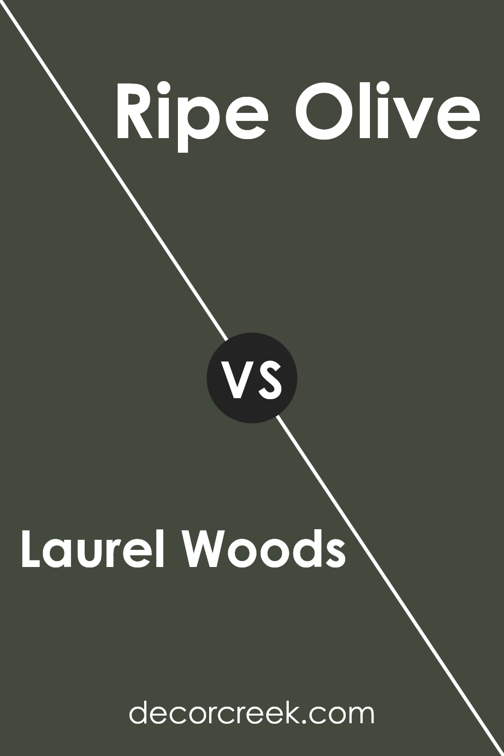
Laurel Woods SW 7749 by Sherwin Williams vs Olympic Range SW 7750 by Sherwin Williams
Laurel Woods and Olympic Range, both by Sherwin Williams, are two rich, nature-inspired green hues. Laurel Woods has a deep, earthy tone with a hint of moss, creating a cozy and warm atmosphere in any space. It’s a color that feels grounded and works well in areas where you want a touch of nature’s calm, such as a study or living room.
Olympic Range, on the other hand, is slightly lighter and carries more of a forest green shade. This color is fresh and vibrant, perfect for energizing a space. It suits active areas like kitchens or playrooms, where a brighter touch can inspire more energy and activity.
While both colors share a green base, Laurel Woods offers a darker, moodier feel compared to the brighter and livelier vibe of Olympic Range. This contrast in mood and brightness makes each color suitable for different types of rooms depending on the atmosphere you want to achieve.
You can see recommended paint color below:
- SW 7750 Olympic Range (CHECK A SAMPLE)
Conclusion
In wrapping up, SW 7749 Laurel Woods by Sherwin Williams is a lovely, deep green paint color that can make any room look rich and cozy. It’s like standing in the middle of a peaceful, green forest. This shade works especially well in places where you want to feel relaxed and close to nature, like a bedroom or a reading nook.
Laurel Woods pairs beautifully with light creams or rich browns, creating a warm and inviting space. It’s a good choice if you’re tired of neutral colors and want something that stands out, yet still feels timeless. Using this color in your home is a simple way to bring in a touch of nature’s calmness.
Overall, if you’re thinking about giving your room a new look, Laurel Woods is a great color to consider. It’s easy to like, and it will make your space feel both elegant and comfortable. Whether you’re looking to paint an entire room, or just add a pop of color with an accent wall, Laurel Woods is definitely a color worth trying out.
Ever wished paint sampling was as easy as sticking a sticker? Guess what? Now it is! Discover Samplize's unique Peel & Stick samples.
Get paint samples


