Choosing the right paint color for your home can often feel stressful, but settling on SW 6254 Lazy Gray by Sherwin Williams might just be the decision that helps tie your room together perfectly. If you’re considering this particular shade, there are a few things you should know to ensure it aligns with your vision for your room.
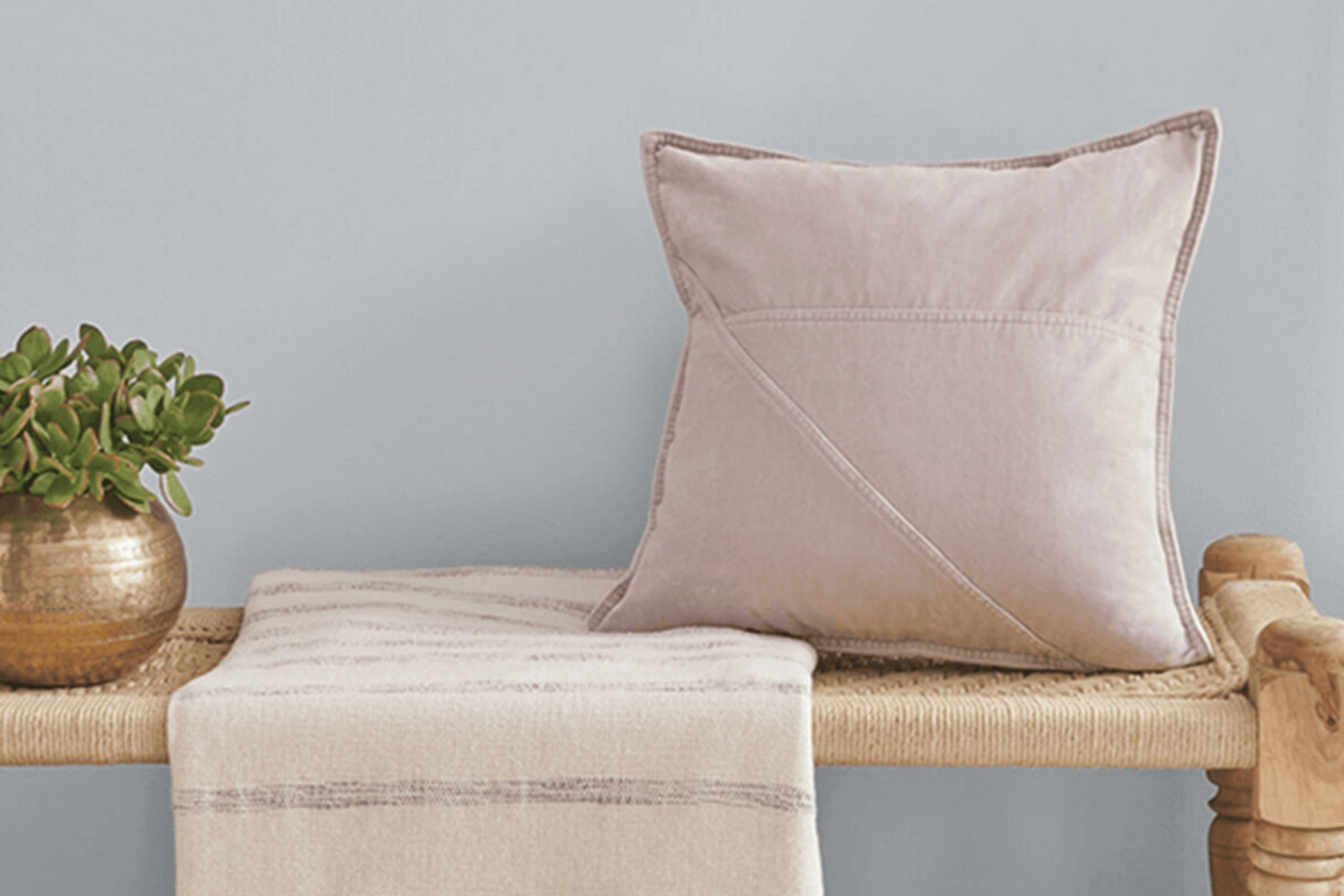
First of all, Lazy Gray is a flexible color that manages to balance a modern feel with classic understatement. Its tone is neutral yet distinctive, which means it can complement various décor styles and preferences. Whether you’re aiming to refresh your living room, bedroom, or even your kitchen, this shade can lend a subtle elegance without overpowering the room.
Additionally, light plays a big role in how Lazy Gray will look in your room. Depending on the natural and artificial light your room receives, this color can appear as a true gray or shade toward a blue-gray. I recommend testing this color in different parts of your room at various times of the day. This practice will give you a good sense of how the color adapts and whether it meets your expectations consistently throughout the day.
Considering Lazy Gray for your next painting project could be a smart choice if you’re looking for a color that provides both flexibility and an air of sleekness to your living environment.
Is Lazy Gray SW 6254 Right for My Home?
Lazy Gray by Sherwin Williams is one of those paint colors that really brings a calming and gentle ambiance to any room. It’s a soft gray that leans slightly toward blue, depending more on the natural light it gets. I find it to be quite adaptable, whether I want a cool, laid-back vibe or something that looks a bit more polished without being too stark or cold.
In terms of interior styles, Lazy Gray fits beautifully with modern minimalist, contemporary, and even transitional decor. Its subtlety bridges the gap between modern clean lines and the comforting, homey feel of traditional styles. I’ve personally seen it work wonders in a living room paired with crisp white trim and light wood flooring—it creates an effortlessly airy feel.
When it comes to materials and textures, this color plays really well with a variety of options. I love combining it with natural elements like wooden furniture or wicker accents because it brings out the warmer tones in the wood. It also pairs superbly with metals like brushed nickel or stainless steel for a more streamlined look. Textiles in white or soft pastels create a gentle contrast that really makes the room feel welcoming.
Overall, Lazy Gray has a subtle charm that complements many design elements, making it a great choice for anyone looking to freshen up their room.
decorcreek.com
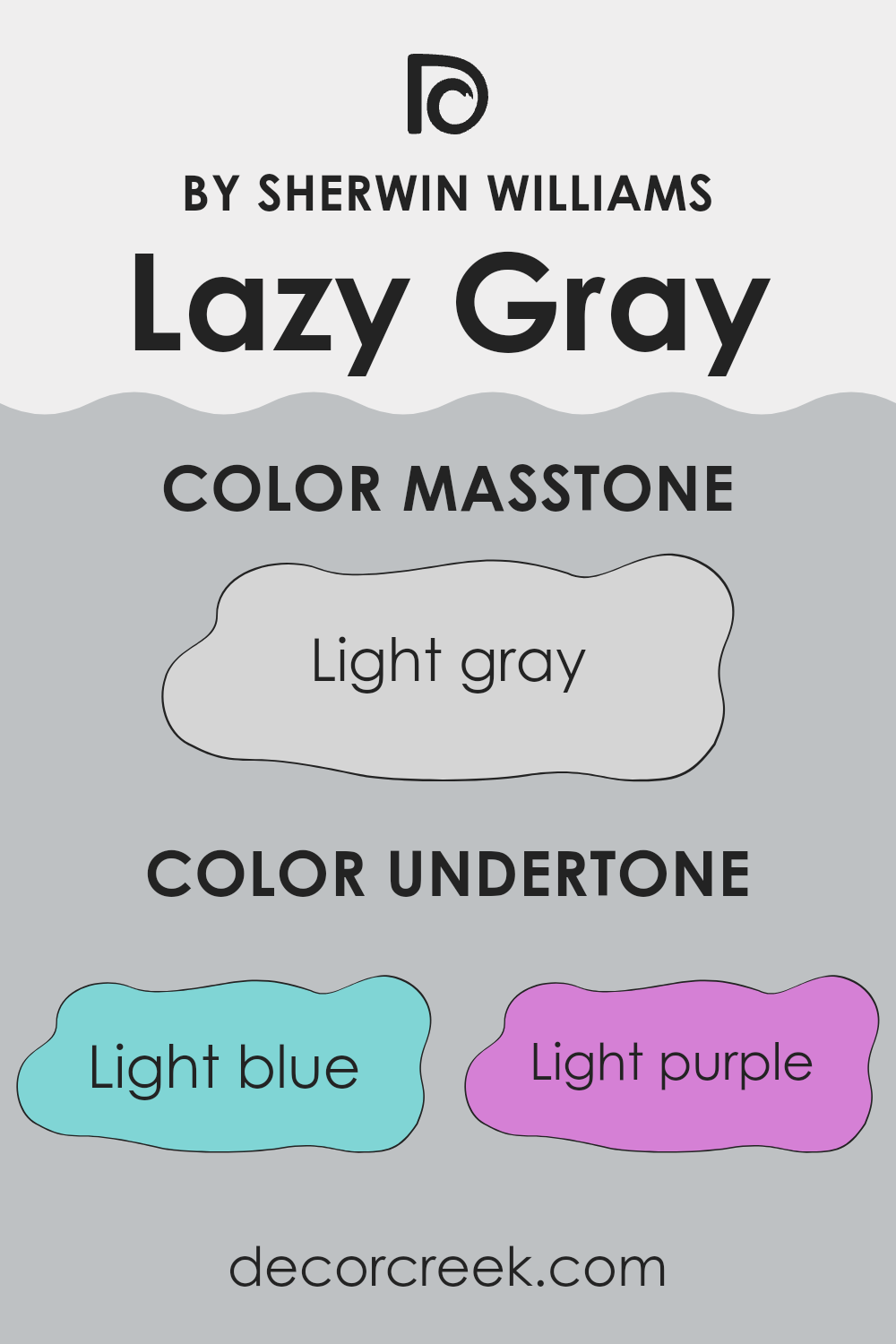
What are the right undertones of Lazy Gray SW 6254 ?
Lazy Gray by Sherwin Williams is a flexible paint color that appears differently depending on the lighting and surrounding colors because of its undertones. Undertones are subtle colors that underlie a primary paint color. Lazy Gray has a mix of light blue, light purple, pale yellow, lilac, mint, pale pink, and gray undertones.
These undertones slightly influence how we perceive the main gray color. For example, in a room with lots of natural light, the light blue and mint undertones might make the walls seem cooler and more refreshing. On the other hand, in artificial light, the lilac and light purple undertones could give the walls a warmer, cozy feeling.
When using Lazy Gray on interior walls, the look of the room can change based on these hidden colors. If the room has a lot of yellow or warm colored decor, the pale yellow and pale pink undertones might stand out, creating a soft, welcoming atmosphere. Conversely, pairing Lazy Gray with blues or greens might highlight its cool mint and light blue undertones, giving the room a calm, collected vibe.
Overall, understanding undertones can help in choosing the right paint color for your room, ensuring that it matches your vision and reacts well with the room’s lighting and furnishings. Lazy Gray’s unique mix of undertones makes it a flexible choice for various rooms and styles.
decorcreek.com
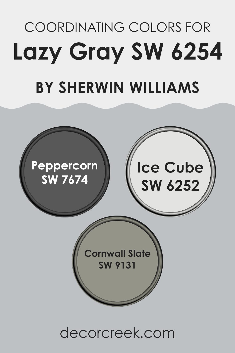
Best Coordinating Colors to use with Lazy Gray SW 6254 by Sherwin Williams this year.
Coordinating colors are shades that complement each other and work together to enhance the overall aesthetic of a room. When used thoughtfully, these colors can create a harmonious atmosphere in any room. For instance, Lazy Gray by Sherwin Williams can be perfectly paired with specific coordinating colors to highlight its neutral yet distinct tone.
One great coordinating color is Peppercorn (SW 7674), a robust and deep gray that offers a bold contrast to the softer Lazy Gray. The striking depth of Peppercorn can be used to accentuate key architectural features or furniture pieces, injecting a sense of drama without overpowering the room.
Ice Cube (SW 6252), on the other hand, is a much lighter and cleaner shade of blue, providing a crisp and refreshing look. This color works wonderfully to brighten up rooms and adds a breezy and fresh element when paired with Lazy Gray. Another complementing shade is Cornwall Slate (SW 9131), which brings a subtle hint of blue-green to the mix. Its muted but distinct hue can help in creating a unique, cohesive color scheme that is neither too loud nor too dull, offering an understated elegance to any interior design. Together, these colors support each other in bringing balance and beauty to any decorating project.
You can see recommended paint colors below:
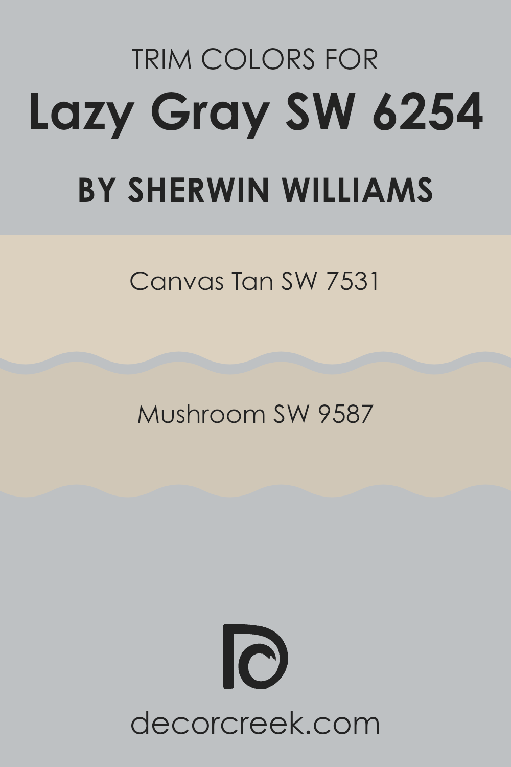
Trendy Trim Colors of Lazy Gray SW 6254 by Sherwin Williams to use this year.
Trim colors are specific shades used to accentuate and define the details like doors, window frames, and baseboards in a room, contrasting with or complementing the primary wall color.
Choosing appropriate trim colors can enhance the overall appearance of a room, creating a harmonious look or adding visual interest that defines areas effectively. For a color like Lazy Gray by Sherwin Williams, trim colors should subtly offset its cool, subdued tone to achieve a balanced aesthetic.
Canvas Tan SW 7531 is a warm neutral that provides a gentle contrast to Lazy Gray’s cooler hue, offering a soft blend that’s pleasing to the eye and works well in various lighting conditions. Mushroom SW 9587, on the other hand, is a deeper, earthy color that offers a bolder contrast, making it ideal for areas where you want to highlight architectural features without overpowering the primary color. Both options present a welcoming and refined appearance that can complement Lazy Gray effectively, enhancing the room with aesthetic cohesion and a pleasing contrast.
You can see recommended paint colors below:
- SW 7531 Canvas Tan
- SW 9587 Mushroom
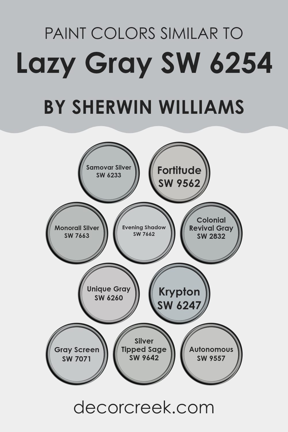
Evergreen Colors Similar to Lazy Gray SW 6254 by Sherwin Williams
Similar colors play a vital role in design by creating a cohesive and harmonious look. Colors like Lazy Gray by Sherwin Williams and its similar shades offer a palette that blends naturally together, allowing designers and homeowners to maintain a consistent theme while adding variety.
By using shades that are closely related, one can achieve a subtle contrast without the clash that often comes from combining highly distinct colors. This approach is particularly useful in rooms that aim for a calm and collected ambiance, as it avoids the distraction of sharp color differences while adding depth and dimension.
SW 6233 – Samovar Silver is a lighter, almost silvery gray that brings a bright and airy feel to rooms. Moving slightly darker, SW 9562 – Fortitude offers a robust gray that has a hint of strength and presence. SW 7663 – Monorail Silver and SW 7662 – Evening Shadow are two grays that lean toward a steel-like tone, giving a modern touch to interiors.
SW 2832 – Colonial Revival Gray strikes a balance, suggesting a historical yet classic look. SW 6260 – Unique Gray introduces a touch of warmth, making it adaptable for various decorations. SW 6247 – Krypton and SW 7071 – Gray Screen are cooler grays, perfect for achieving a fresh and contemporary vibe. Finally, SW 9642 – Silver Tipped Sage and SW 9557 – Autonomous integrate slight undertones of green and blue respectively, offering a unique twist on the traditional gray palette. By choosing colors within this range, one can ensure that the overall visual flow of the room is cohesive yet visually interesting.
You can see recommended paint colors below:
- SW 6233 Samovar Silver
- SW 9562 Fortitude
- SW 7663 Monorail Silver
- SW 7662 Evening Shadow
- SW 2832 Colonial Revival Gray
- SW 6260 Unique Gray
- SW 6247 Krypton
- SW 7071 Gray Screen
- SW 9642 Silver Tipped Sage
- SW 9557 Autonomous
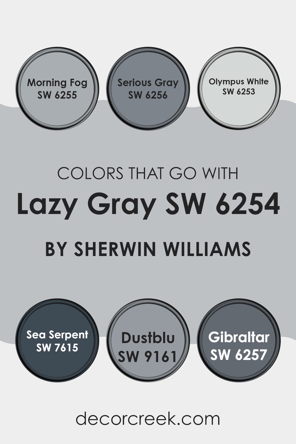
Colors that Go With Lazy Gray SW 6254 by Sherwin Williams
Choosing the right colors to complement Lazy Gray SW 6254 by Sherwin Williams is key for creating a harmonious and appealing room. Lazy Gray, as a flexible shade, serves as a splendid base color that pairs beautifully with a range of colors, ensuring a cohesive look.
For instance, pairing Lazy Gray with Morning Fog SW 6255 introduces a subtle contrast, as Morning Fog is a slightly lighter gray that brightens rooms while maintaining a calm, collected feel. When used together, these colors provide a smooth transition, perfect for areas like living rooms or bedrooms that benefit from a gentle, continuous color flow.
Serious Gray SW 6256, on the other hand, offers a deeper tone that anchors the lighter hues of Lazy Gray, creating a dynamic yet balanced environment, ideal for accent walls or furniture pieces. Olympus White SW 6253 is another excellent companion for Lazy Gray, offering a near-white simplicity that reflects more light, making any room appear larger and more open.
For bolder aesthetics, Sea Serpent SW 7615 introduces a deep, maritime blue that contrasts strikingly with Lazy Gray, ideal for adding dramatic flair or as an accent color. Dustblu SW 9161, a soft, dusty blue, blends subtly with Lazy Gray, supporting a relaxed and welcoming ambiance. Finally, Gibraltar SW 6257 is a strong, rocky gray that reinforces the urban tones of Lazy Gray, perfect for creating modern, grounded rooms. These colors, when paired with Lazy Gray, ensure that each room is not only aesthetically pleasing but also reflective of individual styles and preferences.
You can see recommended paint colors below:
- SW 6255 Morning Fog
- SW 6256 Serious Gray
- SW 6253 Olympus White
- SW 7615 Sea Serpent
- SW 9161 Dustblu
- SW 6257 Gibraltar
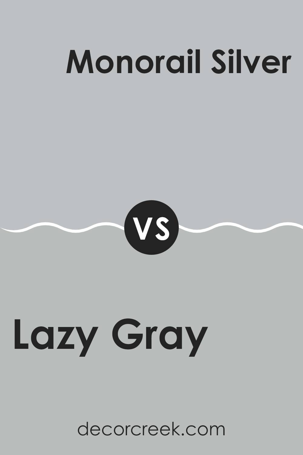
Lazy Gray SW 6254 by Sherwin Williams vs Monorail Silver SW 7663 by Sherwin Williams
Lazy Gray and Monorail Silver, both by Sherwin Williams, possess unique shades of gray that offer distinct vibes for any room. Lazy Gray has a soft, understated quality with a slightly cool undertone that makes it very adaptable.
It works well in lighting conditions where you want to maintain a subdued and neutral atmosphere. On the other hand, Monorail Silver has a deeper, more pronounced gray tone that carries a touch of metallic flair, making it a great choice for modern and trendy rooms.
It tends to stand out more compared to Lazy Gray and can make a strong statement in a room. While Lazy Gray is more about blending in and providing a soft backdrop, Monorail Silver is ideal for those looking to make their walls a focal point. Both colors work well in a variety of settings but serve different aesthetic purposes depending on the desired impact.
You can see recommended paint color below:
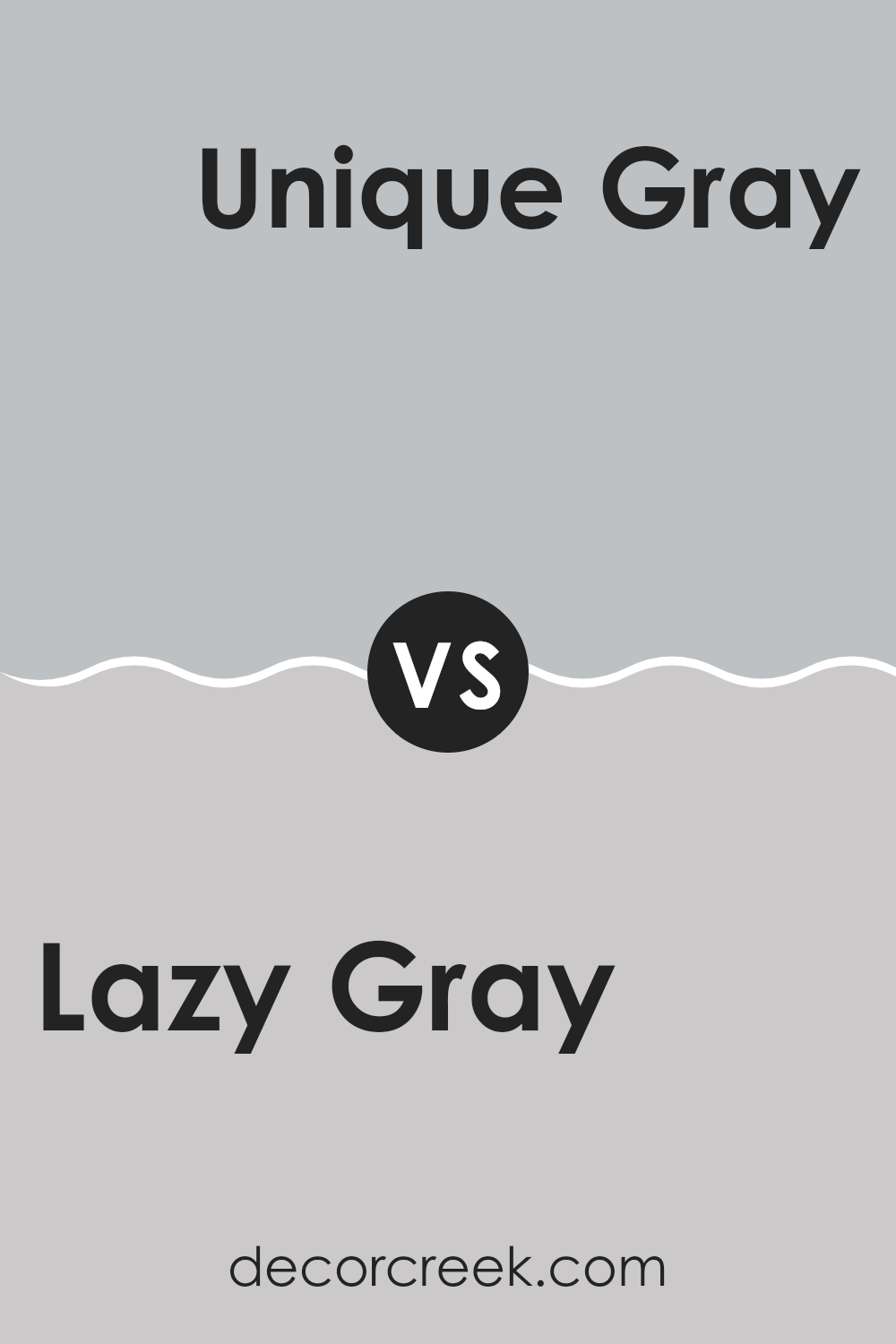
Lazy Gray SW 6254 by Sherwin Williams vs Unique Gray SW 6260 by Sherwin Williams
Lazy Gray and Unique Gray are two colors offered by Sherwin Williams that are both subtle and stylish, yet they have distinct undertones and moods. Lazy Gray has a soft, soothing feel, leaning slightly towards blue, making it perfect for creating a calm and gentle atmosphere in rooms like bedrooms or home offices.
On the other hand, Unique Gray has a touch of green in its undertone, giving it a slightly warmer and more inviting feel compared to Lazy Gray. This makes Unique Gray ideal for living areas and kitchens where a cozy, welcoming feel is desired.
Both colors are flexible and neutral, allowing them to pair well with a wide range of decor styles and other colors, from bright accents to more muted tones. The choice between them depends on the ambiance you want to achieve and the natural light in your room, with Lazy Gray offering cooler hues and Unique Gray providing a warmer palette.
You can see recommended paint color below:
- SW 6260 Unique Gray
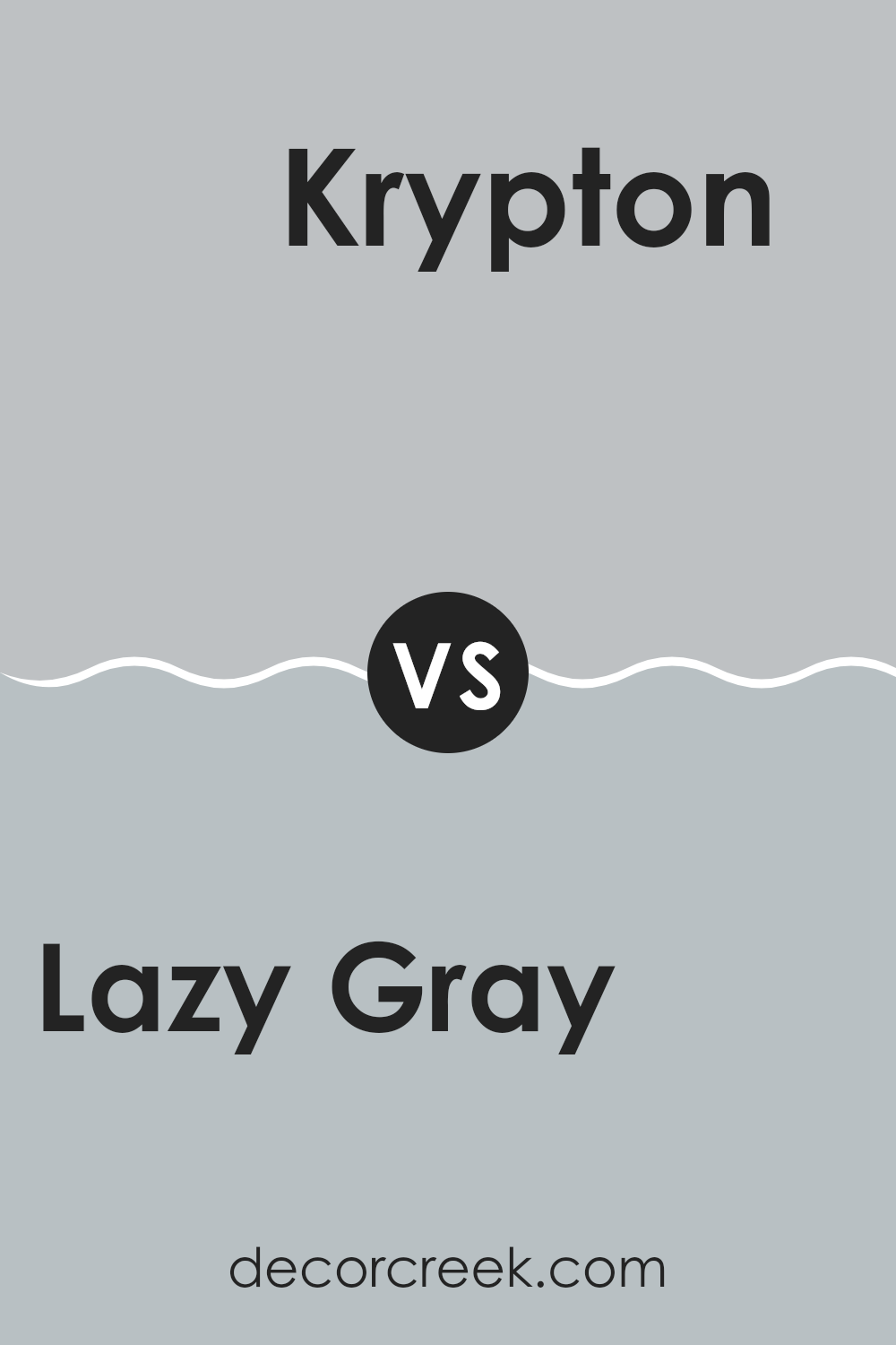
Lazy Gray SW 6254 by Sherwin Williams vs Krypton SW 6247 by Sherwin Williams
Lazy Gray and Krypton, both from Sherwin Williams, are cool-toned colors, but they have distinct differences in their tones and where they fit best in home decor. Lazy Gray is a soft, understated gray with a hint of blue that gives it a calm and gentle appearance. It’s excellent for creating a soothing and neutral backdrop in rooms like bedrooms and living rooms, where you want a peaceful vibe without the room feeling too cold.
On the other hand, Krypton is deeper compared to Lazy Gray and leans more toward a true blue-gray. This makes it a great choice for those looking to add a bit more drama or contrast, while still keeping the overall feel light and airy. It works well in bathrooms and kitchens, where its crisp and fresh quality can complement the hard surfaces and fittings commonly found in these rooms.
Both colors support a contemporary aesthetic but offer different levels of warmth and depth, making each suitable for specific rooms and personal preferences in home decor.
You can see recommended paint color below:
- SW 6247 Krypton
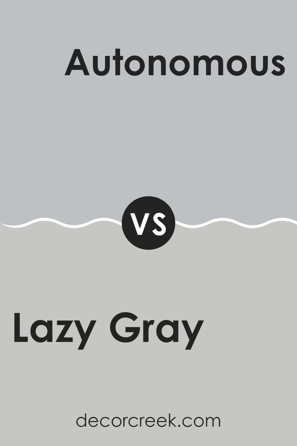
Lazy Gray SW 6254 by Sherwin Williams vs Autonomous SW 9557 by Sherwin Williams
Lazy Gray and Autonomous are two different shades of gray by Sherwin Williams. Lazy Gray is a soft, light gray with subtle blue undertones, giving it a calm and gentle appearance. It works well in rooms where you want to create a peaceful and relaxed feel.
On the other hand, Autonomous is a much darker gray, almost leaning toward charcoal. It has a strong presence due to its depth and can make a bold statement in a room.
Because of its intensity, Autonomous is excellent for creating dramatic and modern rooms. Both colors can be used in various settings, but the choice between them depends on the mood you’re looking to achieve. Lazy Gray is better for a lighter, airy feel, while Autonomous suits a more striking, defined look.
You can see recommended paint color below:
- SW 9557 Autonomous
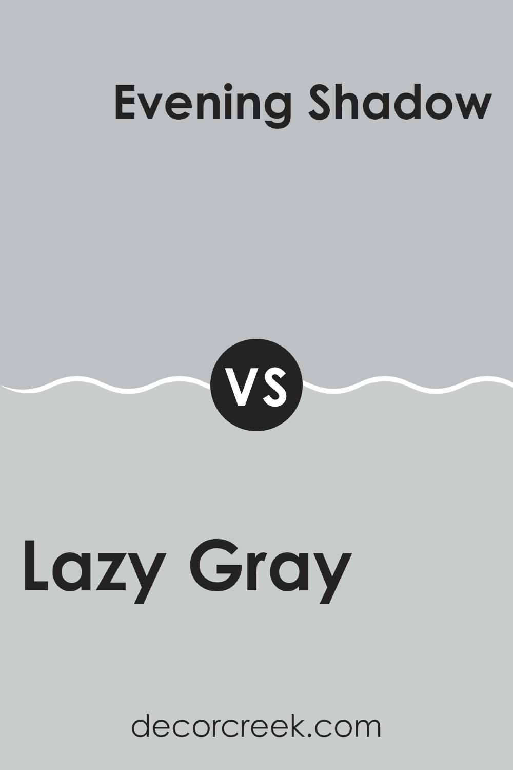
Lazy Gray SW 6254 by Sherwin Williams vs Evening Shadow SW 7662 by Sherwin Williams
Lazy Gray and Evening Shadow are two distinct colors from Sherwin Williams. Lazy Gray offers a soft, subtle gray tone that provides a calm and neutral background, suitable for any room. It’s light enough to keep rooms feeling open but carries enough depth to add character.
On the other hand, Evening Shadow has a darker, more pronounced gray shade that can give a room a stronger presence. This color works well for adding drama or accentuating a room with its deeper tone.
Both colors can work beautifully in modern decor styles, but while Lazy Gray is better for those preferring a lighter, airier feel, Evening Shadow suits a bolder, more striking look. Together, they could also complement each other, with Lazy Gray on most walls and Evening Shadow as an accent.
You can see recommended paint color below:
- SW 7662 Evening Shadow
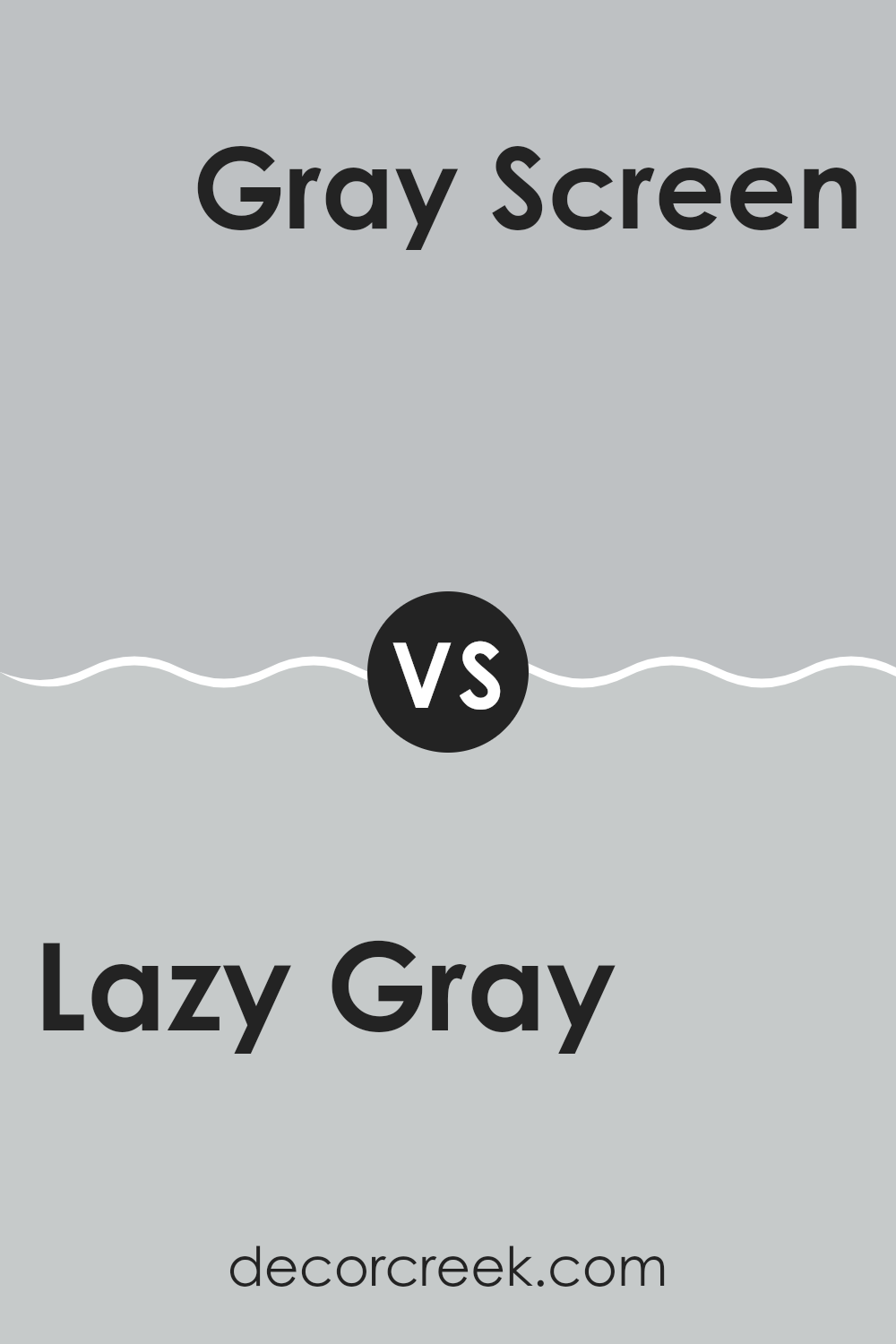
Lazy Gray SW 6254 by Sherwin Williams vs Gray Screen SW 7071 by Sherwin Williams
Lazy Gray and Gray Screen, both by Sherwin Williams, have unique tones that appeal to various tastes in décor. Lazy Gray is a warm gray that offers a subtle, cozy feeling to a room, perfect for creating a relaxed environment. It has a hint of blue undertone, which adds a soft, inviting quality without being too bold or overpowering.
On the other hand, Gray Screen has a cooler tone, possessing more evident blue undertones compared to Lazy Gray. This makes it ideal for modern rooms that aim for a clean, fresh look. It reflects light beautifully, making rooms appear brighter and more open.
Both colors work well in different settings: Lazy Gray suits areas where warmth and comfort are key, while Gray Screen fits in rooms that call for a crisp, contemporary vibe. Choosing between them depends on the room’s purpose and the atmosphere you want to create.
You can see recommended paint color below:
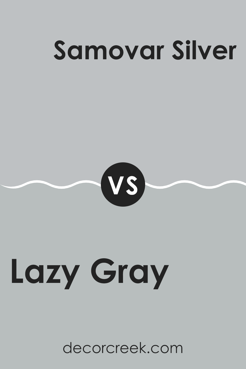
Lazy Gray SW 6254 by Sherwin Williams vs Samovar Silver SW 6233 by Sherwin Williams
Lazy Gray and Samovar Silver are two distinct colors by Sherwin Williams. Lazy Gray is a soft, neutral gray with a hint of blue, making it feel calm and gentle. This color works well in rooms that need a touch of coolness, yet it still retains a cozy vibe.
On the other hand, Samovar Silver is lighter and has a more silver-toned quality that reflects light beautifully. This makes Samovar Silver ideal for smaller rooms or areas where you want to brighten up the room while maintaining an understated elegance.
When used together, Lazy Gray can anchor a room with its deeper tone, while Samovar Silver can be used on trim or smaller elements to catch the light and add contrast. Both colors offer a clean and modern look that can freshen up any room.
You can see recommended paint color below:
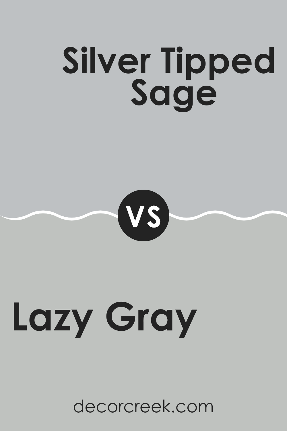
Lazy Gray SW 6254 by Sherwin Williams vs Silver Tipped Sage SW 9642 by Sherwin Williams
Lazy Gray and Silver Tipped Sage are two subtly different colors from Sherwin Williams. Lazy Gray leans toward a soft, cool gray that brings to mind a cloudy day. It’s a very calm color, adaptable enough for many rooms, particularly where you want a simple, neutral backdrop.
On the other hand, Silver Tipped Sage introduces a hint of green, giving it an earthy vibe. This color is slightly warmer than Lazy Gray due to the green tint, making it feel more inviting. Silver Tipped Sage can be a great choice for areas where you want a touch of nature-inspired softness.
Comparing both, Lazy Gray offers a cleaner, more straightforward gray while Silver Tipped Sage provides a unique twist with its green undertones. Both colors can work beautifully in a modern home, depending on the mood and style you want to achieve.
You can see recommended paint color below:
- SW 9642 Silver Tipped Sage
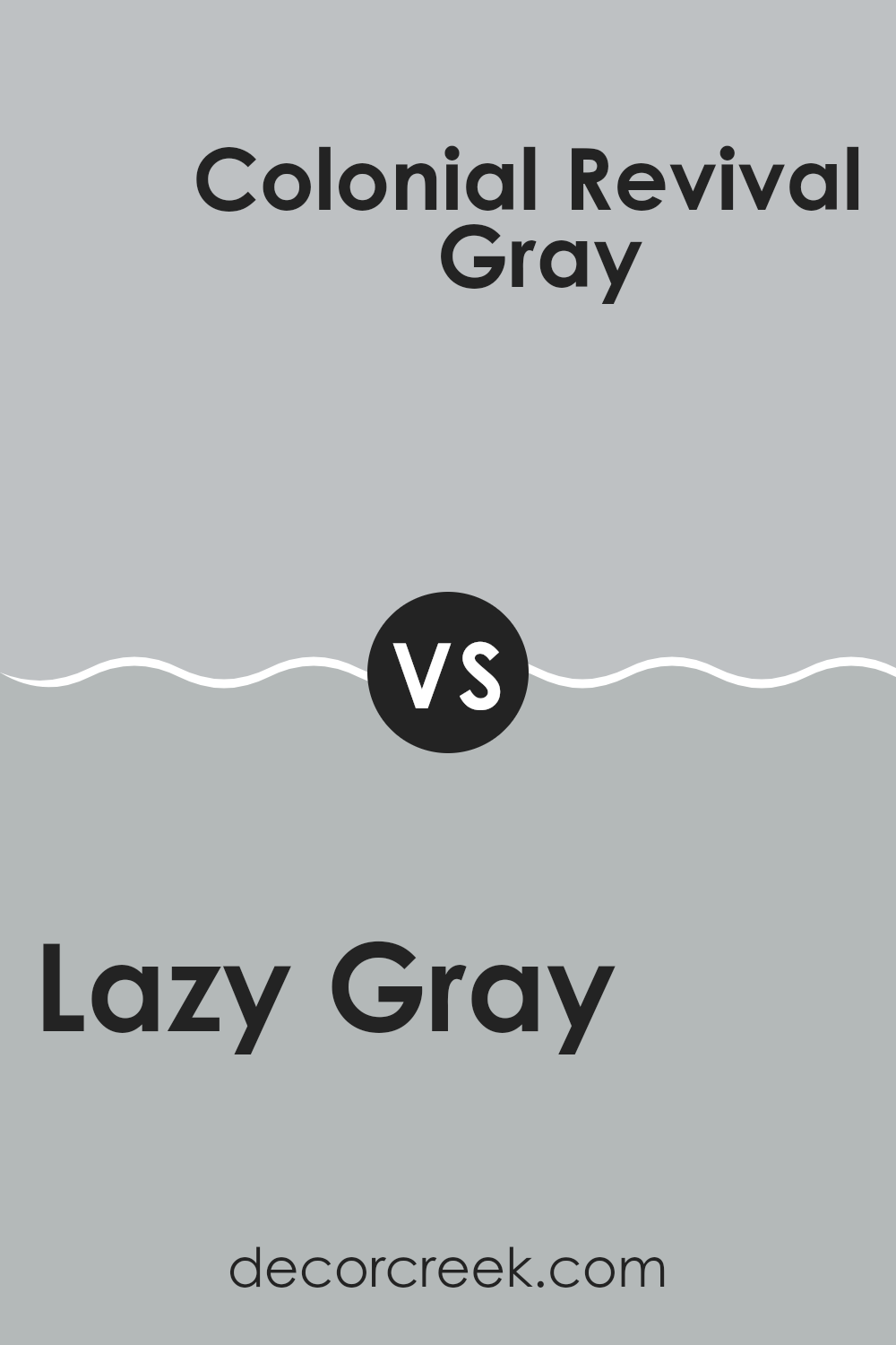
Lazy Gray SW 6254 by Sherwin Williams vs Colonial Revival Gray SW 2832 by Sherwin Williams
Lazy Gray and Colonial Revival Gray by Sherwin Williams are both soothing, adaptable grays, but they offer different vibes because of their undertones and intensity. Lazy Gray has a cool undertone that gives it a fresh, modern feel that’s perfect for creating a calm and relaxed room.
It can look fantastic in a room that gets a lot of natural light, making the room feel airy. On the other hand, Colonial Revival Gray carries a slightly warmer tone, making it ideal for rooms where you want a cozier, more inviting atmosphere.
This color works well in areas with less natural light or where you want to promote a sense of warmth and comfort. Both colors are subtle yet effective and can work beautifully in various settings, depending on what kind of mood you’re aiming to achieve. Choosing between them depends on your personal preference for cooler versus warmer tones and the specific characteristics of the room.
You can see recommended paint color below:
- SW 2832 Colonial Revival Gray
Lazy Gray SW 6254 by Sherwin Williams vs Fortitude SW 9562 by Sherwin Williams
Lazy Gray and Fortitude by Sherwin Williams are two distinct paint colors that can create unique atmospheres in a room. Lazy Gray is a soft, light gray that feels calm and soothing. This color is adaptable, making it easy to use in almost any room, from kitchens to bedrooms. It pairs well with both bright and dark colors, adding a neutral backdrop that’s easy on the eyes.
In contrast, Fortitude is a darker, more dramatic gray that leans a bit toward blue. This shade is bolder and can make a strong statement in a room. It’s perfect for an accent wall or a room where you want to add some depth and interest. Fortitude works well in modern decor schemes and can also be paired with lighter colors to balance its intensity.
Both colors offer distinct options for decorating, whether you’re looking for something light and airy with Lazy Gray or more moody and impactful with Fortitude.
You can see recommended paint color below:
- SW 9562 Fortitude
After reading about SW 6254 Lazy Gray by Sherwin Williams, I really think it’s a great color for rooms in a house. Lazy Gray is a cool shade that looks a bit blue and gray. It’s peaceful and not too bright or too dark, which makes it perfect for places where you want to relax like bedrooms or living rooms. This color is also great because it works well in different kinds of light, whether it’s sunny outside or you’re just using indoor lights.
Also, Lazy Gray is a color that can match with lots of other colors. You can pair it with bright colors like yellow for a fun look, or with dark colors like black for a more grown-up style. It’s a paint color that can grow up with you; it’s nice for kids’ rooms but also looks good in rooms used by adults.
One more thing that’s great about Lazy Gray is that it helps hide little marks or dirt on the walls, thanks to its not-too-light and not-too-dark shade. This makes it a practical choice for busy areas in the home.
So, I would say if you’re thinking about painting a room and want a color that is calm, looks good with many things, and can keep looking good even when a bit dirty, Lazy Gray could be a really good choice.
decorcreek.com
Ever wished paint sampling was as easy as sticking a sticker? Guess what? Now it is! Discover Samplize's unique Peel & Stick samples.
Get paint samples

