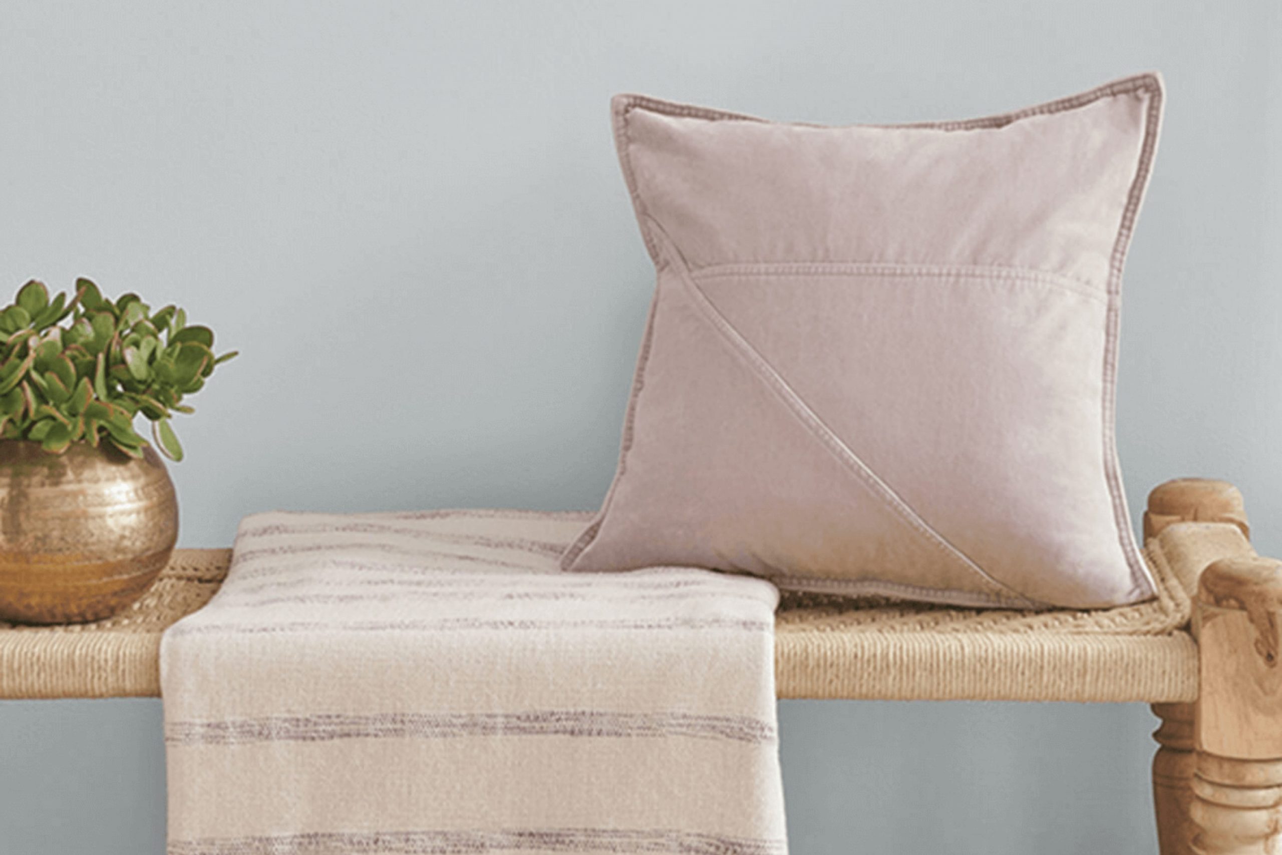
As you consider refreshing your room, Sherwin Williams’ SW 7071 Gray Screen might be on your radar. Before deciding, here’s what you need to know about this particular shade. Gray Screen is a flexible color that sits perfectly between a light and mid-tone gray. This balance makes it an excellent choice for rooms where you want a modern feel without the stark harshness that some grays can bring.
One of the main advantages of Gray Screen is its adaptability. It pairs beautifully with a wide range of decor styles and colors, offering a subtle backdrop that enhances without overpowering. It’s particularly effective in rooms that get plenty of natural light, as the color shifts subtly throughout the day, presenting a dynamic aspect to your interiors.
However, keep in mind that lighting plays a crucial role in how this color presents itself. In rooms with less natural light, it might appear slightly bluer, which could be a factor to consider based on your desired outcome. Also, when thinking about larger areas or open rooms, this color maintains a clean and open feel.
Whether you are updating your living room, bedroom, or kitchen, SW 7071 Gray Screen could provide that fresh and contemporary atmosphere you’re aiming for.
Is Gray Screen SW 7071 Right for My Home?
I was on the lookout for a flexible paint color and stumbled upon a shade called Gray Screen. This hue is a soft, airy gray that strikes a perfect balance between cool and warm tones. I find it incredibly adaptive to different lighting conditions, which shows off a beautiful spectrum from silver to deeper gray under natural light.
From my experience, Gray Screen works wonders in modern and minimalist interiors as it provides a clean, subtle background that highlights decor without overpowering it. It also fits seamlessly into a Scandinavian style where the focus is on simplicity and comfort. The understated elegance of this color supports a muted palette which is ideal for achieving a cozy yet stylish living room.
I love pairing Gray Screen with natural materials like light wooden furniture, which complements its coolness, or with white marble that brings out its subtle luxurious feel. Linen fabric in soft whites or even pale blues makes a great match with this color, enhancing the comfortable, airy vibe of a room. Metal accents in brushed nickel or polished chrome are another great combo, adding just the right amount of shine to an otherwise matte finish on the walls. This color is my go-to for a fresh, modern look that feels cozy yet undeniably chic.
What are the right undertones of Gray Screen SW 7071 ?
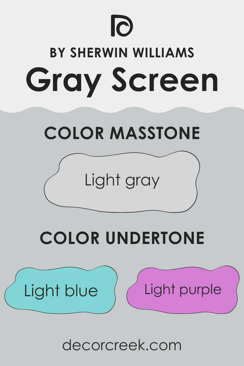
Gray Screen is a flexible paint color that blends well into many interior rooms. What sets it apart are its subtle undertones which can gently influence the overall ambiance of a room. This shade contains undertones of light blue, light purple, pale yellow, lilac, mint, pale pink, and grey. Each of these undertones contributes to how the color is perceived and how it interacts with different lighting and décor.
Undertones are secondary colors that influence the primary shade in a subtle yet meaningful way. They can make a color appear cooler or warmer depending on the surrounding light and can either complement or clash with the existing colors in furniture and decorations. For example, the light blue and mint undertones of Gray Screen can evoke a calm and soothing mood, making it suitable for bedrooms and bathrooms where a relaxing atmosphere is desirable. Meanwhile, the pale pink and lilac undertones can add a gentle touch of warmth, ideal for living areas.
When applied to interior walls, Gray Screen can appear differently based on the room’s natural and artificial light. In a room with ample sunlight, the pale yellow undertones might become more noticeable, giving the room a brighter feel. Conversely, in a less lit area, the grey undertones might dominate, making the room feel cooler.
Choosing the right color for your walls can greatly affect the perception and feel of your room, and understanding the undertones can help in making a more informed decision. This understanding ensures that the color you choose complements your home’s lighting and decor beautifully.
Best Coordinating Colors to use with Gray Screen SW 7071 by Sherwin Williams this year.
Coordinating colors are chosen to complement a primary color, enhancing the overall aesthetic of a room without feeling too strong. For Gray Screen, a soft, gentle gray that offers a clean and subtle backdrop, coordinating shades typically include variations that maintain harmony and balance. This selection ensures that each color blends smoothly while still allowing for a distinct visual appeal.
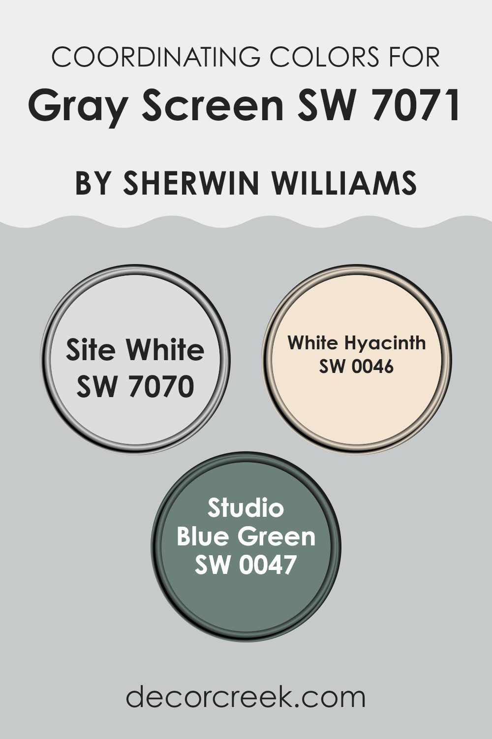
One coordinating color is Site White (SW 7070), a light neutral that has a slightly warmer tone than Gray Screen. It’s perfect for creating a smooth transition in areas that benefit from natural light, giving a fresh and airy appearance to any room.
Another harmonious option is White Hyacinth (SW 0046), a clear and bright white with just a hint of vibrancy. This color adds a crisp contrast that can make the details in a room stand out without clashing with the cool subtlety of Gray Screen. Lastly, Studio Blue Green (SW 0047) offers a deeper, more colorful complement. This shade combines subtle green and blue tones, producing a calming effect that pairs beautifully with the neutrality of Gray Screen, ideal for adding a touch of color in a balanced, understated way.
You can see recommended paint colors below:
Trendy Trim Colors of Gray Screen SW 7071 by Sherwin Williams to use this year.
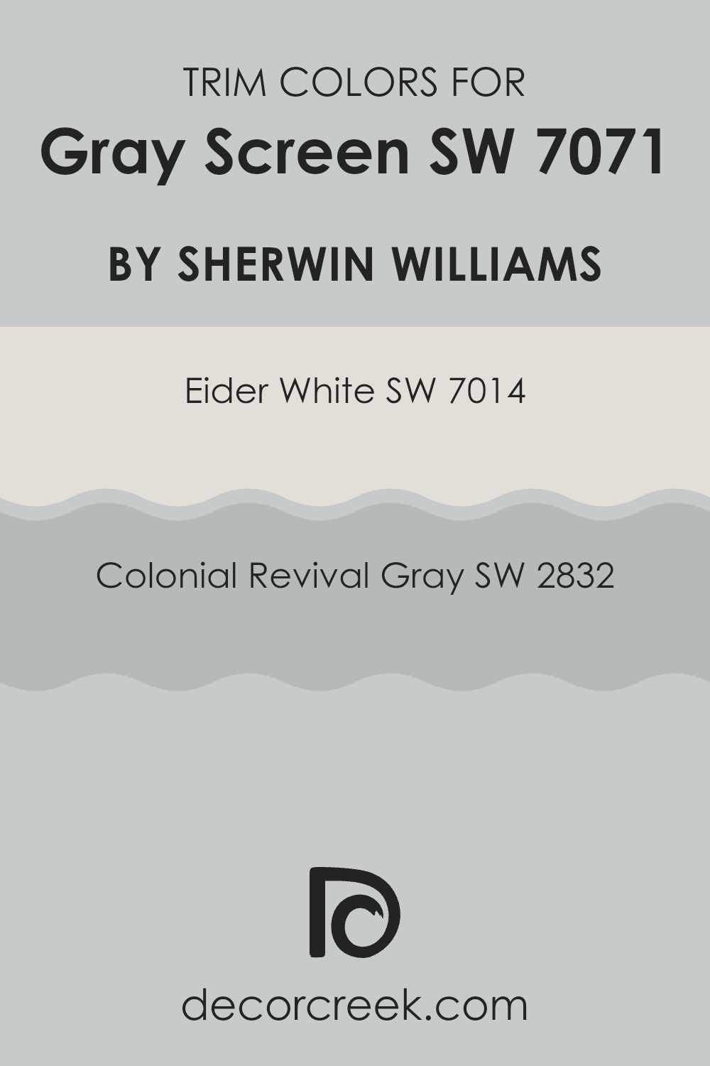
Trim colors are the hues used for accents in home décor, primarily on features like door frames, window frames, baseboards, and crown molding. They’re essential because they help define and highlight these architectural details, improving the overall appearance of a room. For a color like Gray Screen SW 7071 by Sherwin-Williams, choosing the right trim colors can complement and enrich its medium-tone gray, creating a harmonious living room. SW 7014 – Eider White and SW 2832 – Colonial Revival Gray are great options as trim colors to pair with Gray Screen.
Eider White SW 7014 is a soft, subtle white with a touch of gray, making it an excellent choice for a trim color that offers a gentle contrast without feeling too strong against the primary hue of Gray Screen. It adds a light and airy feel to the room, refreshing the surroundings in a subtle way.
On the other hand, Colonial Revival Gray SW 2832 offers a sturdier, more pronounced contrast, as it’s a deeper shade of gray that can draw attention to the trim details with stronger definition. Using Colonial Revival Gray as a trim can accentuate the depth and outline of architectural features effectively, pairing nicely with the softer Gray Screen to create a pleasing balance in color dynamics.
You can see recommended paint colors below:
Evergreen Colors Similar to Gray Screen SW 7071 by Sherwin Williams
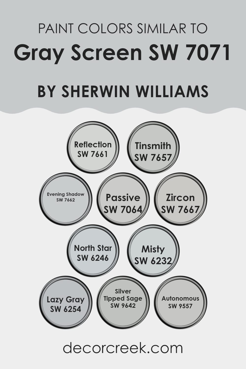
Similar colors are crucial in design because they create a harmonious and cohesive look, making rooms feel more pulled together and visually pleasing. When colors like Gray Screen by Sherwin Williams are paired with shades within the same color family, they offer gentle contrasts that can enhance the beauty of the main color without feeling too strong. Shades such as Reflection, Tinsmith, Evening Shadow, and the others mentioned share gray undertones, yet each brings a unique hue that adds depth and variety while maintaining a unified theme.
Reflection is a light gray with a hint of blue, ideal for a soft, muted backdrop. Tinsmith, slightly deeper, offers a steady medium gray that works well in any room seeking balance. Evening Shadow steps in with a touch of lavender, adding a gentle, unexpected twist to the gray palette. Passive, a popular choice, leans toward a cooler bluish-gray, perfect for a modern feel.
Zircon, very light in tone, nearly reaches white, making it excellent for creating a bright and airy room. North Star provides a cooler, pale gray that mirrors the subtle light of dusk. Misty offers a warm tone, making it a comforting choice for living areas. Lazy Gray, darker than its counterparts, offers strength suitable for accent walls. Silver Tipped Sage includes a hint of green, lending a natural and refreshing vibe, while Autonomous stands out with its steel-like quality, adding a bold, solid character to rooms. Each of these colors works beautifully with Gray Screen, making them well-suited for both accents and main color schemes.
You can see recommended paint colors below:
- SW 7661 Reflection
- SW 7657 Tinsmith
- SW 7662 Evening Shadow
- SW 7064 Passive
- SW 7667 Zircon
- SW 6246 North Star
- SW 6232 Misty
- SW 6254 Lazy Gray
- SW 9642 Silver Tipped Sage
- SW 9557 Autonomous
Colors that Go With Gray Screen SW 7071 by Sherwin Williams
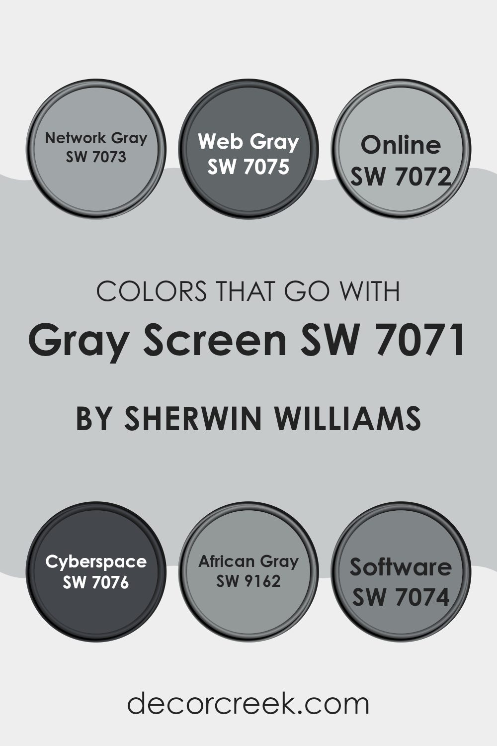
Choosing colors that complement Gray Screen SW 7071 by Sherwin Williams is crucial because it helps create a harmonious and visually pleasing room. Gray Screen is a flexible gray that serves as a perfect neutral backdrop, allowing other colors to stand out or blend smoothly depending on the chosen scheme. By pairing it with shades like Network Gray, Web Gray, Online, Cyberspace, African Gray, and Software, you can achieve a balanced and coherent look that ties the different elements of a room together.
Network Gray is a darker gray that provides a solid, grounding effect, ideal for creating depth in a room. It contrasts gently with the lighter Gray Screen, adding dimension without feeling too intense. Web Gray, slightly deeper than Network Gray, offers a more noticeable contrast, making it ideal for accent walls or furniture, adding a dynamic layer to interiors.
Online is a soft gray with a touch of blue, providing a slight infusion of color to lift the gentle neutrality of Gray Screen. This combination can give a room a fresh, airy feel. Cyberspace brings a much darker, nearly black hue that can serve as a bold statement or focal point, sharply contrasting with Gray Screen.
African Gray offers a hint of warmth with its earthy tones, making the environment feel welcoming and cozy, a perfect complement to soften Gray Screen’s cool undertones. Lastly, Software is another shade of gray that leans toward a utilitarian look, ideal for modern rooms that require a sleek, streamlined aesthetic. Together, these colors provide a rich palette that enhances the visual appeal of Gray Screen SW 7071, allowing for a range of interior styles from minimal and contemporary to warm and inviting.
You can see recommended paint colors below:
- SW 7073 Network Gray
- SW 7075 Web Gray
- SW 7072 Online
- SW 7076 Cyberspace
- SW 9162 African Gray
- SW 7074 Software
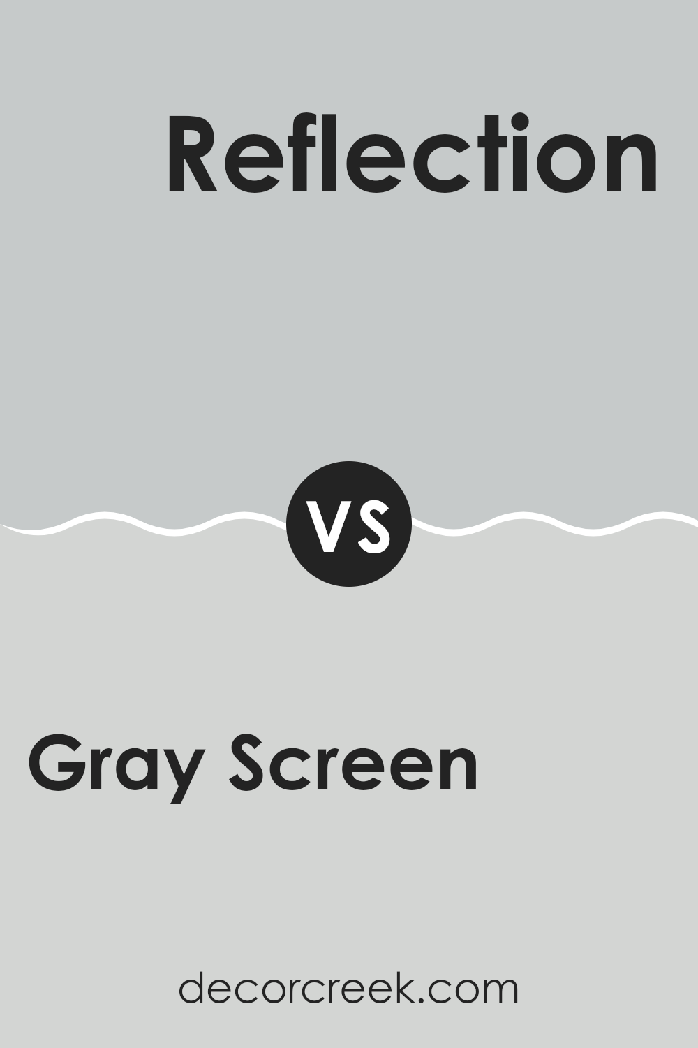
Gray Screen SW 7071 by Sherwin Williams vs Reflection SW 7661 by Sherwin Williams
Gray Screen SW 7071 and Reflection SW 7661 by Sherwin Williams are both flexible gray shades, but they have distinct tones and uses. Gray Screen is a cooler gray, giving a fresh and modern feel to any room.
It pairs well with both bright and subtle colors, making it a great choice for living rooms or bedrooms. Reflection, on the other hand, is slightly warmer and lighter, creating a soft, welcoming atmosphere.
This color works especially well in areas that get lots of natural light, as it reflects the light beautifully, enhancing a sense of roominess. Both colors offer a clean, neutral backdrop, but Gray Screen leans more toward a contemporary vibe, while Reflection suits a cozy, comforting aesthetic. When choosing between the two, consider the mood you want to set and the natural light in your room.
You can see recommended paint color below:
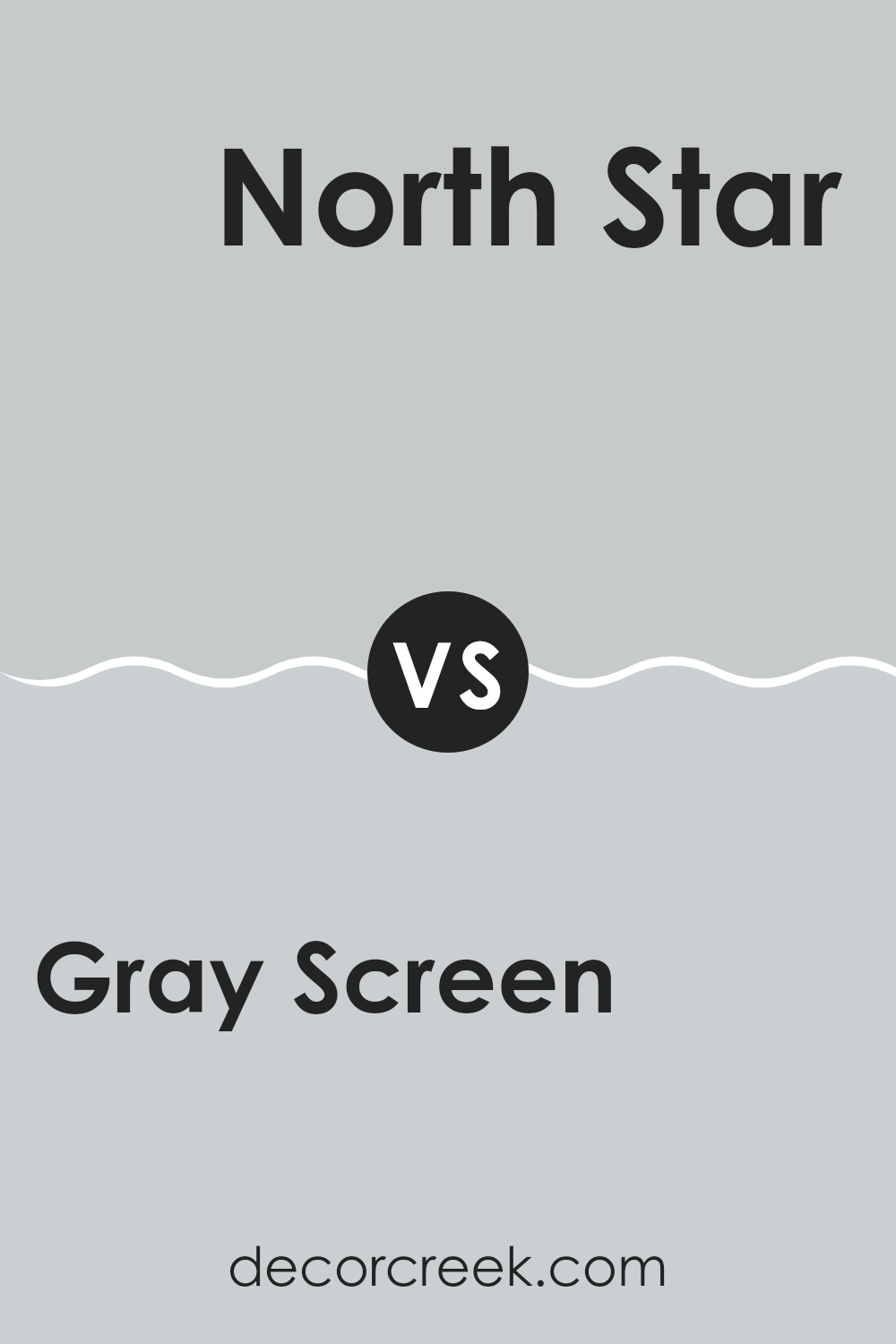
Gray Screen SW 7071 by Sherwin Williams vs North Star SW 6246 by Sherwin Williams
Gray Screen and North Star are both paint colors by Sherwin Williams, but they have some distinct differences. Gray Screen is a light gray with a balanced blend of warm and cool tones.
It’s flexible and can give a clean and subtle backdrop to any room without making the room feel cold. On the other hand, North Star is a softer, slightly lighter color with a hint of blue.
This gives it a cooler feel compared to Gray Screen, making it ideal for a calming vibe in rooms like bedrooms or bathrooms. Both colors are quite neutral, so they work well in various lighting conditions and can pair easily with other colors for accents and decor. Whether you choose Gray Screen for its neutral warmth or North Star for its cool calmness, both offer a fresh, modern look.
You can see recommended paint color below:
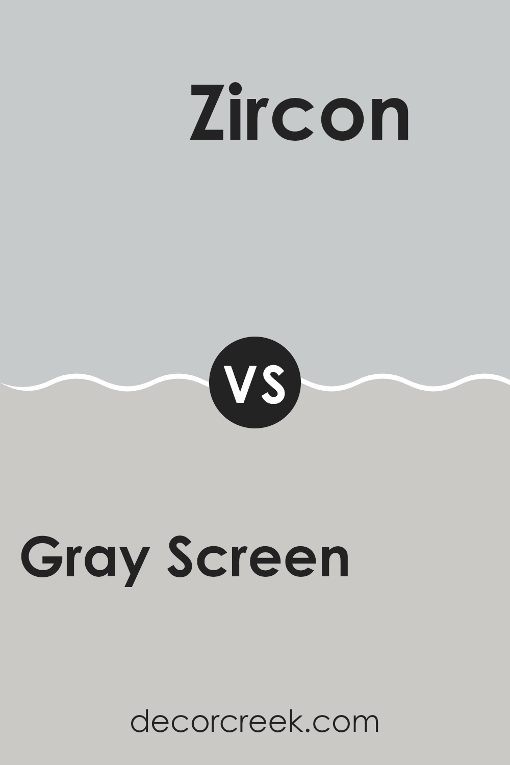
Gray Screen SW 7071 by Sherwin Williams vs Zircon SW 7667 by Sherwin Williams
Gray Screen SW 7071 and Zircon SW 7667, both by Sherwin Williams, are subtle yet distinct shades of gray. Gray Screen has a cooler undertone, leaning slightly toward blue, making it feel fresh and modern.
It’s perfect for rooms where you want to add a calm and clean backdrop. Zircon, on the other hand, is a lighter gray that leans more neutral with very mild hints of green. This makes it highly adaptable and well suited for any room, providing a soft, inviting atmosphere.
Both colors pair well with a wide range of decor styles, but Gray Screen is ideally suited for those looking to achieve a more contemporary vibe, while Zircon works well in rooms aiming for a gentle, understated look. Whether used together or separately, both grays offer a sleek, minimal charm that can enhance any room.
You can see recommended paint color below:
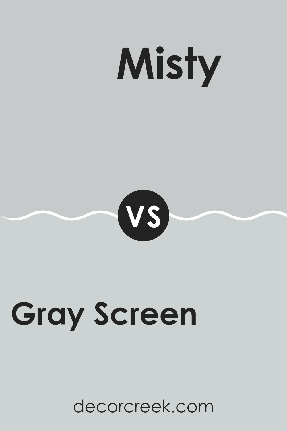
Gray Screen SW 7071 by Sherwin Williams vs Misty SW 6232 by Sherwin Williams
Gray Screen and Misty are two calm and neutral paint colors by Sherwin Williams. Gray Screen is a cooler tone of gray that leans a bit towards blue. This makes it a great choice if you want a color that gives off a fresh and clean look without feeling too bold. It’s a flexible shade that can look quietly stylish in many rooms, such as living rooms or bedrooms.
Misty, on the other hand, is lighter and warmer than Gray Screen. It has a soft, cloudy appearance, which can make a small room appear bigger and more open. Misty works well in rooms where you want a gentle hint of color. It’s light enough to be soothing, but still adds a touch of personality to a room without being overpowering.
Both colors offer a sense of calm and are subtle, yet they distinguish themselves through their warm and cool undertones. Gray Screen is ideal for a modern look, while Misty can lend a softer, more welcoming atmosphere.
You can see recommended paint color below:
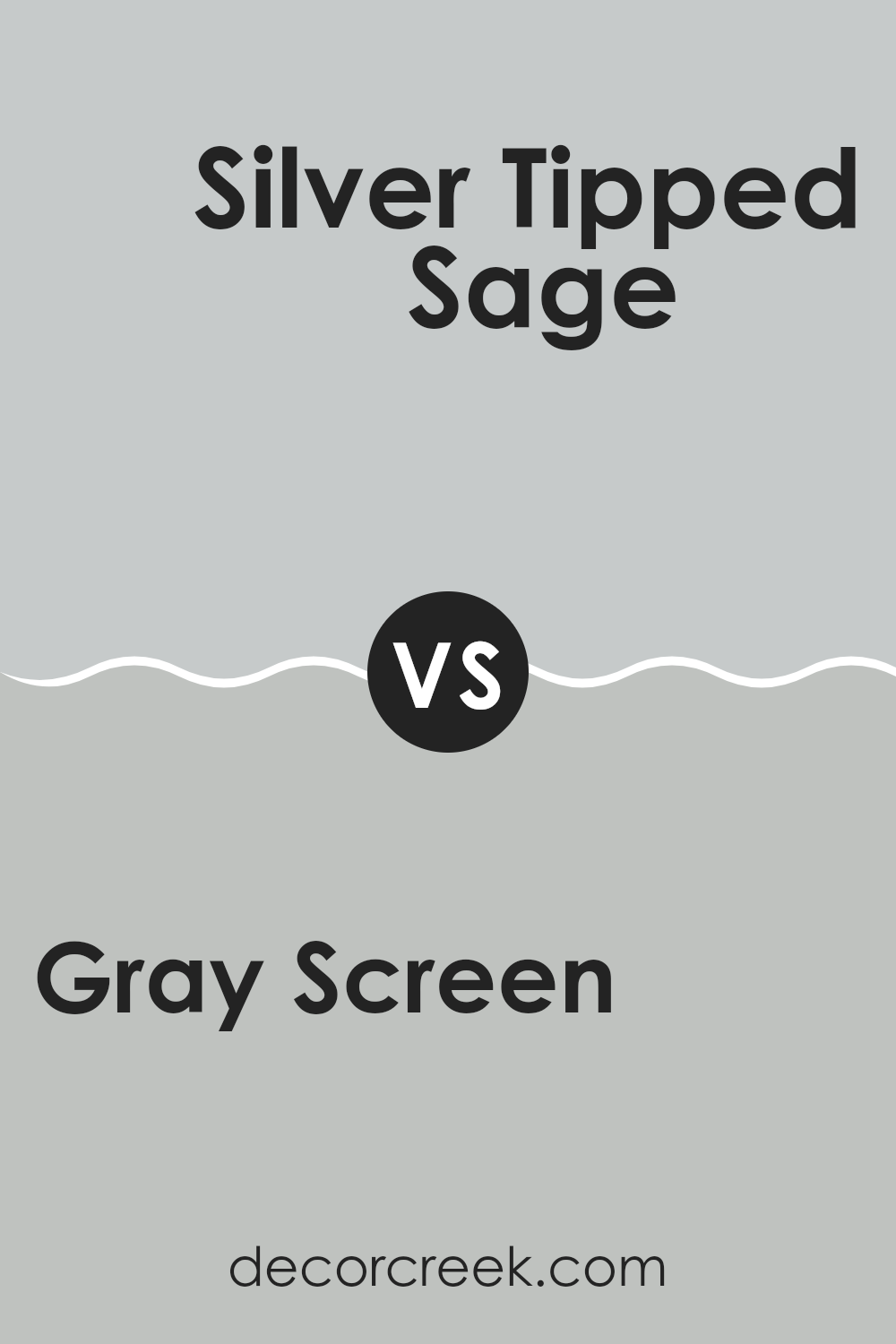
Gray Screen SW 7071 by Sherwin Williams vs Silver Tipped Sage SW 9642 by Sherwin Williams
Gray Screen SW 7071 is a subtle gray with a cool undertone, making it flexible for various rooms, providing a clean and understated backdrop. It’s light enough to make rooms feel open and airy, yet has enough depth to stand as a gentle statement color.
On the other hand, Silver Tipped Sage SW 9642 moves away from the simplicity of gray to introduce a hint of sage green. This color brings a touch of nature into the room, offering a mild, refreshing twist while maintaining a neutral palette. The green undertone in Silver Tipped Sage also adds a soft touch of warmth that can make rooms feel more inviting and cozy compared to the cooler Gray Screen.
In summary, while both colors are great choices for creating a calm and pleasant environment, Gray Screen leans more toward a classic, clean look, while Silver Tipped Sage offers a subtle hint of nature with its green undertones.
You can see recommended paint color below:
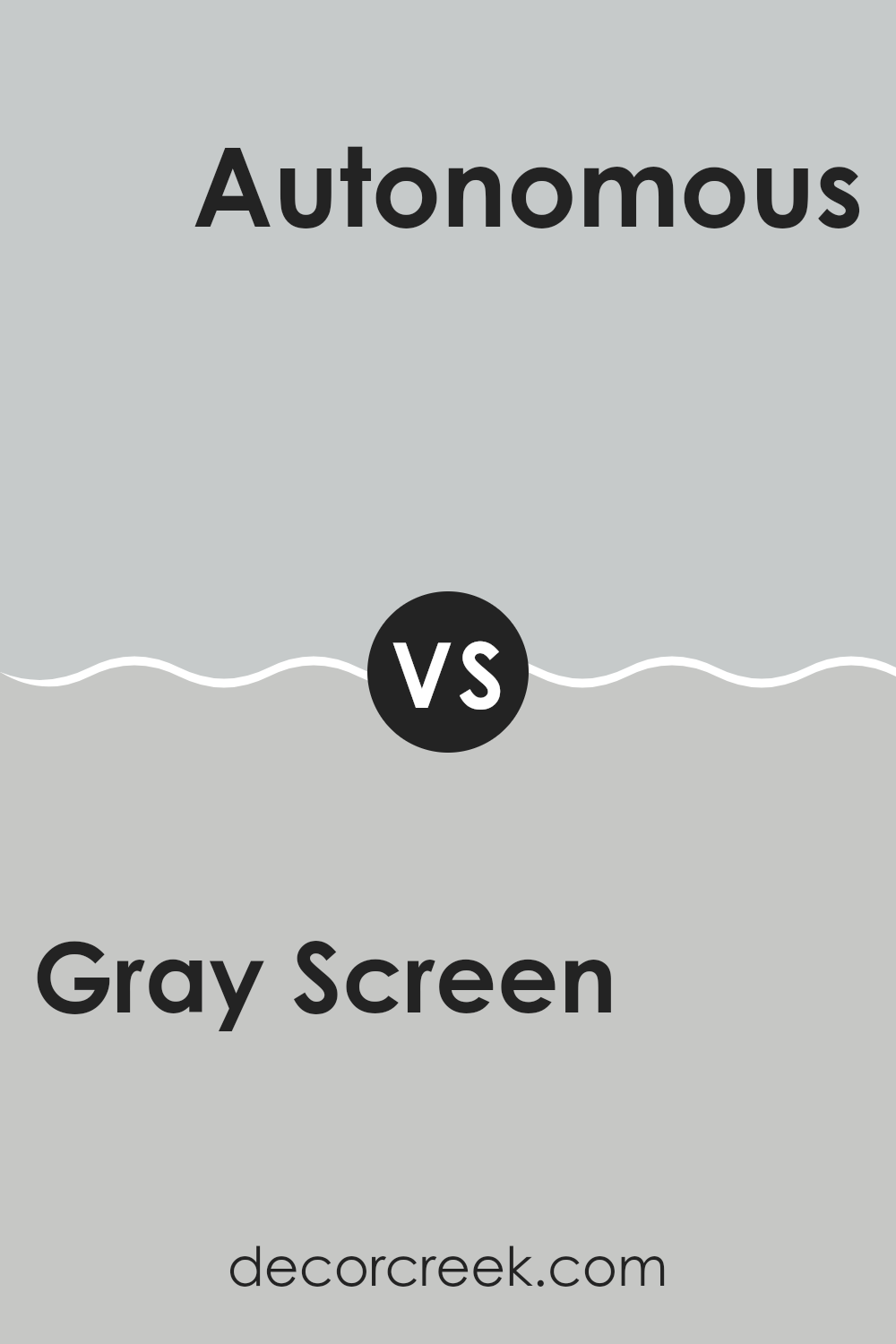
Gray Screen SW 7071 by Sherwin Williams vs Autonomous SW 9557 by Sherwin Williams
Gray Screen and Autonomous are two shades from Sherwin Williams. Gray Screen is a light gray that’s very flexible. It feels fresh and can work well in many different areas of a home, making small rooms appear larger and giving a clean look. It pairs well with both bright and soft colors, adding a gentle neutral backdrop.
Autonomous, on the other hand, is a darker gray that leans toward the blue end of the spectrum. This color is more intense and can create a strong presence in a room. It’s perfect for making a statement or anchoring a room with its deeper tone.
Overall, Gray Screen is lighter and more subtle, making it a good choice for a quiet, understated look, while Autonomous offers a deeper, more striking effect, ideal for adding some drama or grounding a room with its darker hue. Both colors provide a modern feel and can be used to freshen up any room.
You can see recommended paint color below:
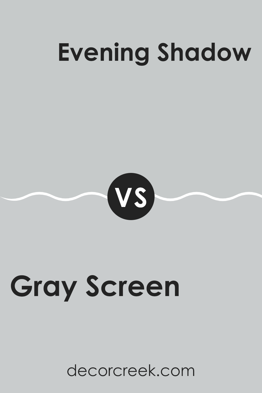
Gray Screen SW 7071 by Sherwin Williams vs Evening Shadow SW 7662 by Sherwin Williams
Gray Screen by Sherwin Williams is a light gray shade that feels fresh and modern. It has a touch of blue undertones, making it a cool and calm color. This hue works well in rooms that aim for a clean and open look, such as bathrooms and kitchens. It pairs beautifully with white trims or furniture for a crisp appearance.
Evening Shadow, on the other hand, is a deeper gray that leans slightly towards blue. This color offers a stronger presence and can give a room a more pronounced, yet still understated, style. It’s excellent for creating a striking backdrop in areas like living rooms or bedrooms. When used with lighter colors or metallic accents, it can really make a room stand out.
Overall, while both colors share a base of gray, Gray Screen is lighter and cooler, perfect for a gentle and breezy vibe. Evening Shadow is darker with a hint of refined character, suitable for making a bolder statement in a room.
You can see recommended paint color below:
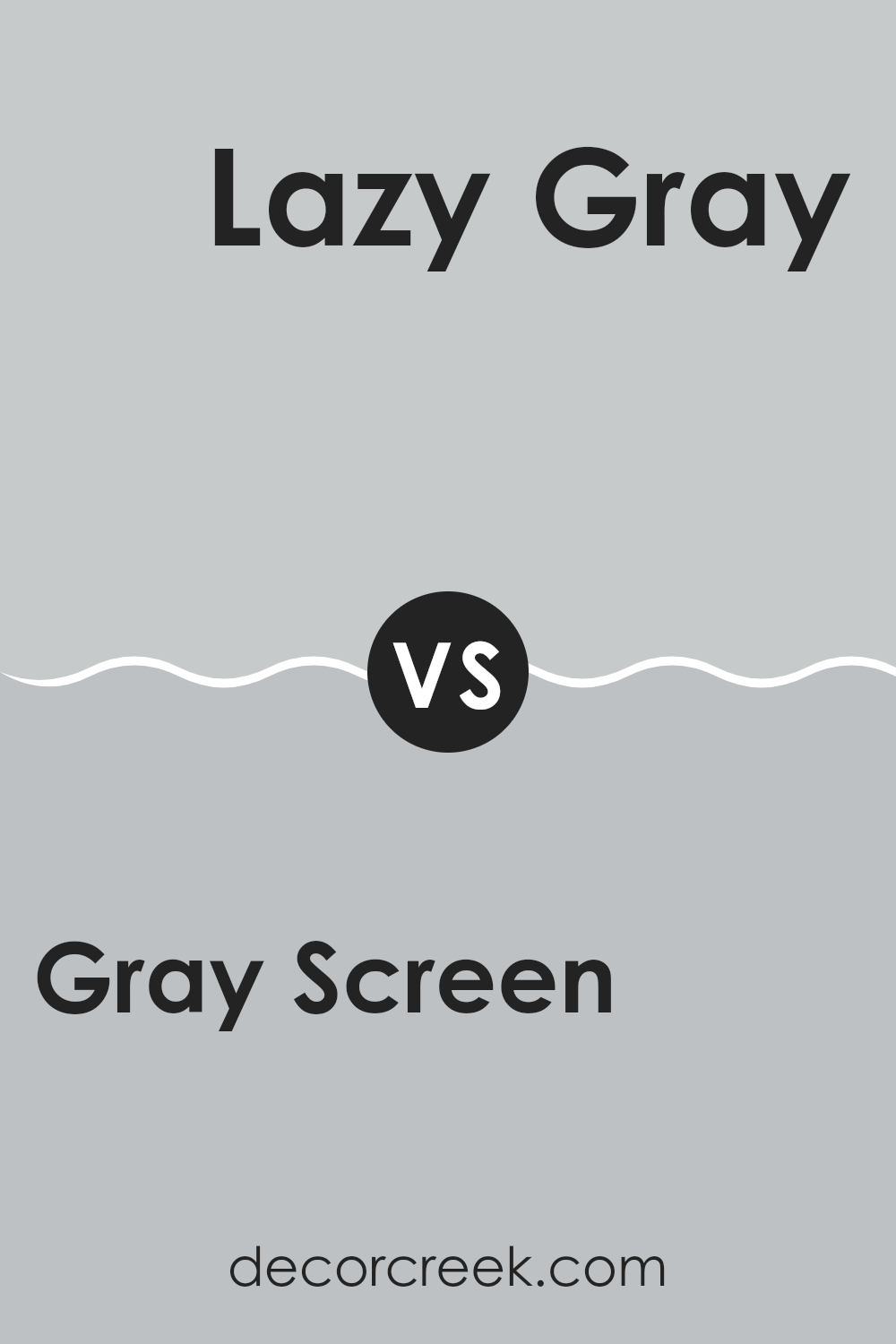
Gray Screen SW 7071 by Sherwin Williams vs Lazy Gray SW 6254 by Sherwin Williams
Gray Screen and Lazy Gray are both shades by Sherwin Williams. Gray Screen is a softer, lighter gray that almost has a silvery tone, making it very flexible for different rooms. It has a cool undertone that gives a calm and subtle appearance, which works nicely in rooms that aim for a relaxed and gentle ambiance.
On the other hand, Lazy Gray is a deeper gray that leans slightly toward blue, giving it a more pronounced look compared to Gray Screen. This color provides a strong presence in a room, making it ideal for accent walls or areas where a touch of depth is desired without feeling too heavy.
Both colors are great choices but serve different purposes based on the mood you want to set and the size of your room. Lazy Gray, with its richer feel, is excellent for creating a focal point, while Gray Screen’s lighter touch is perfect for giving a room a fresh and open feel.
You can see recommended paint color below:
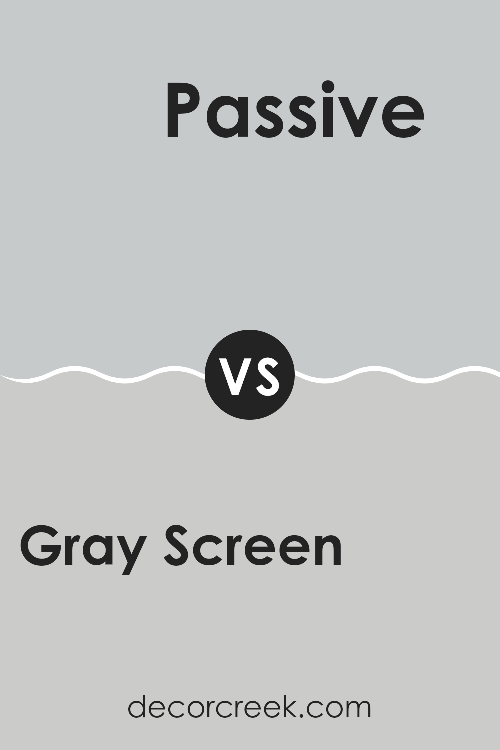
Gray Screen SW 7071 by Sherwin Williams vs Passive SW 7064 by Sherwin Williams
Gray Screen and Passive, both by Sherwin Williams, are popular choices for a modern and subtle look in home interiors. Gray Screen has a cooler undertone, leaning slightly towards blue, which gives it a fresh, calm vibe. It’s a light to medium gray that pairs well with more vibrant colors or works beautifully on its own for a minimalistic approach.
On the other hand, Passive is also a light gray but with a warmer undertone. This makes it feel softer and more inviting compared to Gray Screen. Passive is great for rooms where you want a cozy atmosphere without drifting too far into darker shades.
Both colors are flexible and can be used in various settings, like living rooms, bedrooms, or offices. They work well with modern decor and can help brighten up a room while keeping the color scheme understated. Depending on the mood you want to set, Gray Screen could be the go-to for a cooler, more open feel, while Passive might be perfect for a warmer, cozier touch.
You can see recommended paint color below:
Gray Screen SW 7071 by Sherwin Williams vs Tinsmith SW 7657 by Sherwin Williams
Gray Screen SW 7071 and Tinsmith SW 7657, both by Sherwin Williams, are cool, soothing shades of gray, ideal for a modern look in any room. Gray Screen leans toward a light to medium gray with subtle blue undertones, giving it a fresh and airy feel. This color is particularly good for creating a calm, relaxed environment and works well in areas that receive a lot of natural light, as the blue undertones gently interact with the light.
On the other hand, Tinsmith is a slightly darker shade of gray compared to Gray Screen. It has a balanced, neutral gray tone that makes it flexible for use in various decorating styles and rooms. Tinsmith can effectively cover walls in both brightly lit and dimly lit rooms without losing its character.
Both colors offer a modern, clean backdrop for any room, but the choice between them depends on the desired warmth and depth of the gray tone in the living area. Gray Screen is preferable if you want a cooler, lighter wall color, while Tinsmith is excellent if you prefer something a bit warmer and more grounded.
You can see recommended paint color below:
In conclusion, SW 7071 Gray Screen by Sherwin Williams is a really nice, soft gray paint color that can make any room feel cozy and cool. It’s like a gentle hug from a cloud, calming and comforting. This color works great in many different places in a house, whether it’s the living room, bedroom, or even the kitchen. It’s light enough to make small rooms look a bit bigger and won’t make them feel too dark.
Gray Screen also goes well with many other colors. This means you can use your favorite bright or light decorations and furniture pieces, and they will still look good with this paint.
If you’re thinking about painting a room in your house and you want something simple yet pretty, Gray Screen could be a perfect choice. It’s easy to mix and match with other colors, and it helps create a clean, peaceful feeling in any room. So if you want a color that is friendly and easy to live with, Gray Screen is definitely worth considering.
decorcreek.com
Ever wished paint sampling was as easy as sticking a sticker? Guess what? Now it is! Discover Samplize's unique Peel & Stick samples.
Get paint samples

