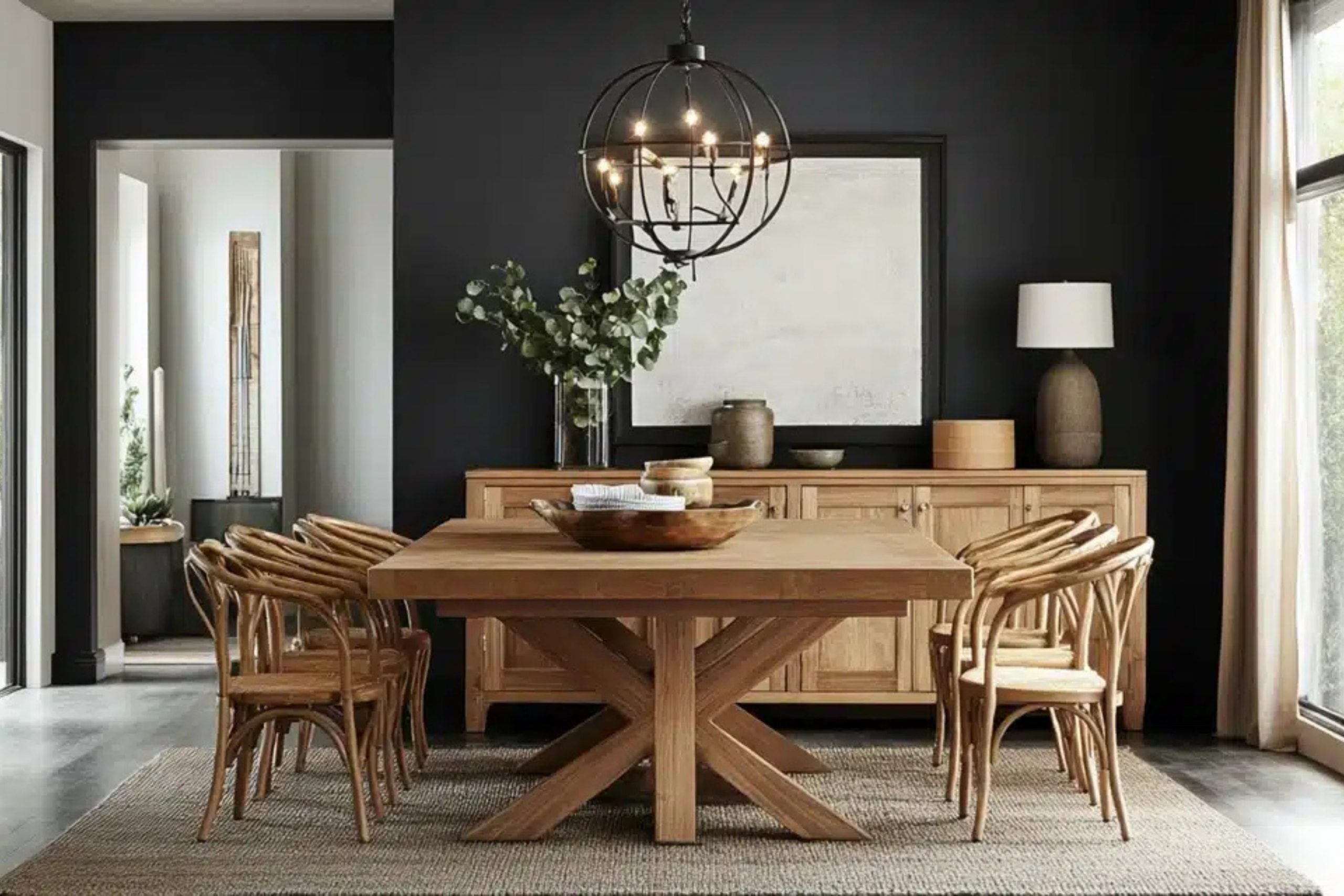
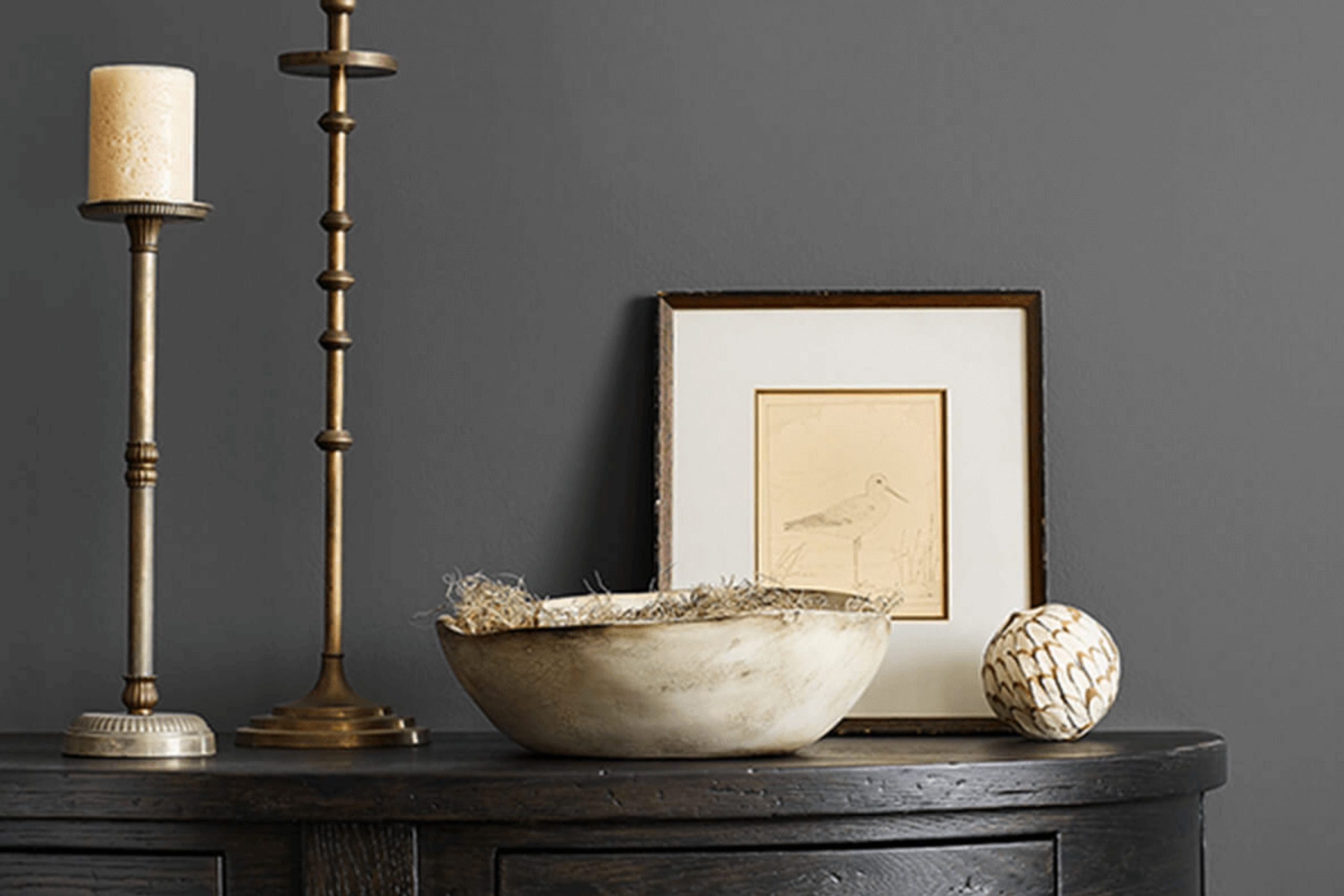
Choosing the right paint color for your home is a key decision, and you might be considering SW 7674 Peppercorn by Sherwin Williams. Let me share some essential insights about this color to help you make an informed choice. First, Peppercorn is a robust, deep charcoal that manages to strike a fine balance between black and gray. Its flexibility is worth noting—it comfortably fits into most rooms without overpowering them.
This shade can dramatically change the mood of a room depending on the lighting. In well-lit areas, it radiates a soft grey ambiance, while in darker rooms, it leans more towards a solid black. Also, due to its intensity, Peppercorn works beautifully as an accent wall or even on cabinetry to add depth and focus.
Pairing Peppercorn with contrasting colors can also produce an aesthetically pleasing effect. Think of pairing it with whites for a bold, modern look or soft pastels for a more nuanced interplay. You should also consider your room’s size and the amount of natural light it gets before settling on this shade, as its deep tone could make a small, dimly lit room feel a bit more confined. Understanding these nuances will ensure you’re delighted with the walls once the painting is done, making your interior feel just right.
Is Peppercorn SW 7674 Right for My Home?
Peppercorn is a deep, rich gray color with a hint of charcoal that adds a touch of refinement to any room. It’s a flexible shade that works well in various interior styles, especially in modern and minimalist designs. This color can also beautifully complement industrial and contemporary themes due to its strong yet neutral character.
In terms of materials, Peppercorn pairs exceptionally well with natural wood, which can help to warm up the coolness of the gray. It also looks stunning when combined with metals like brushed nickel or stainless steel, enhancing a more modern feel. For a luxurious texture contrast, I like using soft fabrics like velvet or silk against a Peppercorn backdrop. This creates a visually interesting dynamic.
I’ve used this color in several projects, including living rooms and bedrooms. It works great for providing a dramatic backdrop that makes lighter colors pop, like pastels or even bright whites. Additionally, this shade is perfect for accent walls or even cabinetry to give a room a fresh, updated look without feeling too strong. Peppercorn ensures a grounded, cohesive look that pulls different elements and textures together in a balanced way.
What are the right undertones of Peppercorn SW 7674 ?
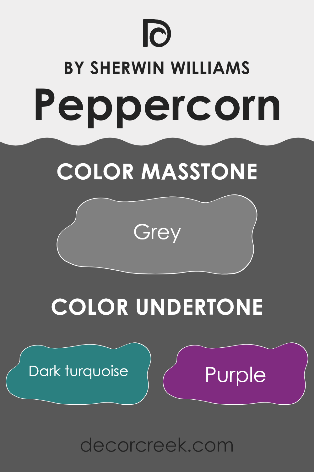
Peppercorn SW 7674 is a richly complex color with a variety of undertones that add substantial depth and flexibility to its appearance. Understanding the undertones of a color is crucial because they subtly influence how the color looks under different lighting conditions and when paired with other colors. For Peppercorn SW 7674, the undertones create an intricate blend that can make the color appear differently based on its surroundings.
The undertones in Peppercorn SW 7674 include dark turquoise, purple, olive, navy and many others, each adding a unique shade to the base color. These undertones matter a lot in an interior setting because they can bring out different aspects of the color in natural and artificial light. For instance, in a room with natural light, the navy and dark turquoise might become prominent, giving the walls a cooler feel. In the evening under warm lights, the brown or olive undertones might stand out, offering a warmer, cozier vibe.
When used on interior walls, Peppercorn SW 7674 provides a dynamic backdrop that can complement a wide range of decor styles and colors. If you’re decorating a room, knowing these undertones can help you choose furniture, curtains, and accents that either highlight or balance the color’s complexity. Whether pairing it with bright colors or more muted tones, the undertones will play a key role in ensuring everything works together in a balanced way.
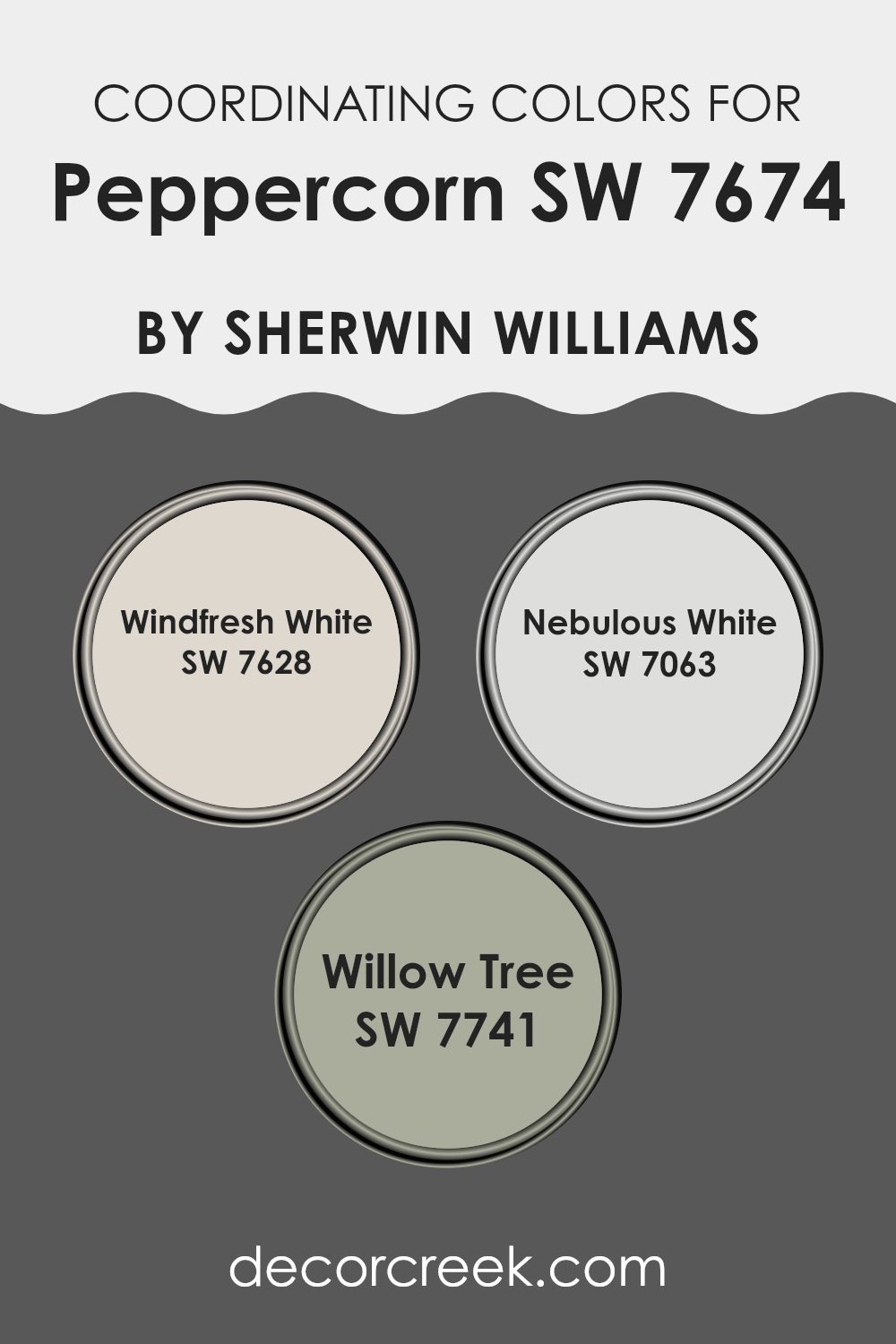
Best Coordinating Colors to use with Peppercorn SW 7674 by Sherwin Williams this year.
Coordinating colors are selected hues that work harmoniously with a primary color to create a cohesive look in a room or design. In interior design, coordinating colors can enhance the mood, style, and visual appeal of the interior. When coordinating with Peppercorn by Sherwin Williams, a rich, dark gray, it’s essential to choose colors that can balance its depth and intensity. Peppercorn pairs beautifully with lighter shades, which provide contrast and lift the ambiance of a room without feeling too strong.
Windfresh White, Nebulous White, and Willow Tree are excellent examples of colors that coordinate well with darker tones like Peppercorn. Windfresh White is a crisp, clean white that adds brightness, making it perfect for trim or ceilings to give a fresh, airy feel to the room.
Nebulous White, on the other hand, offers a slightly warmer and softer white, providing a subtle contrast that is ideal for creating a more relaxed atmosphere. Willow Tree is a soft green with earthy undertones that complements natural elements in decor, introducing a gentle splash of color that maintains the room’s harmonious palette. These shades help maintain balance and add dimension when used alongside darker grays, ensuring the room feels inviting and well-composed.
You can see recommended paint colors below:
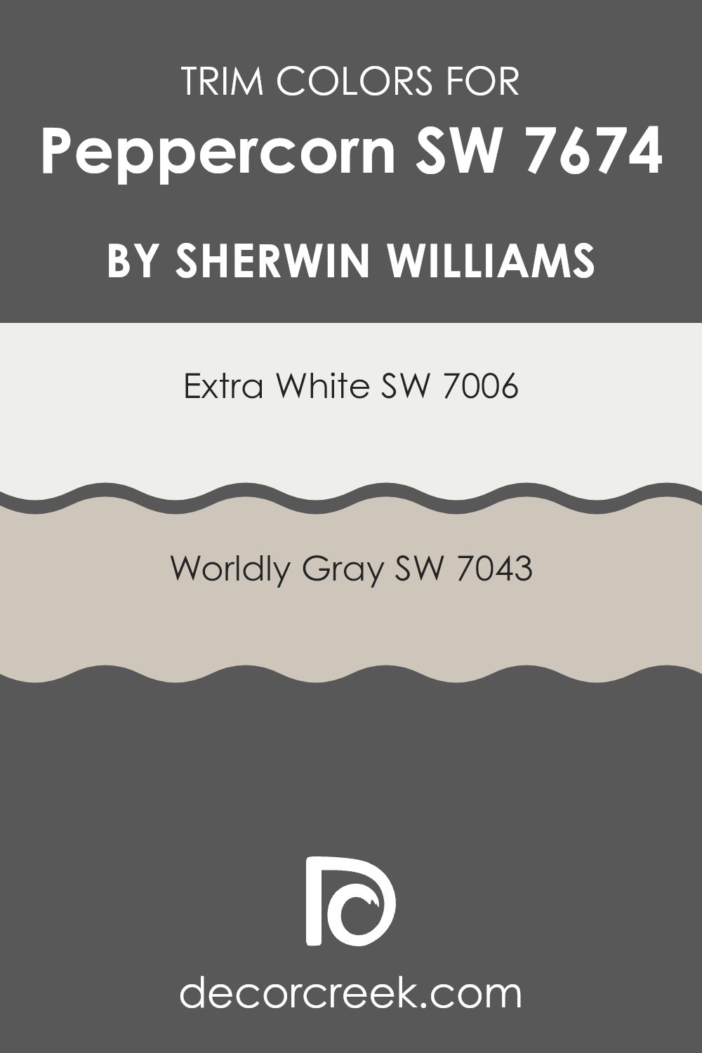
Trendy Trim Colors of Peppercorn SW 7674 by Sherwin Williams to use this year.
Trim colors play a vital role in interior design by accentuating the borders around doors, windows, and baseboards, helping to frame the main color of the walls. When using a striking color like Peppercorn by Sherwin Williams, selecting the right trim colors can either subtly complement the rich main hue or create a contrasting effect that makes the wall color pop.
For Peppercorn, a deep, shifting gray, using shades like Extra White or Worldly Gray for the trim can help define the room while maintaining a cohesive look. Extra White, known as SW 7006, is a clean and refreshing white shade that provides a clear contrast to darker tones like Peppercorn, highlighting architectural features crisply and freshly.
On the other hand, Worldly Gray, or SW 7043, offers a softer edge, a mid-tone gray that harmoniously blends with Peppercorn, ensuring the transition between wall and trim is smooth yet appealing. Both colors can enhance the overall aesthetic by adding visual depth and interest, making the interior feel well-composed and inviting.
You can see recommended paint colors below:
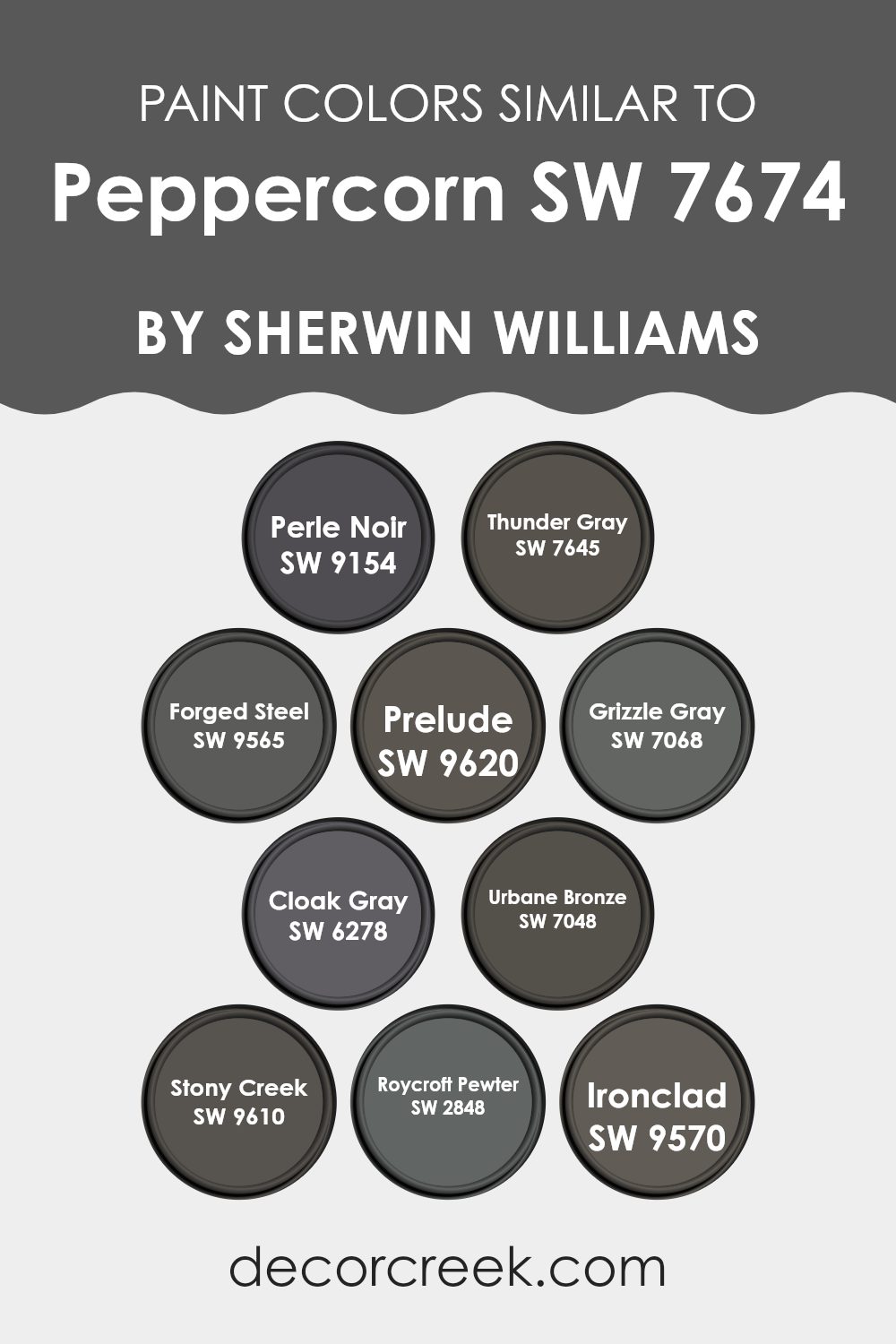
Evergreen Colors Similar to Peppercorn SW 7674 by Sherwin Williams
Similar colors play a crucial role in creating a coherent and aesthetically pleasing color scheme, especially when dealing with shades like those akin to Peppercorn by Sherwin Williams. These shades, ranging from deep charcoals to soft grays, help in maintaining a smooth visual flow in rooms, making them appear larger and more inviting.
By using colors such as Perle Noir or Thunder Gray, one can achieve a subtle contrast without feeling too heavy, which is perfect for achieving a balanced look. Shades like Forged Steel and Prelude further complement this by providing depth and a sense of continuity, which is essential in design for connecting different elements of a room.
Additionally, using shades like Grizzle Gray and Cloak Gray can introduce a soft variability in texture and luminance, enhancing the dimensions of a room subtly but effectively. Urbane Bronze adds a unique richness, aligning well with wood finishes and metallic accents, which can be ideal for grounding the decor.
Colors like Stony Creek and Roycroft Pewter are excellent for those looking to implement a classic, enduring feel, bringing a traditional touch to modern setups. Lastly, incorporating a darker tone like Ironclad can anchor lighter shades and elements, completing the design with a strong, cohesive palette that is pleasing to the eye and functional.
You can see recommended paint colors below:
- SW 9154 Perle Noir
- SW 7645 Thunder Gray
- SW 9565 Forged Steel
- SW 9620 Prelude
- SW 7068 Grizzle Gray
- SW 6278 Cloak Gray
- SW 7048 Urbane Bronze
- SW 9610 Stony Creek
- SW 2848 Roycroft Pewter
- SW 9570 Ironclad
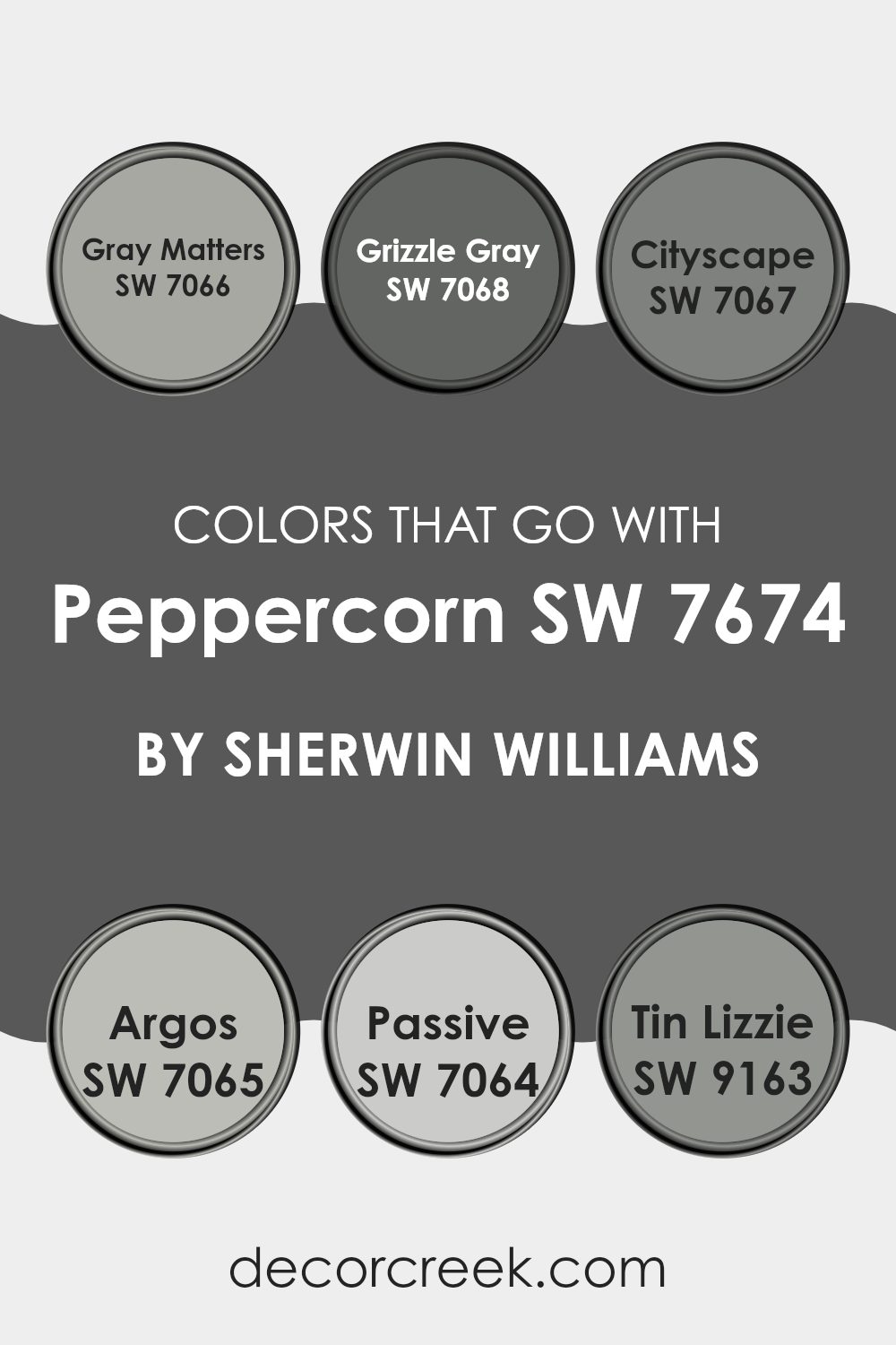
Colors that Go With Peppercorn SW 7674 by Sherwin Williams
Choosing the right colors that coordinate with Peppercorn SW 7674 by Sherwin Williams is crucial because it ensures that the overall aesthetic of a room is harmonious and pleasing to the eye. Peppercorn is a deep, charcoal gray that can act as a strong foundation in a room, providing a sense of grounding and depth.
When paired with colors like Gray Matters, Grizzle Gray, Cityscape, Argos, Passive, and Tin Lizzie, it creates a palette that is cohesive and fluid, allowing each color to complement and enhance the others effectively. This type of color coordination can make decorating decisions easier and help achieve a professional and cohesive look.
Each of these coordinating colors brings its own unique shade to the mix, enhancing the depth and complexity of Peppercorn. Gray Matters is a lighter, soft gray that provides a subtle contrast, making it a perfect choice for creating a balanced look. Grizzle Gray is deeper and more intense, adding drama and interest when used alongside Peppercorn. Cityscape offers a mid-tone gray that bridges the lighter and darker shades nicely.
Argos has a slight blue undertone, introducing a cool and calm hue into the room. Passive is even lighter and can be used to brighten areas without feeling too heavy next to darker tones. Finally, Tin Lizzie stands out as a steel gray with a hint of blue, perfect for adding a slightly different yet harmonious element to the design. By using these colors together, one can easily achieve a layered and inviting room.
You can see recommended paint colors below:
- SW 7066 Gray Matters
- SW 7068 Grizzle Gray
- SW 7067 Cityscape
- SW 7065 Argos
- SW 7064 Passive
- SW 9163 Tin Lizzie
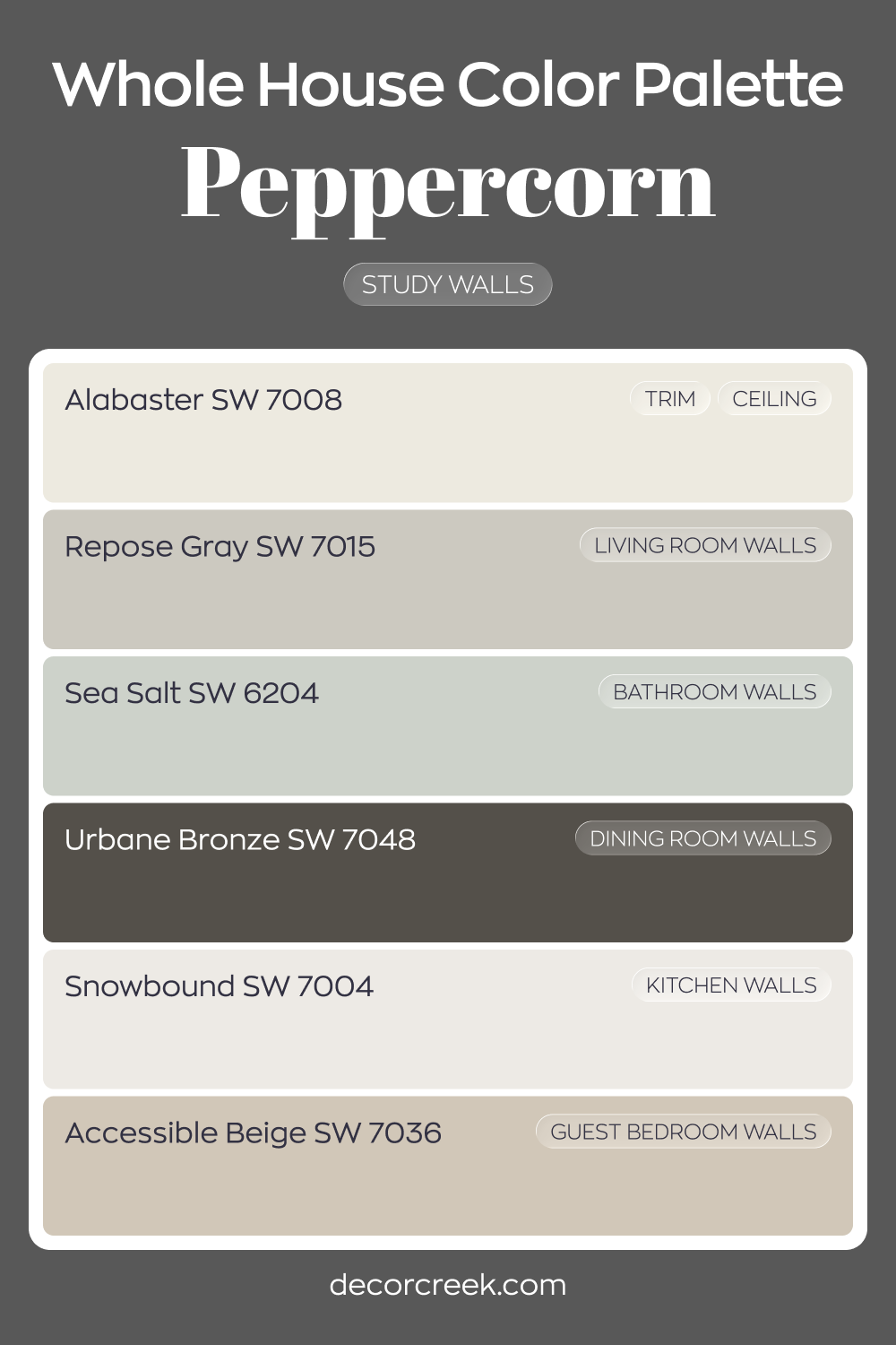
Whole House Paint Color Palette Centered On Peppercorn SW 7674
Peppercorn SW 7674 gives the study walls a bold and confident presence. Alabaster on trim and ceiling keeps the dark tone sharp and balanced. Snowbound in the kitchen brightens the palette and creates contrast nearby.
Repose Gray in the living room softens the transition from dark to light. Sea Salt in the bathroom and Accessible Beige in the guest bedroom add warmth and gentle color variation.
These shades keep the house feeling layered and cohesive.
Urbane Bronze in the dining room reinforces the depth introduced by Peppercorn. Together, the mix of charcoals, warm neutrals, and fresh whites creates a strong yet balanced look
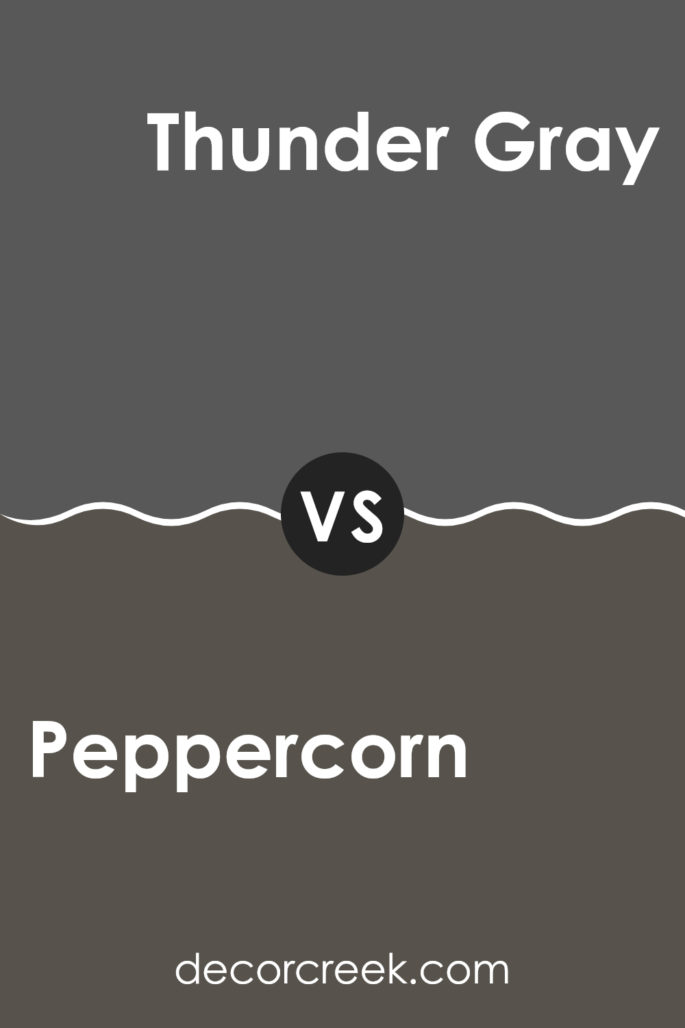
Peppercorn SW 7674 by Sherwin Williams vs Thunder Gray SW 7645 by Sherwin Williams
Peppercorn and Thunder Gray are two paint colors offered by Sherwin Williams that both provide a strong presence in any room, yet they have subtle differences. Peppercorn is a darker shade, leaning more towards a deep charcoal with hints of black. This color is perfect for creating a bold statement and can make other colors in a room stand out more dramatically.
On the other hand, Thunder Gray is slightly lighter than Peppercorn. It’s a warm gray that combines elements of both gray and brown, giving it a cozy feel without feeling too strong. This shade works exceptionally well in areas where you want a hint of richness without the intensity of a black-like color.
Both colors are flexible and work well in a variety of settings, from modern to traditional, making them practical choices for walls in living rooms, bedrooms, or even offices.
You can see recommended paint color below:
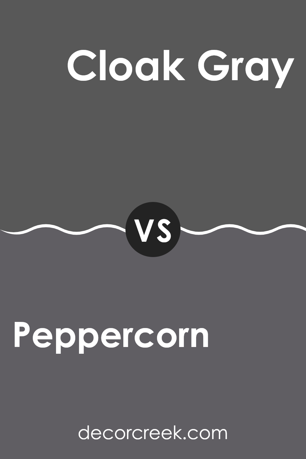
Peppercorn SW 7674 by Sherwin Williams vs Cloak Gray SW 6278 by Sherwin Williams
Peppercorn and Cloak Gray, both from Sherwin Williams, each present a unique shade of gray that can set a very different mood in any room. Peppercorn is a much darker, almost charcoal-like color. It offers a strong and bold character, which can make a room feel cozy and grounded, especially in well-lit or large rooms.
On the other hand, Cloak Gray is lighter and leans toward a steel gray. This softer shade is great for creating a lighter, airier atmosphere without becoming too stark or cold, making it a good choice for smaller areas or rooms without a lot of natural light.
When comparing the two, Peppercorn makes more of a statement and can serve as a striking backdrop for brighter accents, while Cloak Gray offers more adaptability and works well as a neutral base in a color scheme. Each color suits different needs depending on the effect you’re looking for in your room.
You can see recommended paint color below:
- SW 6278 Cloak Gray
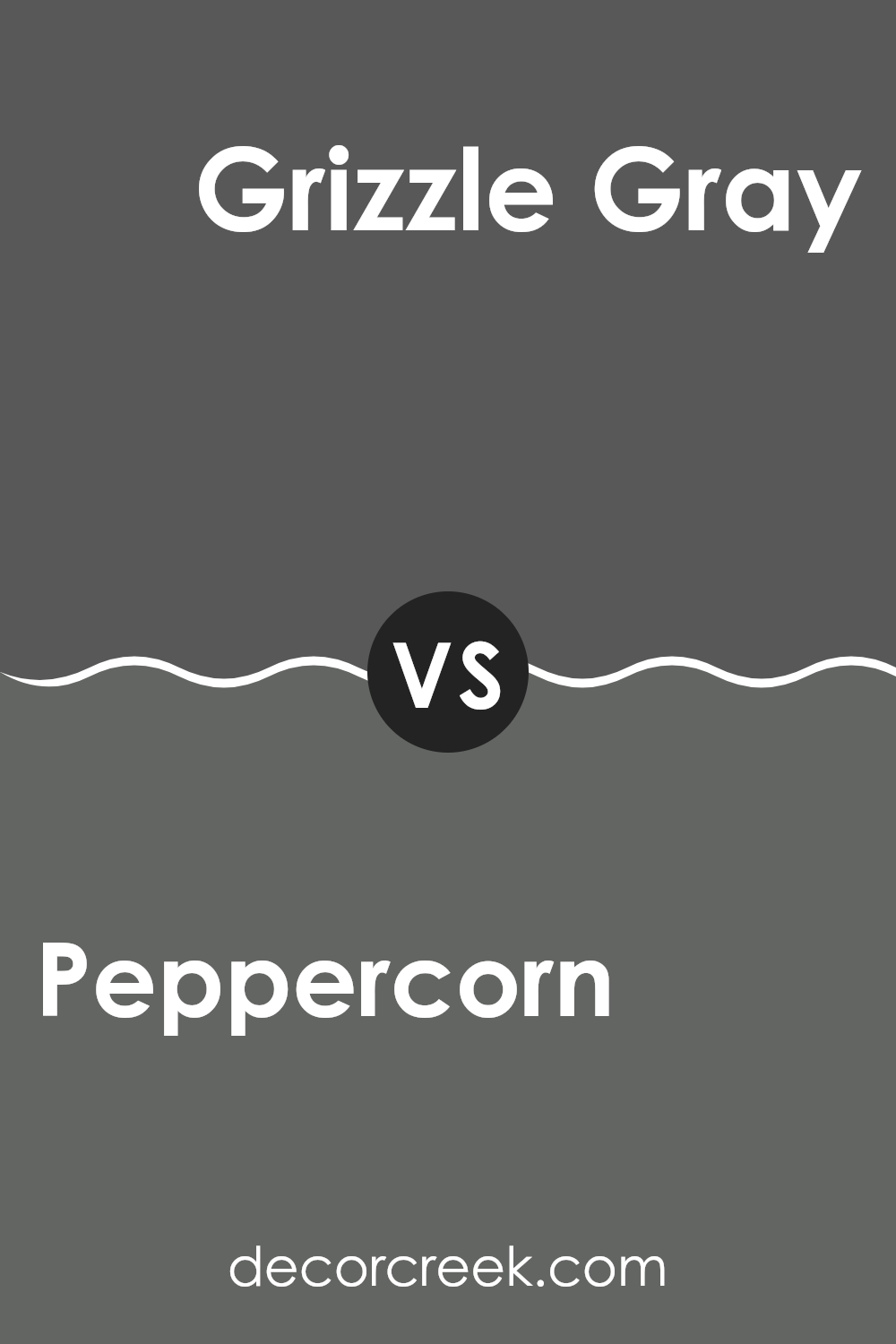
Peppercorn SW 7674 by Sherwin Williams vs Grizzle Gray SW 7068 by Sherwin Williams
Peppercorn and Grizzle Gray by Sherwin Williams are two stylish shades of gray with distinct tones. Peppercorn is a darker shade that closely resembles charcoal. It offers a bold and impactful look, making it a great choice for creating dramatic accents in a room.
On the other hand, Grizzle Gray is lighter and has a warmer undertone compared to Peppercorn. This makes it more flexible for different rooms, providing a cozy yet modern feel without making the room feel too closed in.
Both colors work well in modern decor styles, complementing materials like metal, glass, and wood, and can create a striking contrast when used alongside lighter colors. Whether you’re looking for a deep, striking color or a softer, adaptable shade, both Peppercorn and Grizzle Gray have their unique appeal.
You can see recommended paint color below:
Peppercorn SW 7674 by Sherwin Williams vs Stony Creek SW 9610 by Sherwin Williams
Peppercorn by Sherwin Williams is a deep, charcoal gray with a slightly warm undertone, making it a solid choice for those wanting to add a bold, grounding effect to any room. Its strength in color can make smaller rooms appear cozier and can act as an excellent backdrop for vibrant decor or artwork.
On the other hand, Stony Creek is a softer, mid-tone gray which leans towards the earthier side of the gray spectrum, offering a more muted and natural feel. This color is especially good for creating a calm and inviting atmosphere, and it pairs well with a wide range of other colors, from bright accents to subtler, earthy tones.
While both colors are grays, Peppercorn is much darker and can sometimes almost appear black in low light, giving a dramatic flair to interiors. Stony Creek, being lighter, can help rooms feel more open and airy. Each holds its unique appeal depending on the effect you wish to achieve in your decorating project.
You can see recommended paint color below:
Peppercorn SW 7674 by Sherwin Williams vs Prelude SW 9620 by Sherwin Williams
Peppercorn and Prelude by Sherwin Williams are distinct in their color tones, making them suitable for different aesthetic moods and rooms. Peppercorn is a deep, almost black gray that brings a strong, bold feel to interiors.
It’s excellent for creating a dramatic accent wall or for use in areas where a powerful, grounding effect is desired. On the other hand, Prelude is a gentle gray with a subtle hint of blue. This color is lighter and works wonderfully to calm a room, making it ideal for bedrooms or other relaxing areas where a softer, more airy atmosphere is desired.
Where Peppercorn adds weight and depth, Prelude contributes lightness and a breath of fresh air. Both colors offer unique possibilities and can be used effectively depending on the desired impact and room function.
You can see recommended paint color below:
Peppercorn SW 7674 by Sherwin Williams vs Forged Steel SW 9565 by Sherwin Williams
Peppercorn and Forged Steel by Sherwin Williams are two distinct shades of gray, each bringing its own unique vibe to a room. Peppercorn is a deep, warm gray that tends to add a cozy and somewhat more inviting feel to interiors. It pairs well with both bright accents and softer, muted tones, making it quite adaptable for interior design. It’s dark enough to make a statement yet not so bold as to dominate a room.
On the other hand, Forged Steel is a cooler, lighter gray that offers a fresh and clean look. It is closer to a true gray, providing a more neutral backdrop that works exceptionally well in modern and minimalist designs. This color can help brighten rooms while still keeping a sleek, modern aesthetic.
Both colors are great choices for those looking to incorporate gray into their décor, but the choice between Peppercorn and Forged Steel depends on the desired atmosphere and the amount of natural light in the room.
You can see recommended paint color below:
Peppercorn SW 7674 by Sherwin Williams vs Urbane Bronze SW 7048 by Sherwin Williams
Peppercorn and Urbane Bronze, both by Sherwin Williams, offer distinct yet harmonious shades suitable for various rooms. Peppercorn is a deeper, almost charcoal gray with a touch of warmth, making it a strong choice for creating a bold, cozy atmosphere in a room. It pairs well with lighter grays and vibrant accents and tends to absorb light, giving a rich, enveloping feel to interiors.
On the other hand, Urbane Bronze has a softer, earthier tone, combining gray and brown for a naturally grounded feeling. This color can act as a subtle, darker neutral, excellent for adding depth to a room while maintaining a relaxing vibe. Urbane Bronze works very effectively with natural elements like wooden furniture or greenery, enhancing a connection to the outdoors.
Both colors are flexible, but while Peppercorn lends a more dramatic flair with its darker, cooler undertones, Urbane Bronze offers a warmer, more understated elegance. Each creates a unique mood and can be used effectively for walls, accents, or cabinet colors.
You can see recommended paint color below:

Peppercorn SW 7674 by Sherwin Williams vs Ironclad SW 9570 by Sherwin Williams
Peppercorn and Ironclad by Sherwin Williams are two distinct shades that can add a unique character to any room. Peppercorn is a deep, rich gray with hints of charcoal, making it a strong, grounding color.
It works excellently in areas that could benefit from a cozy and slightly dramatic atmosphere, such as living rooms or bedroom walls. On the other hand, Ironclad is a darker, almost black shade with a cooler undertone.
This color suits well in modern interiors or on accents like doors and cabinets for a bold, clean appearance. While both colors are in the gray family, Peppercorn leans towards a warm, inviting feel, whereas Ironclad offers a more stark, crisp vibe. These colors could be used together to create a balanced contrast or individually to achieve specific aesthetics within different rooms.
You can see recommended paint color below:
Peppercorn SW 7674 by Sherwin Williams vs Roycroft Pewter SW 2848 by Sherwin Williams
Peppercorn and Roycroft Pewter, both from Sherwin Williams, offer distinct vibes for decorating interiors. Peppercorn is a deep charcoal gray that has a strong presence due to its dark tones. It’s great for creating a bold, cozy feel in a room. This color works well for accent walls or for rooms where you want to make a dramatic statement like living rooms or bedrooms.
On the other hand, Roycroft Pewter is a softer gray with a warmer undertone. It’s lighter than Peppercorn, making it more flexible for various lighting situations and rooms. Roycroft Pewter feels more welcoming and calming, ideal for areas where you spend a lot of time or want to promote a relaxed atmosphere, such as kitchens, bathrooms, or home offices.
Choosing between these colors depends on what kind of mood or style you’re aiming for. Peppercorn suits bolder, more dramatic décor, while Roycroft Pewter is better for a gentle, soothing environment. Both colors pair well with a wide range of other hues and decor styles.
You can see recommended paint color below:
Peppercorn SW 7674 by Sherwin Williams vs Perle Noir SW 9154 by Sherwin Williams
Peppercorn and Perle Noir, both by Sherwin Williams, are deep shades that bring their unique flair to rooms they’re used in. Peppercorn has a rich, robust quality with just enough warmth to keep it from feeling too harsh. This makes it a great choice for creating cozy, inviting rooms without making them feel small or cramped.
On the other hand, Perle Noir is a cooler shade, leaning more toward a charcoal with subtle blue undertones. This cooler tone gives it a cleaner look, which can make rooms feel more open and airy while still providing the dramatic impact of a dark color.
When comparing these two, the main difference lies in their undertones and the warmth each brings to a room. Peppercorn, with its slight warmth, feels more welcoming, while Perle Noir offers a sharper, more modern edge due to its cooler undertones. Choosing between them would largely depend on the mood you want to set and the other colors in your design scheme.
You can see recommended paint color below:
After studying and using SW 7674 Peppercorn by Sherwin Williams, I’ve learned quite a bit about what makes it unique and why so many people might like it for their homes. Peppercorn is a color that’s a deep gray, with a hint of something almost black, which adds a cool look wherever it’s painted.
This color works well in many parts of a house. It could make a living room feel cozy and modern, or add a stylish touch to a kitchen. It’s also strong enough to stand out when used for just one wall, or to help other colors around it look good when used together.
What’s especially nice about Peppercorn is how it goes with lots of other colors. Whether you’re pairing it with light shades like white or soft blue, or even other dark shades, it always looks good. It’s a useful color to have in your tool kit if you enjoy changing the look of your rooms without too much fuss.
After using Peppercorn and seeing it in different lights and settings, I think it’s a really cool color that can give any room a fresh and modern feel. Whether for a bedroom, living room, or kitchen, it’s a strong color choice that can make any area of your home look better and feel more welcoming.
Ever wished paint sampling was as easy as sticking a sticker? Guess what? Now it is! Discover Samplize's unique Peel & Stick samples.
Get paint samples

