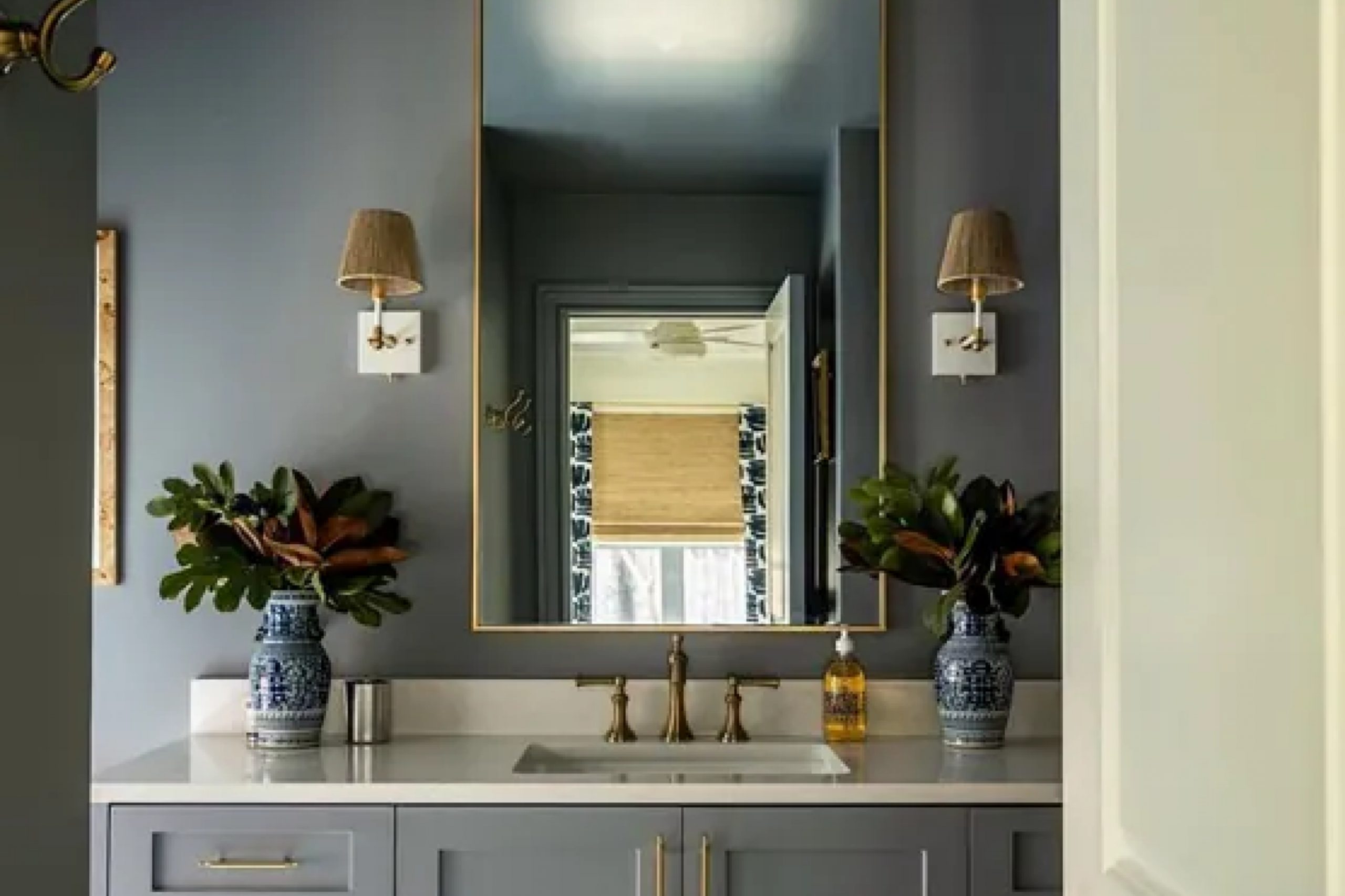
This unique color, a gentle blend of blue and gray, brings a soothing vibe to any space. It’s not just another shade; it feels like a breath of fresh air, perfect for creating a peaceful environment in your home. I found that it pairs beautifully with both modern and traditional elements, giving me the flexibility to experiment with different styles.
In my living room, Dustblu creates a serene backdrop that complements my art and furniture without overwhelming them. The color’s soft nature seems to adapt throughout the day, reflecting different moods with the changing light.
I especially love how it sets a relaxed tone in my bedroom, inviting me to unwind after a long day. Dustblu feels like a whisper of elegance, subtle yet impactful, versatile for any room in my home.
As I continue to enjoy its presence, I’ve realized it’s more than just a paint color; it’s an experience that enhances the atmosphere of my living space in the most delightful way.
What Color Is Dustblu SW 9161 by Sherwin Williams?
Dustblu SW 9161 by Sherwin Williams is a soothing dusty blue with a hint of gray. This color offers a calm vibe, perfect for creating a peaceful and inviting space. Its muted tone works beautifully in various interior styles, making it a versatile choice for many home designs.
In coastal-themed interiors, Dustblu resembles the subtle hues of a misty ocean, blending seamlessly with whites, sandy beiges, and soft grays. It also fits beautifully within modern farmhouse styles, providing a gentle contrast to natural wood textures and rustic elements.
Mid-century modern spaces can benefit from Dustblu’s understated elegance, where it pairs well with teak wood and bold geometric patterns.
For the materials, Dustblu complements natural woods, particularly those with lighter finishes, as well as matte black accents for a contemporary look. It harmonizes with soft linens, chunky knit throws, and natural fibers, adding depth and interest without being overwhelming.
Incorporate Dustblu on bedroom walls to set a restful mood or as an accent in a living room for a touch of calm. Its versatile nature also makes it an appealing choice for kitchens and bathrooms, particularly when paired with white tiles and stainless steel finishes.
Is Dustblu SW 9161 by Sherwin Williams Warm or Cool color?
Dustblu SW 9161 by Sherwin Williams is a soft, muted blue-gray color that can create a calming atmosphere in a home. Its subtle, neutral tone makes it versatile and easy to incorporate into various design styles. This color works well in living rooms, bedrooms, and bathrooms, offering a relaxing and soothing environment.
Because of its gray undertones, Dustblu pairs nicely with both warm and cool colors, allowing it to complement a wide range of furniture and decor.
In living spaces, Dustblu can add a touch of sophistication without being overpowering, making it a great choice for walls or as an accent color. In bedrooms, it provides a calm backdrop that can promote relaxation and restful sleep. It also works beautifully in bathrooms, helping to create a spa-like atmosphere. Overall, Dustblu SW 9161 is an adaptable color that can enhance the comfort and style of any room in the home.
Undertones of Dustblu SW 9161 by Sherwin Williams
Dustblu SW 9161 by Sherwin Williams is a paint color with various subtle undertones that can change how it looks in different settings. Paint undertones are the subtle hints of color beneath the main color. They can affect how a color looks depending on lighting and surrounding colors. Dustblu has undertones including lilac, mint, pale pink, light blue, light purple, pale yellow, light gray, dark turquoise, and many others.
These undertones can influence the paint’s appearance. For instance, light settings might bring out the lilac and pale pink undertones, adding a soft, warm feel to a room.
In bright daylight, the pale yellow and light gray undertones might stand out, giving the room a more neutral and balanced vibe.
On interior walls, the mix of undertones means Dustblu can adapt to various decor styles. In a dimly lit room, the dark turquoise and navy undertones may become more pronounced, offering a cozy and intimate atmosphere.
If paired with brightly colored furniture, Dustblu’s more muted undertones like mint and light green can help balance and complement the other colors in the room. Ultimately, the wide range of undertones in Dustblu allows it to be a versatile and adaptable choice for many spaces.

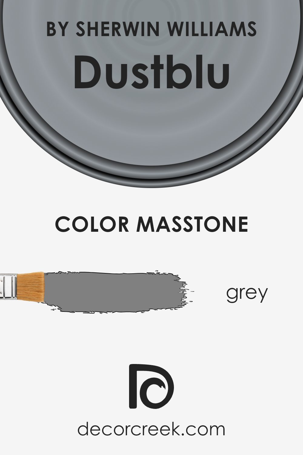
What is the Masstone of the Dustblu SW 9161 by Sherwin Williams?
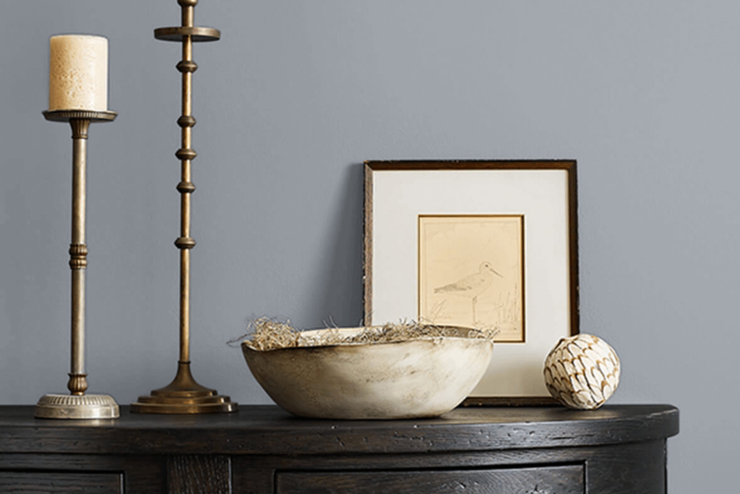
Dustblu SW 9161 by Sherwin Williams is a muted, medium blue-gray paint color. Its masstone is a true gray (#808080), which sets a neutral foundation. This neutral base can make Dustblu appear cooler or warmer, depending on the light.
In homes, it can create a calm and balanced atmosphere, as it reflects just enough light to keep a room open and inviting without feeling stark or overly bright.
The subtle gray undertone can complement both modern and traditional interiors. In spaces with a lot of natural light, Dustblu may take on a slightly bluer hue, enhancing its cool tones and providing a fresh look. In darker spaces, the gray becomes more prominent, offering a cozy and grounded feel. Its versatility makes it suitable for living rooms, bedrooms, or home offices, where it can either stand out as a feature wall or serve as a cohesive backdrop for artwork and furnishings.
How Does Lighting Affect Dustblu SW 9161 by Sherwin Williams?
Lighting plays a crucial role in how we perceive colors. The same color can look very different depending on the type of light it is viewed under. For example, Dustblu SW 9161 by Sherwin Williams is a versatile blue-gray shade. Its appearance can change significantly in different lighting conditions.
In natural light, Dustblu SW 9161 tends to reflect its truest color. However, the exposure of the room can affect how the color is perceived. In north-facing rooms, natural light is usually cooler and has a blue tint, making Dustblu appear grayer and more muted. This can give the room a calm, subtle appearance.
In contrast, south-facing rooms receive more direct sunlight, which is warmer. Here, Dustblu SW 9161 can look slightly warmer and more vibrant. The abundant sunlight brings out the blue undertones, making the space feel brighter and more open.
East-facing rooms get warm, yellow sunlight in the morning and cooler light later in the day. In the morning, Dustblu may look warmer and more welcoming due to the yellow tones. However, as the day progresses, it might appear cooler and slightly grayer.
West-facing rooms have the opposite effect, with cooler light in the morning and warm, golden light in the afternoon and evening. In these rooms, Dustblu SW 9161 may appear cooler and muted in the morning but takes on a richer, warmer hue as the sun sets.
When it comes to artificial light, the type of bulbs used can make a difference. Incandescent bulbs emit a warm light, which can make Dustblu look slightly warmer. LED lights come in a range of color temperatures, so their effect will depend on whether they emit warm or cool light. In cool LED or fluorescent lighting, the color might look grayer and more subdued.
Overall, the interaction between Dustblu SW 9161 and the lighting in a space can significantly impact the color’s appearance, influencing the overall mood and feel of a room.
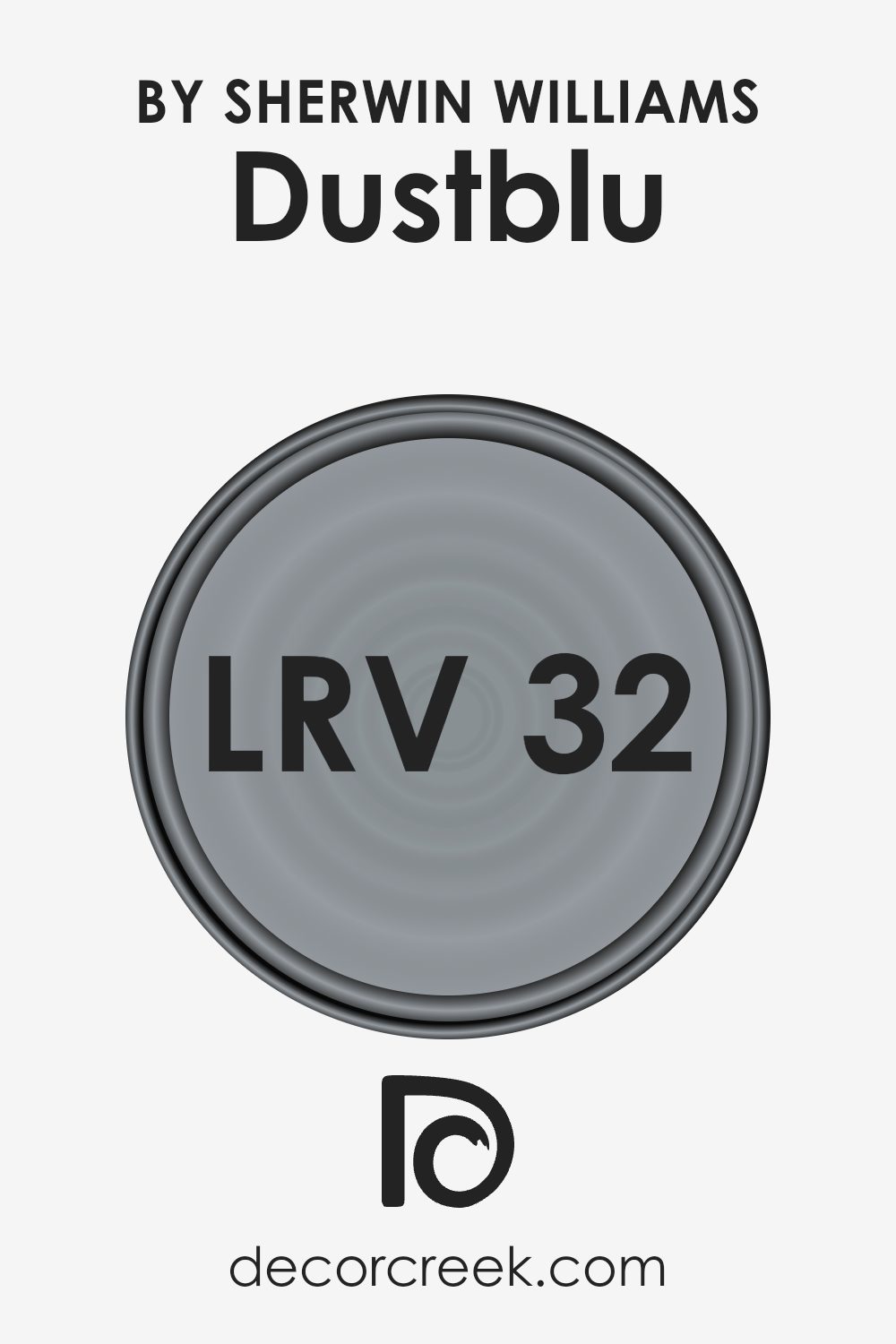
What is the LRV of Dustblu SW 9161 by Sherwin Williams?
The Light Reflectance Value, or LRV, is a measure that tells us how much light a color will reflect or absorb when it’s painted on a surface. The scale ranges from 0, which is completely black and absorbs all light, to 100, which is pure white and reflects all light.
When you’re choosing a paint color, LRV is an important factor because it can affect how bright or dark a room feels. Higher LRV values mean the color will reflect more light, making a room feel larger or more open. Lower LRV values absorb more light, which can make a room feel cozier or smaller.
For the color Dustblu by Sherwin Williams, with an LRV of 32.327, this means it falls on the lower end of the scale. It is a fairly dark color, which means it will absorb more light than it reflects. This can result in a more intimate or snug feeling in a room, as it won’t bounce a lot of light around.
When using Dustblu in a space, it could make the room feel cozy and enclosed, which is something to consider if the room has limited natural light. If you want to ensure the room doesn’t feel too dark, it can be balanced with lighter furnishings or accents.
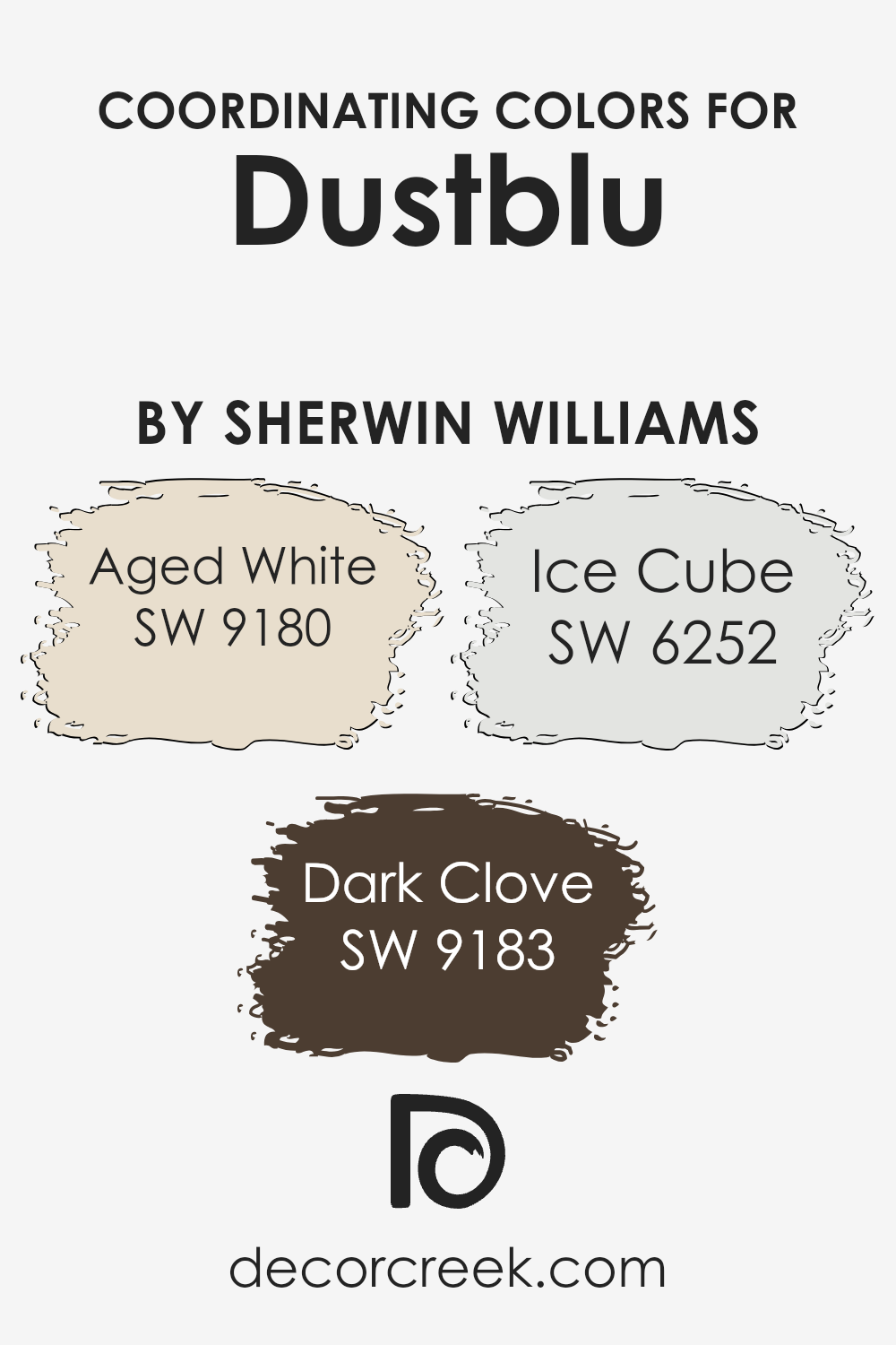
Coordinating Colors of Dustblu SW 9161 by Sherwin Williams
Coordinating colors are shades that work well together to create a harmonious look in a space. They draw out the beauty in each other and help maintain a balanced and cohesive design.
Dustblu by Sherwin Williams is a soft, muted blue that provides a calming backdrop, and it’s often complemented with a selection of carefully chosen coordinating colors. Using these colors together can enhance a room’s atmosphere, whether you’re aiming for a cozy environment or a more refined feel.
For instance, Aged White adds a touch of warmth with its creamy, off-white tone, which perfectly softens the cooler Dustblu. This combination can make a room feel airy and inviting. Dark Clove introduces a rich, deep brown that adds depth and sophistication, making it excellent for accent walls or furnishings that need to stand out.
Ice Cube, on the other hand, is a crisp, pale blue-gray that seamlessly blends with Dustblu, enhancing its cool undertones and adding a refreshing contrast.
Together, these colors create a visually pleasing palette that is both soothing and stylish, ideal for a space that aims to be both welcoming and tasteful.
You can see recommended paint colors below:
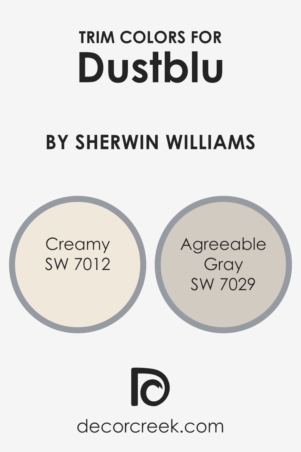
What are the Trim colors of Dustblu SW 9161 by Sherwin Williams?
Trim colors are the shades used to paint the borders or edges of walls, windows, doors, and baseboards. They provide contrast and definition, helping to frame a space and highlight architectural features. For a color like SW 9161 Dustblu by Sherwin Williams, using the right trim color is essential to balance and complement its hue.
Dustblu is a soft, muted blue with a calming presence, so pairing it with strategic trim colors can either enhance its subtlety or provide a striking contrast. The choice of trim color can set the tone for the entire room, making it feel more inviting and complete.
Using SW 7012 Creamy as a trim color with Dustblu creates a warm and welcoming atmosphere. Creamy is a soft, buttery white that adds warmth without overpowering. This shade works particularly well to soften the coolness of Dustblu, creating a cozy yet fresh feeling in the space.
On the other hand, SW 7029 Agreeable Gray offers a neutral backdrop, adding sophistication and a touch of modernity.
Agreeable Gray is a warm greige with balanced undertones that can complement both cool and warm colors, making it a versatile choice for trim. When paired with Dustblu, these trim colors bring out the best in each other, enhancing the overall look and feel of the room.
You can see recommended paint colors below:
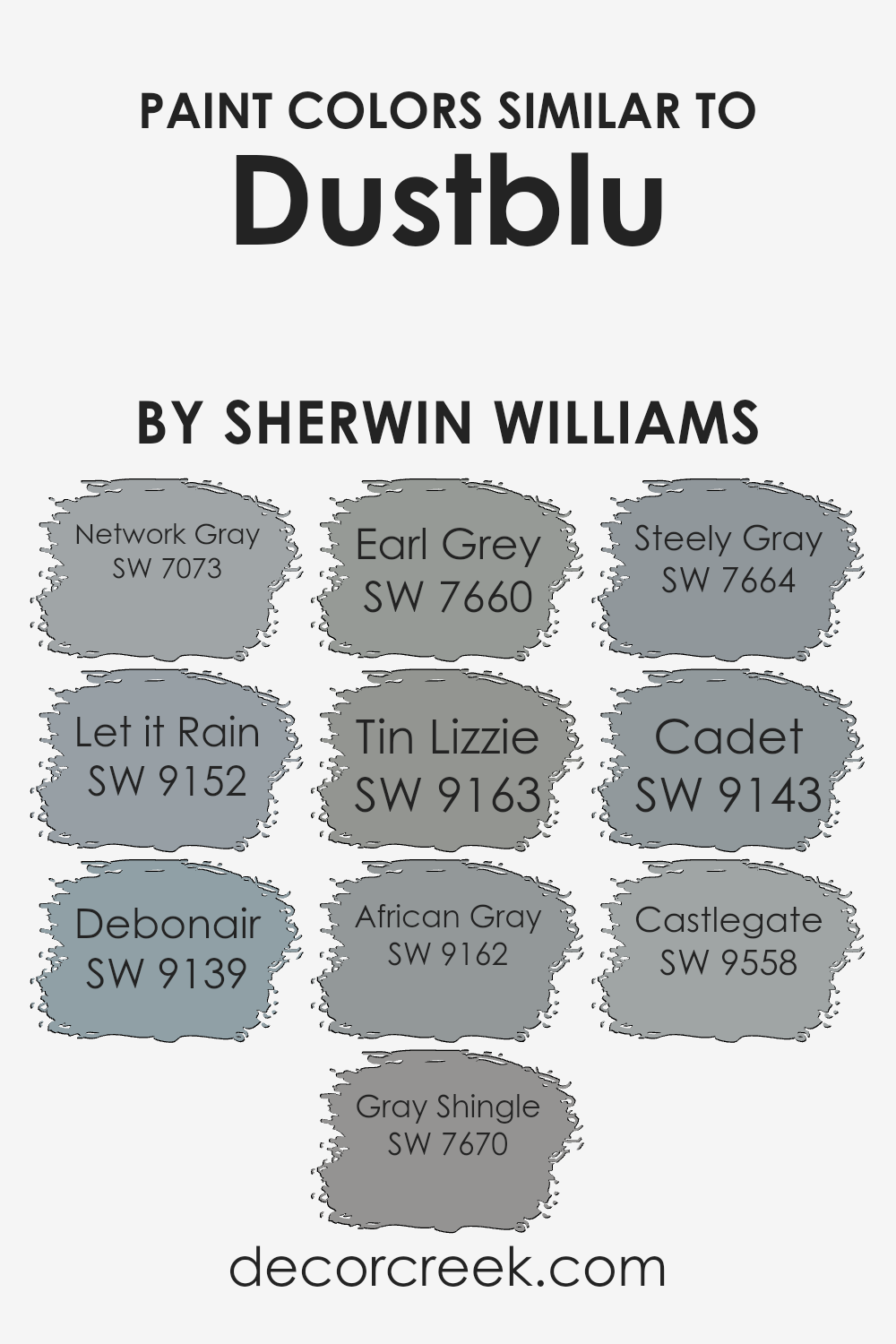
Colors Similar to Dustblu SW 9161 by Sherwin Williams
Similar colors play a key role in creating visually pleasing spaces, as they help maintain harmony while adding variety to a color scheme. For example, Network Gray is a cool, balanced gray that offers a neutral backdrop, making it incredibly versatile. Let it Rain offers a gentle blue-gray tone, reminiscent of a stormy sky, bringing a peaceful, calming vibe to any room.
Debonair presents a soft, muted blue that can add a touch of elegance without overwhelming a space. Gray Shingle brings a more rugged, earthy gray with subtle undertones that can tie everything together, while Earl Grey provides a classic, warm gray hue that is both inviting and sophisticated.
Tin Lizzie is a deeper gray with hints of blue, providing a richer alternative that still blends well with the original Dustblu. African Gray offers a slightly warmer gray with a subtle taupe undertone, perfect for creating a cozy atmosphere.
Steely Gray leans towards a stronger, darker tone, lending a sense of depth and solidity. Additionally, Cadet, with its blend of blue and gray, offers a more traditional take on blue, evoking images of classic uniforms.
Lastly, Castlegate, a strong, deep gray, adds an element of boldness and structure to the overall palette. Together, these colors complement the original tone beautifully, offering a range of moods and settings.
You can see recommended paint colors below:
- SW 7073 Network Gray
- SW 9152 Let it Rain
- SW 9139 Debonair
- SW 7670 Gray Shingle
- SW 7660 Earl Grey
- SW 9163 Tin Lizzie
- SW 9162 African Gray
- SW 7664 Steely Gray
- SW 9143 Cadet
- SW 9558 Castlegate
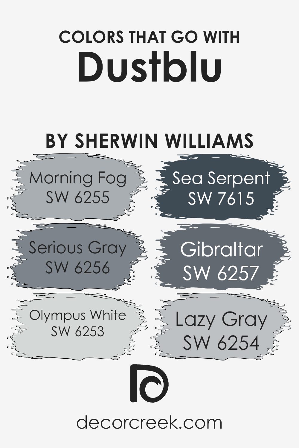
Colors that Go With Dustblu SW 9161 by Sherwin Williams
When choosing colors that complement Dustblu SW 9161 by Sherwin Williams, it’s important to understand how they can enhance the overall feel of a space. Dustblu is a soft, muted blue that has a calming effect, and pairing it with the right colors can create a harmonious and inviting environment.
SW 6255 Morning Fog is a gentle gray with a hint of blue, offering a subtle contrast that still feels cohesive and pleasant. SW 6256 Serious Gray steps in with a stronger shade of gray, providing a solid backdrop that balances nicely with Dustblu without overpowering it.
These shades work together to create a relaxed, unified look, making your space feel comfortable and balanced.
To further complement Dustblu, you might consider SW 6253 Olympus White, which is a light gray-white with a cool undertone that adds brightness and a sense of openness. SW 7615 Sea Serpent is a deep, bold blue that adds depth and creates a striking focal point when paired with the softer Dustblu.
For a more grounded look, SW 6257 Gibraltar delivers a rich gray with a touch of blue, offering weight and sophistication.
Finally, SW 6254 Lazy Gray is a cool, light gray that pairs seamlessly with Dustblu, adding softness and a sense of airy spaciousness.
Together, these colors enhance the subtle beauty of Dustblu, making any space feel thoughtfully designed and visually appealing.
You can see recommended paint colors below:
- SW 6255 Morning Fog
- SW 6256 Serious Gray
- SW 6253 Olympus White
- SW 7615 Sea Serpent
- SW 6257 Gibraltar
- SW 6254 Lazy Gray
How to Use Dustblu SW 9161 by Sherwin Williams In Your Home?
Dustblu SW 9161 by Sherwin Williams is a calming and versatile paint color. It’s a soft, muted blue with gray undertones that makes it easy to incorporate into different spaces in your home. You can use this color to create a peaceful bedroom. Pair it with crisp white bedding and natural wood furniture for a cozy, welcoming feel.
In the living room, Dustblu serves as a subtle backdrop that matches well with both modern and traditional decor. Consider combining it with light gray or beige for a harmonious look. You can also use Dustblu in a bathroom for a spa-like atmosphere, complementing it with white tiles and silver fixtures.
This shade works well in small spaces as it can make the room feel more open and airy. Whether painting a feature wall or an entire room, Dustblu offers a gentle, pleasing color that enriches any environment.
Dustblu SW 9161 by Sherwin Williams vs Earl Grey SW 7660 by Sherwin Williams
Dustblu SW 9161 and Earl Grey SW 7660 by Sherwin Williams are two distinct colors that offer different vibes. Dustblu is a light, muted blue-gray. It has a soft, calming appearance and works well in spaces where you want a gentle, airy feel. This color brings a sense of peacefulness without being overwhelming.
On the other hand, Earl Grey is a medium gray with a more solid presence. It has warmer undertones compared to Dustblu, making it feel cozier and more grounded. Earl Grey is versatile and can fit into both modern and traditional settings, providing a neutral backdrop that allows other colors to stand out.
When choosing between the two, consider the mood you want to create. Dustblu is ideal for bright, open spaces that need a touch of color, while Earl Grey is great for adding warmth and depth to a room. Both colors can complement a variety of decor styles.
You can see recommended paint color below:

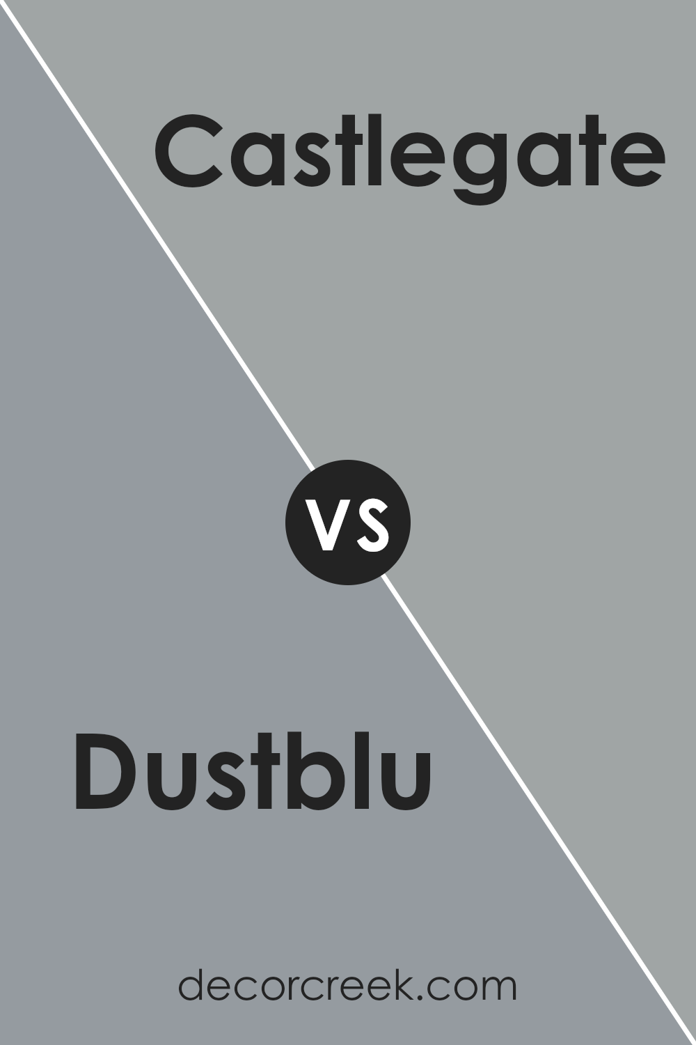
Dustblu SW 9161 by Sherwin Williams vs Castlegate SW 9558 by Sherwin Williams
Dustblu SW 9161 by Sherwin Williams is a soft, muted blue with subtle gray undertones. It’s calming and neutral, making it a versatile choice for various spaces in a home. This color feels fresh and airy, ideal for creating a light and open atmosphere.
Castlegate SW 9558, also by Sherwin Williams, is a contrasting shade that is deeper and more saturated compared to Dustblu. It leans toward a dark gray with hints of blue, offering a more grounded and dramatic effect. This color works well as an accent, adding depth and a modern touch to a room.
While Dustblu brings a gentle and soothing vibe to a space, Castlegate introduces a stronger, more powerful presence. Together, they can complement each other beautifully, with Dustblu providing a light background and Castlegate adding character through accents or feature walls.
You can see recommended paint color below:
- SW 9558 Castlegate
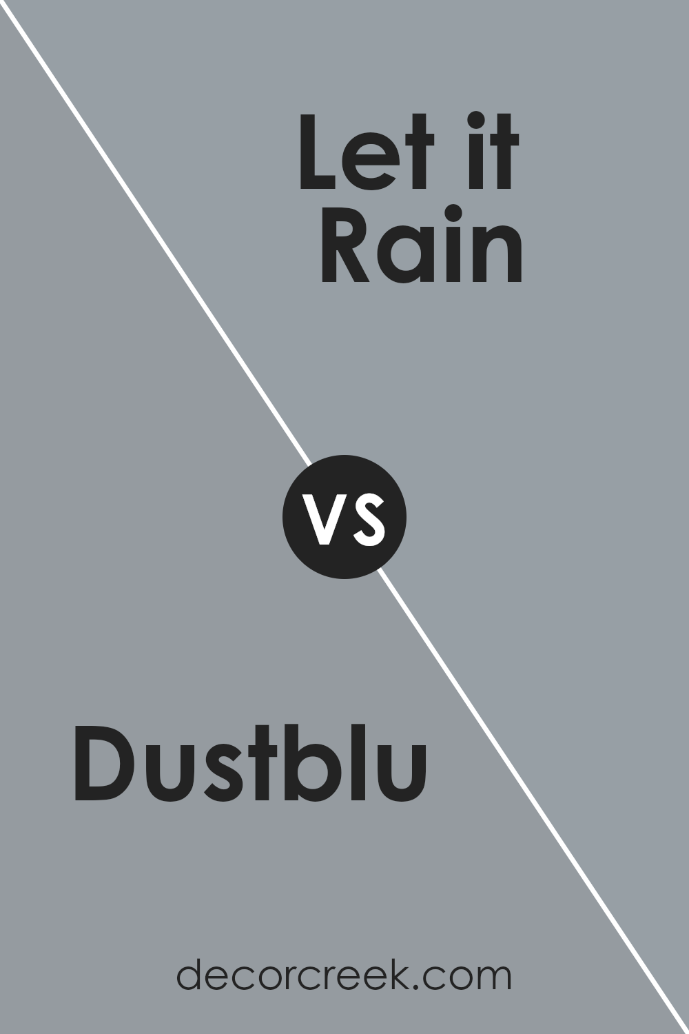
Dustblu SW 9161 by Sherwin Williams vs Let it Rain SW 9152 by Sherwin Williams
Dustblu SW 9161 and Let it Rain SW 9152 by Sherwin Williams are two subtle, soothing shades of blue that can nicely complement various spaces. Dustblu is a soft, muted blue with a hint of gray, making it a versatile choice for creating a calm and inviting environment. It works well in bedrooms and living rooms, adding a touch of quiet elegance.
On the other hand, Let it Rain is slightly deeper with more pronounced gray undertones, giving it a cooler, more modern feel. This color can provide a bit more contrast when paired with other lighter shades, making it ideal for accent walls or spaces where you want a bit of drama without overpowering the room.
Both colors have a gentle quality, but Dustblu leans towards a softer palette, while Let it Rain is a bit bolder. Together, they offer different moods that can suit a variety of decorating styles and preferences.
You can see recommended paint color below:
- SW 9152 Let it Rain
Dustblu SW 9161 by Sherwin Williams vs Debonair SW 9139 by Sherwin Williams
Dustblu SW 9161 and Debonair SW 9139 by Sherwin Williams are both shades of blue, but they have distinct differences. Dustblu has a muted, soft appearance, reminiscent of a cloudy sky or distant mist. It’s a calming color that doesn’t overpower a space, making it suitable for bedrooms or living areas where a peaceful atmosphere is desired.
On the other hand, Debonair is a more vibrant and rich hue. It’s a stronger blue that stands out more compared to Dustblu. This makes it an excellent choice for accent walls or areas where you want to make a statement.
While both colors belong to the blue family, Dustblu leans towards the subtle side, whereas Debonair has a more striking presence. Together, they can create a balanced and harmonious look, with Dustblu providing a gentle backdrop and Debonair adding depth and personality.
You can see recommended paint color below:

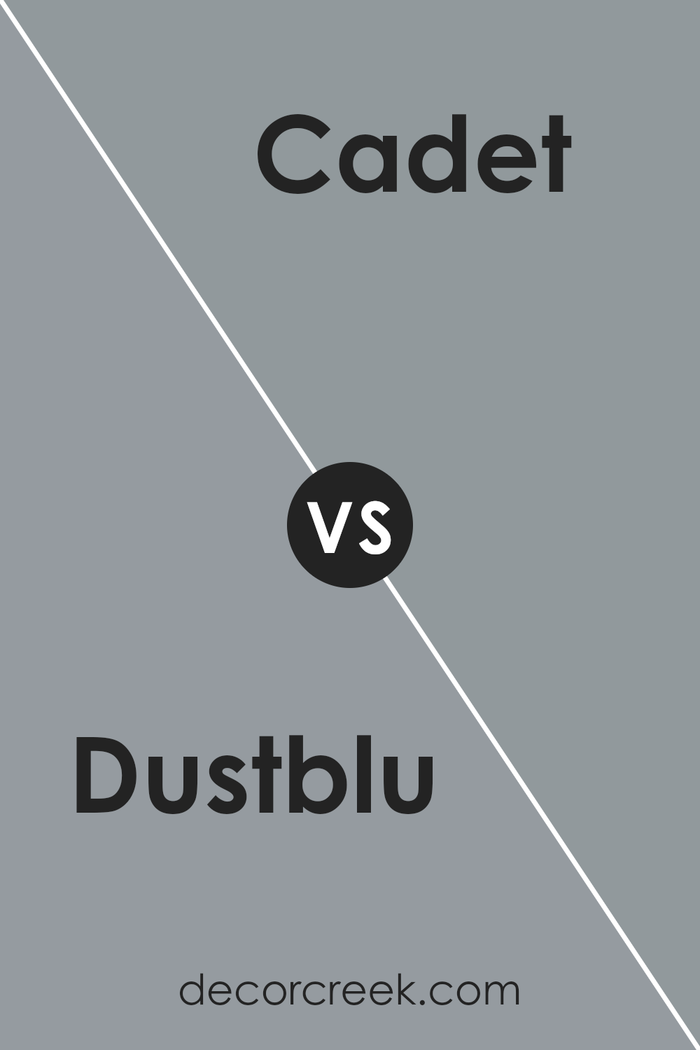
Dustblu SW 9161 by Sherwin Williams vs Cadet SW 9143 by Sherwin Williams
Dustblu SW 9161 and Cadet SW 9143 are both beautiful shades of blue from Sherwin Williams, but they have distinct characteristics. Dustblu SW 9161 is a soft, muted blue with gray undertones. It creates a calm and soothing atmosphere, making it perfect for bedrooms or living areas where a relaxed vibe is desired. It’s versatile and pairs well with both light and dark colors, adding a touch of tranquility.
On the other hand, Cadet SW 9143 is a deeper, more saturated blue. It has a richer and bolder presence, offering a stronger statement in any room. This color works well in spaces where more energy or attention is needed, such as an accent wall or home office. The depth of Cadet can create a cozy and inviting feel while still maintaining a touch of elegance.
Both colors are excellent choices, but the decision depends on the mood you want to set in your space.
You can see recommended paint color below:
- SW 9143 Cadet
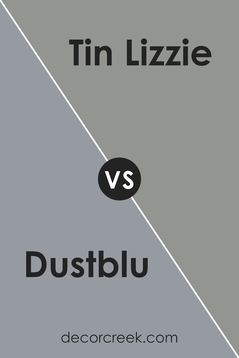
Dustblu SW 9161 by Sherwin Williams vs Tin Lizzie SW 9163 by Sherwin Williams
Dustblu SW 9161 and Tin Lizzie SW 9163 by Sherwin Williams are both subtle, neutral colors, making them versatile for various spaces. Dustblu is a soft, muted blue with cool undertones, lending a relaxed and calming vibe to a room. It’s an excellent choice for creating a breezy, soothing environment.
On the other hand, Tin Lizzie is a deeper, cooler gray with a touch of blue. This gives it a more pronounced and contemporary feel, suitable for adding a bit of depth without overpowering a room. While both colors can complement many design styles, Dustblu is great for adding a gentle touch of color, particularly in bedrooms or spaces where a peaceful ambiance is desired.
Tin Lizzie, being darker, works well for accent walls or paired with brighter accents in modern or minimalist designs, providing a sleek background that maintains a subtle hint of color.
You can see recommended paint color below:
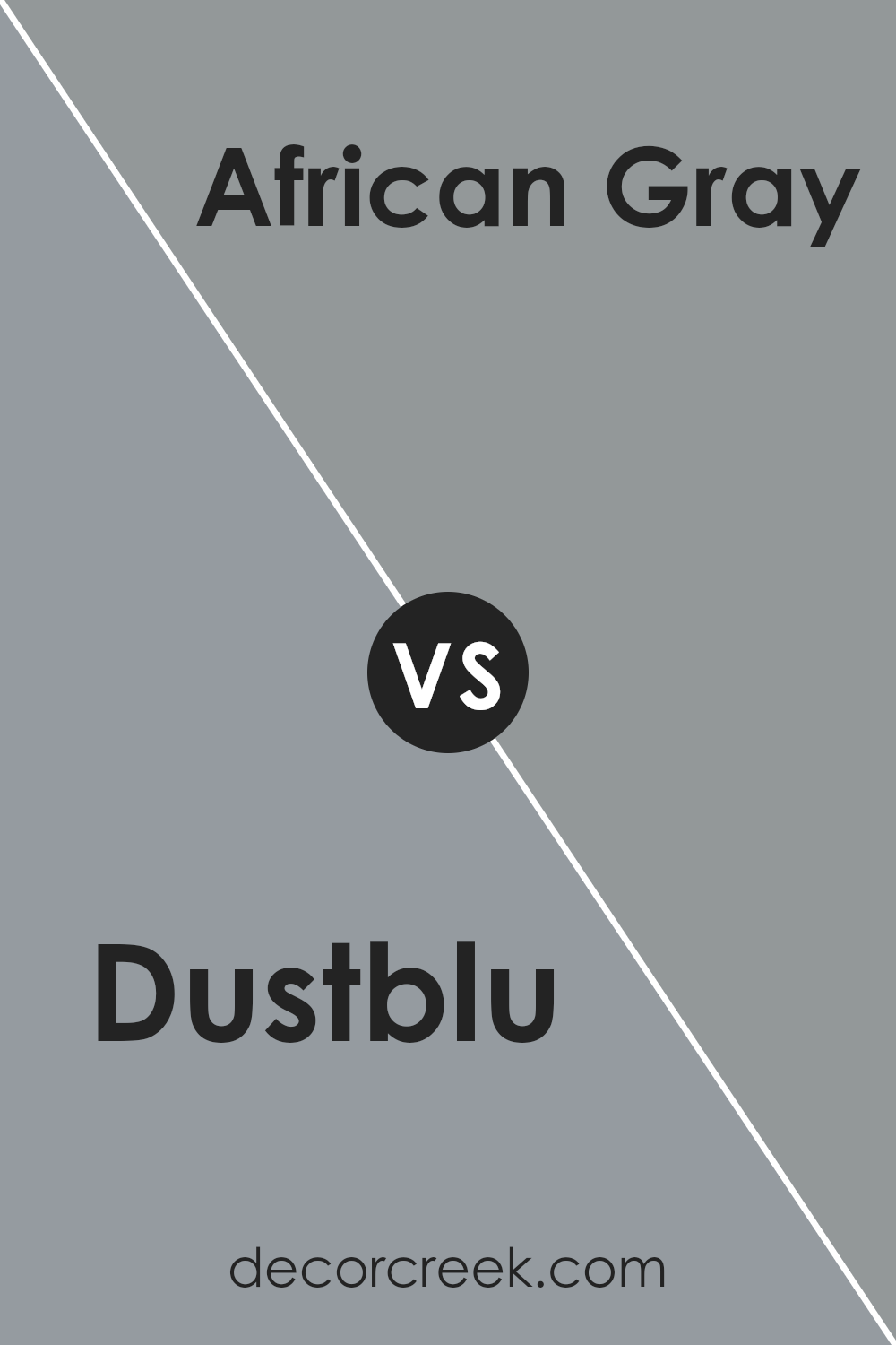
Dustblu SW 9161 by Sherwin Williams vs African Gray SW 9162 by Sherwin Williams
Dustblu and African Gray by Sherwin Williams are two colors that offer unique styles for your space. Dustblu is a soft blue with a hint of gray, giving it a calm and airy feel. It’s perfect for creating a relaxed atmosphere without overpowering the room. On the other hand, African Gray is a medium gray with a touch of warmth. It provides a more grounded and neutral backdrop, making it versatile for various design schemes.
Dustblu works well in spaces where you want to invite a peaceful vibe, making it ideal for bedrooms or living rooms. African Gray, being slightly darker and warmer, can add a touch of sophistication and works wonderfully in kitchens or offices.
Both colors pair well with whites and other neutrals, but Dustblu can complement soft pastels and cool tones, while African Gray pairs beautifully with richer, deeper colors for contrast. Each offers its own charm, depending on the mood you want to set.
You can see recommended paint color below:
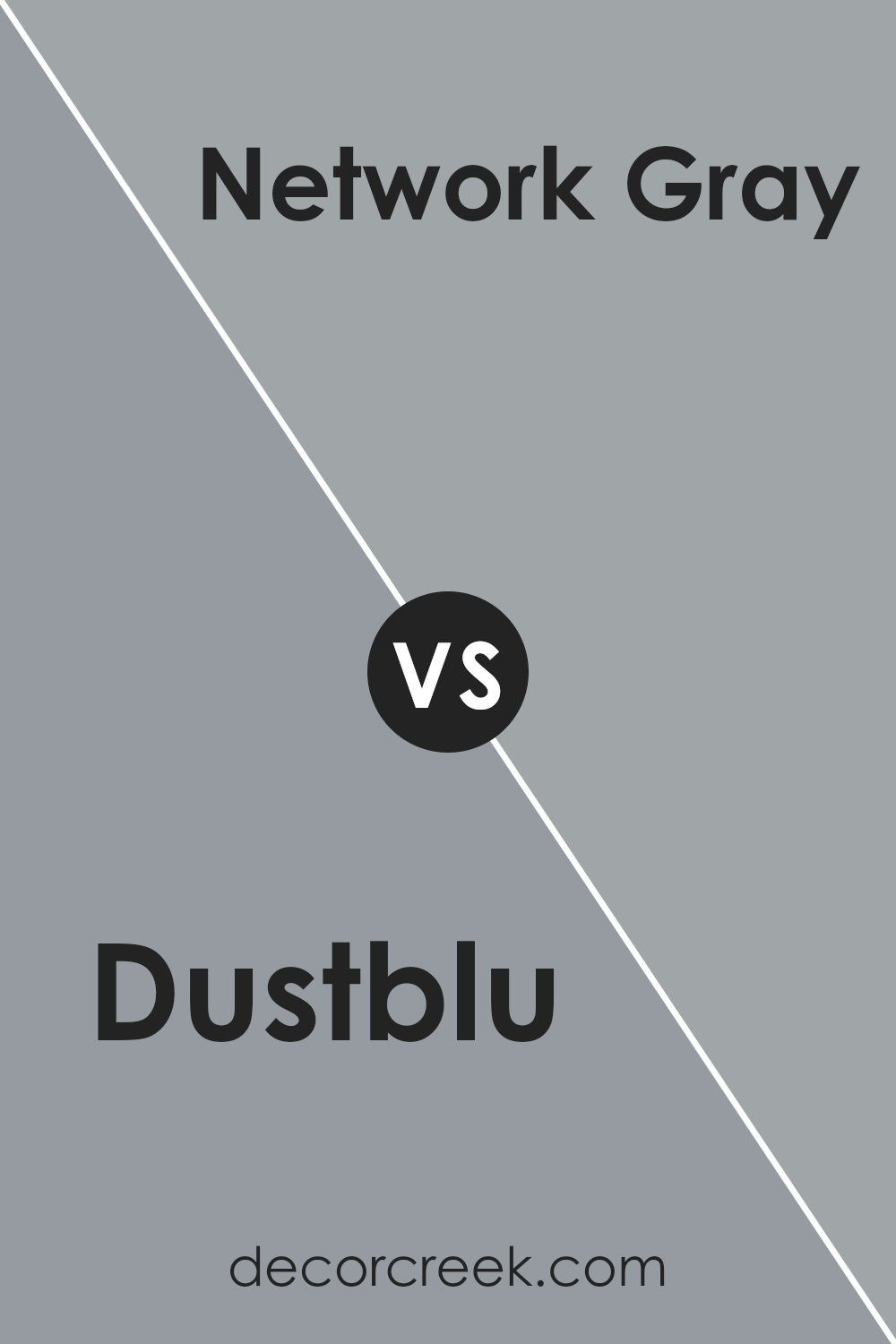
Dustblu SW 9161 by Sherwin Williams vs Network Gray SW 7073 by Sherwin Williams
Dustblu (SW 9161) and Network Gray (SW 7073) are both subtle, neutral colors by Sherwin-Williams that offer a calm yet distinct atmosphere. Dustblu is a soft, muted blue-gray. It brings a gentle, airy vibe to a room, reminiscent of a peaceful sky or a quiet morning. It works well in spaces where a sense of calm is desired, such as bedrooms or bathrooms.
On the other hand, Network Gray is a medium gray with subtle blue undertones. It feels a bit more grounded and can add a touch of sophistication to any room. This shade is versatile and pairs well with both modern and traditional decor, making it suitable for living rooms or offices.
While both colors have gray undertones, Dustblu leans more towards the blue side, offering a lighter, more relaxed feel, whereas Network Gray provides a deeper, more stable presence. These colors can complement each other beautifully in any balanced space.
You can see recommended paint color below:
Dustblu SW 9161 by Sherwin Williams vs Gray Shingle SW 7670 by Sherwin Williams
Dustblu SW 9161 and Gray Shingle SW 7670, both by Sherwin Williams, offer unique tones to a space. Dustblu is a soft, muted blue with gray undertones, creating a calming ambiance. It’s a versatile color, great for adding a touch of calmness to bedrooms or living rooms.
In contrast, Gray Shingle is a deeper, warmer gray with earthy undertones. It gives a sense of coziness and works well in areas like the kitchen or study, where a strong yet neutral color is desired.
When paired together, Dustblu can lighten and brighten spaces, visually opening them up, while Gray Shingle provides depth and contrast. Using Dustblu on walls can add a touch of color without being overwhelming, while Gray Shingle can serve as a rich accent, whether on a feature wall or cabinetry. Together, these colors create a balanced and inviting environment, perfect for any home.
You can see recommended paint color below:
Dustblu SW 9161 by Sherwin Williams vs Steely Gray SW 7664 by Sherwin Williams
Dustblu SW 9161 by Sherwin Williams is a soft, muted blue with a hint of gray, giving it a calming and balanced feel. It’s versatile and can suit different styles, from modern to traditional. It’s a great color for spaces where you want a peaceful atmosphere without overwhelming brightness.
Steely Gray SW 7664, on the other hand, is a medium to dark gray with blue undertones. It feels more dramatic than Dustblu, offering a stronger presence in a room. Steely Gray can create a bold and sophisticated look, making it an excellent choice for accent walls or spaces where you want a more striking effect.
When comparing the two, Dustblu is lighter and more subtle, providing an airy feel, while Steely Gray is deeper and richer, giving spaces a more intense and confident look. Both can work beautifully, depending on the mood you want to create.
You can see recommended paint color below:
- SW 7664 Steely Gray
Conclusion
When I think about SW 9161 Dustblu by Sherwin Williams, I feel like it’s a color that can make any room feel different and nice. It’s like a gentle, soft blue with a touch of gray, which makes it feel calm and cozy. Imagine a color that reminds you of a quiet, cloudy day but in a good way. That’s Dustblu.
I like Dustblu because it’s not too bright, but not too dark either. It feels just right for places where you want to feel relaxed, like a bedroom or a living room. It’s also a color that can go with lots of other colors.
You can have it with white to make a room feel brighter, or with dark colors to make it feel more classy.
Dustblu also feels like a friendly color. If you want your room to be a place where you and your friends feel comfy hanging out, this could be a great choice. It’s a color that can make people feel welcome and happy.
In my opinion, Dustblu is perfect for someone who wants a room that feels peaceful and nice without being too flashy. It’s like a gentle blanket that makes everything feel better. So, if you’re thinking about painting your room, SW 9161 Dustblu could be a really good pick!
Ever wished paint sampling was as easy as sticking a sticker? Guess what? Now it is! Discover Samplize's unique Peel & Stick samples.
Get paint samples

