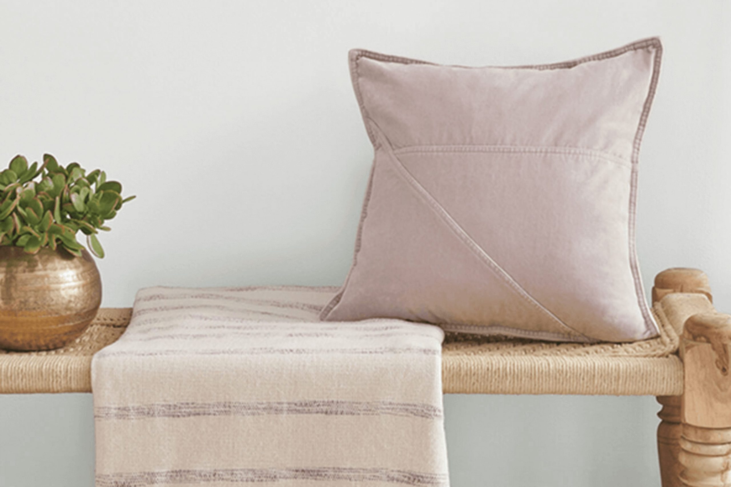
If you’re considering a fresh coat of paint for your room and have been eyeing Sherwin Williams SW 6252 Ice Cube, here are some key insights to guide your decision. Choosing the right paint color can feel stressful with so many options out there. SW 6252 Ice Cube is a subtle shade, hovering between gray and blue, which can influence the ambience of any room.
When you look at Ice Cube in different lighting, it shifts subtly, which is something to keep in mind. In natural light, it leans more towards a crisp blue, while under artificial light, it can appear as a soft, clean gray. It’s essential to consider the size of your room and the amount of light it gets, as this can dramatically affect how Ice Cube looks on your walls.
Remember to test this shade in different parts of your room at different times of the day. This strategy will give you a better feel for the paint’s true color once it’s up on your walls. Ice Cube is flexible but don’t assume it will look the same in every environment. It’s perfect for creating a calm atmosphere, making it ideal for places where you want calm, like bedrooms or bathrooms.
If you want a hue that supports relaxation and also offers a modern touch, SW 6252 Ice Cube might be the choice for you.
Is Ice Cube SW 6252 Right for My Home?
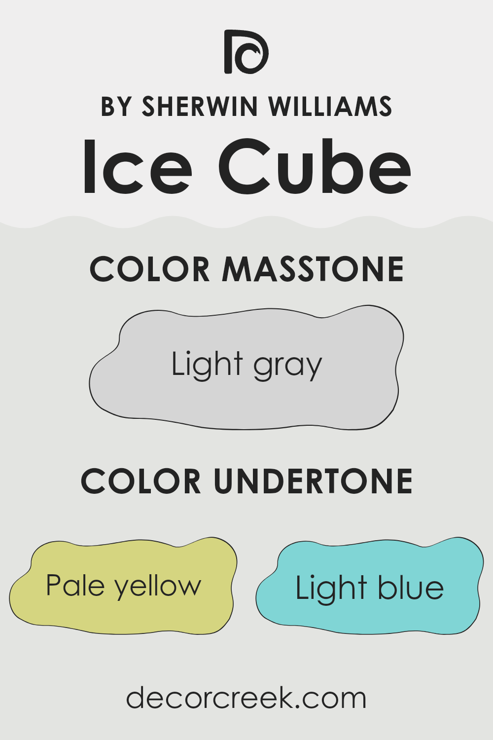
When I look at the color Ice Cube, it reminds me of a fresh, clean slate. It’s a light gray shade that carries a subtle blue undertone, making it incredibly calming and flexible. This color is just perfect for creating a bright, airy feel in any room, without feeling too stark.
I find that it works beautifully in modern and minimalist interior styles because of its simple elegance. For those who appreciate a Scandinavian or contemporary look, Ice Cube is an ideal choice. It serves as a soft backdrop that allows furniture and decor to stand out.
Pairing this color with materials and textures can be quite fun too! I love matching it with natural elements like light woods, which complement its cool tones, and add a touch of warmth to the room. Textiles in wool or cotton with subtle patterns also look fantastic against this color, providing a cozy, inviting environment.
For a bit of a modern edge, metallic finishes like brushed nickel or chrome are great choices for fixtures and fittings, adding just the right amount of sleekness without feeling too intense. Ice Cube is flexible and gentle, perfect for those looking to create a peaceful yet stylish room.
What are the right undertones of Ice Cube SW 6252 ?
Ice Cube by Sherwin Williams is a gentle and flexible shade of gray that carries subtle undertones which can influence its appearance under different lighting conditions. The undertones present in this color include pale yellow, light blue, light purple, mint, pale pink, lilac, and grey. These undertones help to shape the way the color is perceived, making it adaptable to various styles and areas.
When a color like Ice Cube is used on interior walls, its diverse undertones interact with both natural and artificial light. For example, the pale yellow undertone might make the color appear slightly warmer in sunlight, while the light blue could give it a cooler feel in dimmer, artificial lighting. This ability of the color to shift slightly depending on the light sources makes it an excellent choice for rooms that are used at different times of the day.
Furthermore, the mint and lilac undertones can add a touch of freshness or softness to a room, respectively, improving the overall atmosphere. The pale pink undertone provides a hint of warmth, which can make a room feel more welcoming. Lastly, the presence of a grey undertone maintains a sense of balance, ensuring that the color remains neutral and flexible.
This combination of undertones can make Ice Cube a go-to choice for those looking to achieve a calm and adaptable room.
Best Coordinating Colors to use with Ice Cube SW 6252 by Sherwin Williams this year.
Coordinating colors are those that complement one another well and create a balanced, harmonious look when used together in interior design. These colors either blend smoothly because they are similar in tone, or they contrast in a way that is pleasing to the eye, offering a vibrant look without clashing. Coordinating colors can be used for painting walls, choosing furniture, or picking out accessories, helping to tie the entire room together with a cohesive theme.
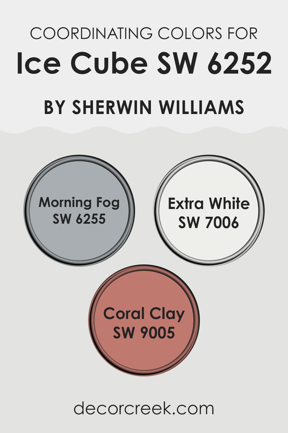
For instance, Ice Cube by Sherwin Williams harmonizes beautifully with colors like Morning Fog, Extra White, and Coral Clay. Morning Fog is a soft, muted gray that offers a subtle contrast to Ice Cube, providing a gentle, calming effect suitable for relaxing areas such as bedrooms or living areas.
Extra White is a bright, clean white that works as a perfect backdrop or accent color, making other colors pop while adding a fresh, open feel to any room. Coral Clay adds a touch of warmth with its gentle reddish tone, creating an inviting and slightly cheerful ambiance, ideal for areas where you want to add a bit of personality and warmth. Together, these colors support one another, improving the overall aesthetic of a room while maintaining a fluid visual flow.
You can see recommended paint colors below:
Trendy Trim Colors of Ice Cube SW 6252 by Sherwin Williams to use this year.
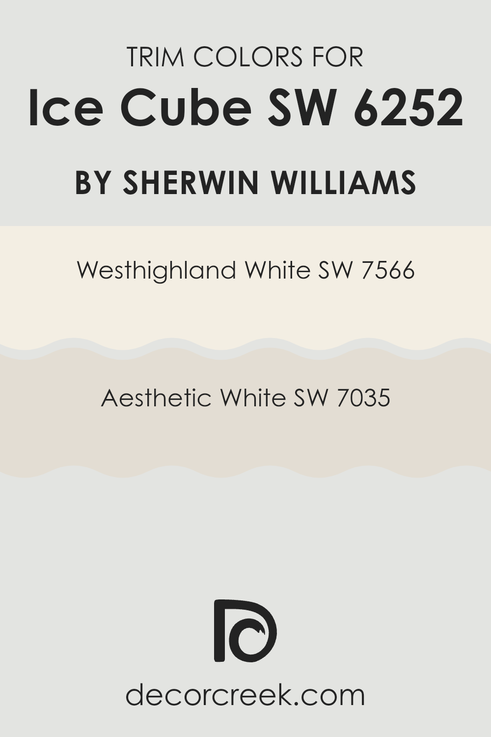
Trim colors play a crucial role in defining the look and feel of a room by providing contrast or complementing the main colors used on the walls. For instance, when using a clean and subtle shade like Sherwin Williams’ Ice Cube (SW 6252), choosing the right trim color can really make the walls stand out and give the room a finished appearance. Trim colors such as Westhighland White (SW 7566) and Aesthetic White (SW 7035) are great options that improve the freshness of Ice Cube without feeling too intense.
Westhighland White is a warm and inviting off-white that works wonderfully as a trim color, offering a gentle contrast that highlights the cooler tones of Ice Cube. The warmth it brings is subtle, ensuring the focus remains on the primary paint color while nicely framing the room.
On the other hand, Aesthetic White is a soft, light gray shade that blends beautifully with Ice Cube, providing a slightly stronger contrast than Westhighland White, yet still maintaining a harmonious look. This color is ideal for creating a crisp, clean boundary along edges and corners, helping to define the architectural details of the room.
You can see recommended paint colors below:
Evergreen Colors Similar to Ice Cube SW 6252 by Sherwin Williams
Similar colors play a crucial role in interior design, as they allow for a harmonious and cohesive look while providing room for depth and subtlety. Using shades like those similar to Ice Cube by Sherwin Williams creates a seamless transition between areas, giving the eye a comforting pathway as it moves around the room. These shades can improve the aesthetic appeal of your home without creating stark contrasts, making the environment feel more unified and thoughtfully curated.
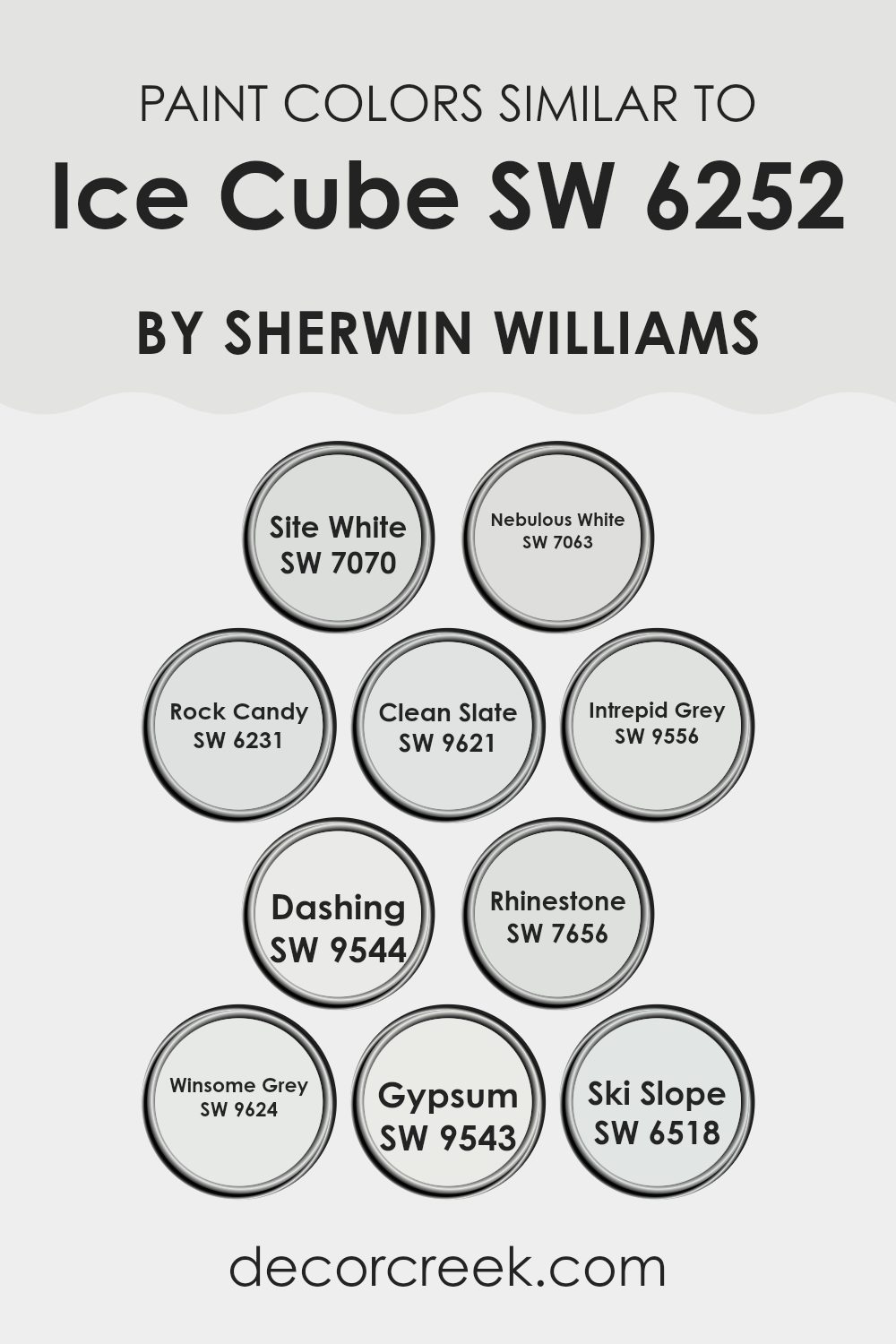
For example, Site White is a clean, nearly pure white that offers a fresh backdrop, ideal for creating a sense of room. Nebulous White has a hint of gray, softening the overall ambiance without demanding attention. Rock Candy brings a slightly cooler tone, providing a subtle contrast that’s both refined and calming.
Clean Slate possesses a deeper gray, setting an elegant yet approachable mood in any room. Intrepid Grey adds a touch of boldness with its richer hue, perfect for accent walls. Dashing is a dynamic color, offering a deeper, more engaging gray that can define areas beautifully.
Rhinestone is one of the lightest, almost reflecting light, which can brighten rooms effortlessly. Winsome Grey blends well with other hues thanks to its understated elegance. Gypsum offers a very light, almost ethereal gray that works well in areas seeking a minimalistic touch. Lastly, Ski Slope introduces a unique touch with its slightly bluish tint, ideal for creating a refreshing vibe. Together, these colors provide an extensive palette that supports a wide range of design preferences.
You can see recommended paint colors below:
- SW 7070 Site White
- SW 7063 Nebulous White
- SW 6231 Rock Candy
- SW 9621 Clean Slate
- SW 9556 Intrepid Grey
- SW 9544 Dashing
- SW 7656 Rhinestone
- SW 9624 Winsome Grey
- SW 9543 Gypsum
- SW 6518 Ski Slope
Colors that Go With Ice Cube SW 6252 by Sherwin Williams
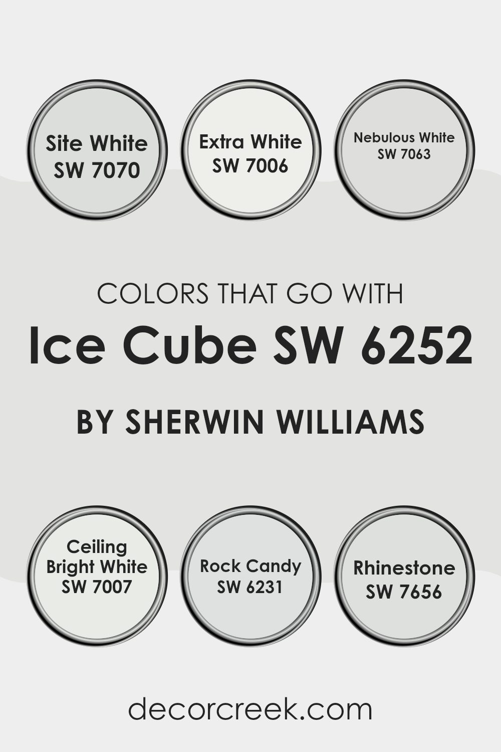
Choosing complementary colors for Ice Cube SW 6252 by Sherwin Williams is essential as it helps in creating a balanced and aesthetically pleasing environment. The colors that go well with Ice Cube, such as Site White, Extra White, Nebulous White, Ceiling Bright White, Rock Candy, and Rhinestone, each contribute to improving the calm and clean look of Ice Cube. These colors help in setting different moods and themes throughout the room, depending on how they are used together. They offer a cool and neutral palette that makes them flexible for different settings from modern kitchens to cozy bedrooms.
Site White is a gentle gray shade with a hint of warmth, which makes it ideal for living areas, providing a subtle contrast without feeling too intense. Extra White is a crisp white, perfect for trims and ceilings, giving a fresh lift to any room.
Nebulous White offers a soft gray balance, which is great for areas that require a hint of differentiation without straying too far from a white scheme. Ceiling Bright White is a very clean white, excellent for a sharp and distinct ceiling line. Rock Candy appears as a soft pale gray, suitable for those looking to maintain a light but slightly grounded interior decor. Lastly, Rhinestone is a lighter gray that adds a hint of coolness, perfect for bathrooms or areas that benefit from a very subtle color variation. Together, these shades complement Ice Cube by creating depth and continuity without feeling too intense.
You can see recommended paint colors below:
- SW 7070 Site White
- SW 7006 Extra White
- SW 7063 Nebulous White
- SW 7007 Ceiling Bright White
- SW 6231 Rock Candy
- SW 7656 Rhinestone
Ice Cube SW 6252 by Sherwin Williams vs Dashing SW 9544 by Sherwin Williams
Ice Cube and Dashing are both colors by Sherwin Williams, but they offer quite different vibes. Ice Cube is a light, cool gray that brings a clean and fresh look to any room. It’s subtle enough to serve as a background color, allowing other elements in a room to stand out. This makes it perfect for modern, minimalist designs where you want to keep things simple yet stylish.
On the other hand, Dashing is a deeper, bolder navy blue. It has a strong presence and adds a dramatic flair to interiors. This color is ideal for creating a focal point in a room or adding depth when used on accent walls. It works well in areas where you want to introduce some energy and contrast, yet it retains a classic feel.
Both colors are flexible and can easily fit into different decor styles, yet they set quite different moods due to their distinctive tones. Where Ice Cube is airy and light, Dashing is rich and impactful.
You can see recommended paint color below:
Ice Cube SW 6252 by Sherwin Williams vs Rock Candy SW 6231 by Sherwin Williams
Ice Cube and Rock Candy are two light shades from Sherwin Williams, each with distinct qualities despite their similarities. Ice Cube has a cool, almost frosty blue undertone, giving it a crisp and clean look. This makes it perfect for areas where you want a fresh and airy feel. On the other hand, Rock Candy is slightly warmer, with soft gray undertones that offer a subtle, soothing vibe. It’s a flexible color that can gently improve a room without feeling too intense.
When deciding between the two, consider the mood you hope to achieve. Ice Cube works well in a modern, minimalistic setting or areas that receive plenty of natural light, reflecting a brighter ambiance.
Rock Candy, however, is more forgiving in areas with fluctuating natural light, maintaining its gentle charm under different lighting conditions. Both shades are light and neutral, making them ideal for small rooms as they help to make areas appear larger and more open.
You can see recommended paint color below:
Ice Cube SW 6252 by Sherwin Williams vs Rhinestone SW 7656 by Sherwin Williams
Ice Cube and Rhinestone by Sherwin Williams are both cool, light grays, but they have subtle differences that impact their appearance. Ice Cube has a slightly bluer undertone, giving it a crisp, refreshing feel, much like its namesake suggests. It’s a color that mimics the freshness of ice, making it ideal for creating a clean and airy atmosphere.
On the other hand, Rhinestone carries a touch more gray and less blue, making it appear somewhat softer and more muted compared to Ice Cube. It’s the kind of color that blends effortlessly into a room, providing a gentle backdrop that complements various decor styles without feeling too intense.
Both colors are extremely flexible but Ice Cube, with its cooler undertone, often works better in areas with lots of natural light. Rhinestone, being softer, is great for areas where a subtler, cozy feel is desired.
You can see recommended paint color below:
Ice Cube SW 6252 by Sherwin Williams vs Ski Slope SW 6518 by Sherwin Williams
The color Ice Cube by Sherwin Williams is a fresh, calming gray that feels light and airy in a room. It has a subtle cool undertone that makes it flexible for different decorating styles, particularly effective in modern and minimalist interiors. It tends to make rooms look slightly more spacious and crisp.
On the other hand, Ski Slope by Sherwin Williams is a softer, more delicate color. It’s a pale gray that leans towards a slightly warmer tone compared to Ice Cube. This warmth makes it ideal for creating a cozy atmosphere, suitable for areas where comfort and softness are desired, like bedrooms or living areas.
In summary, while both colors belong to the gray family, Ice Cube offers a cooler, sharper presence that suits modern aesthetics, making rooms appear larger. Ski Slope, with its warmer tones, is better suited for areas where you want to create a soft, inviting feel.
You can see recommended paint color below:
- SW 6518 Ski Slope
Ice Cube SW 6252 by Sherwin Williams vs Clean Slate SW 9621 by Sherwin Williams
Comparing Ice Cube and Clean Slate by Sherwin Williams involves looking at two distinct shades. Ice Cube is a light, fresh gray that almost has a subtle blue undertone.
This makes it ideal for creating a bright and airy room. It works well in areas that get a lot of natural light, improving an open, clean feel. In contrast, Clean Slate is a much darker gray, providing a bold and striking effect.
It has a depth that can make large rooms feel cozier and more grounded. If you’re looking to make a statement or accent a specific area, Clean Slate would be the go-to. Both colors, however, maintain a modern feel and can be flexible in their use, depending on the surrounding decor and your desired ambiance.
You can see recommended paint color below:
Ice Cube SW 6252 by Sherwin Williams vs Winsome Grey SW 9624 by Sherwin Williams
Ice Cube and Winsome Grey are both colors by Sherwin Williams that offer subtle and neutral tones, but with their own unique vibes. Ice Cube is a very light, almost white, blue that gives a crisp and clear feel to a room.
It is cool-toned and best suits areas where you want a fresh and airy atmosphere, like bathrooms or small areas that need to feel more open.
On the other hand, Winsome Grey is a deeper, warm gray that adds a cozy and welcoming touch. Unlike Ice Cube, this color provides more warmth due to its gray base, making it a great choice for living rooms or bedrooms where a gentle, inviting feel is desired. Although both colors are flexible, Winsome Grey works better in areas that benefit from a hint of warmth and depth, whereas Ice Cube is ideal for creating a bright and clean look.
You can see recommended paint color below:
Ice Cube SW 6252 by Sherwin Williams vs Nebulous White SW 7063 by Sherwin Williams
Ice Cube and Nebulous White are both soft, neutral colors by Sherwin Williams, but they carry distinct tones. Ice Cube holds a subtle hint of blue, giving it a fresh, crisp vibe. This cooler tone can make a room feel airy and open, ideal for creating a light and clean look in areas like bathrooms or modern kitchens.
On the other hand, Nebulous White leans towards a cloudy gray color. This makes it slightly warmer than Ice Cube, providing a cozy, welcoming ambiance. It’s great for living rooms and bedrooms where a soft, more inviting atmosphere is desired.
When deciding between the two, consider the room’s purpose and the mood you want to set. Ice Cube works well where you want a sharp, minimalistic style, while Nebulous White is better for a gentle, relaxed feel. Both colors are flexible and pair well with different decor styles, helping you achieve a beautiful and harmonious room.
You can see recommended paint color below:
Ice Cube SW 6252 by Sherwin Williams vs Site White SW 7070 by Sherwin Williams
The main color, Ice Cube, is a very light gray with subtle blue undertones, creating a cool and refreshing feel in any room. This color works well in areas that seek a clean, bright, and open atmosphere.
On the other hand, Site White is a true white with a hint of gray, giving it a neutral and balancing quality. It’s a great choice for rooms that aim for a sharp, modern look.
Both Ice Cube and Site White are quite flexible, but Ice Cube lends a slightly cooler touch due to its blue hints, while Site White offers a more neutral canvas. These differences make Ice Cube better suited for a minimalist style aiming for a hint of color, whereas Site White is ideal for creating a crisp, uncluttered backdrop that goes well with any decor.
You can see recommended paint color below:
Ice Cube SW 6252 by Sherwin Williams vs Gypsum SW 9543 by Sherwin Williams
Ice Cube and Gypsum by Sherwin Williams are two subtle colors that serve unique purposes in home decor. Ice Cube is a light gray with a cool undertone, making it feel fresh and clean. It’s particularly good for creating a bright and airy feel in a room. It lends itself well to areas that aim for a modern look and works with any kind of light.
On the other hand, Gypsum is softer and warmer compared to Ice Cube. It’s a gentle off-white with a hint of beige, giving it a cozy and inviting aspect. This color is ideal for more traditional or relaxed settings. It pairs beautifully with natural materials and soft textures.
Both colors are flexible and can be used in different settings, from bathrooms and kitchens to living rooms and bedrooms. Whether choosing Ice Cube for a sharp, clean style, or Gypsum for a warm, nurturing atmosphere, each color has its strengths for different decorating visions.
You can see recommended paint color below:
Ice Cube SW 6252 by Sherwin Williams vs Intrepid Grey SW 9556 by Sherwin Williams
Ice Cube and Intrepid Grey, both from Sherwin Williams, offer unique shades that can change the feel of a room. Ice Cube is a light, airy blue with a crisp, clean vibe that can make small areas appear larger and brighter. It’s perfect for creating a fresh, relaxing atmosphere in rooms like kitchens and bathrooms or anywhere you want a hint of cool calmness.
On the other hand, Intrepid Grey is a deeper, bold grey with a strong presence, ideal for adding drama and depth to a room. It works well in areas that benefit from a more striking, grounded appearance, such as living rooms or bedrooms. This color can also be a good choice for exterior parts of a home, giving it a modern look.
Together, these two colors can complement each other nicely in a home, offering a balance between light and dark, subtle and pronounced. This makes them suitable for different themes and decorative experiments in various areas.
You can see recommended paint color below:
After reading about SW 6252 Ice Cube by Sherwin Williams, I’ve learned quite a bit about this unique paint color. Ice Cube is a cool and light gray color that can make a room feel calm and light. It’s great because it doesn’t take over the room but adds just the right amount of color to make the room interesting.
This color works well in many places in a house, like a living room or a bedroom, because it pairs beautifully with both bright colors and other neutral shades. So, whether you want your room to have pops of color or a more laid-back look, Ice Cube can handle it. It’s like a quiet friend that gets along with everyone!
What’s also special about Ice Cube is that it changes a bit depending on the light. During the day, it looks more alive and bright, and at night, it’s more subdued and calm. This makes it an excellent choice for someone who wants a color that adapts throughout the day.
To conclude, Sherwin Williams’ Ice Cube is a wonderful choice if you are looking for a paint color that is gentle and flexible for any room in your house. It’s simple yet effective in improving the beauty of your home.
Ever wished paint sampling was as easy as sticking a sticker? Guess what? Now it is! Discover Samplize's unique Peel & Stick samples.
Get paint samples

