I recently had the chance to work with SW 6686 Lemon Chiffon by Sherwin Williams, and I want to share my experience with you. This particular shade of yellow is soft and subtle, offering a hint of brightness without overpowering a space. It captures the essence of a sunny morning without the glare, making it an ideal choice if you’re looking to add a touch of warmth to your room.
Using Lemon Chiffon in a living area or a bedroom can create a gentle backdrop for a wide range of décor styles. Whether you’re aiming for a classic look with vintage pieces or a more contemporary aesthetic with sleek furniture, this color complements nicely. It helps other colors in the room pop while maintaining a harmonious atmosphere.
For anyone considering a paint update or starting a new decorating project, Lemon Chiffon is a versatile option that adapts well to various lighting conditions, enhancing natural light during the day and creating a cozy, inviting glow in the evening.
Let’s see how this color works practically in home décor and why it might be the perfect choice for your next project.
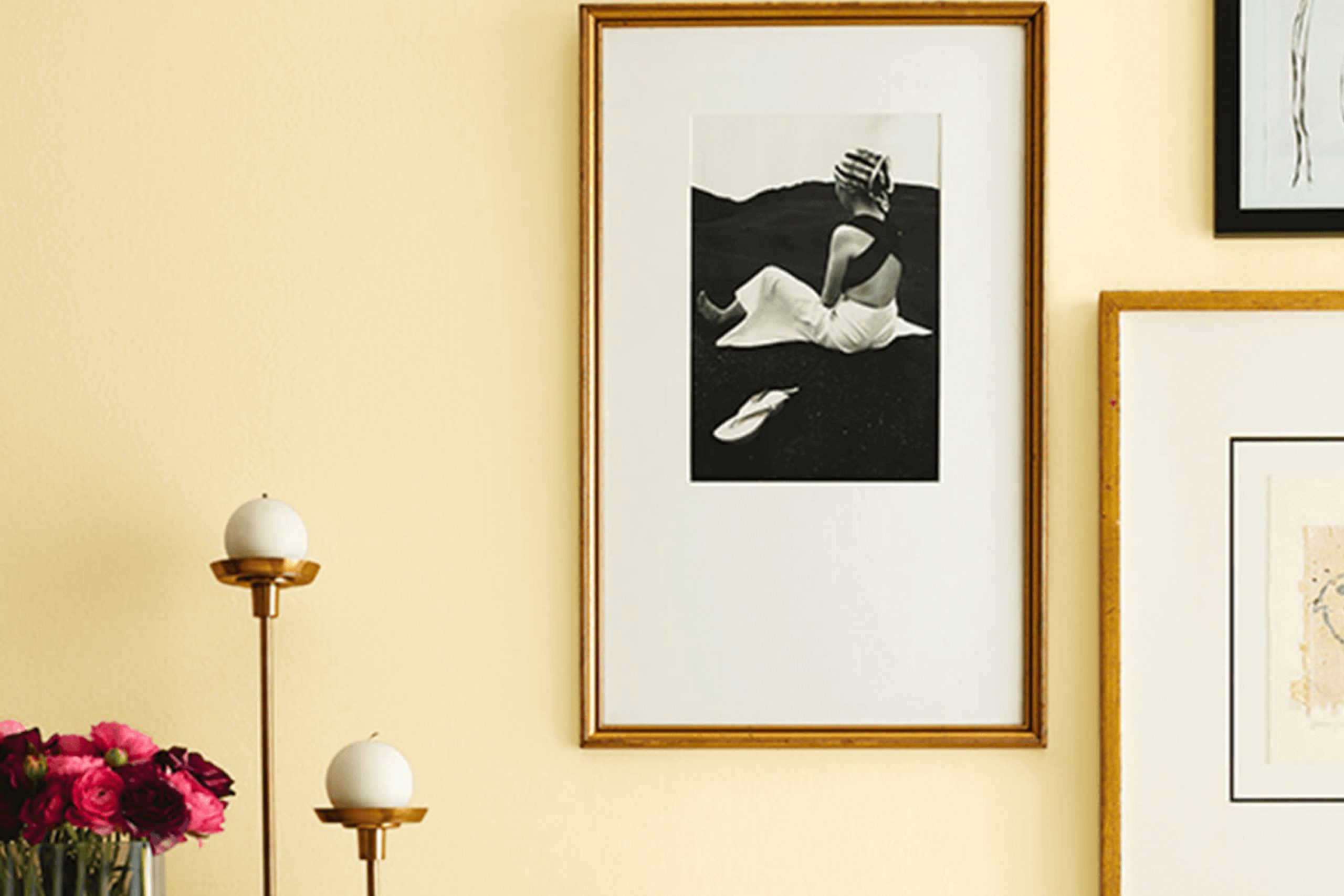
What Color Is Lemon Chiffon SW 6686 by Sherwin Williams?
Lemon Chiffon is a light and airy yellow shade that brings a cheerful warmth to any space. Its soft brightness is highly versatile, complementing various interior styles and settings. The color is like a gentle whisper of sunshine on a spring morning, making it a delightful choice for enhancing natural light in a room.
This sunny hue works wonders in cottage and farmhouse-style interiors where its gentle presence supports a light, welcoming environment. It also fits beautifully into a Scandinavian decor, known for its clean and muted color palettes, where Lemon Chiffon can add a subtle splash of warmth without overpowering the minimalist vibe.
Pairing well with natural materials, this color looks stunning alongside light woods like oak and birch, which help maintain the airy feel of a room. Wicker and rattan furniture also complement its light-hearted nature, promoting a relaxed, cozy atmosphere. For textiles, consider linen or soft cotton in white or light floral patterns to keep the space feeling fresh and bright.
In terms of textures, smooth, matte finishes on walls work best with Lemon Chiffon as they prevent excessive shine and keep the color grounded. Accents in pastel or creamy tones can also tie the space together, creating a gentle, cohesive look that feels effortless and inviting.
Is Lemon Chiffon SW 6686 by Sherwin Williams Warm or Cool color?
Lemon Chiffon is a paint color by Sherwin Williams that brings a bright and cheerful vibe to any room. The color is a soft yellow that mimics the light, airy feel of chiffon fabric. It’s perfect for spaces where you want to add a hint of sunshine without overwhelming the room with bold color.
This shade works well in kitchens and bathrooms where natural light can enhance its warm tones. It’s also a great choice for children’s rooms or play areas because of its playful and inviting feel.
When used in living areas, Lemon Chiffon can make the space feel more open and welcoming. It pairs well with white trim or furniture, which helps to keep the look fresh and clean. For those looking to add a bit of personality, this color also coordinates well with blues, greens, and even some purples, allowing for a variety of decorating styles. Overall, Lemon Chiffon is a versatile color that can help to brighten up any home.
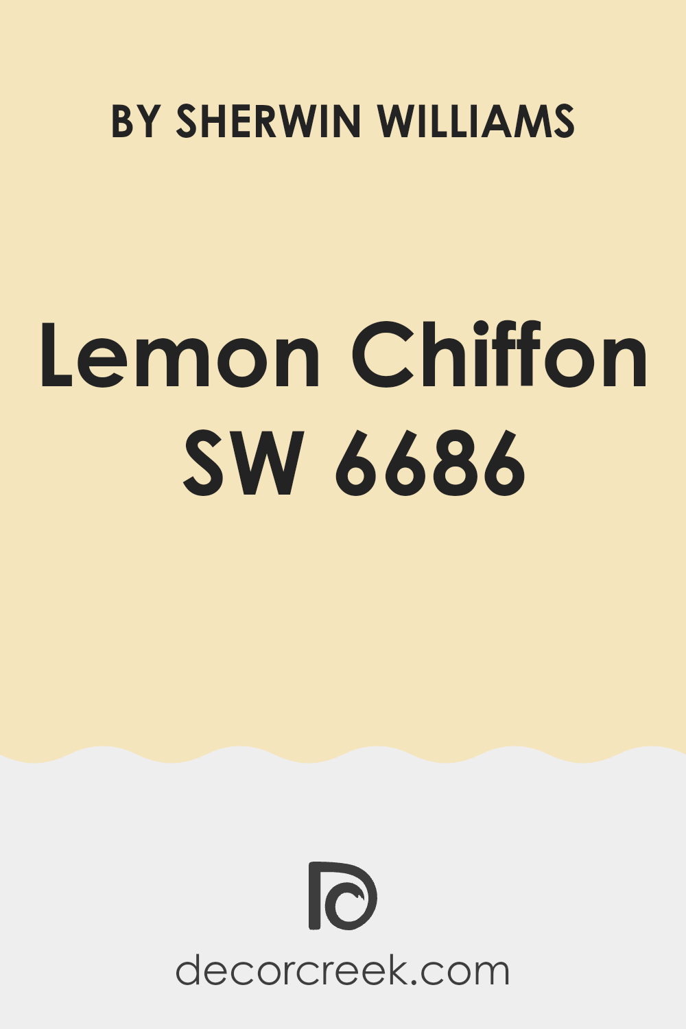
Undertones of Lemon Chiffon SW 6686 by Sherwin Williams
Lemon Chiffon is a soft, subtle hue offered by Sherwin Williams that beautifully complements various interior designs and styles. Though primarily viewed as a pale, creamy yellow, Lemon Chiffon possesses a range of undertones including pale yellow, light purple, light blue, pale pink, mint, lilac, and grey. These undertones are subtle hues mixed within the paint that can influence how the color appears under different lighting conditions.
Undertones play a crucial role in the overall appearance of paint colors. Depending on the lighting and surrounding colors, an undertone can make a color look cooler or warmer. For instance, in a room with plenty of natural light, Lemon Chiffon might reveal its pale yellow or light blue undertones, giving it a fresher and brighter look.
Conversely, in a space with less natural light or with artificial lighting, the grey or lilac undertones could become more apparent, making the color appear slightly muted and cooler. When painting interior walls with Lemon Chiffon, it’s essential to consider these undertones as elements such as room size, lighting, and decor will interact with the color, influencing the room’s overall ambiance.
Thus, when choosing colors like Lemon Chiffon for your walls, considering these undertones will help you achieve the desired effect and harmony in your living space. They enable a versatile use of Lemon Chiffon that can vary from warm and inviting to soft and subdued, based on your room’s characteristics and personal style.
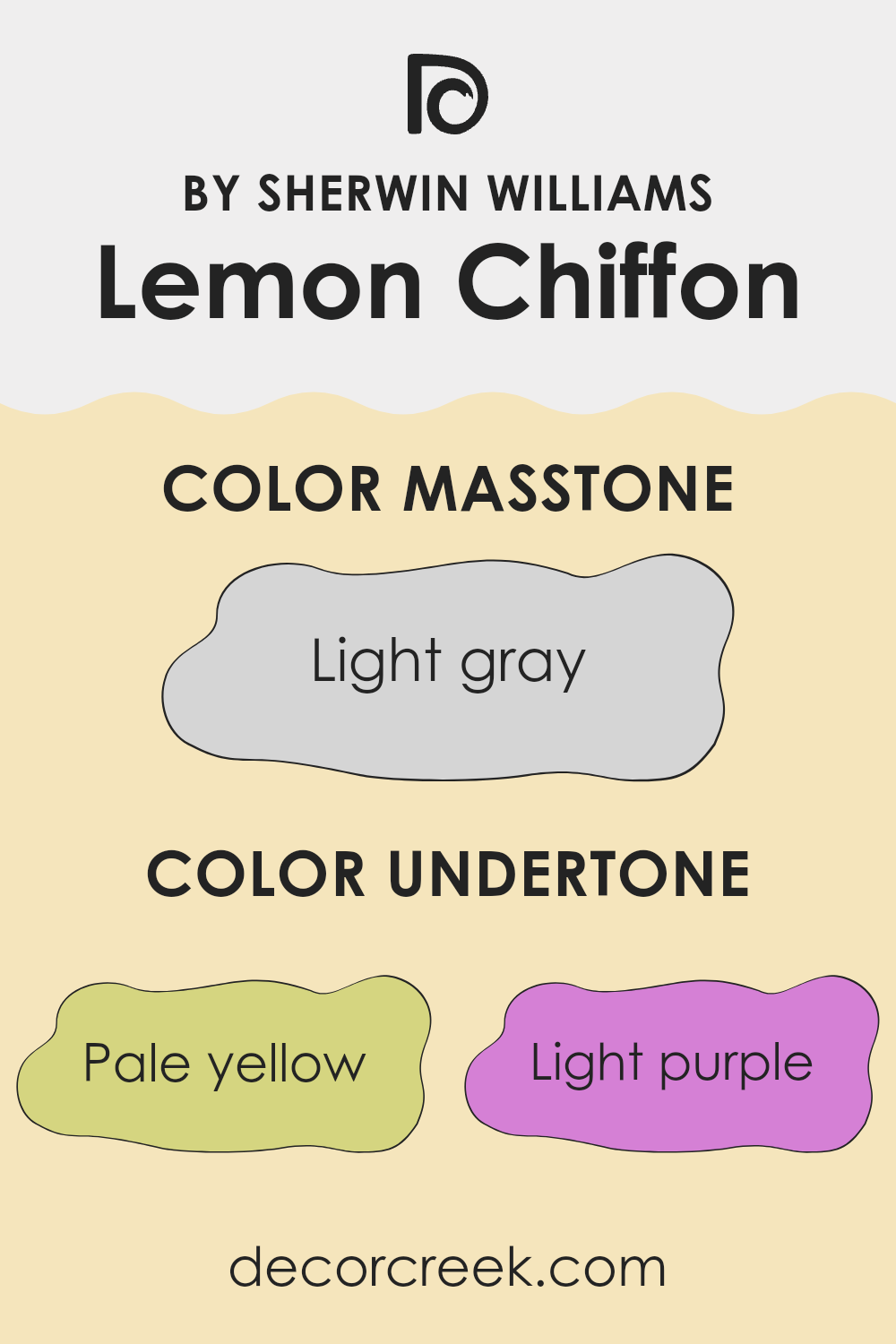
What is the Masstone of the Lemon Chiffon SW 6686 by Sherwin Williams?
Lemon Chiffon SW 6686, a light gray color with a hue code of #D5D5D5, has a subtle yet effective presence in home decor. This particular shade acts as a versatile background in various spaces, easily blending with other colors.
Due to its light gray nature, it gently influences the ambiance of a room, making spaces appear brighter and larger. This characteristic is particularly useful in smaller rooms or areas with limited natural light. The neutrality of Lemon Chiffon SW 6686 allows it to serve as a calm base, enabling homeowners to add decorative elements of any color without the fear of clashing.
It’s perfect for those who like to change their decor frequently, as it pairs well with bold colors as well as softer, muted tones. Overall, this color offers a clean canvas for personal expression while maintaining a fresh, tidy look that appeals to a wide audience.
How Does Lighting Affect Lemon Chiffon SW 6686 by Sherwin Williams?
Lighting plays a significant role in how we perceive colors, as different light sources can dramatically change how a color appears. This effect is crucial to consider when choosing paint for a room, such as the color Lemon Chiffon.
Lemon Chiffon is a subtly warm and gentle yellow. Under natural light, this shade glows softly, bringing a sunlit feel to any space. Its lightness can make small rooms appear larger and more open. On the other hand, under artificial lighting, especially those with a yellow or warmer tint like incandescent bulbs, Lemon Chiffon can appear richer and more golden, adding a cozy glow to the atmosphere.
The direction a room faces also affects how Lemon Chiffon looks throughout the day:
- North-facing rooms – These rooms get less direct sunlight and can often appear cooler or have bluish light. Here, Lemon Chiffon might look slightly muted and less vibrant, presenting a calm, subtle hue.
- South-facing rooms – With plentiful sunlight, south-facing rooms highlight the best of Lemon Chiffon. The paint will appear brighter and truer to its color swatch, enhancing the cheerful vibe of the space.
- East-facing rooms – Morning light in these rooms will make Lemon Chiffon look very bright and lively, perfect for spaces used mainly in the morning. As the day progresses and the natural light diminishes, the yellow may take on a softer appearance.
- West-facing rooms – In the afternoon and evening as the sun sets, west-facing rooms catch those golden rays, which can intensify the warmth of Lemon Chiffon, making it appear vibrant and dynamic at this time of day.
Knowing how lighting affects a color like Lemon Chiffon can help you decide if it’s the right choice for your space, considering both its natural and artificial lighting conditions. This way, you ensure the color always complements the mood and functionality of the room, no matter the time of day.
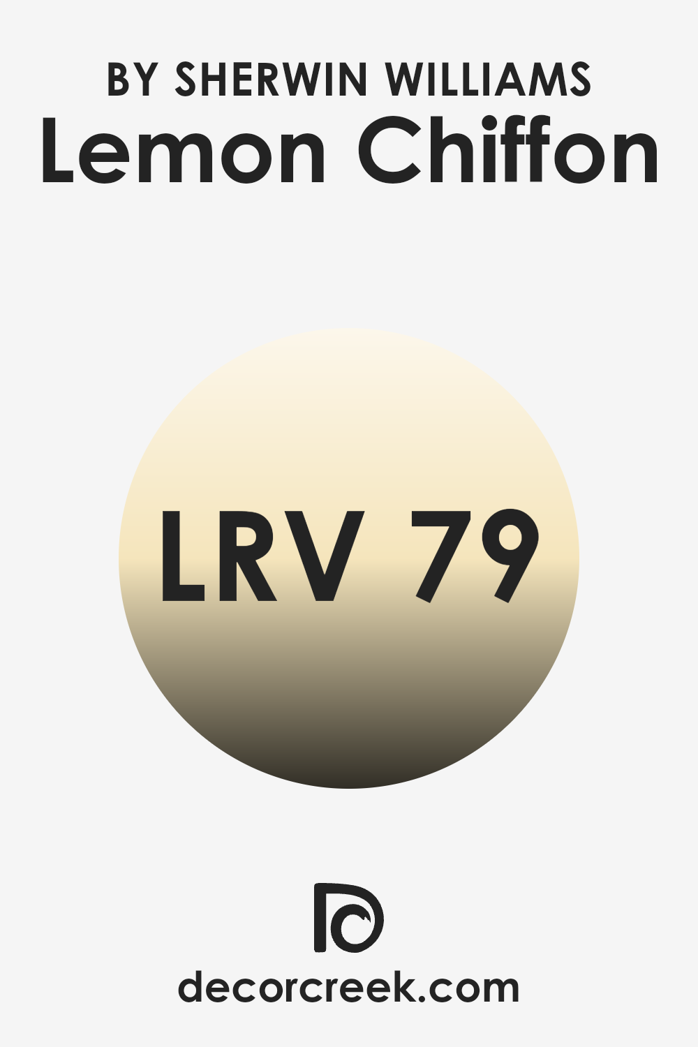
What is the LRV of Lemon Chiffon SW 6686 by Sherwin Williams?
LRV stands for Light Reflectance Value, which measures the percentage of light a paint color reflects back into a room. It’s a useful way to predict how light or dark a color will appear once it’s up on your walls.
If a paint has a high LRV, it means it reflects more light, making a space feel brighter and potentially appear larger. In contrast, colors with lower LRVs absorb more light, which can make a room feel cozier but smaller and darker.
In the case of the color Lemon Chiffon with an LRV of approximately 79, it falls into the category of lighter shades. This high LRV means that it reflects a lot of light, illuminating a space well when used on walls. This characteristic can be particularly beneficial in rooms that are smaller or have limited natural light.
The light and airy feel provided by this color can make such spaces feel more open and welcoming without being overwhelming. Additionally, colors like this can help in hiding minor imperfections on walls due to their high light reflectance.
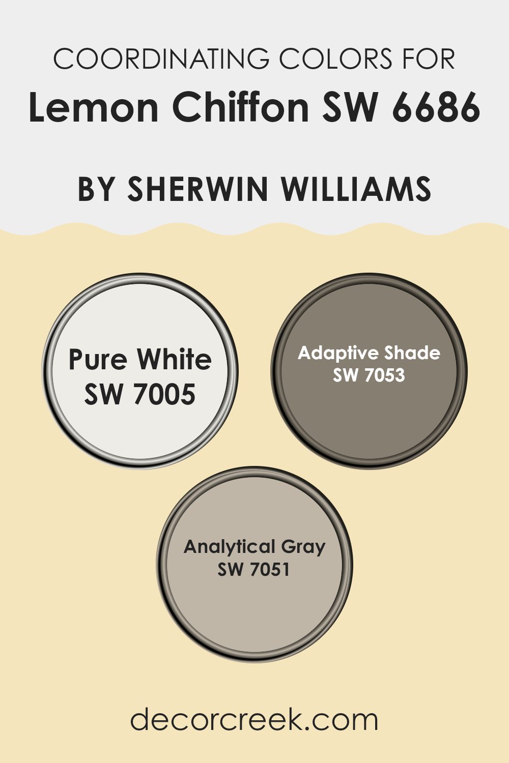
Coordinating Colors of Lemon Chiffon SW 6686 by Sherwin Williams
Coordinating colors are those that harmonize well with a main color to create a balanced and pleasing visual effect. For example, Lemon Chiffon by Sherwin Williams can be paired with specific coordinating colors to enhance its beauty and impact in a space. These coordinating shades help in achieving a cohesive look by complementing the primary color without overpowering it. Utilizing coordinating colors effectively can add depth and character to any room, enhancing the overall aesthetic appeal.
The colors Pure White, Adaptive Shade, and Analytical Gray are excellent complements to Lemon Chiffon. Pure White is a clean and bright shade that can bring out the vibrancy in Lemon Chiffon, making the space feel fresh and airy.
It works well for trim, ceilings, and even furniture to provide a crisp contrast. Adaptive Shade, a subtle and muted gray, offers a more grounded approach, giving a room a balanced, polished look without distracting from the primary color. Lastly, Analytical Gray, a slightly deeper gray, lends a mellow yet impactful presence, suitable for furniture or accent walls. This color adds a nice depth to the setting, working well in areas where you want to add some sophistication without using very dark or bold colors.
Together, these colors blend well with Lemon Chiffon to create a harmonious and inviting space.
You can see recommended paint colors below:
- SW 7005 Pure White (CHECK A SAMPLE)
- SW 7053 Adaptive Shade (CHECK A SAMPLE)
- SW 7051 Analytical Gray (CHECK A SAMPLE)
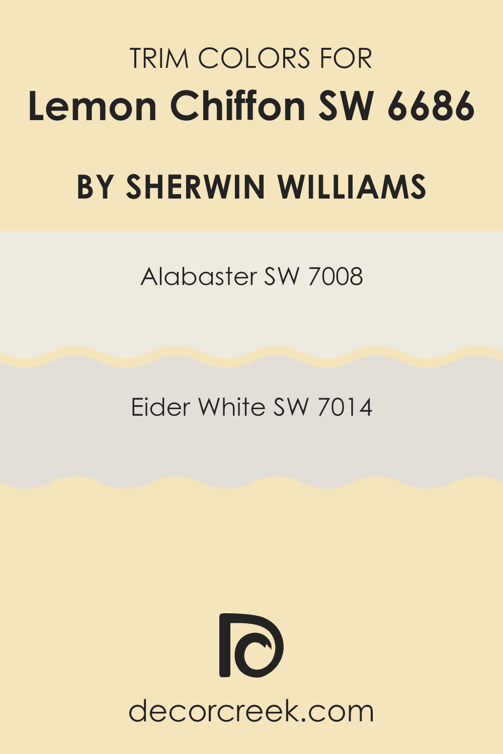
What are the Trim colors of Lemon Chiffon SW 6686 by Sherwin Williams?
Trim colors are specific shades used to highlight or define the edges and accents on walls, doorways, and windows, enhancing the architecture and overall appearance of a room. These colors are particularly essential when working with a primary wall color like Lemon Chiffon by Sherwin Williams, a warm, inviting yellow.
The right trim color creates a crisp border that can subtly complement or mildly contrast with the main color, bringing balance and coherence to an interior design. Choosing a suitable trim color can also affect the perception of space and light in a room, making it seem brighter or more spacious.
For Lemon Chiffon, Alabaster SW 7008 and Eider White SW 7014 are excellent trim choices. Alabaster is a warm but bright white that has a softness to it, making it a natural pairing for the sunny Lemon Chiffon, as it prevents the room from feeling overwhelming and keeps the ambiance relaxed and airy.
On the other hand, Eider White has a slightly gray undertone, offering a subtler contrast that softly outlines architectural features, thereby providing depth and definition without clashing with the gentle vibrancy of Lemon Chiffon. Both colors support in enhancing the main yellow shade while maintaining a fresh and cohesive look.
You can see recommended paint colors below:
Colors Similar to Lemon Chiffon SW 6686 by Sherwin Williams
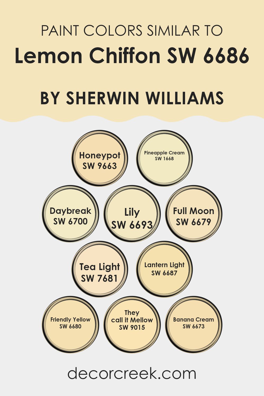
Choosing similar colors is crucial when designing a space to create a cohesive and harmonious atmosphere. Colors close in hue, like variations of yellow inspired by Lemon Chiffon by Sherwin Williams, work together seamlessly to provide a warm and inviting feel. These shades share a common color base yet vary in brightness and depth, allowing for a rich, layered look without clashing.
Honeypot is a warm, golden yellow that gives off a cozy, sunlit vibe. Pineapple Cream has a soft, creamy texture in its appearance, lending subtle elegance to a room. Daybreak offers a vivid, energetic yellow, great for energizing a space.
Lily is slightly softer, akin to the delicate petals of a flower, perfect for creating a soft, welcoming environment. Full Moon is brighter, offering a gleam like the night sky’s moonlight, ideal for adding light to darker spaces. Tea Light resembles the soft glow from a candle, suggesting calm and relaxation. Lantern Light is a vibrant, cheerful yellow, enlivening any area it graces.
Friendly Yellow boasts a straightforward, clear yellow hue that is sunny and approachable. They Call It Mellow is a subdued shade, excellent for relaxed accents. Lastly, Banana Cream has a delectable, airy quality that brings a light-hearted, playful mood to interiors.
Each of these colors supports each other, enhancing the overall aesthetic without overwhelming the senses, perfect for achieving a balanced and inviting décor.
You can see recommended paint colors below:
- SW 9663 Honeypot (CHECK A SAMPLE)
- SW 1668 Pineapple Cream (CHECK A SAMPLE)
- SW 6700 Daybreak (CHECK A SAMPLE)
- SW 6693 Lily (CHECK A SAMPLE)
- SW 6679 Full Moon (CHECK A SAMPLE)
- SW 7681 Tea Light (CHECK A SAMPLE)
- SW 6687 Lantern Light (CHECK A SAMPLE)
- SW 6680 Friendly Yellow (CHECK A SAMPLE)
- SW 9015 They call it Mellow (CHECK A SAMPLE)
- SW 6673 Banana Cream (CHECK A SAMPLE)
Colors that Go With Lemon Chiffon SW 6686 by Sherwin Williams
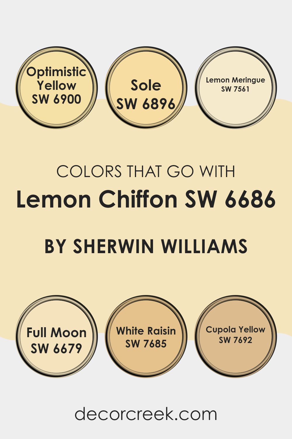
Choosing complementary colors for Lemon Chiffon SW 6686 by Sherwin Williams is crucial in ensuring that your space feels cohesive and well-designed. These colors help in creating a harmonious environment by balancing the bright and sunny tone of Lemon Chiffon. Colors like Optimistic Yellow SW 6900, which is a bright and energetic shade, enhance the vivaciousness in a room, making it feel lively and cheerful. Sole SW 6896 offers a deeper, rich yellow hue, providing a contrast that can add depth and interest to the visual palette.
Lemon Meringue SW 7561 is reminiscent of a pale, creamy yellow, providing a softer match that gently complements Lemon Chiffon without overwhelming it. Full Moon SW 6679 gives a subtle yellow, slightly paler than Lemon Chiffon, perfect for creating a gentle gradient of yellows that are easy on the eyes.
White Raisin SW 7685 adds a unique twist with a yellow-tinted off-white, ideal for trims and ceilings where a soft highlight is needed. Finally, Cupola Yellow SW 7692, brings a mustard-like shade that could add a vintage or rustic touch, creating an interesting visual layer that complements the primary yellow tones. Together, these colors work to create a delightful visual flow in any space, whether it’s used for walls, accents, or decorative features.
You can see recommended paint colors below:
- SW 6900 Optimistic Yellow (CHECK A SAMPLE)
- SW 6896 Sole (CHECK A SAMPLE)
- SW 7561 Lemon Meringue (CHECK A SAMPLE)
- SW 6679 Full Moon (CHECK A SAMPLE)
- SW 7685 White Raisin (CHECK A SAMPLE)
- SW 7692 Cupola Yellow (CHECK A SAMPLE)
How to Use Lemon Chiffon SW 6686 by Sherwin Williams In Your Home?
Lemon Chiffon by Sherwin Williams is a soft, gentle yellow paint color that brings a cheerful brightness to any room. Its warm tone works beautifully to make spaces feel cozy and inviting without being too bold or overwhelming. This color is perfect for living rooms or kitchens where you want to add a sunny vibe, helping to boost mood and make the area feel more welcoming.
For bedrooms, pairing Lemon Chiffon with soft whites or light grays creates a calm, pleasant atmosphere, ideal for relaxing. In smaller spaces like bathrooms, this shade can help to reflect light, making the area seem larger and more open.
Additionally, Lemon Chiffon is great for accent walls. You can use it to highlight a particular part of a room, such as behind a bed in a bedroom or around a fireplace in a living room. This color also pairs well with a variety of decors, matching well with both modern and classic styles. Using Lemon Chiffon is a great way to add a touch of warmth to any home.
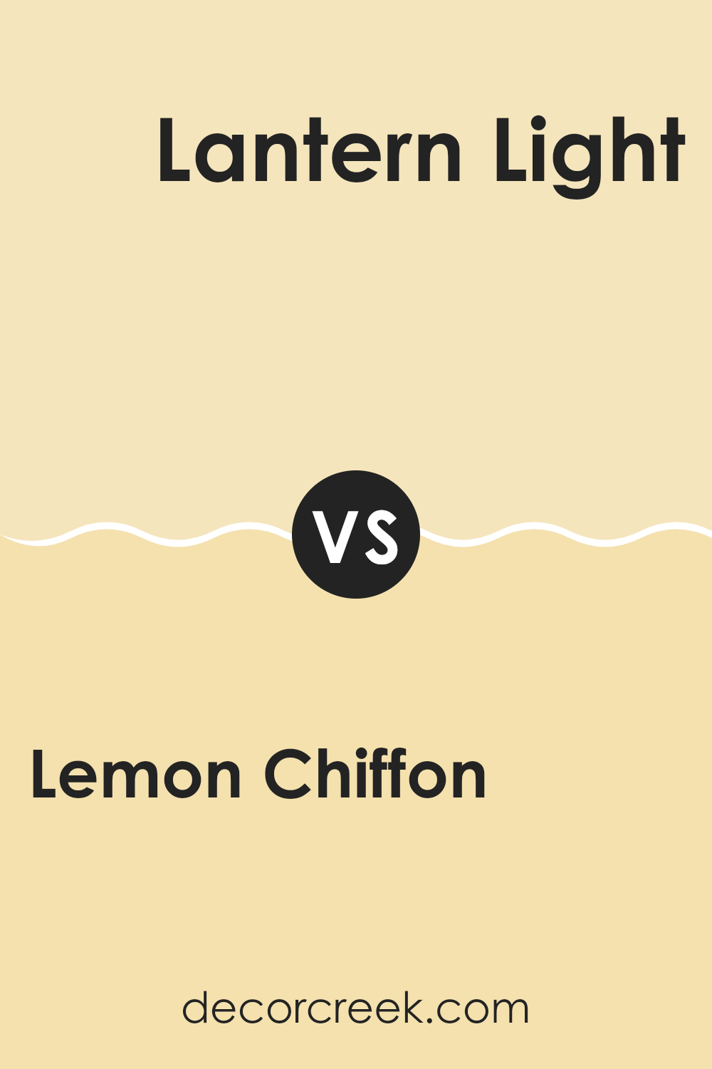
Lemon Chiffon SW 6686 by Sherwin Williams vs Lantern Light SW 6687 by Sherwin Williams
Lemon Chiffon and Lantern Light are two warm, inviting colors from Sherwin Williams that are quite similar but have subtle differences. Lemon Chiffon has a soft, creamy appearance with a hint of yellow that brings a light and airy feel to any room.
It’s perfect for creating a bright, welcoming space. On the other hand, Lantern Light is slightly deeper and richer, leaning more toward a pure yellow shade. This color adds a cheerful and lively energy to spaces, making it ideal for areas where you want a bit of brightness without overwhelming brightness.
Both colors work well in spaces that need a touch of warmth, and they pair well with whites and grays. Choosing between them depends on how subtle or bold you want the yellow tint to be in your decor.
You can see recommended paint color below:
- SW 6687 Lantern Light (CHECK A SAMPLE)
Lemon Chiffon SW 6686 by Sherwin Williams vs Daybreak SW 6700 by Sherwin Williams
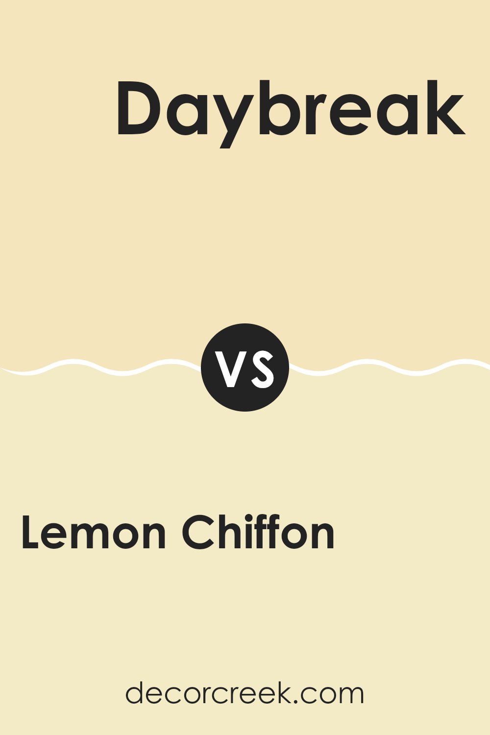
Lemon Chiffon and Daybreak are two distinct colors from Sherwin Williams, each offering its own unique vibe. Lemon Chiffon is a soft, pale yellow that brings a gentle warmth to any space. It’s light and airy, making it a great choice for creating a cozy, welcoming atmosphere in areas like living rooms or kitchens.
In contrast, Daybreak is a vibrant, youthful green with a touch of brightness that can energize a room. It’s perfect for spaces where you want to inject some life and freshness, such as a bathroom or a study area.
While Lemon Chiffon has a subtle, soothing quality, Daybreak stands out more and often works best in spaces that benefit from a pop of color. Both shades reflect light well, but the impact of Lemon Chiffon is more muted, whereas Daybreak can make more of a statement. This makes each color suitable for different purposes depending on the mood you want to set in your room.
You can see recommended paint color below:
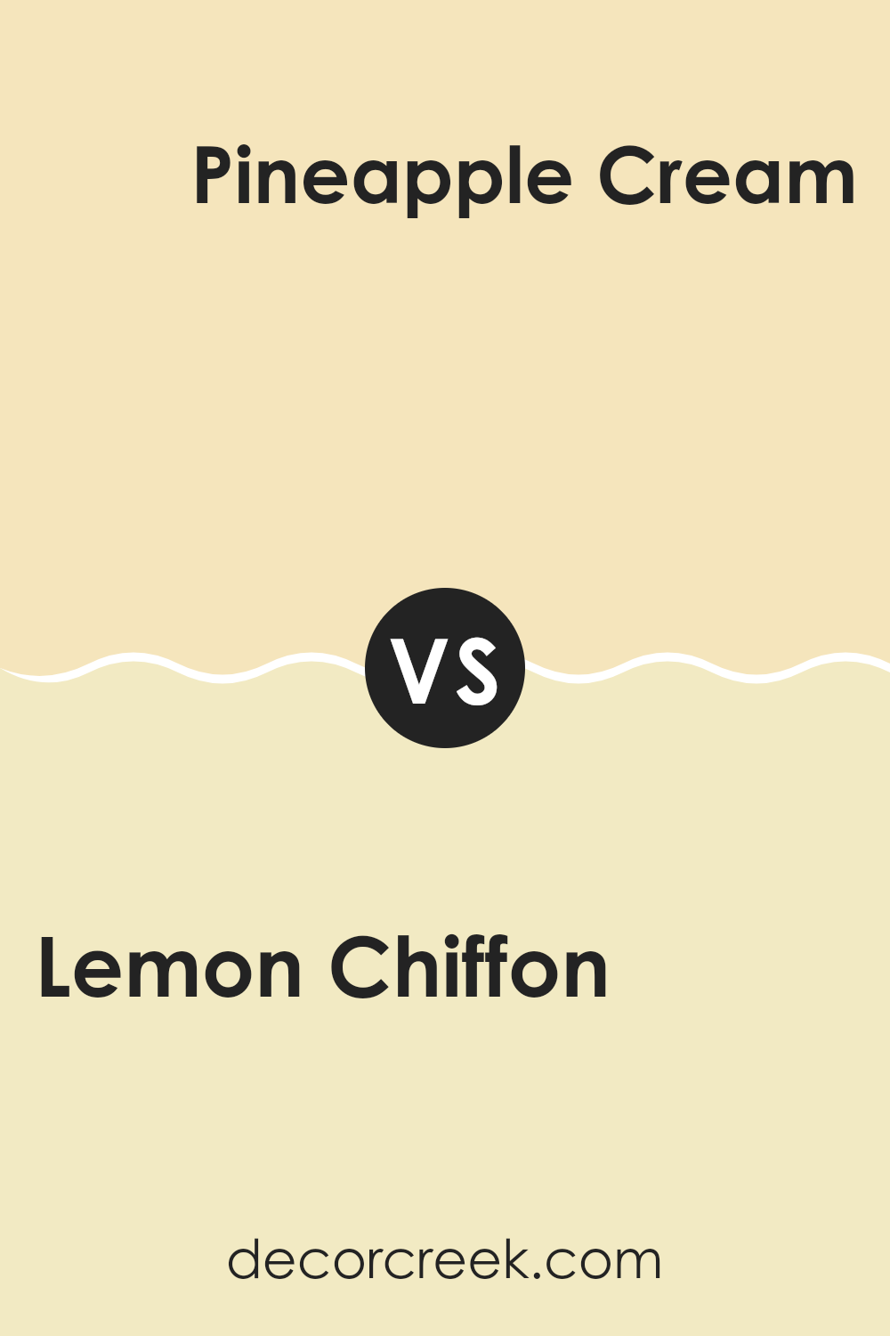
Lemon Chiffon SW 6686 by Sherwin Williams vs Pineapple Cream SW 1668 by Sherwin Williams
Lemon Chiffon and Pineapple Cream, both by Sherwin Williams, offer a bright and cheerful palette but differ subtly in their tones. Lemon Chiffon is a soft, pale yellow, akin to the light color you might see inside a lemon pie. It’s gentle on the eyes and gives spaces a clean, airy feel, making it perfect for kitchens, bathrooms, or any room that benefits from a sunny touch.
On the other hand, Pineapple Cream is a shade deeper, reflecting more of a creamy, rich yellow reminiscent of the ripe flesh of a pineapple. This color tends to add a bit more warmth to an environment than Lemon Chiffon, which is slightly lighter. This makes Pineapple Cream a great choice for creating a cozy, welcoming atmosphere in living rooms or bedrooms.
Both colors are versatile and work well in spaces that aim for a bright and open vibe. Your choice between them could depend on how subtle or warm you want the room to feel.
You can see recommended paint color below:
- SW 1668 Pineapple Cream (CHECK A SAMPLE)
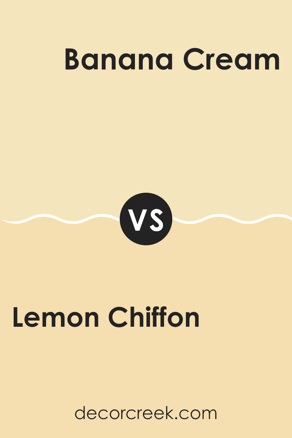
Lemon Chiffon SW 6686 by Sherwin Williams vs Banana Cream SW 6673 by Sherwin Williams
Lemon Chiffon and Banana Cream are two light and bright shades by Sherwin Williams, ideal for creating a cheery atmosphere. Lemon Chiffon is a soft, pale yellow that brings to mind a hint of spring sunlight.
It’s quite subtle and works wonderfully in spaces that require a gentle touch of color without overwhelming the senses. On the other hand, Banana Cream has a richer, more buttery tone. This color is slightly more saturated than Lemon Chiffon, offering a fuller yellow that can make a room feel more warm and cozy.
Both colors are excellent choices for anyone looking to add a splash of cheer to their home. Lemon Chiffon is perfect for those who prefer a lighter, almost pastel shade. Banana Cream suits those looking for something a little more vibrant without going too bold. Whether used for a full room or just an accent wall, both colors provide a fresh and welcoming atmosphere.
You can see recommended paint color below:
- SW 6673 Banana Cream (CHECK A SAMPLE)
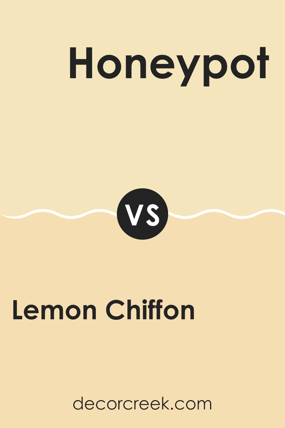
Lemon Chiffon SW 6686 by Sherwin Williams vs Honeypot SW 9663 by Sherwin Williams
The Lemon Chiffon color by Sherwin Williams is a vibrant, airy yellow with a soft and light vibe, making it a fantastic choice for spaces needing a cheerful boost. It’s very gentle on the eyes, which makes it an easy color to pair with darker or contrasting shades.
In contrast, Honeypot has a deeper, more golden tone. This color provides a warm and inviting feel, giving any room a cozy and comfortable atmosphere. Its richness can add depth to spaces and works well in areas with ample natural light or where a more nestled, intimate feel is desired.
Both colors are shades of yellow, but Lemon Chiffon is lighter and quieter, suitable for creating a more open and bright space. Honeypot, being bolder and warmer, can make a statement and serves well in areas for gathering or relaxing. These varying qualities mean they could complement each other in a space used for both active engagement and relaxation.
You can see recommended paint color below:
- SW 9663 Honeypot (CHECK A SAMPLE)
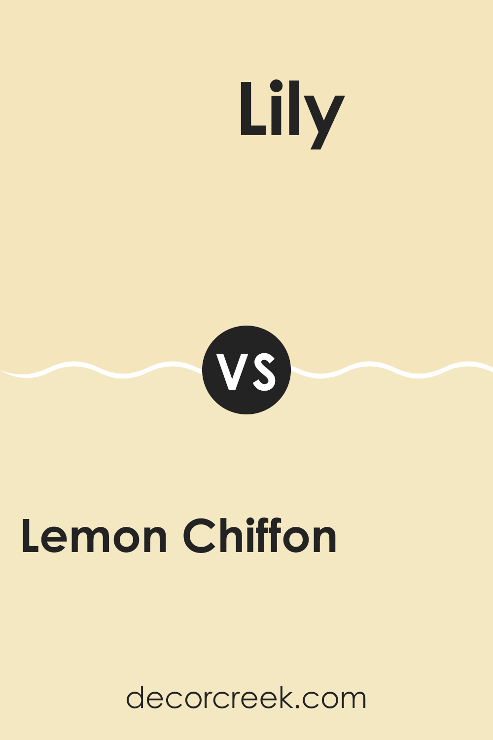
Lemon Chiffon SW 6686 by Sherwin Williams vs Lily SW 6693 by Sherwin Williams
Lemon Chiffon and Lily by Sherwin Williams are both light and airy colors, but they offer distinct vibes due to their different undertones and brightness levels. Lemon Chiffon is a soft, creamy yellow that brings a cheerful and sunny feel to any space. It’s a warm color that can make a room feel inviting and cozy, especially in well-lit areas.
On the other hand, Lily is a gentle shade of yellow that leans slightly towards a pastel tone. It’s a bit milder compared to Lemon Chiffon and can provide a subtle, fresh look to a room without being too bold. Lily works well in spaces where you want a touch of color while maintaining a light and open feel.
Both colors are great for creating a friendly and welcoming atmosphere. Lemon Chiffon might be the choice if you’re looking for a color to brighten up the room more noticeably, while Lily is ideal if you prefer a more subdued look.
You can see recommended paint color below:
- SW 6693 Lily (CHECK A SAMPLE)
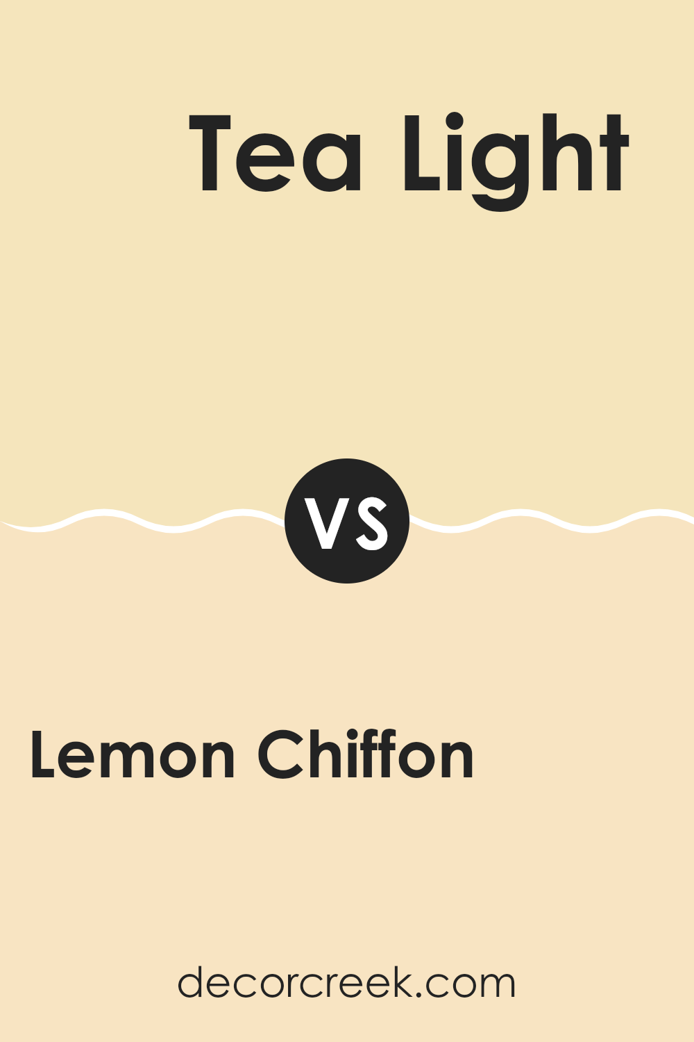
Lemon Chiffon SW 6686 by Sherwin Williams vs Tea Light SW 7681 by Sherwin Williams
‘Lemon Chiffon’ and ‘Tea Light,’ both by Sherwin Williams, offer their unique appeal, each bringing a distinct flair to interiors. ‘Lemon Chiffon’ is a refreshing, pale yellow that brightens up a space with its soft, sunny vibe.
This color is perfect for kitchens, bathrooms, or any area where a cheerful touch is desired. It pairs well with darker colors, providing a pleasant contrast. On the other hand, ‘Tea Light’ is a warm, creamy beige that lends a subtle, cozy feel to rooms. It’s an excellent choice for living areas and bedrooms where a calm, inviting atmosphere is key.
Moreover, ‘Tea Light’ is versatile, blending easily with both bright and muted tones to create a balanced aesthetic. Whether you choose the airy touch of ‘Lemon Chiffon’ or the gentle warmth of ‘Tea Light,’ each color offers a unique possibility to enhance your living spaces.
You can see recommended paint color below:
- SW 7681 Tea Light (CHECK A SAMPLE)
Lemon Chiffon SW 6686 by Sherwin Williams vs Full Moon SW 6679 by Sherwin Williams
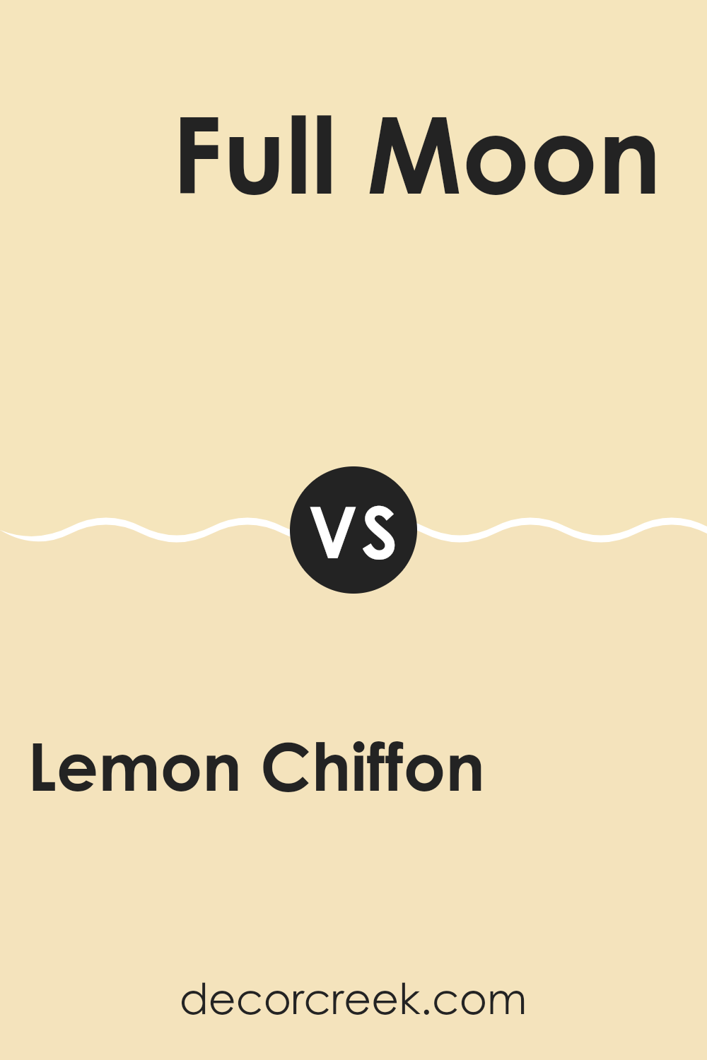
Lemon Chiffon and Full Moon are both inviting colors from Sherwin Williams, but they offer distinct tones that could influence the mood of any room. Lemon Chiffon is a light, creamy yellow that offers a fresh and bright feel, making spaces appear more open and airy. This color is perfect for kitchens or living areas where you want a cheerful, sunny vibe without overwhelming brightness.
On the other hand, Full Moon is a paler, more neutral yellow. It’s less vibrant than Lemon Chiffon and leans towards a softer, more subtle shade. This makes it an excellent choice for areas where you prefer a gentler touch of color, such as bedrooms or bathrooms, where a calming environment is often desired.
Both shades are flexible and can be easily integrated into various decor styles, whether you want to add a splash of warmth with Lemon Chiffon or create a mild, soothing setting with Full Moon. The choice between the two will depend on how much you want the color to stand out or blend in with the surroundings.
You can see recommended paint color below:
- SW 6679 Full Moon (CHECK A SAMPLE)
Lemon Chiffon SW 6686 by Sherwin Williams vs Friendly Yellow SW 6680 by Sherwin Williams
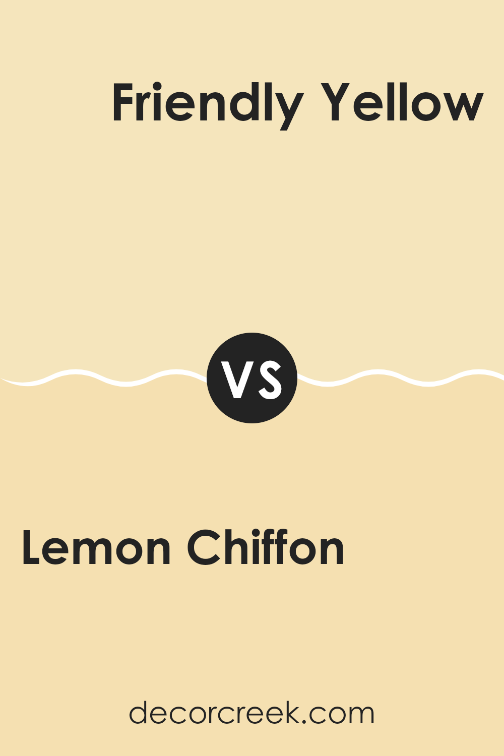
Lemon Chiffon and Friendly Yellow, both by Sherwin Williams, offer distinct vibes for any room. Lemon Chiffon is a light, creamy yellow that brings brightness into a space without being overpowering. It’s perfect for creating a soft, welcoming feel, and because it’s so gentle, it works well in areas where you want to relax, like bedrooms or living rooms.
On the other hand, Friendly Yellow boasts a bolder, more vibrant tone. This color is livelier and can add a cheerful touch to a space. It’s great for kitchens, playrooms, or any area where positive energy is desired.
Both colors reflect light beautifully but in different ways. Lemon Chiffon can make small rooms seem bigger and more open, while Friendly Yellow adds a sense of joy and energy, perfect for stimulating spaces. Depending on the mood you want to set, either color offers a great way to brighten up your home.
You can see recommended paint color below:
Lemon Chiffon SW 6686 by Sherwin Williams vs They call it Mellow SW 9015 by Sherwin Williams
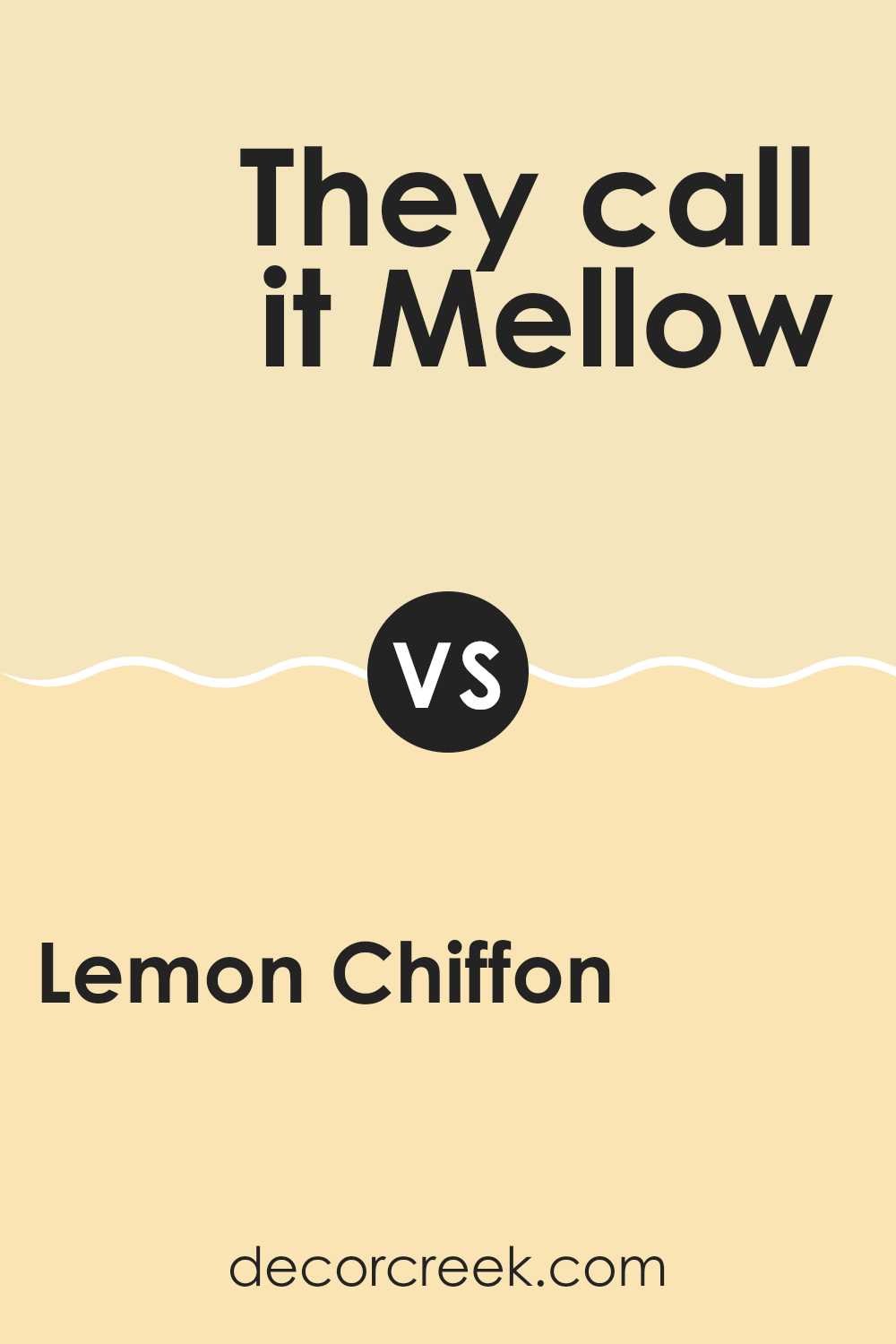
Lemon Chiffon and They Call It Mellow are both inviting colors from Sherwin Williams, but they bring their unique vibes. Lemon Chiffon is a bright, sunny yellow that feels fresh and cheerful, perfect for adding a pop of light to any space. It has a vibrant energy that can make a room feel more open and welcoming.
On the other hand, They Call It Mellow is a subtler yellow with hints of cream, creating a softer, more relaxed feel. It’s ideal for spaces where you want a calm, gentle atmosphere without the intense brightness of Lemon Chiffon.
Both colors brighten up a room but in different ways. Lemon Chiffon works well in spaces that you want to feel energetic and lively, like a kitchen or playroom. They Call It Mellow is better suited for areas where a soothing, gentle ambiance is preferred, such as bedrooms or living rooms. Deciding between the two depends on what mood you want to set in your space.
You can see recommended paint color below:
- SW 9015 They call it Mellow (CHECK A SAMPLE)
Conclusion
In wrapping up my thoughts on Sherwin Williams’ SW 6686 Lemon Chiffon, I must say it’s a wonderful color choice if you’re looking for something bright and cheerful. This light yellow shade has a way of making any room in your home feel sunny and happy, even on days when it’s a bit gloomy outside.
What stands out about Lemon Chiffon is how well it works in different areas of a house. Whether it’s the living room or your bedroom, this color brings a fresh and airy feel that’s very pleasing.
It’s also easy to match with other colors. You can pair it with blues, greens, or even grays, and it will still look great. This makes it a good choice if you like to change things up or if you have other colors in your room that you want to keep. Additionally, Lemon Chiffon is gentle on the eyes, so it’s a safe pick if you’re not into vibrant colors.
So, if you’re thinking about giving your home a little makeover, definitely consider Lemon Chiffon. It’s pretty, it’s cheerful, and it can make any room look a bit brighter and more welcoming.
It’s a simple way to add some light to your daily life!

Ever wished paint sampling was as easy as sticking a sticker? Guess what? Now it is! Discover Samplize's unique Peel & Stick samples.
Get paint samples


