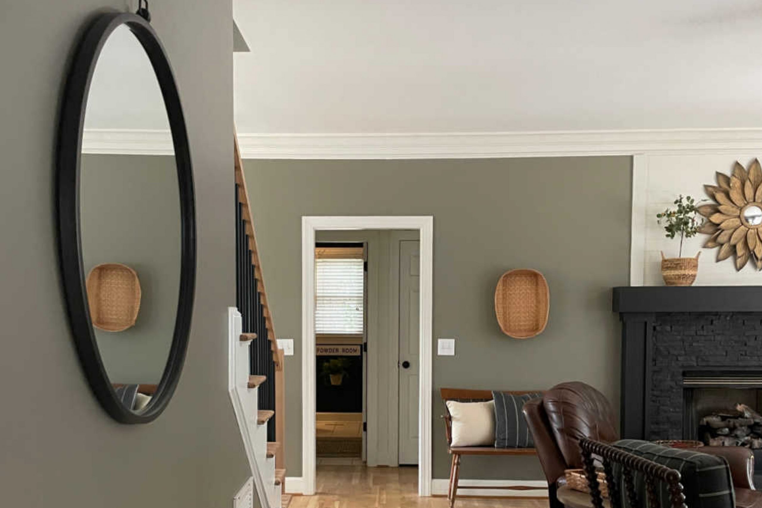
SW 7053 Adaptive Shade by Sherwin Williams caught my attention right away with its calm, modern look. It brings just the right amount of warmth and depth to a room, creating a comfortable feel without being too bold. It’s one of those colors that quietly adds style and personality wherever you use it.
Adaptive Shade is a versatile color that seems to shift depending on the lighting and surrounding decor. It can carry a sense of coziness during a quiet evening and then surprise me with a fresh ambiance in the morning light.
The hue seems to adapt to different settings, whether I’m aiming for a chic modern look or a more traditional feel.
What really stands out about SW 7053 is its ability to complement a wide range of color palettes. Whether I pair it with soft whites and beiges for a serene vibe or with bolder, saturated colors for a lively contrast, Adaptive Shade never fails to harmonize the look.
Using this color, I find that it naturally becomes a part of the space, providing a calming backdrop that enhances the overall atmosphere. It encourages me to see the potential of my space in a new light, offering a refined and elegant touch that feels both timeless and fresh.
What Color Is Adaptive Shade SW 7053 by Sherwin Williams?
Adaptive Shade SW 7053 by Sherwin Williams is a versatile and warm neutral color. It sits comfortably between beige and gray, offering a soft, inviting atmosphere to any space. This shade adapts well to various lighting conditions, making it a popular choice for different rooms in a home. Its warm undertones create a cozy and comfortable feel, making it perfect for living rooms, bedrooms, and hallways.
This color complements a range of interior styles. It works beautifully in traditional and classic settings, bringing warmth and depth without overpowering the space. In modern or minimalist styles, Adaptive Shade adds a touch of warmth to balance clean lines and simple design elements.
It’s also an excellent choice for rustic or farmhouse interiors, where it pairs well with natural materials.
When it comes to materials and textures, Adaptive Shade harmonizes with wood, stone, and metal. It enhances the look of wooden floors or furniture, while also softening the appearance of metal fixtures.
Textural elements like woven fabrics, natural fibers, or soft linens create a cohesive and layered look. This color serves as an excellent backdrop for both bold and subtle accents, allowing for flexibility in decor choices. Its adaptability ensures it fits well in many environments and styles.
Is Adaptive Shade SW 7053 by Sherwin Williams Warm or Cool color?
Adaptive Shade SW 7053 by Sherwin Williams is a versatile paint color that can change the mood of a room. It is a warm, neutral shade that works well in many spaces. This color has enough warmth to make a room feel cozy without overpowering other elements in the decor. It pairs well with both light and dark colors, making it suitable for any style, from modern to traditional.
In living rooms, Adaptive Shade creates an inviting atmosphere. It can make bedrooms peaceful, providing a restful backdrop for relaxation. Kitchens and dining areas benefit from its subtle, welcoming tone, allowing other features like cabinets or appliances to stand out.
The ability of Adaptive Shade to fit in different lighting conditions is one of its best qualities. Natural or artificial light can highlight different undertones, giving rooms depth and interest throughout the day. Its adaptability and neutral base make it a great choice for various home styles.
Undertones of Adaptive Shade SW 7053 by Sherwin Williams
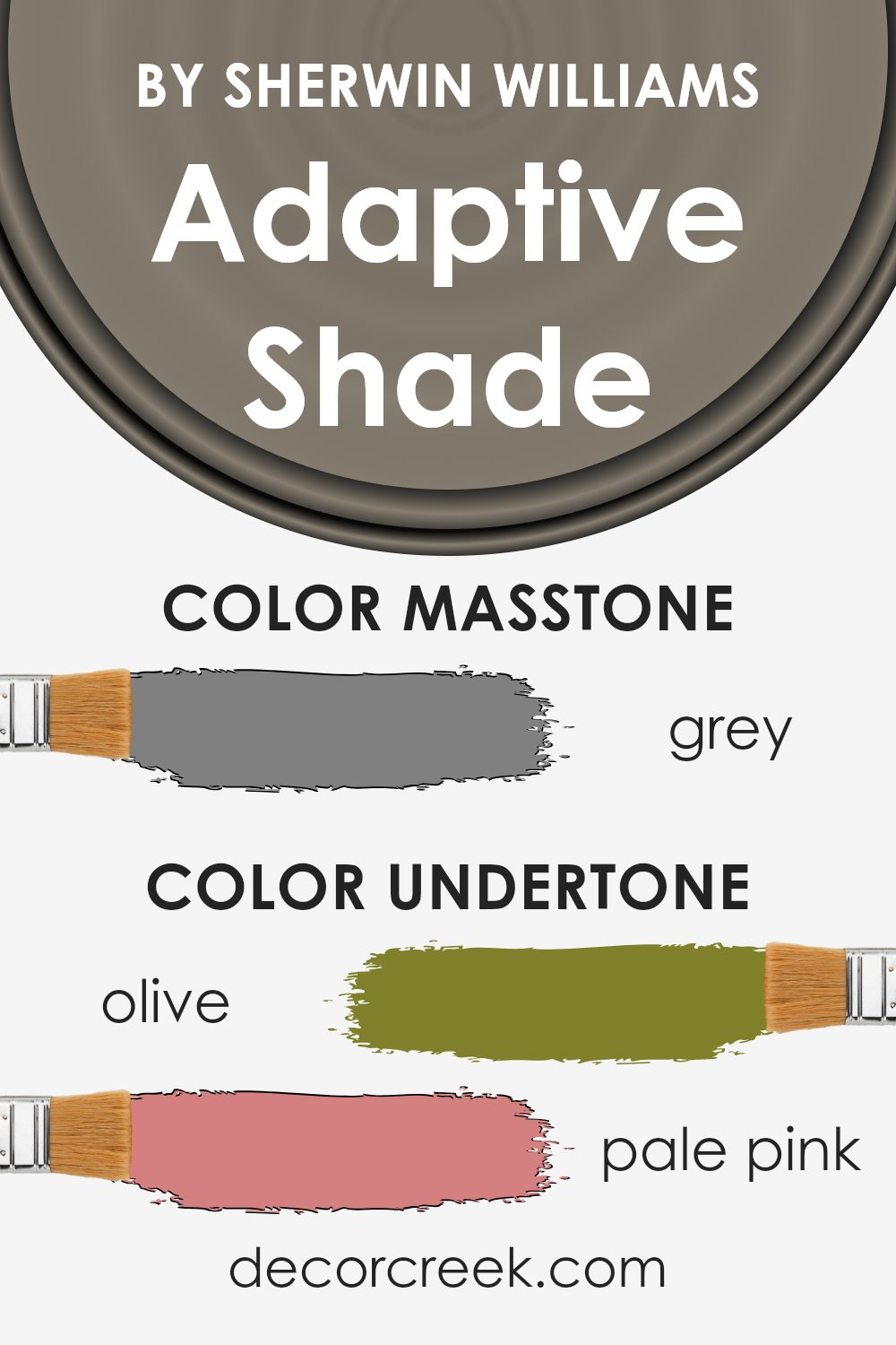
Adaptive Shade SW 7053 by Sherwin Williams is a complex color with various undertones that can influence its appearance on interior walls. Undertones are the subtle hints of color underneath the main hue, and they can affect how the paint looks depending on lighting and surrounding decor.
This color includes undertones like olive, pale pink, purple, and mint, among others. These undertones can make Adaptive Shade appear different throughout the day. For example, under warm lighting, the pink and orange undertones might become more prominent, giving the room a warmer feel.
In contrast, cooler light might highlight the purple and blue undertones, lending a cooler vibe to the space.
Adaptive Shade can also pick up on other colors in the room. If the room contains a lot of green plants, the olive and mint undertones might stand out. Meanwhile, a room with navy or dark blue elements may bring out the gray and blue hues in the color.
Overall, the various undertones in Adaptive Shade allow the color to be versatile, helping it to blend with a wide range of decor styles. It can create different moods based on its surroundings and lighting, making it an interesting choice for interior walls.
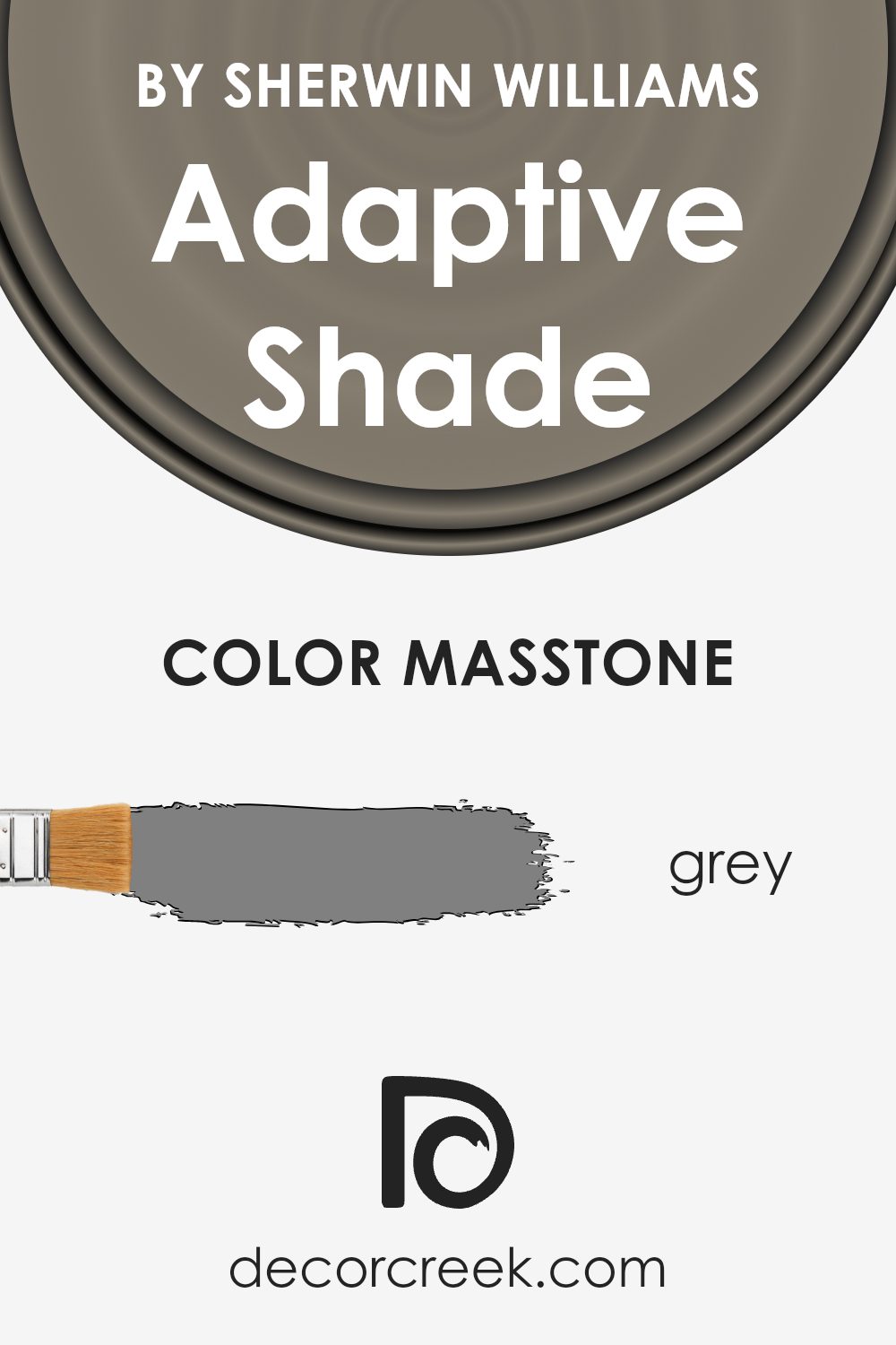
What is the Masstone of the Adaptive Shade SW 7053 by Sherwin Williams?
Adaptive Shade SW 7053 by Sherwin Williams is a soft gray with a balanced masstone, identified by its neutral hexadecimal value of #808080. This color works well in homes due to its versatility and timeless appeal.
The even tone of this gray allows it to match various styles and other colors used in interior design. It doesn’t lean too warm or too cool, making it a flexible option for different rooms.
In living spaces, it provides a calm, neutral backdrop that lets furniture and decor stand out without clashing. In kitchens and bathrooms, its neutrality can highlight features like countertops, cabinets, and fixtures. Because it doesn’t overpower, it serves as a canvas that can handle different lighting conditions.
This makes Adaptive Shade a practical choice for homeowners who want a reliable, unobtrusive color that will suit many tastes and settings over time. Its adaptability makes it a favorite for those seeking a balanced and classic look.
How Does Lighting Affect Adaptive Shade SW 7053 by Sherwin Williams?
Lighting has a significant impact on how colors are perceived. The type and direction of light can change the appearance of paint colors in a room. For instance, the paint color Adaptive Shade by Sherwin Williams, identified as SW 7053, can look different depending on the lighting conditions.
In natural light, colors tend to show more accurately, but this can also vary. In rooms with north-facing windows, the light is cooler and softer. This often makes colors like SW 7053 appear a bit darker and muted, with some gray undertones coming through.
It might look more subdued and less warm than it would in other types of lighting.
In contrast, south-facing rooms get more direct sunlight throughout the day, which brings out the warmth in colors. SW 7053 might appear lighter and slightly warmer in these rooms as the abundant natural light enhances its true shade, giving it a more inviting look.
East-facing rooms receive warm, yellowish light in the morning, which can enhance the warm tones in Adaptive Shade, possibly making it look more vibrant. However, as the day progresses and the light shifts, the color could become a bit cooler and more subdued.
West-facing rooms, on the other hand, are characterized by cooler light in the morning and warm, golden light in the evening. In the late afternoon, SW 7053 might appear richer and more intense as the light warms up, whereas in the morning it may seem softer and more neutral.
When it comes to artificial lighting, the type of bulbs used matters. Incandescent lights can make SW 7053 look warmer due to their yellowish hue. LED or fluorescent lights might emphasize its cooler tones depending on their color temperature.
In general, it’s good to test a paint color like Adaptive Shade under all lighting conditions in a room to see how it changes throughout the day.
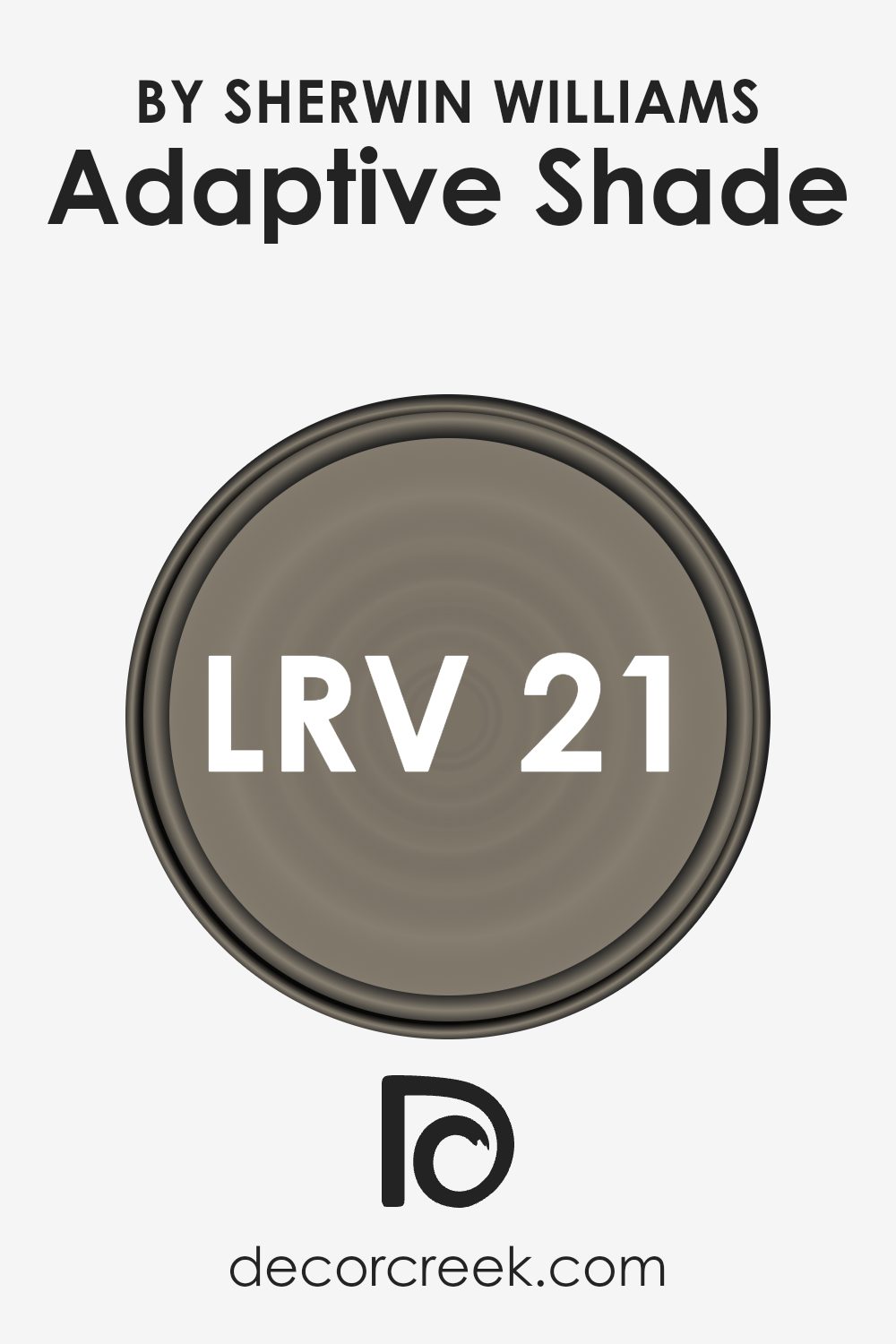
What is the LRV of Adaptive Shade SW 7053 by Sherwin Williams?
Light Reflectance Value (LRV) is an important number to consider when choosing paint colors. It indicates how much light a color will reflect when applied to a surface, with lower values absorbing more light and higher values reflecting more. LRV ranges from 0, meaning the color absorbs all light and reflects none (like black), to 100, meaning it reflects all light (like white).
Understanding the LRV of a paint color helps predict how it will look in different lighting conditions. It also aids in selecting complementary colors or understanding if the color will make a space feel larger and brighter or more intimate and cozy.
The LRV of Adaptive Shade by Sherwin Williams is 21, meaning this color absorbs a good deal more light than it reflects. This makes it a relatively dark color, which will bring a sense of warmth and coziness to a room.
While it won’t make a space appear larger or brighter, it can create a comfortable and intimate atmosphere. Such colors are often used in spaces where you want to relax or feel grounded, as they absorb light, and create a snug environment.
When used in a room with plenty of natural light, the color can still look rich and vivid, showing its depth and complexity.
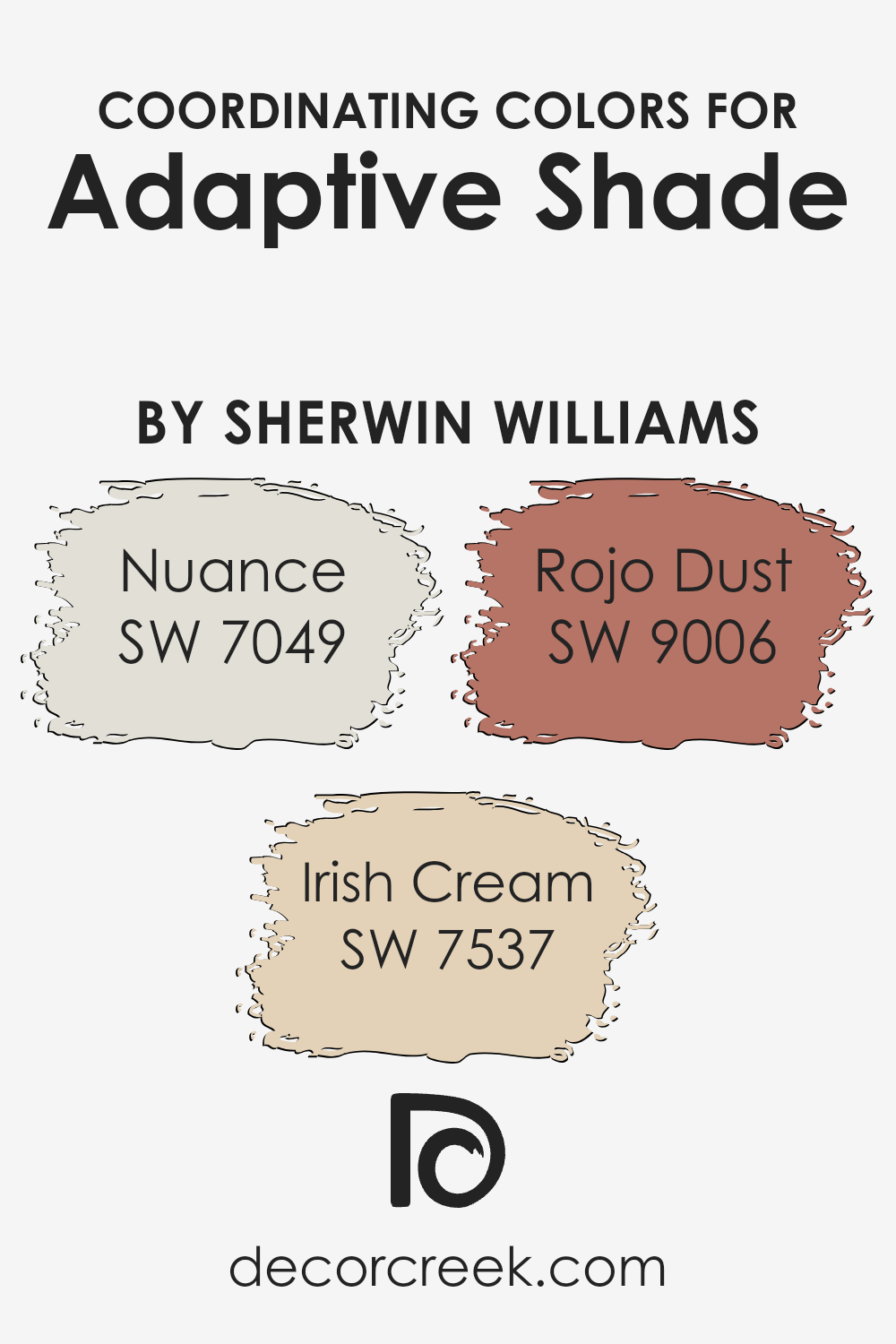
Coordinating Colors of Adaptive Shade SW 7053 by Sherwin Williams
Coordinating colors are hues that harmonize well together, enhancing the overall aesthetic and creating a unified look in a space. They work by complementing each other’s undertones and intensities, offering a balanced and pleasing visual experience.
In the case of Sherwin Williams’ Adaptive Shade, coordinating colors like Nuance, Irish Cream, and Rojo Dust can add depth and warmth to your decor. Nuance (SW 7049) is a soft, understated gray with a hint of warmth that adds a gentle backdrop to any room, helping other colors stand out without overwhelming the space.
Irish Cream (SW 7537) is a cozy, inviting beige that brings a sense of warmth and comfort to a room, making it a great option for living areas or bedrooms where you want to promote relaxation.
Rojo Dust (SW 9006), meanwhile, provides a rich, earthy terracotta tone that introduces a touch of boldness and vitality, perfect for creating focal points or adding personality to neutral settings.
Together, these colors create a balanced palette that offers both subtlety and interest, allowing each hue to shine in its own right while supporting the overall harmony of the design.
You can see recommended paint colors below:
- SW 7049 Nuance
- SW 7537 Irish Cream
- SW 9006 Rojo Dust
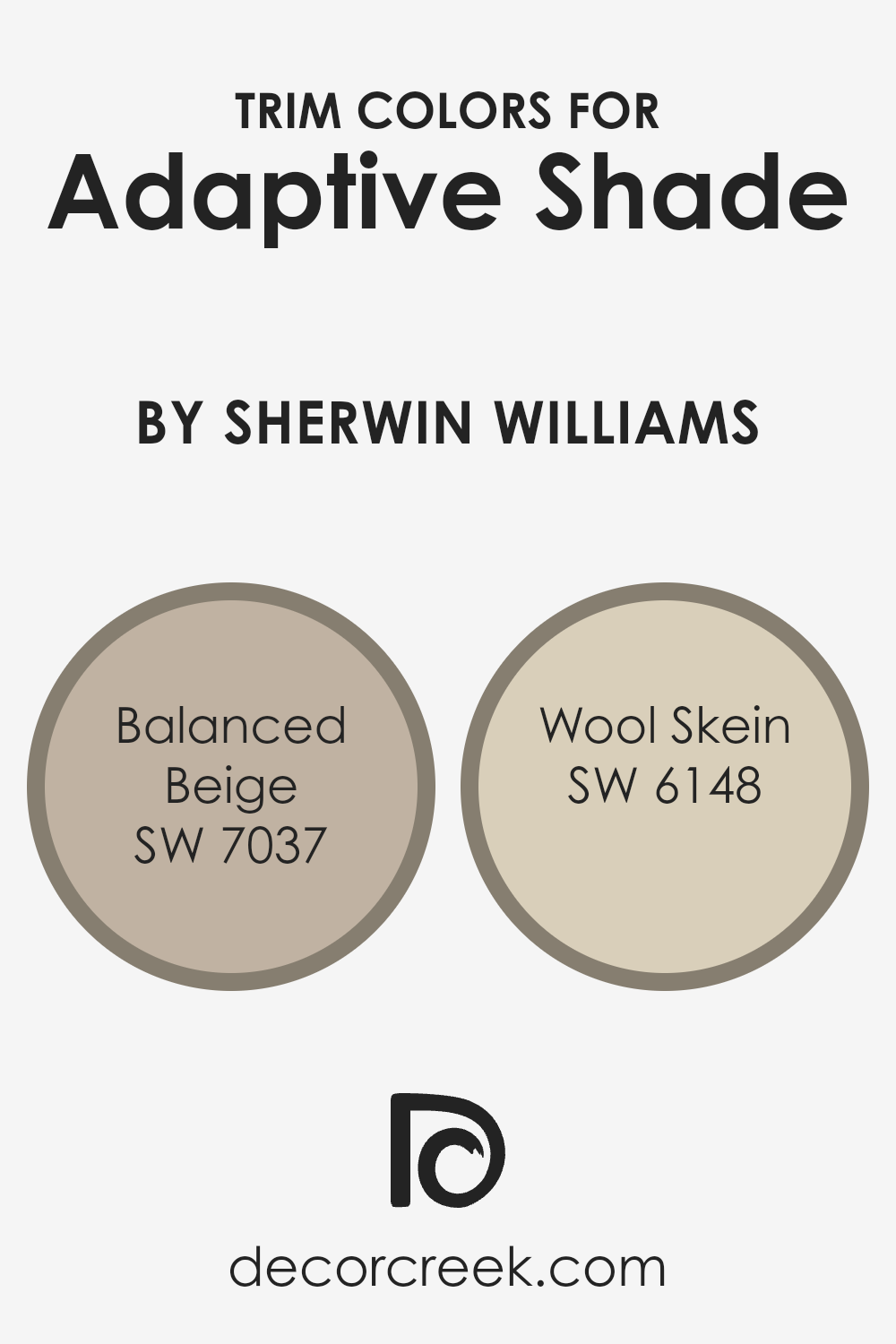
What are the Trim colors of Adaptive Shade SW 7053 by Sherwin Williams?
Trim colors play a key role in enhancing and defining a room’s appearance by providing an attractive frame for walls, ceilings, and various architectural elements. For a main wall color like Adaptive Shade (SW 7053), choosing the right trim colors can highlight its warmth and depth, adding an appealing contrast or a gentle complement.
Trim colors not only accentuate the main paint color but also help in tying the decor together, ensuring a cohesive look throughout the space. Balanced Beige (SW 7037) and Wool Skein (SW 6148) are excellent choices for trim as they harmonize well with a variety of shades, bringing out the best features of Adaptive Shade without overpowering it.
Balanced Beige is a warm, neutral tone with undertones of brown and gray, perfect for adding a subtle contrast to walls painted in similar warm tones like Adaptive Shade. It introduces a soft backdrop that can coordinate with various styles and furniture, whether used in living rooms or bedrooms.
Wool Skein, on the other hand, offers a gentle, muted beige with just a hint of green, which creates an inviting and calm feeling, making it suitable for areas that wish to express comfort and grounded elegance.
Both trim colors help in framing and highlighting the chosen main color, creating a well-rounded and inviting atmosphere that remains visually interesting and appealing.
You can see recommended paint colors below:
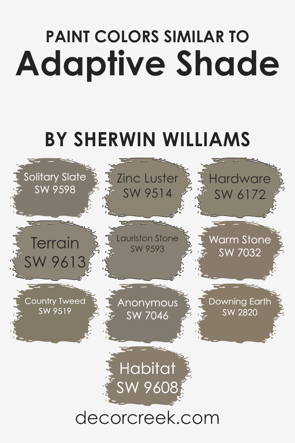
Colors Similar to Adaptive Shade SW 7053 by Sherwin Williams
Similar colors play a crucial role in design because they create a harmonious look that is pleasing to the eye. When colors are similar, they blend together seamlessly, allowing for a cohesive and inviting space. For example, Adaptive Shade by Sherwin-Williams is complemented beautifully by other similar colors which create a unified and calming atmosphere.
Solitary Slate is a deep, moody gray that adds depth and interest, perfect for those who want a touch of drama in their space. Terrain, on the other hand, is an earthy green that brings a sense of nature and calm, ideal for cozy interiors. Country Tweed is a warm beige that adds softness and can make a room feel more inviting and comfortable.
Meanwhile, Habitat is a natural taupe that exudes warmth and pairs well with a variety of other colors, while Zinc Luster offers a metallic touch, adding a modern edge to any room. Lauriston Stone, a soft gray-brown, is gentle on the eyes and creates a soothing environment.
Anonymous brings a grounded, classic gray tone that fits well in both modern and traditional settings.
Hardware is a deeper, charcoal gray that adds a touch of drama without overpowering. Warm Stone is a versatile neutral beige, and Downing Earth embraces the richness of a brown earth tone, lending warmth and depth to any space they inhabit. Together, these colors create a balanced palette that enhances the beauty and comfort of your home.
You can see recommended paint colors below:
- SW 9598 Solitary Slate
- SW 9613 Terrain
- SW 9519 Country Tweed
- SW 9608 Habitat
- SW 9514 Zinc Luster
- SW 9593 Lauriston Stone
- SW 7046 Anonymous
- SW 6172 Hardware
- SW 7032 Warm Stone
- SW 2820 Downing Earth
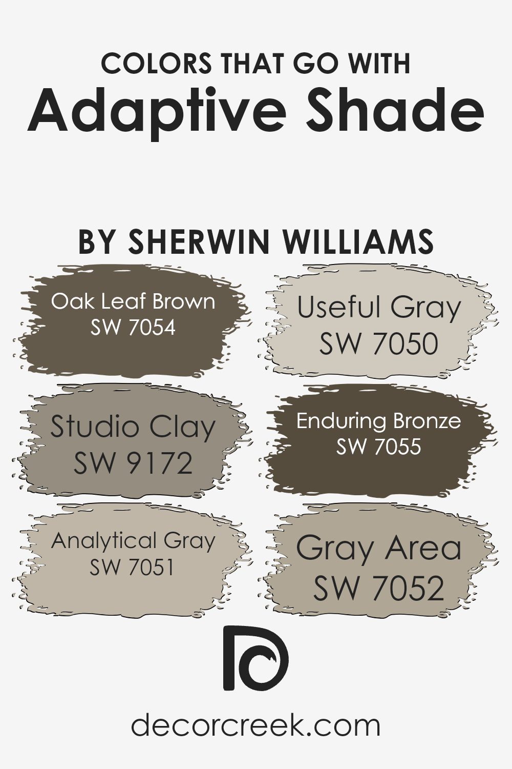
Colors that Go With Adaptive Shade SW 7053 by Sherwin Williams
Adaptive Shade SW 7053 by Sherwin Williams is a versatile color that pairs well with several complementary shades, each adding depth and interest to a space. When choosing colors that go with Adaptive Shade, it’s important to consider how they work with each other to create a harmonious environment.
Oak Leaf Brown SW 7054, for instance, is a rich, earthy color that adds warmth and coziness, making it ideal for creating a welcoming atmosphere. On the other hand, Studio Clay SW 9172 offers a muted, natural tone that brings a sense of rugged charm, melding beautifully with Adaptive Shade’s neutral base.
Analytical Gray SW 7051 and Useful Gray SW 7050 both bring a refined subtlety to the palette. Analytical Gray provides a soft, sophisticated contrast, while Useful Gray has a slightly warmer undertone, adding a gentle touch to the overall look.
Enduring Bronze SW 7055 imparts a darker, more dramatic contrast, lending the space a touch of elegance with its deep, rich coloration. Lastly, Gray Area SW 7052 introduces a smooth, reliable gray that balances the palette with its calming influence.
Together, these colors create a cohesive and inviting ambiance, highlighting Adaptive Shade’s ability to work seamlessly with both warm and cool hues.
You can see recommended paint colors below:
- SW 7054 Oak Leaf Brown
- SW 9172 Studio Clay
- SW 7051 Analytical Gray
- SW 7050 Useful Gray
- SW 7055 Enduring Bronze
- SW 7052 Gray Area
How to Use Adaptive Shade SW 7053 by Sherwin Williams In Your Home?
Adaptive Shade SW 7053 by Sherwin Williams is a versatile neutral paint color. It’s a warm, medium beige that can create a cozy and inviting atmosphere in any room of your home. This color works well in living rooms, where it can add warmth without overwhelming the space. It pairs nicely with natural wood tones and other earth-inspired colors, making it a good choice for those who want a relaxed, comfortable feel.
In bedrooms, Adaptive Shade can enhance a restful environment, helping you unwind at the end of the day. It also complements both light and dark furniture, giving you flexibility in your décor choices. In the kitchen, this shade provides a soft, welcoming backdrop for dining and gatherings.
Overall, Adaptive Shade SW 7053 is a reliable option for those looking for a neutral color that maintains a sense of homeliness throughout the home. It is easy to coordinate with a variety of accent colors and furnishings.
Adaptive Shade SW 7053 by Sherwin Williams vs Country Tweed SW 9519 by Sherwin Williams
Adaptive Shade SW 7053 is a warm neutral color by Sherwin Williams, known for its versatility. It has hints of beige and tan, making it an excellent choice for creating a cozy and inviting atmosphere in any room. It’s a color that works well with both light and dark accents and fits nicely into any style, from traditional to contemporary.
On the other hand, Country Tweed SW 9519 is a more earthy and muted tone. It brings in a touch of warmth through its soft brown and gray undertones, giving spaces a relaxed and grounded feel. Country Tweed can complement natural materials like wood and stone beautifully, making it ideal for spaces seeking a connection to the outdoors.
When comparing the two, Adaptive Shade leans more towards a classic, neutral look, while Country Tweed offers an earthy, more rustic vibe. Both colors are excellent for creating inviting spaces but cater to slightly different styles and moods.
You can see recommended paint color below:

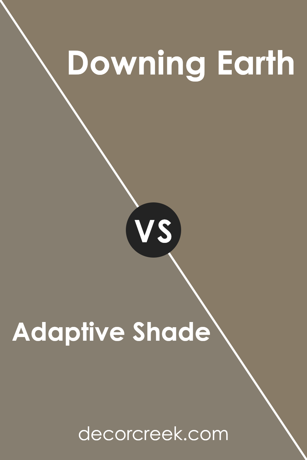
Adaptive Shade SW 7053 by Sherwin Williams vs Downing Earth SW 2820 by Sherwin Williams
Adaptive Shade SW 7053 and Downing Earth SW 2820 are two distinct colors from Sherwin Williams, each offering unique qualities. Adaptive Shade is a versatile, neutral color that leans towards warm beige. It’s excellent for creating a cozy and inviting atmosphere, fitting for various spaces like living rooms or bedrooms. It pairs well with both light and dark accents, making it a flexible option for many design styles.
On the other hand, Downing Earth SW 2820 is a richer, earthier hue. It has deeper brown undertones that give it a sense of warmth and comfort. This color is perfect for historic or traditional spaces, adding depth and character to a room. While Adaptive Shade tends to be more modern and neutral, Downing Earth feels more classic and grounded.
Both colors have their own charm, with Adaptive Shade offering subtlety and adaptability, while Downing Earth provides warmth and richness.
You can see recommended paint color below:
- SW 2820 Downing Earth
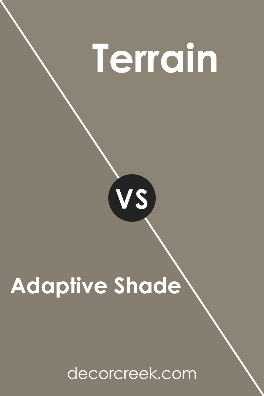
Adaptive Shade SW 7053 by Sherwin Williams vs Terrain SW 9613 by Sherwin Williams
Adaptive Shade SW 7053 and Terrain SW 9613 by Sherwin Williams are both versatile colors with distinct characters. Adaptive Shade is a soft, warm beige that adds coziness to any room. It’s a neutral tone that can work well in various settings, bringing comfort without overwhelming the space.
On the other hand, Terrain is a muted, earthy green that evokes a more natural feeling. It’s grounded and adds an organic touch to interiors. While Adaptive Shade brightens a room with its warmth, Terrain introduces a calming, nature-inspired vibe.
Together, these colors can complement each other beautifully; Adaptive Shade can be used for larger areas to keep things light and open, while Terrain may serve as an accent color, giving depth and a subtle pop of color. Both colors offer different moods but can create a balanced, inviting atmosphere when paired together.
You can see recommended paint color below:
Adaptive Shade SW 7053 by Sherwin Williams vs Lauriston Stone SW 9593 by Sherwin Williams
Adaptive Shade SW 7053 by Sherwin Williams is a warm, neutral hue with beige undertones. It offers a cozy and versatile look, making it suitable for various spaces like living rooms, bedrooms, or hallways. This color pairs well with both darker and lighter accents, providing a balanced background that complements many styles.
In contrast, Lauriston Stone SW 9593 is a cooler, earthy tone with a hint of gray. It brings a calm and soothing vibe, making it perfect for areas where a relaxed atmosphere is desired, such as bathrooms or bedrooms. Lauriston Stone’s subtle gray undertone offers a more modern and sleek feel compared to the warmer Adaptive Shade.
Both colors have their unique charm: Adaptive Shade adds warmth and versatility, while Lauriston Stone provides a calm and contemporary touch. Your choice between these colors will depend on whether you want a cozy ambiance or a cooler, modern feel in your space.
You can see recommended paint color below:
- SW 9593 Lauriston Stone
Adaptive Shade SW 7053 by Sherwin Williams vs Solitary Slate SW 9598 by Sherwin Williams
Adaptive Shade SW 7053 and Solitary Slate SW 9598 from Sherwin Williams are two distinct colors that each bring their own vibe to a space. Adaptive Shade is a warm, neutral color that can bring a cozy and inviting feel to a room. It tends to blend well with different design elements, providing a flexible backdrop for various styles of decor.
On the other hand, Solitary Slate is a darker, cooler shade of gray. It can add a more modern and sophisticated touch to a space. This color works well with lighter accents to create a balanced look, making it ideal for creating a dramatic or sleek atmosphere.
While Adaptive Shade brightens a room and makes it feel comforting, Solitary Slate offers a bold and striking presence. Together, they can be combined for a harmonious look where the warmth of Adaptive Shade complements the depth of Solitary Slate.
You can see recommended paint color below:
Adaptive Shade SW 7053 by Sherwin Williams vs Zinc Luster SW 9514 by Sherwin Williams
Adaptive Shade SW 7053 is a warm neutral paint color by Sherwin Williams, known for its earthy undertone. It works well in spaces where you want a cozy and inviting atmosphere. This color pairs nicely with both bold and muted tones, making it versatile for many designs, whether modern or traditional.
On the other hand, Zinc Luster SW 9514 is a cool, metallic silver-gray from Sherwin Williams. It’s great for adding a touch of industrial elegance to any room. The metallic finish of Zinc Luster gives it a slight shimmer, making it a standout choice for accent walls or architectural elements.
Comparing the two, Adaptive Shade provides warmth and a welcoming feel, while Zinc Luster offers a cooler, more contemporary edge with its metallic sheen. Depending on the mood you wish to create, Adaptive Shade accommodates soft, comforting vibes, whereas Zinc Luster introduces a sleek, modern touch to interiors.
You can see recommended paint color below:
- SW 9514 Zinc Luster
Adaptive Shade SW 7053 by Sherwin Williams vs Warm Stone SW 7032 by Sherwin Williams
Adaptive Shade SW 7053 and Warm Stone SW 7032 from Sherwin Williams are two versatile neutral colors. Adaptive Shade is a medium greige tone that combines elements of gray and beige, creating a balanced and adaptable base. It complements a wide variety of other colors and works well in different lighting conditions, making it a great choice for both walls and trim.
On the other hand, Warm Stone SW 7032 is a slightly darker brownish-gray, adding depth and warmth to spaces. Its richer tone makes it ideal for adding coziness to a room, especially in areas where a touch of warmth is desired.
While Adaptive Shade has a lighter, more muted appearance, Warm Stone provides a stronger, more grounded presence. Both colors are excellent for creating a neutral backdrop, but Adaptive Shade is more subtle, whereas Warm Stone provides a bolder, warmer feel. Each can bring its own character to a space depending on how they’re used.
You can see recommended paint color below:
Adaptive Shade SW 7053 by Sherwin Williams vs Hardware SW 6172 by Sherwin Williams
Adaptive Shade SW 7053 and Hardware SW 6172 by Sherwin Williams are two beautiful, versatile colors. Adaptive Shade is a neutral brown-gray, giving off a cozy and warm feel. It fits well in living spaces, offering a welcoming vibe. On the other hand, Hardware is an earthy green with gray undertones, bringing a natural, calming effect to rooms. This color is perfect for creating a grounded and relaxed atmosphere.
Adaptive Shade has a sophisticated edge, making it ideal for modern and traditional spaces alike. It pairs well with both dark and light accents. Meanwhile, Hardware works nicely in areas where you want to introduce elements of nature and peace.
Both colors are great choices for interior walls, each adding a distinct personality to a space. Adaptive Shade leans towards warmth, while Hardware offers a cooler, earthier presence. Depending on your style, these hues can set the perfect mood in any room.
You can see recommended paint color below:
- SW 6172 Hardware
Adaptive Shade SW 7053 by Sherwin Williams vs Anonymous SW 7046 by Sherwin Williams
Adaptive Shade SW 7053 and Anonymous SW 7046 are both colors from Sherwin Williams, but they bring different moods to a space. Adaptive Shade is a warm, neutral brown that can create a cozy and inviting atmosphere. It works well in living rooms or bedrooms where you want to feel comfortable and relaxed.
On the other hand, Anonymous SW 7046 is a cooler, darker gray. It’s a more dramatic choice that adds depth and a modern touch to any room. This color is often used to make a statement and pairs nicely with lighter accents to prevent the space from feeling too dark.
While Adaptive Shade tends to blend well with earthy tones, Anonymous can stand out more, offering a sleek and contemporary look. Choosing between them depends on whether you prefer the warmth of brown or the coolness of gray.
You can see recommended paint color below:
Adaptive Shade SW 7053 by Sherwin Williams vs Habitat SW 9608 by Sherwin Williams
Adaptive Shade SW 7053 is a warm, neutral color that pairs well with various design styles. It’s a versatile tan shade, bringing a cozy and comforting feel to any room. This color is often used in living areas and bedrooms, giving them a grounded and welcoming atmosphere.
On the other hand, Habitat SW 9608 has a more earthy, green undertone. It’s a nature-inspired color that can bring a fresh and calming vibe to spaces. Habitat is ideal for creating an environment that feels connected to the outdoors. It’s a bit more adventurous compared to Adaptive Shade, which is more classic.
When comparing the two, Adaptive Shade is neutral and adaptable, while Habitat offers a touch of natural warmth. Both colors can work well in a home but serve different purposes depending on the mood and style you’re trying to achieve.
You can see recommended paint color below:
- SW 9608 Habitat
It’s such a neat color because it can look different depending on where you use it. It’s like magic! This color is kind of like a chameleon because it changes its look based on the light and what’s around it.
If you put it in a room filled with sunlight, it looks one way, and in a darker room, it has another look. This makes it super interesting and fun to use.
I also found out that Adaptive Shade can work well with lots of other colors. That means you can play around with different colors for things like furniture or decorations, and it will still look good. It’s a really nice shade for walls if you want something cozy and not too bright.
It can make rooms feel warm and inviting without being too bold or loud.
In the end, I think SW 7053 Adaptive Shade is a really cool choice if you want your rooms to feel comfy and interesting. It’s like a secret agent of colors because it can change and adapt in cool ways that surprise you. I think it would be fun to use this color in different parts of my home!
Ever wished paint sampling was as easy as sticking a sticker? Guess what? Now it is! Discover Samplize's unique Peel & Stick samples.
Get paint samples

