When you’re searching for the perfect yellow-green shade to spruce, consider SW 7726 Lemon Verbena by Sherwin Williams. This unique color strikes a pleasant balance between lively and soothing, making it versatile for various spaces in your home. Lemon Verbena isn’t just another green; it carries a zest that can brighten rooms while maintaining an air of calm.
I find Lemon Verbena ideal for kitchens or living areas where you want to add a splash of vibrancy without overwhelming the senses. It pairs well with both light and dark accents, providing flexibility in your decor choices.
Whether you’re looking to refresh a space or start fresh in a new one, this color offers a fresh, cheerful backdrop that can make your furnishings pop.
Moreover, this shade works beautifully in spaces that get a lot of natural light, enhancing the room’s overall energy.
If you’re thinking about a color that can uplift and add character, Lemon Verbena by Sherwin Williams could be the one for you.
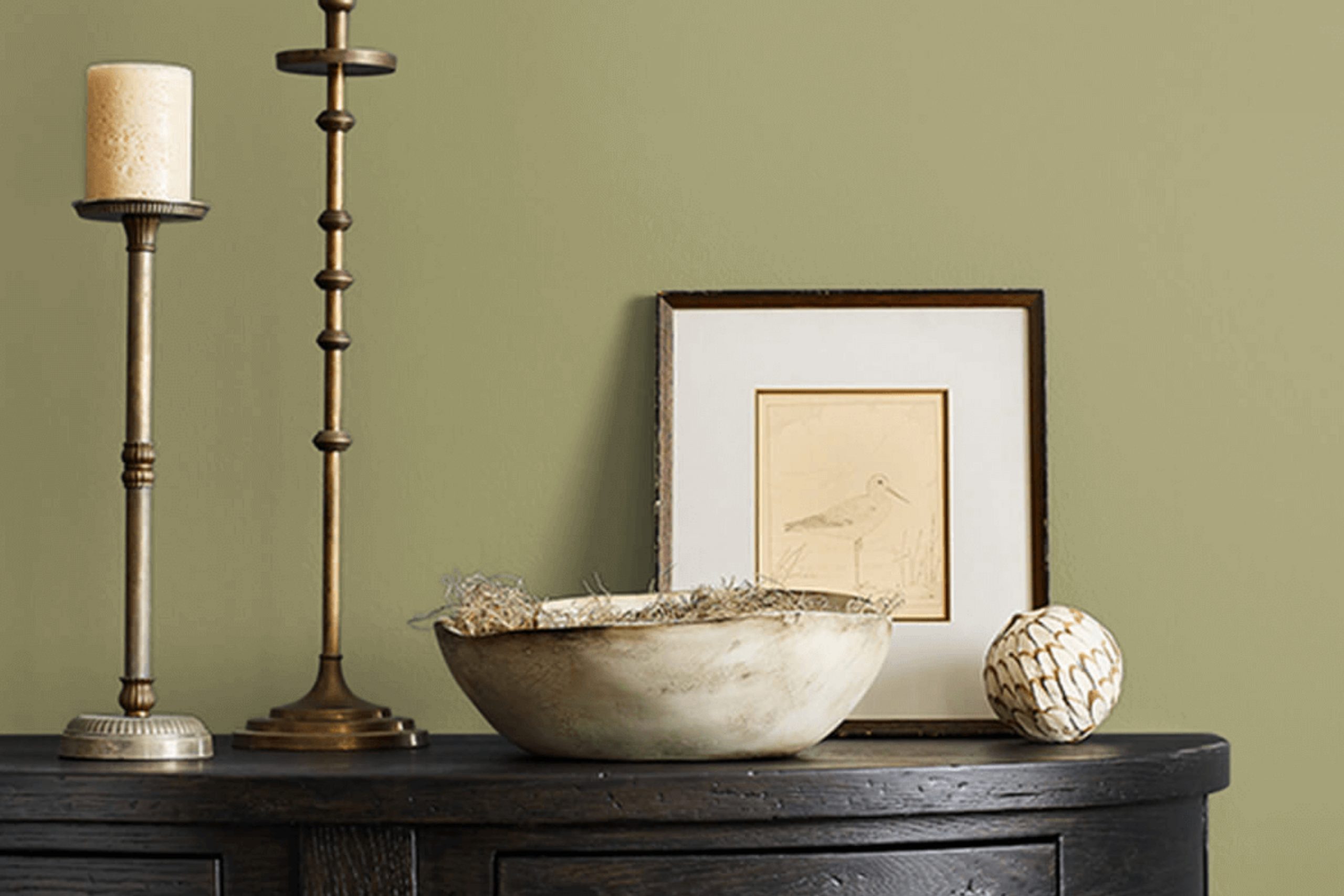
What Color Is Lemon Verbena SW 7726 by Sherwin Williams?
The color Lemon Verbena by Sherwin Williams is a vibrant and cheerful shade of yellow-green, reminiscent of the fresh, zesty tones found in a lemon grove at peak season. This lively hue brings a burst of energy and optimism to any space.
Its brightness is especially effective in invigorating rooms that receive little natural light, making it an excellent choice for brightening up dim areas or giving a lively splash to smaller spaces.
Lemon Verbena works beautifully in a variety of interior styles, particularly those that lean towards the casual or eclectic. It’s a perfect fit for modern farmhouses where its freshness complements natural wood and rustic elements.
In contemporary settings, it pairs well with sleek surfaces and geometric forms, offering a pop of color amidst neutral tones.
When it comes to materials, Lemon Verbena pairs wonderfully with natural textures like linen, rattan, and unfinished wood, which balance its vibrancy with their subtle, earthy vibes.
For a more dynamic contrast, integrating metals like brushed nickel or polished chrome can add a hint of modern flair that enhances Lemon Verbena’s energetic presence.
This color works exceptionally well with white trims or furniture pieces, which can help outline and intensify its visibility, creating a clean, crisp contrast that makes the room feel fresh and lively.
Is Lemon Verbena SW 7726 by Sherwin Williams Warm or Cool color?
Lemon Verbena by Sherwin Williams is a vibrant and cheerful paint color that brings a lot of energy into any room. It has a fresh, lively feel that can perk up spaces and make them more inviting. This shade is perfect for adding a splash of brightness to kitchens or living rooms where you spend a lot of time during the day.
Since it’s a bold color, it works well on accent walls or for smaller projects like painting furniture to create fun focal points. It can also be balanced with neutral colors like whites or grays to keep it from overwhelming the space.
Additionally, this color pairs well with natural materials like wood or stone, enhancing the outdoorsy, fresh appeal.
Overall, using Lemon Verbena in your home can make it feel more energetic and cheerful, making it a great choice for lively family rooms or creative spaces.
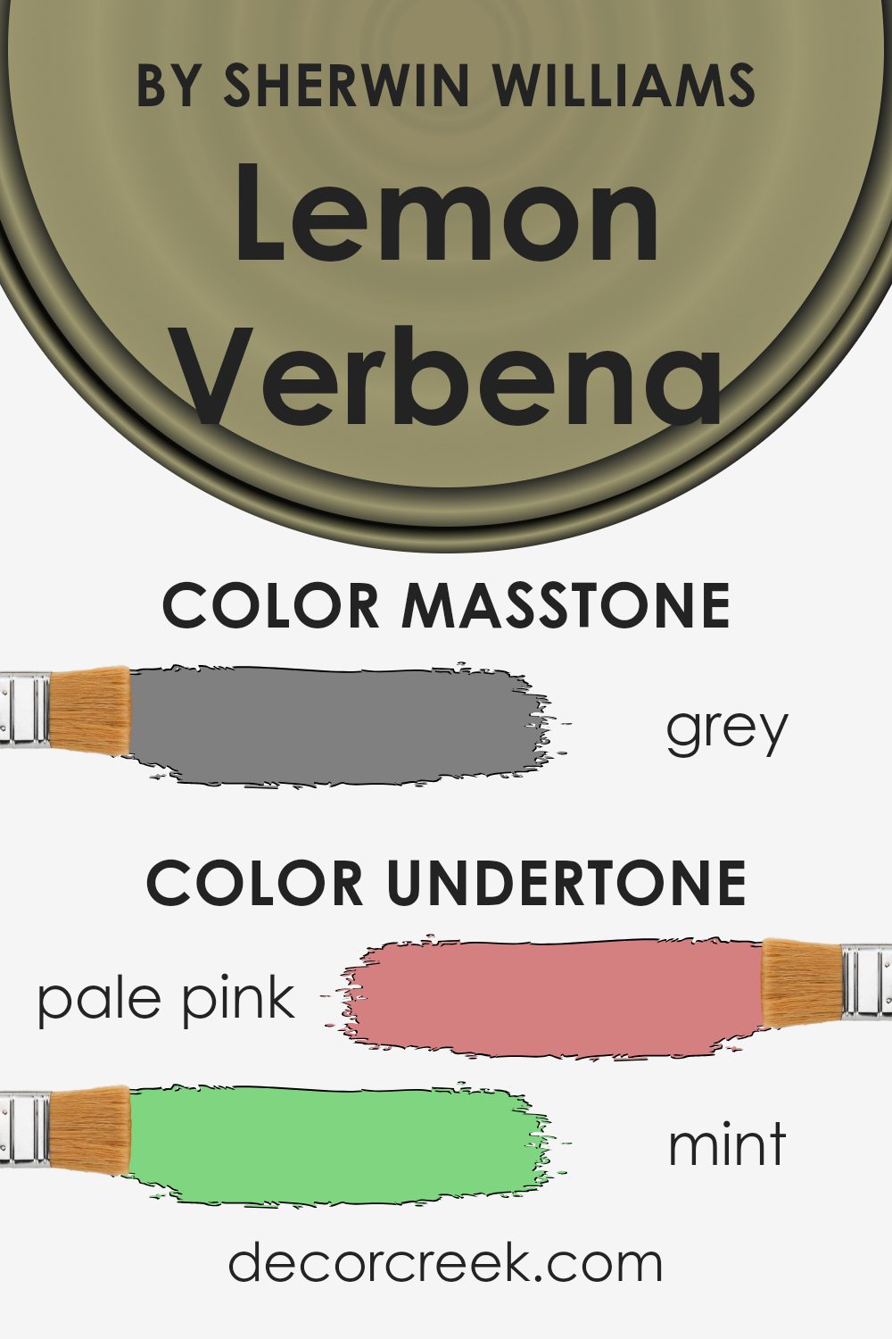
Undertones of Lemon Verbena SW 7726 by Sherwin Williams
Lemon Verbena, with its diverse array of undertones, can significantly influence the ambiance of any room. Undertones are subtle colors that can be seen beneath the surface of the primary color. They play a crucial role in the overall appearance and mood set by the paint.
Firstly, undertones like pale yellow and light green enhance the freshness of Lemon Verbena, making it ideal for kitchens or sunrooms where a bright, cheery atmosphere is desired.
On the other hand, touches of olive and dark green add a natural, earthy feel, perfect for creating a cozy, inviting space in living rooms.
In spaces like bathrooms or small offices, the mint and light turquoise undertones of the color can evoke a clean and calm environment, helping the areas feel more spacious and airy. Meanwhile, accents of pink and lilac introduce a soft, playful aspect, which can be perfect for children’s rooms or casual sitting areas.
Using this color on interior walls can have a dynamic impact depending on the lighting and accompanying decor.
Natural light brings out the brighter undertones, making the space feel lively. In contrast, artificial lighting can highlight the deeper, warmer tones, making a room feel more enclosed and intimate.
Understanding these undertones helps in choosing furniture and decorations that either complement or contrast effectively with Lemon Verbena, ensuring that the overall decor is harmonious and appealing.
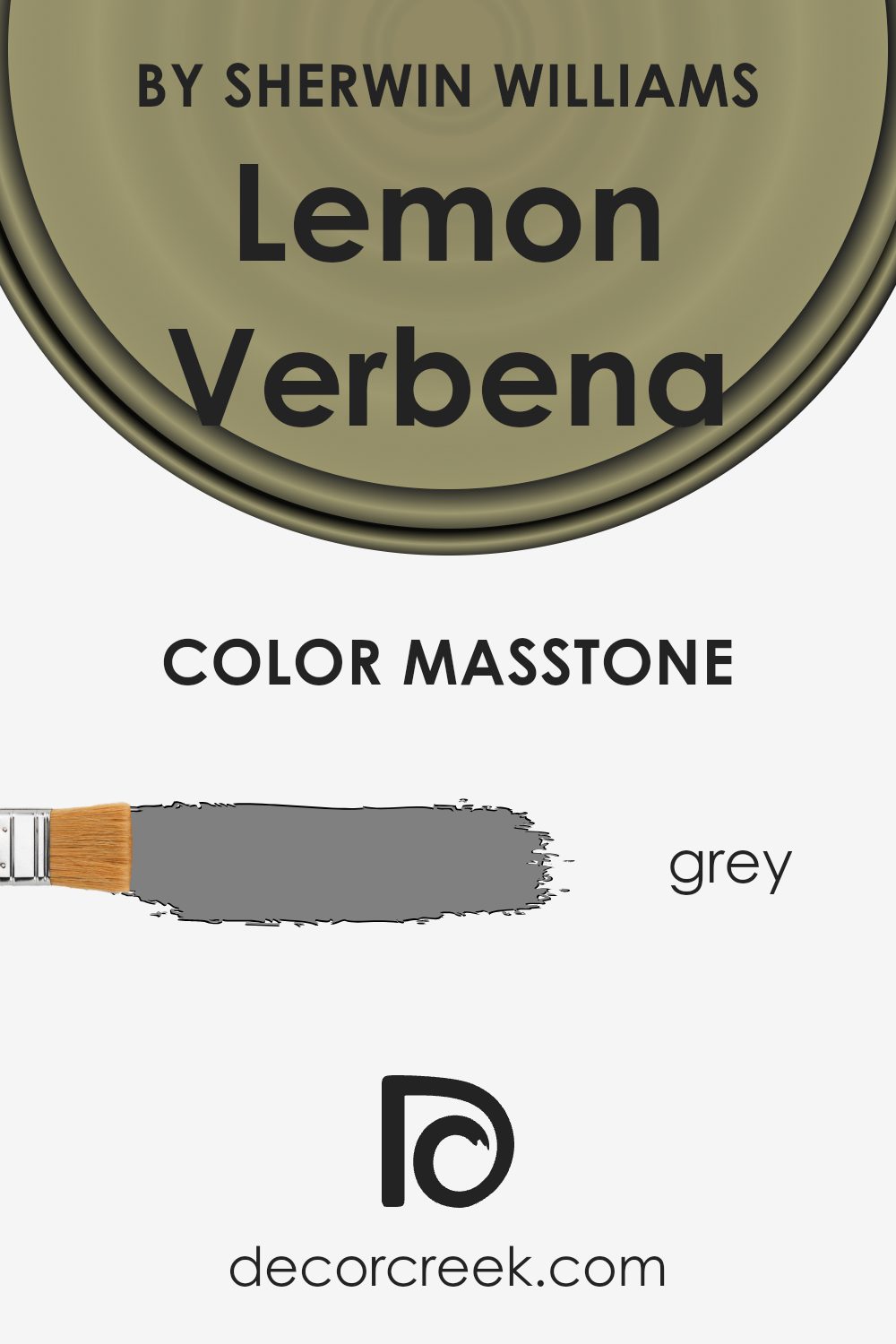
What is the Masstone of the Lemon Verbena SW 7726 by Sherwin Williams?
Lemon Verbena SW 7726 by Sherwin Williams, showing masstone Grey (#808080), offers a versatile and neutral backdrop for any room. Its grey masstone means that it can pair well with a wide range of other colors, from bright and bold to soft and subtle, making it an ideal choice for those who enjoy changing their decor often.
This shade is particularly effective in spaces that require a calming, understated look, such as bedrooms or home offices. Because it’s so neutral, it doesn’t overpower the room but instead blends seamlessly with different styles and textures.
This adaptability makes it useful for both small spaces, which can appear larger, and large areas, where it helps create a cohesive feel throughout.
Additionally, being a light grey, it is excellent at hiding small marks or imperfections on the walls, making it a practical choice for busy homes.
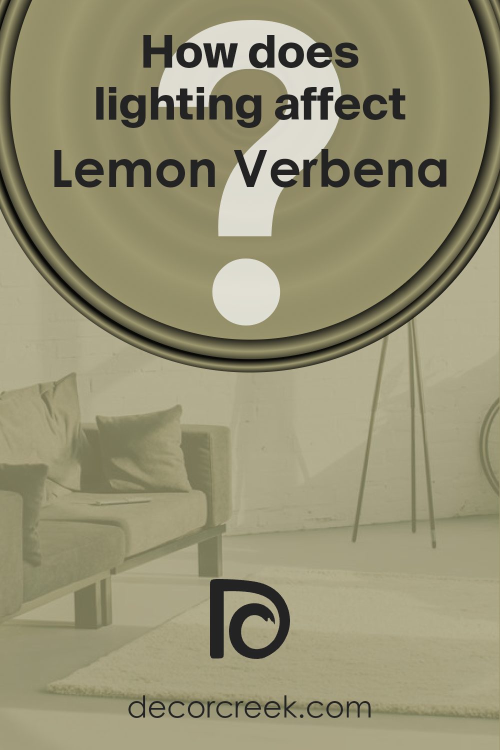
How Does Lighting Affect Lemon Verbena SW 7726 by Sherwin Williams?
Lighting plays a crucial role in how we perceive colors. The type of light and its intensity can change how a color looks in a room, especially when it comes to paint like Lemon Verbena by Sherwin Williams. This specific shade is a vibrant but soft yellow that has the flexibility to look different under various lighting conditions.
In natural light, Lemon Verbena tends to appear brighter and truer to its sunny hue.
This makes it an excellent choice for rooms that receive a lot of daylight, as it enhances the room’s natural vibrancy.
There’s a notable difference in this hue under different exposures:
- North-Faced Rooms: These rooms generally get less direct sunlight, which can make colors appear slightly cooler. Lemon Verbena in a north-facing room might not reach its brightest potential and could look a bit more muted and gentle.
- South-Faced Rooms: South-facing rooms benefit from abundant light for most of the day. Here, Lemon Verbena will look vivacious and warm, bringing a cheerful and energetic ambiance to the space.
- East-Faced Rooms: Morning light is warm and yellow-toned, which complements Lemon Verbena beautifully, making the room glow in the early hours. However, as the day progresses and the natural light diminishes, the color may lose some of its brightness.
- West-Faced Rooms: In these rooms, the color will show a mild tone during the morning and become vibrantly warm and sunny in the evening as the sun sets. This can create a welcoming and lively space in the afternoon and evening.
Under artificial lighting, Lemon Verbena’s appearance can differ significantly based on the type of bulbs used:
– Warm White Bulbs: Enhance the yellow tones, making the paint look warmer and cozier.
– Cool White Bulbs: May cast a slightly greenish tint on this shade, reducing its warmth.
Overall, Lemon Verbena is a versatile color that adapts differently to each type of light, offering varied aesthetics across different rooms and conditions. Adjusting the lighting can help you achieve the desired effect and mood using this particular hue.
What is the LRV of Lemon Verbena SW 7726 by Sherwin Williams?
LRV stands for Light Reflectance Value, which is a measure of the amount of visible and usable light that gets reflected from a surface when illuminated by a light source. It is expressed as a percentage, where a higher value indicates that the surface reflects more light, making it appear lighter, and a lower value means it reflects less light, making it appear darker.
Understanding LRV can help in choosing paint colors for rooms based on the amount of natural or artificial light available, as well as their intended use. Lighter colors can make small rooms seem larger and more open, while darker colors can make large, bright rooms feel cozier.
With an LRV of around 31, the color Lemon Verbena by Sherwin Williams is on the darker side of the middle range.
This means it won’t reflect a lot of light, possibly making spaces feel smaller and more enclosed when used on walls.
In rooms with limited natural light, this color might make the environment seem dimmer, especially if used over large areas.
However, in a well-lit or a large room, it could add a sense of warmth and depth to the decor.
When considering use, it’s important to balance the color with adequate lighting and complementary decor to achieve the desired mood and effect in the space.

Coordinating Colors of Lemon Verbena SW 7726 by Sherwin Williams
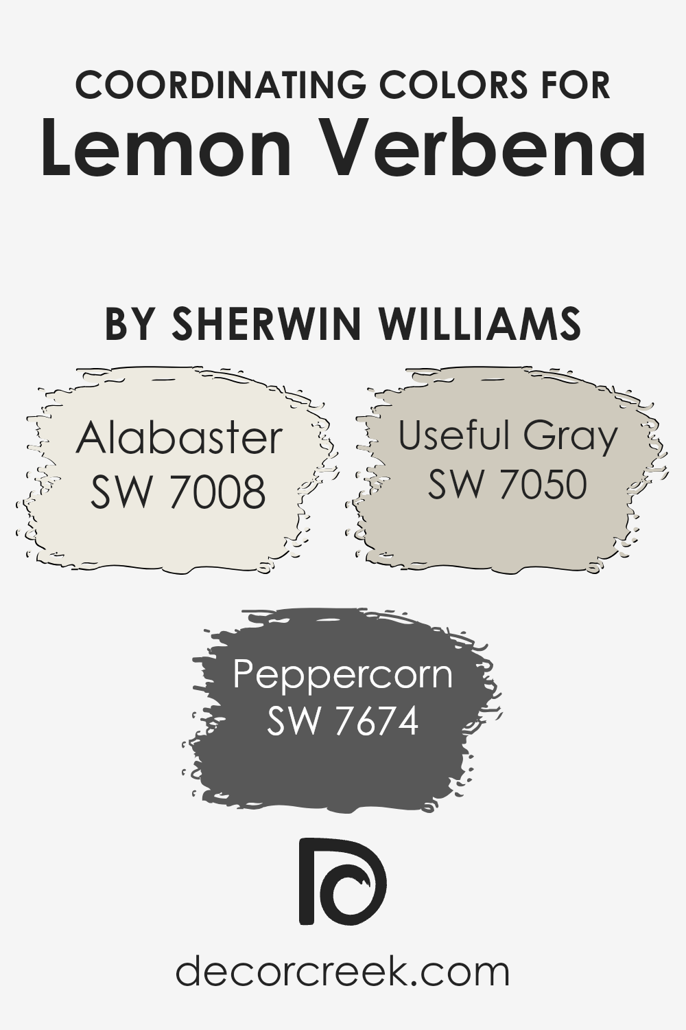
Coordinating colors are chosen to complement a main color, enhancing the overall aesthetic of a space without overwhelming it. For the vibrant Lemon Verbena, a lively green hue, perfect coordinating colors include Alabaster, Peppercorn, and Useful Gray.
These shades harmonize well, creating a balanced color scheme suitable for various design styles and spaces.
Alabaster is a soft, creamy white that brings a light and airy feel to interiors. It pairs beautifully with the fresh vibrance of Lemon Verbena, providing a calm backdrop that allows the green to stand out. On the other end of the spectrum, Peppercorn offers a bold contrast.
This dark gray, almost black color adds drama and depth, making it a great choice for accentuating key features or for use in smaller doses. Useful Gray is a versatile mid-tone that straddles the line between gray and beige.
This neutrality makes it an excellent choice for larger areas, blending seamlessly with both the vividness of Lemon Verbena and the crispness of Alabaster. Together, these coordinating colors create a cohesive and attractive palette.
You can see recommended paint colors below:
- SW 7008 Alabaster (CHECK A SAMPLE)
- SW 7674 Peppercorn (CHECK A SAMPLE)
- SW 7050 Useful Gray (CHECK A SAMPLE)
What are the Trim colors of Lemon Verbena SW 7726 by Sherwin Williams?
Trim colors are essential for accentuating the features of a room and framing the central hues, like Lemon Verbena by Sherwin Williams, in a way that enhances the overall aesthetic. When used strategically, trim colors can help define the space, highlight architectural details, and create a cohesive look.
For Lemon Verbena, a vibrant, lively green, selecting the right trim colors can really make the walls pop and give the room a fresh, cheerful vibe.
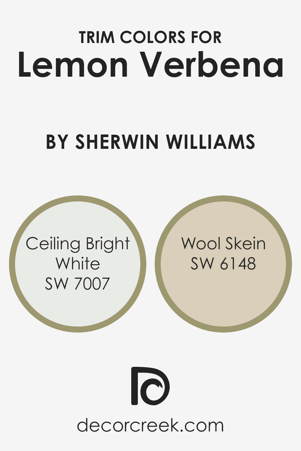
Using SW 7007 – Ceiling Bright White as a trim color offers a crisp, clean contrast that can help the lively Lemon Verbena stand out even more. Ceiling Bright White is ideal for ceilings and moldings, providing a sharp boundary that makes the ceiling appear higher and the space larger.
On the other hand, SW 6148 – Wool Skein provides a softer, neutral counterpoint to the brighter tones of Lemon Verbena.
This shade is a gentle beige that can subtly soften transitions between the vibrant walls and other decorative elements in the room, lending a harmonious, balanced feel to the overall design.
You can see recommended paint colors below:
- SW 7007 Ceiling Bright White (CHECK A SAMPLE)
- SW 6148 Wool Skein (CHECK A SAMPLE)
Colors Similar to Lemon Verbena SW 7726 by Sherwin Williams
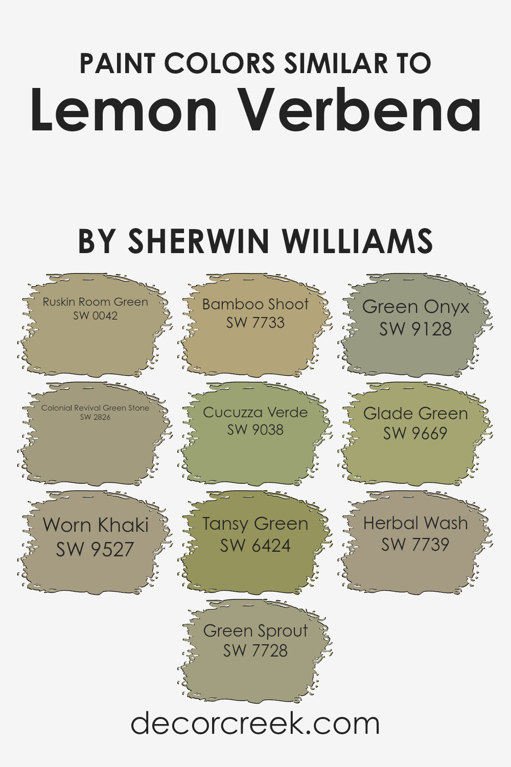
Choosing similar colors is a great way to create a harmonious and appealing visual appearance. Colors similar to Lemon Verbena, such as Ruskin Room Green, Colonial Revival Green Stone, and others, coordinate well because they share underlying tones that unify the space they are in.
Using shades like Worn Khaki, Green Sprout, and Bamboo Shoot can soften transitions between spaces, making them feel cohesive yet distinct.
These similar shades from Sherwin Williams, such as Cucuzza Verde, Tansy Green, and Green Onyx, help in creating themes that offer a subtle variation in mood but maintain a connected color scheme.
This strategy is especially effective for achieving a natural flow in an environment, where the eye moves smoothly from one area to another without sharp disruptions caused by contrasting colors.
When describing the colors, Ruskin Room Green and Colonial Revival Green Stone offer rich earthy tones, providing a grounding effect. Worn Khaki brings a muted utility that works well in a variety of settings, while Green Sprout introduces a fresh, lively touch.
Bamboo Shoot and Cucuzza Verde offer slightly exotic hues that can give a space a feeling of lushness and growth. Tansy Green stands out with a more vivid intensity, suitable for creating focal points.
Green Onyx adds a unique, somewhat muted elegance, and Glade Green offers a refreshing blend of green tones that has a subtle energy.
Lastly, Herbal Wash is a light, soothing color that can enhance the feeling of space and lightness. All these colors collectively help in setting a desired atmosphere, ensuring a smooth aesthetic flow throughout interior environments.
You can see recommended paint colors below:
- SW 0042 Ruskin Room Green (CHECK A SAMPLE)
- SW 2826 Colonial Revival Green Stone
- SW 9527 Worn Khaki (CHECK A SAMPLE)
- SW 7728 Green Sprout (CHECK A SAMPLE)
- SW 7733 Bamboo Shoot
- SW 9038 Cucuzza Verde (CHECK A SAMPLE)
- SW 6424 Tansy Green (CHECK A SAMPLE)
- SW 9128 Green Onyx (CHECK A SAMPLE)
- SW 9669 Glade Green (CHECK A SAMPLE)
- SW 7739 Herbal Wash (CHECK A SAMPLE)
Colors that Go With Lemon Verbena SW 7726 by Sherwin Williams
Choosing the right colors to pair with Lemon Verbena SW 7726 by Sherwin Williams is crucial because it ensures that the space feels cohesive and balanced. Lemon Verbena is a vibrant and lively green hue that can bring energy and brightness to any room.
Complementary colors can either enhance this vibrancy or provide a calming contrast, depending on the desired ambiance.
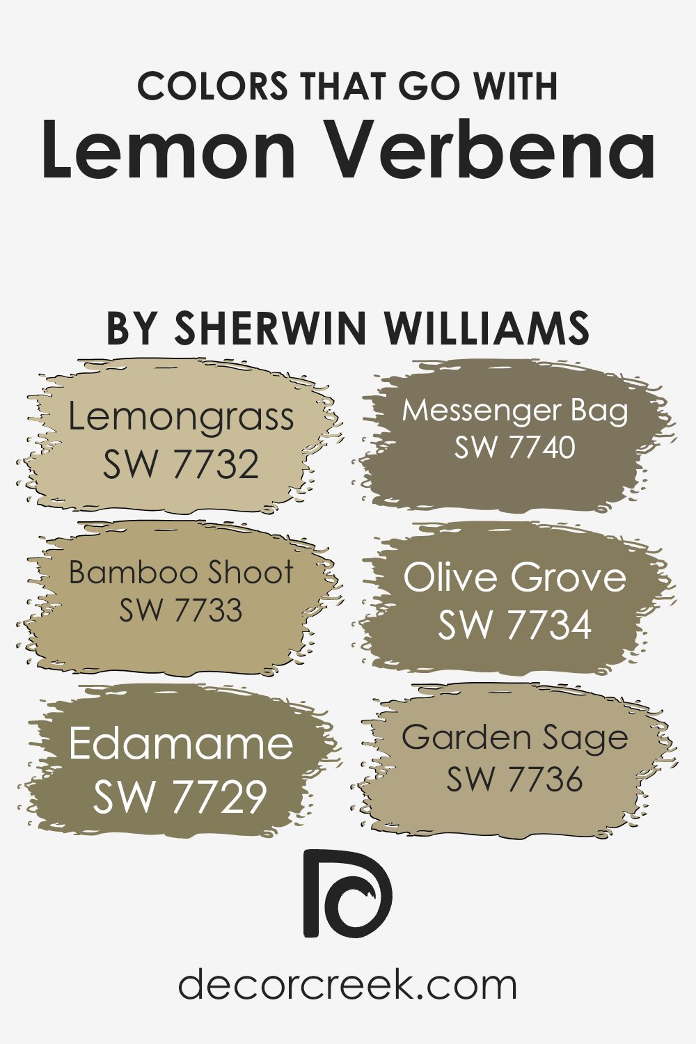
For example, pairing it with colors like SW 7732 – Lemongrass or SW 7733 – Bamboo Shoot adds a sense of harmony as these greens share certain undertones, creating a smooth, consistent look.
SW 7729 – Edamame is a shade that introduces a bit deeper green, offering a subtle and grounding effect when used with Lemon Verbena.
SW 7740 – Messenger Bag, a darker, muted green, provides a strong visual anchor, offering a striking contrast that can make Lemon Verbena pop even more.
In contrast, SW 7734 – Olive Grove offers a rich, deep green that borders on earthy, offering depth and complexity to the color palette.
Lastly, SW 7736 – Garden Sage is a lighter and softer green which acts as a gentle complement to Lemon Verbena, ensuring the space retains a light and airy feel.
By selecting appropriate complementary colors, the overall aesthetic achieves a harmonious and appealing look.
You can see recommended paint colors below:
- SW 7732 Lemongrass (CHECK A SAMPLE)
- SW 7733 Bamboo Shoot
- SW 7729 Edamame (CHECK A SAMPLE)
- SW 7740 Messenger Bag (CHECK A SAMPLE)
- SW 7734 Olive Grove (CHECK A SAMPLE)
- SW 7736 Garden Sage (CHECK A SAMPLE)
How to Use Lemon Verbena SW 7726 by Sherwin Williams In Your Home?
Lemon Verbena SW 7726 by Sherwin Williams is a vibrant yet soothing shade of green that can add a fresh and lively feel to any space in your home. With its light and airy vibe, it’s perfect for creating a welcoming atmosphere in areas like the kitchen or living room.
The color pairs well with natural wood finishes, whites, and even soft grays, making it quite versatile for various design styles from modern to rustic.
Consider using Lemon Verbena in smaller, possibly darker spaces where a touch of brightness can make the area appear larger and more inviting. It’s also an excellent choice for a bedroom where a calm and pleasant environment is desirable for relaxation. Additionally, you can use it in a bathroom paired with white tiles to create a clean and refreshing look.
Accessories in contrasting colors like deep blues or vibrant yellows can create a dynamic interior that feels both lively and harmonious.
Lemon Verbena SW 7726 by Sherwin Williams vs Colonial Revival Green Stone SW 2826 by Sherwin Williams
Lemon Verbena by Sherwin Williams is a bright and cheery yellow. It brings a fresh, lively feel to any room, ideal for spaces where you want an inviting, happy ambiance. This color works well in kitchens, dining areas, or any space that benefits from a boost of energy and brightness.
On the other hand, Colonial Revival Green Stone by Sherwin Williams is a much more subdued and neutral shade. It’s a soft green that leans towards gray, giving it a muted, calming effect perfect for creating a relaxed environment.
This color is great for bedrooms, living rooms, or bathrooms where a more gentle and soothing presence is desired.
Both colors offer unique vibes: Lemon Verbena injects vibrancy and liveliness, while Colonial Revival Green Stone provides a muted backdrop for a more low-key, calming atmosphere. Each can be used effectively depending on the mood and function you wish to impart in a room.
You can see recommended paint color below:
- SW 2826 Colonial Revival Green Stone

Lemon Verbena SW 7726 by Sherwin Williams vs Glade Green SW 9669 by Sherwin Williams
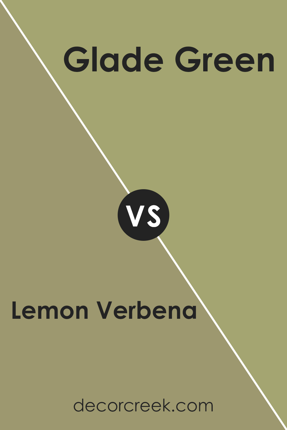
Lemon Verbena is a vibrant, cheerful yellow-green hue that brightens up any space with a lively burst of color. It has a fresh and energizing quality that can make rooms feel more inviting and alive. This color pairs well with both neutrals and bold shades, making it versatile for different design styles.
On the other hand, Glade Green is a much deeper and richer green with a more subdued and natural feel. It evokes the sense of being in a dense, lush forest and adds a grounding, calming effect to interiors.
This color tends to make spaces feel more cozy and enclosed, contrasting with the openness Lemon Verbena brings.
While both colors are green-based, Lemon Verbena leans towards a lighter, yellow-infused variant that sparks energy, and Glade Green brings a depth that is reminiscent of natural settings, offering a peaceful, sheltered atmosphere. Each color creates distinct moods and can be chosen based on the desired impact on a room’s ambiance.
You can see recommended paint color below:
- SW 9669 Glade Green (CHECK A SAMPLE)
Lemon Verbena SW 7726 by Sherwin Williams vs Green Onyx SW 9128 by Sherwin Williams
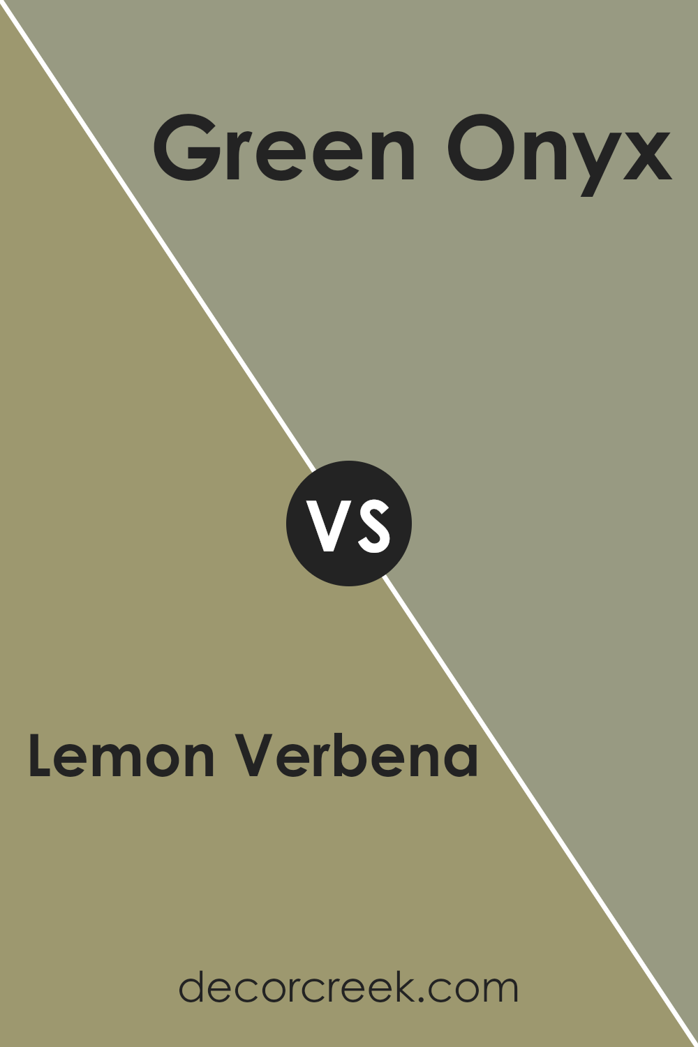
“Lemon Verbena” is a vibrant, refreshing shade of green. It brings to mind the lively color of fresh spring leaves or a zesty lemon peel. This color is especially great for adding a pop of brightness to a room or an object, making spaces feel more alive and energetic.
On the other hand, “Green Onyx” is a much deeper and muted green hue. It suggests the quiet and shadowy parts of a dense forest. This color is more understated compared to Lemon Verbena, providing a feeling of calm and stability.
While both colors belong to the green family, Lemon Verbena is louder and more cheerful, which could instantly light up a space. Green Onyx, being subtler, would work well in areas where you want a more grounded, soothing atmosphere.
Their different vibes mean that one might choose Lemon Verbena for a lively, vibrant setting, while Green Onyx could be better for a more reserved, peaceful area.
You can see recommended paint color below:
Lemon Verbena SW 7726 by Sherwin Williams vs Ruskin Room Green SW 0042 by Sherwin Williams
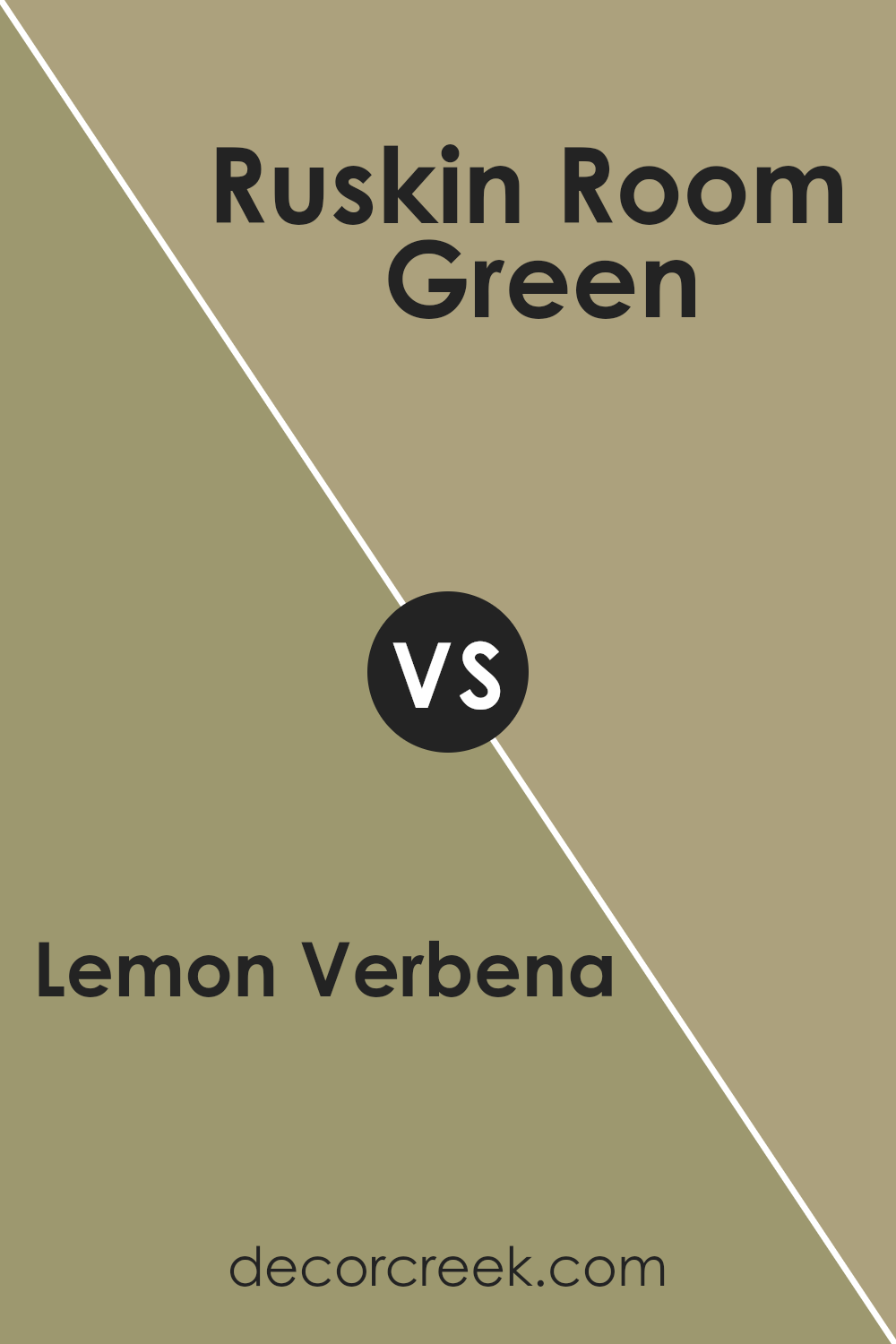
Lemon Verbena and Ruskin Room Green are two distinct colors from Sherwin Williams that each bring their unique vibe to a space. Lemon Verbena is a light, cheerful yellow that brightens up any room. It’s a great choice if you want to add a sense of airiness and fun. This shade can make small spaces appear larger and more inviting.
On the other hand, Ruskin Room Green is a deeper, subdued green with a hint of gray. It brings a calm and grounding feel, making it ideal for spaces where you want to promote relaxation and concentration. It’s a perfect color for bedrooms, studies, or cozy living areas.
When used together, these two colors offer a pleasant contrast that can balance vibrant brightness with soothing depth, making a space feel both lively and relaxed. They complement each other well in spaces that serve multiple purposes like living rooms or open-plan homes.
You can see recommended paint color below:
- SW 0042 Ruskin Room Green (CHECK A SAMPLE)
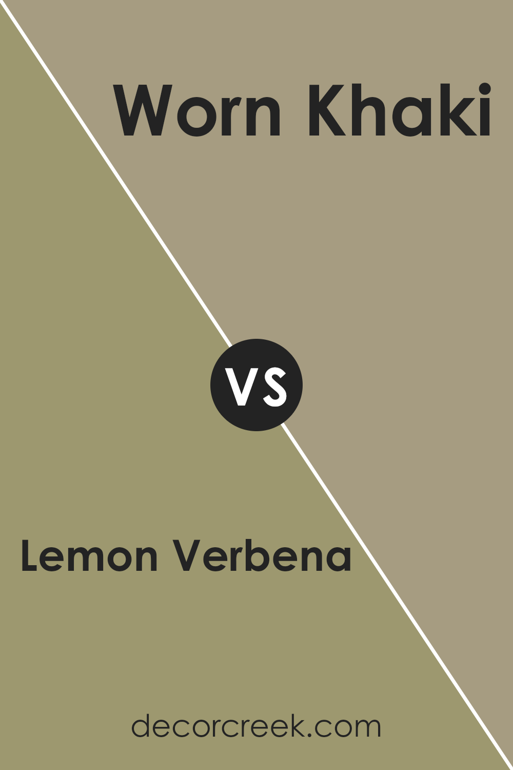
Lemon Verbena SW 7726 by Sherwin Williams vs Worn Khaki SW 9527 by Sherwin Williams
Lemon Verbena is a light, refreshing green with a vibrant touch that brightens up a space. It has a youthful and energetic feel, perfect for creating a lively atmosphere. This color works beautifully in kitchens or playrooms where the aim is to inspire positivity and creativity.
On the other hand, Worn Khaki is a subdued, warm gray with earthy undertones. It offers a calm and soothing vibe, making it ideal for areas where relaxation is key, such as bedrooms or living rooms.
This color pairs well with a variety of decor styles, adding a touch of grounded sophistication without overpowering the space.
Although both colors are unique, they cater to different moods and settings. Lemon Verbena injects vibrancy and could energize a room, while Worn Khaki provides a calming effect, perfect for winding down. Depending on what atmosphere you want to create, each color has its distinct charm and application.
You can see recommended paint color below:
- SW 9527 Worn Khaki (CHECK A SAMPLE)
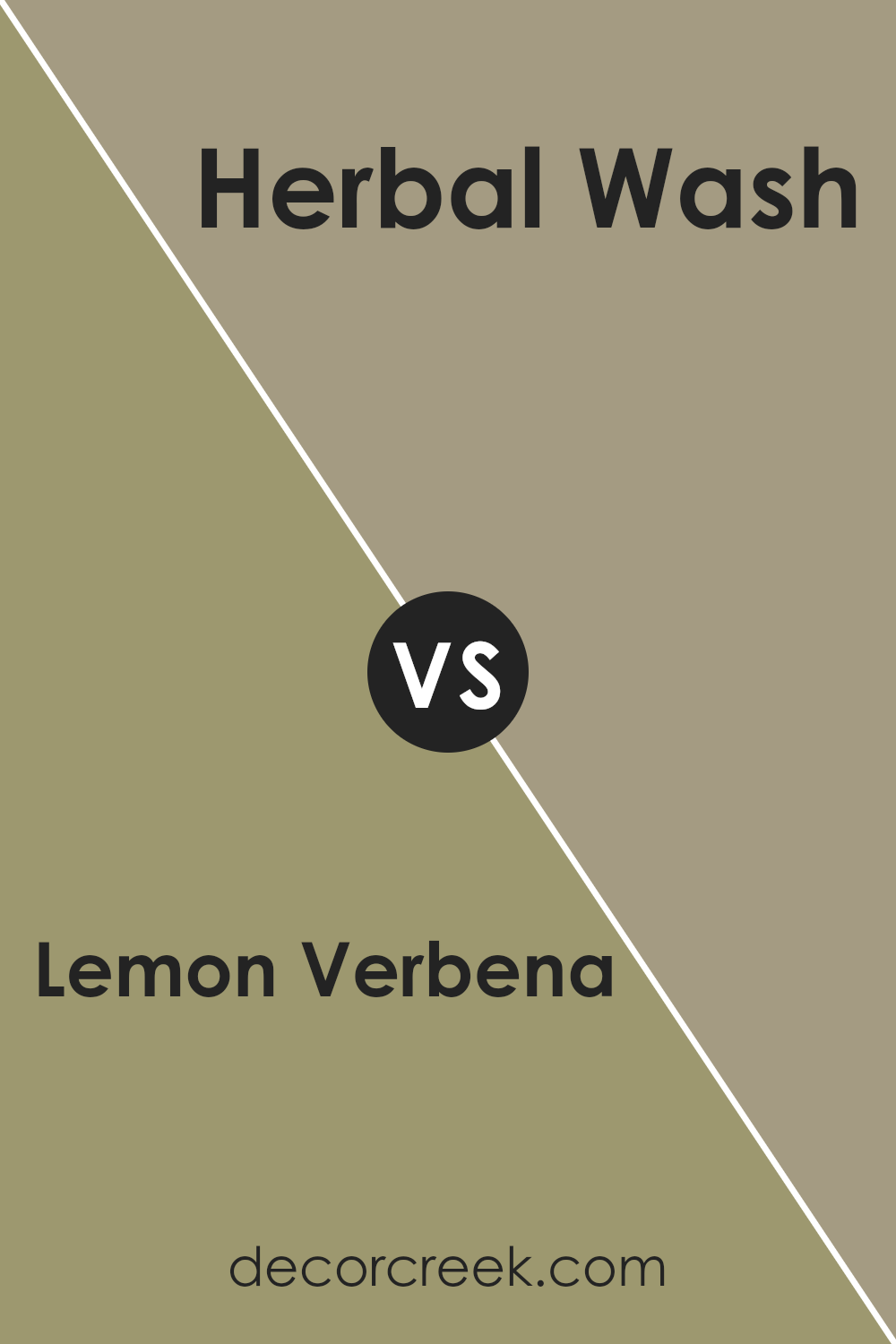
Lemon Verbena SW 7726 by Sherwin Williams vs Herbal Wash SW 7739 by Sherwin Williams
Lemon Verbena and Herbal Wash are both colors produced by Sherwin Williams, each offering a unique shade for interior or exterior spaces. Lemon Verbena is a bright and cheerful yellow with a lightness that can instantly make a room feel more vibrant and welcoming. Its subtle green undertones give it a fresh, lively look, aligning well with spaces meant to energize and uplift.
On the other hand, Herbal Wash presents a deeper, muted green hue, reminiscent of sage. This color has a calming effect and is perfect for creating a cozy, restful environment.
It stands out for its organic feel, which can help in making a space look harmonious and grounded.
Both colors have their specific uses depending on the mood and style you want to achieve in a room. Lemon Verbena works well in areas that benefit from a bright, sunny atmosphere, like kitchens or playrooms, while Herbal Wash is better suited for spaces where a more subdued, natural feeling is desired, such as bedrooms or studies.
You can see recommended paint color below:
- SW 7739 Herbal Wash (CHECK A SAMPLE)
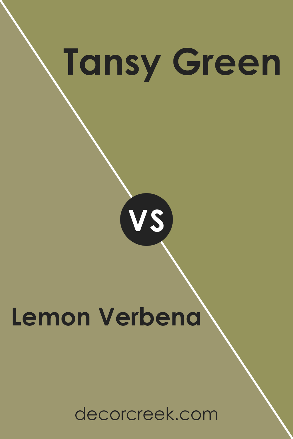
Lemon Verbena SW 7726 by Sherwin Williams vs Tansy Green SW 6424 by Sherwin Williams
Lemon Verbena is a soft, pale yellow with a gentle, subtle character that creates a light and airy feel in any space. It has a refreshing vibe and provides a clean backdrop that can brighten up darker areas or give a sun-kissed look to a room, working well in kitchens and living rooms where a touch of warmth is desirable.
In contrast, Tansy Green is a vibrant, medium shade of green that brings a lively and natural feel to an environment. It resembles the greenery in a lush garden, making it perfect for spaces where you want to add a touch of nature.
Its richer tone pairs well with wood finishes and can function beautifully in bedrooms or home offices where a calm but energizing atmosphere is helpful.
Together, these colors offer a charming balance if used in the same space, with Lemon Verbena lightening the space and Tansy Green providing depth and energy. Each stands out on its own but also complements the other when used in decor and styling.
You can see recommended paint color below:
- SW 6424 Tansy Green (CHECK A SAMPLE)
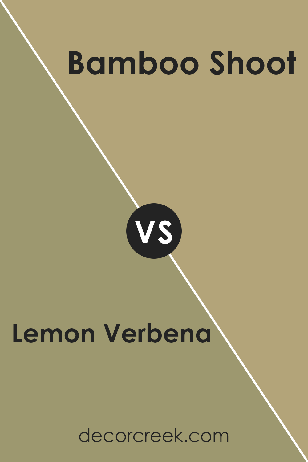
Lemon Verbena SW 7726 by Sherwin Williams vs Bamboo Shoot SW 7733 by Sherwin Williams
Lemon Verbena and Bamboo Shoot are two paint colors by Sherwin Williams that have a natural, earthy appeal. Lemon Verbena is a soft, gentle green with a hint of yellow, giving it a bright, cheerful quality. This color is excellent for spaces where you want to bring in a sense of liveliness and freshness. It reflects light well, making a room feel airy and more spacious.
On the other hand, Bamboo Shoot is a deeper, sage green color that leans toward a more muted tone. It’s ideal for areas where a calming, grounding effect is desired.
Though less vibrant than Lemon Verbena, Bamboo Shoot provides a strong backdrop that works well in a variety of settings, from bedrooms to living areas.
It pairs beautifully with wooden furniture and natural elements.
Both colors have their unique appeal and can dramatically affect the feel of a room, depending on how they are used. Where Lemon Verbena brightens, Bamboo Shoot soothes, making them versatile choices for different decorating styles.
You can see recommended paint color below:
- SW 7733 Bamboo Shoot
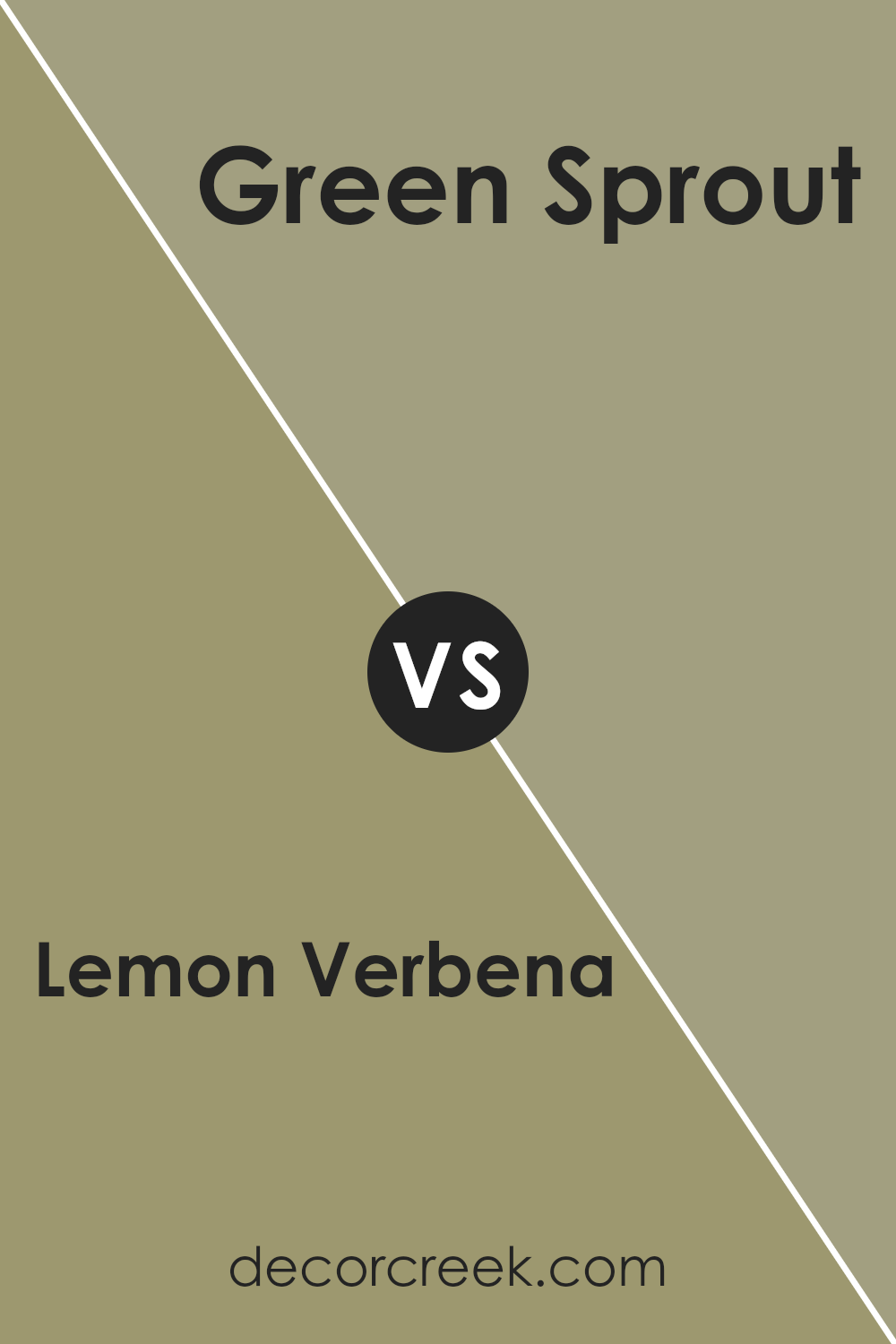
Lemon Verbena SW 7726 by Sherwin Williams vs Green Sprout SW 7728 by Sherwin Williams
Lemon Verbena and Green Sprout are two distinct shades from Sherwin Williams. Lemon Verbena is a light, soft green that leans towards a pale yellow, giving it a fresh and uplifting vibe. It’s the kind of color that brightens up a space and makes it feel airy and light.
In contrast, Green Sprout is a deeper, more vibrant shade of green. It has a more lively and energetic feel to it, reminiscent of fresh greenery in spring. This color can add a punch of life to any room, making it feel more dynamic and inviting.
Both colors bring their own unique qualities to a space. Lemon Verbena works well in areas where you want to create a subtle, soothing atmosphere without making the space feel too enclosed. It’s perfect for bedrooms or quiet sitting areas.
Green Sprout, on the other hand, is great for spaces where you want more vibrancy, like kitchens or playrooms, where its brightness can stimulate activity and energy.
Choosing between them would depend on the mood you’re looking to create. If you want calm and quiet, go for Lemon Verbena. If you’re after energy and freshness, Green Sprout is the way to go.
You can see recommended paint color below:
- SW 7728 Green Sprout (CHECK A SAMPLE)
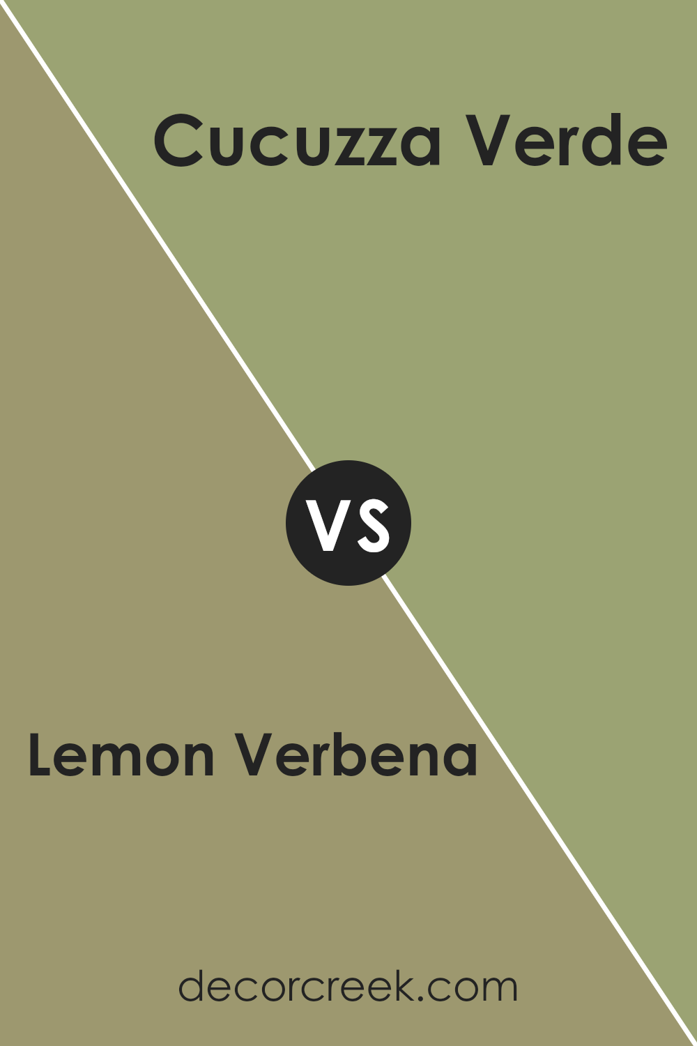
Lemon Verbena SW 7726 by Sherwin Williams vs Cucuzza Verde SW 9038 by Sherwin Williams
Lemon Verbena is a lively yellow-green color that feels fresh and full of energy. It’s reminiscent of a light, zesty lemon mixed with green herbs, giving it a vibrant yet natural feel. This color is great for adding a bright, cheerful touch to spaces, especially in kitchens or sunrooms where you might want lots of natural light.
On the other hand, Cucuzza Verde is a deeper, more muted green with a grey undertone. It looks like the color of a dense forest on a rainy day, offering a more subdued and grounding vibe.
This color works well in areas where you want a touch of nature but in a more understated way, like in bedrooms or offices.
Both colors bring their own unique style to the table: Lemon Verbena is more about energy and brightness, while Cucuzza Verde offers a calm, soothing backdrop.
They could even complement each other in a home, used in different rooms to create varied moods and themes.
You can see recommended paint color below:
- SW 9038 Cucuzza Verde (CHECK A SAMPLE)
Conclusion
In summary, SW 7726 Lemon Verbena by Sherwin Williams is a vibrant and cheerful paint color that can brighten up any room. This shade of yellow is like the warm sunshine on a lovely summer day, bringing a happy and lively feel wherever it is used.
Whether it’s in a kitchen, living room, or even a small corner, Lemon Verbena makes the area look fresh and inviting.
The great thing about Lemon Verbena is that it goes well with many other colors, making it easy to use in many different home styles. You can pair it with white for a clean and simple look, or with gray and blue for a more grown-up and calm atmosphere.
It’s also perfect for a room where all family members gather, as its cheerfulness enhances good moods and can make a space feel more welcome.
After seeing how this paint color acts in different rooms and settings, I think it’s a fantastic choice for anyone looking to add a splash of joy and light to their home.
So, if you’re thinking about refreshing a room or just adding a little extra cheer, Lemon Verbena might be just what you need. It’s like bringing a little piece of sunshine indoors!

Ever wished paint sampling was as easy as sticking a sticker? Guess what? Now it is! Discover Samplize's unique Peel & Stick samples.
Get paint samples


