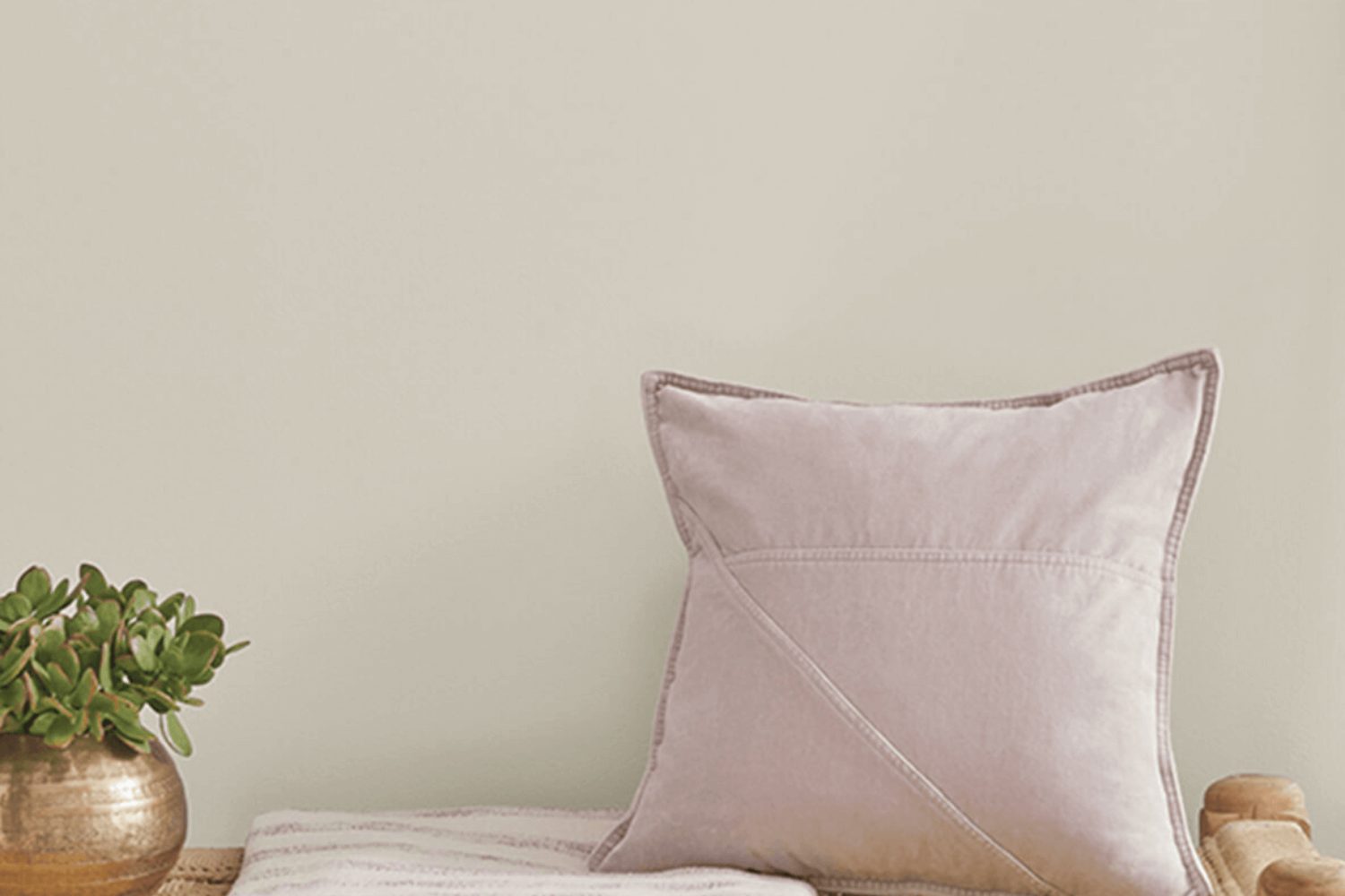
SW 7050, also known as Useful Gray, is a popular paint color from the well-known brand Sherwin Williams. This color strikes a perfect balance between warmth and coolness, making it exceptionally versatile for various decorating styles and spaces. It’s a subtle shade that can add a touch of sophistication to any room without overpowering it. Whether you’re looking to freshen up your living room, bedroom, or even your kitchen, Useful Gray has a way of bringing a modern yet timeless appeal to walls, cabinets, and even exterior surfaces.
One of the best things about this shade is how it adapts to different lighting conditions, subtly shifting its tone from a light, soothing gray in bright daylight to a warmer, more enveloping hue as the sun sets.
This chameleon-like quality makes it an excellent choice for those who are seeking a color that can easily compliment various decor styles and color palettes.
Moreover, Useful Gray pairs beautifully with a wide range of other colors, from bold and bright hues to soft and neutral tones, offering endless possibilities for creating a space that feels both unique and welcoming. Whether you’re a fan of minimalist designs or prefer more eclectic decor, Useful Gray provides a solid foundation for exploring your aesthetic preferences. Let’s explore how Useful Gray can transform your space into a stylish and inviting haven.
What Color Is Useful Gray SW 7050 by Sherwin Williams?
Useful Gray is a subtle and versatile color from Sherwin Williams. This shade straddles the line between gray and beige, making it a perfect neutral choice for those who want a hint of warmth without overpowering their space. Its muted tones allow it to blend seamlessly with various interior styles, especially those that favor a minimalist or Scandinavian look, due to its clean and calming vibe. It also works wonders in rustic or shabby chic settings, where its earthy quality can complement natural textures.
When it comes to pairing materials and textures with Useful Gray, the options are plentiful. This color looks stunning with natural wood, whether you opt for dark, rich tones that contrast beautifully against its lightness, or lighter, washed-out woods that maintain a soft, airy feel in the room.
Adding textiles in white, cream, or even soft pastels can create a cozy, layered effect that’s both inviting and stylish. Metals like brushed nickel or bronze can add a touch of sophistication, while stone elements, such as marble or granite, contribute to a more grounded and organic atmosphere.
Overall, Useful Gray serves as a flexible backdrop that can support a wide array of decor choices, allowing materials and textures to truly shine. It’s an excellent choice for anyone looking to achieve a serene and welcoming space.
Is Useful Gray SW 7050 by Sherwin Williams Warm or Cool color?
Useful Gray by Sherwin Williams is a versatile shade that homeowners love for its flexibility and warmth. This color isn’t just another gray; it has a unique quality that makes spaces feel cozy yet sophisticated. With its soft, understated tone, it easily pairs with a wide range of decor styles, from modern minimalism to rustic charm. This gray has a slight warmth to it, making it perfect for rooms that need a touch of coziness without the heaviness of darker colors.
When applied to walls, Useful Gray transforms the room into a peaceful retreat, where natural light enhances its beauty, giving the space an inviting ambiance. It’s particularly effective in living areas and bedrooms where comfort is key.
Additionally, its neutral base allows for endless accent color possibilities, enabling personal touches through furniture and decor. This color works well in homes because it creates a neutral backdrop that’s anything but boring, adding depth and character to any room without overwhelming it.
Undertones of Useful Gray SW 7050 by Sherwin Williams
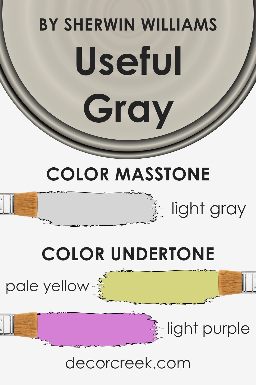
Useful Gray by Sherwin Williams is a versatile color with a complex mix of undertones that can subtly influence the feel of any room. Understanding its undertones is crucial because they can significantly affect how this gray appears under different lighting conditions and when paired with various furnishings and decor.
This paint has hints of pale yellow, light purple, light blue, pale pink, mint, lilac, and grey. Each of these undertones can emerge more prominently depending on the light exposure in the room and nearby colors. For instance, in a room with lots of natural light, the light blue and mint undertones might make the space feel more airy and fresh. In contrast, in a space with less natural light, the pale pink or lilac might become more noticeable, giving the room a cozier feel.
On interior walls, the complexity of Useful Gray means it’s a highly adaptable backdrop. It can warm up a space if the lighting highlights its yellow or pink undertones, making it inviting. Conversely, its cooler blue or mint undertones can offer a serene, calming vibe, ideal for bedrooms or bathrooms.
The grey and lilac undertones can give a neutral ground, making it easy to match with a wide range of colors, from bold to soft.
In sum, the unique mix of undertones in Useful Gray means it can work beautifully in many spaces, adapting subtly to different settings and enhancing the overall mood of a room. Its versatility makes it a smart choice for anyone looking to refresh their interior walls with a color that can shift and play with the light throughout the day.
What is the Masstone of the Useful Gray SW 7050 by Sherwin Williams?
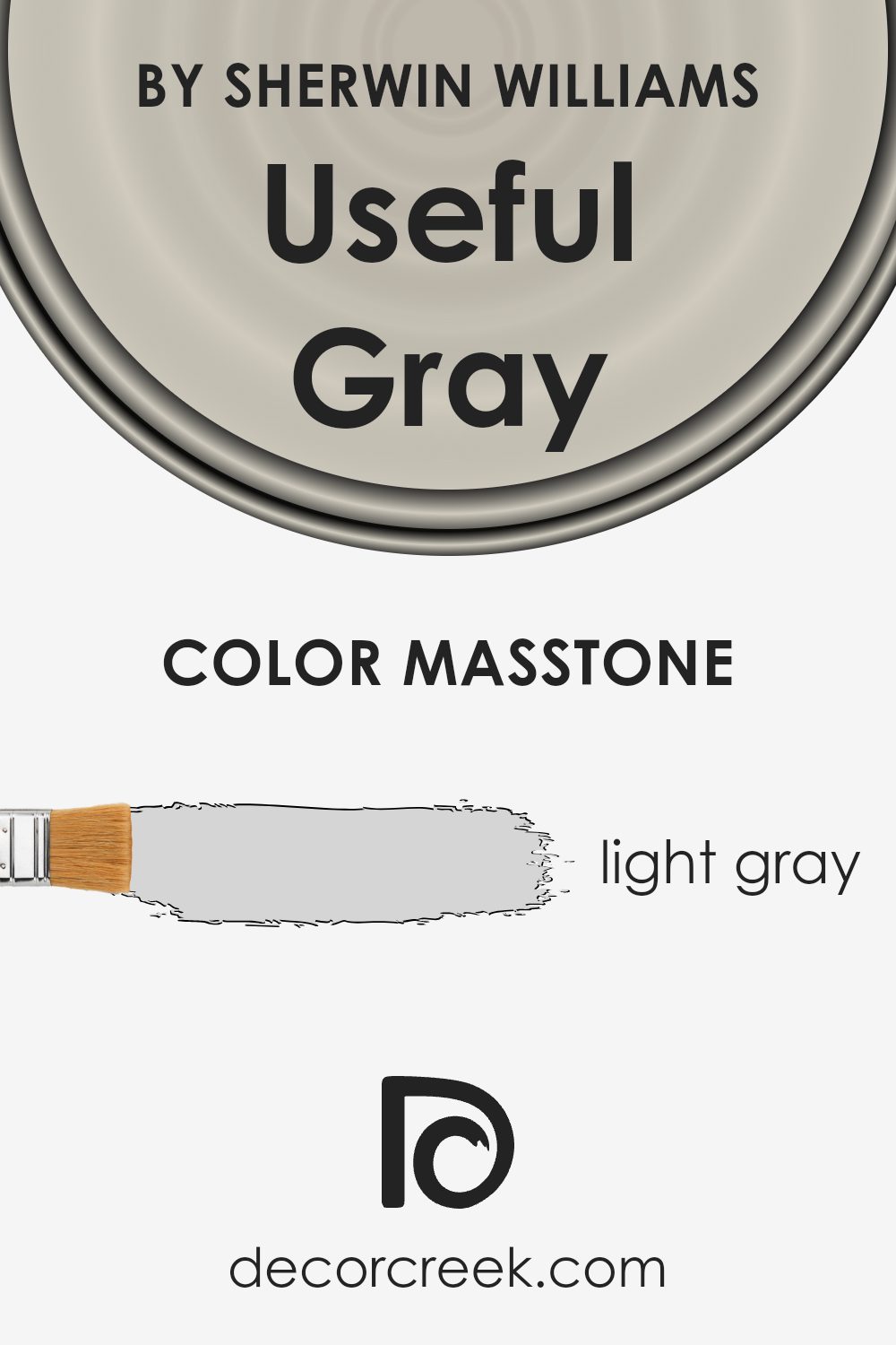
Useful Gray SW 7050 by Sherwin Williams is a light gray color that looks very soft and neutral. When you paint a room with this color, it creates a calm and peaceful space. It’s not too dark or too light, making it a perfect choice for almost any room in your home.
This light gray color works well because it’s very versatile. It can match with many different colors of furniture and decorations. For example, it looks great with both bright colors that pop and softer, more subtle tones. This makes it easy to change your room’s look without needing to repaint.
Another great thing about Useful Gray is that it reflects light nicely. This can make small rooms look bigger and more open. It’s also good for places that don’t get a lot of sunlight, making them feel brighter and more welcoming.
Overall, this color can help create a beautiful, modern look in your home. It’s simple, yet effective, making your home feel cozy and stylish.
How Does Lighting Affect Useful Gray SW 7050 by Sherwin Williams?
Lighting plays a crucial role in how we perceive colors. A color might look one way under the bright sun and completely different under a lamp. This happens because light sources vary in their color temperatures. Sunlight, for example, can range from warm and golden in the early morning and late afternoon to cool and blueish at midday. Artificial lights, like LED or fluorescent bulbs, have their own specific shades that can alter the appearance of colors.
Useful Gray is a versatile shade that can look different depending on the light. In artificial light, such as from standard incandescent bulbs, this color can appear warmer and cozier, making it a great choice for living rooms or bedrooms where you want a snug atmosphere.
Under cooler, bluer artificial lights, like some LEDs, it might look more neutral or slightly cooler, which is excellent for spaces you want to feel fresh and open.
- In natural light, the changes are even more pronounced. In a north-facing room, which receives less direct sunlight and tends to have cooler, softer light, Useful Gray can seem more muted and subtle. The lack of intense sunlight preserves the color’s neutrality, making it a peaceful and calming choice for areas designed for relaxation or focus.
- In a south-facing room, where light is warmer and more abundant, Useful Gray can take on a softer, slightly warmer tone, highlighting the room with a welcoming and pleasant atmosphere. This makes it ideal for communal spaces like living rooms or kitchens where a friendly, inviting vibe is desired.
- East-facing rooms see the warm, golden tones of the morning sun, which can make Useful Gray feel slightly warmer in the mornings but return to a more balanced, true-to-swatch appearance as the day progresses. This natural shift is perfect for bedrooms and breakfast nooks that benefit from a gentle, energizing ambiance in the morning.
Conversely, in west-facing rooms, the color will bask in the warm, intense late afternoon and evening light, making it appear warmer and richer. This is a wonderful characteristic for dining rooms or sitting areas where you’d want a cozy and slightly more dramatic effect in the evening.
In summary, lighting significantly impacts how we perceive colors, and Useful Gray’s versatility makes it a fantastic choice for various settings and orientations, adapting uniquely to each type of light.
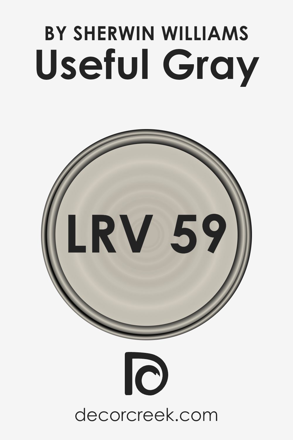
What is the LRV of Useful Gray SW 7050 by Sherwin Williams?
With an LRV of 59.103, Useful Gray falls into the medium-light range. This means it’s neither too bright nor too dark, making it a versatile color for various spaces. In brightly lit rooms, this color will look lighter and can add a sense of spaciousness.
In rooms with less light, Useful Gray will appear slightly darker, helping to create a cozy atmosphere without making the room feel small or cramped. It’s a balanced shade that works well in many settings, offering flexibility in design and a pleasant backdrop for decoration.
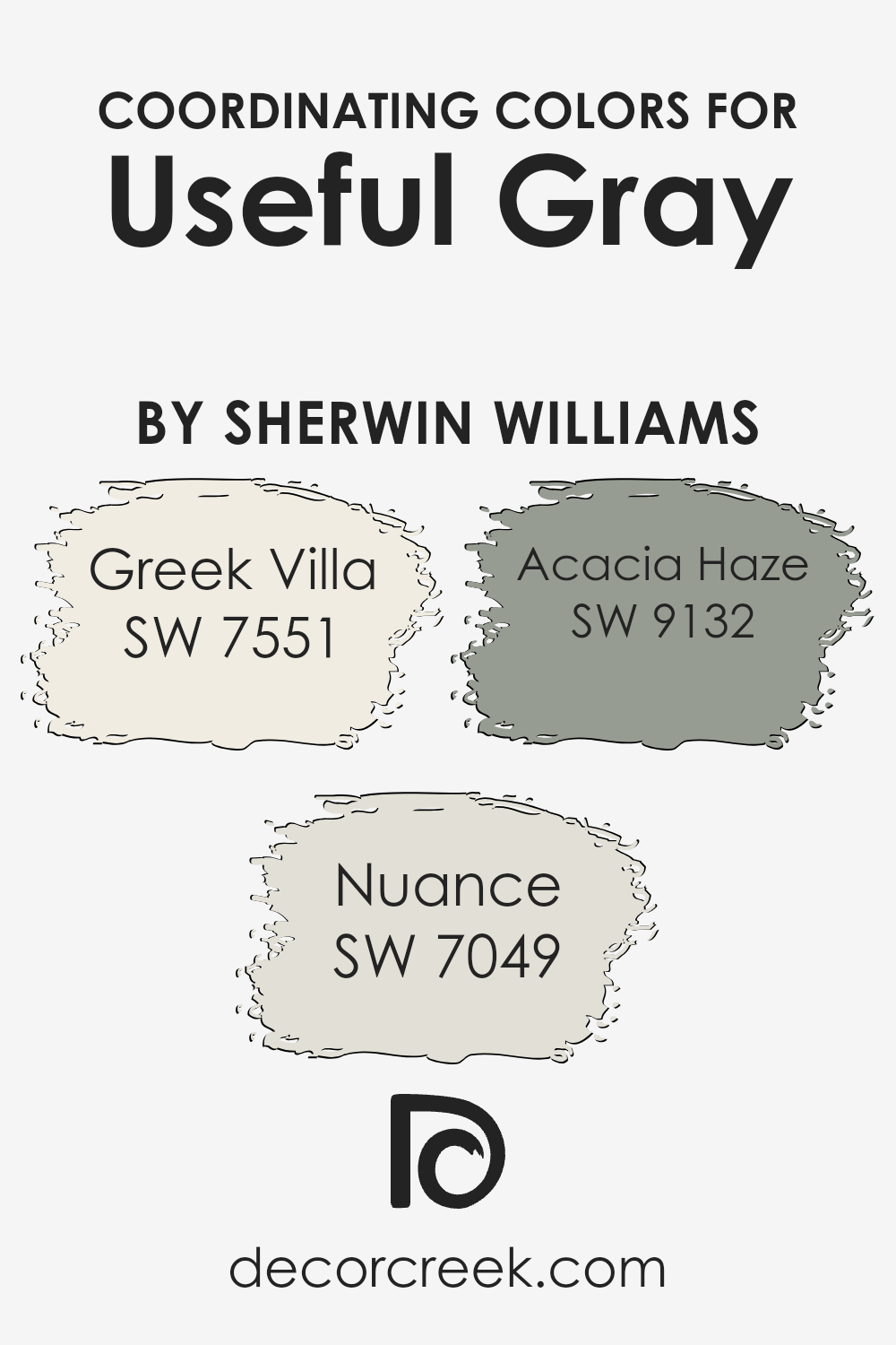
Coordinating Colors of Useful Gray SW 7050 by Sherwin Williams
Coordinating colors are hues that work in harmony with a primary color to enhance the overall palette of a space. In the case of Useful Gray by Sherwin Williams, three colors that beautifully complement it are Greek Villa, Nuance, and Acacia Haze. These coordinating colors can help create a balanced and inviting atmosphere when used together. By combining these shades, you can achieve a sophisticated and cohesive look in any room.
Greek Villa is a soft, off-white shade with a warm undertone, perfect for creating a light and airy feel that contrasts subtly with the deeper tones of Useful Gray. It’s an excellent choice for trim or ceilings to give a space a crisp, clean look.
Nuance, a subtle shade of gray with hints of almond, adds depth and warmth to the color scheme, working well in spaces that seek a neutral backdrop with a bit of complexity.
Acacia Haze, which is a deeper, moody green with gray undertones, offers a bold contrast to Useful Gray, bringing a touch of nature and sophistication into the room. Each of these coordinating colors has its unique charm, but when paired together, they create a visually appealing space that feels cohesive and thoughtfully designed.
You can see recommended paint colors below:
- SW 7551 Greek Villa
- SW 7049 Nuance
- SW 9132 Acacia Haze
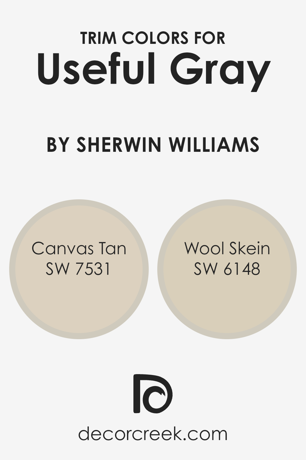
What are the Trim colors of Useful Gray SW 7050 by Sherwin Williams?
Trim colors are the shades used for painting the architectural details of a room, such as baseboards, moldings, doors, and frames, in contrast to the wall color. For Useful Gray, a neutral and versatile shade, selecting the right trim color is essential because it defines and highlights the aesthetic appeal of the walls, adding depth and character to the space. The choice of trim color can either subtly complement the walls for a cohesive look or stand out for a more dramatic effect, making the choice of color for trims an important decision in interior design.
For a harmonious look with Useful Gray, Canvas Tan SW 7531 and Wool Skein SW 6148 are excellent choices. Canvas Tan, a soft beige with warm undertones, offers a subtle contrast that enhances the warmth of Useful Gray, creating a serene and inviting atmosphere.
It has the unique ability to blend with various decor styles, making it a versatile choice for many spaces. On the other hand, Wool Skein, with its slightly yellowish tint, brings a gentle brightness to the room, offering a soft, yet noticeable contrast against the cooler undertones of Useful Gray. This combination results in a refined and elegant space that feels cohesive and thoughtfully designed.
You can see recommended paint colors below:
- SW 7531 Canvas Tan
- SW 6148 Wool Skein
Colors Similar to Useful Gray SW 7050 by Sherwin Williams
Similar colors are important in interior design and decoration because they create a harmonious and cohesive look, allowing for a space that feels well put-together and calming. By using colors that share a certain degree of similarity, one can ensure that different elements in a room blend smoothly, avoiding harsh contrasts that might disturb the overall aesthetic balance.
This strategy works particularly well when aiming for a subtle and sophisticated environment, as it allows for variations in hue and tone without straying too far from the chosen color palette.
- For instance, Gossamer Veil is a gentle, warm gray that offers a soft backdrop, perfect for creating a serene and inviting space.
- Vessel, on the other hand, introduces a touch of depth with its slightly cooler tone, making it ideal for adding dimension without overpowering.
- Dumpling brings in a creamy, almost ethereal quality, lending itself to spaces that crave a touch of lightness. Simple Stone strikes a balance between warmth and neutrality, providing versatility.
- Repose Gray, a true gray, works splendidly in contemporary settings, offering a modern and chic vibe.
- Agreeable Gray adds a smidgen of warmth, making any room feel more welcoming and lived-in.
- Sedate Gray stands out with its richer, deeper tone, perfect for creating focal points or accentuating details.
- Accolade introduces a subtle whisper of color, infusing spaces with elegance and understated charm.
- Slumber Sloth has a cozy depth to it, ideal for spaces meant for relaxation and contemplation.
- Finally, Mushroom offers a hint of earthiness, grounding the space and adding a sense of stability.
Together, these similar colors provide a toolkit for designing spaces that are coherent, refined, and thoughtfully curated, proving that subtlety in color choice can have a profound impact on the ambiance of any room.
You can see recommended paint colors below:
- SW 9165 Gossamer Veil
- SW 9547 Vessel
- SW 9616 Dumpling
- SW 9521 Simple Stone
- SW 7015 Repose Gray
- SW 7029 Agreeable Gray
- SW 6169 Sedate Gray
- SW 9516 Accolade
- SW 9606 Slumber Sloth
- SW 9587 Mushroom

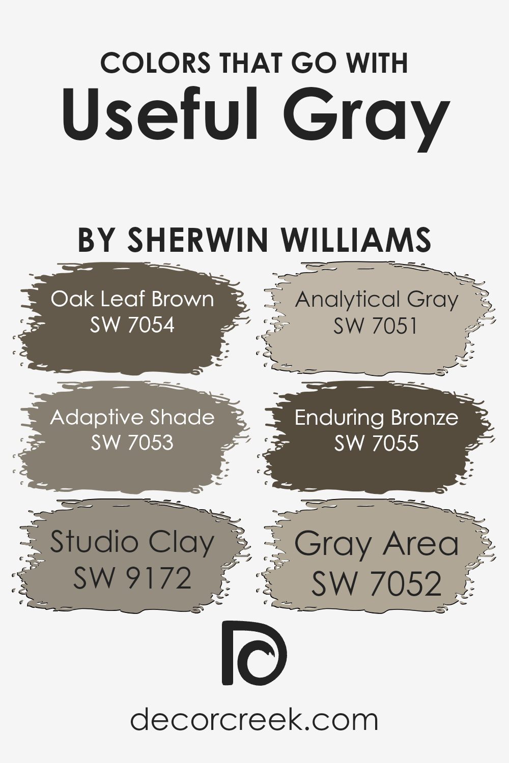
Colors that Go With Useful Gray SW 7050 by Sherwin Williams
Choosing colors that complement Useful Gray SW 7050 by Sherwin Williams is key to creating a cohesive and appealing space. Each color, when paired with Useful Gray, adds depth and character to the room while ensuring that the overall aesthetic remains balanced and inviting. The importance of these color combinations lies in their ability to enhance the beauty and versatility of Useful Gray, making it a perfect backdrop for various design styles and preferences.
- Oak Leaf Brown SW 7054 offers a rich, earthy touch that grounds the softness of Useful Gray, creating a comforting and secure atmosphere, ideal for living rooms or study areas.
- Adaptive Shade SW 7053, on the other hand, provides a subtle contrast with a cooler undertone, bringing a sense of calm and openness to spaces, making it excellent for bathrooms or bedrooms.
- Studio Clay SW 9172 introduces a warmer, more inviting feel, perfect for gathering spaces like the kitchen or dining room.
- Analytical Gray SW 7051, closely related to Useful Gray, seamlessly integrates with it, offering a sophisticated, monochromatic look suitable for modern and minimalist designs.
- Enduring Bronze SW 7055 brings in a muted, darker contrast, adding elegance and a touch of drama, ideal for accent walls or sophisticated entryways.
- Lastly, Gray Area SW 7052, with its deeper tone, creates a striking visual interest that complements the lighter hues of Useful Gray, making it perfect for creating focal points or adding depth to a room.
These colors, when used alongside Useful Gray, ensure a harmonious yet dynamic interior space that feels both cohesive and distinct.
You can see recommended paint colors below:
- SW 7054 Oak Leaf Brown
- SW 7053 Adaptive Shade
- SW 9172 Studio Clay
- SW 7051 Analytical Gray
- SW 7055 Enduring Bronze
- SW 7052 Gray Area
How to Use Useful Gray SW 7050 by Sherwin Williams In Your Home?
Useful Gray SW 7050 by Sherwin Williams is a versatile color that homeowners can easily integrate into their homes for a classy and modern look. This shade of gray balances perfectly between warm and cool tones, making it an excellent choice for any room. Whether you’re freshening up your living room, bedroom, or kitchen, this neutral color works wonders by creating a cozy yet sophisticated atmosphere.
If you’re aiming for a minimalist style, Useful Gray serves as an ideal backdrop. It pairs beautifully with white trim or accents, bringing a clean and airy feel to the space. For those who love a bit of color, it also complements vibrant hues, allowing furniture or artwork to stand out and become focal points in the room.
In smaller spaces, such as bathrooms or entryways, Useful Gray can help to make the area appear more spacious and inviting. Applying this color in various shades through paint, decorations, or fabrics can also add depth and interest to your home without overwhelming it with bright colors.
Overall, Useful Gray is a practical choice for anyone looking to update their home with a fresh, modern look that remains timeless.
Useful Gray SW 7050 by Sherwin Williams vs Dumpling SW 9616 by Sherwin Williams
Useful Gray and Dumpling by Sherwin Williams are two distinct colors each offering a unique ambiance for spaces. Useful Gray is a neutral, light-gray tone that presents a subtle, calming backdrop. It’s versatile and works well in a variety of settings, serving as a gentle foundation that complements both bright and subdued accents. In contrast, Dumpling swings towards the warmer spectrum, providing a creamy, off-white color.
This hue radiates a soft, welcoming vibe, making it perfect for creating a cozy and inviting atmosphere. While Useful Gray leans towards a modern, minimalist aesthetic, Dumpling offers a classic warmth, ideal for spaces aiming for a comfortable and homey feel. Regardless of their differences, both colors maintain a level of sophistication and ease, allowing for creative freedom in decorating.
Their distinct qualities make them suitable for different aesthetic goals, yet both can harmonize within a space if used thoughtfully.
You can see recommended paint color below:
- SW 9616 Dumpling
Useful Gray SW 7050 by Sherwin Williams vs Simple Stone SW 9521 by Sherwin Williams
Useful Gray and Simple Stone, both from Sherwin Williams, are two neutral colors with their unique appeal. Useful Gray is a gentle gray with subtle brown undertones, giving it a warm, inviting feel. This color is versatile, fitting well in various spaces, bringing a sense of comfort.
On the other hand, Simple Stone has a slightly cooler tone, blending gray with understated beige notes. This mix makes Simple Stone a perfect backdrop for a serene and sophisticated look, ideal for creating a peaceful environment.
While Useful Gray adds warmth due to its brownish hints, making spaces cozy and welcoming, Simple Stone offers a cleaner, more minimalistic vibe, thanks to its cooler, more balanced blend. Both colors stand out for their ability to complement a wide range of decor styles, from modern to rustic, but the choice between them depends on the desired ambiance – warmer and cozier with Useful Gray or cooler and more refined with Simple Stone.
You can see recommended paint color below:
- SW 9521 Simple Stone
Useful Gray SW 7050 by Sherwin Williams vs Agreeable Gray SW 7029 by Sherwin Williams
Useful Gray and Agreeable Gray are two popular colors by Sherwin Williams, each bringing its own unique vibe to spaces. Useful Gray carries a slightly cooler, more neutral tone compared to Agreeable Gray. Useful Gray can sometimes feel more like a traditional gray, offering a subtle cool backdrop that works well in rooms with both natural and artificial light. It’s a solid choice for those seeking a muted yet versatile color that doesn’t lean too heavily towards warm or cool tones.
On the other hand, Agreeable Gray is warmer and has hints of beige, making it a go-to neutral for many homeowners. This color has a welcoming feel to it, perfect for creating a cozy atmosphere in any room. Its warmth means it pairs beautifully with a wide range of décor, adding a soothing touch to spaces.
When selecting between the two, consider the lighting in your room and the mood you want to set. Useful Gray is great for a modern, balanced look, while Agreeable Gray is ideal for a softer, inviting space.
You can see recommended paint color below:
Useful Gray SW 7050 by Sherwin Williams vs Sedate Gray SW 6169 by Sherwin Williams
Useful Gray and Sedate Gray by Sherwin Williams are two popular colors, but they have their own unique vibes. Useful Gray sits in a sweet spot that’s like a warm, gentle hug. It’s not too dark or too light; it’s just right for creating a cozy atmosphere. Think of it as a light gray with a touch of warmth that can make any room feel welcoming.
On the other hand, Sedate Gray takes things down a notch. It’s a bit deeper, offering a serene and calming vibe. This color has a tad more depth, making it perfect for spaces where you want to relax and unwind. It’s like the calm before the storm, but in a good way, offering peace and tranquility to whoever enters the room.
Both colors are great choices, but your pick depends on what feeling you want to create in your space. If you’re after a light and airy feel, Useful Gray is your go-to. If it’s a peaceful and soothing atmosphere you’re after, Sedate Gray will do the trick.
You can see recommended paint color below:
- SW 6169 Sedate Gray
Useful Gray SW 7050 by Sherwin Williams vs Mushroom SW 9587 by Sherwin Williams
Useful Gray and Mushroom by Sherwin Williams are two distinct colors that bring their unique vibes to any space. Useful Gray is like a soft, gentle mist on an early morning, providing a light, airy feel that can make a room feel open and calm. It’s a gray that carries a hint of warmth, avoiding any cold or sterile feeling often associated with grays.
On the other hand, Mushroom steps in with a richer, earthier tone. Imagine the subtle warmth of soil or the quiet beauty of a forest floor; that’s the essence Mushroom brings. It’s deeper and cozier, creating a snug and welcoming atmosphere that invites you to relax.
While Useful Gray leans towards a minimalist and serene ambiance, Mushroom offers a more grounded and comforting presence. Whether you’re looking to refresh a bright and open space or cozy up a den or bedroom, choosing between these colors depends on the mood you’re aiming to achieve. They both offer a modern and sophisticated palette, but their individual strengths cater to different tastes and moods.
You can see recommended paint color below:
- SW 9587 Mushroom
Useful Gray SW 7050 by Sherwin Williams vs Repose Gray SW 7015 by Sherwin Williams
Useful Gray and Repose Gray are two popular colors by Sherwin Williams, each offering a unique touch to interior spaces. Useful Gray has a warmer undertone, providing a cozy and inviting feel. It’s perfect for rooms that need a soft, warm look without becoming too dark or overwhelming.
Repose Gray, on the other hand, leans more towards a cooler tone, offering a modern and neutral backdrop. This makes it versatile for various rooms, aiding in brightening spaces while maintaining a sophisticated vibe.
When comparing the two, Useful Gray gives off a more earthy vibe, making it ideal for those seeking a natural, grounded aesthetic. Repose Gray is your go-to for creating airy, serene environments due to its lighter and cooler approach.
Both colors are subtle yet distinct, capable of complementing a wide range of décor styles and preferences. Whether you aim for warmth with Useful Gray or prefer the cooler, calming effect of Repose Gray, each color offers its own charm to interiors.
You can see recommended paint color below:
Useful Gray SW 7050 by Sherwin Williams vs Accolade SW 9516 by Sherwin Williams
Useful Gray and Accolade by Sherwin Williams are two distinct colors that serve different moods and spaces well. Useful Gray is a neutral, versatile gray with a warm undercurrent, making it cozy for almost any room. Its ability to play well with both natural light and surrounding colors allows it to adapt easily, whether in a living area or a bedroom.
On the other hand, Accolade is a much paler, almost off-white hue with a subtle hint of gray. This color lights up spaces, creating a bright, airy feel that can make small rooms appear larger and inviting.
While Useful Gray provides a solid, warm base for interior designs, inviting a sense of calm, Accolade offers a cleaner, crisper backdrop, perfect for a minimalist or more modern aesthetic. Choosing between them depends on the desired atmosphere; Useful Gray adds depth and warmth, whereas Accolade brings brightness and an open, clean look.
You can see recommended paint color below:
- SW 9516 Accolade
Useful Gray SW 7050 by Sherwin Williams vs Vessel SW 9547 by Sherwin Williams
Main color, Useful Gray, is a neutral shade that leans towards the cooler side but still maintains a welcoming warmth. It’s a versatile gray that can blend well in various lighting conditions, making it a popular choice for many homes.
On the other hand, Vessel is a deeper, more pronounced color that brings a sense of sophistication and depth to spaces. Unlike Useful Gray, Vessel has a more distinct presence, offering a bold choice for those looking to make a stronger statement in their decor.
Both colors come from Sherwin Williams, reflecting their understanding of color trends and preferences. While Useful Gray can be seen as a subtle backdrop that can suit numerous design styles and preferences, Vessel steps forward as an accent color, perfect for highlighting specific areas or features within a room. In choosing between them, it comes down to the desired impact: Useful Gray for a gentle, adaptable background, or Vessel for a striking, memorable punch.
You can see recommended paint color below:
Useful Gray SW 7050 by Sherwin Williams vs Slumber Sloth SW 9606 by Sherwin Williams
Useful Gray and Slumber Sloth are two distinct colors offered by Sherwin Williams. Useful Gray is a lighter shade that blends gray with subtle warm undertones, making it a versatile color that can create a peaceful and welcoming space. It’s perfect for those who want a neutral backdrop that still adds a bit of warmth to their decor.
On the other hand, Slumber Sloth introduces a deeper, more pronounced gray tone, leaning towards a richer and cozier atmosphere. This darker gray can make a room feel more grounded and sophisticated but still keeps that inviting warmth.
While both colors share a gray base, Useful Gray is lighter and softer, making a space feel open and airy. Slumber Sloth, with its deeper tone, offers a stronger statement and can bring depth and character to a space. Depending on the mood you’re aiming for, either color can beautifully transform a room with their unique shades of gray.
You can see recommended paint color below:
- SW 9606 Slumber Sloth
Useful Gray SW 7050 by Sherwin Williams vs Gossamer Veil SW 9165 by Sherwin Williams
When comparing Useful Gray and Gossamer Veil, both by Sherwin Williams, there are a few key points to consider. Useful Gray is a versatile, mild gray shade with a subtle touch of green. This unique mix gives it a soothing, warm feel, perfect for creating a cozy atmosphere in any room.
On the other hand, Gossamer Veil stands out as a softer, lighter gray. It leans more towards a warm, creamy side, making it an excellent choice for those looking to brighten up their space while still keeping that elegant gray tone.
Both colors are great for adding a modern yet timeless look to your interior, but they serve slightly different purposes based on their tones. Useful Gray, being a tad deeper, works well in areas where you want to establish a more grounded, comforting vibe. Gossamer Veil, being lighter, is ideal for making smaller rooms appear larger and more open. Choosing between them depends on the mood you’re aiming to achieve in your space.
You can see recommended paint color below:
Conclusion
Useful Gray SW 7050 by Sherwin Williams is a versatile and neutral color that brings a peaceful and subtle elegance to any space. This shade effortlessly complements a wide variety of decor styles and color schemes, making it a fantastic choice for those looking to update their home without overwhelming it with color.
Its understated charm adds a layer of sophistication to interiors, proving that simplicity can indeed stand out and transform a room into a serene and inviting space.
Choosing Useful Gray for your home means opting for a color that can easily adapt to changing trends and personal tastes. Whether you’re styling a cozy living room, a productive home office, or a restful bedroom, this color creates a harmonious backdrop that enhances furnishings and architectural details without competing for attention. Its ability to blend seamlessly with other colors and materials makes it a smart pick for anyone looking to achieve a contemporary, yet timeless look in their living space.
Ever wished paint sampling was as easy as sticking a sticker? Guess what? Now it is! Discover Samplize's unique Peel & Stick samples.
Get paint samples

