The SW 7674 Peppercorn color by Sherwin Williams is a stunning paint option for those looking to add a sophisticated and modern touch to their spaces. This particular shade is a part of Sherwin Williams’ collection, known for its quality and durability.
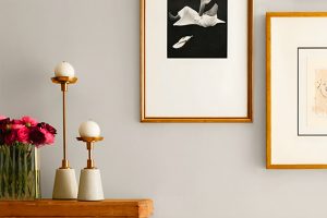
Peppercorn presents as a deep, warm gray that can almost lean into the charcoal category under certain lighting. It’s versatile, making it a fantastic choice for various places in a home or office.
Whether you’re thinking about freshening up your living room, bedroom, or even exterior spaces, Peppercorn has a unique ability to complement different decor styles and color palettes.
This color stands out for its ability to balance warmth and coolness, making it suitable for creating a cozy yet refined atmosphere. It works well with natural light, shifting subtly throughout the day to offer different aspects of its character.
The beauty of Peppercorn lies in its depth. It can make a bold statement on a feature wall, bring out the best in your furniture and decor, or provide a grounding base when used as an all-over wall color.
If you’re considering a paint upgrade or starting a new project, Peppercorn is worth a look for its elegance and transformative power.
What Color Is Peppercorn SW 7674 by Sherwin Williams?
Peppercorn by Sherwin Williams is a rich, deep gray with subtle brown undertones that give it a warm and inviting feel.
This versatile color works well in a variety of lighting conditions, shifting subtly between a solid gray in bright light to a more complex, almost charcoal tone in dimmer environments.
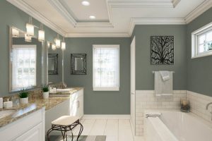
Its depth and sophistication make it an excellent choice for creating accent walls or for use in entire rooms to add a touch of elegance and drama.
This color is particularly well-suited for modern and contemporary interior styles, where its depth can add a layer of sophistication. It also fits seamlessly into industrial designs, complementing metal finishes and exposed brick or concrete details.
In traditional spaces, Peppercorn can bring a contemporary twist without overwhelming the classic elements.
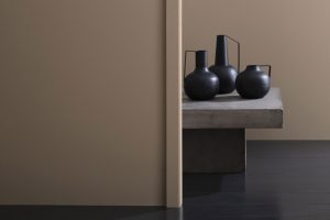
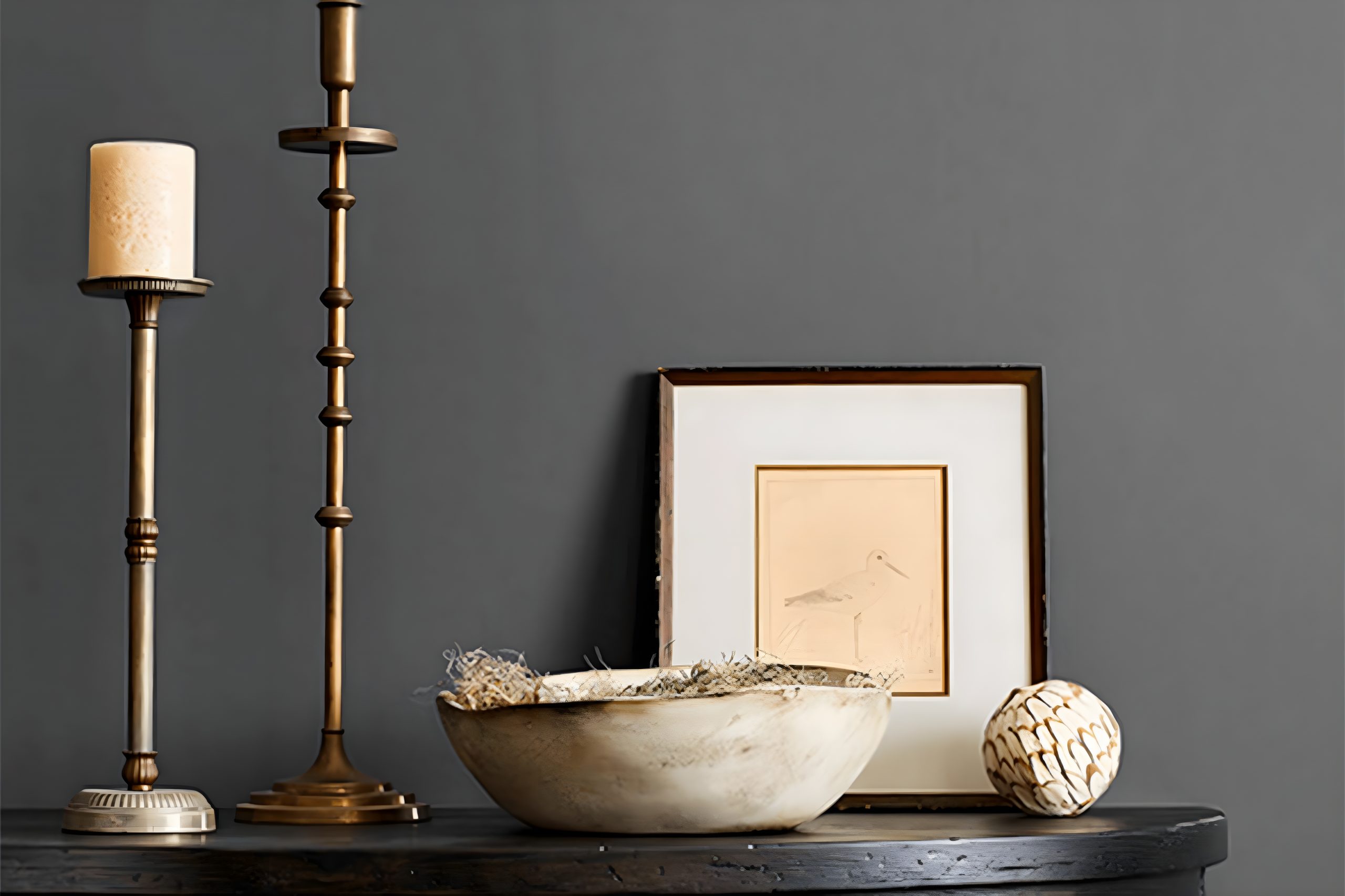
When it comes to materials and textures, Peppercorn pairs beautifully with a wide range. Natural wood, whether light or dark, stands out against this deep gray, creating a balance between warmth and coolness.
Metallic finishes, such as brass or copper, add a touch of luxury and warmth, while marble and other natural stones bring out its elegant side.
Soft textures, like velvet or wool in lighter colors, can also complement Peppercorn by offering a contrast that highlights its rich depth.
Ever wished paint sampling was as easy as sticking a sticker? Guess what? Now it is! Discover Samplize's unique Peel & Stick samples.
Get paint samples

Is Peppercorn SW 7674 by Sherwin Williams Warm or Cool color?
Peppercorn by Sherwin Williams is a rich, deep color that brings an elegant and sophisticated touch to any home. This shade has a unique ability to add character and depth to spaces, making it a favorite among homeowners.
Being a part of the gray family, it’s versatile enough to work in various settings, from modern to traditional.
This particular gray has warm undertones, which means it can create a cozy and inviting atmosphere, unlike cooler grays that might feel more detached.
One of the best qualities of Peppercorn is its adaptability. It can serve as a bold statement wall in a light-filled room, grounding the space without overwhelming it.
Alternatively, using it across a room can transform the area into a snug retreat, perfect for relaxing at the end of a long day.
It pairs beautifully with crisp whites, which can help to balance its intensity and highlight architectural features.
Additionally, natural wood and metallic accents complement its warmth, making it an ideal backdrop for a variety of decor styles. In a nutshell, Peppercorn can enhance a home’s appeal by adding depth, elegance, and a touch of warmth.
Undertones of Peppercorn SW 7674 by Sherwin Williams
Peppercorn by Sherwin Williams is a versatile and sophisticated gray that brings much more to the table than its surface suggests.
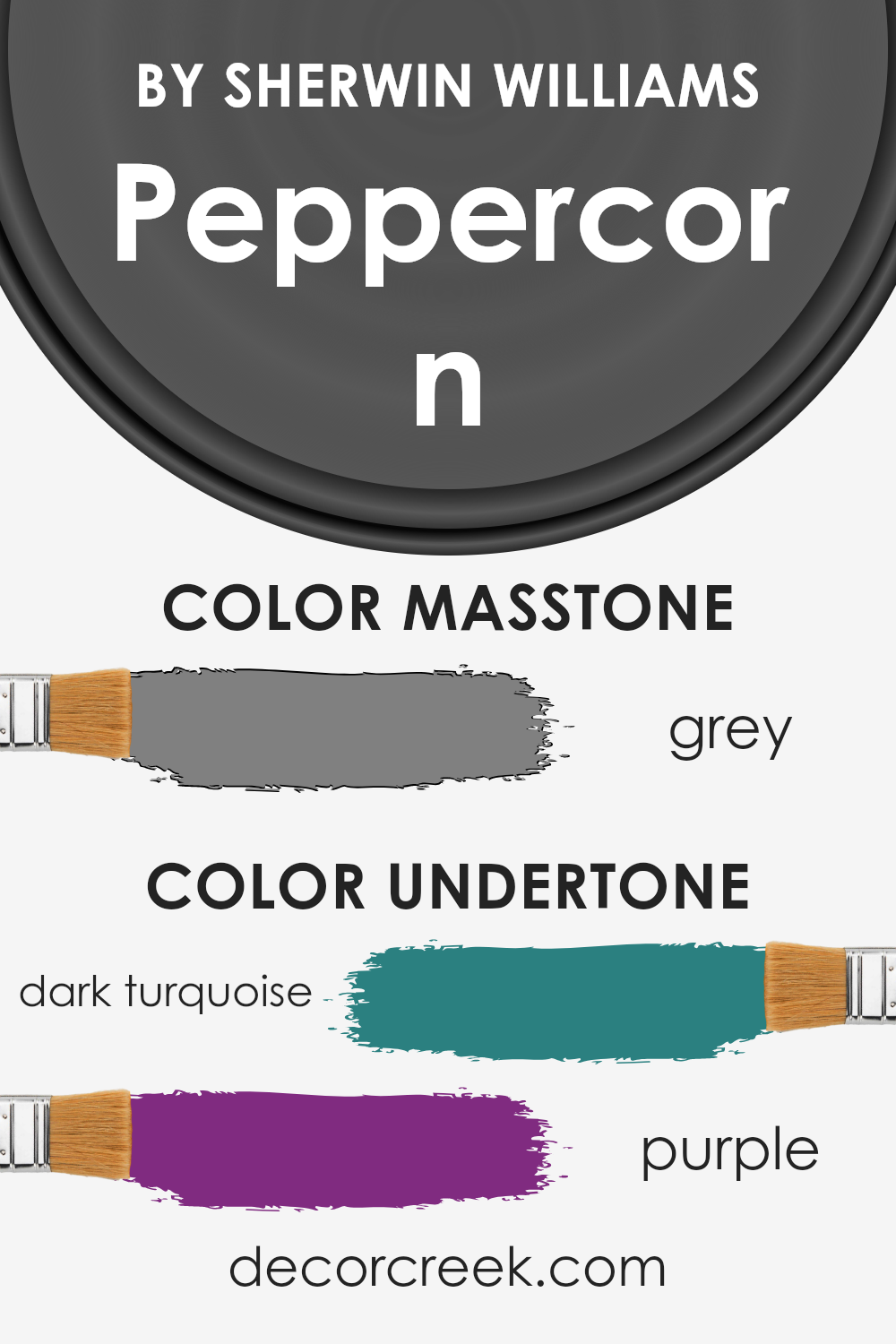
When choosing a paint color, it’s crucial to consider its undertones, the subtle colors lurking beneath the main hue, as they can significantly affect the color’s appearance in various lighting conditions.
For Peppercorn, the undertones are quite unique, featuring hints of dark turquoise and purple.
These undertones play a big role in how we perceive the color. Usually, gray is seen as a neutral backdrop, but with Peppercorn, the dark turquoise adds a layer of coolness, while the purple brings in depth and warmth.
This blend means the gray can shift in appearance, looking more like a deep, warm gray in some lights and a cooler, more mystical color in others.
When used on interior walls, these undertones give Peppercorn an incredible ability to adapt and merge with different decors and styles. In natural light, the room can feel fresh and slightly expansive, thanks to the coolness of the turquoise.
In artificial light, the purple undertone can make the space feel cozier and more intimate. This chameleon-like quality makes Peppercorn a fantastic choice for those looking to add drama and sophistication to their space, without overwhelming it with color.
Its ability to harmonize with various lighting and decor styles means it’s a color that can truly elevate a room.
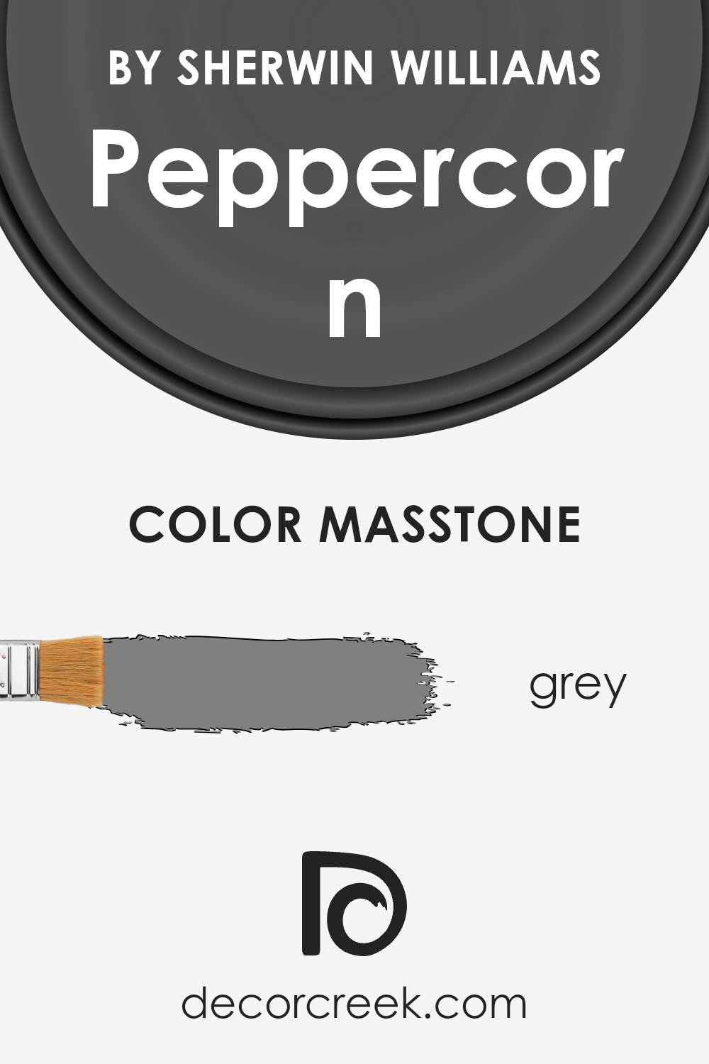
What is the Masstone of the Peppercorn SW 7674 by Sherwin Williams?
PeppercornSW 7674 by Sherwin Williams has a masstone, or main color, that is grey, much like the color code #808080. This specific shade of grey offers a neutral, versatile backdrop for various home styles.
Its balanced tone means it can work well in different lighting conditions, from natural sunlight to artificial lighting, without losing its character.
This makes it a solid choice for many parts of the home, from bedrooms and living rooms to kitchens.
Since grey is a neutral color, it allows for a lot of freedom when it comes to decorating. You can pair it with bright, bold colors for a striking contrast or keep things calm and collected with other neutrals for a more subdued, sophisticated look.
The masstone of PeppercornSW 7674 ensures it’s flexible enough to fit with both modern and traditional decor, adding depth and interest to spaces without overwhelming them.
ts ability to blend with various textures and materials, from soft fabrics to harder woods and metals, further enhances its practicality for home design.
How Does Lighting Affect Peppercorn SW 7674 by Sherwin Williams?
Lighting plays a crucial role in how we perceive colors. It can change how a color looks depending on the type of light it’s under – be it natural sunlight or artificial light sources like LED or incandescent bulbs.
The color Peppercorn, a sophisticated dark gray with warm undertones, offers a great example of how lighting impacts color perception.
Under artificial light, Peppercorn takes on various hues depending on the type of bulb used. LED lights, which can range from cool to warm white, influence how this color looks in a room.
Cool white LEDs may make Peppercorn appear more crisp and slightly bluer, enhancing its gray qualities, while warm white LEDs can bring out its warm undertones, making the color seem cozier and more inviting.
Incandescent bulbs, known for their warm, yellowish light, can make Peppercorn feel even warmer, potentially highlighting its brown undertones and making the room feel snug and welcoming.
In natural light, Peppercorn’s appearance shifts throughout the day and depends on the room’s orientation.
In north-facing rooms, which receive cooler, indirect light, this color can seem more true to its dark gray nature but might feel somewhat colder and more austere.
South-facing rooms, bathed in warm, bright sunlight for most of the day, will see Peppercorn revealing its warmer, more welcoming side, making spaces feel more inviting and cozy.
East-facing rooms enjoy bright morning light, making Peppercorn look lighter and highlighting its warmer undertones. As the day progresses and the light fades, the color will appear more muted and closer to its true gray essence.
Conversely, in west-facing rooms, Peppercorn may start the day looking more subdued under softer morning light, and as the sunlight intensifies towards the evening, the color warms up, becoming more dynamic and rich.
In summary, Peppercorn’s appearance is significantly influenced by lighting conditions.
Its complex undertones can shift from cooler to warmer hues, making it a versatile color choice that can bring different vibes to a space, depending on the room’s orientation and light sources.
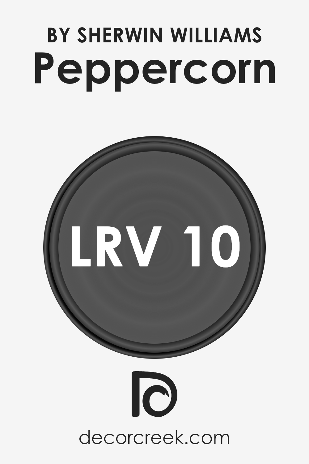
What is the LRV of Peppercorn SW 7674 by Sherwin Williams?
LRV stands for Light Reflectance Value, a measurement used to understand how light or dark a color will appear when painted on a wall. It ranges from 0 to 100, with 0 being completely black, absorbing all light, and 100 being pure white, reflecting all light back.
This measurement is crucial because it affects how bright or moody a room feels without changing anything but the paint color. A higher LRV means the color reflects more light, making a space feel more open and airy.
Conversely, a lower LRV makes a color absorb more light, which can make a room feel more intimate or cozy but also smaller or darker if not lit properly.
With an LRV of 9.681, the mentioned color is on the darker end of the scale. This means it’ll absorb a lot of light, rather than reflecting it.
In practical terms, when used on walls, it can give a room a rich, deep look, but it may also make the space feel smaller or more enclosed.
To counterbalance this effect, using good lighting and combining it with lighter colors in decor or furniture can help.
This particular LRV value suggests that the color is quite bold and can serve as a dramatic backdrop, perfect for creating a statement wall or an intimate, cozy atmosphere in a space.
LRV – what does it mean? Read This Before Finding Your Perfect Paint Color
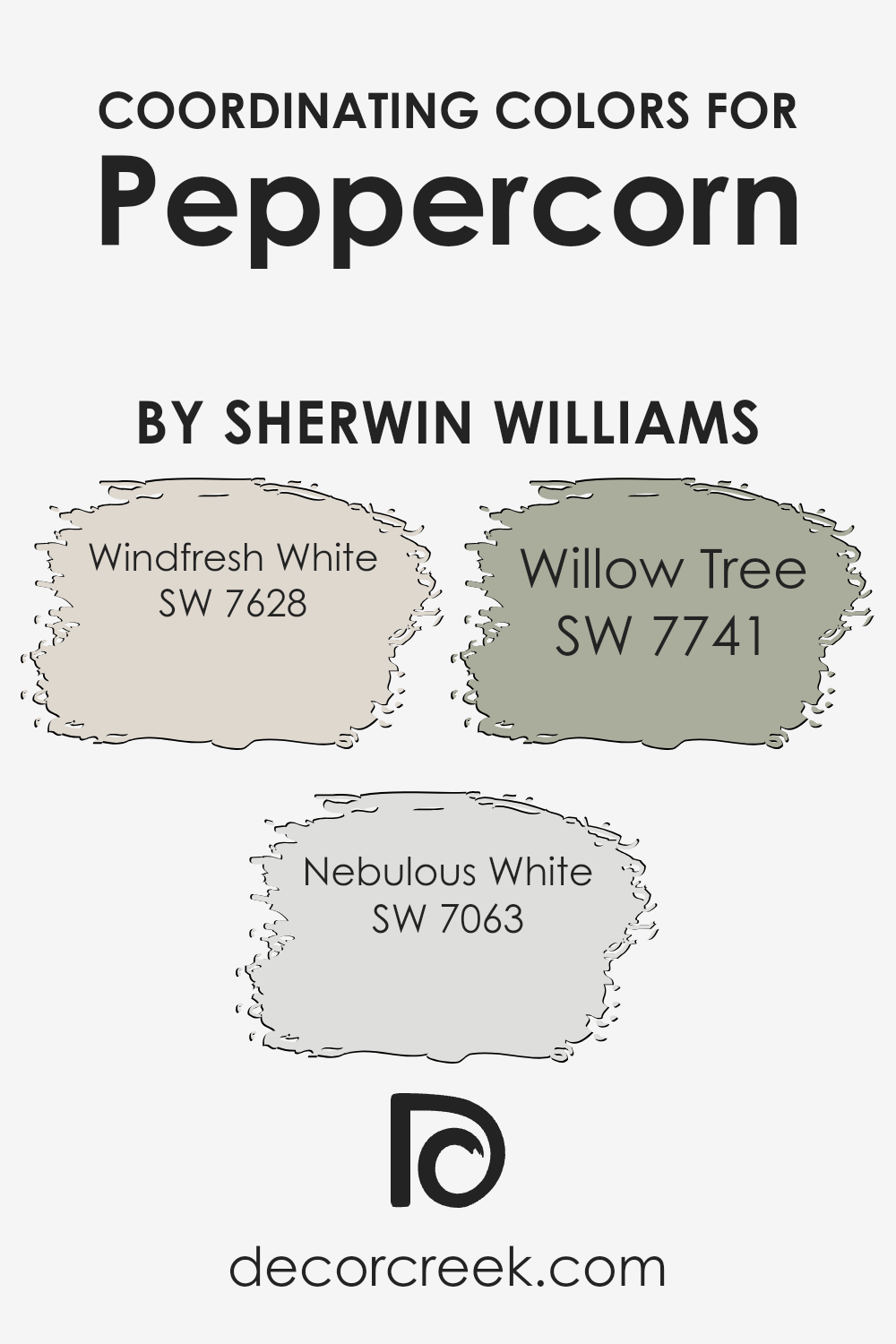
Coordinating Colors of Peppercorn SW 7674 by Sherwin Williams
Coordinating colors are those selected to complement or enhance the appearance of a primary color, in this case, Peppercorn by Sherwin Williams.
These colors work together to create a cohesive look by balancing out the strengths and weaknesses of each other. When chosen wisely, coordinating colors can add depth and harmony to a space, making it more visually appealing.
The process of selecting coordinating colors often involves considering the undertones and saturation of the primary color to find others that can either contrast it interestingly or blend smoothly with it.
For the rich and bold shade of Peppercorn, three coordinating colors suggested are Windfresh White, Nebulous White, and Willow Tree.
Windfresh White is a crisp, clean shade that brings a breath of fresh air to a room, offering a stark, refreshing contrast to Peppercorn’s deep tones.
It’s perfect for trim or ceilings to create a sense of openness and light. Nebulous White, on the other hand, is a softer, warmer white with subtle gray undertones, providing a gentle transition between the more dramatic Peppercorn and the brighter elements in a space.
It works well on walls in rooms seeking a balance of coziness and spaciousness. Lastly, Willow Tree is a muted green with earthy undertones, which lends a natural, calming touch to spaces dominated by Peppercorn.
It’s ideal for accent walls or as a complementary color for accessories, bringing a bit of the outside world into the home. Together, these colors create a sophisticated palette that can enhance various design styles.
You can see recommended paint colors below:
- SW 7628 Windfresh White
- SW 7063 Nebulous White
- SW 7741 Willow Tree
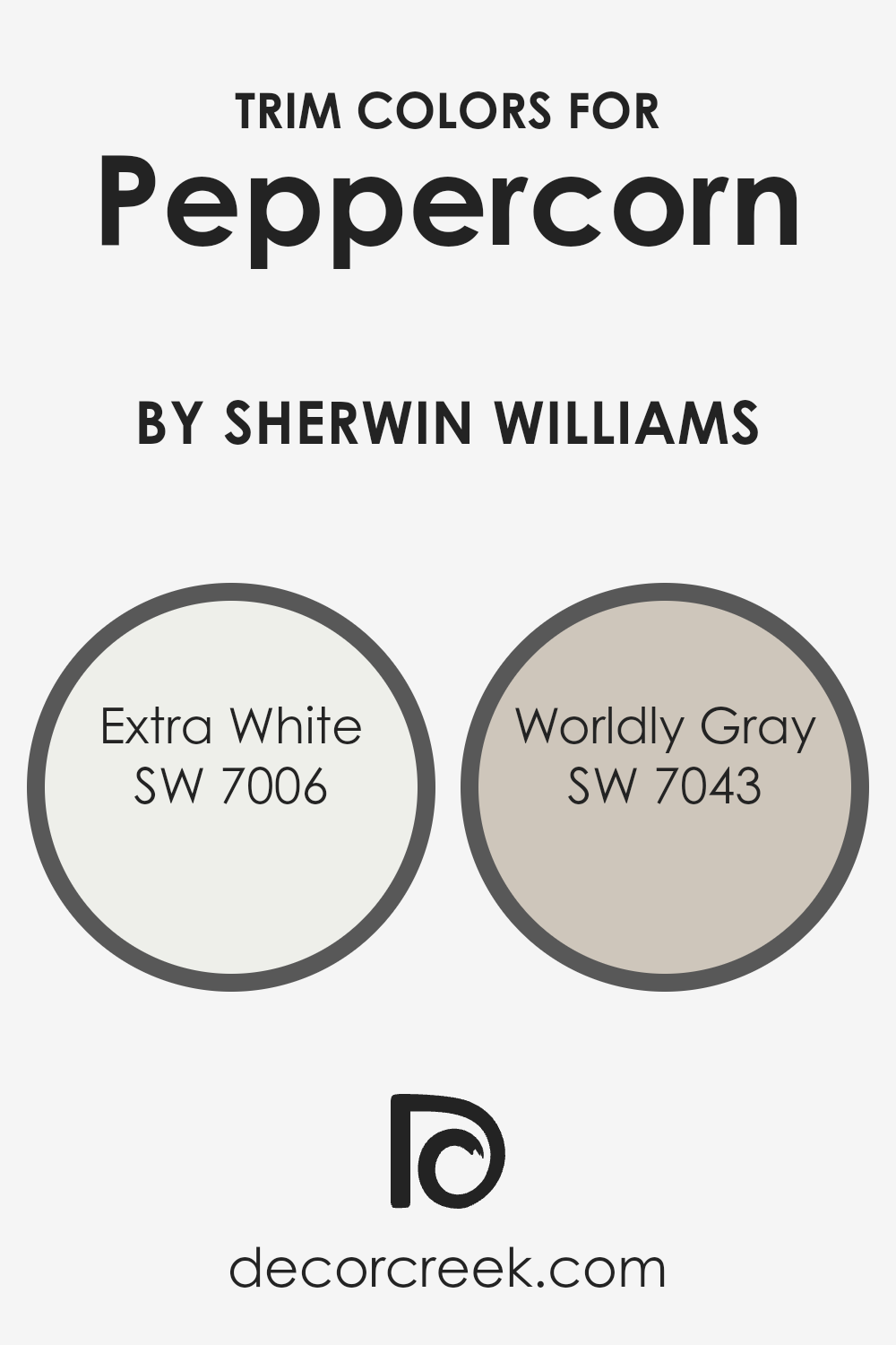
What are the Trim colors of Peppercorn SW 7674 by Sherwin Williams?
Trim colors play a significant role in defining the visual appeal and overall aesthetic of a room or exterior, acting as a frame to highlight and complement the primary wall colors.
When used alongside Peppercorn, which is a deep, warm charcoal color, trim colors like SW 7006 – Extra White and SW 7043 – Worldly Gray, can significantly influence the ambiance and perception of the space.
The careful selection of trim colors can enhance the sophisticated and modern vibe that Peppercorn embodies, creating striking contrasts or soft transitions that elevate the look of a room or home exterior.
Extra White (SW 7006) is a crisp, clean white that brings a fresh and sharp contrast to the rich depth of Peppercorn, making the darker hues stand out and giving the space a more pronounced, modern look.
On the other hand, Worldly Gray (SW 7043) is a soothing, mid-tone gray that offers a smoother transition when paired with Peppercorn.
It adds a layer of subtlety and complexity, softening the contrast with a harmonious blend that can make a room feel more cohesive and thoughtfully designed.
Together, these trim colors provide versatile options that can cater to different tastes and styles, highlighting the versatility and beauty of Peppercorn as a primary color choice.
You can see recommended paint colors below:
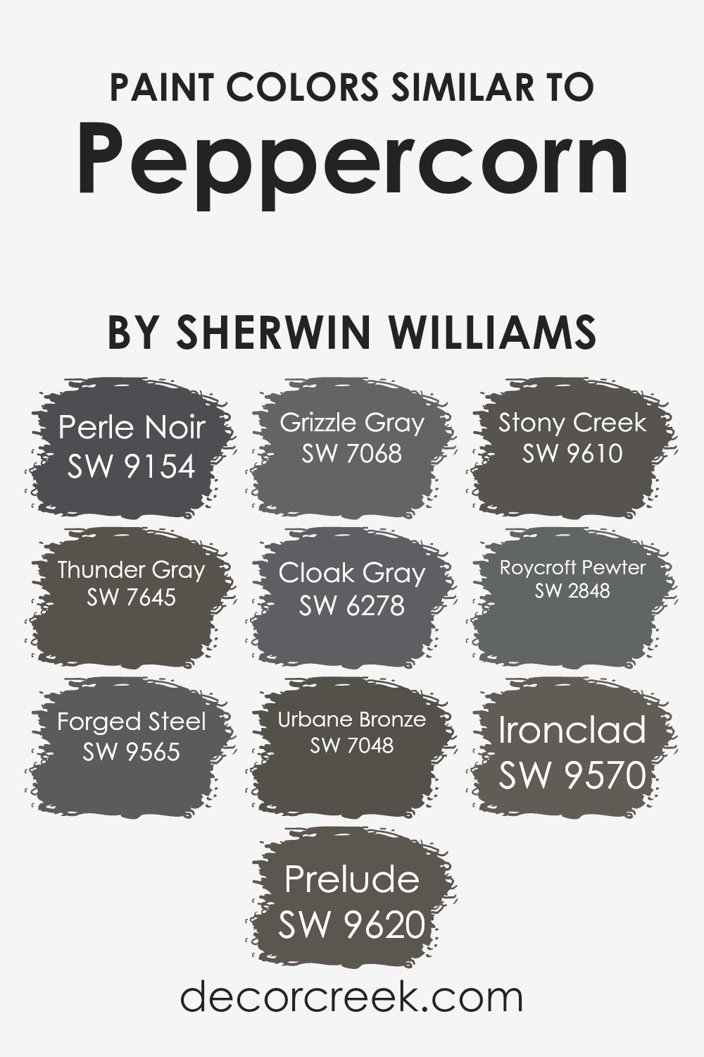
Colors Similar to Peppercorn SW 7674 by Sherwin Williams
Similar colors play a crucial role in design, offering a palette that harmonizes while allowing each hue to bring its unique character to the space.
Take, for instance, a selection of colors akin to Peppercorn by Sherwin Williams, such as Perle Noir, Thunder Gray, and others.
These shades, while close relatives in the color spectrum, possess subtle differences that can enrich an environment, offering depth and dimension without overwhelming the senses.
Perle Noir, for example, is a deep, sophisticated shade that can instill a sense of elegance and mystery, while Thunder Gray provides a softer, more approachable tone, ideal for creating a serene backdrop.
Forged Steel and Prelude, alongside others like Grizzle Gray and Cloak Gray, demonstrate the versatility of the gray palette, stretching from the strength and coolness of metal tones to softer, more muted expressions of gray.
Urbane Bronze adds a touch of warmth, suggesting solidity and comfort, whereas Stony Creek, Roycroft Pewter, Ironclad, and others each contribute variations in mood and style.
This nuanced spectrum from light to dark and cool to warm offers designers and homeowners alike the opportunity to craft spaces that are both cohesive and dynamic, balancing unity with visual interest.
The interplay of these colors can help to pull together diverse elements within a room, creating aunified and inviting atmosphere.
You can see recommended paint colors below:
- SW 9154 Perle Noir
- SW 7645 Thunder Gray
- SW 9565 Forged Steel
- SW 9620 Prelude
- SW 7068 Grizzle Gray
- SW 6278 Cloak Gray
- SW 7048 Urbane Bronze
- SW 9610 Stony Creek
- SW 2848 Roycroft Pewter
- SW 9570 Ironclad
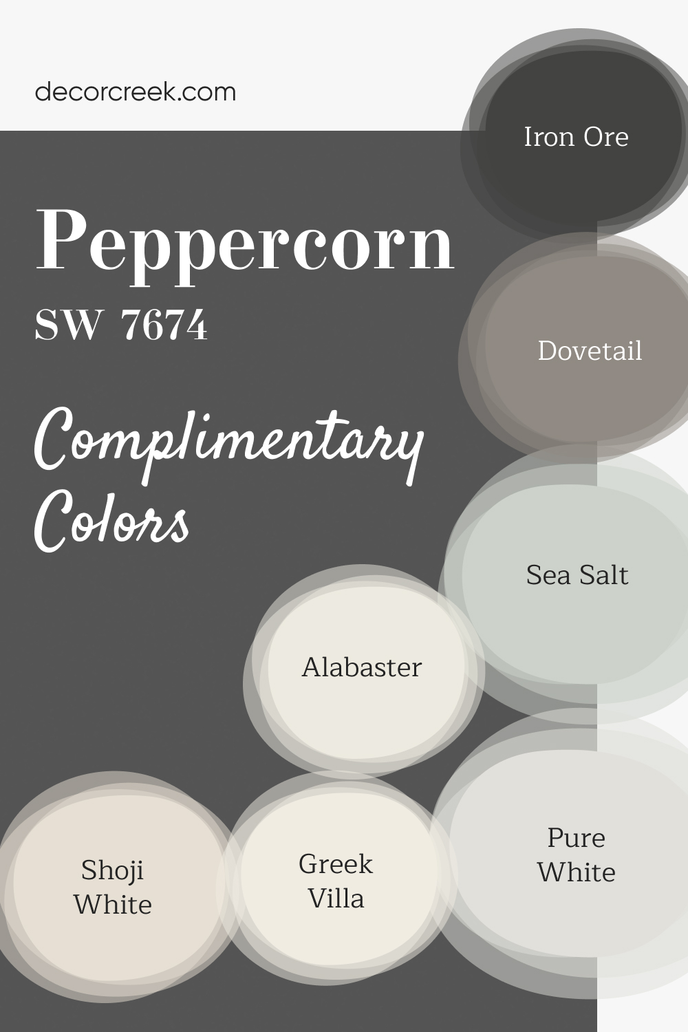
Complimentary Colors for Peppercorn SW 7674 Paint Color by Sherwin Williams
Peppercorn by Sherwin Williams is a bold, deep color that makes a statement in any room. When combined with lighter shades such as Alabaster, Shoji White, and Greek Villa, it creates a clean, balanced look that feels modern and sophisticated. Sea Salt brings in a hint of color, adding a fresh touch to the overall palette, while Iron Ore and Dovetail add layers of depth and richness.
For a finishing touch, Pure White works perfectly for trim or ceilings, providing a crisp contrast that ties everything together. These colors work harmoniously to create a space that feels both grounded and bright, with a perfect mix of light and dark tones for a modern, yet timeless look.
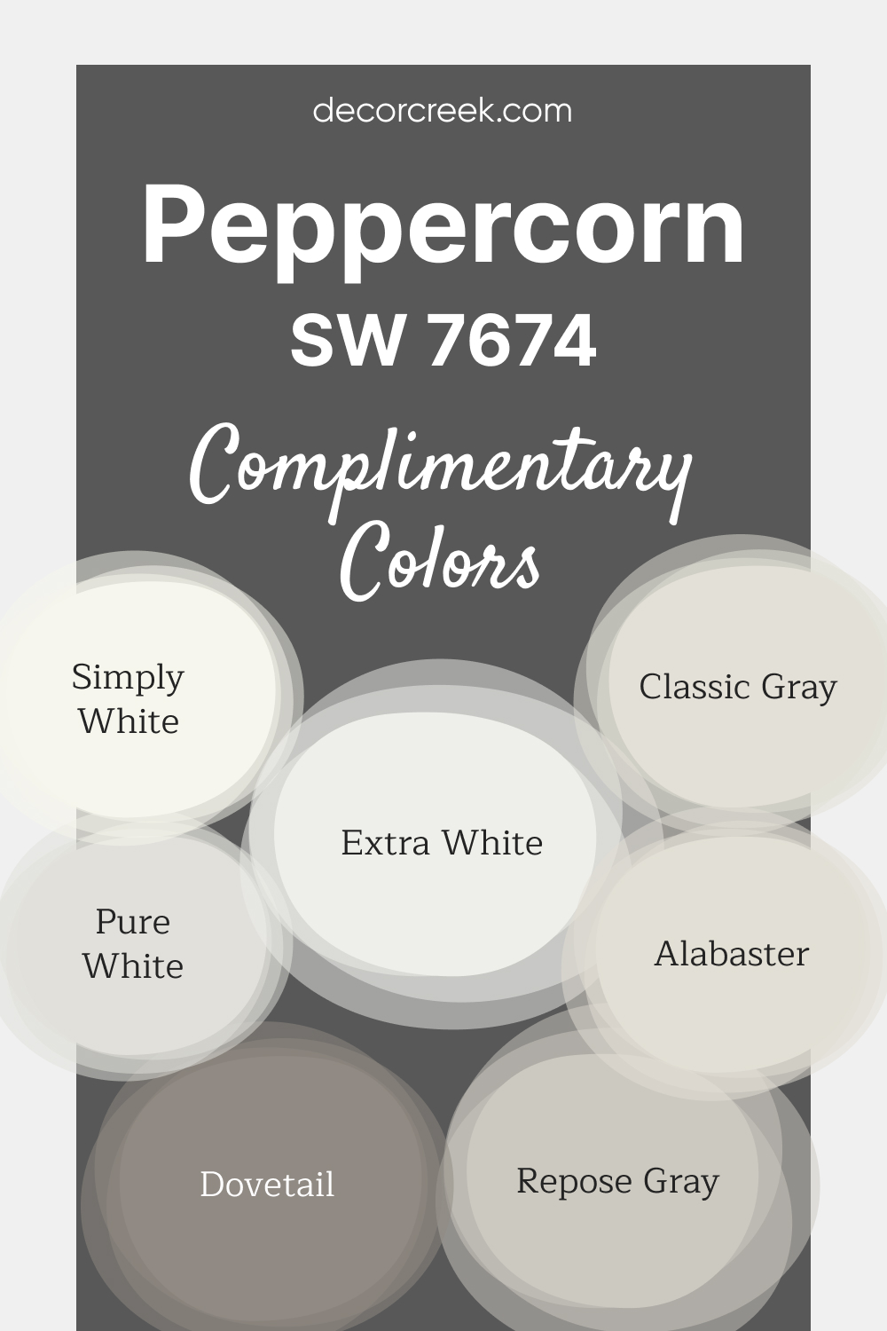
Peppercorn SW 7674 by Sherwin-Williams is a deep, bold charcoal gray that adds drama and elegance to any space.
Whether used for accent walls, cabinetry, or exteriors, this versatile shade makes a striking statement while maintaining a timeless appeal.
It pairs seamlessly with both warm and cool tones, creating endless design possibilities. For a crisp and modern contrast, Pure White SW 7005, Simply White OC-117, and Extra White SW 7006 are excellent choices.
Repose Gray SW 7015 and Classic Gray OC-23 provide soft, neutral balance, while Alabaster SW 7008 introduces a subtle warmth. To add even more depth and cohesion, Dovetail SW 7018 completes the palette beautifully.
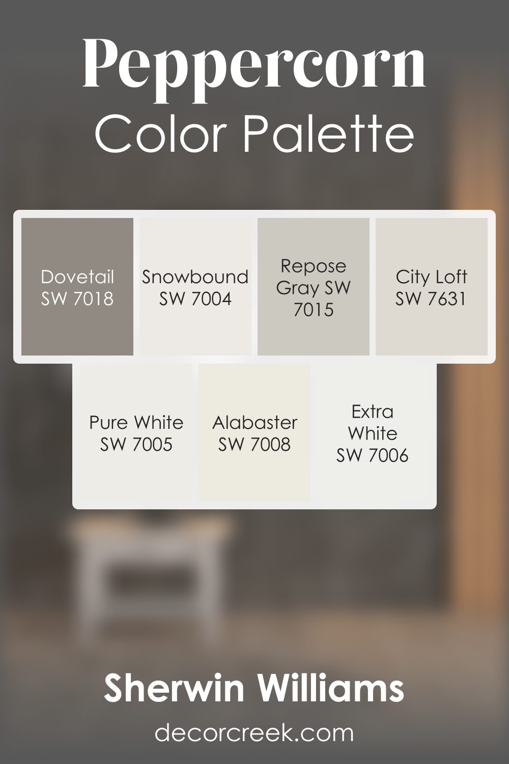
Peppercorn SW 7674 by Sherwin Williams Color Palette
Peppercorn brings a bold presence that instantly adds character, while the mix of soft whites and warm grays creates a peaceful harmony. Pure White, Extra White, and Snowbound brighten the deeper tone, helping the palette feel light and approachable.
Repose Gray and City Loft add smooth neutral layers that make transitions gentle and pleasant.
Dovetail introduces warm depth that adds comfort without feeling too strong, giving each room a grounded and inviting feeling. Alabaster adds a soft glow that enhances the warmth of the palette.
Together, these shades create a modern, calm, and welcoming mood, perfect for homes that enjoy clean lines, warm accents, and a quiet sense of style.
How to Use Peppercorn SW 7674 by Sherwin Williams In Your Home?
Peppercorn by Sherwin Williams is a rich and versatile gray paint color with deep blue undertones. This hue can bring a sense of sophistication and warmth to any room in your home.
Perfect for creating a cozy yet elegant atmosphere, it works well in living areas, bedrooms, and even home offices.
Peppercorn isn’t just for walls; it’s also great for accentuating furniture or cabinets, offering a contemporary look that complements various decor styles, from modern to traditional.
Using this color in a room with plenty of natural light highlights its unique tones, making the space feel inviting.
For those looking to add a bit of drama, Peppercorn pairs beautifully with lighter shades, such as soft whites or cool grays, creating a striking contrast that draws the eye.
Whether you’re aiming to refresh a single room or transform your entire home, this paint color can provide a solid foundation that helps tie together different elements and textures.
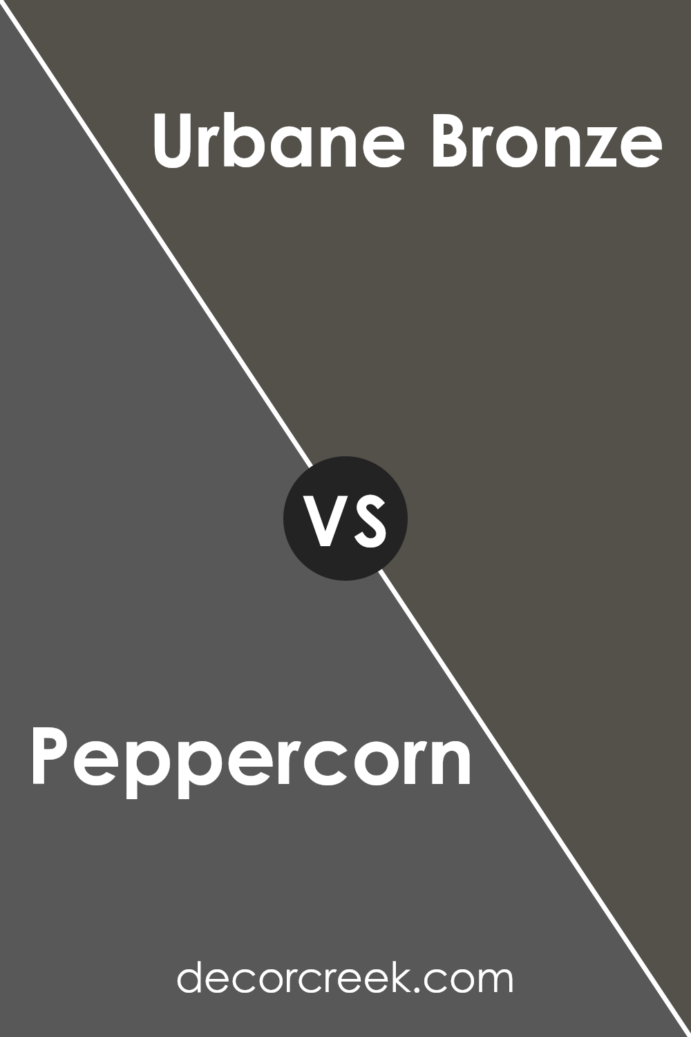
Peppercorn SW 7674 by Sherwin Williams vs Urbane Bronze SW 7048 by Sherwin Williams
Peppercorn and Urbane Bronze are two colors from Sherwin Williams that share a sophisticated vibe, yet they bring different moods to a space. Peppercorn is a deep, warm gray with a hint of brown.
It’s a versatile color that can make a room feel cozy and inviting, perfect for creating a snug atmosphere in living areas or bedrooms. On the other hand, Urbane Bronze is a darker, earthier tone that leans more towards a rich brown with gray undertones.
This color is ideal for making a bold statement, especially in spaces where you want to add depth and a touch of nature-inspired serenity.
While both colors are great for adding sophistication to any room, Peppercorn offers a lighter, more flexible backdrop that can brighten spaces despite its depth.
Urbane Bronze, however, brings a stronger, earthy grounding effect that works well in spaces aiming for an organic, anchored aesthetic.
You can see recommended paint color below:
Peppercorn SW 7674 by Sherwin Williams vs Cloak Gray SW 6278 by Sherwin Williams
Peppercorn and Cloak Gray are two interesting colors from Sherwin Williams. Peppercorn is a dark, rich color that might remind you of the peppercorns used in cooking.
It’s a bold choice, perfect for making a statement in a room. It adds a lot of character and can anchor a space with its deep, nearly black hue.
On the other hand, Cloak Gray is lighter and lends a softer, more understated feel to a space. It’s still in the gray family but offers a distinct contrast to the intensity of Peppercorn.
Cloak Gray can work well in areas where you want a touch of sophistication without the weight of a very dark color.
Together, these two colors could complement each other nicely, with Cloak Gray possibly serving as a calming balance to the strong presence of Peppercorn.
You can see recommended paint color below:
- SW 6278 Cloak Gray
Peppercorn SW 7674 by Sherwin Williams vs Forged Steel SW 9565 by Sherwin Williams
Peppercorn and Forged Steel, both by Sherwin Williams, offer unique shades for adding sophistication to spaces. Peppercorn is like a dark gray with a hint of warmth, creating a cozy yet bold ambiance.
It’s versatile, pairing well with both bright and muted decor, making it a solid choice for living areas or bedrooms seeking a statement wall without overwhelming darkness.
Forged Steel, on the other hand, leans towards a cooler, more industrial gray. It’s a lighter shade compared to Peppercorn, offering a sleek and modern vibe.
This color is ideal for spaces aiming for a contemporary look, perfect for offices or kitchens where a subtle, yet modern aesthetic is desired.
While both colors share the same gray family, Peppercorn’s warmer tones provide a welcoming depth, and Forged Steel’s cooler hues introduce a crisp, clean look.
Choosing between them comes down to the desired mood and theme of your room.
You can see recommended paint color below:
- SW 9565 Forged Steel
Peppercorn SW 7674 by Sherwin Williams vs Perle Noir SW 9154 by Sherwin Williams
Peppercorn and Perle Noir are two distinct colors by Sherwin Williams, each with its own unique character. Peppercorn is a deep, almost charcoal grey that brings a strong, sophisticated vibe to any space.
It’s a versatile color that can look stunning in various settings, adding depth and seriousness wherever it’s applied.
On the other hand, Perle Noir leans towards a softer, slightly lighter shade of black. This color has an elegance to it, offering a touch of luxury without overwhelming a room.
It’s perfect for creating a cozy, inviting atmosphere with a hint of modern flair.
While Peppercorn has a bold presence that commands attention, Perle Noir offers a subtler charm, perfect for those who want to add a sophisticated yet understated elegance to their environment.
Choosing between them depends on the ambiance you’re aiming for: Peppercorn for a definitive statement and Perle Noir for a refined, chic look.
You can see recommended paint color below:
- SW 9154 Perle Noir
Peppercorn SW 7674 by Sherwin Williams vs Roycroft Pewter SW 2848 by Sherwin Williams
Peppercorn and Roycroft Pewter, both from Sherwin Williams, are unique, intriguing colors. Peppercorn, a deep, nearly black shade, strikes a bold look that’s ideal for creating a dramatic ambiance.
It’s perfect for accent walls or furniture, adding sophistication wherever used.
On the other hand, Roycroft Pewter lies in the realm of dark gray colors with a warmer undertone. It’s less intense than Peppercorn and brings a comforting, cozy feel to spaces.
This color works wonders in areas where a strong but warm presence is desired, blending seamlessly with a variety of decor styles.
While Peppercorn leans towards a solid, almost imposing effect, Roycroft Pewter offers a softer, more welcoming atmosphere.
Choosing between them depends on the mood you want to set: Peppercorn for striking depth and Roycroft Pewter for warm elegance.
Both colors are versatile but cater to different aesthetic preferences and uses within a home or office.
You can see recommended paint color below:
- SW 2848 Roycroft Pewter
Peppercorn SW 7674 by Sherwin Williams vs Stony Creek SW 9610 by Sherwin Williams
Peppercorn is a deep, dark hue, resembling the color of the black peppercorns found in kitchens. It’s almost like a rich charcoal, offering a bold and dramatic touch to spaces.
On the other hand, Stony Creek introduces a softer, earthy blend, akin to stones found along a creek bed. While Peppercorn leans towards a strong and moody atmosphere, Stony Creek feels more natural and grounded, providing a calming presence.
When comparing the two, Peppercorn stands out for creating striking contrasts, especially when paired with lighter colors, making it ideal for accent walls or statement pieces.
Stony Creek, however, works wonderfully as a neutral backdrop, supporting a variety of decor styles without overpowering them.
Both colors offer unique vibes – Peppercorn being more dramatic and sophisticated, and Stony Creek offering a serene and welcoming feel.
You can see recommended paint color below:
- SW 9610 Stony Creek
Peppercorn SW 7674 by Sherwin Williams vs Thunder Gray SW 7645 by Sherwin Williams
Peppercorn and Thunder Gray are two colors by Sherwin Williams that might look similar at a quick glance but have their own unique traits. Peppercorn is a deep color that leans towards a dark charcoal with hints of warm undertones.
It’s the kind of color that adds a strong, bold feel to a space without making it feel heavy or too dark. On the other hand, Thunder Gray is also a dark shade but it carries more of a cool, muted vibe.
It’s like looking at a stormy sky, offering a bit of drama but in a more subdued, calming way compared to Peppercorn.
While Peppercorn can transform a room into a cozy, inviting space with its warmth, Thunder Gray provides a sleek, modern look with its cooler undertones.
Whether you choose Peppercorn for its richness or Thunder Gray for its tranquil feel, both colors offer a lot of depth and sophistication.
You can see recommended paint color below:
- SW 7645 Thunder Gray
Peppercorn SW 7674 by Sherwin Williams vs Ironclad SW 9570 by Sherwin Williams
Peppercorn and Ironclad are two interesting colors from Sherwin Williams. Peppercorn is a rich, deep gray that adds a touch of sophistication and depth to any space.
It’s kind of like the color of the stones you might find at the bottom of a river – dark, but with a bit of a soft side, too. This color is great for creating cozy, inviting rooms or for making a bold statement on an accent wall.
On the other hand, Ironclad is a bit different. It’s also a gray, but it has a cooler tone, leaning more toward a steel or metallic gray. Think of it like the color of a knight’s armor – strong and sturdy, with a hint of shine.
Ironclad is excellent for giving spaces a modern, sleek look. It’s perfect for those who want a contemporary vibe in their home or office.
In summary, Peppercorn offers warmth and depth for a cozy atmosphere, while Ironclad brings a cooler, more modern feel. Both colors are versatile and can create distinct moods in a room, depending on what you’re going for.
You can see recommended paint color below:
- SW 9570 Ironclad

Peppercorn SW 7674 by Sherwin Williams vs Grizzle Gray SW 7068 by Sherwin Williams
Peppercorn and Grizzle Gray are two intriguing colors by Sherwin Williams that offer distinct moods for any space. Peppercorn is a deep, rich color with a charcoal essence.
This makes it a bold choice, perfect for creating a striking impression in a room. It’s surprisingly versatile, able to anchor a space with its depth while still blending smoothly with a variety of decor styles.
On the other hand, Grizzle Gray is a lighter, more muted shade. Though still in the gray family, it has a softer, more approachable feel compared to the intense depth of Peppercorn.
This quality makes Grizzle Gray a great option for those looking to add sophistication to their space without overwhelming it with darkness.
Despite their differences, both colors share an elegance that can elevate the look of any room. Peppercorn offers a daring darkness that’s full of character, while Grizzle Gray provides a gentler, refined elegance.
Depending on the atmosphere one wishes to create, either color could be the perfect choice, with Peppercorn suited for bold, dramatic statements and Grizzle Gray for serene, subtle sophistication.
You can see recommended paint color below:
- SW 7068 Grizzle Gray
Peppercorn SW 7674 by Sherwin Williams vs Prelude SW 9620 by Sherwin Williams
Peppercorn and Prelude by Sherwin Williams are two distinct colors. Peppercorn is a deeper, almost charcoal gray. It has a strong presence, making it perfect for creating a bold, sophisticated look in a room.
It’s the kind of color that can make furniture and decor pop, especially when paired with lighter shades.
On the other hand, Prelude is much lighter, sitting in the soft, airy gray category. It’s a gentle color, bringing a sense of calm and tranquility to spaces.
Prelude works well in rooms looking for a light, fresh feel. It’s great for making small spaces appear bigger and brighter.
Where Peppercorn leans towards a strong and striking ambiance, Prelude leans towards creating a serene and inviting space.
Together, they could complement each other in a space, using Peppercorn as an accent or feature color, while Prelude could serve as a soothing backdrop.
They offer contrasting vibes – one powerful and moody, the other light and uplifting.
You can see recommended paint color below:
- SW 9620 Prelude
Conclusion
In summary, the color Peppercorn by Sherwin Williams is a versatile and rich shade that adds a touch of sophistication and depth to any space.
It’s a dark, almost charcoal grey that manages to bring both warmth and a contemporary feel to interiors and exteriors. This flexibility makes it a popular choice for those looking to add a modern yet timeless element to their design scheme.
Whether applied in a living room, bedroom, or as an accent in a more neutral palette, Peppercorn proves to be a dynamic and inviting color. Its ability to pair well with a wide range of colors, from bold hues to soft pastels, further enhances its appeal.
For anyone looking to update their space with a color that balances between making a statement and creating a cozy retreat, Peppercorn is a commendable selection.

Ever wished paint sampling was as easy as sticking a sticker? Guess what? Now it is! Discover Samplize's unique Peel & Stick samples.
Get paint samples