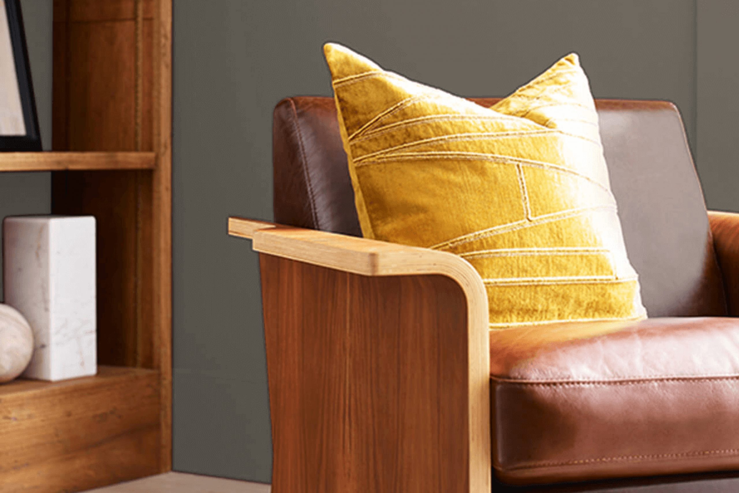
If you’re considering a fresh look for your home, let me introduce you to an understated yet versatile color option: SW 9599 Limestone by Sherwin Williams. In my experience, choosing the right paint color can be crucial in setting the tone and mood for any room.
This particular shade, Limestone, offers a subtle balance between warmth and neutrality, making it an excellent choice for spaces where you aim to instill a sense of calmness without the starkness frequently associated with cooler neutrals.
Throughout my time decorating homes, I’ve found that Limestone adapts beautifully to various lighting situations, reflecting a gentle warmth in well-lit areas and exuding a soft, cozy feel as natural light wanes.
It complements wood finishes and metals alike, which allows for versatility in choosing decor and furniture. Whether you’re painting a bustling kitchen or a quiet study space, SW 9599 Limestone sets a solid foundation for your decor, welcoming accent colors or simply standing alone for a clean, minimalistic look.
What Color Is Limestone SW 9599 by Sherwin Williams?
The color Limestone by Sherwin Williams is a soft, neutral gray that possesses an understated warmth, making it incredibly versatile for a variety of interior spaces. This particular shade strikes a perfect balance between light and cozy, providing a solid foundation for both vibrant and muted color schemes.
Limestone works exceptionally well in interior styles that favor simplicity and calmness. It is ideal for Scandinavian designs, where the focus is on clean lines and minimalist aesthetics. Additionally, its warm undertones make it a perfect choice for modern farmhouse and rustic styles, complementing natural materials like wood and stone beautifully.
In terms of pairing, Limestone synchronizes well with a range of materials and textures. When matched with smooth, matte finishes like brushed metal or soft, plush textiles such as wool or linen, it helps create a comfortable, cohesive look. It’s equally at home with the rough textures of reclaimed wood and natural stone, enhancing their organic appeal without overpowering them.
This color can also act as a subtle backdrop to metallic elements like bronze or copper, adding a hint of elegance to a space without overwhelming it. Overall, Limestone is a reliable choice for those looking to create a warm, inviting interior that feels both modern and timeless.
Is Limestone SW 9599 by Sherwin Williams Warm or Cool color?
Limestone SW 9599, by Sherwin Williams, is a warm, versatile shade of paint that brings a gentle and cozy ambiance to any room in a home. This light beige color has hints of gray, making it a great choice for those looking to create a welcoming and relaxed environment without overwhelming the space with darker tones.
Due to its neutral hue, Limestone works exceptionally well in various settings, from modern kitchens to classic living rooms. It pairs seamlessly with both bright colors and darker shades, providing an understated background that allows furniture and decor items to stand out.
Perfect for bedrooms and studies, this color contributes to a calm and focused atmosphere. In natural light, Limestone reflects beautifully, enhancing a space’s brightness and feeling airy. It’s a practical choice for anyone wanting to refresh their home’s look while keeping things simple and stylish.
Undertones of Limestone SW 9599 by Sherwin Williams
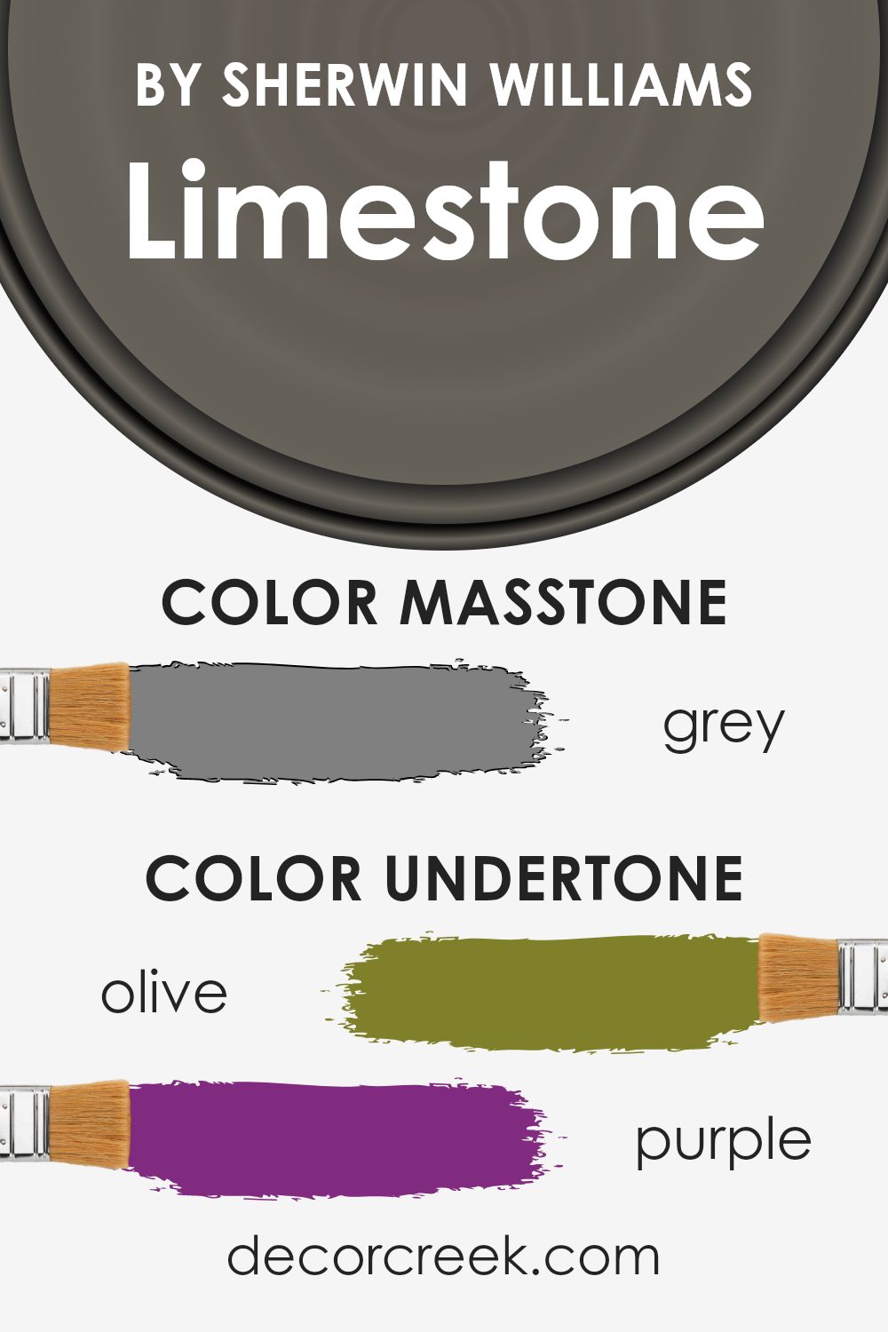
Limestone by Sherwin Williams is a distinct color that carries a variety of undertones which can subtly influence the perception and feel of a space when used on interior walls. Understanding these undertones is crucial because they can alter how the primary hue appears under different lighting conditions and when paired with other colors.
Undertones are essentially subtle colors that lurk beneath the surface of the main color. Even though you might see Limestone as one solid color at first glance, the different undertones can cause the color to look slightly different depending on where it’s used and what kind of light it’s exposed to.
This color has a complex mix of undertones ranging from olive and dark turquoise to soft shades like pale pink and light green. These undertones can enhance the warmth or coolness of a room. For example, brown and orange undertones bring a warm feel, making a room feel cozy and inviting. On the other hand, undertones like dark turquoise and navy contribute to a cooler vibe, which can make a space feel more calm and collected.
In an interior setting, the variety of undertones in Limestone means it can be quite versatile. In a room with lots of natural light, the lighter undertones like pale yellow or light turquoise might become more prominent, giving the room a bright and airy feel.
In spaces with less light, the darker undertones like dark grey or navy could be more noticeable, providing a grounded, more enclosed feel. Overall, the impact of these undertones means that Limestone can work well in many different types of rooms, from bedrooms and living rooms to kitchens and bathrooms, adjusting subtly to the changing light and accompanying decor.
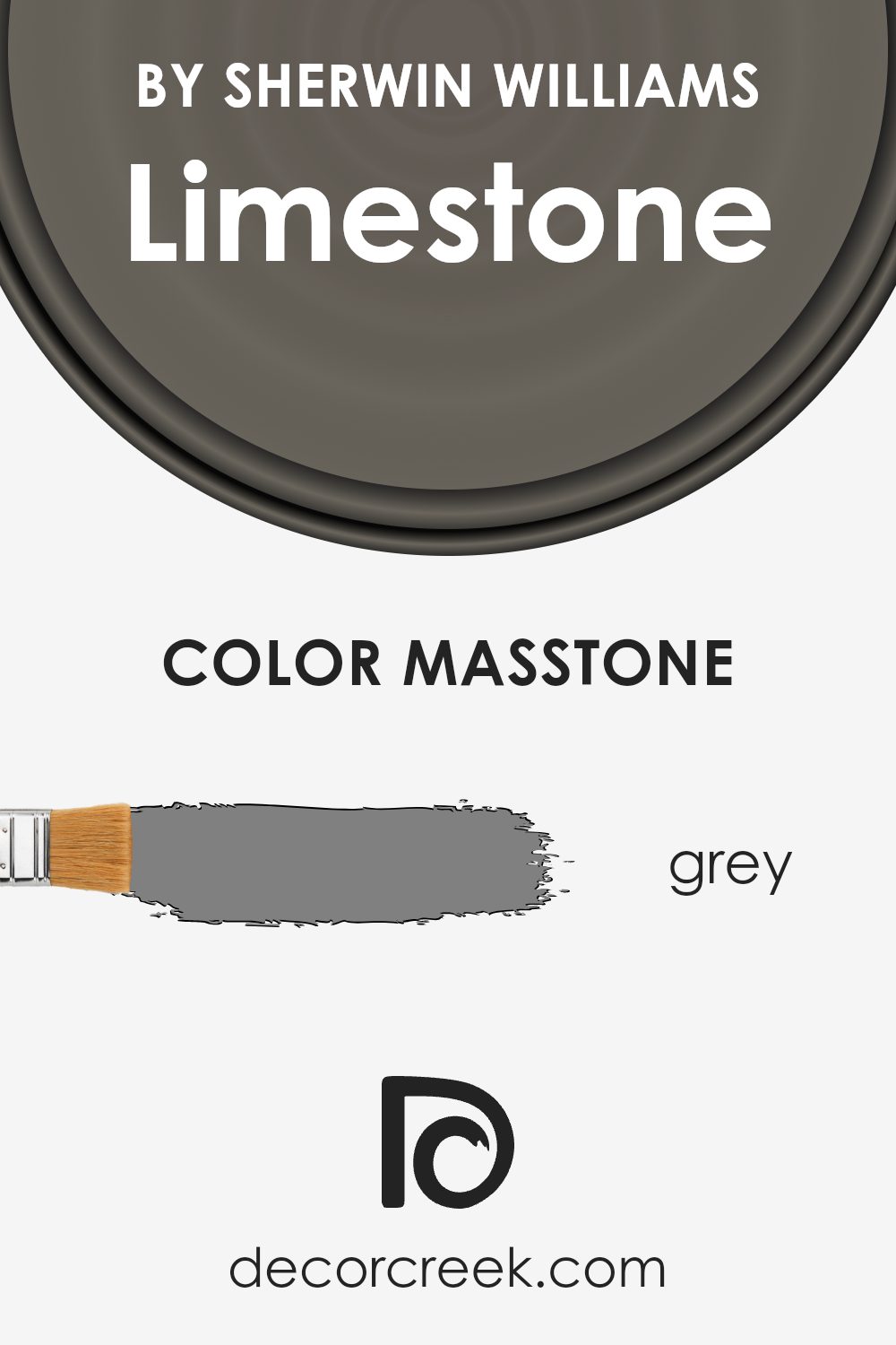
What is the Masstone of the Limestone SW 9599 by Sherwin Williams?
LimestoneSW 9599 by Sherwin Williams, which has a masstone of grey (#808080), is a versatile color that works well in various home settings. The neutrality of this grey shade means it can seamlessly blend with other colors and decor styles, from modern to traditional.
Being a middle-ground color, it doesn’t overpower a room but instead offers a subtle, calming backdrop. This makes it ideal for living areas, bedrooms, and even bathrooms, where creating a relaxing atmosphere is often desired.
Additionally, its balanced tone helps in making small spaces appear larger and brighter as it reflects light efficiently without creating a stark effect like pure white might. This color is practical for high-traffic areas too, as it can skillfully hide everyday wear and tear and marks, reducing the frequency of touch-ups. Overall, its adaptability and understated charm make it a reliable choice for those looking to enhance their homes without overwhelming changes.
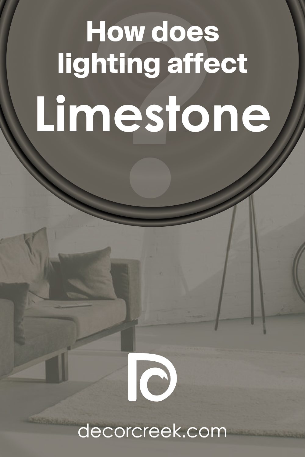
How Does Lighting Affect Limestone SW 9599 by Sherwin Williams?
Lighting plays a crucial role in how colors appear in a room. Different types of light can alter our perception of color, impacting the mood and visual appeal of a space. The color Limestone by Sherwin Williams is a nuanced shade that sits somewhere between gray and taupe, making it quite adaptable in various lighting conditions.
In natural light, Limestone tends to look lighter and can bring out more of its warm undertones, creating a cozy and welcoming atmosphere. However, the effect of natural light on this color can vary significantly depending on the direction of the room’s windows.
In north-facing rooms, which receive less direct sunlight and have cooler light, Limestone may appear more subdued and slightly grayer. This can give the room a calm and subtle look. South-facing rooms, on the other hand, get plenty of bright, warm sunlight throughout the day, which can make Limestone look warmer and more vibrant, enhancing its beige undertones.
East-facing rooms receive light in the morning when the light is cooler and brighter. Here, Limestone can look especially lively and fresh in the morning but might lose some of its warmth later in the day as the natural light dims. West-facing rooms experience the opposite effect, with the color possibly appearing duller in the morning but glowing warmly in the evening as the sun sets.
Artificial lighting also impacts how Limestone looks. Warm artificial lights, like incandescent bulbs, will highlight the beige and yellow undertones, making the color feel warmer. In contrast, cooler lights, such as fluorescent bulbs, might push it towards its grayer aspects.
Overall, Limestone is a versatile color that can work beautifully in many settings, adapting subtly with both natural and artificial light sources. Its ability to shift in tone depending on the lighting makes it a practical choice for rooms facing any direction.
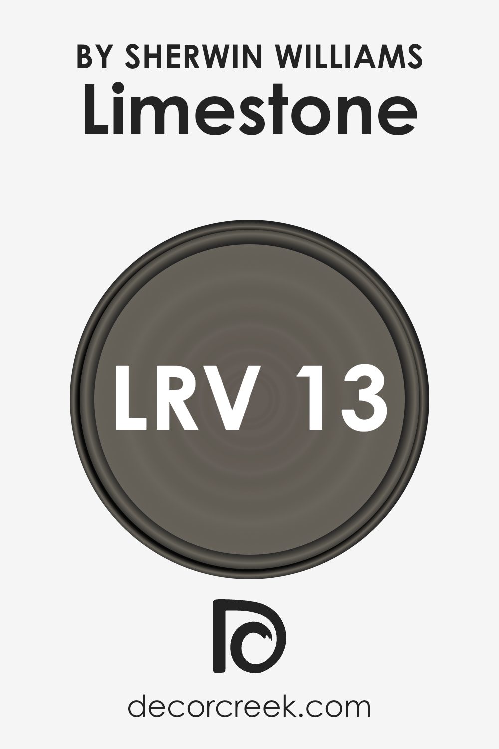
What is the LRV of Limestone SW 9599 by Sherwin Williams?
LRV stands for Light Reflectance Value, which is a measurement used to determine how much light a paint color will reflect when applied to a surface. This number is on a scale where lower values indicate that the color absorbs more light, making it look darker, while higher values mean it reflects more light, making it appear lighter.
This value is crucial in choosing paint colors because it helps predict how a color will feel in a space. A color with a high LRV makes a room feel brighter and more open, whereas a color with a low LRV can make a space feel cozier but smaller.
In the case of Limestone with an LRV of 13.114, this color falls on the lower end of the scale, meaning it does not reflect much light. As a result, it appears quite dark and can significantly influence the mood and size perception of a room. When used on walls, Limestone can create a more enclosed, intimate atmosphere due to its lower light reflection.
This makes it more suitable for larger rooms or spaces where a sense of closeness is desired. The specific LRV of Limestone means it’s important to have adequate lighting in the room to prevent it from feeling too dark or cramped.
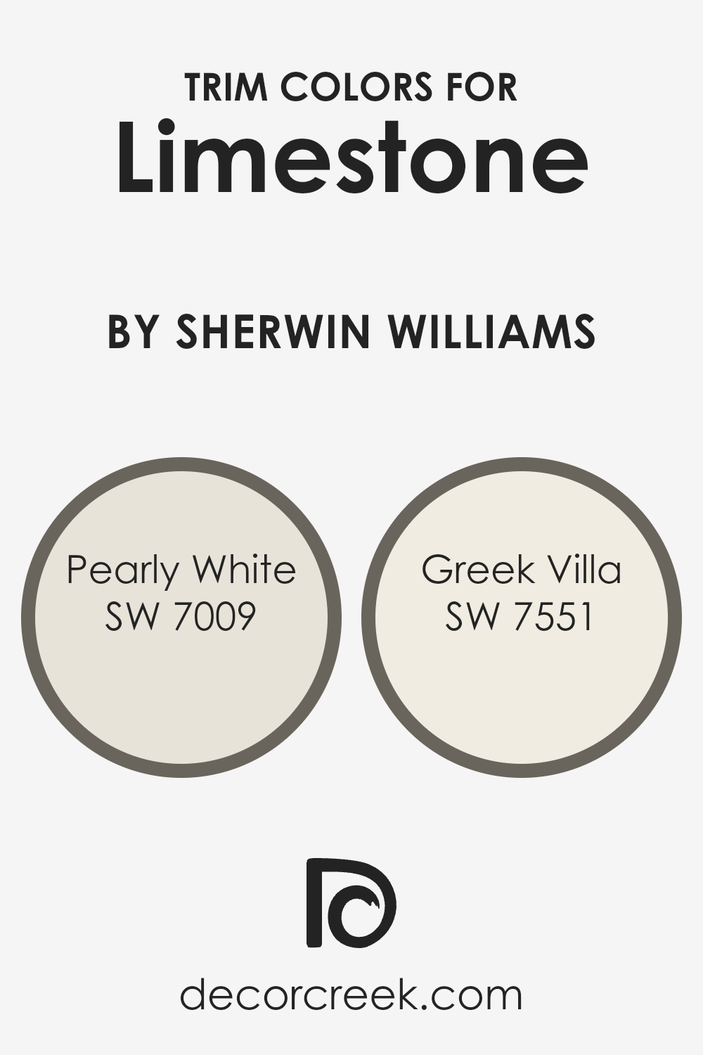
What are the Trim colors of Limestone SW 9599 by Sherwin Williams?
Trim colors are specific shades used to highlight architectural details on a building, such as window frames, doors, and moldings. When paired with a main color, in this case Limestone from Sherwin Williams, trim colors like Pearly White and Greek Villa play a crucial role in defining and complementing the overall look. The right trim color can enhance the main shade, providing a clean and finished look that accentuates the structure’s best features.
Pearly White is a soft, creamy white with a hint of warmth that makes it a versatile choice for trim. It contrasts gently against richer and darker hues, bringing a fresh and inviting presence that lightens the overall aesthetic without overwhelming it.
Greek Villa, on the other hand, tends towards a slightly warmer tone, richer than Pearly White but still neutral. This color can add a subtle depth and a hint of coziness to the building’s exterior, working particularly well with Limestone to offer a harmonious combination that’s both welcoming and visually appealing.
You can see recommended paint colors below:
Colors Similar to Limestone SW 9599 by Sherwin Williams
Choosing similar colors is essential in design because it creates a cohesive and harmonious look. By using shades that complement each other, you can achieve a balanced and aesthetically pleasing environment.
Colors like Storm Warning, Night Owl, Eclipse, Cast Iron, Porpoise, Griffin, Cocoon, Thunderous, Braintree, and Ironclad offer a variety of depths and tones that coordinate well with each other, providing a sophisticated ambiance without overpowering a space.
For instance, Storm Warning is a muted gray that exudes a calm and collected vibe, perfect for spaces that call for a subtle touch of sophistication. Night Owl, on the other hand, is a deeper gray that adds a bit of mystery and elegance to any room. Eclipse and Cast Iron are both strong, dark grays that bring a powerful presence to an environment.
Porpoise is a medium-toned gray that bridges the gap between light and dark, offering versatility. Griffin introduces a slight warmth into its gray, making it ideal for inviting spaces. Cocoon is unique with its taupe-gray offering a cocooning effect that’s cozy and enveloping.
Thunderous provides a dramatic flair with its deep, dark gray, making it perfect for striking accents. Braintree is a lighter, more neutral gray that works well to brighten spaces subtly. Finally, Ironclad is a bold, strong color that grounds spaces with its solid, gray presence. Each of these colors can work beautifully together or stand alone, depending on the look and feel you wish to achieve in your space.
You can see recommended paint colors below:
- SW 9555 Storm Warning
- SW 7061 Night Owl
- SW 6166 Eclipse
- SW 6202 Cast Iron
- SW 7047 Porpoise
- SW 7026 Griffin
- SW 6173 Cocoon
- SW 6201 Thunderous
- SW 9595 Braintree
- SW 9570 Ironclad

How to Use Limestone SW 9599 by Sherwin Williams In Your Home?
Limestone SW 9599 by Sherwin Williams is a subtle, neutral paint color that can be used in various ways around your home to create an inviting atmosphere. This shade of gray offers a soft, calming backdrop perfect for living rooms or bedrooms where a quiet, peaceful mood is desired. Being a neutral color, Limestone works well with almost any other color, making it a fantastic choice for people who enjoy decorating and changing their room’s accents according to the seasons or their preferences.
In the kitchen, Limestone cabinets can give the space a clean, fresh look. Pair it with vibrant accessories like colored vases or bright kitchen towels to make the features pop. Bathrooms also benefit from this color, as it provides a light and airy feel that makes the space appear larger.
Limestone is also ideal for exterior use; painting your home’s façade with this color gives it a timeless appeal that blends beautifully with natural surroundings. By choosing this versatile shade, you can achieve a cohesive look throughout your home that feels welcoming and put-together.
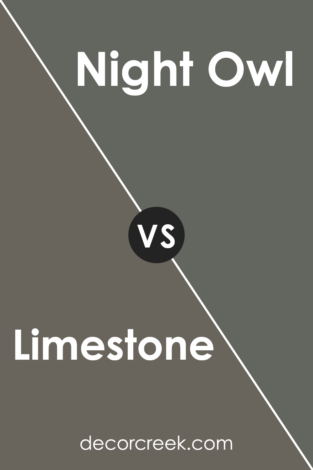
Limestone SW 9599 by Sherwin Williams vs Night Owl SW 7061 by Sherwin Williams
Limestone by Sherwin Williams is a soft, pale gray that brings a light and airy feel to any space. It’s quite neutral, which makes it very versatile for various decorating styles. Its subtlety creates a clean and open atmosphere, perfect for living rooms or bedrooms that aim for a calm and muted aesthetic.
On the other hand, Night Owl is a deeper, mid-tone gray with cool, moody undertones. This color adds more drama and presence to a room compared to Limestone. It’s ideal for creating a striking contrast, especially when used for accent walls or furniture pieces.
Night Owl works well in modern and contemporary settings, providing a bold backdrop that highlights decor.While Limestone is more about creating a bright and breezy feel, Night Owl focuses on delivering a more pronounced and strong visual impact. Each has its unique charm, depending on the mood and style you want to achieve in your space.
You can see recommended paint color below:
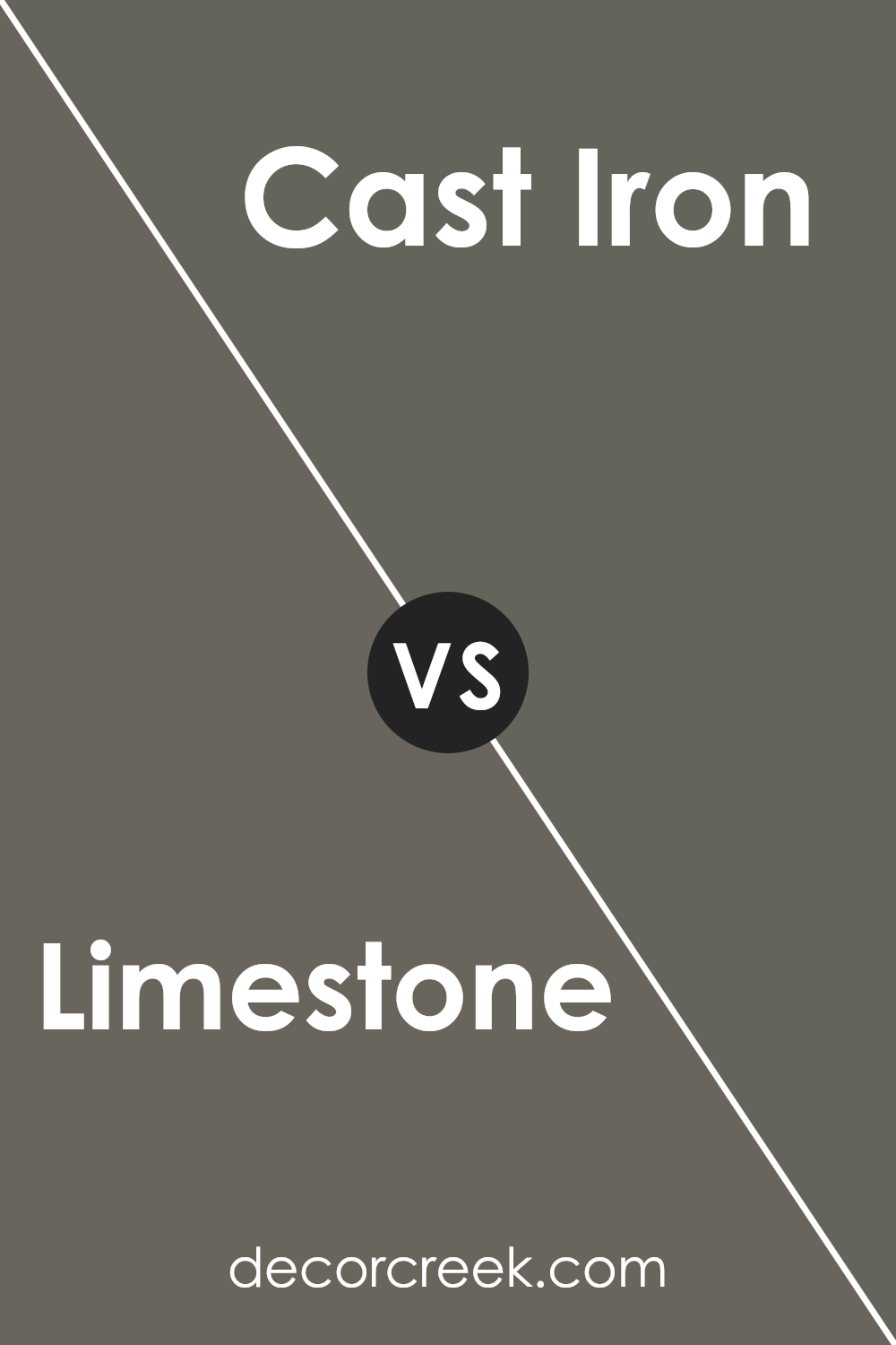
Limestone SW 9599 by Sherwin Williams vs Cast Iron SW 6202 by Sherwin Williams
Limestone SW 9599 and Cast Iron SW 6202 by Sherwin Williams are two distinct paint colors that cater to different aesthetic preferences. Limestone is a soft, neutral color with beige undertones, giving it a light and airy feel. This color is versatile, making it suitable for various spaces like living rooms or bedrooms, where a calming, subtle ambiance is desired.
On the other hand, Cast Iron is a much darker shade, closer to a deep charcoal. It provides a bold and strong presence, perfect for creating dramatic accents in a room or for use in space where a more striking, defining look is preferred.
When used together, these colors can complement each other well, with Limestone providing a bright backdrop that highlights the richness of Cast Iron. The contrast between the two can also help define spaces within a home or bring a unique balance to a room’s decor.
You can see recommended paint color below:
- SW 6202 Cast Iron
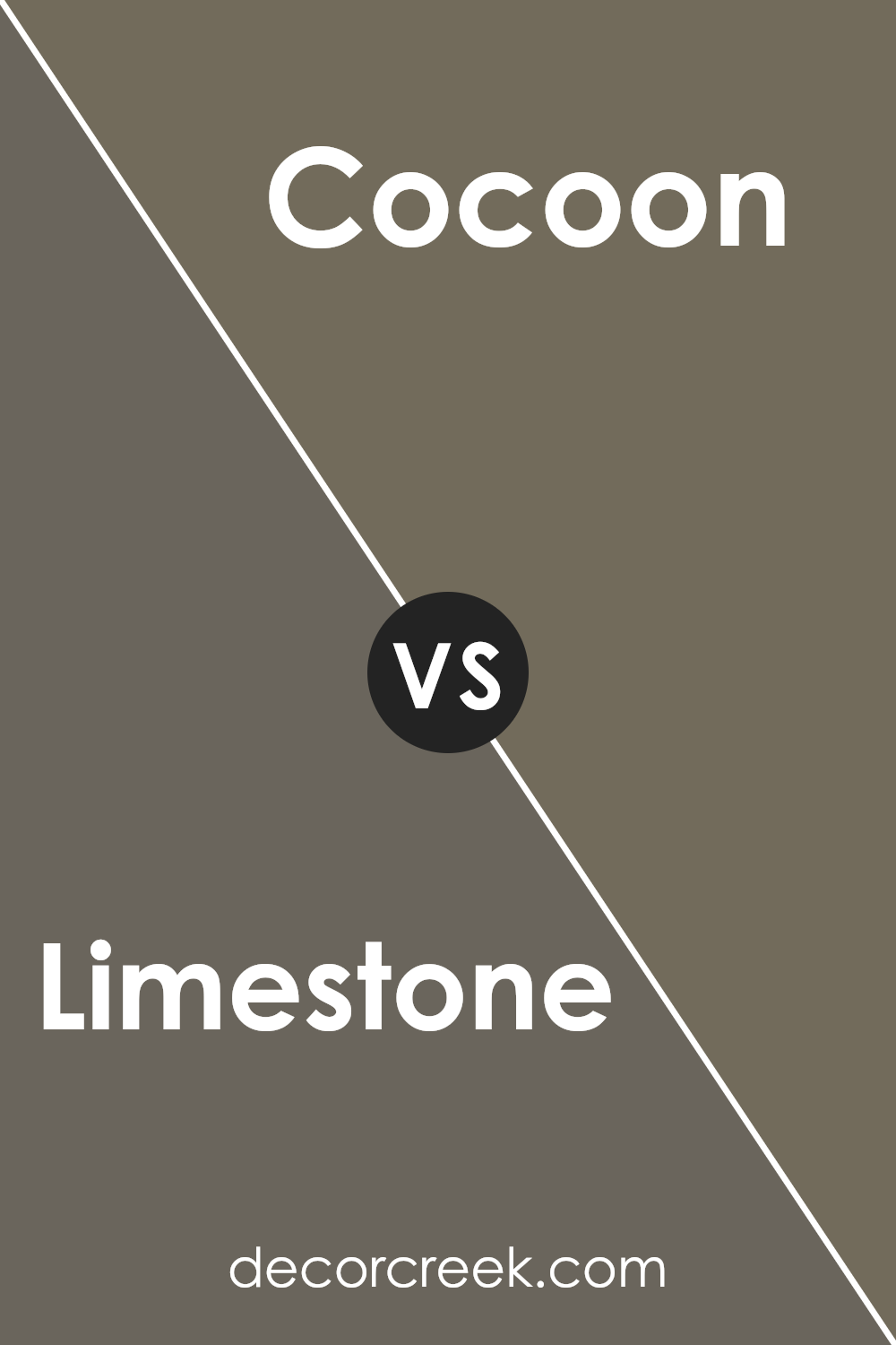
Limestone SW 9599 by Sherwin Williams vs Cocoon SW 6173 by Sherwin Williams
Limestone and Cocoon are two different paint colors from Sherwin Williams. Limestone is a light gray that has a fresh and clean look, making it great for creating a bright and airy feeling in a room. It pairs well with a wide range of decor styles and adds a subtle modern touch without overpowering the space.
On the other hand, Cocoon is a deeper, muted taupe. It’s a cozy color that brings warmth to any space, making it ideal for areas where you want to feel relaxed, like living rooms or bedrooms. Its richer tone provides a strong contrast to lighter colors, which can help highlight specific areas or features in a room.
Comparing the two, Limestone offers a lighter, crisper feel which can make small spaces appear larger, while Cocoon offers depth and warmth, perfect for adding character and comfort. Both colors work well in various settings, depending on the mood you want to set and the space you’re working with.
You can see recommended paint color below:
- SW 6173 Cocoon
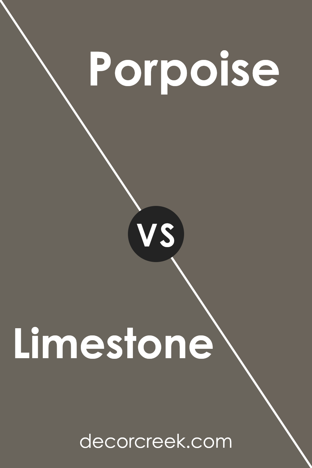
Limestone SW 9599 by Sherwin Williams vs Porpoise SW 7047 by Sherwin Williams
Limestone and Porpoise by Sherwin Williams are two neutral colors with distinct tones. Limestone is a soft, light gray with warm undertones, creating a cozy and welcoming feel to any room. It reflects light well, making spaces appear brighter and more open. This color works beautifully in living areas and bedrooms where a gentle, calming backdrop is desirable.
On the other hand, Porpoise is a deeper, cooler gray that carries a hint of brown. This darker shade adds a strong presence to a space, making it ideal for accent walls or furniture. It’s particularly effective in providing contrast and depth when paired with lighter shades, such as Limestone.
When used together, these colors offer a balanced and harmonious palette, with Limestone lightening the space and Porpoise providing grounded accents. This combination can work well in various design styles, from modern to rustic, depending on how they’re applied.
You can see recommended paint color below:
- SW 7047 Porpoise
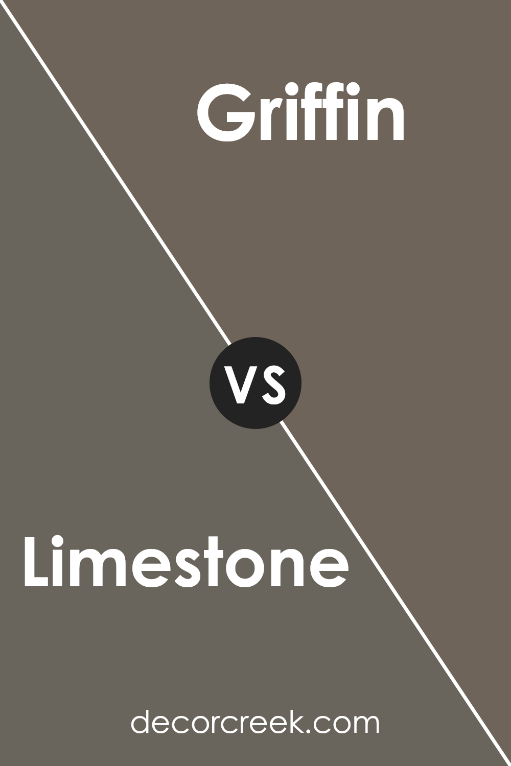
Limestone SW 9599 by Sherwin Williams vs Griffin SW 7026 by Sherwin Williams
Limestone and Griffin, both from Sherwin Williams, present two distinct shades that can significantly influence the atmosphere of a room. Limestone is a light, almost creamy color that reflects a lot of light, making spaces appear more open and airy.
It’s an excellent choice for small rooms or areas without much natural light. On the other hand, Griffin is a much darker gray that brings a strong sense of drama and depth to a space. It works well in larger rooms or as an accent wall, where it can make a bold statement without overwhelming the area.
deciding between them, consider the size of your room and the amount of natural light it gets. Limestone can help make a cramped area feel more spacious, while Griffin would be ideal for adding a touch of elegance to a well-lit, larger room.
You can see recommended paint color below:
- SW 7026 Griffin
Limestone SW 9599 by Sherwin Williams vs Ironclad SW 9570 by Sherwin Williams
Limestone and Ironclad by Sherwin Williams are two distinct paint colors each suited for different aesthetic vibes in a home. Limestone is a soft, muted beige with warm undertones, making it a versatile choice for creating a cozy and inviting atmosphere in spaces like living rooms or bedrooms. It reflects a lot of light, which can help make a small room look bigger and brighter.
On the other hand, Ironclad is a much darker gray that leans slightly towards blue. This color is bold and can make a strong statement when used on walls. It’s ideal for accent walls or for bringing a sense of drama to a space. Due to its darkness, it works well in larger or well-lit areas to prevent the space from feeling too cramped.
Together, these colors can be used to achieve a balanced look in a home, with Limestone offering a light backdrop and Ironclad serving as a striking complement.
You can see recommended paint color below:
- SW 9570 Ironclad
Limestone SW 9599 by Sherwin Williams vs Thunderous SW 6201 by Sherwin Williams
Limestone is a warm, light gray color with subtle beige undertones, making it very versatile and easy to integrate into various spaces. It tends to give a cozy and welcoming vibe, which works well for living rooms and other areas where you want a soft, neutral backdrop.
On the other hand, Thunderous is a much darker gray that leans slightly toward a stormy blue. This color provides a strong presence in a space, ideal for creating a striking contrast against lighter tones or for use in accent walls.
While Limestone reflects more light and can help to make a small room appear larger and more open, Thunderous tends to draw in the walls and can make a dramatic statement. Together, these colors can be used to balance out a space, with Limestone lifting the ambiance and Thunderous adding depth and focus.
You can see recommended paint color below:
- SW 6201 Thunderous
Limestone SW 9599 by Sherwin Williams vs Eclipse SW 6166 by Sherwin Williams
Limestone and Eclipse are two distinct colors by Sherwin Williams that offer unique vibes for different spaces. Limestone is a light, creamy beige that brings a warm and welcoming feel to any room.
softness makes it a great choice for living areas and bedrooms where you want a calm atmosphere. On the other hand, Eclipse is a deep, dark gray that adds a strong presence to a space. It’s perfect for creating a bold statement and works well in modern settings or as an accent wall, providing a backdrop that makes lighter colors pop.
While Limestone reflects more light and enhances the sense of space, Eclipse tends to absorb light, making it ideal for large, well-lit areas. Together, these colors could complement each other nicely in a space that balances light and dark elements.
You can see recommended paint color below:
- SW 6166 Eclipse
Limestone SW 9599 by Sherwin Williams vs Storm Warning SW 9555 by Sherwin Williams
The main difference between Limestone and Storm Warning is their tone and the mood they set. Limestone is a lighter shade, close to a soft beige with a hint of warm gray.
It’s a versatile color that can easily brighten up any space and make it feel more open and welcoming. Because of its light and neutral nature, it pairs well with many other colors, providing a gentle backdrop that allows other design elements to stand out.
In contrast, Storm Warning is noticeably darker and more intense. This color leans more towards a deep gray with blue undertones, giving it a stronger presence in a room. It’s ideal for creating a more dramatic and bold look, perfect for accent walls or spaces where you want to make a statement. Its depth provides a stark contrast to lighter colors like Limestone, making it a great choice for color schemes seeking balance between light and dark shades.
You can see recommended paint color below:

Limestone SW 9599 by Sherwin Williams vs Braintree SW 9595 by Sherwin Williams
Limestone and Braintree, both by Sherwin Williams, offer subtle yet distinct differences in their appeal. Limestone is a cooler gray with hints of blue, creating a fresh and airy feeling that can make a room feel more open and light. This color is ideal for spaces where you want an element of calm without any warmth in the tone.
On the other hand, Braintree is a slightly warmer tone, nearing the spectrum of greige, where gray meets beige. This color adds a touch of warmth to it, making it perfect for creating a cozy and welcoming atmosphere. It’s especially suitable for living areas or any room where comfort is key.
Both colors are versatile and neutral, and they work well in various design styles, from modern to traditional. Whether you choose Limestone for a crisp, cool vibe or Braintree for a soft, warm environment, both colors provide a solid foundation for decorating and accenting with other colors.
You can see recommended paint color below:
- SW 9595 Braintree
Conclusion
This color has a warm and gentle color that seems perfect for places where you relax, like your living room or bedroom. The light gray shade of Limestone is soft and not too loud, making it really pleasant to look at. I learned that it works well with many different colors, so you can use it with furniture and decorations you already have.
I think this paint can make a small room look a bit bigger and a dark room look lighter. This is really helpful if you don’t have a lot of big windows. Also, since it’s a paint by Sherwin Williams, you can expect it to last a long time and keep looking good.
Overall, choosing SW 9599 Limestone seems like a smart move if you’re looking for paint that can make your home feel warm and inviting. It’s simple, not too flashy, and it brings a comfortable mood to your spaces.
If you are looking to repaint any room, this color is definitely worth considering.
Ever wished paint sampling was as easy as sticking a sticker? Guess what? Now it is! Discover Samplize's unique Peel & Stick samples.
Get paint samples

