SW 9555 Storm Warning grabs your attention right away with its deep, bold look. It’s the kind of color that makes a strong impression and sticks with you. Not just paint—it sets the mood.
It brings to mind the quiet power of a brewing storm, with its rich, layered hues capturing that tension in the air before the first drop of rain falls.
The color seems to shift and dance, always showing a different facet depending on the light and surroundings. In the mornings, it can feel calm and soothing, wrapping you in a cocoon of comfort. But as the day progresses, it can take on a more dramatic, almost theatrical presence.
You notice how it can transform a room, bringing out unexpected character and warmth from even the most mundane spaces.
Storm Warning isn’t just for one type of room or style; it complements a wide range of environments, from modern to classic, and even rustic. Its versatility is evident as it seems to blend effortlessly with both bold accent colors and more muted tones.
You realize that this color doesn’t just enhance a space, it shapes the very mood and energy of the room. With SW 9555, you’re not just adding a color to your walls; you’re inviting a bold statement into your home.
What Color Is Storm Warning SW 9555 by Sherwin Williams?
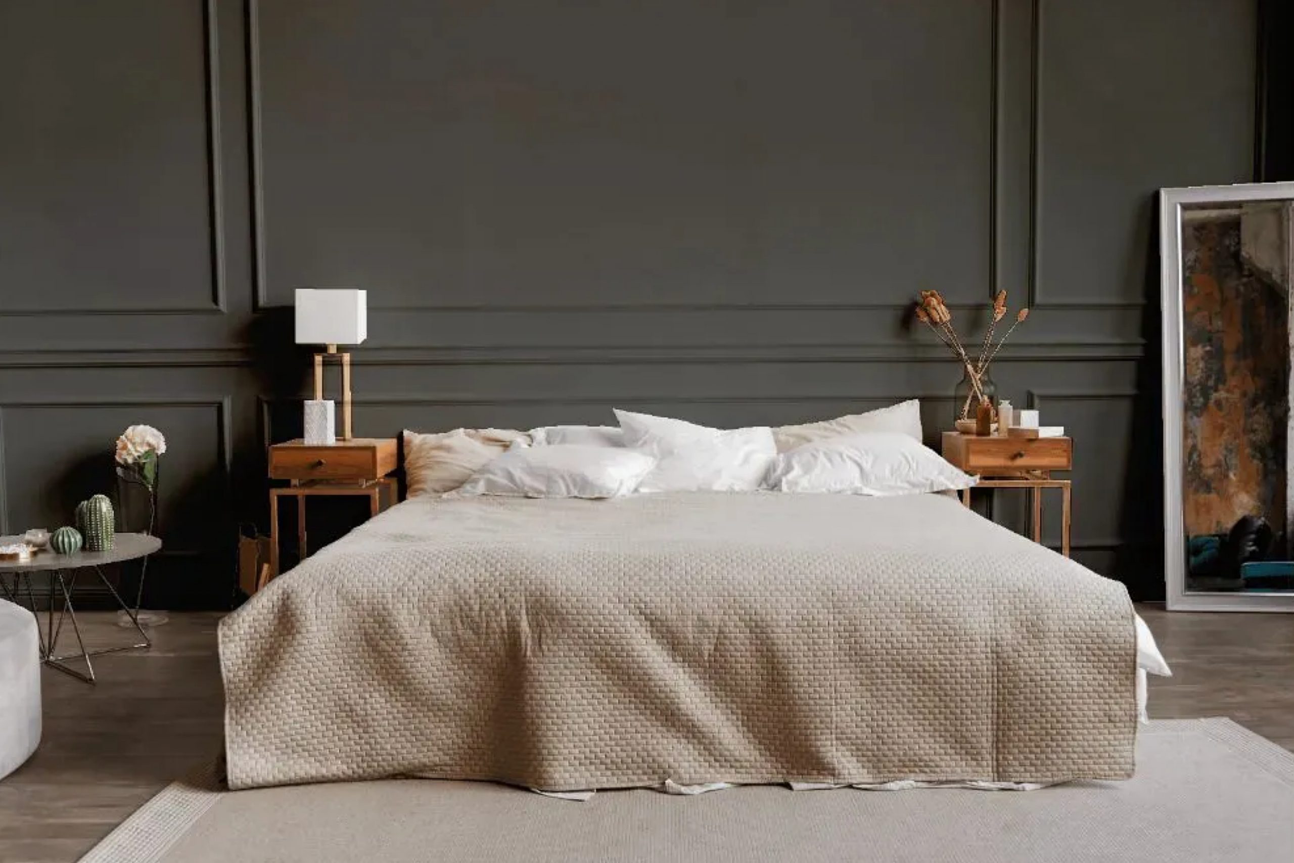
Storm Warning by Sherwin Williams is a deep, intense gray with cool undertones. This color adds depth and drama to any space, making it an excellent choice for accent walls or entire rooms where you want to create a bold statement. It works well in modern and contemporary interiors, where its rich tone complements clean lines and minimalist designs.
In terms of materials, Storm Warning pairs beautifully with metals such as stainless steel or chrome, adding a sleek touch to the overall aesthetic. In contrast, natural wood elements in light or medium tones can warm up the room, creating a balanced environment.
For textiles, soft materials like velvet or wool in lighter shades, such as soft grays, whites, or even muted pastels, offer an appealing contrast against this dark gray.
Industrial-style spaces also benefit from this color, as it perfectly complements raw materials like concrete and exposed brick. In such settings, combining stone and metal finishes enhances the urban feel, while adding green plants can introduce a touch of nature.
When it comes to lighting, Storm Warning looks best with warm lighting to prevent the space from feeling too cold. Use it cleverly throughout a room to take advantage of its strong presence, bringing a modern yet cozy vibe to your home.
Is Storm Warning SW 9555 by Sherwin Williams Warm or Cool color?
Storm Warning SW 9555 by Sherwin Williams is a deep, muted gray with a hint of blue. This color can create a calming and cozy atmosphere in homes. Because of its neutral tone, it works well in various spaces and complements many design styles. It pairs nicely with both light and dark furnishings, making it versatile for different rooms.
In a living room, Storm Warning creates a cozy backdrop that pairs well with wooden furniture and colorful accents. In a bedroom, it gives a restful feel, especially when combined with soft textiles and warm lighting.
In kitchens or bathrooms, this color provides a modern and clean look, blending well with stainless steel appliances or white fixtures.
Lighting in the room can affect how Storm Warning appears. It might look cooler in a room with natural sunlight and appear warmer in spaces with dimmer lighting. Overall, it offers a flexible choice for homeowners seeking a timeless and subtle wall color.
Undertones of Storm Warning SW 9555 by Sherwin Williams
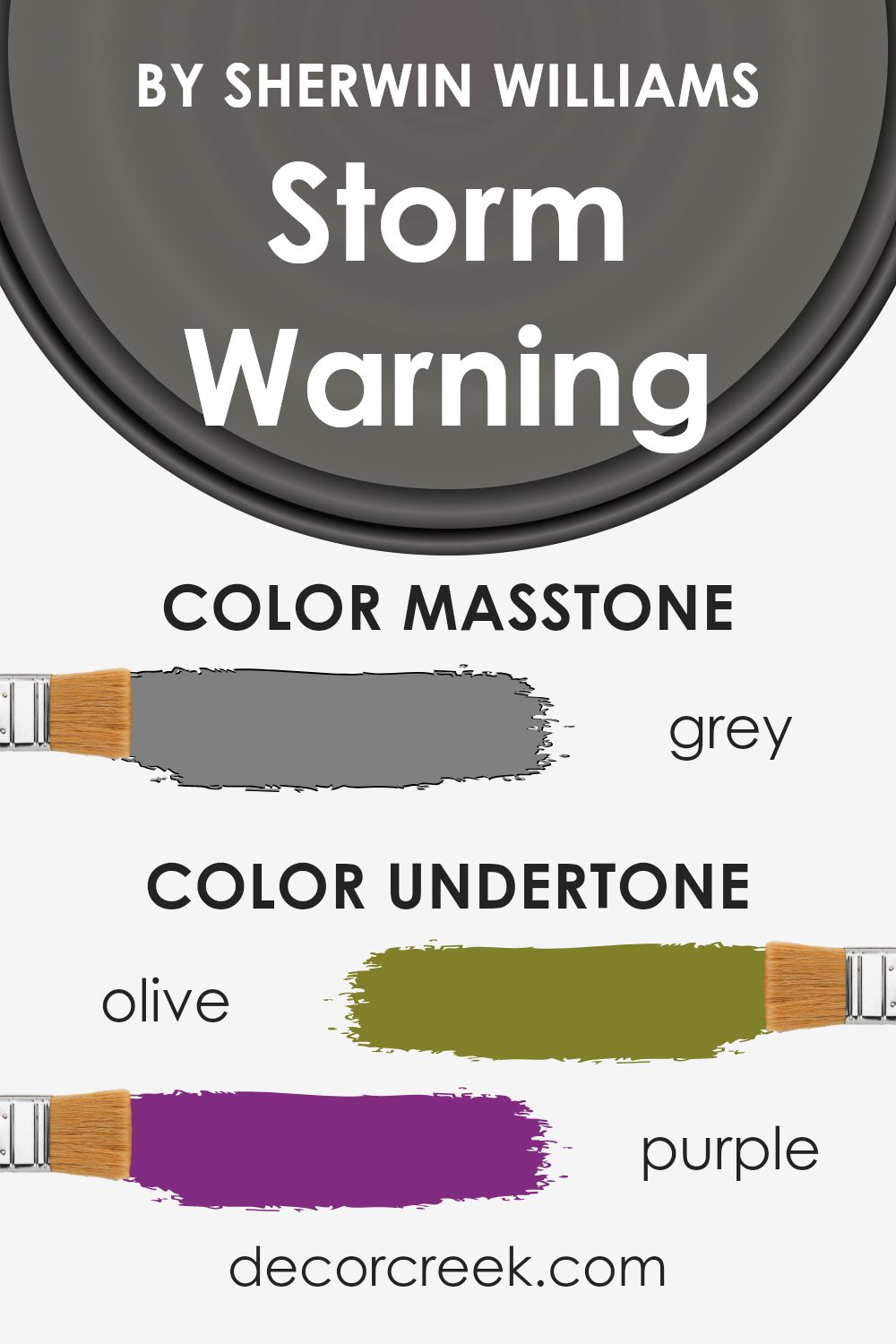
Storm Warning by Sherwin Williams, known as SW 9555, is a rich, muted shade characterized by a complex mix of undertones. These undertones include earthy shades like olive and brown, cool notes from violet and blue, and slight warmth from orange and pale pink.
The interplay of these undertones influences how we perceive the color, making it dynamic and varied depending on lighting and surrounding colors.
When used on interior walls, the paint showcases its versatility. In natural daylight, the blue and green undertones can become prominent, giving rooms a calm and soothing ambiance.
Under warm, artificial lighting, the warmer hues, like brown and orange, might be more visible, offering a cozy and inviting feel. These subtle shifts make Storm Warning adaptable for different moods and purposes in a home.
The presence of dark gray and navy undertones lends depth to the color, ensuring it maintains a strong visual presence without being overwhelming. Meanwhile, lighter undertones such as light blue and pale yellow can brighten the overall look, creating a balance that prevents the paint from feeling too heavy. This makes Storm Warning an excellent choice for spaces where a shift in atmosphere is desired.
What is the Masstone of the Storm Warning SW 9555 by Sherwin Williams?
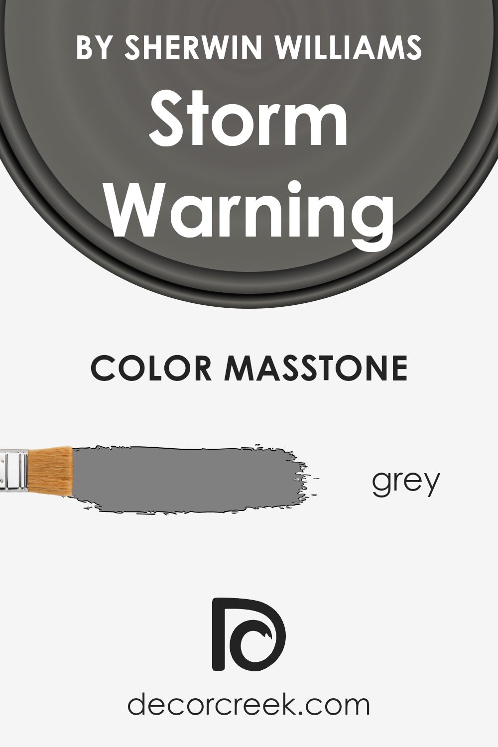
Storm Warning SW 9555 by Sherwin Williams is a medium grey color that has a versatile and neutral appeal. This grey serves as a great backdrop in homes because it is not too dark or too light. Its masstone, or the main color seen in paint, resembles a true grey (#808080), which provides a balanced and calming effect in any room.
In living spaces, this shade can create a cozy and modern atmosphere. It pairs well with both bold colors and softer tones, allowing homeowners to easily switch up accent pieces without changing the wall color.
In kitchens and bathrooms, Storm Warning provides a clean and sleek look, complementing stainless steel appliances and white cabinetry nicely.
This grey also works well with natural elements, like wood and stone, enhancing the overall aesthetic without overpowering it. Whether used on walls or as an accent color, Storm Warning SW 9555 brings a fresh yet timeless feel to any space.
How Does Lighting Affect Storm Warning SW 9555 by Sherwin Williams?
Lighting plays a crucial role in how we perceive colors. It can change the way a color looks, making it appear lighter, darker, warmer, or cooler depending on the source and direction of the light. When it comes to the color Storm Warning SW 9555 by Sherwin Williams, like any other color, its appearance varies significantly under different lighting conditions.
In natural light, the color takes on a more true representation. North-facing rooms tend to receive cooler, more consistent natural light throughout the day.
As a result, Storm Warning in a north-facing room might appear slightly cooler and more muted, as these rooms often cast a subtle blue tone on colors.
In contrast, south-facing rooms receive warm, bright sunlight for the majority of the day.
This warm light can bring out the richness and depth of Storm Warning, making it appear more vibrant and slightly warmer. The color might show more of its undertones, resulting in a cozier feel.
East-facing rooms have bright, direct sunlight in the morning, which then transitions to cooler, softer light as the day progresses. In the morning sunlight, Storm Warning can appear fresh and well-defined, while later in the day, it might take on a subtler, more shaded look.
West-facing rooms enjoy softer daylight in the morning, but in the afternoon and evening, they receive strong, warm light. Storm Warning will appear much warmer and deeper in this setting as the day progresses, creating a dramatic and inviting atmosphere.
In artificial light, the color’s appearance will depend on the type of bulbs used. Incandescent or warm LED bulbs will enhance the warm tones in Storm Warning, making it feel cozier and more intimate. In contrast, cool fluorescent lights may make it appear sharper and more subdued.
Understanding these lighting effects can help in choosing the perfect room and lighting combination for an optimal appearance of this color.
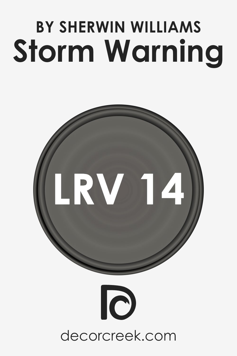
What is the LRV of Storm Warning SW 9555 by Sherwin Williams?
LRV, or Light Reflectance Value, measures how much light a color reflects. On a scale from 0 to 100, 0 means the color reflects no light and is completely black, while 100 means the color reflects all light and is completely white. In simpler terms, LRV tells us how light or dark a color will look once it’s on your walls.
A higher LRV means the color will make a room feel brighter and more open, while a lower LRV results in a cozier, more intimate feel. So, understanding LRV can help you predict how a paint color will feel in a room, especially when considering how much natural or artificial light the room gets.
For Storm Warning with an LRV of 13.735, this means it is a relatively dark color. With this low LRV, Storm Warning won’t reflect much light. Instead, it will absorb more light, making it a good choice for creating a space that feels warm and intimate.
This shade might be best suited for areas where you want a more enveloping feel, rather than spaces where you’re seeking brightness or openness.
In well-lit rooms, it can add depth and contrast, whereas in darker rooms, it may make the space feel more closed in. So, depending on your lighting situation and the atmosphere you wish to create, Storm Warning can add a bold element to your walls.
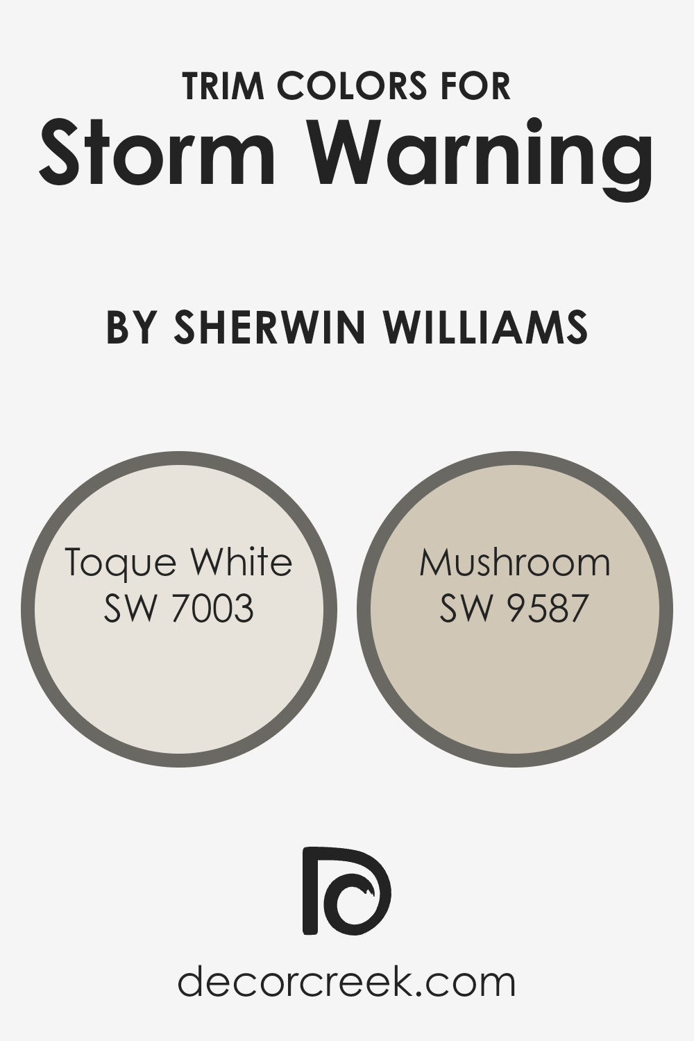
What are the Trim colors of Storm Warning SW 9555 by Sherwin Williams?
Trim colors play a crucial role in enhancing the overall look of a room by defining spaces and highlighting architecture. For a room painted with Storm Warning, which is a strong and moody color, the choice of trim colors can make a significant difference.
Toque White (SW 7003) is an ideal trim color for such a dark shade. This soft, warm white provides a gentle contrast that helps define the space while complementing the boldness of Storm Warning.
It ensures the edges and details of the room stand out without being stark or overwhelming. Meanwhile, using Mushroom (SW 9587) as a second trim option introduces warmth and subtlety.
This cozy, earth-toned hue works harmoniously with Storm Warning, adding an understated touch that enriches the room’s ambiance.
Toque White is a warm, creamy white that pairs wonderfully with deeper shades like Storm Warning. It has a subtle delicacy that softens the space and adds lightness to the room without clashing with the primary wall color.
On the other hand, Mushroom is a natural and muted neutral that brings an earthy feel to the space.
Its soft undertones balance the intensity of darker walls while providing continuity and warmth across the room. Both trim colors serve to augment the primary color without overshadowing it, creating an inviting and well-coordinated environment.
You can see recommended paint colors below:
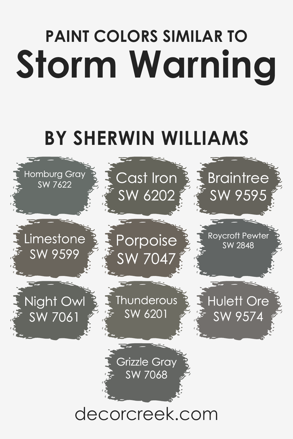
Colors Similar to Storm Warning SW 9555 by Sherwin Williams
Similar colors play a significant role in creating harmony and balance in any space. When colors are close to each other on the color spectrum, they tend to complement one another well, resulting in a unified look. For example, Homburg Gray is a deep, muted gray with green undertones that pairs beautifully with Limestone, a soft, natural beige that adds warmth to a room.
Night Owl, a deep charcoal with blue hints, works well alongside Grizzle Gray, a rich shade that’s perfect for adding depth. Cast Iron is a strong, bold color that provides a dramatic punch amid the subtler tones, while Porpoise offers a medium gray tone that blends easily with other colors.
Thunderous is a dark, moody shade of gray that amplifies the richness of surrounding hues.
It complements Braintree, a faded olive green that adds a touch of earthiness to the palette. Roycroft Pewter provides a historical gray tone that fits effortlessly into any traditional design scheme.
Finally, Hulett Ore offers a bold brownish-gray that can add an unexpected but pleasing contrast. Together, these colors form a cohesive group that can be used to design spaces that feel both warm and inviting, perfectly supporting the dramatic presence of Storm Warning.
You can see recommended paint colors below:
- SW 7622 Homburg Gray
- SW 9599 Limestone
- SW 7061 Night Owl
- SW 7068 Grizzle Gray
- SW 6202 Cast Iron
- SW 7047 Porpoise
- SW 6201 Thunderous
- SW 9595 Braintree
- SW 2848 Roycroft Pewter
- SW 9574 Hulett Ore
How to Use Storm Warning SW 9555 by Sherwin Williams In Your Home?
Storm Warning SW 9555 by Sherwin Williams is a rich and versatile paint color. It’s a gray with blue undertones, making it an ideal choice for creating a cozy and calming environment in your home. You can use it on walls in living rooms or bedrooms to add depth and warmth to your space. It pairs well with both light and dark furnishings, allowing for a wide range of decorating options.
If you want to highlight architectural features like moldings or trims, Storm Warning will make them stand out in subtle contrast when paired with whites or creams.
It also works beautifully in a modern kitchen, harmonizing with stainless steel appliances and bringing a fresh look to your cabinets. Its neutral tones make it easy to accessorize with colorful decor, artwork, or textiles that pop against the calming backdrop. Overall, it’s a flexible color that suits both contemporary and traditional styles.
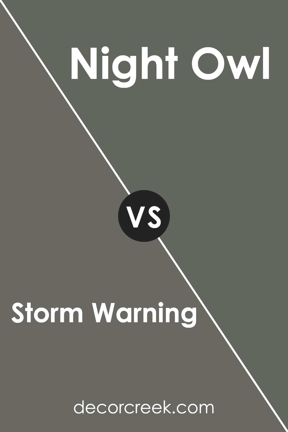
Storm Warning SW 9555 by Sherwin Williams vs Night Owl SW 7061 by Sherwin Williams
Storm Warning SW 9555 by Sherwin Williams is a soft, muted gray with warm undertones. It creates a calm and welcoming atmosphere, making it a versatile choice for various spaces. This color pairs beautifully with both warm and cool elements, allowing it to fit well in different room settings.
On the other hand, Night Owl SW 7061 is a deeper, richer gray with green undertones. It has a dramatic and bold presence, giving it a more intense look compared to Storm Warning. This color adds depth and makes a strong statement in a room.
While both colors are shades of gray, Storm Warning leans toward a subtle, cozy feel, while Night Owl offers a more dramatic and moody vibe. Choosing between them depends on whether you prefer a softer, understated ambiance or a bold, striking one. Each color affects the mood and feel of a space in its own way.
You can see recommended paint color below:
- SW 7061 Night Owl
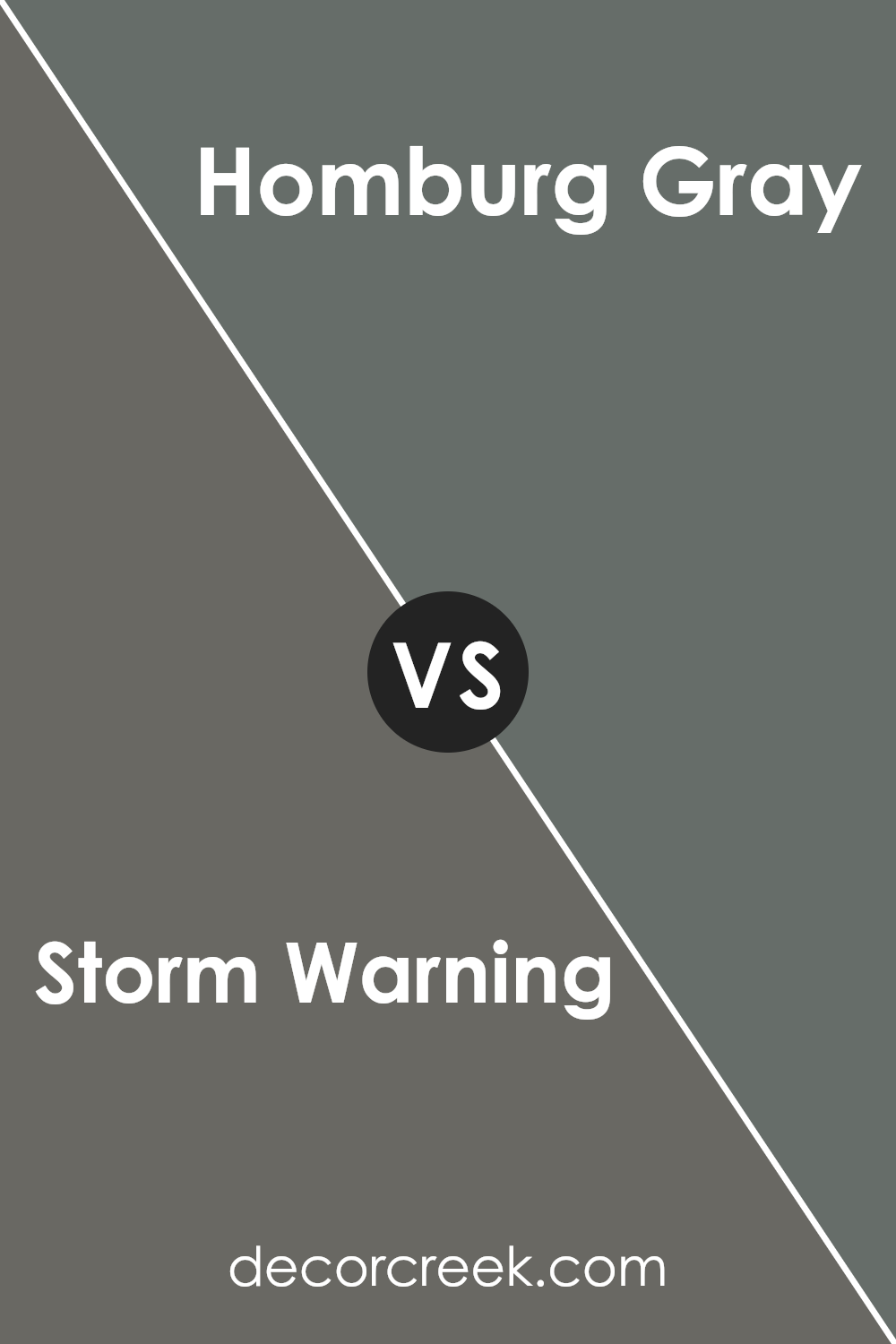
Storm Warning SW 9555 by Sherwin Williams vs Homburg Gray SW 7622 by Sherwin Williams
Storm Warning SW 9555 by Sherwin Williams is a bold and dramatic color. It has a deep, stormy essence, which can make a significant impact in a space. The color is perfect for adding depth and creating a focal point in a room. On the other hand, Homburg Gray SW 7622 is a more muted and understated hue. It’s a gray with subtle hints of green, bringing a calming effect and a touch of nature indoors.
While Storm Warning is striking and commands attention, Homburg Gray feels more neutral and soothing. Both colors work well in different settings.
Storm Warning might be used to add energy or drama to a space, while Homburg Gray is ideal for creating a peaceful and harmonious environment. When paired together, these colors can provide a beautiful contrast, with Storm Warning adding excitement and Homburg Gray offering balance.
You can see recommended paint color below:
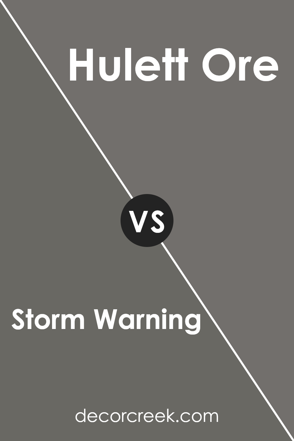
Storm Warning SW 9555 by Sherwin Williams vs Hulett Ore SW 9574 by Sherwin Williams
Storm Warning SW 9555 and Hulett Ore SW 9574 by Sherwin Williams both offer unique characteristics that may appeal to different tastes. Storm Warning is a medium gray with a blue undertone, which can give a space a calm and cool feeling. It’s versatile and works well as a neutral backdrop in various settings, from modern to traditional.
Hulett Ore, on the other hand, is a warmer, earthy color with hints of brown and red. This hue can create a cozy and inviting atmosphere, making a room feel snug and welcoming. It’s a great choice for spaces where you want warmth and comfort.
While Storm Warning brings a cooler, more modern touch, Hulett Ore leans towards a more traditional, warm feeling. Both colors have their strengths, and the choice between them would depend on whether you want a cool, neutral vibe or a warm, earthy ambiance.
You can see recommended paint color below:
- SW 9574 Hulett Ore
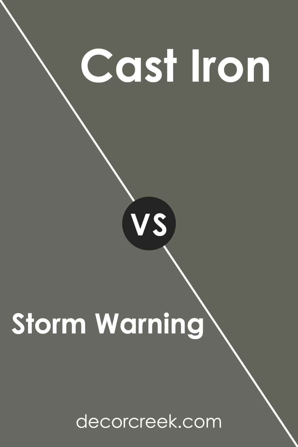
Storm Warning SW 9555 by Sherwin Williams vs Cast Iron SW 6202 by Sherwin Williams
Storm Warning SW 9555 and Cast Iron SW 6202 by Sherwin Williams are two distinct colors that add depth to different spaces. Storm Warning is a medium-tone gray with a warm undertone, making it versatile for various styles. It can create a cozy yet modern feel in living rooms or bedrooms.
In contrast, Cast Iron is a dark, bold color with deep charcoal tones. It is ideal for creating dramatic settings, perfect for accent walls or feature areas where you want to make a strong statement.
While Storm Warning offers a more neutral and adaptable option, Cast Iron adds richness and intensity, suitable for those looking to create a more striking effect. Both colors can complement other lighter shades beautifully, but Storm Warning is generally more subtle and accessible, while Cast Iron is best used where a confident and bold appearance is desired.
You can see recommended paint color below:
- SW 6202 Cast Iron
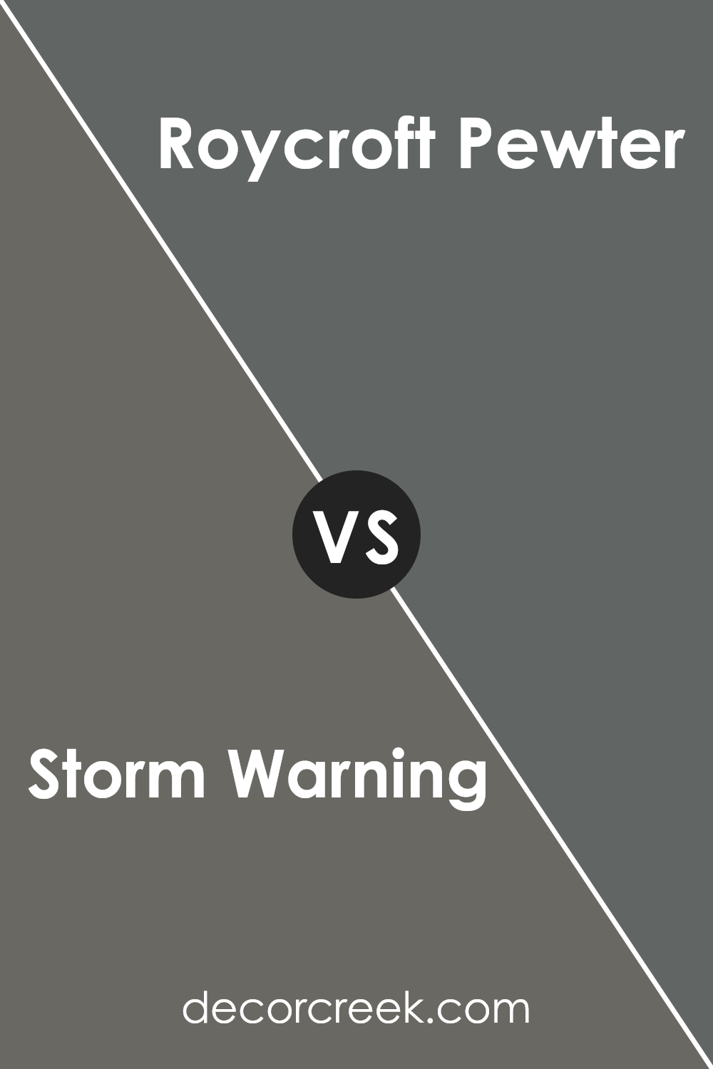
Storm Warning SW 9555 by Sherwin Williams vs Roycroft Pewter SW 2848 by Sherwin Williams
Storm Warning SW 9555 and Roycroft Pewter SW 2848 are both from Sherwin Williams, but they offer different vibes. Storm Warning is a medium gray with a hint of warmth, making spaces feel cozy and inviting. It’s versatile, pairing well with both light and dark colors, and works for contemporary and traditional settings.
On the other hand, Roycroft Pewter is a deeper, richer color with green undertones. It’s more historic in feel, often used in Arts and Crafts-style homes. While Storm Warning is subtle and adaptable, Roycroft Pewter makes a bolder statement.
When choosing between them, consider your space’s mood and lighting. In a bright room, Storm Warning can add softness, while Roycroft Pewter can add depth and character. In darker rooms, Storm Warning will maintain warmth, whereas Roycroft Pewter might deepen the cozy atmosphere. Both have their place, depending on your design goals.
You can see recommended paint color below:
- SW 2848 Roycroft Pewter
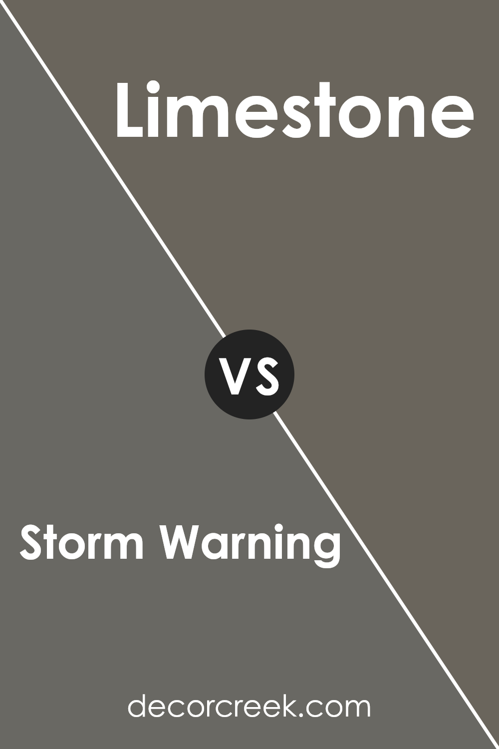
Storm Warning SW 9555 by Sherwin Williams vs Limestone SW 9599 by Sherwin Williams
Storm Warning SW 9555 is a medium gray with a hint of warmth, balancing between cool and warm tones. It provides a neutral backdrop that can fit well in various settings, offering versatility for home interiors. It’s a color that can ground a room, adding a sense of stability without overwhelming other design elements.
Limestone SW 9599, on the other hand, is a lighter and softer shade of gray with subtle beige undertones. This makes it a more delicate and airy color that can brighten spaces and create an inviting atmosphere. Limestone works well in smaller rooms or areas where you want a feeling of openness.
When comparing the two, Storm Warning is bolder and more grounding, while Limestone is lighter and softer. They can be paired together, with Storm Warning used for accent walls or larger spaces and Limestone for areas where you want lighter, more open vibes.
You can see recommended paint color below:
- SW 9599 Limestone
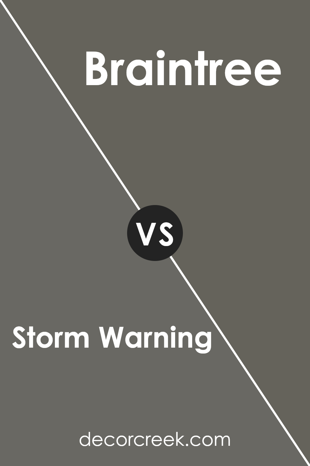
Storm Warning SW 9555 by Sherwin Williams vs Braintree SW 9595 by Sherwin Williams
Storm Warning SW 9555 and Braintree SW 9595 are two colors from Sherwin Williams that offer distinct visual experiences. Storm Warning is a soft, muted gray with subtle hints of warmth, giving it a cozy, inviting feel. It’s versatile, making it suitable for a variety of spaces, from modern and minimalist to more traditional settings.
On the other hand, Braintree is a deeper, richer shade with green undertones. It has an earthy quality that can provide a bold, statement-making contrast in any room. While Storm Warning is more understated and calming, Braintree brings an element of nature indoors, making spaces feel grounded and balanced.
Together, these colors can complement each other nicely, with Storm Warning serving as a neutral backdrop and Braintree adding depth and character. Both colors work well with natural materials and textures, enhancing the overall ambiance of a room.
You can see recommended paint color below:
- SW 9595 Braintree
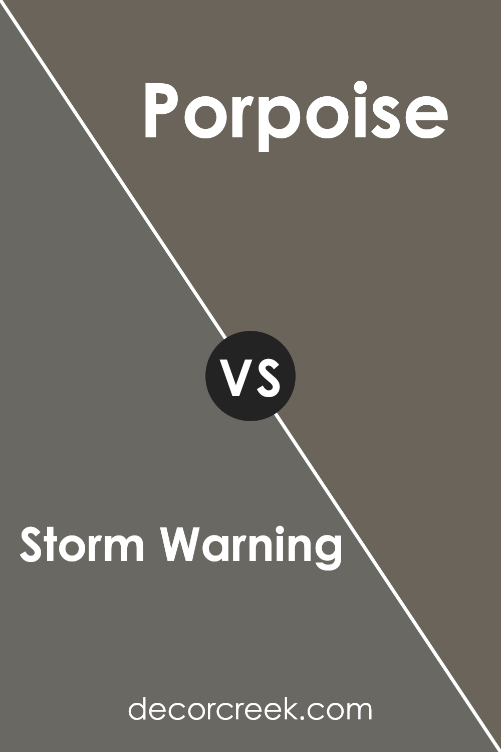
Storm Warning SW 9555 by Sherwin Williams vs Porpoise SW 7047 by Sherwin Williams
Storm Warning SW 9555 and Porpoise SW 7047 are two paint colors from Sherwin Williams. Storm Warning is a medium gray with a cool, slightly bluish tint. It has a modern and calming feel, making it a versatile choice for different spaces. Porpoise, on the other hand, is a darker gray with a warm, taupe undertone. It adds depth and a cozy feel to any room.
When comparing these two colors, Storm Warning can make a room feel fresh and open, while Porpoise adds a sense of warmth and intimacy. Storm Warning might be better for spaces where you want a light and airy feel, such as a living room or kitchen.
Porpoise is a great choice for creating a more inviting or sophisticated environment, like in a bedroom or study.
Both colors are neutral, making them easy to pair with other shades, but their undertones differ, influencing the overall mood of a space.
You can see recommended paint color below:
- SW 7047 Porpoise
Storm Warning SW 9555 by Sherwin Williams vs Grizzle Gray SW 7068 by Sherwin Williams
Storm Warning SW 9555 by Sherwin Williams is a soft, muted gray with a touch of warmth, making it versatile for different spaces. It works well as a neutral backdrop, offering a calm and balanced feel.
On the other hand, Grizzle Gray SW 7068 is a darker, bolder shade of gray with deep undertones. It creates a more dramatic and moody atmosphere. Grizzle Gray is often used to create contrast and add depth to a room.
When comparing the two, Storm Warning is more subtle and light, easily blending with other colors. It’s ideal for a soothing and peaceful setting. In contrast, Grizzle Gray makes a strong statement and is suited for accent walls or rooms where a more intense look is desired. Both colors have their unique charm, allowing homeowners to choose based on the mood they want to set.
You can see recommended paint color below:
Storm Warning SW 9555 by Sherwin Williams vs Thunderous SW 6201 by Sherwin Williams
Storm Warning SW 9555 by Sherwin Williams is a strong, stormy gray with cool undertones. It gives a room a bold and dramatic look. This color works well in modern or industrial spaces, adding depth and a sense of style without being overly overpowering.
Thunderous SW 6201, on the other hand, is a deeper and slightly warmer gray. It has a bit more weight, making it suitable for cozy, comfortable environments. Thunderous is versatile, pairing nicely with natural materials like wood and stone, and providing a neutral backdrop that enhances furnishings.
Both colors are rich and grounded but serve different purposes. Storm Warning feels more contemporary and sharp, making it ideal for spaces that need a fresh, eye-catching element. Thunderous, being warmer, brings a snug and enveloping vibe, perfect for creating an inviting atmosphere. Choosing between them depends on whether you want a subtle, bold look or a comforting, warm ambiance.
You can see recommended paint color below:
- SW 6201 Thunderous
Conclusion
It’s a shade that looks like the sky before a big rain, with deep grays and hints of blue. Imagine standing outside and feeling the wind pick up just before a storm. That’s the mood this color sets.
When I think about painting with Storm Warning, I picture a room that feels safe and snug, like being wrapped in a cozy blanket.
This color would be great for a living room or bedroom where you want to relax and feel calm. It’s not too bright or too dark; it’s just right for making a room feel comfortable and warm.
What’s cool about Storm Warning is how it can match with lots of other colors, so you could add bright pillows or colorful paintings, and they’d really pop against this soft background.
Even though it’s a simple color, it can make a big difference in how a room feels. I can picture sitting in a Storm Warning painted room, drinking hot chocolate while watching the rain tap on the window. That sounds nice and cozy to me!
Ever wished paint sampling was as easy as sticking a sticker? Guess what? Now it is! Discover Samplize's unique Peel & Stick samples.
Get paint samples

