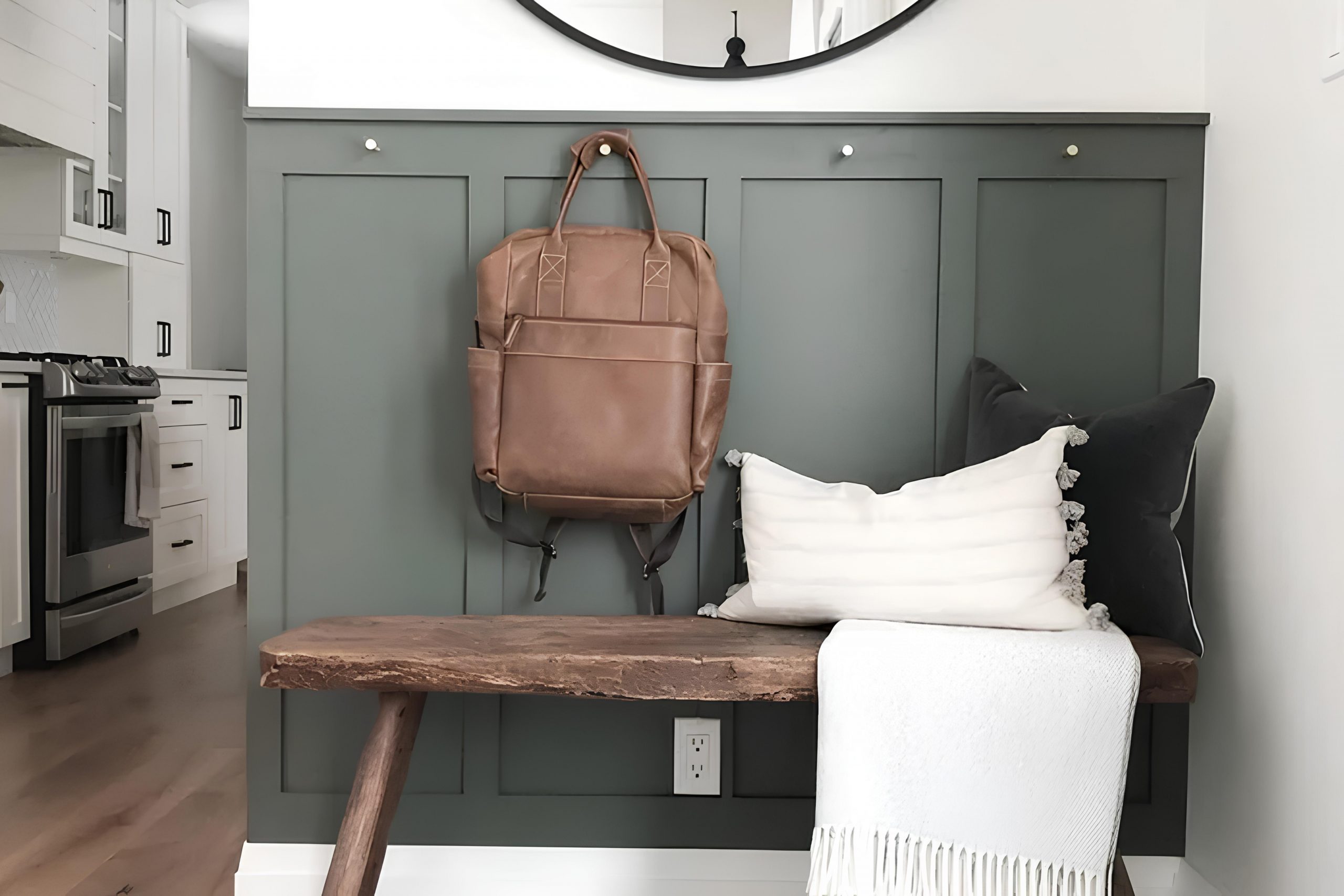
There’s something about SW 7061 Night Owl by Sherwin Williams that really speaks to me. It’s a shade that seems to strike a perfect balance between being bold and reassuring. As soon as I noticed this color, I couldn’t help but feel its calming yet confident presence. Night Owl is a deep gray-blue that seems to carry the essence of a peaceful twilight, offering a moment of calm in an otherwise hectic day.
When I bring this color into a space, it changes the atmosphere entirely. Rooms feel more intimate and cozy, wrapping you in a gentle yet sophisticated embrace. The depth of this color adds a sense of elegance, making it suitable for any setting, whether it’s a living room, bedroom, or study. Its versatility is impressive, pairing perfectly with lighter neutrals or warm wood tones.
It’s incredible how a single color can create such a mood. With Night Owl, I find a sense of groundedness and balance. It’s a reminder of the beauty found in simplicity and stillness. If you’re looking for a paint color that offers both depth and warmth, SW 7061 Night Owl might just be that perfect choice.
This hue makes every corner feel welcoming and well-thought-out, inviting you to enjoy your surroundings fully.
What Color Is Night Owl SW 7061 by Sherwin Williams?
Night Owl is a rich, deep gray with a hint of olive green, providing an earthy and grounded feel. This color can add a cozy and inviting atmosphere to any space. It works well in various interior styles, including modern, rustic, and industrial. In a modern setting, Night Owl can serve as a bold accent wall that adds depth without overwhelming the room. It complements clean lines and can be balanced with lighter shades like soft whites or muted grays.
In rustic interiors, Night Owl enhances natural materials such as reclaimed wood and stone, highlighting their organic charm. This color works beautifully with rough textures and earthy materials, creating a warm and intimate atmosphere. In an industrial style, Night Owl pairs perfectly with metal finishes and exposed brick, enhancing the rugged and raw elements of the decor.
This color looks stunning alongside warm metallics like brass or gold and can be softened with natural textiles such as linen and wool. Adding plants or natural greenery can help bring out its green undertones, while accessories in lighter shades keep the space feeling balanced.
Overall, Night Owl provides a versatile and timeless choice that adapts to various design tastes while maintaining a unique presence.
Is Night Owl SW 7061 by Sherwin Williams Warm or Cool color?
Night Owl SW 7061 by Sherwin Williams is a rich, deep color that can add warmth and coziness to any room in a home. This shade is a blend of dark gray with hints of green, which makes it versatile for different decorating styles.
When used on walls, it creates a snug and inviting atmosphere, perfect for living rooms or bedrooms where relaxation is key. Pairing Night Owl with lighter furniture or accents can help balance the darkness, ensuring the room doesn’t feel too closed in. In spaces with plenty of natural light, this color can add depth without feeling overwhelming. It’s also an excellent choice for accent walls, providing a striking contrast against lighter tones.
Accessories like throw pillows, rugs, and artwork can help tie the room together and add visual interest. Overall, Night Owl brings a cozy and grounded feel to home interiors, making spaces feel welcoming and comfortable.
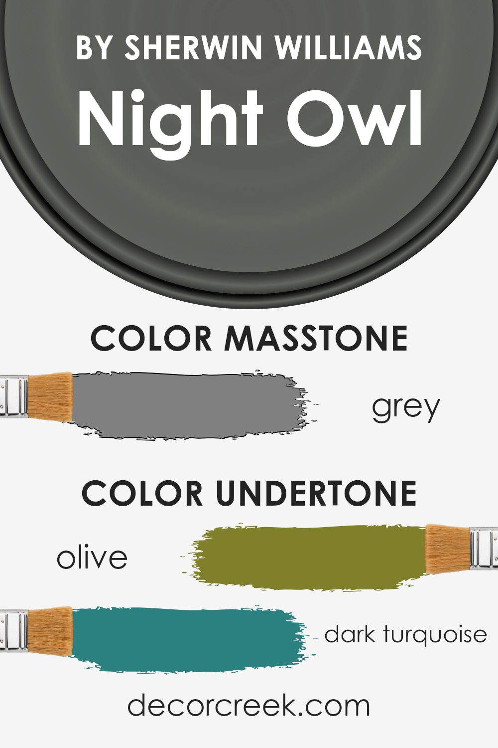
Undertones of Night Owl SW 7061 by Sherwin Williams
Night Owl by Sherwin Williams is a complex and interesting color with many undertones that affect how it appears in different lighting conditions. The base color is a rich, deep shade with blends of greens, blues, purples, and more, contributing to its dynamic appearance. These undertones can change the perception of the color.
For instance, the presence of dark green and olive undertones gives the color a natural, earthy feel, making it suitable for rooms that need a calming, grounded atmosphere. The hints of purple and dark turquoise add a layer of mystery and depth, which can make a room feel cozy and intimate.
On the other hand, the impact of subtle blue and grayish tones can make the color look cooler and more sophisticated in spaces with plenty of natural light or cooler artificial lighting. The mint and pale pink hints add a playful touch that can lighten the mood of the space without overwhelming it.
In dim lighting, Night Owl’s darker undertones might become more prominent, giving the walls a warm brown or dark bluish appearance, creating a snug and inviting environment. Thus, understanding these undertones helps you predict how the paint will look and feel within your home, shaping the ambiance and mood of your space.
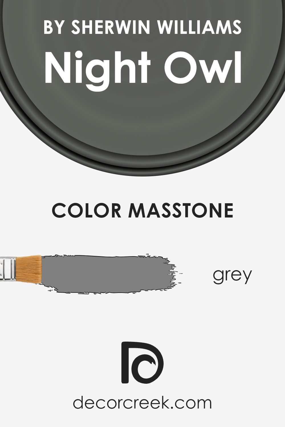
What is the Masstone of the Night Owl SW 7061 by Sherwin Williams?
Night Owl SW 7061 by Sherwin Williams is a warm, deep gray color. Its masstone, which is the primary color seen when you first look at it, is a shade of medium gray (#808080). This hue is versatile and works well in different spaces around the home. In living rooms, it creates a cozy, inviting atmosphere, making the space feel welcoming.
In bedrooms, it helps set a restful mood, allowing for relaxation. The gray tone pairs beautifully with a variety of other colors, so you can easily match it with both cool and warm shades. It works well with whites, creams, and bolder accents like blue or mustard for added contrast.
Light in the room can affect its appearance; in dim lighting, it can look even deeper, while natural light may bring out its true shade. Overall, Night Owl’s gray masstone offers a nice balance, making it suitable for different areas of a home.
How Does Lighting Affect Night Owl SW 7061 by Sherwin Williams?
Lighting plays a big role in how we perceive colors. The same color can look very different depending on the lighting in a room. This can happen because different types of light have different color temperatures and intensities.
For example, the color Night Owl by Sherwin Williams can change its appearance based on the source of light. In artificial lighting, like incandescent or LED lights, Night Owl might appear warmer or cooler, depending on the bulbs used. Incandescent bulbs tend to give off a warm, yellow light that can make Night Owl look more muted and cozy. LED lights, depending on their specific color temperature, can make it look either more neutral or cooler.
In natural light, the appearance of Night Owl can also vary greatly with the direction a room faces. In north-facing rooms, which tend to have cooler and consistent light throughout the day, Night Owl may appear darker and more subdued. The natural blue-ish light from the north can make this color seem more intense.
In south-facing rooms, Night Owl can appear brighter and warmer because these rooms receive strong, warm light throughout the day. The sunlight can enhance the warmth in Night Owl, making it look more inviting.
In east-facing rooms, the color can look cooler in the morning when the sunlight is direct and softer. As the day goes on, and the sun moves away, the room might appear a little darker, altering the way Night Owl looks, often making it feel more shadowed.
In west-facing rooms, Night Owl can seem cooler in the morning, but as the day progresses and the afternoon sunlight hits, the color may take on a warmer tone. The warm afternoon and evening light can highlight different undertones in the color, making it feel cozier.
So, it’s always good to sample Night Owl in your space, considering how different lighting will affect it throughout the day.
What is the LRV of Night Owl SW 7061 by Sherwin Williams?
The term “LRV” stands for Light Reflectance Value, which is a measurement used to determine how much light a color reflects. The scale runs from 0 to 100, where 0 represents absolute black, which absorbs all light, and 100 represents pure white, which reflects all light. LRV is important when picking paint colors because it helps you understand how a color will affect the brightness of a room.
A lower LRV means the color absorbs more light, making the room feel cozier and bringing a sense of depth, whereas a higher LRV reflects more light, which can make a space feel larger and more open.
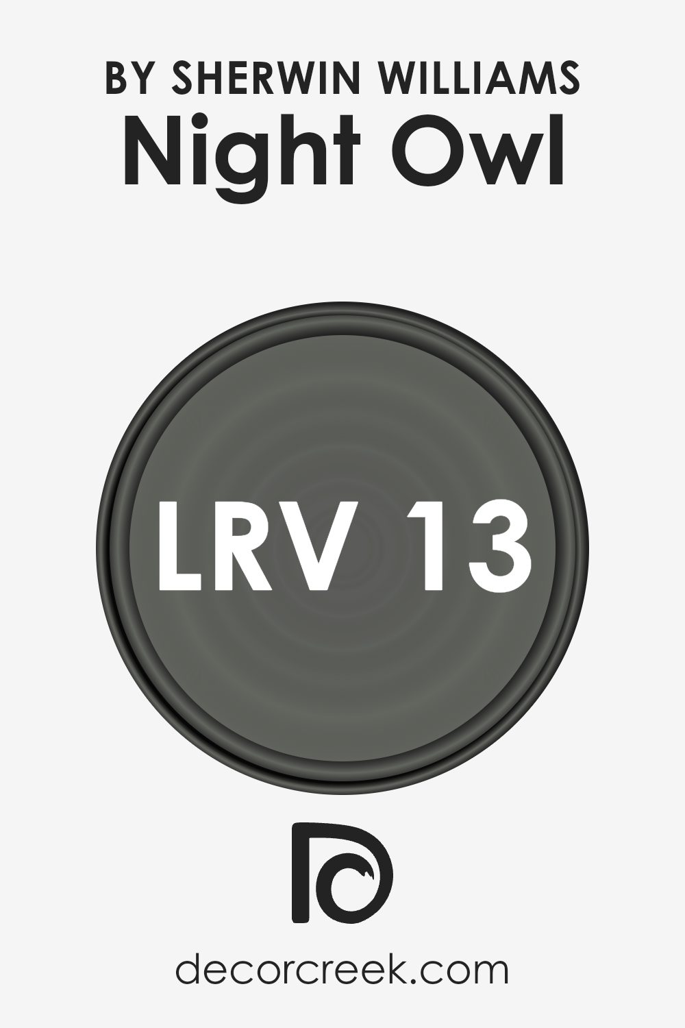
The LRV of 12.82 for the color Night Owl indicates that it is on the darker side of the spectrum. With such a low LRV, Night Owl absorbs a significant amount of light, resulting in a rich, deep hue on the walls.
This means it can make a room feel more intimate and cozy, especially in spaces with little natural light. However, in a well-lit room, the color can add a striking and dramatic backdrop. It’s important to consider the amount of natural and artificial light a room receives when using such a color, as it can make the room feel smaller and more enclosed if not balanced properly.
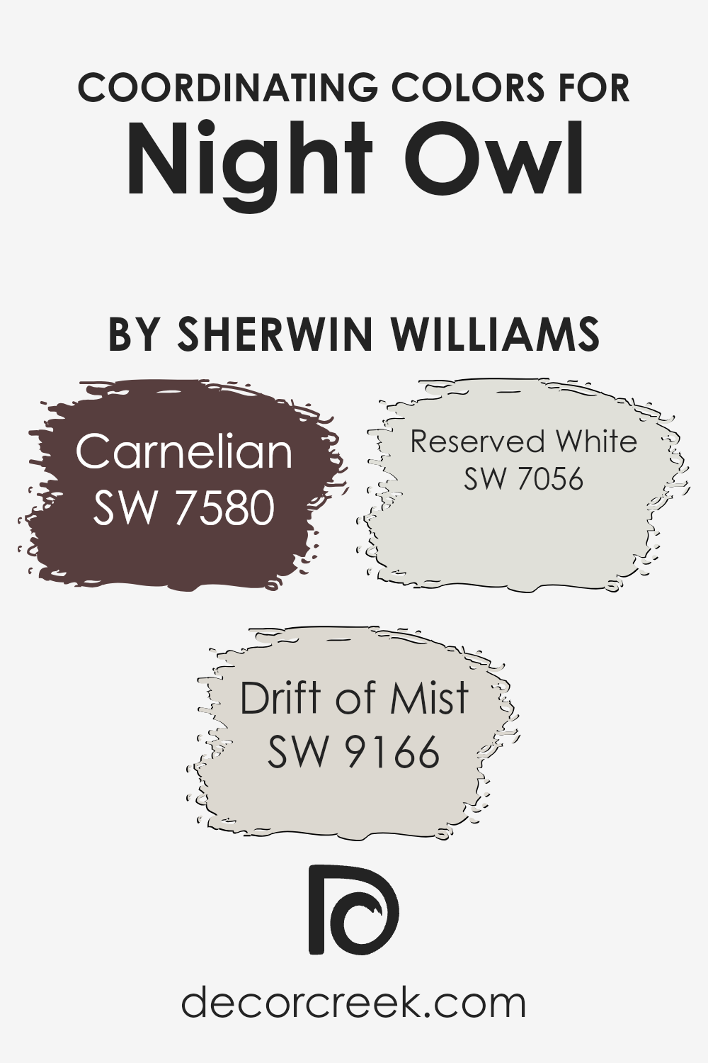
Coordinating Colors of Night Owl SW 7061 by Sherwin Williams
Coordinating colors are hues that complement each other well when used together in a space. They provide balance and harmony, enhancing the overall aesthetic appeal of a room. Night Owl by Sherwin-Williams is a deep, rich color with dark, moody undertones. When you pair this color with coordinating shades, it helps to create a cohesive and visually appealing design.
Carnelian is a warm, earthy shade with a reddish-brown tone that adds a touch of elegance and cozy warmth. Drift of Mist is a light, airy gray that offers a delicate contrast, bringing out the depth of darker colors while keeping the space feeling open and inviting.
Reserved White is a soft, neutral white that provides a clean and crisp backdrop, allowing bolder colors to stand out. Together, these colors create a balanced palette, where each hue enhances the next, perfect for any inviting living space or cozy bedroom.
You can see recommended paint colors below:
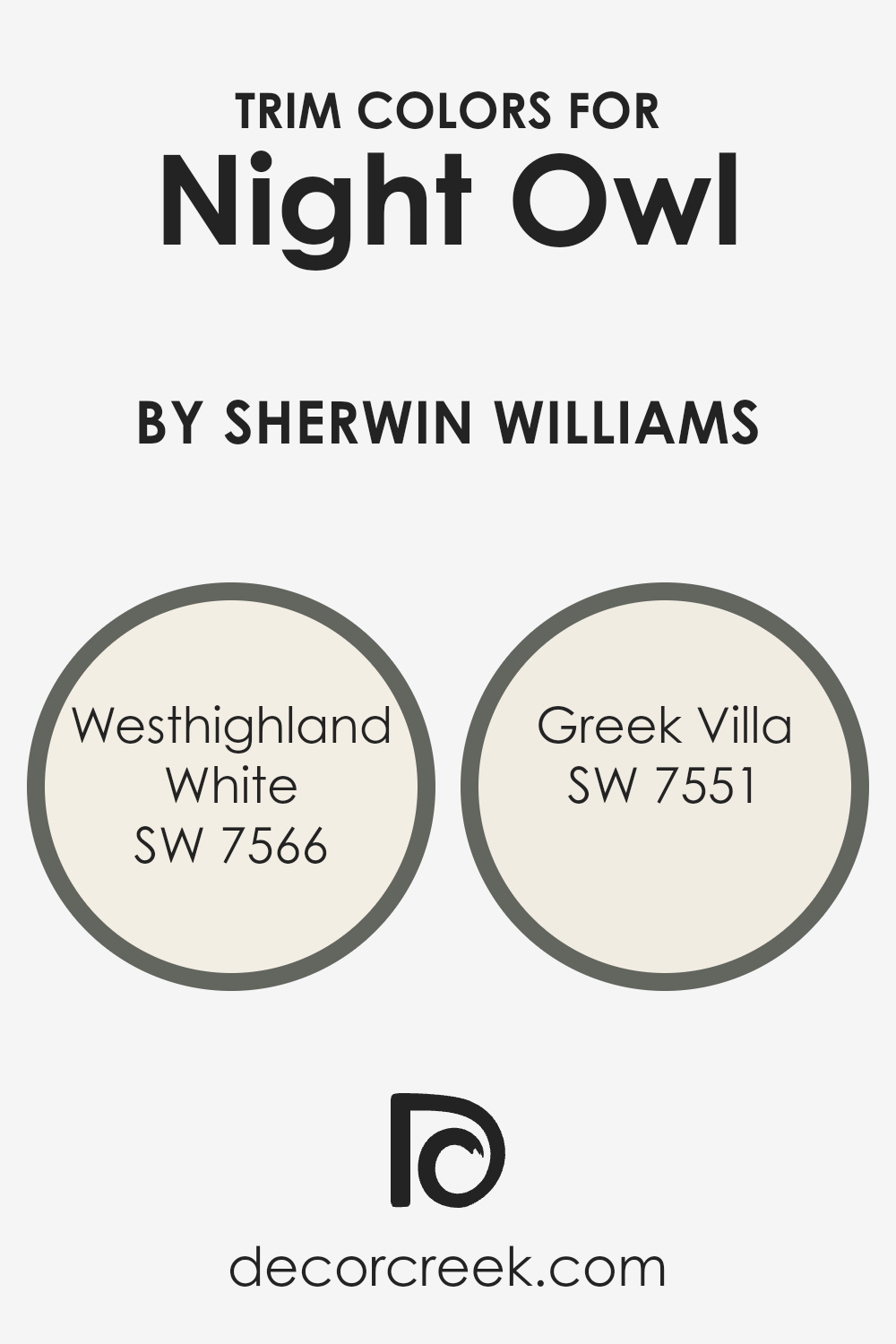
What are the Trim colors of Night Owl SW 7061 by Sherwin Williams?
Trim colors are shades used to highlight or define the edges and details of a space, like door frames, baseboards, and windowsills. For Night Owl SW 7061 by Sherwin-Williams, choosing the right trim color is essential to enhance its rich, dark tones. Night Owl is a deep, moody hue that can make a room feel cozy and inviting.
To complement this, trim colors should be light and soothing, providing a gentle contrast that highlights the depth and elegance of Night Owl. Using lighter trim colors can help balance the space, making it appear cleaner and more open without taking away from the boldness of the main color.
Westhighland White SW 7566 is an excellent trim choice for Night Owl. This color is a warm, creamy white that adds softness and brightness without being stark. It pairs beautifully with dark shades, subtly accentuating details without overwhelming them.
Greek Villa SW 7551 is another suitable trim color; it is a soft, airy white with just a hint of warmth, which makes spaces look more expansive and light-filled. Both of these colors offer a soothing contrast to Night Owl, enhancing its depth while keeping the room feeling fresh and alive.
You can see recommended paint colors below:
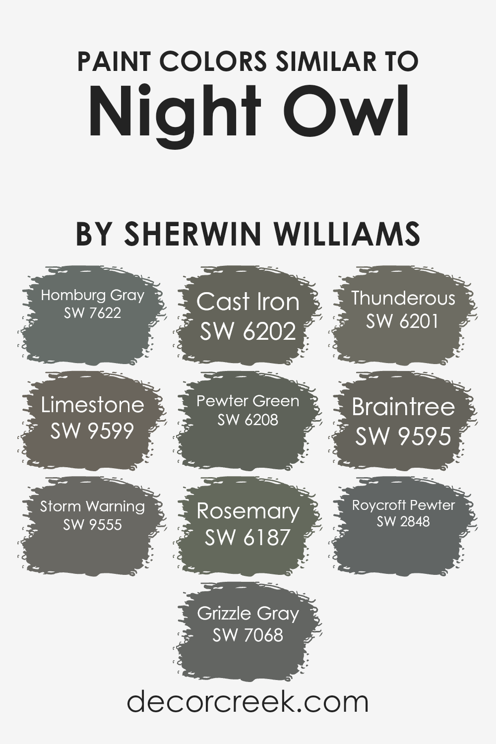
Colors Similar to Night Owl SW 7061 by Sherwin Williams
Choosing colors that are similar to Night Owl by Sherwin Williams can create a harmonious and cohesive look in any space. Homburg Gray offers a deep, muted shade that pairs well with Night Owl, adding depth without overwhelming the space. Limestone is a lighter, earthy tone that balances the darker hues and brightens up the room.
Storm Warning is a brooding gray, perfect for creating a moody ambiance. Grizzle Gray provides a solid presence with its medium-dark tone, enhancing the dramatic effect while maintaining a sleek appearance. Cast Iron brings a touch of ruggedness with its deep green-gray mix, complementing Night Owl’s own dark allure.
Pewter Green introduces a softer, natural feel with its potent mix of gray and green, which can ground the palette. Rosemary leans into the green spectrum with a hint of warmth, adding a touch of nature-inspired calmness. Thunderous is a rich and authoritative gray that adds a touch of strength and complements the richer tones.
Braintree has a deep, nuanced composition that echoes the grounding effect found in Night Owl. Finally, Roycroft Pewter ties together the collection with its balanced blend of tradition and timelessness, providing just the right amount of vintage charm. Together, these similar colors create a unified and pleasing environment.
You can see recommended paint colors below:
- SW 7622 Homburg Gray
- SW 9599 Limestone
- SW 9555 Storm Warning
- SW 7068 Grizzle Gray
- SW 6202 Cast Iron
- SW 6208 Pewter Green
- SW 6187 Rosemary
- SW 6201 Thunderous
- SW 9595 Braintree
- SW 2848 Roycroft Pewter
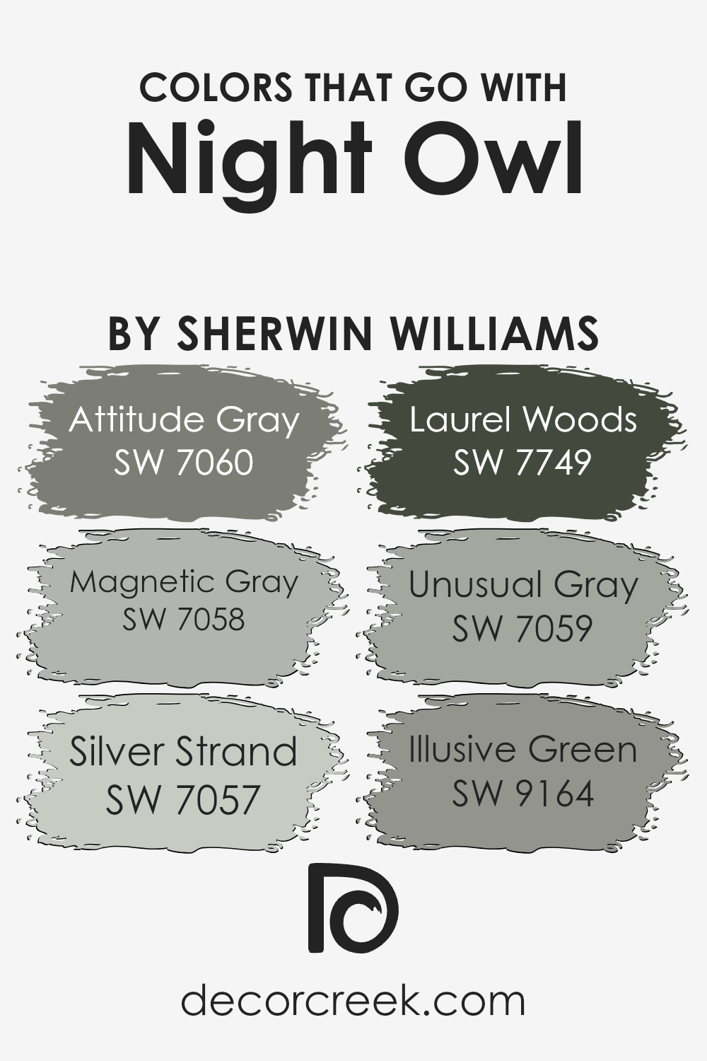
Colors that Go With Night Owl SW 7061 by Sherwin Williams
Choosing colors to pair with Night Owl SW 7061 by Sherwin Williams is important because these colors help create a harmonious and balanced environment. Night Owl is a deep, muted green that can be described as a little moody and very versatile. The colors that go well with it can either enhance its depth or bring a soft contrast.
SW 7060 – Attitude Gray is a medium gray that has a calming presence, making it a great companion for Night Owl. When you want a slightly softer look, SW 7058 – Magnetic Gray comes in handy with its cool and subtle undertones, which balance well with Night Owl’s richness. Silver Strand SW 7057 is a light, soft color with hints of green and gray, providing a gentle brightness to complement Night Owl’s darkness.
Laurel Woods SW 7749, with its rich and earthy green, adds another layer of warmth and nature-inspired tones, working well alongside Night Owl. If you prefer something understated, SW 7059 – Unusual Gray has a muted quality that pairs nicely, remaining subtle yet present.
Finally, Illusive Green SW 9164 leans slightly more towards blue, providing a fresh touch that can lighten the feel of the space without clashing with Night Owl. Each of these colors works individually to bring out the best in Night Owl, creating a space that feels connected and intentional.
You can see recommended paint colors below:
- SW 7060 Attitude Gray
- SW 7058 Magnetic Gray
- SW 7057 Silver Strand
- SW 7749 Laurel Woods
- SW 7059 Unusual Gray
- SW 9164 Illusive Green
How to Use Night Owl SW 7061 by Sherwin Williams In Your Home?
Night Owl SW 7061 by Sherwin Williams is a deep, muted green with a touch of gray. It provides a cozy and inviting atmosphere, making it a great choice for various areas in the home. You might consider using this color in a bedroom to create a restful space that’s perfect for winding down at the end of the day.
It also works well in a living room, adding warmth and depth, especially if paired with soft, neutral furnishings and natural textures like wood or linen.
If you’re looking to make a bolder statement, Night Owl can be striking in a home office or study, offering a creative yet calming backdrop that helps focus. It pairs beautifully with whites and metallics, which can help highlight its unique tone without overwhelming the room. Whether you use it on all walls or as an accent, this color adds a touch of relaxed elegance and comfort wherever it is applied.
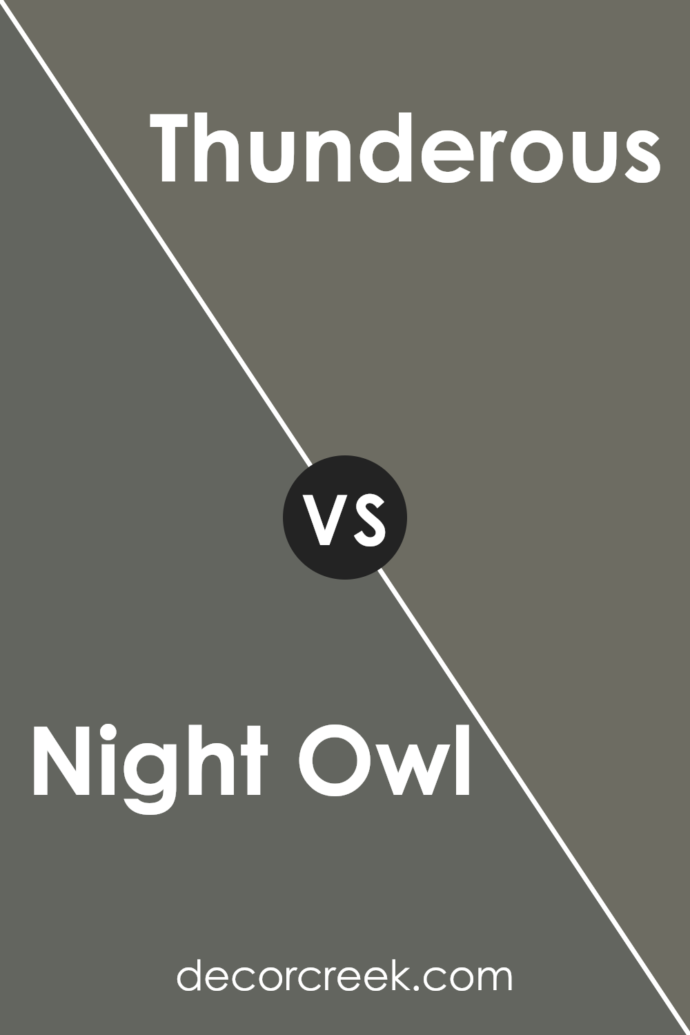
Night Owl SW 7061 by Sherwin Williams vs Thunderous SW 6201 by Sherwin Williams
Night Owl (SW 7061) is a deep, moody gray with hints of navy blue, making it appear almost black in low light. It’s perfect for creating a dramatic or cozy atmosphere in a room. Its rich, dark tone can make a space feel intimate and warm, especially when paired with lighter furnishings or accents.
In contrast, Thunderous (SW 6201) is a medium gray-green that’s softer and less intense than Night Owl. This color brings a natural, earthy feel to a space, reminiscent of a cloudy sky or a calm forest. It offers a relaxing and balanced tone suitable for almost any room.
Both colors bring unique feelings to a space. Use Night Owl to make a bold statement or add a touch of elegance, while Thunderous is great for a more subtle, calming effect. Together, they can create a balanced and harmonious contrast in interior design.
You can see recommended paint color below:
- SW 6201 Thunderous
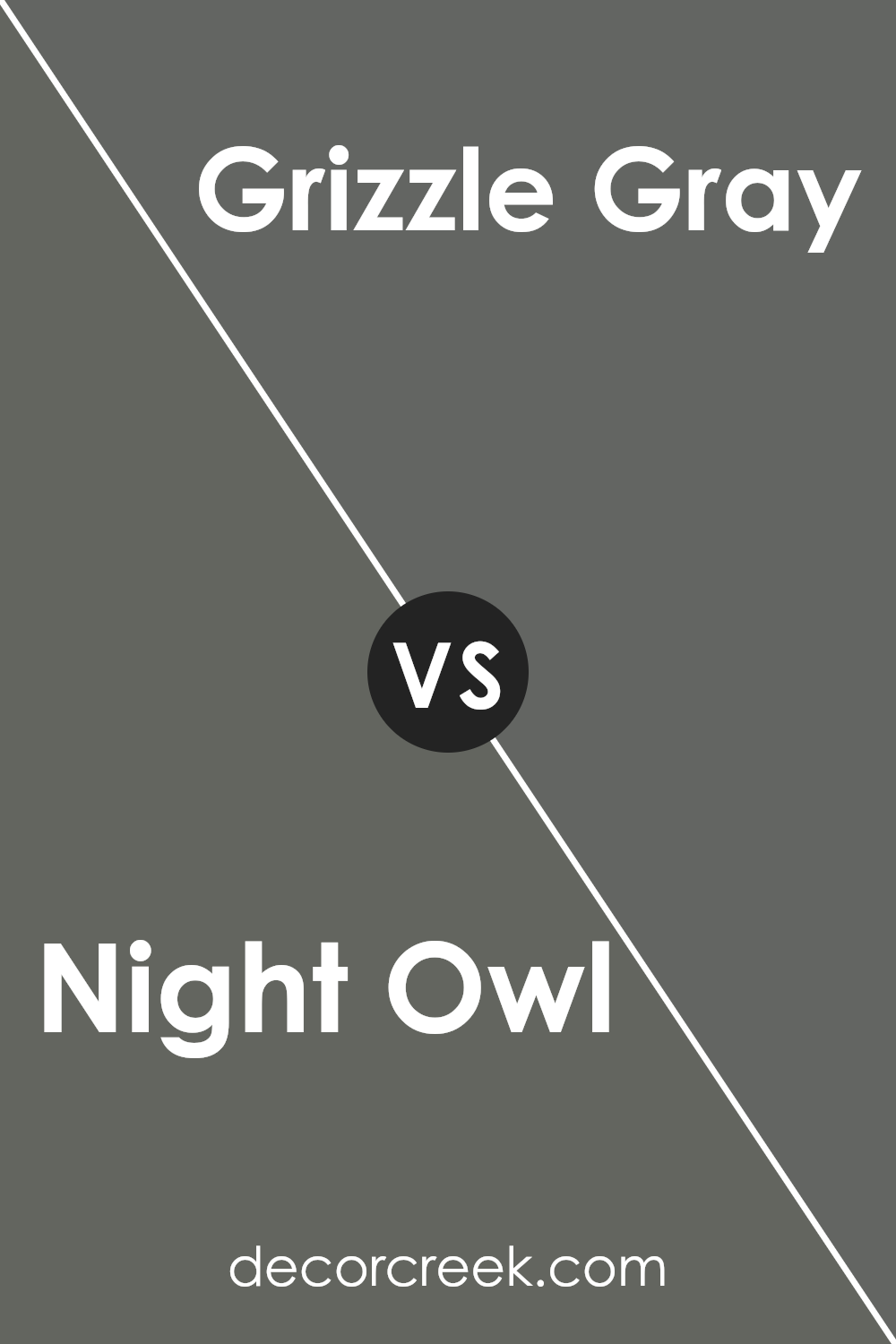
Night Owl SW 7061 by Sherwin Williams vs Grizzle Gray SW 7068 by Sherwin Williams
Night Owl SW 7061 by Sherwin Williams is a deep, rich gray with a hint of green, giving it a mysterious and moody feel. It’s a color that works well in a variety of spaces, adding depth and warmth without being too overpowering. It’s perfect for a cozy room where you want a touch of drama.
On the other hand, Grizzle Gray SW 7068 by Sherwin Williams is a solid, medium-dark gray with a bold presence. It leans more straightforwardly gray compared to Night Owl, and has less of a green hue. This makes it a bit more versatile for use in many areas, particularly in modern and minimalistic settings.
In comparison, Night Owl feels intimate and slightly more complex, whereas Grizzle Gray stands confidently as a neutral gray. Both colors offer a strong sense of grounding, each adding its unique character to a space.
You can see recommended paint color below:
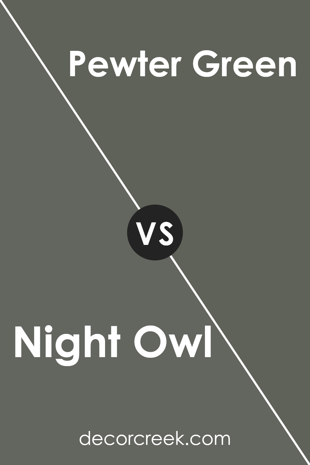
Night Owl SW 7061 by Sherwin Williams vs Pewter Green SW 6208 by Sherwin Williams
Night Owl SW 7061 by Sherwin Williams is a deep, moody color that feels cozy and comforting. It’s a dark shade with rich tones that create a sense of warmth and intimacy, making it perfect for a bedroom or a reading nook. The color is reminiscent of a peaceful night sky, providing a calm and soothing atmosphere.
On the other hand, Pewter Green SW 6208 by Sherwin Williams is a softer, muted green that brings a natural and fresh feel to any space. It has a subtle earthy quality that pairs well with both neutral and bold colors, making it quite versatile. Pewter Green is great for spaces where you want a touch of nature, such as kitchens or living rooms.
While Night Owl is darker and more intense, Pewter Green is lighter and more calming. Both colors add depth and personality to a room, but they offer different moods and vibes.
You can see recommended paint color below:
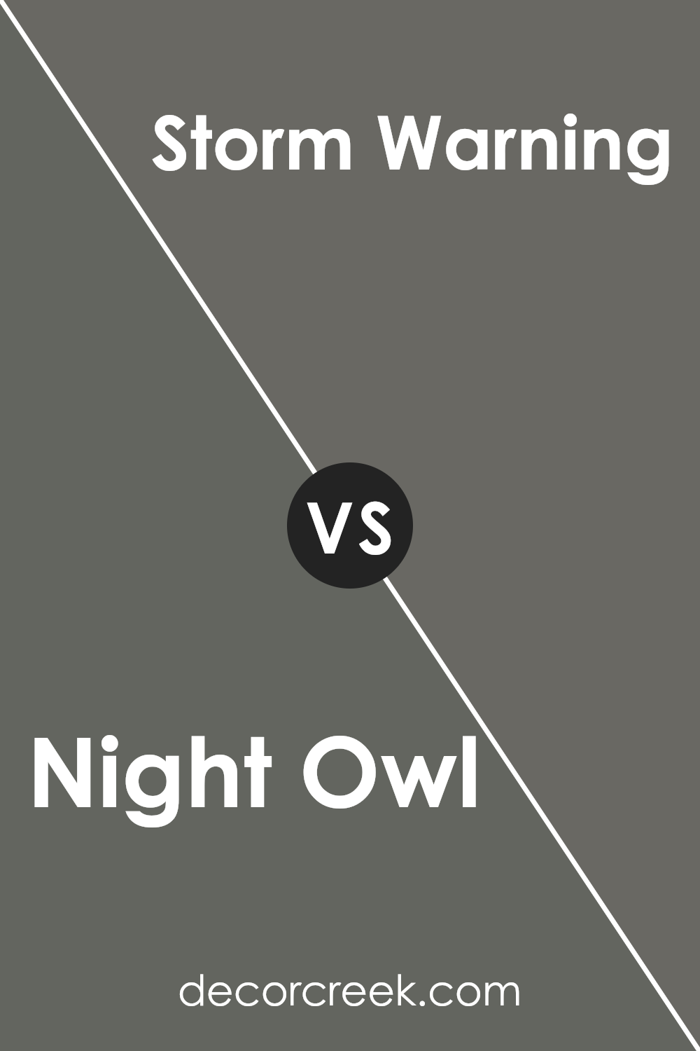
Night Owl SW 7061 by Sherwin Williams vs Storm Warning SW 9555 by Sherwin Williams
Night Owl SW 7061 is a deep, moody blue with hints of gray and green that give it a calm and grounded feel. It’s a versatile color that works well in spaces where you want a cozy and intimate atmosphere. Storm Warning SW 9555, on the other hand, is a medium gray with blue undertones. It is lighter and more neutral, making it suitable for creating a classic and balanced look.
Comparing the two, Night Owl has a richer and more intense presence due to its darker shade, while Storm Warning feels softer and more subtle. Night Owl is perfect for accent walls or in spaces where dramatic color can shine, whereas Storm Warning can be used more broadly throughout a home for a cohesive and timeless look.
Both colors have cool undertones, which can complement each other when used together to create depth and interest in a room.
You can see recommended paint color below:
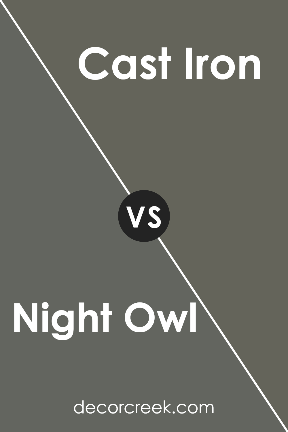
Night Owl SW 7061 by Sherwin Williams vs Cast Iron SW 6202 by Sherwin Williams
Night Owl and Cast Iron are two distinct colors by Sherwin Williams. Night Owl is a deep, muted charcoal with green undertones, giving it a rich, comforting feel. It works well in spaces where you want an intimate, cozy atmosphere. The color is versatile, pairing nicely with both light and dark hues for contrast or harmony.
Cast Iron, on the other hand, is a darker, more intense gray. It’s bolder compared to Night Owl, with less noticeable undertones, making it feel more straightforward and robust. Cast Iron can create strong, dramatic spaces, making it suitable for accent walls or modern, industrial themes where you want to make a statement.
While both colors are deep and moody, Night Owl tends towards warmth with its green touch, whereas Cast Iron is cooler and more neutral. Each offers a unique vibe fitting for various decorating styles.
You can see recommended paint color below:
- SW 6202 Cast Iron
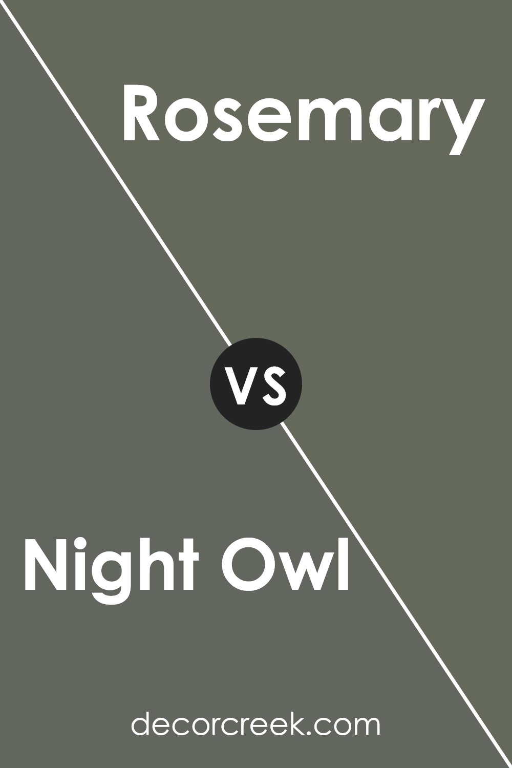
Night Owl SW 7061 by Sherwin Williams vs Rosemary SW 6187 by Sherwin Williams
Night Owl and Rosemary are two distinct colors from Sherwin Williams. Night Owl is a deep, muted blue-green, offering a moody and cozy feel. It’s a versatile color that can work as a neutral backdrop, adding depth without overpowering a space. Its dark tone makes it ideal for creating a warm and intimate atmosphere, especially in bedrooms or study areas.
On the other hand, Rosemary leans towards a more earthy green. It has a warm undertone that gives it a natural, organic vibe. Rosemary works well in living spaces or kitchens, providing a refreshing and calming environment.
While Night Owl gives off a more dramatic feel, Rosemary brings in a sense of nature and gentle calmness. Both colors are great for adding character to a home, but the choice between them depends on whether you prefer the deep, mysterious presence of Night Owl or the lush, soothing effect of Rosemary.
You can see recommended paint color below:
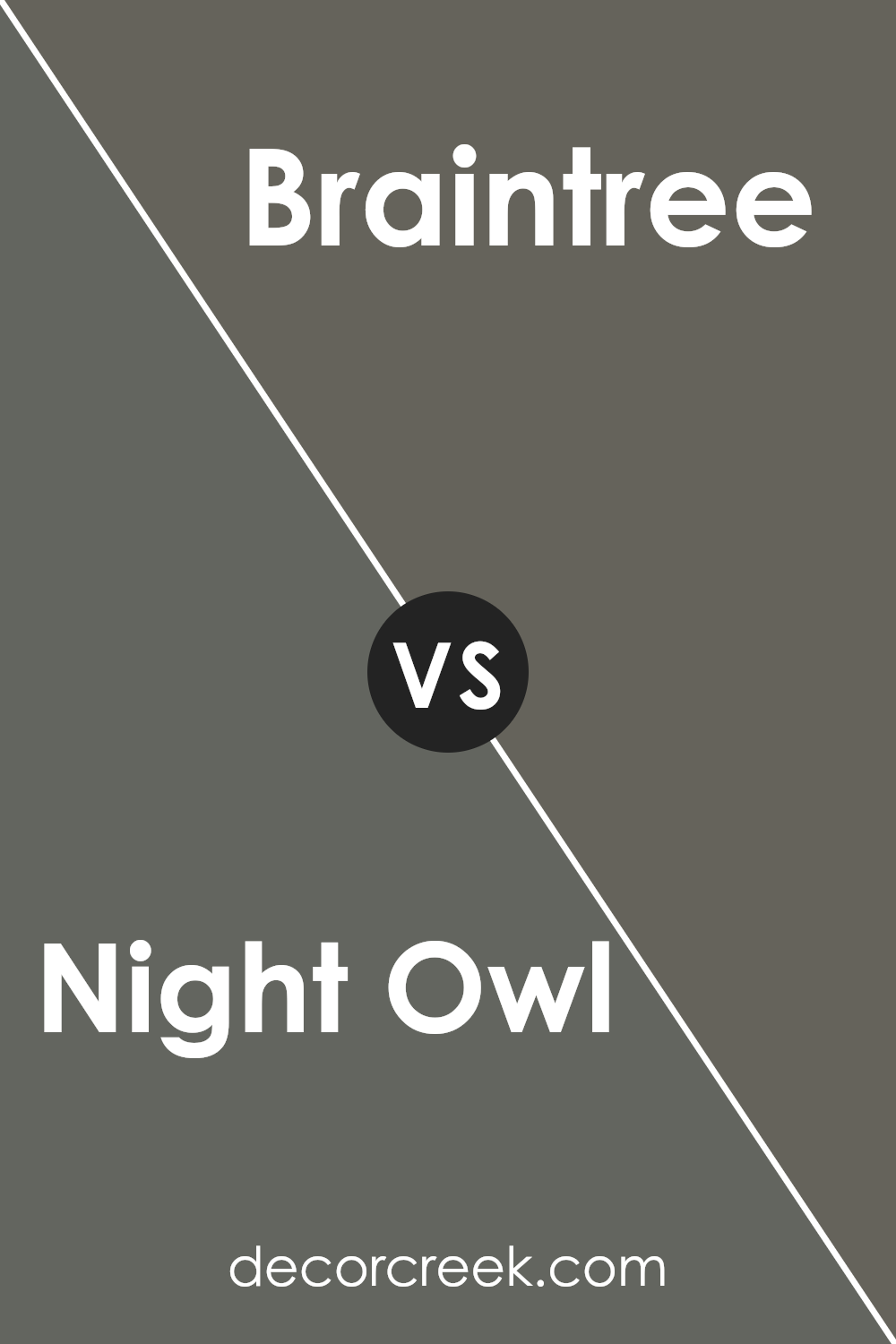
Night Owl SW 7061 by Sherwin Williams vs Braintree SW 9595 by Sherwin Williams
Night Owl SW 7061 by Sherwin Williams is a dark, moody gray with green undertones, creating a cozy and intimate feel. It’s a versatile color that pairs well with a variety of styles and adds depth to any room. Night Owl is ideal for creating a comfortable, calm environment, whether used in living areas or bedrooms.
On the other hand, Braintree SW 9595 is a lighter and warmer gray with slight brown undertones. This color offers a softer, more inviting look compared to the depth of Night Owl. It’s perfect for spaces where you want a neutral backdrop that doesn’t feel too cool or stark. Braintree brings warmth and lightness, making it suitable for open spaces or areas where you want a bright yet restful vibe.
Both colors are stunning in their own right, but Night Owl is bold and dramatic, while Braintree is soft and welcoming.
You can see recommended paint color below:
- SW 9595 Braintree
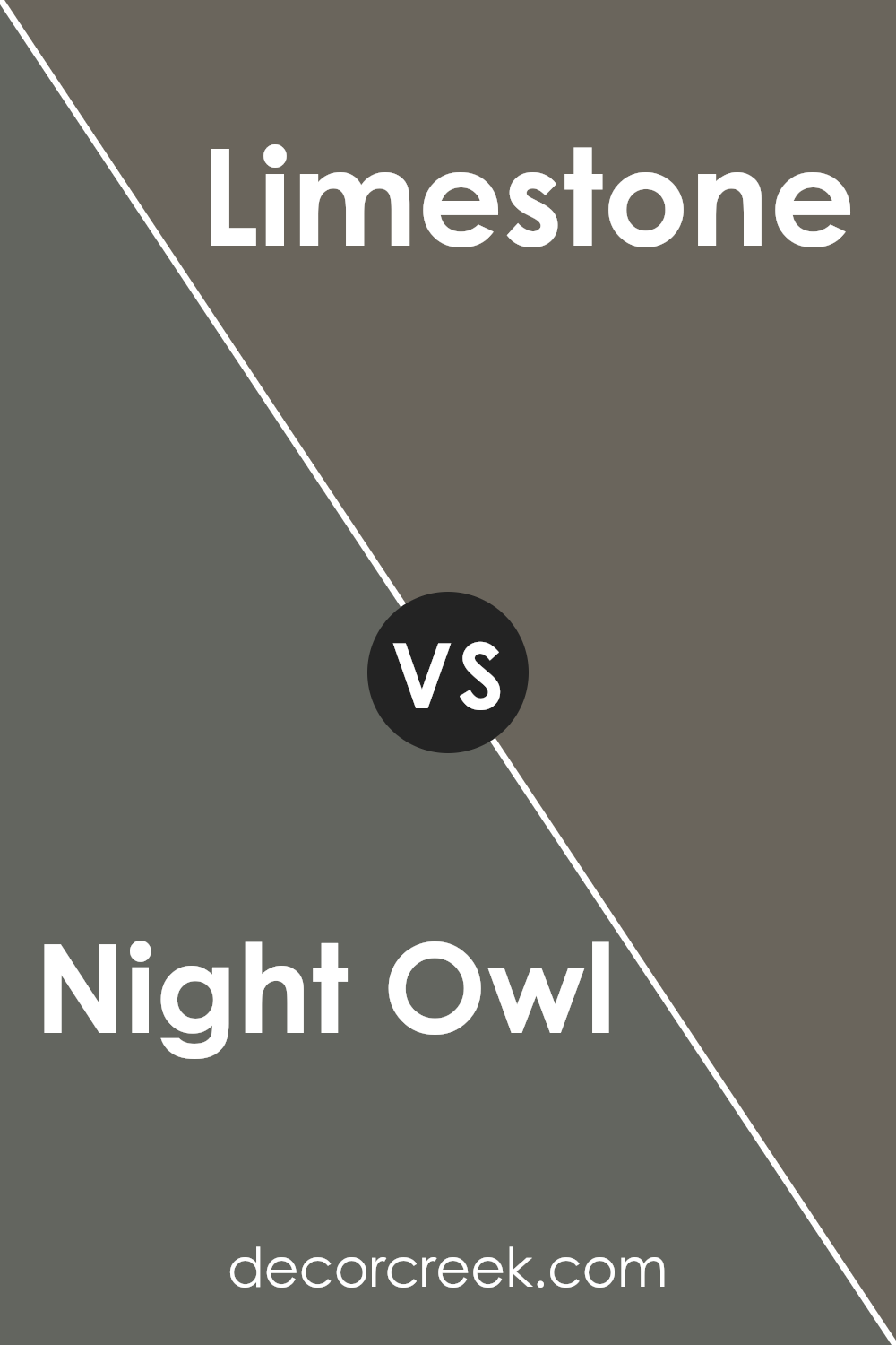
Night Owl SW 7061 by Sherwin Williams vs Limestone SW 9599 by Sherwin Williams
Night Owl SW 7061 by Sherwin Williams is a deep, rich gray with green undertones that creates a cozy and comforting atmosphere. It works well in spaces where you want to add depth and drama. With its bold presence, it’s often suitable for accent walls or smaller rooms where you want to make a statement.
On the other hand, Limestone SW 9599 by Sherwin Williams is a soft, warm neutral color. It has a more muted, creamy tone that brings light and a sense of openness to a room. It’s versatile and can be used in larger spaces without feeling overwhelming, making it a great option for living rooms, kitchens, or hallways.
While Night Owl is bold and moody, making a space feel snug, Limestone is light and airy, contributing to a spacious and welcoming feel. Both colors complement each other well and can be used together for contrast, with Night Owl adding depth and Limestone providing balance.
You can see recommended paint color below:
- SW 9599 Limestone
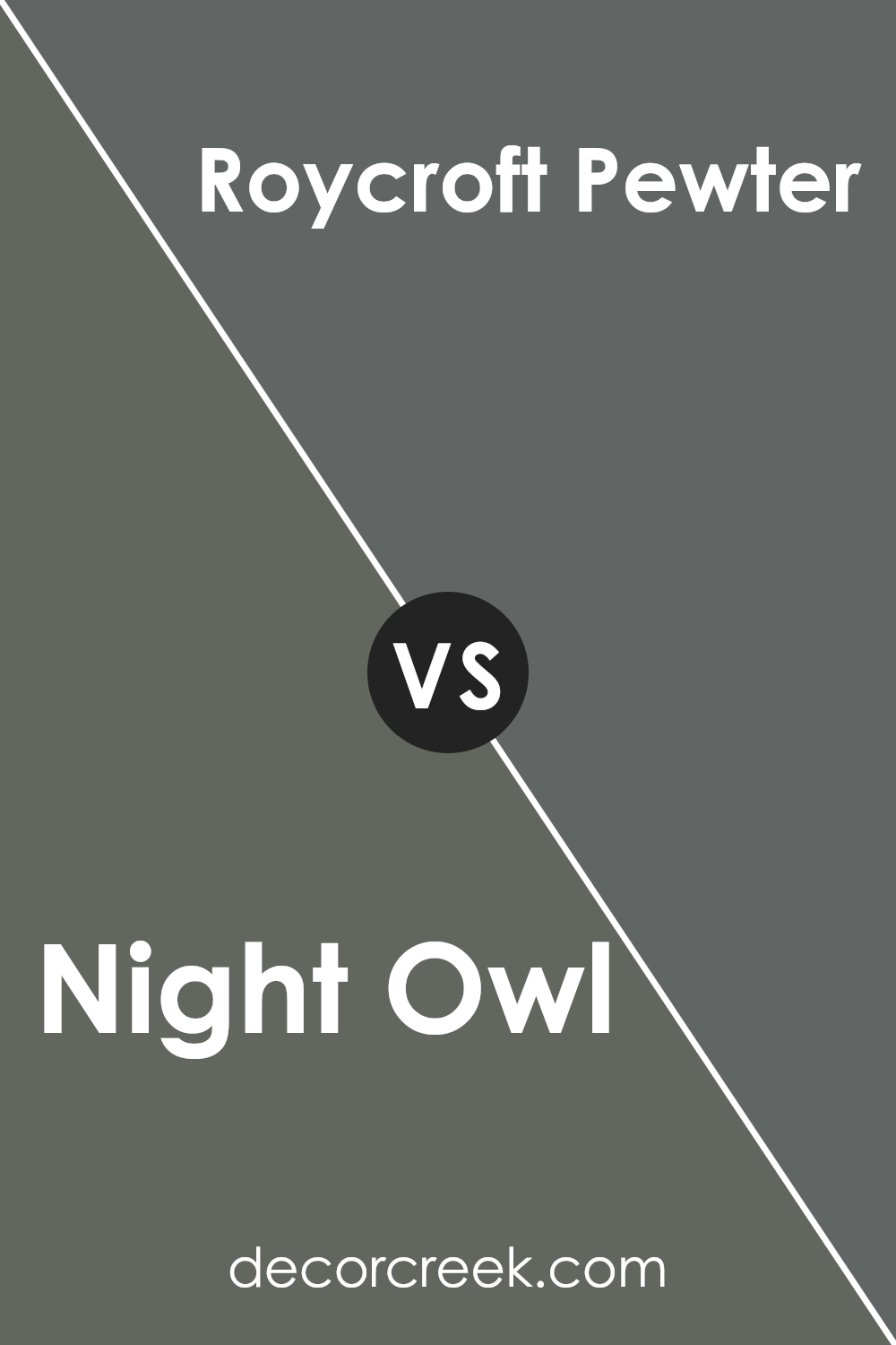
Night Owl SW 7061 by Sherwin Williams vs Roycroft Pewter SW 2848 by Sherwin Williams
Night Owl (SW 7061) and Roycroft Pewter (SW 2848) by Sherwin Williams offer distinct vibes for any space. Night Owl is a deep, moody gray with a hint of blue. It’s a bold choice that can add drama to a room, creating a cozy and intimate atmosphere.
On the other hand, Roycroft Pewter is softer, featuring a warm gray tone with subtle green undertones. This makes it more versatile, fitting seamlessly into both traditional and modern settings.
While Night Owl can make a statement, Roycroft Pewter provides a more neutral backdrop, ideal for balancing stronger colors in furniture or accents. Night Owl works well in rooms where you want a cocooning effect, like a bedroom or study. Roycroft Pewter is great for living areas or kitchens where you need a gentle, welcoming feel. Both colors are sophisticated but cater to different tastes and functional needs.
You can see recommended paint color below:
- SW 2848 Roycroft Pewter
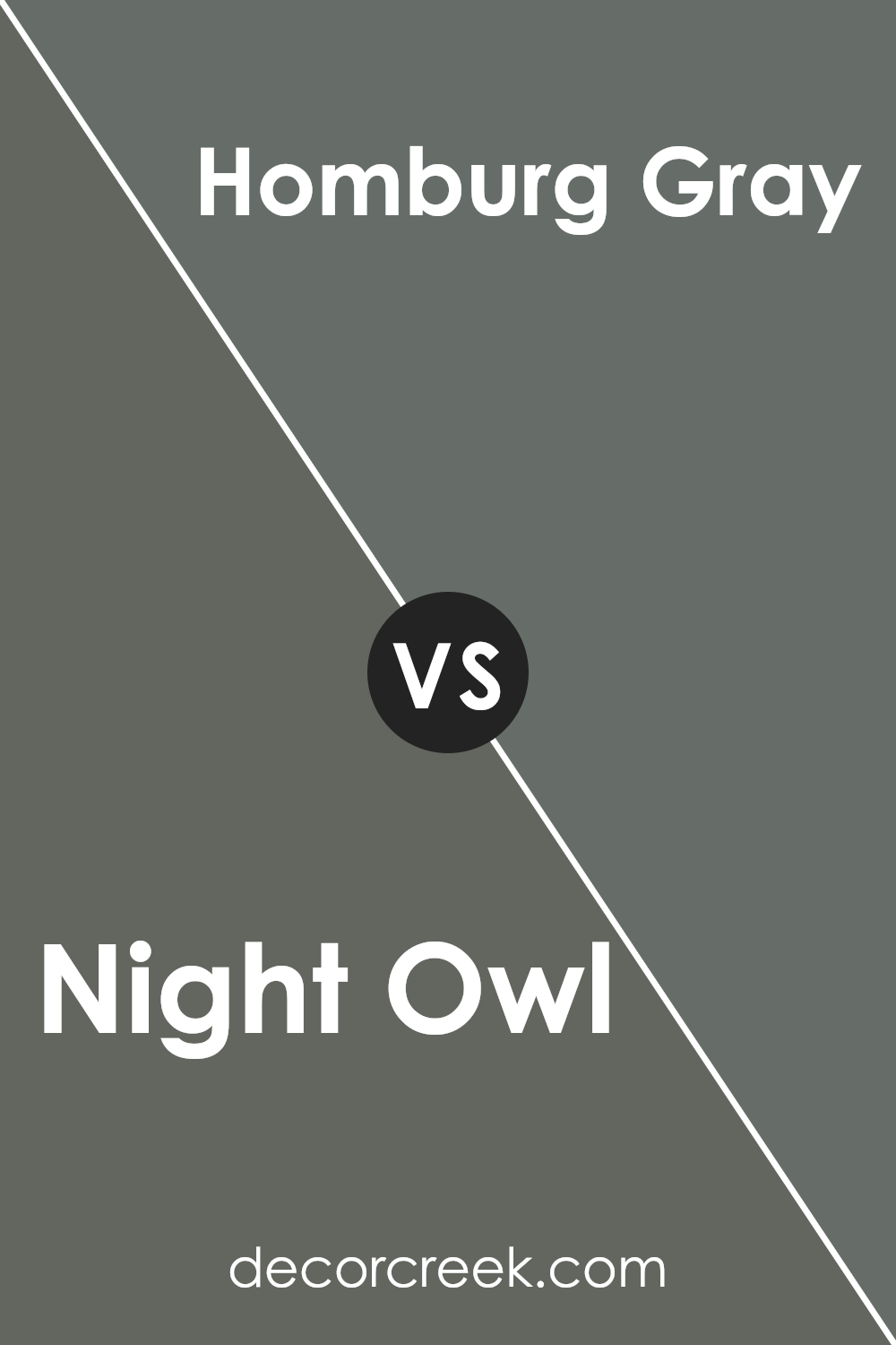
Night Owl SW 7061 by Sherwin Williams vs Homburg Gray SW 7622 by Sherwin Williams
Night Owl (SW 7061) and Homburg Gray (SW 7622) are both rich and deep colors by Sherwin Williams. Night Owl is a dark, muted blue-gray with a subtle green undertone, creating a cozy and calming atmosphere. It’s perfect for bedrooms or spaces where you want a sense of restfulness.
On the other hand, Homburg Gray is a medium to dark gray with bluish-green hues. It offers a slightly brighter option compared to Night Owl, making it more versatile for different rooms. The green influence in Homburg Gray adds a touch of warmth, making it suitable for living rooms or offices.
Both colors are excellent choices for adding depth to your space, but Night Owl leans more towards a moody atmosphere, while Homburg Gray provides a balanced and inviting feel. Pairing either with lighter accents can enhance their elegance and allow other decorative elements to stand out.
You can see recommended paint color below:
After learning about SW 7061 Night Owl by Sherwin Williams, I can say it’s a color that stands out because of its unique character. It’s a special shade of gray with a hint of green that can make any room look cozy and inviting. When I think about using Night Owl, I see a perfect color for creating a warm and peaceful feeling in a room.
Imagine painting your living room or bedroom with Night Owl. The room would feel calm and welcoming, like a comfy blanket wrapping around you. The color isn’t too light or too dark; it’s just right for making a room feel snug without being gloomy.
Night Owl is a great choice because it goes well with other colors. You can match it with white for a clean look or pair it with wood tones to give a natural and earthy vibe. If you have a room full of colorful decorations, Night Owl is like a good friend that helps everything look just right.
So, whether you’re painting a whole room or just a small part of it, Night Owl can make it feel just right. This color can make you smile every time you walk into the room because it feels comfortable and welcoming. That’s why I think Night Owl is a wonderful choice for anyone looking to make their home feel extra special.
Ever wished paint sampling was as easy as sticking a sticker? Guess what? Now it is! Discover Samplize's unique Peel & Stick samples.
Get paint samples

