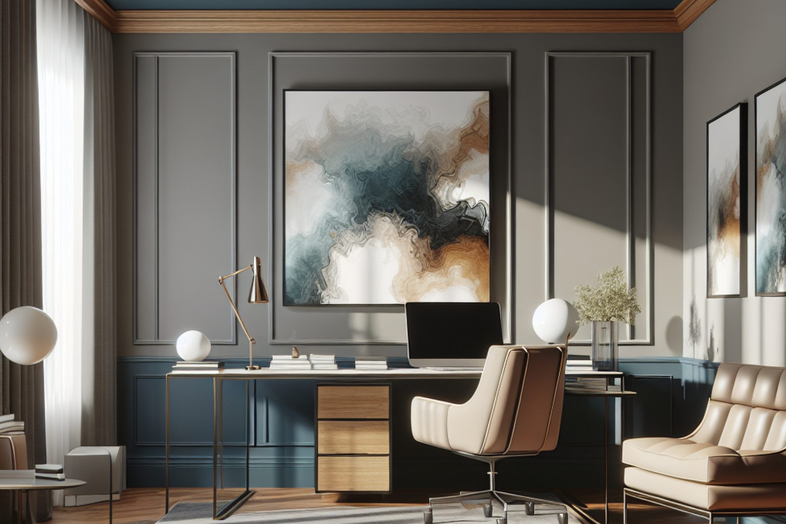
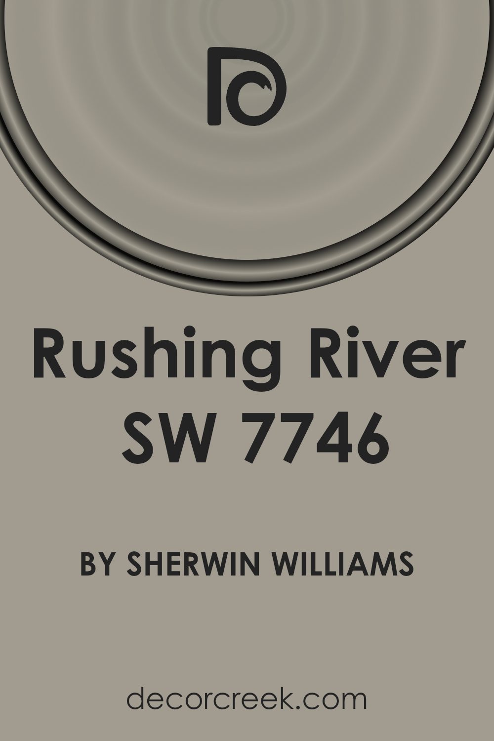
If you’re looking for a paint color that brings a sense of calm and serenity to your space, you might want to consider SW 7746 Rushing River by Sherwin Williams. It’s a soft, muted shade that mimics the tranquil flow of a gentle river.
As you think about refreshing your home or office, it’s important to choose colors that not only look beautiful but also create the right atmosphere. Rushing River could be just what you need to give your rooms a peaceful, soothing backdrop.
This shade pairs well with a variety of decor styles, from modern to rustic, making it a versatile choice for your next decorating project.
Whether you’re painting a bedroom, a living space, or even a bathroom, Rushing River offers a refreshing palette that can help you unwind after a long day.
Let’s take a closer look at how this color can transform your space into a peaceful haven.
What Color Is Rushing River SW 7746 by Sherwin Williams?
Rushing River by Sherwin Williams is a versatile and understated blue-gray hue that carries a sense of calmness and subtlety, making it an excellent choice for creating a cozy, inviting atmosphere in any room. This color is muted enough to be neutral but still adds a touch of depth and interest to a space without overwhelming it.
Rushing River works exceptionally well in interior styles that favor a clean and contemporary look, such as minimalist, Scandinavian, and modern coastal designs. It’s an ideal backdrop for these decors because it complements clean lines and simple forms without clashing or competing for attention.
When pairing materials and textures with this color, consider using natural wood, which adds warmth and organic texture, creating a pleasing contrast. For a more polished look, metallic finishes like brushed nickel or stainless steel offer a subtle shine that complements the cool tones of Rushing River.
Textiles in soft wool or cotton, particularly in white or light neutral tones, can soften the overall feel of the room and enhance the comforting vibe of the color. Rushing River also pairs beautifully with leather, adding a touch of luxury and durability to the space, whether through furniture like sofas or accents like pillows.
Is Rushing River SW 7746 by Sherwin Williams Warm or Cool color?
Rushing River is a vibrant paint color from Sherwin Williams that brings a fresh and lively feel to any space in a home. This shade is a mix of blue and green, which makes it versatile for different decorating styles and areas. When applied in rooms like the living room or bedroom, it adds a refreshing touch that can make the space feel more inviting and cozy. It works well especially in well-lit areas, as natural light enhances its dynamic tones.
In smaller spaces, such as a bathroom or a study, Rushing River can create an illusion of more space, making the area seem larger and more open. It’s also an excellent choice for kitchen cabinets for a pop of color amongst neutral tones like whites or grays.
The effect of this color can be either calming or energizing, depending on the room’s decor and lighting, offering flexibility in interior design. Overall, Rushing River is perfect for those looking to add a bit of life and color into their home without overwhelming the senses.
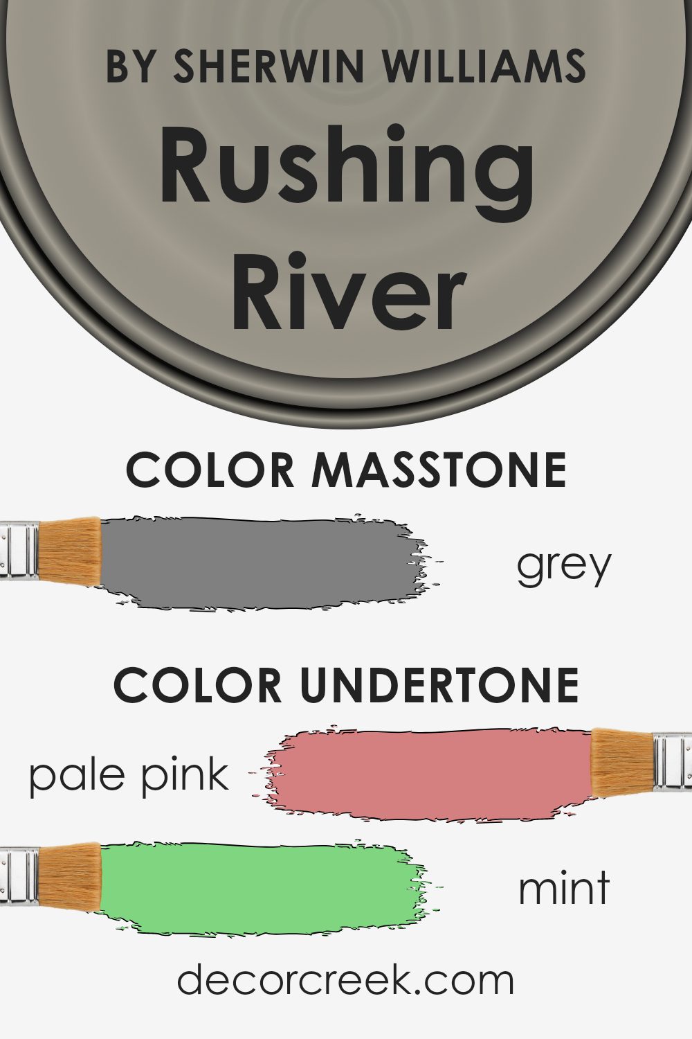
Undertones of Rushing River SW 7746 by Sherwin Williams
Rushing River by Sherwin Williams is a versatile paint color with multiple undertones that influence how it appears in different settings and lighting conditions. Undertones are subtle hues blended into the main color, affecting its overall tone and vibe.
Undertones in Rushing River include pale pink, mint, pale yellow, lilac, light purple, light blue, light gray, and several other subtle shades. These undertones play a crucial role in how we perceive the color. For example, pale pink adds a soft warmth, while mint provides a hint of cool freshness. Pale yellow brings a subtle brightness, making the color feel more inviting.
When used on interior walls, Rushing River’s array of undertones can dramatically influence the mood and atmosphere of a room. The presence of light blue and mint undertones might make a room feel more relaxed and airy, ideal for a bedroom or bathroom. In contrast, warmer undertones like pale pink and pale yellow can make a space feel cozier, ideal for a living room or dining area.
Moreover, the lighting in a room can amplify or mute these undertones. Natural light tends to reveal the true colors and subtleties, while artificial lighting can either enhance or downplay certain tones. For instance, under warm lighting, the red or orange undertones might become more pronounced, adding warmth to the space. In cooler lighting, blue or green undertones might stand out, giving the room a cooler feel.
Therefore, choosing a paint color like Rushing River for interior walls means considering both its primary color and its undertones, as well as the type of lighting a room receives. This thoughtful consideration ensures that the walls will complement the intended aesthetic and functional feel of the room.
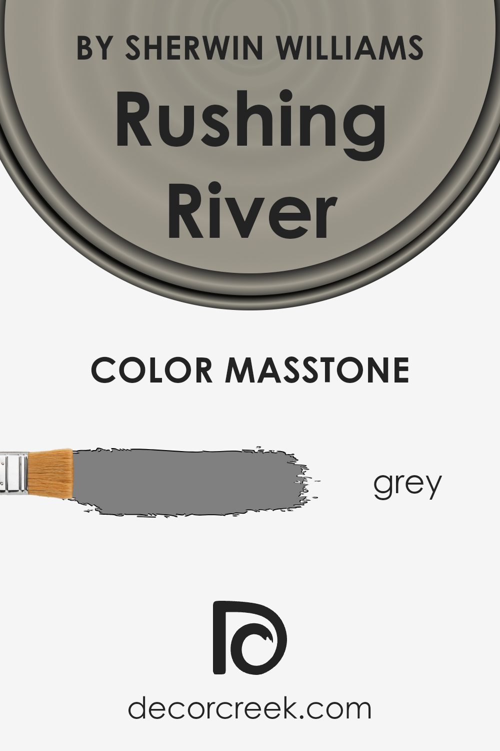
What is the Masstone of the Rushing River SW 7746 by Sherwin Williams?
Rushing RiverSW 7746 by Sherwin Williams has a masstone of Grey (#808080), which is a balanced shade that is incredibly versatile for home interiors. This grey acts as a neutral backdrop, allowing it to pair well with a wide range of other colors, from soft pastels to bold hues. Its neutrality means it can fit seamlessly into various decorative styles, whether your home has a modern look or a more traditional feel.
In rooms with limited natural light, this shade of grey helps to subtly reflect the light, brightening the space without being too stark or overwhelming. In larger, well-lit spaces, it can help create a sense of cohesion and calm, pulling together various elements of the room’s decor.
Overall, Rushing RiverSW 7746 is a practical choice for homeowners looking to achieve a fresh, clean look that’s both stylish and easy to maintain. This makes it an ideal choice for busy living areas, bedrooms, and even kitchens and bathrooms.
How Does Lighting Affect Rushing River SW 7746 by Sherwin Williams?
Lighting plays a crucial role in how we perceive colors, affecting the mood and atmosphere of a space. Different light sources can change how a color appears, whether subtly or dramatically. Typically, colors like Rushing River, a cool and slightly muted hue, can look very different under various lighting conditions.
In artificial light settings, Rushing River might appear more muted or have a slightly greener tint, depending on the type of bulb used. Incandescent bulbs, which emit a warm, yellowish light, can soften the color, making it look warmer than it actually is. Fluorescent lights, on the other hand, could enhance the gray and blue tones in the color, giving it a sharper, cooler appearance.
In natural light, this color will change throughout the day. Morning light, which is generally softer and clearer, may bring out the fresh and calm qualities of Rushing River. As the day progresses and sunlight becomes brighter and more direct, the color might appear sharper and more vibrant.
The orientation of a room can also impact how Rushing River looks:
1. North-facing rooms: These rooms get less direct sunlight, which means cooler light throughout the day. Here, Rushing River may appear more muted and shadowy, emphasizing its gray tones more than its underlying greens.
2. South-facing rooms: These rooms benefit from abundant, warm light for most of the day. This bright light can make Rushing River look lighter and possibly bring out subtle hints of green, creating a fresher appearance.
3. East-facing rooms: Morning light in these rooms is warm and bright, making Rushing River appear soft and lively in the mornings. As the day goes on, the color may lose some of its vibrancy and look more subdued.
4. West-facing rooms: Evening light in these rooms is warm and intense. Rushing River could look very dynamic and bright in the late afternoon, potentially highlighting its cooler, bluish aspects as the sunlight fades.
Overall, understanding how different light conditions affect a color like Rushing River can help in deciding where to use it for the desired effect. Whether the goal is to create a refreshingly bright space or a cozy nook, lighting considerations can greatly influence the final outcome.
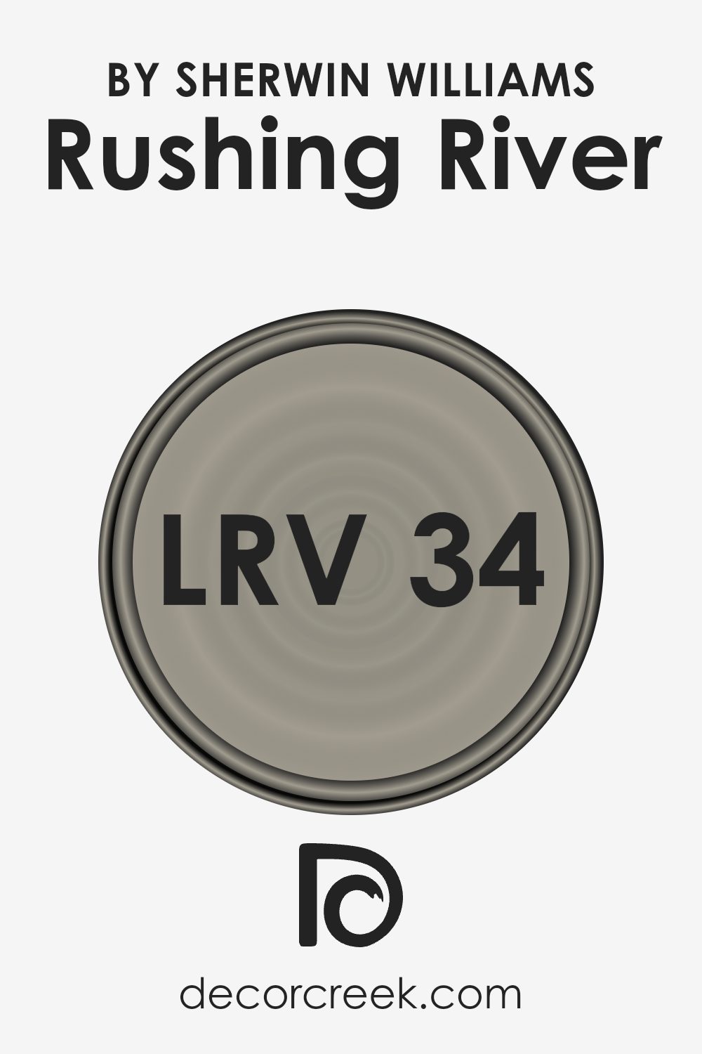
What is the LRV of Rushing River SW 7746 by Sherwin Williams?
LRV stands for Light Reflectance Value, which is a measure of the amount of visible light that a paint color reflects when it is applied to a wall or another surface. This scale measures how much light a color reflects back into the room, with higher values indicating that the color reflects more light.
For dark colors, the LRV is usually lower, meaning they don’t reflect much light, while lighter colors have a higher LRV, making them brighter and more reflective. This value helps you understand how light or dark a color will appear once it’s on your walls, influencing the overall mood and visual size of the space.
Regarding the specific LRV of 33.545 for Rushing River, this tells us that it is a relatively darker shade. It will absorb more light than it reflects, which can make a room feel cozier and more enclosed. In rooms with less natural light, using a color with this LRV might make the space appear smaller and darker.
Conversely, in a well-lit room or a space with ample artificial lighting, this color can add a rich, moody atmosphere without making the room feel too cramped. It’s important to consider this when choosing where to apply this paint color, to ensure it complements the room’s lighting and size effectively.
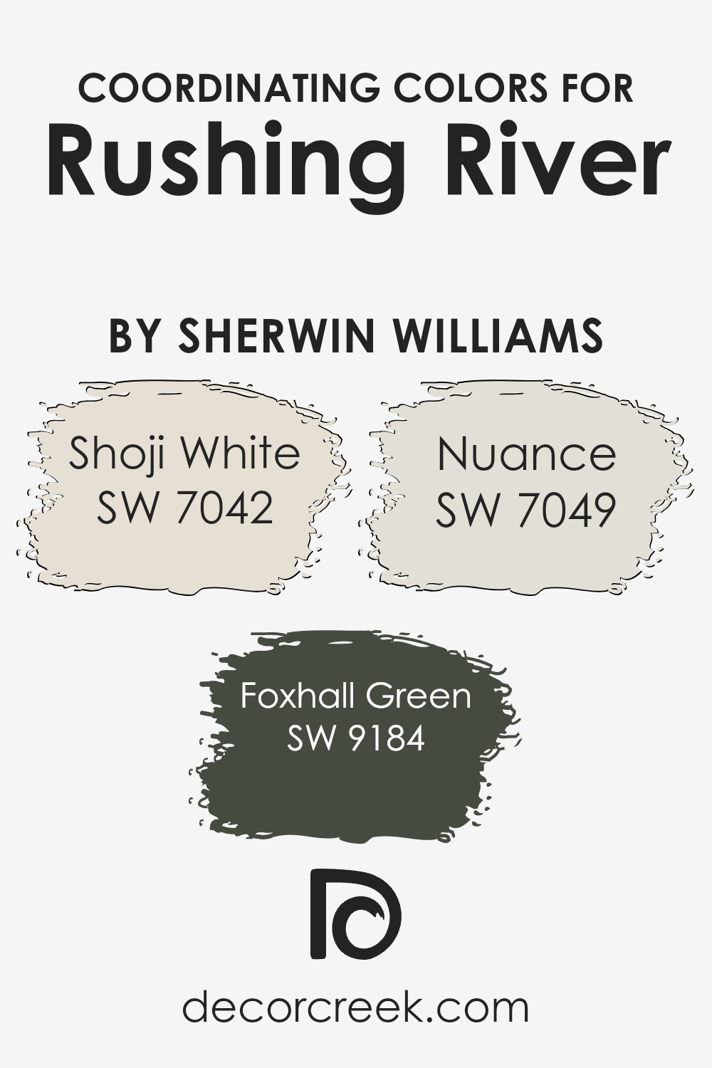
Coordinating Colors of Rushing River SW 7746 by Sherwin Williams
Coordinating colors are selected to harmonize and complement a primary color, creating a cohesive color scheme in a space. In the case of Sherwin Williams Rushing River, which is a distinct hue, the chosen coordinating colors are Shoji White, Foxhall Green, and Nuance. These colors work together to balance the atmosphere, ensuring that the primary shade stands out while maintaining an aesthetic harmony within the room.
Shoji White is a soft, warm neutral that acts as a versatile backdrop. It pairs seamlessly with the bolder Rushing River, providing a subtle contrast that highlights the depth and richness of the main color.
On the other hand, Foxhall Green has an earthy, subdued tone that complements outdoor-inspired colors like Rushing River, adding a natural, understated touch to the palette. Nuance, as another supporting shade, offers a gentle gray that blends well with the other colors, ensuring the overall look remains unified and pleasing to the eye. Together, these colors create a balanced and inviting environment, making them ideal for anyone looking to enhance their space.
You can see recommended paint colors below:
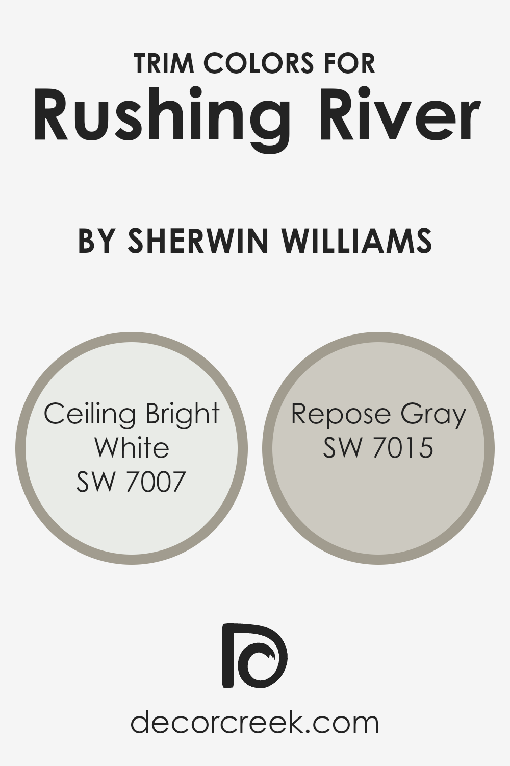
What are the Trim colors of Rushing River SW 7746 by Sherwin Williams?
Trim colors play a significant role in enhancing the aesthetic of a room, providing a subtle yet impactful contrast or cohesion with the main wall colors. For instance, when coordinating with a color like Rushing River from Sherwin Williams, selecting the right trim colors can completely change how the space feels.
Using colors like Ceiling Bright White and Repose Gray as trim options offer a way to define and accentuate architectural features, make spaces appear more polished, and can even influence the perceived size and brightness of the room.
Ceiling Bright White is a pristine and clear shade, making it an excellent choice for trims to achieve a crisp, clean look that can help other colors stand out more vividly. It reflects light effectively, making a room appear brighter and more open. Repose Gray, on the other hand, is a subtle gray with a warm undertone that provides a mild and welcoming contrast when used as a trim. This color is fantastic for softening the overall effect of a room while still defining space boundaries with a gentle distinction from Rushing River.
You can see recommended paint colors below:
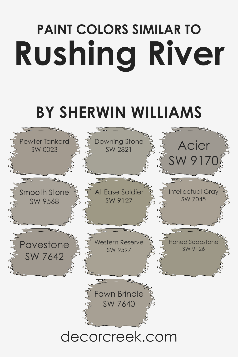
Colors Similar to Rushing River SW 7746 by Sherwin Williams
Similar colors play a crucial role in creating a cohesive and harmonious environment, which can subtly enhance the overall aesthetic of any space. When colors like Rushing River and its similar shades are used together, they provide a seamless transition between spaces, making smaller rooms appear larger and giving a sense of continuity that is visually pleasing. These colors, all sharing muted, earthy undertones, are versatile and can be used in various combinations to achieve a balanced look that is both inviting and comforting.
Starting with Pewter Tankard, this color brings a deep, silvery-gray tone that can anchor lighter shades. Smooth Stone, on the other hand, offers a gentle gray with a touch of warmth, perfect for softening edges and adding depth. Pavestone is a stronger gray that leans towards taupe, excellent for making a subtle statement.
Fawn Brindle is another lovely option, presenting a warmer gray with hints of brown, ideal for cozy settings. Downing Stone is a bolder, darker hue that can be used for accentuating features. At Ease Soldier adds an organic feel with its dusty greenish-gray, reminiscent of natural elements. Western Reserve is a unique blend of gray and subtle blue, evoking a calm atmosphere. Acier, similar to a steel gray, is excellent for contemporary spaces, giving a clean, sharp finish.
Intellectual Gray offers a sophisticated blend of gray and brown, perfect for both traditional and modern designs. Lastly, Honed Soapstone is the darkest of these shades, providing depth and contrast that is perfect for an impactful design element. Collectively, these colors create a versatile palette that can be used to create a variety of moods and styles, depending on the combinations chosen.You can see recommended paint colors below:
- SW 0023 Pewter Tankard
- SW 9568 Smooth Stone
- SW 7642 Pavestone
- SW 7640 Fawn Brindle
- SW 2821 Downing Stone
- SW 9127 At Ease Soldier
- SW 9597 Western Reserve
- SW 9170 Acier
- SW 7045 Intellectual Gray
- SW 9126 Honed Soapstone
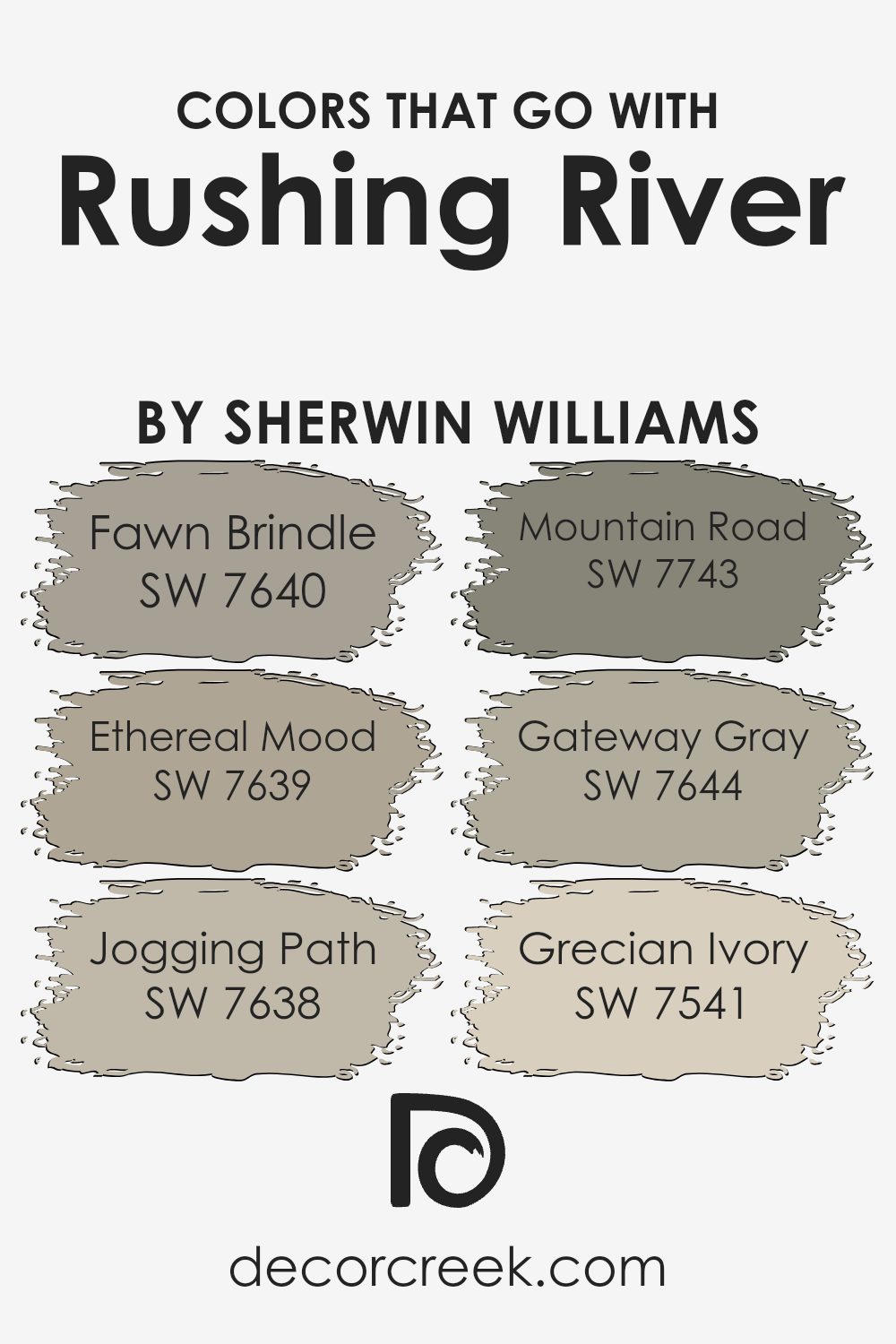
Colors that Go With Rushing River SW 7746 by Sherwin Williams
Choosing the right colors to complement Rushing River SW 7746 by Sherwin Williams is crucial because it ensures that the overall appearance of a room feels harmonious and visually appealing. Rushing River is a unique shade that can act as a subtle backdrop or an accent, depending on what it is paired with. Colors like Fawn Brindle, Ethereal Mood, Jogging Path, Mountain Road, Gateway Gray, and Grecian Ivory are great for creating a balanced and inviting atmosphere.
Fawn Brindle is a warm, medium gray that brings a cozy feel to spaces. It’s a versatile color that works well in areas where relaxation is key. Ethereal Mood also offers a calming effect, but with a slightly lighter tone, giving spaces a fresh and airy feel.
Jogging Path, another superb match, provides a deeper gray that can help ground a room while keeping it welcoming. Mountain Road offers a darker hue that’s perfect for adding depth and interest to an area. Gateway Gray is a richer shade that pairs splendidly with Rushing River, providing a stately and refined look without overpowering.
Lastly, Grecian Ivory offers a subtle contrast with a soft, creamy texture, enhancing the space with a hint of warmth and brightness, making any room feel more open and light. Each of these colors works together to create a cohesive look that enhances the beauty and functionality of a space.
You can see recommended paint colors below:
- SW 7640 Fawn Brindle
- SW 7639 Ethereal Mood
- SW 7638 Jogging Path
- SW 7743 Mountain Road
- SW 7644 Gateway Gray
- SW 7541 Grecian Ivory
How to Use Rushing River SW 7746 by Sherwin Williams In Your Home?
**Rushing River SW 7746** by Sherwin Williams is a versatile and appealing paint color that can add a unique touch to any home. This shade, which resembles the deep tones of a flowing river, can be used in various ways around the house. In the living room, Rushing River can create a cozy and inviting atmosphere when used on a feature wall. It pairs beautifully with light neutrals or earthy tones, making it easy to blend with existing decor.
In the bedroom, applying this color can help establish a calm and restful environment, promoting better sleep. For those looking to add a little character to their kitchen or bathroom, Rushing River can also be a great choice for cabinets or an accent wall, especially when combined with sleek, modern fixtures and white accents.
Lastly, for an unexpected twist, consider Rushing River for your home’s exterior. It can give your house a stylish and distinct appearance from the outside, setting it apart from others in the neighborhood.
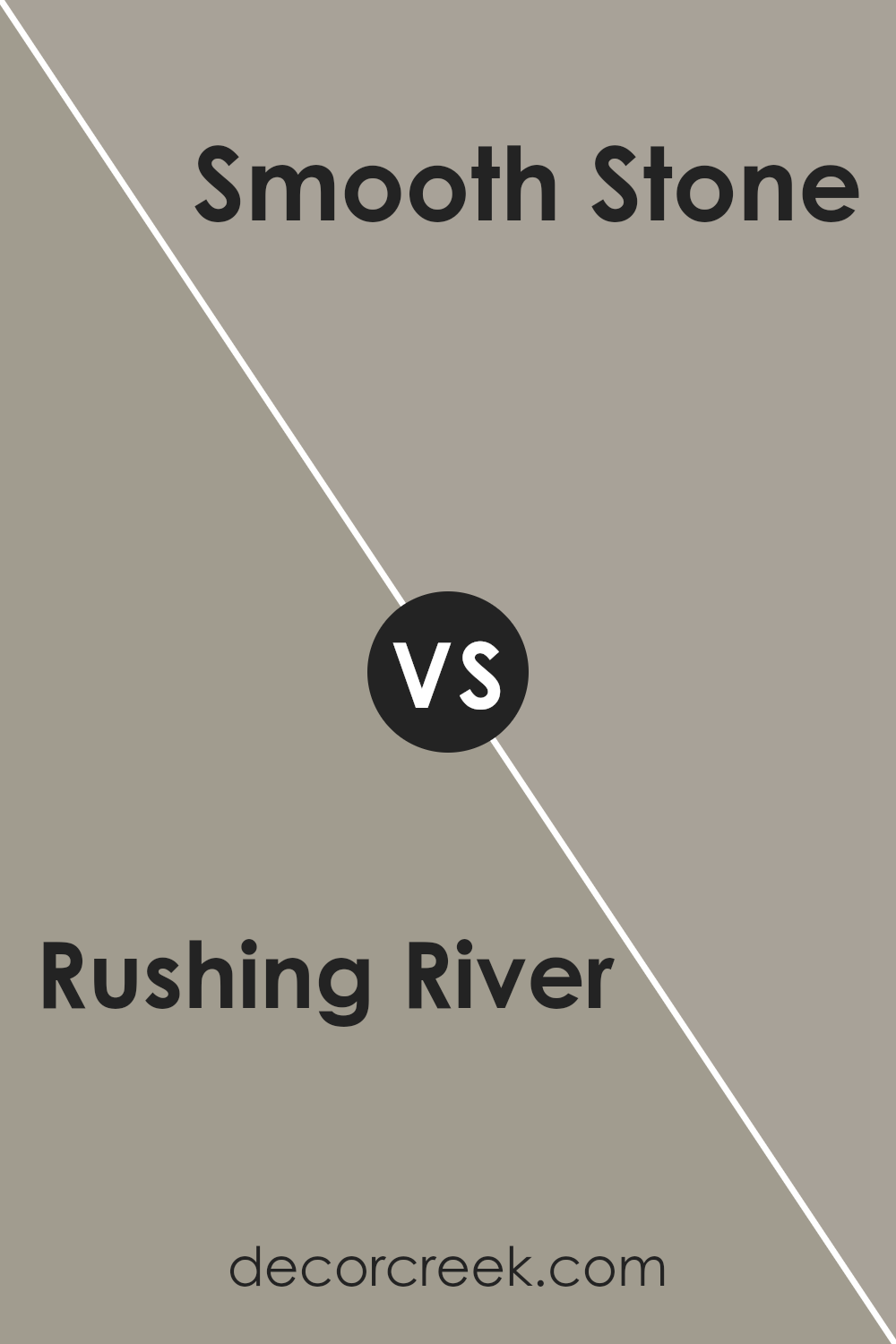
Rushing River SW 7746 by Sherwin Williams vs Smooth Stone SW 9568 by Sherwin Williams
The main color, Rushing River, is a peaceful gray-blue that has a gentle and calming presence. It feels like a mix between a soft sky on a cloudy day and a quiet, distant body of water. It’s not too dark or too bright, making it versatile for various spaces like living rooms or bedrooms.
On the other hand, Smooth Stone is a lighter, neutral gray with a smooth and subtle appearance. It’s even softer on the eyes and blends easily with any decor without making too strong of a statement. This color is ideal for creating a relaxed atmosphere in any part of the home.
Both colors share a quiet and understated elegance, with Rushing River bringing a hint of depth and color, while Smooth Stone offers a clean palette that complements without competing. They work well together, providing a harmonious combination for a space that feels cohesive and gently styled.
You can see recommended paint color below:
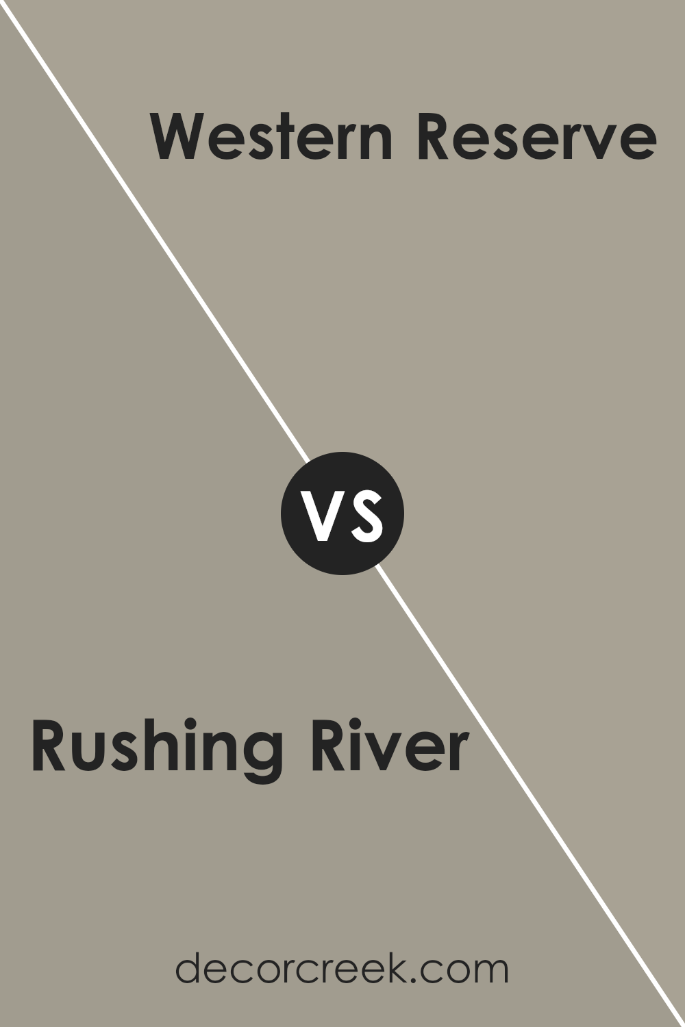
Rushing River SW 7746 by Sherwin Williams vs Western Reserve SW 9597 by Sherwin Williams
Rushing River and Western Reserve are both intriguing colors created by Sherwin Williams, yet they clearly differ in their visual impact and the mood they set. Rushing River has a cool, soft gray undertone that can make spaces feel fresh and modern. It can brighten up a room while still keeping it grounded due to its depth.
On the other hand, Western Reserve is a much darker shade that leans towards a navy blue. This color is powerful and can add a dramatic flair to any space. It is perfect for making a statement whether on an accent wall or throughout a room for a bold look.
Together, these two colors can work beautifully if used properly. Rushing River can be used on larger areas or rooms to keep the base light and airy while using Western Reserve for striking highlights. This pairing can define spaces attractively without overwhelming the senses.
You can see recommended paint color below:
- SW 9597 Western Reserve
Rushing River SW 7746 by Sherwin Williams vs Pewter Tankard SW 0023 by Sherwin Williams
Rushing River and Pewter Tankard by Sherwin Williams offer two distinct moods for any room. Rushing River has a soft, cool green hue that feels fresh and calm, making it great for a peaceful retreat. It can lighten a space while maintaining a cozy touch.
On the other hand, Pewter Tankard is a deeper, muted shade of grey with warm undertones. This color is perfect for adding a stylish yet understated touch to a space, providing a solid backdrop that complements various decor styles. While Rushing River adds a breezy, light air to walls, Pewter Tankard offers a grounded, comforting feel.
colors are versatile, but the choice between them depends on whether you want the freshness of a gentle green or the grounding presence of a warm grey.
You can see recommended paint color below:
Rushing River SW 7746 by Sherwin Williams vs At Ease Soldier SW 9127 by Sherwin Williams
The colors Rushing River and At Ease Soldier both by Sherwin Williams offer distinct vibes for any space. Rushing River has a soothing, muted green tone akin to a peaceful brook. It’s light enough to make smaller rooms feel spacious but offers enough depth to add character.
On the other hand, At Ease Soldier is a darker, more subdued green-gray shade, which gives it a solid, grounding effect. This color works well in spaces that aim for a more understated, cozy feel, as it tends to absorb light, making large spaces feel more intimate.
In terms of compatibility, these colors can actually complement each other well in a space, where Rushing River could be used on a feature wall or for accents, while At Ease Soldier could serve as a calming backdrop for entire rooms.
You can see recommended paint color below:
- SW 9127 At Ease Soldier
Rushing River SW 7746 by Sherwin Williams vs Fawn Brindle SW 7640 by Sherwin Williams
Rushing River and Fawn Brindle are two distinct shades from Sherwin Williams. Rushing River is a soft, soothing gray with a hint of blue, providing a cool and calming feel to any space.
It’s a versatile color that works well in many parts of the home, adding a light and airy touch. On the other hand, Fawn Brindle has a warmer tone, leaning towards a greige (a mix of gray and beige) that offers a cozy and welcoming vibe. This color is great for creating a comfortable and inviting atmosphere, making spaces feel more grounded and homely.
Both colors are neutral enough to be paired with various decor styles and colors, but they set different moods due to their cool versus warm undertones. Rushing River may be more suited for a modern look, while Fawn Brindle fits perfectly in traditional settings.
You can see recommended paint color below:
Rushing River SW 7746 by Sherwin Williams vs Pavestone SW 7642 by Sherwin Williams
Rushing River and Pavestone are two distinct colors from Sherwin Williams. Rushing River is a smoky shade of teal that gives a calm and gentle feel to any space, making it ideal for creating a soothing atmosphere. It is a versatile color that can pair well with both light and dark hues, suitable for living rooms or bedrooms.
On the other hand, Pavestone is a deep gray with subtle brown undertones, which lends a warm and inviting quality to it. This color is excellent for those who prefer a more grounded and cozy environment. It’s particularly good for areas like dens or dining rooms where a more relaxed setting is desirable.
When compared, Rushing River adds a hint of subtle vibrancy due to its teal influences, while Pavestone offers a sturdy and earthy feel, making each unique in their way. While Rushing River can lighten up a room, Pavestone tends to anchor spaces with its richer depth.
You can see recommended paint color below:
Rushing River SW 7746 by Sherwin Williams vs Acier SW 9170 by Sherwin Williams
Rushing River and Acier, both by Sherwin Williams, offer distinct tones for any space. Rushing River is like a light, refreshing gray that suggests the smooth pebbles and soft hues found beside a gentle stream. It has a hint of blue, which gives it a slightly cool, clean look, making it perfect for creating a calm, relaxed atmosphere.
In contrast, Acier is a darker shade that leans towards a steely charcoal gray. This color provides a strong, stable feel to a room, ideal for someone looking to set a more grounded, mature tone. Acier’s deeper gray can make a striking statement, especially when used in larger areas or as an accent wall.
Together, these colors could work well for someone looking to balance brightness and depth in their décor. Rushing River could lighten up spaces, while Accier can anchor different elements in darker, richer tones. Whether for a home or office, these grays can adapt to various styles and preferences.
You can see recommended paint color below:
- SW 9170 Acier
Rushing River SW 7746 by Sherwin Williams vs Honed Soapstone SW 9126 by Sherwin Williams
The main color, Rushing River, is a calming shade of blue-green that has a freshness similar to a forest stream. It’s a color that brings a sense of refreshing nature into any space, making it feel vibrant yet peaceful. On the other hand, Honed Soapstone is a muted gray with subtle green undertones, lending it a rich, earthy feel. This color is perfect for those looking to create a cozy and understated atmosphere in their home or office.
When comparing Rushing River and Honed Soapstone, it’s clear that both colors draw their inspiration from natural elements. Rushing River, being brighter, adds a lively and refreshing vibe, ideal for spaces like bathrooms or kitchens. In contrast, Honed Soapstone, with its deeper and more grounding hue, works well in areas where a feeling of warmth and solidity is desired, like in living rooms or bedrooms.
These colors can also complement each other beautifully in a color scheme, providing a harmonious balance between vibrancy and subtlety.
You can see recommended paint color below:
- SW 9126 Honed Soapstone
Rushing River SW 7746 by Sherwin Williams vs Intellectual Gray SW 7045 by Sherwin Williams
Rushing River and Intellectual Gray are two distinct colors by Sherwin Williams that each bring a unique vibe to a space. Let’s start with Rushing River. This is a soft, soothing green with a pronounced blend of blue undertones. It’s a light to medium shade that feels fresh and natural. It would work well in a room where you want to create a calm, peaceful environment, perhaps like a bedroom or bathroom.
On the other side, we have Intellectual Gray. Despite its name, it isn’t a typical gray. This shade leans more towards a warm, earthy taupe with subtle gray inflections. It’s a versatile color that provides a neutral backdrop suitable for almost any room, from living rooms to kitchens. It pairs exceptionally well with wooden finishes and metallic elements, adding a grounded yet airy feel.
When comparing, Rushing River offers a cooler, lighter atmosphere, perfect for a refreshing touch, while Intellectual Gray brings a warmer, cozier feel, suitable for a more grounded, welcoming setting. Both colors stand out for their ability to complement various decor styles and preferences.
You can see recommended paint color below:
Rushing River SW 7746 by Sherwin Williams vs Downing Stone SW 2821 by Sherwin Williams
Rushing River and Downing Stone by Sherwin Williams are two distinct paint colors, each offering a unique mood for interior spaces. Rushing River is a soft, muted green with a hint of gray, creating a calm and soothing environment. This color is versatile, well-suited for bedrooms and living areas where a peaceful atmosphere is desired.
In contrast, Downing Stone is a deeper, warm gray that offers a grounding feel. This color has a touch of brown, making it cozy and inviting, perfect for areas where comfort is a priority such as family rooms and dining areas.
Both colors are flexible and can be adapted to various decor styles, but their tones set different moods. Rushing River is lighter and can help make a small room feel larger and more open, while Downing Stone, being richer and darker, works well in larger spaces or as an accent wall to add depth and warmth to a room.
Using these colors together can also provide a harmonious balance, pairing the softness of Rushing River with the strong foundation of Downing Stone.
You can see recommended paint color below:
Conclusion
After looking into SW 7746 Rushing River by Sherwin Williams, I’ve learned a lot about this paint color. It’s a unique shade of blue that looks a bit like green. It makes me think of being outside by a calm stream or standing in a quiet forest.
This color isn’t too bold or bright, so it’s really easy on the eyes. It also reminds one of nature, which can make any room feel fresh and inviting. People love using this color in their homes because it gives a natural, calm feel to any room, whether it’s a bathroom, bedroom, or even a kitchen.
When painting with Rushing River, you can use it on all the walls or just one wall to make it stand out. It pairs well with white, gray, and even some brown colors. This means you can use different decorations or furniture colors, and they will still look nice with the paint.
To wrap up, SW 7746 Rushing River by Sherwin Williams is a fabulous choice if you want to bring a bit of the outdoor feel into your home. It’s calm, not too bold, and goes well with many other colors. It’s a paint color that can make your home look beautiful and cozy.
Ever wished paint sampling was as easy as sticking a sticker? Guess what? Now it is! Discover Samplize's unique Peel & Stick samples.
Get paint samples

