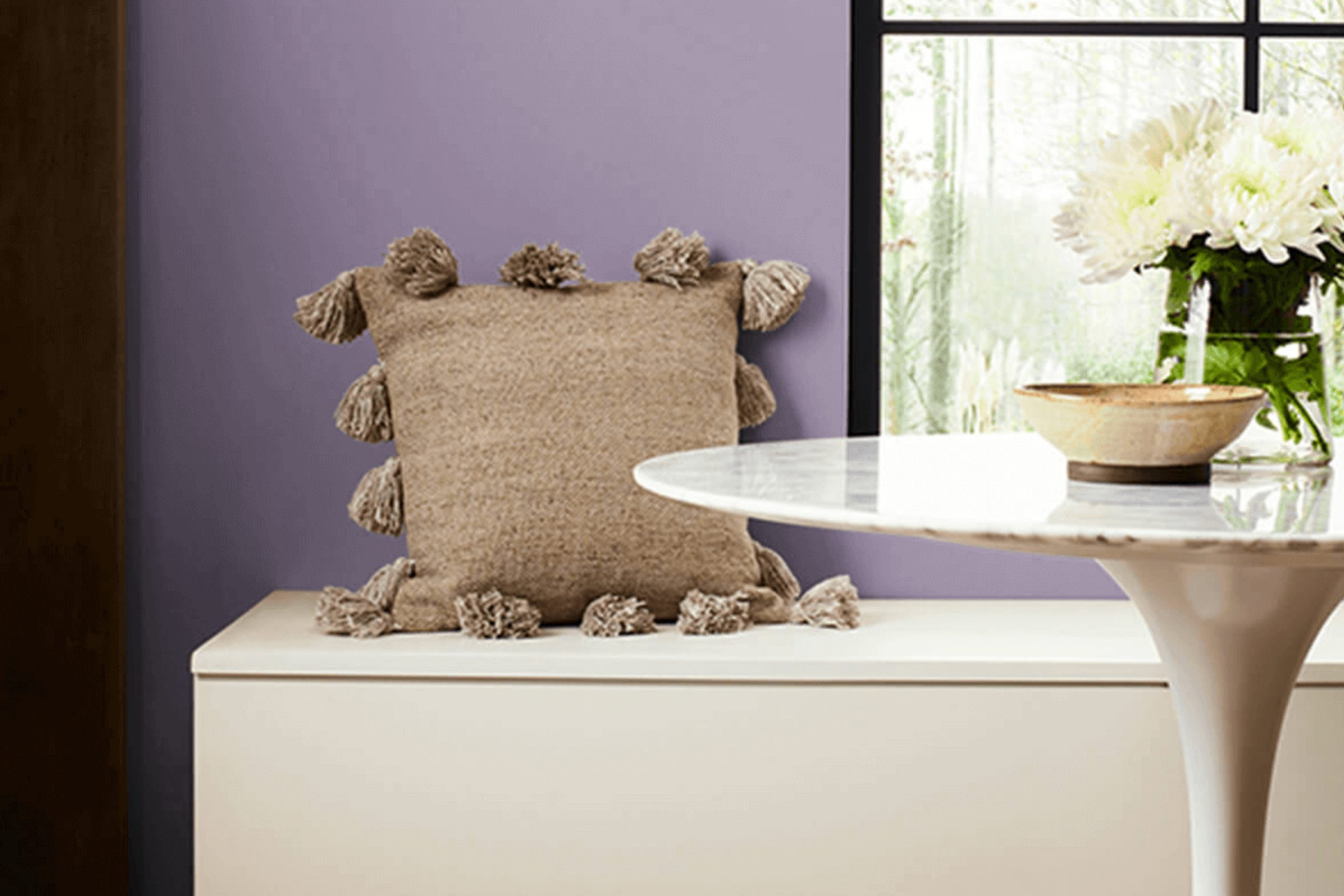
Soft and inviting, SW 9075 Berry Cream by Sherwin Williams has become one of my favorite colors. As soon as I see it, I’m struck by its warmth and subtle charm. This shade isn’t just a simple pink; it’s a blend that carries a sense of character and grace. It’s the type of hue that can make any room feel cozy and welcoming, yet polished and tasteful.
What I truly appreciate about Berry Cream is its versatility. Whether adorning the walls of a living room, a bedroom, or even a kitchen, it seems to adapt magically to different settings. In daylight, it reflects a gentle brightness, while under soft evening lights, it provides a sense of calm and comfort.
Berry Cream brings an understated luxury that is subtle yet distinct. It isn’t excessively bold, making it perfect for rooms where a calm atmosphere is sought. Pairing it with neutral accents or contrasting it with deeper tones can enhance its beauty even more. It inspires creativity and gives rooms a personal touch that guests often admire.
Overall, Berry Cream offers an easygoing elegance that’s appealing and adaptable. It helps create rooms that are both inviting and unique, no matter where I choose to use it.
What Color Is Berry Cream SW 9075 by Sherwin Williams?
Berry Cream is a lovely color by Sherwin Williams, marked by its warm and soft pastel hue. It blends rose tones with creamy undertones, creating a cozy and inviting shade. This subtle yet charming color works beautifully in various interior styles, from traditional to modern farmhouse.
In a classic setting, Berry Cream can add a touch of warmth to living rooms or bedrooms, blending well with vintage furniture and decor. For modern farmhouse designs, it pairs nicely with natural woods and shiplap, adding a gentle accent that complements rustic elements.
This adaptable shade works well alongside a range of materials and textures. Pair it with natural fibers such as linen and cotton for a relaxed and comfortable atmosphere. Berry Cream also harmonizes effectively with light woods like oak or maple, creating a balanced and harmonious look.
Metals such as brushed brass or copper can add a touch of elegance to the setting, making Berry Cream an adaptable choice for fixtures or decorative accents.
For textiles, consider using soft, plush materials, like velvet or chenille, which can enhance the warm, cozy feeling that Berry Cream imparts. Whether used on walls, furniture, or accessories, this color brings a soft elegance to any room.

Is Berry Cream SW 9075 by Sherwin Williams Warm or Cool color?
Berry Cream SW 9075 by Sherwin Williams is a warm, soft color that brings a cozy and inviting feel to any room in a home. It has a gentle pink undertone, giving it a subtle, charming appearance. When used on walls, it creates a soothing backdrop that can make a room feel more comfortable and open.
Because Berry Cream is a neutral color, it pairs well with various other colors, allowing you to mix and match with different furniture and accessories. It works especially well in living rooms, bedrooms, or any room where you want to create a relaxed and welcoming atmosphere. The color reflects light softly, making rooms feel brighter without overpowering.
Adding accents in grays, beiges, or even other muted pinks can enhance the warm vibe. Overall, this shade promotes a pleasant and balanced environment, making it an adaptable choice for many home styles.
Undertones of Berry Cream SW 9075 by Sherwin Williams
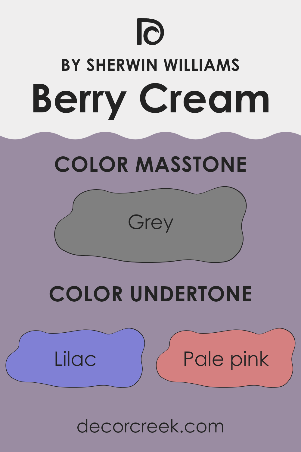
Berry Cream, a paint color by Sherwin Williams, is a unique and adaptable hue thanks to its varied undertones. The presence of undertones such as lilac, pale pink, light purple, mint, light blue, and pale yellow adds complexity and can influence how the paint appears in different lighting conditions. Undertones are subtle colors that lie beneath the main color and can shift its appearance based on surrounding colors and lighting.
For example, in natural daylight, Berry Cream might emphasize its light purple and pink undertones, giving the room a soft and warm appeal. In contrast, artificial lighting might bring out the mint and light blue undertones, making the room feel cooler and more refreshing. This dynamic nature of Berry Cream means it can adapt to various settings.
On interior walls, the undertones of light gray and pale yellow create a balanced backdrop that works well with both modern and traditional decor. The mix of cool tones like navy and dark turquoise adds depth, while the touches of reds, dark greens, and browns can provide warmth. Overall, Berry Cream’s range of undertones ensures it remains adaptable, allowing it to complement various furniture pieces and accents in the home.
What is the Masstone of the Berry Cream SW 9075 by Sherwin Williams?
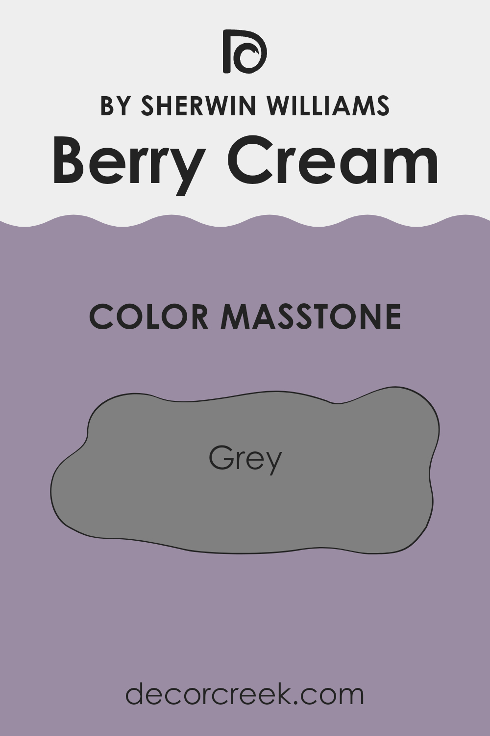
Berry Cream SW 9075 by Sherwin Williams is a warm, inviting color with a gray masstone, characterized by a balanced blend of brown and red undertones. This makes it an excellent choice for creating cozy and comfortable home environments. The gray base provides a neutral foundation, allowing Berry Cream to work well in various settings.
When used in living rooms or bedrooms, the soft, warm hue contributes to a sense of calm and coziness. The gray helps tone down the warmth, keeping it from feeling too intense or overpowering. This makes it ideal for rooms where relaxation is a priority. It can also complement a wide range of furnishings and décor styles, from traditional to modern.
In kitchens or dining areas, Berry Cream can add a touch of warmth without being too dominant. This versatility makes it a popular choice for homeowners seeking a color that adapts well while providing comfort and style.
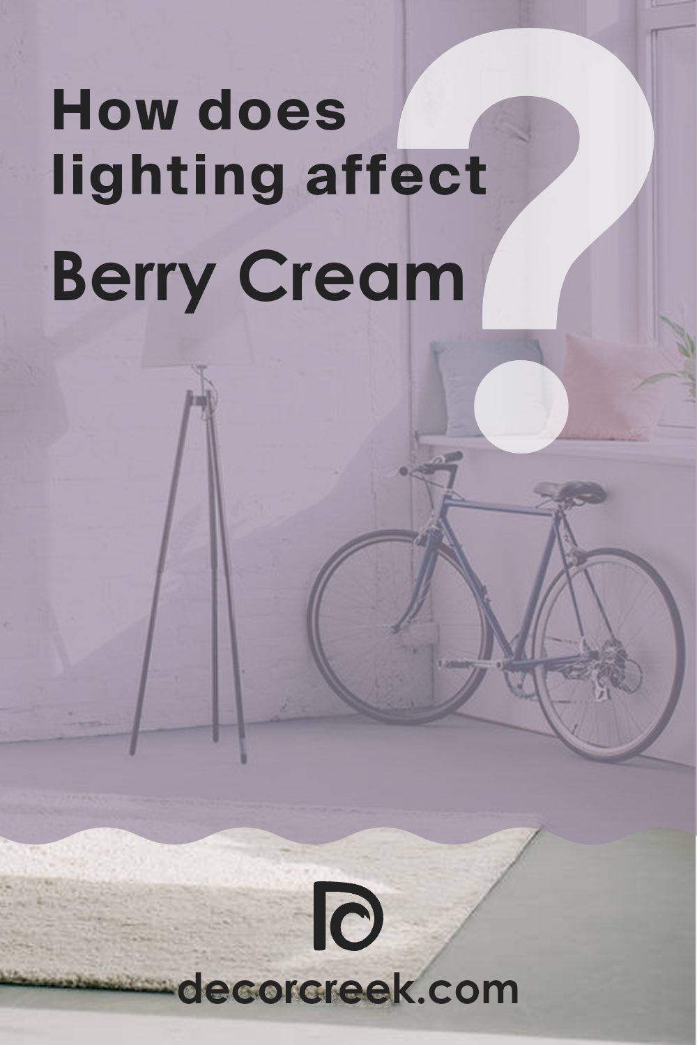
How Does Lighting Affect Berry Cream SW 9075 by Sherwin Williams?
Lighting plays a crucial role in how we perceive colors. The color Berry Cream (SW 9075) by Sherwin Williams, like any paint color, can look quite different depending on the lighting conditions.
In natural light, colors tend to look more true to their original hues. For Berry Cream, a pink-toned beige, it will appear soft and inviting. However, the direction your room faces significantly affects how this color looks. In north-facing rooms, where the light is cooler and softer, Berry Cream might take on more subdued, grayish tones, as the cooler light can make warm colors appear less vibrant.
In contrast, south-facing rooms receive warm, bright light throughout the day. This type of illumination tends to enhance warm colors, so Berry Cream will appear warmer and more vibrant. It can look more peachy or rosy, bringing out the coziness of the color.
East-facing rooms enjoy bright, direct light in the mornings, while the light becomes cooler and more muted as the day progresses. In the morning, Berry Cream will look warm and cheerful, capturing the essence of a soft sunrise. As the day moves on, the cooler light may slightly tone down its warmth, making it feel more balanced.
West-facing rooms have the opposite lighting pattern, with cooler light in the morning and warm, rich light in the afternoon and evening. In the morning, Berry Cream might look a bit cooler and more muted, while in the evening, as the light becomes richer, the color can seem more vibrant and comforting.
In artificial light, the color interpretation will depend on the type of bulbs used. Incandescent lighting, which is warm, will enhance Berry Cream’s warm undertones, making it appear cozy. Fluorescent lighting, typically cooler, might make Berry Cream look more muted and neutral. LED lighting can vary, so it’s essential to choose lighting that complements the shade’s warmth.
What is the LRV of Berry Cream SW 9075 by Sherwin Williams?
Light Reflectance Value (LRV) measures the percentage of visible and usable light that a color reflects from a painted surface. It’s a crucial aspect to consider when choosing paint colors for your home, as it affects how light or dark a color will appear once applied to the walls. An LRV of 0 represents absolute black, absorbing all light, while an LRV of 100 is pure white, reflecting all light.
Therefore, a color with a lower LRV will make a room feel cozier and warmer, as it absorbs more light, while a higher LRV color will make a room feel larger and brighter, bouncing more light around.
Berry Cream has an LRV of 28.206, which places it on the lower end of the scale. This means it will absorb more light than it reflects, allowing it to create a cozy and intimate atmosphere. In rooms with limited natural light, this color may appear darker and richer. However, in a well-lit area, whether from natural or artificial sources, Berry Cream can reveal its full depth and warmth, highlighting its creamy undertones.
If you want to add warmth and comfort to a room, this color can be a good choice, although it’s important to consider the existing lighting to predict its overall effect.

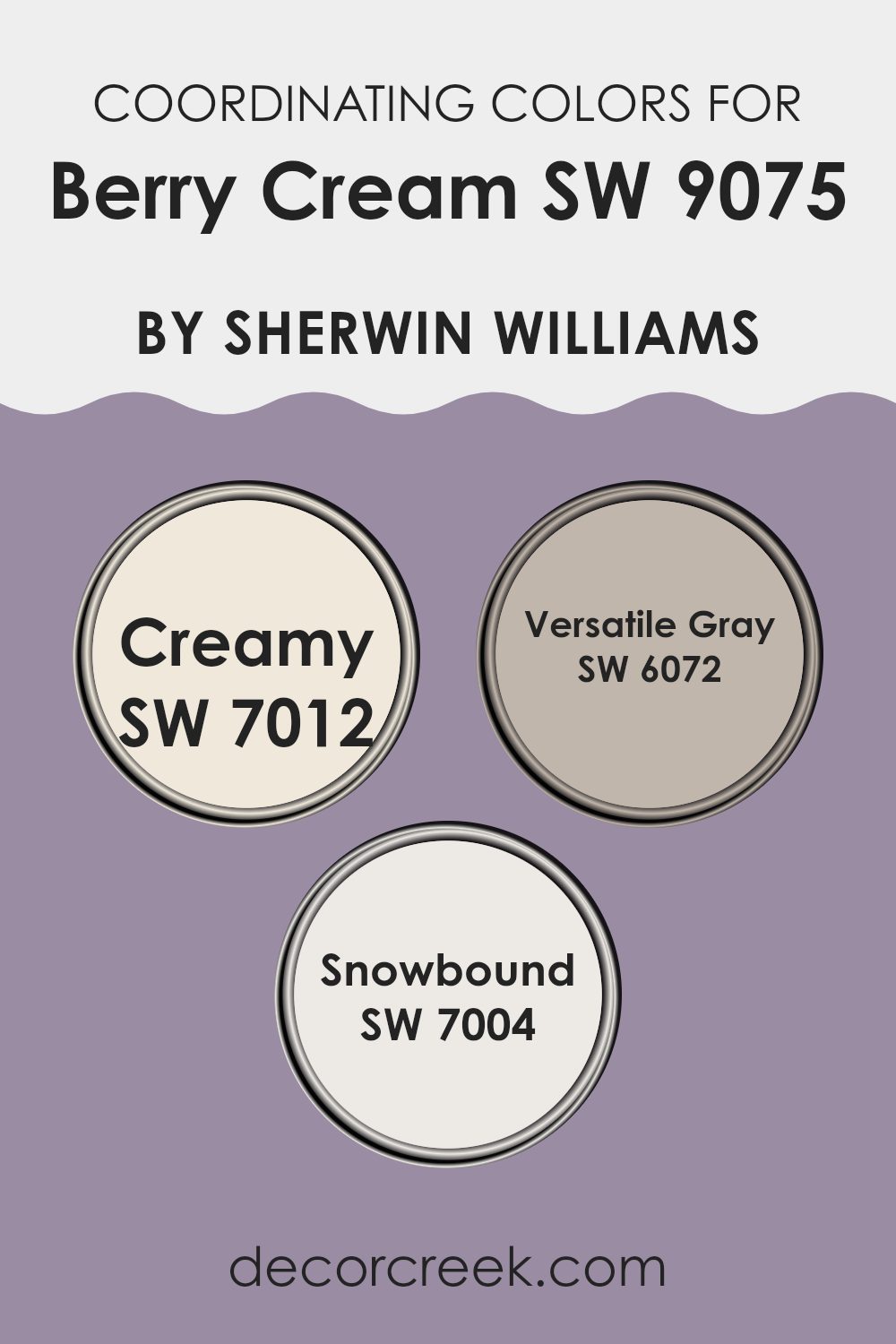
Coordinating Colors of Berry Cream SW 9075 by Sherwin Williams
Coordinating colors are hues that complement each other and work well together in a room, creating a harmonious look. When you choose a main color, like Sherwin Williams’ Berry Cream (SW 9075), coordinating colors are selected to support and highlight its qualities. They are not meant to match exactly but to enhance the main color and create balance in the design. These supporting shades often come from different areas of the color wheel, bringing interest and variety to the palette without clashing.
For Berry Cream, some excellent coordinating colors include Creamy (SW 7012), Adaptable Gray (SW 6072), and Snowbound (SW 7004). Creamy is a warm, soft off-white, perfect for adding a gentle, inviting brightness to any room. Adaptable Gray is a balanced neutral that adds depth with its subtle undertones, making it a great choice for those who want a refined, understated look.
Snowbound is a crisp, clean white, ideal for creating a fresh backdrop or highlighting architectural features. Together, these colors can be used to create a cohesive look that is both inviting and visually interesting, each playing its part to harmonize without overpowering the main hue of Berry Cream.
You can see recommended paint colors below:
What are the Trim colors of Berry Cream SW 9075 by Sherwin Williams?
Trim colors are the additional hues used to highlight or accentuate the primary color of a room’s walls, providing contrast and definition. They frame the room and accentuate architectural details like doors, windows, and baseboards.
For Berry Cream by Sherwin Williams, selecting the right trim colors not only enhances the cozy and warm atmosphere that Berry Cream creates but also ensures a cohesive and balanced look. Using Creamy or Aesthetic White can complement and enrich the Berry Cream’s charming and warm tones, helping to underline the elegance or simplicity of the room without overpowering it.
SW 7012, known as Creamy, offers a soft and gentle off-white shade with a subtle hint of warmth, creating an inviting feeling. This color is an excellent choice if you want the trim to have a warm touch that doesn’t overshadow the main wall color. On the other hand, SW 7035, Aesthetic White, is slightly cooler with a hint of gray, making it an adaptable choice for modern settings.
It adds a touch of sophistication and can make the architectural details stand out, providing a beautiful contrast against the warmer tones of Berry Cream. Both these trim colors can seamlessly blend with Berry Cream to produce an overall harmonious and appealing look.
You can see recommended paint colors below:

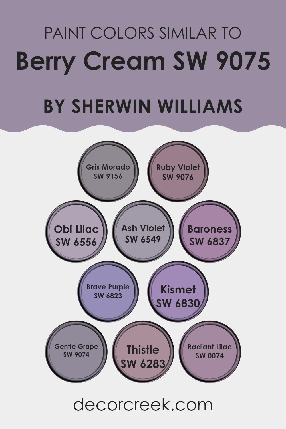
Colors Similar to Berry Cream SW 9075 by Sherwin Williams
Berry Cream by Sherwin Williams is a rich, smooth color that pairs beautifully with other shades for a well-coordinated room. Similar colors like Gris Morado and Ruby Violet extend this color’s versatility. Gris Morado is a deep, muted shade that offers a calm, sophisticated feel, while Ruby Violet adds a touch of warmth and excitement with its reddish undertones. Obi Lilac presents a gentle lavender tone that complements Berry Cream’s comforting vibe, and Ash Violet softens the palette with its slightly smoky, muted finish.
Baroness and Brave Purple introduce a livelier side; Baroness has a bright, royal quality, while Brave Purple brings boldness with its vivid hue. Kismet, on the other hand, radiates with vibrant energy, bringing a dynamic contrast. Gentle Grape adds softness with its subdued undertones, creating a perfect link between bold and soft shades.
Meanwhile, Thistle introduces an airy freshness with its subtle pale lilac essence, and Radiant Lilac enhances this with its light and lively nature. Together, these similar colors create harmony by blending into rooms, adding depth and character without feeling too intense. They work well together because they share a common color origin, ensuring they complement rather than clash.
You can see recommended paint colors below:
- SW 9156 Gris Morado
- SW 9076 Ruby Violet
- SW 6556 Obi Lilac
- SW 6549 Ash Violet
- SW 6837 Baroness
- SW 6823 Brave Purple
- SW 6830 Kismet
- SW 9074 Gentle Grape
- SW 6283 Thistle
- SW 0074 Radiant Lilac
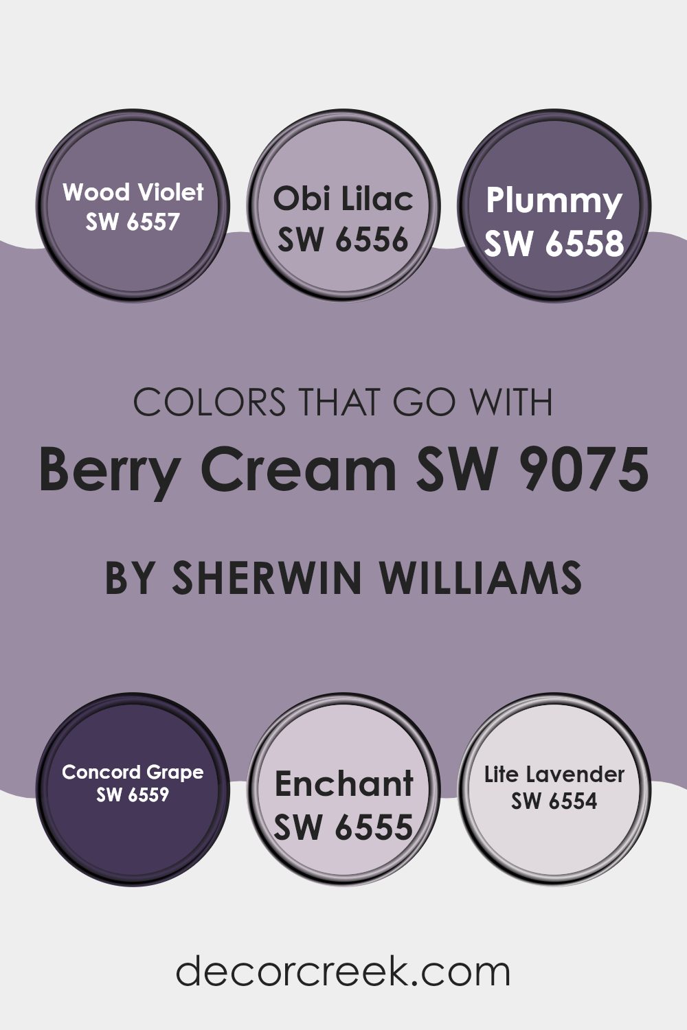
Colors that Go With Berry Cream SW 9075 by Sherwin Williams
Choosing colors that complement Berry Cream (SW 9075) by Sherwin Williams plays a big role in making a room feel welcoming and complete. By using shades that go well with it, you can create a setting that is both harmonious and visually interesting.
One such color is Wood Violet (SW 6557), which features a rich, deep purple tone that adds a bold contrast to Berry Cream. Then there’s Obi Lilac (SW 6556), a lighter and softer purple option that pairs nicely if you want a gentler vibe.
For those looking for darker accents, Plummy (SW 6558) is a deep shade that adds depth and luxury. Concord Grape (SW 6559) provides a slightly softer, yet still rich look with more of a bluish hint, which can act as an elegant backdrop. Enchant (SW 6555) has a more muted look, blending soft rose and brown notes, offering a subtle balance without overpowering the senses.
Finally, Lite Lavender (SW 6554) presents a fun and lively touch with its delicate and airy nature, providing a refreshing contrast.
Altogether, these colors can help knit a room together creatively, building a room that is both colorful and appealing to the eye.
You can see recommended paint colors below:
- SW 6557 Wood Violet
- SW 6556 Obi Lilac
- SW 6558 Plummy
- SW 6559 Concord Grape
- SW 6555 Enchant
- SW 6554 Lite Lavender
How to Use Berry Cream SW 9075 by Sherwin Williams In Your Home?
Berry Cream SW 9075 by Sherwin-Williams is a warm, inviting color that brings a cozy feel to any home. This creamy beige shade adds a touch of warmth and softness to your room without being overpowering.
It works well in living rooms, creating a comforting environment perfect for relaxation or socializing with family and friends. In the bedroom, Berry Cream can help create a soothing atmosphere conducive to rest. Pair it with soft white trim for a clean, classic look or with deeper colors like browns or terracottas for added depth and contrast.
Using this color in a kitchen can make the room feel welcoming, and it complements wooden cabinets and stone countertops beautifully. Berry Cream is also a great choice for hallways and entryways, setting a pleasant tone for the rest of the home. Its easy adaptability makes it simple to match with various decor styles and accents.
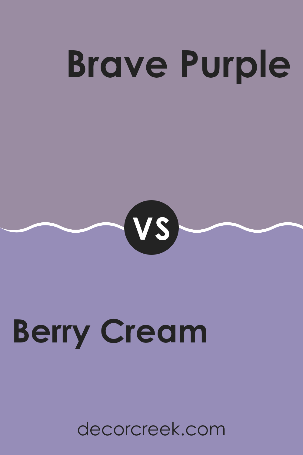
Berry Cream SW 9075 by Sherwin Williams vs Brave Purple SW 6823 by Sherwin Williams
Berry Cream SW 9075 is a soft, warm pinkish hue, while Brave Purple SW 6823 is a bolder, darker purple shade. Berry Cream offers a gentle, calming vibe, making it suitable for bedrooms or living areas that aim for a cozy feel. In contrast, Brave Purple is more intense and eye-catching, perfect for making a statement in a room or as an accent color.
Berry Cream works well in rooms where a light, inviting atmosphere is desired. It pairs nicely with neutrals like whites and grays. Brave Purple, on the other hand, is ideal for adding depth and drama. It can be paired with lighter colors to create contrast and highlight its richness.
Both colors can bring personality to a room. Choosing between them depends on whether you want a soft and subtle look or a bold and vibrant one.
You can see recommended paint color below:
- SW 6823 Brave Purple
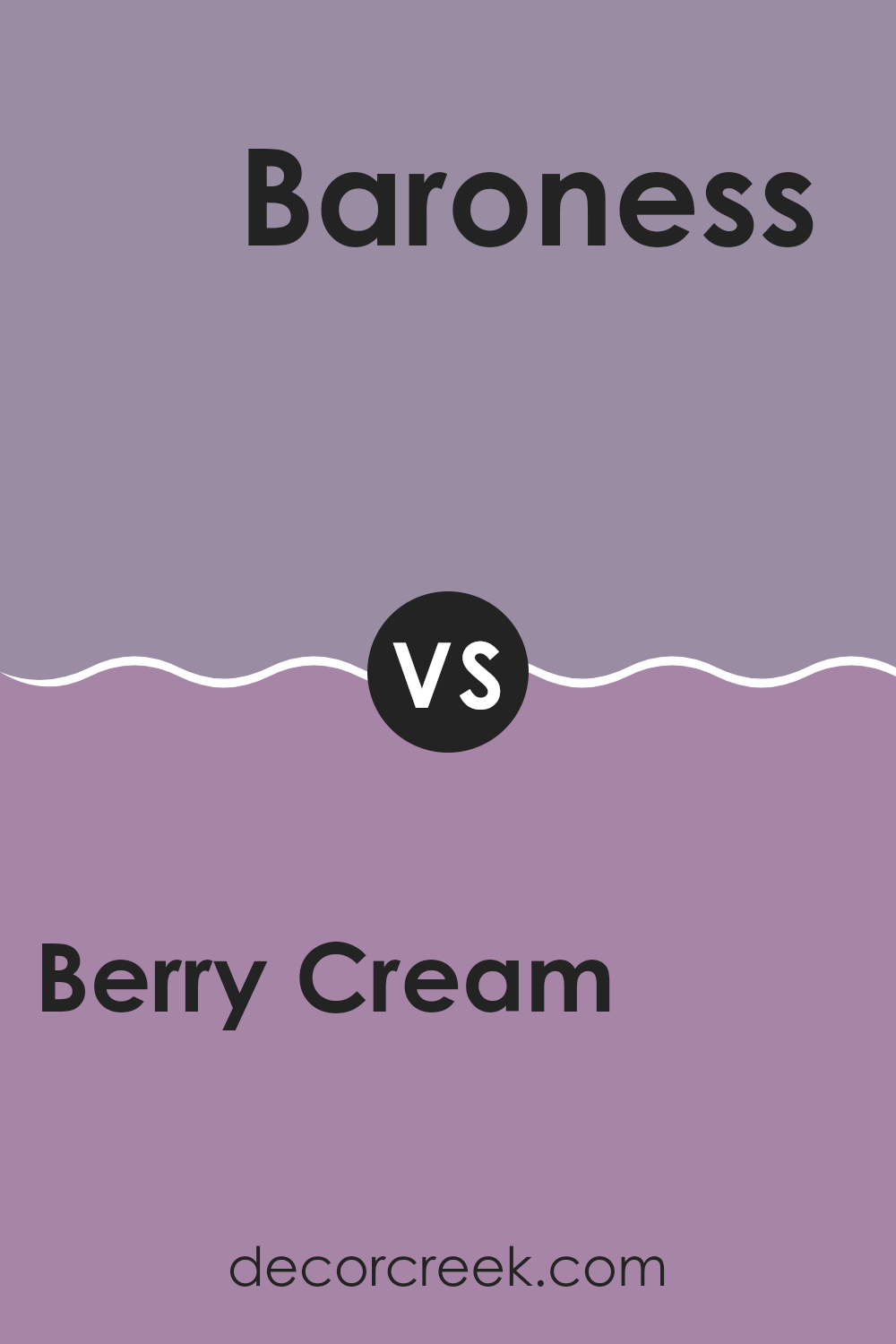
Berry Cream SW 9075 by Sherwin Williams vs Baroness SW 6837 by Sherwin Williams
Berry Cream SW 9075 by Sherwin Williams is a soft, muted pink with a hint of warmth, resembling the color of freshly whipped berry mousse. It’s a gentle and comforting color, making it suitable for rooms where you want a calming and cozy atmosphere, such as bedrooms or living rooms.
On the other hand, Baroness SW 6837 is a bold and vibrant magenta. It exudes energy and makes a statement in any room it’s used. This color is perfect if you want to add a lively and dramatic touch to your room, like in accent walls or as decorative highlights.
When compared, Berry Cream is subdued and quiet, offering a subtle charm, while Baroness is attention-grabbing and full of life. Use Berry Cream for a gentle and relaxed vibe, and opt for Baroness when you wish to spark excitement and creativity in a room.
You can see recommended paint color below:
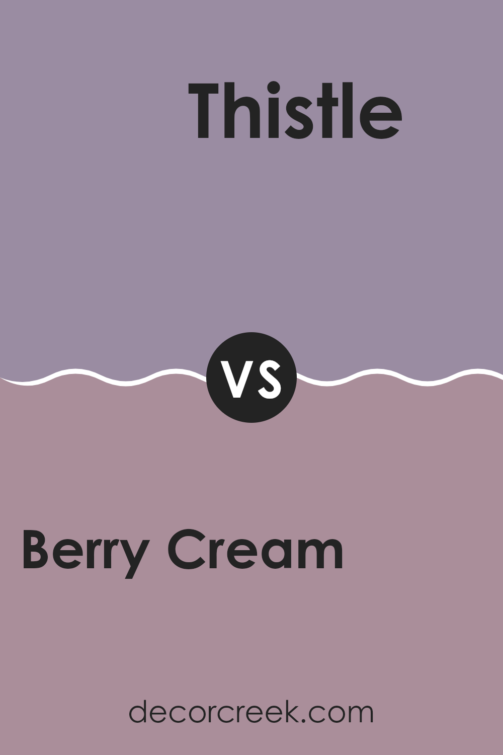
Berry Cream SW 9075 by Sherwin Williams vs Thistle SW 6283 by Sherwin Williams
Berry Cream SW 9075 by Sherwin Williams is a warm, cozy shade that resembles a soft pink or muted berry tone. It brings a gentle and inviting feeling to any room. Berry Cream works wonderfully in living areas or bedrooms where warmth and comfort are desired. It adds a touch of subtle color without being too bold.
On the other hand, Thistle SW 6283 by Sherwin Williams is a cooler shade with hints of lavender and gray. Thistle has a calm and refreshing quality, making it a suitable choice for rooms where relaxation is key. It fits well in bathrooms or offices, offering a soothing backdrop.
While Berry Cream provides warmth and a sense of coziness, Thistle introduces coolness and a gentle sense of calm. Pairing these two colors can create a balanced contrast, with Berry Cream adding warmth and Thistle offering a soothing, peaceful effect. Both colors bring unique character and can complement each other beautifully in different rooms.
You can see recommended paint color below:
- SW 6283 Thistle
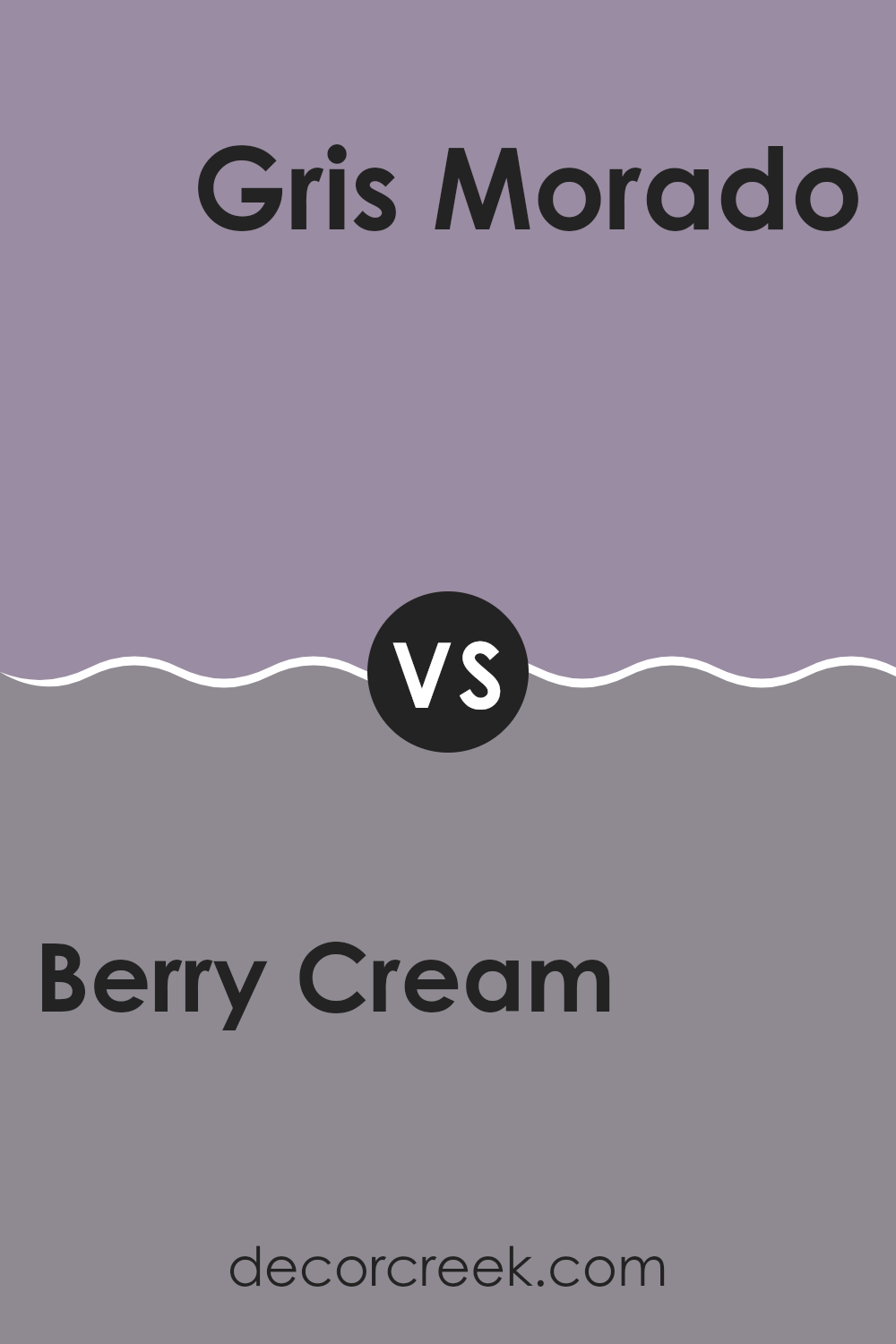
Berry Cream SW 9075 by Sherwin Williams vs Gris Morado SW 9156 by Sherwin Williams
Berry Cream SW 9075 and Gris Morado SW 9156 by Sherwin Williams are two distinct colors, each bringing its own vibe to a room. Berry Cream is a soft, warm pink with a creamy undertone. It creates a cozy, inviting feel that’s perfect for bedrooms or living areas where warmth and comfort are desired.
On the other hand, Gris Morado is a deeper, muted gray with a hint of purple. This color gives a room a cool, modern feel and works well in areas where a touch of sophistication is needed without being too bold. It adds depth and can serve as a great backdrop for other decor elements.
Together, these colors can complement each other beautifully. Using Berry Cream in a room with Gris Morado accents can balance warmth and elegance, making for a pleasing and harmonious environment. Both colors have unique qualities but can work well in combination.
You can see recommended paint color below:
- SW 9156 Gris Morado
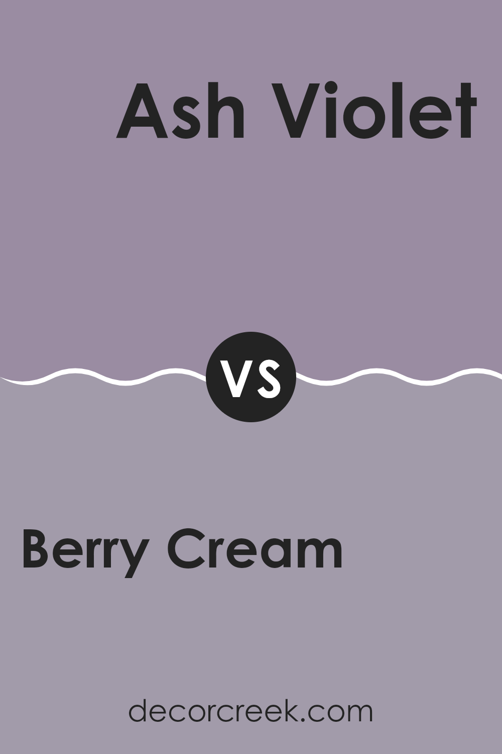
Berry Cream SW 9075 by Sherwin Williams vs Ash Violet SW 6549 by Sherwin Williams
Berry Cream SW 9075 is a warm, soft color with undertones of pink and beige. It brings a cozy and inviting feel into a room, making it ideal for living areas and bedrooms. Its creamy texture adds a touch of warmth without feeling too intense.
In contrast, Ash Violet SW 6549 offers a cooler, subtle lavender tone with hints of gray. It’s restrained and provides a gentle, calming backdrop. It’s perfect for rooms where you want a hint of color without overpowering the senses.
When comparing the two, Berry Cream offers more warmth and is suited for creating a cozy atmosphere. Ash Violet, with its cool undertones, can bring a calming and restful vibe. While Berry Cream fits well in rooms aiming for comfort, Ash Violet lends itself well to modern settings where a touch of subtle color is desired. Both colors can enhance different aspects of a room, depending on the desired mood.
You can see recommended paint color below:
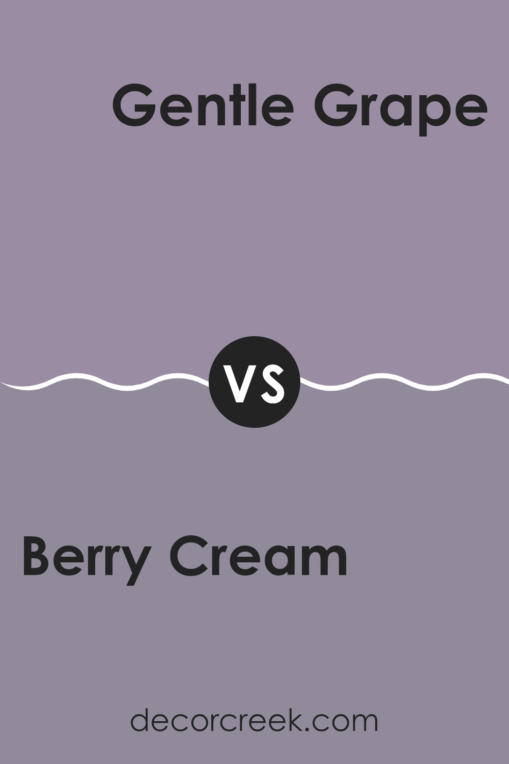
Berry Cream SW 9075 by Sherwin Williams vs Gentle Grape SW 9074 by Sherwin Williams
Berry Cream SW 9075 by Sherwin Williams is a soft, warm shade that combines a hint of pink with neutral tones. It’s a cozy and inviting color, perfect for creating a relaxed atmosphere in any room. Imagine the color of a light berry smoothie, reflecting a sense of warmth and comfort.
On the other hand, Gentle Grape SW 9074 is a bit deeper and richer. It carries more purple undertones, giving it a more cool and calming feel. Think of a gentle lavender that’s soothing to look at.
Both colors complement each other well, with Berry Cream offering a lighter touch and Gentle Grape providing depth. These shades can work beautifully together in a living area or bedroom. Berry Cream can serve as the main color for walls, while Gentle Grape can be used for accents or a feature wall, adding contrast and interest.
You can see recommended paint color below:
- SW 9074 Gentle Grape
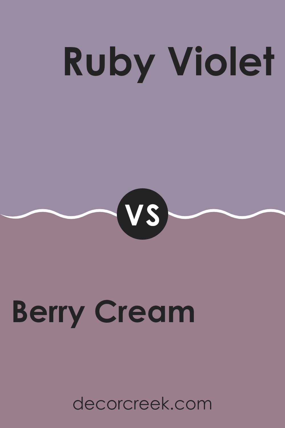
Berry Cream SW 9075 by Sherwin Williams vs Ruby Violet SW 9076 by Sherwin Williams
Berry Cream (SW 9075) and Ruby Violet (SW 9076) are two beautiful colors from Sherwin Williams, each with its unique charm. Berry Cream is a soft, warm hue with a creamy undertone. It’s light and refreshing, ideal for creating cozy and welcoming rooms. This color can make an interior feel open and airy while adding a touch of warmth.
On the other hand, Ruby Violet is a deeper and richer shade with a hint of purple. It’s bold and makes a strong statement, adding drama and elegance to any room. Ruby Violet works well as an accent color, especially in rooms where you want to introduce a sense of luxury or create a focal point.
When comparing these two colors, Berry Cream is gentle and subtle, perfect for backgrounds and larger areas. Ruby Violet, with its intensity, adds a striking contrast, making it suitable for feature walls and accents. Together, they can complement each other, with Berry Cream providing a soft backdrop and Ruby Violet adding depth.
You can see recommended paint color below:
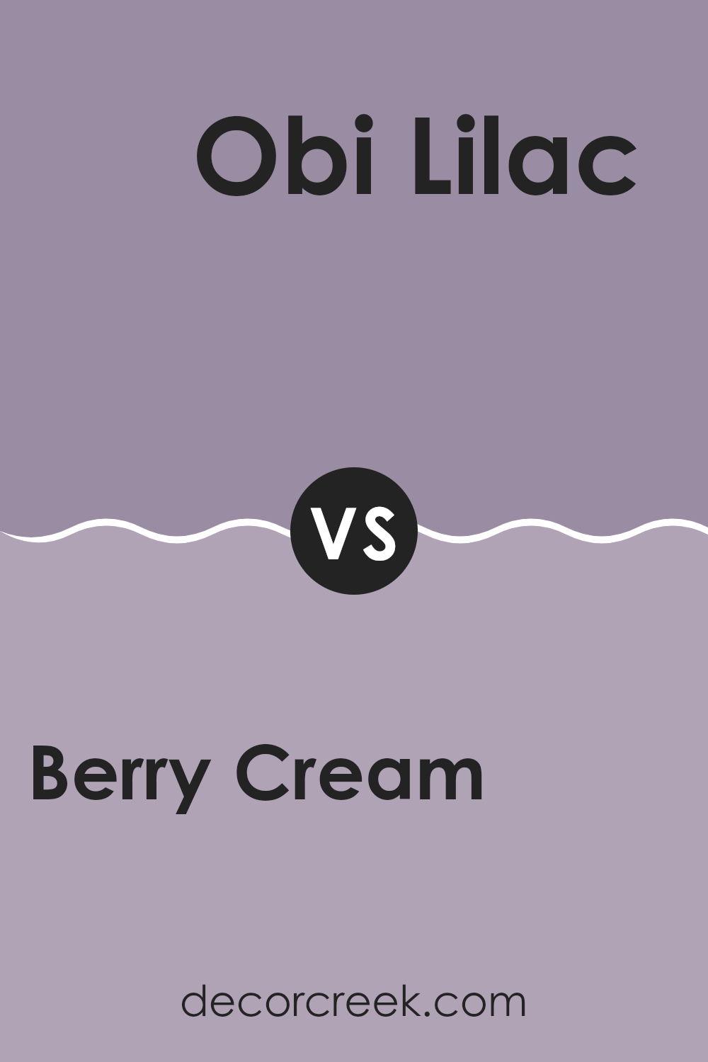
Berry Cream SW 9075 by Sherwin Williams vs Obi Lilac SW 6556 by Sherwin Williams
Berry Cream SW 9075 by Sherwin Williams is a warm, cozy color with a soft pinkish-beige tone. It feels comforting and gentle, making it a great choice for rooms where you want a welcoming atmosphere. This color can work well in bedrooms or living areas, where relaxation is key.
On the other hand, Obi Lilac SW 6556 by Sherwin Williams is a cool, soft purple. It has a calming presence but with a hint of whimsy, making it a fun choice for children’s rooms or play areas. While Berry Cream feels grounded and warm, Obi Lilac adds a touch of playfulness and light.
Both colors have their unique charm. Berry Cream is easy to coordinate and pairs well with many other shades, especially other warm tones. Obi Lilac, with its cooler undertone, complements whites and other pastels beautifully. Together, they can create a soft, balanced palette in any room.
You can see recommended paint color below:
- SW 6556 Obi Lilac
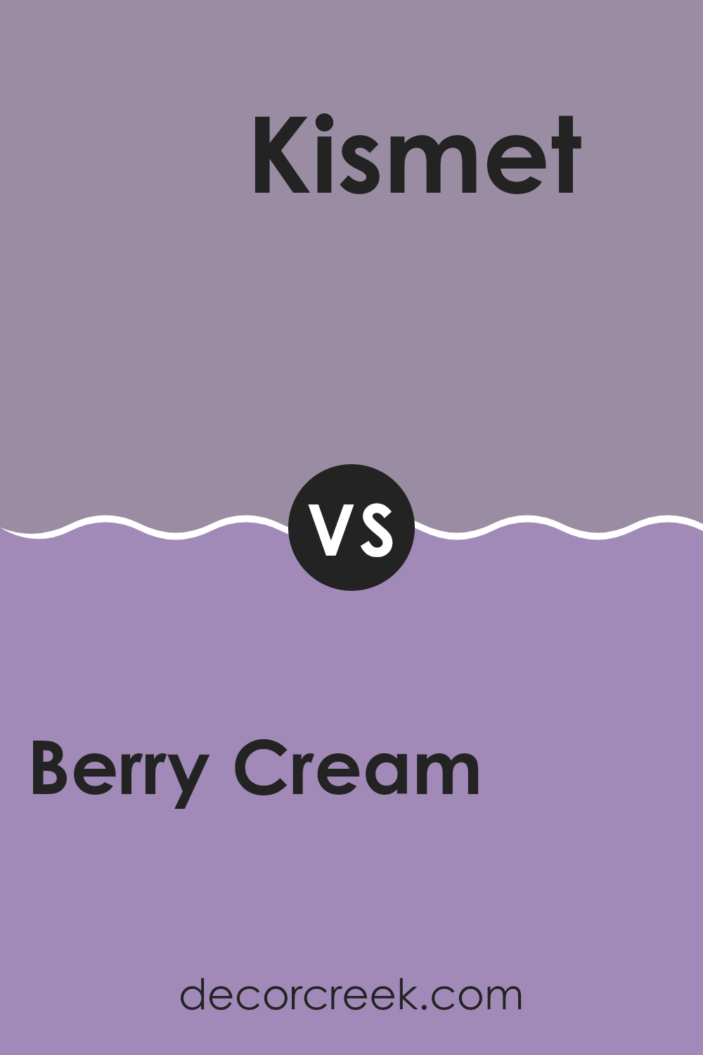
Berry Cream SW 9075 by Sherwin Williams vs Kismet SW 6830 by Sherwin Williams
Berry Cream SW 9075 and Kismet SW 6830 are both colors from Sherwin Williams, but they have distinct appearances and vibes. Berry Cream is a soft, warm, and muted pinkish hue that adds a gentle, cozy feel to any room. It works well in rooms where you want a calm and nurturing atmosphere, like bedrooms or living areas.
On the other hand, Kismet is a more vibrant and lively pink. It’s a bold choice that can bring energy and excitement to a room. Kismet is perfect if you want to make a statement or add a playful touch to an area, such as accent walls, children’s rooms, or creative corners.
While Berry Cream is subtle and comforting, Kismet offers a more striking and fun option. Both colors have their own charm and can be used to achieve different effects depending on the mood and style you’re aiming for in your home.
You can see recommended paint color below:
- SW 6830 Kismet
Berry Cream SW 9075 by Sherwin Williams vs Radiant Lilac SW 0074 by Sherwin Williams
Berry Cream (SW 9075) and Radiant Lilac (SW 0074) by Sherwin Williams are two distinct colors that offer different vibes. Berry Cream is a soft, warm shade that leans towards a creamy beige with a hint of berry undertone. It creates a cozy, welcoming feel in a room, making it great for living areas or bedrooms.
On the other hand, Radiant Lilac is a light purple with a brighter, more playful tone. It can add a pop of color and energy to any room. While Berry Cream is subtle and soothing, perfect for a calm environment, Radiant Lilac stands out with its vibrant hue, ideal for areas where a lively touch is desired.
Together, these colors can complement each other. Berry Cream can be used as a calming backdrop, with Radiant Lilac providing accents or focal points, creating a balanced and visually interesting setting.
You can see recommended paint color below:
After looking into SW 9075 Berry Cream by Sherwin Williams, I find it a truly lovely paint color. It’s not just any color; it feels warm and soft, and almost like a gentle hug. Imagine the creamy pinkish color of berries mixed with cream. That’s Berry Cream for you!
This color makes a room feel cozy and welcoming. Whether it’s used in a bedroom, where you want to relax, or in a kitchen, where you want everything to feel cheerful and bright, Berry Cream works out great. It’s not too bold or too bright, and it’s not dull either. It feels just right, like the color you want to see when you want to feel happy but calm at the same time.
I can see it being enjoyed by people who want something special on their walls without being too loud. Paired with whites or grays, it stands out nicely and brings out a charming feel in any room.
I believe Berry Cream is a delightful choice, and it can make any room feel pleasant and inviting. It’s a color that one could look at every day and still smile.

Ever wished paint sampling was as easy as sticking a sticker? Guess what? Now it is! Discover Samplize's unique Peel & Stick samples.
Get paint samples

