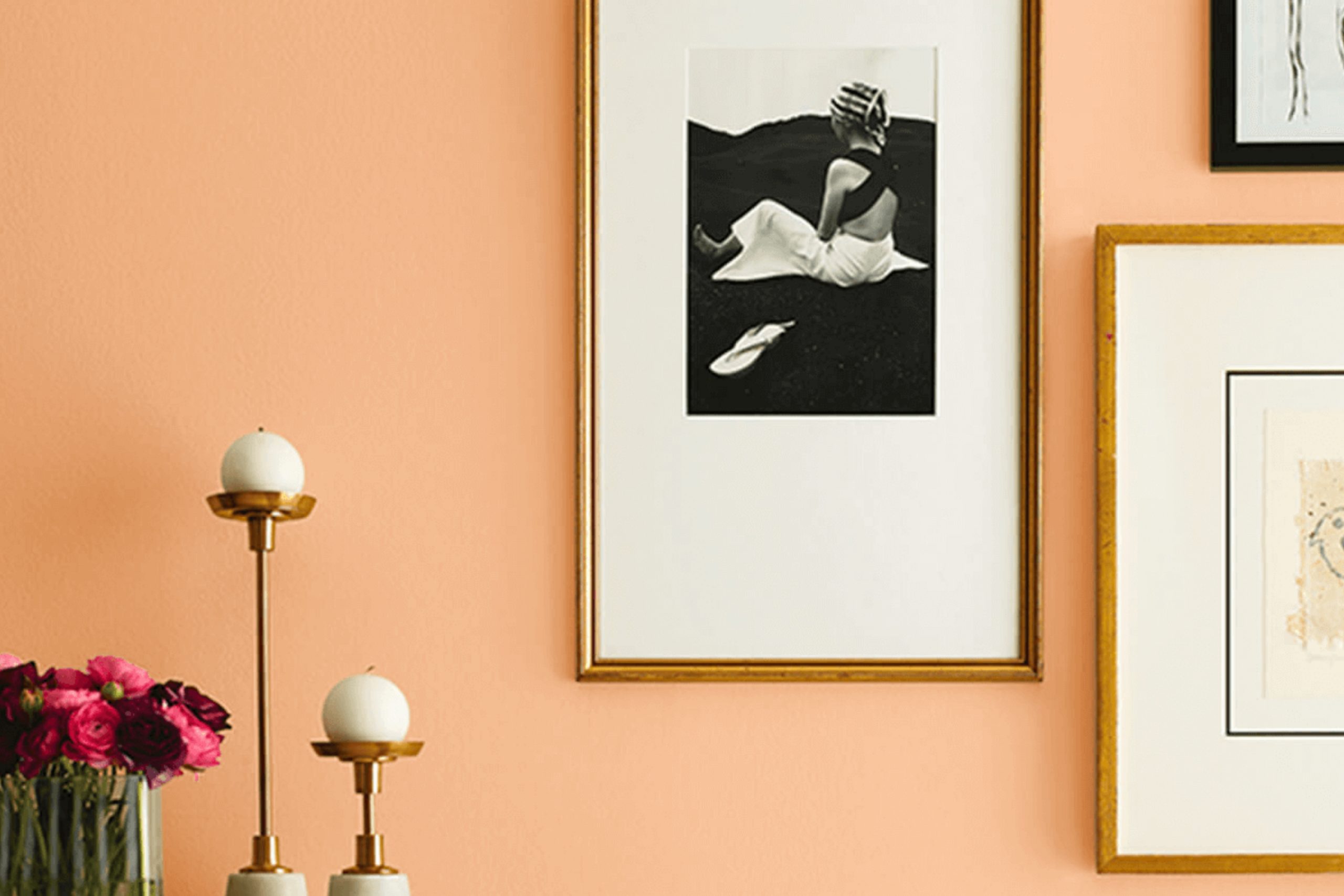
I recently painted a room with Sherwin Williams’ SW 9007 Melon Meloso, and I want to share my experience with this unique color. Initially, I was looking for something fresh yet subtle that could brighten up the room without being too strong. Melon Meloso caught my eye with its soft, creamy presence that radiates warmth and comfort.
The calming shade strikes a beautiful balance, adding just the right amount of cheerfulness while maintaining an air of calm. I chose this color for a bedroom, aiming to create a cozy, inviting room, and it turned out to be a perfect pick.
The light plays wonderfully with Melon Meloso, changing the room across different times of the day. In the morning light, it feels bright and airy, while in the evening, it brings a soothing, warm glow that is incredibly pleasing.
Painting with Melon Meloso was a straightforward task, thanks to the excellent coverage and the quality of Sherwin Williams paints. I found the color to be well-pigmented, which made the application process smooth and efficient. If you’re considering a new look for your room and want a shade that brings both light and warmth, Melon Meloso is worth considering. This shade has truly changed the vibe of my room, making it feel more welcoming and peaceful.
What Color Is Melon Meloso SW 9007 by Sherwin Williams?
The color Melon Meloso by Sherwin Williams is a vibrant, yet soft peach hue that brings a warm and inviting atmosphere to any room. It has an energetic vibe that can brighten rooms while maintaining a gentle, cozy feel. This shade effectively combines freshness with comfort, making it an adaptable choice for many home interior styles.
Melon Meloso works exceptionally well in more casual, laid-back designs like bohemian or rustic settings, where its light-hearted character can be fully appreciated. It also fits beautifully into modern and minimalist decors as a pop of color among neutral tones. It has the ability to add warmth to a sleek, contemporary look without being too strong.
In terms of materials and textures, Melon Meloso pairs wonderfully with natural elements. Consider using this color with wooden furnishings which can range from pale beech to rich walnut, enhancing the earthy, inviting atmosphere.
Textiles like linen or cotton in white or soft pastels coordinate well, providing a smooth contrast that highlights the peach tones without causing visual disruption. Additionally, incorporating matte metal fixtures or ceramics can balance the sweetness of Melon Meloso with a hint of industrial edge, making for a balanced, appealing room.
Is Melon Meloso SW 9007 by Sherwin Williams Warm or Cool color?
Melon Meloso SW 9007 by Sherwin Williams is a warm, inviting color that brings a fresh, cheerful vibe to any home. This shade of melon or soft peach offers a gentle pop of color without being too bold. It works particularly well in living areas, kitchens, and bathrooms where its cheerful nature can brighten the room and create a welcoming atmosphere.
In a living room, Melon Meloso can make the room feel cozy and bright. Pairing it with white trim can help keep the room light and airy. In a kitchen, this color can pair well with wood cabinets or white countertops for a clean, charming look.
Its soothing quality also makes it an excellent choice for bathrooms, where it can complement natural light to make the room feel comfortable and fresh. Overall, Melon Meloso is perfect for anyone looking to add a touch of warmth and cheer to their home without being too strong. It’s adaptable too, blending well with many decors and furniture styles.
Undertones of Melon Meloso SW 9007 by Sherwin Williams
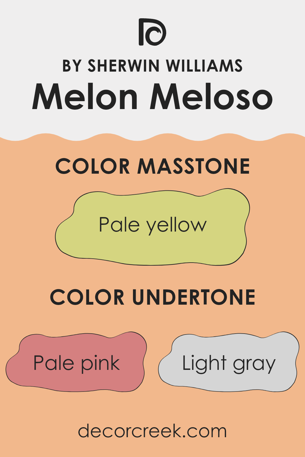
Melon Meloso is a unique paint color that contains a mix of several subtle undertones, making it adaptable for interior decorating. These undertones include shades of pale pink, light gray, light purple, yellow, orange, mint, grey, light blue, lilac, light green, and olive. Each undertone subtly influences how the primary color is perceived depending on the lighting and surrounding colors.
When used on interior walls, the undertones in Melon Meloso can affect the mood and feel of a room. For instance, pale pink can add a gentle warmth, while light gray can provide a neutral backdrop that complements various decor elements. Yellow can bring brightness and energy, whereas light purple might add a touch of softness.
Moreover, factors like natural light can highlight certain undertones. In a room with ample sunlight, yellow and orange undertones may become more pronounced, giving the walls a vibrant glow. In contrast, in a room with limited light, the grays and blues might stand out, lending a cooler feel.
Choosing decor and accessories that harmonize with these undertones can further enhance the aesthetic. For instance, furniture in shades of olive or mint can bring out the greenish undertones, creating a cohesive and visually appealing room. This synergy between the undertones and decorative choices can significantly impact the overall ambiance of any room.
What is the Masstone of the Melon Meloso SW 9007 by Sherwin Williams?
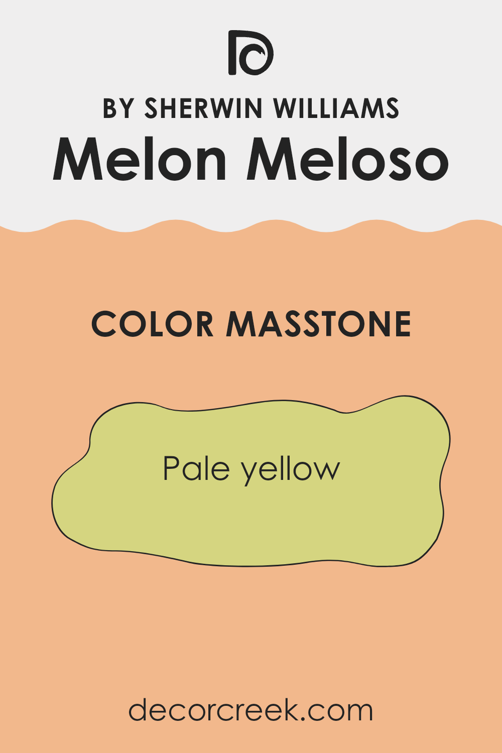
Melon Meloso SW 9007 has a pale yellow masstone that resembles a light, creamy yellow, perfect for creating a cozy and welcoming atmosphere in homes. It is an excellent choice for rooms that could benefit from a soft and light ambiance without being too strong with intense color. The gentle hue can make smaller rooms feel bigger and brighter by reflecting natural light, which helps open up the room.
This shade works well in a variety of areas including living rooms, kitchens, and bedrooms. In living rooms, it pairs nicely with both dark and light furniture, offering balance to various decor styles. Kitchens painted in this pale yellow can feel warmer and more inviting, which enhances the room’s role as a gathering place for family and friends.
In bedrooms, the color adds a subtle touch of warmth, contributing to a relaxing environment conducive to rest. Pale yellow can also be ideal for a child’s room, providing a cheerful backdrop that is both playful and soothing.
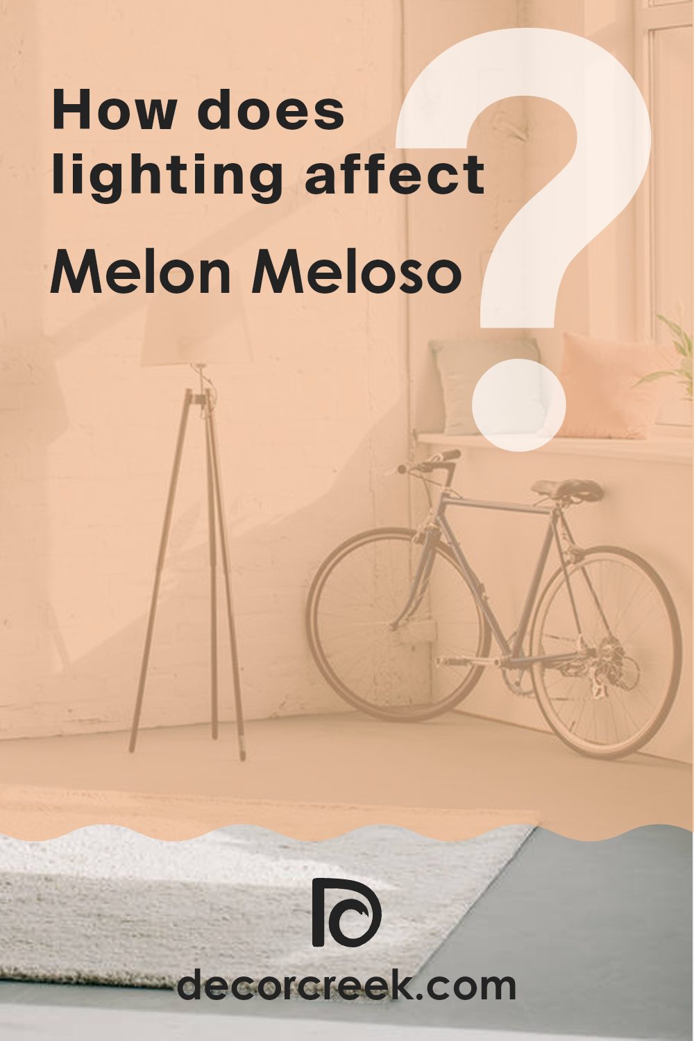
How Does Lighting Affect Melon Meloso SW 9007 by Sherwin Williams?
Lighting plays a crucial role in how we perceive colors in our environment. The same color can appear differently depending on the type of light it’s under—whether it’s natural sunlight or artificial lighting. For example, Melon Meloso, a specific paint color, can look different under various lighting conditions.
In natural light, colors tend to show their truest form. For the color Melon Meloso, which has a warm, peachy tone, natural sunlight enhances its brightness and warmth, making it feel more lively and inviting. This effect is particularly noticeable during the early morning and late afternoon when the sunlight is soft and warm.
Artificial lighting, which includes LED and fluorescent lights, impacts how we see colors indoors. Under cool, fluorescent lighting, Melon Meloso might lose some of its warmth, appearing slightly muted and less vibrant. In contrast, under warm LED lights, this color will appear closer to how it looks in natural light, maintaining its inviting peachy tone.
The orientation of a room also affects how Melon Meloso appears throughout the day:
- North-facing rooms: These rooms receive less direct sunlight and can make colors appear cooler. Here, Melon Meloso might seem a bit subdued and less intense.
- South-facing rooms: These get ample sunlight throughout the day, making colors like Melon Meloso look brighter and more vivid. This is ideal for showcasing the warm, vibrant nature of the color.
- East-facing rooms: These rooms get plenty of light in the morning. Melon Meloso will appear brightest in the morning, providing a cheerful, warm start to the day but may appear less vibrant as the day progresses.
- West-facing rooms: Lighting is warmer in the evening, so Melon Meloso will look most lively and inviting in the afternoon and evening in these rooms.
Understanding how lighting affects colors helps in choosing the right paint color for your room that maintains its beauty under different lighting conditions throughout the day.
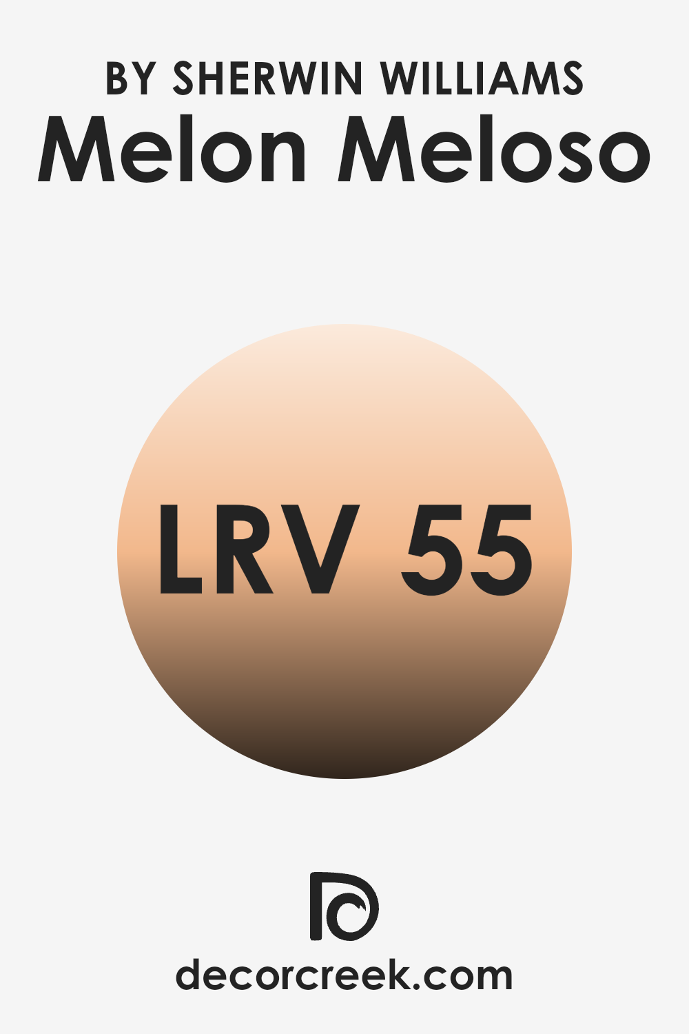
What is the LRV of Melon Meloso SW 9007 by Sherwin Williams?
LRV stands for Light Reflectance Value, a measure that indicates how much light a paint color reflects or absorbs when light hits it. The LRV scale ranges from zero, where no light is reflected and all is absorbed (making the surface appear very dark), to a high value close to the top of the scale, where most of the light is reflected making the surface look lighter.
This measurement is useful when deciding on paint colors because it helps predict how bright or dark a color will make a room feel. Higher LRV colors can make small rooms feel more open and airy, while lower LRV colors might give a cozy or closed-in feel.
For a color like Melon Meloso, with an LRV of around 55, it’s in the middle range, meaning it neither reflects nor absorbs light excessively. This makes it an adaptable color that won’t dramatically alter the perception of a room, offering a nice balance between a light and dark shade.
In rooms with moderate to abundant lighting, Melon Meloso will feel moderately bright and lively. In less well-lit rooms, it could appear slightly more subdued. This characteristic makes it suitable for various rooms and settings, adapting well to different lighting conditions without overshadowing other design elements.
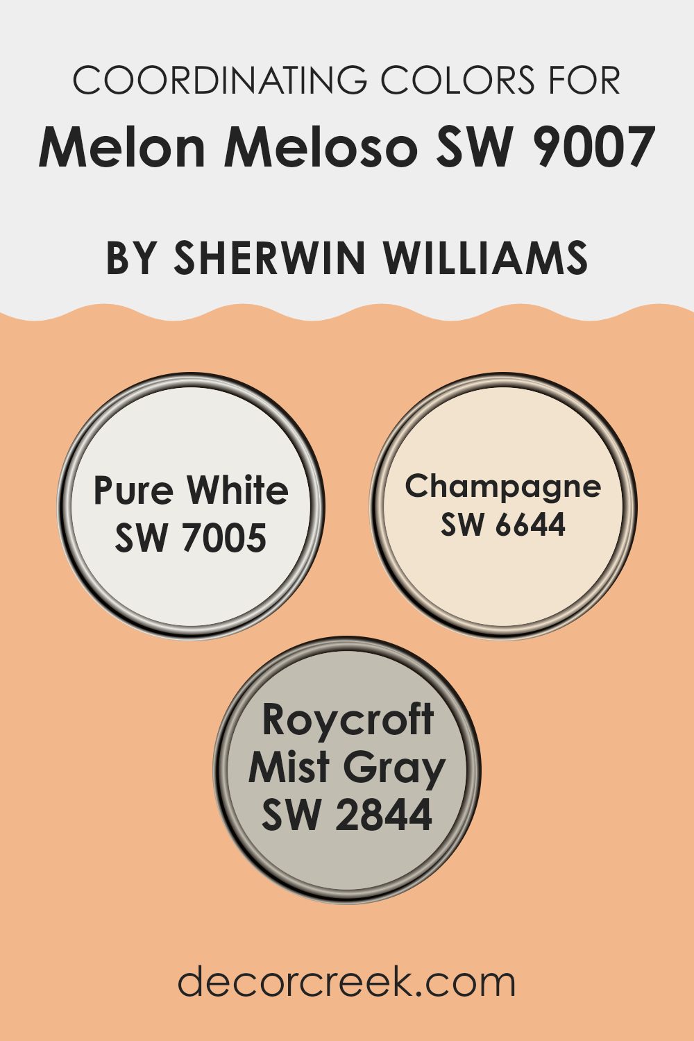
Coordinating Colors of Melon Meloso SW 9007 by Sherwin Williams
Coordinating colors are shades that complement each other well when used together in home decor or design projects. They are selected to create a harmonious color scheme that balances visual appeal and adds aesthetic depth to any room.
This is done by choosing colors that can either contrast or blend smoothly with the main hue you are working with. For instance, if the main color is a warm shade like a soft peach, coordinating colors might include neutrals or other warm tones that help accentuate its warmth without being too strong.
For Melon Meloso by Sherwin Williams, some ideal coordinating colors include Pure White, Champagne, and Roycroft Mist Gray. Pure White is a clean and clear shade that offers a crisp contrast to richer, darker colors, making it an excellent choice for trim or ceilings to provide a fresh, airy feel.
Champagne is a light, muted yellow that offers a gentle complement to warmer tones, lending a subtle richness to the overall palette. Lastly, Roycroft Mist Gray provides a soft, neutral backdrop that works well with both light and vibrant colors, ensuring that the main color stands out while also tying the look together smoothly. This combination helps in achieving a balanced and appealing look in any room.
You can see recommended paint colors below:
- SW 7005 Pure White
- SW 6644 Champagne
- SW 2844 Roycroft Mist Gray
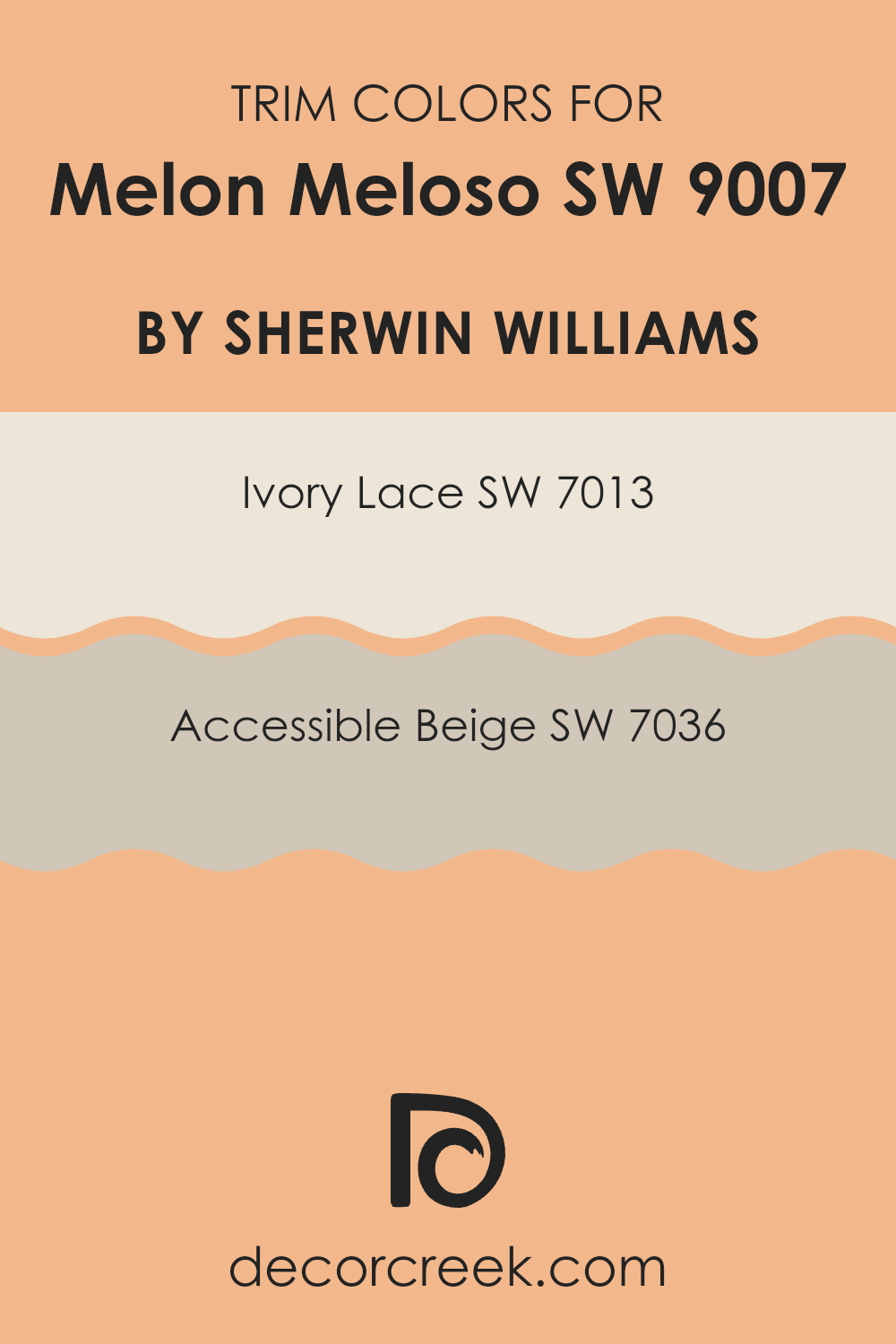
What are the Trim colors of Melon Meloso SW 9007 by Sherwin Williams?
Trim colors are specific shades used to paint the architectural details of a room, such as baseboards, moldings, door frames, and window trims, to create contrast and define rooms distinctly. When paired with a primary wall color like Melon Meloso SW 9007 by Sherwin Williams, trim colors can both complement and enhance the overall aesthetic of a room.
Opting for shades such as SW 7013 – Ivory Lace or SW 7036 – Accessible Beige as trim colors can add a subtle yet noticeable definition that frames the vibrant Melon Meloso without being too strong. Ivory Lace SW 7013 is a light, creamy hue that offers a gentle contrast, highlighting the brighter tones in Melon Meloso, adding a touch of lightness to the room.
Accessible Beige SW 7036, on the other hand, is a warm beige that provides a soft, neutral background, ensuring that the trim subtly supports the room’s color scheme without clashing. These colors are chosen to complement the main shade gently, structuring the room and enhancing its overall appeal while keeping the feel balanced and pleasant.
You can see recommended paint colors below:
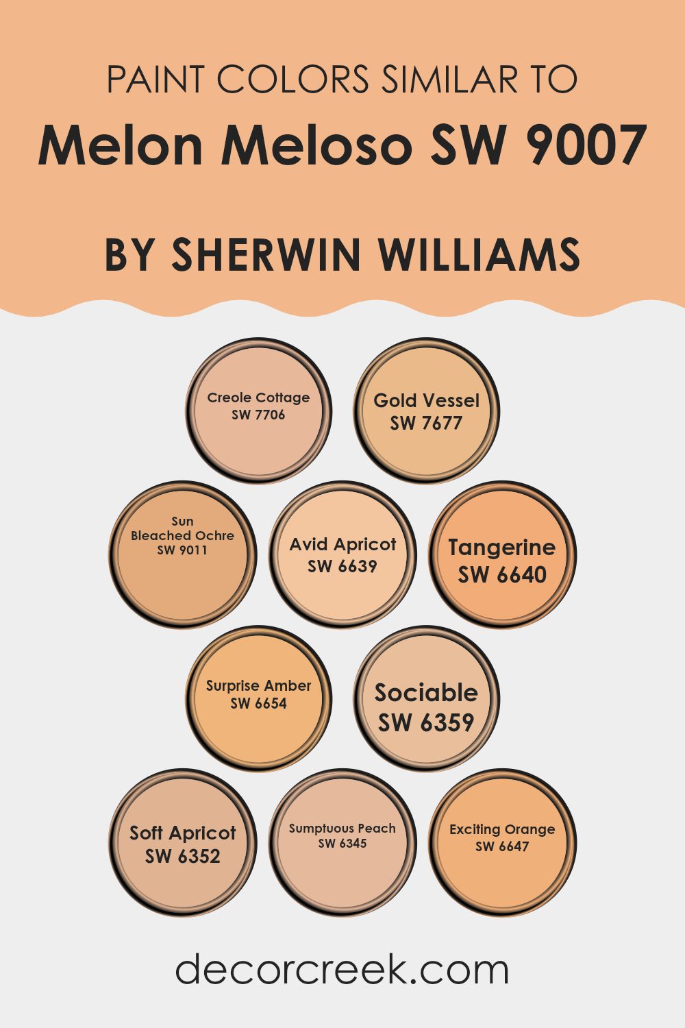
Colors Similar to Melon Meloso SW 9007 by Sherwin Williams
Using similar colors in a design scheme creates a harmonious and aesthetically pleasing environment, offering a subtle variation that keeps the room interesting yet cohesive. Colors close to Melon Meloso by Sherwin Williams are excellent for achieving this effect as they belong to a warm and welcoming palette that ranges from soft peaches to vibrant oranges.
Creole Cottage is a muted peach that adds a touch of warmth to any room, giving it a cozy and inviting atmosphere. Gold Vessel has a deeper, golden hue that brings a rich and comforting vibe, perfect for rooms where you want to feel relaxed and at ease.
Sun Bleached Ochre offers a dusty orange shade, reminiscent of a sunset, ideal for adding a soft, nostalgic touch. Avid Apricot and Soft Apricot sit beautifully in rooms, with Avid Apricot providing a more vivid splash of color, and Soft Apricot bringing in a lighter, more understated feel.
Tangerine and Exciting Orange are brighter and more energetic, great for injecting a dose of cheerfulness into any setting. Surprise Amber has a subtle amber glow that works well to warm the room without being too strong with color.
Sociable is a friendly, vibrant shade that makes a statement without overpowering, while Sumptuous Peach offers a gentle, soothing presence in rooms, perfect for creating a relaxed, comfortable environment. Together, these colors create a cohesive palette that can liven up an interior while maintaining a unified look.
You can see recommended paint colors below:
- SW 7706 Creole Cottage
- SW 7677 Gold Vessel
- SW 9011 Sun Bleached Ochre
- SW 6639 Avid Apricot
- SW 6640 Tangerine
- SW 6654 Surprise Amber
- SW 6359 Sociable
- SW 6352 Soft Apricot
- SW 6345 Sumptuous Peach
- SW 6647 Exciting Orange
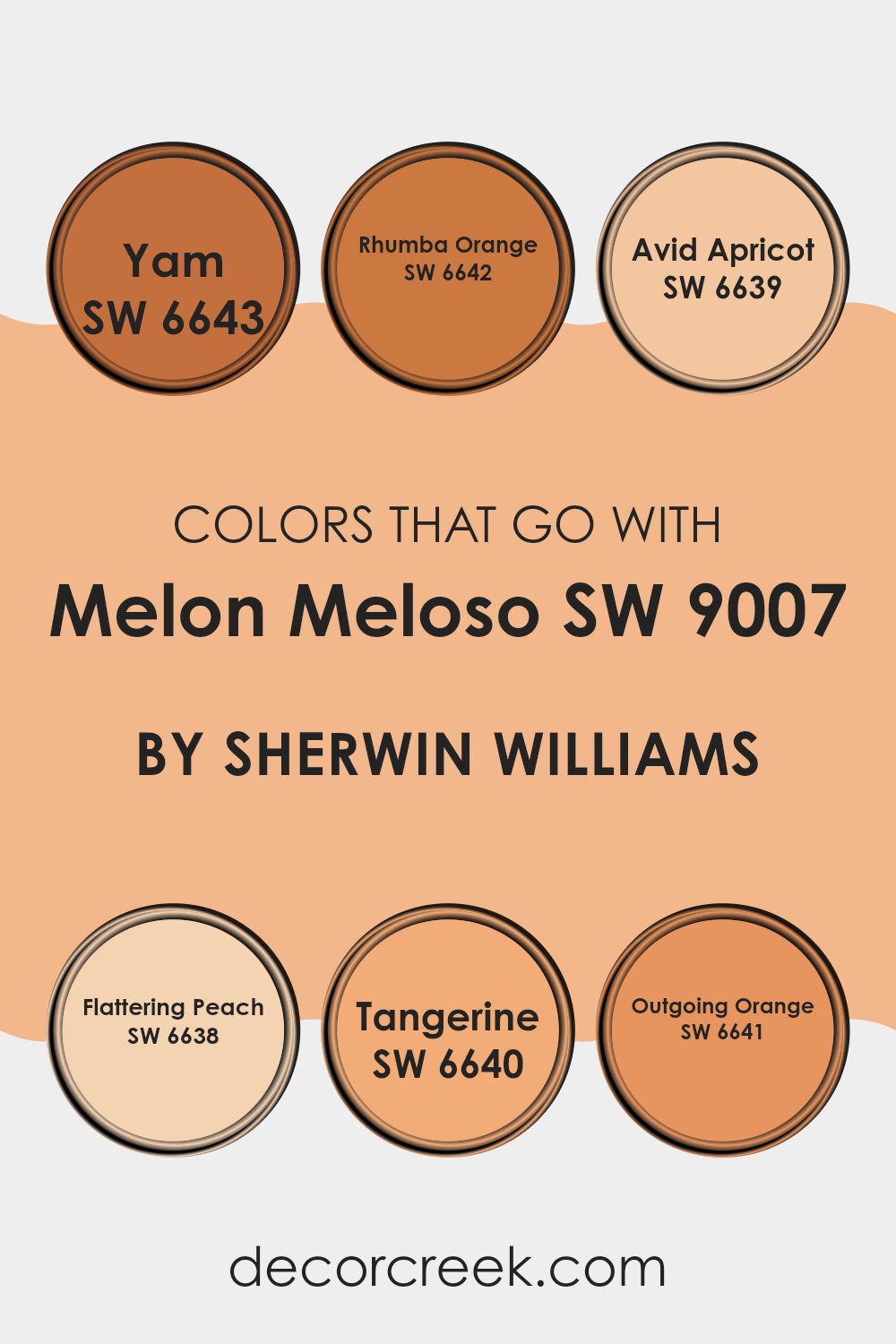
Colors that Go With Melon Meloso SW 9007 by Sherwin Williams
Choosing the right colors to complement Melon Meloso SW 9007 by Sherwin Williams is crucial for creating a harmonious and appealing environment. When colors such as SW 6643 – Yam, SW 6642 – Rhumba Orange, and others pair well, they enhance the overall aesthetic and set the desired mood in a room.
For instance, Yam is a deep, rich orange that brings a sense of warmth and coziness to rooms, perfect for areas that aim to be inviting and comfortable. Rhumba Orange, on the other hand, is a vibrant, lively shade that injects energy and vivacity, ideal for places where you want to add a splash of enthusiasm.
Further, Avid Apricot offers a softer, gentler orange that works well in creating a soothing yet cheerful atmosphere, making it great for bedrooms or sitting areas. Flattering Peach has a subtle pinkish-orange tone that provides a soft, flattering glow, enhancing natural light in a room. Tangerine is an assertive, bold orange that really makes a statement, suited for a focal wall or accents in high-energy rooms.
Lastly, Outgoing Orange is very dynamic and friendly, perfect for fostering a social atmosphere in places like living rooms or dining areas. Each of these colors supports and complements Melon Meloso in a way that can cater to different tastes and design objectives, enabling a personalized yet aesthetically pleasing color scheme.
You can see recommended paint colors below:
- SW 6643 Yam
- SW 6642 Rhumba Orange
- SW 6639 Avid Apricot
- SW 6638 Flattering Peach
- SW 6640 Tangerine
- SW 6641 Outgoing Orange
How to Use Melon Meloso SW 9007 by Sherwin Williams In Your Home?
Melon Meloso SW 9007 by Sherwin Williams is a warm, inviting paint color that adds a cozy touch to any room. This particular shade is a soft, peachy tone that can really brighten up rooms and make them feel more welcoming. It’s an excellent choice for living areas, kitchens, or even bedrooms where you want a gentle splash of color without being too strong.
You can use Melon Meloso in several ways. For a subtle effect, consider painting one accent wall with this color and keeping the others in a neutral tone. This creates a nice focal point without making the room look too busy. If you’re feeling more adventurous, you might paint the entire room with it, which can warm up the room especially well in areas that get lots of natural light.
Additionally, pairing Melon Meloso with complementary colors like soft greens, light blues, or creamy whites can enhance its warmth and create a friendly, inviting atmosphere. Perfect for anyone looking to add a touch of coziness to their home.
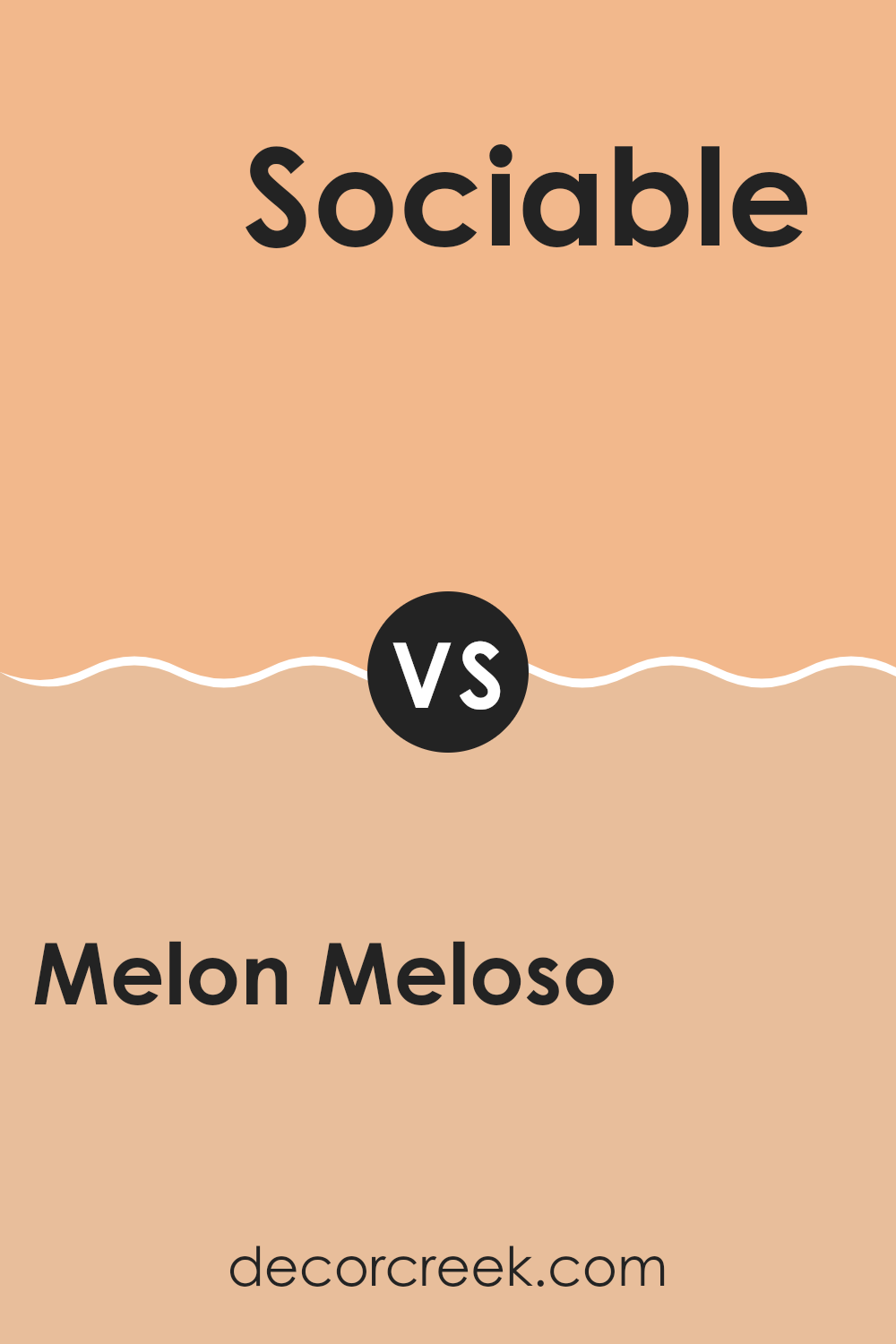
Melon Meloso SW 9007 by Sherwin Williams vs Sociable SW 6359 by Sherwin Williams
Melon Meloso and Sociable, both by Sherwin Williams, offer distinct vibes for any room due to their unique tones. Melon Meloso is a gentle and soft peach hue that brings a warm, calming sensation to a room, making it feel welcoming and cozy. It’s ideal for creating a relaxing environment in living areas or bedrooms.
On the other hand, Sociable is a bold, vivid coral color that stands out more and adds a cheerful and energetic touch to any room. This color is perfect for rooms like kitchens or dining areas where you want to create a lively atmosphere that encourages interaction and enjoyment.
When choosing between these two, think about the mood you want to set. Melon Meloso works well for a softer and more subdued look, while Sociable is great if you’re aiming for a brighter, more dynamic feel. Both colors offer a fresh and modern appeal, but their impacts on the ambiance of a room are quite different.
You can see recommended paint color below:
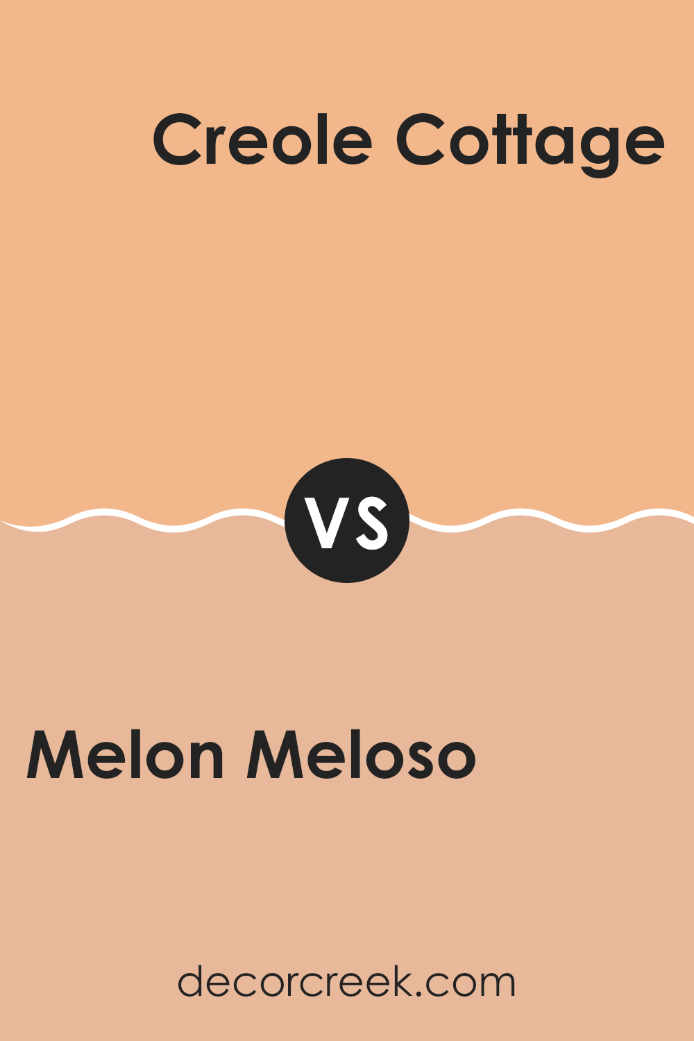
Melon Meloso SW 9007 by Sherwin Williams vs Creole Cottage SW 7706 by Sherwin Williams
Melon Meloso by Sherwin-Williams is a soft, creamy orange that brings a warm, inviting feeling to any room. It’s light enough to make a room feel airy yet has enough depth to add a cozy touch. This color works well in rooms that could use a gentle pop of color without being too strong.
On the other hand, Creole Cottage is a darker, earthy green. It’s a color that reminds you of nature and has a grounding effect, ideal for creating a comforting and cozy atmosphere. It’s perfect for rooms that you want to feel calm and collected, providing a solid backdrop that complements natural materials like wood or stone.
Together, Melon Meloso and Creole Cottage offer a harmonious balance if you’re looking to combine colors. The joyful warmth of Melon Meloso contrasts nicely with the soothing, nature-inspired Creole Cottage, making them a great pair for an energetic, yet grounded interior design scheme.
You can see recommended paint color below:
- SW 7706 Creole Cottage
Melon Meloso SW 9007 by Sherwin Williams vs Exciting Orange SW 6647 by Sherwin Williams
Melon Meloso and Exciting Orange, both by Sherwin Williams, are vivid and energetic colors, but they display distinctly different vibes. Melon Meloso is a softer, creamy orange that gives off a gentle, welcoming feel, making it great for creating a cozy and warm atmosphere in a room. It’s less intense and has a hint of peachiness which softens its overall appearance.
On the other hand, Exciting Orange is a bolder, more vibrant shade. It’s a true orange that packs a punch and stands out more dramatically. This color is perfect for rooms where you want to make a statement or add a burst of energy.
In terms of use, Melon Meloso works well in areas where calmness is desired, like bedrooms or living rooms, while Exciting Orange is ideal for more active rooms or as an accent wall to bring life to neutral surroundings. Overall, your choice between these two would depend on the kind of mood and impact you want to achieve in your room.
You can see recommended paint color below:
- SW 6647 Exciting Orange
Melon Meloso SW 9007 by Sherwin Williams vs Avid Apricot SW 6639 by Sherwin Williams
Melon Meloso and Avid Apricot, both by Sherwin Williams, are warm, inviting colors, each with a distinct character. Melon Meloso is a soft, muted peach that offers a gentle, soothing presence on walls, creating a cozy, laid-back vibe. It’s not too bright, making it easy to incorporate into various rooms without being too strong.
In contrast, Avid Apricot has a slightly more vibrant tone, resembling the cheerful, lively hue of an apricot. This color is bolder and more energetic, perfect for rooms where a more dynamic and cheerful atmosphere is desired. It can energize a room and works well in areas meant for activity and enjoyment.
Both colors work well in a home setting, but the choice between them would depend on the mood you want to create. Melon Meloso suits relaxed, quiet rooms, while Avid Apricot is great for areas that benefit from a pop of warmth and energy.
You can see recommended paint color below:
- SW 6639 Avid Apricot
Melon Meloso SW 9007 by Sherwin Williams vs Gold Vessel SW 7677 by Sherwin Williams
Melon Meloso is a soft, peachy color that gives off a warm and inviting vibe. It’s light and airy, making it perfect for creating a cozy and comfortable room. It works well in areas like living rooms or bedrooms, where you want to promote a relaxed atmosphere.
On the other hand, Gold Vessel is a deeper, more golden hue. This color brings a richer and somewhat more traditional feel to a room. It could be great for adding a touch of warmth to rooms that feel too big or too impersonal, making them feel more grounded.
Together, the lightness of Melon Meloso balances the depth of Gold Vessel, providing a wonderful contrast if used together. Each has its unique charm: Melon Meloso being breezy and light, while Gold Vessel is warm and inviting. Either color works well depending on the feeling you want to achieve in your room.
You can see recommended paint color below:

Melon Meloso SW 9007 by Sherwin Williams vs Surprise Amber SW 6654 by Sherwin Williams
Melon Meloso and Surprise Amber are two warm and inviting paint colors from Sherwin Williams. Melon Meloso is a soft, muted peach shade that brings a gentle, calming effect to any room. It has a subtle pink undertone that makes it feel cozy and comforting. This color works great in living areas and bedrooms where a light and airy mood is desired.
On the other hand, Surprise Amber is a vibrant, golden orange. It’s much bolder and can add a splash of energy and cheer to a room. This color is perfect for areas where you want to make a statement or stir up excitement, such as a dining area or kitchen.
These two shades differ mainly in their intensity and the vibes they set. Melon Meloso is more laid-back and soothing, while Surprise Amber is lively and dynamic. Both colors can warm up a room, but the way they affect the mood is distinctly different.
You can see recommended paint color below:
- SW 6654 Surprise Amber
Melon Meloso SW 9007 by Sherwin Williams vs Sun Bleached Ochre SW 9011 by Sherwin Williams
Melon Meloso and Sun Bleached Ochre, both by Sherwin Williams, display warm characteristics but differ in their overall vibe and color richness. Melon Meloso is a soft, creamier shade, resembling a lighter, more pastel cantaloupe. It gives off a gentle and inviting feel, making it an excellent choice for a room where comfort and lightness are desired.
On the other hand, Sun Bleached Ochre presents a bolder approach with its earthier, more golden-yellow hue. This color is vibrant and can add a lot of personality to a room, offering a sunny, cheerful backdrop that can make rooms feel more lively and warm.
If you’re deciding which one to use, consider the room’s purpose and the atmosphere you want to create. Melon Meloso works well in bedrooms or living rooms where a softer touch is beneficial, while Sun Bleached Ochre could be perfect for a kitchen or dining area where a more dynamic and energizing color is welcome.
You can see recommended paint color below:
- SW 9011 Sun Bleached Ochre
Melon Meloso SW 9007 by Sherwin Williams vs Soft Apricot SW 6352 by Sherwin Williams
Melon Meloso and Soft Apricot are two warm, inviting shades from Sherwin Williams that offer subtle differences in mood and tone for interior rooms. Melon Meloso is a gentle pink, soft and light, providing a fresh and airy feel to any room.
It’s perfect for creating a relaxing atmosphere with a touch of sweetness. In contrast, Soft Apricot leans more towards a peachy orange, radiating a slightly more energetic vibe. This color is great for rooms where you want to add a bit of warmth and cheer without being too strong.
Both colors work well in rooms that get plenty of natural light, enhancing their beauty and making the room feel open and welcoming. While Melon Meloso tends to pull more towards a subtle pink, making it ideal for softer, more reflective rooms, Soft Apricot offers a punchier presence that can perk up an area. Each color has its unique appeal, depending on the room’s purpose and the desired ambiance.
You can see recommended paint color below:
Melon Meloso SW 9007 by Sherwin Williams vs Tangerine SW 6640 by Sherwin Williams
Melon Meloso and Tangerine are both vibrant and cheerful colors from Sherwin Williams, but they bring different vibes to a room. Melon Meloso is a soft, muted coral shade that gives off a gentle, calming feel. It’s light and airy, making it perfect for creating a soothing environment.
On the other hand, Tangerine is a bold, bright orange color that is much more energetic and lively. It’s the kind of color that can really make a statement and add a pop of enthusiasm to a room.
While Melon Meloso might be better suited for a bedroom or bathroom where you want to relax, Tangerine could be great for a kitchen, dining area, or any place you want to feel more dynamic and active. Both colors can bring warmth to a room, but they do so in distinctly different ways.
You can see recommended paint color below:
Melon Meloso SW 9007 by Sherwin Williams vs Sumptuous Peach SW 6345 by Sherwin Williams
Melon Meloso and Sumptuous Peach, both by Sherwin Williams, offer subtle yet distinct tones that can brighten up any room. Melon Meloso is a soft, muted orange that has a hint of pink, giving it a gentle and warm feel. This color is perfect for those looking to add a light, welcoming touch to their rooms without being too strong with brightness.
On the other hand, Sumptuous Peach leans more towards a bold peach shade with a strong presence of orange. It’s a richer color compared to Melon Meloso, offering more warmth and vibrancy. This makes it ideal for rooms where you want to introduce a lively yet cozy atmosphere.
Both colors share a warm base, but while Melon Meloso is subtler and softer, Sumptuous Peach stands out with its vividness. Depending on your decor goals, either could be a great choice; the former for a lighter touch, and the latter for a more pronounced, cheerful impact.
You can see recommended paint color below:
- SW 6345 Sumptuous Peach
After reading about SW 9007 Melon Meloso by Sherwin Williams, I’ve learned a lot about this unique paint color. Melon Meloso isn’t just any color; it’s a warm, cheerful hue that looks a bit like a gentle orange mixed with a soft peach. This color brings a friendly and bright touch to any room, making it feel welcoming and cozy.
What’s cool about this color is how it can change the mood of a room. In a bedroom, it can make the room feel cheerful when you wake up. In a living room, it’s like the sun is always shining, even on rainy days. If someone wants their home to feel happy and warm, this color is a great choice!
Also, it’s not a loud or bright orange; instead, it’s soft and has a calming effect. This makes it unique because it can work well in many different rooms without being too bold. And, since it’s made by Sherwin Williams, you know it’s good quality paint that will last a long time.
All in all, Melon Meloso is much more than just a paint color. It can really make a house feel like a home, adding a bit of sunshine to any room. It’s definitely a color I would consider if I were to paint my room or suggest to friends when they want to add a little warmth to their homes.

decorcreek.com
Ever wished paint sampling was as easy as sticking a sticker? Guess what? Now it is! Discover Samplize's unique Peel & Stick samples.
Get paint samples

