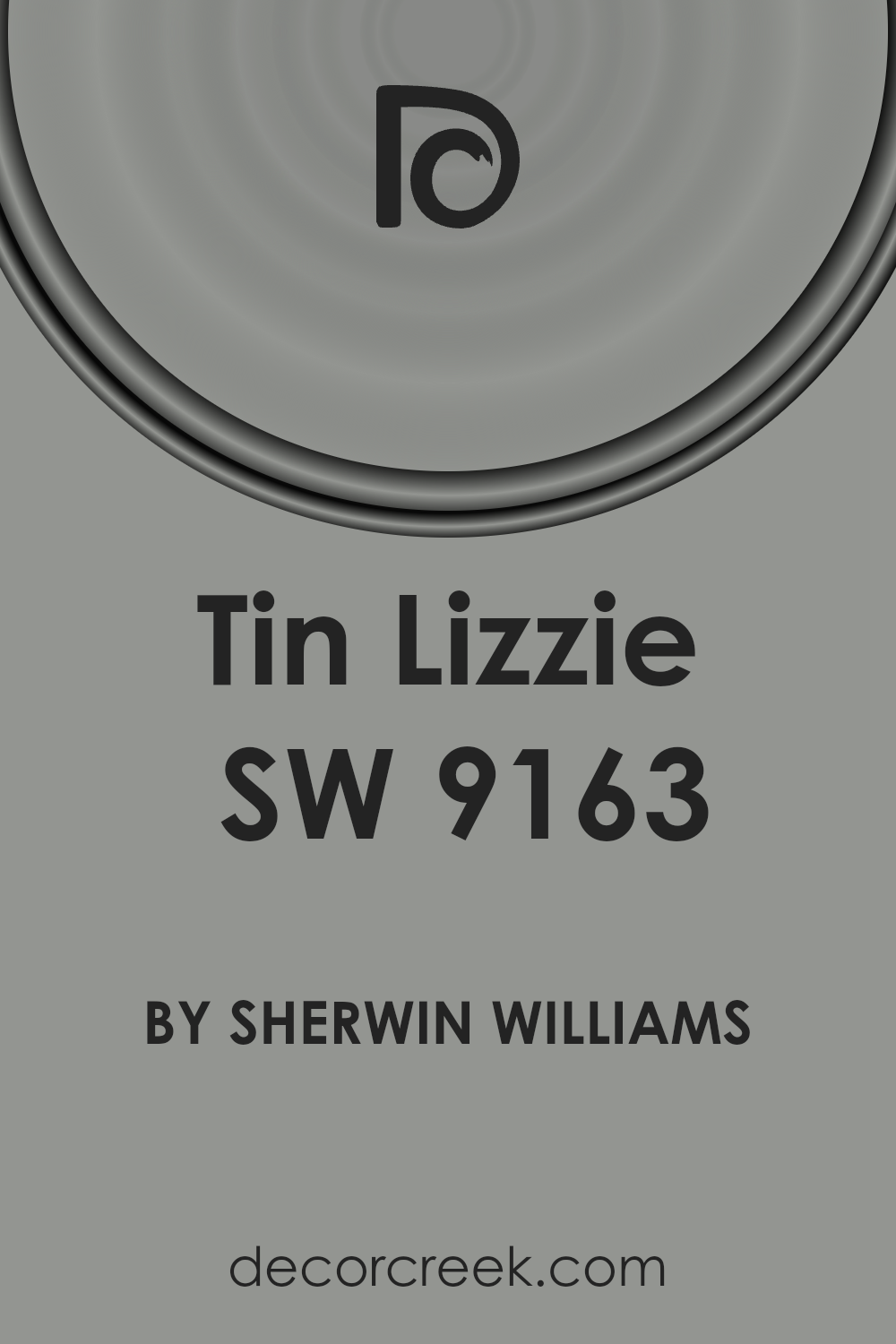
The allure of a timeless aesthetic in interior design is encapsulated perfectly in Sherwin-Williams’ SW 9163 Tin Lizzie. This unique shade serves as a bridge between the contemporary and the classic, providing a sophisticated backdrop that can elevate any space.
With its subtle gray tones, Tin Lizzie captures the essence of understated elegance, making it a versatile option for homeowners and designers alike.
Its adaptability allows it to seamlessly complement a wide range of decor styles, from modern minimalism to rustic charm, highlighting its strength as a neutral palette foundation.
Selecting the right paint color is crucial in defining the atmosphere and mood of a room. SW 9163 Tin Lizzie has emerged as a favorite for its ability to enhance the natural light in a space, creating a soft, inviting ambiance.
Its depth adds character and dimension to walls without overwhelming the senses, making it an ideal choice for creating serene bedrooms, sophisticated living areas, and everything in between.
Whether you’re embarking on a major renovation or simply updating a room, Tin Lizzie by Sherwin-Williams offers a timeless solution that transcends fleeting design trends, ensuring a lasting appeal for years to come.

What Color Is Tin Lizzie SW 9163 by Sherwin Williams
Tin Lizzie, a nuanced shade that manages to capture both the depth and subtlety of nature’s elements, presents a fascinating choice for interiors. Embodying a delicate balance between a cool grey and a warm taupe, this hue adds a sophisticated and versatile backdrop to any space.
It reflects a serene, almost ethereal quality that can seamlessly adapt to various lighting conditions, showcasing a chameleon-like ability to shift from a grounding presence in well-lit areas to a cozy embrace in dimmer settings.
This color’s understated elegance makes it a perfect fit for modern minimalism, where its ability to act as a neutral yet impactful backdrop can be utilized to create spaces that feel both open and inviting.
It also compliments Scandinavian designs, where the focus on light, natural elements, and simplicity can be enhanced by its subtle warmth and understated depth.
Furthermore, Tin Lizzie finds a harmonious place in industrial interiors, pairing exceptionally well with rustic metals, exposed bricks, and raw, unfinished wood to amplify the aesthetic’s authenticity and tactile appeal.
When it comes to materials and textures, Tin Lizzie pairs exquisitely with natural wood grains, from pale birches to deeper walnuts, highlighting their natural beauty without overpowering them. In spaces with metallic accents, such as copper or brass, it provides a cool contrast that brings out their warm tones.
Rich textiles like velvet or linen in complementary colors can add layers of interest and depth, making the space feel inviting and well-curated.
Its versatility and nuanced depth ensure that Tin Lizzie is a color capable of bringing sophisticated warmth and grounded elegance to a variety of interior styles.
Ever wished paint sampling was as easy as sticking a sticker? Guess what? Now it is! Discover Samplize's unique Peel & Stick samples.
Get paint samples

Is Tin Lizzie SW 9163 by Sherwin Williams Warm or Cool color?
Tin Lizzie by Sherwin Williams is a captivating and versatile gray shade that harmoniously balances between cool and warm tones. This particular hue possesses a certain depth that offers an elegant backdrop to any room in which it’s used.
Its adaptability means it pairs beautifully with both modern and traditional decor, allowing homeowners to utilize it in a variety of settings—from kitchens and bathrooms to living rooms and bedrooms.
The neutrality of Tin Lizzie makes it an ideal choice for those seeking a color that supports a wide range of color palettes. It works effortlessly with bold colors, serving as a grounding force that allows vibrant accessories to pop.
Conversely, when paired with softer, lighter tones, it contributes to a serene and tranquil environment, perfect for spaces aiming for a more relaxed vibe.
In homes, this color affects the sense of space and light. In well-lit areas, it can appear almost ethereal, reflecting light to make rooms look more spacious and airy. In spaces with less natural light, it brings a cozy warmth that can make even the smallest nook feel inviting.
This duality is what makes Tin Lizzie not just a color, but a transformative design element that can adapt and morph to suit the aesthetic needs and functional uses of any room in the home.
Undertones of Tin Lizzie SW 9163 by Sherwin Williams
When examining the unique characteristics of the color Tin Lizzie, it’s paramount to appreciate the significant influence exerted by its undertones. This particular hue, with its subtle complexity, brings together the freshness of mint and the soft warmth of pale pink.
The inclusion of a mint undertone lends a certain vibrancy, imbuing spaces with a sense of rejuvenation and airy lightness. It’s this refreshing quality that can make a room feel more open and invigorated. Conversely, the pale pink undertone introduces a gentle warmth and a nuanced depth, promoting an atmosphere of comfort and serenity.
Undertones play a crucial role in the way a color manifests within a space, affecting not just the hue itself but also the mood and perception of the room. They act as subtle influencers, shifting the character of the color under different lighting conditions.
This is why an understanding of these underlying tones is essential when selecting paint.
In the context of interior walls, the combined effect of these undertones means that Tin Lizzie can offer a versatile backdrop that is both calming and uplifting. During the day, as natural light shifts, the walls may lean towards a cool freshness or a warm embrace, adapting seamlessly to the evolving ambience.
This duality ensures that spaces painted in this shade remain dynamic yet cohesive, a testament to the complex interplay of its undertones.
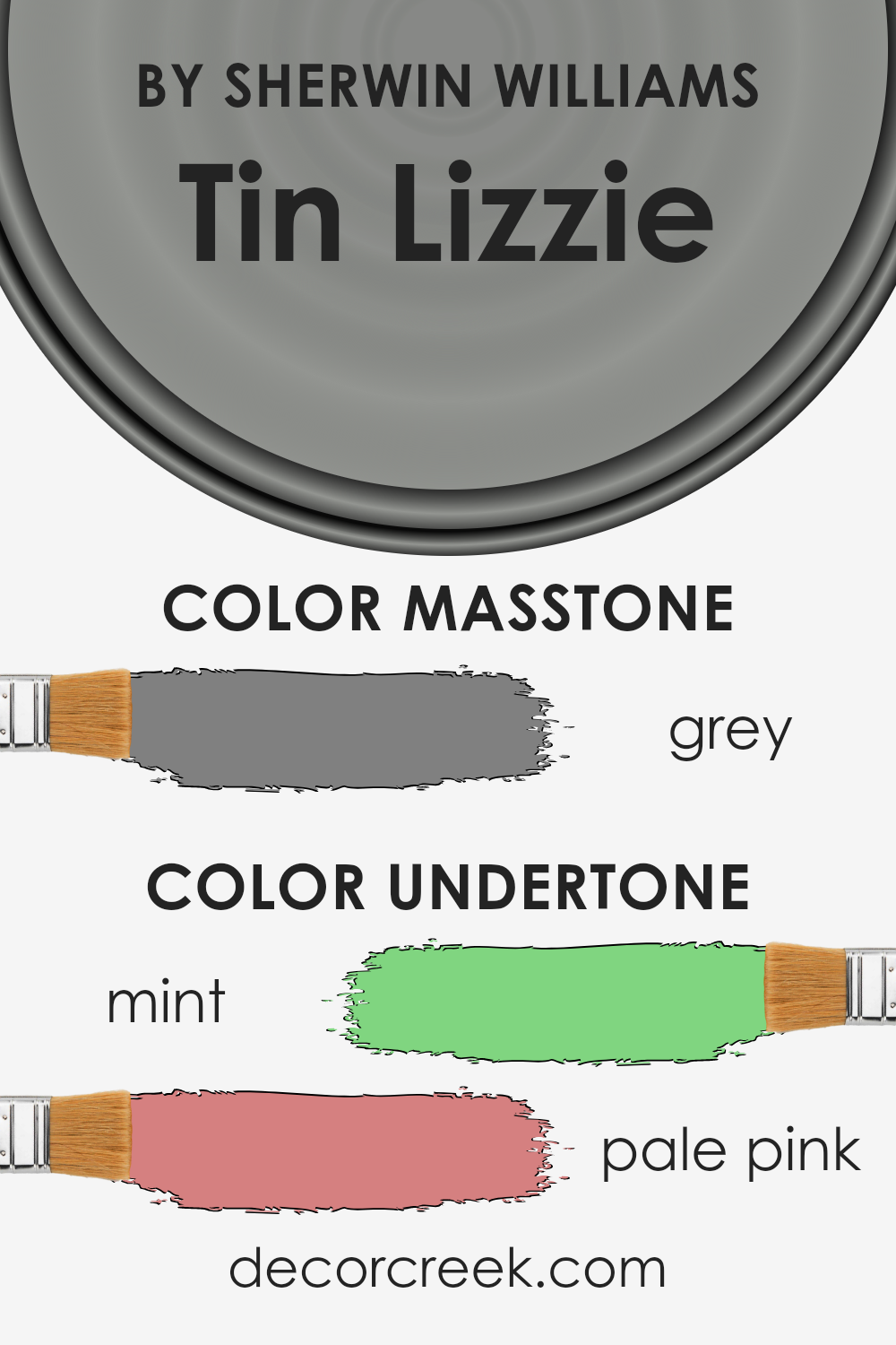
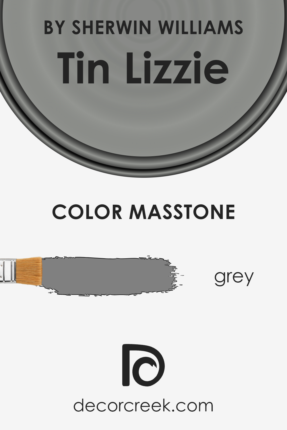
What is the Masstone of the Tin Lizzie SW 9163 by Sherwin Williams?
Tin Lizzie, a sophisticated shade poised between the defining lines of charcoal and the soft embrace of mist, holds a masstone that closely resembles the classic grey (#808080). This particular grey hue brings a balance of warmth and neutrality into any space, making it a versatile choice for homes.
Its inherent neutrality means it pairs effortlessly with a wide range of color palettes, from vibrant tones to more subdued hues, allowing for flexible design options. The color embodies a timeless elegance, which can transform both traditional and contemporary spaces, adding depth and sophistication.
Moreover, the masstone of Tin Lizzie supports various lighting scenarios. In well-lit areas, it can appear lighter and more inviting, while in spaces with less natural light, it can create a cozy, enveloping atmosphere.
This adaptability makes it an excellent choice for diverse applications throughout a home, from living rooms and bedrooms to kitchens and bathrooms.
Its ability to act as both a statement color and a neutral backdrop ensures it can meet various aesthetic preferences and design needs, making Tin Lizzie a beloved choice for creating stylish and comfortable living environments.
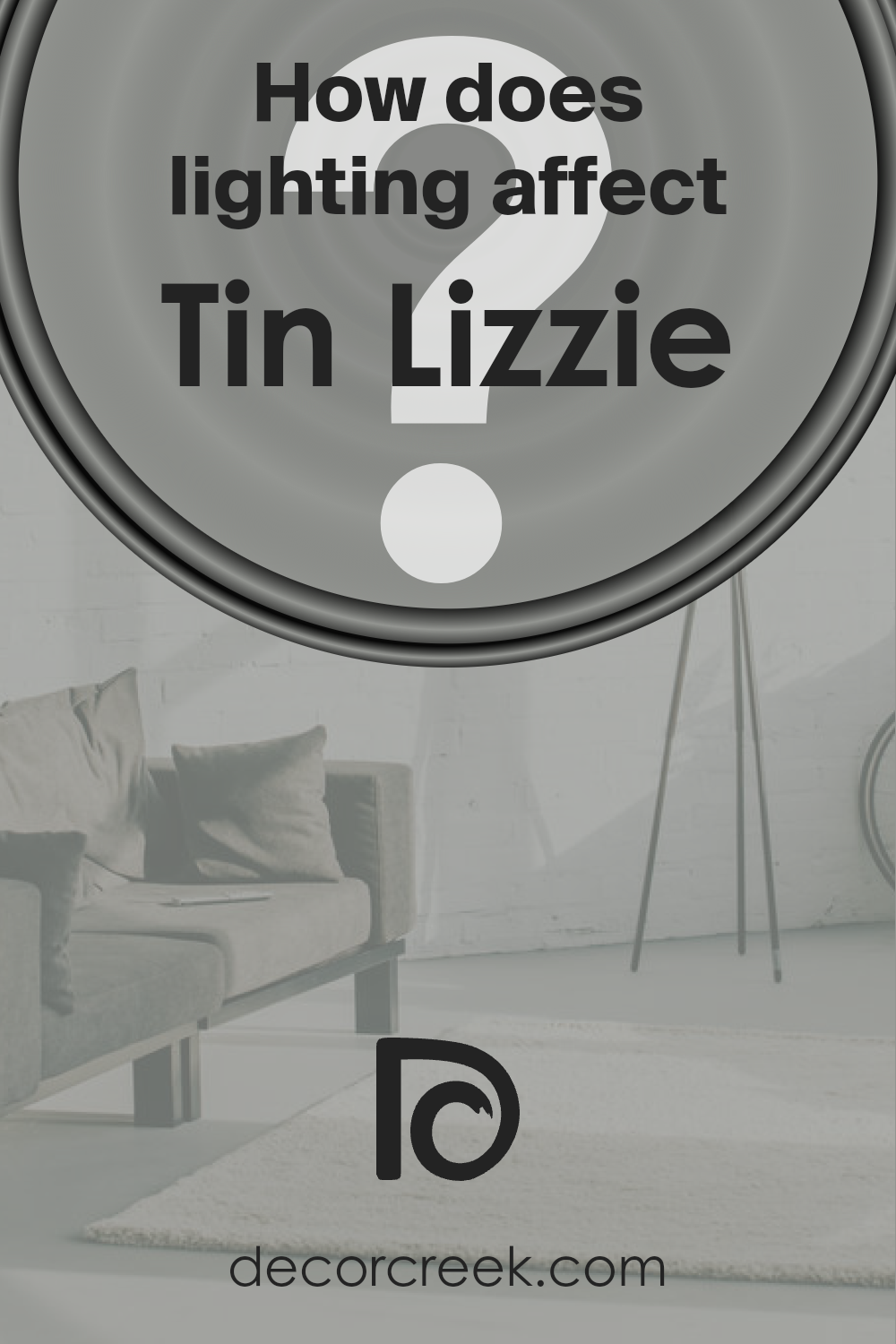
How Does Lighting Affect Tin Lizzie SW 9163 by Sherwin Williams
The interplay between lighting and color can dramatically alter the perception of hues in any space, turning the selection of paint colors into both an art and a science. Tin Lizzie, a versatile shade, exemplifies how different lighting conditions can influence the appearance of colors, showcasing their dynamic and mutable nature.
In artificial light, the characteristics of Tin Lizzie shift depending on the type of bulb used. Incandescent lighting, with its warm, yellowish hue, tends to enhance the cozy and inviting qualities of this color, making spaces feel more intimate.
Fluorescent lighting, on the other hand, casts a cooler tone, potentially drawing out the more subdued, gray aspects of the color, giving it a more modern and crisp appearance.
In natural light, the perception of this sophisticated gray shade is further influenced by the direction the room faces, each bringing its own unique quality of light. North-facing rooms receive less direct sunlight, bathing spaces in cool, diffuse light for most of the day. Here, the color can appear slightly more muted, emphasizing its cooler undertones and creating a serene, tranquil atmosphere.
South-facing rooms are awash with warm, golden light throughout the day, which can make the color appear warmer and more vibrant. This inviting quality makes it an ideal backdrop for lively living spaces and bedrooms, where a comforting and cheerful ambiance is desired.
East-facing rooms enjoy the bright, warm light of the morning sun, which can make the color look softer and more luminous in the morning, gradually transitioning to a cooler tone as the day progresses. This natural progression accentuates the color’s versatility, adapting to the changing atmosphere of the day.
West-facing rooms experience the opposite effect, with cooler morning light giving way to intense, warm light in the afternoon and evening. This can make the color shift from appearing more neutral and understated in the morning to strikingly richer and more dynamic in the later hours, perfectly suited for spaces used more frequently in the evenings.
Through the lens of Tin Lizzie, the profound impact of lighting on color perception is evident, underscoring the importance of considering both artificial and natural light sources when choosing colors for an interior.
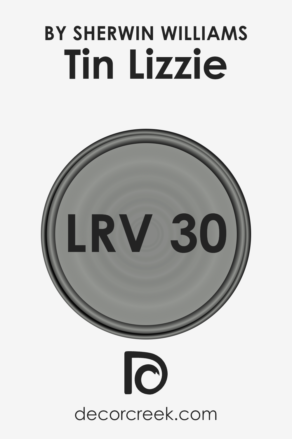
What is the LRV of Tin Lizzie SW 9163 by Sherwin Williams
Light Reflectance Value (LRV) is a measure on a scale of 0 to 100, with 0 being absolute black and 100 being pure white. This scale represents the percentage of light a particular color reflects from or absorbs into a painted surface.
LRV is critical in color selection because it influences how light or dark a color appears under various lighting conditions.
The value plays a pivotal role in creating the desired ambience in a space, affecting both the aesthetic appeal and functionality of the area. High LRV colors reflect more light, making them ideal for brightening dark rooms or creating a light, airy feel.
Conversely, low LRV colors absorb more light, which can make a bold statement or add warmth to a space but might make a small room feel smaller or darker.
With an LRV of 29.757, Tin Lizzie by Sherwin Williams sits towards the lower end of the scale, meaning it absorbs more light than it reflects. This characteristic suggests that the color will appear relatively darker and can significantly influence the mood and perception of the space it occupies.
In rooms with ample natural light, this color might present a rich, profound depth, adding character and sophistication.
However, in spaces lacking natural light, it could create a more intimate and cozy atmosphere, although it might also make the room appear smaller. The specific LRV of Tin Lizzie means it’s essential to consider the room’s size, lighting, and intended mood when deciding whether this color is the right choice for your walls.
Lighting, both natural and artificial, will play a significant role in how this color is perceived, making it versatile yet requiring thoughtful application to achieve the desired effect.
LRV – what does it mean? Read This Before Finding Your Perfect Paint Color
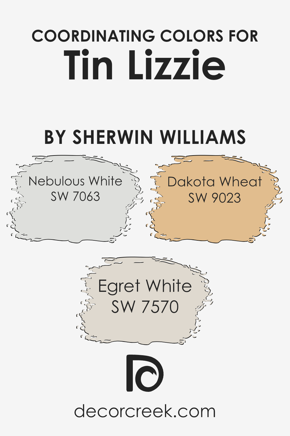
Coordinating Colors of Tin Lizzie SW 9163 by Sherwin Williams
In the realm of interior design and home decoration, coordinating colors play a vital role in creating a harmonious and appealing aesthetic. These colors are specifically chosen to enhance and complement each other, providing balance within a space without overpowering any single element.
When it comes to coordinating colors for Tin Lizzie by Sherwin Williams, a sophisticated gray shade with deep, cool undertones, particular attention is paid to selecting colors that resonate with its unique personality yet bring their own charm to the mix.
The chosen coordinating colors act as supportive companions, enriching the ambiance and adding layers of visual interest and depth to the palette.
Nebulous White, Egret White, and Dakota Wheat are exemplary choices that serve as coordinating colors for Tin Lizzie. Nebulous White offers a light, airy touch with its soft, ethereal quality, making spaces feel more open and relaxing. It’s an excellent backdrop that allows Tin Lizzie to stand out while ensuring the environment remains bright and welcoming.
Egret White steps in as a slightly warmer hue, adding a hint of coziness with its understated elegance. It bridges the gap between cool and warm tones, facilitating a seamless transition within the space. Dakota Wheat introduces a richer, earthy element with its golden undertones, grounding the palette and infusing it with warmth and character.
This color’s presence adds a natural, comforting feel, perfectly complementing the sophisticated foundation set by Tin Lizzie. Together, these coordinating colors orchestrate a cohesive look that is both versatile and captivating, embodying a sense of unity and balance throughout the space.
You can see recommended paint colors below:
- SW 7063 Nebulous White
- SW 7570 Egret White
- SW 9023 Dakota Wheat
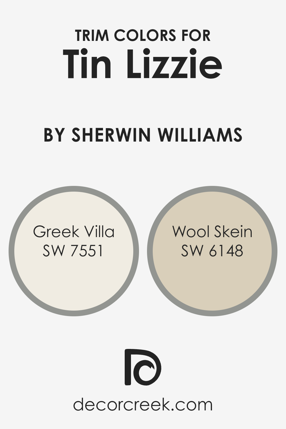
What are the Trim colors of Tin Lizzie SW 9163 by Sherwin Williams
Trim colors, especially in the context of interior design and painting, play a crucial role in enhancing the aesthetic appeal of a space. They serve as accent colors that frame and highlight the architectural features of a room, such as doors, moldings, and window frames, providing contrast and depth against the primary wall color.
For a sophisticated color like Tin Lizzie by Sherwin Williams, choosing the right trim colors becomes essential, as they complement the main hue, ensuring a harmonious and balanced look. By selecting appropriate trim colors, designers can emphasize the elegant and modern vibe of a space, while also creating a cohesive and visually appealing environment.
Greek Villa (SW 7551) and Wool Skein (SW 6148) are prime examples of trim colors that pair beautifully with a nuanced shade like Tin Lizzie. Greek Villa is a soft, off-white hue with warm undertones, offering a subtle contrast that illuminates and expands the space, making it feel more open and inviting.
It has the ability to soften the cooler tones of Tin Lizzie, resulting in an elegant and refined aesthetic.
On the other hand, Wool Skein is a versatile, warm neutral with earthy undertones, providing a natural and grounding effect when used as a trim color. Its understated elegance complements the sophistication of Tin Lizzie, ensuring an ambiance that is both cozy and stylish.
Together, these trim colors enhance the overall visual appeal, adding layers of depth and interest to the design.
You can see recommended paint colors below:
- SW 7551 Greek Villa
- SW 6148 Wool Skein
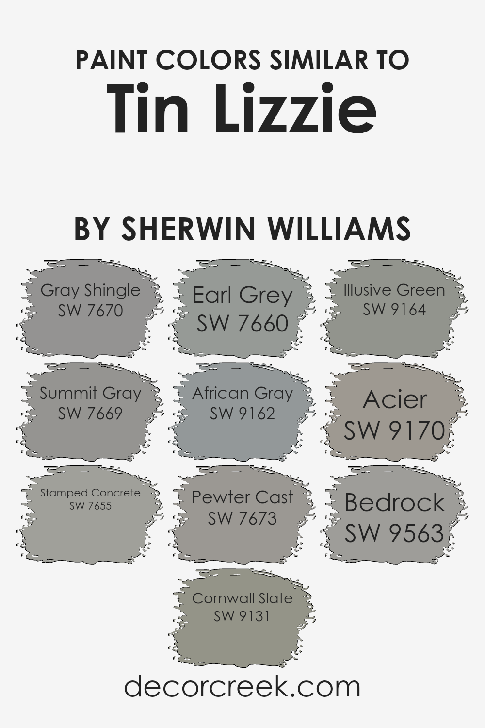
Colors Similar to Tin Lizzie SW 9163 by Sherwin Williams
Exploring a palette of similar colors, like those reminiscent of Tin Lizzie by Sherwin Williams, offers a refined and cohesive approach to design that exudes both harmony and sophistication. Such colors, represented by a range of grays and muted tones, play a pivotal role in creating a seamless visual flow in spaces.
This subtle spectrum, with variations stretching from the light whispers of Gray Shingle to the deep and contemplative hues of Bedrock, encapsulates a versatile backdrop suitable for any interior. These shades are designed to complement each other, making it effortless to mix and match, ensuring that every element in a room contributes to a unified aesthetic.
For example, Gray Shingle offers a soft, airy quality that whispers tranquility, while Summit Gray deepens the narrative with a slightly more pronounced presence, hinting at serene stability.
Stamped Concrete brings forth a sturdier, grounded feel, adding depth to the palette. In contrast, Cornwall Slate evokes the rugged beauty of natural stone, and Earl Grey warms the ensemble with its comforting, familiar tone.
African Gray, with its subtle complexity, bridges lighter and darker tones, whereas Pewter Cast introduces a stately, almost aristocratic elegance. Illusive Green stands out by incorporating a gentle, green undertone, offering a refreshing twist. Acier, sophisticated and robust, anchors the palette with its strength, while Bedrock culminates the collection with its rich, earthy essence.
Together, these colors weave a fabric of visual consistency that enhances the inherent beauty of interior spaces, allowing for a myriad of design possibilities that are both elegant and effortlessly harmonious.
You can see recommended paint colors below:
- SW 7670 Gray Shingle
- SW 7669 Summit Gray
- SW 7655 Stamped Concrete
- SW 9131 Cornwall Slate
- SW 7660 Earl Grey
- SW 9162 African Gray
- SW 7673 Pewter Cast
- SW 9164 Illusive Green
- SW 9170 Acier
- SW 9563 Bedrock
Colors that Go With Tin Lizzie SW 9163 by Sherwin Williams
Selecting colors that pair well with Tin Lizzie SW 9163 by Sherwin Williams is essential for creating harmonious and aesthetically pleasing spaces. When you’re pairing colors, you’re not just choosing shades that look good together; you’re crafting an environment that evokes certain emotions, enhances moods, and perhaps even influences thoughts.
Tin Lizzie is a versatile shade that can serve as a neutral foundation, allowing other colors to stand out or blend smoothly, depending on what you want to achieve in your space. Whether it’s for home interiors or exteriors, the impact of complementary colors is profound, affecting everything from the perceived size of a room to its warmth or coolness.
- Gray Matters SW 7066 is a lighter gray that brings a sense of calm and simplicity, making spaces feel more expansive and airy, perfect for a modern look that’s soft and inviting.
- Grizzle Gray SW 7068, on the other hand, is a deeper, more intense color that adds drama and depth, making it ideal for accent walls or furniture.
- Cityscape SW 7067 offers a balance between dark and light, providing versatility and sophistication.
- Argos SW 7065 has a touch of blue that introduces a serene, peaceful quality to rooms, suggesting the subtle beauty of a cloudy sky.
- Passive SW 7064 is another light gray with cool undertones that can make spaces appear brighter and more refreshing.
- Lastly, Peppercorn SW 7674 is a bold choice that brings a strong presence to a room, offering contrast and focal interest when used with Tin Lizzie.
Together, these colors work in harmony to create environments that are visually appealing and emotionally resonant, enhancing the design of any space.

How to Use Tin Lizzie SW 9163 by Sherwin Williams In Your Home?
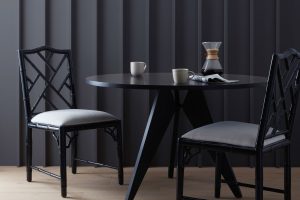
Tin Lizzie by Sherwin Williams is a captivating gray hue that brings an element of sophistication and tranquility to any space. Its versatility enables it to fit seamlessly into various areas of a home, creating an elegant backdrop that pairs well with numerous decor styles, from modern minimalist to cozy traditional.
For homeowners looking to refresh their living room, Tin Lizzie offers a serene foundation that complements both vibrant accents and understated furnishings, making the room appear more spacious and inviting.
In bedrooms, its calming effect can transform the space into a peaceful retreat, ideal for relaxation. Its neutral tone also works effectively in kitchens and bathrooms, where it can balance out the brightness of natural light and enhance the aesthetics of cabinetry and countertops.
By choosing Tin Lizzie for walls, homeowners can achieve a subtle yet impactful design update, providing rooms with a timeless elegance that’s both comforting and chic.
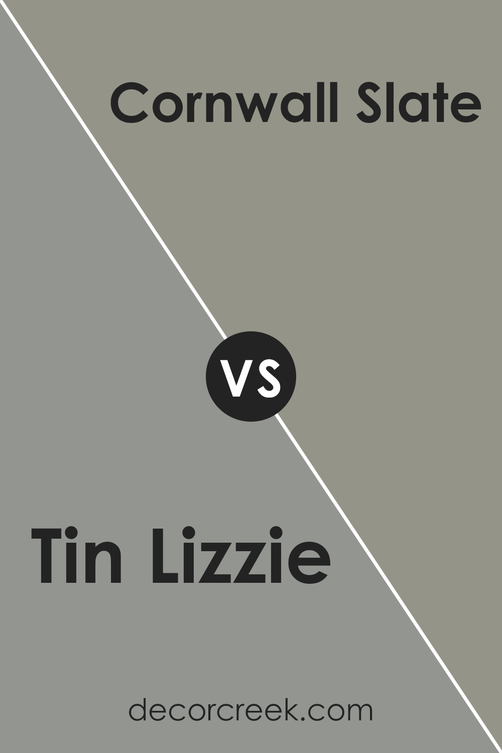
Tin Lizzie SW 9163 by Sherwin Williams vs Cornwall Slate SW 9131 by Sherwin Williams
Tin Lizzie and Cornwall Slate , both from Sherwin Williams, are distinct hues that cater to different aesthetic tastes and interior design schemes. Tin Lizzie presents itself as a serene, soft gray with subtle blue undertones, evoking a sense of calmness and sophistication.
This color is versatile, making it suitable for spaces aiming for a contemporary, sleek look while still wanting to maintain a welcoming atmosphere. It reflects light beautifully, enhancing a room’s natural brightness.
On the other hand, Cornwall Slate is a deeper, more intense color, with rich, dark gray tones that lean towards a slate appearance. This color thrives in spaces that aim to make bold statements or seek to imbue a sense of grounding and depth. It’s excellent for accent walls or rooms that can handle a dramatic flair without overwhelming the senses.
Despite its intensity, Cornwall Slate maintains an elegant character, offering a luxurious feel to any interior.
Choosing between the two depends on the desired ambiance: Tin Lizzie for a light and airy feel, and Cornwall Slate for a strong, sophisticated presence.
You can see recommended paint color below:
- SW 9131 Cornwall Slate
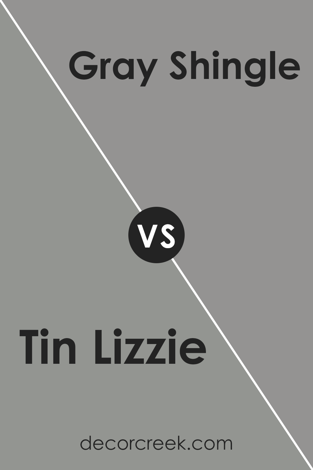
Tin Lizzie SW 9163 by Sherwin Williams vs Gray Shingle SW 7670 by Sherwin Williams
The color Tin Lizzie, by Sherwin Williams, presents as a deep, rich gray with a slight blue undertone, providing a serene and sophisticated aesthetic. This hue is perfect for those seeking to create a cozy yet refined space, as it pairs well with both bold and muted color palettes, offering flexibility in interior design.
On the other hand, Gray Shingle carries a lighter, warmer gray tone, edging towards a classic, timeless look.
It’s a versatile color that can easily adapt to various styles, from modern to traditional, making it an excellent choice for creating a tranquil and inviting atmosphere. While Tin Lizzie exudes depth and complexity, often making a statement in spaces it occupies, Gray Shingle offers a softer, more neutral backdrop that complements and enhances its surroundings.
Both colors showcase unique aspects of the gray color spectrum, enabling designers and homeowners to tailor their spaces according to their desired mood and style.
You can see recommended paint color below:
- SW 7670 Gray Shingle
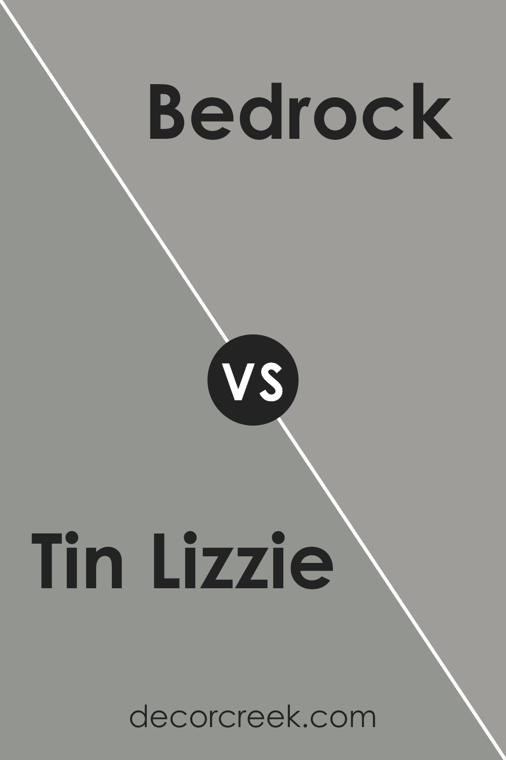
Tin Lizzie SW 9163 by Sherwin Williams vs Bedrock SW 9563 by Sherwin Williams
Tin Lizzie and Bedrock are both sophisticated hues from Sherwin Williams, offering unique atmospheres to any space. Tin Lizzie is a deep, muted gray with cool undertones, resembling the historic and sturdy nature of its namesake.
This color exudes an air of calmness and stability, making it an excellent choice for creating a serene and grounding environment. It pairs beautifully with both warm and cool tones, offering versatility in design schemes.
In contrast, Bedrock leans towards a warmer spectrum. It is a rich, earthy taupe that embodies a natural, comforting presence. Bedrock’s warmth makes it inviting, perfect for spaces where a sense of welcome and comfort is desired. It has the unique ability to create a cozy atmosphere while maintaining an elegant appearance.
While both colors share a muted sophistication, Tin Lizzie’s cool, gray undertones offer a more formal and reserved ambiance. In contrast, Bedrock, with its warmer, taupe undertones, brings a snug and homey feel. Their differing undertones and the atmospheres they evoke set them apart, each bringing its own distinct character to interiors.
You can see recommended paint color below:
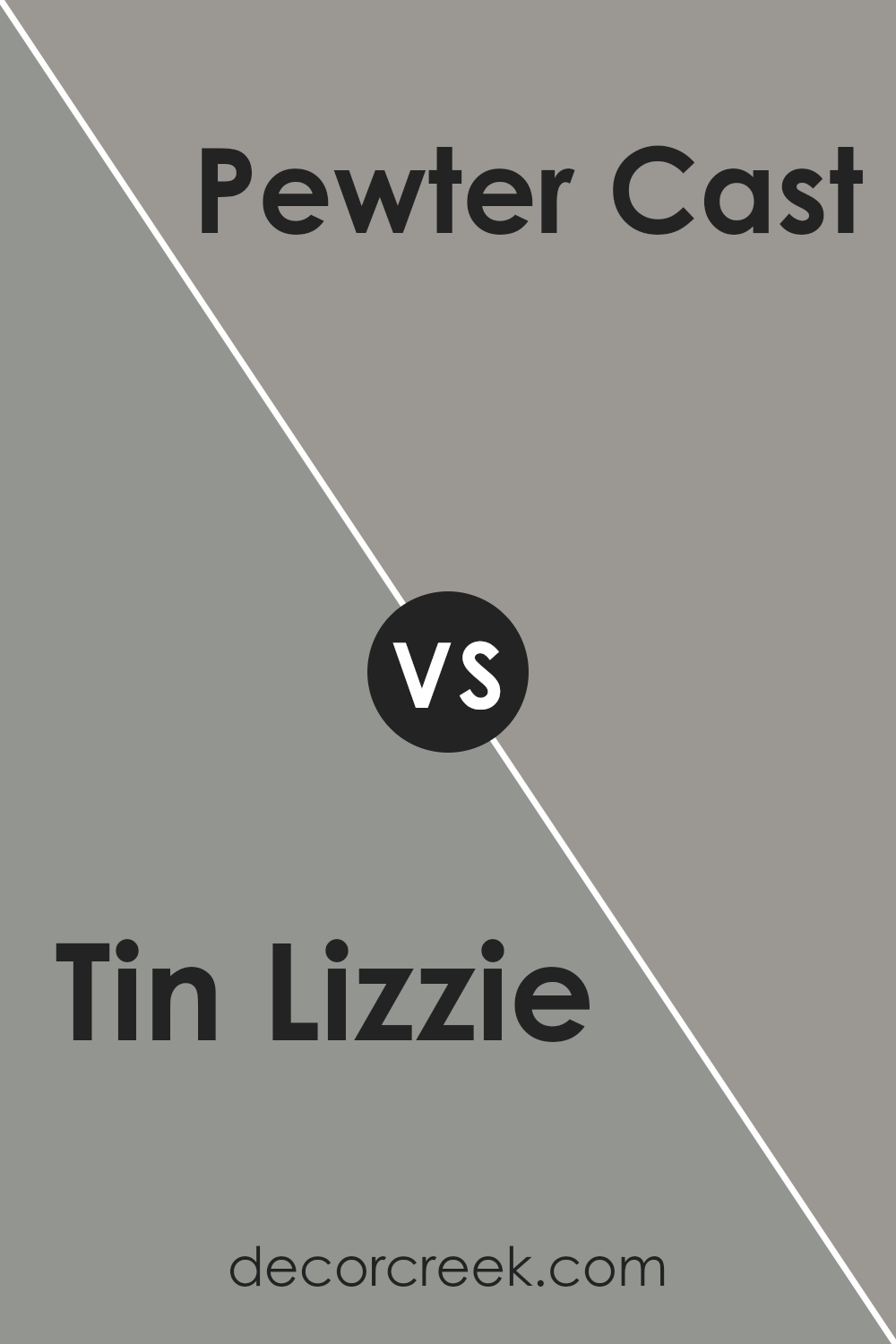
Tin Lizzie SW 9163 by Sherwin Williams vs Pewter Cast SW 7673 by Sherwin Williams
Tin Lizzie and Pewter Cast are both sophisticated colors from Sherwin Williams, known for their ability to impart a serene and refined ambiance to any space. Tin Lizzie presents as a soft, muted gray with hints of blue, creating a tranquil and soothing atmosphere.
This color leans towards a slightly cooler palette, making it ideal for spaces that aim for a calm and collected vibe. It’s perfect for bedrooms or bathrooms where a gentle, relaxing mood is desired.
On the other hand, Pewter Cast is a deeper gray that carries a subtle green undertone. This quality adds a touch of warmth to its appearance, making it a versatile choice for both modern and traditional settings.
Pewter Cast is robust enough to make a statement in living rooms or dining areas, providing a sophisticated backdrop that complements a wide range of decor styles.
Both colors offer unique attributes: Tin Lizzie with its cooler, serene qualities, and Pewter Cast with a slightly warmer, more pronounced character. Depending on the desired mood and the specific characteristics of the space, either color can elevate the aesthetic in its own distinct way.
You can see recommended paint color below:
- SW 7673 Pewter Cast
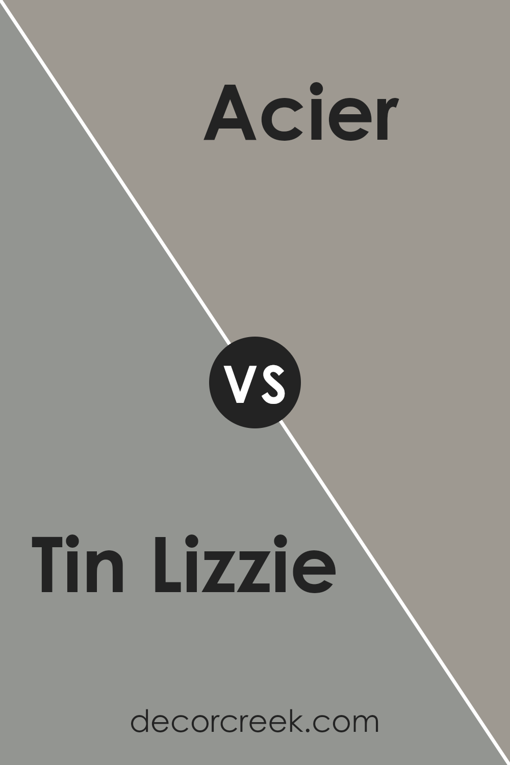
Tin Lizzie SW 9163 by Sherwin Williams vs Acier SW 9170 by Sherwin Williams
Tin Lizzie and Acier , both from Sherwin Williams, share a sophisticated, neutral palette yet embody distinct characteristics that set them apart. Tin Lizzie reveals a softer, more subdued quality, leaning towards a lighter gray that offers a serene backdrop, making it an ideal choice for spaces intended to evoke calm and tranquility.
Its ability to reflect light gently enhances its versatility, making it a go-to shade for various settings, from living rooms to bedrooms.
On the other hand, Acier holds a stronger presence with its deeper, richer tone. This shade skews closer to a medium-dark gray, imbuing a sense of solidity and strength. Acier’s bold character makes it perfect for accent walls or for creating a statement in areas that benefit from a touch of drama and sophistication.
While both colors maintain a grey base, Tin Lizzie presents a cooler, more airy feel, whereas Acier serves depth and warmth, offering a more pronounced statement.
Their differences allow them to cater to diverse aesthetic preferences and applications, from creating a peaceful retreat to crafting a robust, stylish environment.
You can see recommended paint color below:
- SW 9170 Acier
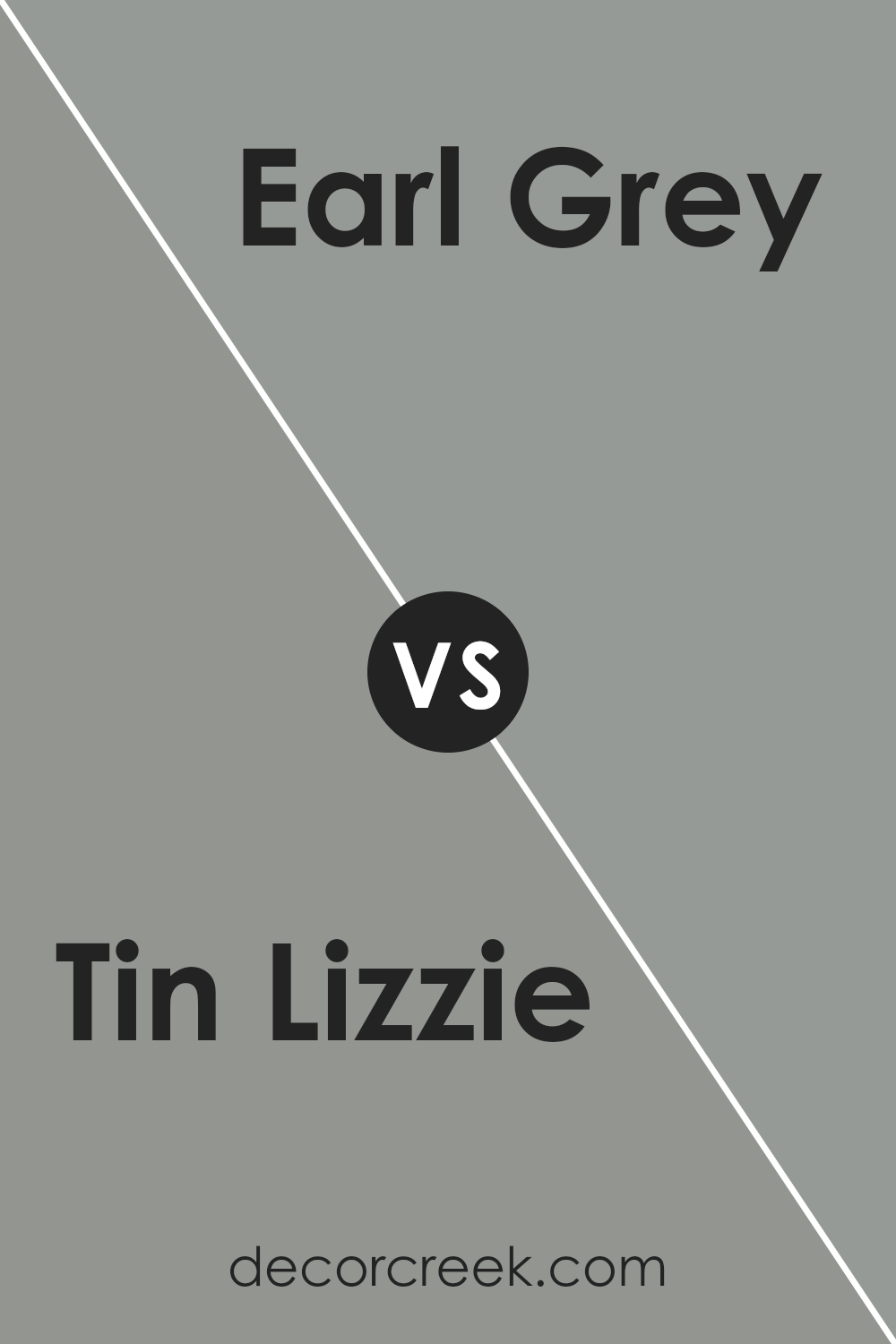
Tin Lizzie SW 9163 by Sherwin Williams vs Earl Grey SW 7660 by Sherwin Williams
Tin Lizzie and Earl Grey are two sophisticated shades by Sherwin Williams, each offering a unique ambiance for interior spaces. Tin Lizzie stands out as a deeper, more pronounced gray, veering towards a steel-like appearance.
This shade exudes an air of strength and modernity, making it an excellent choice for creating a statement in a room. Its depth allows it to serve as a focal point or an elegant backdrop for brighter colors and decor.
On the other hand, Earl Grey presents a softer, more subtle gray. This color leans towards a lighter, airier feel, providing a serene and calming atmosphere. It’s versatile, working well in spaces that aim for a relaxed aesthetic, promoting a sense of tranquility and openness.
Earl Grey can seamlessly blend with a wide range of color palettes, enhancing the overall design without overwhelming it.
In comparison, while both colors share a gray base, Tin Lizzie’s darker tone offers a bold, contemporary vibe, whereas Earl Grey brings a lighter touch, ideal for a softer, more inviting space. Each color, though distinct, provides a unique opportunity to create depth and character in home décor, depending on the intended mood and style of the room.
You can see recommended paint color below:
- SW 7660 Earl Grey
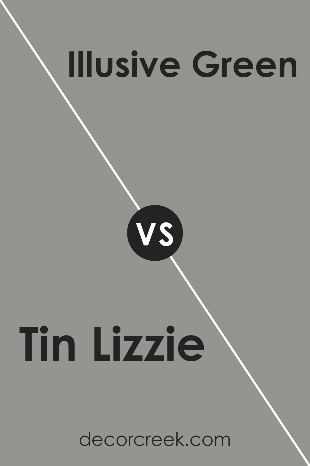
Tin Lizzie SW 9163 by Sherwin Williams vs Illusive Green SW 9164 by Sherwin Williams
Tin Lizzie and Illusive Green , both from Sherwin Williams, present subtle yet distinctive differences that make them unique in their own right. Tin Lizzie is a deep, moody gray with a subtle blue undertone, offering a sense of sophistication and tranquility.
This color embodies a timeless elegance, perfect for creating a serene, focused ambiance in any space. Its depth makes it versatile for both modern and traditional settings, providing a strong foundation for various decor styles.
On the other hand, Illusive Green is a gentle, soft green with gray undertones, evoking a natural, calming feel. This color, slightly lighter than Tin Lizzie, leans towards a more organic inspiration, bringing the tranquility of nature indoors. It carries a freshness that can brighten spaces while maintaining a grounded, cozy atmosphere.
Despite their similarities in depth and versatility, the core difference lies in their undertones—Tin Lizzie’s cool blue against Illusive Green’s earthy green. This distinction influences their impact on room atmospheres, with Tin Lizzie offering a refined, calming retreat and Illusive Green creating a soothing, natural sanctuary.
You can see recommended paint color below:
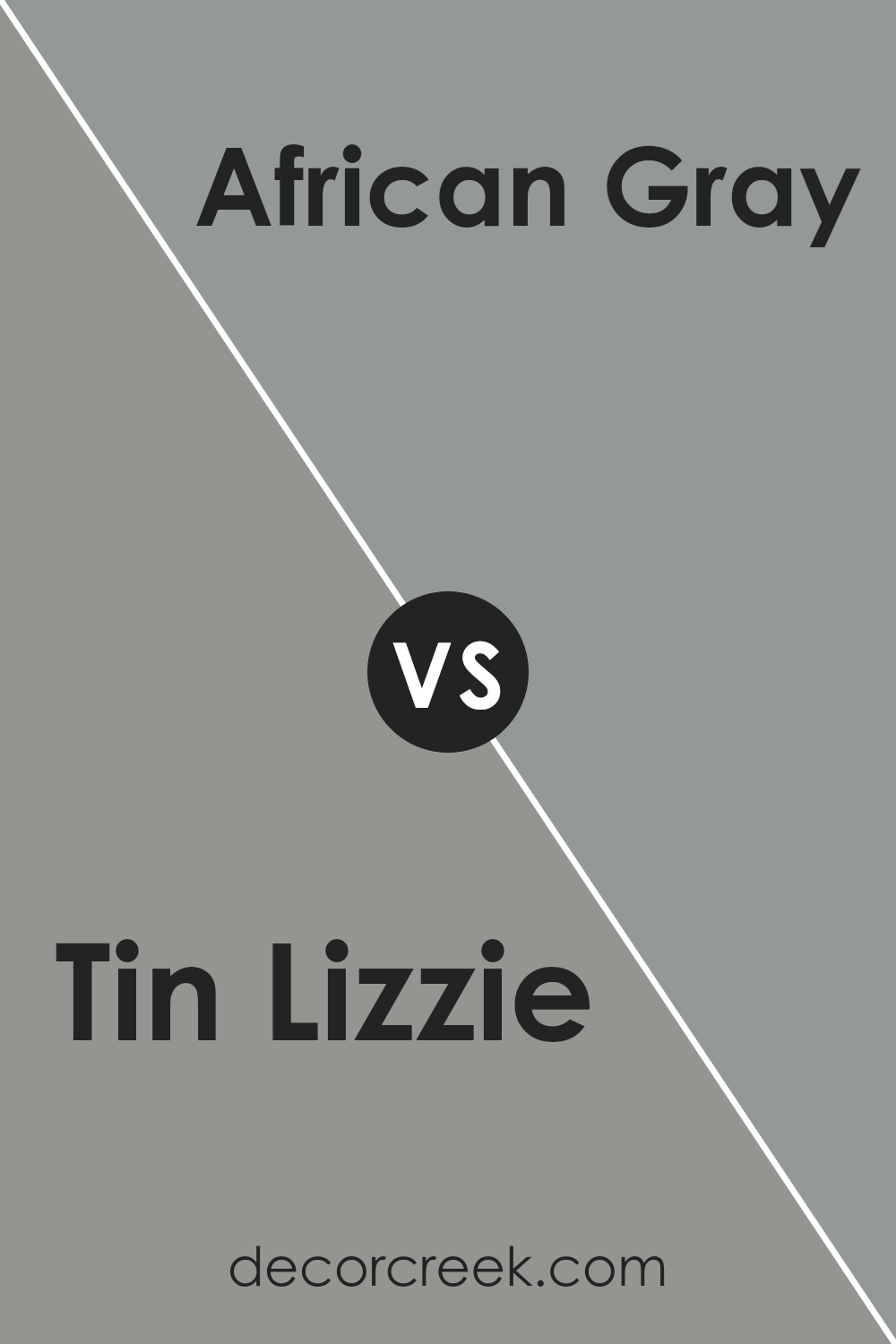
Tin Lizzie SW 9163 by Sherwin Williams vs African Gray SW 9162 by Sherwin Williams
Tin Lizzie and African Gray , both by Sherwin Williams, present subtle nuances that distinguish their visual appeal. Tin Lizzie emerges as a deep, soothing gray that seems to carry a hint of blue undertones, giving it a cool, serene vibe. This shade evokes the feeling of a misty morning, offering a tranquil and refined aesthetic.
Its depth makes it a perfect choice for spaces where a touch of sophistication and calmness is desired, blending seamlessly with a wide range of decor styles.
On the other hand, African Gray steps in with a warmer presence. Its composition, while still rooted in gray, subtly leans towards warmer undertones, hinting at taupe or a soft, earthy base. This quality makes African Gray incredibly versatile, providing a comforting and welcoming atmosphere.
It’s a color that can easily adapt to different lighting conditions, showing a slightly different face when basked in natural sunlight versus artificial light, exuding warmth and a grounded feeling.
Though both colors share a gray foundation, Tin Lizzie’s cooler, slightly more muted demeanor contrasts with African Gray’s warmer, more embracing feel. The choice between them depends on the desired mood and atmosphere of the space, with Tin Lizzie favoring more modern, sleek designs, and African Gray leaning towards cozy, inviting environments.
You can see recommended paint color below:
- SW 9162 African Gray
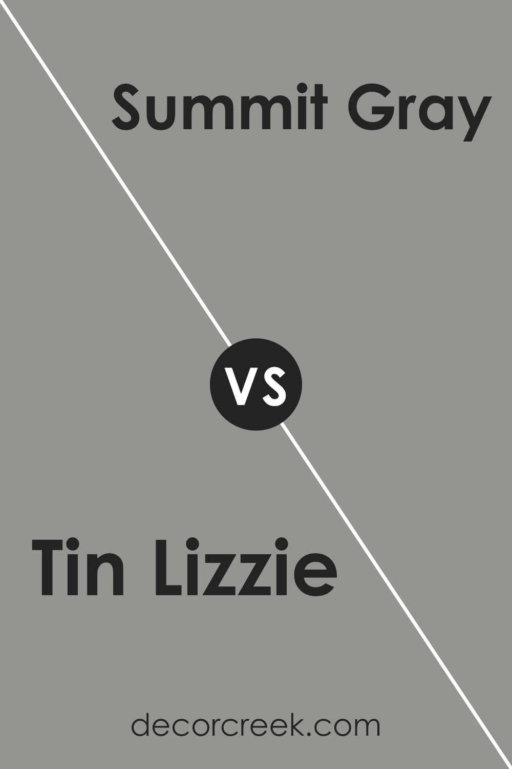
Tin Lizzie SW 9163 by Sherwin Williams vs Summit Gray SW 7669 by Sherwin Williams
Tin Lizzie and Summit Gray , both from Sherwin-Williams, are nuanced grays that cater to refined tastes. Tin Lizzie presents itself with a slightly heavier, deeper hue, reminiscent of stormy skies or the sleek color of vintage automobiles. This makes it an ideal choice for those seeking a bold yet understated elegance. Its richness offers a sense of depth, making spaces feel more enveloping and cozy.
On the other hand, Summit Gray leans towards a lighter, more balanced gray. It captures the essence of misty mornings and soft, natural stones, creating a serene and tranquil atmosphere. Its versatility serves well in spaces that aim for a fresh, airy, and open feel, making rooms appear more spacious and inviting.
While both colors share a gray base, their individual undertones and saturation levels set them apart. Tin Lizzie delves into a deeper, more introspective vibe, perfect for creating dramatic accents or cozy nooks. Summit Gray, with its softer approach, provides a calm backdrop for a wide range of decor styles, enhancing natural light and space.
Together, these colors offer diverse options for those looking to embrace the sophistication and versatility of gray in their spaces.
You can see recommended paint color below:
- SW 7669 Summit Gray
Tin Lizzie SW 9163 by Sherwin Williams vs Stamped Concrete SW 7655 by Sherwin Williams
Tin Lizzie and Stamped Concrete , both from Sherwin Williams, present a nuanced palette grounded in sophisticated neutrals. Tin Lizzie veers into the realm of deep, slate gray, offering a rich backdrop that conveys elegance and depth. Its undertones suggest a subtle coolness, making it an ideal choice for spaces aiming for a serene and contemplative ambiance.
This color has the capacity to make bold statements in well-lit areas while maintaining a cozy feel in spaces with less natural light.
On the other hand, Stamped Concrete operates in a lighter zone of the gray spectrum. It showcases a versatile, mid-tone gray that leans slightly towards the warmer side, making it exceptionally adaptable across various lighting conditions. This warmth imbues spaces with a welcoming atmosphere, bridging the gap between modernity and comfort.
While Tin Lizzie suggests a more pronounced character with its deeper hue, Stamped Concrete offers flexibility and a lighter, more open-feeling environment.
Together, these colors can create a cohesive look within a space, with Stamped Concrete serving as the perfect complement to the boldness of Tin Lizzie, providing balance and a harmonious transition between different areas or elements within an interior design scheme.
You can see recommended paint color below:
- SW 7655 Stamped Concrete
Conclusion
Concluding, Tin Lizzie is a versatile color that embodies a blend of sophistication and adaptability, making it a favored choice for those looking to impart a neutral yet distinctively elegant aura to their spaces.
Its understated elegance allows it to integrate seamlessly across various design styles, from modern minimalist to rustic chic, thereby providing a timeless backdrop that can evolve with changing decor trends.
Its ability to harmonize with an array of color palettes and materials further cements its position as a go-to choice for designers and homeowners alike, looking for a color that marries style with functionality.
Moreover, the adaptability and aesthetic appeal of this color highlight its potential in not only transforming the ambiance of an interior space but also enhancing the architectural elements of exterior applications.
Whether it is used as a dominant theme or an accent, it exudes a sense of calmness and sophistication that is rarely matched by other hues.
For those seeking to create spaces that resonate with serenity and understated elegance, it proves to be an impeccable choice, reinforcing its stature in the realm of interior design as a color that transcends temporary trends to offer enduring appeal.
Ever wished paint sampling was as easy as sticking a sticker? Guess what? Now it is! Discover Samplize's unique Peel & Stick samples.
Get paint samples