The shade SW 6276, known as Mystical Shade by Sherwin Williams, is one that stands out in their vast array of colors. As you look for a color that adds a subtle, yet profound, touch to your space, this particular hue could be just what you need.
It’s a deep, enchanting blue that holds a hint of mystery, perfect for creating a serene environment in your home or workplace. Whether you’re thinking about revamping your living room, bedroom, or even your office, Mystical Shade provides a unique blend of sophistication and calmness without being overwhelming.
You’ll notice how it pairs wonderfully with various decor styles, from modern minimalist to cozy traditional. This color invites you to experiment with different accents and furnishings, making it versatile for any room you’re planning to update.
So, if you’re looking to refresh your walls with a color that brings both beauty and a sense of peace, Mystical Shade might just be your ideal choice. Let’s see how this color could transform your desired space into a more inviting and stylish area.
What Color Is Mystical Shade SW 6276 by Sherwin Williams?
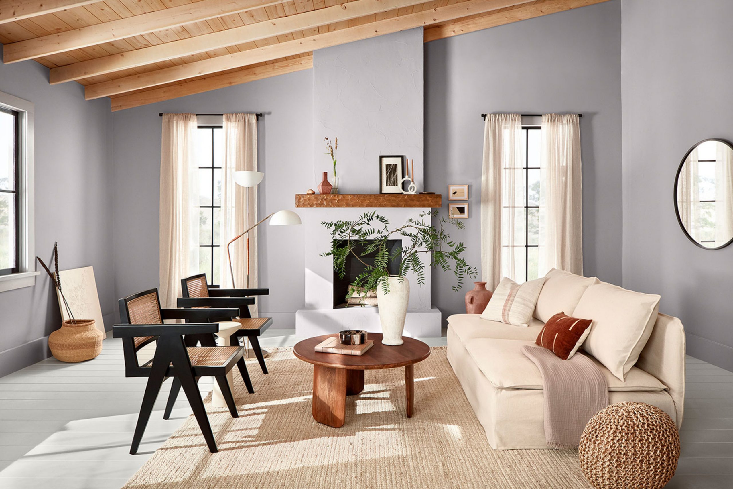
Mystical Shade by Sherwin Williams is a unique and versatile deep blue hue with subtle purple undertones, perfect for adding a touch of elegance and mystery to any space. This color has a rich depth that works beautifully in various interior design styles, particularly modern, contemporary, and bohemian decors. It’s an excellent choice for creating a focal point in a room, whether as an accent wall or used throughout a space for a more dramatic look.
Mystical Shade pairs wonderfully with a range of materials and textures, enhancing the aesthetic appeal of each. In a room with natural wood elements, such as oak or walnut furniture, it creates a warm, inviting contrast. Metallic finishes like brass or copper bring out its cool undertones, making light fixtures and décor accessories pop against its deep backdrop.
For a softer and more cohesive look, incorporating fabrics like velvet or silk in lighter shades such as soft grays or creamy whites can balance the intensity of this color. This color can also be complemented by various textures, from the smoothness of leather to the roughness of natural stone or the organic feel of woven baskets.
Each combination highlights different aspects of Mystical Shade, making it a fantastic choice for those looking to create a stylish and personalized space.
Is Mystical Shade SW 6276 by Sherwin Williams Warm or Cool color?
Mystical Shade is a rich and deep color by Sherwin Williams that brings a unique vibe to any room it’s used in. This color works well in homes because it adds a bold and cozy feeling, making spaces feel more inviting and warm. Since it’s a darker shade, it’s great for creating a striking contrast when paired with lighter colors like white or cream, which can make the details of a room stand out.
When used in small spaces like a powder room or an accent wall, Mystical Shade can add depth and interest without overwhelming the area. On the other hand, in larger rooms like living areas or bedrooms, this color can help to create a sense of intimacy and comfort, which is perfect for relaxing.
Additionally, Mystical Shade is versatile enough to fit with various decor styles, from modern to traditional, making it a practical choice for many homeowners. It pairs beautifully with natural materials like wood or leather, enhancing the overall aesthetic of a space.
Undertones of Mystical Shade SW 6276 by Sherwin Williams
Mystical Shade is a unique color with various undertones that contribute to its overall appearance and the way it influences the mood of a room. Undertones are subtle colors that lie beneath the surface of the main color. They can significantly affect how a color looks under different lighting conditions and can complement different decor styles.
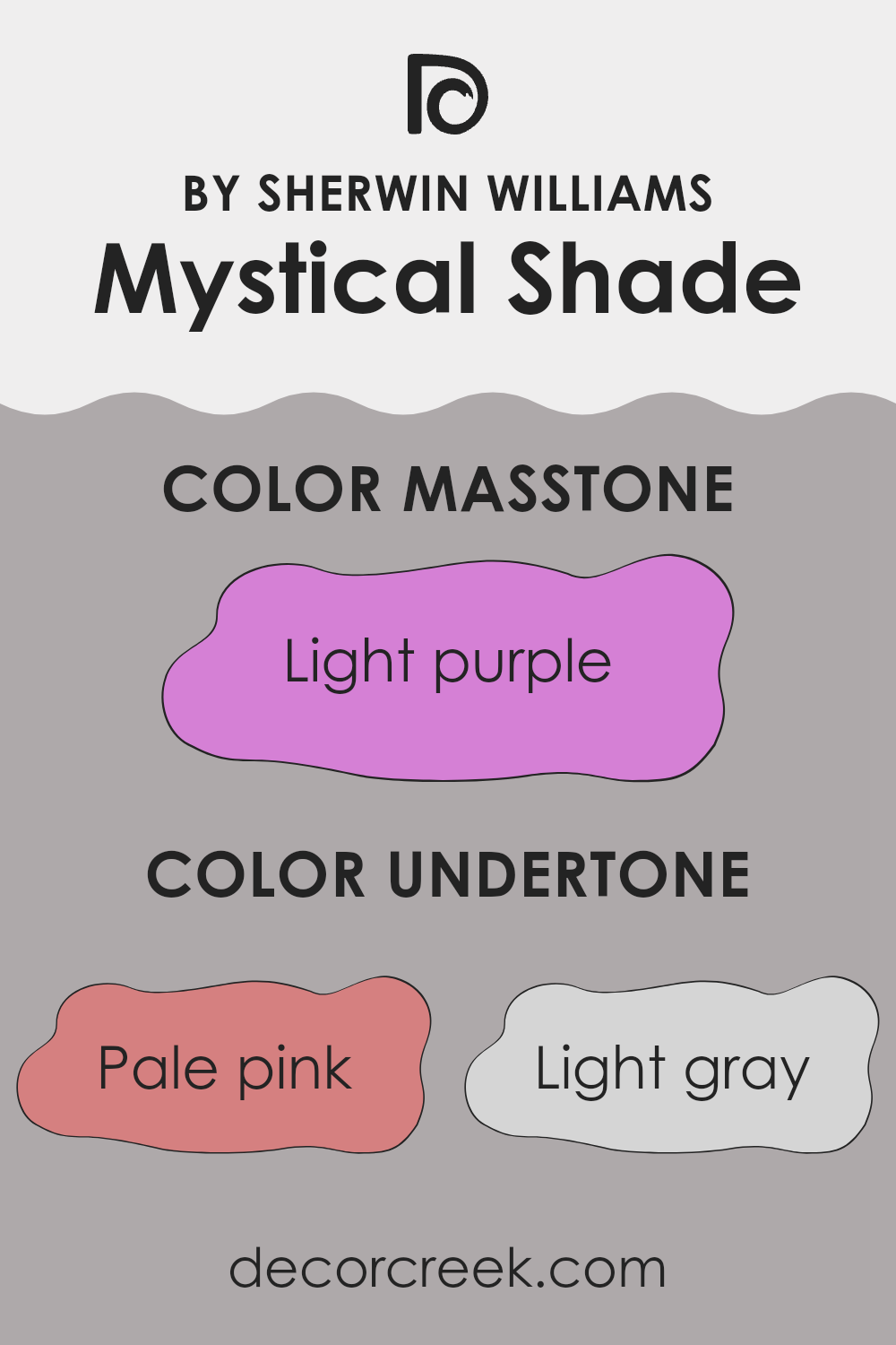
Among the undertones in this color, you’ll find pale pink, light gray, pale yellow, lilac, grey, mint, light blue, pink, fuchsia, purple, and violet. Each of these undertones adds a layer of depth and complexity to the paint. For instance, pale pink and lilac undertones bring a soft, gentle feel, making the room feel welcoming. Light gray and grey add a neutral balance, ensuring the color doesn’t overwhelm, while mint and light blue introduce a fresh, airy quality.
When applied to interior walls, the subtleties of these undertones will play with the lighting, shifting subtly throughout the day. In bright, natural light, lighter undertones like pale yellow and light blue might become more prominent, giving the space a vibrant look. In artificial or dim light, darker undertones like purple and fuchsia can make the room feel cozy and intimate.
For someone choosing paint, it’s essential to consider these undertones. They will not only affect how the color looks on your walls at different times of the day but also how well it pairs with your furniture and decor. Undertones can either clash or harmonize with your room’s elements, significantly influencing the overall aesthetic. Testing the color in different lights and alongside other room elements is a good strategy to ensure it works harmoniously in your space.
What is the Masstone of the Mystical Shade SW 6276 by Sherwin Williams?
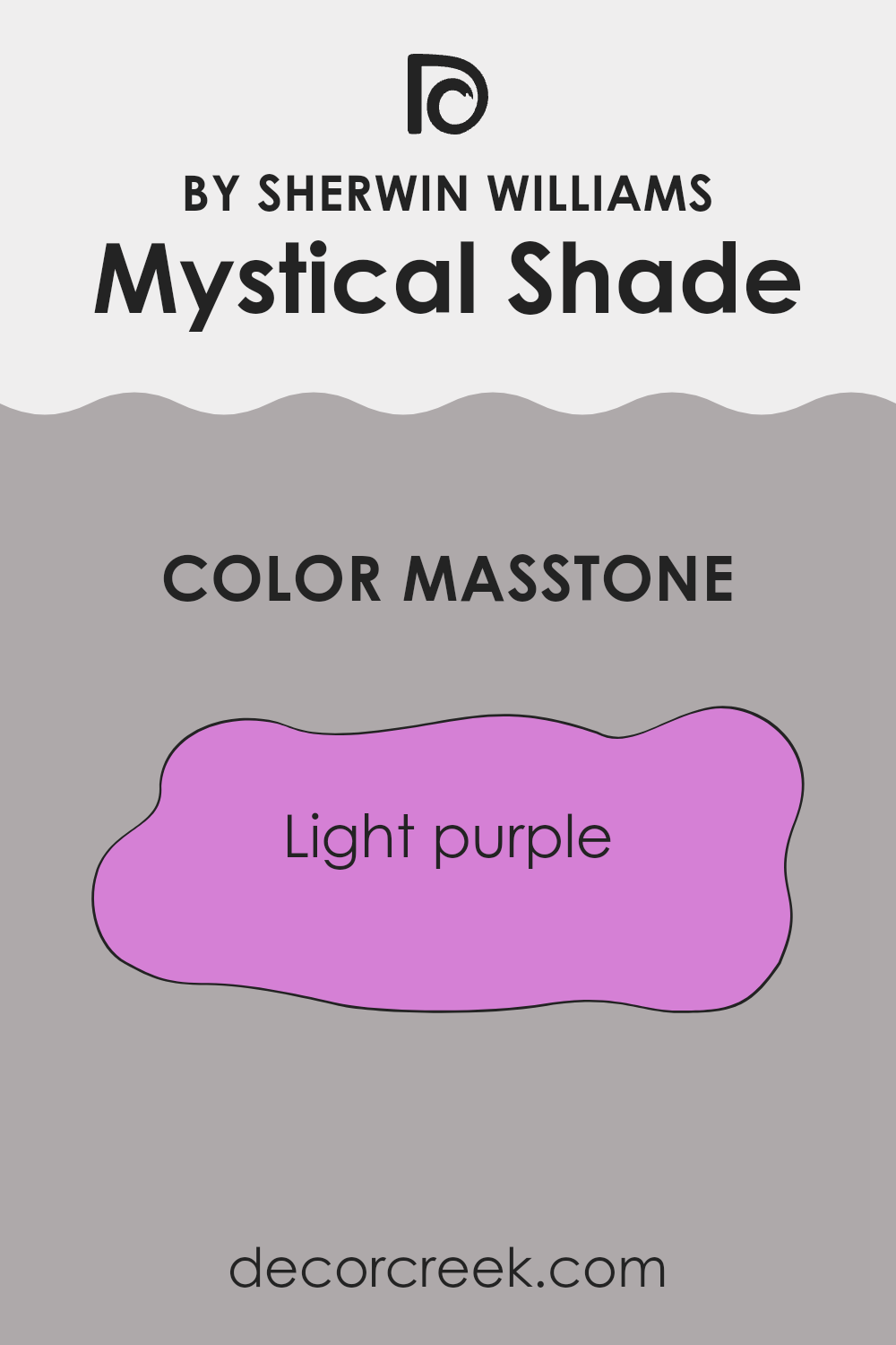
Mystical Shade is a gentle light purple color that brings warmth and a playful touch to any room. This specific shade has a soothing effect, making it perfect for spaces where relaxation is key, like bedrooms or reading nooks.
Its light purple tone blends nicely with soft whites or grays, providing a subtle contrast that isn’t too overwhelming. Perfect for those who want a hint of color without making a bold statement, it adds a personal touch without overpowering the room. It’s also versatile, looking great in both natural and artificial light.
This makes it a reliable choice for various lighting conditions in homes. Mystical Shade is light enough to keep spaces looking open and airy while still adding a touch of individuality through its charming purple hue. It is particularly appealing in children’s rooms or as an accent wall, where it provides a pleasant backdrop for creativity and play.
How Does Lighting Affect Mystical Shade SW 6276 by Sherwin Williams?
Lighting plays a critical role in how we perceive colors because it can significantly alter their appearance. The impact of lighting on color is crucial to consider when choosing paint shades for different rooms. One example of a paint color influenced by lighting conditions is the color Mystical Shade (SW 6276) by Sherwin Williams.
In artificial light, such as that from incandescent or LED bulbs, Mystical Shade can look different depending on the type of bulb used. Incandescent lighting, with its warm tone, gives this color a richer and more intense appearance. LED lights, typically cooler, can make it appear slightly bluer.
In natural light, the appearance of Mystical Shade varies through the day as the quality of sunlight changes. Morning light tends to be cooler, so the color might look more muted in the early hours. As the day progresses and the light becomes warmer, especially in the afternoon, the color can appear warmer and more vibrant.
The direction your room faces also affects how Mystical Shade looks:
- North-Faced Rooms: These rooms get less direct sunlight, leading to cooler, more consistent light throughout the day. Mystical Shade can appear more subdued and slightly richer in these conditions.
- South-Faced Rooms: These receive more direct sunlight, which can make the color look brighter and more vivid. In these rooms, Mystical Shade will show its warmer tones during the day.
- East-Faced Rooms: Expect this color to change dramatically in east-facing rooms as the light varies from bright and cool in the morning to dimmer and warmer by afternoon. It may appear more lively and bright in the morning light.
- West-Faced Rooms: In rooms facing west, the paint will be influenced by the intense and warm afternoon and evening sun, making the color seem more vibrant and dynamic later in the day.
Understanding these variations can help you decide the best room and purpose for using this shade, ensuring it complements both the lighting conditions and your intended aesthetic.
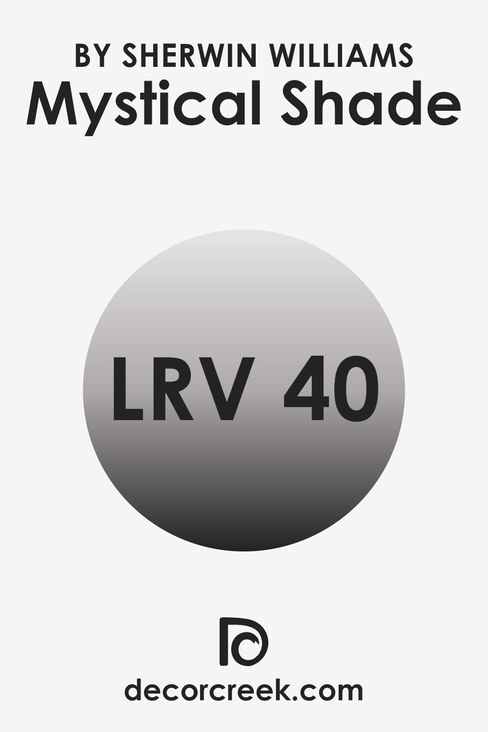
What is the LRV of Mystical Shade SW 6276 by Sherwin Williams?
LRV stands for Light Reflectance Value, a measure used to describe the percentage of light a paint color reflects from or absorbs into a painted surface. Simply put, LRV tells us how light or dark a paint color will look when applied to a wall. It is a scale, in this case ranging between 0 and 100, where lower values signify darker colors that reflect less light and higher values indicate lighter colors reflecting more light.
The LRV helps you understand how much natural or artificial light you might need in a room and can significantly affect the ambience because a lighter color can make a room feel more spacious, while a darker color can make it feel more cozy.
In the case of the color with an LRV of 40.246, it’s considered a medium shade, neither too dark nor too light. This LRV level means it will reflect some light but also absorb a good amount, thus not brightening a room excessively but also not making it overly dark.
When applied to a wall, this type of color can provide a balanced feel, neither overpowering with brightness nor making the room feel somber. It works well in spaces that receive a moderate amount of light, making the space feel grounded without decreasing the perception of space too much. It’s a practical choice that can handle varying levels of lighting and still maintain its unique character.
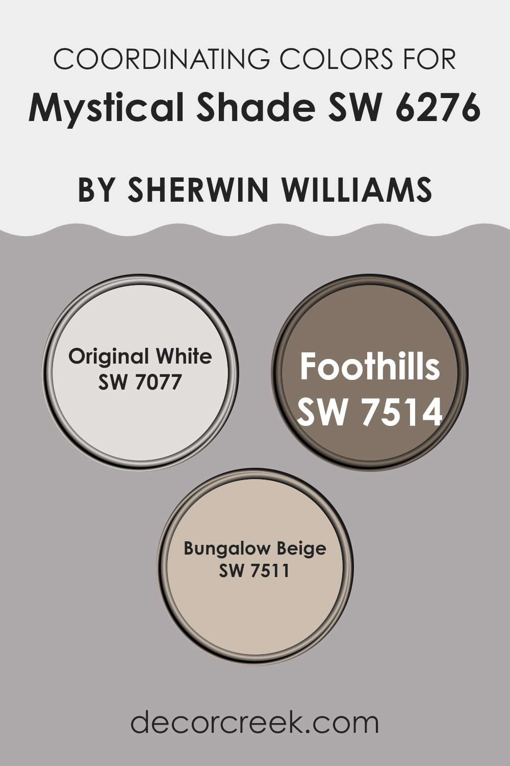
Coordinating Colors of Mystical Shade SW 6276 by Sherwin Williams
Coordinating colors are hues that match well with a primary color to create a pleasing blend. These additional colors complement the main shade by enhancing its aesthetic value and creating harmonious combinations. The main shade sets the tone and theme, whereas coordinating colors add depth and complexity without overpowering the primary hue.
They are carefully selected to ensure that each works together seamlessly to create a unified look. They can also be used to accentuate architectural details, highlight key furnishings, or to simply balance the visual appeal of a space.
Mystical Shade by Sherwin Williams can be beautifully paired with coordinating colors like Original White, Foothills, and Bungalow Beige. Original White is a crisp, clean shade that offers a fresh contrast to the deeper tones of Mystical Shade, bringing light and brightness to spaces. Foothills, with its warm, earthy undertones, adds a cozy, grounding element to interiors, producing a natural, inviting environment.
Bungalow Beige is a versatile and warm color that provides a subtle, neutral backdrop, enhancing the richness of Mystical Shade while maintaining a soft, accessible look throughout the area. Together, these colors create a balanced and harmonious palette that can enhance any space.
You can see recommended paint colors below:
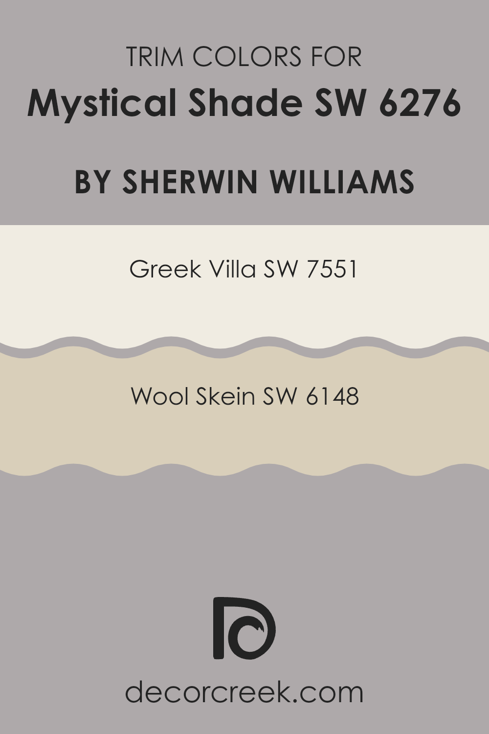
What are the Trim colors of Mystical Shade SW 6276 by Sherwin Williams?
Trim colors are essential for creating a cohesive look in your home’s decor, acting as accents that complement or contrast the primary wall color. In the case of a deep and rich hue like Mystical Shade from Sherwin Williams, selecting the right trim colors can either soften the overall impact or highlight the boldness of the main shade.
Trims frame the various elements of a room, like windows, doors, and skirting boards, adding detail and depth to the space. Soft or neutral trim colors can prevent a bold wall color from overwhelming the room, maintaining a balanced visual appeal.
Greek Villa (SW 7551) is a soft white with a touch of warmth, making it an excellent choice for trims when Mystical Shade is used as a primary color. It provides a gentle contrast that highlights the depth of Mystical Shade without competing with it, enhancing the overall aesthetic without overpowering. Wool Skein (SW 6148), on the other hand, is a neutral shade with a subtle mix of beige and gray tones. This color works well as a trim by adding a layer of understated complexity, softly framing the boldness of the main color and lending a refined look to the interior space.
You can see recommended paint colors below:
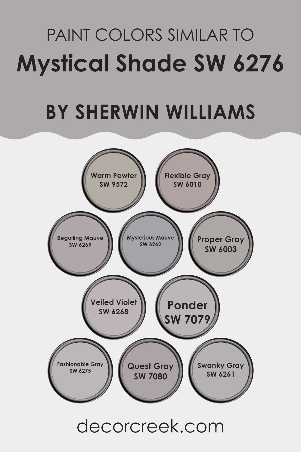
Colors Similar to Mystical Shade SW 6276 by Sherwin Williams
The choice of similar colors in interior design can be crucial for creating a cohesive and harmonious space. Colors that are similar in tone or shade can seamlessly blend with each other, providing a subtle yet effective visual flow in a room. This method of color coordination is particularly useful in achieving a balanced look without harsh contrasts, making the environment feel more welcoming and comfortable. For instance, using a palette of closely related hues allows for flexibility in decor, making it easier to mix and match furniture and accessories in a room.
Take SW 9572 – Warm Pewter, a gentle gray with a warm undertone, perfect for spaces that need a cozy touch. Next, SW 6010 – Flexible Gray offers a neutral base, adaptable to various accents and decor styles. SW 6269 – Beguiling Mauve adds a hint of soft purple for a subtle splash of color, while SW 6262 – Mysterious Mauve deepens that tone for a bit more depth.
SW 6003 – Proper Gray is a straightforward, clean gray that sets a calm, neutral backdrop. For adding delicate color, SW 6268 – Veiled Violet provides a whisper of purple. SW 7079 – Ponder is a deeper gray that gives weight and grounding to a space. SW 6275 – Fashionable Gray strikes a balance between trendy and timeless, fitting for an elegant look.
SW 7080 – Quest Gray pushes towards a slightly bolder, more pronounced gray presence. Finally, SW 6261 – Swanky Gray rounds out this group with its smooth and refined appearance, offering an understated yet chic vibe. Using these similar colors allows for a room’s design elements to interact more fluidly, enhancing the overall aesthetic without overwhelming the senses.
You can see recommended paint colors below:
- SW 9572 Warm Pewter
- SW 6010 Flexible Gray
- SW 6269 Beguiling Mauve
- SW 6262 Mysterious Mauve
- SW 6003 Proper Gray
- SW 6268 Veiled Violet
- SW 7079 Ponder
- SW 6275 Fashionable Gray
- SW 7080 Quest Gray
- SW 6261 Swanky Gray
Colors that Go With Mystical Shade SW 6276 by Sherwin Williams
Choosing the right colors to complement Mystical Shade SW 6276 by Sherwin Williams is crucial for creating a harmonious and visually appealing space. These complementary colors, such as SW 9154 – Perle Noir, SW 6277 – Special Gray, and others, help balance the atmosphere in a room by enhancing or subtly contrasting with Mystical Shade.
For instance, these colors can highlight certain features, dictate the room’s mood, or simply create a visual flow that makes the environment more enjoyable and pleasing to the eye. It’s all about finding the right mix to achieve a cohesive look that suits your personal taste and the room’s purpose.
Perle Noir is a deep, almost black hue that adds drama and depth when combined with lighter shades like Mystical Shade. It’s great for making other colors pop or for adding a strong statement to a space. Special Gray, a softer medium gray, works beautifully to provide a gentle contrast, softening the overall look without overwhelming the senses.
Cloak Gray offers a slightly bolder gray tone, perfect for adding a bit of a shadow effect and enriching the texture of the decor. Fashionable Gray is lighter, providing a subtle transition between colors, making it ideal for blending various elements in a room.
Destiny is a unique blend that hints at a dusty mauve, which can introduce a hint of warmth and softness, perfect for spaces needing a touch of coziness. Lastly, Moonlit Orchid has a soft, ethereal quality that works well to bring a touch of lightness to spaces dominated by darker hues, offering a refreshing contrast to Mystical Shade. These colors together create a palette that allows for flexibility and creativity in decorating, making any room feel well-coordinated and thoughtfully designed.
You can see recommended paint colors below:
- SW 9154 Perle Noir
- SW 6277 Special Gray
- SW 6278 Cloak Gray
- SW 6275 Fashionable Gray
- SW 6274 Destiny
- SW 9153 Moonlit Orchid

How to Use Mystical Shade SW 6276 by Sherwin Williams In Your Home?
Mystical Shade by Sherwin Williams is a unique gray paint color with deep blue undertones that add a subtle hint of richness. This shade is versatile, making it perfect for many areas in your home. It can offer a refreshing change to living spaces when applied to walls, creating a cozy and welcoming atmosphere.
In bedrooms, its calming qualities are especially beneficial, helping to promote relaxation ahead of bedtime. If you’re looking to refresh cabinets or furniture, Mystical Shade works wonders, giving pieces a modern twist without being too bold.
It pairs well with white trim or accessories, enhancing its depth and creating a neat contrast. For those interested in updating their bathrooms or kitchens, this color also proves to be both durable and stylish. With its ability to work in various lighting conditions, Mystical Shade is a solid choice for giving your home a fresh, new look.
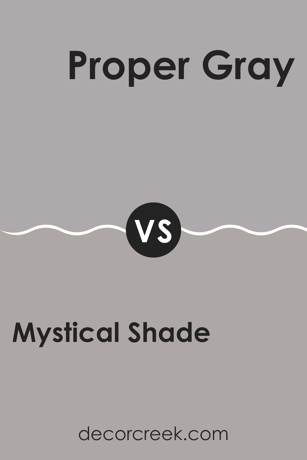
Mystical Shade SW 6276 by Sherwin Williams vs Proper Gray SW 6003 by Sherwin Williams
Mystical Shade and Proper Gray by Sherwin Williams are both unique, each offering a distinct mood for room decor. Mystical Shade is a deep, rich purple that can make spaces feel cozy and distinctive.
It’s a great choice if you want a room to have a touch of drama or a cozy, inviting vibe. On the other hand, Proper Gray is a soft, neutral gray that works well in a variety of spaces. It’s perfect for those looking for a clean and straightforward look that pairs easily with different colors and decor styles.
While Mystical Shade adds a striking pop of color, Proper Gray offers a subtle background, making it versatile for all areas of a home. Thus, choosing between them depends on whether you prefer a bold statement or a minimalist approach.
You can see recommended paint color below:
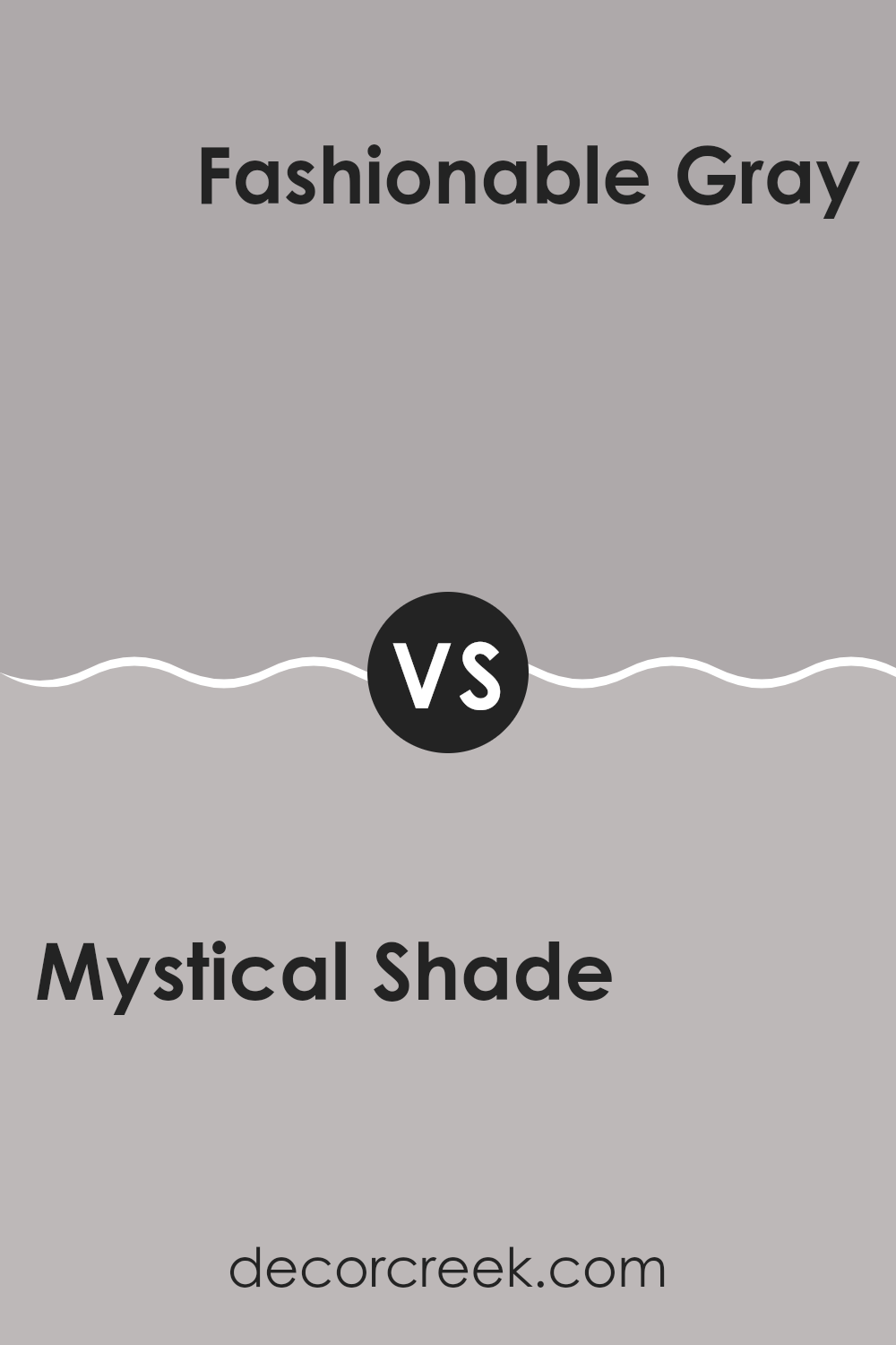
Mystical Shade SW 6276 by Sherwin Williams vs Fashionable Gray SW 6275 by Sherwin Williams
Mystical Shade and Fashionable Gray are two paint colors from Sherwin Williams that sit next to each other on the color palette. Mystical Shade is a rich, medium-dark blue that gives a sense of depth to any space.
It has a certain boldness that makes it stand out, which can be great for creating a focal point in a room. On the other hand, Fashionable Gray is a softer, lighter gray that offers a neutral backdrop suitable for various decor styles. This color is versatile and can easily blend with other hues, making it perfect for those who like a more understated look.
While Mystical Shade makes a strong statement with its almost navy-like appearance, Fashionable Gray provides a quiet and clean ambiance, ideal for a calming environment. Choosing between them depends on whether you want the richness of a deep blue or the subtle sophistication of a gentle gray.
You can see recommended paint color below:
- SW 6275 Fashionable Gray
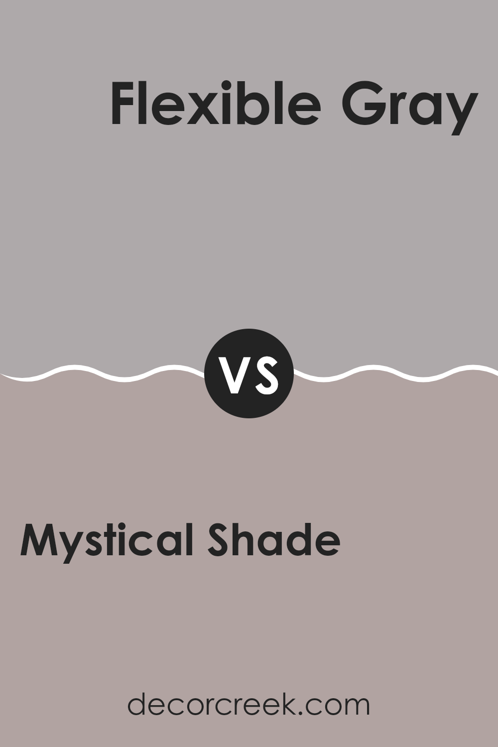
Mystical Shade SW 6276 by Sherwin Williams vs Flexible Gray SW 6010 by Sherwin Williams
Mystical Shade and Flexible Gray by Sherwin Williams are both unique colors with distinct vibes. Mystical Shade is a deep, rich blue that adds a touch of drama and elegance to any space. This color works well in areas where you want to make a statement or create a cozy, inviting atmosphere.
On the other hand, Flexible Gray is a versatile, light gray shade that can fit into almost any decorating style comfortably. It’s a softer color that sets a relaxed and calming mood in a room, making it an excellent choice for spaces like living rooms, bedrooms, or offices where you want to keep things light and airy.
The contrast between the two is quite significant. Mystical Shade tends to draw the eye and become a focal point due to its depth, while Flexible Gray blends seamlessly into the background, providing a subtle, soothing backdrop. Depending on your design goals, each color offers distinct advantages.
You can see recommended paint color below:
- SW 6010 Flexible Gray
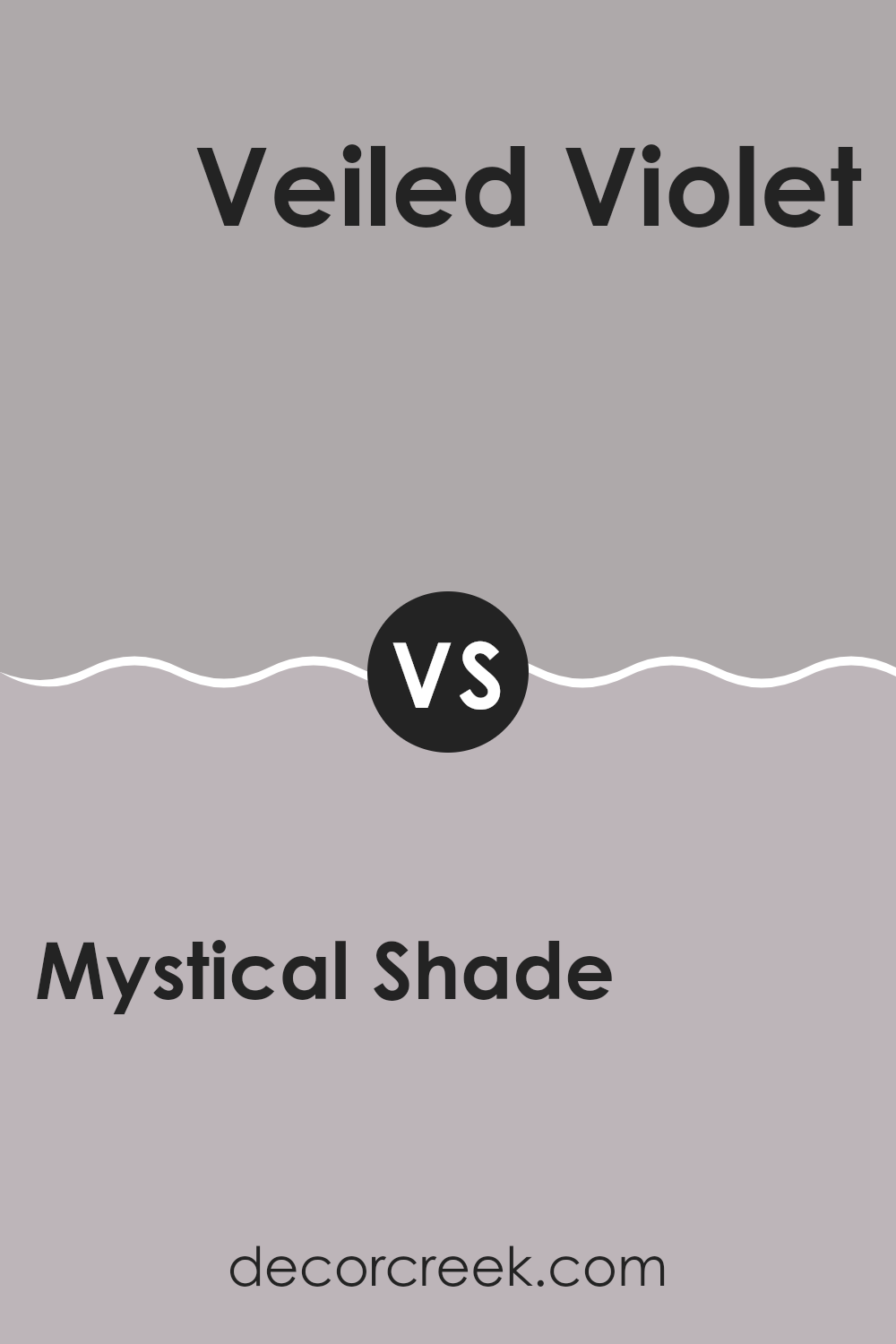
Mystical Shade SW 6276 by Sherwin Williams vs Veiled Violet SW 6268 by Sherwin Williams
Mystical Shade and Veiled Violet are two distinct colors offered by Sherwin Williams. Mystical Shade is a deep, blue-rich color that brings a sense of calm and strength to a space, making it ideal for accent walls or furniture. It leans towards a slightly navy feel, which can help ground a room’s decor while still keeping it vibrant.
On the other hand, Veiled Violet has a softer presence, with a blend of purple and gray hues that offers a more muted and gentle feel. This color is excellent for creating a cozy and inviting atmosphere in bedrooms or living areas, where a light and airy vibe is preferred.
When comparing the two, Mystical Shade is bolder and more pronounced, making a statement wherever it is used. Veiled Violet, however, is quieter and more understated, perfect for those looking for something less in-your-face. Both colors provide unique possibilities for interior design, each bringing its special character to the environments they are used in.
You can see recommended paint color below:
- SW 6268 Veiled Violet
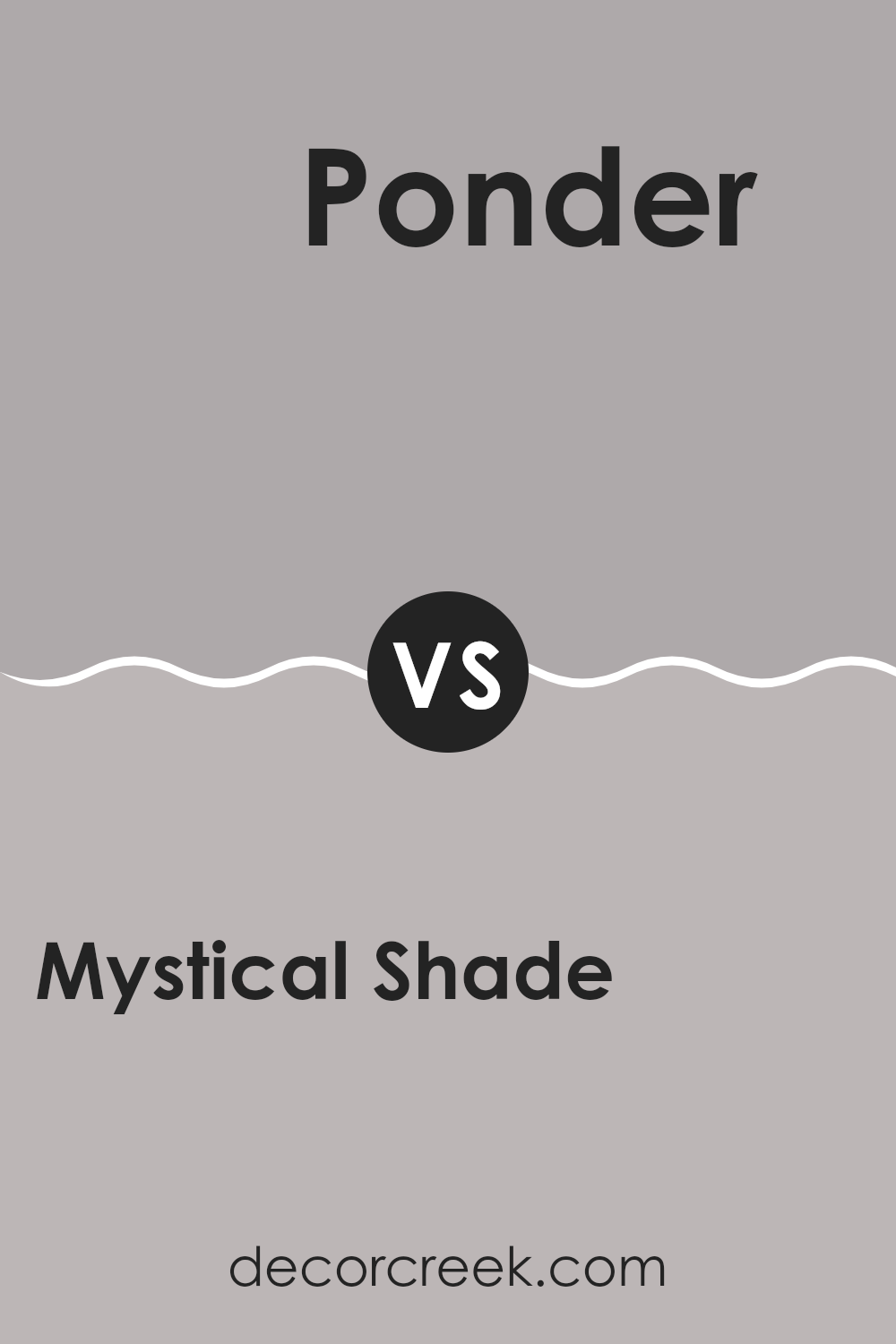
Mystical Shade SW 6276 by Sherwin Williams vs Ponder SW 7079 by Sherwin Williams
Mystical Shade and Ponder, both from Sherwin Williams, offer distinct vibes for any space. Mystical Shade is a deep, almost purple shade that brings a strong and bold touch. This color can make a statement in a room, perfect for creating a focal point or accentuating key furniture pieces.
On the other hand, Ponder is a soft, gray shade, providing a subtle and calming effect that’s ideal for a more laid-back or minimalistic style. It’s versatile and works well in various settings, such as living rooms or bedrooms, where you want a soothing atmosphere.
While Mystical Shade draws the eye and can define a space, Ponder blends into the background, offering a quiet backdrop that pairs easily with many colors and decors. Together, these colors could be used to balance each other — Mystical Shade adding a dash of drama and Ponder smoothing things out.
You can see recommended paint color below:
- SW 7079 Ponder
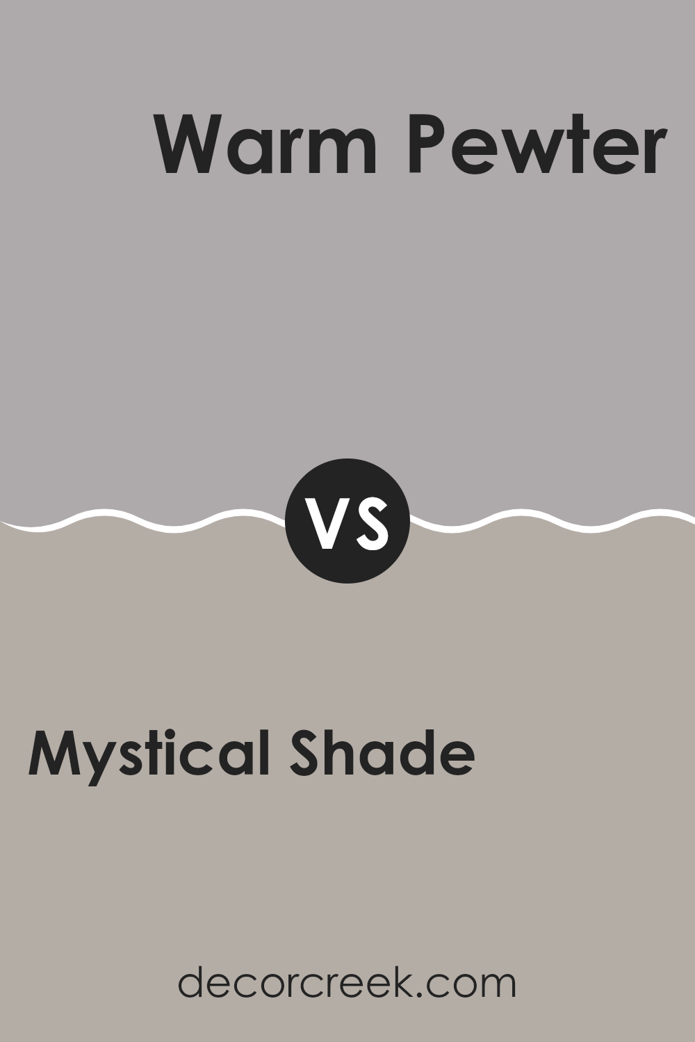
Mystical Shade SW 6276 by Sherwin Williams vs Warm Pewter SW 9572 by Sherwin Williams
Mystical Shade and Warm Pewter are two unique colors by Sherwin Williams that each bring their own distinct feel to a space. Mystical Shade is a deep, rich blue with hints of purple that can make a room feel cozy and warm, despite its dark tone.
It pairs well with bright whites or metallic accents to create a striking contrast. On the other hand, Warm Pewter is a soft gray with warm undertones. It’s a versatile color that works in any room, providing a neutral backdrop that allows other colors and decor elements to stand out.
While Mystical Shade adds a bold touch, drawing attention and making statements, Warm Pewter offers a more subdued, calm background, ideal for those preferring a minimalist or more laid-back decor style. Both colors are great choices in their own right, depending on what mood or style you are trying to achieve in your space.
You can see recommended paint color below:
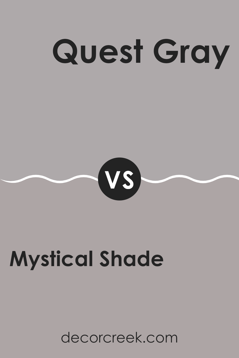
Mystical Shade SW 6276 by Sherwin Williams vs Quest Gray SW 7080 by Sherwin Williams
Mystical Shade and Quest Gray are both colors by Sherwin Williams, each offering a distinct mood for room decor. Mystical Shade is a deep, rich blue with a touch of purple, providing a bold and profound feel to spaces. This color can make a statement and works well in areas where a sense of creativity or strength is desired.
On the other hand, Quest Gray is a muted gray that leans slightly towards blue, offering a more reserved and subtle look. This color is versatile and perfect for creating a calm and neutral backdrop in any room, allowing other elements of decor to stand out.
While Mystical Shade is more dramatic and intense, Quest Gray is understated and adaptable, making it suitable for various settings, from modern kitchens to cozy living rooms. Both colors have their unique charms and can significantly affect the atmosphere of a space.
You can see recommended paint color below:
- SW 7080 Quest Gray
Mystical Shade SW 6276 by Sherwin Williams vs Swanky Gray SW 6261 by Sherwin Williams
Mystical Shade and Swanky Gray, both from Sherwin Williams, are unique in their appeal. Mystical Shade is a deeper, more intense color, bordering on a navy blue with a hint of purple. This makes it a great choice for settings where a strong, prominent color is needed.
It can really stand out in a room, providing a bold backdrop that draws attention. On the other hand, Swanky Gray is a lighter, more muted gray. It has a subtle elegance and is versatile enough to work well in various spaces without overpowering them. Swanky Gray tends to blend into designs, providing a soft, neutral base that complements other colors.
When comparing the two, Mystical Shade makes a stronger statement, while Swanky Gray offers a gentle, more adaptable aesthetic. While both colors offer distinct vibes, the choice between them would depend on the mood and functionality you want to achieve in your space.
You can see recommended paint color below:
- SW 6261 Swanky Gray
Mystical Shade SW 6276 by Sherwin Williams vs Beguiling Mauve SW 6269 by Sherwin Williams
Mystical Shade and Beguiling Mauve are two distinct colors from Sherwin Williams, each offering its unique charm. Mystical Shade is a deep, rich blue with a subtle hint of gray. This color has a calming presence and is great for creating a strong, statement-making look in a space. It works nicely in areas where a touch of formality or a moody atmosphere is desired.
On the other hand, Beguiling Mauve is a soft, muted purple with a warm gray undertone. It is a lighter shade that brings a gentle, soothing feel to rooms. This color is perfect for spaces where you want to foster a relaxed and welcoming environment, such as bedrooms or living areas.
While Mystical Shade adds depth and drama, Beguiling Mauve offers a gentle, cozy backdrop. Depending on the mood you want to set, each color has its advantages, whether you’re aiming for bold and impactful or soft and soothing.
You can see recommended paint color below:
- SW 6269 Beguiling Mauve
Mystical Shade SW 6276 by Sherwin Williams vs Mysterious Mauve SW 6262 by Sherwin Williams
Mystical Shade and Mysterious Mauve, both from Sherwin Williams, present unique tones that could change how a room feels. Mystical Shade is a deep, dark blue with hints of purple, giving a feeling of depth and moodiness to any space.
It’s perfect for creating a cozy or dramatic atmosphere. On the other hand, Mysterious Mauve is a softer, subdued purplish-gray. It lends a gentle and calming effect, making it great for bedrooms or places where you want to relax.
While Mystical Shade is bolder and can make a strong statement, Mysterious Mauve is more understated, offering a lighter touch. These two could pair well if used in the same home, providing nice contrast while maintaining a fluid color theme. Predominantly, Mystical Shade feels more commanding, whereas Mysterious Mauve is more relaxed and easy on the eyes. Choosing between them would depend on the mood you’re looking to create in your space.
You can see recommended paint color below:
- SW 6262 Mysterious Mauve
Wrapping up my thoughts on SW 6276 Mystical Shade by Sherwin Williams, I’ve really enjoyed sharing how this unique paint color can make your room look special. This shade is like a soft hug from the sky at dusk; it’s not too bold but it’s also not too shy. It’s just right for adding a gentle touch of color to any room without making everything too loud.
Mystical Shade goes well with lots of other colors. Whether you pair it with light pinks or even dark greens, it still looks great! It’s perfect for someone who wants to add a little bit of color to their room without making too big of a change.
Using this paint can be a fun way to change up your room without needing lots of new decorations or big pieces of furniture. It’s amazing how just a little paint can make your room feel new and exciting.
In conclusion, SW 6276 Mystical Shade by Sherwin Williams is a fantastic choice if you’re thinking about giving your room a fresh look. It’s gentle, it plays well with others, and it can really change the feel of your room without too much fuss. It might just be the perfect color you’re looking for to make your space feel just right.
Ever wished paint sampling was as easy as sticking a sticker? Guess what? Now it is! Discover Samplize's unique Peel & Stick samples.
Get paint samples

