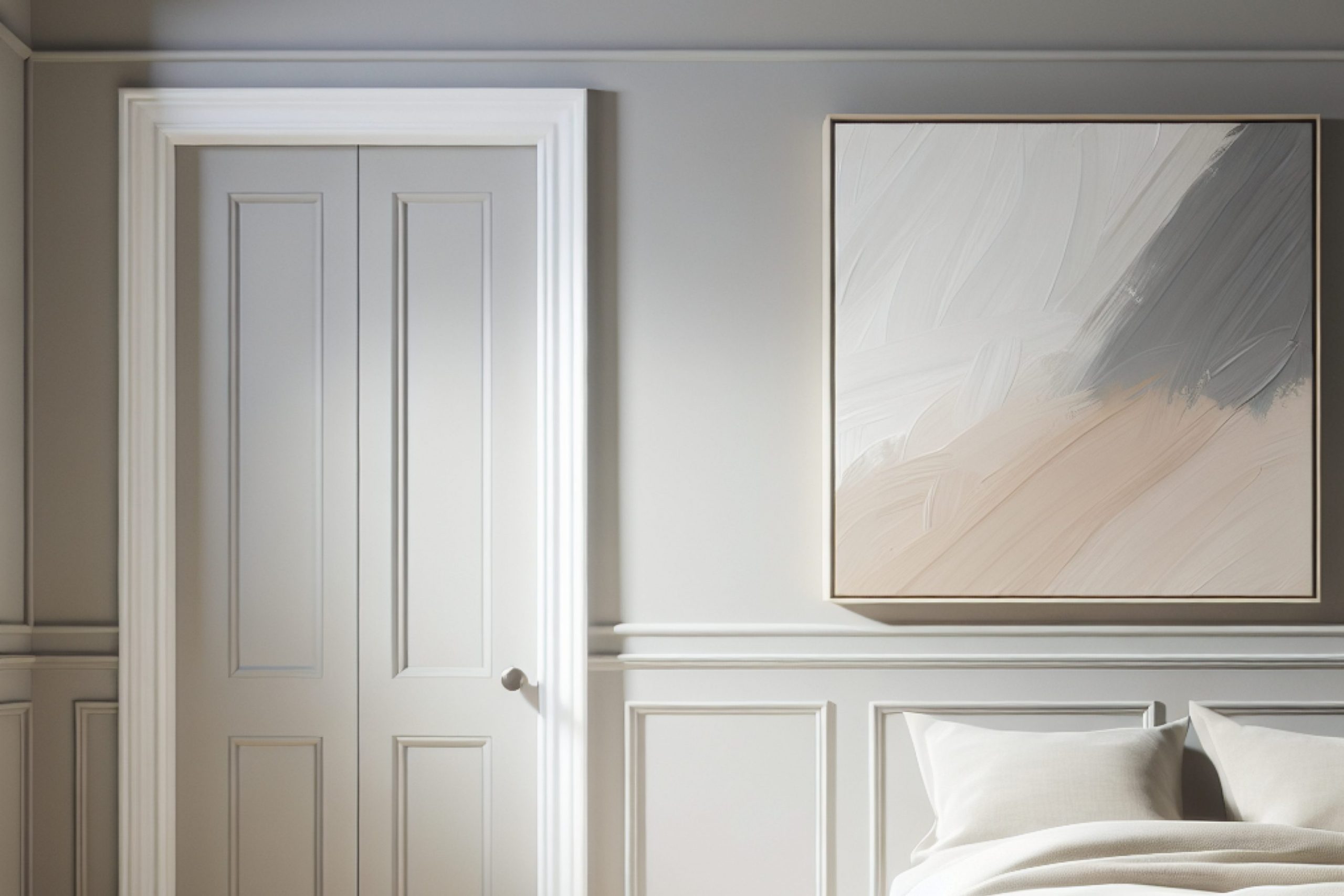
As I began my quest for the perfect gray paint, I stumbled upon SW 6003 Proper Gray by Sherwin Williams. If you’re searching for a versatile gray that subtly stands out without overwhelming a space, Proper Gray might be what you need.
It has a balanced blend that doesn’t lean too warm or too cool, making it a fantastic choice for various rooms in your home. The color can seamlessly fit into a minimalist aesthetic yet holds enough depth for more dynamic decor styles.
In my experience, Proper Gray works exceptionally well in well-lit rooms, reflecting a gentle vibrancy that both soothes and refreshes the ambiance.
I found it pairs beautifully with white trim for a clean, crisp look, or it can serve as the understated backdrop to bolder colors and patterns.
If you’re considering updating your space with a fresh coat of paint, Proper Gray could very well be the fresh look you’re aiming for.
What Color Is Proper Gray SW 6003 by Sherwin Williams?
Proper Gray by Sherwin Williams is a versatile mid-tone gray that brings a balanced, neutral feel to any space. This color has just the right mix of warmth and coolness, making it a go-to choice for those looking to create a modern yet inviting atmosphere. Its subtle undertones prevent it from feeling cold, which is often a concern with grayer shades.
This adaptable hue works exceptionally well in minimalist and contemporary interiors but is equally at home in transitional or even traditional settings. Due to its neutral base, Proper Gray pairs beautifully with a wide range of materials and textures.
In rooms with hardwood floors or wooden furniture, it offers a striking contrast that highlights the natural beauty of the wood. With metal accents, whether stainless steel or brass, Proper Gray complements the sleekness with its understated elegance.
For those who enjoy playing with textures, this color balances well against soft textiles like velvet or wool, providing a soothing background that makes colors and fabrics pop. In terms of pairing with other colors, Proper Gray looks stunning alongside soft pastels for a gentle look or vibrant colors for a dynamic contrast.
Overall, its adaptability across different styles and combinations makes it a practical choice for anyone looking to refresh their interior.
Is Proper Gray SW 6003 by Sherwin Williams Warm or Cool color?
Proper Gray by Sherwin Williams is a versatile and understated shade of gray that can make any room feel more modern and fresh. This color has a balanced neutrality that works well in a variety of spaces, whether it’s a bedroom, living room, or kitchen.
Its subtle hue doesn’t overpower the room but instead provides a clean and calm background. This makes it easy to pair with different decor styles and colors. From bright and bold to soft and subtle, accents stand out nicely against Proper Gray.
It’s particularly useful in areas that have less natural light, as it won’t make the space feel dark or cramped. Instead, it helps create a light and airy feel. Homeowners appreciate this color for its ability to maintain a sleek look while hiding everyday wear and tear better than lighter shades. Overall, Proper Gray is a smart choice for creating a fresh, contemporary look in your home.
Undertones of Proper Gray SW 6003 by Sherwin Williams
The paint color Proper Gray has subtle undertones that can significantly influence the ambiance and appearance of a room when used on interior walls. Undertones are the colors lurking beneath the main hue, and they can surface based on lighting conditions and surrounding colors. Understanding these undertones helps in predicting how the color will behave in different environments.
Proper Gray is a complex shade that carries undertones of light purple, light blue, mint, and gray, among others. These undertones can make the walls look slightly different as the day progresses and as natural light changes.
For example, in bright daylight, the mint or light blue undertones might make the walls look more vibrant and airy, while during the evening under artificial light, the light purple undertones could give a cozy, calmer feel.
Moreover, when choosing furnishings and decor, these undertones play a critical role. Warm-colored furniture might bring out subtle orange or light brown undertones, while metallic or blue decor could highlight its cooler gray or light blue underpinnings.
In essence, the undertones in Proper Gray add depth and versatility, making it more than just a simple gray. It’s this complexity that allows it to adapt well to various decorating styles and color schemes, affecting overall perception and feel of the spaces it graces.
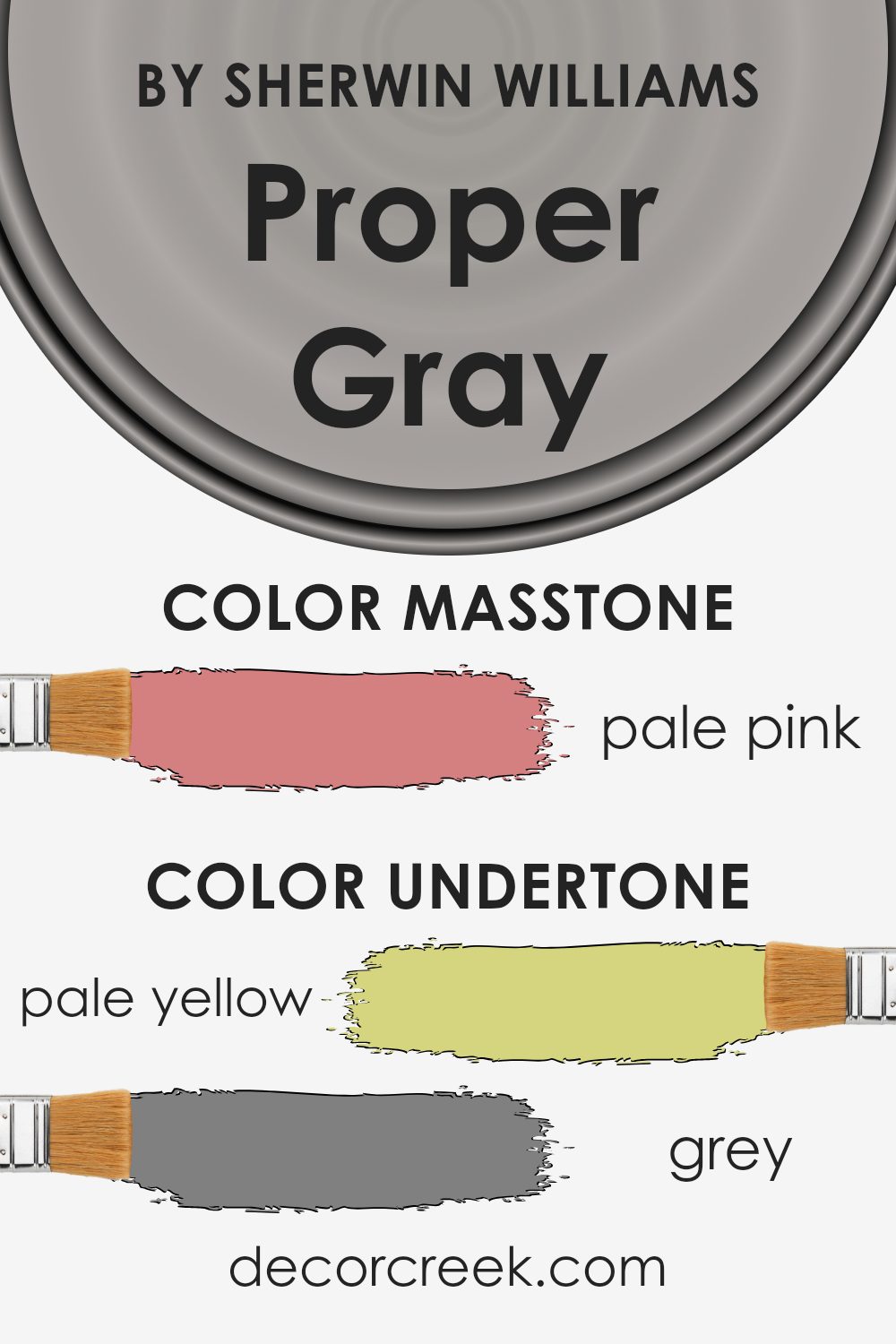
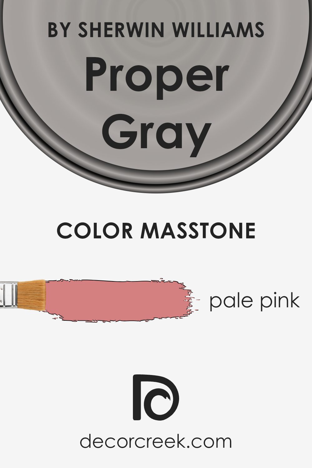
What is the Masstone of the Proper Gray SW 6003 by Sherwin Williams?
Proper Gray SW 6003 by Sherwin Williams has a masstone of pale pink, which visually translates to a soft, gentle tone. This specific shade of pink brings a calming and inviting feeling to rooms, making it a great fit for spaces like bedrooms or living areas where comfort is key.
The lightness of the pale pink helps to make smaller rooms appear slightly larger and creates a warm backdrop for both modern and classic decor. It pairs well with soft whites, deep grays, or even accents like navy blue for those looking to add a bit of contrast.
The mildness of the color also means it doesn’t overwhelm spaces but instead offers a subtle hint of warmth and color, suitable for those who prefer a more understated look in their decorating style. This makes it a versatile choice that works well across various materials and lighting situations, helping create a cozy, welcoming environment in any home.
How Does Lighting Affect Proper Gray SW 6003 by Sherwin Williams?
Lighting plays a crucial role in how we perceive colors. The type of light and the direction it comes from can significantly affect the appearance of a color. Take, for example, the color gray. Depending on the lighting, it can look very different. Each type of light, be it artificial or natural, brings out different tones and qualities in a color.
Starting with artificial light, such as light bulbs in a home, gray tones can vary in appearance depending on the color temperature of the bulb. Warmer bulbs might make the gray look softer and slightly more welcoming, whereas cooler bulbs could bring out a crisper, more austere gray.
When we consider natural light, it influences how we see colors throughout the day. For the gray color in different room orientations, the appearance changes significantly:
1. North-faced rooms: These rooms get less direct sunlight, which can make colors appear cooler and slightly duller. The gray here might look more shadowy and muted, making the room feel calm but a bit dimmer.
2. South-faced rooms: These receive ample sunlight, brightening colors. Here, gray can look lighter and more vivid, potentially highlighting any undertones, like blue or green. The room feels airier and more open.
3. East-faced rooms: Light in these rooms is brighter in the morning but fades throughout the day. The morning light can make gray look soft and pleasant, but as the day progresses, it might look less lively.
4. West-faced rooms: Sunlight in these rooms intensifies during the afternoon and evening. The gray could appear vibrant and dynamic in the afternoon, which could add a touch of warmth later in the day as the sunlight turns golden.
Understanding how light affects colors helps in choosing the right paint for a room, ensuring that it always looks its best under different lighting conditions. Whether using artificial light or relying on natural sunlight, the direction of the room and the type of light can significantly impact how a color like gray is perceived.
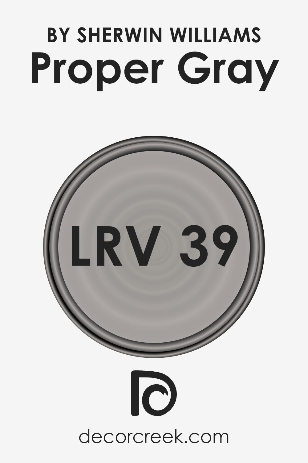
What is the LRV of Proper Gray SW 6003 by Sherwin Williams?
LRV stands for Light Reflectance Value, which is a measure of the amount of light a paint color reflects back into the room as opposed to absorbing it. This number is scaled between zero and one hundred, where zero means it reflects no light (absorbs all light) and one hundred means it reflects all the light that hits it.
The LRV helps in deciding how light or dark a color will appear on your walls and can be especially useful when choosing paint colors for your space. A higher LRV will make a room feel brighter because it reflects more light, while a lower LRV can make a room feel cozier but slightly darker as it absorbs more light.
For the color Proper Gray with an LRV of 39.438, it falls into the medium range on the LRV scale. This means it neither reflects a large amount of light nor does it absorb most of it. In practical terms, this LRV will give the color a balanced look where it won’t make the space feel overly bright or excessively dark.
In rooms with less natural light, this color might look a bit darker, making the space feel smaller. Conversely, in a well-lit room, Proper Gray will appear lighter and contribute to the overall airy feel of the room. Choosing a color like Proper Gray offers flexibility, working well in a variety of lighting conditions without dominating the room’s atmosphere.
Coordinating Colors of Proper Gray SW 6003 by Sherwin Williams
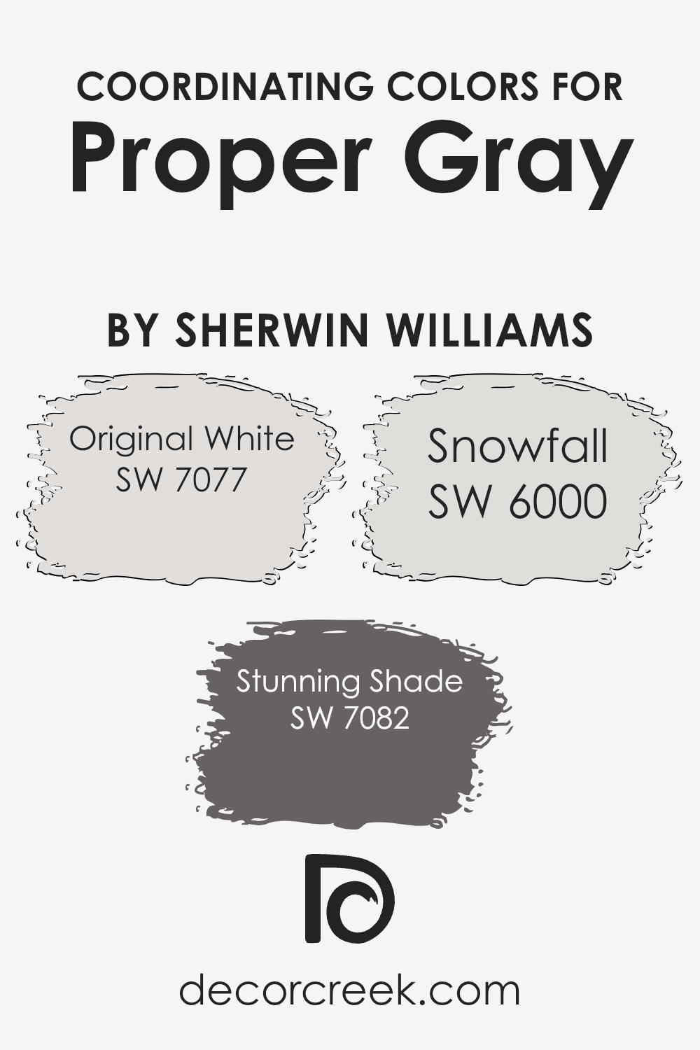
Coordinating colors are chosen to complement a main color, enhancing the overall aesthetic of a space without overpowering it. Proper Gray SW 6003 by Sherwin Williams can be paired with various coordinating colors to create different moods and styles in a room. This versatile gray serves as a neutral backdrop, allowing coordinating colors to stand out and add character to the environment. By selecting colors like Original White, Stunning Shade, and Snowfall as companions, one can achieve a balanced and harmonious look.
Original White SW 7077 is a clean and crisp white that provides a fresh contrast to the more muted Proper Gray. It helps to brighten spaces and bring a sense of freshness when used on trim, ceilings, or as an accent. Stunning Shade SW 7082 offers a deeper, more dramatic tone that complements the mid-tone of Proper Gray.
This color can be used effectively for accent walls or in furnishing details to add depth and interest to the decor. Snowfall SW 6000 is a gentle white with subtle undertones that pairs smoothly with Proper Gray, ensuring the space feels cohesive and thoughtfully designed. This color works well in creating a soft transition between the more pronounced shades of a palette.
You can see recommended paint colors below:
- SW 7077 Original White
- SW 7082 Stunning Shade
- SW 6000 Snowfall
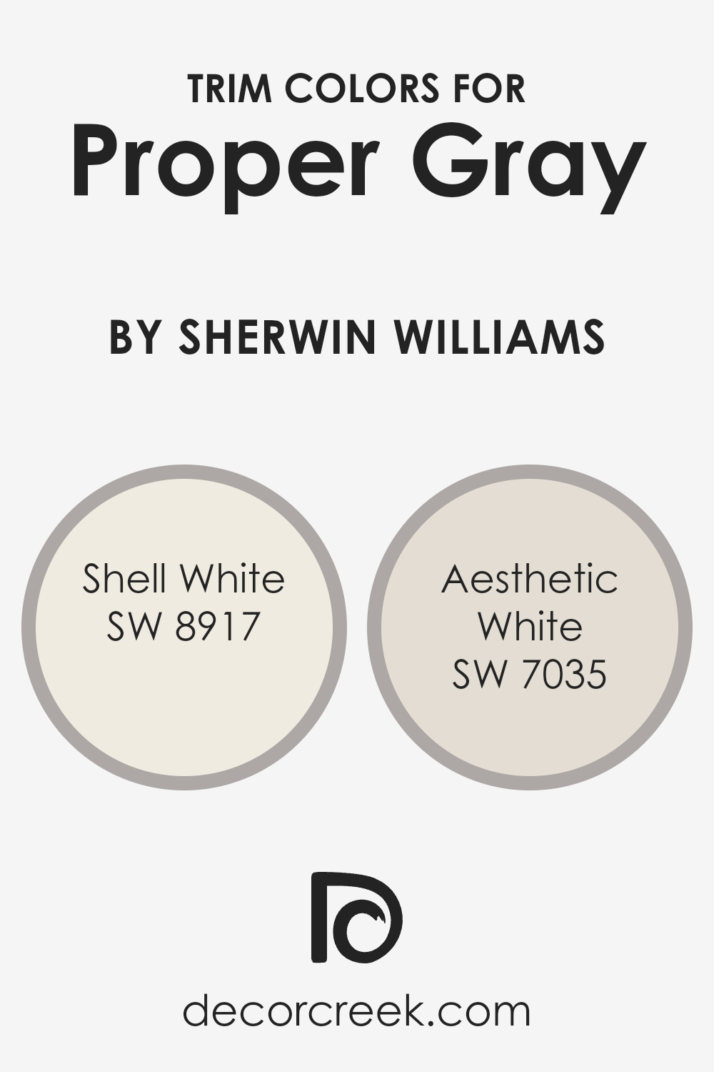
What are the Trim colors of Proper Gray SW 6003 by Sherwin Williams?
Trim colors are specific shades used to enhance and define the edges or transitions in spaces such as door frames, moldings, windows, and skirting. Choosing the right trim color can significantly affect the visual experience of a room, highlighting architectural details and creating a finished look. This is particularly true when paired with a neutral shade like Proper Gray by Sherwin Williams. Proper choices in trim color can accentuate this gray’s subtle and versatile character, helping to define spaces clearly and cleanly without overwhelming the main color.
Shell White (SW 8917) is a gentle and light color that offers a barely-there contrast to Proper Gray, ensuring a soft and seamless transition between the wall color and the trim. This can help in creating a gentle, cohesive look in a room.
On the other hand, Aesthetic White (SW 7035) is slightly darker and warmer, providing a subtle yet noticeable contrast that can help in framing the space more distinctly. This option could be great for those looking to softly highlight architectural features without creating too stark of a contrast.
You can see recommended paint colors below:
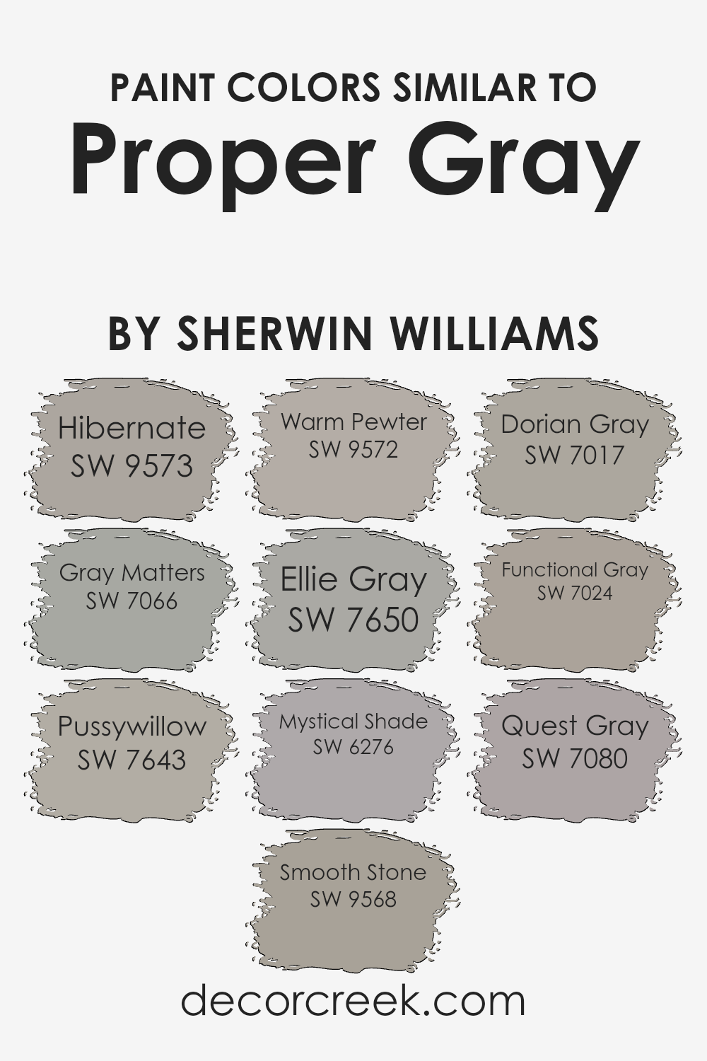
Colors Similar to Proper Gray SW 6003 by Sherwin Williams
Choosing similar colors when decorating can create a cohesive and harmonious look in any space. When working with a base like Proper Gray by Sherwin Williams, selecting shades like Hibernate, Gray Matters, and Pussywillow can subtly vary the mood without clashing.
These colors maintain a soothing balance yet allow for slight variations that define different areas or elements within a room. Smooth Stone and Warm Pewter, for instance, offer a touch of warmth, making them excellent for living spaces or bedrooms where a cozy atmosphere is desired.
Ellie Gray and Mystical Shade present a slightly more intense hue, which can be perfect for accent walls or furniture, lending a dignified air without overwhelming the primary color theme. Similarly, Dorian Gray and Functional Gray provide depth, making them ideal for larger areas or exterior spaces, complementing modern or traditional designs.
Lastly, Quest Gray stands out among these choices with its unique ability to blend into spaces that require a bold yet still neutral backdrop. Using shades like these ensures that the aesthetic flows seamlessly while providing each room its character and charm.
You can see recommended paint colors below:
- SW 9573 Hibernate
- SW 7066 Gray Matters
- SW 7643 Pussywillow
- SW 9568 Smooth Stone
- SW 9572 Warm Pewter
- SW 7650 Ellie Gray
- SW 6276 Mystical Shade
- SW 7017 Dorian Gray
- SW 7024 Functional Gray
- SW 7080 Quest Gray
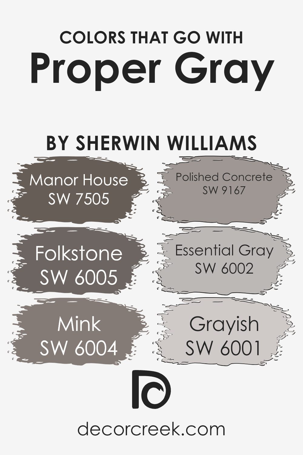
Colors that Go With Proper Gray SW 6003 by Sherwin Williams
Choosing complementary colors for Proper Gray SW 6003 by Sherwin Williams is crucial as it helps create a cohesive and visually appealing space. Proper Gray is a versatile mid-tone gray that serves as an excellent backdrop for various interior styles, from modern to traditional. Matching this color with the right shades enhances the overall aesthetic, ensures balance, and brings a harmonious feel to the room.
Manor House SW 7505 provides a deeper, rich gray that adds warmth and depth when paired with Proper Gray, making spaces feel more inviting. Similarly, Folkstone SW 6005 is a slightly darker gray that offers a subtle contrast, perfect for creating a layered look without overwhelming the base color.
Mink SW 6004, with its deeper and slightly brown undertone, introduces an elegant contrast, enriching the visual texture of a room. Polished Concrete SW 9167 is a lighter, softer gray that brightens spaces and works well in offering a slight yet striking difference.
Essential Gray SW 6002 leans towards a lighter palette, providing a gentle lift to the surroundings, enhancing the light in rooms with less natural light. Lastly, Grayish SW 6001 bridges the gap between gray and beige, softening the overall decor and offering a warm complement to Proper Gray, ensuring the room feels cozy and well-coordinated.
You can see recommended paint colors below:
- SW 7505 Manor House
- SW 6005 Folkstone
- SW 6004 Mink
- SW 9167 Polished Concrete
- SW 6002 Essential Gray
- SW 6001 Grayish
How to Use Proper Gray SW 6003 by Sherwin Williams In Your Home?
Proper Gray SW 6003 by Sherwin Williams is a versatile shade that fits well in any room of your house. This color is a gentle gray that looks fresh and clean, making it a perfect backdrop for both bright and muted accents.
You can paint your living room walls with Proper Gray to create a cozy, welcoming vibe. It also works great in bedrooms, where it adds a soft, calming touch without making the space feel too dark. In the kitchen, Proper Gray can help modernize the space when paired with white cabinets or as an island base color for contrast.
Additionally, this neutral hue is ideal for bathrooms, as it complements both light and dark tiles, ensuring a polished look. With Proper Gray, you can easily refresh your home without overwhelming it with strong colors, keeping everything looking sleek and tidy.
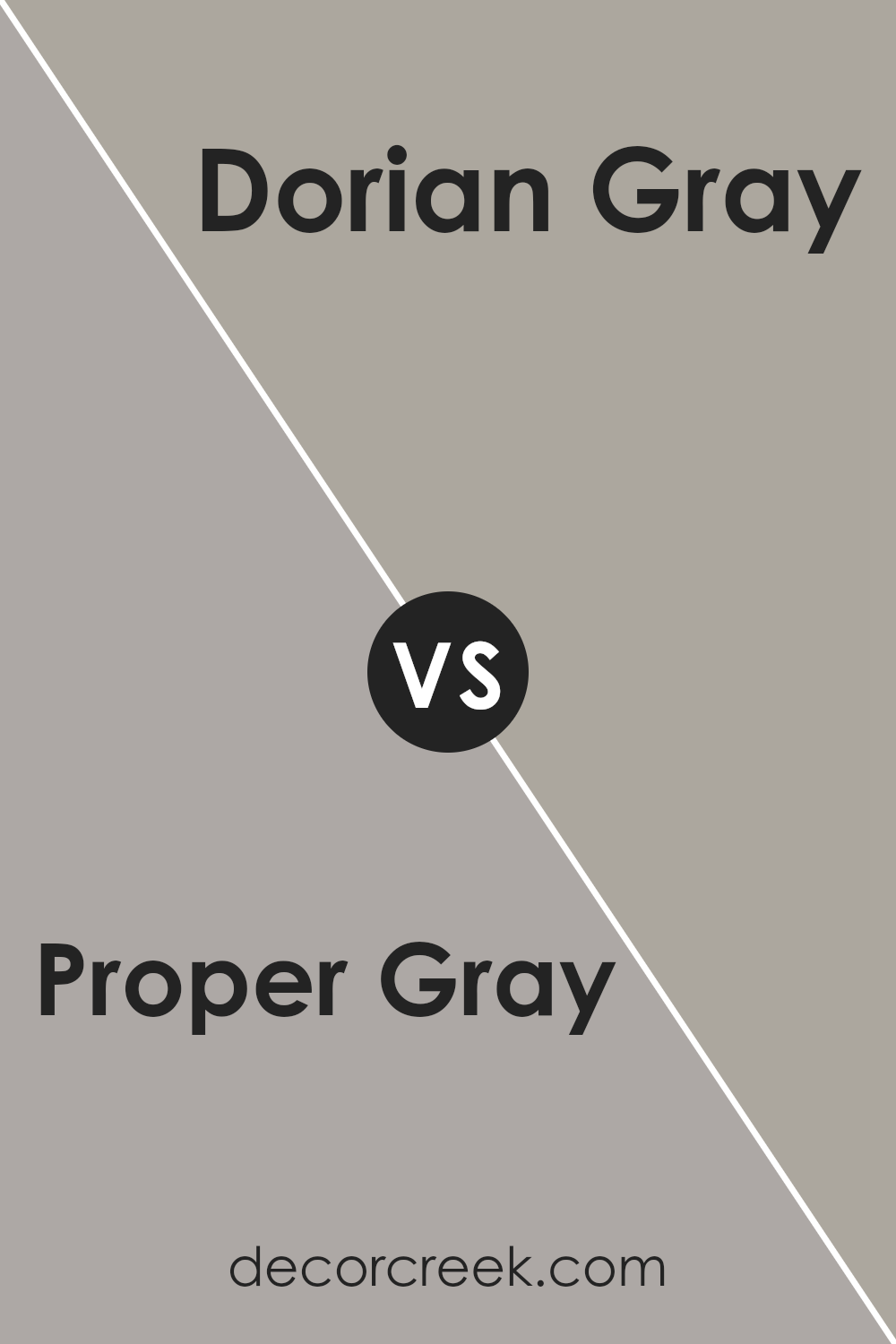
Proper Gray SW 6003 by Sherwin Williams vs Dorian Gray SW 7017 by Sherwin Williams
Proper Gray and Dorian Gray are both popular shades from Sherwin Williams, and while they share a common base color, their vibes differ subtly. Proper Gray is a bit lighter and can make spaces feel more open and airy.
It’s a great choice for achieving a neutral look without making a room feel too cold or stark. On the other hand, Dorian Gray is darker, giving it a warmer, cozier feel. This makes it perfect for larger spaces or rooms with a lot of natural light, as it can prevent the room from feeling too expansive. Both colors pair well with white trims and can be used in a variety of settings, from modern to traditional.
Your choice between Proper Gray and Dorian Gray could depend on the size of your room and the amount of light it receives.
You can see recommended paint color below:
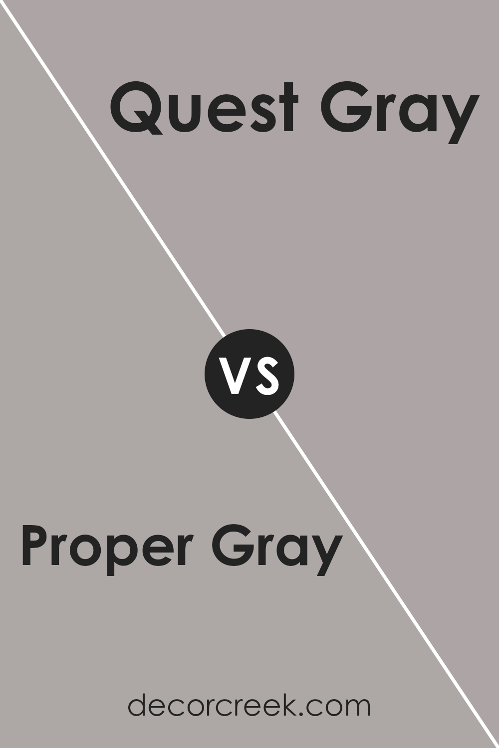
Proper Gray SW 6003 by Sherwin Williams vs Quest Gray SW 7080 by Sherwin Williams
Proper Gray and Quest Gray are two distinct shades offered by Sherwin Williams. Proper Gray is a balanced, neutral gray that leans towards a warm tone, making it versatile for various spaces and pairing well with both vivid and subdued colors.
It creates a cozy backdrop, perfect for living areas or bedrooms where you want a subtle hint of warmth. On the other hand, Quest Gray is a deeper, more pronounced gray. This color has cooler undertones, which can give a sharper, more defined look. It works well in areas where you want to make a statement, like an accent wall or cabinetry.
Despite both being gray, their differing undertones and depths can influence the mood and style of a room. Choosing between them depends on the desired aesthetic and the lighting of the space, as these factors can affect how each shade appears once applied.
You can see recommended paint color below:
- SW 7080 Quest Gray
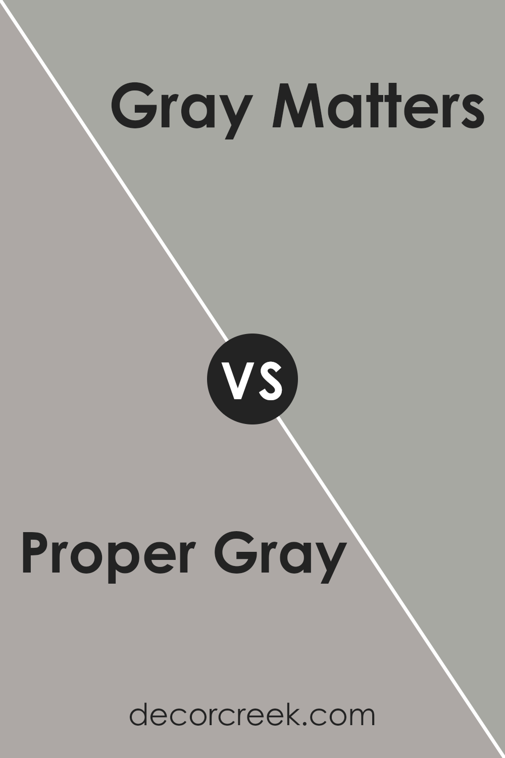
Proper Gray SW 6003 by Sherwin Williams vs Gray Matters SW 7066 by Sherwin Williams
Proper Gray and Gray Matters, both by Sherwin Williams, are versatile shades of gray but with distinct undertones and depth that set them apart. Proper Gray leans more towards a neutral, balanced gray with a calm and subdued quality. It’s a great option if you are looking for a color that’s not too dark and can work well in various spaces without making them feel too enclosed.
On the other hand, Gray Matters is a bit darker with a cooler undertone that could remind one of steel or a stormy sky. This shade is excellent for someone looking to add a more dramatic feel to their space without going too bold.
Both colors offer a modern look and can easily match different decor styles, but your choice would depend on the desired ambiance and lighting in your room. Proper Gray is lighter and can help make a small room look bigger, while Gray Matters is ideal for creating a more striking, defined look.
You can see recommended paint color below:
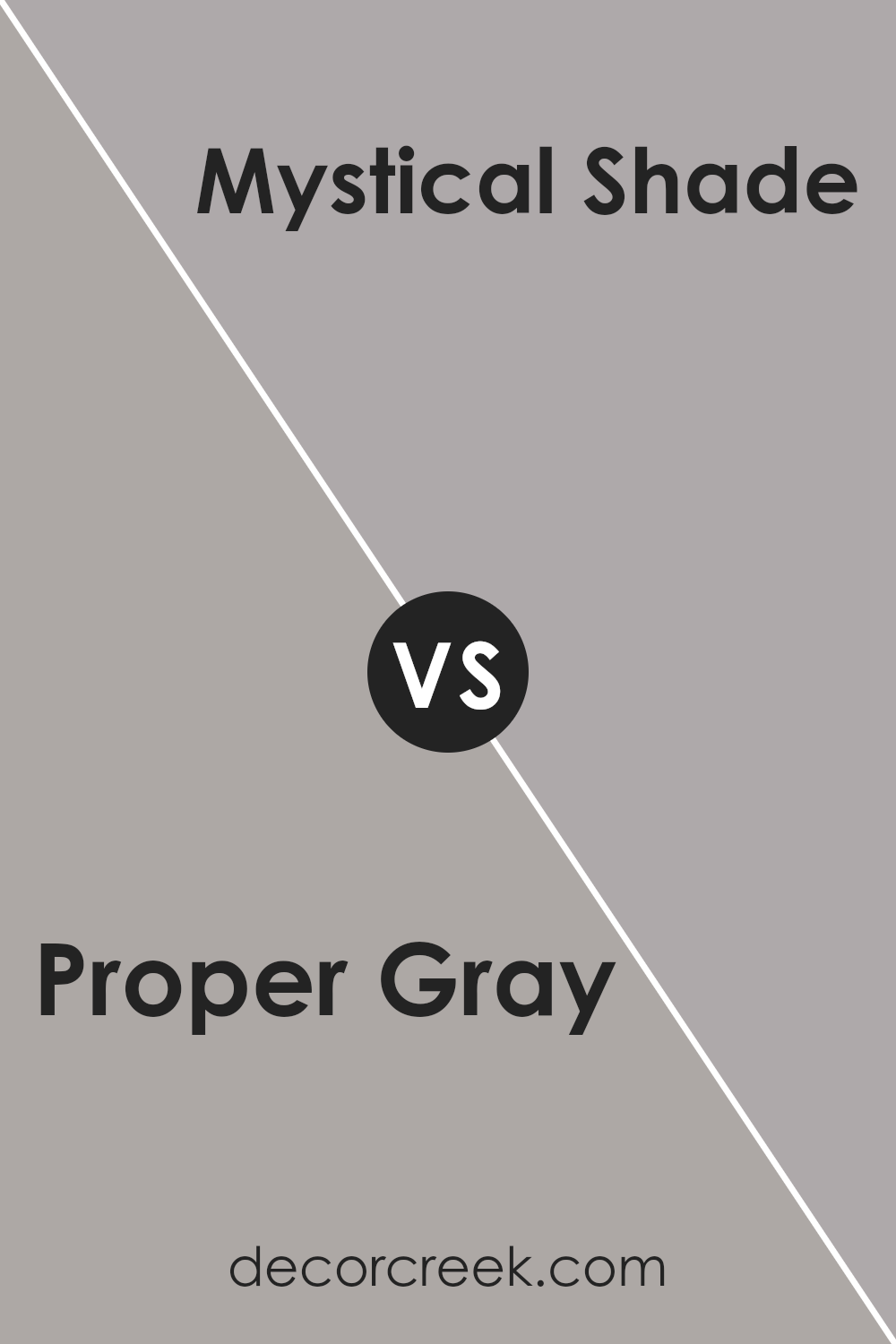
Proper Gray SW 6003 by Sherwin Williams vs Mystical Shade SW 6276 by Sherwin Williams
Proper Gray and Mystical Shade by Sherwin-Williams are two distinct colors, each offering a unique vibe for interior spaces. Proper Gray is a neutral gray that provides a calm, understated backdrop to any room. Its balanced tone makes it highly versatile, making it suitable for living rooms, bedrooms, or even office spaces, pairing well with a wide variety of decor styles and colors.
On the other hand, Mystical Shade is a deeper, more intense color. This gray has a hint of navy blue, giving it a cooler, slightly more dramatic feel compared to Proper Gray. It’s ideal for creating a focal point in a space, perfect for accent walls or for rooms that benefit from a cozier, more enveloping feel.
Choosing between the two depends on the desired mood and functionality of the space. Proper Gray works well where you need a neutral, flexible background, while Mystical Shade is great for adding a touch of drama and depth.
You can see recommended paint color below:
- SW 6276 Mystical Shade
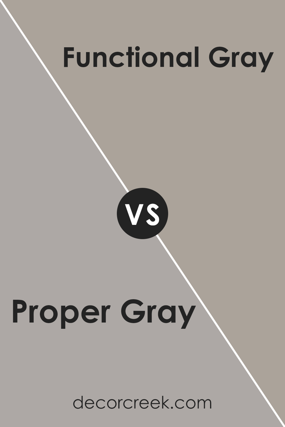
Proper Gray SW 6003 by Sherwin Williams vs Functional Gray SW 7024 by Sherwin Williams
The main color, Proper Gray, is a subdued and gentle shade of gray. It provides a soft look that is perfect for creating calm and soothing spaces. This color pairs well with both bright and muted tones, making it versatile for various decorating styles. On the other hand, Functional Gray is a deeper gray with a slightly warmer undertone.
It adds a bit more strength and presence to a room compared to Proper Gray. Functional Gray works well in areas that need a robust, stable look without becoming too dark or overwhelming. Both colors offer a neutral palette, but Functional Gray stands out more dramatically, making it suitable for feature walls or larger areas, whereas Proper Gray is ideal for a more consistent, overall color that maintains lightness throughout the space.
In conclusion, Proper Gray is lighter and softer, while Functional Gray is darker and warmer, with each bringing its unique atmosphere to an environment.
You can see recommended paint color below:
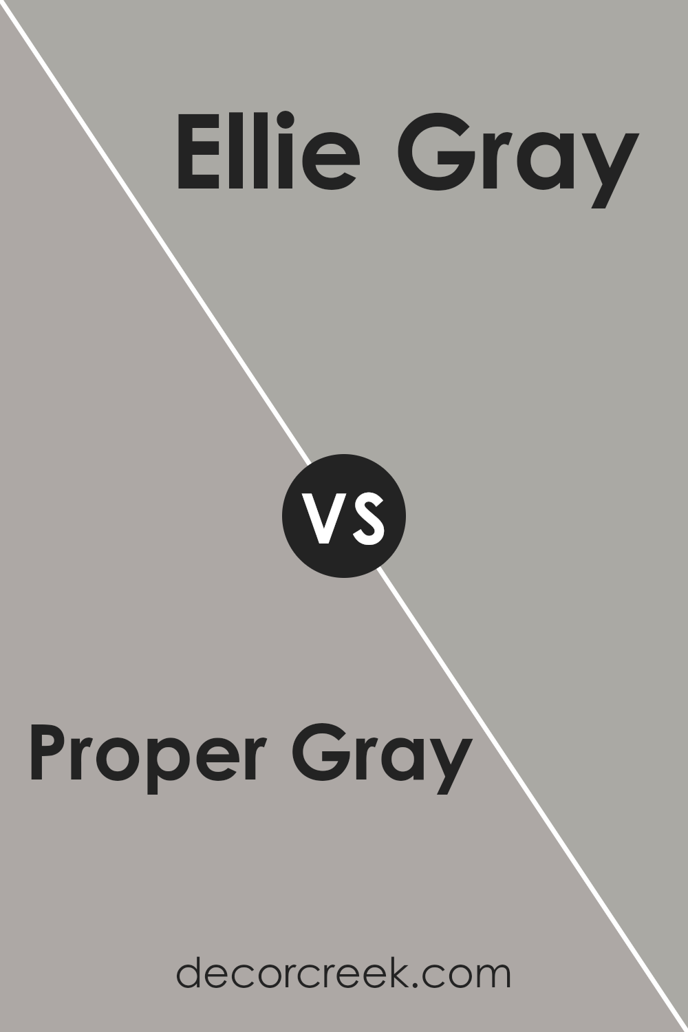
Proper Gray SW 6003 by Sherwin Williams vs Ellie Gray SW 7650 by Sherwin Williams
Proper Gray and Ellie Gray by Sherwin Williams are two distinct gray shades that can change the feel of a space. Proper Gray is a neutral, balanced gray that leans towards a traditional look.
It’s a versatile color that fits well in various areas of a home, offering a timeless backdrop. On the other hand, Ellie Gray is a deeper shade, providing a stronger statement in design. It can make smaller spaces feel a bit more enclosed but gives a sizable area a sense of warmth and coziness.
Both colors pair well with bright whites or rich darks for trims and accents. Choosing between them depends on the atmosphere you’re aiming for: Proper Gray works well for a light and airy feel, while Ellie Gray is ideal if you prefer a more anchored, cozy setting.
You can see recommended paint color below:
- SW 7650 Ellie Gray
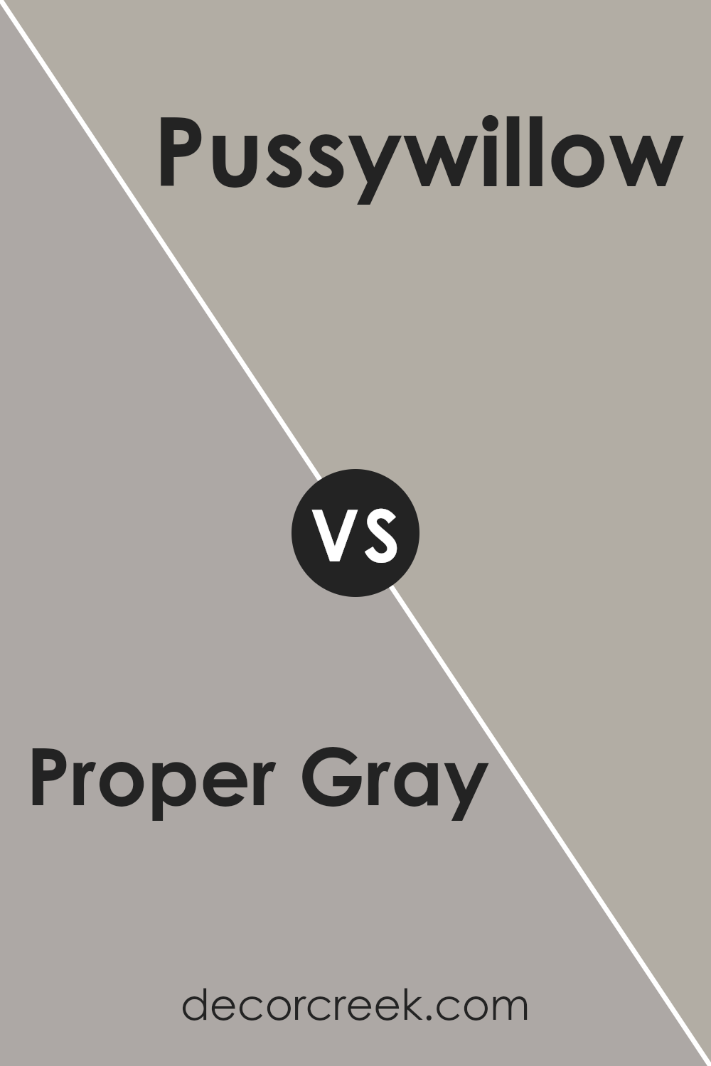
Proper Gray SW 6003 by Sherwin Williams vs Pussywillow SW 7643 by Sherwin Williams
Proper Gray and Pussywillow are two distinctive shades from Sherwin Williams. Proper Gray is a balanced, neutral gray that provides a subtle, clean backdrop to any room. It leans towards a cooler tone, making it suitable for spaces where a fresh and straightforward look is desired.
On the other hand, Pussywillow is a slightly darker gray that carries a hint of warmth. This makes it more inviting and perfect for creating a cozy atmosphere in spaces like living rooms or bedrooms. Both colors are versatile, but Pussywillow’s warmth offers a more welcoming vibe, while Proper Gray’s cooler tone is excellent for achieving a modern and minimal aesthetic.
These shades can work well together in a space, as their gray bases allow them to complement each other, enhancing the overall feel without overwhelming the senses.
You can see recommended paint color below:
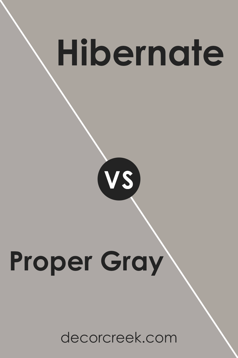
Proper Gray SW 6003 by Sherwin Williams vs Hibernate SW 9573 by Sherwin Williams
The main color, Proper Gray, is a soft, neutral gray that has a balanced, understated quality. It can work well in various spaces, providing a calm, soothing backdrop without being too stark or cold. It’s a versatile shade that can pair nicely with both warm and cool tones, making it easy to use in most home decor styles.
On the other hand, Hibernate is a darker, cozier gray that feels more enclosed and cozy. This color is ideal for creating a more intimate atmosphere in spaces like bedrooms or reading nooks. It has a certain depth that adds warmth to a room, making it feel more private and sheltered.
Both colors are grays, but they serve different purposes in terms of mood and space usage. While Proper Gray is more about creating a neutral, flexible canvas, Hibernate is about crafting a snug, warm retreat. Their impact on a room’s ambiance can be distinctly different, offering either a gentle balance or a deep, comforting shelter.
You can see recommended paint color below:
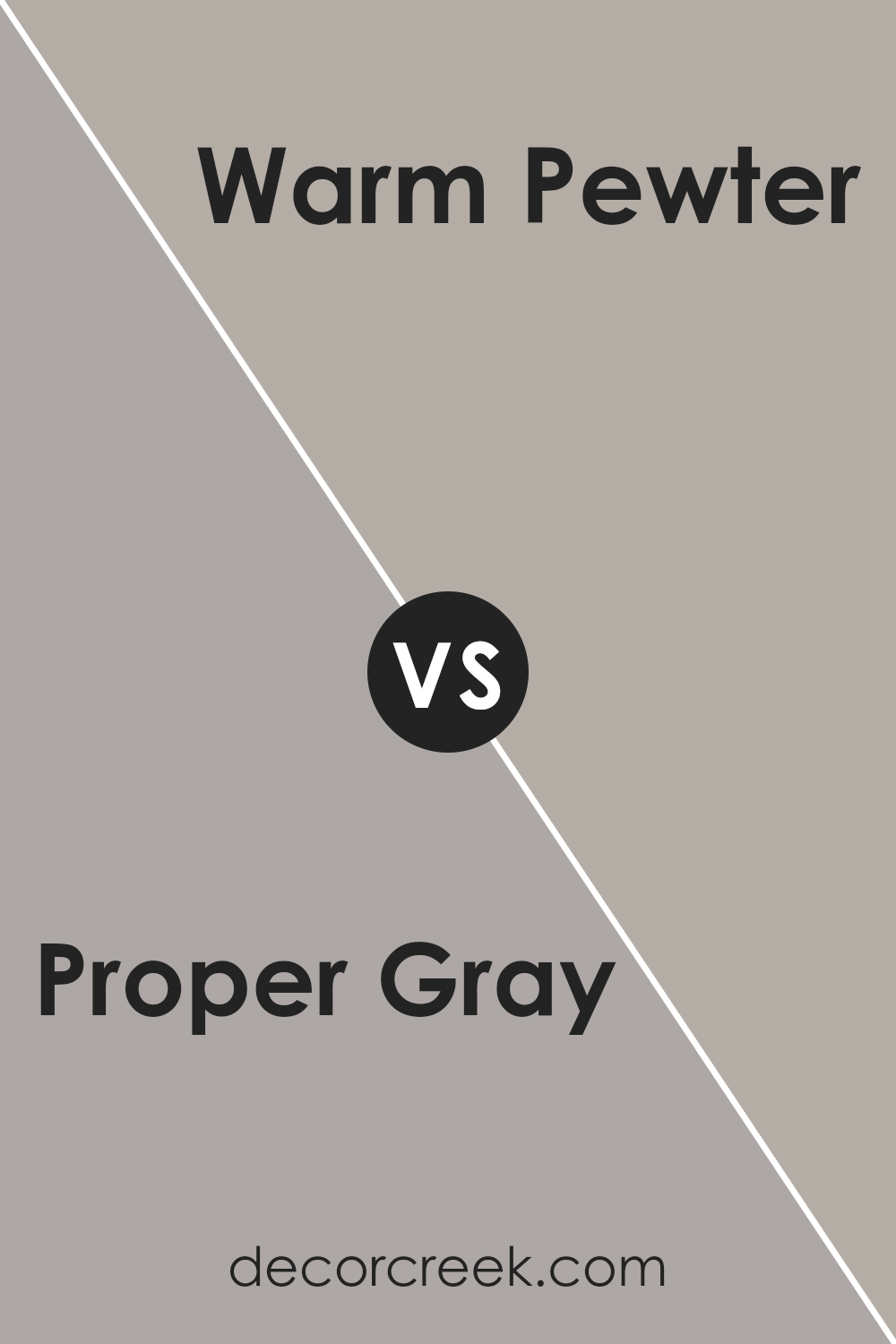
Proper Gray SW 6003 by Sherwin Williams vs Warm Pewter SW 9572 by Sherwin Williams
Proper Gray and Warm Pewter are both elegant colors from Sherwin Williams, but they have distinct tones that set them apart. Proper Gray is a neutral gray that provides a clean and straightforward backdrop.
It’s versatile enough to work in various spaces, offering a fresh and modern feel without overpowering the room. In contrast, Warm Pewter is a warmer tone, with a beige-gray color that gives a cozier feel. It’s perfect for spaces where you want a touch of warmth while maintaining a modern look.
This color can make a room feel inviting and comfortable. While both colors are great for those looking for a modern and understated look, the choice between Proper Gray and Warm Pewter comes down to the desired warmth and mood of the space.
Warm Pewter works well in areas like living rooms or bedrooms, where a softer ambiance is preferred, while Proper Gray is ideal for a crisp, clean look in kitchens and bathrooms.
You can see recommended paint color below:
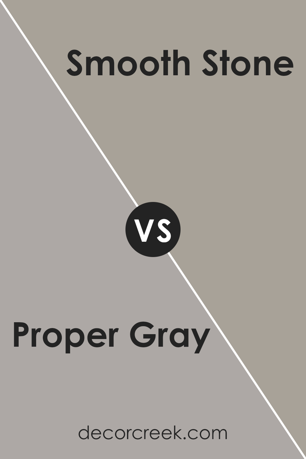
Proper Gray SW 6003 by Sherwin Williams vs Smooth Stone SW 9568 by Sherwin Williams
**Main Color:** Proper Gray is a versatile choice that balances between a true gray and hints of beige, making it a great neutral base for any room. It has a warmer undertone which makes it cozy and inviting, perfect for living spaces or bedrooms.
**Second Color:** Smooth Stone, on the other hand, is lighter and more subtle than Proper Gray. It leans more towards a soft gray with very slight blue undertones, giving it a fresher feel. This color would work well in spaces that get a lot of natural light or in smaller rooms to make them appear larger.
**Comparison:** When comparing Proper Gray and Smooth Stone, the key difference is in their depth and undertones. Proper Gray offers a richer, warmer hue that works well in a variety of settings, providing a comforting backdrop. Smooth Stone, being lighter, offers a more airy and open vibe, which can help in creating a relaxed, calm atmosphere.
Depending on the room’s function and the amount of light it receives, each color has its unique strengths.
You can see recommended paint color below:
In wrapping up my thoughts on SW 6003 Proper Gray by Sherwin Williams, I’m pleasantly surprised by this color. It’s a calm sort of gray that doesn’t feel too dark or too light, making it just right for adding a bit of charm to a room without making things feel too gloomy or too bright. Whether on living room walls, a bedroom, or even a kitchen, Proper Gray manages to provide a soothing backdrop. It plays well with other colors, too, meaning you can throw in splashes of brighter hues through furniture or decorations, and they will stand out nicely.
What’s extra nice is that it doesn’t change much under different lights. Some paint colors can look really different when the sun goes down or in dimmer rooms, but Proper Gray stays pretty true to itself, which means less guessing for you about what you’re going to get through the day and night.
So, if you’ve been thinking about giving your room a new look, perhaps for a new cool vibe without going too bold, Proper Gray might just be the way to go. Its ability to keep things simple yet appealing can certainly make any room feel fresh and cozy all at once.
This gray by Sherwin Williams surely has won my approval!
Ever wished paint sampling was as easy as sticking a sticker? Guess what? Now it is! Discover Samplize's unique Peel & Stick samples.
Get paint samples

