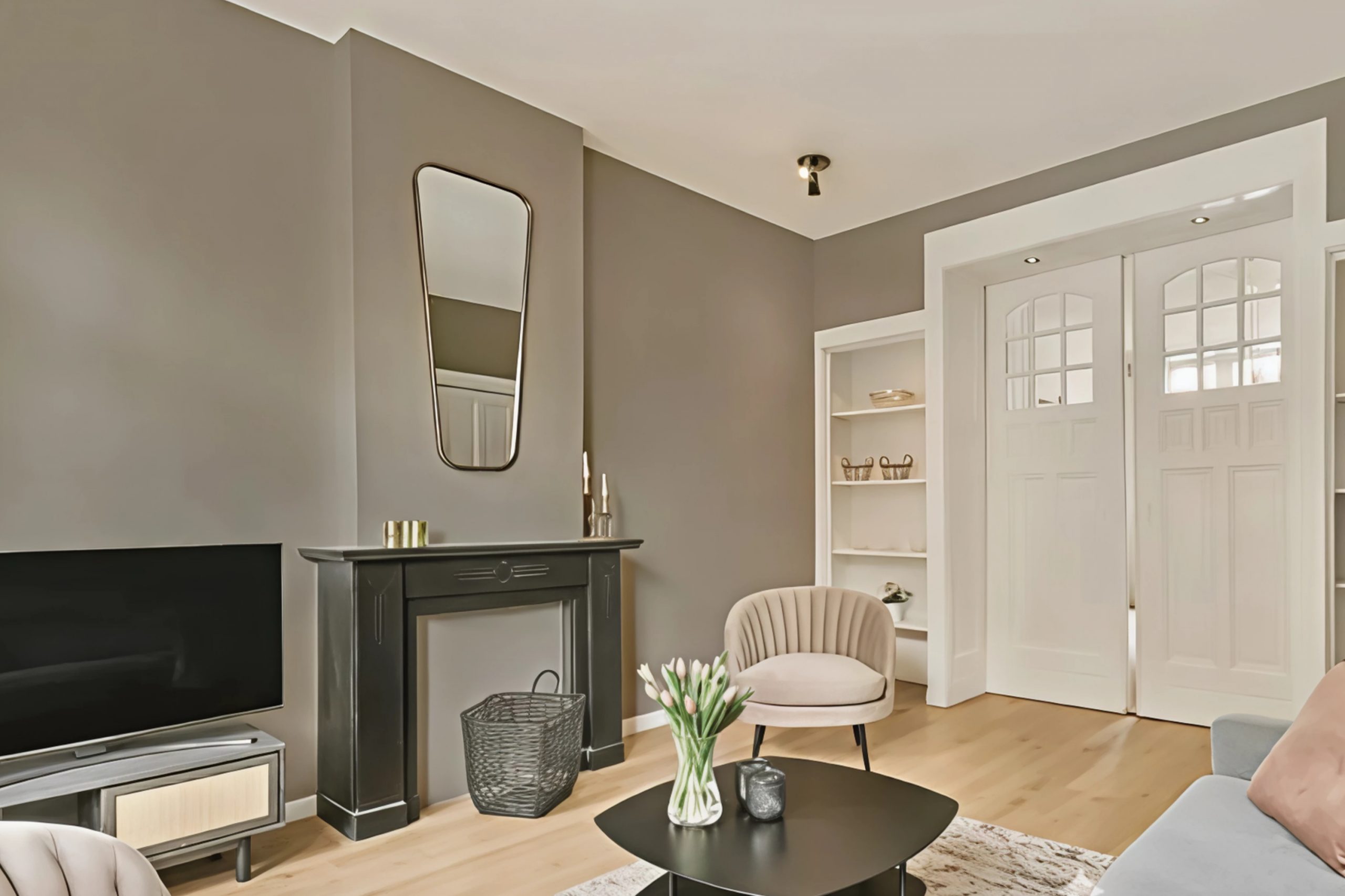
Have you ever needed a color that strikes the perfect balance between warmth and neutrality? Sherwin Williams’ SW 9572 Warm Pewter might just be what you’re looking for. This color offers a delightful blend of subtle hues that can enrich any room without overwhelming it.
When I think about adding colors to a space, I usually seek something that provides comfort and versatility. Warm Pewter delivers exactly that. It combines the calming presence of grey with just a hint of warmth to make any setting feel inviting and cohesive.
Imagine painting your living room with a color that complements both modern and traditional furnishings effortlessly. The soft undertones of Warm Pewter allow for a seamless transition between various design elements, making it an ideal choice for those who appreciate a harmonious environment.
This shade works well in multiple lighting conditions, providing depth that changes beautifully throughout the day as light shifts.
Warm Pewter also acts as a wonderful canvas for anyone who loves to accessorize with bolder colors. It supports vibrant artwork, colorful cushions, or striking furniture pieces without competing for attention.
Whether you’re refreshing a single room or updating an entire home, this shade offers sophistication and versatility in equal measure.
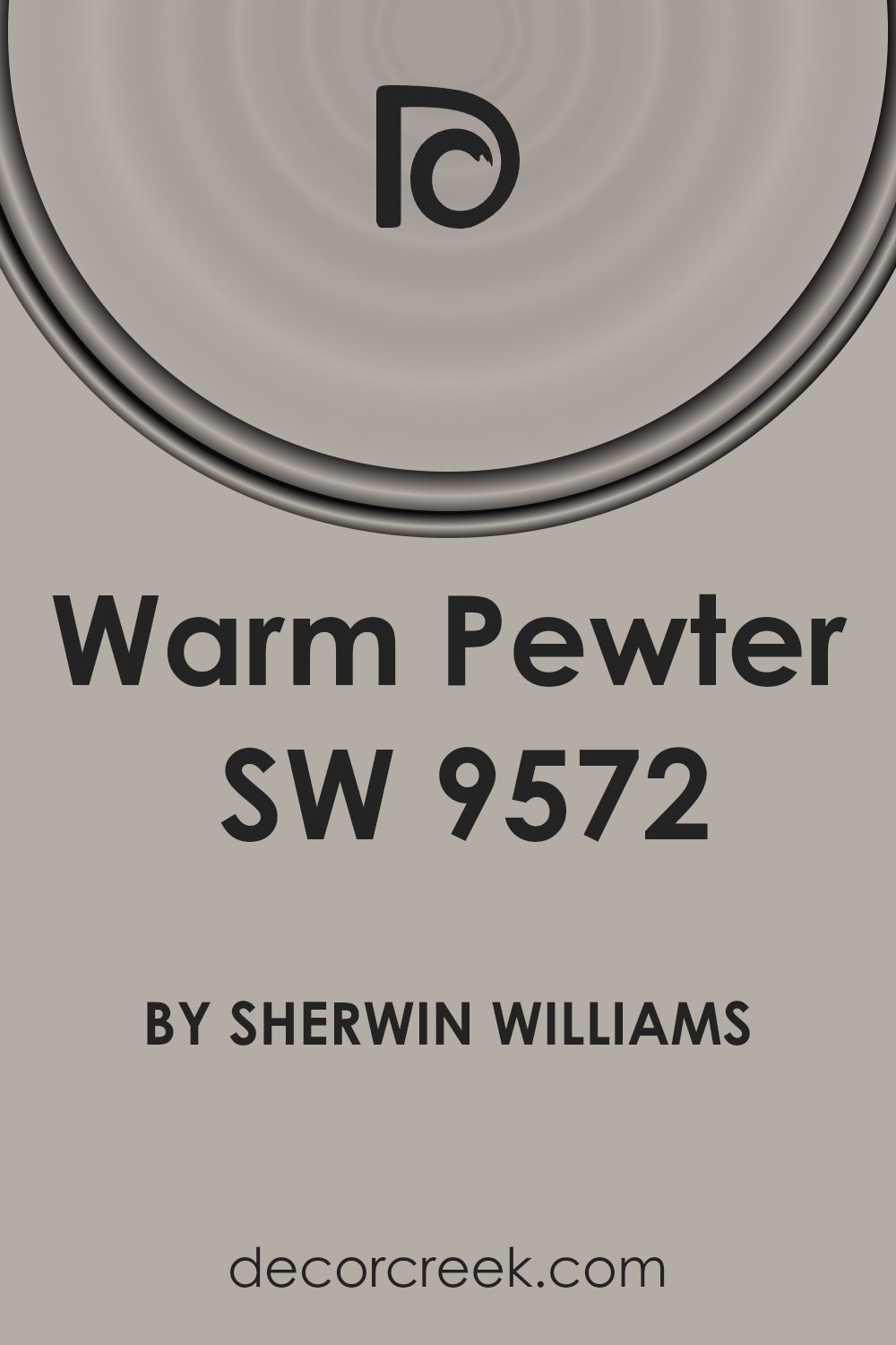
What Color Is Warm Pewter SW 9572 by Sherwin Williams?
Warm Pewter by Sherwin Williams is a neutral, light gray with a soft undertone that brings a cozy and inviting feel to any space. Its subtle warmth makes it a versatile choice for different interior styles. It pairs well with modern and contemporary designs, where clean lines and minimalistic decor are key.
This shade also complements traditional and transitional styles, blending seamlessly with classic elements like wood and stone.
In industrial spaces, Warm Pewter acts as a softer background against raw materials such as exposed brick, metal, and concrete, balancing the rugged textures with a soothing touch.
When used in a farmhouse or rustic setting, it highlights wood tones, giving them a fresh and updated look while preserving their natural beauty.
Warm Pewter works beautifully with materials like natural wood, linen, and leather. Its neutrality allows for flexibility with bold colors, patterns, or textures in furniture and accessories. For textiles, consider pairing it with soft, woven fabrics like wool or cotton to enhance its warmth.
In kitchens or bathrooms, it complements marble or granite countertops and stainless-steel appliances, providing a subtle elegance. Overall, its understated charm makes it a favorite for creating welcoming spaces.
Is Warm Pewter SW 9572 by Sherwin Williams Warm or Cool color?
Warm Pewter by Sherwin Williams is a versatile paint color that works well in various rooms in a home. It is a soft, warm shade of gray that brings a cozy feeling to any space. This color can help create a comfortable and inviting atmosphere in living areas, bedrooms, or even kitchens. It coordinates well with both light and dark furniture, allowing for flexibility in decorating.
Because it is a neutral color, Warm Pewter complements a wide range of styles, from modern to traditional. It pairs nicely with wood tones and can highlight architectural features in a subtle way. In a well-lit room, the shade can reflect natural light, making spaces feel more open. In rooms with less natural light, it provides warmth without feeling overwhelming. Overall, Warm Pewter is an adaptable choice that helps make any home feel welcoming and stylish without overpowering other design elements.
Undertones of Warm Pewter SW 9572 by Sherwin Williams
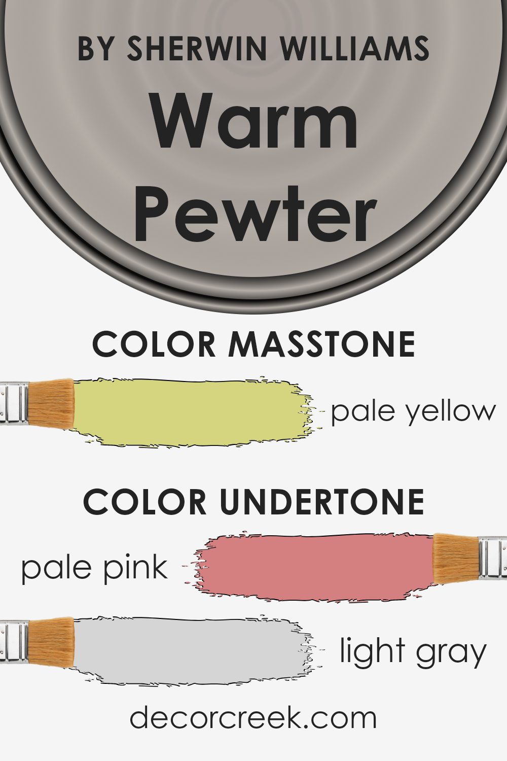
Warm Pewter by Sherwin Williams is a nuanced color with a range of undertones that can influence how it’s perceived in a space. Undertones are subtle hints of color that affect the overall appearance of a paint color. They can change based on lighting, furniture, and decor. Warm Pewter incorporates undertones like pale pink, light gray, light purple, and others, which blend to give the color its unique character.
When applied to interior walls, these undertones help Warm Pewter adapt to different settings. In a room with abundant natural light, the pale pink and light purple undertones may become more prominent, giving the walls a gentle warmth and inviting feel.
In more shaded areas, the light gray and gray undertones can bring out a cooler vibe, making the space feel calm and balanced.
The light green and mint undertones can add a fresh touch, while the slight presence of yellow and orange can bring warmth and vibrancy.
Overall, Warm Pewter’s blend of undertones allows it to shift subtly under varying conditions, ensuring the color harmonizes well with its surroundings. This makes it a versatile choice for a range of interior styles and color schemes, adapting easily as the environment changes.
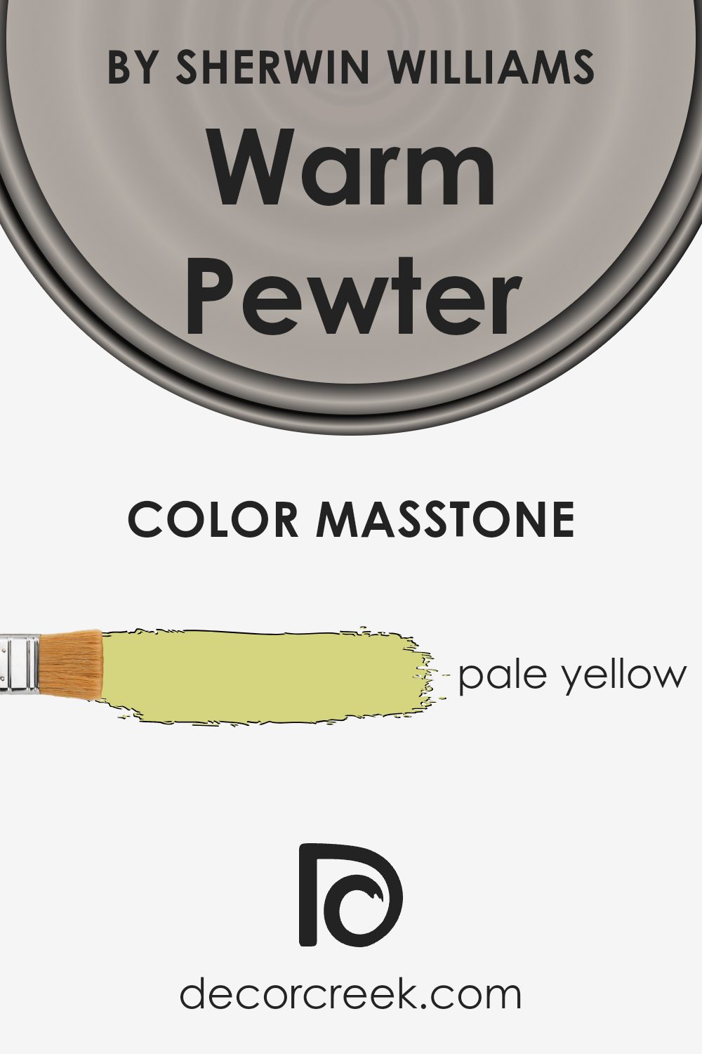
What is the Masstone of the Warm Pewter SW 9572 by Sherwin Williams?
Warm Pewter (SW 9572) by Sherwin Williams is a pale yellow with a masstone of #D5D580. This shade creates a welcoming and cozy atmosphere, making it ideal for homes. The light yellow hue brings warmth and brightness to a room without being overpowering.
It’s a great choice for spaces that need an extra touch of light. In living rooms, bedrooms, or kitchens, Warm Pewter adds a sunny and cheerful vibe, making these areas feel more open and airy. It pairs well with neutral colors, allowing for a harmonious and balanced look.
White trims or wooden accents can enhance its effect, creating a soft and inviting space that feels comfortable and approachable. This warm, pale yellow works well in any decor style, whether modern or traditional, due to its versatile and neutral undertones. It provides a subtle background that allows other elements in the room to stand out while maintaining a pleasant and cozy feel.
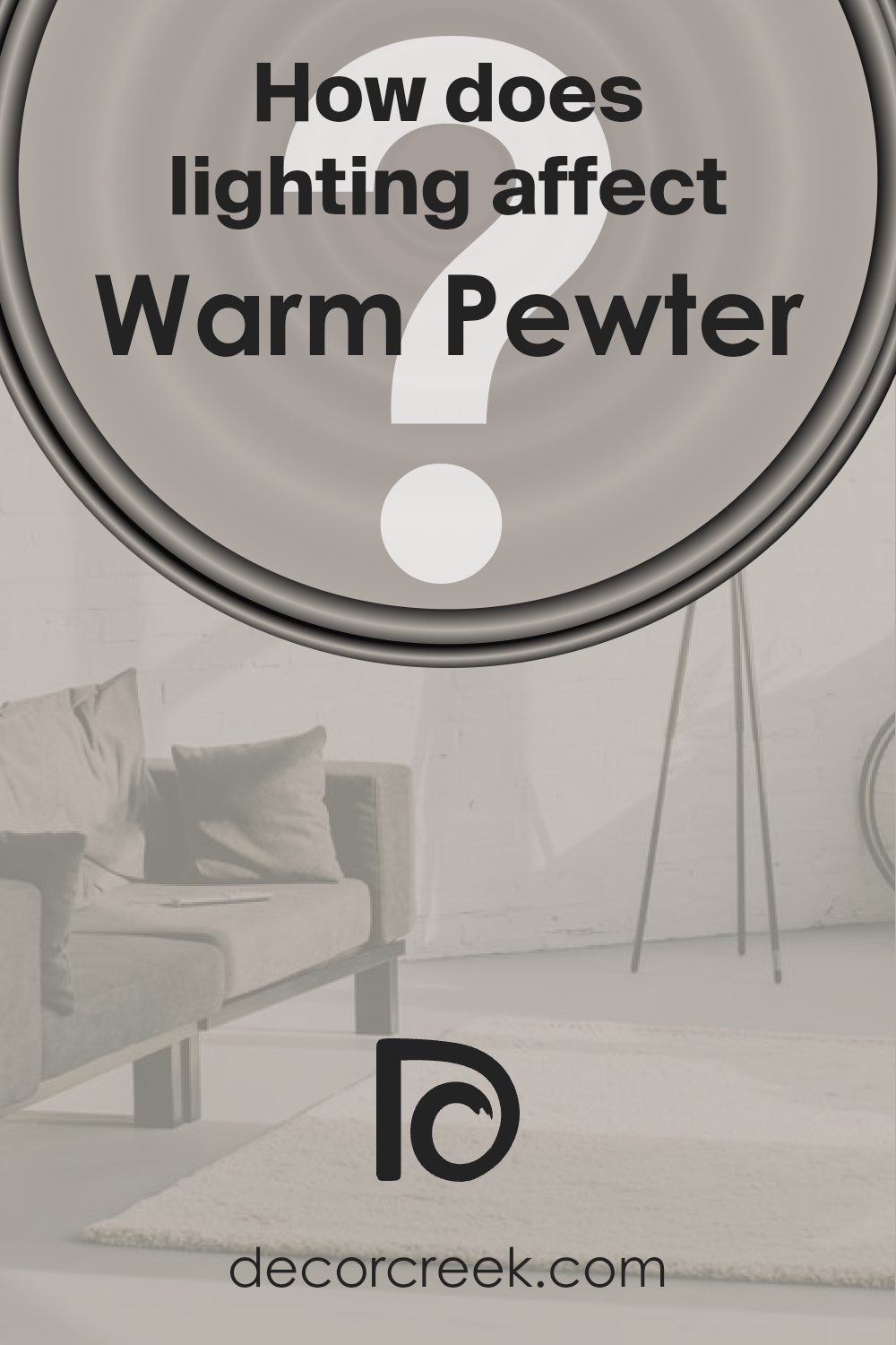
How Does Lighting Affect Warm Pewter SW 9572 by Sherwin Williams?
Lighting plays a big role in how we see colors. Different types of light can make the same color look different. This is important when choosing paint colors for a room. For example, Warm Pewter by Sherwin Williams is a medium gray with warm undertones. Let’s see how it behaves under different lighting conditions.
In natural light, colors can look more varied. Natural light changes throughout the day. In a north-facing room, the light tends to be cooler and less intense. So, Warm Pewter may appear more bluish or slightly cooler.
It’s like a soft shadow casting over the walls, making the color look a bit darker than it might in other rooms.
In a south-facing room, you get bright, warm light for most of the day. This light will make Warm Pewter seem lighter and warmer. The warm undertones will be more prominent, and the color may appear more inviting and cozy.
East-facing rooms get bright, sharp light in the morning but lose direct light in the afternoon. In the morning, Warm Pewter will look bright and fresh, taking on a lighter tone. As the day progresses, the walls might start to look a bit more muted.
West-facing rooms gain light in the afternoon and evening. Warm Pewter in these rooms can look a bit flat in the morning but will come to life with golden tones as the sun sets. The warm afternoon glow will enhance the warm undertones in the paint, giving the room a rich feel.
Artificial lighting also affects color. Incandescent bulbs cast a warm yellow light, which can enhance the warm tones in Warm Pewter. LED lights can vary, but many have a cool tone that might make the paint look grayer. It’s good to test your paint in both natural and artificial light to see what works best in your space.
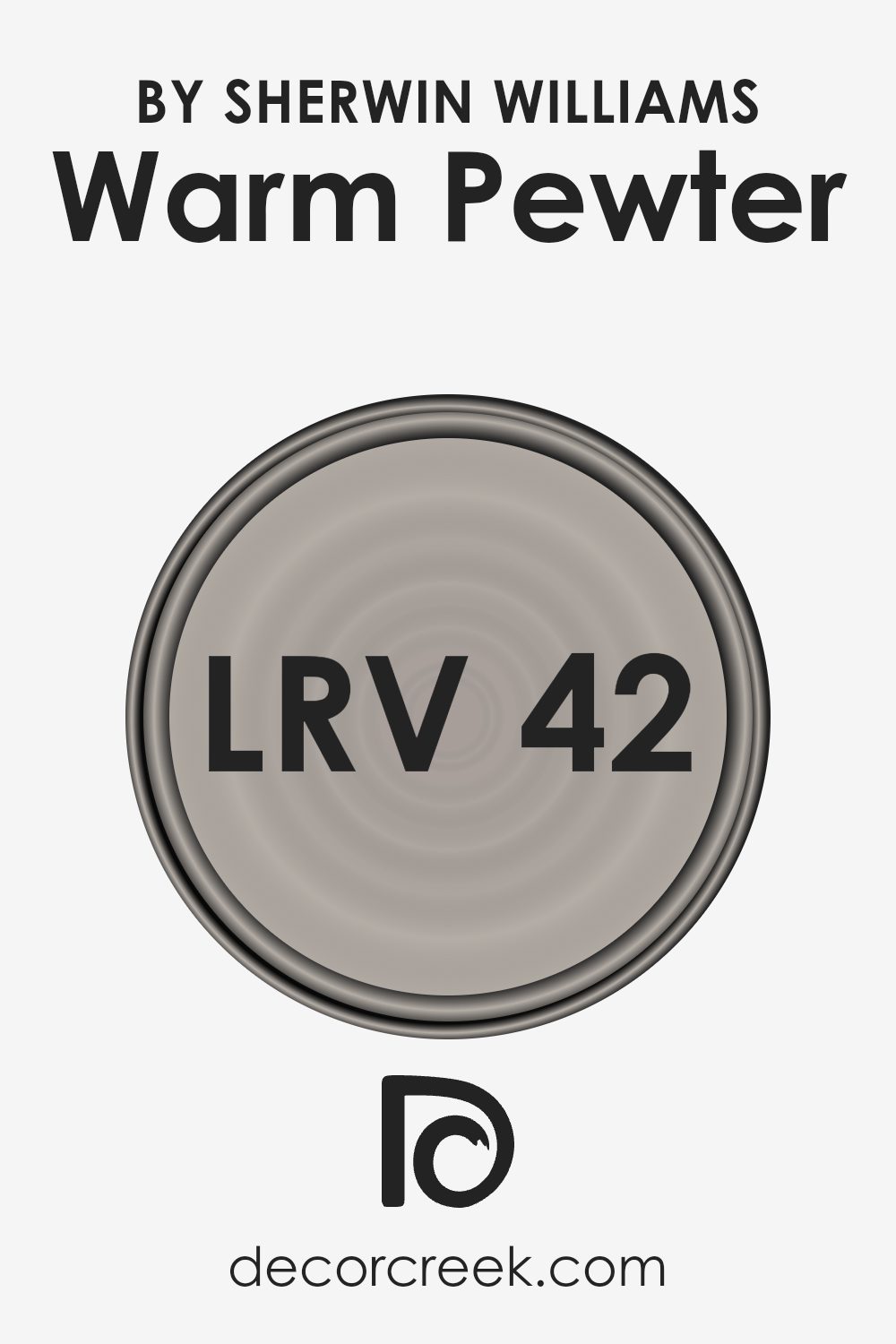
What is the LRV of Warm Pewter SW 9572 by Sherwin Williams?
LRV, or Light Reflectance Value, is a measure used to describe how much light a color reflects. It is expressed as a percentage, where 0% means no light is reflected (pure black) and 100% means all light is reflected (pure white).
In simpler terms, it tells us how light or dark a paint color will appear once applied to walls. The LRV of a paint color can significantly influence the ambiance and perception of space in a room.
Colors with higher LRV values will reflect more light, making a space feel more open and airy, while colors with lower LRV values absorb light, making rooms feel more intimate and cozy.
For the color Warm Pewter by Sherwin Williams, with an LRV of 42.424, it falls in the mid-range of the spectrum.
This means Warm Pewter will reflect a moderate amount of light. It will not be too bright or too dark, allowing it to complement well with both well-lit and dimly lit spaces. In a room with ample natural light, it will appear lighter and may highlight warmer undertones.
In contrast, in a room with less light, the color can create a more subdued and comforting atmosphere, maintaining a balance without making the space feel too enclosed or stark. This LRV makes Warm Pewter a versatile choice for various rooms and lighting conditions.
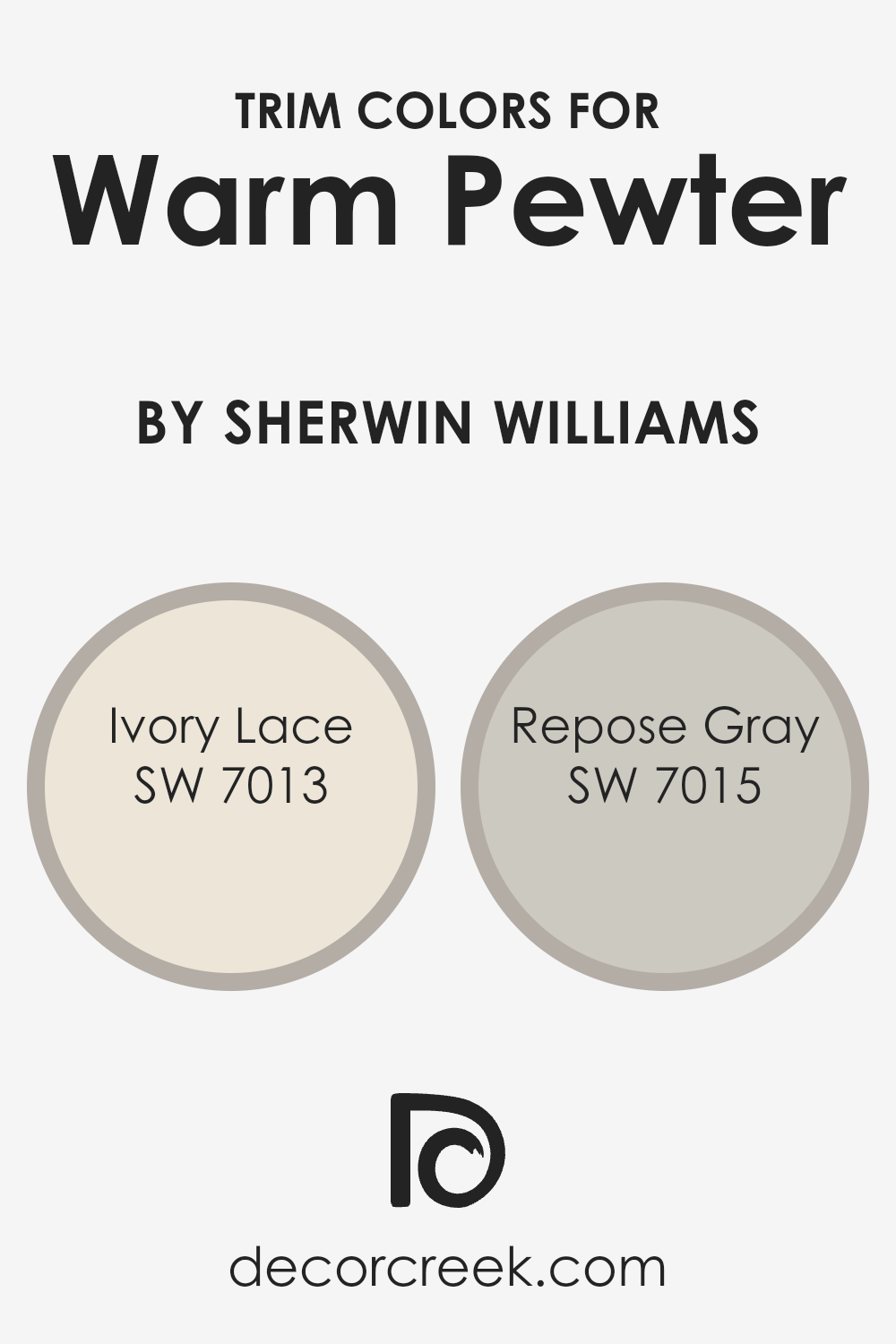
What are the Trim colors of Warm Pewter SW 9572 by Sherwin Williams?
Trim colors are the shades used on the edges of walls, like moldings or window frames, to create contrast or harmony with the main wall color. For Warm Pewter by Sherwin Williams, which is a soft and neutral tone, selecting the right trim colors can enhance its warmth and make it stand out.
Trim colors can define spaces and make them visually appealing. Using complementary shades, like those found in Ivory Lace or Repose Gray, can work well with Warm Pewter, giving a space a polished and complete feel.
Ivory Lace is a gentle, off-white that adds a light, airy touch to a room, making it look bright and clean. It contrasts beautifully with Warm Pewter without being too stark, adding warmth and elegance to the space.
On the other hand, Repose Gray is a cool, neutral gray that can introduce a subtle contrast, adding depth and interest while still complementing Warm Pewter. These trims can help highlight the features of a space, making the main color of Warm Pewter more prominent and balanced.
You can see recommended paint colors below:
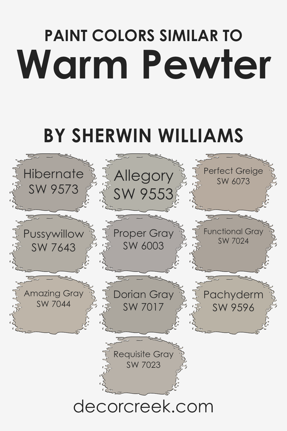
Colors Similar to Warm Pewter SW 9572 by Sherwin Williams
Similar colors are important because they create a sense of harmony and flow within a space. For example, Sherwin Williams’ Warm Pewter finds its counterparts in colors like Hibernate, Pussywillow, and Amazing Gray. Hibernate is a soft, muted tone that exudes calmness.
Pussywillow brings a touch of nature into your home with its gentle, earthy presence. Amazing Gray offers a slightly warmer touch, providing both comfort and depth to any room it graces. Each of these shades works beautifully alongside Warm Pewter to create a cohesive aesthetic.
Requisite Gray and Allegory carry forward the subtle sophistication, offering balance and warmth. Requisite Gray is a versatile color grounded in neutrality, while Allegory adds depth with its rich undertones.
Proper Gray and Dorian Gray continue this trend, with Proper Gray introducing a cozy, comfortable feel to any room, and Dorian Gray presenting a slightly cooler, more classic option.
Perfect Greige and Functional Gray are also wonderful choices, with Perfect Greige balancing the best of gray and beige, while Functional Gray offers a straightforward and practical solution. Finally, Pachyderm is known for its quiet elegance, rounding out this palette with a sense of stability. Together, these colors create a connected atmosphere that is both inviting and refined.
You can see recommended paint colors below:
- SW 9573 Hibernate
- SW 7643 Pussywillow
- SW 7044 Amazing Gray
- SW 7023 Requisite Gray
- SW 9553 Allegory
- SW 6003 Proper Gray
- SW 7017 Dorian Gray
- SW 6073 Perfect Greige
- SW 7024 Functional Gray
- SW 9596 Pachyderm
How to Use Warm Pewter SW 9572 by Sherwin Williams In Your Home?
Warm Pewter SW 9572 by Sherwin Williams is a versatile paint color that can add a cozy and inviting touch to any room in your home. This color is a soft, neutral gray with warm undertones, making it a great choice for various spaces.
In a living room, you can use Warm Pewter to create a comfortable and welcoming atmosphere. It pairs well with both light and dark furniture, adding a subtle contrast to your decor. In the bedroom, it can create a calming environment, perfect for relaxation.
You could also use it in a hallway or entryway to provide a warm yet modern feel as people enter your home. This color is quite adaptable and works nicely with different styles, from modern to traditional. To accentuate the color, consider using white trim for a crisp and clean look, or pair it with natural wood tones for a more earthy vibe.
Warm Pewter SW 9572 by Sherwin Williams vs Pussywillow SW 7643 by Sherwin Williams
Warm Pewter SW 9572 and Pussywillow SW 7643 by Sherwin Williams are two colors that create different atmospheres. Warm Pewter is a soft, light gray with warm undertones, making it feel cozy and inviting. It works well in spaces where you want a gentle, warm backdrop.
On the other hand, Pussywillow is a medium gray with cooler undertones. This gives it a more neutral and balanced look, suitable for rooms where you want clear, understated walls. While Warm Pewter creates a sense of warmth, Pussywillow offers a more traditional gray appearance.
Both can pair well with various colors and styles, but your choice will depend on whether you prefer the comforting warmth of Warm Pewter or the classic neutrality of Pussywillow. If you desire a warmer setting, Warm Pewter is ideal, while Pussywillow suits those looking for a cooler or more neutral feel.
You can see recommended paint color below:
Warm Pewter SW 9572 by Sherwin Williams vs Hibernate SW 9573 by Sherwin Williams
Warm Pewter SW 9572 and Hibernate SW 9573 are two paint colors by Sherwin Williams that look quite different. Warm Pewter is a cozy and inviting grey with slight beige undertones, giving it a warm and soft look. It’s versatile and can work well in many rooms, from living spaces to bedrooms.
On the other hand, Hibernate is a cooler color with more pronounced blue undertones. This gives it a calm and restful vibe, which is especially nice for bedrooms or areas meant for relaxation. While Warm Pewter leans warm, Hibernate definitely feels cooler.
When you place them side by side, Warm Pewter has a touch more warmth and versatility. It suits a variety of styles, while Hibernate introduces a sense of calm that might feel more subdued. Both colors are beautiful, each offering a distinct mood and atmosphere, depending on the space you use them in.
You can see recommended paint color below:
Warm Pewter SW 9572 by Sherwin Williams vs Allegory SW 9553 by Sherwin Williams
Warm Pewter and Allegory, both by Sherwin Williams, offer distinct vibes for any space. Warm Pewter SW 9572 is a soft, warm gray that brings a cozy and inviting feel. It’s versatile and can suit various settings, making rooms feel comfortable and lived-in. This color works well with natural wood tones and can be paired with warmer shades for a balanced look.
On the other hand, Allegory SW 9553 leans more towards a muted, earthy beige. This color has a subtle green undertone, which gives it a slightly cool feel compared to Warm Pewter.
Allegory is a bit more neutral and can serve as a great backdrop for spaces where a touch of understated elegance is needed. It pairs nicely with both warm and cool accents, offering flexibility in design.
Both colors provide a neutral base, but Warm Pewter brings warmth, while Allegory offers a softer, earthier neutral.
You can see recommended paint color below:
- SW 9553 Allegory
Warm Pewter SW 9572 by Sherwin Williams vs Functional Gray SW 7024 by Sherwin Williams
Warm Pewter SW 9572 and Functional Gray SW 7024, both by Sherwin Williams, are two distinct shades of gray. Warm Pewter is a soft, warm gray with beige undertones, giving it a cozy and inviting feel. It works well in spaces where you want to create a comfortable and welcoming atmosphere.
In contrast, Functional Gray is a more traditional, cooler gray with subtle green undertones, providing a clean and modern look. While Warm Pewter suits spaces that aim for warmth and comfort, Functional Gray is ideal for settings where a more neutral and sophisticated base is desired.
Both colors are versatile and can complement a range of décor styles, but Warm Pewter tends to pair nicely with warm hues, whereas Functional Gray harmonizes with cooler tones. Overall, choosing between the two depends on whether you prefer a warm, inviting ambiance or a more classic, refined appearance.
You can see recommended paint color below:

Warm Pewter SW 9572 by Sherwin Williams vs Perfect Greige SW 6073 by Sherwin Williams
Warm Pewter SW 9572 by Sherwin Williams and Perfect Greige SW 6073 are both neutral shades, but they have distinct differences. Warm Pewter is a soft, light gray with warm undertones, giving it a cozy and inviting feel. It works well in spaces where you want a subtle, calming atmosphere without feeling too cool or stark.
On the other hand, Perfect Greige leans slightly more towards a beige-gray, combining warm and cool tones. This color is versatile and can complement a variety of decor styles, making it a popular choice for living rooms or bedrooms.
While Warm Pewter is softer and more subdued, Perfect Greige offers a bit more depth and richness. Both colors provide a neutral canvas, but Warm Pewter is ideal for spaces aiming for a light and airy effect, whereas Perfect Greige adds a touch of warmth and sophistication.
You can see recommended paint color below:
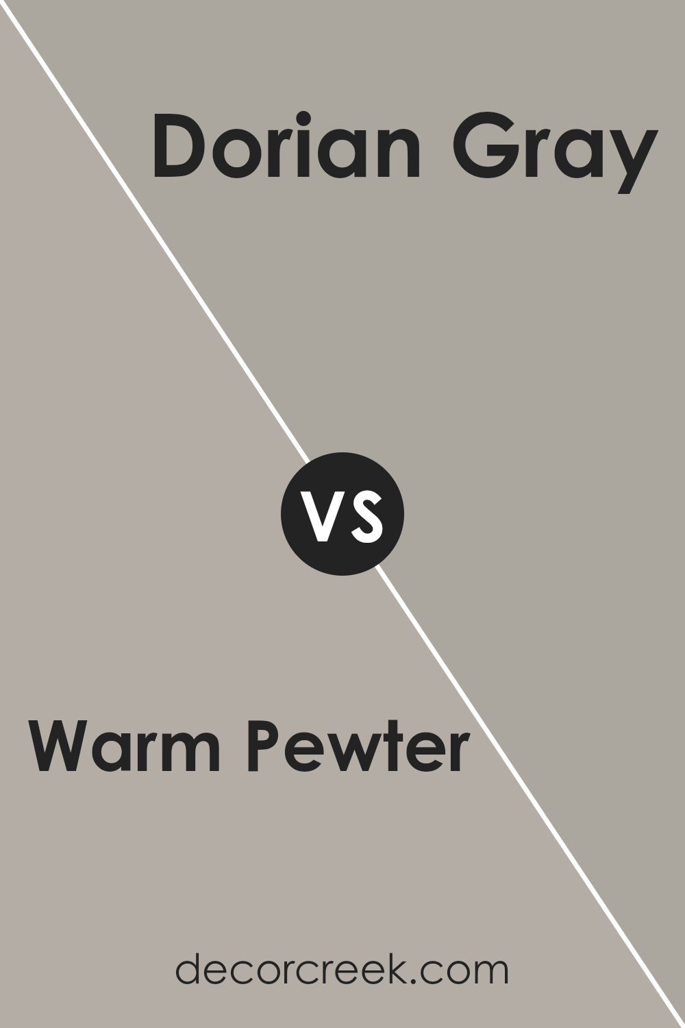
Warm Pewter SW 9572 by Sherwin Williams vs Dorian Gray SW 7017 by Sherwin Williams
Warm Pewter SW 9572 and Dorian Gray SW 7017 by Sherwin Williams are both neutral colors, but they have distinct differences. Warm Pewter is a soft, warm gray with subtle beige undertones, giving it an inviting and cozy feel. It works well in spaces where you want a bit of warmth without overpowering other design elements.
Dorian Gray, on the other hand, is a medium-tone gray with a cooler, more balanced appearance. It has a hint of sophistication and tends to be more neutral, allowing it to pair well with bolder colors in a room.
While both colors are versatile and can be used throughout a home, Warm Pewter might suit areas where a little warmth is needed, such as living rooms or bedrooms. Dorian Gray can work well in modern spaces and even on cabinetry for a more classic look. Both colors are great choices but offer different moods based on their undertones.
You can see recommended paint color below:
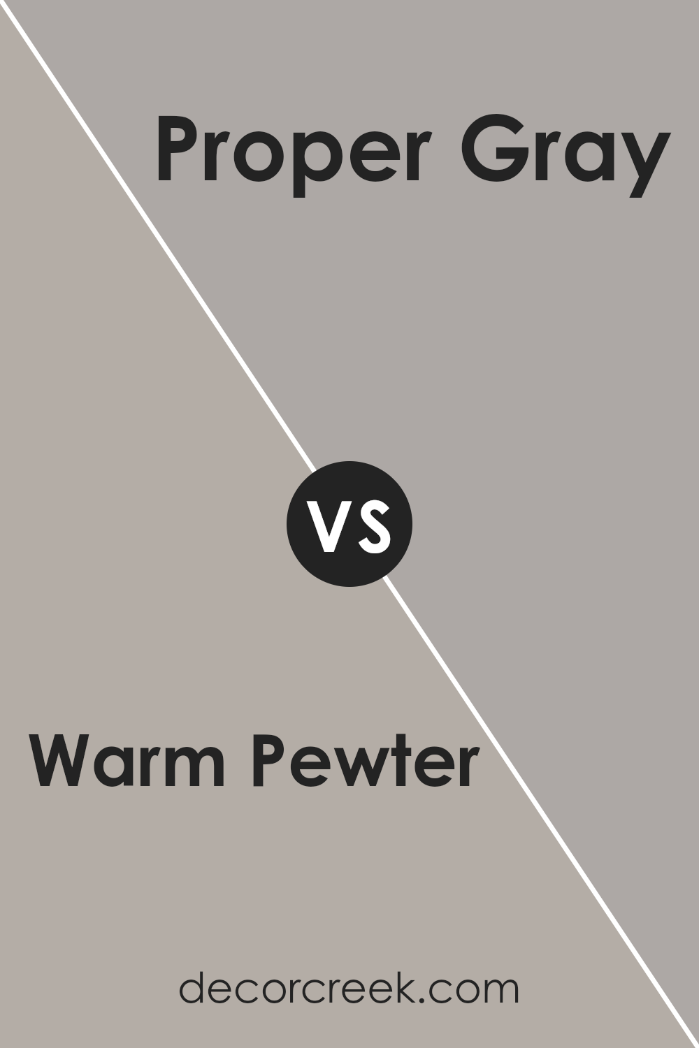
Warm Pewter SW 9572 by Sherwin Williams vs Proper Gray SW 6003 by Sherwin Williams
Warm Pewter SW 9572 and Proper Gray SW 6003 by Sherwin Williams are both shades of gray, but they offer different vibes. Warm Pewter is a gentle, soft gray with warm undertones, which can create a cozy and inviting atmosphere in any room. It’s versatile and pairs well with natural materials and earthy colors.
On the other hand, Proper Gray is a cool-toned gray. It has a more neutral feel and can bring a modern, clean look to a space. Proper Gray works well with whites, blues, and bolder colors, giving a more sleek and contemporary style.
When deciding between these two, consider the mood you’re aiming for. Warm Pewter suits spaces where warmth and comfort are desired, while Proper Gray is ideal for areas where a crisp and open feel is preferred. Both are great choices, but their different tones can significantly affect the overall ambiance of your interior.
You can see recommended paint color below:
- SW 6003 Proper Gray
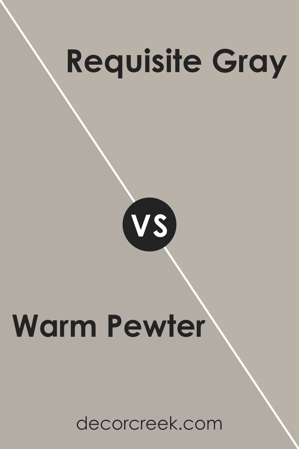
Warm Pewter SW 9572 by Sherwin Williams vs Requisite Gray SW 7023 by Sherwin Williams
Warm Pewter SW 9572 and Requisite Gray SW 7023 by Sherwin Williams are both popular choices for neutral tones, but they offer different vibes. Warm Pewter is a soft, warm gray with subtle beige undertones, making it a cozy and inviting option. It adds warmth to a space without being overwhelming, making it perfect for living rooms or bedrooms where comfort is key.
Requisite Gray, on the other hand, is a true, balanced gray with slight warm undertones. It’s a bit cooler and more modern than Warm Pewter, making it a versatile backdrop for many different styles.
Requisite Gray works well in spaces where you want a clean, neutral palette, like kitchens or bathrooms.
While both colors are neutral, Warm Pewter leans more toward a snug, homey feel, while Requisite Gray is more crisp and versatile. Choosing between them depends on whether you want a warmer or more neutral gray in your space.
You can see recommended paint color below:
- SW 7023 Requisite Gray
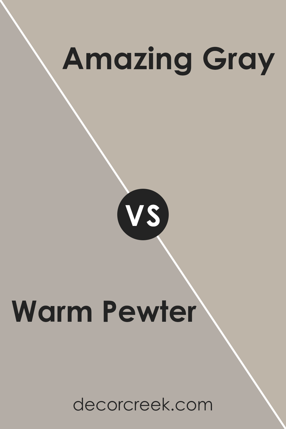
Warm Pewter SW 9572 by Sherwin Williams vs Amazing Gray SW 7044 by Sherwin Williams
Warm Pewter SW 9572 by Sherwin Williams is a soft, neutral color that has hints of warmth, making it cozy and welcoming. It’s a versatile shade that can work well in any room, providing a gentle backdrop for other colors and decorations.
On the other hand, Amazing Gray SW 7044 is a bit darker and has a cooler undertone compared to Warm Pewter. This color provides a slightly more grounded feel and can add depth to a room.
It’s a versatile greige that works well with various decor styles, offering a bit more richness than lighter grays.
While both colors are neutral and adaptable, Warm Pewter feels a bit lighter and warmer, making it ideal for spaces where you want a soft, inviting atmosphere.
Amazing Gray, being deeper and cooler, can add a touch of sophistication and is great for giving a room a more defined, modern look. Both are excellent choices depending on the mood and style of your space.
You can see recommended paint color below:
Warm Pewter SW 9572 by Sherwin Williams vs Pachyderm SW 9596 by Sherwin Williams
Warm Pewter SW 9572 and Pachyderm SW 9596 by Sherwin Williams are two distinct colors with unique characteristics. Warm Pewter is a versatile neutral with a subtle warmth woven into its gray base. It can effortlessly match various décor styles, providing a cozy and inviting atmosphere. It’s often used in spaces where a gentle, warming tone is desired without being overpowering.
On the other hand, Pachyderm SW 9596 is a slightly darker and cooler gray. It has more depth and can make a bold statement, creating a strong and stable feel in any room. Pachyderm can add an elegant touch to modern settings, offering a more grounded and structured appearance.
While both colors belong to the gray family, Warm Pewter leans towards warmth with a hint of beige, and Pachyderm offers a more dramatic and cool ambiance. Depending on the mood you want to create, each color offers distinct possibilities.
You can see recommended paint color below:
- SW 9596 Pachyderm
Conclusion
Warm Pewter is like a gentle hug for your walls. It’s a soft gray that can make any room feel cozy and comfortable. Imagine wearing your favorite sweater—Warm Pewter is like that for your home, making it feel inviting and safe.
What makes this color special is how it fits in different rooms, whether it’s the kitchen, bedroom, or living room.
Because it’s not too dark or too light, it works well just about anywhere. It helps everything in the room look good together, whether you have bright furniture or something more plain.
Using Warm Pewter can also make your house feel calmer. It’s not flashy or loud, but instead helps everything feel peaceful. This paint is like the grown-up version of a coloring book – it’s simple, clear, and makes you happy when you look at it.
I think Warm Pewter is great if you want to make your home a little nicer without doing a lot of changes. It’s like adding a touch of magic that makes your house feel like a warm, inviting place to be. So, if you’re thinking about painting, Warm Pewter could be a really good choice.
Ever wished paint sampling was as easy as sticking a sticker? Guess what? Now it is! Discover Samplize's unique Peel & Stick samples.
Get paint samples

