Nestled comfortably between the soft tones of earth and the serene atmosphere of a twilight landscape, SW 7514 Foothills by Sherwin Williams stands as a testament to understated elegance. This unique paint color brings the calm and gentle embrace of nature into any space, making it a popular choice for those looking to create a cozy, inviting atmosphere in their homes. SW 7514 Foothills holds a special place in the hearts of homeowners and interior designers alike, thanks to its versatility and beautiful balance of warmth and subtlety.
This color isn’t just another shade of brown or beige; it’s a sophisticated blend that mimics the natural beauty of the rolling hills it’s named after. Whether you’re looking to refresh your living room, bedroom, or even the exterior of your home, SW 7514 Foothills provides a solid foundation that can be easily complemented with a variety of decor styles and color schemes.
Choosing the right paint color can be overwhelming, but with SW 7514 Foothills, you get a hue that brings a sense of peace and tranquility to any space. It’s not merely about changing the color of your walls; it’s about transforming your environment to reflect a sense of calm and comfort. Whether you’re renovating your entire home or simply updating a single room, this shade offers a timeless appeal that is both rich and inviting.

What Color Is Foothills SW 7514 by Sherwin Williams?
Foothills by Sherwin Williams is a warm, versatile shade that effortlessly brings a touch of nature indoors. Imagine the serene beauty of a gentle slope covered in soft, dusky vegetation right before sunset—that’s the essence of this color. It’s a sophisticated green with gray undertones, making it both cozy and refined. This color finds its strength in its subtlety; it doesn’t shout for attention but rather enhances the space it occupies with a calm and welcoming vibe.
This color works wonders in various interior styles, particularly in rustic, modern farmhouse, and Scandinavian designs, where its earthy qualities can truly shine. It’s a natural fit for living rooms, bedrooms, and home offices, creating a backdrop that’s both comforting and stylish. In minimalist settings, it adds depth without overpowering the simplicity of the decor.
Foothills pairs beautifully with natural materials and textures. Think of pairing it with light, unfinished wood, stone elements, and woven fabrics to magnify its organic feel. Leather accents and rich, plush velvets also complement its depth, offering a more luxurious feel to the space. Metals, whether brushed gold or matte black, provide a striking contrast that can enhance the sophisticated side of this versatile hue. With Foothills as a base, the possibilities for creating a harmonious, inviting interior are nearly limitless.

Is Foothills SW 7514 by Sherwin Williams Warm or Cool color?
Foothills SW 7514 by Sherwin Williams is a rich, warm brown hue that brings a cozy and welcoming atmosphere into any home. This versatile color has a way of making large spaces feel more intimate while giving smaller rooms a sophisticated depth. Its earthy tones work well with a variety of decor styles, from rustic to modern. In homes, Foothills creates an inviting backdrop that complements natural materials like wood and stone, enhancing the textures and adding to the overall warmth of the space. Whether applied on a feature wall, throughout a room, or on exterior siding, this shade can anchor a space without overpowering it.
It pairs beautifully with lighter neutrals for a subtle contrast or with bolder hues for a more dynamic look. Moreover, Foothills has an enduring quality that transcends fleeting trends, making it a smart choice for homeowners looking for longevity in their color selections. Its ability to adapt to different lighting conditions also means it can maintain its inviting quality throughout the day.
Undertones of Foothills SW 7514 by Sherwin Williams
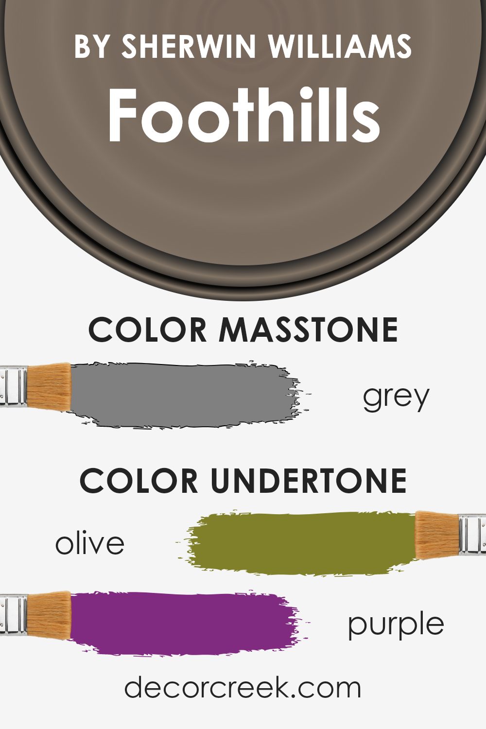
Foothills by Sherwin Williams is a complex color with a rich palette of undertones. When we talk about undertones, we mean those subtle colors that lurk beneath the surface of the main color. These undertones can significantly influence how we perceive the color, depending on the lighting and surrounding elements. For Foothills, the mixture of undertones like olive, purple, and pale pink adds a layer of depth that can transform its appearance in different environments.
Imagine putting Foothills on an interior wall. In natural daylight, the olive and light green undertones might make the color appear more nature-inspired and fresh. This can create a peaceful and calming atmosphere in a room. Under artificial light, the darker undertones like brown and dark green could become more pronounced, giving the room a cozy and warm feeling.
The beauty of Foothills is in how its undertones of pale pink and mint bring a softness to space, making it feel welcoming. On the other hand, elements like dark turquoise and navy add a hint of sophistication and depth. The presence of undertones like pale yellow and light turquoise keeps the color versatile and adaptable to different styles and spaces.
Understanding the undertones of Foothills can help in choosing decor and accessories. For instance, items in violet or light purple can draw out the cooler undertones, while something in orange or red can highlight the warmth, allowing for a tailored ambiance that fits personal tastes or desired moods.
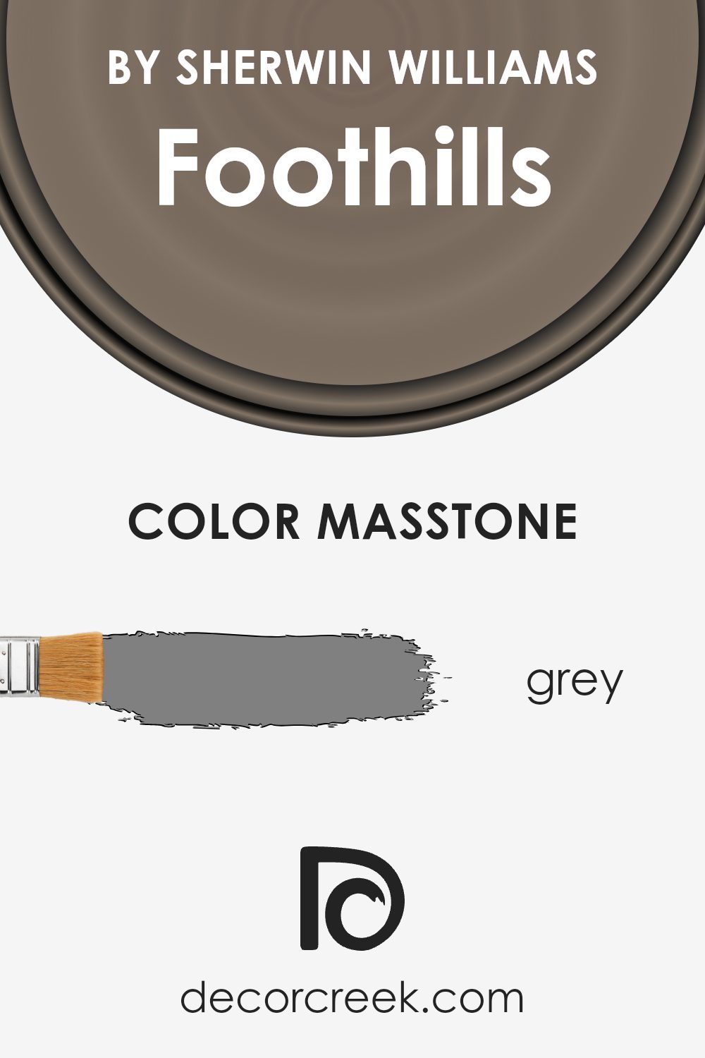
What is the Masstone of the Foothills SW 7514 by Sherwin Williams?
Foothills SW 7514 by Sherwin Williams is a unique color with a masstone that closely resembles the classic grey, coded as #808080. This specific shade plays a critical role in its adaptability and appeal in home decor. Given its grey masstone, it serves as a versatile backdrop in any room, offering a sense of balance and neutrality. This means it can easily pair with a wide range of colors, from soft pastels to vibrant hues, allowing for flexibility in designing spaces. In terms of mood, the grey undertone of Foothills SW 7514 brings a calm and soothing atmosphere to a room, making it ideal for spaces where relaxation is key, like bedrooms and living areas.
Its neutrality does not overshadow other design elements in the room but rather complements them, making the space feel cohesive. Additionally, this shade can help illuminate darker rooms when paired with the right lighting, enhancing the overall ambiance of a home.
How Does Lighting Affect Foothills SW 7514 by Sherwin Williams?
Lighting plays a crucial role in how we perceive colors. When it comes to painting our rooms, understanding this can help us choose the right shades for our spaces. For example, a color like Foothills by Sherwin Williams can look different under various lighting conditions due to its unique undertones.
- In artificial light, the nuances of Foothills can shift depending on the type of bulb used. Warm bulbs may enhance its cozy, earthy qualities, making the color feel more inviting. On the other hand, cool LED bulbs might bring out its subtle cooler undertones, giving it a slightly more reserved appearance. This versatility allows Foothills to complement a wide range of interior styles and preferences.
- Natural light has its own impact on this color. Rooms that face north often receive less direct sunlight, which can make colors appear more muted. In these spaces, Foothills might look a bit more subdued, emphasizing its calming qualities. It’s a peaceful backdrop that works well with soft, natural textiles and materials.
- South-facing rooms are bathed in warm, bright light for most of the day. Here, Foothills can truly shine, revealing its depth and warmth. It becomes vibrant and lively, perfect for living areas or any space meant to feel welcoming and energized.
- East-facing rooms enjoy the morning light, which is cooler and bluer. This kind of light can highlight the cooler undertones in Foothills, making it appear fresher and brighter in the morning. It’s great for bedrooms or breakfast nooks where you start your day.
- West-facing rooms get the evening light, which is warm and golden. During this time, Foothills might take on a richer, more amber hue, creating a cozy and inviting atmosphere. It’s ideal for dining rooms or spaces where you relax in the evening.
In conclusion, the look of Foothills by Sherwin Williams can vary dramatically depending on lighting. Whether it’s under artificial light or influenced by the direction of natural light, this color offers flexibility and can adapt to create the desired mood in a room.

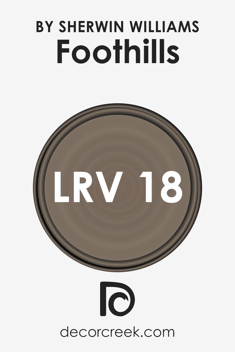
What is the LRV of Foothills SW 7514 by Sherwin Williams?
LRV stands for Light Reflectance Value, which is a measure of how much light a paint color reflects or absorbs. This scale runs from 0 to 100, with 0 being pure black, absorbing all light, and 100 being pure white, reflecting all light back. The LRV of a color can greatly affect how it looks in a space. Higher LRV colors can make rooms feel more open and airy because they reflect more light. In contrast, colors with lower LRVs absorb more light, making them ideal for creating a cozy or more enclosed feeling in a room. The amount of natural light a room gets also influences how these colors appear, with lower LRV colors looking darker in poorly lit areas.
With an LRV of 18.214, Foothills is on the darker end of the spectrum, meaning it absorbs more light than it reflects. This characteristic makes it a strong, deep color that can add warmth and depth to a space. In rooms with ample natural light, this color could give a rich, inviting look without becoming too overpowering.
However, in spaces with limited light, it could make the room appear smaller or more intimate. The specific LRV of this color suggests it’s suitable for creating dramatic, cozy spaces or accent walls, particularly in areas where the addition of light can be controlled to prevent the color from becoming too dark.
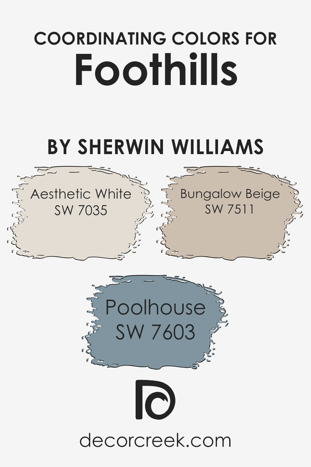
Coordinating Colors of Foothills SW 7514 by Sherwin Williams
Coordinating colors are shades that complement each other and bring harmony to a space when used together. This concept is essential in interior design and decoration because it ensures that colors blend seamlessly, enhancing the overall aesthetic of a room. When referring to the coordinating colors of Sherwin Williams Foothills, a beautiful, warm greige tone, we see how selecting the right supplementary shades can create a cohesive and inviting atmosphere.
Aesthetic White (SW 7035) is a soft, creamy white that serves as an excellent backdrop for Foothills, providing a light, neutral base that allows the deeper tones to stand out without overwhelming the space. This color brings a subtle warmth to interiors, making it perfect for creating a cozy and welcoming environment. Poolhouse (SW 7603) adds a splash of color, offering a serene blue with a touch of green that draws inspiration from tranquil waters.
It’s an ideal choice for adding a cool, refreshing contrast to the earthy warmth of Foothills, enhancing rooms with a calm and relaxing vibe. On the other end of the spectrum, Bungalow Beige (SW 7511) is a warm, inviting beige. It complements Foothills by sticking within the earth tone family, ensuring a natural flow from one space to another without any jarring transitions. This color works wonders in adding depth and coziness to living areas, creating a harmonious color scheme that feels both balanced and inviting.
You can see recommended paint colors below:
- SW 7035 Aesthetic White
- SW 7603 Poolhouse
- SW 7511 Bungalow Beige
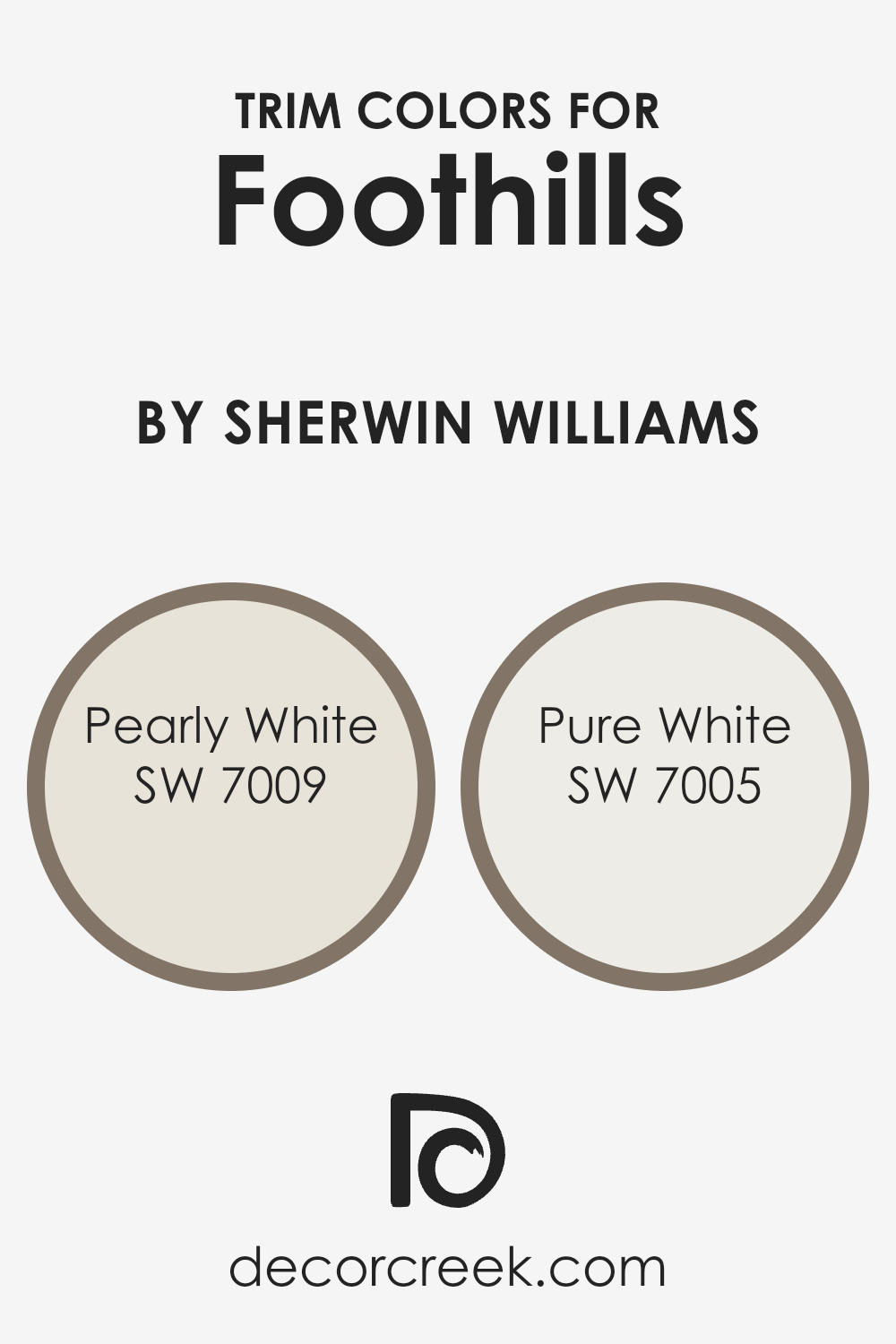
What are the Trim colors of Foothills SW 7514 by Sherwin Williams?
Trim colors, like those provided by Sherwin Williams, serve a critical role in accentuating the aesthetic appeal of a home. By carefully selecting a trim color to complement the main color, such as FoothillsSW 7514, homeowners can create a visually pleasing contrast or a subtle transition that enhances the overall look of the exterior or interior. For example, using lighter trim colors can frame and define the architectural details of a space, making the primary color pop and giving the room or façade a more cohesive and polished appearance.
Among the trim colors that pair beautifully with a shade like FoothillsSW 7514 by Sherwin Williams are SW 7009 – Pearly White and SW 7005 – Pure White. Pearly White is a soft, warm white with a hint of beige, giving it a cozy and inviting feel that can soften the edges of a bolder color and bring a soothing balance to a space.
On the other hand, Pure White is a crisp, clean white with a neutral undertone that offers a sharp contrast, providing a fresh and modern edge to both traditional and contemporary designs. By selecting either of these trim colors, homeowners can enhance the architectural features of their home and create a visually appealing exterior or interior.
You can see recommended paint colors below:
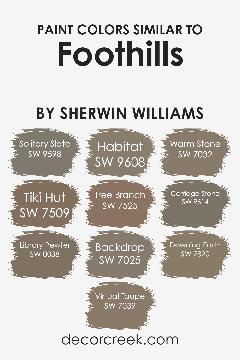
Colors Similar to Foothills SW 7514 by Sherwin Williams
Similar colors are crucial in design because they create a harmonious and cohesive look, making spaces feel put-together and intentional. When colors closely resemble each other, like those similar to Foothills by Sherwin Williams, they can subtly differentiate a space without the contrast being jarring or overwhelming. This is particularly important in achieving a nuanced and sophisticated aesthetic, where the beauty lies in the details and slight variations of hue. For instance, colors like Solitary Slate and Tiki Hut offer gentle shifts in tone that can complement woodwork or textiles, enriching a room without dominating it.
Solitary Slate brings a serene, subdued slate blue to the tableau, introducing a calm, grounded feel. Tiki Hut, on the next brush stroke, warms up a space with its mid-tone, earthy taupe, reminiscent of sunbaked clay. Library Pewter and Virtual Taupe provide deeper, more contemplative hues that anchor spaces, giving depth and gravity with their richer tones. Habitat and Tree Branch carry through with subtle greens and browns, connecting an interior to the natural world outside its windows.
Backdrop, Warm Stone, Carriage Stone, and Downing Earth play with the spectrum of neutrals, offering shadows and light to designs, while enabling flexibility in decor choices. Each color, while able to stand on its own, works better as part of a collective, crafting spaces that are inviting and visually cohesive.
You can see recommended paint colors below:
- SW 9598 Solitary Slate
- SW 7509 Tiki Hut
- SW 0038 Library Pewter
- SW 7039 Virtual Taupe
- SW 9608 Habitat
- SW 7525 Tree Branch
- SW 7025 Backdrop
- SW 7032 Warm Stone
- SW 9614 Carriage Stone
- SW 2820 Downing Earth
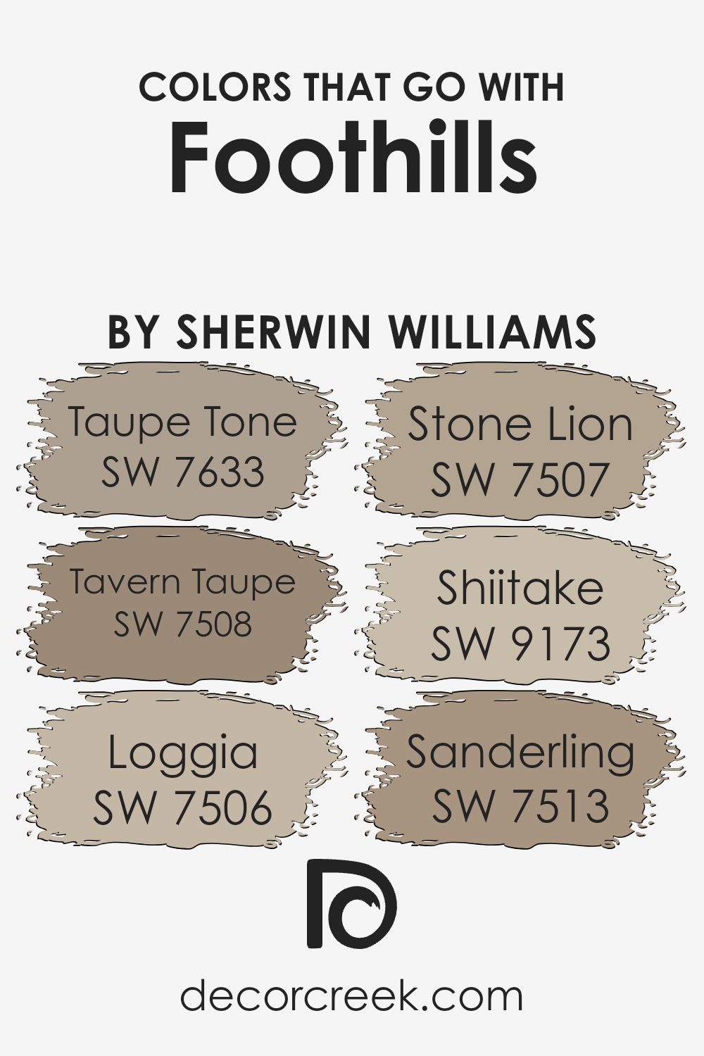
Colors that Go With Foothills SW 7514 by Sherwin Williams
Choosing the right colors that complement Foothills SW 7514 by Sherwin Williams is crucial in creating a harmonious and inviting atmosphere in any space. These colors play a significant role because they help balance the mood, enhance aesthetic appeal, and tie different design elements together seamlessly. When paired with shades like Taupe Tone, Tavern Taupe, Loggia, Stone Lion, Shiitake, and Sanderling, Foothills serves as a versatile backdrop that can adapt to various decor styles, from cozy traditional to modern minimalism.
- Taupe Tone SW 7633 is a warm, comforting shade that adds a subtle depth to rooms, working beautifully with the earthy nuances of Foothills.
- Tavern Taupe SW 7508, on the other hand, brings a richer, more pronounced earthiness that complements the serene vibe of Foothills, making spaces feel more grounded.
- Loggia SW 7506 offers a lighter, airy option that brightens spaces while maintaining that connection to natural elements.
- Stone Lion SW 7507 adds a hint of sophistication with its muted, neutral tone, enhancing the elegance of Foothills without overpowering it.
- Shiitake SW 9173 weaves in a slightly organic feel with its unique blend, creating a soft, inviting layer.
- Lastly, Sanderling SW 7513 is the gentle whisper among the group, providing a light, nearly sandy touch that uplifts the calmness of Foothills, ensuring the overall look remains cohesive yet distinctly layered.
Together, these colors create an effortlessly blended palette that enriches the appeal of any room when combined with Foothills SW 7514.
You can see recommended paint colors below:
- SW 7633 Taupe Tone
- SW 7508 Tavern Taupe
- SW 7506 Loggia
- SW 7507 Stone Lion
- SW 9173 Shiitake
- SW 7513 Sanderling
How to Use Foothills SW 7514 by Sherwin Williams In Your Home?
Foothills by Sherwin Williams is a versatile paint color with a warm, earthy tone that can make any room in your home feel welcoming and cozy. Its subtle richness works well in living rooms and bedrooms, offering a soothing backdrop that pairs nicely with both modern and traditional decor. If you’re looking to add a touch of sophistication without overwhelming your space, Foothills is a great choice.
This color can also enhance your kitchen cabinets or bathroom walls, giving them an updated look without the need for a complete remodel. Because of its neutral yet deep nature, it coordinates well with natural materials like wood and stone, creating a seamless connection between your indoor spaces and the natural world outside.
For those wanting to add depth to their home’s interior without going too dark, Foothills provides the perfect balance. It’s a color that works in harmony with a wide range of accent colors, from soft creams to vibrant blues, allowing for easy personalization of your space. Whether you’re painting an entire room or looking for an accent wall, Foothills can help make your home feel more inviting and uniquely yours.
Foothills SW 7514 by Sherwin Williams vs Backdrop SW 7025 by Sherwin Williams
Foothills by Sherwin Williams is a warm, inviting beige that has a comforting and cozy feel to it. Think of it like a warm blanket on a chilly evening. It’s a color that makes a room feel more like a home, adding a sense of calmness and relaxation. It can easily blend with a variety of decor styles, making it versatile for different spaces in your house.
On the other hand, Backdrop, also by Sherwin Williams, leans toward a cooler, more neutral gray. It’s like the color of clouds on a stormy day, giving spaces a modern and sleek look. Backdrop is great for adding a touch of sophistication and elegance to a room. It works well in spaces that aim for a contemporary feel, providing a chic backdrop that complements bold and vibrant accents.
While Foothills adds warmth and coziness, Backdrop brings a modern and tranquil vibe. Both colors offer unique qualities that can transform a space depending on the atmosphere you’re aiming to achieve.
You can see recommended paint color below:

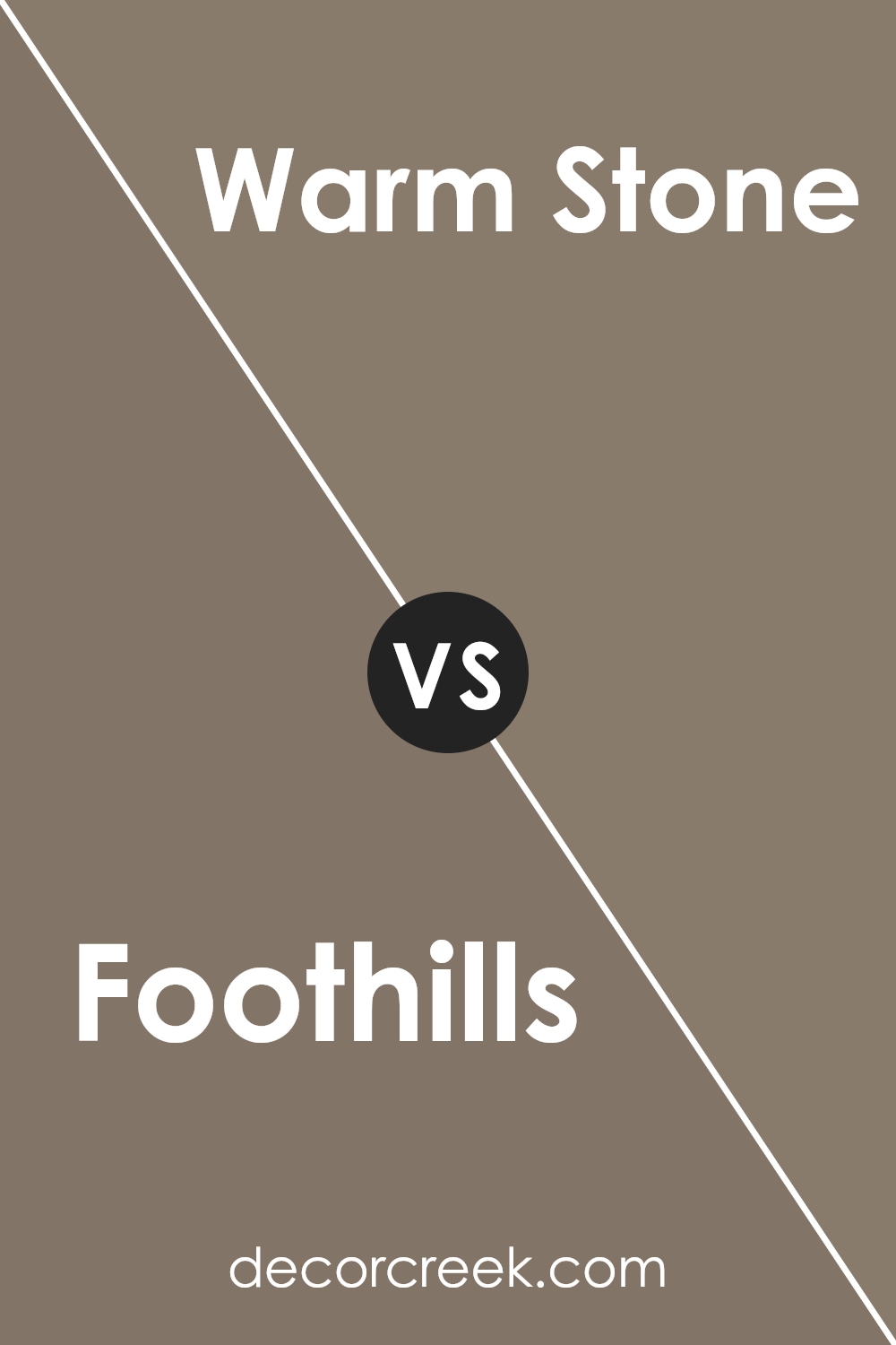
Foothills SW 7514 by Sherwin Williams vs Warm Stone SW 7032 by Sherwin Williams
Foothills is a rich, deep beige that gives off a cozy and inviting vibe. It tends to lean a bit towards a darker shade, making it perfect for creating a warm and snug atmosphere in a room. This color is versatile, easily pairing with both light and dark accents for a balanced look.
Warm Stone, on the other hand, is a slightly lighter color. It’s a warm, gentle gray with hints of beige, making it a great choice for those wanting to add a soft, neutral backdrop to their space. It brings a sense of calm and serenity, ideal for rooms where relaxation is key.
When comparing Foothills to Warm Stone, Foothills offers a more pronounced, deeper hue that can make a statement in a space, while Warm Stone provides a subtle, soothing touch. Both colors are great for creating a cozy environment, but your choice would depend on the mood you’re aiming to achieve – Foothills for a more enveloping feel, and Warm Stone for a light, airy room.
You can see recommended paint color below:
- SW 7032 Warm Stone
Foothills SW 7514 by Sherwin Williams vs Habitat SW 9608 by Sherwin Williams
Foothills and Habitat are two shades by Sherwin Williams, offering a natural, earthy palette but with distinct differences. Foothills is a warm, medium brown that brings to mind the serene, gently rolling slopes of a mountain at dusk. It has a cozy feel, perfect for creating a welcoming space. Its warmth is subtle, making it versatile for various settings, from living rooms to bedrooms.
On the other hand, Habitat is a deeper, more intense color. It leans more towards a darker, olive green shade, reminiscent of dense woodland areas. This color is great for adding depth and a touch of nature to any space. It evokes the richness of an untouched forest and can make a bold statement in a room without overwhelming it.
While both colors draw inspiration from nature, Foothills offers a lighter, more subdued experience, akin to the soft light of early evening. Habitat, with its darker, richer tones, brings the profound and complex green of nature indoors. Both are great choices but serve different moods and preferences.
You can see recommended paint color below:
- SW 9608 Habitat

Foothills SW 7514 by Sherwin Williams vs Downing Earth SW 2820 by Sherwin Williams
Foothills and Downing Earth are both colors offered by Sherwin Williams, but they have their unique attributes. Foothills is a shade that feels like a cozy hug from nature, with its earthy tones leaning towards a soft, muted green. It gives off a feeling of tranquility and calm, making it perfect for spaces where you want to relax or connect with nature.
On the other hand, Downing Earth takes a different path in the earth tone family. It’s a warm, rich brown that suggests stability and grounding. This color is more reminiscent of the solid earth beneath our feet, offering a sense of security and warmth. It’s ideal for creating a comfortable and inviting atmosphere in any room, often used in spaces where you wish to foster gatherings and warmth.
Both colors share an earthy essence but express it in distinct ways. Foothills with its greenish touch brings the outdoors’ calm and freshness, while Downing Earth, with its deeper brown, ensures a solid and warm foundation, making each suitable for different moods and settings.
You can see recommended paint color below:
- SW 2820 Downing Earth

Foothills SW 7514 by Sherwin Williams vs Solitary Slate SW 9598 by Sherwin Williams
Foothills and Solitary Slate are two distinct colors by Sherwin Williams. Foothills is a warm, earthy hue that gives a cozy and welcoming feel to any space. It’s a kind of color that makes a room feel like home, grounding it with a sense of nature and comfort. On the other hand, Solitary Slate is cooler and leans towards a serene, more neutral palette. It’s reminiscent of a cloudy sky, providing a calm and collected atmosphere.
This color is perfect for creating a modern, minimalistic look, offering a clean and fresh vibe. While Foothills brings warmth and richness, Solitary Slate offers a sleek, tranquil backdrop. These two colors cater to different moods and themes, with Foothills suiting those looking for a warmer, earth-toned environment and Solitary Slate appealing to fans of cool, understated elegance. Both are versatile, but their distinct undertones mean they serve different design purposes.
You can see recommended paint color below:
Foothills SW 7514 by Sherwin Williams vs Tree Branch SW 7525 by Sherwin Williams
Foothills and Tree Branch by Sherwin Williams are two colors that complement each other well, each having its unique charm. Foothills is a soft, muted green with earthy undertones, giving it a natural, serene feeling. It’s like looking at a gentle hill covered in a light layer of morning mist. On the other hand, Tree Branch is a deeper, richer brown. This color reminds one of the sturdy, comforting presence of tree trunks or the peaceful, quiet grounding of a forest floor.
When you compare them, Foothills offers a lighter, refreshing look, making a space feel open and airy, while Tree Branch provides depth and warmth, creating a cozy, welcoming atmosphere. Together, they bring the best of the outdoors inside, marrying the freshness of green landscapes with the solid, reassuring embrace of the earth. Whether used side by side or in different parts of a room, they create a balanced, harmonious look that’s soothing and appealing.
You can see recommended paint color below:
- SW 7525 Tree Branch

Foothills SW 7514 by Sherwin Williams vs Tiki Hut SW 7509 by Sherwin Williams
Foothills and Tiki Hut, both from Sherwin Williams, are two distinct shades that bring unique vibes to spaces. Foothills is a deeper, richer color that could be described as a cozy and warm brown with a hint of green, offering a subtle connection to nature. It feels like a snug embrace in a forest cabin, making rooms feel inviting and grounded. On the other hand, Tiki Hut has a lighter, softer appeal.
It’s a sandy beige that carries the essence of tranquility and simplicity, reminiscent of a beach cottage. This color is excellent for spaces aiming for a light, airy feel, as it pairs well with a wide range of decors, adding a gentle warmth without overwhelming the senses. While Foothills adds depth and character to a room, Tiki Hut provides a neutral backdrop that’s versatile and soothing. Both colors have their unique charm, with Foothills leaning towards a more statement touch and Tiki Hut offering a subtle nod to natural beauty.
You can see recommended paint color below:

Foothills SW 7514 by Sherwin Williams vs Library Pewter SW 0038 by Sherwin Williams
Foothills and Library Pewter, both from Sherwin Williams, offer unique tones that can significantly affect the ambiance of a room. Foothills presents as a soothing, earthy beige with a warm undertone, giving a room a cozy and welcoming vibe. It’s versatile, fitting well in many settings like living rooms or bedrooms, where comfort is key.
On the other hand, Library Pewter is a deeper, more robust shade. This gray has a sophisticated edge, making it ideal for spaces that aim for a serious, stylish, or formal look. It’s a color that stands out more, possibly making a strong statement in a space without overwhelming it with darkness.
In comparing both colors, it’s clear that Foothills offers a lighter, warmth-inducing choice, ideal for casual, comfortable spaces. Library Pewter, however, brings a sense of depth and elegance, perfect for creating a focal point or enhancing a modern, chic feel in a room. Whether you prefer the warm, welcoming hug of Foothills or the strong, stylish embrace of Library Pewter depends on the atmosphere you wish to achieve in your space.
You can see recommended paint color below:

Foothills SW 7514 by Sherwin Williams vs Virtual Taupe SW 7039 by Sherwin Williams
Foothills and Virtual Taupe, both paints by Sherwin Williams, have unique but somewhat similar vibes. Foothills stands out with its earthy, warm undertones that can remind you of a cozy, sunlit hillside. Its rich and welcoming feel makes it ideal for creating inviting spaces. On the other hand, Virtual Taupe carries a cooler, more balanced tone, leaning slightly towards a grayish tint while maintaining that taupe essence.
This color is versatile, fitting well in both modern and traditional settings, offering a calming neutrality that’s both sophisticated and understated. When comparing the two, Foothills feels warmer and more enveloping, perfect for a living room or bedroom craving a touch of comfort. Virtual Taupe, with its cooler, more neutral appeal, is the go-to for those seeking a subtle elegance that pairs well with a wide range of decor, making it a solid choice for common areas and offices.
You can see recommended paint color below:
- SW 7039 Virtual Taupe

Foothills SW 7514 by Sherwin Williams vs Carriage Stone SW 9614 by Sherwin Williams
Foothills and Carriage Stone are two shades from Sherwin Williams, each offering a unique feel to any space. Foothills is a calming, neutral green with a touch of earthiness, making it perfect for creating a serene and grounded atmosphere. It’s a kind of color that brings the outside in, adding a subtle touch of nature to your room without overpowering it with boldness.
On the other hand, Carriage Stone walks a different path with its rich, warm gray tone. It’s a versatile color that brings a cozy elegance to any space. It can easily pair with a variety of decor styles, making it a fantastic choice for those wanting to add sophistication without going too dark or too cold.
When comparing these two, it boils down to the mood you’re aiming for. Foothills leans towards a soft, earthy vibe, inviting a sense of calm and connection with nature, while Carriage Stone offers a suave, chic feel, perfect for modern spaces that aim for a touch of warmth. Whether you choose the grounding green of Foothills or the refined gray of Carriage Stone, both colors promise to add personality and style to your interiors.
You can see recommended paint color below:
- SW 9614 Carriage Stone

Conclusion
Foothills SW 7514 by Sherwin Williams is a versatile and warm paint color that has grown in popularity due to its ability to create a welcoming and cozy atmosphere in any room. Its rich, earthy tone makes it an excellent choice for those looking to add depth and character to their space without overwhelming it with too much darkness. This particular shade is perfect for people wanting to add a subtle touch of nature into their interiors, as it beautifully complements both natural light and a wide range of decor styles.
Homeowners and designers alike appreciate Foothills SW 7514 for its flexibility and how it brings a sense of calm and comfort to living spaces. Whether applied in a busy kitchen, a serene bedroom, or a welcoming living room, this color stands out for its ability to blend seamlessly with other elements in the room. Moreover, its enduring appeal demonstrates that Foothills SW 7514 is more than just a trend; it’s a timeless choice that can enhance the beauty and warmth of homes for years to come.

Ever wished paint sampling was as easy as sticking a sticker? Guess what? Now it is! Discover Samplize's unique Peel & Stick samples.
Get paint samples

