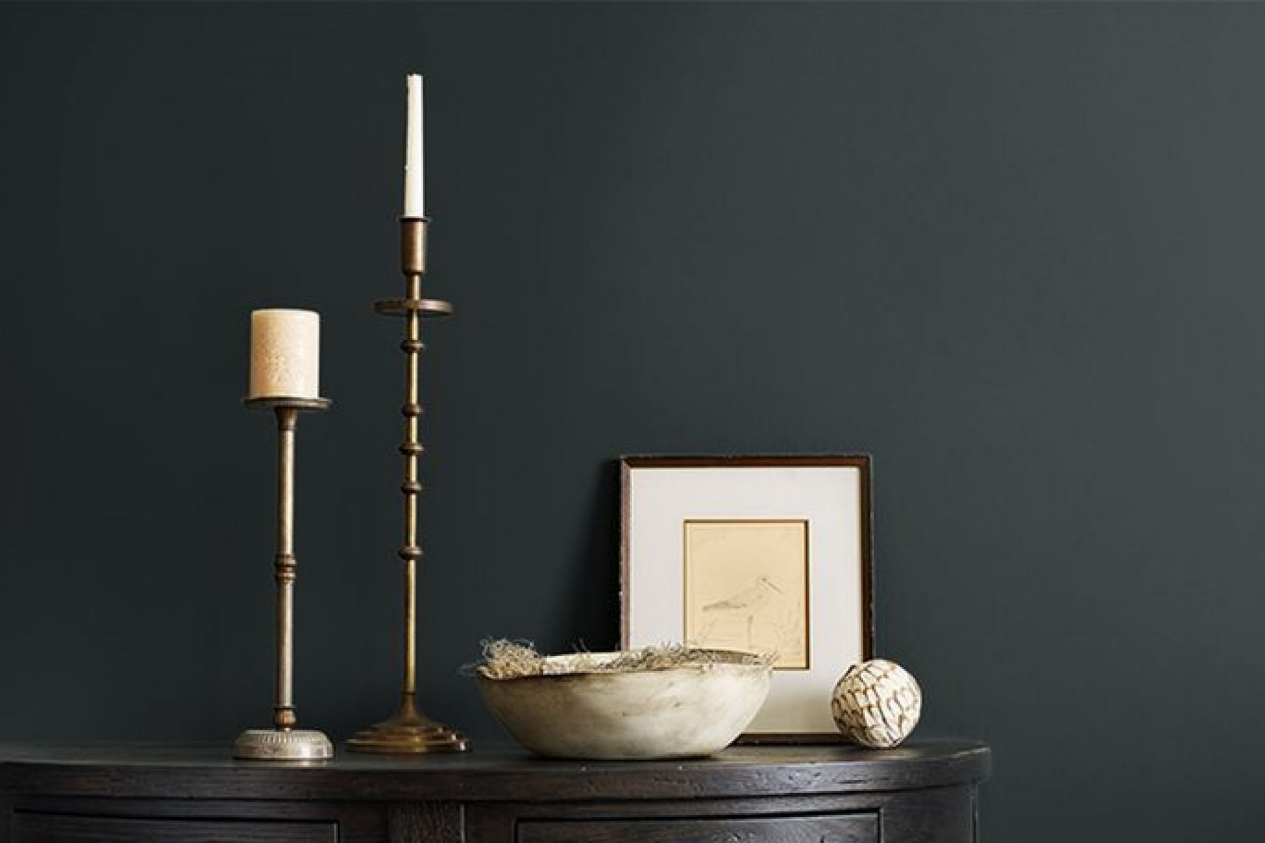
SW 9680 Night Watch by Sherwin Williams is a color that immediately makes you feel calm and grounded. This deep, rich green has an ability to bring a sense of nature into your surroundings. It’s like having a piece of the forest right inside your home. You can feel the soothing effect it has, almost as if you’re standing under the canopy of trees. The depth of this shade makes a statement while still being flexible enough to complement a variety of styles and settings.
When you look at Night Watch, you’ll notice how it effortlessly balances elegance with warmth. Its classic quality means it can be both modern and traditional, fitting into any design without feeling out of place. In rooms where you want to add a touch of intimacy or relaxation, this color serves as a perfect backdrop. It invites you to relax, unwind, and leave the chaos behind.
Using Night Watch on your walls, furniture, or even accent pieces can shift the atmosphere of a room, making it more inviting and cozy. It’s exciting to see how it interacts with different lighting throughout the day, adding a dynamic aspect to your room.
With Night Watch, you’re not just choosing a paint color—you’re enriching your environment with a sense of calm and elegance that feels both classic and fresh.
What Color Is Night Watch SW 9680 by Sherwin Williams?
Night Watch by Sherwin Williams is a rich, dark green that brings a touch of nature indoors. This color exudes a deep, forest-like vibe, making it perfect for adding depth and a cozy feeling to any room. Ideal for those who appreciate a bold yet calming environment, Night Watch works well in various interior styles, particularly modern, rustic, and traditional.
In a modern home, this green can create a striking accent wall, especially when paired with clean lines and minimalist furniture. In a rustic setting, it enhances the warmth of wood and natural elements, creating an inviting atmosphere. Traditional rooms can benefit from its luxurious depth, adding a classic quality that complements antique or classic furnishings.
Material choices play a significant role in bringing Night Watch to life. Pair it with natural woods, such as oak or walnut, to emphasize its earthy tone. Metals like brass or gold add a touch of elegance and warmth. For textiles, consider using soft velvets or wool in neutral shades or lighter greens to balance the depth of the color. Crisp white or cream-colored accents can lighten the mood and add contrast, while leather materials provide a rugged, yet refined texture against this bold hue.

Is Night Watch SW 9680 by Sherwin Williams Warm or Cool color?
Night Watch SW 9680 by Sherwin Williams is a deep, rich green with a hint of blue. This color can make a bold statement in a home, giving rooms a cozy and inviting feel. When used in living areas, it creates a warm atmosphere that’s perfect for relaxing. In a bedroom, it promotes a sense of calm and comfort, making it an excellent choice for walls or accent pieces.
This color pairs well with earthy tones, neutral shades, and natural materials like wood and stone, enhancing its natural vibe. It can work beautifully on feature walls, adding depth and interest to a room.
Night Watch also excels in smaller doses, such as on furniture or in accessories, where it adds a touch of elegance without overpowering the room. Overall, Night Watch SW 9680 is flexible and can adapt to various home styles, from classic to modern, enriching any area with its lush and calming presence.
Undertones of Night Watch SW 9680 by Sherwin Williams
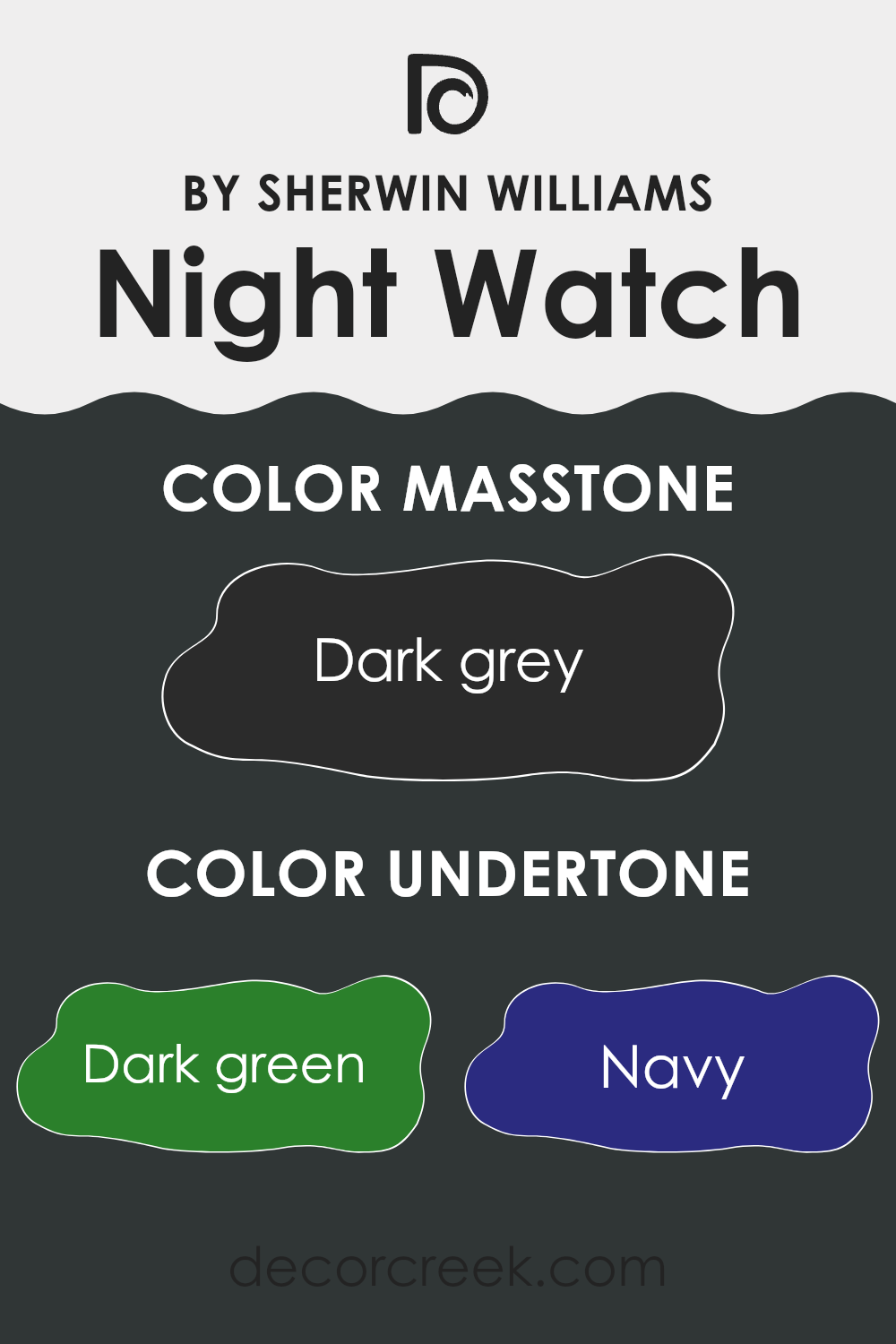
Night Watch SW 9680 by Sherwin-Williams is a rich and deep shade that might initially be seen as a dark green. However, it has multiple undertones that subtly change how we perceive it. One key undertone is a deep green, which makes the overall color appear grounded and organic. The navy undertone adds a hint of depth and elegance, giving the paint a slightly cooler feel under certain lighting conditions.
Hints of brown bring warmth, preventing the green from feeling too cold. Dark turquoise touches can occasionally add a watery or refreshing vibe, while purple adds an unexpected richness. Olive introduces an earthy quality, making Night Watch feel closer to nature. A grey undertone softens these colors, making the shade more balanced and flexible.
When used on interior walls, these undertones can make rooms feel cozy and inviting or perhaps elegant depending on the lighting and furnishings. In darker rooms, the navy and grey may be more prominent, giving a quiet and thoughtful environment. Meanwhile, in well-lit rooms, the green and brown tones might dominate, making the room feel welcoming and natural.
These undertones help the color adapt to different settings, giving the room a varied and interesting character.
What is the Masstone of the Night Watch SW 9680 by Sherwin Williams?
Night Watch by Sherwin Williams is a deep, dark grey that can bring a strong, bold presence to any room. Its masstone, a rich grey similar to the color of charcoal, can create a cozy yet modern atmosphere in a home.
When used on walls, this color can make a room feel intimate and elegant, ideal for living rooms or bedrooms where a calm, restful mood is desired. It’s a flexible color that pairs well with both lighter and darker shades, adding contrast without being too much.
In larger rooms, this dark grey can be balanced with lighter furniture or accessories to prevent the room from feeling too enclosed. In smaller areas, such as hallways or bathrooms, it can add drama and interest. Night Watch can also highlight architectural features, making it a great choice for accent walls. By incorporating different textures, like metallics or natural woods, you can pair this dark grey beautifully.
How Does Lighting Affect Night Watch SW 9680 by Sherwin Williams?
Lighting plays a crucial role in how colors appear. Depending on the type of light, colors can look different. Natural light changes throughout the day, affecting color perception. Similarly, artificial lighting can greatly influence how a color looks.
Let’s take the color Night Watch (SW 9680) by Sherwin Williams as an example. Night Watch is a deep green with rich undertones. In the morning, when natural light is cooler, this color can appear more muted and slightly bluish. In the bright afternoon light, it might look more vibrant. As the day progresses and the light becomes warmer, the color may shift, showing more of its green tones.
In a north-facing room, where the light is generally cooler and more consistent throughout the day, Night Watch may appear darker and bluer. The lack of direct sunlight means the color retains its depth, giving a cozy yet dramatic effect.
In a south-facing room, which receives warm, direct sunlight for most of the day, Night Watch might appear lighter and more pronounced. The bright light enhances the green tones, making the room feel lively and warm.
East-facing rooms get direct sunlight in the morning. Here, Night Watch will have a cooler tone during the morning light, and then take on darker shades as the day goes on and the sun moves away.
West-facing rooms enjoy warm, afternoon light. In this scenario, Night Watch might look more intense in the afternoon. The warm light can bring out the softer, more inviting aspects of the green, making the room feel snug and welcoming as the day ends.
In artificial light, the color will depend on the bulbs used. Incandescent lighting can make Night Watch look warmer, while cool white or LED lights might highlight the bluer undertones. It’s important to consider lighting when choosing a color like Night Watch, as it can change dramatically based on the light source and room orientation.

What is the LRV of Night Watch SW 9680 by Sherwin Williams?
LRV, or Light Reflectance Value, is a measurement used in the paint industry to express how much light a color reflects compared to how much it absorbs. It is measured on a scale from 0 to 100, where 0 is absolute black, reflecting no light, and 100 is pure white, reflecting all light. When a color has a low LRV, it means it absorbs more light, making it look darker and potentially smaller when applied to a room.
Conversely, a high LRV indicates that a color reflects more light, often making a room feel larger and more open. The LRV can affect mood and perception of a room, as colors with low values can create cozy, intimate settings, while those with higher values can contribute to a brighter, airier feel.
With an LRV of 3.54, this color is quite dark. This means that when applied to walls, it will absorb a significant amount of light, giving the room a very intimate and cozy feel. It will likely make the room appear smaller, as darker colors tend to do, and may require ample lighting to avoid feeling too enclosed.
However, if used thoughtfully, such a deep color can add a touch of drama and elegance to a room, especially when paired with lighter accents and furnishings that help balance the overall feel. It’s well-suited for an accent wall or a room that benefits from a cozy, moody ambiance.

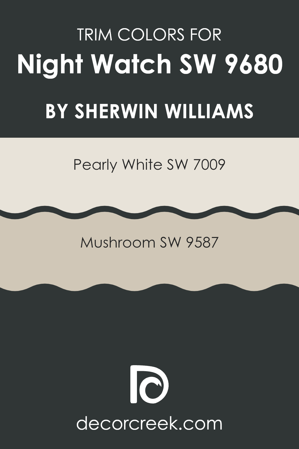
What are the Trim colors of Night Watch SW 9680 by Sherwin Williams?
Trim colors are the additional shades used to highlight and define the edges in a room, such as around windows, doors, and baseboards. They play a crucial role in balancing and complementing the main wall color, offering contrast or harmony in a room. When it comes to the rich, deep green hue like Sherwin Williams’ Night Watch (SW 9680), choosing the right trim color is important to enhance its depth and elegance.
Night Watch is a bold, moody color that benefits from lighter trim colors to provide distinction and balance. The right trim can make the overall appearance more vivid and polished, ensuring Night Watch stands out beautifully without being too much in the room.
Two great options for trim colors alongside Night Watch are Sherwin Williams’ Pearly White (SW 7009) and Mushroom (SW 9587). Pearly White is a soft, warm white with creamy undertones that provide a gentle contrast to Night Watch. It creates a clean, crisp look that doesn’t overpower the main color.
On the other hand, Mushroom offers a light brownish-gray tint with earthy undertones. This choice gives a subtle, natural warmth to the room, adding a bit more color while still being understated enough to keep the focus on the deep green of Night Watch. Together, these selections help create a harmonious and inviting room.
You can see recommended paint colors below:
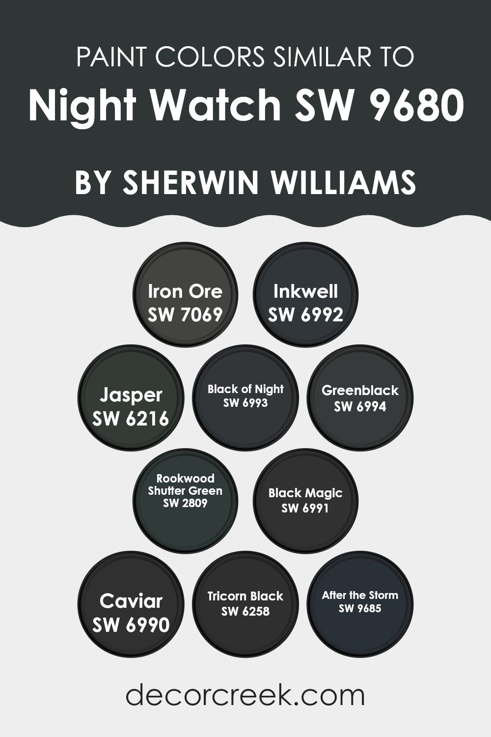
Colors Similar to Night Watch SW 9680 by Sherwin Williams
Similar colors to Night Watch by Sherwin Williams play an essential role in creating harmony in design. These colors complement Night Watch’s deep green tone, providing subtle variety without clashing. SW 7069 Iron Ore is a dark charcoal gray that adds depth and a touch of modern style.
SW 6992 Inkwell is a rich blue-black that provides an elegant alternative, while SW 6216 Jasper brings in a forest green that echoes natural elements in any room. Each of these color variants enhances the ambiance and mood in different ways, just like Night Watch.
SW 6993 Black of Night is a deep black, reminiscent of a quiet starless night, offering a refined touch. SW 6994 Greenblack combines black with green undertones, adding warmth to interiors. SW 2809 Rookwood Shutter Green presents a traditional, historical green that adds classic elegance, whereas SW 6991 Black Magic brings drama with its profound, intense black. SW 6990 Caviar is a soft black that introduces subtlety to its surroundings.
Finally, SW 6258 Tricorn Black offers a classic black option that pairs well with any design. SW 9685 After the Storm provides a lighter, muted tone to contrast and complement these deeper shades. Together, these colors work seamlessly to offer limitless design possibilities.
You can see recommended paint colors below:
- SW 7069 Iron Ore
- SW 6992 Inkwell
- SW 6216 Jasper
- SW 6993 Black of Night
- SW 6994 Greenblack
- SW 2809 Rookwood Shutter Green
- SW 6991 Black Magic
- SW 6990 Caviar
- SW 6258 Tricorn Black
- SW 9685 After the Storm
How to Use Night Watch SW 9680 by Sherwin Williams In Your Home?
Night Watch SW 9680 by Sherwin Williams is a rich, dark green color, reminiscent of deep forests. It’s a bold choice for those looking to add depth and warmth to their home. You can use Night Watch on a feature wall to create a focal point in the living room or bedroom. This color beautifully pairs with natural wood tones, making it an excellent choice for rooms with wooden furniture or flooring.
In a dining room, painting all walls with Night Watch can create an intimate and cozy atmosphere, perfect for dinners and gatherings. For a more subtle effect, consider using it on cabinetry or door frames to add a touch of elegance without making the room feel too heavy.
Pairing Night Watch with lighter colors, like creams or soft grays, balances the dark hue and prevents the room from feeling too closed in. Add some gold or brass accents for a chic, modern look.
Night Watch SW 9680 by Sherwin Williams vs Tricorn Black SW 6258 by Sherwin Williams
Night Watch SW 9680 and Tricorn Black SW 6258 by Sherwin Williams are both deep, bold colors, but they have distinct differences. Night Watch is a rich, dark green that brings a sense of the outdoors inside.
It creates a cozy and natural feel and works well with earthy tones or as an accent against lighter colors. It gives a room a calm and inviting atmosphere. On the other hand, Tricorn Black is a classic, true black. It’s flexible and works with almost any color scheme, providing a strong contrast when paired with lighter shades.
It’s often used to add drama or make a statement in a room. While Night Watch softens a room with its green hue, Tricorn Black offers a sharper, more modern look. Both colors can create a striking effect, but their different undertones and finishes offer distinct moods.
You can see recommended paint color below:
Night Watch SW 9680 by Sherwin Williams vs Greenblack SW 6994 by Sherwin Williams
Night Watch and Greenblack are two dark and rich colors by Sherwin Williams, each bringing its own mood to a room.
Night Watch is a deep green that evokes the feeling of being in a lush forest at night. It has a calming, natural quality that can make a room feel cozy and grounded. This color pairs well with natural materials and can be used to create a soothing environment that feels connected to nature.
Greenblack, on the other hand, is a very dark green, almost black, with a subtle hint of green. It offers a more dramatic look and can make a bold statement in a room. This color is flexible and can add depth and contrast to any room. It pairs well with lighter colors and metallics for a modern, elegant look.
Overall, while both colors are deep and rich, Night Watch leans more towards a green forest feel, whereas Greenblack is darker and more mysterious.
You can see recommended paint color below:
Night Watch SW 9680 by Sherwin Williams vs Caviar SW 6990 by Sherwin Williams
Night Watch SW 9680 and Caviar SW 6990, both from Sherwin Williams, are rich, dark colors, but they each bring a unique feel. Night Watch is a deep green with hints of teal, evoking the calming, lush tones of a dense forest.
It’s perfect for creating a cozy, inviting atmosphere in a room, adding a touch of nature indoors. Caviar, on the other hand, is a deep black with a luxurious, classic vibe. It’s bold and dramatic, often used to make a statement or add an edge to a room.
While Night Watch offers a connection to the natural world, Caviar provides a sleek, modern touch. Choosing between them can depend on whether you want the calming influence of a rich green or the impactful statement of a pure black. Both colors are flexible and can add depth and character to any room, yet they carry distinct moods.
You can see recommended paint color below:

Night Watch SW 9680 by Sherwin Williams vs Iron Ore SW 7069 by Sherwin Williams
Night Watch (SW 9680) and Iron Ore (SW 7069) by Sherwin Williams are both rich, dark colors, but they offer different moods and styles. Night Watch is a deep green with a hint of blue, reminiscent of lush forests and a sense of calm. It’s bold yet soothing, bringing a touch of nature indoors, perfect for creating a cozy and inviting atmosphere.
On the other hand, Iron Ore is a dark charcoal gray. It’s sleek, modern, and a bit more neutral compared to Night Watch. It offers an elegant and flexible backdrop that works well in contemporary rooms.
While Night Watch has a bit of warmth due to its green hue, Iron Ore leans cooler, adding a touch of drama and depth without being too much in the room. Both colors can serve as striking accents or main colors in a room, but their different tones offer varied vibes depending on the desired ambiance.
You can see recommended paint color below:
Night Watch SW 9680 by Sherwin Williams vs Black of Night SW 6993 by Sherwin Williams
Night Watch SW 9680 is a deep green color by Sherwin Williams. It has an earthy, nature-inspired feel and can create a calming atmosphere in a room. This color is rich and works well in areas where you want to add a touch of elegance and a hint of the outdoors.
On the other hand, Black of Night SW 6993 is a pure black. This shade is classic and bold, providing a strong contrast in any design. It is flexible and can add a sense of drama to any room. While Night Watch offers warmth with its green hue, Black of Night gives a sharp, stylish look.
Using them together can balance a room, with Night Watch providing warmth and comfort, and Black of Night offering a modern, striking touch. Both colors have their own unique presence and can enrich the feel of a room when used thoughtfully.
You can see recommended paint color below:
Night Watch SW 9680 by Sherwin Williams vs Inkwell SW 6992 by Sherwin Williams
Night Watch (SW 9680) and Inkwell (SW 6992) are both deep, rich hues from Sherwin Williams, but they offer different vibes. Night Watch is a dark green with a touch of blue, making it feel nature-inspired and calming.
It can create a cozy, inviting atmosphere reminiscent of a lush forest or dense foliage. Its depth makes rooms feel warm and secure. On the other hand, Inkwell is a very dark, almost black, blue. It’s more dramatic and can add a bold statement to any room. This color is flexible, fitting in modern, eclectic, or traditional styles due to its classic black undertone.
While both colors are deep, Inkwell tends to be more formal and striking, while Night Watch feels more grounded and earthy. When choosing between them, consider the mood you want: soothing and natural with Night Watch, or bold and elegant with Inkwell.
You can see recommended paint color below:

Night Watch SW 9680 by Sherwin Williams vs Rookwood Shutter Green SW 2809 by Sherwin Williams
Night Watch SW 9680 by Sherwin Williams is a deep, rich green that feels very calming and is reminiscent of a quiet forest. It’s a color that can create a cozy and intimate feeling in any room. It pairs well with natural materials and neutral colors, offering a flexible base for a variety of interior styles.
In contrast, Rookwood Shutter Green SW 2809 by Sherwin Williams is an earthy, more muted green with a touch of historical charm. It feels like a color you might find on an old farmhouse or traditional home. It’s less intense than Night Watch and has a softer, classic feel.
Both colors bring a sense of nature indoors but in different ways. Night Watch is bold and dramatic, perfect for modern rooms that want an impactful look. Rookwood Shutter Green is more subtle, lending an understated elegance that suits vintage or rustic designs.
You can see recommended paint color below:
- SW 2809 Rookwood Shutter Green
Night Watch SW 9680 by Sherwin Williams vs Black Magic SW 6991 by Sherwin Williams
Night Watch (SW 9680) and Black Magic (SW 6991) are two distinct colors by Sherwin Williams, each bringing a different feel to a room.
Night Watch is a deep green that feels like a breath of fresh air. It resembles a lush forest, bringing a calming and natural vibe to the room. It works well in living rooms or bedrooms where a soothing atmosphere is desired. This color pairs nicely with light woods and metallic accents, adding a touch of nature indoors.
On the other hand, Black Magic is a pure, deep black that feels bold and powerful. It’s a dramatic color that is perfect for making a statement in any room. Black Magic is flexible and can be used in modern, bold designs or as an accent to create contrast. It pairs well with white for a classic black-and-white look, or with brighter colors for a striking effect. Overall, Night Watch offers a touch of nature and calmness, while Black Magic provides boldness and drama.
You can see recommended paint color below:
Night Watch SW 9680 by Sherwin Williams vs Jasper SW 6216 by Sherwin Williams
Night Watch SW 9680 and Jasper SW 6216 are both deep, rich colors by Sherwin Williams, but they offer different moods and styles. Night Watch is a deep green hue that feels grounded and natural, almost like a dense forest at night. It creates a cozy and intimate feeling, perfect for rooms where you want a calming and relaxing setting.
On the other hand, Jasper SW 6216 is also a rich color but leans more towards blue-green. While still soothing, Jasper can feel slightly cooler and more refreshing compared to the earthy warmth of Night Watch. This makes Jasper a great choice for adding an elegant touch to rooms like bathrooms or kitchens, where a fresh feel is often desired.
Both colors are flexible and can work well as accent walls or even main wall colors in rooms, depending on the mood you want to create. One offers a more grounded feel, while the other brings a bit of freshness.
You can see recommended paint color below:
Night Watch SW 9680 by Sherwin Williams vs After the Storm SW 9685 by Sherwin Williams
Night Watch is a dark, rich green that feels cozy and intimate. It’s like being surrounded by a lush forest, providing a calming and protective vibe. The color can make a room feel smaller but also warm and inviting, perfect for rooms where you want to relax and unwind.
After the Storm, on the other hand, is a lighter, gentle blue with a hint of gray. It brings to mind the calm and clearness following a rain. This color can make a room feel open and airy, adding a sense of freshness and peace to a room. It works well in areas where you want a light, refreshing feel, like a bathroom or a sunny kitchen.
When you compare the two, Night Watch is about creating a snug, comforting atmosphere, while After the Storm is about lightness and freshness. Both can offer different moods depending on the feel you want in your room.
You can see recommended paint color below:
- SW 9685 After the Storm

After learning about SW 9680 Night Watch by Sherwin Williams, I feel quite excited about this paint color. Night Watch is a deep green, like the color of a forest at night, which makes it both calming and powerful. When I think about using Night Watch in a room, I imagine it bringing a sense of comfort and warmth.
This shade of green can make any room feel cozy and inviting. It has a rich and bold look, which gives any room a special character. Though it’s a strong color, it balances nicely with lighter tones, like whites or soft pastels, making things feel pleasant and not too dark.
What’s really nice about Night Watch is that it can fit in many different places, like a living room, bedroom, or even a study area, adding style and a touch of nature to our homes. For someone like me who loves the outdoors, Night Watch brings that natural feeling inside.
Overall, I think painting with Night Watch by Sherwin Williams can really help make a room feel warm and unique, giving it both beauty and a connection to nature. It’s a wonderful way to make a room feel more personal and enjoyable.
Ever wished paint sampling was as easy as sticking a sticker? Guess what? Now it is! Discover Samplize's unique Peel & Stick samples.
Get paint samples

