Deciding on the perfect paint color for your room can feel challenging with so many options available. Today, let me share some insights about SW 6206 Oyster Bay by Sherwin Williams, a choice that might just be what your home needs.
Oyster Bay is a unique blend of green and gray, offering a soothing yet refined hue that fits beautifully into various decor styles and settings. Before you make your final decision, it’s worth considering how this particular color behaves in different lighting and what atmospheres it best complements.
I’ll walk you through how it looks in natural versus artificial light, and suggest the types of rooms where Oyster Bay truly shines. By understanding these nuances, you’ll be better prepared to see if this color aligns with your vision for your room.
Whether you’re updating a single room or planning a full home renovation, knowing these key points about Oyster Bay can help you create a cohesive and inviting environment. Let’s get started!
Is Oyster Bay SW 6206 Right for My Home?
I recently came across a beautiful paint color called Oyster Bay by Sherwin Williams, and I instantly fell in love with it. This color is a muted, soft green with a hint of gray, making it extremely adaptable and soothing to the eye. Its subtle tone works wonders in creating a relaxed atmosphere while still adding a splash of color to any room.
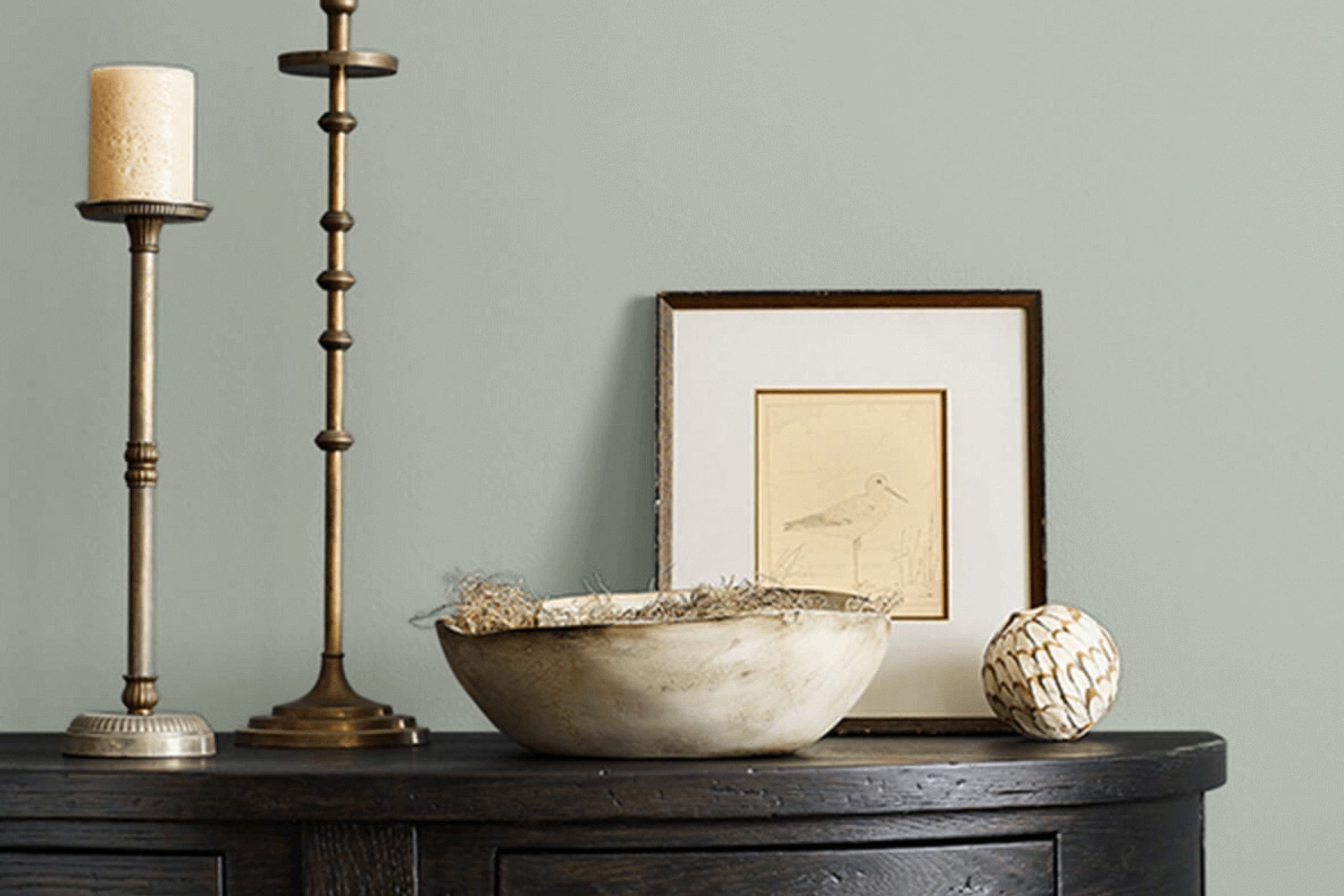
I think Oyster Bay is particularly well suited for styles like coastal, traditional, and even modern interiors. It has a way of blending seamlessly with various decor elements, enhancing the overall aesthetic without creating an intense feeling. In my living room, which has a coastal theme, Oyster Bay pairs perfectly with light woods, soft linens, and wicker textures, creating a cozy yet fresh vibe. I also think it would look stunning in a kitchen or bathroom where you want a touch of freshness without going too bold.
In terms of materials and textures, Oyster Bay coordinates beautifully with natural elements. Think of pairing it with oak or pine for a more rustic appeal or with sleek marble and metallic finishes for a more contemporary look. Soft fabrics like cotton or linen in light, neutral colors also complement this color wonderfully, adding to its gentle charm. If you’re looking for a color that supports a diverse range of styles and materials, Oyster Bay is a fantastic pick. I’m so happy with how it turned out in my home!

decorcreek.com
What are the right undertones of Oyster Bay SW 6206 ?
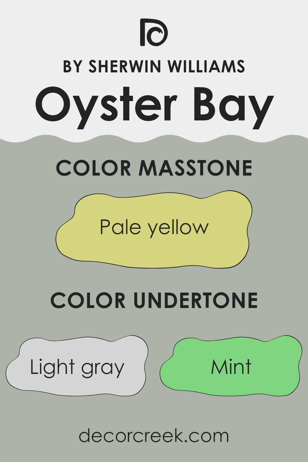
Oyster Bay is a unique paint color that includes a mix of several undertones which influence how it appears under different lighting conditions and when paired with various decor elements. The undertones of light gray, mint, and light blue give it a cool foundation, making the color feel fresh and calm. These cooler undertones can make a room feel more open and airy, which is excellent for smaller rooms or areas that need a touch of brightness.
The addition of pale pink and light purple adds a subtle warmth to the color, ensuring that it does not feel too cold or stark. This combination can help create a balanced atmosphere in a room, making it feel inviting. When used on interior walls, these warmer hues can soften the overall look, providing a gentle backdrop that complements wood finishes and neutral furnishings well.
Other undertones like grey, lilac, yellow, light green, orange, and olive add complexity to the color. These can either accentuate Oyster Bay’s freshness or add a hint of earthiness, depending on the surrounding colors and lighting. In natural light, for example, yellow and light green undertones might become more pronounced, adding a vibrant touch to the room.
Overall, the variety of undertones in Oyster Bay means it can adapt to different interior styles and preferences, from modern and minimalist to more traditional settings. However, the final effect of these undertones will largely depend on the room’s lighting, size, and complementary colors used in decorations and furnishings.
decorcreek.com
Best Coordinating Colors to use with Oyster Bay SW 6206 by Sherwin Williams this year.
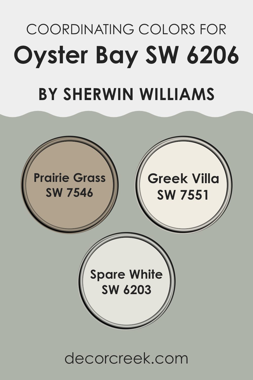
Coordinating colors are shades that complement each other when used together in a room, creating a harmonious and balanced visual experience. These colors typically share similar undertones or are positioned close to each other on the color wheel, which allows them to enhance the overall aesthetic without clashing. When it comes to decorating with a specific paint like Oyster Bay SW 6206 by Sherwin Williams, choosing the right coordinating colors is key to achieving a cohesive look.
One such coordinating color, Prairie Grass SW 7546, is a muted green with earthy tones that pairs well with the subtle blue-green hues of Oyster Bay. It offers a natural, grounding effect in any room. Greek Villa SW 7551 is a soft, warm white with creamy undertones, making it an excellent choice for trim, doors, or cabinetry to contrast gently against the cooler Oyster Bay.
Another complementary color is Spare White SW 6203, a light, airy gray with subtle blue undertones, which echoes the coolness of Oyster Bay and helps create a fresh and inviting atmosphere. Together, these colors work seamlessly to enhance the beauty of each other and the room they inhabit.
You can see recommended paint colors below:
Trendy Trim Colors of Oyster Bay SW 6206 by Sherwin Williams to use this year.
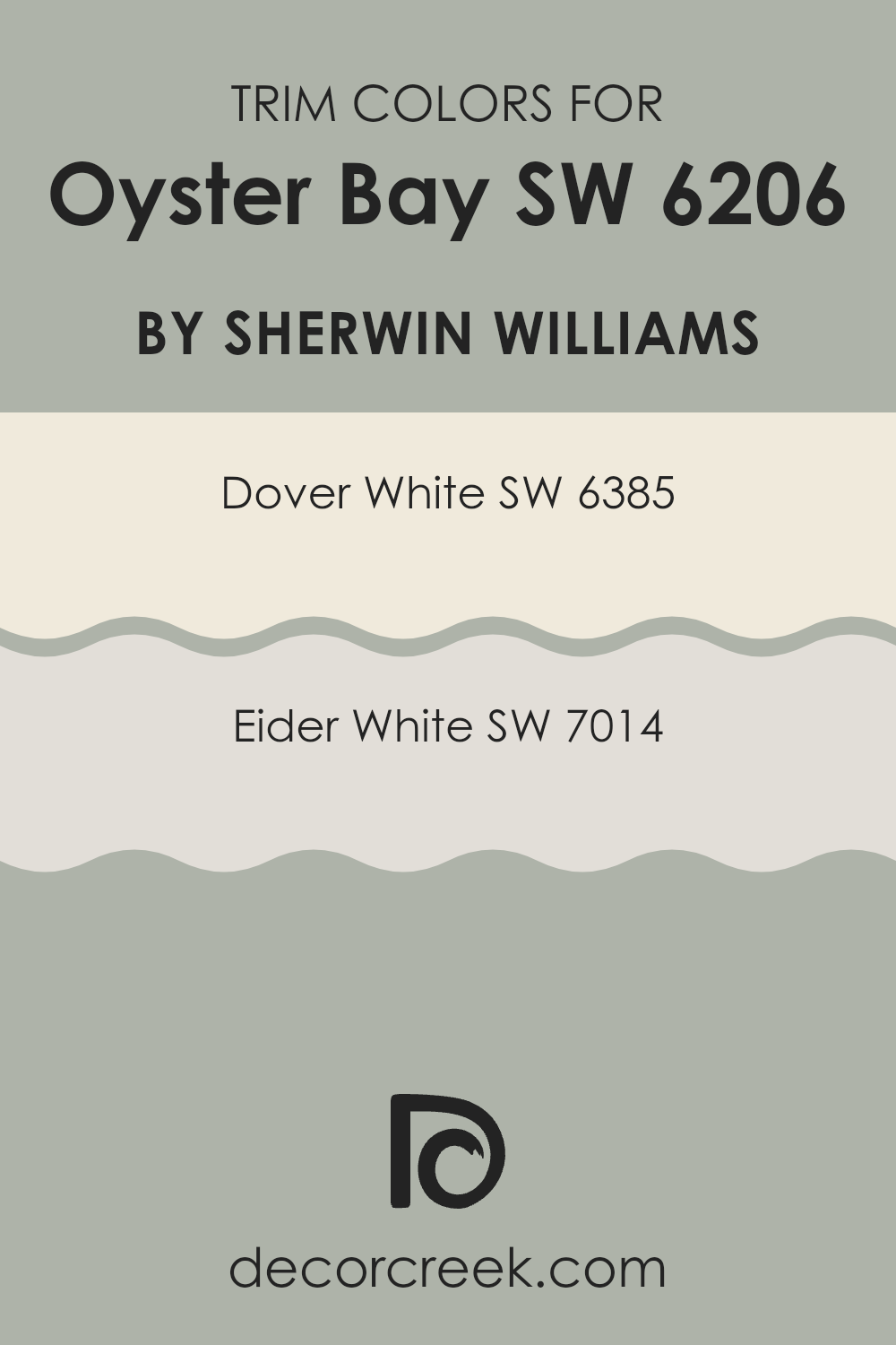
Trim colors are specific shades selected to complement or contrast with the primary wall colors in a room, enhancing the overall aesthetic and defining architectural details like door frames, window sills, and baseboards. For Oyster Bay, a distinctive and handsome greenish-blue hue, choosing the right trim colors can significantly enhance its visual appeal.
Using either Dover White or Eider White as trim colors can gently highlight Oyster Bay’s unique qualities without creating an intense feeling, ensuring a clean, coherent look that makes both the wall and trim colors noticeably pleasant.
Dover White SW 6385 is a warm, creamy white that offers a soft contrast against Oyster Bay, providing a soothing outline to any room and making it feel inviting and home-style cozy. On the other hand, Eider White SW 7014 has a slightly grayish tone, giving it a subtle, understated presence that complements the cooler aspects of Oyster Bay, ensuring that the room maintains a balanced and harmonious atmosphere. These trim colors are excellent choices for creating an aesthetically pleasing environment that feels both comfortable and stylish.
You can see recommended paint colors below:
- SW 6385 Dover White
- SW 7014 Eider White
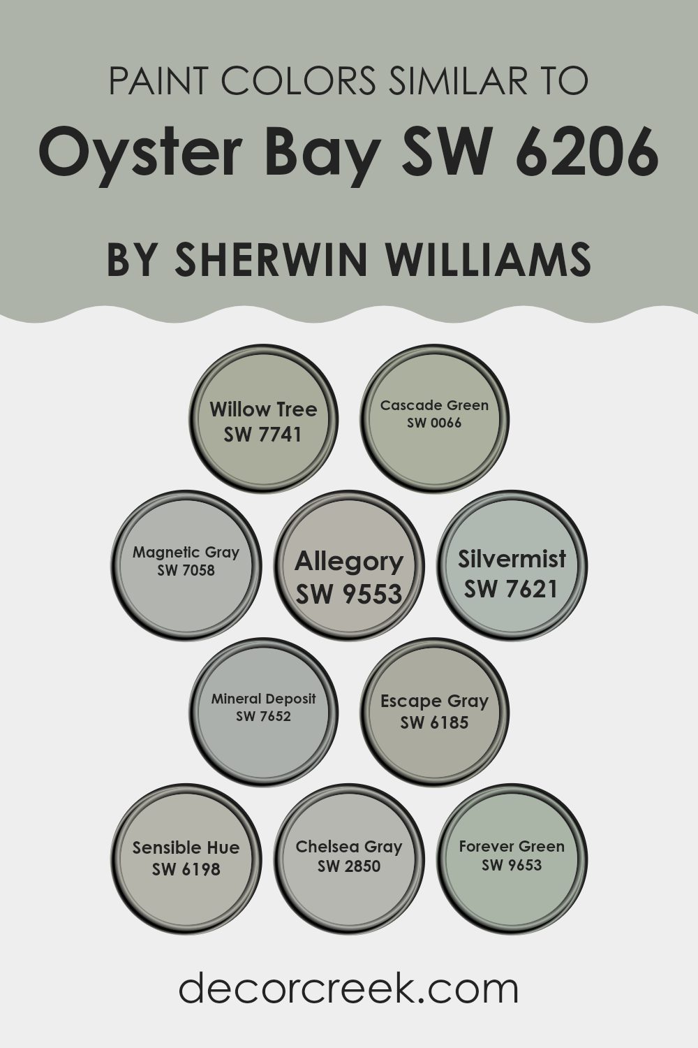
Evergreen Colors Similar to Oyster Bay SW 6206 by Sherwin Williams
Using similar colors in design can create a harmonious and visually appealing environment. Colors like SW 7741 – Willow Tree, a soft muted green, and SW 0066 – Cascade Green, which carries a deeper green hue, ensure a smooth visual transition and maintain a cohesive look throughout a room. SW 7058 – Magnetic Gray serves as a balanced neutral with a gentle gray tone, complementing the more expressive SW 9553 – Allegory, a unique blend of blue and gray that adds a subtle depth.
Meanwhile, SW 7621 – Silvermist, showcasing a blend of blue with soft gray undertones, pairs beautifully with SW 7652 – Mineral Deposit, which offers a slightly darker gray-blue shade, enhancing the overall soothing effect.
Similarly, SW 6185 – Escape Gray and SW 6198 – Sensible Hue both offer variations of warm grays, ensuring they can be interchanged without disrupting the room’s aesthetic fluidity. SW 2850 – Chelsea Gray provides a more solid gray that works well as a grounding color, while SW 9653 – Forever Green introduces a vibrant yet not creating an intense feeling touch of green, adding a lively yet balanced element to rooms. These similar shades can be used to ensure that different areas or elements in a room feel connected yet distinct, making the environment feel unified and thoughtfully put together.
You can see recommended paint colors below:
- SW 7741 Willow Tree
- SW 0066 Cascade Green
- SW 7058 Magnetic Gray
- SW 9553 Allegory
- SW 7621 Silvermist
- SW 7652 Mineral Deposit
- SW 6185 Escape Gray
- SW 6198 Sensible Hue
- SW 2850 Chelsea Gray
- SW 9653 Forever Green
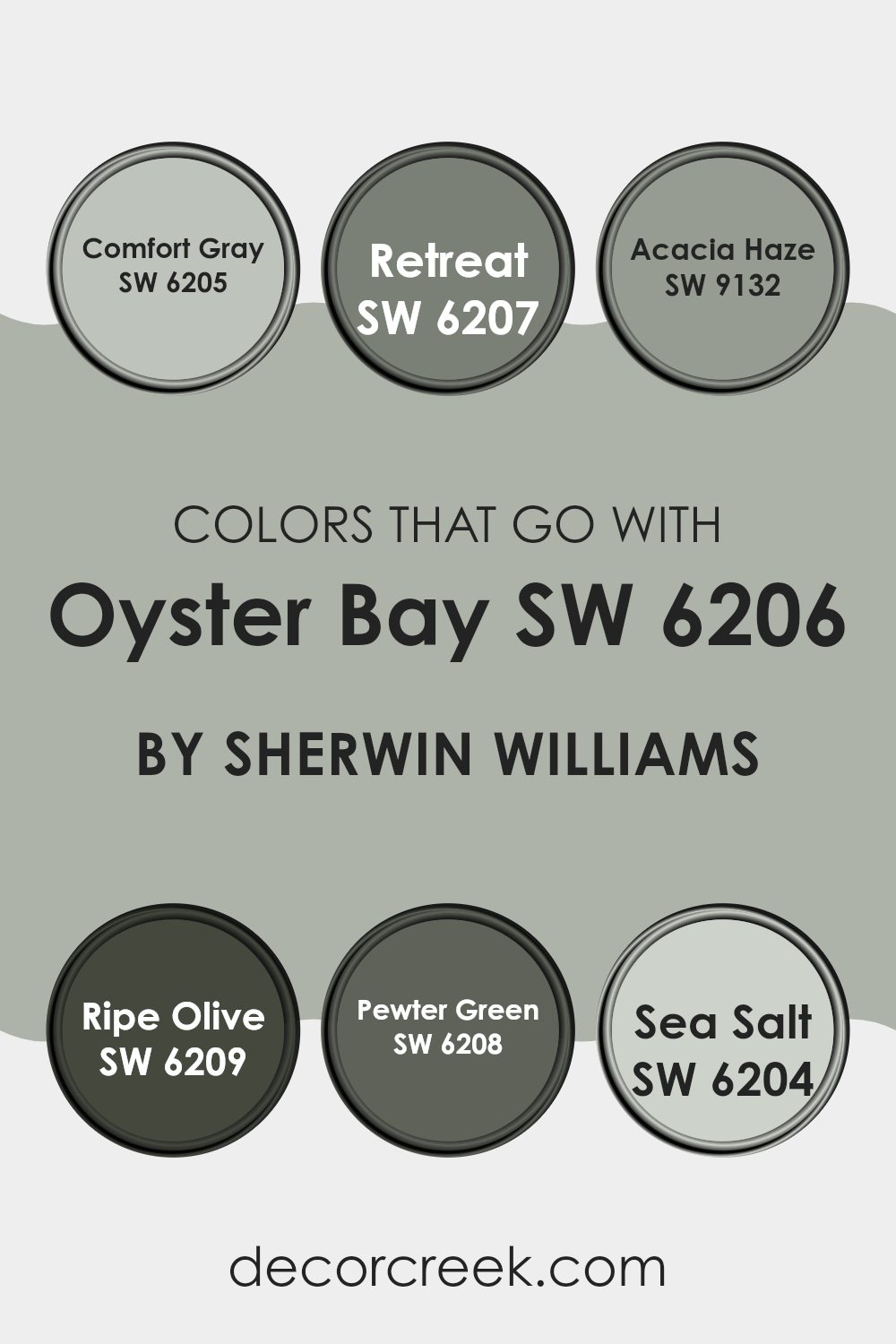
Colors that Go With Oyster Bay SW 6206 by Sherwin Williams
Choosing the right colors to complement Oyster Bay SW 6206 by Sherwin Williams is crucial as it helps create a harmonious and visually appealing room. These colors ensure that the overall design feels cohesive and well-thought-out. For instance, Comfort Gray SW 6205 provides a slightly lighter shade that pairs beautifully with Oyster Bay, enhancing the mood without creating an intense feeling. On the other hand, Retreat SW 6207 offers a deeper, more intense color that contrasts nicely, adding depth and interest to the environment.
Acacia Haze SW 9132 is a subtle and gentle green that works well with Oyster Bay, offering a refreshing feel to any room. Ripe Olive SW 6209, being a darker green, presents a bold look that stands out against the softer tones of Oyster Bay, perfect for creating focal points in a room.
Pewter Green SW 6208, with its deeper and cooler tones, combines well to provide a balanced look. Lastly, Sea Salt SW 6204, a light and airy color, complements Oyster Bay by providing a bright and open feel, often used to impart a sense of cleanliness and spaciousness in a room. Together, these colors help in achieving a delightful aesthetic that is both inviting and comfortable.
You can see recommended paint colors below:
- SW 6205 Comfort Gray
- SW 6207 Retreat
- SW 9132 Acacia Haze
- SW 6209 Ripe Olive
- SW 6208 Pewter Green
- SW 6204 Sea Salt
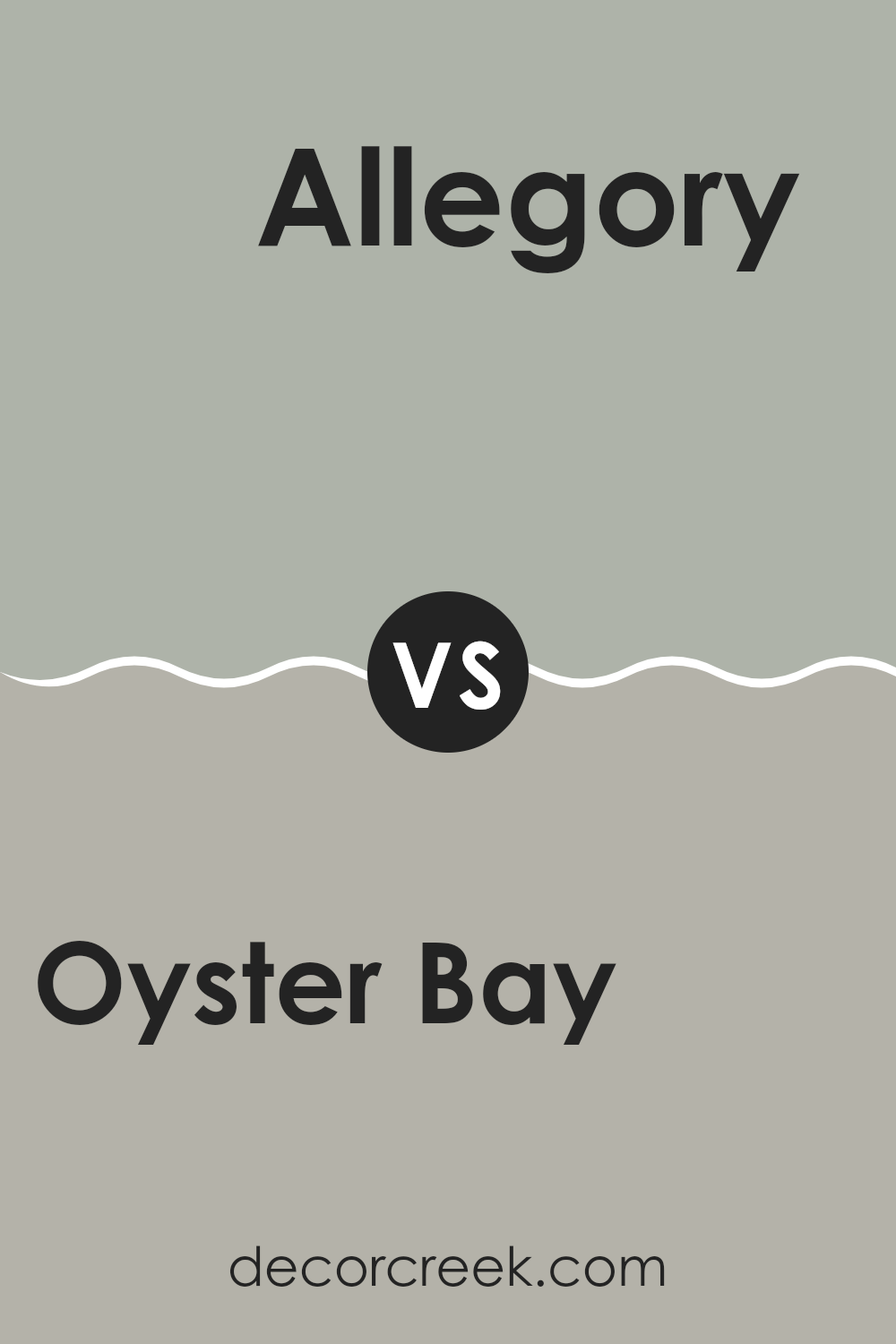
Oyster Bay SW 6206 by Sherwin Williams vs Allegory SW 9553 by Sherwin Williams
Oyster Bay and Allegory, both by Sherwin Williams, are distinctly different hues that can create unique moods in a room. Oyster Bay is a soft, soothing green with a hint of blue that gives it a gentle and calming feel.
This color works well in rooms where relaxation is key, such as in bedrooms or bathrooms. On the other hand, Allegory is a deeper, sage-like green that carries a more grounded and earthy vibe. This color is excellent for areas that could benefit from a touch of nature, like kitchens or living rooms, infusing them with a cozy, welcoming atmosphere.
Both colors pair well with natural elements and can be used to create a harmonious environment, but Oyster Bay leans towards a fresher, lighter feel while Allegory goes towards a richer, more enveloping ambiance.
You can see recommended paint color below:
- SW 9553 Allegory
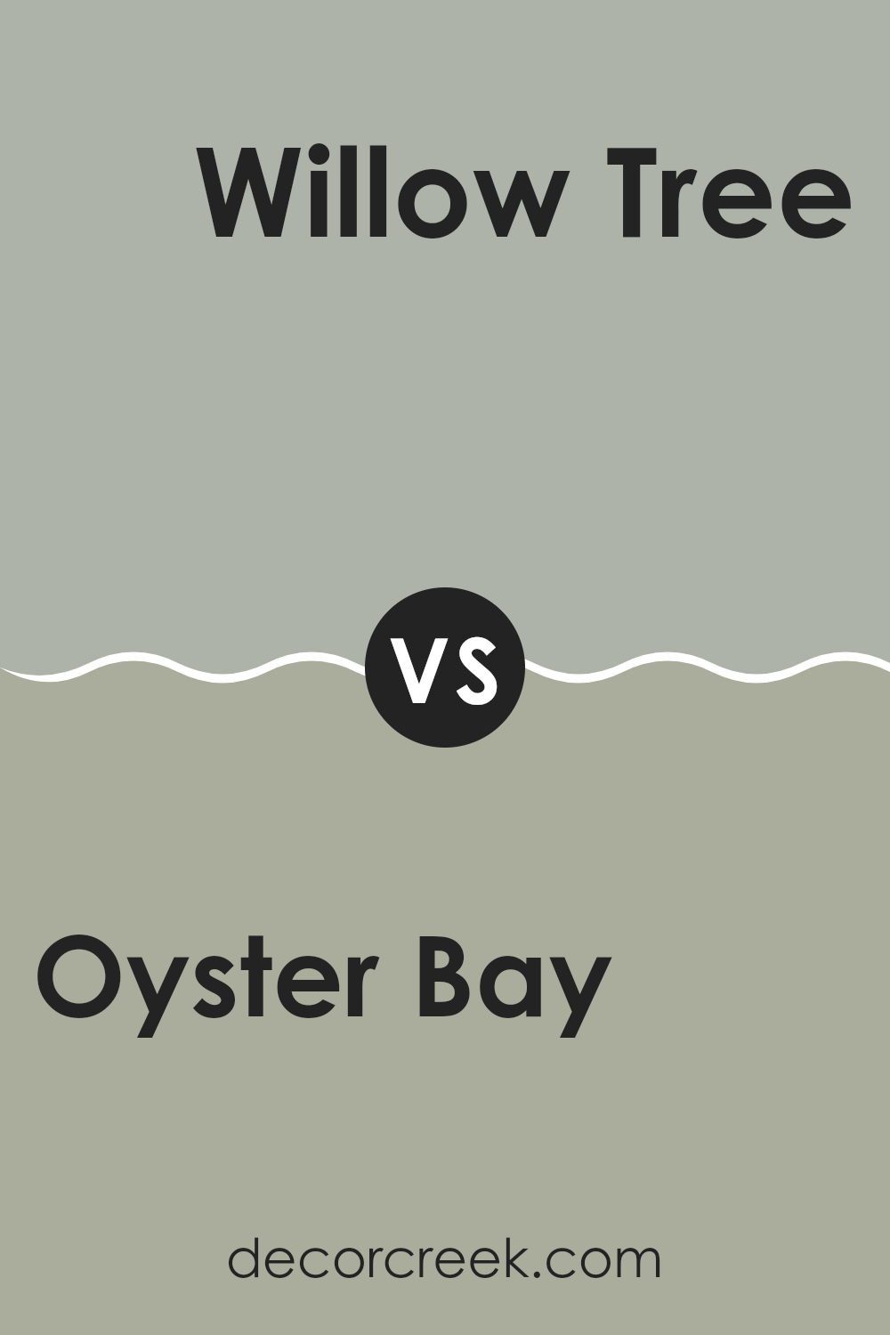
Oyster Bay SW 6206 by Sherwin Williams vs Willow Tree SW 7741 by Sherwin Williams
Oyster Bay and Willow Tree are two distinct shades by Sherwin Williams. Oyster Bay is a soft, muted green with gray undertones, giving it a calm, soothing feel. It works well in rooms where you want a hint of color without creating an intense feeling. This color is adaptable and blends well with both modern and traditional decor.
On the other hand, Willow Tree is a deeper green with a more pronounced presence. It retains a natural vibe, but its richer tone creates a stronger visual impact. Suitable for accent walls or rooms where you want to add a bit of nature-inspired boldness, Willow Tree can make a room feel more grounded and full of life.
Both colors reflect elements of nature but cater to different aesthetic preferences and uses in a home. Oyster Bay is lighter and subtler, while Willow Tree stands out more with its depth.
You can see recommended paint color below:
- SW 7741 Willow Tree
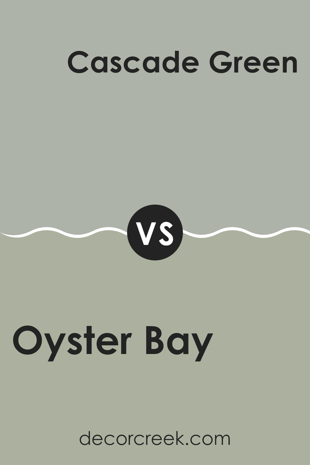
Oyster Bay SW 6206 by Sherwin Williams vs Cascade Green SW 0066 by Sherwin Williams
Oyster Bay and Cascade Green are two distinctive colors from Sherwin Williams. Oyster Bay is a soft, muted green with gray undertones, giving it a subtle and understated look. This color works well in rooms where you want a hint of color without creating an intense feeling. It’s ideal for creating a calm and relaxing environment.
On the other hand, Cascade Green is a deeper, more vibrant shade of green. It has a lively and refreshing feel, making it great for adding a pop of energy to a room. This color is perfect for areas where you want to make a statement, such as an accent wall or a small bathroom.
Each color offers its own unique charm and can be used to set a different mood. Oyster Bay’s low-key vibe is suited for those looking for a gentle touch of color, while Cascade Green fits rooms that benefit from a brighter, more dynamic shade.
You can see recommended paint color below:
- SW 0066 Cascade Green
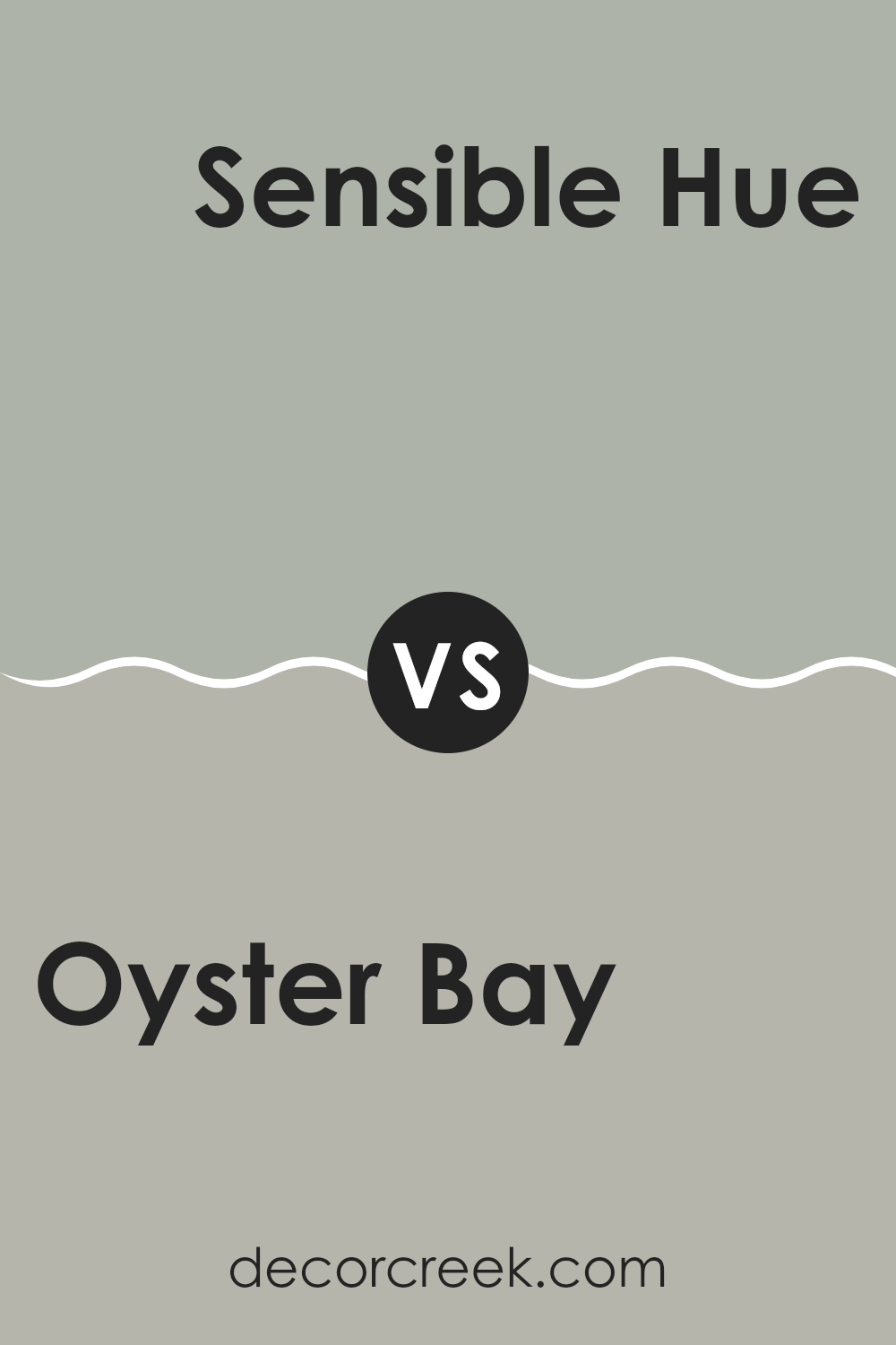
Oyster Bay SW 6206 by Sherwin Williams vs Sensible Hue SW 6198 by Sherwin Williams
Oyster Bay and Sensible Hue, both by Sherwin Williams, are unique in their own ways. Oyster Bay is a cooler, more muted green with hints of blue, giving it a calming effect without being too bold. It works well in rooms where you want a touch of color, yet maintaining a subtle, soothing atmosphere. This color pairs nicely with both dark and light furniture, allowing for adaptable design options.
Sensible Hue is a softer, more neutral shade that leans towards gray with a slight green undertone. This color is perfect for those who prefer a more understated look. It provides a clean, fresh backdrop that can easily blend with various decor styles and other colors, making it ideal for living areas, bedrooms, or even offices.
When comparing the two, Oyster Bay offers a bit more personality with its green-blue tones, while Sensible Hue keeps things low-key and flexible, adapting well to any room without creating an intense feeling. Both colors are great choices, depending on the mood and style you want to achieve.
You can see recommended paint color below:
- SW 6198 Sensible Hue
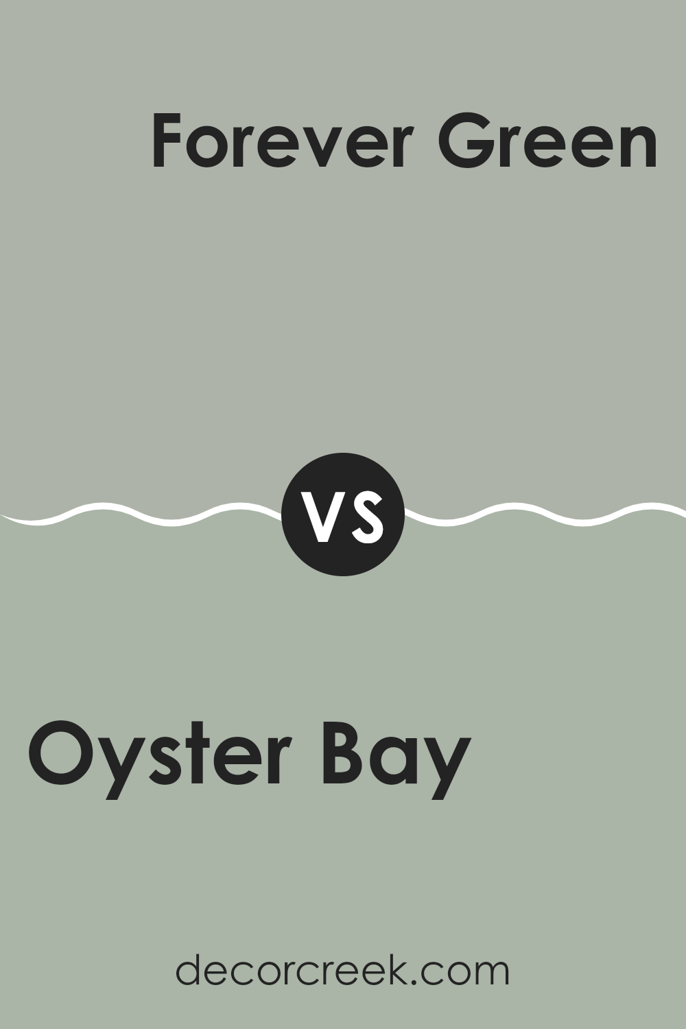
Oyster Bay SW 6206 by Sherwin Williams vs Forever Green SW 9653 by Sherwin Williams
Oyster Bay is a soft, greenish-gray color that brings a light and airy feel to a room. It’s subtle and doesn’t overpower the room, making it a popular choice for creating a calm and gentle atmosphere in a home. In contrast, Forever Green is a more intense and vivid green.
It stands out more boldly and adds depth and character to a room. This color is ideal for those who want to make a stronger statement or highlight a specific area with a pop of energy.
When comparing the two, Oyster Bay offers a more muted, laid-back vibe, while Forever Green goes for a fresh, vibrant look. Each color serves a different purpose depending on your design goals and the mood you want to set in your room.
You can see recommended paint color below:
- SW 9653 Forever Green
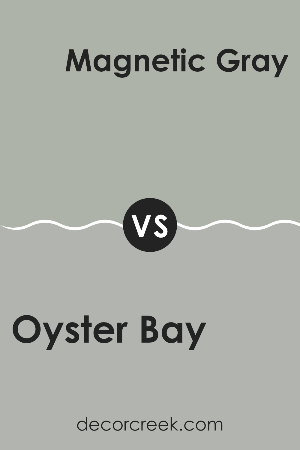
Oyster Bay SW 6206 by Sherwin Williams vs Magnetic Gray SW 7058 by Sherwin Williams
Oyster Bay and Magnetic Gray are two different shades by Sherwin Williams. Oyster Bay is a soft, greenish-gray color that gives a light and airy feel to any room. It’s especially great for rooms where you want a touch of color without creating an intense feeling.
On the other hand, Magnetic Gray is a deeper shade that leans more towards a neutral gray. This color is perfect for areas where you want a stronger presence and more definition. It has a subtle warmth to it, making it adaptable for various decorating styles.
When comparing the two, Oyster Bay offers a hint of freshness due to its green undertones, whereas Magnetic Gray provides a more straightforward, calm gray that works well as a backdrop for brighter colors or as a standalone shade for a more muted look. Both colors are excellent choices, but your preference might depend on the mood you want to set in your room.
You can see recommended paint color below:
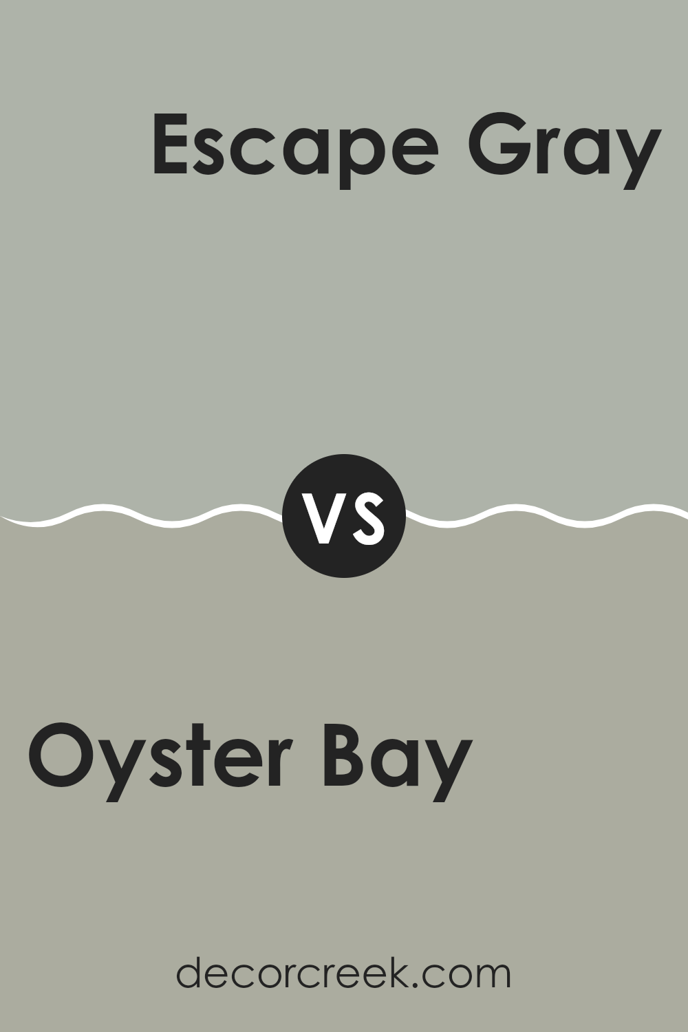
Oyster Bay SW 6206 by Sherwin Williams vs Escape Gray SW 6185 by Sherwin Williams
Oyster Bay and Escape Gray are two paint colors by Sherwin Williams. Oyster Bay is a soft, calming green with a hint of gray, giving it an adaptable and welcoming feel that works well in many rooms, including living rooms and kitchens.
It creates a gentle backdrop that adds a touch of nature to interiors. On the other hand, Escape Gray leans more towards a neutral gray with subtle green undertones. This color is quieter and more subdued compared to Oyster Bay, making it ideal for creating a peaceful and understated look in areas like bedrooms or offices.
While Oyster Bay brings a light, airy vibe, Escape Gray offers a more grounded, almost cozy feel. Both colors can complement each other well in different rooms of a house, depending on the mood you want to set.
You can see recommended paint color below:
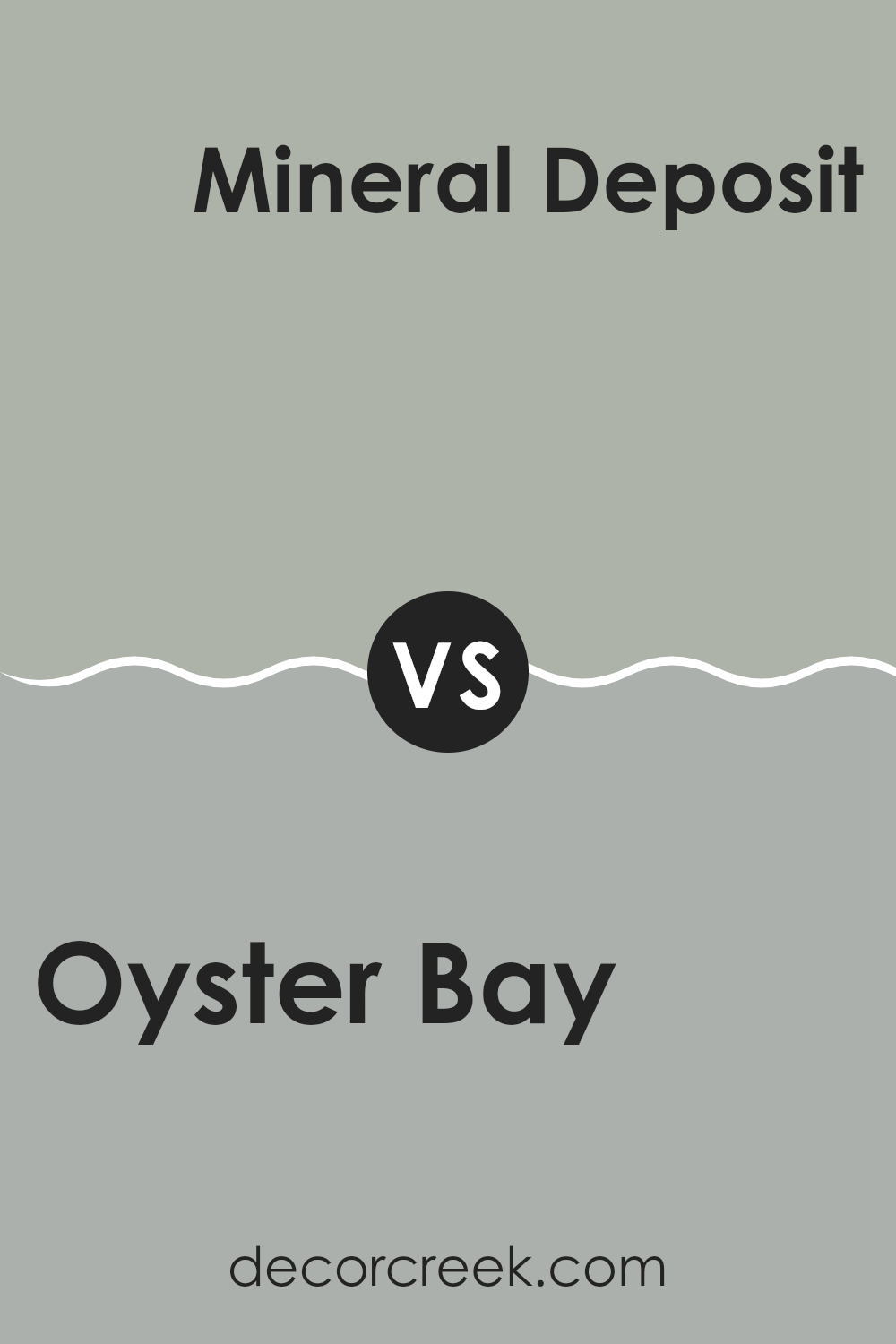
Oyster Bay SW 6206 by Sherwin Williams vs Mineral Deposit SW 7652 by Sherwin Williams
Oyster Bay and Mineral Deposit are both colors offered by Sherwin Williams, unique in their own right. Oyster Bay is a soft, muted green with a hint of gray, giving it a very calming vibe that is easy on the eyes. It is subtle enough to work well in various rooms, from kitchens to bedrooms, and pairs nicely with both light and dark furnishings.
On the other hand, Mineral Deposit appears more as a light gray with a touch of blue, delivering a cool, airy feeling ideal for modern rooms that aim for a clean and fresh look. It’s especially good in bathrooms or kitchens, where the hint of coolness offers a clean, crisp environment.
While both shades are understated and adaptable, Oyster Bay leans towards a greener, warmer tone, ensuring a cozy atmosphere. Mineral Deposit’s cooler blue-gray palette makes it perfect for a sleek and contemporary vibe. Both colors provide a gentle backdrop, allowing room for more colorful accents in a decor scheme.
You can see recommended paint color below:
- SW 7652 Mineral Deposit
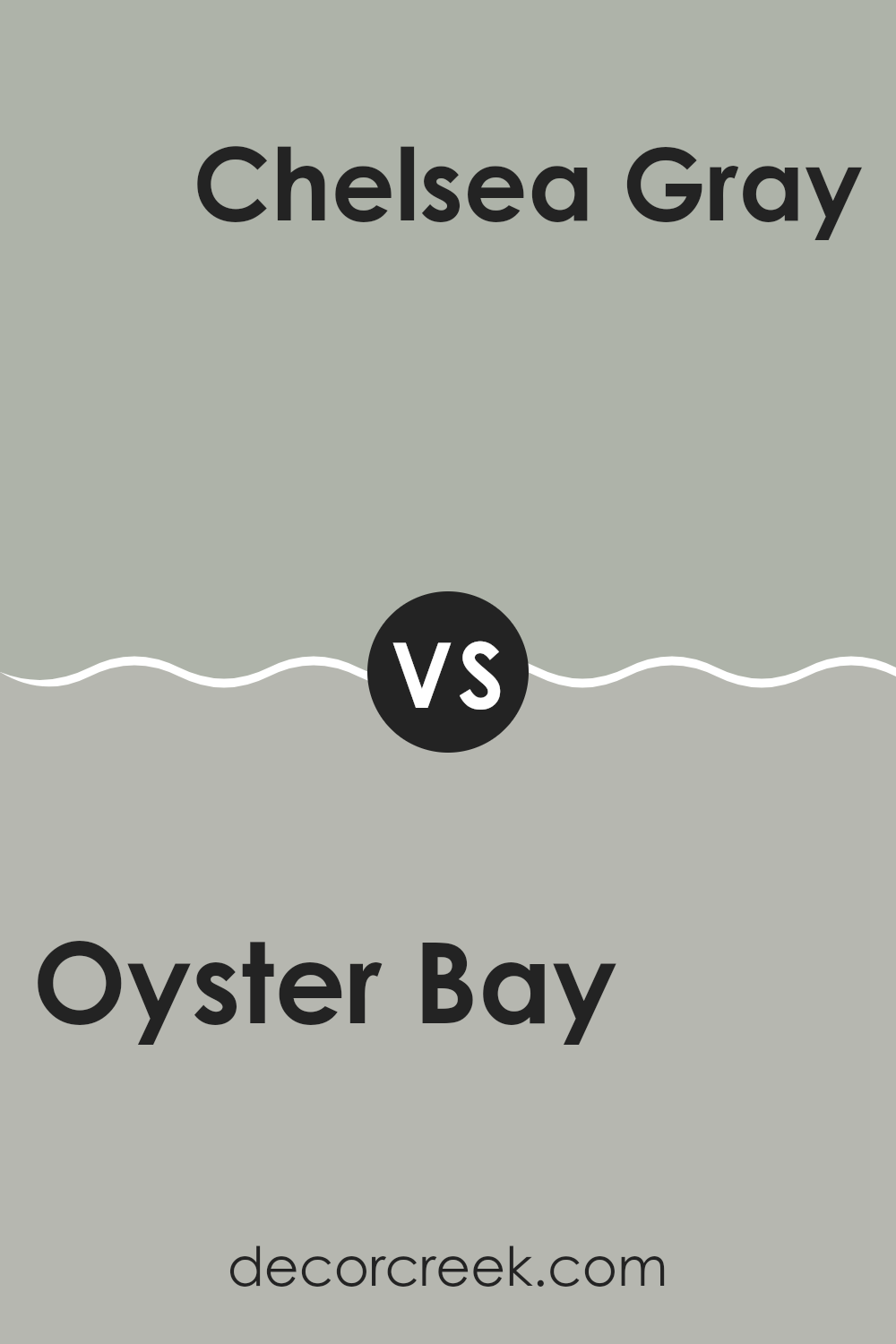
Oyster Bay SW 6206 by Sherwin Williams vs Chelsea Gray SW 2850 by Sherwin Williams
Oyster Bay and Chelsea Gray by Sherwin Williams are two distinct shades with unique characteristics. Oyster Bay is a soft, soothing green with a hint of gray. It evokes a sense of calmness and is gentle enough for rooms where you want a touch of color without creating an intense feeling. It’s ideal for creating a relaxed atmosphere in places like bedrooms or living rooms.
On the other hand, Chelsea Gray is a much deeper, bolder gray with a strong presence. It’s perfect if you’re aiming for a more noticeable impact in your room. This color can make furniture or decor items stand out, especially in well-lit areas. It’s a great choice for statement walls or even for cabinets and doors, providing a classic and stylish look.
Together, these colors can work well if you’re looking for a balance between a subtle hint of color and a standout shade. Their different tones can complement each other, with Oyster Bay brightening areas that Chelsea Gray makes more pronounced.
You can see recommended paint color below:
- SW 2850 Chelsea Gray
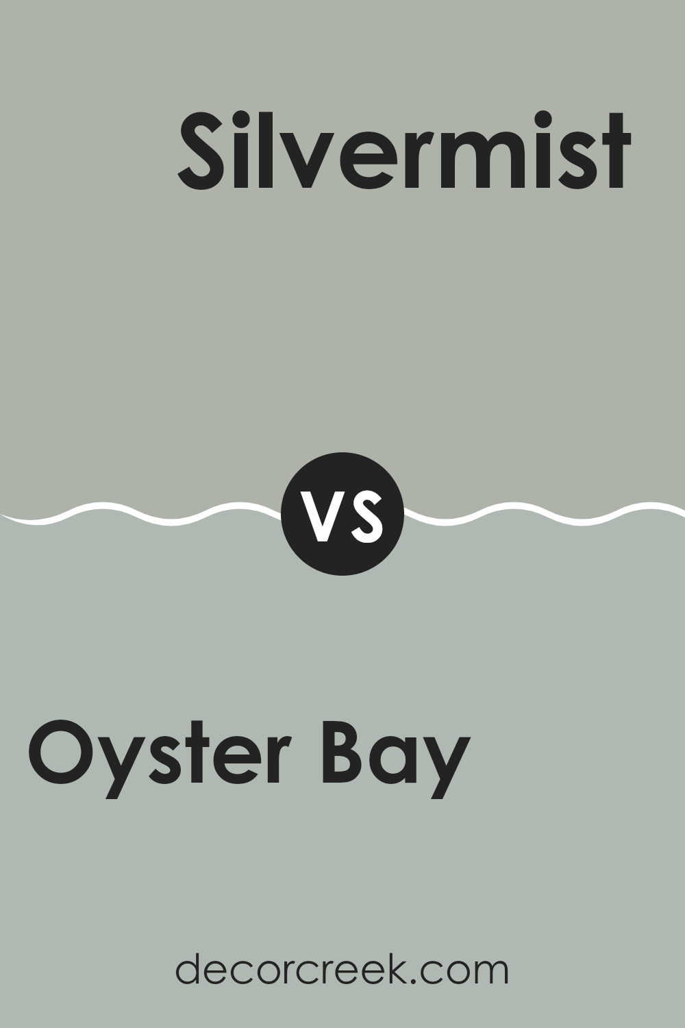
Oyster Bay SW 6206 by Sherwin Williams vs Silvermist SW 7621 by Sherwin Williams
When comparing Oyster Bay and Silvermist, both from Sherwin Williams, it’s great to note that each brings a unique vibe to rooms. Oyster Bay offers a gentle, more subdued green with a hint of gray. This allows it to function beautifully in areas where a calm, soothing presence is needed without being too bold. It’s quite flexible, fitting well in living rooms or bedrooms where softness is appreciated.
On the flip side, Silvermist stands out with a stronger gray dominance, touched by a subtle blue. This color is cooler, making it excellent for modern settings that aim for a clean and airy look. Perfect for bathrooms or kitchens, it reflects light well, helping rooms appear larger.
Both colors are muted and can work together harmoniously in a home, offering a balanced palette of cool and warm undertones, but each creates its distinct atmosphere depending on where and how it is used.
You can see recommended paint color below:
- SW 7621 Silvermist
Wrapping up my thoughts on SW 6206 Oyster Bay by Sherwin Williams, I’ve got to say, I really like this paint color! It’s like a mix between blue, green, and gray, and it reminds me of a calm sea or a peaceful sky. I’ve noticed it can look different depending on which room you paint it in and what kind of light the room gets. In a room with lots of sunlight, it looks more cheerful and bright. But in a darker room, it becomes more cozy and muted.
What’s cool about Oyster Bay is how well it goes with other colors. If you put it in a room with dark woods or bright whites, it stands out nicely without making too strong of a statement. I also think it would be lovely in a bathroom or a bedroom because it has such a calming effect.
Overall, if you’re thinking about a new color for your room, you might really like Oyster Bay. It’s not just simple blue or green; it has a special touch that makes your room feel just right. Whether you’re looking to freshen up your living room or add a new vibe to your bedroom, this color could be the perfect choice. Plus, it’s always fun to see how it changes in different lights throughout the day!

decorcreek.com
Ever wished paint sampling was as easy as sticking a sticker? Guess what? Now it is! Discover Samplize's unique Peel & Stick samples.
Get paint samples

