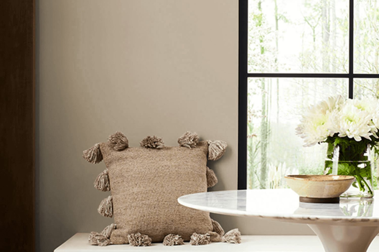
Today, let’s explore a color that brings a touch of serene nature into your home: SW 7546 Prairie Grass by Sherwin Williams. This color belongs to a palette that draws inspiration from the natural landscapes and open spaces of the prairie. It’s a soft, muted green that reflects the hues found in fields of grass stretching towards the horizon. Imagine the gentle sway of grass under a clear, expansive sky – that’s the essence of Prairie Grass.
This color isn’t just beautiful; it’s also incredibly versatile. It works well in a variety of spaces, whether you’re looking to create a calming bedroom retreat, a lively living area, or even a refreshing bathroom. The beauty of Prairie Grass lies in its ability to offer both a sense of calm and a hint of energy, depending on the colors you pair it with.
Homeowners and designers alike appreciate SW 7546 Prairie Grass for its adaptability. It can complement rustic themes, modern designs, or anything in between. Whether you’re painting a whole room or looking for the perfect accent wall, this shade offers a balance between grounding and uplifting, making any space feel more harmonious.
As we delve into the specifics of Prairie Grass, remember that its true strength lies not just in its aesthetic appeal, but in the atmosphere it helps create. It’s a color that transforms a house into a home, matching effortlessly with various decor styles and preferences. So, let’s uncover how SW 7546 Prairie Grass can bring a fresh, natural vibe into your living space.
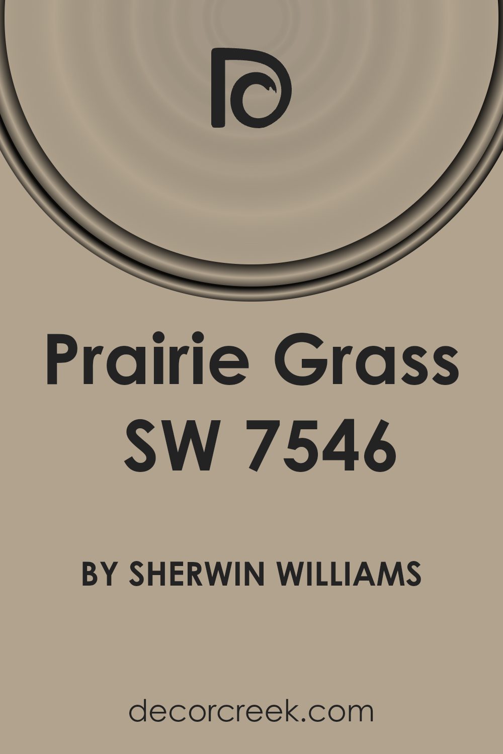
What Color Is Prairie Grass SW 7546 by Sherwin Williams?
Prairie Grass by Sherwin Williams is a warm, soft green with earthy undertones that bring a sense of calm and natural beauty into any space. This color has the versatility to act as a subtle backdrop or a gentle statement within a room. It perfectly mirrors the serene and soothing vibes of a lush meadow, making spaces feel more open and airy.
This color works exceptionally well in interior styles that lean towards simplicity and connection with nature, such as modern farmhouse, rustic, and Scandinavian designs. Its earthy tone allows it to blend seamlessly with natural materials like wood, stone, and linen, adding depth and warmth to the aesthetic of a room. Textures play a crucial role when pairing with Prairie Grass, as they can enhance its organic feel. Think of rough, natural wood, soft, woven fabrics, and even the smoothness of leather as ideal companions for this color.
For a cohesive look, combining it with neutrals like creamy whites or soft beiges will make the room feel more spacious and inviting. However, if you’re looking to add a little more dynamism, accessories in terracotta or muted blues can introduce contrast while maintaining the overall sense of tranquility. This color’s quiet charm makes it a perfect candidate for bedrooms, living areas, and even home offices, creating a peaceful and productive environment.
Is Prairie Grass SW 7546 by Sherwin Williams Warm or Cool color?
Prairie Grass by Sherwin Williams is a soothing and versatile shade of green that brings a touch of nature into any home. This earthy color has a calming effect, making it perfect for creating a relaxing atmosphere in living rooms, bedrooms, or any space that could use a serene touch. Its natural tones help to connect indoor spaces with the outdoors, ideal for homes with big windows or those surrounded by greenery. The muted quality of Prairie Grass allows it to blend well with a variety of decor styles, from modern minimalism to rustic charm. It’s also incredibly adaptable when pairing with other colors. Neutral furnishings or wood elements look especially stunning against this backdrop, allowing for a cohesive and inviting space. Prairies Grass is more than just a paint color; it’s a way to bring a sense of peace and grounding to your home environment.
Undertones of Prairie Grass SW 7546 by Sherwin Williams
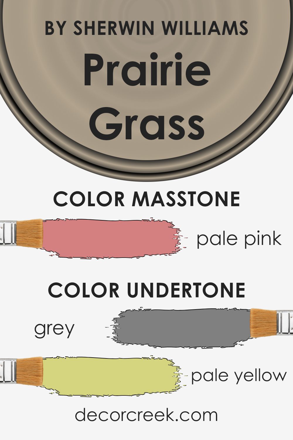
Prairie Grass by Sherwin Williams is an intriguing paint color that carries a blend of various undertones, making it more than just a simple shade. Understanding undertones is key because they subtly influence how we perceive the main color. These hidden hues can change dramatically based on lighting, surrounding colors, and even the time of day, affecting the mood and feel of a space.
When looking at Prairie Grass, you might initially see it as a straightforward color, but it’s the underlying tones of grey, pale yellow, mint, light purple, and more that give it depth and complexity. These undertones work together to create a versatile color that can appear differently depending on its environment. For instance, in a room with lots of natural light, the pale yellow and light blue undertones might make the color appear warmer and more welcoming. In contrast, in a space with less light, the grey or light purple undertones could emerge, giving the room a cooler feel.
The diverse undertones of Prairie Grass mean it can complement a wide range of interior styles and pair well with various colors. On interior walls, this dynamic can add richness and texture, making spaces feel more layered and interesting. The mint and light green undertones could bring a touch of freshness to a kitchen, while the soft lilac or light purple might add a tranquil vibe to a bedroom. The key is observing how these undertones interact with the room’s specific conditions, like lighting and décor, to fully take advantage of Prairie Grass’s unique character.
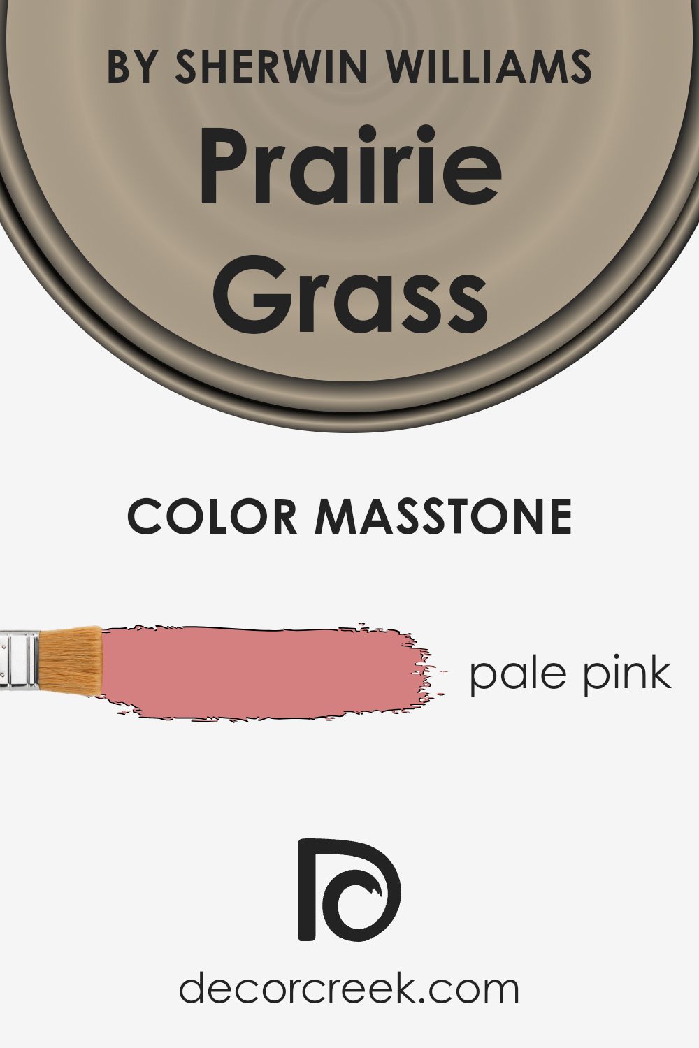
What is the Masstone of the Prairie Grass SW 7546 by Sherwin Williams?
Prairie Grass SW 7546 by Sherwin Williams has a unique masstone that appears as a soft, pale pink with the hex code #D58080. This gentle, warm hue brings a subtle touch of color to any room, enhancing spaces with its soothing presence. In homes, this color works wonders by creating a cozy and welcoming atmosphere, perfect for living rooms, bedrooms, and even bathrooms. Its light pink shade pairs well with a variety of decor styles, from modern and minimalist to more traditional and rustic themes. Since it’s not overwhelming, it supports a range of complementary colors, allowing for versatile design choices.
Using this shade on walls can make a room feel more spacious and open, while adding it as an accent can introduce a delicate hint of color without dominating the space. The inviting vibe of this color makes it an excellent choice for anyone looking to add a gentle, uplifting feel to their home.
How Does Lighting Affect Prairie Grass SW 7546 by Sherwin Williams?
Lighting plays a significant role in how we perceive colors. It can change the way a color looks, making it seem brighter, darker, or even altering its hue. This is because different light sources emit light in various colors, which can affect the appearance of a color. Natural daylight, for example, is considered the purest form of light and usually shows colors in their truest form. Artificial light, on the other hand, can vary widely, from the warm glow of incandescent bulbs to the cooler tones of LED lights.
Take the color Prairie Grass, a paint color by Sherwin Williams, as an example. Under natural light, its true color, a soft and subtle green, is evident, often appearing vibrant and lively. However, under artificial lighting, the color can look different. Warm artificial light can enhance the yellow undertones, making the color appear warmer and cozier. In contrast, cooler artificial light might bring out more of the green’s freshness, making it appear crisper.
The direction your room faces also impacts how Prairie Grass looks. In north-facing rooms, which get less direct sunlight, this color might appear more muted, emphasizing its cooler, softer tones, making the room feel calm and serene. South-facing rooms get abundant light, highlighting the vibrant and warm undertones of Prairie Grass, which can make the space feel more inviting and cheerful.
In east-facing rooms, morning light can make Prairie Grass appear bright and airy, emphasizing its green and yellow undertones. As the day progresses, the color may become softer and more subdued. West-facing rooms, on the other hand, might not benefit much from this color in the morning, but come afternoon and evening, as the sun sets, Prairie Grass can take on a warm, golden glow, creating a cozy and welcoming atmosphere.
Understanding how lighting affects colors like Prairie Grass can help you decide where to use it to its best advantage, ensuring your space feels exactly as you want it to.
What is the LRV of Prairie Grass SW 7546 by Sherwin Williams?
LRV, or Light Reflectance Value, is a measure that indicates how much light a paint color reflects or absorbs once it’s on the wall. It’s represented on a scale from 0 to 100, where 0 is pure black (absorbs all light) and 100 is pure white (reflects all light). Understanding LRV helps in choosing the right paint color for your spaces because it affects how light or dark a room will feel. For example, colors with a higher LRV will make a room feel brighter and more open because they reflect more light. On the other hand, colors with a lower LRV can make a room feel cozier and more intimate, as they absorb more light.
Speaking of the color with an LRV of 37.64, it’s positioned in the medium range of the LRV scale. This means it doesn’t reflect as much light as lighter colors do, but it’s also not as dark as those with lower LRV values. For this specific color, its LRV suggests that it has a moderate absorption and reflection of light, making it a versatile choice that can bring warmth to a space without making it feel too enclosed. When applied to walls, this level of LRV provides a balanced ambiance that’s neither too bright nor too dark, suitable for areas where you want a mix of coziness and spaciousness.

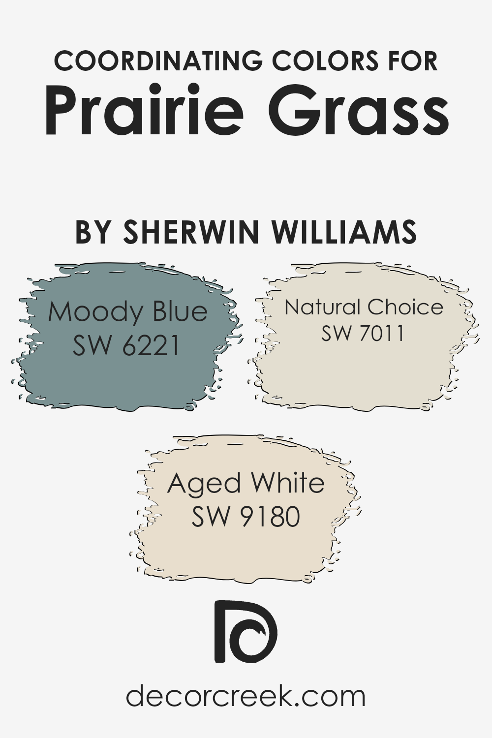
Coordinating Colors of Prairie Grass SW 7546 by Sherwin Williams
Coordinating colors are hues that work well together to create a harmonious and balanced look in any space. When it comes to pairing colors with Prairie Grass by Sherwin Williams, a delightful shade that embodies the serene and refreshing qualities of natural grasslands, three colors that coordinate beautifully with it include Moody Blue, Aged White, and Natural Choice. These colors have been carefully selected by Sherwin Williams to complement and enhance Prairie Grass, making it easy to create a cohesive and inviting atmosphere in your home.
Moody Blue is a deep, soothing shade that evokes the tranquility of the evening sky or a calm sea, providing a striking contrast to the lighter, earthy tone of Prairie Grass. Aged White, on the other hand, offers a warm, creamy hue that resembles the subtle elegance of aged parchment or lightly toasted almonds, adding a touch of sophistication and light to spaces when paired with Prairie Grass. Lastly, Natural Choice serves as a neutral backdrop, reminiscent of sandy beaches or soft limestone, which effortlessly harmonizes with the natural vibe of Prairie Grass. Together, these coordinating colors bring balance, depth, and elegance to any décor, making it easy for anyone to create beautifully designed spaces.
You can see recommended paint colors below:
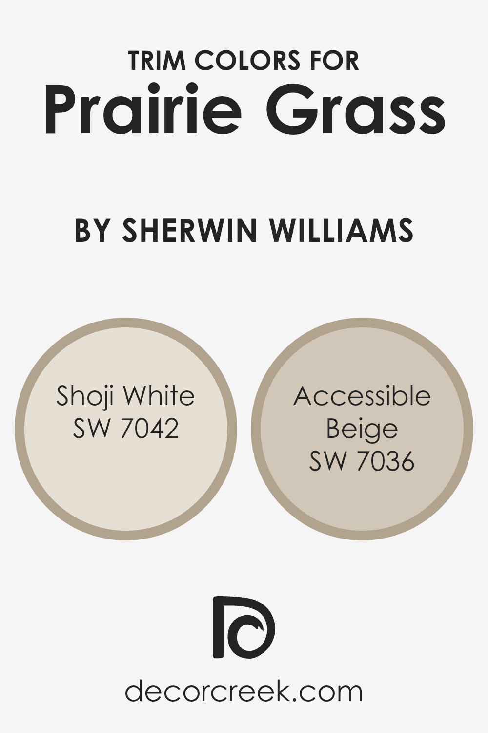
What are the Trim colors of Prairie Grass SW 7546 by Sherwin Williams?
Trim colors are the hues used on the architectural elements like door frames, window trims, and baseboards that accentuate or contrast with the main wall colors of a room. For a color like Prairie Grass by Sherwin Williams, choosing the right trim color is vital because it can either subtly complement the wall color to create a harmonious space or offer a striking contrast that highlights the architectural details of a room. Trim colors help to define a room’s edges and shapes, making the space more dynamic and visually appealing.
Shoji White SW 7042 is a soft, warm white with a slightly beige undertone that provides a subtle contrast to the richer tones of Prairie Grass, ensuring the space feels open and airy. Its neutral shade makes it incredibly versatile, working well in spaces that aim for a light and welcoming atmosphere.
On the other hand, Accessible Beige SW 7036, as the name suggests, is a light beige that leans towards a grayish tone, offering a slightly stronger contrast to Prairie Grass while maintaining a soft, cohesive look. It’s perfect for creating a soothing and inviting environment, complementing the natural-inspired hues of Prairie Grass without overwhelming the senses.
You can see recommended paint colors below:
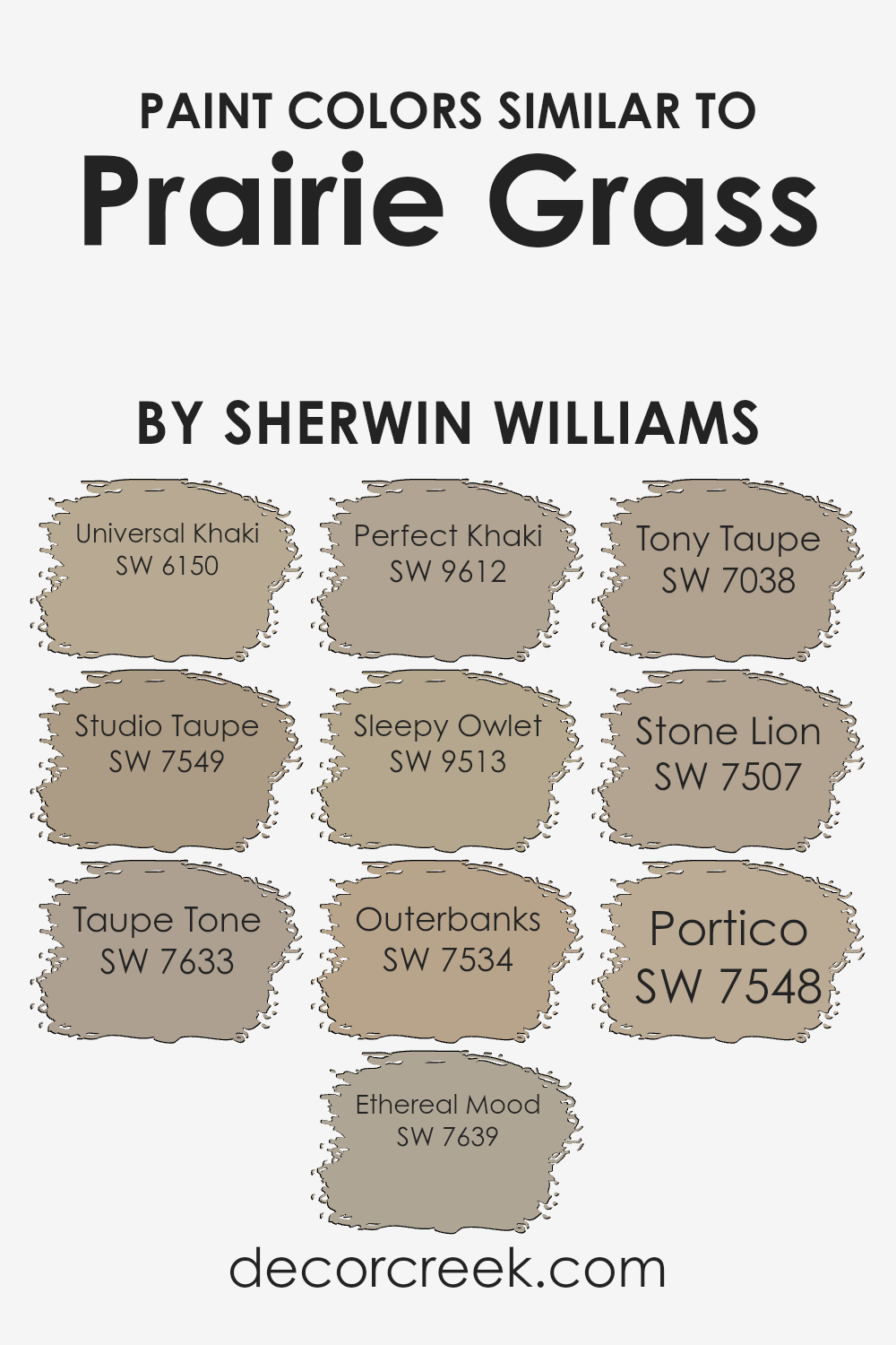
Colors Similar to Prairie Grass SW 7546 by Sherwin Williams
Similar colors play a crucial role in creating harmonious and balanced designs, especially when working within a color scheme inspired by Prairie Grass by Sherwin Williams. These shades provide flexibility and subtlety in design, allowing for a gentle transition between spaces or creating a nuanced palette that adds depth and complexity without overwhelming the senses. For instance, Universal Khaki is a soft, warm hue that brings a cozy feel to any space, making it feel inviting and serene. Studio Taupe, on the other hand, offers a slightly more anchored and earthy quality, grounding designs with its rich, neutral base.
- Taupe Tone and Ethereal Mood further demonstrate the versatility of similar colors.
- Taupe Tone adds a touch of elegance with its subdued, sophisticated depth, perfect for creating a calm and collected ambiance.
- Ethereal Mood, lighter and airier, introduces a breath of freshness, akin to a gentle morning mist, ideal for spaces meant to soothe and rejuvenate.
- Perfect Khaki and Sleepy Owlet extend this palette by offering warmer and cooler undertones, respectively, allowing designers to fine-tune the mood and temperature of a room.
- Outerbanks presents a deeper, bolder option for adding dramatic flair without straying from the theme, whereas Tony Taupe offers a balance between warm and cool, making it incredibly versatile.
- Stone Lion and Portico both provide solid, earthy foundations that can anchor any space, giving it a sense of stability and tranquility.
Together, these colors demonstrate the power of similar hues in creating cohesive, visually appealing designs that speak to the subtleties of human perception and emotion.
You can see recommended paint colors below:
- SW 6150 Universal Khaki
- SW 7549 Studio Taupe
- SW 7633 Taupe Tone
- SW 7639 Ethereal Mood
- SW 9612 Perfect Khaki
- SW 9513 Sleepy Owlet
- SW 7534 Outerbanks
- SW 7038 Tony Taupe
- SW 7507 Stone Lion
- SW 7548 Portico
Colors that Go With Prairie Grass SW 7546 by Sherwin Williams
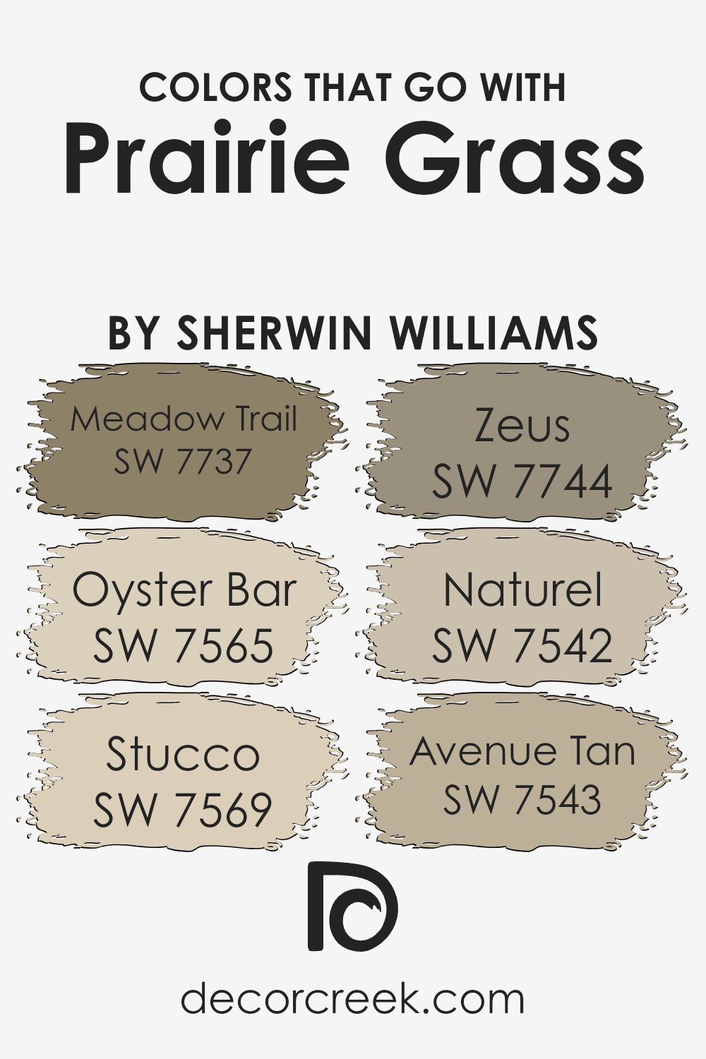
Colors that complement Prairie Grass SW 7546 by Sherwin Williams play a significant role in design because they help create balance, harmony, and visual appeal in any space. Choosing the right colors to go with Prairie Grass can enhance its natural beauty and bring a sense of calm and serenity to an area. These compatible colors, such as Meadow Trail, Oyster Bar, Stucco, Zeus, Naturel, and Avenue Tan, work together by either contrasting or coordinating with Prairie Grass, leading to a cohesive and aesthetically pleasing palette.
Meadow Trail SW 7737 provides a soft, earthy touch that brings out the warmth in Prairie Grass, making spaces feel welcoming and homey. Oyster Bar SW 7565, on the other hand, is a light, neutral shade that adds a hint of elegance and sophistication, perfect for creating a subtle backdrop. Stucco SW 7569 offers a sturdy foundation that pairs well with Prairie Grass for a more grounded, comforting look.
Zeus SW 7744 is a bold, dark hue that contrasts nicely, adding depth and character to spaces. Naturel SW 7542 is a warm, inviting color that works seamlessly with Prairie Grass, promoting a cozy, harmonious environment. Lastly, Avenue Tan SW 7543 is another neutral option that complements Prairie Grass, providing a balanced, restrained elegance to interiors. Together, these colors enhance the room’s ambiance, making it more engaging and pleasant to spend time in.
You can see recommended paint colors below:
- SW 7737 Meadow Trail
- SW 7565 Oyster Bar
- SW 7569 Stucco
- SW 7744 Zeus
- SW 7542 Naturel
- SW 7543 Avenue Tan
How to Use Prairie Grass SW 7546 by Sherwin Williams In Your Home?
Prairie Grass by Sherwin Williams is a warm and earthy paint color that brings a touch of nature indoors. This hue can add a cozy and inviting feel to any room in your home. It works really well in living rooms or bedrooms where you want to create a relaxing atmosphere. Since it’s a versatile color, you can pair it with both dark and light furniture, making it easy to fit into your existing decor or inspire a new look. For example, in a living room, it can be the main wall color, offering a soothing backdrop for art and photos.
In a bedroom, using it on walls can help create a peaceful retreat. You can also use it in smaller spaces, like bathrooms or kitchens, to add warmth without overwhelming the space. Prairie Grass can complement natural wood tones, whites, and even pops of bright color, giving you lots of options to customize your space.
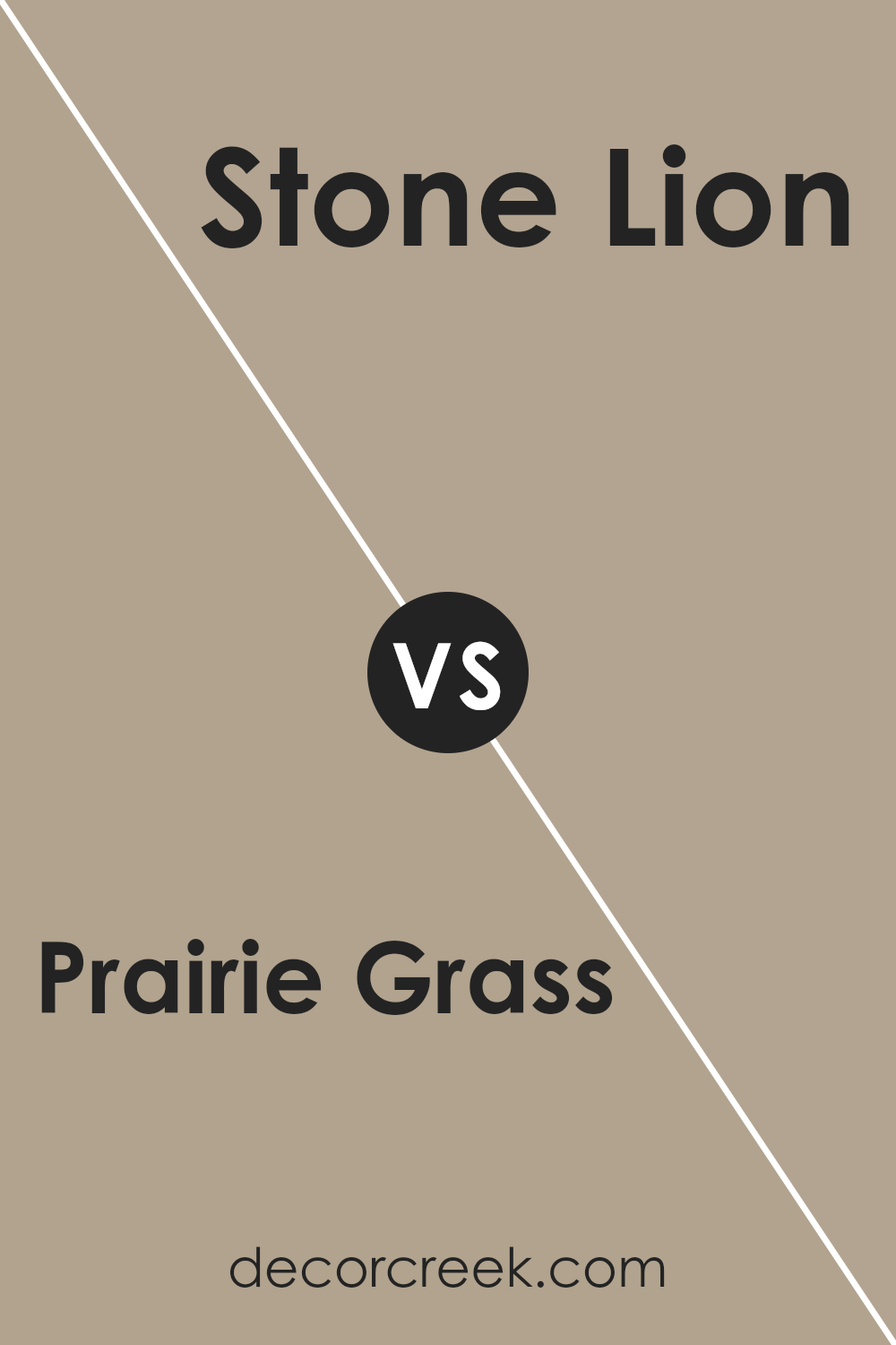
Prairie Grass SW 7546 by Sherwin Williams vs Stone Lion SW 7507 by Sherwin Williams
Prairie Grass and Stone Lion, both by Sherwin Williams, offer distinct vibes for any space. Prairie Grass is a soft, earthy green that brings a breath of fresh air into a room. It has a natural feel, almost like a gentle meadow, which can create a calm and serene environment. On the other hand, Stone Lion takes a different direction. It’s a warm, neutral beige that leans towards elegance and subtlety.
This color can make a room feel cozy and inviting, providing a solid backdrop that complements a wide range of décor. While Prairie Grass adds a touch of nature and rejuvenation with its green hue, Stone Lion offers a classic and versatile option that works well in various spaces. Whether you’re after a hint of outdoor freshness or a timeless neutral, these two colors have their unique appeal.
You can see recommended paint color below:
- SW 7507 Stone Lion
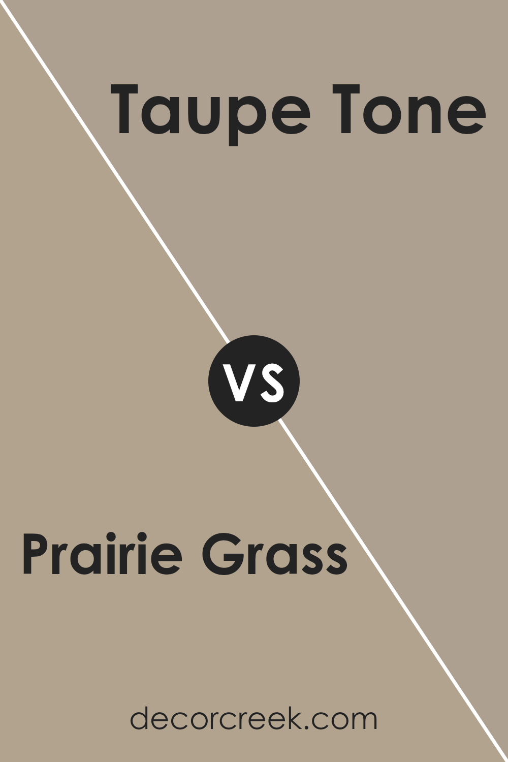
Prairie Grass SW 7546 by Sherwin Williams vs Taupe Tone SW 7633 by Sherwin Williams
Prairie Grass and Taupe Tone are both paints from Sherwin Williams, but they have distinct looks. Prairie Grass is a warm, muted green that might remind you of a peaceful, natural field. It’s not too bright but has enough color to create a calm and inviting space. On the other hand, Taupe Tone leans more towards a soft, versatile brown with a hint of gray. It’s the kind of color that works well with almost anything, making it a great choice for those who like a cozy and understated look.
While Prairie Grass brings a touch of the outdoors inside, Taupe Tone offers a subtle elegance that easily pairs with different decor styles. Choosing between them really depends on whether you prefer the soft green of a natural landscape or the quiet sophistication of a neutral brown-gray.
You can see recommended paint color below:
- SW 7633 Taupe Tone
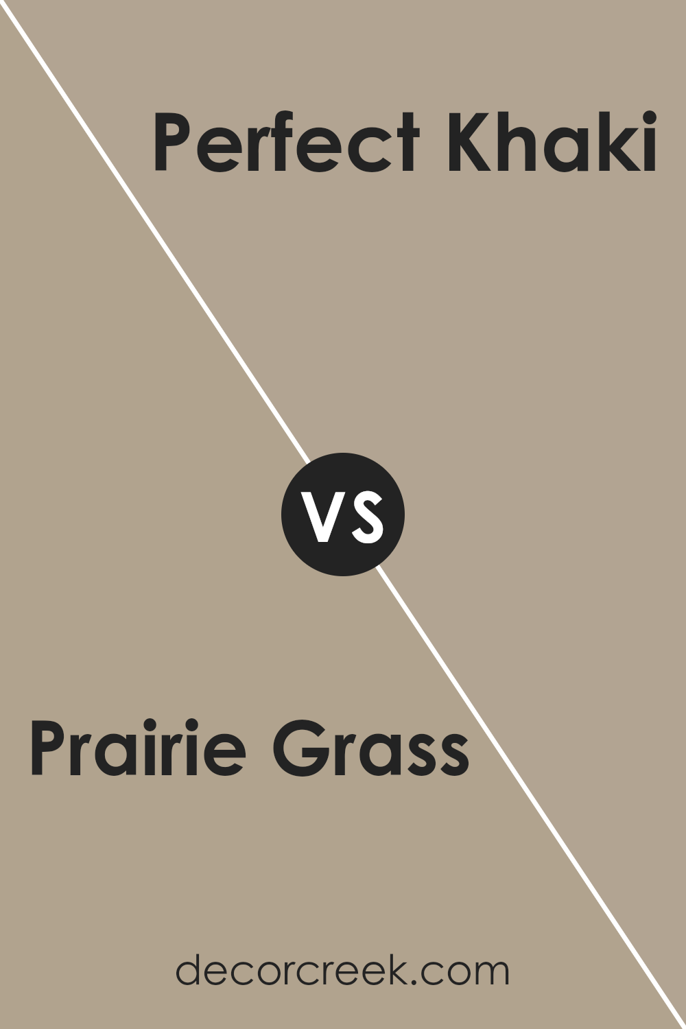
Prairie Grass SW 7546 by Sherwin Williams vs Perfect Khaki SW 9612 by Sherwin Williams
Prairie Grass and Perfect Khaki, both by Sherwin Williams, offer distinct vibes for any space. Prairie Grass leans toward a soft, warm beige with a touch of green, giving it a natural, earthy feel. It recalls the colors of late summer prairies, making it cozy and welcoming. Perfect Khaki, on the other hand, is a true khaki shade. It’s a bit darker than Prairie Grass and has more of a gray undertone.
This color brings a sense of sophistication and neutrality, making it a great choice for those who want something versatile that pairs well with various decor styles. While Prairie Grass brings warmth and an organic touch, Perfect Khaki offers a classic, understated look. Both colors are subtle yet have their unique characteristics, making them suitable for a variety of settings, from casual to more formal spaces.
You can see recommended paint color below:
- SW 9612 Perfect Khaki
Prairie Grass SW 7546 by Sherwin Williams vs Sleepy Owlet SW 9513 by Sherwin Williams
Prairie Grass and Sleepy Owlet by Sherwin Williams are two unique colors with their own personalities. Prairie Grass is a warm, earthy green that brings to mind the natural, soothing shades of a meadow or an open field. It has this cozy, inviting feel that makes spaces feel grounded and connected to nature.
On the other hand, Sleepy Owlet is a soft, muted gray with a subtle green undertone. This color is like a quiet, early morning when the world is still waking up. It’s gentle and calming, perfect for creating a peaceful and serene space.
While Prairie Grass adds warmth and a touch of nature, Sleepy Owlet offers a tranquil backdrop that’s soothing and understated. Both colors can beautifully transform a room, but they serve different moods and themes. If you’re looking for something that feels earthy and vibrant, Prairie Grass is the way to go. If you prefer a lighter, more restful ambiance, then Sleepy Owlet is your color.
You can see recommended paint color below:
- SW 9513 Sleepy Owlet
Prairie Grass SW 7546 by Sherwin Williams vs Ethereal Mood SW 7639 by Sherwin Williams
Prairie Grass and Ethereal Mood are two paint colors from Sherwin Williams that each create their own unique vibe. Prairie Grass is like a soft hug from nature, bringing warmth and a touch of earthiness to a room. It’s a color that feels grounded and solid, making spaces cozy and welcoming, like a sunny spot on a cool day.
On the other hand, Ethereal Mood is more about creating a serene and peaceful atmosphere. It’s a lighter, more muted shade that leans toward a calm, almost dreamy feel. It’s great for rooms where you want to relax and unwind, offering a subtle background that doesn’t demand attention but rather complements the room’s mood.
While Prairie Grass connects you more to the earth with its warmer, deeper tones, Ethereal Mood lifts the space with its cooler, lighter presence. Both colors can transform a room beautifully, but in very different ways. Whether you’re looking for warmth and grounding or a soft, serene vibe, these colors offer great choices.
You can see recommended paint color below:
- SW 7639 Ethereal Mood
Prairie Grass SW 7546 by Sherwin Williams vs Portico SW 7548 by Sherwin Williams
Prairie Grass and Portico are two Sherwin Williams paint colors that both have a cozy and welcoming vibe, yet they exhibit distinct tones that can create different moods in a space.
Prairie Grass is like a soft blanket of golden wheat – it’s a warm, inviting color that’s slightly brighter and can make a room feel sunny and cheerful. It has a touch of earthiness that can bring a natural, comforting atmosphere into a home.
On the other hand, Portico steps into the realm of neutrality with its cooler, more reserved character. It’s like the shadow of a building in the late afternoon – still warm, but with a hint of coolness, making it versatile for combining with other hues. Portico can give rooms a more grounded, serene feel compared to the vibrant liveliness of Prairie Grass.
Both colors offer a beautiful backdrop for living spaces, but while Prairie Grass leans towards a sunnier disposition, Portico offers a calming, neutral canvas that’s easy to complement with various decor styles.
You can see recommended paint color below:
- SW 7548 Portico
Prairie Grass SW 7546 by Sherwin Williams vs Universal Khaki SW 6150 by Sherwin Williams
Prairie Grass and Universal Khaki are two colors from Sherwin Williams that provide different vibes for any space. Prairie Grass is a light, soothing green with a touch of earthiness that can make a room feel fresh and alive. It’s perfect for those looking to add a natural, calming element to their space, reminiscent of a peaceful, grassy meadow.
On the other hand, Universal Khaki is a versatile, warm beige that leans towards a classic and timeless look. It’s the kind of color that offers a solid, neutral backdrop, making it easier to complement with various decor styles and colors. Universal Khaki brings a subtle warmth to a room, creating a cozy and inviting atmosphere.
While both colors share an earthy base, Prairie Grass adds a hint of vibrancy with its green undertones, suggesting growth and renewal. Universal Khaki, conversely, provides a strong foundation of warmth and stability, evoking a sense of comfort and resilience. Depending on the mood you want to create, both colors offer unique advantages to enhance your space.
You can see recommended paint color below:
- SW 6150 Universal Khaki
Prairie Grass SW 7546 by Sherwin Williams vs Studio Taupe SW 7549 by Sherwin Williams
Prairie Grass and Studio Taupe, both from Sherwin Williams, are two distinct shades that offer different vibes for any space. Prairie Grass is a lighter, more earthy color that brings a hint of nature indoors, creating a fresh and airy atmosphere. It has a greenish-yellow undertone that can brighten up a room and make it feel more open and welcoming. On the other hand, Studio Taupe is a bit darker and leans toward a more neutral, warmer beige with a subtle gray influence.
This color is versatile and sophisticated, providing a solid foundation for various decor styles without overpowering the room. While Prairie Grass might be perfect for someone looking to add a touch of the outdoors and some lightness to their space, Studio Taupe is ideal for those seeking a cozy, grounded vibe that pairs well with many color schemes and furnishings. Both colors are unique in their way and can significantly affect the mood and style of a room.
You can see recommended paint color below:
- SW 7549 Studio Taupe
Prairie Grass SW 7546 by Sherwin Williams vs Tony Taupe SW 7038 by Sherwin Williams
Prairie Grass and Tony Taupe, both from Sherwin Williams, offer two unique palettes for home interiors. Prairie Grass is a light, fresh green that brings a subtle, nature-inspired vibe to a room. It’s like bringing a bit of the outdoors inside, making spaces feel more open and airy. On the other hand, Tony Taupe is a warm, cozy beige with gray undertones. It’s versatile, creating a neutral backdrop that can complement a wide range of decor styles.
While Prairie Grass injects a bit of liveliness and rejuvenation, Tony Taupe offers a soothing and calming atmosphere, making it ideal for those seeking a more understated elegance. These colors cater to different tastes and uses: Prairie Grass is perfect for adding a touch of freshness to kitchens or sunrooms, whereas Tony Taupe shines in living areas or bedrooms where a serene, welcoming feel is desired. Choosing between them depends on the mood you want to set and the natural light in your space.
You can see recommended paint color below:
Prairie Grass SW 7546 by Sherwin Williams vs Outerbanks SW 7534 by Sherwin Williams
Prairie Grass and Outer Banks are both paint colors by Sherwin Williams, but they have distinct tones that set them apart. Prairie Grass is a warm, earthy hue that reminds one of open fields and natural landscapes. Its welcoming vibe makes it a great choice for creating a cozy atmosphere in a home.
On the other hand, Outer Banks has a more subdued, neutrally grounding character. This color leans towards a muted, soft tone that can make spaces feel elegant and understated. While it also draws inspiration from nature, it’s more like the subtle colors of a sandy beach on a cloudy day.
Both colors offer a sense of calm and are versatile enough to be used in various settings, from living rooms to bedrooms. Prairie Grass brings a bit more warmth and energy, making a space feel more alive. Outer Banks, with its cooler, more neutral tone, provides a refined and tranquil backdrop. Choosing between them depends on the atmosphere you’re aiming to create, whether it’s the warm embrace of Prairie Grass or the serene touch of Outer Banks.
You can see recommended paint color below:
- SW 7534 Outerbanks
Conclusion
Sherwin Williams’ Prairie Grass color is a versatile and warm shade that can elevate the look of any room. Its unique balance between green and beige tones makes it a perfect choice for creating a cozy and inviting atmosphere. Homeowners and interior designers alike appreciate how this color works well with various decor styles and adds a touch of nature-inspired serenity to spaces. Whether applied in living rooms, bedrooms, or kitchens, Prairie Grass offers a comforting presence that’s both stylish and timeless.
Additionally, its adaptability in pairing with different colors and materials highlights its practicality for interior design. From acting as a calming backdrop for bold accents to harmonizing with wood and natural fabrics, Prairie Grass manages to maintain a fresh and modern feel. It’s a color that supports a range of aesthetic preferences and can easily be incorporated into any home’s palette, making it a go-to choice for those looking to update their interiors without overwhelming with color.
Ever wished paint sampling was as easy as sticking a sticker? Guess what? Now it is! Discover Samplize's unique Peel & Stick samples.
Get paint samples

