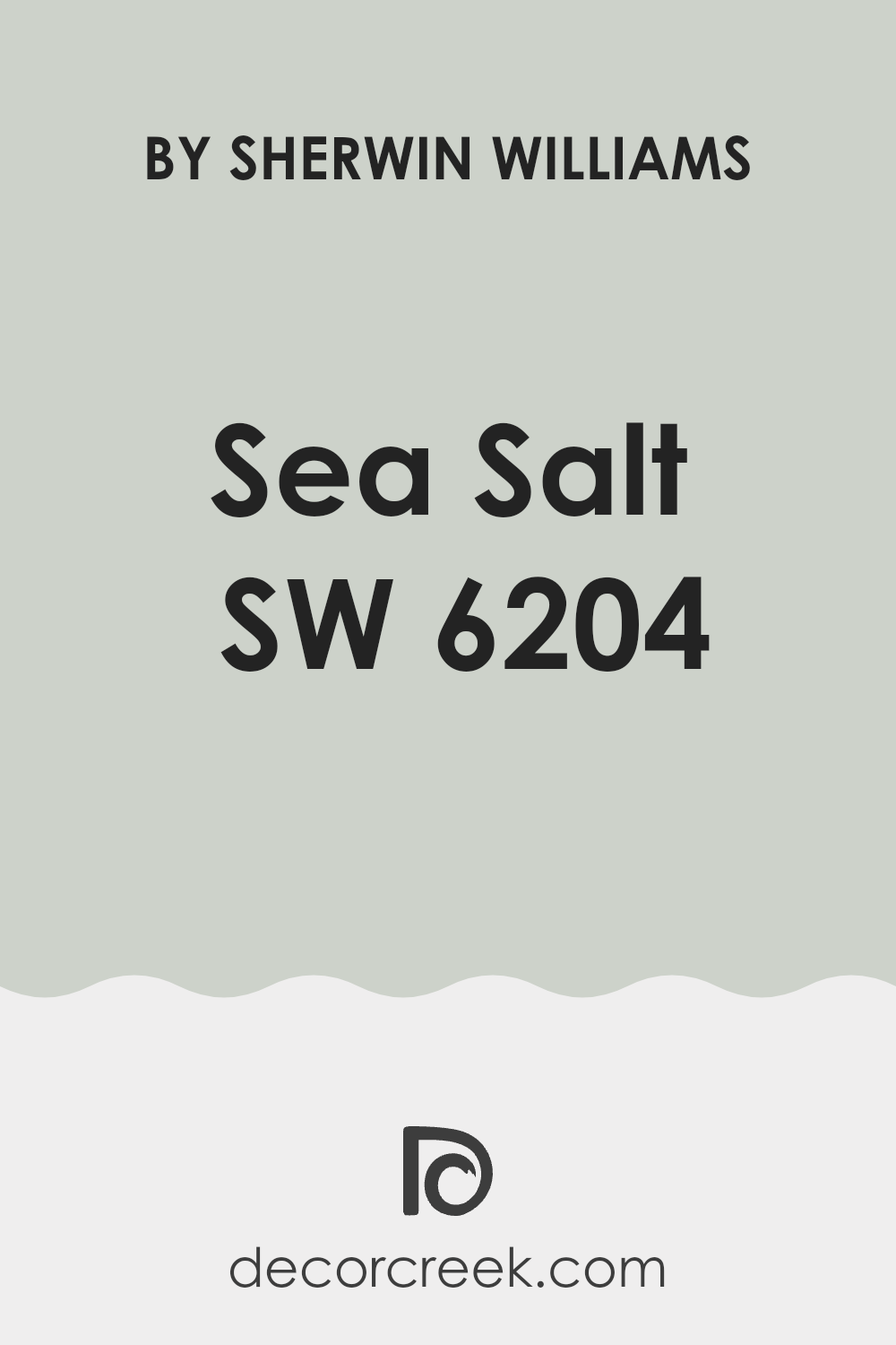
Selecting the right paint color for your room can be a thrilling yet challenging task. I want to share some insights about Sherwin Williams SW 6204 Sea Salt that might help you in your decision-making process. Known for its calming and airy vibe, Sea Salt is a color that can reshape any room into a peaceful retreat. This shade is a mix of green and gray, adapting easily to various lighting situations, which means it can look slightly different depending on the natural light in your room throughout the day.
Before you decide to paint your walls with Sea Salt, consider the room’s lighting and other existing elements like furniture and flooring. This color pairs beautifully with both soft and rich hues, allowing you to create a variety of moods and styles. It’s also worth noting that Sea Salt works wonderfully in rooms intended for relaxation, such as bedrooms or bathrooms, providing a calm backdrop.
If you’re thinking about choosing SW 6204 Sea Salt for your next project, trying out a sample first is a smart move. See how it behaves in your specific room at different times of the day to ensure it meets your expectations.
Remember, the paint can change the perception of room size and light, potentially making rooms feel more open and refreshing.
Is Sea Salt SW 6204 Right for My Home?
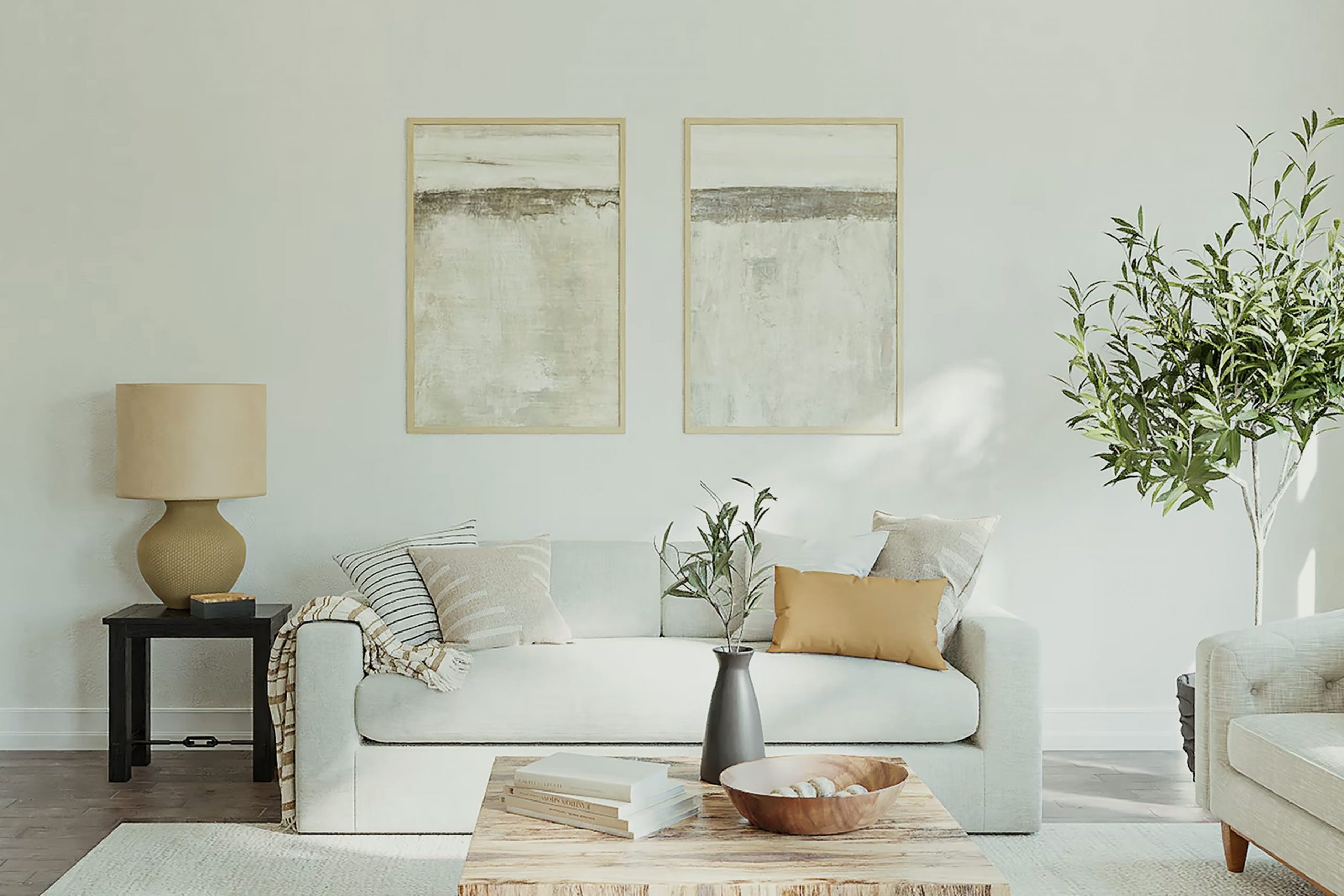
Sea Salt by Sherwin Williams is a refreshing and light greenish-gray color that brings to mind the calmness of a gentle ocean breeze and misty mornings. It has this unique ability to inject a subtle touch of nature into any room without feeling too strong. Personally, I find it incredibly flexible and soothing, making it an excellent choice for rooms where you want to encourage a feeling of calm and cleanliness.
When it comes to interior styles, Sea Salt shines in rooms that aim for a coastal, modern, or scandinavian look. Its understated elegance fits beautifully in rooms that prioritize light, creating an airy and open feel. I love pairing it with materials that emphasize comfort and simplicity. Think soft cottons, cozy wools, and natural wood finishes. These materials not only complement the color but also add a layer of texture and warmth to the setting.
Additionally, Sea Salt works well with elements like white trim or cabinetry which help to pull the look together, making the color pop just the right amount. For those who enjoy a bit of contrast, integrating darker greens or even navy blue can create a delightful balance, enhancing the overall aesthetic of the room while keeping that relaxed vibe I enjoy so much.
decorcreek.com
What are the right undertones of Sea Salt SW 6204 ?
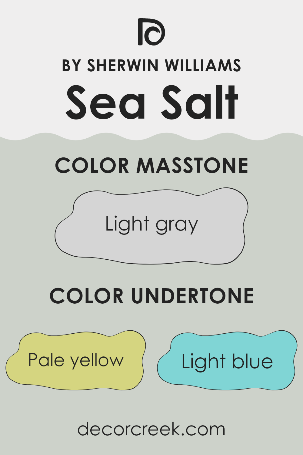
Sea Salt by Sherwin Williams is a popular color choice for its calming and flexible nature. The color has a mix of subtle undertones that can influence how it appears in different settings. These undertones include pale yellow, light blue, light purple, mint, pale pink, lilac, and grey. Each undertone plays a role in shifting the color’s appearance under various lighting conditions.
Undertones are secondary colors that are blended into the primary paint color and can affect the way we perceive the main color. For instance, a pale yellow undertone might make Sea Salt appear warmer in a sunlit room, whereas a light blue undertone could give it a cooler feel under fluorescent lighting. This variability is crucial in deciding where to use the color and what atmosphere it will create.
When applied to interior walls, the complex undertones of Sea Salt can create different vibes in the room. In a room with lots of natural light, the pale yellow and mint undertones might make the room feel brighter and more inviting. In artificial light, the lilac or light purple undertones might become more pronounced, giving the room a subtle hint of a cool, calm feel.
The grey undertone helps balance out the brightness, ensuring the color maintains a neutral stance that complements a variety of décor styles. Overall, the layered undertones in Sea Salt make it a flexible paint choice for interiors, adjusting uniquely to both the lighting and the room’s other design elements.
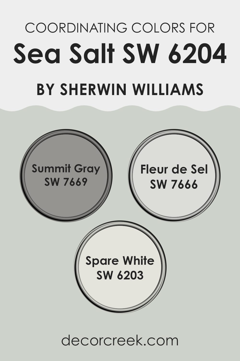
Best Coordinating Colors to use with Sea Salt SW 6204 by Sherwin Williams this year.
Coordinating colors are shades that complement each other and work well together to create harmonious looks in interior design. When selecting coordinating colors, it’s important to choose hues that balance each other, enhancing the overall aesthetic without feeling too strong. By pairing a neutral or subtle base color with coordinating shades, you can achieve a cohesive atmosphere in any room.
For instance, when working with a flexible base like a soft, muted green, colors such as a deeper gray, a light whimsical gray, and a crisp white make excellent companions. Summit Gray is a deeper gray that provides a strong contrast to lighter tones, adding depth and interest to the room.
Fleur de Sel is a soft, light gray with a hint of warmth, ideal for creating a gentle, refined backdrop that complements without feeling too heavy. Lastly, Spare White offers a clean, fresh look that brings light and airiness to the room, ensuring that the environment feels open and inviting. Together, these colors create a balanced and appealing palette that enhances the aesthetic appeal of any room.
You can see recommended paint colors below:
- SW 7669 Summit Gray (CHECK A SAMPLE)
- SW 7666 Fleur de Sel (CHECK A SAMPLE)
- SW 6203 Spare White (CHECK A SAMPLE)
Trendy Trim Colors of Sea Salt SW 6204 by Sherwin Williams to use this year.
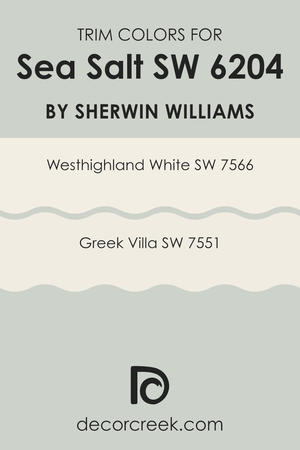
Trim colors play an important role in defining and complementing the main color used on the walls, such as Sea Salt by Sherwin Williams—a gentle and flexible shade. The trim color can highlight a room’s architectural features and provide a crisp, finished look that frames the wall color and enhances its appeal. For Sea Salt, using a trim color like Westhighland White or Greek Villa, both by Sherwin Williams, can effectively accentuate its soft, cool hue, ensuring the walls stand out while maintaining a harmonious color scheme throughout the room.
Westhighland White SW 7566 is a warm, creamy white that offers a subtle contrast against the lighter, cooler tones of Sea Salt. This combination can create a cozy yet distinct boundary that naturally draws the eye to appreciate the room’s borders and corners.
On the other hand, Greek Villa SW 7551 presents a slightly off-white tone that blends smoothly with Sea Salt, providing a less stark transition between wall and trim that can especially suit rooms looking for a soft cohesive aesthetic. By choosing either of these trim colors, the overall look remains neat and well-thought-out, enhancing the atmosphere of the room without feeling too strong.
You can see recommended paint colors below:
- SW 7566 Westhighland White (CHECK A SAMPLE)
- SW 7551 Greek Villa (CHECK A SAMPLE)
Evergreen Colors Similar to Sea Salt SW 6204 by Sherwin Williams
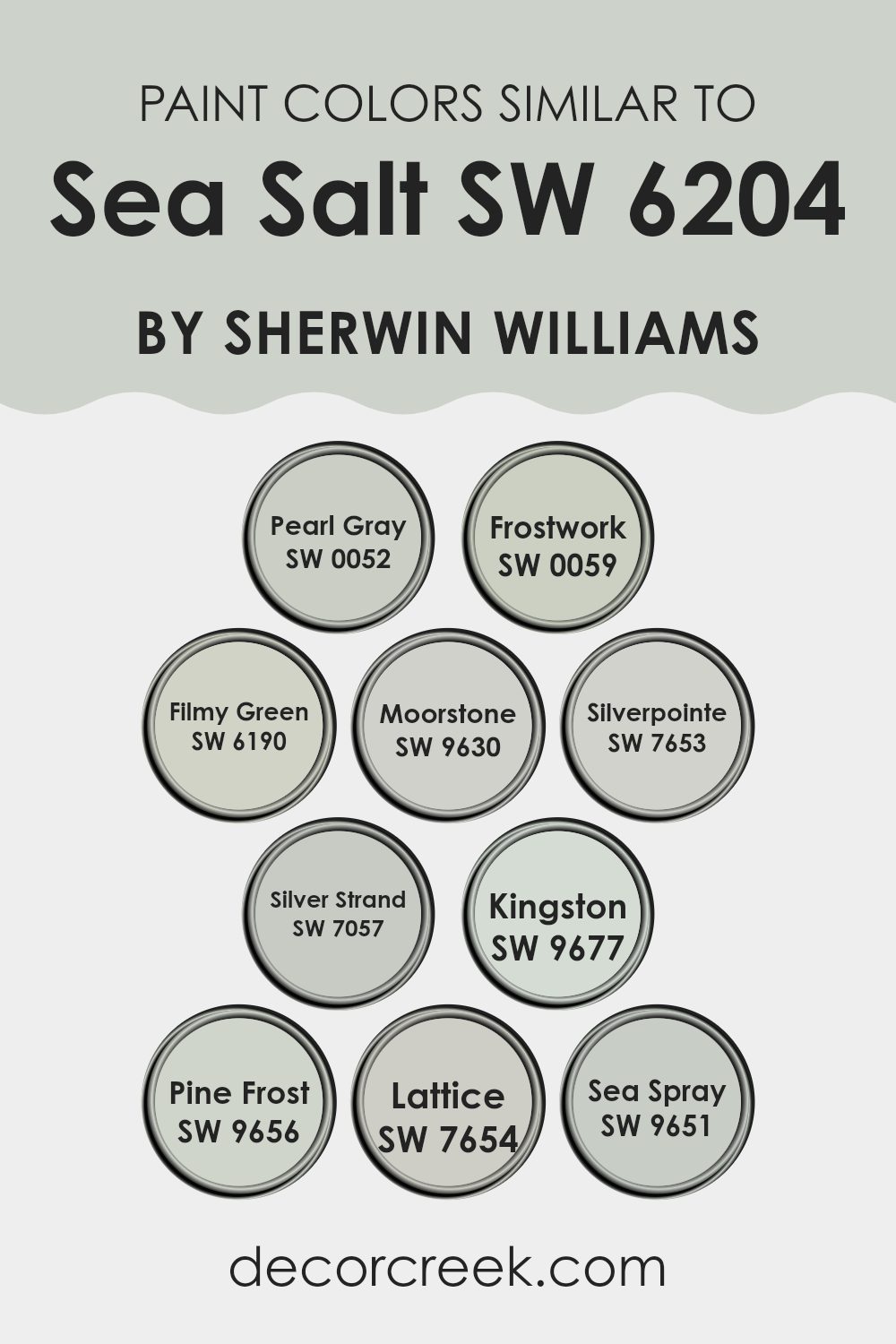
Similar colors are crucial in design for creating harmonious and visually cohesive rooms. When you use colors like Sea Salt by Sherwin Williams, incorporating shades like Pearl Gray and Frostwork can enhance the overall aesthetic without causing a sharp contrast. These slight variations in hue help maintain a fluid theme throughout a room, making it feel connected and well-thought-out. Pearl Gray offers a soft, muted version of gray with a calm presence, while Frostwork provides a slightly lighter touch that brightens rooms subtly.
Other similar colors such as Filmy Green and Moorstone add a touch of earthiness, giving rooms a grounded feel without feeling too strong next to the gentle vibe of Sea Salt. Filmy Green is a gentle green with a mist-like softness, perfect for adding a pinch of nature-inspired color. Moorstone, on the other hand, introduces a deeper, stonier shade that complements more robust furnishings or architectural elements.
Colors like Silverpointe and Silver Strand weave in a silvery thread to the palette, enhancing the modern look without straying far from the central theme. Silverpointe is a clear, light gray that brings a modern twist, while Silver Strand layers in a slightly blue-green gray, reminiscent of where water meets stone. This palette of colors works in unison to create a room that feels coherent and connected, making it pleasant to the eye and easy to adapt to various decor styles.
You can see recommended paint colors below:
- SW 0052 Pearl Gray (CHECK A SAMPLE)
- SW 0059 Frostwork (CHECK A SAMPLE)
- SW 6190 Filmy Green (CHECK A SAMPLE)
- SW 9630 Moorstone (CHECK A SAMPLE)
- SW 7653 Silverpointe (CHECK A SAMPLE)
- SW 7057 Silver Strand (CHECK A SAMPLE)
- SW 9677 Kingston (CHECK A SAMPLE)
- SW 9656 Pine Frost (CHECK A SAMPLE)
- SW 7654 Lattice (CHECK A SAMPLE)
- SW 9651 Sea Spray (CHECK A SAMPLE)
Colors that Go With Sea Salt SW 6204 by Sherwin Williams
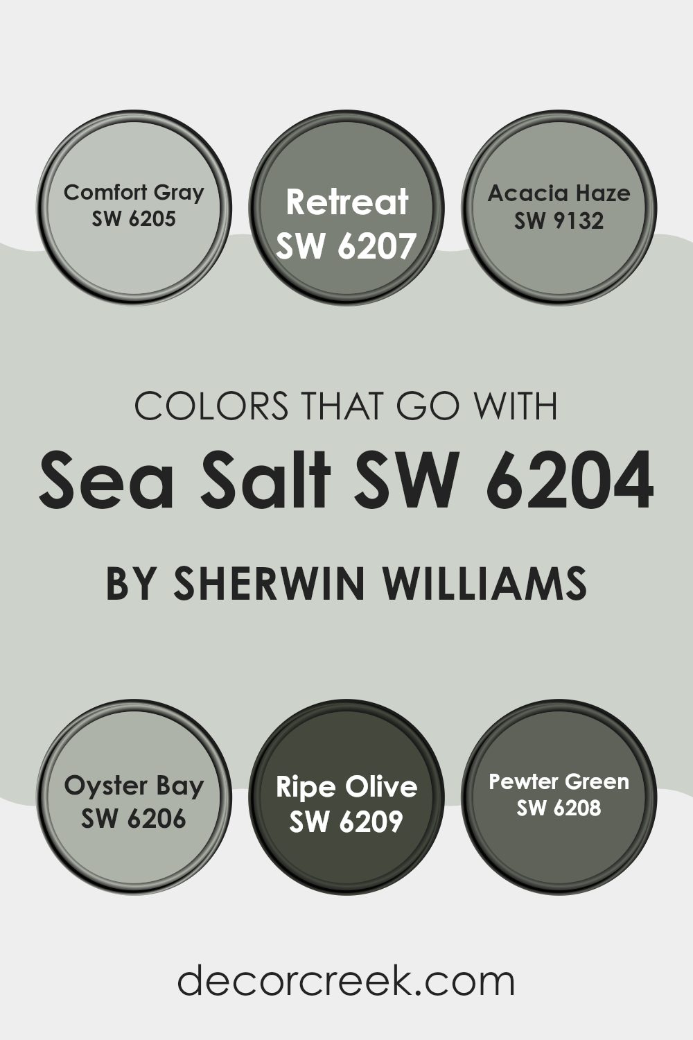
Choosing the right colors to complement Sea Salt SW 6204 by Sherwin Williams is crucial because it can greatly impact the overall look and feel of a room. Sea Salt is a flexible, light greenish-gray color, and pairing it with harmonious shades enhances the aesthetic coherence of any room. Colors like Comfort Gray, Retreat, Acacia Haze, Oyster Bay, Ripe Olive, and Pewter Green create a palette that balances nicely, offering opportunities to create a visually pleasing and cohesive interior. When these colors work together, they can make a room feel more welcoming and connected, ensuring that the rooms do not feel disjointed or too strong.
Comfort Gray has a calm, grayish-green undertone, providing a mild contrast that is soothing to the eye. Retreat is a deeper green with gray tones that add a rich, grounding effect to rooms, making it perfect for highlighting areas or for use on accent walls. Acacia Haze is a mid-tone green with gray elements that works beautifully to maintain a soft and harmonious vibe throughout your home.
Oyster Bay is another gray-green but with a touch of blue, giving it a slightly cooler presence which can refresh a warmer palette. Ripe Olive offers a deep, dark green that is ideal for creating dramatic and cozy nooks or for elegant cabinetry, complementing the lighter tones of Sea Salt. Lastly, Pewter Green is a smoky green with robust gray undertones, which pairs nicely with Sea Salt when aiming for a grounded, cohesive environment. These colors not only support each other but also enhance the room where they are applied, mirroring a natural environment that is appealing and comfortable.
You can see recommended paint colors below:
- SW 6205 Comfort Gray (CHECK A SAMPLE)
- SW 6207 Retreat (CHECK A SAMPLE)
- SW 9132 Acacia Haze (CHECK A SAMPLE)
- SW 6206 Oyster Bay (CHECK A SAMPLE)
- SW 6209 Ripe Olive
- SW 6208 Pewter Green (CHECK A SAMPLE)
Whole House Paint Color Palette Inspired By Sea Salt SW 6204
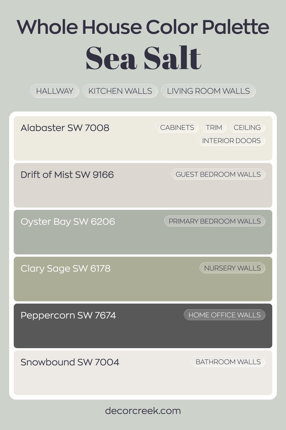
Sea Salt SW 6204 carries a light, airy feel through the hallway, kitchen, and living room walls. Alabaster on cabinets, trim, ceilings, and interior doors keeps the look clean and cohesive. Snowbound in the bathroom supports that brightness while staying within the same fresh range.
Drift of Mist in the guest bedroom and Oyster Bay in the primary bedroom build on Sea Salt’s soft green-gray character.
Clary Sage in the nursery deepens the natural tone, giving a gentle botanical touch. Peppercorn in the house office introduces contrast and structure to balance the lighter hues.
This palette leans into soft greens and airy neutrals with a strong dark accent. It feels harmonious and thoughtfully layered from front door to back room.
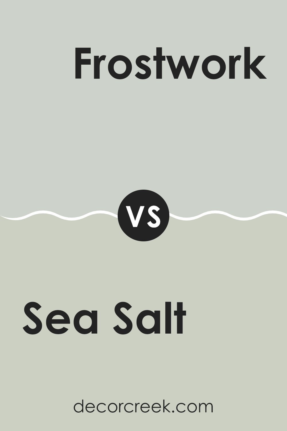
Sea Salt SW 6204 by Sherwin Williams vs Frostwork SW 0059 by Sherwin Williams
Sea Salt and Frostwork are both appealing colors from Sherwin Williams, offering subtle but distinct differences. Sea Salt provides a calming, light green tone with hints of gray. This color is refreshing and flexible, ideal for creating a gentle atmosphere in rooms like bathrooms and bedrooms.
On the other hand, Frostwork presents a cooler vibe with its pale blue shade that also carries underlying gray tones. This color leans slightly toward a neutral palette, making it perfect for achieving a modern, airy feel in any room.
Both colors share a soft, muted quality, but where Sea Salt pulls in green undertones for warmth, Frostwork introduces a cooler blue, bringing a crisp and gentle aesthetic. Together, these colors can complement each other, especially in a theme aiming for a relaxed and welcoming ambiance.
You can see recommended paint color below:
- SW 0059 Frostwork (CHECK A SAMPLE)
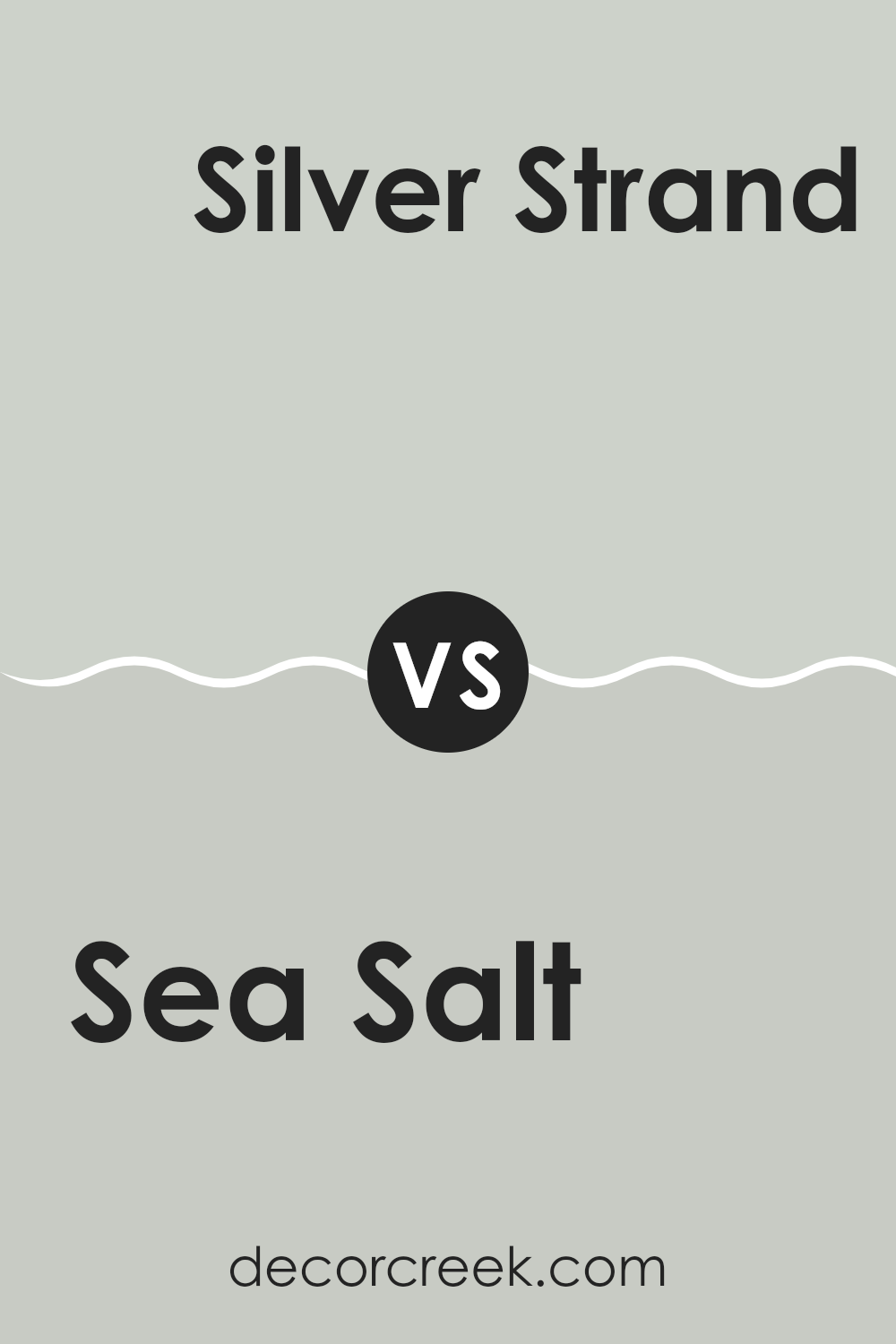
Sea Salt SW 6204 by Sherwin Williams vs Silver Strand SW 7057 by Sherwin Williams
Sea Salt and Silver Strand are both popular paint colors by Sherwin Williams, but they have distinct nuances that set them apart. Sea Salt has a light, airy quality with a blend of gray and green undertones, giving it a fresh and calming vibe that is very adaptable for various rooms.
It’s light enough to be soothing yet has enough color to make a subtle statement. On the other hand, Silver Strand leans more toward a gray color with hints of blue and green.
This makes it a bit cooler compared to Sea Salt, offering a somewhat more muted and neutral atmosphere. Both colors work beautifully in rooms that aim for a modern, clean look, but your choice depends on whether you prefer the warmer, greener tint of Sea Salt or the cooler, grayer feel of Silver Strand.
You can see recommended paint color below:
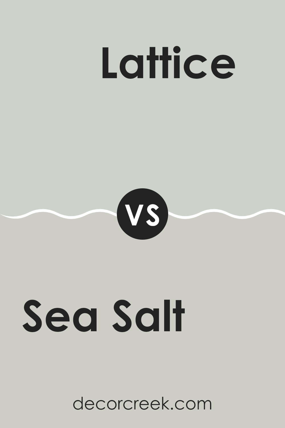
Sea Salt SW 6204 by Sherwin Williams vs Lattice SW 7654 by Sherwin Williams
Sea Salt and Lattice by Sherwin Williams are two unique shades that both offer a fresh vibe. Sea Salt is a light, airy green with a hint of gray, creating a calm and soothing feel perfect for a peaceful bedroom or a relaxing bathroom.
It pairs well with natural light, giving rooms a breezy feel. On the other hand, Lattice is a slightly darker gray with a subtle blue undertone. This color provides a cool, crisp look that is great for modern living rooms or kitchens.
It can make small rooms appear bigger and more open. Both colors are flexible and can combine well with different décor styles, but Sea Salt leans toward a more natural, soft look while Lattice provides a sharper, cleaner appearance. These differences make each suitable for specific room atmospheres and functions, giving homeowners different options depending on their style preferences.
You can see recommended paint color below:
- SW 7654 Lattice (CHECK A SAMPLE)
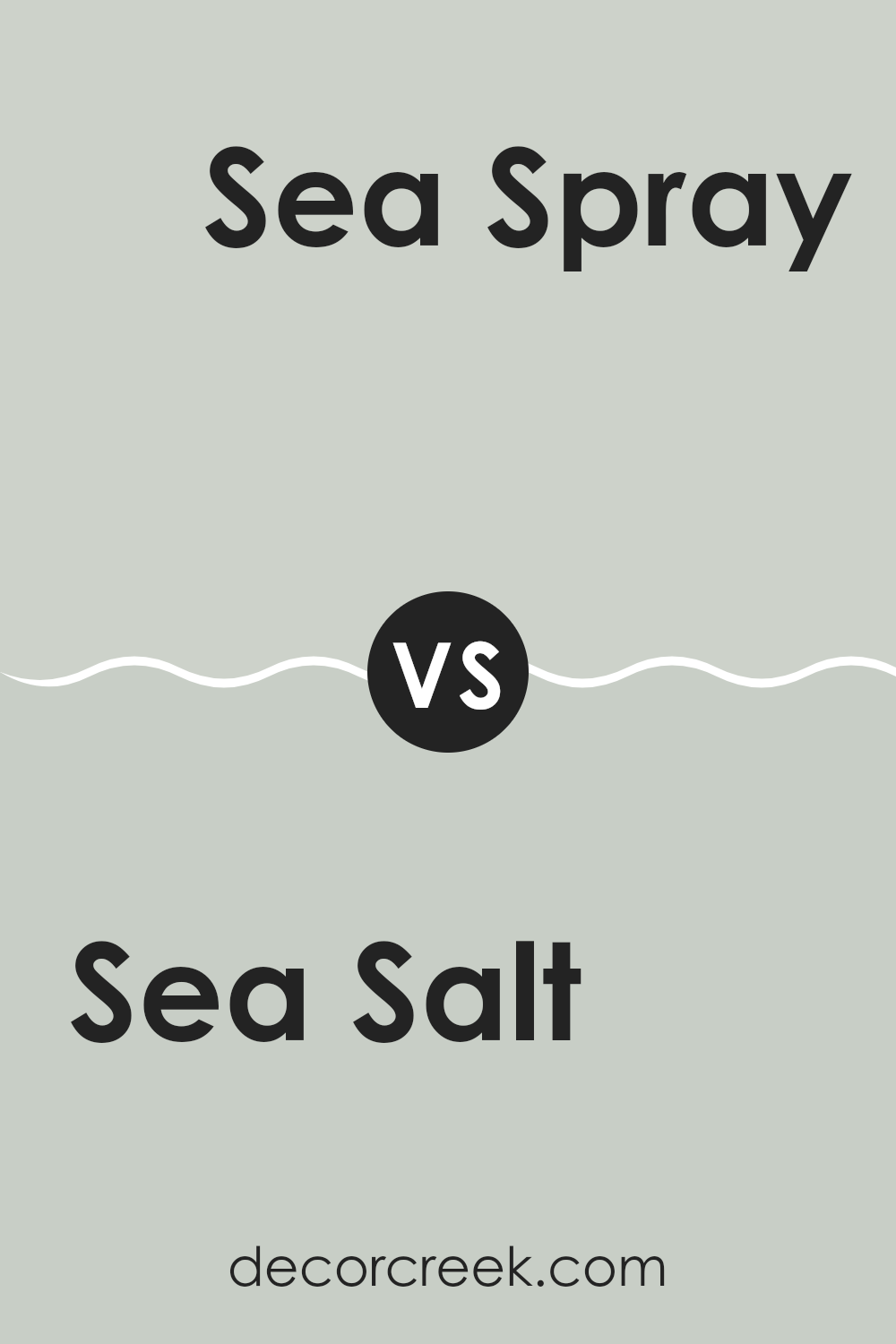
Sea Salt SW 6204 by Sherwin Williams vs Sea Spray SW 9651 by Sherwin Williams
Sea Salt by Sherwin Williams is a popular color with a gentle mix of green and gray. It gives off a light, calming feeling, making it a flexible choice for many rooms. On the other hand, Sea Spray is a deeper shade that leans more toward blue with a touch of gray. This color provides a stronger presence, offering a cool, fresh look that can make rooms feel more defined and cozy.
While both colors carry the essence of the ocean, Sea Salt is subtler and blends easily with various decor styles. It’s particularly good for small rooms as it can help them appear brighter and more open. Sea Spray, with its richer tone, is ideal for adding character to a room without feeling too heavy.
In essence, Sea Salt is softer and more neutral, making it a great backdrop for many designs. Sea Spray, being slightly bolder, works well as an accent or in areas where a touch of vibrancy is desired. Both colors complement each other beautifully in themed rooms or as contrasting elements in a single area.
You can see recommended paint color below:
- SW 9651 Sea Spray (CHECK A SAMPLE)
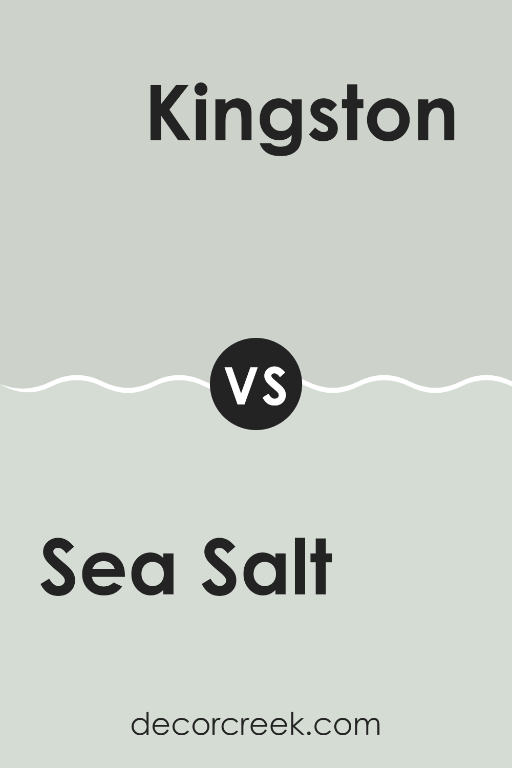
Sea Salt SW 6204 by Sherwin Williams vs Kingston SW 9677 by Sherwin Williams
Sea Salt and Kingston are two distinct colors from Sherwin Williams, each bringing its unique vibe. Sea Salt is a soft, gentle gray with a hint of green. It creates a calming, light backdrop, perfect for making small rooms feel larger and airy.
On the other hand, Kingston is a much deeper shade, a rich navy that adds a bold touch to interiors. It’s ideal for accent walls or for adding a dramatic flair to a room. While Sea Salt reflects natural light beautifully in a room, making it feel open and fresh, Kingston draws in focus, creating a feeling of depth and solidity.
Both colors work well in various styles of decor, but their impact is very different: Sea Salt is more about creating a subtle, fresh feel, while Kingston is about making a strong, confident statement. These colors can work beautifully together, with Kingston providing a striking contrast to the lighter, softer Sea Salt.
You can see recommended paint color below:
- SW 9677 Kingston (CHECK A SAMPLE)
Sea Salt SW 6204 by Sherwin Williams vs Silverpointe SW 7653 by Sherwin Williams
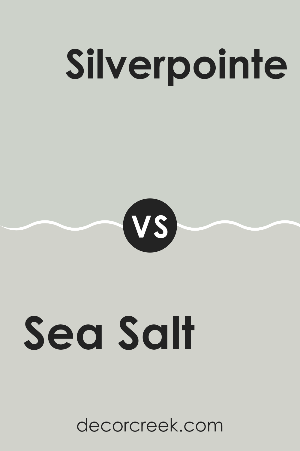
Sea Salt and Silverpointe are both colors offered by Sherwin Williams. Sea Salt is a light greenish-gray shade, giving it a soft, muted feel, suitable for rooms you want to keep light and airy. It works well in bathrooms and bedrooms, offering a calm and clean look.
On the other hand, Silverpointe is a cooler gray that tends to lean slightly toward silver. This color is flexible, fitting well in modern living rooms or offices, where it can create a backdrop that makes furnishings and artwork stand out.
Both colors are relatively neutral, but Silverpointe’s cooler tone makes it a better match for contemporary or minimalistic decors, while Sea Salt’s slight hint of green provides a warmer, more organic feel. Both can lighten up a room, but their different undertones allow them to serve different aesthetic purposes, depending on your style and the personality you want the room to have.
You can see recommended paint color below:
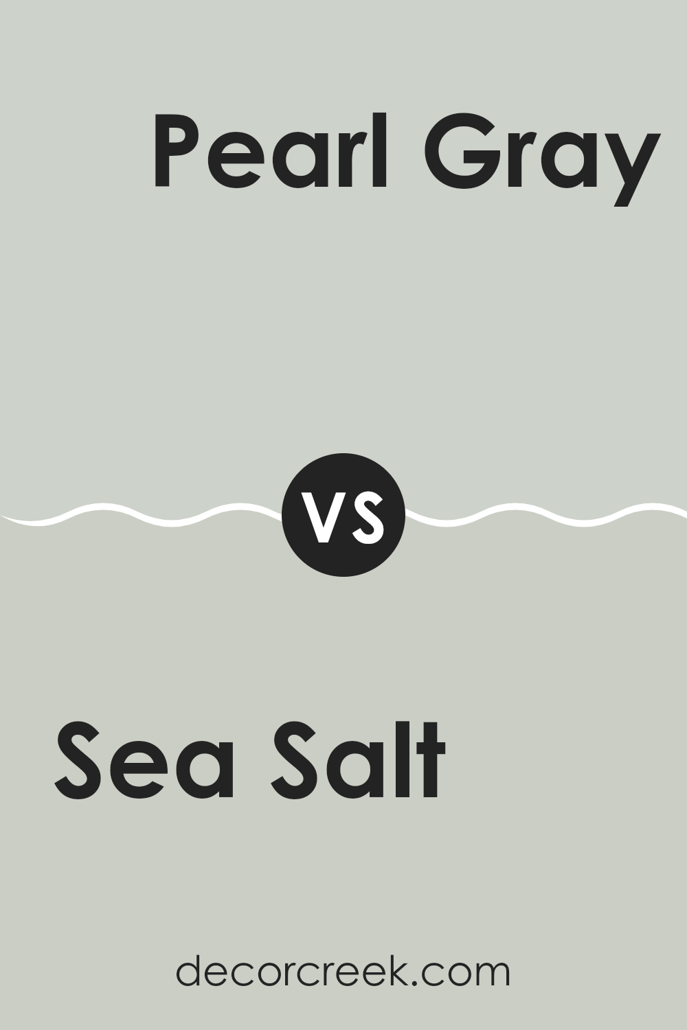
Sea Salt SW 6204 by Sherwin Williams vs Pearl Gray SW 0052 by Sherwin Williams
Sea Salt is a light and airy color that gently combines hints of green and gray. It provides a calm and refreshing vibe, making it a great choice for creating a relaxed atmosphere in any room. On the other hand, Pearl Gray has a stronger presence of gray with subtle blue undertones, offering a more neutral backdrop. This shade is flexible and creates a calming but more grounded feeling in a room.
When comparing Sea Salt and Pearl Gray, the main difference lies in their undertones and the type of ambiance they set. Sea Salt, with its touch of green, tends to evoke a soft, natural feel, almost like a light breeze in a calm meadow. Pearl Gray, in contrast, offers a classic, clean look that aligns well with modern and traditional decors, reflecting more of a straightforward, crisp environment.
Both colors are great for interiors seeking a refreshing feel, with Sea Salt leaning toward a slightly more vibrant and uplifting mood, while Pearl Gray anchors rooms with its subtle, more defined gray tone.
You can see recommended paint color below:
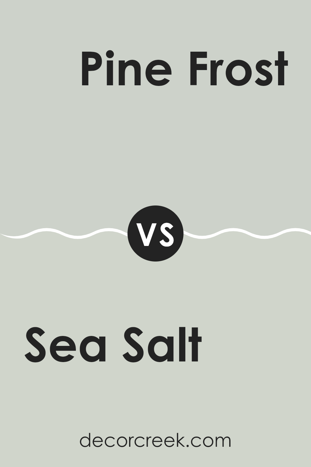
Sea Salt SW 6204 by Sherwin Williams vs Pine Frost SW 9656 by Sherwin Williams
Sea Salt and Pine Frost by Sherwin Williams are two distinct colors, each bringing its own unique vibe to a room. Sea Salt is a light, airy gray with a subtle green undertone. It’s very flexible and can brighten up a room while maintaining a soft, neutral feel. This color works well in various settings, making it a preferred choice for many because it pairs beautifully with both modern and traditional decor.
On the other hand, Pine Frost is a deeper, more pronounced green with a touch of gray. It resembles the calm and refreshing shades of a pine forest, providing a stronger color presence in a room. Pine Frost is ideal for creating more of a statement or adding a dash of nature-inspired hue to rooms that benefit from a cooler, more vibrant look.
Together, these colors offer a nice contrast, with Sea Salt serving as a gentle backdrop and Pine Frost as an accent to bring energy and focus to a room.
You can see recommended paint color below:
- SW 9656 Pine Frost (CHECK A SAMPLE)
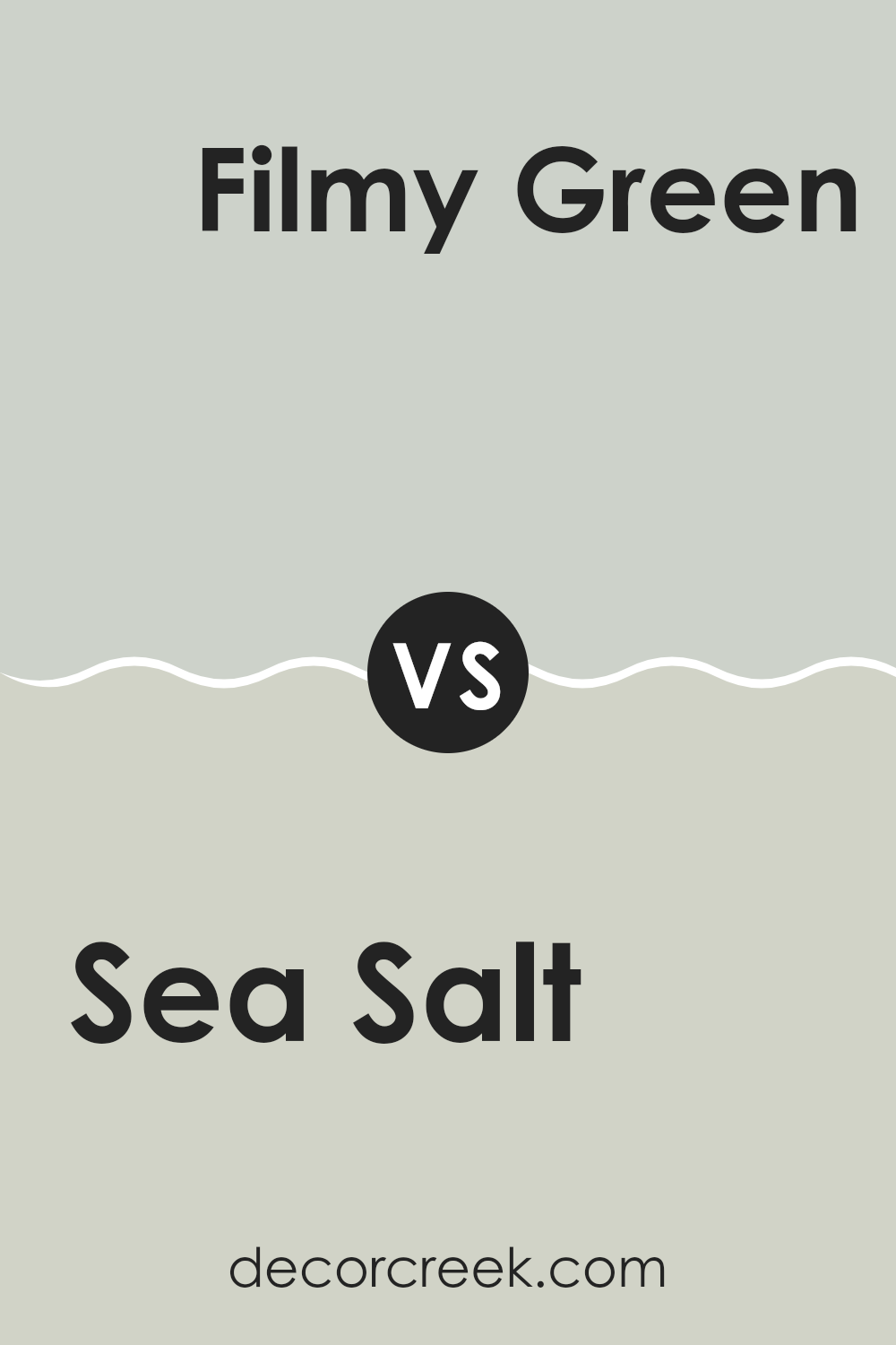
Sea Salt SW 6204 by Sherwin Williams vs Filmy Green SW 6190 by Sherwin Williams
Sea Salt and Filmy Green are two popular shades by Sherwin Williams. Sea Salt is a light, airy gray with a touch of green, making it feel fresh and clean. This color is very adaptable and looks great in most rooms, especially in areas that get a lot of natural light, as it can make the room feel more spacious and open.
On the other hand, Filmy Green is a bit deeper and leans more toward a muted green with gray undertones. It gives off a calm and cozy vibe, which can make larger rooms feel more intimate and welcoming. Filmy Green works well in areas where you want to add a touch of color, but in a subtle way.
Both colors can work beautifully together, with Filmy Green anchoring the room as a darker shade and Sea Salt lightening the mood as a refreshing neutral. They offer a harmonious palette that can feel soothing and inviting in any home.
You can see recommended paint color below:
- SW 6190 Filmy Green (CHECK A SAMPLE)
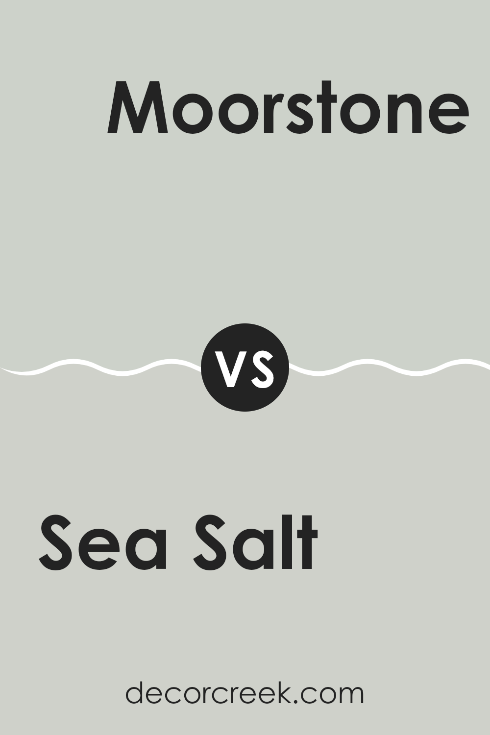
Sea Salt SW 6204 by Sherwin Williams vs Moorstone SW 9630 by Sherwin Williams
Sea Salt and Moorstone by Sherwin Williams are two distinct paint colors that can greatly affect the mood of a room. Sea Salt is a light, airy gray with a touch of green. It’s a soft color that brightens up rooms and creates a relaxed, welcoming atmosphere. Its subtle green undertone brings a hint of nature indoors, making it a popular choice for bathrooms and bedrooms where you might want a refreshing but calm vibe.
Moorstone, on the other hand, is a much darker shade. This color is a deep gray that leans toward a slate tone. It can add drama and depth to a room, making it ideal for accent walls or areas that benefit from a more grounded, strong color presence. Moorstone works well in areas with ample natural light or rooms designed for focus and concentration, like home offices or libraries.
Together, these colors can create a beautiful, contrasting scheme. Sea Salt adds lightness and airiness, while Moorstone provides a bold counterpoint, anchoring the design with its strength.
You can see recommended paint color below:
- SW 9630 Moorstone (CHECK A SAMPLE)
In conclusion, after learning about SW 6204 Sea Salt by Sherwin Williams, I found out quite a bit about this unique paint color. It’s like a mix between light gray and a soft green, which looks a lot like the sea on a cloudy day. This color is very calming, which makes it perfect for rooms like the bedroom or the bathroom, where you just want to relax. Also, I learned that this color goes well with lots of other colors. It can look amazing with blues and greens, or even with different shades of gray and white.
Many people talked about how Sea Salt changes its look based on the light in the room. During the daytime with a lot of natural light, it might look more green. At night, under the lamp light, it could look more gray. This is really cool because it’s like having a room that changes color a little bit throughout the day.
Overall, SW 6204 Sea Salt by Sherwin Williams could be a great choice if you want a room that feels calm and cozy, and also looks beautiful in different types of light. It’s definitely a paint color that could make your room feel just right.
Ever wished paint sampling was as easy as sticking a sticker? Guess what? Now it is! Discover Samplize's unique Peel & Stick samples.
Get paint samples
