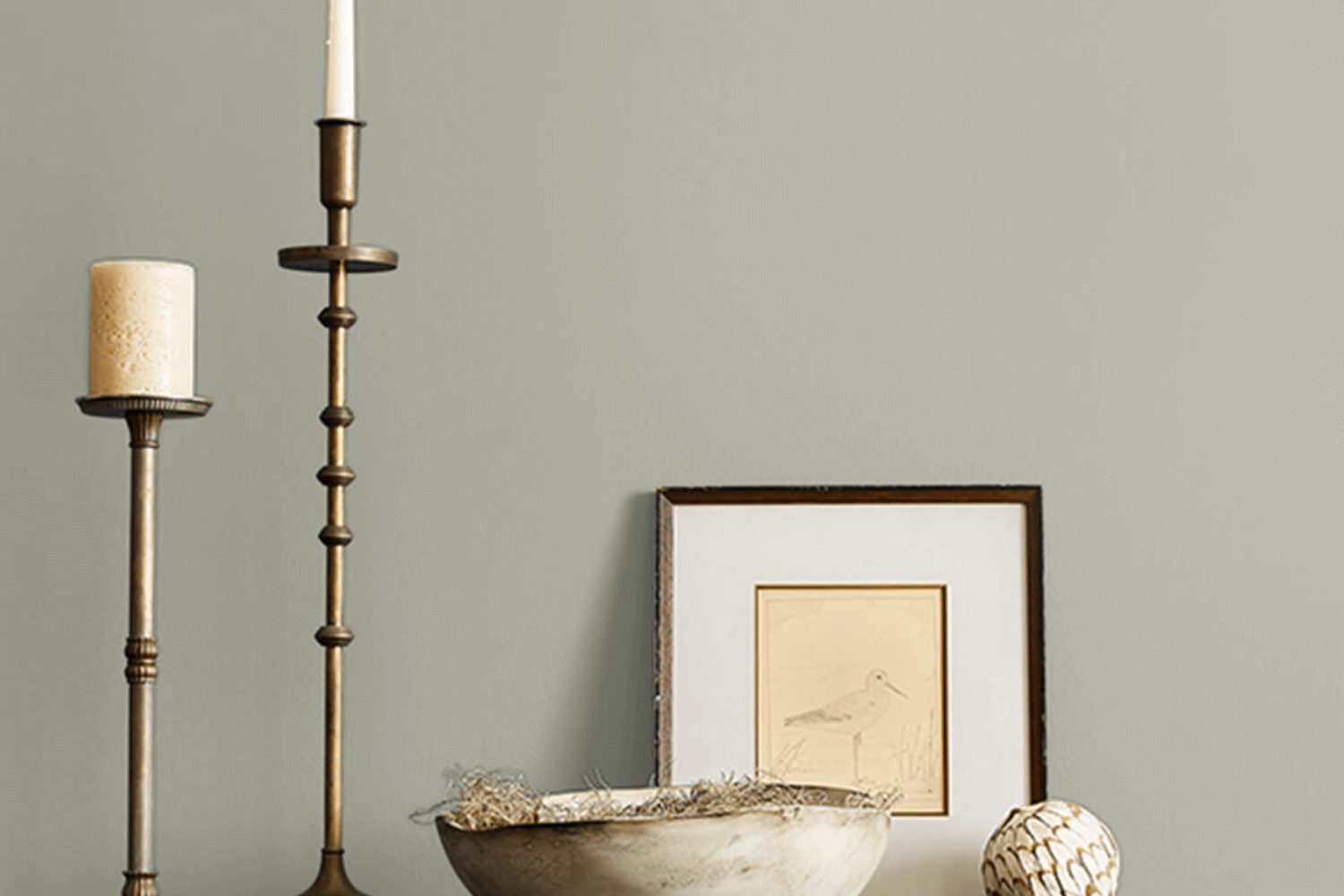
Introducing Escape Gray SW 6185 by Sherwin Williams, a versatile and elegant paint color that has caught the eye of homeowners and decorators alike. This unique shade of gray offers a perfect balance, standing out as neither too dark nor too light, making it an ideal choice for a wide range of spaces and design schemes. Its subtle undertones provide warmth and sophistication, ensuring that it complements a variety of decor styles, from modern to traditional.
Escape Gray is more than just a color; it’s a mood setter. Whether you’re looking to refresh your living room, bedroom, or even your kitchen, this color brings a sense of calm and serenity to any room. It pairs beautifully with crisp whites, deep blues, and natural woods, offering endless possibilities for creating a space that feels both cozy and stylish. Additionally, its adaptability makes it a favorite among those looking to sell their homes, as it adds a touch of polished appeal to interiors.
In this article, we’ll explore the charm and versatility of Escape Gray SW 6185, showing you how it can transform your space into a soothing retreat. Whether you’re redecorating a single room or revamping your entire home, discover why this Sherwin Williams shade could be the perfect choice for your next project.
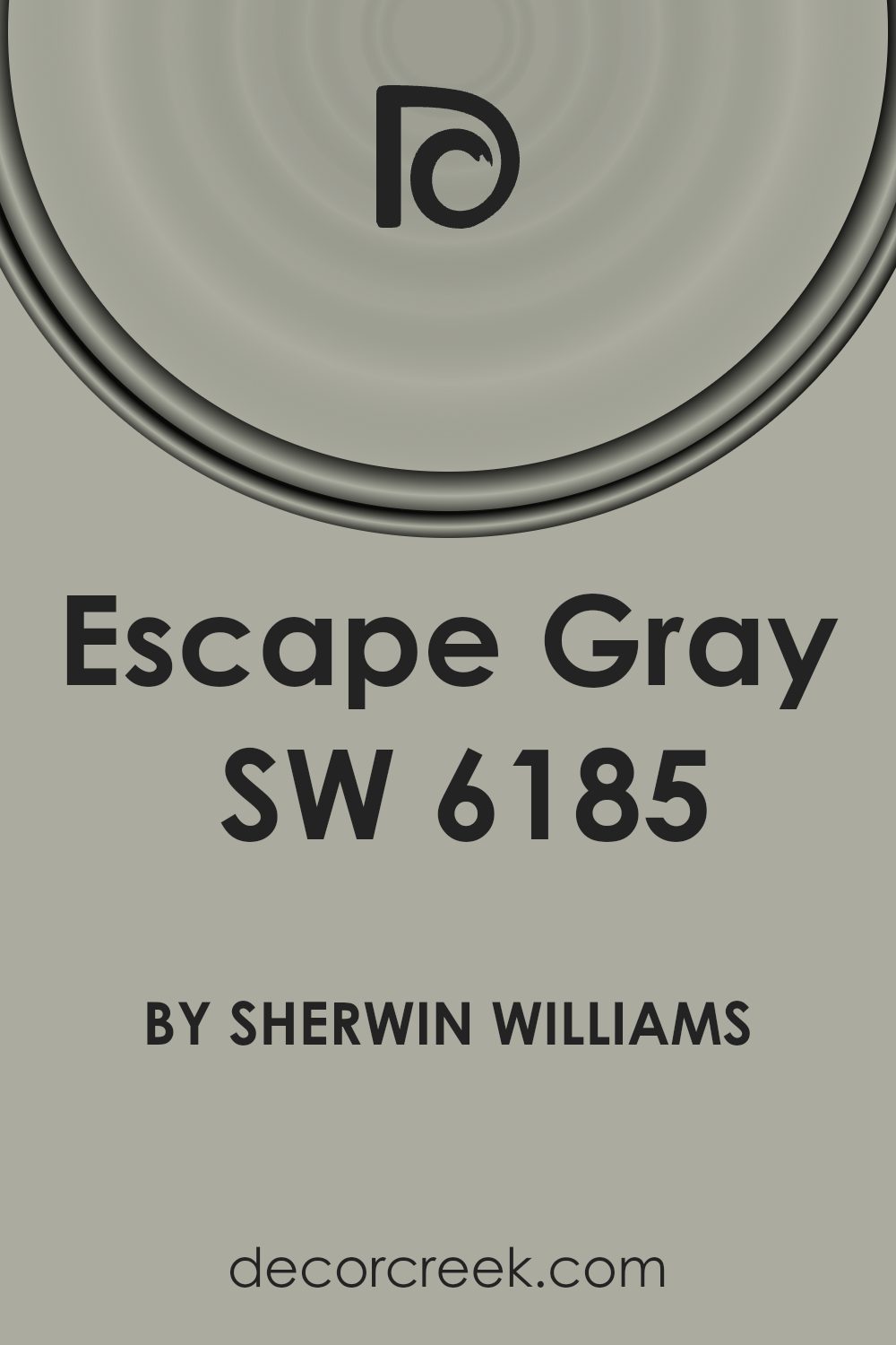
What Color Is Escape Gray SW 6185 by Sherwin Williams?
Escape Gray from Sherwin Williams is a versatile color that brings a sense of calmness to any space. It’s a unique shade that strikes a fine balance between cool and warm tones, making it an ideal choice for various interior styles. This color has a soothing presence, somewhat reminiscent of a serene, foggy morning, and it effortlessly pairs with a wide range of materials and textures.
In terms of interior styles, Escape Gray shines in modern, minimalist, and Scandinavian designs due to its understated elegance. It also works well in traditional settings, providing a fresh update without losing the classic charm. For a contemporary twist, combining it with bold accents can uplift the neutral base it offers.
When it comes to materials, Escape Gray pairs beautifully with natural wood, bringing warmth to the space. It also complements metallic finishes like brass or copper, adding a touch of sophistication. Textiles in rich textures or soft pastels alongside this gray create an inviting and comfortable atmosphere. It’s a color that supports versatility, allowing for a range of creative design choices from soft and cozy to sleek and modern. Overall, it’s a fantastic color for creating a tranquil and stylish interior that feels both updated and timeless.
Is Escape Gray SW 6185 by Sherwin Williams Warm or Cool color?
Escape Gray SW 6185 by Sherwin Williams is a versatile color that brings a fresh and soothing atmosphere into any home. This unique shade of gray has subtle hints of green, allowing it to adapt well to various lighting conditions and settings. It’s not just a simple gray; its complexity adds a layer of sophistication and tranquility to rooms, making it an excellent choice for those looking to create a peaceful and inviting space.
Using Escape Gray in your home can have a calming effect, making it perfect for bedrooms and living areas where comfort is key. Its natural undertones can also help connect the indoors with the outdoors, especially when used in spaces with plenty of natural light or alongside wooden elements and greenery.
This color is incredibly versatile, fitting seamlessly with both modern and traditional decor. Whether you’re looking to create a serene backdrop or complement bolder colors and textures, Escape Gray offers a balanced base that supports a wide range of design styles without overwhelming the senses. Its adaptability makes it a go-to choice for homeowners seeking a neutral, yet distinctive, hue.
Undertones of Escape Gray SW 6185 by Sherwin Williams
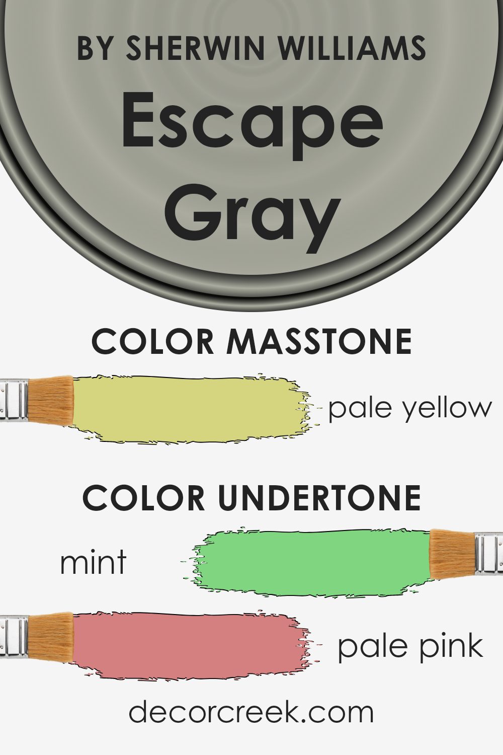
The color Escape Gray by Sherwin Williams is a versatile shade that brings a sense of calm to any room. What makes it unique are its undertones. Undertones are subtle colors hidden within the main color. They can influence how we perceive the main color, making it cooler, warmer, or giving it a hint of another color.
Escape Gray has a variety of undertones, including mint, pale pink, grey, light gray, light blue, light purple, lilac, yellow, light green, orange, and olive. These undertones add depth and complexity, allowing the color to adapt under different lighting conditions and complement a wide range of decor styles.
For instance, the mint and light green undertones can make a room feel more refreshing and lively. The pale pink and lilac can add a soft, welcoming touch. Grey and light gray give it a neutral base, making it incredibly versatile. Light blue and light purple can introduce a serene, almost dreamy quality. Yellow, orange, and olive undertones can warm up the space, making it feel cozy and inviting.
When applied to interior walls, the undertones in Escape Gray impact the room’s atmosphere. Under natural light, the blue and green undertones might become more pronounced, creating a peaceful, calming space. Artificial lighting might highlight the warmer undertones, like pale pink and orange, adding warmth to the room. This adaptability makes Escape Gray a fantastic choice for anyone looking to create a specific mood in their space without committing to a strong color.
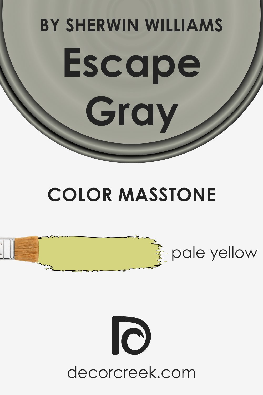
What is the Masstone of the Escape Gray SW 6185 by Sherwin Williams?
Escape Gray SW 6185 by Sherwin Williams, with its masstone of pale yellow, offers a subtle yet inviting tone to any space in a home. This soft hue effortlessly complements various decor styles, infusing rooms with a light, airy feel. The gentle yellow undertone brings a hint of warmth and cheerfulness, making spaces feel more open and welcoming. Whether applied in living areas, bedrooms, or even small nooks, this color adds a sense of brightness without overwhelming the senses.
Its versatility allows it to play well with both natural light and artificial lighting, adjusting subtly to enhance the mood of the room at different times of the day. In spaces where light is scarce, it can help to visually enlarge the area and make it appear more lively. Moreover, it pairs beautifully with a wide range of colors, from soft neutrals to bold accents, granting homeowners the freedom to experiment with various decor themes. This makes it not just a color choice, but a backdrop for creating a cozy, personalized home environment.
How Does Lighting Affect Escape Gray SW 6185 by Sherwin Williams?
Lighting has a significant impact on how we perceive colors. The color or shade you paint your walls can look different throughout the day or under different lighting conditions. This is because light sources vary in their color temperatures, affecting how we see colors in a room.
Take the color Escape Gray, for instance. In natural light, colors can look more vivid or more muted, depending on the direction of the window and the quality of daylight. In artificial light, the type of bulb (LED, fluorescent, incandescent) plays a big role in how colors appear.
- In rooms facing north, light is cooler and can bring out the cooler tones in colors. Escape Gray might appear more of a true gray or slightly blue-tinted in these rooms, especially under the overcast sky. North-facing light is consistent but not as direct, so this color may feel softer and subtler.
- South-facing rooms enjoy warm, bright light for most of the day. This warmth can make Escape Gray look warmer than it is, bringing out subtle brown or green undertones. The color can feel more dynamic and vibrant in these rooms, changing with the light as the day goes on.
- East-facing rooms get bright light in the morning, which is warm and yellow. This morning light can make Escape Gray look softer and slightly warmer in the morning, gradually returning to its true color as the day progresses and the natural light becomes cooler.
- West-facing rooms experience the opposite. The color will stay true to its cool self in the morning but will warm up in the afternoon and evening as the sunlight pours in. Escape Gray might then reveal more hidden warmth, becoming cozier.
- Artificial lighting affects this color too. Warm bulbs can enhance its warmer tones, making the room feel welcoming at night, while cool LED lights might strip away some of its warmth, highlighting its cooler undertones.
Overall, Escape Gray’s appearance can vary greatly depending on the light, shifting slightly with the time of day and the orientation of the room. This makes it a versatile color, adaptable but always stylish.
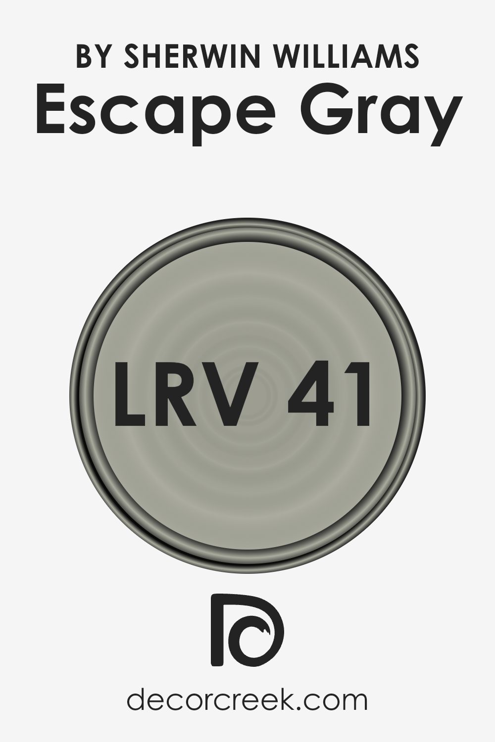
What is the LRV of Escape Gray SW 6185 by Sherwin Williams?
LRV stands for Light Reflectance Value, which is a measure of the percentage of light a paint color reflects from or absorbs into a painted surface. It’s on a scale from 0 to 100, where 0 absorbs all light (think of a deep, dark black) and 100 reflects all light (imagine a bright, pure white). This value can greatly affect how a color looks in a space, making it appear brighter or darker depending on the amount of natural or artificial light available. The perception of size in a room can also change based on LRV; lighter colors can make spaces seem larger and airier, while darker colors can make them feel more cozy and smaller.
Now, considering the LRV of 40.592 for the color in question, it sits in the mid-range on the scale. This means it neither reflects nor absorbs light extremely, placing it in a versatile category where it might not drastically alter the perception of a room’s size but instead, lend a balanced, nuanced character. In spaces with ample light, this particular gray will likely appear slightly lighter, enhancing the room’s ambiance without overwhelming it. In dimmer, less lit areas, the color could seem a bit darker, adding a cozy feel to the space. This LRV value makes this shade of gray a flexible choice for various lighting conditions and settings, adapting subtly to its surroundings.
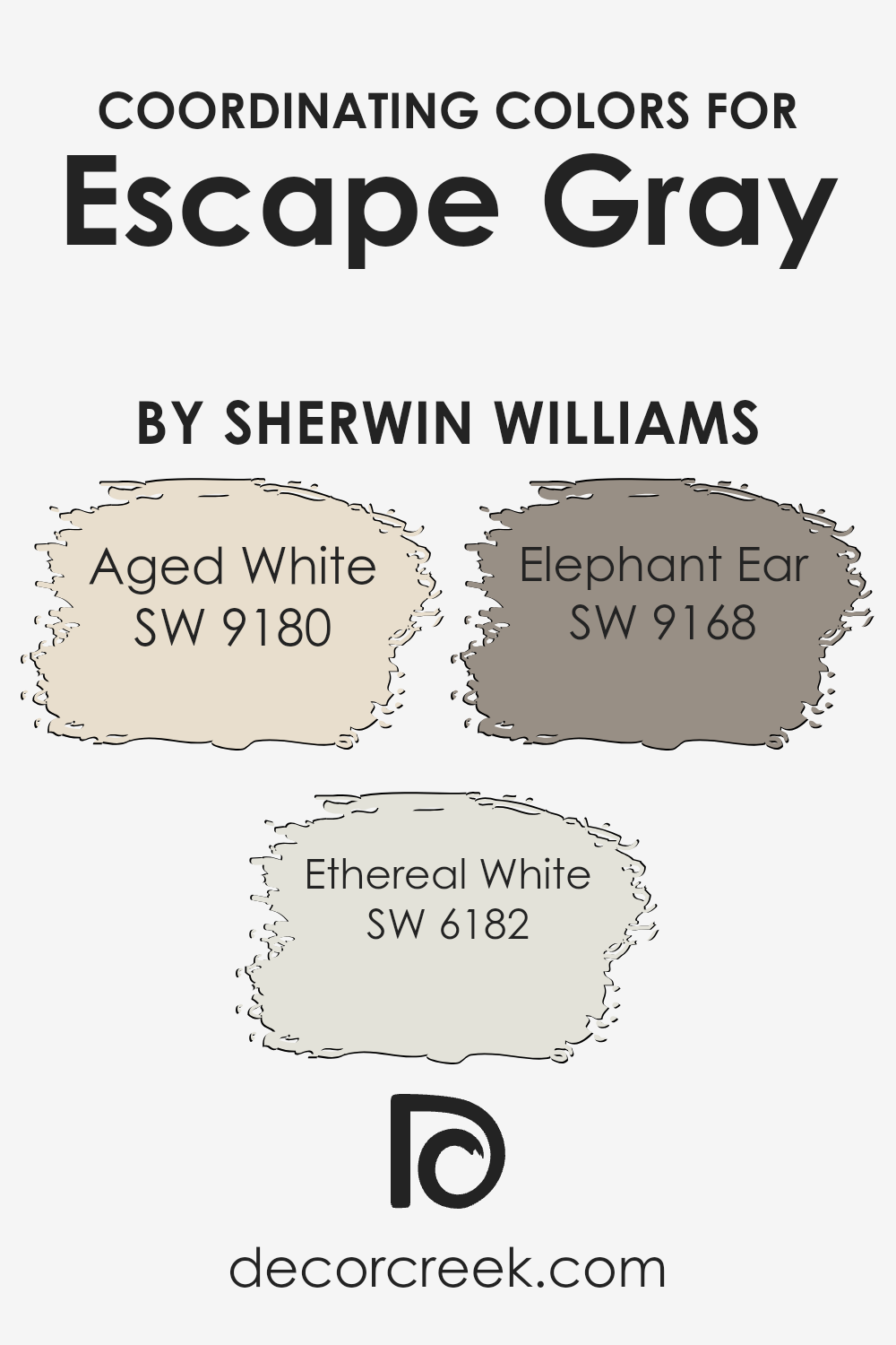
Coordinating Colors of Escape Gray SW 6185 by Sherwin Williams
Coordinating colors are those that complement one another on the color spectrum, creating harmonious and visually appealing palettes. They work by balancing out tones, either by enhancing each other’s brightness or offering a calm, unified look. When it comes to the color Escape Gray from Sherwin Williams, its coordinating colors include Aged White SW 9180, Ethereal White SW 6182, and Elephant Ear SW 9168. These specific shades are chosen to complement and enhance the base color, allowing for a cohesive and beautiful design space.
Aged White SW 9180 is a warm, creamy hue that brings a soft and inviting atmosphere to any space. It works beautifully with Escape Gray by adding a touch of coziness and light. Ethereal White SW 6182, on the other hand, is a lighter, almost ethereal color that offers a subtle contrast to the deeper tones of Escape Gray, giving a room an open and airy feeling. Elephant Ear SW 9168 is a rich, warm gray that shares a close kinship with Escape Gray, providing a deeper tone that grounds the color scheme and adds sophistication. Together, these coordinating colors work seamlessly to create a balanced and attractive space.
You can see recommended paint colors below:
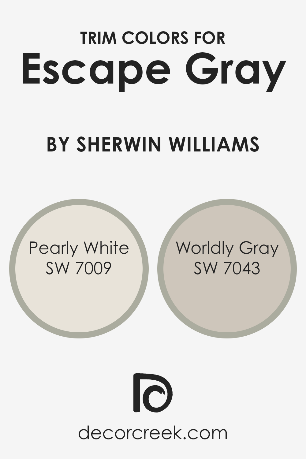
What are the Trim colors of Escape Gray SW 6185 by Sherwin Williams?
Trim colors are those chosen to complement or contrast the main color on walls, thereby defining and accentuating architectural features such as door frames, window sills, and baseboards. Selecting the right trim color enhances the overall look of a room, creating depth and drawing attention to the detailing of the space. For a color like Escape Gray by Sherwin Williams, which has a versatile and subtle tone, the choice of trim color can either subtly blend with the aesthetic or provide a striking counterpoint, depending on the desired atmosphere of the room.
Pearly White SW 7009 is a soft, warm white with a hint of creaminess that gives it a welcoming vibe. It’s a great choice if you’re looking to subtly highlight the trim without creating too much contrast with Escape Gray, maintaining a relaxed and cohesive atmosphere. On the other hand, Worldly Gray SW 7043 is a warmer gray that’s slightly deeper than Escape Gray, which can create a sophisticated and harmonious look. This choice allows the trim to gently stand out against the walls, adding depth and visual interest to the space without overwhelming it with contrast.
You can see recommended paint colors below:
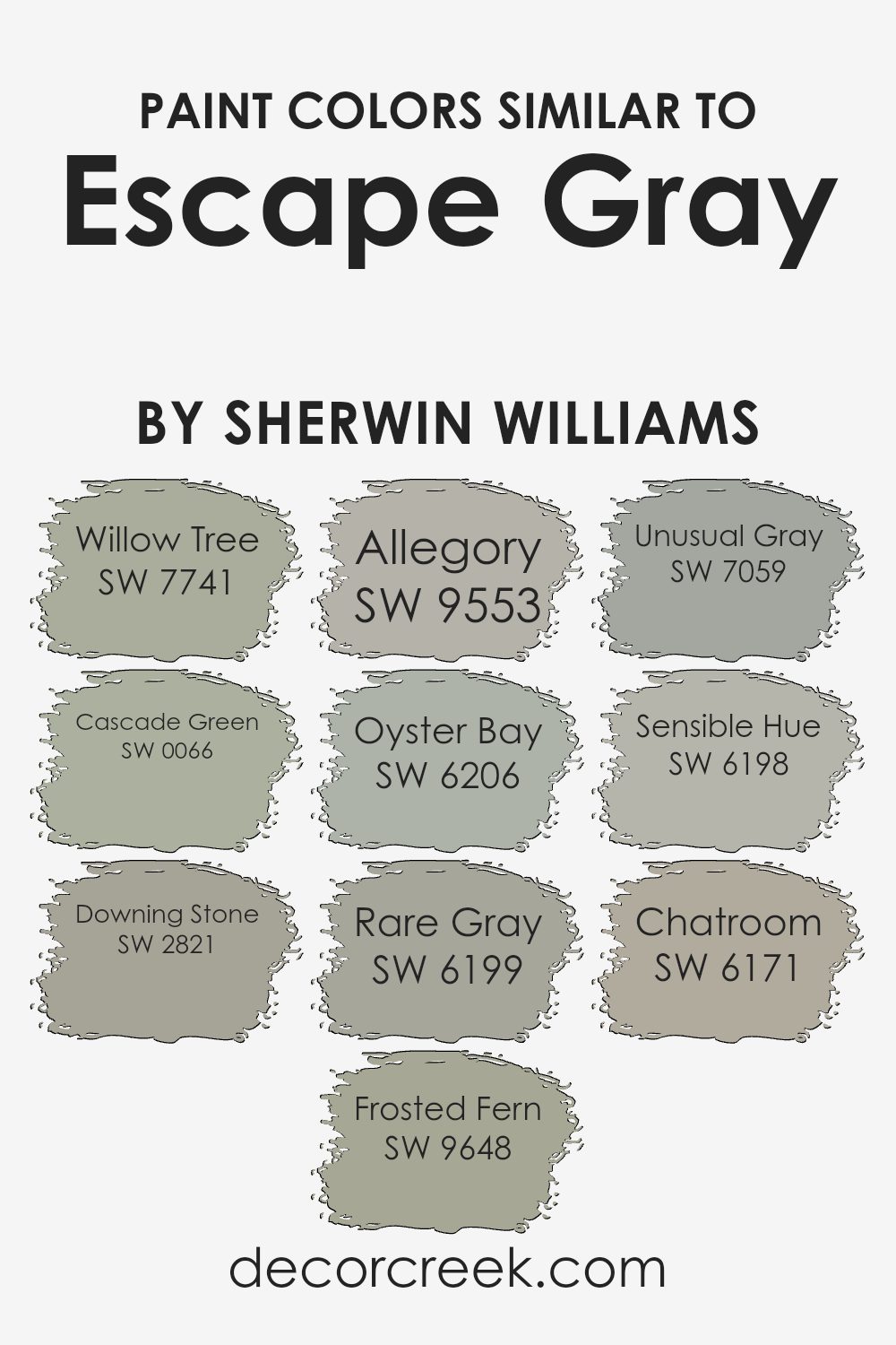
Colors Similar to Escape Gray SW 6185 by Sherwin Williams
Choosing similar colors to a base color like Escape Gray by Sherwin Williams is crucial in design for creating a cohesive and harmonious look. These analogous shades work well together because they share a common hue, brightness, or saturation level, making them naturally pleasing to the eye. When used in a space, they can produce a subtle yet impactful aesthetic, ensuring the environment feels unified without the monotony of using a single color.
- For example, Willow Tree is a greenish-gray shade that introduces a sense of calm and earthiness, akin to a serene forest.
- Cascade Green, on the other hand, is a bit bolder, reminiscent of the lush greenery found near waterfalls, providing a vibrant yet comforting touch.
- Downing Stone offers a robust, grounding effect, its stony gray essence imbuing spaces with an air of stability.
- Frosted Fern has a gentle, almost mystical quality, like early morning frost on a delicate leaf, perfect for creating a soft, elusive charm.
- Allegory is a nuanced, almost narrative hue, suggesting a story beyond its pale, dreamy appearance.
- Oyster Bay straddles the line between green and gray, invoking the tranquility of seaside retreats.
- Rare Gray is a sophisticated, almost elusive shade, bringing an air of mystery and depth.
- Unusual Gray stands out with its unique blend of warmth and coolness, making spaces feel contemporary yet timeless.
- Sensible Hue is exactly as it sounds – pragmatic and down-to-earth, a solid choice for any design.
- Lastly, Chatroom is a conversational color, with a muted, smoky tone that encourages relaxation and dialogue.
Each of these colors, while sharing similarities with Escape Gray, brings its own unique vibe and atmosphere, demonstrating how varied shades can collaborate to create a visually cohesive yet diverse palette.
You can see recommended paint colors below:
- SW 7741 Willow Tree
- SW 0066 Cascade Green
- SW 2821 Downing Stone
- SW 9648 Frosted Fern
- SW 9553 Allegory
- SW 6206 Oyster Bay
- SW 6199 Rare Gray
- SW 7059 Unusual Gray
- SW 6198 Sensible Hue
- SW 6171 Chatroom
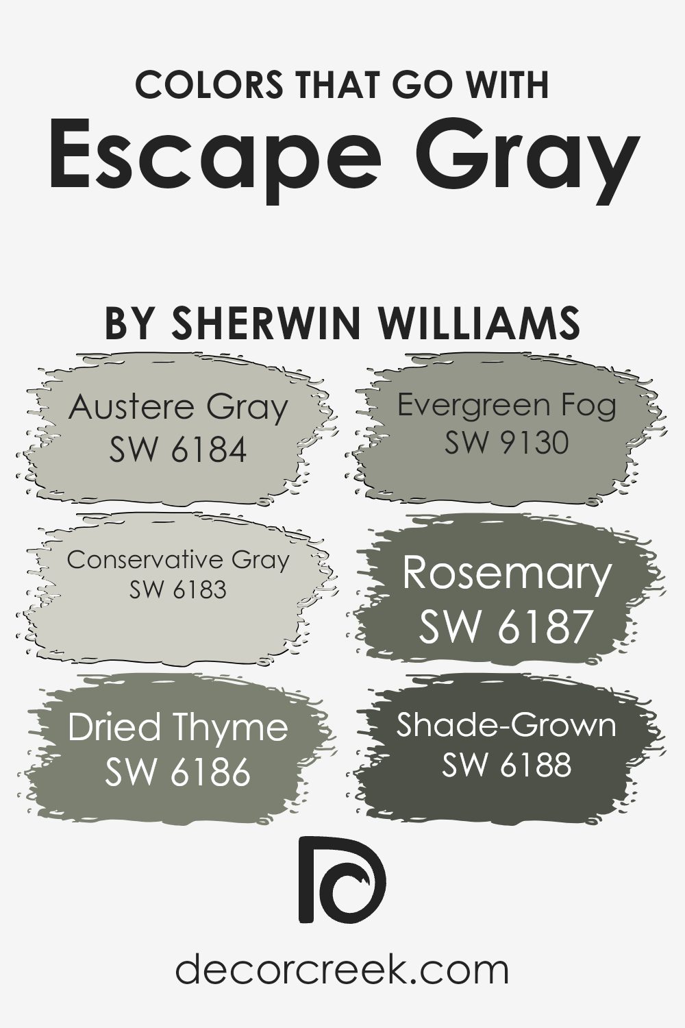
Colors that Go With Escape Gray SW 6185 by Sherwin Williams
Choosing the right colors to complement Escape Gray SW 6185 by Sherwin Williams is critical because they help create a cohesive and harmonious space. These colors ensure that the soothing, versatile tone of Escape Gray is enhanced, not overwhelmed. By carefully selecting shades that work together, one can achieve a balanced and visually appealing environment. The colors that pair well with Escape Gray, such as Austere Gray, Conservative Gray, Dried Thyme, Evergreen Fog, Rosemary, and Shade-Grown, each bring their unique touch while maintaining a seamless aesthetic flow.
Austere Gray and Conservative Gray, for instance, are close relatives in the color spectrum, offering a subtle differentiation that can add depth and complexity to a room without clashing. Austere Gray has a calm, understated elegance that makes it perfect for creating serene spaces. Conservative Gray, a touch lighter, provides a refreshing breath of air, enhancing the open, airy feel of a room. Dried Thyme and Evergreen Fog introduce a natural element, grounding the space with their earthy, green undertones. Dried Thyme possesses a warm, herbal essence that evokes a sense of comfort, while Evergreen Fog brings in a cooler, more muted green, lending a sophisticated edge to the setting. Rosemary and Shade-Grown, slightly bolder choices, add character and depth. Rosemary has a rich, botanical green that injects vitality into a space, and Shade-Grown offers a deep, luxurious touch with its dark, moody hues. Together, these colors form a palette that complements Escape Gray, creating rooms that feel thoughtfully designed and effortlessly stylish.
You can see recommended paint colors below:
- SW 6184 Austere Gray
- SW 6183 Conservative Gray
- SW 6186 Dried Thyme
- SW 9130 Evergreen Fog
- SW 6187 Rosemary
- SW 6188 Shade-Grown
How to Use Escape Gray SW 6185 by Sherwin Williams In Your Home?
Escape Gray SW 6185 by Sherwin Williams is a versatile gray paint that offers a simple yet effective way to refresh any space in your home. This color has a unique blend that makes it stand out, adding a cozy and calming feel to rooms. Ideal for living rooms or bedrooms, it creates a soothing atmosphere that encourages relaxation. You can use it on walls as the main color to set a soft, neutral backdrop that works well with various decor styles, from modern to traditional.
It’s also great for painting furniture or cabinets for a subtle update. In smaller spaces like bathrooms or hallways, Escape Gray can make the area feel more spacious and brighter. Pairing this color with white trim or accents amplifies its beauty, creating a clean and inviting look. Whether you’re updating a single room or giving your whole home a makeover, Escape Gray offers a timeless appeal that’s easy to incorporate.
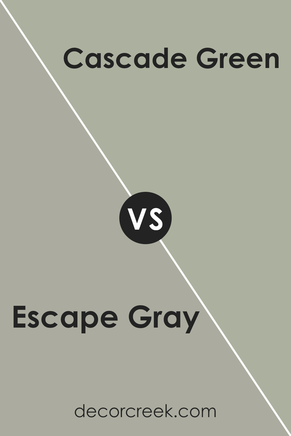
Escape Gray SW 6185 by Sherwin Williams vs Cascade Green SW 0066 by Sherwin Williams
Escape Gray and Cascade Green, both from Sherwin Williams, offer distinct vibes for walls. Escape Gray is like a soft hug of gray with a hint of warmth, making spaces cozy and inviting without being overpowering. It’s versatile, fitting well in bedrooms, living rooms, or offices, adding a subtle modern touch.
On the other hand, Cascade Green brings a fresh and lively feel, with its green-blue tones reminiscent of nature. It’s perfect for adding a splash of color to a bathroom or kitchen, creating a cheerful and refreshing atmosphere. While Escape Gray leans more towards a neutral and understated elegance, Cascade Green offers a vibrant and energizing look. Whether you prefer the calm neutrality of gray or the vibrant freshness of green, both colors have their unique charm.
You can see recommended paint color below:
- SW 0066 Cascade Green
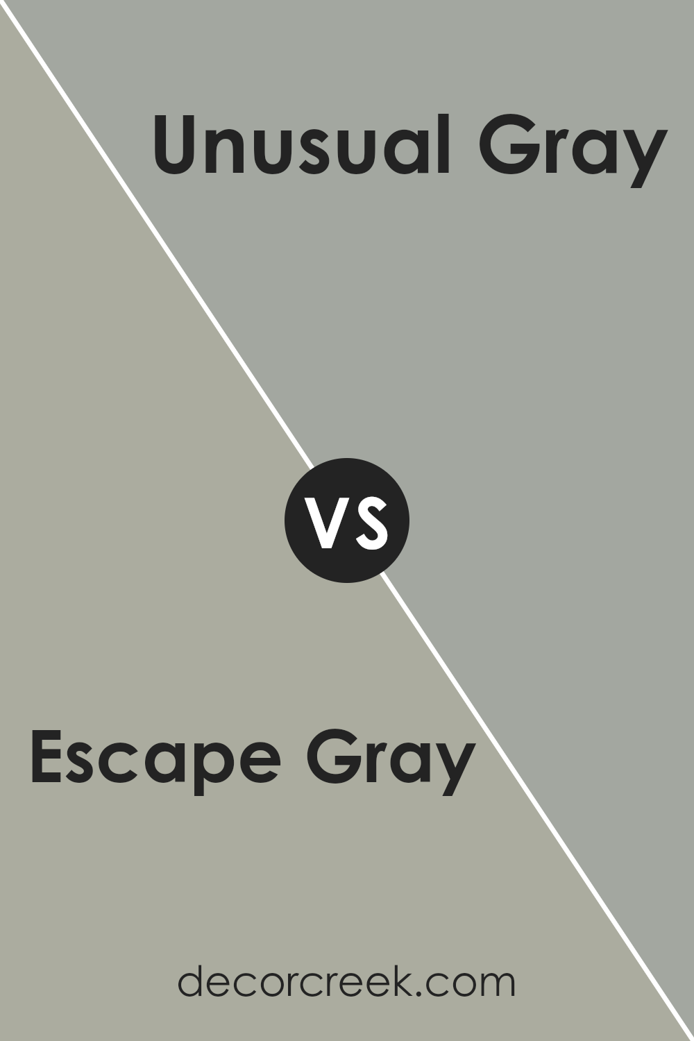
Escape Gray SW 6185 by Sherwin Williams vs Unusual Gray SW 7059 by Sherwin Williams
Escape Gray and Unusual Gray by Sherwin Williams are both unique, but they bring different vibes to a space. Escape Gray is like a soft, cozy blanket on a lazy afternoon. It has a warm undertone that makes a room feel more inviting and relaxed. It’s perfect for someone looking to create a snug and homely atmosphere.
On the other hand, Unusual Gray is the cooler, more sophisticated cousin. It carries a slight blue undertone, making it feel more modern and sleek. This color suits those who prefer a more contemporary look, adding a bit of an edgy twist to traditional gray.
While both colors are versatile and can blend well with various decor styles, Escape Gray leans towards creating a warmer, cozier feel. In contrast, Unusual Gray steps up the game with a cooler, more cutting-edge look. Depending on what ambiance you’re aiming for, each color has its charm to transform your space.
You can see recommended paint color below:
- SW 7059 Unusual Gray
Escape Gray SW 6185 by Sherwin Williams vs Allegory SW 9553 by Sherwin Williams
Escape Gray and Allegory by Sherwin Williams are two unique hues that stand out on their own. Escape Gray is a gentle, soft gray that offers a calm and soothing vibe to any space. It’s a versatile color that can make rooms feel more open and airy, while also providing a modern touch. On the other hand, Allegory adds a slightly warmer and more inviting atmosphere. It’s a color that leans towards a lighter, creamy side, making spaces feel cozy and welcoming without overwhelming the senses.
While Escape Gray serves as a perfect backdrop for a minimalist or contemporary style, Allegory brings a subtle hint of elegance and soft warmth to interiors, complementing both rustic and modern decors. The choice between these two depends on the mood you wish to create—Escape Gray for a crisp, clean look, or Allegory for a touch of snugness and soft charm. Both colors offer unique potential for transforming spaces but cater to different aesthetic preferences and atmospheres.
You can see recommended paint color below:
- SW 9553 Allegory
Escape Gray SW 6185 by Sherwin Williams vs Sensible Hue SW 6198 by Sherwin Williams
Escape Gray and Sensible Hue, both from Sherwin Williams, offer subtle yet distinctive tones for any space. Escape Gray presents a mild, soft gray with a hint of warmth that can make a room feel cozy and inviting. It’s versatile, fitting well in many areas of a home, from living rooms to bedrooms, adding a calm and gentle atmosphere.
On the other hand, Sensible Hue leans towards a softer, more neutral color with green undertones. This gives it a unique ability to bring a touch of nature indoors, creating a serene and balanced feel. It works exceptionally well in spaces where calmness and focus are desired, like home offices or reading nooks.
While both colors share a quiet elegance, Escape Gray offers a straightforward approach to gray, making spaces feel more open and airy. Sensible Hue, with its hint of green, introduces a natural element, fostering a soothing environment. Choosing between them depends on the desired ambience and the specific undertones you want to introduce into your space.
You can see recommended paint color below:
- SW 6198 Sensible Hue
Escape Gray SW 6185 by Sherwin Williams vs Chatroom SW 6171 by Sherwin Williams
Escape Gray and Chatroom, both from Sherwin Williams, are unique yet soothing colors that stand out for their versatility. Escape Gray lies on the lighter side, offering a soft, airy feel to any space. It has a gentle hint of green, making it a soothing choice for rooms where calmness is key. On the other hand, Chatroom leans towards a darker, more subdued hue. This color has a stronger presence, attributed to its deeper, sage-like green undertones. It’s perfect for creating a cozy, inviting atmosphere in areas meant for relaxation or concentration.
When comparing these two, remember that Escape Gray brings a lighter, refreshing touch, ideal for making small spaces appear larger and brighter. Chatroom, with its richer tone, is excellent for adding depth and warmth, making it suitable for larger rooms or as an accent wall to add character.
Both colors work well with natural light and can complement each other beautifully within the same color scheme, offering a balanced approach to home or office decor.
You can see recommended paint color below:
- SW 6171 Chatroom
Escape Gray SW 6185 by Sherwin Williams vs Willow Tree SW 7741 by Sherwin Williams
Escape Gray and Willow Tree by Sherwin-Williams are two distinct colors with their own unique appeal. Escape Gray is a soft, neutral gray with a hint of warmth, making it versatile for any room. It’s like a cozy blanket on a dreary day, bringing comfort and a sense of calm. On the other hand, Willow Tree is a deeper, earthy green that draws inspiration from nature. This color brings the outdoors in, creating a serene and grounding atmosphere.
While both colors share a calming vibe, their differences lie in the mood they set. Escape Gray is understated and adaptable, fitting in with a wide range of decor styles, from modern to rustic. Willow Tree, however, adds a richer, more vibrant touch, ideal for spaces where you want a bit more character and connection to the natural world.
In essence, if you’re looking for a neutral backdrop that’s easy to match with, Escape Gray is a fantastic choice. But if you’re aiming to inject a bit of nature’s tranquility into your space, Willow Tree might be your go-to.
You can see recommended paint color below:
- SW 7741 Willow Tree
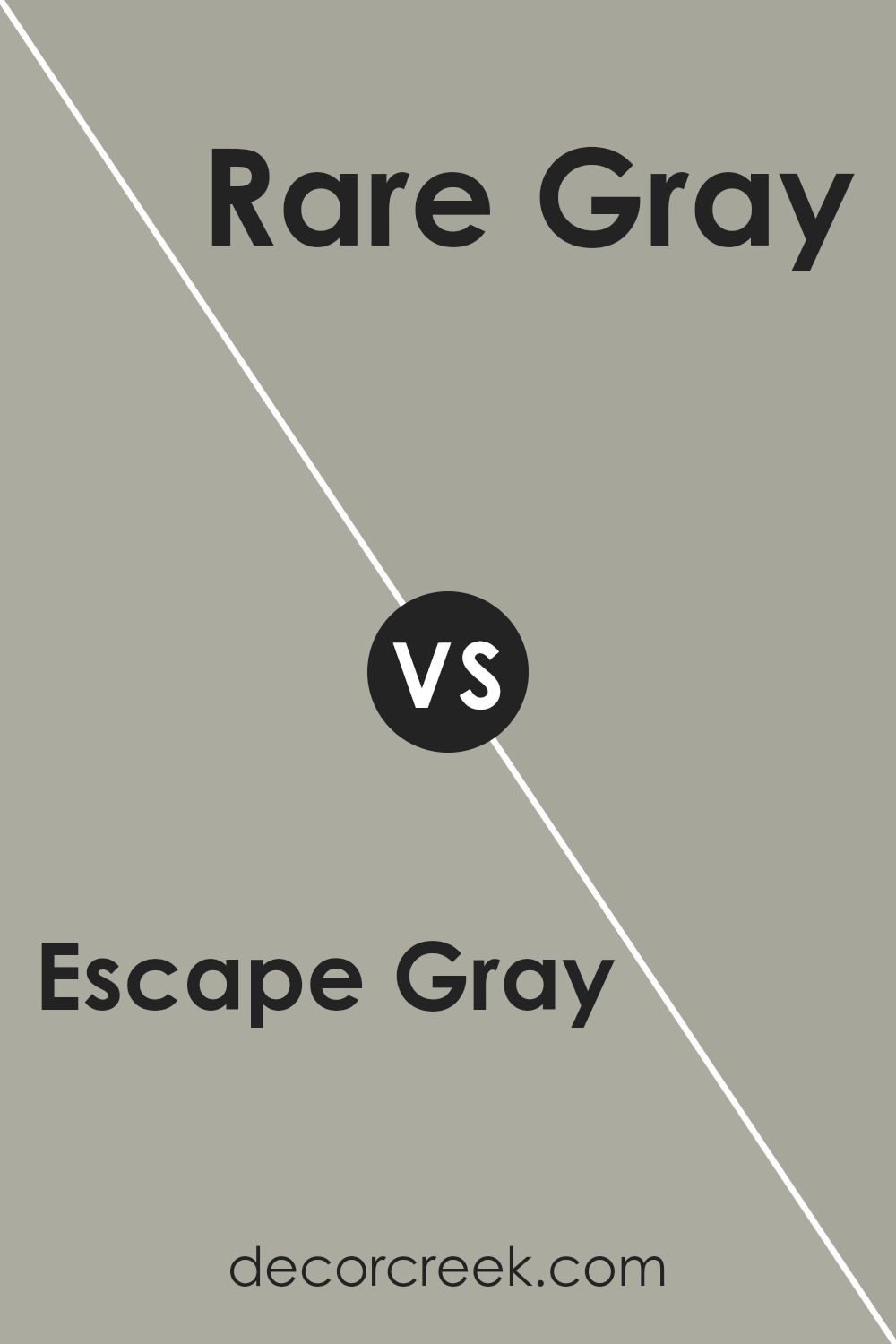
Escape Gray SW 6185 by Sherwin Williams vs Rare Gray SW 6199 by Sherwin Williams
Escape Gray and Rare Gray are two unique shades from Sherwin Williams, each with its own charm. Escape Gray is a soft, cozy gray that leans towards a warm undertone, making it perfect for creating a welcoming atmosphere in any room. Its lightness brings a subtle brightness, offering a serene backdrop that pairs well with a wide range of decor. On the other hand, Rare Gray is a bit more complex, integrating green undertones that give it a slightly cooler vibe compared to Escape Gray.
This color has a distinctive edge, ideal for those looking to add a touch of sophistication and depth to their space. While both colors share the calmness of gray, Escape Gray provides a classic, soothing feel, whereas Rare Gray adds an intriguing twist with its cooler, more nuanced appearance. Choosing between them depends on the mood you want to set: comforting warmth or refined coolness.
You can see recommended paint color below:
- SW 6199 Rare Gray
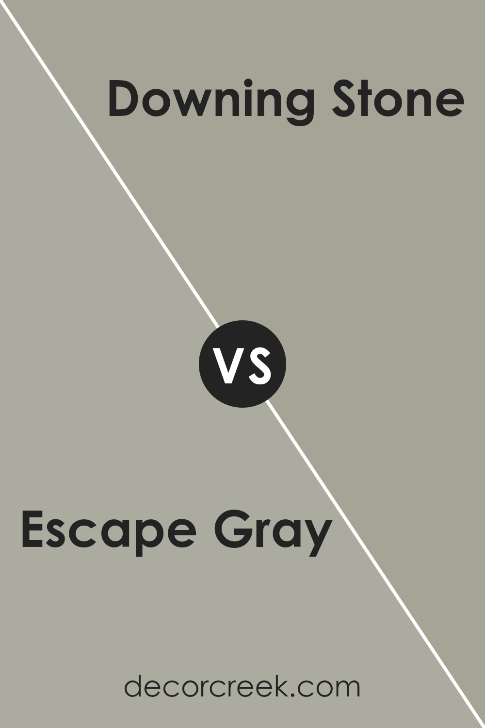
Escape Gray SW 6185 by Sherwin Williams vs Downing Stone SW 2821 by Sherwin Williams
Escape Gray and Downing Stone are two colors from Sherwin Williams that bring their own unique flair to any space. Escape Gray is a subtle and soft gray that gives off a calming and peaceful vibe. It’s like a gentle hug for your walls, creating a serene atmosphere that’s perfect for places where relaxation is key. On the other hand, Downing Stone has a deeper, earthy tone. This color brings a bit of the natural world inside, offering warmth and a grounded feeling.
It’s ideal for areas where you want to add a touch of coziness and comfort. While both colors share a natural essence, Escape Gray leans towards a lighter, airier feel, making spaces seem more open and tranquil. Downing Stone, conversely, adds richness and depth, making it great for adding character and a sense of solidity. Whether you’re looking to brighten up a room or infuse it with a cozy, earthy vibe, these colors offer lovely options to enhance your home’s ambiance.
You can see recommended paint color below:
- SW 2821 Downing Stone
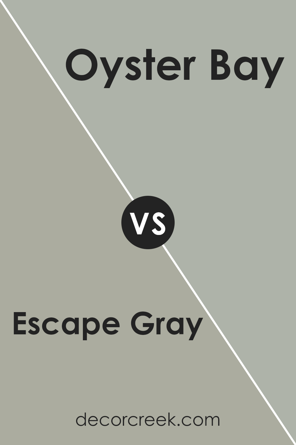
Escape Gray SW 6185 by Sherwin Williams vs Oyster Bay SW 6206 by Sherwin Williams
Escape Gray and Oyster Bay, both from Sherwin Williams, offer unique tones to any space. Escape Gray is a subtle, warm gray with a cozy feel. It’s versatile, fitting well in living rooms, bedrooms, or offices, offering a soft backdrop that complements various decor styles. On the other hand, Oyster Bay stands out with its green-blue hue, providing a serene and refreshing vibe. It’s perfect for spaces where you want to add a touch of calmness and is especially lovely in bathrooms or kitchens for a breezy, aquatic feel.
While Escape Gray leans towards a neutral, understated elegance, Oyster Bay brings a more colorful and lively ambiance. Deciding between them depends on the atmosphere you’re aiming for: warm and understated with Escape Gray, or cool and vibrant with Oyster Bay.
You can see recommended paint color below:
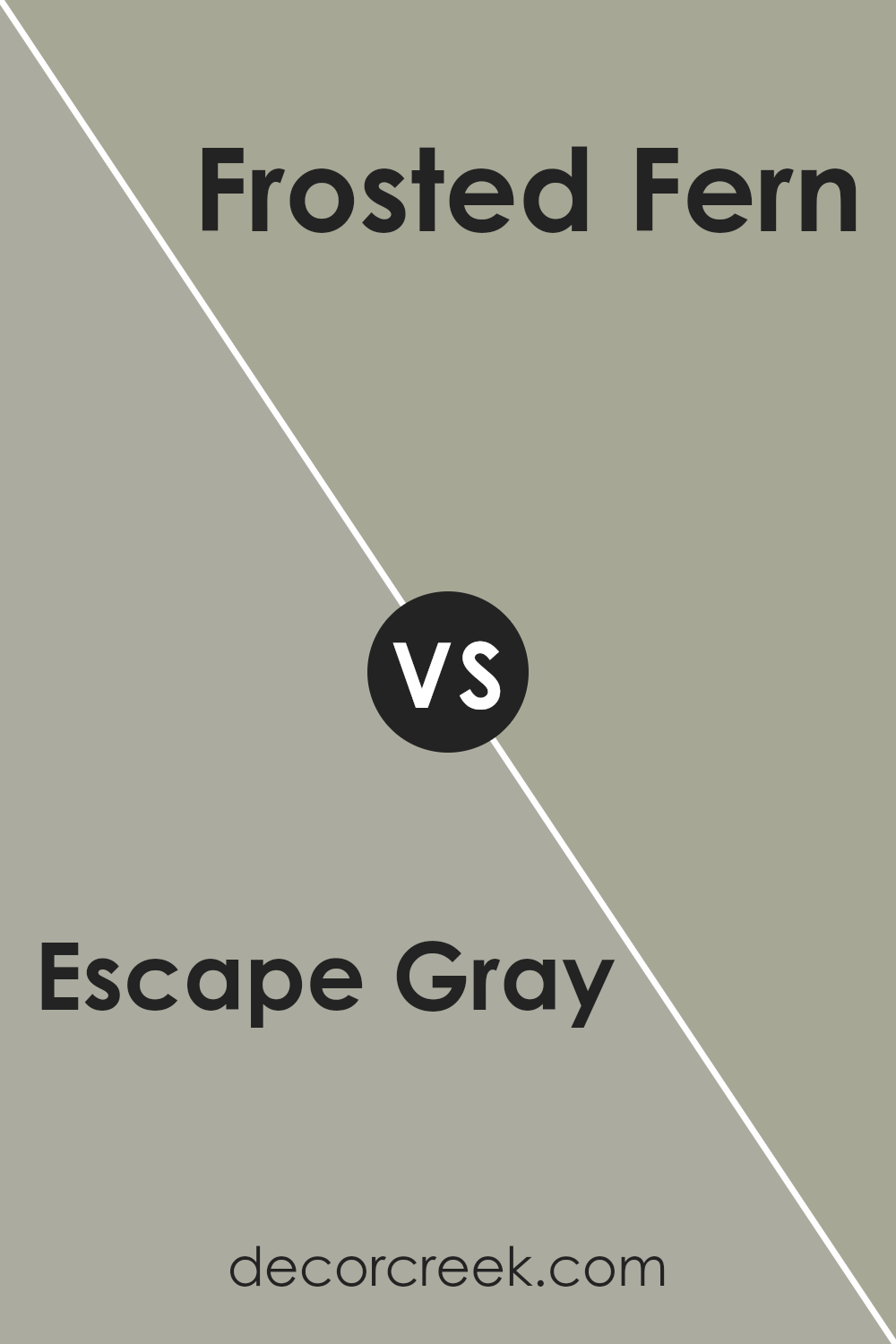
Escape Gray SW 6185 by Sherwin Williams vs Frosted Fern SW 9648 by Sherwin Williams
Escape Gray and Frosted Fern are two distinct colors by Sherwin Williams that offer unique vibes to any space. Escape Gray is a soft, subtle gray with warm undertones that make it versatile for any room, adding a cozy, serene feeling. It pairs well with both bright colors and other neutrals, providing a solid base for various decor styles.
On the other hand, Frosted Fern presents a fresh, gentle green that mimics the natural, soothing shade of ferns in a frosty morning light. This color brings a touch of nature indoors, creating a calming, refreshing atmosphere. It’s perfect for spaces where you want to add a hint of color without overwhelming the senses.
While Escape Gray leans towards a neutral backdrop, offering a quiet and peaceful gray canvas, Frosted Fern introduces a splash of life and vitality with its muted green, suggesting the presence of outdoor elements. Both colors work well in promoting relaxation and tranquility but in slightly different manners – one through a calm, neutral palette and the other through subtle, natural hues.
You can see recommended paint color below:
- SW 9648 Frosted Fern
Conclusion
Escape Gray by Sherwin Williams offers a balanced and versatile option for those looking to refresh their space with a touch of modern sophistication without overwhelming the senses. It’s a color that fits seamlessly into various decor styles, from minimalistic to more traditional settings, providing a backdrop that enhances furnishings and accents without competing for attention. Its ability to pair well with both warm and cool tones alike makes it a practical choice for any room, ensuring a cohesive look throughout your home.
Furthermore, Escape Gray’s subtle elegance provides a tranquil atmosphere, making it ideal for creating a serene and welcoming environment. Whether you’re looking to update your living room, bedroom, or any other area, this shade offers a timeless appeal that is both stylish and easy to live with. Its versatility and calming effect make it a smart pick for homeowners and designers aiming for a chic yet understated aesthetic.
Ever wished paint sampling was as easy as sticking a sticker? Guess what? Now it is! Discover Samplize's unique Peel & Stick samples.
Get paint samples

