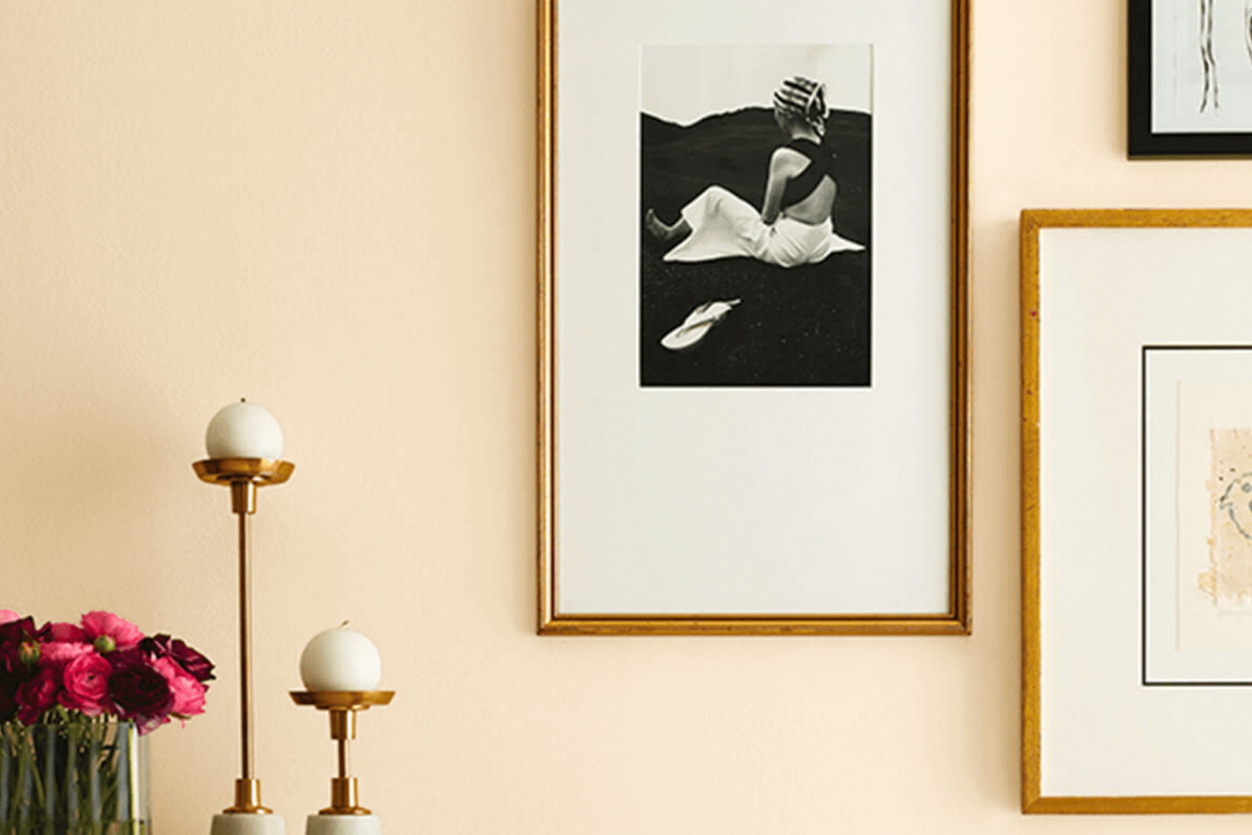
When I first learned about SW 7676 Paper Lantern by Sherwin Williams, I imagined a room filled with warmth and subtle sophistication. This soft, creamy hue brings a sense of calmness and comfort, like a gentle whisper in a busy world. As I considered how this color might fit into different rooms, I saw how it could effortlessly make a small room feel more open or add a cozy ambience to a larger room.
Its versatility is impressive, able to complement modern designs or enhance a traditional setting with equal grace. By playing around with various lighting options, I noticed how Paper Lantern took on different moods—sometimes glowing warmly in sunlight and at other times offering a more muted elegance in dimmer conditions.
I found its understated charm appealing, making it a flexible choice for walls or accents. Whether used in a bedroom, living room, or even a hallway, this shade brings a touch of elegance without feeling too strong.
It creates a backdrop that is both soothing and stylish, making it a wonderful choice for anyone looking to add a gentle but stylish touch to their home.
What Color Is Paper Lantern SW 7676 by Sherwin Williams?
Paper Lantern SW 7676 by Sherwin Williams is a warm and inviting shade that offers a creamy, soft yellow hue with subtle undertones. It’s like a gentle ray of sunshine, bringing a cozy glow to any room. This color can make rooms feel more welcoming and cheerful, especially in areas that might lack natural light.
Paper Lantern works particularly well in traditional and cottage-style interiors, where its warm tone complements classic furnishings and soft fabrics. It’s also a great choice for bohemian areas, where its warm glow can highlight eclectic mixes of textures and patterns. In modern or minimalist interiors, it can add a touch of warmth without being overpowering, balancing the clean lines with its gentle hue.
Materials that pair beautifully with this color include light woods like pine or oak, which enhance its natural appeal. Textures such as linen, wool, and cotton in off-whites and neutral tones can create a harmonious look. Accent with natural elements like wicker or rattan to emphasize its warmth. You can also pair it with deeper colors like rich browns, rusts, or even soft grays for a balanced look.
Paper Lantern is adaptable, bringing light and comfort to many interior styles.
Is Paper Lantern SW 7676 by Sherwin Williams Warm or Cool color?
Paper Lantern SW 7676 by Sherwin Williams is a warm, rich beige color that brings a sense of coziness and comfort to any room. This adaptable shade works well in various rooms, from living areas to bedrooms, creating a welcoming and inviting mood.
Its neutral undertones make it easy to pair with other colors, whether you prefer bold accents or subtle, earthy tones. In homes, Paper Lantern can make small areas feel bigger by reflecting light softly around the room, while also adding warmth to larger areas.
It acts as a perfect backdrop for different styles of decor, from modern to traditional. This color also works well with natural materials like wood and stone, enhancing their natural beauty. Whether you’re looking to freshen up a room or add a touch of warmth, Paper Lantern provides a classic look that’s both functional and stylish, making it a popular choice for many homeowners.
Undertones of Paper Lantern SW 7676 by Sherwin Williams
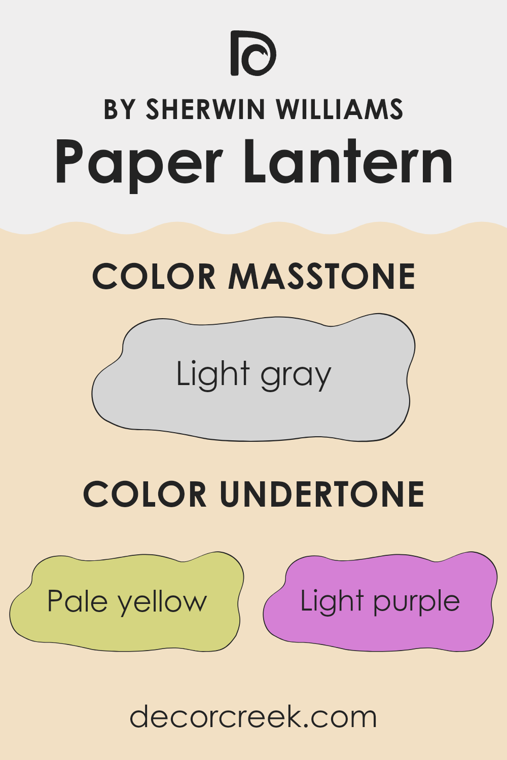
Paper Lantern, a color by Sherwin Williams, presents a subtle and complex blend of undertones that give it a unique and interesting appearance. The various undertones such as pale yellow, light purple, light blue, pale pink, mint, lilac, and grey influence how we perceive the main color.
In general, undertones play a significant role in how a color appears because they create a slight tint that affects our perception. For example, if a color has a yellow undertone, it might look warmer, whereas a blue undertone may make it appear cooler.
In the case of Paper Lantern, its array of undertones gives the color an adaptable feel. The pale yellow adds a hint of warmth, while the light purple and lilac suggest a bit of coolness. The light blue underscores a soothing element, and the mint gives it a refreshing touch. Meanwhile, pale pink softens the overall vibe, and grey keeps the color neutral.
When Paper Lantern is used on interior walls, these undertones can subtly change the mood of a room. Depending on the lighting and surrounding colors, the shade can highlight different aspects of a room, making it blend well with various design elements while creating an inviting mood. The balance of warm and cool undertones makes it an adaptable choice for many home settings.
What is the Masstone of the Paper Lantern SW 7676 by Sherwin Williams?
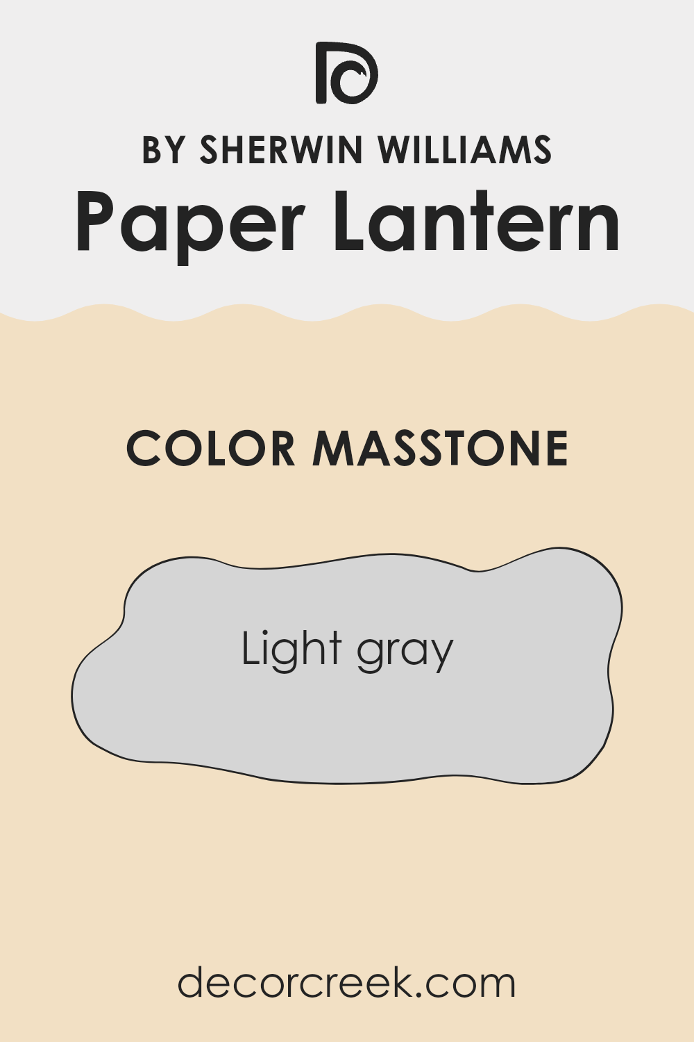
Paper Lantern SW 7676 by Sherwin Williams is a soft, light gray with a masstone of #D5D5D5. This neutral shade can have a gentle and calming effect in homes. Its muted tone makes it adaptable, allowing it to complement a variety of styles and color schemes.
In living rooms, this light gray can create an open and airy feel, making an anreas appear larger and more inviting. It pairs well with both darker and lighter colors, providing a balanced and harmonious look. In bedrooms, the subtle hue can contribute to a restful and peaceful environment, helping occupants unwind and relax.
Kitchens and bathrooms can benefit from its clean and fresh appearance, offering a modern touch without being too stark. Overall, the masstone of light gray in Paper Lantern SW 7676 provides a soft backdrop that supports various decor choices and helps tie different elements of a room together seamlessly.
How Does Lighting Affect Paper Lantern SW 7676 by Sherwin Williams?
Lighting plays a crucial role in how we perceive colors within a room. The color Paper Lantern (SW 7676) by Sherwin Williams, like any color, will appear differently depending on the type of light it is exposed to. Let’s examine how this color behaves in various lighting conditions and room orientations.
Under artificial light, the color of a wall can change based on whether the light is warm or cool. Warm bulbs, which emit a yellow-tinted light, can make Paper Lantern appear cozier and give it a slightly richer tone. Cool bulbs, on the other hand, might cause the color to look a bit colder and more muted.
Natural light changes throughout the day and can significantly impact how Paper Lantern looks in different rooms. In north-facing rooms, which tend to receive cooler and more consistent light throughout the day, Paper Lantern might seem a bit muted and calmer. The light is less direct, often bringing out cooler tones in the color. Paper Lantern could appear slightly grayer or softer in a north-facing room.
South-facing rooms, blessed with warm light for the most part of the day, enhance the warmth in Paper Lantern. Here, the color will likely appear more vibrant and warm, bringing out its underlying warm undertones. It might look more lively and inviting during midday.
East-facing rooms get bright morning light, which is often somewhat yellow and warm. Paper Lantern in this setting might start the day looking very bright and glowing, but as the day progresses and the natural light becomes less direct, it could appear softer.
In west-facing rooms, the light is cooler in the morning but becomes quite warm and golden in the afternoon and evening. This warm light later in the day can make Paper Lantern appear significantly warmer and more saturated, offering a cozy atmosphere in the afternoon and evening. Understanding how different types of light affect Paper Lantern can help you decide where it will work best in your home.
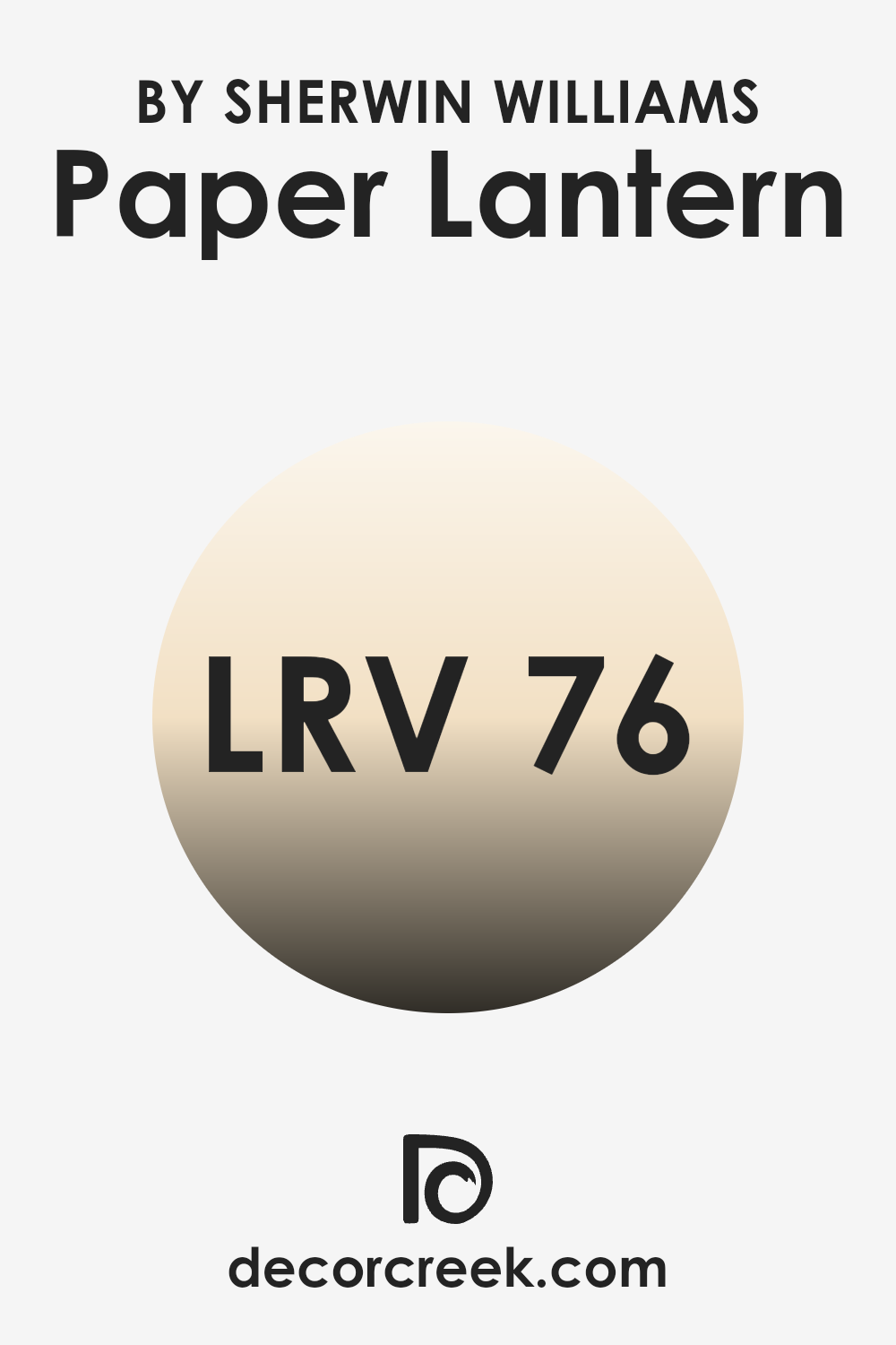
What is the LRV of Paper Lantern SW 7676 by Sherwin Williams?
Light Reflectance Value, or LRV, measures how much light a color reflects or absorbs. On a scale from 0 to 100, a lower LRV means the color absorbs more light and reflects less, appearing darker. Conversely, a higher LRV means the color reflects more light and absorbs less, making it look lighter. LRV is crucial in interior design because it can influence the feel of a room.
Lighter colors with higher LRVs can make a room feel more open and airy, while darker colors with lower LRVs can create a cozier, more intimate atmosphere. For the color Paper Lantern, which has an LRV of 75.928, it reflects a significant amount of light. This means it will contribute to making a room feel brighter and more spacious.
Because it reflects so much light, Paper Lantern would be a good choice for smaller rooms or rooms with limited natural light, as it can enhance brightness and make the room feel open.
It’s also adaptable enough to be used in various areas without overpowering other design elements, as its high LRV ensures it maintains a gentle and light aesthetic.
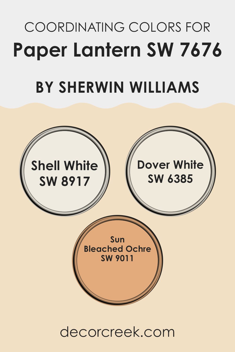
Coordinating Colors of Paper Lantern SW 7676 by Sherwin Williams
Coordinating colors are hues that complement each other, creating a pleasing and harmonious look when used together. They work by balancing one another through color tones and saturation, providing a unified aesthetic. When using coordinating colors, like those paired with Paper Lantern by Sherwin Williams, the goal is to achieve a cohesive and inviting environment.
Shell White (SW 8917) is a soft, airy color that offers a gentle warmth, making any room feel open and inviting. Dover White (SW 6385) is an adaptable, creamy white that provides a classic and clean backdrop, suitable for wood trims or as a neutral canvas for other colors.
Sun Bleached Ochre (SW 9011) adds a touch of sunny warmth, resembling the golden tones you might find in a sunlit field. Together, these colors harmonize beautifully, creating a calm and welcoming room that feels both fresh and grounded. Incorporating these shades into your home can enhance the beauty of an area, offering a balance of light and warmth while maintaining a sense of unity that ties the entire design together.
You can see recommended paint colors below:
- SW 8917 Shell White
- SW 6385 Dover White
- SW 9011 Sun Bleached Ochre
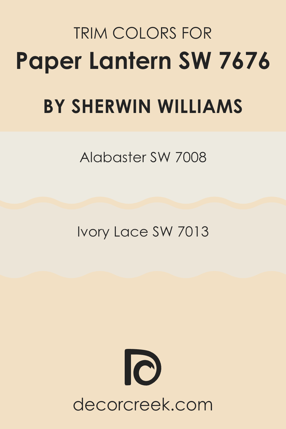
What are the Trim colors of Paper Lantern SW 7676 by Sherwin Williams?
Trim colors are the shades used around the edges of a room, such as baseboards, window frames, and door frames, to accentuate and complement the main wall color. They are important because they provide contrast, depth, and definition, helping the main wall color stand out and giving the room a polished look.
Using SW 7008 – Alabaster and SW 7013 – Ivory Lace as trim colors alongside Paper Lantern enhances the warmth and inviting atmosphere of the area. These soft, neutral trim colors work well with the gentle, creamy undertones of Paper Lantern, creating a cohesive and visually pleasing environment.
SW 7008 – Alabaster is a warm white that brings a sense of freshness and light to a room. It has a classic quality that pairs nicely with almost any color, making it an adaptable choice. SW 7013 – Ivory Lace is a soft, creamy white with a hint of warmth, lending a cozy and comfortable feel to a room.
Both of these trim colors complement Paper Lantern by providing subtle contrast and adding to the overall harmony of the room. Using these shades for the trim helps to highlight architectural details and creates a finished, well-designed look in any room.
You can see recommended paint colors below:
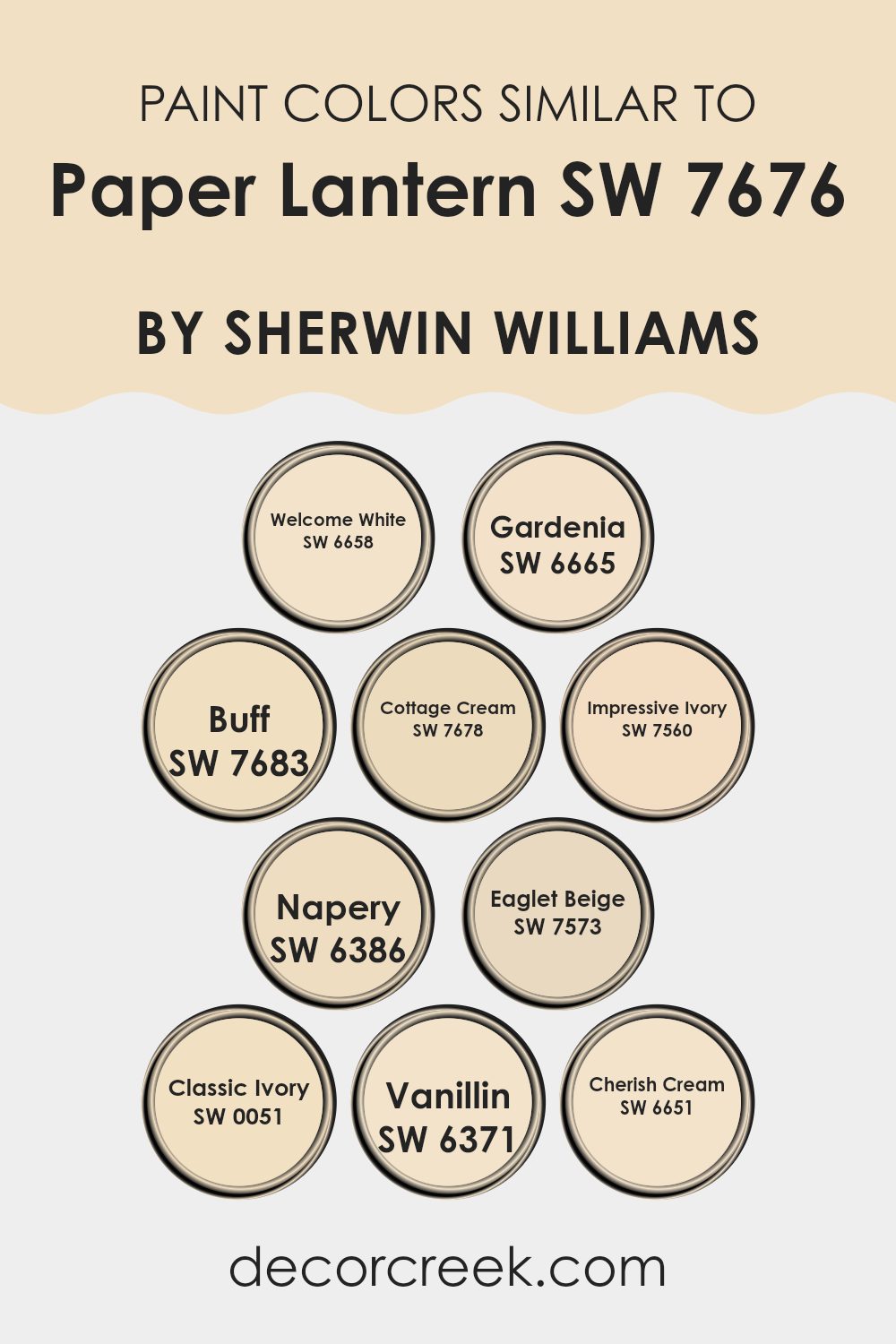
Colors Similar to Paper Lantern SW 7676 by Sherwin Williams
Similar colors are important because they create harmonious and cohesive rooms, making a room feel comfortable and unified. When colors share similar tones and undertones, like those related to Paper Lantern by Sherwin Williams, they blend seamlessly, enhancing the overall design without clashing.
Each color complements the others, bringing out different nuances that can warm up or brighten a room. For example, Welcome White offers a soft, clean backdrop that pairs well with the subtle warmth of Gardenia, which has a delicate, creamy hue. Buff introduces a muted beige, while Cottage Cream provides a gentle, sunlit feel for more inviting areas.
Impressive Ivory brings in a touch of elegance with its rich depth, while Napery offers a warm, yellow undertone that adds a cozy feel. Eaglet Beige gives a neutral, earthy vibe, and Classic Ivory enhances traditional settings with its creamy quality. Vanillin provides a sweet and gentle tone that adds to the warmth of any room, while Cherish Cream is soft with a hint of brightness, making for a gentle transition between shades.
These similar colors work together to create a balanced environment that is both pleasing to the eye and comforting, perfect for living areas, bedrooms, or any room needing a touch of warmth and cohesion.
You can see recommended paint colors below:
- SW 6658 Welcome White
- SW 6665 Gardenia
- SW 7683 Buff
- SW 7678 Cottage Cream
- SW 7560 Impressive Ivory
- SW 6386 Napery
- SW 7573 Eaglet Beige
- SW 0051 Classic Ivory
- SW 6371 Vanillin
- SW 6651 Cherish Cream
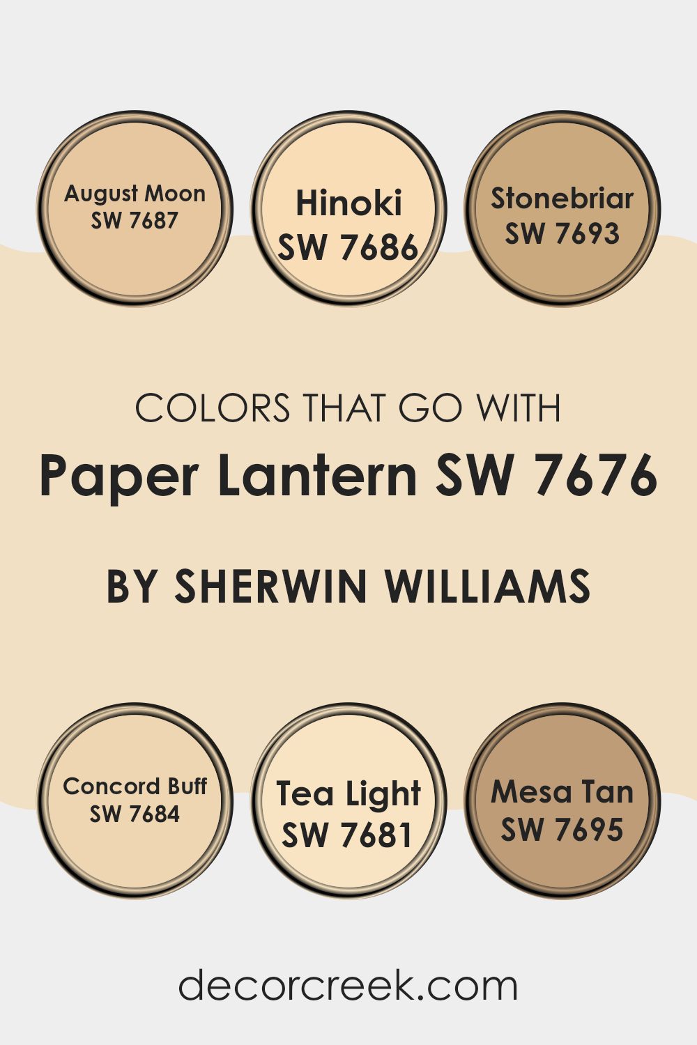
Colors that Go With Paper Lantern SW 7676 by Sherwin Williams
Colors that go with Paper Lantern SW 7676 by Sherwin Williams are important because they create a harmonious and balanced look in any room. This particular shade is a warm and inviting color, and pairing it with complementary hues can enhance the overall aesthetic.
For instance, SW 7687 – August Moon is a soft, muted yellow that brings a gentle brightness without feeling too strong. SW 7686 – Hinoki, on the other hand, offers a warm and earthy tone reminiscent of natural wood, adding depth and richness to the room. SW 7693 – Stonebriar provides a subtle, neutral backdrop with its sandy beige hue, perfect for a calming effect.
SW 7684 – Concord Buff is a golden beige that infuses warmth and elegance into the color palette. SW 7681 – Tea Light is a delicate off-white with a hint of warmth, ideal for adding brightness and openness. Lastly, SW 7695 – Mesa Tan gives a cozy, terracotta feel with its warm, reddish undertones. Together, these colors create a cohesive and inviting mood, making any room feel well-thought-out and welcoming.
You can see recommended paint colors below:
- SW 7687 August Moon
- SW 7686 Hinoki
- SW 7693 Stonebriar
- SW 7684 Concord Buff
- SW 7681 Tea Light
- SW 7695 Mesa Tan
How to Use Paper Lantern SW 7676 by Sherwin Williams In Your Home?
Paper Lantern SW 7676 by Sherwin Williams is a warm, neutral color that can bring a cozy feeling to any room. It’s a soft beige with subtle undertones that create a welcoming atmosphere. This adaptable color can work in various rooms, making it a good option for both living rooms and bedrooms.
If you’re looking to update your living room, consider using Paper Lantern on the walls to set a calm, inviting background. Pair it with cream or off-white furniture to maintain a light and airy feel. Add some colorful cushions or artwork for a bit of contrast and personality.
In the bedroom, Paper Lantern can create a comforting environment, perfect for relaxing. Use it alongside wood furniture and soft textiles for a balanced, natural look. It’s also an ideal color for open areas, as it harmonizes well with other shades, making your home feel cohesive and connected.
Paper Lantern SW 7676 by Sherwin Williams vs Classic Ivory SW 0051 by Sherwin Williams
Paper Lantern SW 7676 by Sherwin Williams is an adaptable, soft color that combines warm gray with a hint of beige. It’s a subtle yet cozy choice that can create an inviting mood in any room. Its neutral tone makes it suitable for various design styles, from modern to traditional.
On the other hand, Classic Ivory SW 0051 by Sherwin Williams is a warm off-white with a slight yellow undertone. It adds brightness and warmth to a room without being too overpowering. Classic Ivory is perfect for rooms where you want a light and airy feel while maintaining a sense of warmth.
When comparing the two, Paper Lantern offers more depth and warmth with its gray-beige mix, making it ideal for more intimate settings. Classic Ivory, however, is excellent for creating a brighter and more open feeling. Both colors work well as base shades, but Paper Lantern leans towards a cozier vibe while Classic Ivory is more uplifting and cheerful.
You can see recommended paint color below:
- SW 0051 Classic Ivory
Paper Lantern SW 7676 by Sherwin Williams vs Buff SW 7683 by Sherwin Williams
Paper Lantern SW 7676 is a soft, warm color that gives a cozy and inviting feel to a room. It’s a light, creamy tone that can make a room feel airy and bright. It works well in living rooms or bedrooms where a gentle touch is desired.
On the other hand, Buff SW 7683 is a richer, slightly darker shade. It carries a bit more depth and has earthy undertones, giving it more of a grounded presence. Buff can bring warmth to a room but with a bit more substance compared to the lightness of Paper Lantern. This color is great for areas where you want a bit more contrast without being overpowering.
When comparing the two, Paper Lantern is more about light and openness, while Buff offers warmth with a hint of depth. Both can create a cozy environment but with different levels of intensity and mood.
You can see recommended paint color below:
- SW 7683 Buff
Paper Lantern SW 7676 by Sherwin Williams vs Eaglet Beige SW 7573 by Sherwin Williams
Paper Lantern SW 7676 and Eaglet Beige SW 7573 are both beautiful neutral colors from Sherwin Williams, but they bring different vibes to a room. Paper Lantern is a warm, inviting hue with a slightly peachy tone.
It adds a cozy, gentle glow to rooms, making them feel comfortable and welcoming. On the other hand, Eaglet Beige is a soft, muted beige that offers a more subdued, calming presence. It serves as an excellent backdrop for various decor styles, providing a sense of calm without overpowering other elements.
While both colors are adaptable and can be used in different settings, Paper Lantern creates a warmer atmosphere, whereas Eaglet Beige maintains a more reserved, classic feel. Together, these colors can complement each other well, or each can stand alone to set the mood you want in your room.
You can see recommended paint color below:
Paper Lantern SW 7676 by Sherwin Williams vs Cherish Cream SW 6651 by Sherwin Williams
Paper Lantern SW 7676 and Cherish Cream SW 6651 are two colors from Sherwin Williams that offer different vibes. Paper Lantern is a warm, subtle beige with slight hints of gray, giving it a soft, neutral look. It’s adaptable and blends well with a variety of décor styles, making it a practical choice for living areas where coziness is desired. It pairs well with whites and deeper neutrals, creating a cozy environment.
Cherish Cream, on the other hand, is a light, creamy yellow that adds warmth and brightness to a room. It’s a welcoming color that reflects more light, perfect for areas where you want a cheerful ambiance. It can make a room feel more open and lively, especially when paired with soft whites or other pastel shades.
While Paper Lantern provides a calm and muted backdrop, Cherish Cream offers a sunny and warm atmosphere. Each has its own charm and is suitable for different moods and areas.
You can see recommended paint color below:
- SW 6651 Cherish Cream
Paper Lantern SW 7676 by Sherwin Williams vs Cottage Cream SW 7678 by Sherwin Williams
Paper Lantern is a warm and inviting hue, ideal for creating cozy rooms. Its gentle yellowness adds a soft glow to any area. This color works well in living areas or bedrooms where a comforting atmosphere is desired. On the other hand, Cottage Cream is a lighter shade with a hint of warmth, giving it a subtle brightness. It can make areas feel open and airy.
Both colors share warm undertones, making them suitable for creating a welcoming environment. Paper Lantern, with its deeper hue, offers more richness and depth, making it perfect for an accent wall or to add warmth to larger areas.
Cottage Cream, being lighter, is excellent for smaller rooms or to complement natural light, creating a sense of spaciousness. Pairing these colors can offer a balanced and harmonious feel, with Paper Lantern adding coziness and Cottage Cream providing lightness and cheer.
You can see recommended paint color below:
- SW 7678 Cottage Cream
Paper Lantern SW 7676 by Sherwin Williams vs Welcome White SW 6658 by Sherwin Williams
Paper Lantern SW 7676 by Sherwin Williams is a soft, warm beige that creates a cozy and inviting atmosphere. It has a slightly yellow undertone, which brings a touch of warmth and comfort to any room. This color is perfect for areas where you want to feel relaxed and at ease, making it ideal for living rooms and bedrooms.
In contrast, Welcome White SW 6658 is a much lighter color with a cooler tone. It’s a crisp white with subtle hints of gray, giving it a modern and clean look. This color is often used to make rooms feel more open and airy, reflecting light beautifully. Welcome White is perfect for kitchens and bathrooms, or any area where you want a fresh and bright feel.
Both colors have distinct personalities and can be used to achieve different effects within a home, depending on the mood and atmosphere you wish to create.
You can see recommended paint color below:
- SW 6658 Welcome White
Paper Lantern SW 7676 by Sherwin Williams vs Vanillin SW 6371 by Sherwin Williams
Paper Lantern SW 7676 by Sherwin Williams is a warm, neutral beige with subtle yellow undertones, creating a cozy and inviting mood. It’s an adaptable color that works well in living rooms, dining areas, or any rooms where a comfortable ambiance is desired. Its neutral nature allows it to pair easily with various other shades and decorations.
On the other hand, Vanillin SW 6371 is a light, creamy color with a soft yellow tint. This paint color is perfect for brightening up a room and can make areas feel more open and airy. It’s ideal for kitchens, bathrooms, or any area where a light, fresh feel is appreciated.
While both colors have warm undertones, Paper Lantern leans slightly more towards beige, giving a more grounded feel. In contrast, Vanillin offers a touch of freshness thanks to its creamier, lighter shade. Both are suitable for creating a warm and friendly environment.
You can see recommended paint color below:
- SW 6371 Vanillin
Paper Lantern SW 7676 by Sherwin Williams vs Napery SW 6386 by Sherwin Williams
Paper Lantern SW 7676 and Napery SW 6386 by Sherwin Williams are both gentle, warm colors that create a friendly and inviting atmosphere. Paper Lantern is a soft, muted shade of white with warm undertones. It adds a sense of calmness and works well with natural light, making rooms feel airy and open. It’s an excellent choice for those who enjoy a relaxed environment in their home.
On the other hand, Napery is a warm, creamy yellow that brings a touch of sunlight into any room. It’s slightly more vibrant than Paper Lantern, offering a cheerful and cozy feel. This color is ideal for those looking to add warmth and light to a room without being too overpowering.
When compared, Paper Lantern maintains a more neutral palette, while Napery offers a little more color and vibrancy. Both colors complement each other and can be used together for a cohesive look in home decor.
You can see recommended paint color below:
- SW 6386 Napery
Paper Lantern SW 7676 by Sherwin Williams vs Impressive Ivory SW 7560 by Sherwin Williams
Paper Lantern SW 7676 is a soft, warm beige with yellow undertones, creating a cozy and inviting feel. This color is adaptable and works well in various settings, bringing warmth and comfort to a room. It’s a great choice for living rooms, bedrooms, or any area where you want a welcoming atmosphere.
Impressive Ivory SW 7560, on the other hand, is a light ivory shade with subtle hints of cream. This color is elegant and classic, offering a neutral backdrop that can brighten a room without being stark. It’s perfect for areas where you want a light and airy feel.
While both colors are warm and inviting, Paper Lantern leans more towards beige with a distinctly warmer tint, whereas Impressive Ivory is creamier and slightly cooler. Both colors can complement various decor styles, but their different undertones give them unique personalities.
You can see recommended paint color below:
- SW 7560 Impressive Ivory
Paper Lantern SW 7676 by Sherwin Williams vs Gardenia SW 6665 by Sherwin Williams
Paper Lantern SW 7676 is a soft, muted beige with a warm undertone. It creates a cozy and inviting mood, perfect for living rooms or bedrooms where you want a comfortable and relaxed feel. It pairs well with both darker and lighter accents, making it adaptable for different styles.
On the other hand, Gardenia SW 6665 is a brighter, creamy yellow. It is energetic and cheerful, bringing a touch of sunshine into any room. This color is great for kitchens or bathrooms, where a fresh and lively environment is desired. It works well with natural woods and clean whites.
While Paper Lantern offers a more subtle and calming vibe, Gardenia adds brightness and warmth. The main difference lies in their intensity; Paper Lantern is understated, whereas Gardenia is vibrant. Both colors add a unique charm to interiors, each suited to different moods and preferences.
You can see recommended paint color below:
- SW 6665 Gardenia
After thinking about SW 7676 Paper Lantern by Sherwin Williams, I’ve realized how this color can really brighten up a room. This pale yellow shade reminds me of a warm hug from the sun. It’s cheerful and makes me feel happy just by looking at it.
Imagine painting your bedroom or living room with this color. It would feel like a sunny day every time you walk in. It’s not too bright, but just enough to make everything seem more cheerful. I think it would work great in a kitchen too, making mornings feel brighter and evenings more cozy.
This shade is also friendly with other colors. You could match it with blues, whites, or even greens, and it would still feel like everything belongs together. It’s like having a piece of sunshine inside your home, making your rooms look welcoming and warm.
In the end, SW 7676 Paper Lantern is a great color choice for anyone wanting to bring a bit of sunshine indoors. It’s perfect for those who want to feel a burst of happiness as soon as they walk into the room. I think it’s a simple yet wonderful way to make any place feel special.
Ever wished paint sampling was as easy as sticking a sticker? Guess what? Now it is! Discover Samplize's unique Peel & Stick samples.
Get paint samples

