When you’re on the hunt for that perfect neutral paint color, SW 7501, also known as Threshold Taupe by Sherwin Williams, is a choice you might want to consider.
This shade strikes a beautiful balance between warmth and sophistication, making it a fantastic pick for anyone looking to add a touch of elegance to their space without overwhelming it with too much color.
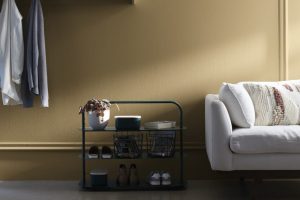
Threshold Taupe is versatile. It can transform any room into a cozy, inviting space, whether it’s your living room, bedroom, or even your kitchen.
Its unique blend of taupe undertones brings a calm, soothing feel to interiors, perfectly complementing a wide range of decor styles from modern to traditional.
The beauty of Threshold Taupe lies in its adaptability. It pairs seamlessly with a variety of colors, from soft whites to bold blacks, allowing for endless decorating possibilities.
Whether you’re aiming for a minimalist look or a more layered, textured aesthetic, SW 7501 can serve as the ideal backdrop.
Choosing the right paint can be a game-changer for your home, and Threshold Taupe by Sherwin Williams offers just the right mix of warmth and style.
It’s a color that not only stands the test of time but also elevates the overall feel of your home with its understated elegance.

What Color Is Threshold Taupe SW 7501 by Sherwin Williams?
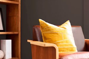
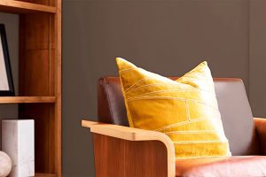
Threshold Taupe by Sherwin Williams is a warm, inviting color that strikes a perfect balance between beige and gray.
This versatile hue blends effortlessly with a range of design aesthetics, whether you’re looking to create a cozy, minimalist space or aiming for something more sophisticated and timeless.
Its subtle richness adds depth to rooms without overwhelming them, making it an excellent choice for walls, trim, or accent areas.
This color works wonders in interior styles such as modern farmhouse, Scandinavian, and traditional, thanks to its ability to act as a neutral backdrop.
It pairs exceptionally well with a variety of materials and textures, enhancing the warmth of natural wood, the rustic charm of distressed leather, and the sleek appeal of metallic finishes like brass or copper.
Fabrics in both light and dark tones also complement Threshold Taupe, allowing for a layered, cohesive look.
For a harmonious space, consider combining Threshold Taupe with soft whites or pale blues for a calm, serene environment.
Alternatively, pairing it with rich jewel tones can create a dynamic and inviting space. Its versatility makes it a go-to choice for those wanting to achieve an elegant, welcoming interior without the fuss.
Ever wished paint sampling was as easy as sticking a sticker? Guess what? Now it is! Discover Samplize's unique Peel & Stick samples.
Get paint samples

Is Threshold Taupe SW 7501 by Sherwin Williams Warm or Cool color?
Threshold Taupe by Sherwin Williams is a versatile paint color that adds warmth and sophistication to any space. This hue strikes the perfect balance between gray and brown, giving it a rich, earthy quality that is both inviting and grounding.
It’s a fantastic choice for those looking to create a cozy, yet elegant atmosphere in their home.
One of the great things about Threshold Taupe is its ability to blend seamlessly with a wide range of decor styles and colors, making it a fantastic neutral base or complementary accent.
In homes, Threshold Taupe shines by bringing a sense of calm and collectedness to rooms. It works exceptionally well in living areas, bedrooms, and even kitchens, where its subtle depth can enhance the room’s features without overpowering them.
This color has a unique way of adjusting to different lighting conditions, appearing warmer or cooler depending on the natural light available, which means it can fit beautifully into spaces with varying light throughout the day.
By choosing Threshold Taupe, homeowners can create a timeless look that feels both sophisticated and welcoming.
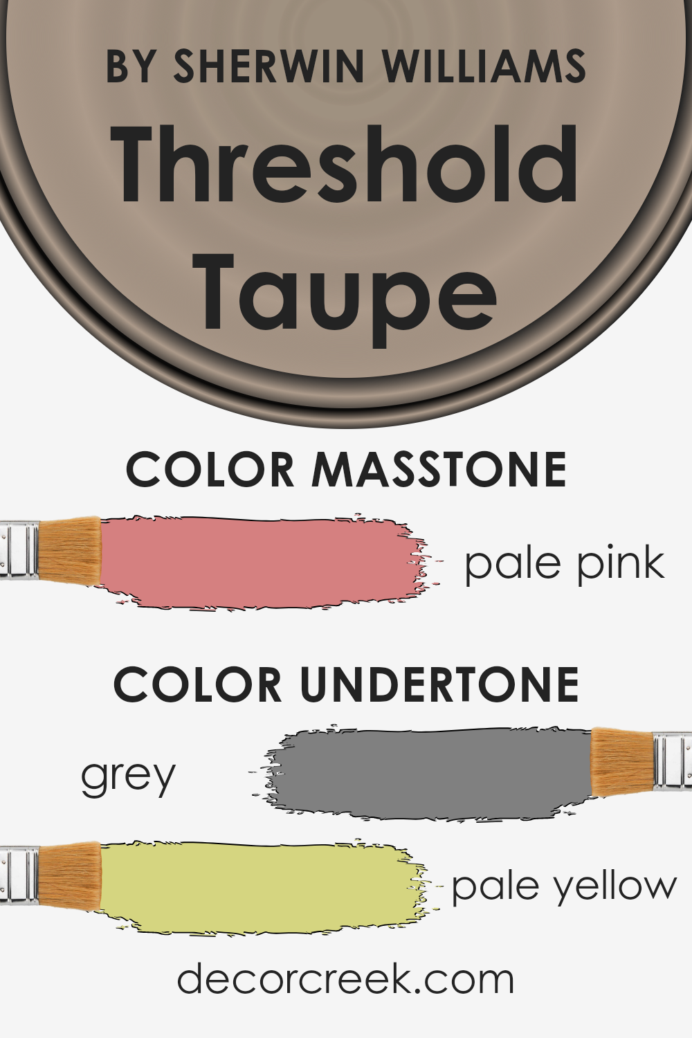
Undertones of Threshold Taupe SW 7501 by Sherwin Williams
Threshold Taupe by Sherwin Williams is a unique color that carries subtle undertones of grey and pale yellow. These undertones play a significant role in how we perceive the color.
Generally, undertones can influence the warmth or coolness of a color, affecting the mood and atmosphere of a room. The grey undertone in Threshold Taupe adds a sense of calm and neutrality, making it a versatile choice for interiors.
It can serve as a peaceful backdrop in various settings, from modern to traditional.
On the other hand, the pale yellow undertone introduces a hint of warmth, ensuring the color doesn’t feel too cold or impersonal. This slight warmth makes the space more inviting and comfortable.
When applied to interior walls, the impact of these undertones becomes even more pronounced.
Depending on the lighting, the color can shift in appearance – looking more like its grey side in cooler, natural light, or showing off its warmer, pale yellow side under warmer artificial lighting.
This dynamic characteristic of Threshold Taupe means it can complement a wide range of decor styles and color schemes.
Whether you’re aiming for a cozy, welcoming vibe or a sleek, contemporary look, the nuanced undertones of Threshold Taupe help achieve the desired atmosphere.
The color’s ability to blend or stand out subtly can significantly influence the overall aesthetic and feel of a room.
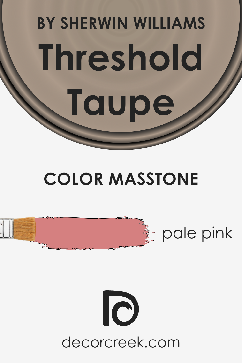
What is the Masstone of the Threshold Taupe SW 7501 by Sherwin Williams?
Threshold Taupe SW 7501 by Sherwin Williams has a masstone that might surprise you – it’s a soft, pale pink, much like the color you’d find in a gentle sunrise or a blooming cherry blossom.
This unique undertone makes it a versatile color for homes, providing a warm and welcoming feel without being too bold or overpowering.
The pale pink nature of this color means it plays well in spaces looking for a touch of warmth and elegance.
It’s subtle enough to act as a neutral backdrop, allowing furniture and decor to stand out, yet has just enough color to add interest and depth to a room.
Because of its muted qualities, it pairs beautifully with a wide range of colors, from soft creams and whites for a calm, serene look, to darker hues and bold accents for more contrast and drama.
In essence, the masstone of Threshold Taupe fosters a flexible and inviting atmosphere in any home, working beautifully in living rooms, bedrooms, or even bathrooms, where it can enhance lighting and make spaces appear larger and more open.
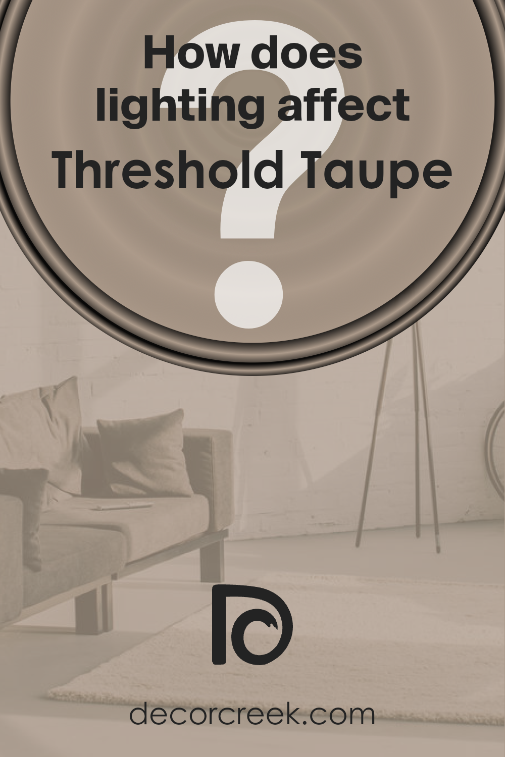
How Does Lighting Affect Threshold Taupe SW 7501 by Sherwin Williams?
Lighting plays a crucial role in how we perceive colors. It can make a color appear vibrant or dull, warm or cool. This interaction between light and color can dramatically affect the ambiance and mood of a room.
Let’s explore how the color Threshold Taupe, a neutral and versatile shade by Sherwin Williams, behaves under different lighting conditions.
In artificial light, the warmth or coolness of the bulbs can influence how Threshold Taupe looks. Warm lighting tends to bring out the cozy, inviting aspects of this color, making it appear more beige and welcoming.
On the other hand, cool artificial light can highlight the gray undertones in Threshold Taupe, giving it a more modern and crisp feel.
The story changes with natural light, which varies throughout the day and depends on the direction windows face.
In north-faced rooms, which receive less direct sunlight, Threshold Taupe may appear slightly cooler and more muted, emphasizing its sophisticated gray qualities. This subtle ambiance can make spaces feel serene and elegant.
In south-faced rooms, bathed in abundant sunlight, Threshold Taupe warms up significantly. The natural, bright light enhances the beige undertones, creating a warm and inviting space.
This setting makes the color feel more lively and perfect for social areas like the living room.
East-faced rooms see bright morning light, which can make Threshold Taupe look very warm and welcoming at the start of the day, gradually moving towards a softer, neutral appearance as the day progresses.
This dynamic change makes it an excellent choice for bedrooms, where the color adapts from a gentle morning wake-up to a calm, relaxing ambiance in the evening.
West-faced rooms, filled with the golden glow of the setting sun, can transform Threshold Taupe into a rich, cozy hue in the afternoons and evenings.
This warm, enveloping quality makes such rooms ideal for relaxation and unwinding.
In conclusion, the effect of lighting on colors, specifically on Threshold Taupe, underscores the importance of considering light sources when choosing paint colors for your space.
Whether lit by the sun or artificial lights, the surrounding environment plays a significant role in bringing out the true character of colors.
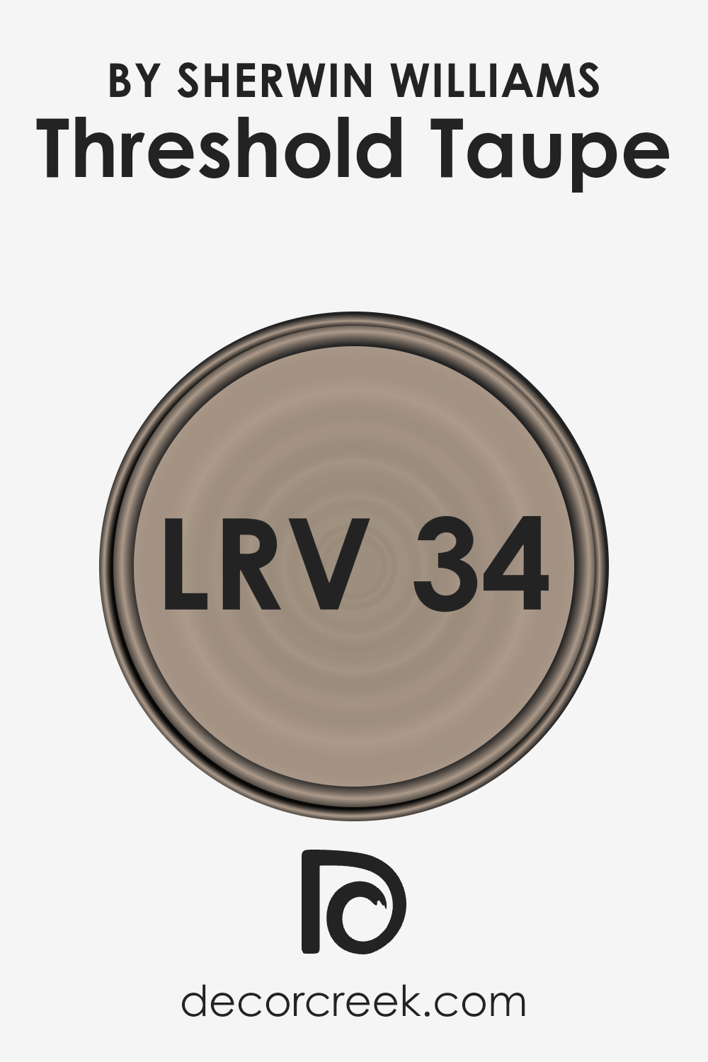
What is the LRV of Threshold Taupe SW 7501 by Sherwin Williams?
LRV stands for Light Reflectance Value, which is a measurement used to describe the percentage of light a paint color reflects back into the room.
This value ranges from 0 to 100, with 0 absorbing all light (think of a pitch-black room) and 100 reflecting all light (imagine a bright, white space).
The LRV of a paint color can greatly influence how light or dark a color appears once it’s on your walls and will affect the atmosphere of a room.
Higher LRV colors make a room feel brighter and more open, as they reflect more light, while lower LRV colors create a cozier and more intimate feeling since they absorb more light.
For the color with an LRV of 33.617, it falls into the lower end of the mid-range LRV spectrum, meaning it does not reflect a lot of light but isn’t the darkest on the scale either.
In the case of a color like this, it can add depth and a sense of warmth to a room without making it feel too closed in. However, because it reflects a moderate amount of light, the appearance of this color can significantly change depending on the lighting in the room.
With natural light, the color may look softer and more vibrant, while in rooms with less natural light, it may appear deeper and more muted.
This specific LRV value suggests the color can serve well in spaces where a balance between coziness and spaciousness is desired, adapting flexibly to varying lighting conditions without overwhelming the space.
LRV – what does it mean? Read This Before Finding Your Perfect Paint Color
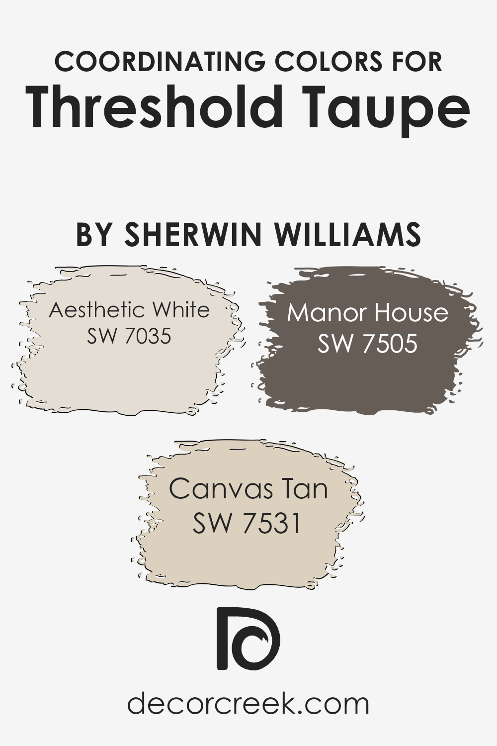
Coordinating Colors of Threshold Taupe SW 7501 by Sherwin Williams
Coordinating colors are shades that complement each other well when used together, either in fashion, interior design, or art, creating a visually appealing and harmonious look.
The idea behind coordinating colors is to select hues that share similar undertones or are positioned in a way on the color wheel that they enhance each other’s beauty without clashing.
For instance, when working with a base color such as Threshold Taupe by Sherwin Williams, you’d pick colors that subtly pair with its warm, inviting nature to achieve a balanced and cohesive look.
Among the colors that go beautifully with Threshold Taupe are Aesthetic White, Canvas Tan, and Manor House. Aesthetic White is a soft, off-white hue that brings a light and airy feel to the palette, offering a subtle contrast that highlights the depth of taupe without overwhelming it.
On the other hand, Canvas Tan is a mid-tone beige that echoes the earthiness of Threshold Taupe, providing a seamless transition between lighter and darker shades to create a sense of continuity.
Lastly, Manor House stands out as a rich, deeper shade that adds a touch of elegance and drama, grounding the scheme with its solid presence while still harmoniously blending with the other colors.
By integrating these coordinating colors, one can craft spaces that are cohesive, stylish, and inviting.
You can see recommended paint colors below:
- SW 7035 Aesthetic White
- SW 7531 Canvas Tan
- SW 7505 Manor House
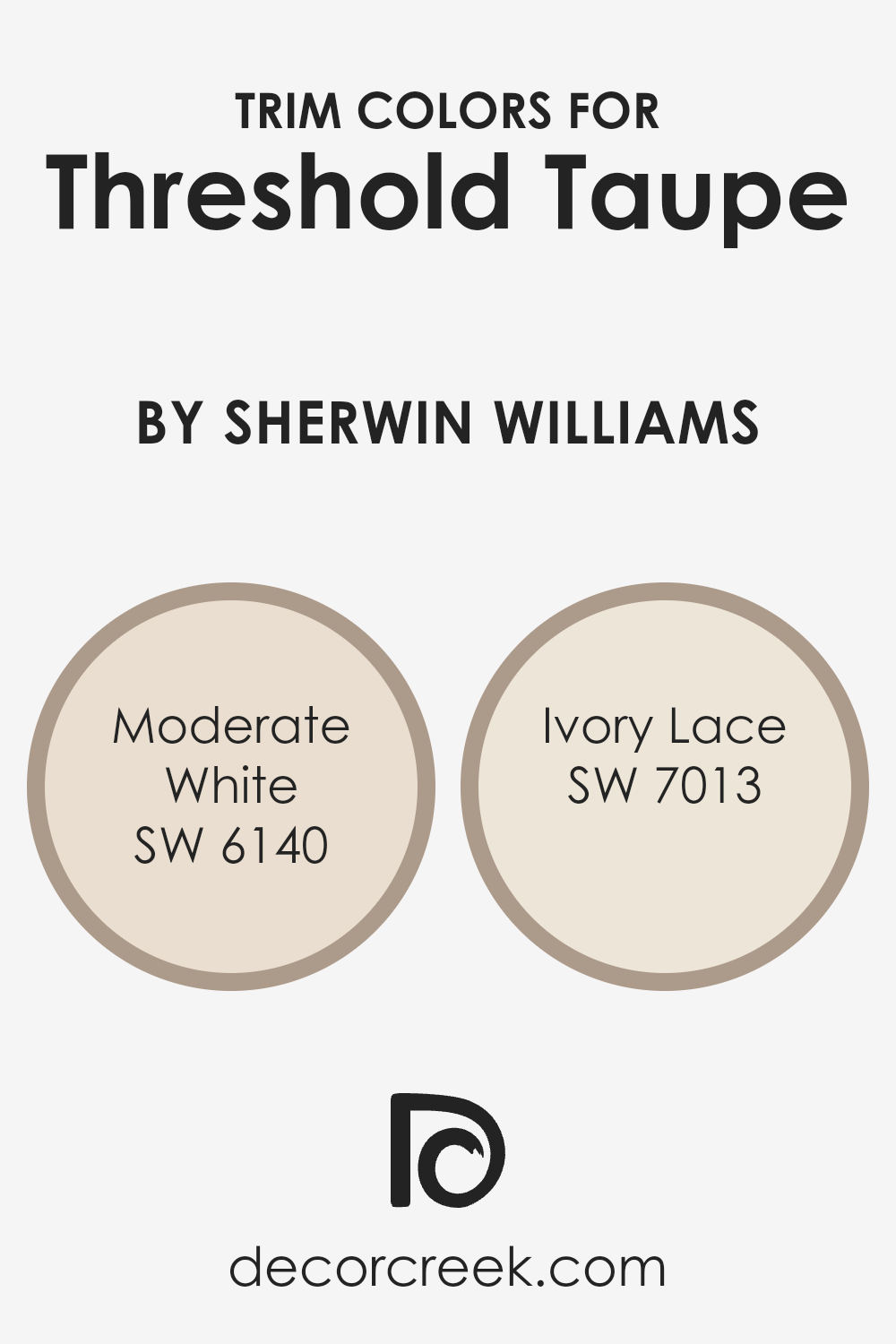
What are the Trim colors of Threshold Taupe SW 7501 by Sherwin Williams?
Trim colors are essentially the colors used on the borders and edges of walls, such as baseboards, moldings, window frames, and door frames, that highlight or complement the primary wall color.
Choosing the right trim color is crucial because it frames the space, defining the architecture and enhancing the overall aesthetic appeal.
For a warm, inviting neutral like Threshold Taupe by Sherwin Williams, selecting a harmonious trim color can subtly enhance its rich, cozy undertones, creating a more cohesive and polished look throughout the room.
The trim color can either softly blend with the primary color for a soothing effect or contrast slightly to outline and accentuate the architectural features of a space, giving it a more defined appearance.
Moderate White SW 6140 is a soft, warm white with subtle beige undertones, lending a creamy and comforting complement to Threshold Taupe.
This trim color offers a gentle transition from the rich depth of Threshold Taupe, providing a sense of harmony and balance without stark contrasts. It’s perfect for creating a seamless look in spaces aiming for a soft, muted aesthetic.
On the other hand, Ivory Lace SW 7013 is a slightly brighter, more defined white with a hint of yellow undertones.
This choice brightens the room’s edges, offering a crisp but warm contrast against Threshold Taupe, perfect for enhancing natural light and giving the space a more distinct, yet inviting boundary.
Both colors enrich the Taupe’s warm tones, ensuring the room feels cozy and well-coordinated.
You can see recommended paint colors below:
- SW 6140 Moderate White
- SW 7013 Ivory Lace
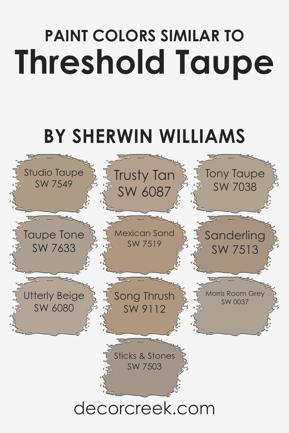
Colors Similar to Threshold Taupe SW 7501 by Sherwin Williams
When decorating a home, choosing the right colors can significantly enhance the overall look and feel of a space. One popular choice for creating a warm, inviting atmosphere is Threshold Taupe by Sherwin Williams.
The reason similar colors to Threshold Taupe, such as Studio Taupe, Taupe Tone, Utterly Beige, Sticks & Stones, Trusty Tan, Mexican Sand, Song Thrush, Tony Taupe, Sanderling, and Morris Room Grey, are important is because they offer subtle variations that can complement different aspects of a room.
These colors work together harmoniously, providing options for coordinating walls, trim, and accent features without clashing, thus maintaining a cohesive aesthetic throughout the space.
Studio Taupe is a bit deeper, bringing richness to rooms, while Taupe Tone softens spaces with its muted warmth. Utterly Beige is a lighter hue that reflects more light, creating a sense of spaciousness.
Sticks & Stones adds a hint of earthiness, grounding the environment. Trusty Tan offers a reliable medium tone, perfect for balancing darker and lighter colors.
Mexican Sand introduces a sun-kissed warmth, ideal for cozy areas. Song Thrush has an understated elegance with its soft brown touch.
Tony Taupe is a harmonious blend that works well in areas that command neutrality. Sanderling is slightly lighter, providing a fresh perspective on traditional taupe.
Lastly, Morris Room Grey is a cooler option that can offer a modern twist to the classic taupe palette. Together, these colors provide a versatile palette to achieve the desired ambiance in any room.
You can see recommended paint colors below:
- SW 7549 Studio Taupe
- SW 7633 Taupe Tone
- SW 6080 Utterly Beige
- SW 7503 Sticks & Stones
- SW 6087 Trusty Tan
- SW 7519 Mexican Sand
- SW 9112 Song Thrush
- SW 7038 Tony Taupe
- SW 7513 Sanderling
- SW 0037 Morris Room Grey
How to Use Threshold Taupe SW 7501 by Sherwin Williams In Your Home?
Threshold Taupe SW 7501 by Sherwin Williams is a warm, inviting color that’s perfect for anyone looking to add a touch of coziness to their home.
This versatile shade straddles the line between gray and brown, making it an excellent choice for those who want a neutral palette that still carries a bit of depth and character. You can use Threshold Taupe in various ways around your house.
For starters, it works great as a main wall color in living rooms or bedrooms, creating a soothing backdrop that makes your space feel more welcoming.
It’s also an ideal pick for accent walls, adding a subtle yet impactful statement without overwhelming the room. In addition, Threshold Taupe pairs beautifully with both bright and soft colors, allowing for endless decorating possibilities.
Whether you’re combining it with crisp whites for a fresh, airy feel or with rich, dark hues for more of a grounded atmosphere, this color adapts easily to your style.
Plus, it’s just as suitable for cabinets or exterior spaces, offering a timeless look wherever you apply it.
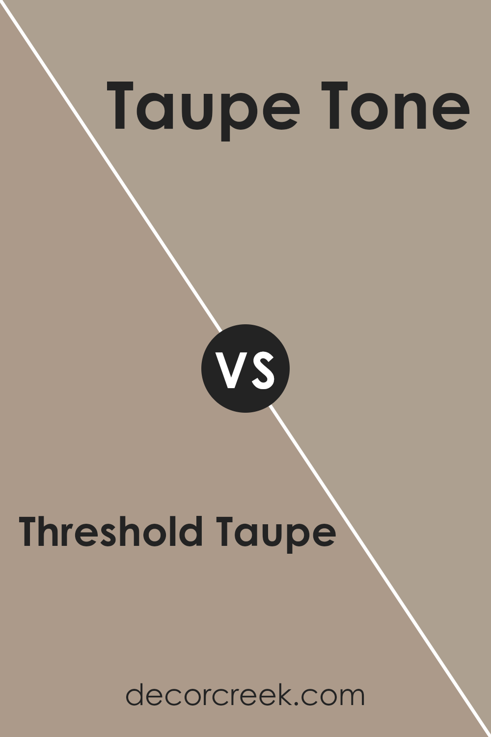
Threshold Taupe SW 7501 by Sherwin Williams vs Taupe Tone SW 7633 by Sherwin Williams
Threshold Taupe and Taupe Tone are two shades you’ll find in the Sherwin Williams palette. Threshold Taupe has a unique blend that could remind you of a cozy, muted brown with just a hint of warmth, making it a great option if you want a space to feel inviting without being too dark.
On the other hand, Taupe Tone leans a tad lighter, offering a softer look. This shade is excellent for those wanting to brighten up a room while still keeping things grounded in neutral territory.
Both colors are versatile, fitting well in many spaces from living rooms to bedrooms. However, the difference in their warmth and brightness levels means Threshold Taupe could be your go-to for a denser, enveloping effect, while Taupe Tone is better for a lighter, airier vibe.
When picking between them, think about the mood you’re aiming for in your space.
You can see recommended paint color below:
- SW 7633 Taupe Tone
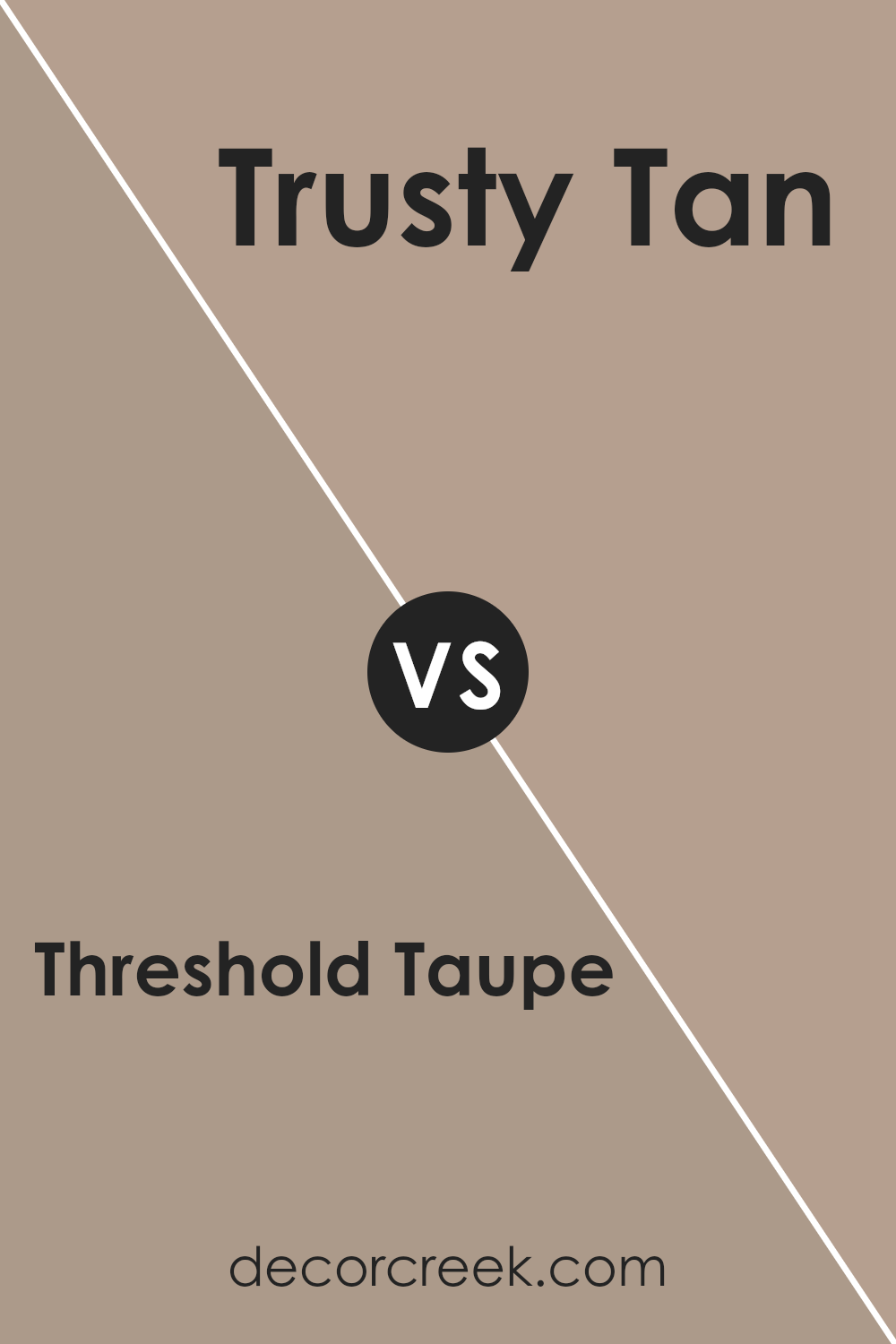
Threshold Taupe SW 7501 by Sherwin Williams vs Trusty Tan SW 6087 by Sherwin Williams
Threshold Taupe and Trusty Tan, both from Sherwin Williams, have subtle but distinct differences. Threshold Taupe carries a cooler tone, leaning towards a grayish base that offers a contemporary and soothing vibe.
It’s a versatile color that works well in spaces where you want to add a touch of elegance without overpowering the room with a strong color.
On the other hand, Trusty Tan brings a warmer, more inviting feel, reminiscent of sandy beaches and soft leather.
Its warmth makes spaces feel more intimate and cozy, perfect for living rooms or bedrooms where you seek comfort and relaxation.
While both colors are neutral, Threshold Taupe leans towards a modern aesthetic, and Trusty Tan towards a traditional, comforting atmosphere.
Each brings its unique charm to interiors, allowing for flexibility in decorating styles and preferences.
You can see recommended paint color below:
- SW 6087 Trusty Tan
Threshold Taupe SW 7501 by Sherwin Williams vs Song Thrush SW 9112 by Sherwin Williams
Threshold Taupe and Song Thrush are two paint colors by Sherwin Williams, each with their own unique charm. Threshold Taupe is a cozy, warm neutral with a subtle hint of pink undertone, making it versatile for various spaces in your home.
It creates an inviting atmosphere, perfect for rooms where relaxation is key, like living rooms or bedrooms. On the other side, Song Thrush has a deeper, earthier tone.
This color brings richness to any space, offering a blend of brown with soft gray undertones, which can enhance a room’s warmth and sophistication.
Although both colors share an ability to create welcoming environments, Threshold Taupe leans more towards a lighter, softer feel, while Song Thrush offers more depth and intensity.
Matching these colors in your home depends on the mood you want to set; Threshold Taupe for a brighter, airy space, and Song Thrush for a more grounded, intimate vibe.
You can see recommended paint color below:
- SW 9112 Song Thrush
Threshold Taupe SW 7501 by Sherwin Williams vs Sanderling SW 7513 by Sherwin Williams
Threshold Taupe and Sanderling, both by Sherwin Williams, have their unique charm in the color spectrum. Threshold Taupe is like a warm, cozy hug in a room.
It has a comforting presence that makes spaces feel inviting and snug. It’s a rich beige with deep, earthy undertones, giving it a solid and grounding effect.
On the flip side, Sanderling goes lighter, offering a fresh and airy feel. It’s akin to the softness of a sandy beach under the morning sun, bringing a gentle warmth and openness to interiors.
While Threshold Taupe lends itself to creating more intimate, cozy atmospheres, Sanderling brightens spaces, making them appear more spacious and relaxed.
In essence, Threshold Taupe pulls you into a comforting embrace of warmth, whereas Sanderling lightens the mood, introducing a serene, calm backdrop to your day-to-day life.
You can see recommended paint color below:
- SW 7513 Sanderling
Threshold Taupe SW 7501 by Sherwin Williams vs Morris Room Grey SW 0037 by Sherwin Williams
Threshold Taupe and Morris Room Grey, both by Sherwin Williams, are unique colors that bring different vibes to spaces. Threshold Taupe is a warm, cozy color with a blend of brown and grey, creating a welcoming atmosphere.
It’s perfect for those looking to add a soft, earthy touch to their rooms, giving off a feeling of comfort and relaxation.
On the other hand, Morris Room Grey leans towards a cooler palette. It’s a classic grey with subtle blue undertones, making it ideal for creating serene and sophisticated spaces.
This color works well in modern settings, offering a crisp, clean look that pairs beautifully with a wide range of decor.
While both colors offer versatility and can enhance the aesthetic of any room, Threshold Taupe brings warmth and a hint of nature indoors, suitable for creating a cozy retreat.
Morris Room Grey, conversely, provides a sleek and refined backdrop, perfect for contemporary interiors. Choosing between them depends on the desired mood and style of the room.
You can see recommended paint color below:
- SW 0037 Morris Room Grey
Threshold Taupe SW 7501 by Sherwin Williams vs Tony Taupe SW 7038 by Sherwin Williams
Threshold Taupe and Tony Taupe, both by Sherwin Williams, are two distinct shades of taupe that can create different moods and styles in a space. Threshold Taupe is a lighter, softer color, offering a more subtle, neutral backdrop.
It’s perfect for creating a serene and peaceful atmosphere in a room, making spaces feel more open and airy. On the other hand, Tony Taupe leans towards a darker, richer hue, providing a stronger presence on walls.
This makes it ideal for adding depth and warmth to a room, making it feel cozy and inviting. Both colors are versatile and can complement various decor styles, but your choice between them would depend on the ambience you wish to achieve.
While Threshold Taupe brings a breezy and light feel, Tony Taupe offers a sense of solidity and grounded elegance, making them suitable for different tastes and spaces.
You can see recommended paint color below:
- SW 7038 Tony Taupe
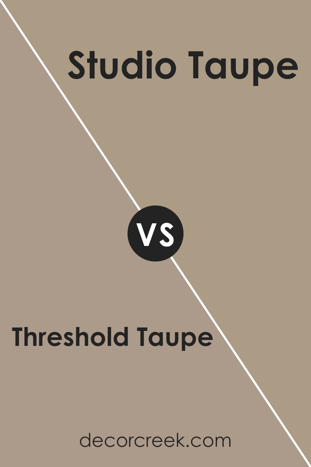
Threshold Taupe SW 7501 by Sherwin Williams vs Studio Taupe SW 7549 by Sherwin Williams
Threshold Taupe and Studio Taupe are two elegant shades offered by Sherwin Williams. They share a similar name but present subtly different vibes to any room.
Threshold Taupe has a warmer, earthier feel, leaning slightly more towards a cozy, inviting atmosphere. It’s the kind of color that feels like a hug – warm and welcoming, perfect for spaces meant for relaxation and comfort.
On the flip side, Studio Taupe carries a cooler, more muted tone. It’s ideal for those seeking a modern, understated elegance. It has a versatility that complements a wide range of decor styles, making it a great choice for creating a sleek, contemporary look.
It’s more reserved compared to Threshold Taupe, offering a calm and collected ambiance that’s equally appealing but in a different vein.
While both colors add a touch of sophistication and class to interiors, your choice between them depends on the mood you want to set.
Whether you’re going for warmth and coziness or cool and contemporary, these taupes have got you covered.
You can see recommended paint color below:
- SW 7549 Studio Taupe
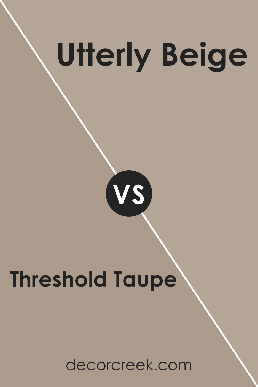
Threshold Taupe SW 7501 by Sherwin Williams vs Utterly Beige SW 6080 by Sherwin Williams
Threshold Taupe and Utterly Beige are two colors by Sherwin Williams that add warmth and coziness to any space, but in slightly different ways.
Threshold Taupe has a unique blend that makes it a perfect choice for those looking for something a bit richer and deeper than a typical beige.
It’s like a warm hug for your walls, offering a subtle hint of gray that adds a sophisticated touch. On the other hand, Utterly Beige is lighter and leans more towards a classic beige tone.
It’s like a soft, cozy sweater; comforting and familiar, making rooms feel more spacious and airy. Both colors work well in various settings, but Threshold Taupe tends to stand out in spaces that benefit from a deeper, more grounded look.
Meanwhile, Utterly Beige is your go-to for a classic, timeless vibe that brightens up the space effortlessly. Whether you choose the deeper, more nuanced Threshold Taupe or the light and airy Utterly Beige, both colors offer a beautiful backdrop for any room.
You can see recommended paint color below:
- SW 6080 Utterly Beige
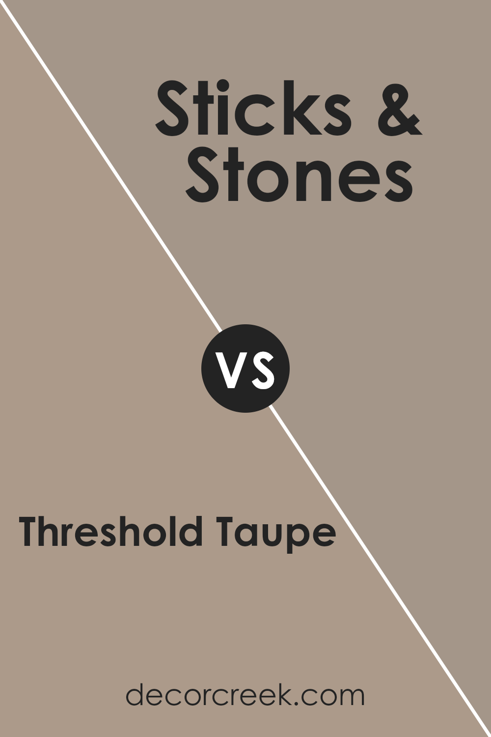
Threshold Taupe SW 7501 by Sherwin Williams vs Sticks & Stones SW 7503 by Sherwin Williams
Threshold Taupe and Sticks & Stones are two colors from Sherwin Williams that share a similar vibe but have unique characteristics. Threshold Taupe is a warm, cozy beige with a hint of gray.
It’s a versatile color, perfect for creating a soothing and welcoming space. Think of it like a gentle hug from a room; it’s soft and comforting, making it great for bedrooms and living areas.
On the other hand, Sticks & Stones steps it up a notch with a darker, more earthy tone. This color brings in a stronger sense of nature and grounding. It’s like the feeling of walking through a tranquil, shaded forest.
This makes it ideal for creating a rich, inviting atmosphere in spaces like kitchens or dining rooms.
While both colors offer a sense of warmth and comfort, Threshold Taupe is lighter and more neutral, offering a subtle backdrop to any style of decor.
Sticks & Stones, with its deeper tone, makes a bolder statement and can bring a more dramatic flair to a room. Whether you’re looking for something laid-back and airy or something with a bit more depth and intensity, these two colors have you covered.
You can see recommended paint color below:
- SW 7503 Sticks & Stones
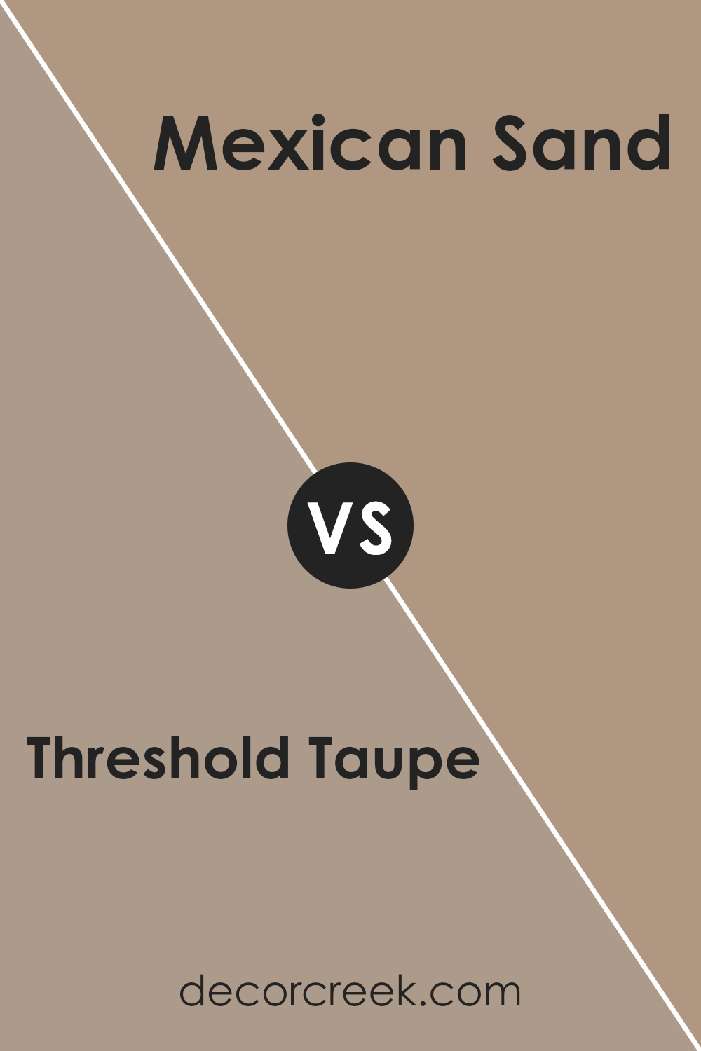
Threshold Taupe SW 7501 by Sherwin Williams vs Mexican Sand SW 7519 by Sherwin Williams
Threshold Taupe and Mexican Sand are both warm, cozy colors from Sherwin Williams, but they offer distinct vibes for any space.
Threshold Taupe is like a soft, welcoming hug. It’s a neutral shade that leans towards a light, creamy taupe, offering a blend of beige and gray that’s versatile for any room. It’s perfect for creating a serene, understated elegance that feels timeless.
On the other hand, Mexican Sand brings a bit more warmth to the table. It’s a richer, deeper beige that reminds you of a warm, sandy beach under a summer sun.
This color has a comforting presence, making any room feel more grounded and inviting. It’s great for adding a bit of coziness without overwhelming a space with too much darkness.
In comparison, Threshold Taupe is cooler and lighter, providing a more muted backdrop that’s easy to match with various decor styles.
Mexican Sand, with its warmer, earthier tone, offers a bit more personality and creates a snug, welcoming atmosphere.
Whether you prefer the subtle elegance of Threshold Taupe or the warm embrace of Mexican Sand likely depends on your personal style and the specific mood you want to create in your space.
You can see recommended paint color below:
- SW 7519 Mexican Sand
Conclusion
Threshold Taupe by Sherwin Williams stands out as a remarkably versatile paint color that effortlessly brings warmth and sophistication to any space.
Its unique blend of brown and gray tones makes it a perfect choice for those looking to create a cozy yet refined atmosphere without overwhelming a room with darkness.
This color works exceptionally well in living areas, bedrooms, and even kitchens, offering a subtle elegance that pairs beautifully with a wide range of decor styles, from modern to rustic.
The adaptability of Threshold Taupe is one of its most compelling attributes, making it a go-to shade for homeowners and designers alike.
Whether it’s applied as a statement wall or used throughout an entire space, this color has a way of tying together diverse elements for a cohesive look.
Its ability to complement both natural light and artificial illumination further enhances its appeal, ensuring that spaces feel warm and inviting at any time of day.
Utilizing Threshold Taupe in interior design not only elevates the aesthetic but also creates an inviting ambiance that makes it a popular choice for those looking to refresh their surroundings with a touch of understated elegance.
Ever wished paint sampling was as easy as sticking a sticker? Guess what? Now it is! Discover Samplize's unique Peel & Stick samples.
Get paint samples