Introducing the serene and earthy embrace of SW 7509 Tiki Hut by Sherwin Williams, a color that offers a warm and inviting atmosphere to any space. This unique shade is more than just a color; it’s a retreat into a world of calmness and comfort. With its rich, deep undertones,
Tiki Hut provides the perfect balance between sophistication and natural charm, making it an ideal choice for those looking to create a cozy and welcoming environment.
As part of Sherwin Williams’ extensive palette, Tiki Hut stands out for its versatility and timeless appeal. Whether you’re aiming to enhance the look of a living room, bedroom, or an outdoor area, this color adapts effortlessly, complementing both contemporary and traditional designs.
Its muted earthiness acts as a stunning backdrop for a wide range of decor styles, from rustic to modern minimalist.
In this article, we’ll delve into the ways in which SW 7509 Tiki Hut can transform your space, offering styling tips and pairing suggestions to maximize its potential.
Whether you’re a seasoned interior designer or embarking on your first home improvement project, learn how this captivating hue can elevate the aesthetic of your home while creating a serene and inviting atmosphere.

What Color Is Tiki Hut SW 7509 by Sherwin Williams?
Tiki Hut is a rich, warm hue that encompasses the soothing shades of brown with a hint of earthly terracotta undercurrent, creating an inviting and cozy atmosphere in any room.
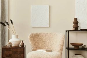
This color embodies the essence of a natural retreat, encapsulating the warmth and tranquility of a serene hideaway. Its versatility allows it to be a stunning neutral that can adapt to various design aesthetics, radiating warmth in minimalist designs and adding depth and coziness to more traditional spaces.
In terms of interior styles, Tiki Hut shines in environments that echo a sense of calm and elegance. It works exceptionally well in Bohemian-inspired spaces, where its earthy tones complement the eclectic mix of textures and patterns.
It also finds a harmonious home in rustic interiors, enhancing the organic, raw elements such as exposed wood and stone. Tiki Hut is equally adept at bringing warmth to modern and contemporary spaces, adding a layer of sophistication and depth to the sleek lines and minimalist decor.
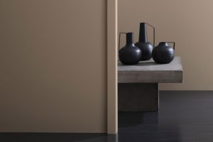
When it comes to pairing with materials and textures, Tiki Hut is exceptionally accommodating. It pairs beautifully with natural wood, from light oak to rich walnut, enhancing the material’s natural beauty.
Against leather, it exudes luxury and comfort, while juxtaposed with metals, such as brass or copper, it highlights their luster without overpowering them.
Fabrics in linen and cotton, in both neutral and bold colors, also work well with Tiki Hut, allowing for a play on textures and contrasts that invigorate the senses. This color encourages creativity in material and texture combinations, making it a fantastic choice for creating spaces that feel both personalized and profoundly welcoming.
Ever wished paint sampling was as easy as sticking a sticker? Guess what? Now it is! Discover Samplize's unique Peel & Stick samples.
Get paint samples

Is Tiki Hut SW 7509 by Sherwin Williams Warm or Cool color?
The color Tiki Hut by Sherwin Williams is a warm, earthy tone that brings a sense of comfort and grounding to any space. Its unique shade, reminiscent of natural wood or rich soil, offers an inviting feel that is both cozy and sophisticated.
When applied to the walls of a home, Tiki Hut has the power to transform the atmosphere into one of warmth and serenity, making it an excellent choice for living rooms, bedrooms, or even home offices where a calming presence is desired.
In terms of interior design, this particular hue works wonderfully with a wide range of complementary colors, from soft creams and whites for a subtle, airy feel to bold greens and blues for a more dynamic contrast.
The versatility of Tiki Hut makes it a fantastic backdrop for various textures and materials, such as natural stone, wood, and linen, enhancing the overall aesthetic of a space.
When lit by natural sunlight, Tiki Hut emanates a soft, golden glow, contributing to a welcoming environment. Conversely, under artificial lighting, it can create a more intimate, enveloping feel.
Thus, its impact on the ambiance of a room varies significantly with the lighting, playing a pivotal role in the mood and character of the home.
Undertones of Tiki Hut SW 7509 by Sherwin Williams
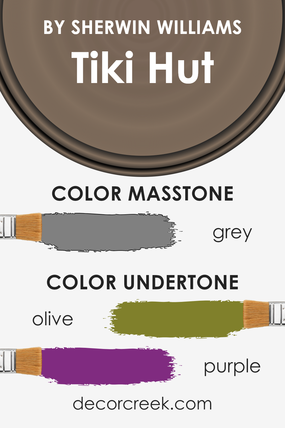
The distinct hue of Tiki Hut, a captivating paint color, is greatly influenced by its subtle undertones, which play a significant role in its perception and impact when applied to interior walls.
The unique blend of olive and purple undertones enriches this color, adding depth and complexity that transform spaces with an unparalleled warmth and elegance.
Olive undertones bring a natural, earthy vibe, grounding spaces with a feeling of stability and serenity. This natural essence is particularly effective in creating a cozy, inviting atmosphere, making rooms feel more intimate and welcoming.
Conversely, the purple undertones inject a touch of sophistication and mystery, adding a layer of richness that elevates the aesthetic appeal of the color.
This intriguing mix not only enhances the versatility of Tiki Hut but also affects the way light interacts with the color, influencing its appearance at different times of the day.
In bright daylight, the olive tones may become more pronounced, emphasizing a connection to the natural world, while in artificial light, the purple undertones might surface, adding a luxurious and comforting ambiance.
On interior walls, these undertones work harmoniously to produce a dynamic and adaptive backdrop that complements a wide range of décor styles, from rustic to modern.
The color’s adaptability makes it an excellent choice for living rooms, bedrooms, and even kitchens, as it can seamlessly integrate with various textures and materials, enhancing wood grains, metals, and fabrics.
The olive and purple undertones also offer a unique advantage in terms of spatial perception, as they can make rooms feel more spacious and airy or cozy and intimate, depending on the lighting and accompanying colors.
This multifaceted nature of Tiki Hut, enriched by its understated undertones, allows for creative freedom in designing spaces that are both aesthetically pleasing and emotionally resonant.
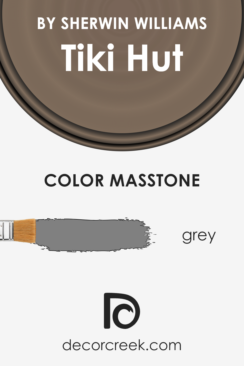
What is the Masstone of the Tiki Hut SW 7509 by Sherwin Williams?
Tiki Hut SW 7509 by Sherwin Williams presents a captivating masstone that leans towards the neutral gray spectrum. This intrinsic gray attribute, reminiscent of the traditional #808080 hex code, infuses spaces with a timeless elegance and versatility.
In home interiors, this nuanced shade adapts seamlessly to a variety of décor styles, functioning as a sophisticated backdrop that highlights furnishings and art without overwhelming them.
The gray masstone of Tiki Hut fosters a calming atmosphere, making it particularly suitable for areas where relaxation and focus are key, such as bedrooms and home offices.
Moreover, its neutrality means it can effortlessly bridge contrasting colors within a room, acting as a cohesive element in diverse color schemes.
Whether paired with warm woods to enhance coziness or juxtaposed against bright accents for a dynamic contrast, Tiki Hut’s gray core remains unobtrusively stylish.
Its adaptability extends to lighting as well, where it can appear subtly different under varying light sources, contributing to the ambiance of a space. This quality ensures that Tiki Hut remains a favored choice for those seeking a blend of sophistication and practicality in their homes.
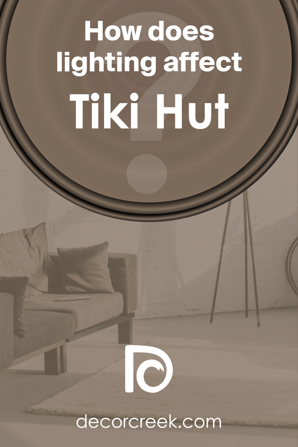
How Does Lighting Affect Tiki Hut SW 7509 by Sherwin Williams?
Lighting plays a pivotal role in how we perceive colors, fundamentally altering their appearance and the ambiance they create in our surroundings.
The impact of light on color is a crucial aspect to consider when choosing a paint like the warm, earthy tone often referred to as Tiki Hut, especially when selecting it for various rooms with different lighting conditions.
In artificial light, the warm undertones of this color can become significantly pronounced, lending a cozy and inviting atmosphere to the room.
The type of bulb used can affect its appearance; for instance, LED bulbs that mimic daylight can make the color appear closer to its true shade, while incandescent lighting can enhance its warmth, making the space feel more intimate.
In natural light, the same color can present a spectrum of shades depending on the time of day and the direction the room faces.
In north-faced rooms, which receive less direct sunlight and can often seem cooler, this warm hue can help counteract the cool light, creating a welcoming and snug space. However, it might appear somewhat darker due to the lesser intensity of natural light.
South-faced rooms bask in ample sunlight throughout the day, which can make this color gleam with vitality and warmth, enhancing its richness.
The generous light can intensify the color’s depth, making it a perfect choice for living spaces where a bright and lively atmosphere is desired.
East-faced rooms enjoy the morning sunlight, which can make this color look very vibrant and fresh in the morning, gradually transitioning into a softer shade as the day progresses.
This natural progression of light can bring a dynamic character to the room, highlighting different facets of the color at different times.
West-faced rooms receive the evening sun, which tends to be warmer and can magnify the cozy, warm undertones of the color, making it ideal for bedrooms or dining areas where a relaxing and serene environment is preferred.
Overall, the interaction between this specific shade and light underscores the importance of considering the direction of light and the quality of light when choosing colors for interior spaces, to achieve the desired mood and effect in each room.
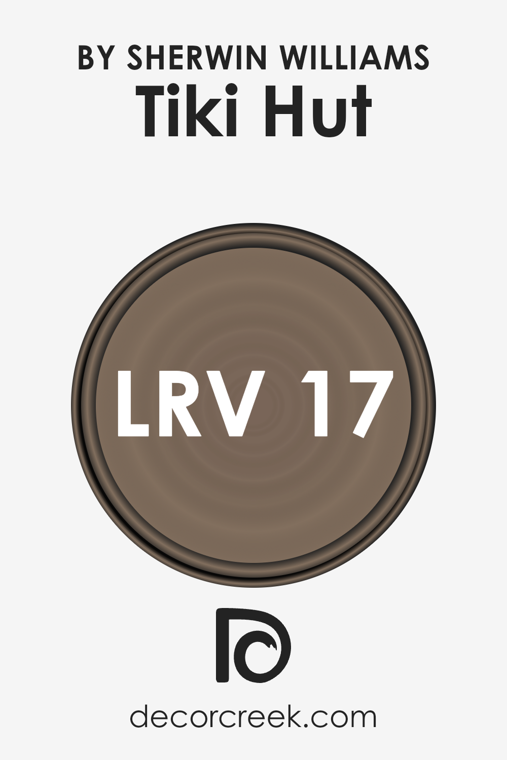
What is the LRV of Tiki Hut SW 7509 by Sherwin Williams?
Light Reflectance Value (LRV) measures the percentage of light a paint color reflects from or absorbs into a painted surface, essentially quantifying how light or dark a color will appear under different lighting conditions.
Ranging from 0 (complete absorption, or black) to 100 (complete reflection, or white), LRV is a critical metric for architects, interior designers, and homeowners to consider when selecting paint colors.
It not only influences the mood and ambiance of a space but also affects how we perceive the size and warmth of an area. Higher LRVs can make a room feel more spacious and brighter as they reflect more light, while lower LRVs create a cozier, more intimate atmosphere by absorbing light.
With an LRV of 16.929, Tiki Hut falls on the darker end of the spectrum, meaning it absorbs a lot of light rather than reflecting it. In practical terms, this means that when used on walls, Tiki Hut can significantly darken a room, making it feel smaller or more enclosed.
This characteristic might be advantageous in large, well-lit spaces where a feeling of coziness is desired, but it could be overwhelming in smaller or poorly lit rooms.
The color’s low LRV suggests that it would be best used as an accent or feature rather than the primary wall color in most spaces. Moreover, the ambient light present in the room, whether it’s natural or artificial, will greatly influence how Tiki Hut appears, potentially enhancing its rich tones or deepening its shadows.
LRV – what does it mean? Read This Before Finding Your Perfect Paint Color
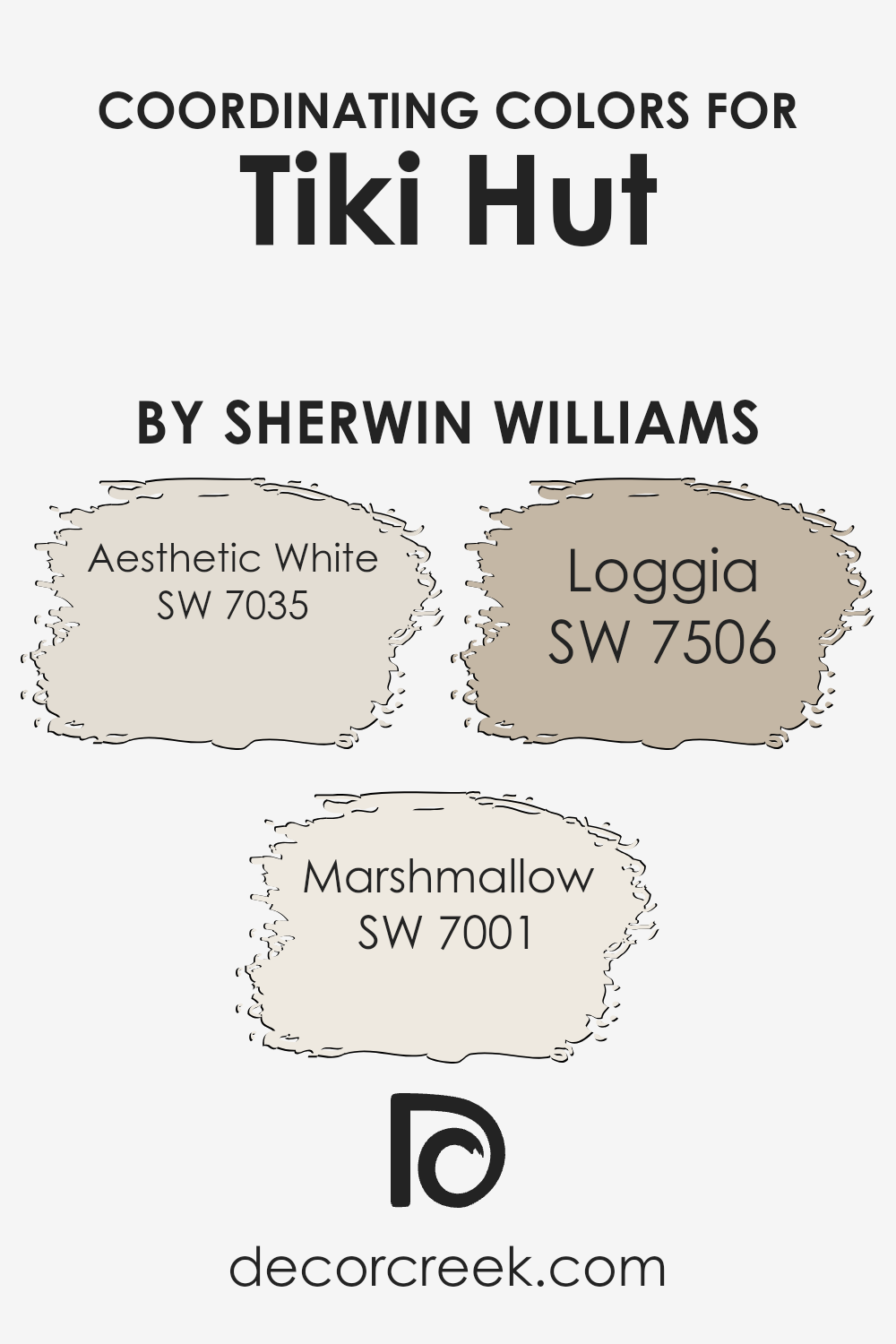
Coordinating Colors of Tiki Hut SW 7509 by Sherwin Williams
Coordinating colors are hues that complement each other when used together in an interior or exterior design, creating a cohesive and aesthetically pleasing look.
These colors have a unique relationship on the color wheel; they can be contrasting colors, which are directly opposite each other, analogous colors, which sit next to each other, or a combination that balances warm and cool tones, providing a harmonious and inviting atmosphere.
When working with a primary color like Tiki Hut by Sherwin Williams, choosing the right coordinating colors can enhance the primary hue’s warmth and depth, making the space feel more put together.
For a color like Tiki Hut, a warm, earthy tone, coordinating colors such as Aesthetic White, Marshmallow, and Loggia have been expertly selected to bring out its best qualities.
Aesthetic White is a soft, serene hue that brings a sense of calm and brightness to the space, subtly enhancing the depth of Tiki Hut without overpowering it.
Marshmallow offers a slightly brighter, creamy tone that adds a touch of light and airiness to the environment, making the space feel more open and inviting.
Lastly, Loggia presents a warmer, more grounded approach, grounding the scheme and adding a layer of sophistication and tranquility that complements the rustic charm of Tiki Hut.
Together, these colors work harmoniously to create a balanced and inviting palette that enhances the beauty and warmth of Tiki Hut.
You can see recommended paint colors below:
- SW 7035 Aesthetic White
- SW 7001 Marshmallow
- SW 7506 Loggia
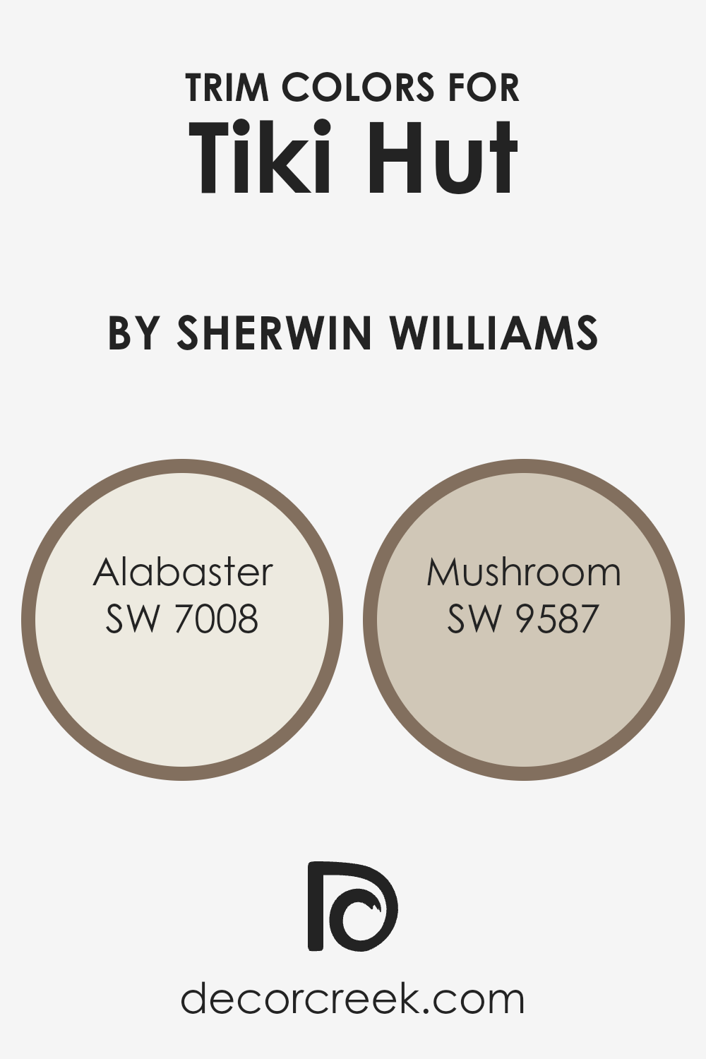
What are the Trim colors of Tiki Hut SW 7509 by Sherwin Williams?
Trim colors are a crucial aspect of a home’s exterior and interior design, acting as defining accents that highlight and contrast the main colors of walls or exteriors.
In the case of Tiki Hut by Sherwin Williams, a warm, inviting tone, the selection of trim colors can significantly impact the overall aesthetic, adding depth and character.
Choosing the right trim colors can enhance the architectural details of a home, framing the main color in a way that complements its hue and texture.
The trim color can also influence how a color like Tiki Hut is perceived, making it appear either more vibrant or subdued depending on the contrasting or harmonious nature of the trim color.
For a color like Tiki Hut, a rich and earthy neutral, selecting trim colors such as Alabaster and Mushroom by Sherwin Williams can add a refined touch.
Alabaster, a soft, warm white with subtle beige undertones, brings a light, airy quality to the trim, offering a gentle contrast that can make the Tiki Hut color appear more grounded and inviting.
On the other hand, Mushroom, a deep, earthy taupe with gray undertones, provides a stronger, yet harmonious contrast to Tiki Hut, enriching the overall palette with its natural, understated elegance.
Together, these trim colors can elevate the appearance of Tiki Hut, ensuring it delivers a sophisticated and cohesive look.
You can see recommended paint colors below:
- SW 7008 Alabaster
- SW 9587 Mushroom
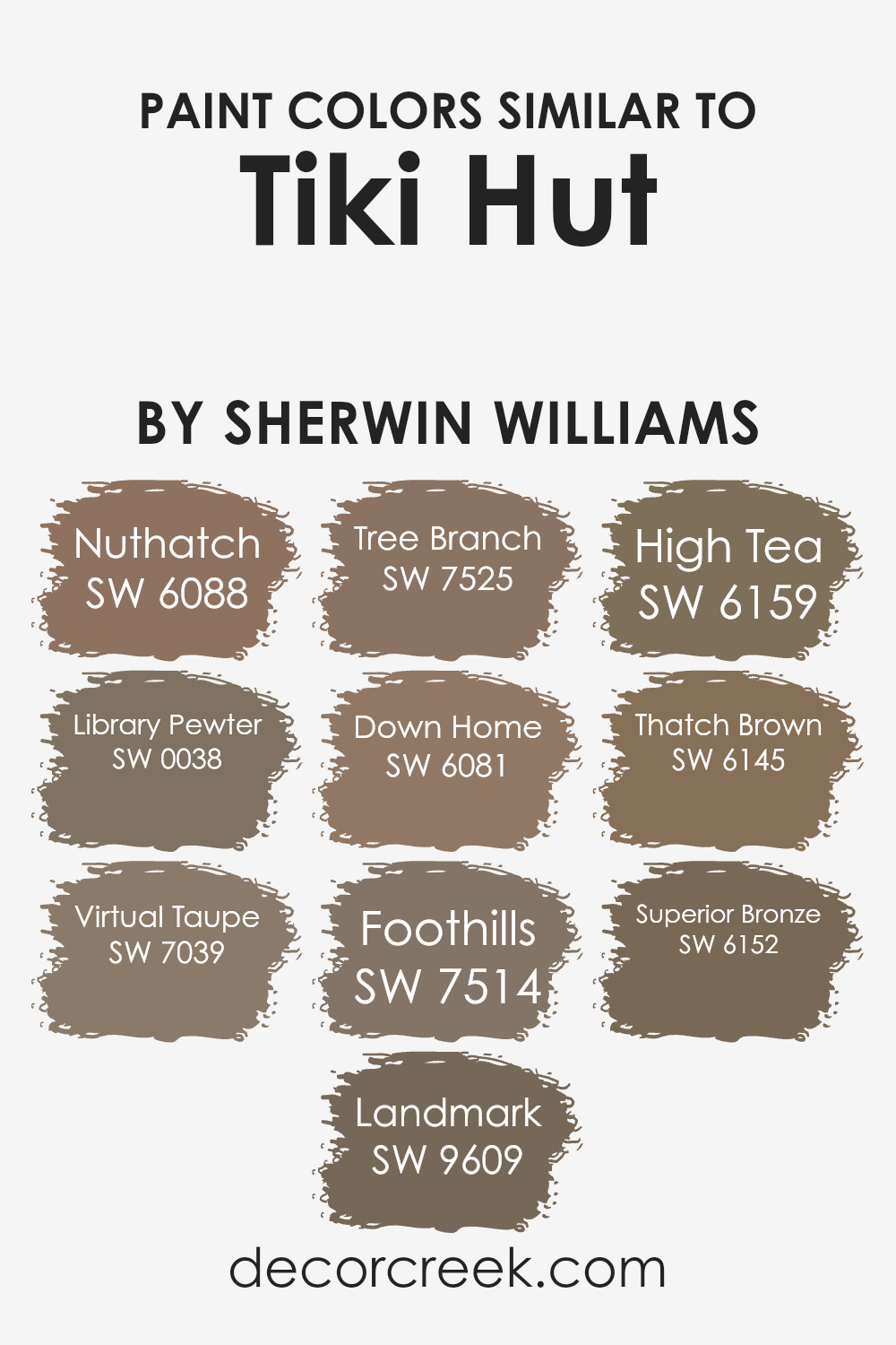
Colors Similar to Tiki Hut SW 7509 by Sherwin Williams
In the nuanced world of interior design and home decoration, the importance of similar colors, especially when we talk about a palette revolving around the warmth and earthiness of a color like Tiki Hut by Sherwin Williams, cannot be understated.
These similar colors work together to create a harmonious, cohesive look that flows seamlessly from room to room, providing a sense of continuity and balance.
When colors like Nuthatch, Library Pewter, Virtual Taupe, Landmark, Tree Branch, Down Home, Foothills, High Tea, Thatch Brown, and Superior Bronze are used in tandem, they evoke a rich, layered aesthetic that is both sophisticated and inviting.
Each of these shades, while maintaining their unique identity, shares a commonality with Tiki Hut—be it in their deep, grounding earth tones, or their ability to evoke a sense of comfort and tranquility.
Nuthatch and Library Pewter, for example, bring a depth to spaces with their darker hues, perfect for accent walls or furniture pieces. Virtual Taupe and Landmark offer a softer approach, blending seamlessly with a variety of textures and finishes.
Tree Branch and Down Home add warmth and rustic charm, ideal for creating cozy, welcoming areas within a home. Foothills, High Tea, Thatch Brown, and Superior Bronze, on the other hand, lean towards the sophisticated spectrum; their refined shades are perfect for adding a touch of elegance and understated luxury.
Together, these colors complement Tiki Hut in a manner that is both versatile and visually engaging, offering numerous possibilities for creating spaces that are not only beautiful but also feel like home.
You can see recommended paint colors below:
- SW 6088 Nuthatch
- SW 0038 Library Pewter
- SW 7039 Virtual Taupe
- SW 9609 Landmark
- SW 7525 Tree Branch
- SW 6081 Down Home
- SW 7514 Foothills
- SW 6159 High Tea
- SW 6145 Thatch Brown
- SW 6152 Superior Bronze
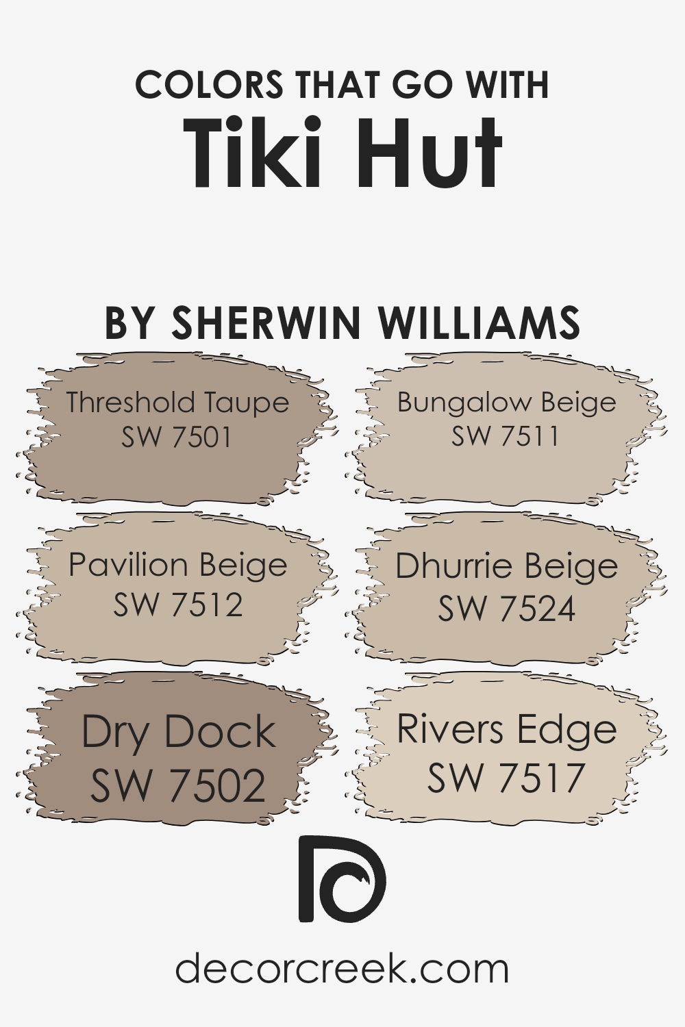
Colors that Go With Tiki Hut SW 7509 by Sherwin Williams
Colors that pair well with Tiki Hut SW 7509 by Sherwin Williams play a vital role in creating a harmonious and inviting atmosphere in any space. These complementary colors, like Threshold Taupe SW 7501 and Pavilion Beige SW 7512, add depth and sophistication to the decor.
Threshold Taupe offers a warm, medium taupe that brings a sense of calm and elegance, making it an excellent backdrop for Tiki Hut. On the other hand, Pavilion Beige has a lighter, neutral tone that enhances the richness of Tiki Hut, providing a subtle contrast and a seamless blend between colors.
Exploring further options, Dry Dock SW 7502 introduces a unique blend of gray and beige, offering a versatile neutral that pairs beautifully with the deeper tones of Tiki Hut. Its earthy feel adds a grounded, comforting layer to interior designs.
- Bungalow Beige SW 7511, with its inviting, warm beige hue, works in tandem with Tiki Hut to evoke a cozy, welcoming vibe perfect for living spaces.
- Dhurrie Beige SW 7524, slightly lighter, brings a fresh, airy feel to the palette, reflecting light and making spaces appear larger.
- Lastly, Rivers Edge SW 7517 offers a cool touch with its unique blend of green and gray, adding a splash of subtle color that complements the earthy tones of Tiki Hut and its allied colors.
Together, these colors create a cohesive look that is both stylish and timeless, enhancing the beauty and depth of Tiki Hut in interior spaces.
How to Use Tiki Hut SW 7509 by Sherwin Williams In Your Home?
Tiki Hut is a warm, inviting shade by Sherwin Williams that offers a cozy and earthy ambiance to any space. This rich, taupe-like color has the unique ability to make a room feel both welcoming and sophisticated.
It serves as a versatile background that can complement a wide range of decor styles, from rustic to modern. When used in a living room or bedroom, Tiki Hut creates a snug atmosphere, making it perfect for spaces where comfort and relaxation are key.
Its calming presence also makes it an excellent choice for a study or home office, encouraging focus and serenity.
For those looking to introduce Tiki Hut into their home, it pairs beautifully with natural materials such as wood, stone, and leather, enhancing the texture and depth of the space.
Accentuating it with pops of color through accessories or artwork can bring a lively contrast to its earthy tones. Whether you’re painting an entire room or using it for an accent wall, Tiki Hut provides a tasteful and timeless backdrop that elevates the aesthetic of your home.
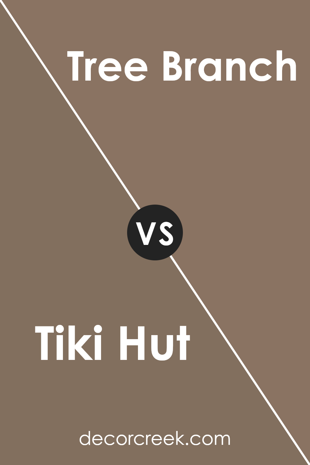
Tiki Hut SW 7509 by Sherwin Williams vs Tree Branch SW 7525 by Sherwin Williams
Tiki Hut and Tree Branch, both by Sherwin Williams, present a warm and earthy palette, though they carry distinct nuances in their warmth and depth.
Tiki Hut emanates a lighter, more golden tone, reminiscent of sandy beaches and sunlit straw huts, offering a subtle brightness that can make spaces feel open and airy. Its inviting warmth works well in living spaces and bedrooms, where a soft, comforting ambiance is desired.
On the other hand, Tree Branch dives into a deeper, richer domain, hinting at the dark silhouettes of trees against a twilight sky. This color possesses a robustness that speaks of stability and grounding, making it a perfect choice for accent walls, trim, or cabinetry, where a touch of sophistication and earthiness is sought.
While both colors share an underpinning of warmth, Tiki Hut leans towards a lighter, more serene side, whereas Tree Branch offers depth and intensity, making them suitable for different applications yet equally capable of creating cozy, welcoming environments.
You can see recommended paint color below:
- SW 7525 Tree Branch
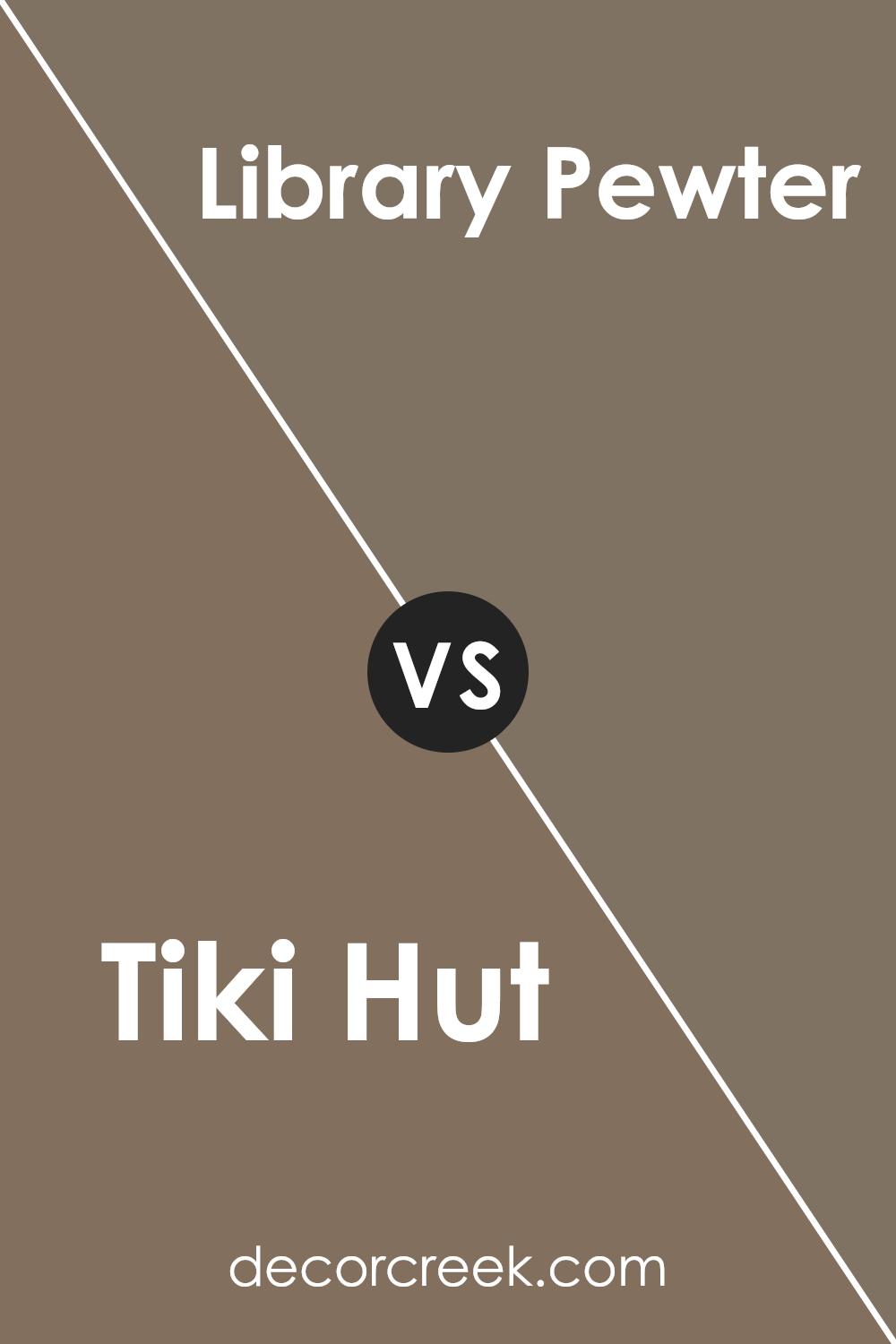
Tiki Hut SW 7509 by Sherwin Williams vs Library Pewter SW 0038 by Sherwin Williams
Tiki Hut and Library Pewter, both colors by Sherwin Williams, provide distinct vibes due to their individual tonal characteristics. Tiki Hut, a warm, muted brown, exudes a sense of coziness and natural earthiness, making spaces feel inviting and snug.
This hue is ideal for areas where a comforting and serene atmosphere is desired, suggesting a subtle connection to nature and traditional aesthetics.
On the other hand, Library Pewter presents a deeper, more sophisticated palette. As a rich gray with subtle blue undertones, it hints at elegance and a contemporary flair.
This color is versatile, aligning well with modern, industrial, or classic design schemes, offering a backdrop that both complements and elevates a variety of decor styles.
While Tiki Hut leans towards a warm, welcoming ambiance, Library Pewter tends towards a refined, stylish mood. Selecting between the two depends largely on the intended atmosphere of the room and personal aesthetic preferences, with Tiki Hut favoring comfort and warmth, and Library Pewter skewing towards sophistication and modernity.
You can see recommended paint color below:
- SW 0038 Library Pewter
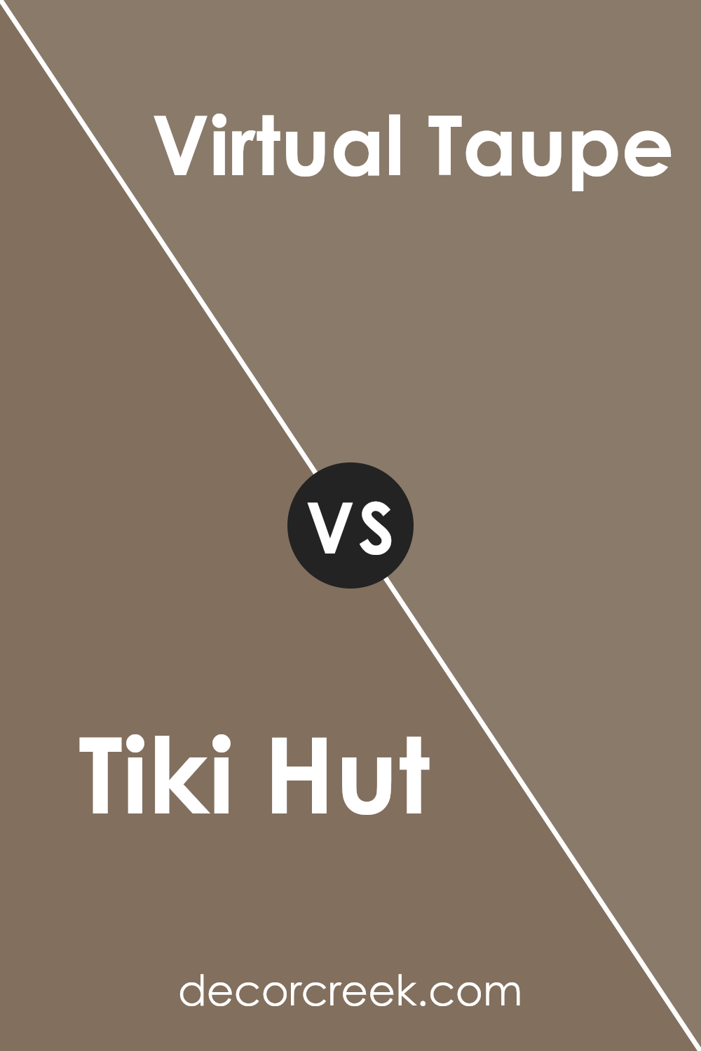
Tiki Hut SW 7509 by Sherwin Williams vs Virtual Taupe SW 7039 by Sherwin Williams
Tiki Hut and Virtual Taupe, both by Sherwin Williams, present a warm and inviting palette, though they cater to different aesthetic tones and atmospheres. Tiki Hut leans towards a warmer, more earthy hue with a strong base in browns that evoke a sense of coziness and natural comfort.
It’s reminiscent of traditional clay pots, embodying a rustic charm that’s both welcoming and rich in character. On the other hand, Virtual Taupe offers a more subdued and versatile option. It straddles the line between gray and brown, presenting a neutral backdrop that complements a wide range of decor styles.
Virtual Taupe’s understated elegance makes it an ideal choice for those seeking a sophisticated yet inviting space. While Tiki Hut adds warmth and depth, perfect for creating a snug and intimate atmosphere, Virtual Taupe provides a sleek and modern feel, accommodating both traditional and contemporary tastes. Together, they offer a harmonious balance, allowing for a versatile and layered design scheme.
You can see recommended paint color below:
- SW 7039 Virtual Taupe
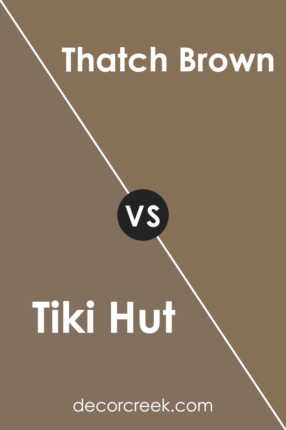
Tiki Hut SW 7509 by Sherwin Williams vs Thatch Brown SW 6145 by Sherwin Williams
Tiki Hut and Thatch Brown, both by Sherwin Williams, present a compelling study in the subtle art of earth-toned nuance. Tiki Hut emanates warmth, with its rich, cozy undertone, reminiscent of the natural wood found in a secluded island escape. This color brings to mind a welcoming space, inviting relaxation and comfort.
In contrast, Thatch Brown leans towards a deeper, more grounded feel. Its foundation in brown offers a stronger connection to the earth, suggesting stability and resilience. While both hues share a common ancestry in the brown family, Tiki Hut provides a lighter ambiance that brightens spaces with its softer, more open feel.
Thatch Brown, on the other hand, anchors a room, offering depth and a sense of solidity. In choosing between them, one must consider the atmosphere they wish to create—whether it leans towards the light-hearted warmth of Tiki Hut or the profound, elemental nature of Thatch Brown.
You can see recommended paint color below:
- SW 6145 Thatch Brown
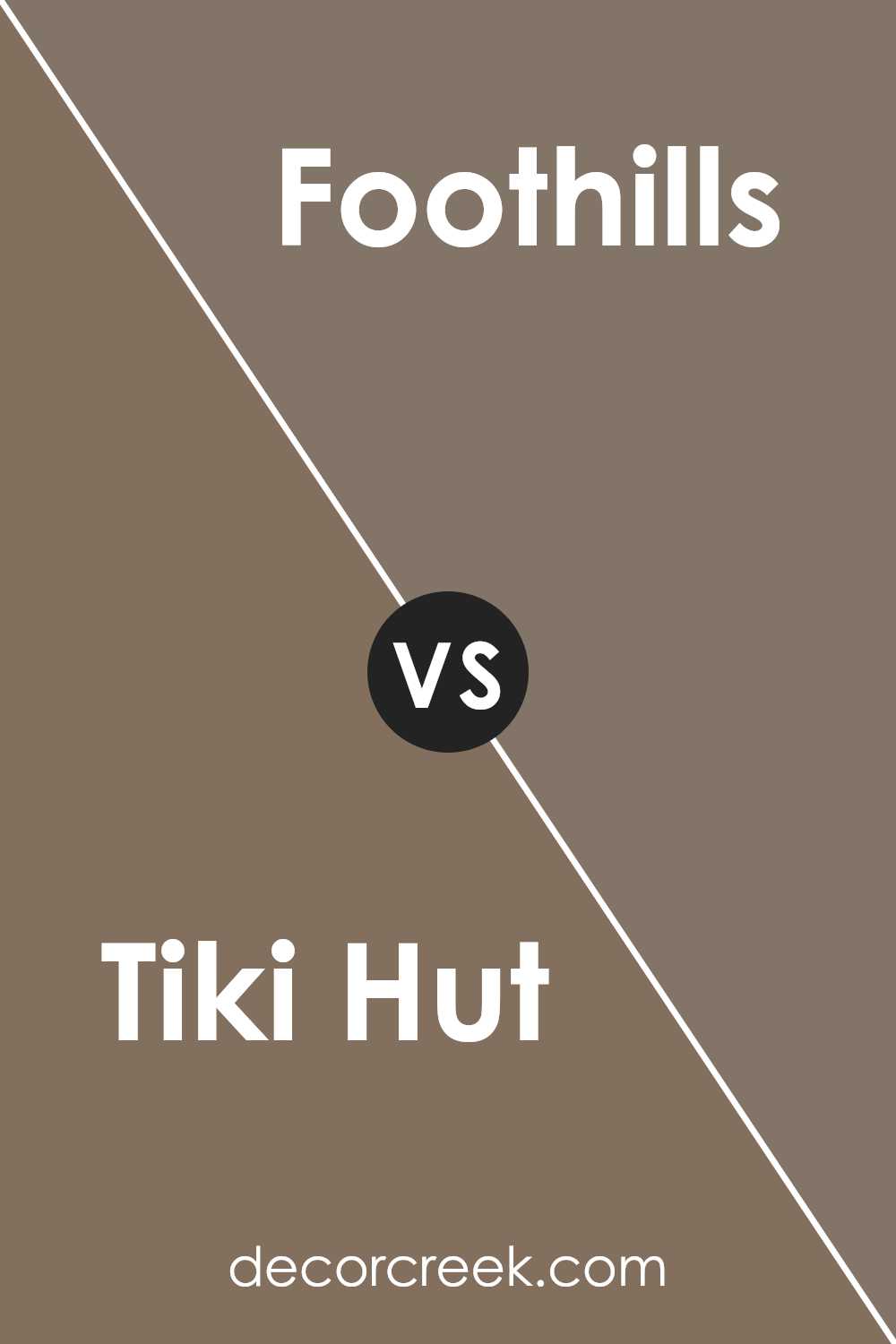
Tiki Hut SW 7509 by Sherwin Williams vs Foothills SW 7514 by Sherwin Williams
Tiki Hut and Foothills, both by Sherwin Williams, present an interesting comparison in the realm of warm, earthy tones. Tiki Hut takes a softer approach, embodying a muted, cozy beige with hints of yellow undertones. Its lighter, inviting hue offers a sense of calm and neutrality, making it a versatile choice for creating serene spaces.
In contrast, Foothills steps into a darker, more pronounced territory. This color features deeper, brown undertones, leaning towards a more robust and earthy character. The richness of Foothills gives it a bolder presence, ideal for adding depth and warmth to interiors.
While Tiki Hut exudes lightness and an airy feel, Foothills anchors a room with its stronger, more defined earthiness. Both colors complement a natural aesthetic but serve different purposes; Tiki Hut brightens spaces with its subtle warmth, whereas Foothills provides a grounding, sophisticated backdrop.
Together, they offer a range of possibilities for creating harmonious, layered looks inspired by nature’s diverse palette.
You can see recommended paint color below:
- SW 7514 Foothills
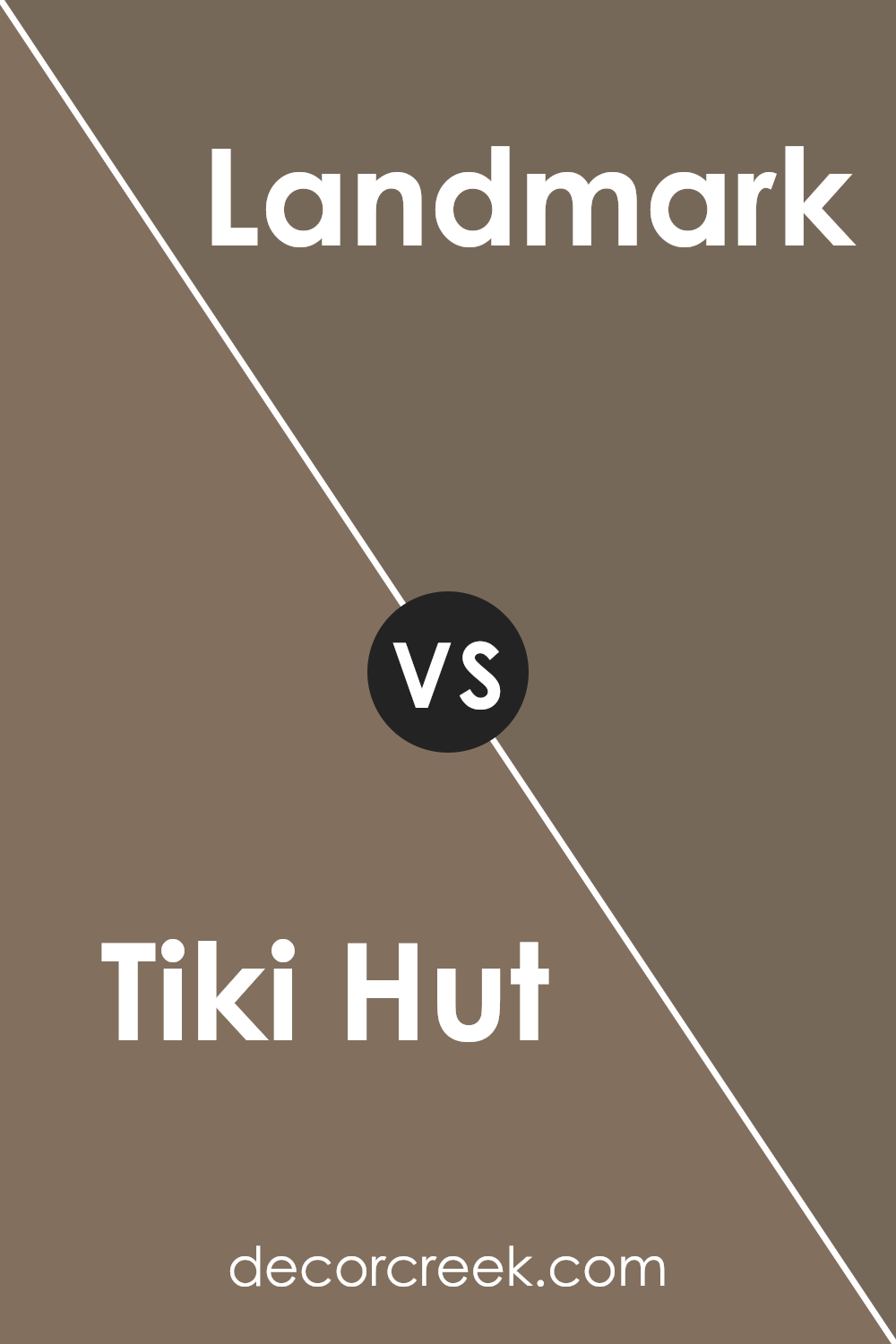
Tiki Hut SW 7509 by Sherwin Williams vs Landmark SW 9609 by Sherwin Williams
Tiki Hut and Landmark, both by Sherwin Williams, stand as distinct hues within the warm, earthy palette. Tiki Hut presents as a rich, mid-tone brown with a comforting warmth, reminiscent of a cozy, secluded cabin or the inviting interior of a rustic hut.
Its deep, comforting terra cotta undertones give it a grounded, natural feel, making it an excellent choice for spaces seeking a touch of earthiness without overwhelming darkness.
In contrast, Landmark offers a slightly cooler, more neutral take. While still within the realm of warm earth tones, its foundation leans towards a lighter, more refined taupe. This color carries a subtle sophistication, providing a versatile backdrop that complements both contemporary and traditional décor.
Its ability to balance between warmth and neutrality makes it a go-to for designers aiming to evoke a sense of calm and understated elegance.
When comparing Tiki Hut to Landmark, the former suggests a bolder, more enveloping ambiance, inviting depth and focus into a room. Landmark, however, serves a different purpose—offering a lighter, airier feel, ideal for spaces that aim for a broad appeal without sacrificing character.
Practical applications see Tiki Hut favoring accent walls or cozy nooks, while Landmark shines as a comprehensive choice for living spaces, enhancing natural light and spaciousness.
You can see recommended paint color below:
- SW 9609 Landmark
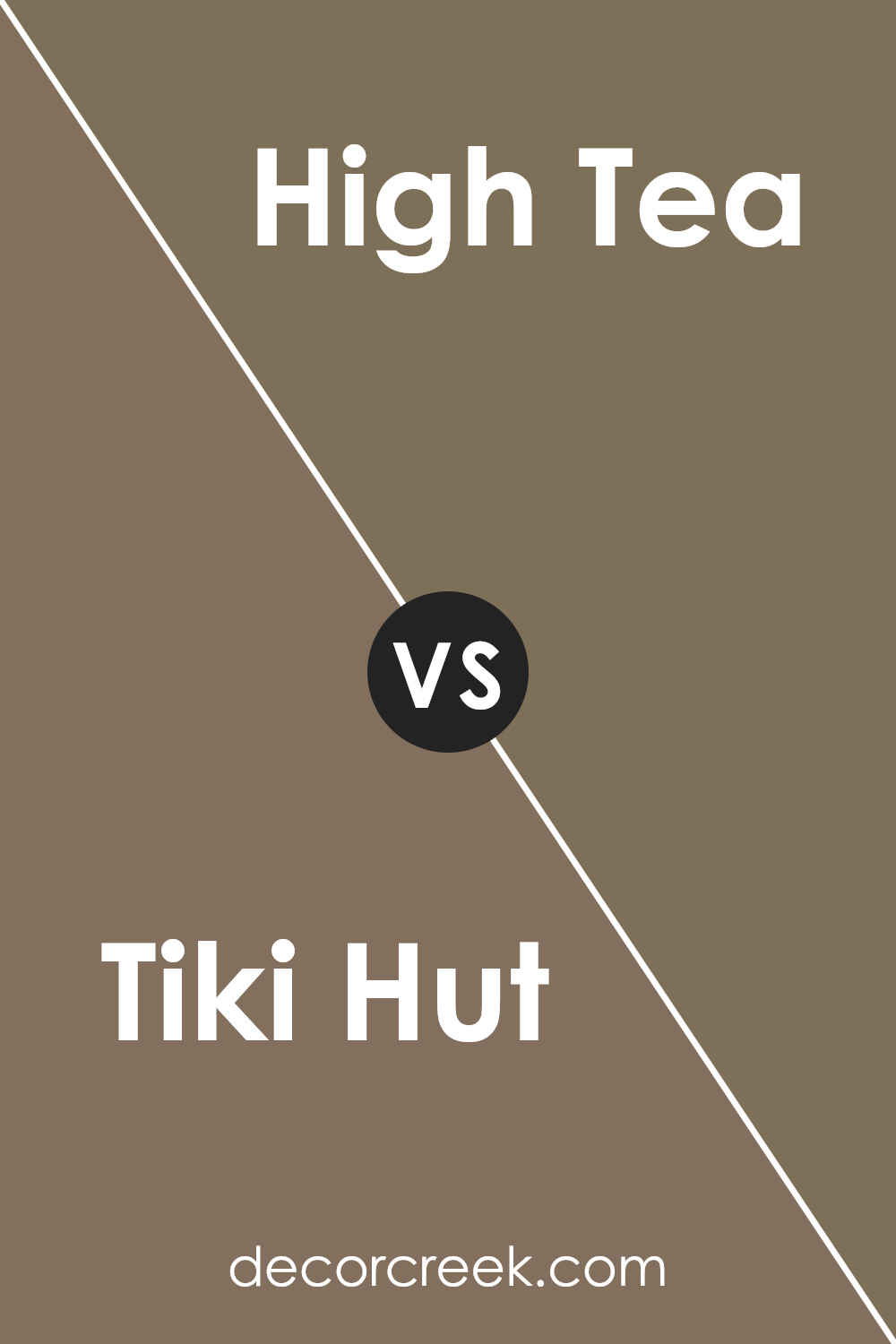
Tiki Hut SW 7509 by Sherwin Williams vs High Tea SW 6159 by Sherwin Williams
Tiki Hut and High Tea, both from Sherwin Williams, exemplify a nuanced approach to bringing warmth and sophistication into a space. Tiki Hut is a deeper, more saturated color that leans into earthy terracotta tones, offering a rich backdrop that is both inviting and grounding.
Its depth makes it a perfect candidate for creating cozy, intimate spaces or making a bold statement when used on accent walls.
In contrast, High Tea walks a lighter, subtler path. It’s a soft, muted green with gray undertones, evoking the calm and serenity of a misty morning. High Tea has a natural, understated elegance that makes it ideal for creating serene, restful environments.
It’s a versatile shade that pairs beautifully with a wide range of colors, from neutrals to brights, enhancing the overall cohesion of a design scheme.
Together, these colors represent two sides of the warmth spectrum. Tiki Hut brings the heat of sunbaked clay, while High Tea provides a cooling touch, reminiscent of shaded foliage. Both colors offer unique possibilities for creating layered, harmonious spaces that are deeply reflective of personal style and aesthetic preferences.
You can see recommended paint color below:
- SW 6159 High Tea
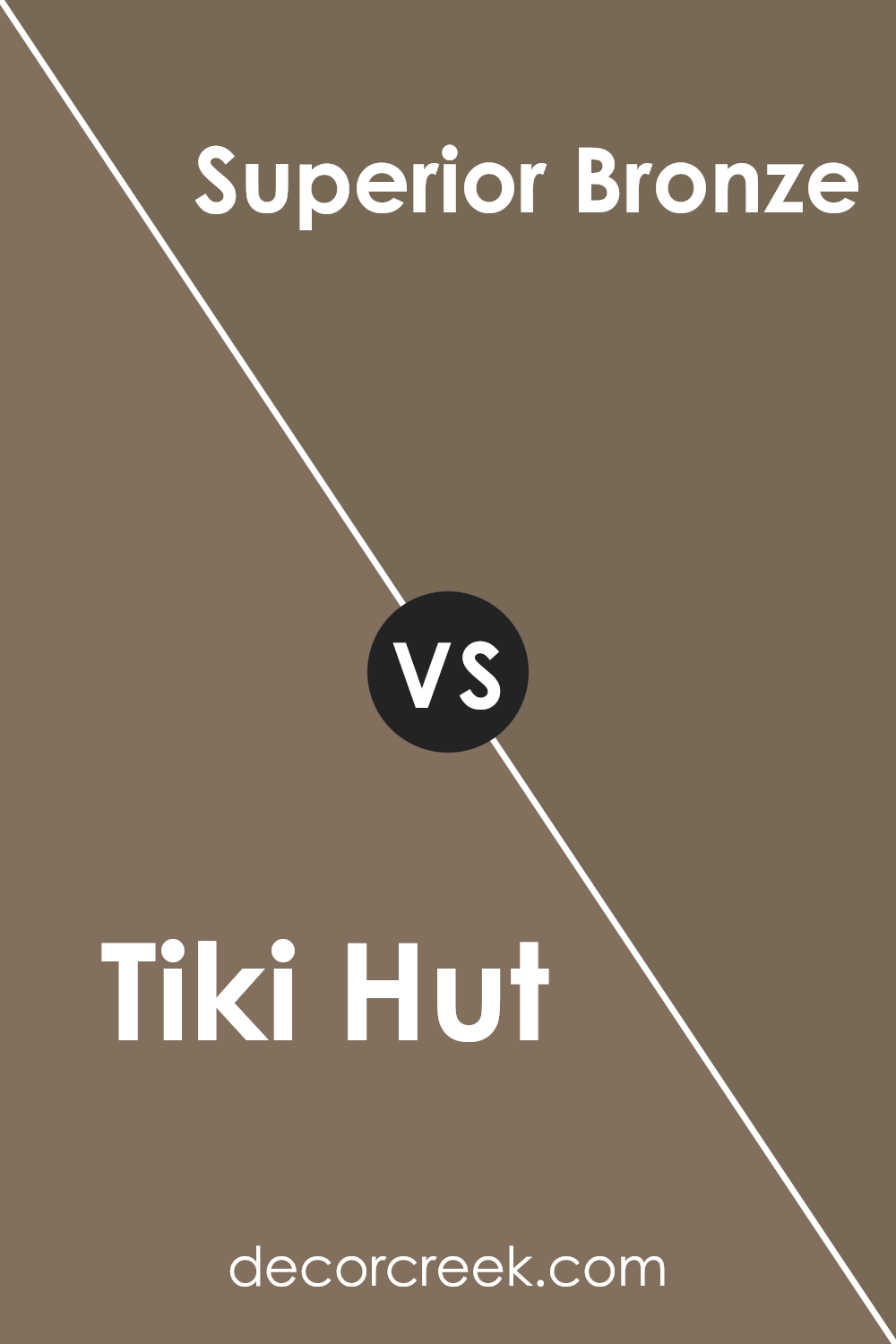
Tiki Hut SW 7509 by Sherwin Williams vs Superior Bronze SW 6152 by Sherwin Williams
Tiki Hut and Superior Bronze, both by Sherwin Williams, present an interesting comparison as they navigate the warm spectrum of interior design colors. Tiki Hut is a deep, soothing beige with a hint of warmth, evoking feelings of a calm and welcoming environment.
It’s a versatile color that can complement various decor styles, making spaces feel cozy and cohesive.
On the other hand, Superior Bronze steps into the realm with a bolder statement. It is a rich, deeper shade that straddles the line between a dark tan and a light brown, imbued with subtle reddish undertones that add a touch of sophistication and depth.
Its character brings a more pronounced warmth to spaces, suggesting an ideal choice for areas meant to evoke a sense of comfort and luxury.
Both colors share a warm base, making them complementary choices in a color scheme. However, while Tiki Hut leans towards subtlety and lightness, offering a backdrop for bolder accents, Superior Bronze demands more attention, standing as a feature color that anchors and defines a space.
This distinction makes each color suited to different applications and atmospheres within interior spaces.
You can see recommended paint color below:
- SW 6152 Superior Bronze
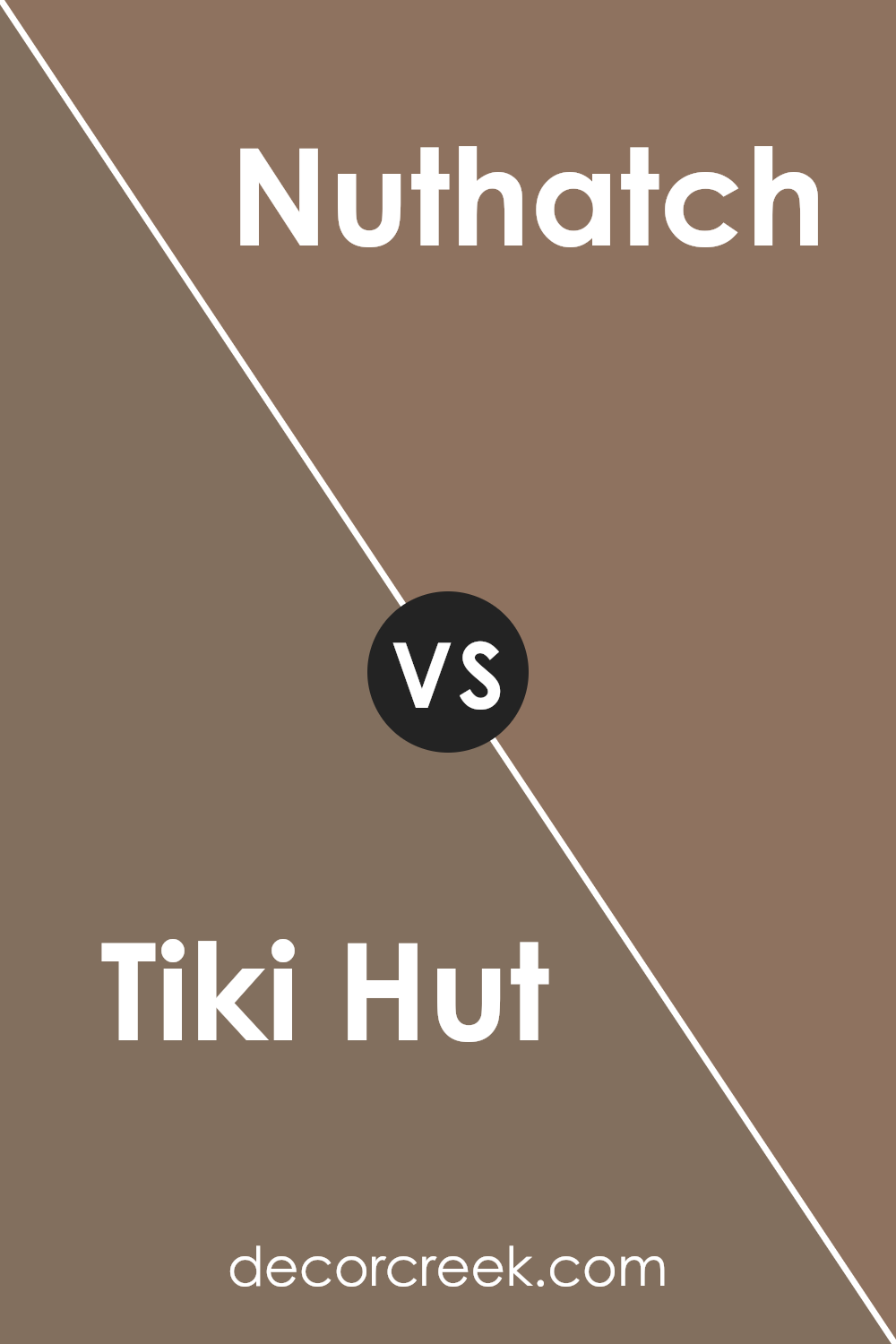
Tiki Hut SW 7509 by Sherwin Williams vs Nuthatch SW 6088 by Sherwin Williams
Tiki Hut and Nuthatch, both from Sherwin Williams, offer unique tones for discerning tastes. Tiki Hut is a warm, inviting hue with a grounding earthiness, reminiscent of rich, sun-baked clay or the welcoming embrace of a rustic cabin’s interior. It carries an inherent coziness that makes spaces feel more intimate and secure, perfect for creating a retreat-like atmosphere in any room.
In contrast, Nuthatch presents a deeper, more subdued character. It leans into the realm of sophisticated neutrals, with a grayish undertone that provides a versatile backdrop for various decor styles.
This color whispers of forest shadows and stone, suggesting a subtle connection to the natural world. It’s an excellent choice for those seeking to cultivate a serene, contemplative space, offering a cool counterpoint to Tiki Hut’s warmth.
While both colors draw inspiration from nature, Tiki Hut envelops with its earthy warmth, making a space feel like a sunlit haven, whereas Nuthatch offers a cooler, more muted elegance that echoes the tranquil aspects of the outdoors.
Together, they could create a harmonious balance, juxtaposing warmth and coolness in a home’s palette.
You can see recommended paint color below:
- SW 6088 Nuthatch
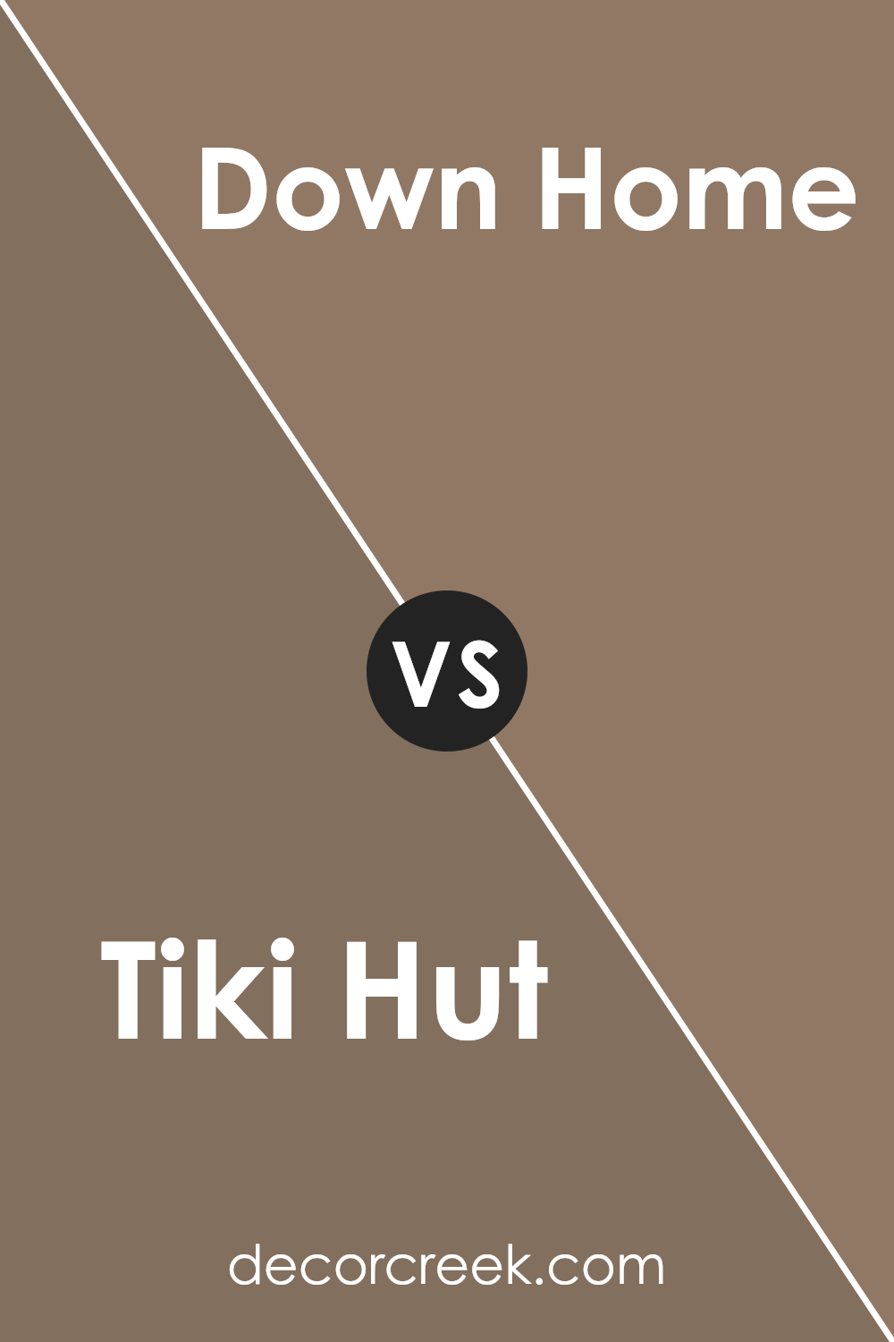
Tiki Hut SW 7509 by Sherwin Williams vs Down Home SW 6081 by Sherwin Williams
Tiki Hut and Down Home are both rich, inviting colors by Sherwin Williams that evoke warmth and comfort but in subtly different ways. Tiki Hut is a mid-tone tan with a welcoming, soft beige undertone, providing a perfect backdrop for a cozy, yet light and airy interior.
Its versatility allows it to stand as a neutral foundation, harmonizing with both vibrant and subdued color palettes. On the other hand, Down Home is a deeper, more saturated hue that leans towards a warm, earthy brown, offering a strong sense of grounding and stability.
This color embodies a rustic charm, making spaces feel more intimate and sheltered. While Tiki Hut reflects the softness of sand underfoot, evoking a sense of openness and calm, Down Home embraces the essence of terra firma, creating environments that feel rooted and secure. Together, they offer a spectrum from gentle neutrality to deep warmth, accommodating a range of aesthetic preferences.
You can see recommended paint color below:
- SW 6081 Down Home
Conclusion
Concluding, Tiki Hut SW 7509 emerges as a uniquely adaptable and warm shade in Sherwin Williams’ extensive palette. Its natural, earthy tone provides a sense of grounding and comfort, making it an excellent choice for creating inviting and serene spaces.
Whether applied in living rooms, bedrooms, or external facades, this color complements a wide range of decor styles and architectural designs. Its versatility ensures that it can seamlessly blend with both contemporary and traditional settings, offering a timeless appeal that enriches the aesthetic value of any space.
Moreover, Tiki Hut’s inherent warmth promotes a cozy atmosphere, encouraging relaxation and a sense of wellbeing. Its ability to harmonize with various textures and materials further underscores its practicality and appeal in interior and exterior design applications.
As a testament to its popularity and functionality, it stands out as a go-to color for designers and homeowners alike, looking to infuse their environments with a touch of earthiness and sophistication. Its enduring charm and adaptability highlight Sherwin Williams’ commitment to offering high-quality, nuanced shades that cater to diverse aesthetic preferences and design needs.
Ever wished paint sampling was as easy as sticking a sticker? Guess what? Now it is! Discover Samplize's unique Peel & Stick samples.
Get paint samples