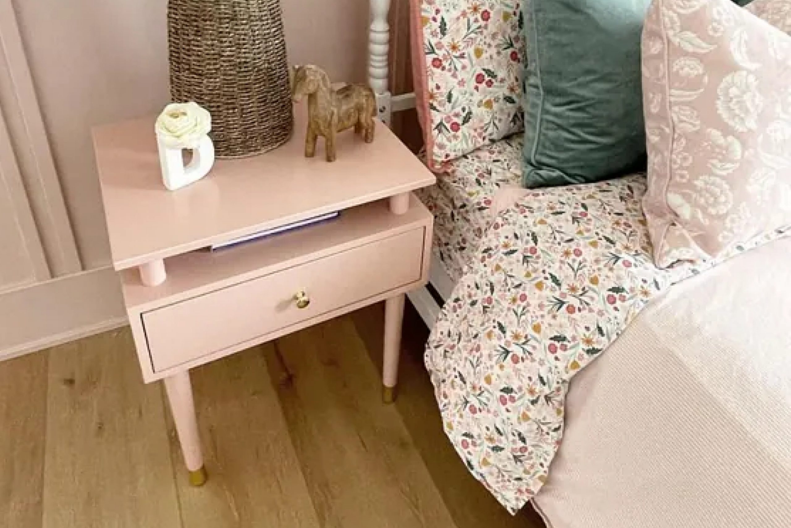
The first time I saw Pink Shadow, I loved how soft and calming it felt. It’s a gentle pink that adds just the right amount of warmth without being too much. What’s great about this shade is how versatile it is—perfect for a sweet nursery but just as beautiful in a stylish living room or cozy bedroom
As someone who enjoys experimenting with color in my home, I find Pink Shadow to be a refreshing alternative to the typical neutral shades. It’s a color that stands out while still maintaining a subtlety that doesn’t overpower a room’s design.
Whether paired with whites and grays for a minimalist look or with bolder colors for a bit more drama, Pink Shadow complements a variety of styles.
For those like me who take pride in creating inviting spaces, this color offers the chance to add a little personality without being too bold. It has that perfect blend of warmth and subtlety, making rooms feel more comfortable and welcoming.
If you’re considering a change that brings just the right amount of color into your home, Pink Shadow might just be the right choice.
What Color Is Pink Shadow SW 0070 by Sherwin Williams?
Pink Shadow by Sherwin Williams is a soft, muted shade of pink that brings warmth and charm to any space. This color is versatile and can create a cozy atmosphere. It’s a gentle pink with gray undertones, making it ideal for both contemporary and traditional interiors.
Pink Shadow works particularly well in styles such as shabby chic, vintage, or rustic, where soft and understated colors are appreciated. It can also enhance modern minimalist spaces by adding just a touch of warmth without overwhelming the design.
In bohemian settings, this color adds a subtle, calming element to balance the often vibrant and eclectic decor.
When it comes to materials and textures, Pink Shadow pairs beautifully with natural elements. Think of light-colored woods like birch or oak, which complement its warmth. Textured fabrics such as linen, cotton, or soft wool in neutral or cream shades can enhance the gentle ambiance of the room.
Metallic accents like brushed gold or copper can add a touch of luxury and contrast nicely with the muted pink.
For a cohesive look, consider incorporating similar hues in your decor accessories or art pieces. This soft pink will effortlessly tie everything together, creating a welcoming and harmonious environment in your home.
Is Pink Shadow SW 0070 by Sherwin Williams Warm or Cool color?
Pink Shadow SW 0070 by Sherwin Williams is a soft and gentle color that can add warmth to any room. This shade of pink has a subtle gray undertone, making it less bold and easier to incorporate into different home styles. It works well in bedrooms and living rooms, creating a cozy and inviting atmosphere.
The muted pink tone can make a space feel more open and bright, without being overwhelming. It’s a great choice for accent walls or smaller decor elements like cushions and curtains.
Pairing it with neutral colors like white or beige can enhance its softness, while combining it with darker shades adds contrast.
Pink Shadow also reflects light nicely, giving a room a warm glow throughout the day.
This color is versatile and can be used in both modern and traditional settings, making it a popular choice for many homeowners looking to add a subtle touch of color.
Undertones of Pink Shadow SW 0070 by Sherwin Williams
Pink Shadow by Sherwin Williams, SW 0070, has a variety of undertones that affect how we perceive it on walls. These undertones are pale yellow, light purple, pale pink, light blue, mint, lilac, and grey. Each undertone adds a subtle influence to the main color, changing the way it looks depending on lighting and surrounding colors.
The pale yellow undertone gives the color a slight warmth. This can make a room feel cozy and inviting. The light purple and pale pink undertones bring a bit of softness, adding a gentle touch that can feel calming.
Meanwhile, the light blue and mint undertones add a refreshing and cool aspect to the color, which can make spaces feel airy and open. The lilac undertone combines a sense of sophistication with a playful edge. Lastly, the grey undertone mellows the color, offering balance and versatility.
When Pink Shadow is applied to walls, these undertones can make the room feel both lively and relaxing, depending on how the light hits.
In natural daylight, the color might lean towards its cooler tones, whereas under artificial lighting, the warmer undertones might come forward, adding variety and depth to a room’s aesthetic.
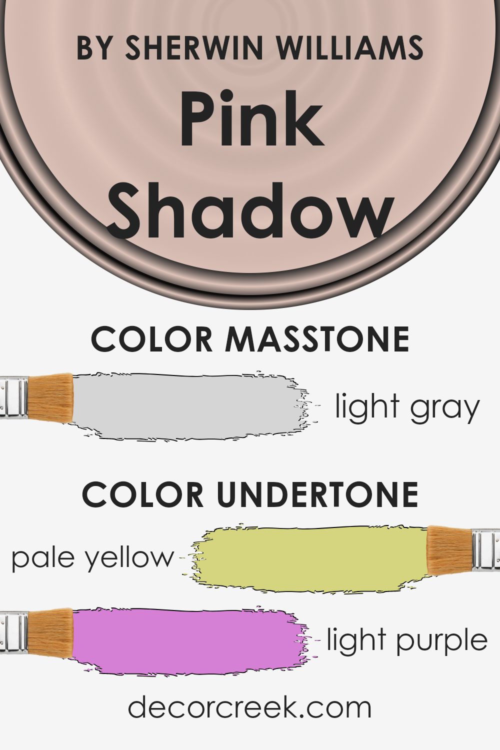
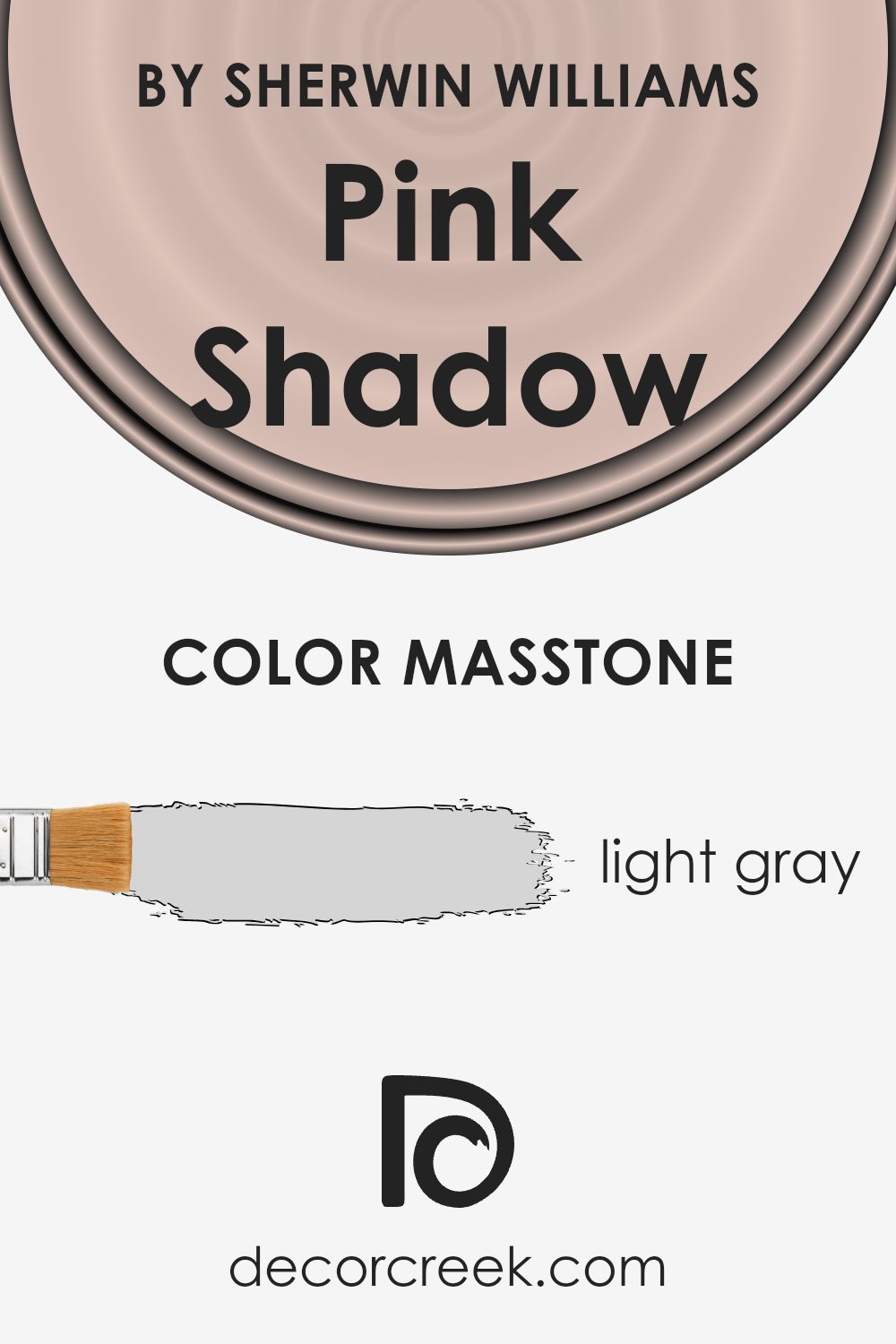
What is the Masstone of the Pink Shadow SW 0070 by Sherwin Williams?
Pink Shadow (SW 0070) by Sherwin Williams is a soft and understated color. Its masstone of light gray (#D5D5D5) provides a subtle and neutral base, which makes it quite versatile for homes. This light gray hue works well to create a calm and inviting atmosphere, without being overpowering. It can be used in various rooms, from living areas to bedrooms, as it adds a touch of warmth and comfort.
Due to its gentle nature, Pink Shadow complements a wide range of other colors and styles. It pairs nicely with natural wood tones and soft whites, enhancing a room’s overall look. It’s also a great backdrop for more vibrant accent colors, allowing them to stand out without clashing.
Because of its neutrality, this color can easily adapt to changing decor styles, making it a popular choice for those looking to maintain versatility in their home design.
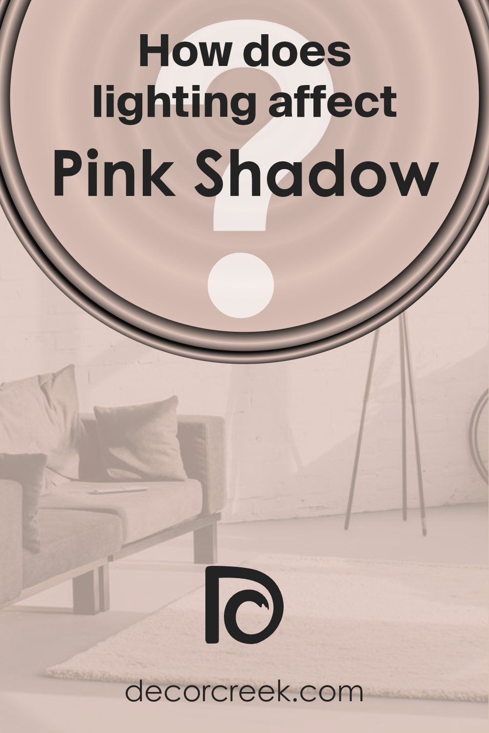
How Does Lighting Affect Pink Shadow SW 0070 by Sherwin Williams?
Lighting plays a crucial role in how we perceive color. It can change the mood of a room and the appearance of wall paint. The way a color looks can vary significantly under artificial light, like bulbs, and natural light, which comes from the sun.
The color Pink Shadow by Sherwin Williams is a gentle, muted pink. Under artificial lighting, particularly warm lights like incandescent bulbs, this color can appear warmer and cozier. It may take on a slightly peachy tone. With cooler artificial lighting, like some LED lights or fluorescent lights, it might look a bit more muted or even grayish.
In natural light, Pink Shadow will change throughout the day and in different directions of light. In a north-facing room, which receives cooler and indirect light, the color might appear more subdued and grayer. It can make a space feel soothing, but it may lack the warmth people expect from a pink.
In a south-facing room, which gets the most intense natural light throughout the day, Pink Shadow can look brighter and more vibrant. The natural sunlight enhances its warmth, making the room feel inviting and more lively.
An east-facing room gets morning sun, so the color may look brighter and warmer early in the day. In the afternoon, as the sun moves away, the color might cool down slightly or look softer.
In a west-facing room, the situation is reversed. The mornings can make Pink Shadow appear cooler and softer, while the late afternoon and evening light can make it glow with warmth as the sun sets.
Overall, Pink Shadow has a versatile character that changes according to light conditions. The orientation of the room and the type of lighting used will both influence its final appearance.
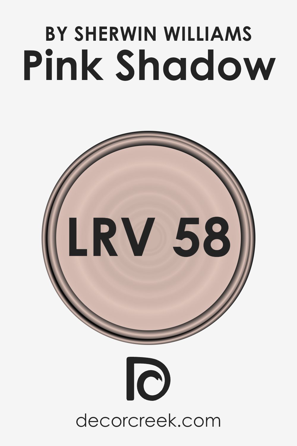
What is the LRV of Pink Shadow SW 0070 by Sherwin Williams?
The Light Reflectance Value (LRV) of a color measures the amount of visible light that a color reflects. It is a scale that runs from 0 to 100, where 0 means it absorbs all light (total black) and 100 means it reflects all light (pure white). This number helps in understanding how light or dark a color will appear when painted on walls.
A higher LRV means the color reflects more light and is more towards the lighter side of the spectrum, which can make rooms feel more open and bright. On the other hand, a lower LRV color will absorb more light, making a space feel cozier and often smaller.
For a color with an LRV of 58.27, like Pink Shadow, it sits comfortably in the mid-range of the LRV scale. This means it can reflect a moderate amount of light, thus it is neither too dark nor too light. Such a color can work well in spaces where you want a pleasant, balanced ambiance. Pink Shadow will reflect enough light to keep a room feeling relatively open while providing enough color to give warmth and character to the walls.
It’s a great option for living areas or bedrooms where a soft, inviting atmosphere is desired.
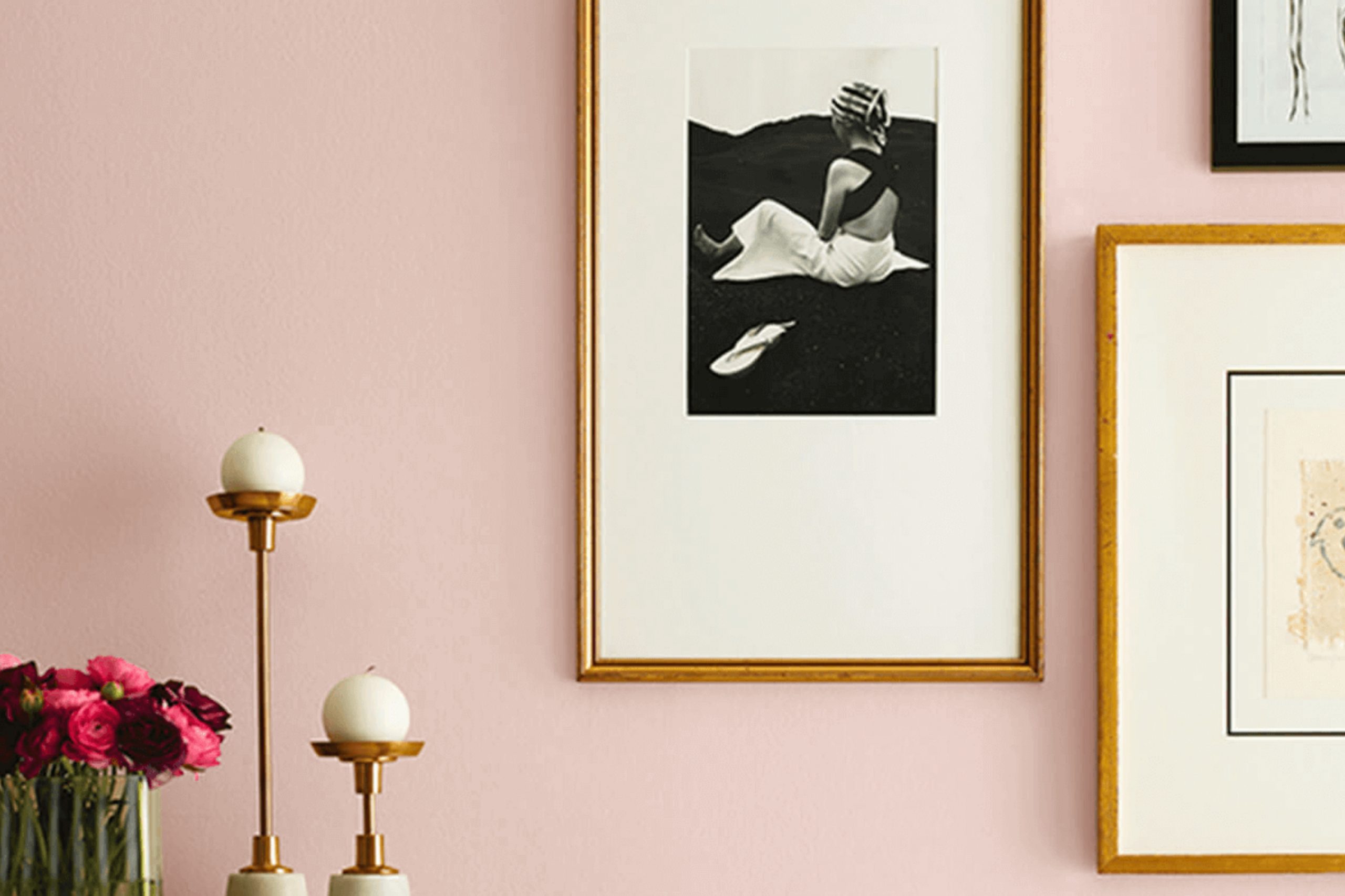
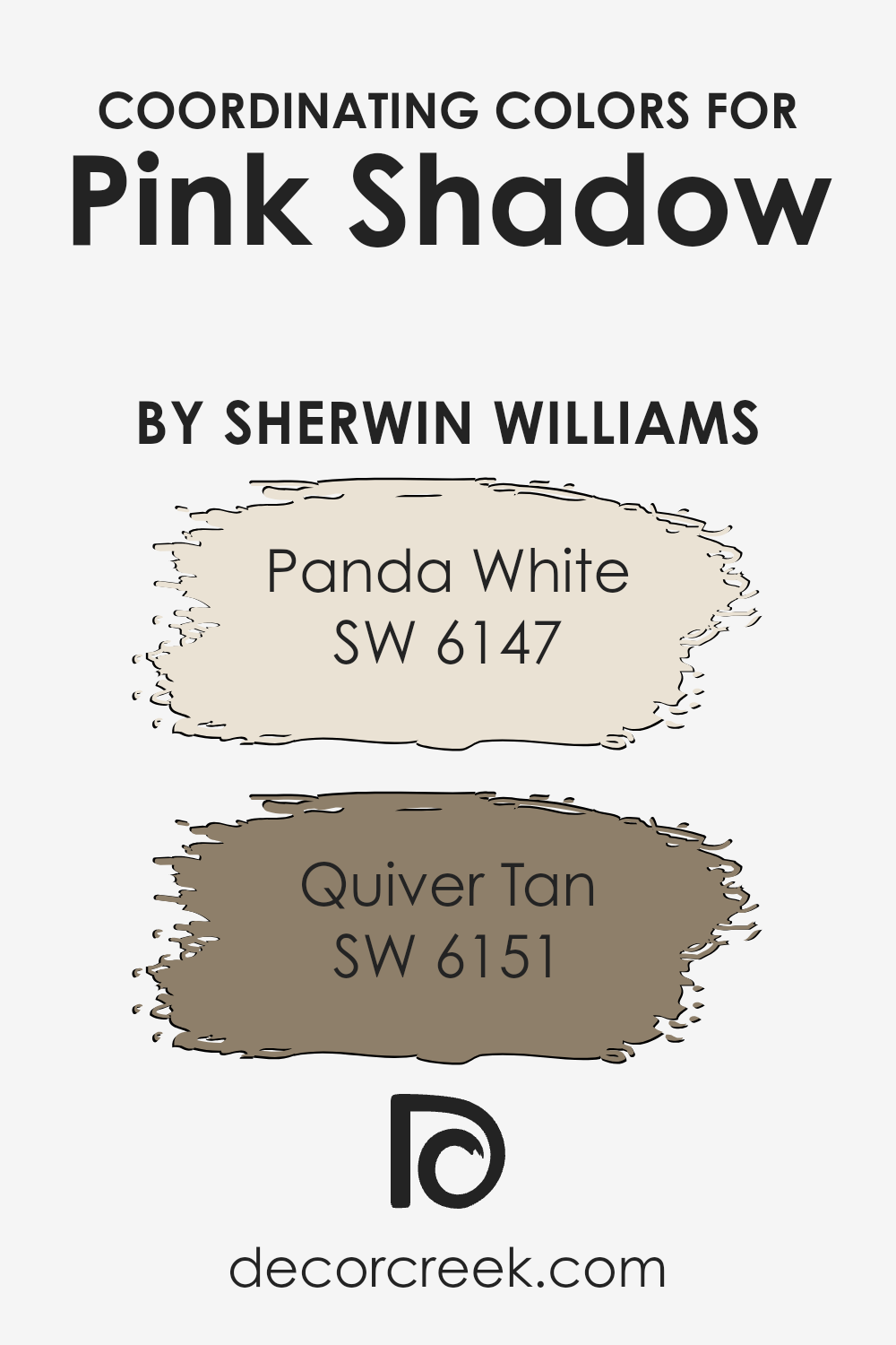
Coordinating Colors of Pink Shadow SW 0070 by Sherwin Williams
Coordinating colors are hues that work well together, creating a balanced and harmonious look. They complement each other without clashing or competing for attention. Take Pink Shadow by Sherwin Williams as an example—its soft and inviting blush tone forms a gentle base, ideal for pairing with other colors.
When coordinating, it’s crucial to find hues that enhance Pink Shadow’s warmth without overpowering it. This ensures a cohesive design, whether it’s in a living room, bedroom, or any other space.
Panda White by Sherwin Williams is a versatile, warm off-white color that perfectly balances out the gentle pink hue. It acts as a neutral backdrop, adding lightness to any space. On the other hand, Quiver Tan is a rich, earthy tone that brings depth and stability. Its grounded nature complements Pink Shadow by adding warmth and texture to the color scheme.
Together, these colors create an inviting and cozy environment, with each one enhancing the others’ best qualities.
Whether used in a palette for interior design or in a piece of artwork, understanding how these colors interact can help build a space that feels unified and pleasing to the eye.
You can see recommended paint colors below:
- SW 6147 Panda White
- SW 6151 Quiver Tan
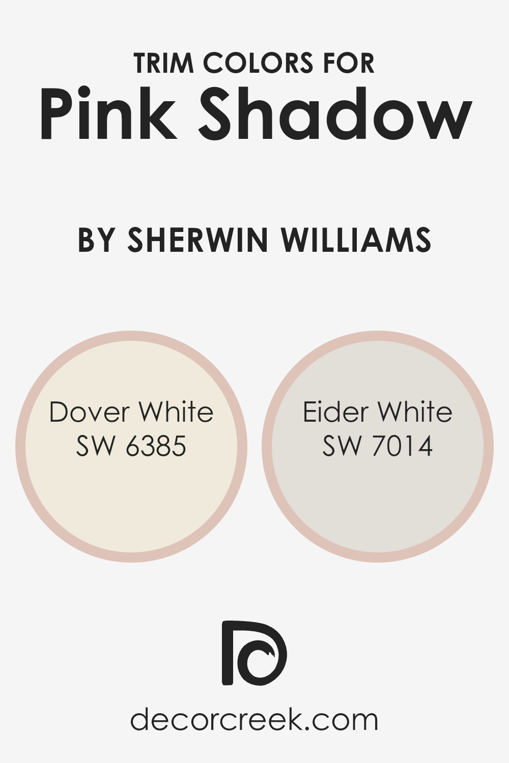
What are the Trim colors of Pink Shadow SW 0070 by Sherwin Williams?
Trim colors are the colors used for the edges and borders around walls, windows, and doors, which complement the main wall color and give a room a polished look. When it comes to using Pink Shadow by Sherwin Williams, choosing the right trim colors is important because they can either enhance or clash with the wall’s soft pink hue.
The trim colors you select can have a big impact on the overall aesthetic of a space. Using Dover White or Eider White as trim can provide the perfect balance to Pink Shadow, creating a stylish and balanced look.
Dover White is a warm, creamy white that creates a friendly and inviting atmosphere. Its subtle warmth can help to soften the boldness of the surrounding pink, offering a cozy and harmonious appearance. On the other hand, Eider White is a cooler, light grayish white that provides a clean and modern contrast to the pink walls.
Its more subdued tone can help to bring out the richness of Pink Shadow, while still maintaining a fresh and airy feel. Both colors serve as excellent trim options that underline the character of Pink Shadow while giving the room a finished and coordinated look.
You can see recommended paint colors below:
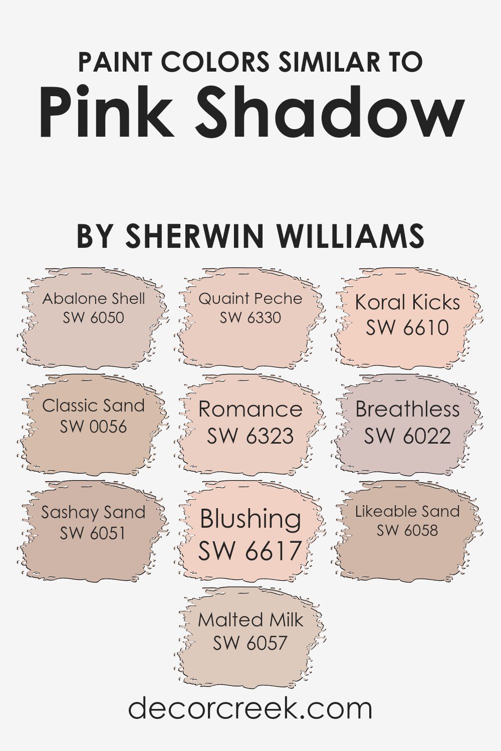
Colors Similar to Pink Shadow SW 0070 by Sherwin Williams
Similar colors play an important role in design and decor because they create a sense of harmony and cohesion. When colors are close in tone or hue, they blend well together and provide a comforting and balanced atmosphere.
For instance, Abalone Shell is a warm, muted beige that pairs nicely with the soft, sandy tones of Classic Sand. Together, they create a neutral base that complements various other shades.
Sashay Sand brings in a gentle rose-tinted hue, adding a hint of warmth, while Malted Milk offers a creamy softness that balances more intense colors. Quaint Peche introduces a subtle peach undertone, echoing the soft, romantic feel of Romance, which is a delicate pink. The vibrant Blushing brings a cheerful touch to the palette, similar to the lively coral tint of Koral Kicks.
Meanwhile, Breathless has a pale, whispery quality that lends a light and airy feel. Lastly, Likeable Sand delivers a warm, approachable tone with its light, earthy shade.
These colors, when used alongside Pink Shadow, create a cohesive look that is both inviting and visually pleasing, perfect for any space seeking a gentle and warm ambiance.
You can see recommended paint colors below:
- SW 6050 Abalone Shell
- SW 0056 Classic Sand
- SW 6051 Sashay Sand
- SW 6057 Malted Milk
- SW 6330 Quaint Peche
- SW 6323 Romance
- SW 6617 Blushing
- SW 6610 Koral Kicks
- SW 6022 Breathless
- SW 6058 Likeable Sand
How to Use Pink Shadow SW 0070 by Sherwin Williams In Your Home?
Pink Shadow SW 0070 by Sherwin Williams is a soft, muted pink that brings a gentle, calming vibe to any room. It’s versatile enough to be used in various spaces in your home. In a bedroom, it creates a cozy, peaceful atmosphere, perfect for winding down at the end of the day. In a bathroom, it adds a touch of warmth and comfort.
This color pairs well with neutral tones or whites, adding a hint of color without being overwhelming. Pink Shadow also complements natural wood accents, making it a good choice for living areas or kitchens with wooden cabinets or floors.
It’s an excellent choice for a nursery, offering a sweet but subtle backdrop. Combine it with soft greys or beige for a balanced look. Overall, Pink Shadow is a great choice for those looking to add a gentle touch of color to their home decor.
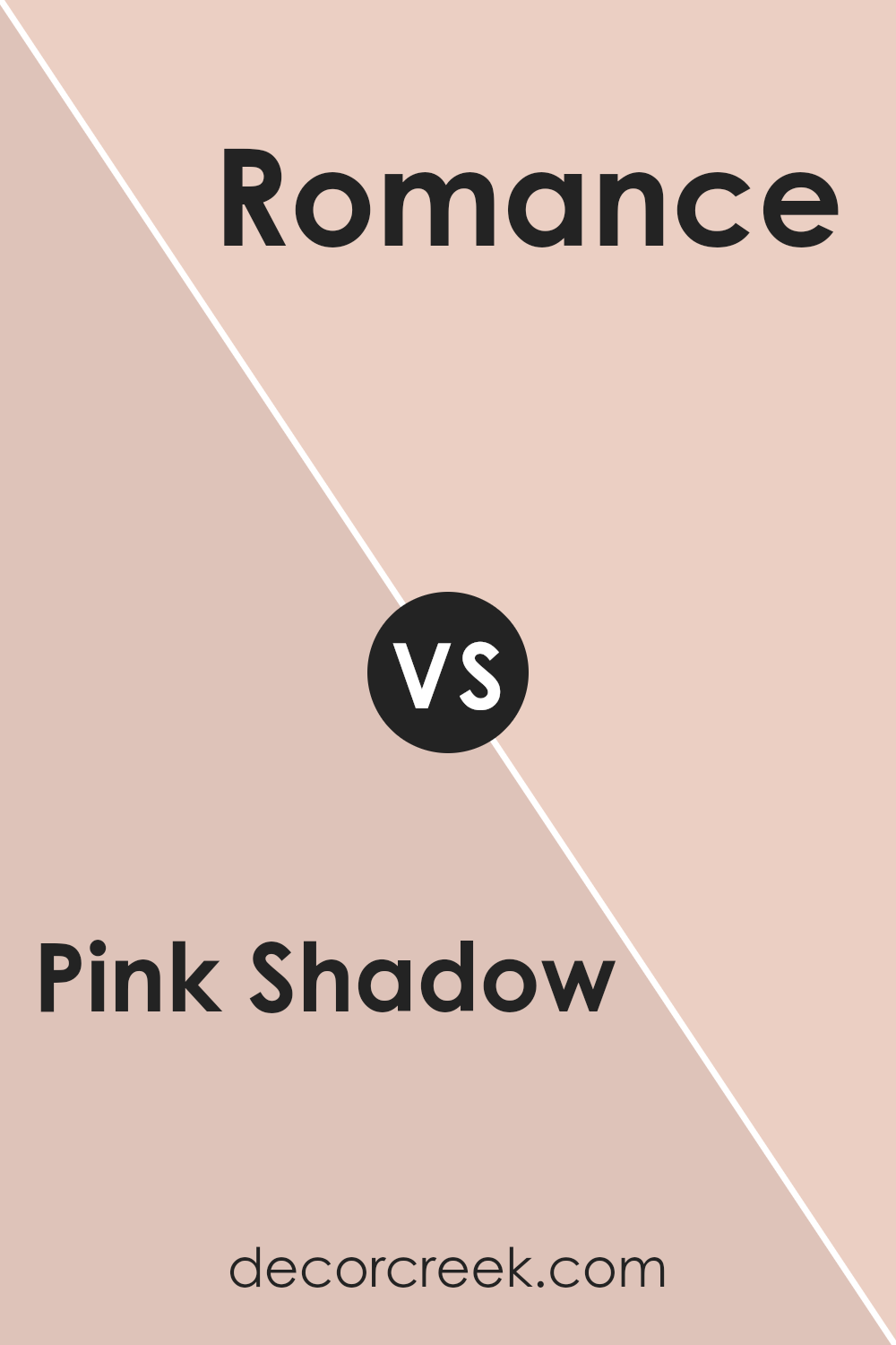
Pink Shadow SW 0070 by Sherwin Williams vs Romance SW 6323 by Sherwin Williams
Pink Shadow SW 0070 and Romance SW 6323 are two soft pink colors by Sherwin Williams. Pink Shadow is a gentle, muted pink with a subtle gray undertone, which gives it a more understated and relaxed look. It’s ideal for creating a calm and soothing space, and it pairs well with neutrals or deeper accent colors for contrast.
On the other hand, Romance is a warmer, more vibrant pink. It is brighter and carries a peachy undertone, which can make a room feel more lively and inviting. This makes it a good choice for rooms where you want a cheerful and welcoming atmosphere.
Both colors can work well in different settings depending on the mood you want to create. Pink Shadow is perfect for those seeking a calm and toned-down vibe, while Romance suits spaces that benefit from a touch of warmth and energy.
You can see recommended paint color below:
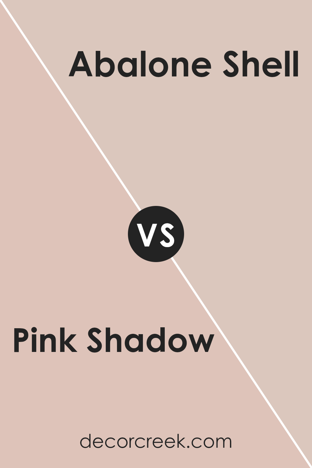
Pink Shadow SW 0070 by Sherwin Williams vs Abalone Shell SW 6050 by Sherwin Williams
Pink Shadow SW 0070 by Sherwin Williams is a soft pink color that brings warmth and calmness to a room. It has a gentle, soothing vibe that can make a space feel cozy and inviting. The pink is subtle and not overpowering, suitable for bedrooms or living areas where relaxation is key.
On the other hand, Abalone Shell SW 6050 is more of a beige with pink undertones, offering a neutral backdrop with a hint of warmth. It’s versatile and easy to pair with other colors, making it ideal for larger rooms or open spaces where flexibility is needed.
While Pink Shadow adds a noticeable touch of pink to a space, Abalone Shell provides a more understated, elegant look. Both colors work well in creating inviting and stylish environments, but Pink Shadow leans more towards a distinctly pink feel, whereas Abalone Shell stays more neutral with a subtle twist.
You can see recommended paint color below:
- SW 6050 Abalone Shell
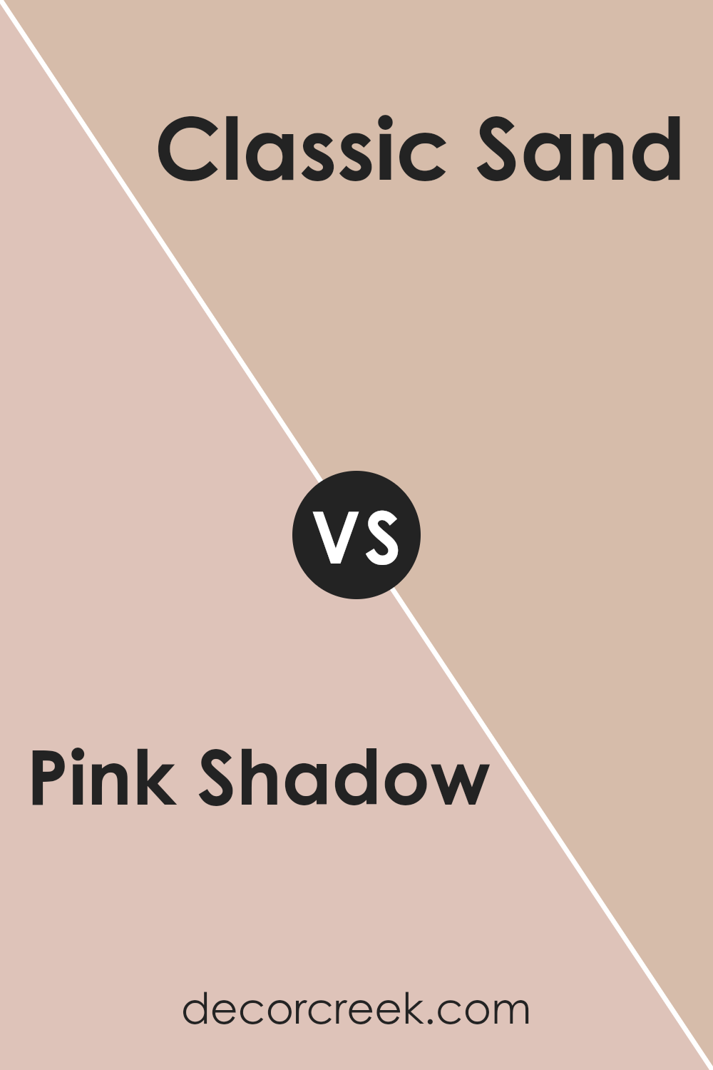
Pink Shadow SW 0070 by Sherwin Williams vs Classic Sand SW 0056 by Sherwin Williams
Pink Shadow SW 0070 and Classic Sand SW 0056 by Sherwin Williams are two distinct colors offering different vibes. Pink Shadow is a soft and gentle tone with a hint of warmth, offering a cozy and inviting feel. It’s perfect for a playful or romantic ambiance, often used in bedrooms or spaces meant for relaxation and comfort.
On the other hand, Classic Sand is a neutral hue with a subtle hint of beige. It provides a warm and earthy backdrop, ideal for creating a calming and natural environment.
This color is versatile and easy to pair with different tones, making it a popular choice for living rooms, dining areas, or any space where a simple, clean look is desired.
While Pink Shadow adds a touch of color and warmth, Classic Sand provides a grounded feel. Both colors enhance a room’s atmosphere but in unique ways, matching different aesthetic preferences and functional needs.
You can see recommended paint color below:
- SW 0056 Classic Sand
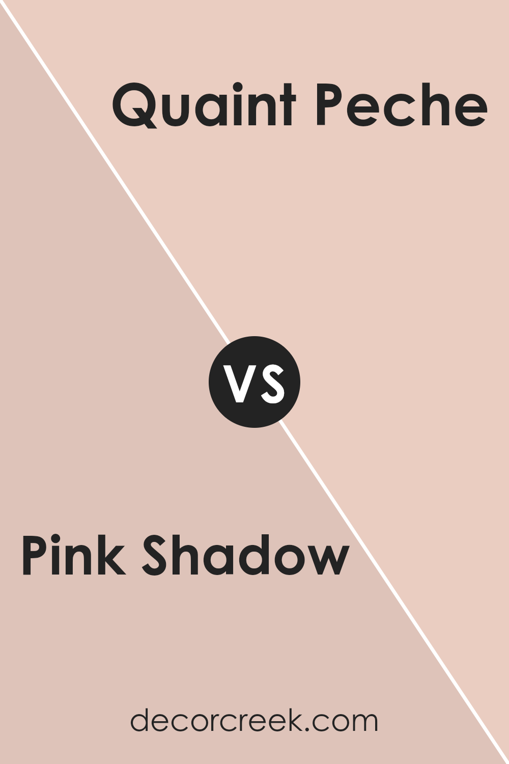
Pink Shadow SW 0070 by Sherwin Williams vs Quaint Peche SW 6330 by Sherwin Williams
Pink Shadow SW 0070 and Quaint Peche SW 6330 are both soft, warm colors by Sherwin Williams, but they have distinct personalities. Pink Shadow is a muted pink with a subtle gray undertone, giving it a gentle, understated look. It’s versatile and can create a calming atmosphere, working well in both modern and traditional settings.
Quaint Peche, on the other hand, leans more towards a peachy tone. It’s slightly warmer and has a cheerful vibe, making a space feel cozy and inviting. Quaint Peche can bring a touch of brightness without being overpowering.
While both colors are warm and inviting, Pink Shadow is more subdued and can serve as a neutral backdrop, whereas Quaint Peche stands out a bit more and adds a friendly, playful touch to a room. Both colors pair well with whites and other soft tones for a harmonious look.
You can see recommended paint color below:
- SW 6330 Quaint Peche
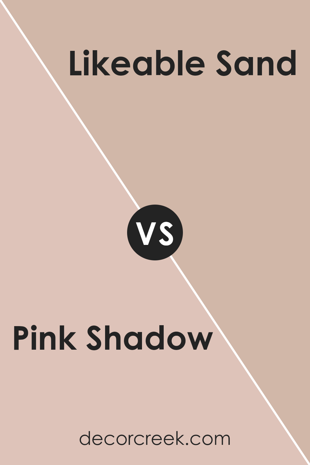
Pink Shadow SW 0070 by Sherwin Williams vs Likeable Sand SW 6058 by Sherwin Williams
Pink Shadow SW 0070 and Likeable Sand SW 6058 by Sherwin Williams are two distinct colors that bring different vibes to a space. Pink Shadow is a soft, muted pink that adds a warm and gentle touch to rooms. It’s often associated with a cozy and inviting atmosphere, making it a great choice for spaces where you want a calm and comforting feel.
On the other hand, Likeable Sand is a warm beige with subtle undertones of pink or peach. This color is versatile and acts as a neutral backdrop, blending well with various decor styles.
It creates a soothing environment that’s easy on the eyes. While Pink Shadow adds a touch of color, Likeable Sand offers a more understated look. Together, these colors can complement each other well, with Pink Shadow providing a gentle pop and Likeable Sand offering a stable base.
You can see recommended paint color below:
- SW 6058 Likeable Sand
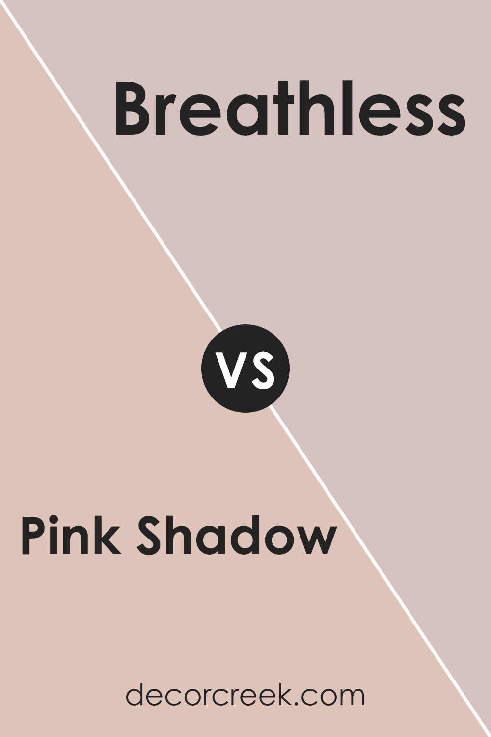
Pink Shadow SW 0070 by Sherwin Williams vs Breathless SW 6022 by Sherwin Williams
Pink Shadow SW 0070 and Breathless SW 6022 by Sherwin Williams are both beautiful shades of pink, but they bring different feelings to a space. Pink Shadow SW 0070 is a gentle, warm pink with a hint of peach, giving off a cozy and inviting vibe. It’s great for spaces where you want to feel comfortable and relaxed.
On the other hand, Breathless SW 6022 is a soft, muted pink with a cooler tone. It has a more subtle and calm feel, making it a good choice for spaces where you want a light and airy atmosphere.
While Pink Shadow feels warm and welcoming, Breathless brings a touch of softness and calmness without being overwhelming. Both colors work well in bedrooms or living areas, but Pink Shadow might add more warmth, whereas Breathless offers a lighter, more understated touch to the decor.
You can see recommended paint color below:
- SW 6022 Breathless
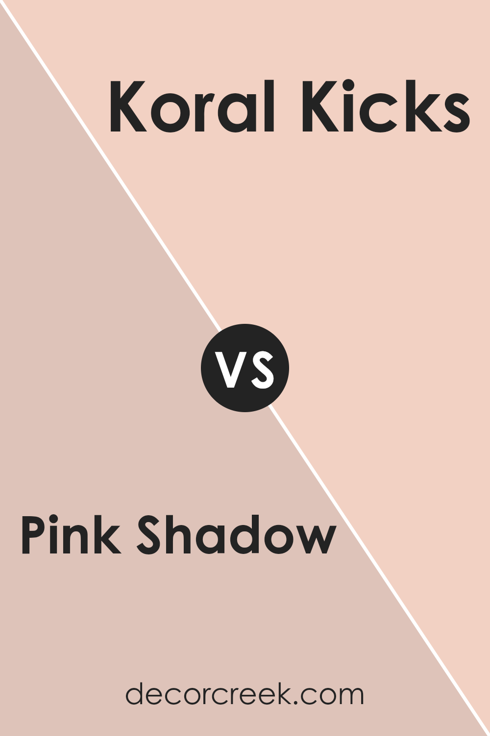
Pink Shadow SW 0070 by Sherwin Williams vs Koral Kicks SW 6610 by Sherwin Williams
Pink Shadow SW 0070 by Sherwin Williams is a soft and subtle pink. It has a gentle, calming vibe that feels light and airy. This color is perfect for creating a soothing atmosphere, making it great for bedrooms or living areas where you want to relax and unwind.
On the other hand, Koral Kicks SW 6610 is a bolder, more vibrant shade of pink. It’s lively and energetic, bringing a sense of fun and joy to a space. This color is ideal for accent walls or areas where you want to make a statement and add some personality.
While Pink Shadow provides a gentle, understated look, Koral Kicks offers a punch of color and excitement. Both colors can add a sense of warmth to a room, but Pink Shadow does it in a more subtle way, while Koral Kicks is more playful and lively.
You can see recommended paint color below:
- SW 6610 Koral Kicks
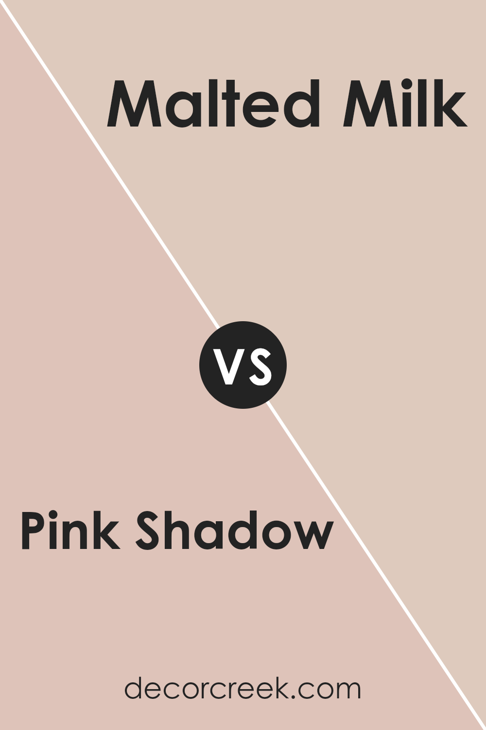
Pink Shadow SW 0070 by Sherwin Williams vs Malted Milk SW 6057 by Sherwin Williams
Pink Shadow SW 0070 is a soft, muted pink with a gentle and warm feel. It’s perfect for creating a cozy and inviting atmosphere, adding a touch of romance to any room. It has a subtle charm, making it versatile enough for bedrooms or living spaces.
On the other hand, Malted Milk SW 6057 is a light, creamy beige. This color offers a warm, neutral backdrop that complements various design styles. It’s understated and elegant, providing a sense of calmness and comfort.
While Pink Shadow brings a hint of color with its soft pink tone, Malted Milk offers a more neutral look. Pink Shadow can add a romantic or playful element, whereas Malted Milk is more about warmth and simplicity. Both colors have a gentle, soothing quality, but Pink Shadow is bolder and slightly more playful compared to the classic, neutral nature of Malted Milk. Both can be used to create welcoming spaces.
You can see recommended paint color below:
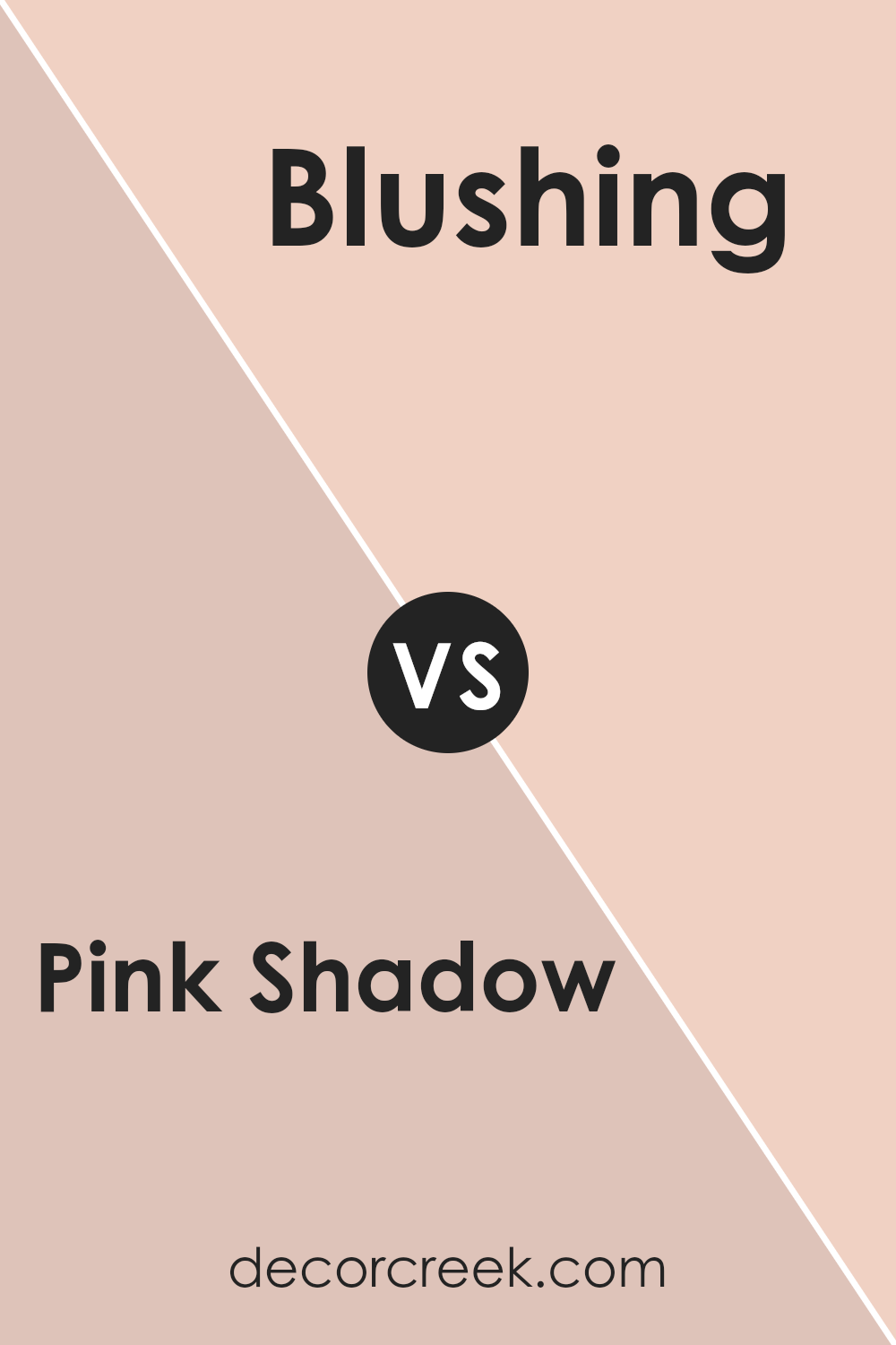
Pink Shadow SW 0070 by Sherwin Williams vs Blushing SW 6617 by Sherwin Williams
Pink Shadow and Blushing, both from Sherwin Williams, are two shades of pink with distinct personalities. Pink Shadow is a deeper, more muted pink with a subtle hint of rose, creating a cozy and inviting feel. It exudes warmth and is ideal for adding depth to a room without being too bold.
Blushing, on the other hand, is a brighter, more vibrant pink. It’s cheerful and lively, bringing more energy to a space. Blushing is perfect for making a statement or adding a playful touch to a room.
These two colors can work well together or separately, depending on the mood you want to set. Pink Shadow’s more subdued tone offers relaxation, making it suitable for bedrooms or living spaces.
Blushing’s vivid nature suits accents or spaces where you want to infuse a burst of color and emotion. Both colors reflect different sides of pink’s versatility.
You can see recommended paint color below:
- SW 6617 Blushing
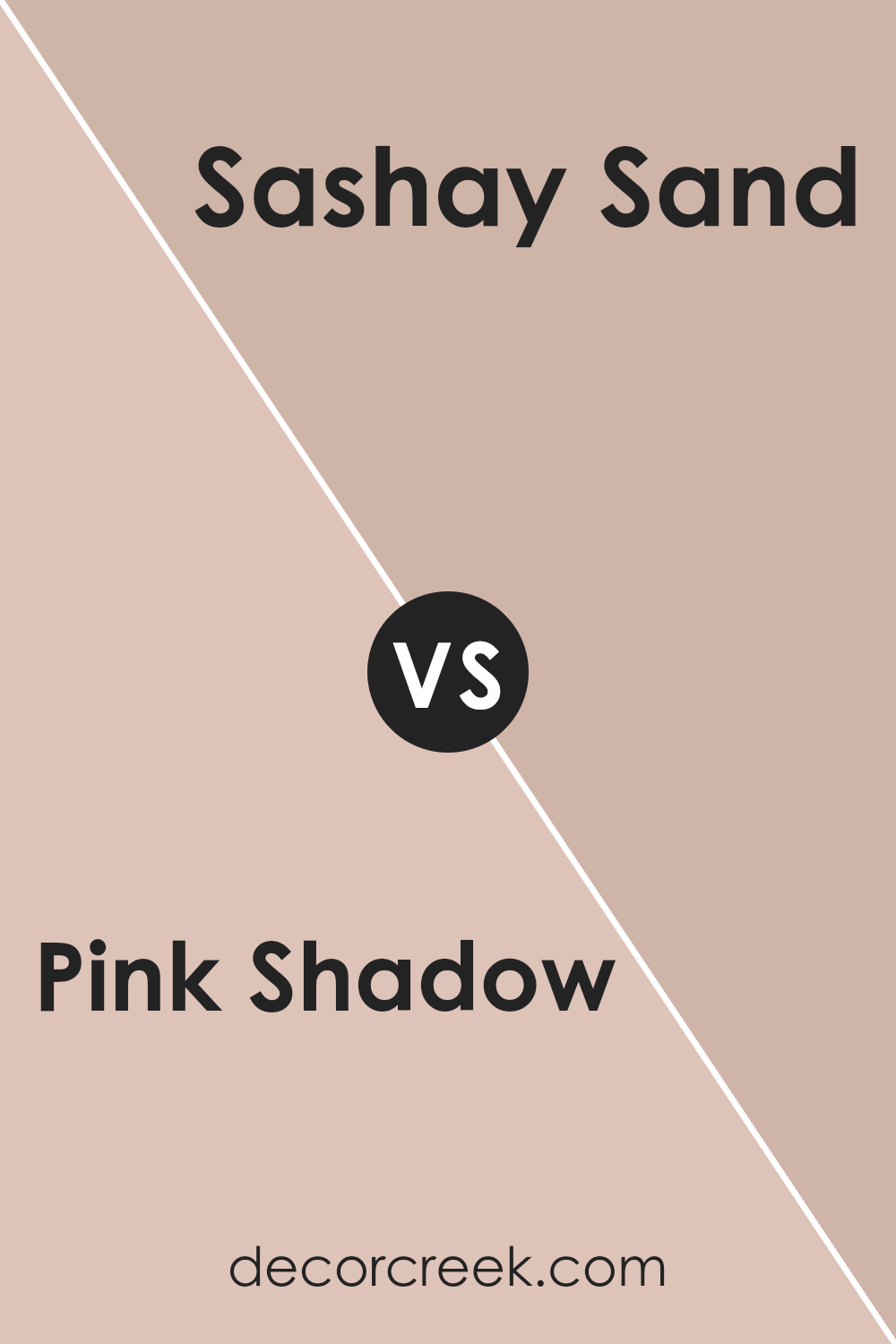
Pink Shadow SW 0070 by Sherwin Williams vs Sashay Sand SW 6051 by Sherwin Williams
Pink Shadow SW 0070 and Sashay Sand SW 6051, both from Sherwin Williams, offer distinct looks. Pink Shadow is a soft pink, lending a playful and fresh feel to spaces. It’s bright and promotes a lively atmosphere, making it ideal for rooms where energy and lightness are desired.
Sashay Sand, on the other hand, has a warm, beige undertone. This color is more subdued, providing a cozy and grounded vibe. Its neutral nature makes it versatile, easy to pair with other colors, and suitable for a variety of settings.
When comparing the two, Pink Shadow adds a pop of color and can brighten up a room, while Sashay Sand creates warmth and can be used as a base color throughout a home. Choosing between them depends on the mood you want: Pink Shadow for vibrancy, Sashay Sand for comfort and versatility.
You can see recommended paint color below:
- SW 6051 Sashay Sand
Conclusion
In wrapping up my thoughts on SW 0070 Pink Shadow by Sherwin Williams, I must say how much this color surprises me. It is a soft pink that feels like a comforting hug or a warm light filtering through the window at the break of dawn. When I see this color on walls, it makes me think of both creativity and gentleness. It’s like a color that tells you everything will be okay.
Painting a room with Pink Shadow brings a sense of calm, like it’s a whisper rather than a shout. It’s perfect for a bedroom or a cozy corner where you might like to read, draw, or simply relax. This color has a way of making a room feel warm and inviting.
It also works well with other colors, like grays or whites, and even some blues.
Pink Shadow is special because it can change depending on the light. In the morning, it might look a little brighter, while in the evening, it becomes more mellow and soft.
That makes it a fun choice for anyone who likes a little magic in their life. So, if you’re thinking about a new wall color and want something friendly and welcoming, SW 0070 Pink Shadow might be just the right pick!
Ever wished paint sampling was as easy as sticking a sticker? Guess what? Now it is! Discover Samplize's unique Peel & Stick samples.
Get paint samples

