Looking for a fresh start for your walls? Consider Sherwin Williams’ SW 7011, also known as Natural Choice. This paint color is a top pick for those aiming to bring a sense of calm and simplicity into their spaces. Its understated elegance makes it a go-to choice for any room in your house.
Natural Choice stands out with its subtle warmth, offering a neutral backdrop that’s both inviting and versatile. Whether you’re updating your living room, bedroom, or even your kitchen, this color provides a clean slate without feeling cold or impersonal.
Its ability to adapt makes it perfect for mixing and matching with different décor styles, from modern minimalism to rustic charm.
One of the best things about Natural Choice is its user-friendliness. It pairs beautifully with a wide range of colors, from bold and vibrant hues to soft and subtle shades. This makes it incredibly easy for anyone to work with, regardless of your decorating experience. Whether you want to create a serene sanctuary or a lively gathering space, Natural Choice offers a solid foundation to build upon.
In this article, we’ll explore the unique qualities of SW 7011 Natural Choice by Sherwin Williams and how it can transform your space. Get ready to refresh your home with this adaptable and timeless shade.
What Color Is Natural Choice SW 7011 by Sherwin Williams?
Natural Choice by Sherwin Williams is a warm and inviting shade that brings a subtle elegance to any room it adorns. This color has a soft, creamy hue that feels like a gentle embrace, offering a calming presence. It’s incredibly versatile, easily fitting into numerous interior styles, from modern minimalist to cozy country and classic traditional. Its understated elegance makes it a perfect backdrop for a variety of decor themes and color palettes, allowing for flexibility in design choices.
This shade works wonders in spaces aiming for a light and airy feel, providing a sense of openness and tranquility. It pairs beautifully with natural materials like wood, bringing out their warmth and texture, and creates a harmonious contrast with stone and metals for a more grounded look.
When it comes to textures, Natural Choice complements both smooth and rough fabrics, enhancing the coziness of wool, linen, or cotton furnishings and curtains.
Furnishings in rich, dark woods or bright, cheerful colors stand out against this neutral backdrop, offering a spectrum of design possibilities. Whether used in a sleek, modern kitchen or a cozy, dim-lit reading nook, Natural Choice sets a foundation that supports a clear, soothing, and cohesive aesthetic. It’s a color that invites creativity and personal flair, making any space feel like home.
Ever wished paint sampling was as easy as sticking a sticker? Guess what? Now it is! Discover Samplize's unique Peel & Stick samples.
Get paint samples

Is Natural Choice SW 7011 by Sherwin Williams Warm or Cool color?
Natural Choice by Sherwin Williams is a soft and subtle color that brings a sense of tranquility and light to any room. This paint shade is a delicate off-white, making it a versatile backdrop for various decor styles and preferences. It has the unique ability to make spaces feel more open and airy, providing a clean and fresh look without the starkness that comes with pure white.
This color works wonders in homes because it serves as a blank canvas, allowing furniture, artwork, and other decor elements to stand out.
What’s great about Natural Choice is its adaptability. It matches well with a wide range of colors, from bold and vibrant hues to more muted tones, making it an excellent option for any room in the house.
It’s especially useful in spaces that lack natural light, as it reflects whatever light is available, brightening the room. Furthermore, its simplicity and warmth create a welcoming environment, making it a top choice for those looking to add a cozy yet sophisticated touch to their home.
Undertones of Natural Choice SW 7011 by Sherwin Williams
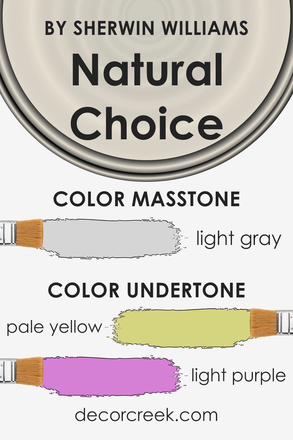
Natural Choice by Sherwin Williams is a color that might seem simple at first glance, but it’s actually quite complex due to its undertones. This paint has hints of pale yellow and light purple, which have a big impact on how it looks on your walls. Undertones are subtle colors that lie beneath the main color. They can change the main color’s appearance depending on the light and what other colors are around.
Pale yellow brings a soft, sunny warmth to Natural Choice, making it feel welcoming and cozy. This slight warmth means it pairs beautifully with natural light, glowing gently in the morning or afternoon sun. It makes spaces feel more open and airy, perfect for living rooms or kitchens where you want a light, fresh vibe.
The light purple undertone adds a hint of cool sophistication. It’s this sneaky splash of purple that can make the color feel more nuanced and layered. In rooms with less natural light, or during the evening, this purple undertone can emerge more, adding depth and a touch of elegance to the space.
Together, these undertones mean Natural Choice is not just a plain off-white. Instead, it’s a versatile backdrop that can shift in mood and style depending on its surroundings. Whether you want your room to feel snug and inviting or refined and stylish, this paint has the ability to subtly shift, making it a fantastic choice for interior walls.
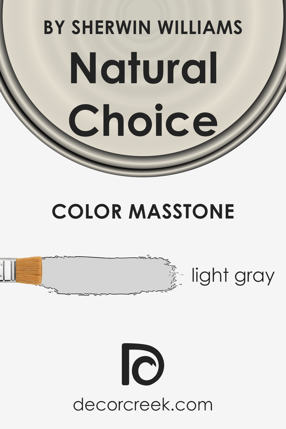
What is the Masstone of the Natural Choice SW 7011 by Sherwin Williams?
Natural Choice by Sherwin Williams, marked with code SW 7011, showcases a masstone of light gray, appearing as #D5D5D5 on the color chart. This color brings a fresh and airy feel into homes, acting as a versatile backdrop that can complement various decor styles.
Since it’s light gray, it easily blends with other colors, from bright accents to softer tones, allowing homeowners to mix and match furnishings and accessories without worrying about clashes. This subtlety in hue makes it perfect for creating a serene and inviting atmosphere in spaces like bedrooms and living rooms, where a sense of calm is often sought.
Moreover, its neutral base enhances natural light in a room, making spaces appear brighter and more spacious. As such, Natural Choice is ideal for anyone looking to introduce a gentle yet sophisticated touch to their home, proving adept at enhancing the perception of space while remaining warmly inviting.
How Does Lighting Affect Natural Choice SW 7011 by Sherwin Williams?
Lighting plays a critical role in how we perceive colors in our environment. The same color can appear differently under various light sources, significantly impacting the mood and aesthetic of a room. This phenomenon occurs due to the color temperature and intensity of the light, which can alter our perception of color hues.
Take, for instance, a light and neutral shade like Natural Choice. In rooms with ample natural light, this color tends to appear warmer and more inviting. The soft undertones of the paint can reflect the sunlight, creating a bright and airy feel.
In the presence of artificial light, the type of bulb used can affect how the color is perceived. LED or fluorescent lighting can make Natural Choice look more crisp and vibrant, whereas incandescent lighting may bring out a softer, more golden hue due to its warmer color temperature.
Now, let’s discuss how this color behaves in rooms with different orientations:
1. North-Faced Rooms: These rooms receive less direct sunlight, which can make light colors appear cooler and slightly more muted. Natural Choice in such a room might look more subdued and can even seem to have a slight grayish tone, emphasizing a serene and calming atmosphere.
2. South-Faced Rooms: These rooms are flooded with warm, natural daylight for most of the day, making colors appear brighter and more vivid. In such rooms, Natural Choice can truly shine, creating a warm, welcoming space that feels cozy and illuminated throughout the day.
3. East-Faced Rooms: Morning light in these rooms is warm and golden, making colors like Natural Choice look soft and inviting in the morning. As the day progresses and the sunlight becomes less direct, the color may appear more neutral and true to its base tone.
4. West-Faced Rooms: These rooms get strong evening light that can cast a warm glow, making warm and neutral colors look more intense. As the sun sets, Natural Choice might take on a warmer, richer appearance, offering a cozy vibe during the evening hours.
Understanding how lighting affects color can help in choosing the right paint for a room’s orientation and lighting conditions, ensuring the selected hue always looks its best.

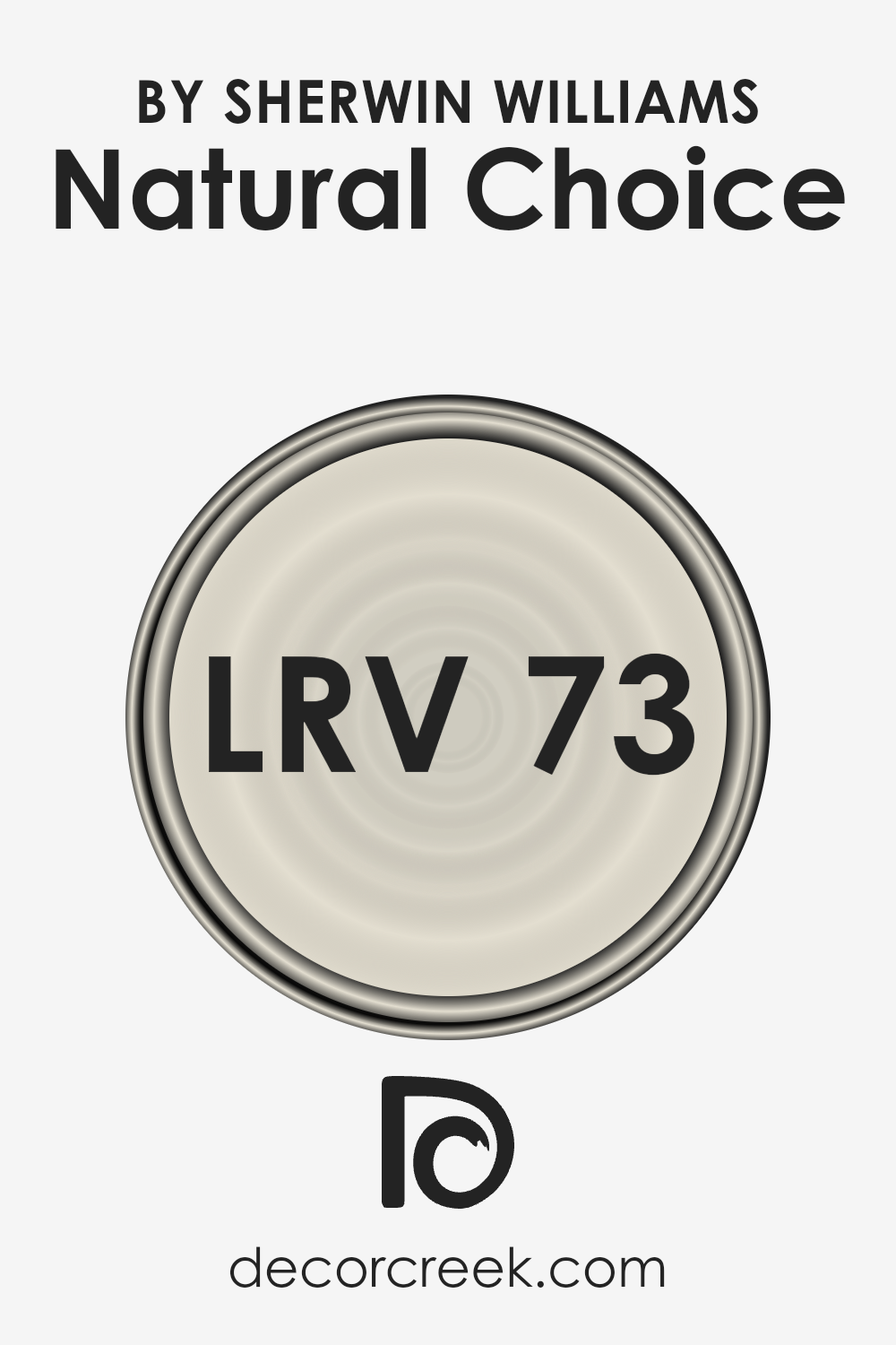
What is the LRV of Natural Choice SW 7011 by Sherwin Williams?
LRV stands for Light Reflectance Value, and it’s a measure of the percentage of light a paint color reflects from or absorbs into a painted surface. LRV ranges from 0 to 100, with 0 absorbing all light (think of a pitch-black room) and 100 reflecting all light (imagine a bright, white wall in direct sunlight). This measure helps in choosing the right paint color for your room, as it can significantly affect the ambiance and mood.
For example, a higher LRV paint will make a room feel brighter and more open because it reflects more light, while a lower LRV paint can make a space feel cozier or smaller since it absorbs more light.
With a LRV of 72.947, Natural Choice by Sherwin Williams is on the higher end of the LRV scale, meaning it will reflect a lot of light and can help make a space appear larger and more airy. This particular shade is a soft, warm white, which can add a sense of calm and relaxation to a room.
Its high LRV makes it an excellent choice for spaces that don’t get a lot of natural light or for smaller rooms that you want to appear more spacious. Since it reflects a significant amount of light, it also has the versatility to work well in various lighting conditions, helping to maintain a stable appearance throughout the day as the natural lighting changes.
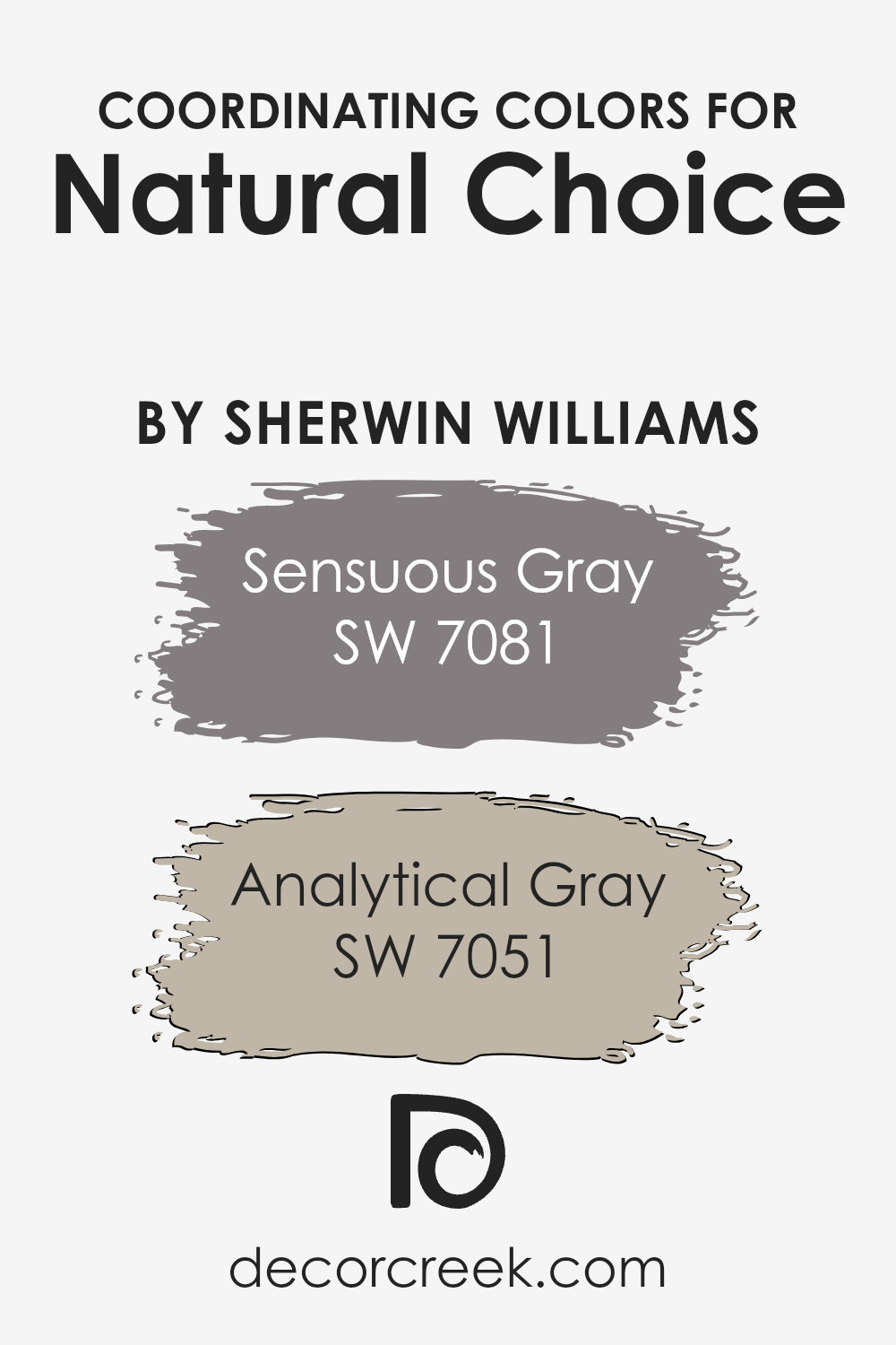
Coordinating Colors of Natural Choice SW 7011 by Sherwin Williams
Coordinating colors are hues that complement each other while being used together in a design or palette to create a cohesive look. When dealing with a base color like Natural Choice by Sherwin Williams, finding the right coordinating colors means searching for shades that enhance the aesthetic appeal and create a balanced atmosphere within a space.
The idea is to select tones that match the undertone and energy of the base color, ensuring that every element in the room feels connected and purposefully chosen. Coordinating colors can either provide contrast, highlight certain features, or blend seamlessly for a subtle effect.
Among the hues that coordinate well with Natural Choice are Sensuous Gray and Analytical Gray, also by Sherwin Williams. Sensuous Gray is a deeper, more enveloping shade that brings a sense of sophistication and depth to spaces. It’s perfect for accent walls or furniture, offering a rich contrast to the lighter, creamy tones of Natural Choice.
On the other hand, Analytical Gray stands out as a lighter, more muted version that carries a serene and calming influence into any room. This color works wonders in providing a gentle transition between the soft backdrop of Natural Choice and the bolder statements made by darker furnishings or decor, ensuring that the overall look remains harmonious and inviting.
You can see recommended paint colors below:
- SW 7081 Sensuous Gray
- SW 7051 Analytical Gray
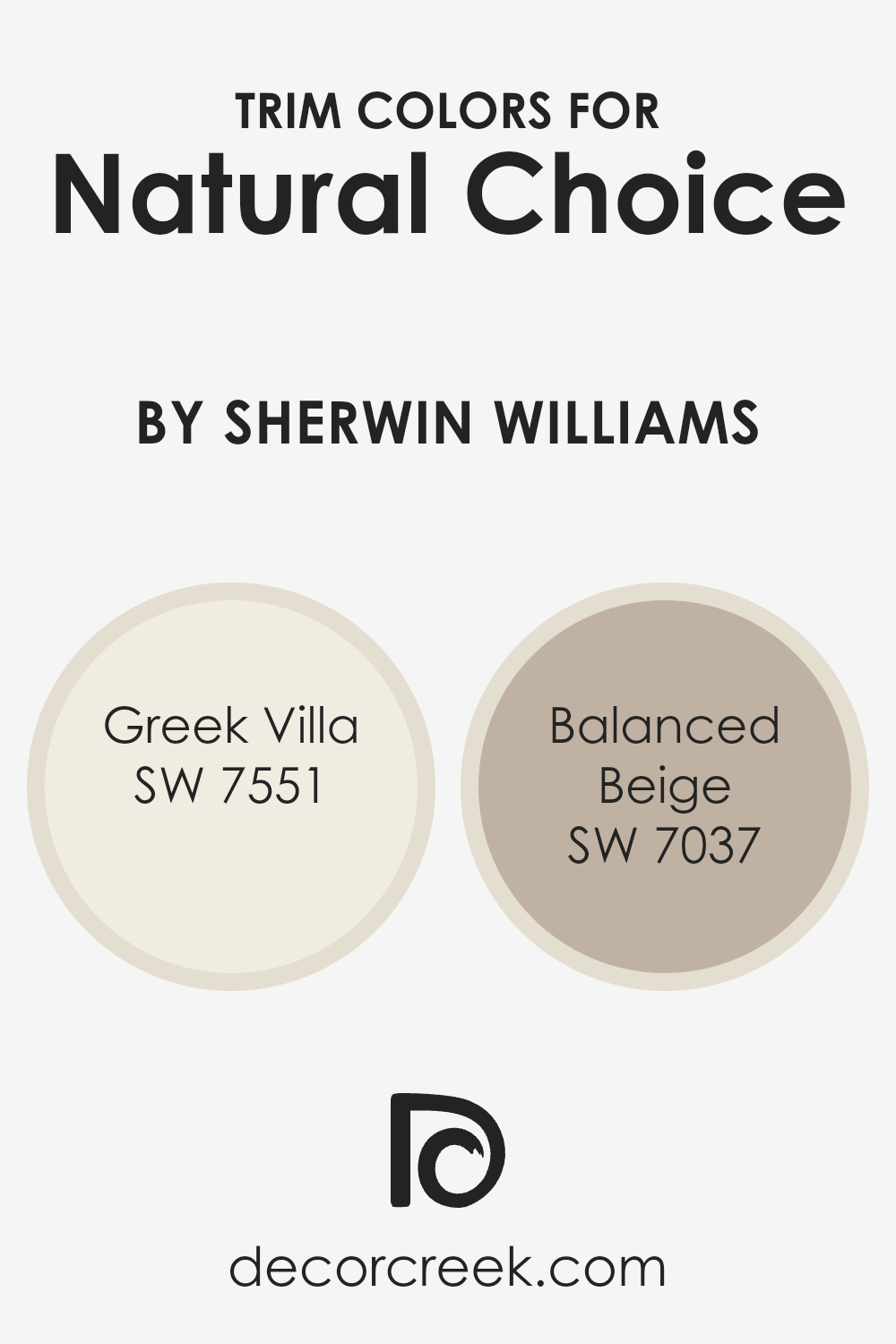
What are the Trim colors of Natural Choice SW 7011 by Sherwin Williams?
Trim colors are the shades used on the edges and details of walls, like baseboards, door frames, and crown moldings, acting as a frame for your room’s color scheme. They play a significant role in adding definition and contrast, helping to highlight the architectural features of a space.
When it comes to a neutral yet inviting wall color like Natural Choice by Sherwin Williams, selecting the right trim color can enhance its beauty and the overall feel of the room. Using complementary trim colors not only frames the space but also brings a cohesive look, making the transition between wall colors and other decorative elements smooth and pleasing to the eye.
For a color like Natural Choice, Greek Villa (SW 7551) serves as an excellent trim color, providing a warm, off-white tone that softly contrasts with Natural Choice’s light warmth, brightening the space without overwhelming it. T
his gentle, creamy shade adds a subtle richness, ensuring the walls stand out without creating a stark contrast. On the other hand, Balanced Beige (SW 7037) offers a deeper, cozy contrast as a trim color, grounding the lighter tones of Natural Choice with its earthy warmth. This mid-tone beige brings an inviting depth to the room, enhancing the welcoming feel while still maintaining a harmonious flow throughout the space.
You can see recommended paint colors below:
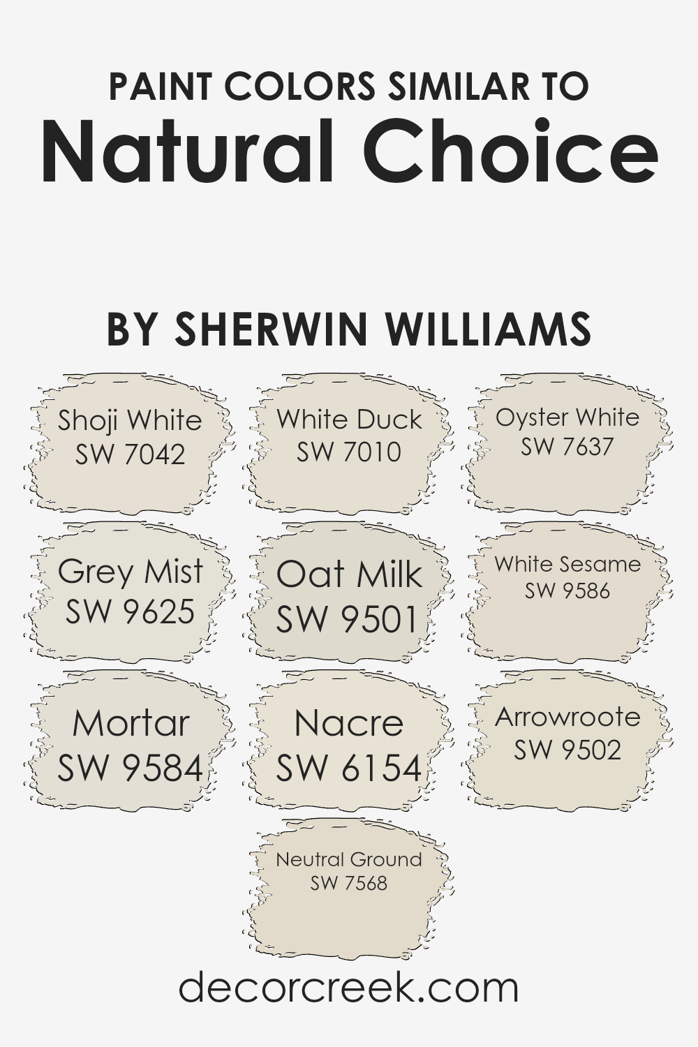
Colors Similar to Natural Choice SW 7011 by Sherwin Williams
Choosing similar colors is essential in design because it allows for a cohesive yet subtly dynamic space. Colors that share a common hue but differ in tone, saturation, or brightness offer a refined palette that can harmonize a room’s look while adding depth and interest. For example, using shades like Shoji White, a soft off-white with a hint of warmth, alongside Grey Mist, a gentle gray with a touch of coziness, can create a serene and inviting space.
These similar colors work together to blend seamlessly, offering a soothing gradient of natural tones that enrich the environment without overwhelming it with contrast.
Further exploring this approach, Mortar presents a deeper, earthy gray that grounds the lighter tones of Neutral Ground and White Duck, both of which offer a clean canvas with a whisper of warmth.
Introducing Oat Milk adds a creamy, soothing touch that is both light and airy. Nacre and Oyster White provide subtle, pearlescent qualities that reflect light elegantly, enhancing the sense of space.
White Sesame and Arrowroot expand on this theme by introducing very faint hints of color within the white spectrum, offering a way to layer textures and finishes without straying from a harmonious palette. This approach to using similar colors not only unifies the design but also elevates it by carefully balancing subtlety and depth, creating a versatile and welcoming environment.
You can see recommended paint colors below:
- SW 7042 Shoji White
- SW 9625 Grey Mist
- SW 9584 Mortar
- SW 7568 Neutral Ground
- SW 7010 White Duck
- SW 9501 Oat Milk
- SW 6154 Nacre
- SW 7637 Oyster White
- SW 9586 White Sesame
- SW 9502 Arrowroote
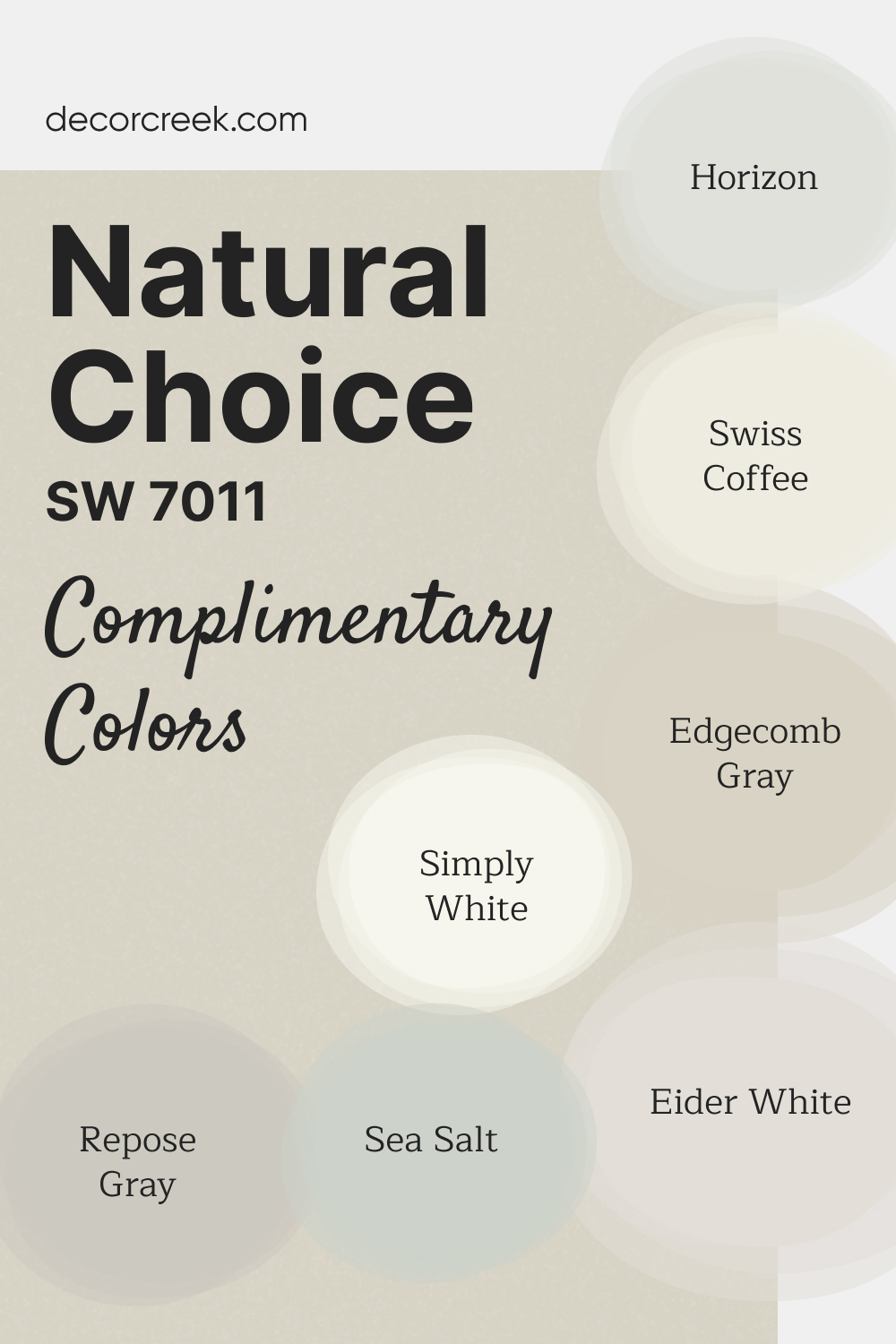
Complimentary Colors for Natural Choice SW 7011 Paint Color by Sherwin Williams
Natural Choice SW 7011 by Sherwin-Williams is a warm, versatile neutral that creates a soft and welcoming atmosphere. This shade works well in various settings, from open living spaces to cozy bedrooms.
Its understated warmth makes it a perfect backdrop for a variety of complementary colors. For bright look, pair Natural Choice with Simply White OC-117 or Swiss Coffee OC-45.
Edgecomb Gray HC-173 and Repose Gray SW 7015 bring in neutral balance, while Sea Salt SW 6204 and Horizon OC-53 add subtle hints of calming color.
Eider White SW 7014 ties the palette together with its light, airy undertones, ensuring a cohesive and good design.
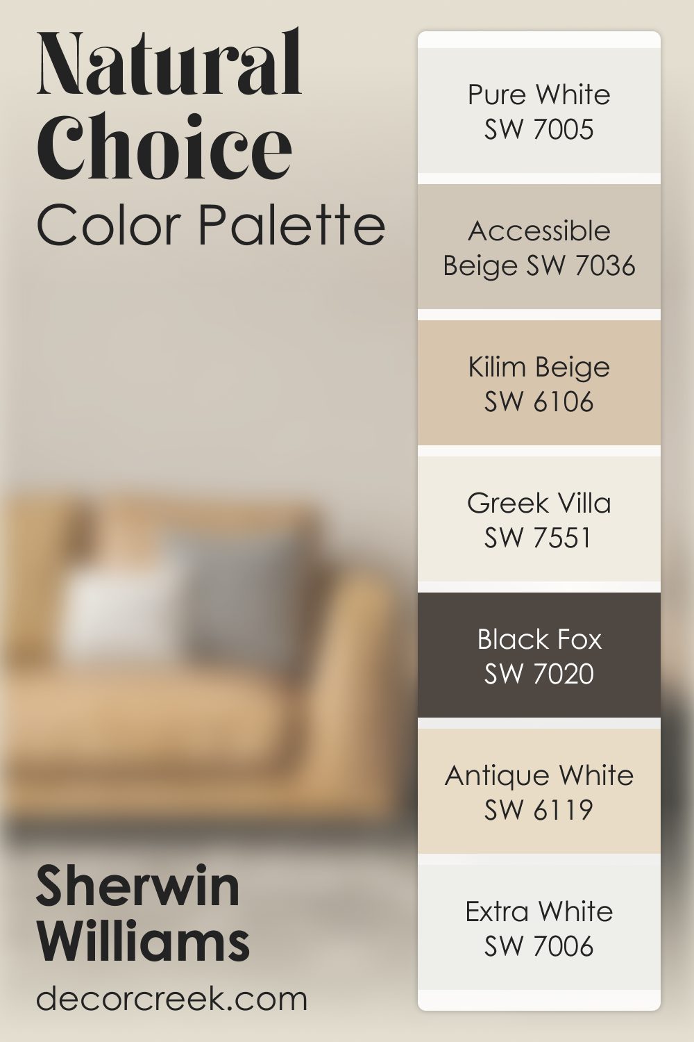
Natural Choice SW 7011 by Sherwin Williams Color Palette
Natural Choice offers a warm, gentle neutrality that feels soft, natural, and incredibly inviting. Pure White and Extra White brighten the palette and give it a fresh lift. Accessible Beige and Kilim Beige add warmth and create easy transitions that feel smooth and cohesive.
Greek Villa brings a creamy softness that blends beautifully with Natural Choice. Antique White deepens the warmth, giving the palette richness.
And Black Fox adds a strong, grounding tone that balances the softness. Together, this palette feels warm, welcoming, and beautifully composed.
How to Use Natural Choice SW 7011 by Sherwin Williams In Your Home?
Natural Choice by Sherwin Williams is a warm and inviting paint color that can easily freshen up any space in your home. This color has a subtle, soft vibe, making it perfect for those who want to create a cozy atmosphere. It’s especially good for living rooms, bedrooms, or any area where relaxation is key.
The beauty of Natural Choice lies in its versatility; it pairs well with a wide range of furniture and decor styles, from modern to rustic.
Using this color in your home is straightforward. You can apply it as a base coat on walls to brighten up the room without overwhelming it with boldness. It also works great for highlighting architectural features like trim, molding, or built-in shelves, adding a subtle contrast against darker colors. If you’re not ready to commit to painting entire walls, consider using it on a focal wall or in a nook to gently define the space.
Its ability to blend harmoniously with other colors makes it a hassle-free choice for anyone looking to update their home’s look with a touch of warmth and elegance.
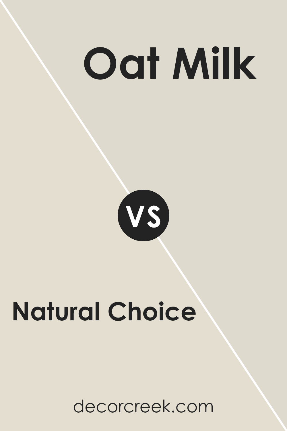
Natural Choice SW 7011 by Sherwin Williams vs Oat Milk SW 9501 by Sherwin Williams
Comparing Natural Choice and Oat Milk, both Sherwin Williams paints, offers a look into two calm, soothing colors. Natural Choice is a soft, warm gray that brings a cozy, understated elegance to any space. It’s a versatile color that works well in a variety of settings, helping to create a serene and welcoming atmosphere.
On the other hand, Oat Milk is a lighter, creamy beige that leans more towards a comforting warmth, reminiscent of its namesake. This shade is perfect for creating a bright and airy feel, making spaces seem larger and more inviting.
While both colors promote a sense of tranquility and relaxation, Natural Choice offers a more grounded, earthy feel due to its gray undertones. In contrast, Oat Milk adds a gentle brightness, offering a hint of cheerfulness to the environment. These differences make Natural Choice more suitable for a sophisticated, modern look, whereas Oat Milk is ideal for a soft, nurturing ambiance. Both colors work beautifully in their own right, with their distinct qualities catering to different tastes and styles.
You can see recommended paint color below:
- SW 9501 Oat Milk
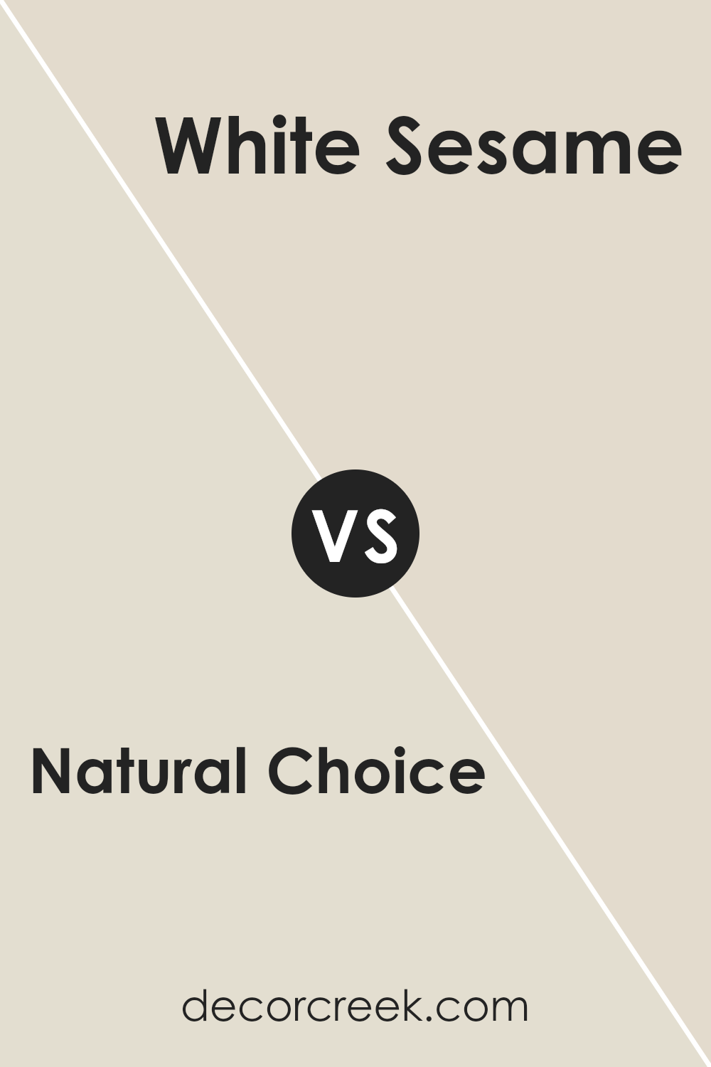
Natural Choice SW 7011 by Sherwin Williams vs White Sesame SW 9586 by Sherwin Williams
Natural Choice and White Sesame are two colors from Sherwin Williams that have their own unique appeal. Natural Choice is a soft, warm beige with a cozy feel. It’s the kind of color that makes a room feel inviting and lived-in, perfect for creating a comfortable and soothing ambiance. On the other hand, White Sesame is a light, neutral off-white with slight beige undertones. It’s brighter and gives spaces a fresh, airy feel, making it ideal for those looking to enhance natural light in their rooms.
When comparing these two, you’ll find that Natural Choice offers a bit more warmth, making it great for a calming effect in bedrooms or living areas. White Sesame, with its lighter touch, works well in smaller spaces or rooms you want to appear more open and bright. Both are versatile, but your choice depends on the mood you’re aiming to achieve in your space.
You can see recommended paint color below:
- SW 9586 White Sesame
Natural Choice SW 7011 by Sherwin Williams vs Nacre SW 6154 by Sherwin Williams
Natural Choice and Nacre are two shades from Sherwin Williams that provide a soft and soothing palette for any space. Natural Choice is a light, neutral beige. It creates a calm and inviting atmosphere, perfect for those who prefer a subtle and understated look. On the other hand, Nacre is slightly lighter with a touch of warmth, giving a cozy and gentle feel to a room.
This color leans a bit more towards a soft ivory than beige, making it ideal for creating a bright and airy space. Both colors are fantastic picks for anyone looking to freshen up their home with a natural and serene vibe.
Whether you’re painting a bedroom, living room, or any space in between, Natural Choice and Nacre offer versatility and elegance. When choosing between them, consider the amount of natural light your room gets; Nacre might brighten a dim space, while Natural Choice adds warmth to a well-lit area.
You can see recommended paint color below:
- SW 6154 Nacre
Natural Choice SW 7011 by Sherwin Williams vs Shoji White SW 7042 by Sherwin Williams
Natural Choice and Shoji White are two paint colors by Sherwin Williams that offer subtle differences in their appeal and application. Natural Choice is a warm, soft beige that brings a cozy and comforting feel to any space.
It’s a very versatile color, making it easy to match with a wide range of decor styles and colors. On the other hand, Shoji White leans towards a lighter, almost off-white with a slight warm undertone. This color is excellent for creating a bright, airy feeling in rooms, making them feel more spacious and inviting.
When comparing the two, Natural Choice offers a bit more depth and warmth, making it ideal for those who want to create a snug and welcoming atmosphere. Shoji White, with its lighter tone, is perfect for those aiming for a minimalist or modern look, providing a clean backdrop that enhances natural light in a room. Both colors work well in various settings, from living rooms to bedrooms, depending on the mood you’re aiming to achieve.
You can see recommended paint color below:
Natural Choice SW 7011 by Sherwin Williams vs Oyster White SW 7637 by Sherwin Williams
Natural Choice and Oyster White are two colors by Sherwin Williams that are great for a calm and inviting space, but they have their unique vibes.
Natural Choice has a soft, warm undertone that makes it a cozy option for any room. It feels like a gentle hug from the sun, giving a soothing atmosphere that’s not too bright or overpowering. This color works well in spaces where you want to relax and feel at ease.
On the other hand, Oyster White steps a bit toward the cooler side. While still maintaining a welcoming feel, it brings a fresh and clean look to the table. It’s like the first light breath of air on a crisp morning. If you’re aiming for a space that feels open and airy, Oyster White is a great choice.
Both of these colors create a natural and peaceful environment, but your choice depends on the mood you’re aiming for. Natural Choice brings warmth and coziness, while Oyster White offers a brighter, fresher atmosphere.
You can see recommended paint color below:
Natural Choice SW 7011 by Sherwin Williams vs Arrowroote SW 9502 by Sherwin Williams
Natural Choice and Arrowroot by Sherwin Williams stand out as unique colors from their collection. Natural Choice is a soft, warm, and creamy shade that brings a calm and comforting feel to any space. It’s a versatile hue that pairs well with various decor styles, adding a subtle elegance without overwhelming the area. On the other hand, Arrowroot presents a distinct but equally appealing color. It leans towards a light, airy, and slightly earthy tone, reminiscent of natural elements like clay or sand.
This color can create a serene and welcoming environment, making it perfect for places where relaxation is key. Both colors offer an understated beauty, but they serve different moods and atmospheres.
Natural Choice encapsulates warmth and coziness, ideal for creating a snug retreat. Arrowroot, conversely, offers a sense of tranquility and simplicity, suited for a more minimalist or naturalistic setting. Together, they showcase the breadth of Sherwin Williams’ palette, catering to varied tastes and interior design needs.
You can see recommended paint color below:
- SW 9502 Arrowroote
Natural Choice SW 7011 by Sherwin Williams vs Neutral Ground SW 7568 by Sherwin Williams
Natural Choice and Neutral Ground, both from Sherwin Williams, are two neutral shades that offer subtle differences to suit various aesthetics. Natural Choice is a soft, warm beige that brings a cozy, inviting feel to any space. It’s a versatile color that pairs well with both bright and dark accents, making it great for rooms needing a balance between light and warmth.
On the other hand, Neutral Ground steps in as a slightly lighter shade, leaning more towards a classic, understated elegance. It’s a pure, clean backdrop that works well in spaces aiming for a bright and airy feel, offering a bit more reflectivity compared to Natural Choice.
While both colors maintain a neutral base, the main distinction lies in their warmth and the atmosphere they create.
Natural Choice, with its slight warmth, adds a bit of comfort and homeliness, whereas Neutral Ground provides a crisp, clean canvas that amplifies natural light, making spaces appear larger and more open. Choosing between them depends on the desired mood and feel of the room you’re decorating.
You can see recommended paint color below:
- SW 7568 Neutral Ground
Natural Choice SW 7011 by Sherwin Williams vs Mortar SW 9584 by Sherwin Williams
Natural Choice and Mortar are two distinct colors from Sherwin Williams. Natural Choice is a soft, warm, and inviting neutral. It’s a muted shade that resembles light beige or off-white, making it a perfect background for various decor styles. This color offers a sense of calm and simplicity to any space, easily pairing with bold and soft color palettes alike.
On the other hand, Mortar falls into a deeper, more robust category. It’s a gray with a strong presence, offering a solid, grounded feel to environments where it’s used. Mortar is versatile, fitting well in modern, industrial, or traditional settings, bringing depth and sophistication.
When comparing the two, Natural Choice brings lightness and a breathable space, creating an open and airy feel. Mortar, being darker, provides a striking contrast or complements as a robust backdrop, excellent for making statement pieces stand out. Together, they can create a balanced look, with Natural Choice softening the boldness of Mortar, suitable for those looking to mix comfort with a bit of drama.
You can see recommended paint color below:
- SW 9584 Mortar
Natural Choice SW 7011 by Sherwin Williams vs Grey Mist SW 9625 by Sherwin Williams
Natural Choice and Grey Mist are two paint colors offered by Sherwin Williams. While both might seem like they’re in the neutral zone, they’re quite different when you look closely. Natural Choice is a soft, warm beige that brings a cozy atmosphere to any room. It has an earthy vibe, making spaces feel open and inviting without becoming overwhelming. This color works great in rooms where you want to relax and feel at ease.
On the other hand, Grey Mist is a light grey that leans slightly towards blue. It’s a cool and airy color, perfect for creating a serene and calming environment. This color suits spaces where you’re looking to achieve a fresh, clean look. It can give the illusion of more space, making it a good choice for smaller rooms or areas with limited natural light.
Comparing the two, Natural Choice adds warmth, while Grey Mist introduces a crisp, tranquil feel. Each color has its unique appeal, depending on the atmosphere you want to achieve in your space.
You can see recommended paint color below:
- SW 9625 Grey Mist
Natural Choice SW 7011 by Sherwin Williams vs White Duck SW 7010 by Sherwin Williams
Comparing Natural Choice and White Duck, both colors by Sherwin Williams, it’s interesting to see how subtle differences can affect the feel of a space. Natural Choice is a soft, warm beige with a hint of gray, making it a cozy and inviting color for any room. It creates a serene backdrop, perfect for spaces where relaxation is key. Its earthy tone pairs well with a wide range of accent colors, from bold to pastel.
On the other hand, White Duck is a slightly lighter shade, leaning more towards an off-white with beige and gray undertones. This color is incredibly versatile, brightening up spaces while still bringing warmth. It’s less about making a statement and more about creating a neutral, calming base that complements different decor styles and colors.
Both Natural Choice and White Duck offer a subtle elegance and a timeless appeal. Their understated nature makes them excellent choices for those looking to achieve a refined look without overwhelming their space with color. Whether you prefer the slightly deeper warmth of Natural Choice or the soft, clean feel of White Duck, both colors provide a beautiful, classic canvas for your home.
You can see recommended paint color below:
- SW 7010 White Duck
Natural Choice (SW 7011) vs Natural Linen (SW 9109)
Natural Choice is a soft off-white with mild warmth, great for a light envelope. Natural Linen is a warmer beige, a step deeper and more noticeable on walls.
Choose Natural Choice for a light, easy backdrop; choose Natural Linen for added warmth and a cozier read.
Natural Choice by Sherwin Williams is a paint color that offers a serene and soothing backdrop for any space. Its subtle, neutral tone provides a clean and classic look, making it versatile for various decorating styles and settings.
This color can effortlessly create a cozy and inviting atmosphere in homes, proving ideal for those looking to achieve a peaceful and relaxing environment. The understated elegance of Natural Choice makes it a smart choice for anyone looking to freshen up their space with a timeless appeal.
Furthermore, Natural Choice’s adaptability extends beyond just the walls of a home; it pairs beautifully with a wide range of decor elements. From vibrant colors to more muted tones, this paint color complements other shades gracefully, allowing for endless creativity in interior design.
Its reliability and ease of application add to its appeal, making it a favorite among homeowners and professionals alike. Overall, Natural Choice stands out as a practical, stylish, and universally appealing option for anyone looking to enhance their living space.

Ever wished paint sampling was as easy as sticking a sticker? Guess what? Now it is! Discover Samplize's unique Peel & Stick samples.
Get paint samples
