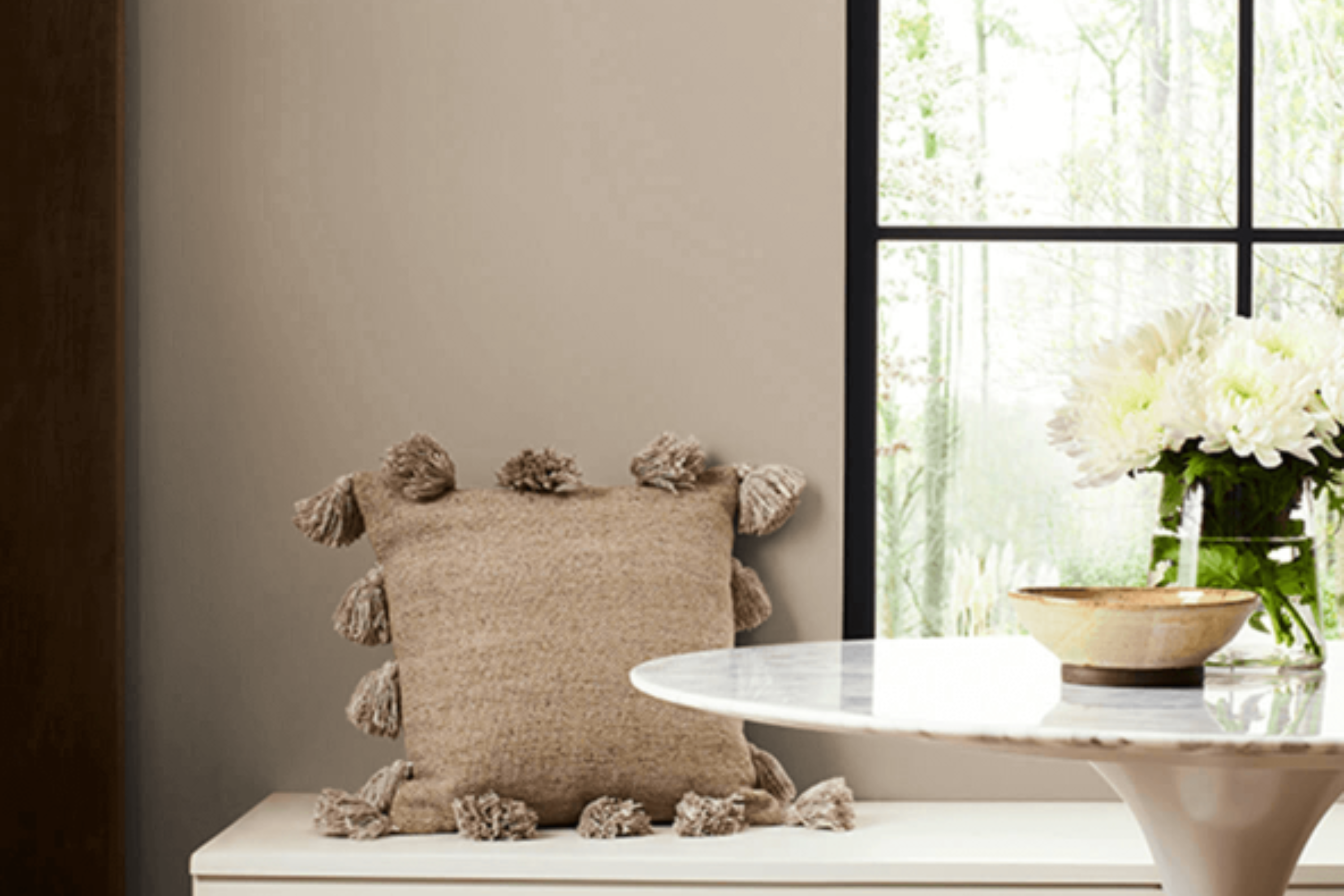
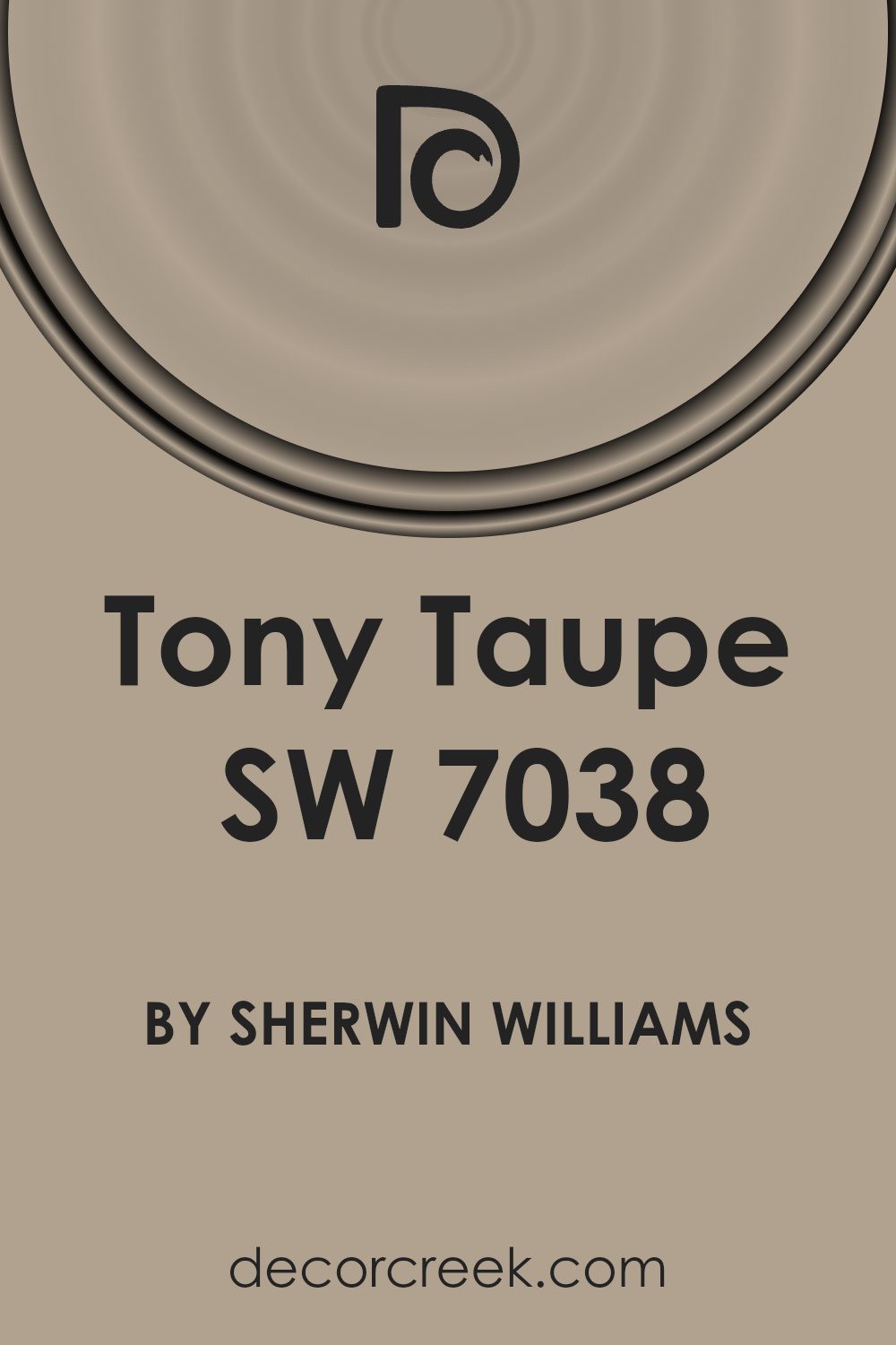
Today, let’s talk about a paint color that has been gaining popularity for its versatility and understated elegance: SW 7038 Tony Taupe by Sherwin Williams. This particular shade is a unique blend of gray and brown, creating a warm, neutral backdrop that can fit into almost any design scheme.
The beauty of Tony Taupe lies in its ability to bridge the gap between contemporary and traditional styles, making it a go-to choice for homeowners and designers alike looking to add a touch of sophistication to their spaces.
Whether you’re updating a cozy living room, giving a fresh look to your kitchen, or adding a serene vibe to your bedroom, Tony Taupe offers a balanced canvas that complements a wide range of decor elements.
From bold and vibrant accessories to more subdued and natural textures, this color supports an array of design preferences without overwhelming the senses. It’s particularly well-suited for creating a peaceful and inviting atmosphere in any part of the home.
If you’re on the lookout for a color that marries warmth with modernity, Tony Taupe by Sherwin Williams might just be the perfect pick for your next project.
What Color Is Tony Taupe SW 7038 by Sherwin Williams?
Tony Taupe is a versatile and sophisticated color that gently balances between gray and brown, offering a warm and earthy nuance that brings a sense of calm and elegance to any space. This unique hue has the cozy richness of taupe with just enough gray to give it a modern twist, making it an excellent choice for creating a serene and inviting atmosphere.
Its subtlety is its strength, allowing it to seamlessly blend with a variety of interior styles, from contemporary to rustic and everything in between.
In terms of interior design, Tony Taupe shines in environments where a soothing backdrop is desired. It’s particularly effective in living rooms, bedrooms, and even home offices, where its calming effect can be most appreciated.
This color works beautifully with natural materials and textures, such as wood, leather, stone, and linen, enhancing the organic feel of a space. It also pairs well with metallic accents like brass or copper, adding a touch of elegance and warmth.
For a harmonious and balanced look, consider incorporating soft, creamy whites or rich, dark colors as complementary tones. Fabrics with a bit of texture, such as wool or chunky knits, can also add depth and interest to a room featuring Tony Taupe, making spaces feel more inviting and lived-in.
Whether aiming for a minimalist aesthetic or a cozy, traditional vibe, Tony Taupe is a flexible choice that can help achieve a variety of design goals with its understated beauty.
Ever wished paint sampling was as easy as sticking a sticker? Guess what? Now it is! Discover Samplize's unique Peel & Stick samples.
Get paint samples

Is Tony Taupe SW 7038 by Sherwin Williams Warm or Cool color?
Tony Taupe by Sherwin Williams is a sophisticated and warm neutral color that brings a cozy yet stylish feel to any room. With its unique balance, it’s not too dark or too light, making it incredibly versatile for different spaces and lighting conditions.
This earthy tone pairs well with a wide range of colors, from crisp whites to bold darks, allowing homeowners to create both modern and traditional looks. Its subtlety provides a serene backdrop that can make small rooms appear more spacious and give larger rooms a more intimate feel.
Using Tony Taupe can transform a home’s atmosphere by adding depth and character without overwhelming with color. It’s a perfect choice for living rooms, bedrooms, or even home offices, where its calming effect can enhance focus and relaxation.
The beauty of Tony Taupe lies in its ability to complement wood finishes, metal accents, and various fabric textures, making it easy to integrate into existing decor or to serve as a foundation for new designs. Its timeless quality means it can adapt to evolving styles, ensuring your home feels both current and welcoming for years to come.
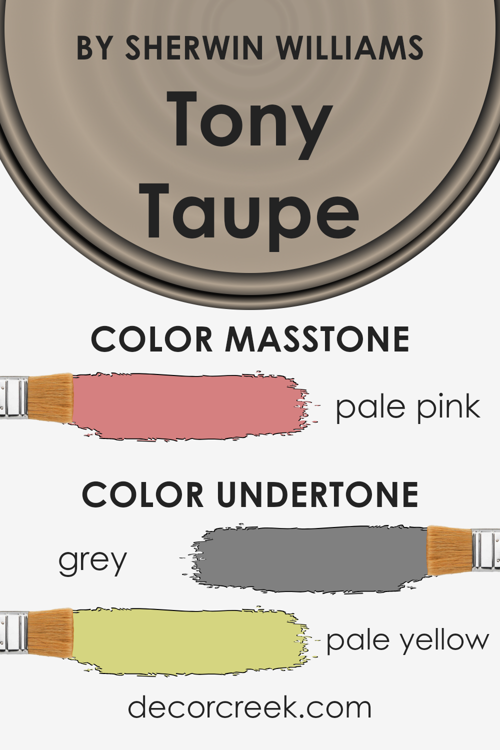
Undertones of Tony Taupe SW 7038 by Sherwin Williams
Tony Taupe by Sherwin Williams is an interesting color because it doesn’t just stick to being a simple taupe. What sets it apart and shapes our perception of it are its undertones. Think of undertones as the subtle hints of color that linger beneath the surface, influencing how the main shade appears under different lighting conditions. For Tony Taupe, the main undertones are grey and pale yellow.
- Grey undertones give it a cool, calm, and collected vibe. They mute the color slightly, ensuring that it doesn’t overwhelm a space. This makes it versatile and easy to match with a wide array of furniture and decor styles. It’s the kind of color that can pull a room together without demanding all the attention.
- Pale yellow undertones add a layer of warmth and softness. They prevent the color from leaning too cool or sterile, ensuring the space feels welcoming. In natural light, these undertones can make the walls seem to gently glow, adding a cozy atmosphere to the room.
When you put these undertones together in Tony Taupe, you get a color that adapts to its surroundings. In rooms with plenty of sunlight, the pale yellow undertones brighten the space, making it feel airy and open. I
n spaces with less light, the grey undertones become more pronounced, giving the room a sophisticated edge.
The beauty of Tony Taupe lies in its complexity. It’s not just a background color; it’s a foundational hue that reacts to its environment, bringing a dynamic and adaptable quality to interior walls.
The interplay of its undertones ensures it can work harmoniously in various settings, making it a popular choice for those looking to create a space that feels both refined and welcoming.
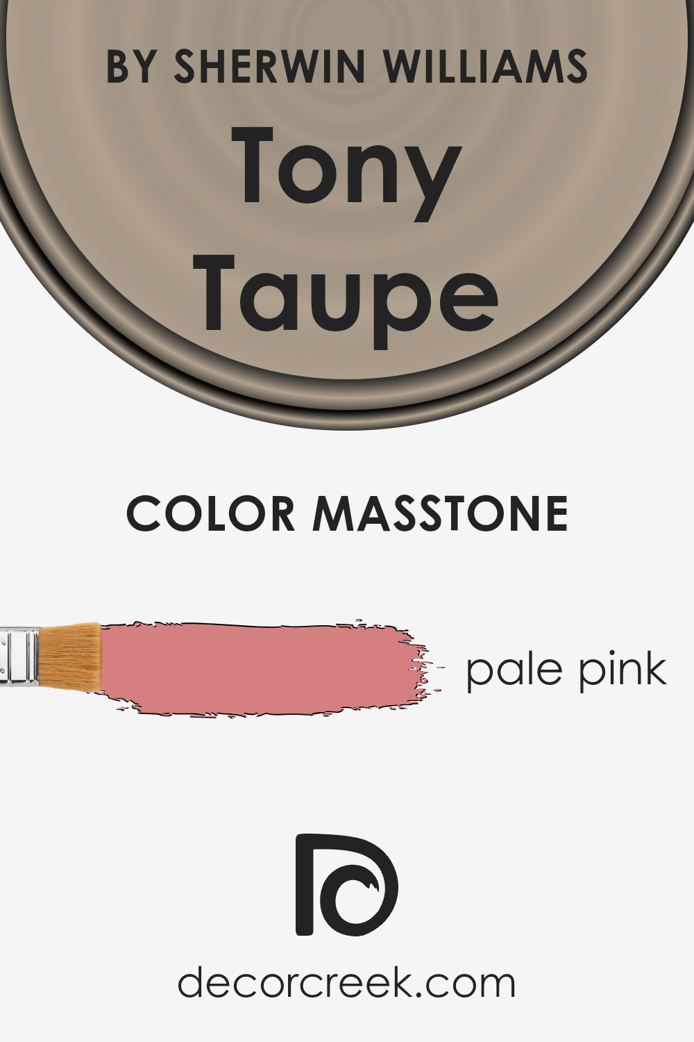
What is the Masstone of the Tony Taupe SW 7038 by Sherwin Williams?
Tony Taupe SW 7038 by Sherwin Williams, when you look at its masstone, you might get surprised. Instead of what its name suggests, the masstone has a pale pink hue, similar to #D58080.
This unique characteristic alters the way it functions within homes. Instead of providing a typical taupe warmth, the pale pink undertone injects a subtle, unexpected warmth and softness into spaces.
This makes it incredibly versatile for home decor. It’s gentle enough to act as a neutral backdrop in various rooms, from living areas to bedrooms, allowing for a wide range of decorating schemes.
The pale pink masstone can also enhance natural light, making spaces feel more open and airy while still adding a touch of color that’s far from overwhelming. This twist on taupe can harmonize with both cool and warm color palettes, offering a fresh perspective on traditional neutrals.
How Does Lighting Affect Tony Taupe SW 7038 by Sherwin Williams?
Lighting has a profound impact on how we perceive colors. Essentially, the kind of light a color is exposed to can either enhance or mute its visual appearance. Understanding this is crucial when considering painting a space, especially with certain shades like the neutral Tony Taupe.
- Under artificial light, this specific shade tends to look warmer. This means in a room lit by standard incandescent bulbs, its cozy, warm undertones are highlighted, making the space feel inviting. In contrast, fluorescent lighting can wash out this color a bit, giving it a slightly cooler appearance and potentially making it feel less rich.
- Natural light, on the other hand, brings a whole different dimension to this shade. In its presence, Tony Taupe can shift appearance throughout the day. During sunrise and sunset, when the light has a golden hue, the color can appear warmer and more vibrant. Around noon, when the sunlight is brightest, its true neutral character shines, making the room feel airy and balanced.
Room orientation also plays a key role in how this color is perceived:
- North-facing rooms tend to receive cooler, somewhat bluish light, which can make the color appear slightly more muted and cooler. It’s a subtle shift but can affect the overall feel of the room, making it appear more formal or serene.
- South-facing rooms get abundant, warm light for most of the day, which enhances the coziness of the color, making it feel warmer and more welcoming.
- East-facing room see the most change, as the morning light is warm and bright, making the color come alive and feel warmer. However, as the day progresses, the light shifts away, and the color cools down, maintaining a more steady appearance throughout the afternoon.
- West-facing rooms get the evening light, which means the color can look quite neutral or slightly cooler during the morning and early afternoon but warms up beautifully towards the evening with the setting sun.
Understanding these nuances can help in planning interior spaces, ensuring that the chosen colors align with the desired ambiance in each room throughout the day.
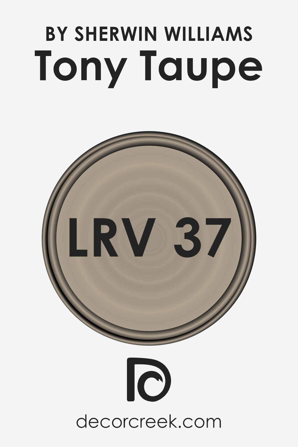
What is the LRV of Tony Taupe SW 7038 by Sherwin Williams?
LRV stands for Light Reflectance Value and is a measurement used to describe the amount of visible and usable light that a color reflects or absorbs when painted on a surface. Think of it as a scale from 0 to 100, with 0 being pure black, which absorbs all light, and 100 being pure white, reflecting all light back.
This value is crucial because it helps you understand how light or dark a color will look in a space once it’s on your walls. It essentially tells you how much that paint color will lighten up a room or make it feel cozier and more enclosed. The LRV can greatly influence the mood and the visual size of a room, making it an important factor to consider during the selection process.
Regarding the color with an LRV of 37.198, it stands in the middle range, suggesting it is a medium shade that will absorb more light than it reflects.
This means in rooms with less natural light, the color might appear darker than expected, potentially making the space feel smaller or more intimate. Conversely, in well-lit areas, the color can offer a warm and soothing ambiance without overpowering the room with brightness.
This particular LRV value strikes a balance, offering flexibility, but it’s also crucial to consider the lighting conditions of your room to ensure the color meets your expectations in terms of appearance and atmosphere.
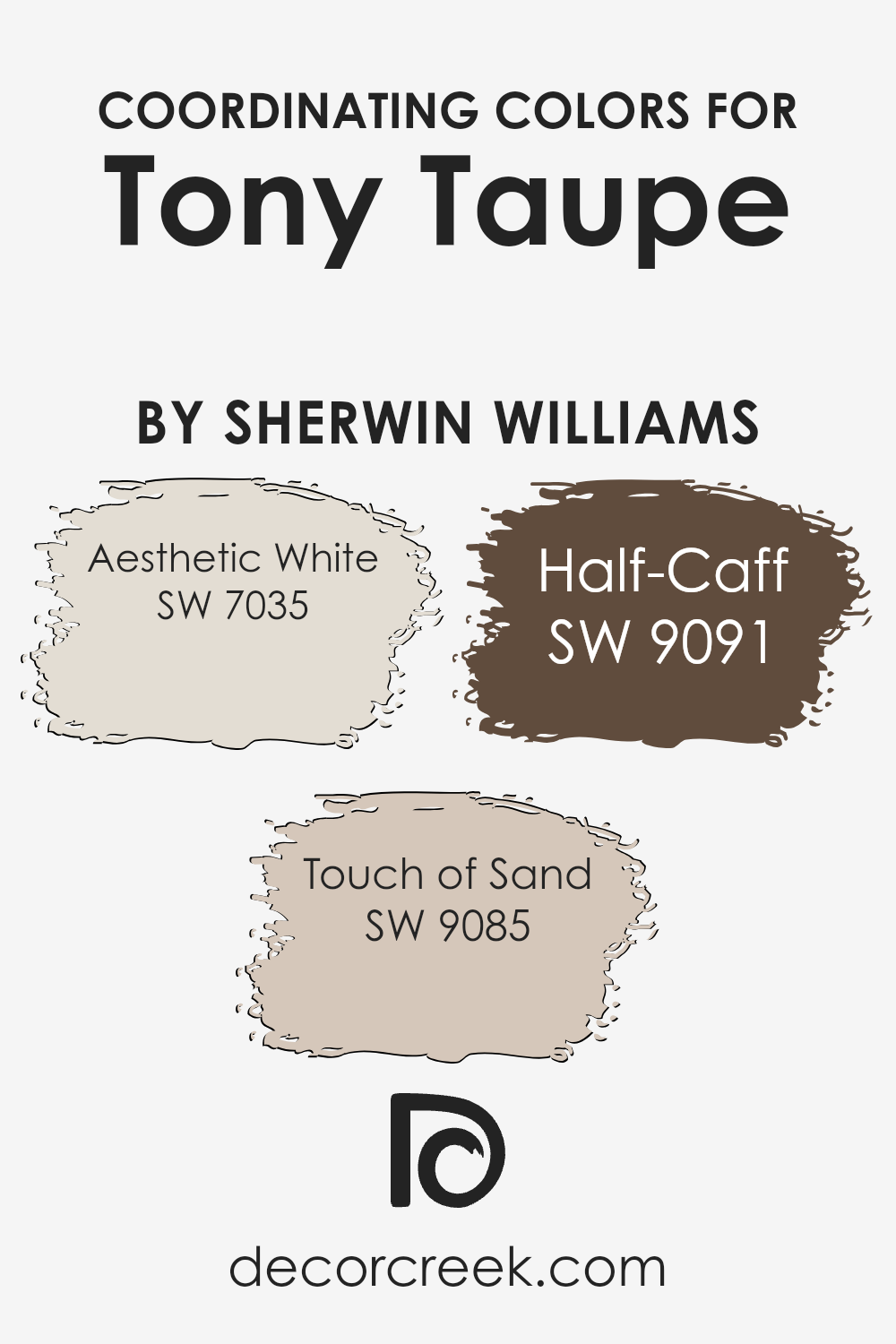
Coordinating Colors of Tony Taupe SW 7038 by Sherwin Williams
Coordinating colors are hues that complement each other and work well together in harmony. When used alongside a primary color, in this case, Tony Taupe by Sherwin Williams (SW 7038), they create a balanced and visually appealing space.
Choosing the right coordinating colors is essential for achieving a cohesive look in any decorating project. These colors can be used for walls, trim, accents, or even furniture and accessories to enhance the overall aesthetic of a room.
The first coordinating color, Aesthetic White (SW 7035), is a soft and subtle shade that brings a sense of calmness and serenity to a space. It pairs beautifully with Tony Taupe, offering a light contrast that makes the room feel open and airy.
Then, there’s Touch of Sand (SW 9085), a warm and inviting color that adds a hint of cosiness to the environment. It works well to soften the look of Tony Taupe, creating a harmonious blend that’s both comforting and stylish.
Lastly, Half-Caff (SW 9091) is a rich, deeper color that grounds the color scheme. It provides a striking balance when used with Tony Taupe, adding depth and character to the palette. Together, these coordinating colors offer a versatile range for designing spaces that feel cohesive and beautifully arranged.
You can see recommended paint colors below:
- SW 7035 Aesthetic White
- SW 9085 Touch of Sand
- SW 9091 Half-Caff
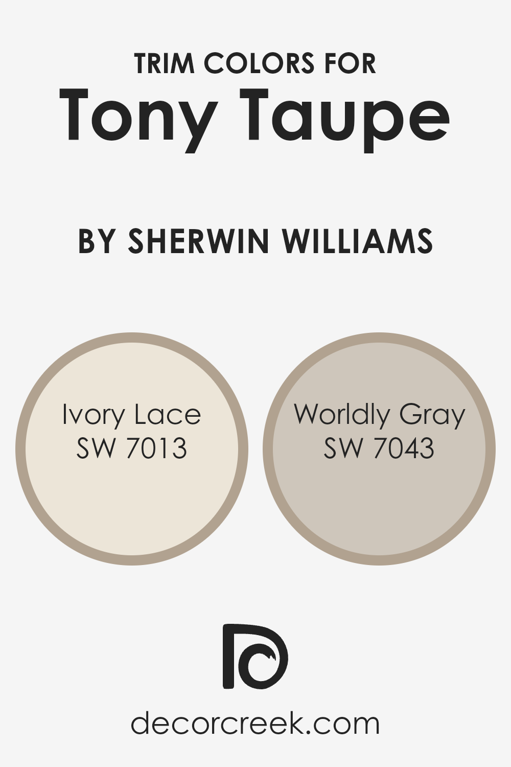
What are the Trim colors of Tony Taupe SW 7038 by Sherwin Williams?
Trim colors act as an accent or a finishing touch to the main color palette of a room or exterior, highlighting architectural details and framing the overall aesthetic. For a color like Tony Taupe by Sherwin Williams, choosing the right trim color is crucial in either subtly complementing the earthy, warm tones of the taupe or bringing in a gentle contrast that enhances its depth.
This is where colors like SW 7013 – Ivory Lace and SW 7043 – Worldly Gray come into play. By carefully picking a trim color, you can shift the ambiance of a space, accentuate design elements, and tie together different components of your décor, making the space more cohesive and visually appealing.
Ivory Lace is a soft, warm white with a serene quality to it, offering a subtle contrast to Tony Taupe without overpowering it. This combination can make a room feel more open and airy, bringing a light and inviting energy.
Worldly Gray, on the other hand, offers a cooler, more grounded pairing. This medium tone stands as a gentle counterbalance to the warmth of Tony Taupe, adding depth and sophistication to the space.
Each color has its own charm, either by brightening the room with a touch of warmth or by providing a composed, modern look that enhances the rich undertones of Tony Taupe, proving that the choice of trim can significantly impact the atmosphere and design cohesiveness of a space.
You can see recommended paint colors below:
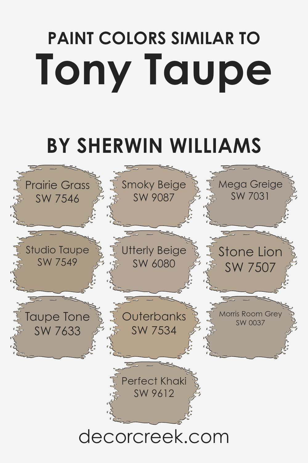
Colors Similar to Tony Taupe SW 7038 by Sherwin Williams
Similar colors play a crucial role in interior design and painting projects because they create a cohesive and harmonious look. By selecting shades that closely relate to each other, like those akin to Tony Taupe by Sherwin Williams, you achieve a subtle and sophisticated palette that can make spaces feel more put-together and inviting.
Colors such as Prairie Grass, Studio Taupe, and Taupe Tone add depth and variety while maintaining a unified atmosphere. They range from slightly greenish hues to warmer tones, offering flexibility in theme and mood without straying far from the base color.
Perfect Khaki and Smoky Beige, on the other hand, introduce a softness and neutrality, making them ideal for creating calm and relaxing environments.
Further extending the palette, Utterly Beige, Outerbanks, and Mega Greige build on this foundation by blending beige and gray in ways that enrich the overall aesthetic without overwhelming it.
Stone Lion and Morris Room Grey are excellent for adding a bit of contrast while still resonating with the core taupe theme. These colors ensure a seamless transition between spaces, whether used across different rooms or as complementary colors within a single area.
By thoughtfully selecting similar colors, you can achieve a look that is both cohesive and visually appealing, making your space feel intentional and well-designed.
You can see recommended paint colors below:
- SW 7546 Prairie Grass
- SW 7549 Studio Taupe
- SW 7633 Taupe Tone
- SW 9612 Perfect Khaki
- SW 9087 Smoky Beige
- SW 6080 Utterly Beige
- SW 7534 Outerbanks
- SW 7031 Mega Greige
- SW 7507 Stone Lion
- SW 0037 Morris Room Grey
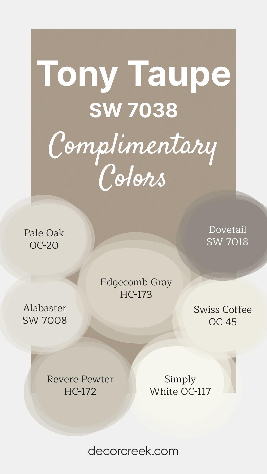
Complimentary Colors for Tony Taupe SW 7038 Paint Color by Sherwin Williams
Tony Taupe SW 7038 by Sherwin-Williams is a versatile, warm taupe that brings a sense of comfort and sophistication. Its earthy undertones make it an excellent choice for creating a cozy, inviting environment.
Whether used on walls or accents, this shade provides a balanced backdrop that complements various styles. For a bright and fresh contrast, Alabaster SW 7008 and Simply White OC-117 work beautifully.
Edgecomb Gray HC-173 and Revere Pewter HC-172 offer neutral tones that enhance the warmth of Tony Taupe.
For added depth, Dovetail SW 7018 provides a bold accent, while Pale Oak OC-20 and Swiss Coffee OC-45 bring in subtle warmth, creating a inviting palette.
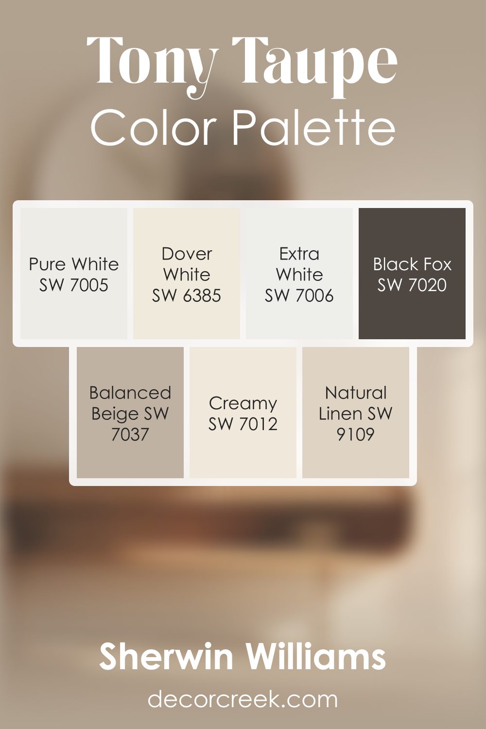
Tony Taupe SW 7038 by Sherwin Williams Color Palette
Tony Taupe brings gentle warmth with a smooth, natural feeling that instantly makes a room feel friendly and calm. Balanced Beige and Natural Linen blend beautifully with its soft tone, creating an easy, cohesive flow.
Creamy and Dover White brighten the palette with warm highlights, while Pure White and Extra White introduce crisp, clean edges for fresh detail.
Black Fox creates bold accents that add depth and definition, bringing a polished finish to the palette.
This combination feels calm, cozy, and welcoming, ideal for homes that love soft neutrals with a comforting energy.
How to Use Tony Taupe SW 7038 by Sherwin Williams In Your Home?
Tony Taupe by Sherwin Williams is a versatile paint color that can bring warmth and elegance to any space in your home. This muted brown with gray undertones gives a cozy yet sophisticated vibe, making it perfect for both lively living areas and peaceful bedrooms. Imagine your living room walls in this soft, earthy shade, creating a welcoming atmosphere for family and friends. It’s also an excellent choice for a home office, where its calming effects can enhance focus and productivity.
You can easily match Tony Taupe with a variety of decor styles and colors. It pairs beautifully with crisp white trim, adding contrast and highlighting the architectural features of a room.
If you prefer a more modern look, consider using it alongside cool blues or greens for a chic, contemporary feel. For those who enjoy changing their decor with the seasons, Tony Taupe serves as a neutral backdrop that can adapt to any color scheme, from warm autumnal oranges to fresh spring pastels.
Incorporating Tony Taupe into your home offers endless possibilities, from creating a serene retreat in your bedroom to welcoming guests in a stylishly appointed entryway. Its adaptability and timeless charm make it a top choice for anyone looking to refresh their space with paint.
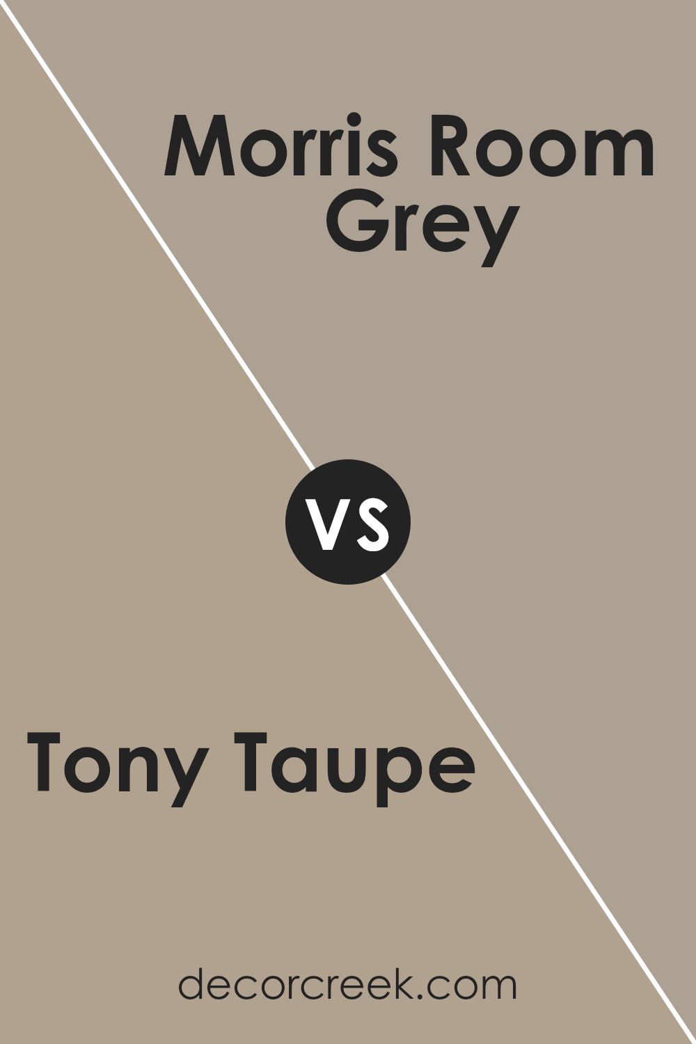
Tony Taupe SW 7038 by Sherwin Williams vs Morris Room Grey SW 0037 by Sherwin Williams
Tony Taupe and Morris Room Grey are two popular shades from Sherwin Williams. Tony Taupe is a warm, inviting color that leans towards a soft, cozy brown with just a hint of gray.
It’s perfect for creating a welcoming atmosphere in any room, making spaces feel more comfortable and relaxed. On the other hand, Morris Room Grey offers a different vibe.
This color is a true grey that provides a timeless and elegant look, bringing a sense of calm and sophistication. It’s more neutral and versatile, easily fitting into various decor styles without overpowering the space.
While Tony Taupe adds warmth and a subtle earthiness to rooms, Morris Room Grey keeps things sleek and modern. Choosing between them depends on the mood you want to create: cozy and warm with Tony Taupe or cool and refined with Morris Room Grey.
You can see recommended paint color below:
- SW 0037 Morris Room Grey
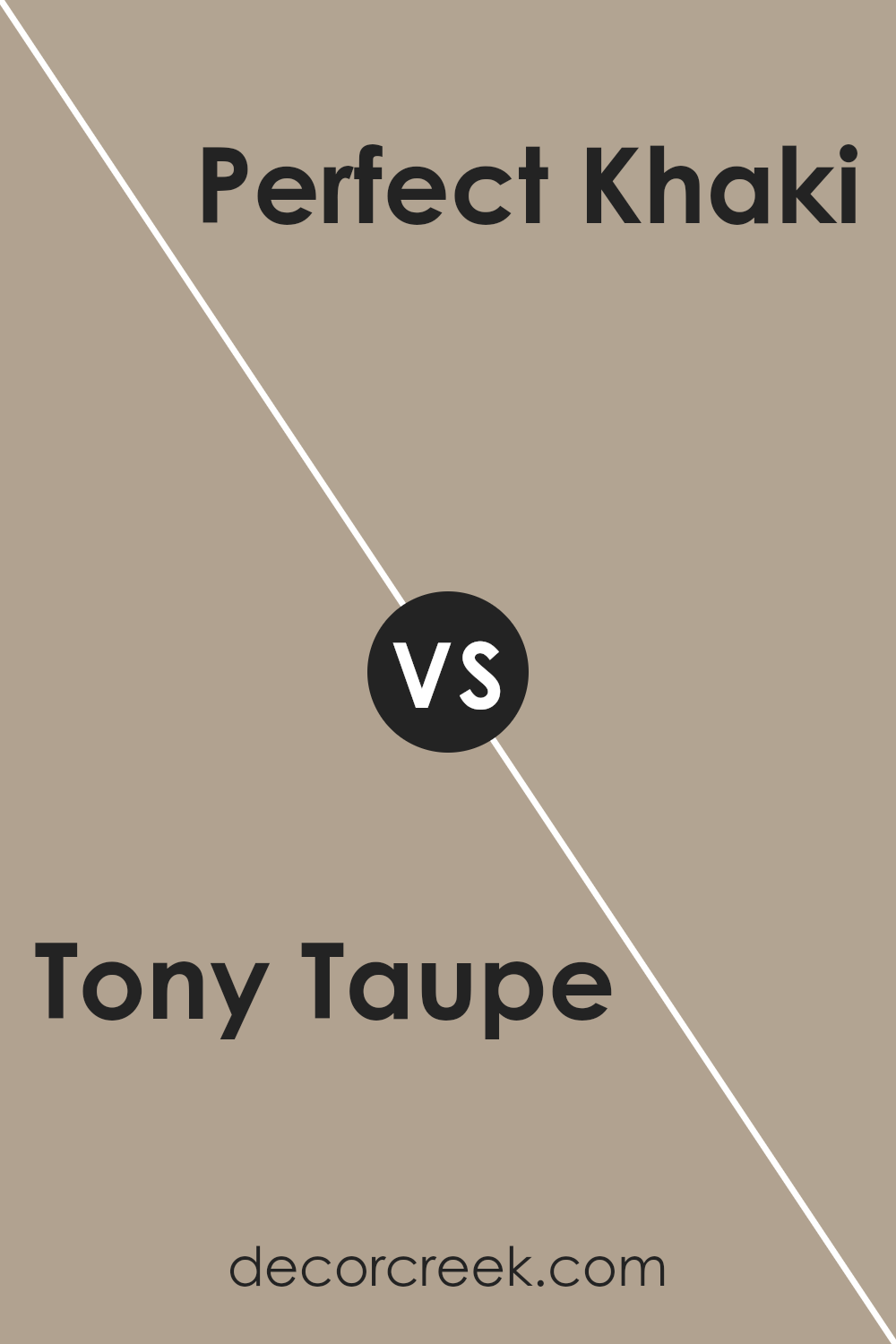
Tony Taupe SW 7038 by Sherwin Williams vs Perfect Khaki SW 9612 by Sherwin Williams
Tony Taupe and Perfect Khaki, both from Sherwin Williams, have their unique charm and utility in interior design. Tony Taupe is a balanced, warm grey that brings a calm and soothing vibe to any room. Its versatility lies in its ability to pair well with a wide range of colors, making it a favorite for creating a cozy yet sophisticated space.
On the other hand, Perfect Khaki leans more towards a traditional khaki shade, offering a classic look that radiates warmth and comfort. This color is perfect for those looking to achieve a neutral space with a hint of earthiness, as it adds a touch of natural elegance to the surroundings.
While Tony Taupe offers a modern neutrality with its grey undertones, Perfect Khaki provides a timeless backdrop with its earthy essence. Both colors are excellent choices for creating inviting spaces, but your preference may depend on whether you’re leaning towards a more contemporary or traditional aesthetic.
You can see recommended paint color below:
- SW 9612 Perfect Khaki
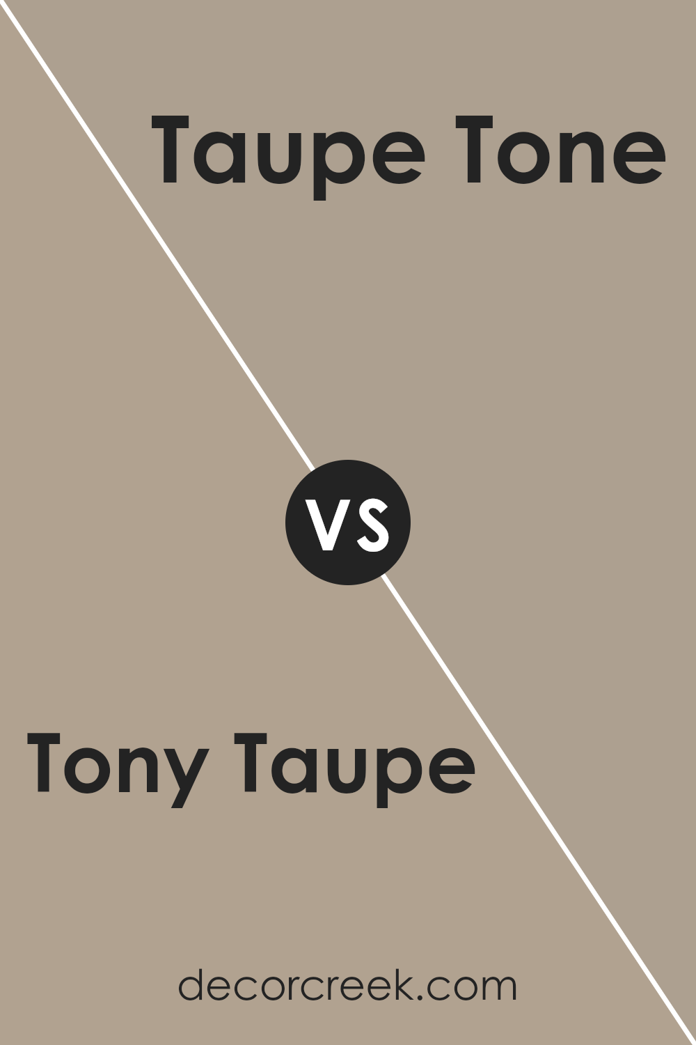
Tony Taupe SW 7038 by Sherwin Williams vs Taupe Tone SW 7633 by Sherwin Williams
Tony Taupe and Taupe Tone are two colors by Sherwin Williams that are quite similar but have their subtle differences. Tony Taupe has a deeper, warmer brownish-gray shade, providing a cozy and rich feel to spaces.
It’s perfect for creating a grounded atmosphere that invites people to unwind. On the other hand, Taupe Tone is slightly lighter, leaning more towards a soft, elegant gray with a hint of warmth.
This color can brighten up a room while still keeping a hint of earthiness. Both colors work well in various settings, whether you’re aiming for a sophisticated look in a living room or a calming bedroom vibe.
While Tony Taupe brings in a bit more depth and warmth, making spaces feel more enclosed and intimate, Taupe Tone offers a lighter touch, potentially making rooms appear more spacious and airy. Choosing between them depends on the mood you want to set and how much natural light your room gets.
You can see recommended paint color below:
- SW 7633 Taupe Tone
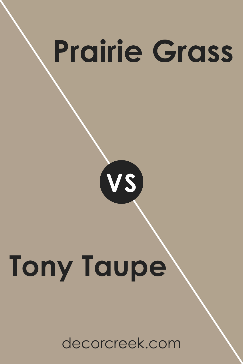
Tony Taupe SW 7038 by Sherwin Williams vs Prairie Grass SW 7546 by Sherwin Williams
Tony Taupe and Prairie Grass are two colors from Sherwin Williams that offer distinct vibes for any space. Tony Taupe is a warm, cozy color, sitting comfortably between brown and gray. It’s like a soft hug for your walls, creating a soothing backdrop that pairs well with a wide range of décor. It’s perfect for someone looking for a neutral with a bit of depth.
On the other hand, Prairie Grass leans into the green family, bringing a touch of nature’s calmness indoors. It’s lighter than Tony Taupe, offering a breath of fresh air and a hint of earthiness to a room. This color can make a space feel grounded yet airy, capturing the essence of a serene meadow.
When comparing the two, Tony Taupe brings a richer, warmer feel, making a room feel more enclosed and cozy. Prairie Grass, with its green undertones, introduces a lighter, more refreshing energy.
Both colors can create beautiful, tranquil spaces, but the choice between them depends on whether you prefer the solid warmth of taupe or the gentle whisper of green.
You can see recommended paint color below:
- SW 7546 Prairie Grass
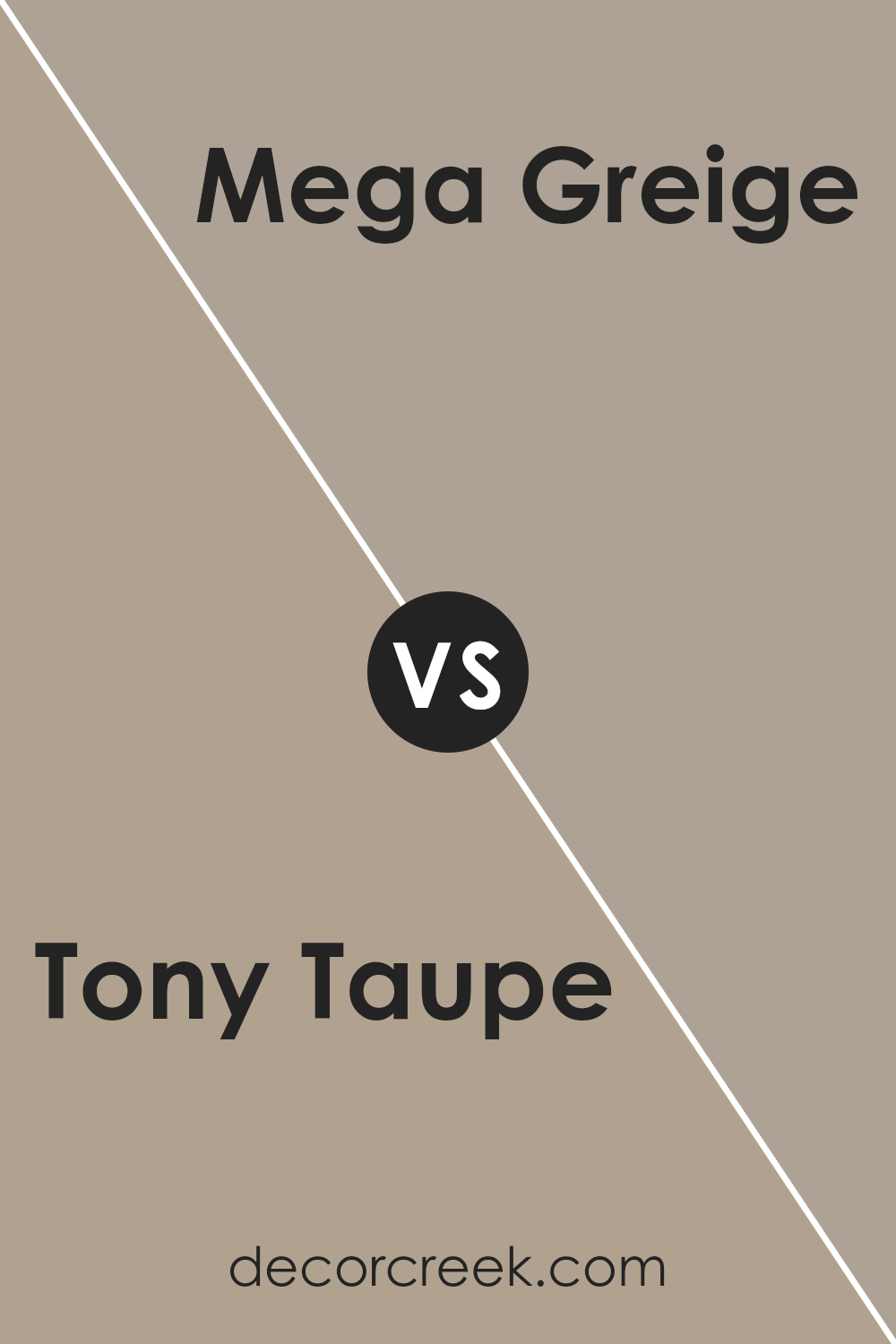
Tony Taupe SW 7038 by Sherwin Williams vs Mega Greige SW 7031 by Sherwin Williams
Tony Taupe and Mega Greige are both popular Sherwin Williams colors that share a comforting warmth for any space. Tony Taupe has a unique blend that strikes a balance between brown and gray, giving off a cozy yet sophisticated vibe. It’s perfect for those looking to create a serene and inviting environment without going too dark or too light.
On the other hand, Mega Greige leans more towards the gray side, while still retaining hints of beige to keep the warmth alive. It works wonders in spaces where you want a touch of modernity without sacrificing the welcoming feel that comes with earthier tones.
Whether you choose Tony Taupe for its balanced neutrality or Mega Greige for its slightly cooler presence, both colors offer a timeless backdrop that complements various decor styles and preferences.
You can see recommended paint color below:
Tony Taupe SW 7038 by Sherwin Williams vs Outerbanks SW 7534 by Sherwin Williams
Tony Taupe and Outerbanks, both by Sherwin Williams, offer unique tones for any space. Tony Taupe is a warm, welcoming gray-brown that adds a cozy, sophisticated touch. It’s versatile, easily fitting into a wide range of decorating styles from modern to traditional.
On the other hand, Outerbanks presents a darker, earthier hue. It leans more into the brown spectrum, offering depth and richness to spaces that aim for a strong, grounded aesthetic.
While Tony Taupe brings a lighter, airier feel, making rooms appear more spacious, Outerbanks draws you into a more intimate atmosphere. Both colors are perfect for creating a statement without overwhelming a room, but your choice depends on the vibe you’re going for: light and airy with Tony Taupe, or warm and deep with Outerbanks.
You can see recommended paint color below:
- SW 7534 Outerbanks
Tony Taupe SW 7038 by Sherwin Williams vs Stone Lion SW 7507 by Sherwin Williams
Tony Taupe and Stone Lion, both by Sherwin Williams, are two neutral shades with distinct characteristics. Tony Taupe leans towards a warm, cozy beige with gray undertones, making it versatile for any space.
It’s a kind of color that brings a soft, sophisticated backdrop to rooms, pairing well with a wide range of decor. On the other hand, Stone Lion has a stronger gray presence, offering a slightly darker and more grounded feel.
While still warm, Stone Lion can serve as a solid foundation for those looking to add a bit of gravity to their space without overwhelming it with too dark a hue. Both colors work well in various lighting conditions, with Tony Taupe providing a lighter, airier feel and Stone Lion giving a bit more depth.
Choosing between them depends on the desired warmth and grounding effect you’re looking for in your room.
You can see recommended paint color below:
- SW 7507 Stone Lion
Tony Taupe SW 7038 by Sherwin Williams vs Studio Taupe SW 7549 by Sherwin Williams
Tony Taupe and Studio Taupe are both colors offered by Sherwin Williams, but they have some distinct differences. Tony Taupe is a warmer, more inviting shade with a cozy vibe, making it perfect for creating a relaxed and homely atmosphere in a room.
It has an earthy tone that pairs well with a wide range of colors, adding a subtle depth to the space without overwhelming it. On the other hand, Studio Taupe has a slightly cooler undertone. It’s a bit lighter than Tony Taupe, making it a great choice for those who want to brighten up a room while still keeping that neutral, sophisticated palette.
Studio Taupe works well in spaces that aim for a modern and minimalist look, as it provides a clean backdrop that complements contemporary furniture and decor. Both colors are versatile, but the choice between them depends on the desired mood and style of the room.
You can see recommended paint color below:
- SW 7549 Studio Taupe
Tony Taupe SW 7038 by Sherwin Williams vs Smoky Beige SW 9087 by Sherwin Williams
Tony Taupe and Smoky Beige are two paint colors by Sherwin Williams that, while similar at a glance, have distinct qualities. Tony Taupe is a warm, medium-toned gray with brown undertones, giving it a cozy, inviting feel perfect for creating a soothing atmosphere in spaces like living rooms or bedrooms. Its versatility allows it to complement various decor styles, from modern to rustic.
On the other hand, Smoky Beige leans more towards a lighter, warmer beige with a subtle gray undertone, providing a soft, neutral backdrop that’s easy to match with different color schemes. It illuminates spaces, making smaller rooms appear larger and more open, an ideal choice for areas that receive less natural light.
Both colors offer a neutral palette, but Tony Taupe brings a depth and warmth that might suit larger, more open spaces or areas where a sense of coziness is desired. Smoky Beige, with its lighter, airier feel, is better suited for creating a relaxed, serene environment, especially in smaller spaces or rooms aiming for a minimalist look.
Choosing between them depends on the desired mood and the lighting in your room, with each offering its unique ambiance.
You can see recommended paint color below:
- SW 9087 Smoky Beige
Tony Taupe SW 7038 by Sherwin Williams vs Utterly Beige SW 6080 by Sherwin Williams
Tony Taupe and Utterly Beige are both colors from Sherwin Williams that offer subtle and warm tones, perfect for creating a cozy atmosphere in any room. When comparing these two, Tony Taupe presents as a deeper, more pronounced shade than Utterly Beige.
It carries a stronger presence due to its richer, more intense taupe undertones, making it an excellent choice for those looking to add a bit of sophistication and depth to their space.
On the other hand, Utterly Beige is lighter and softer, offering a more understated elegance. This color leans towards a traditional beige, providing a neutral backdrop that’s versatile enough to match with a wide range of decor.
It’s particularly well-suited for creating a bright and airy feel in a space, promoting a sense of openness and calm.
In essence, if you’re aiming for a cozy yet refined atmosphere, Tony Taupe is the go-to color. For those seeking a lighter, more neutral canvas that’s easy to match with different styles and accessories, Utterly Beige is the ideal pick. Both colors offer their unique charm, allowing for personalization and style in home design.
You can see recommended paint color below:
- SW 6080 Utterly Beige
Conclusion
Tony Taupe SW 7038 by Sherwin Williams is a versatile neutral color that has gained popularity for its ability to beautifully complement a wide range of interior and exterior spaces.
This particular shade of taupe offers a balanced mix of warm and cool tones, making it an excellent choice for those looking to create a cozy yet refined atmosphere in their home or office. Its understated elegance allows it to pair well with various decor styles, from modern to traditional, ensuring it fits seamlessly into any design scheme.
The adaptability of Tony Taupe SW 7038 extends beyond just its aesthetic appeal. Homeowners and designers alike appreciate how this color works wonderfully in different lighting conditions, subtly shifting in hue to match the natural progression from day to night.
This attribute, combined with its ability to act as both a primary and accent color, underscores why Tony Taupe SW 7038 remains a go-to choice for anyone looking to elevate their space with a touch of sophistication and warmth, proving that selecting the right shade can significantly impact the overall feel of a room.
Ever wished paint sampling was as easy as sticking a sticker? Guess what? Now it is! Discover Samplize's unique Peel & Stick samples.
Get paint samples
