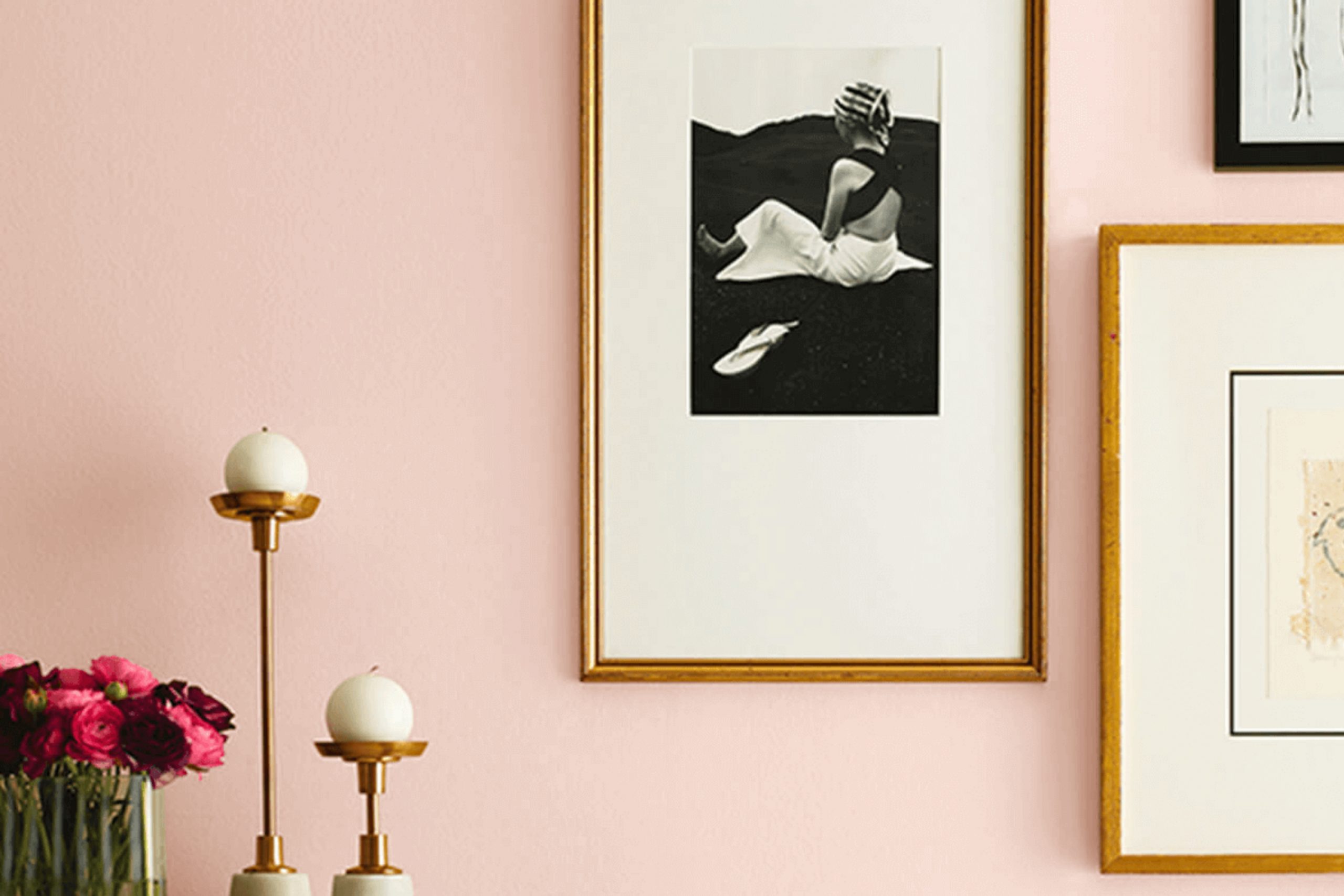
When I laid eyes on SW 6330 Quaint Peche by Sherwin Williams, I felt immediately drawn to its warm and inviting hue. This color reminds me of a gentle sunset, where the day softly shifts into night. Quaint Peche has a way of creating a cozy atmosphere, perfect for a living room or bedroom. It’s a shade that feels like a comforting hug, bringing a sense of peace and ease.
You might notice how this color adds warmth to a room without feeling too intense. It’s soft, yet it has enough presence to make a statement. Whether used as an accent wall or throughout an entire room, Quaint Peche can refresh your living areas into a welcoming retreat. The color pairs beautifully with neutrals and complements both modern and traditional decor styles.
Incorporating Quaint Peche into your home is like adding a touch of gentle elegance. It’s not just a color; it’s a mood, a feeling of ease that surrounds you. I found that it works seamlessly in both open, breezy areas and more personal settings.
This shade of peach invites a sense of well-being and can make any room feel like your favorite place to unwind.
What Color Is Quaint Peche SW 6330 by Sherwin Williams?
Quaint Peche, by Sherwin Williams, is a warm and welcoming peachy hue. It combines soft pink and orange tones, making it a charming choice for those who want to add a touch of warmth to their room. This color works beautifully in cottage and farmhouse interiors, as it adds a touch of coziness and charm. It’s also a great fit for bohemian styles, where its warm, inviting nature complements the vibrant and eclectic decor.
Pair Quaint Peche with natural materials like light wood and rattan for a relaxed, inviting feel. The color looks wonderful alongside linen and cotton fabrics, adding to the overall soft and comfortable atmosphere. If you’re thinking of adding a touch of glam, incorporating brass or gold metallic accents can enhance its warm undertones.
For textured elements, consider woven baskets, chunky knitted throws, or terracotta pottery. These elements can bring out the soft, earthy character of Quaint Peche. In kitchens, combine it with cream-colored cabinetry and subway tiles for a warm, inviting look.
Overall, Quaint Peche is adaptable and can easily create a mood that is both cozy and uplifting, all while blending beautifully with a variety of materials and textures.
Is Quaint Peche SW 6330 by Sherwin Williams Warm or Cool color?
Quaint Peche SW 6330 by Sherwin Williams is a warm, gentle color that brings a cozy and inviting feel to any room. It’s a soft peach shade that has just enough color to brighten up an area without becoming too intense. This hue works well in living rooms, bedrooms, or kitchens, as it creates a comforting and welcoming atmosphere.
It’s perfect for those who want a subtle splash of color without opting for bold or intense shades. Quaint Peche can make a room feel more open and airy, while still adding an element of warmth. It pairs nicely with neutral tones like whites and grays, or even with deeper colors for a bit of contrast.
This shade is ideal for anyone looking to add a touch of warmth and simplicity to their home, making rooms feel more welcoming and lived-in. It’s flexible and easy to coordinate with a range of styles and decor.
Undertones of Quaint Peche SW 6330 by Sherwin Williams
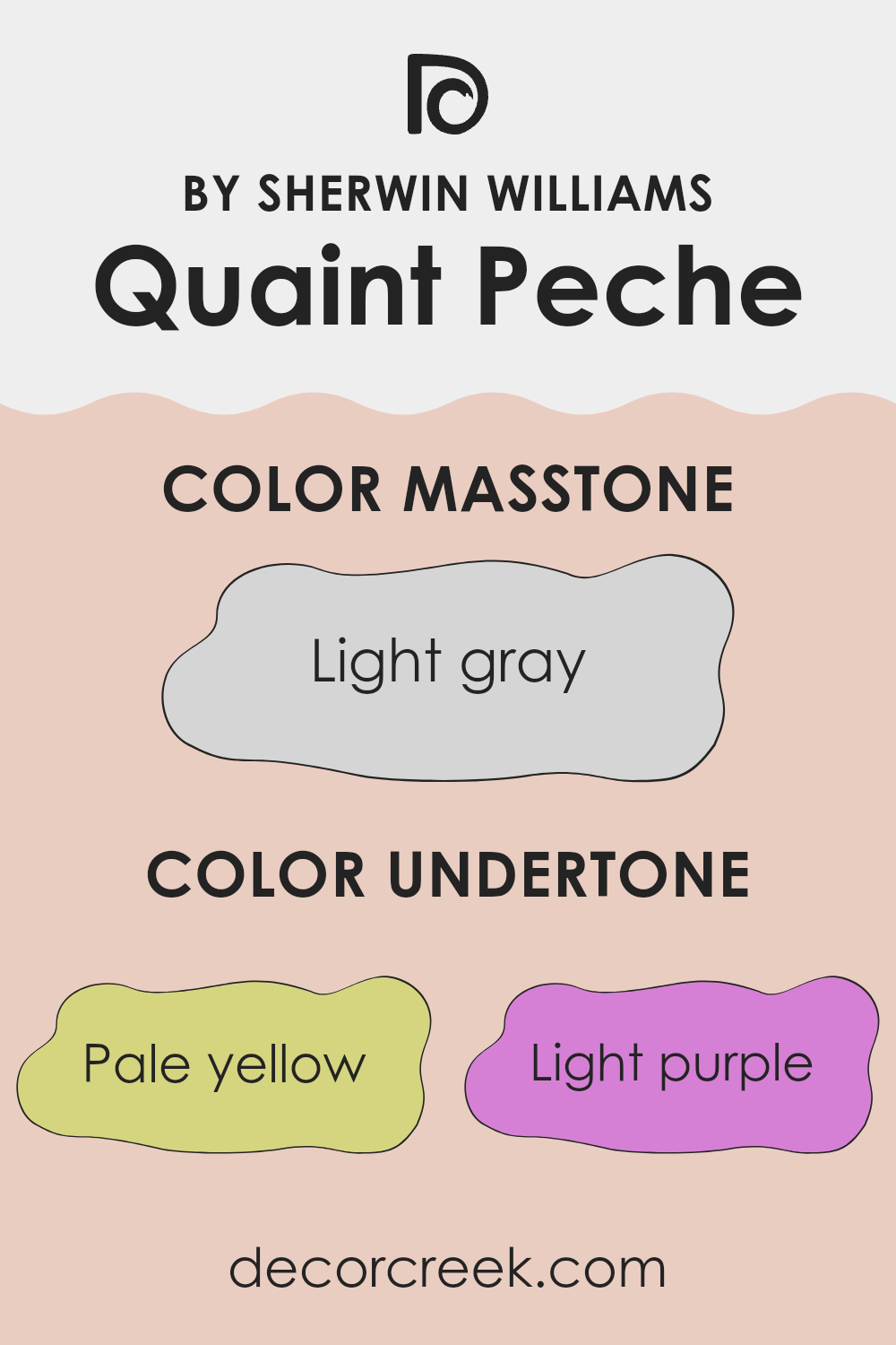
Quaint Peche by Sherwin Williams is a unique color with a complex set of undertones. These undertones include pale yellow, light purple, pale pink, light blue, mint, lilac, and grey. Each of these subtle hints can influence how the color appears on interior walls.
When looking at a color, undertones play a significant role in how we perceive it. They can make a color look cooler, warmer, brighter, or more muted. For example, pale yellow and mint undertones can give Quaint Peche a fresh and lively appearance by adding warmth and brightness.
Meanwhile, the light blue and grey undertones might introduce a calm, soothing feel, making the room appear more relaxed. Light purple and lilac add a touch of refinement, giving a hint of elegance to the area.
In a room, Quaint Peche can create different moods depending on lighting and surrounding colors. In natural daylight, its pale yellow and mint undertones might stand out more, making the room feel sunny and uplifting.
Under artificial light, the grey and lilac undertones could become more noticeable, giving the area a subtle, cozy atmosphere. Overall, these varied undertones allow Quaint Peche to be adaptable, adjusting to different settings and moods.
What is the Masstone of the Quaint Peche SW 6330 by Sherwin Williams?
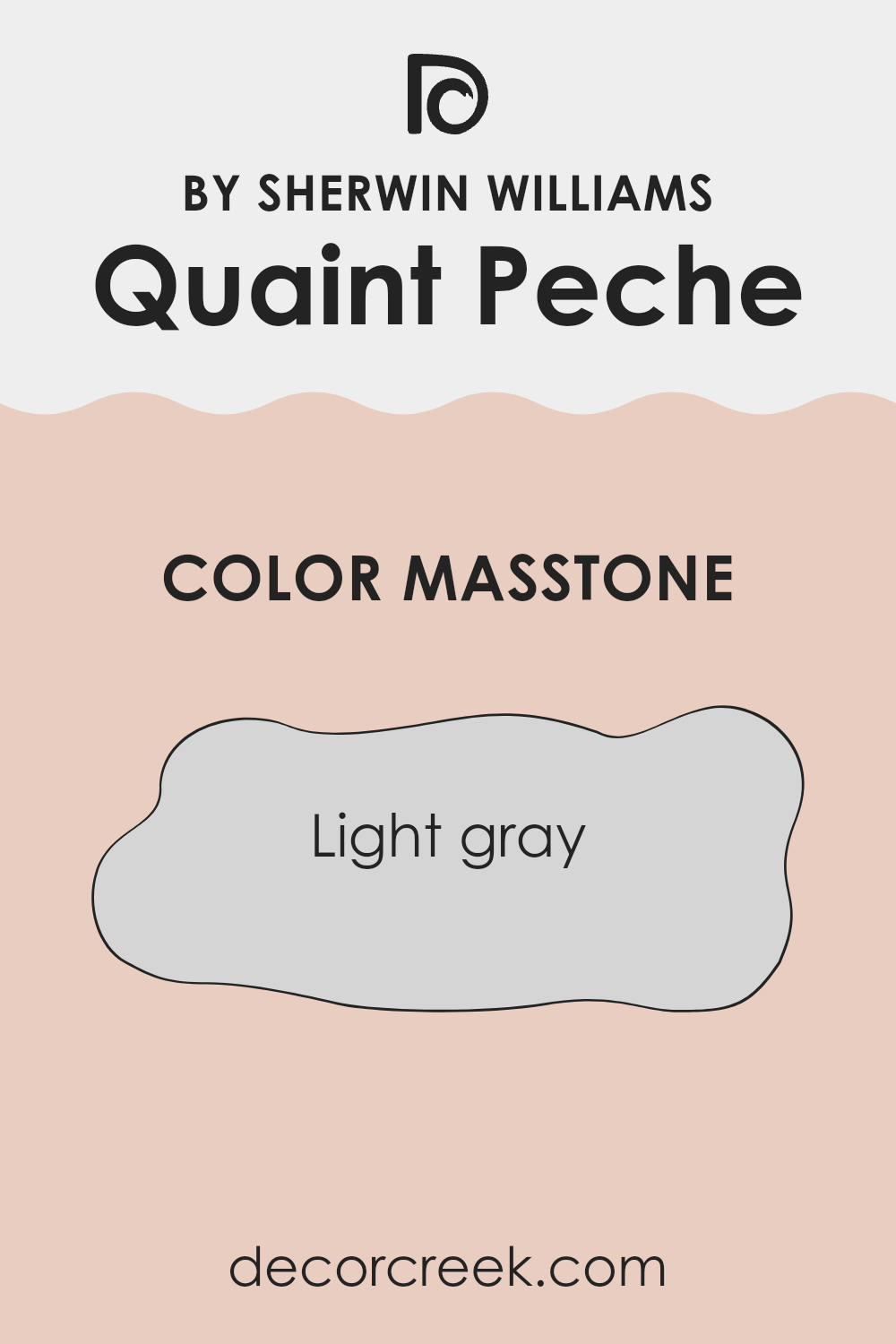
Quaint Peche SW 6330 by Sherwin Williams is a unique color with a light gray masstone, similar to the shade of #D5D5D5. This light gray undertone gives the color a neutral and adaptable quality, making it a great choice for home interiors.
The softness of this masstone helps in creating a calm and welcoming environment in any room. Light gray, as a base, allows Quaint Peche to blend well with other colors, whether you’re matching it with bright accents or more subdued tones. It acts as a subtle backdrop that enhances a room without overpowering it.
This makes it suitable for areas like living rooms, bedrooms, or even kitchens, where you want an inviting yet modern feel. Additionally, its understated nature can make compact rooms appear more open, reflecting light in a gentle manner. Overall, the light gray foundation offers flexibility, making it easy to coordinate with a variety of decor styles and furnishings.
How Does Lighting Affect Quaint Peche SW 6330 by Sherwin Williams?
Lighting plays a crucial role in how we perceive colors in a room. The same paint color can look different depending on whether it is illuminated by natural light or artificial lighting. This is due to the varying wavelengths of different light sources that can alter the appearance of colors.
Quaint Peche (SW 6330) by Sherwin Williams is a warm, peachy color that brings a cozy feel to a room. In natural light, this color appears quite vibrant and fresh, as natural daylight, especially during midday, is neutral and tends to show colors in their true form. However, the effect of natural light on this color can change depending on the room’s orientation.
In north-facing rooms, natural light tends to be cooler and subdued. Colors in these rooms can look a bit muted compared to other directions. As such, Quaint Peche in a north-facing room might appear slightly dulled and cooler, losing some of its inherent warmth.
In contrast, a south-facing room receives abundant warm light throughout the day. Here, Quaint Peche will look rich and vibrant, enhancing its warm tones and adding cheerfulness to the room.
East-facing rooms have cooler light in the evening and warmer light in the morning. Thus, Quaint Peche will appear more saturated and warmer in the morning, but it might look calmer and less intense in the late afternoon and evening.
West-facing rooms have the opposite light pattern of east-facing rooms, with warmer light in the afternoon and cooler light in the morning. In these rooms, Quaint Peche will look brighter and more dynamic in the afternoon sun, showcasing its warmth more prominently.
Artificial lighting also plays a role: warm-toned artificial light, such as from incandescent bulbs, will enhance the warmth of Quaint Peche, while cool-toned bulbs may slightly mute its warm characteristics. Therefore, choosing the right lighting is important to ensure the paint color is displayed in its best light throughout the day.
What is the LRV of Quaint Peche SW 6330 by Sherwin Williams?
LRV stands for Light Reflectance Value, which is a measure of how much light a color reflects when applied to a surface. This scale goes from 0 to 100, where 0 means no light is reflected (completely black) and 100 means all light is reflected (completely white). The higher the LRV, the more light the color reflects, making the room feel brighter.
The LRV helps in understanding how a color will interact with light, whether natural or artificial, in a room. It’s particularly useful for picking paint colors because it can significantly impact the overall feel of a room and how spacious it appears.
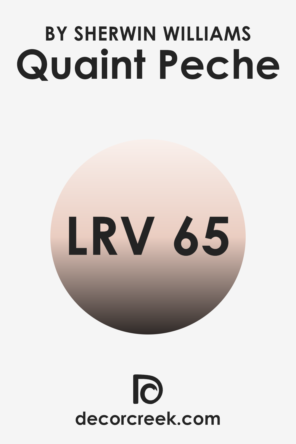
For Quaint Peche SW 6330, which has an LRV of 64.993, this indicates that it reflects a moderate to high amount of light. As a result, when this color is used on the walls, it can help brighten up the room and make it feel more open and airy.
This is especially beneficial in rooms that may lack ample natural light, as the color helps maximize the brightness that is present. With an LRV near 65, Quaint Peche strikes a pleasant middle ground—neither too light nor too dark—offering a warm, welcoming feel without overpowering the room. This balance makes it a flexible choice, well-suited for a range of interiors and design preferences.
Coordinating Colors of Quaint Peche SW 6330 by Sherwin Williams
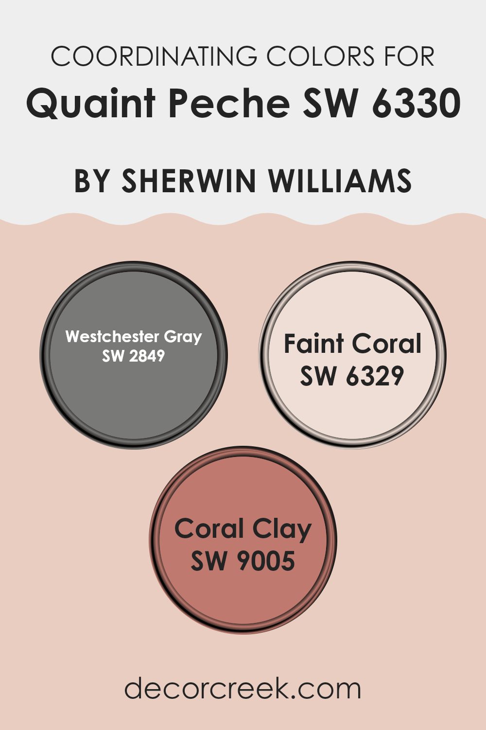
Coordinating colors are hues that work well together, creating a harmonious look in a room. When you use coordinating colors, they should complement each other, enhancing the primary color while adding variety and depth to an area. For example, Quaint Peche by Sherwin Williams is a warm, peachy shade that can be beautifully paired with three specific colors for a cohesive and inviting setting.
Westchester Gray is a deep, cool gray that provides a grounding balance to the warmth of Quaint Peche, adding an elegant touch. Then there’s Faint Coral, a soft and gentle pinkish-orange shade that echoes the warmth of Quaint Peche, adding a subtle yet charming touch to the palette.
To complete the combination, Coral Clay brings in a more earthy, terracotta tone. It reinforces the warm, sun-kissed vibe while introducing a robust and lively element to the scheme. Together, these colors create a balanced interplay of warmth and contrast.
Each hue has its distinct personality, but when combined, they form a pleasant, aesthetically pleasing look that can enhance any interior. Such combinations are perfect for those who appreciate varied tones that play off each other beautifully, creating a room that feels both coordinated and alive.
You can see recommended paint colors below:
- SW 2849 Westchester Gray
- SW 6329 Faint Coral
- SW 9005 Coral Clay
What are the Trim colors of Quaint Peche SW 6330 by Sherwin Williams?
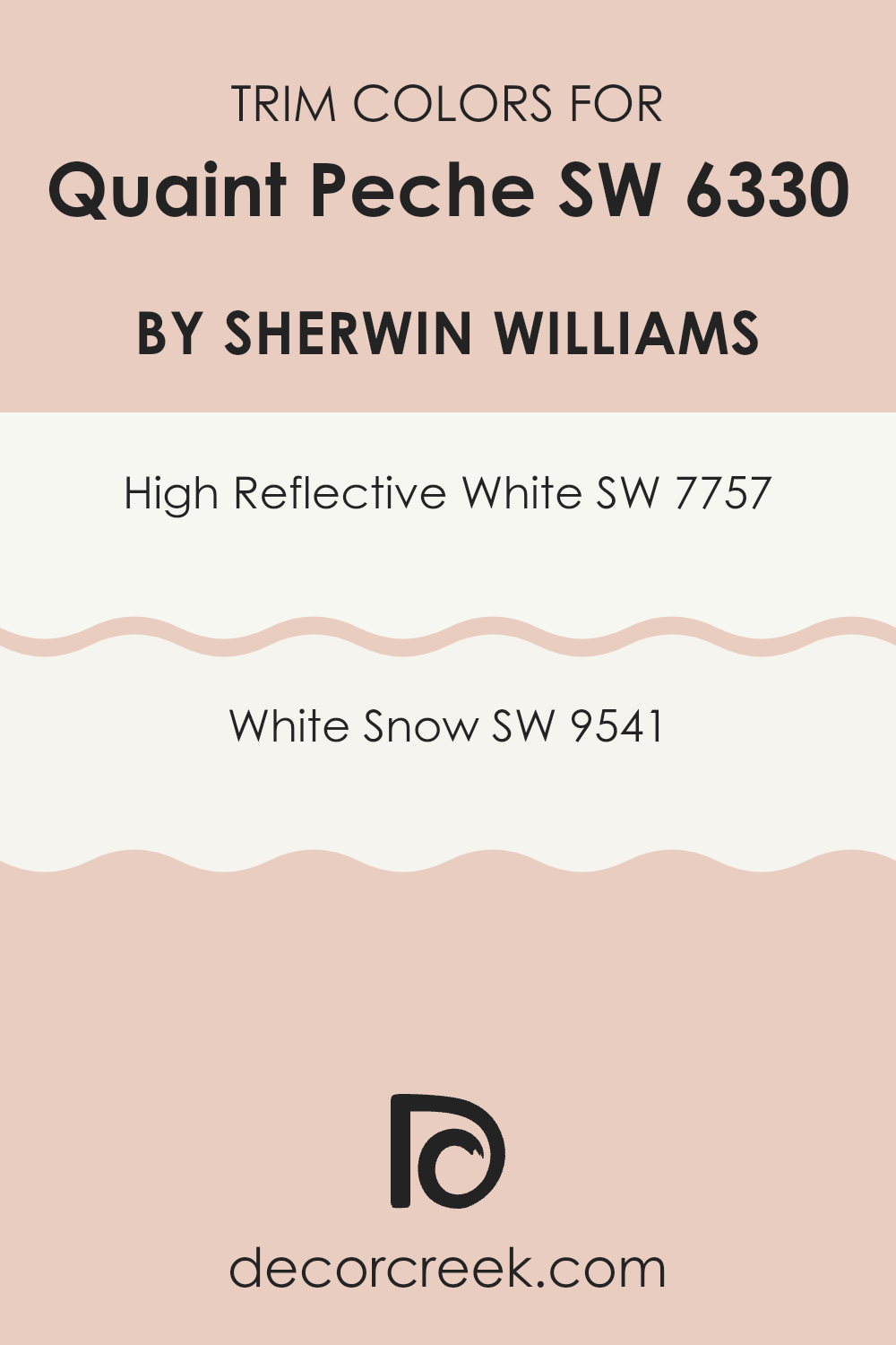
Trim colors are the paint shades used on the edges of walls, door frames, and windows to highlight architectural details and create a refined finish. When paired with a main wall color like Quaint Peche by Sherwin Williams, choosing the right trim colors can enrich the overall style and balance of a room.
Trim colors like High Reflective White and White Snow are particularly effective because they provide a crisp, clean contrast that adds depth and interest. The trim acts as a frame, tying the room together and allowing the main wall color to stand out while maintaining a harmonious look.
High Reflective White (SW 7757) is a bright, true white that reflects a lot of light, making rooms feel more open and spacious. It’s an excellent choice for trim because it highlights the architectural details without competing with other colors. On the other hand, White Snow (SW 9541) offers a softer, warmer white that still maintains simplicity and elegance.
It works great for softer contrast while bringing a touch of warmth to the trim, complementing the main wall color, Quaint Peche, without overpowering it. Both shades work beautifully to emphasize the features of a room while ensuring that the overall look remains cohesive and inviting.
You can see recommended paint colors below:
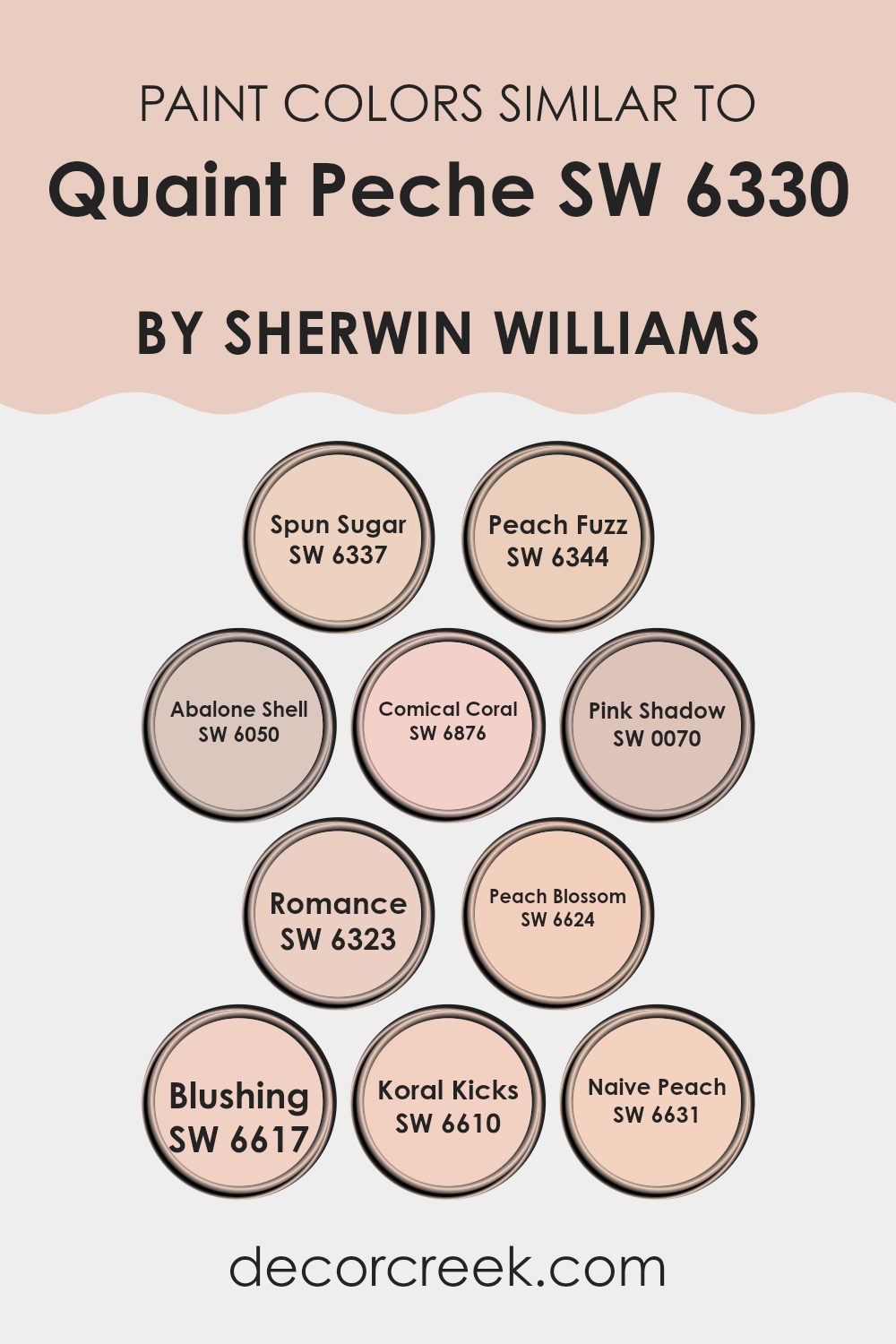
Colors Similar to Quaint Peche SW 6330 by Sherwin Williams
Colors close to Quaint Peche by Sherwin Williams share a harmonious feel that brings cohesion to a room. By using similar colors such as Spun Sugar, Peach Fuzz, Abalone Shell, Comical Coral, Pink Shadow, Romance, Peach Blossom, Blushing, Koral Kicks, and Naive Peach, you can create a palette that feels pleasant and unified. Spun Sugar offers a light, airy feel with a hint of sweetness, while Peach Fuzz delivers a warm undertone that’s more vibrant yet soft.
Abalone Shell provides a muted peach shade that adds subtle elegance to a room. Comical Coral is lively and uplifting, with its charming pinkish-orange hue, while Pink Shadow exudes subtle grace with its dusty pink shadows.
Romance, with its delicate, soft pink tone, creates a gentle and inviting atmosphere. Peach Blossom has a cheerful peach, bright yet nurturing tone that instantly warms a room. Blushing brings out a soft pink that feels tender and quiet. Koral Kicks injects energy with a more vibrant and lively coral hue.
Naive Peach rounds out the palette with a gentle, uncomplicated peach, perfect for adding a touch of freshness. These complementary colors work together to create an environment that is consistently warm and cohesive, with each shade enhancing the others without overpowering the room.
You can see recommended paint colors below:
- SW 6337 Spun Sugar
- SW 6344 Peach Fuzz
- SW 6050 Abalone Shell
- SW 6876 Comical Coral
- SW 0070 Pink Shadow
- SW 6323 Romance
- SW 6624 Peach Blossom
- SW 6617 Blushing
- SW 6610 Koral Kicks
- SW 6631 Naive Peach
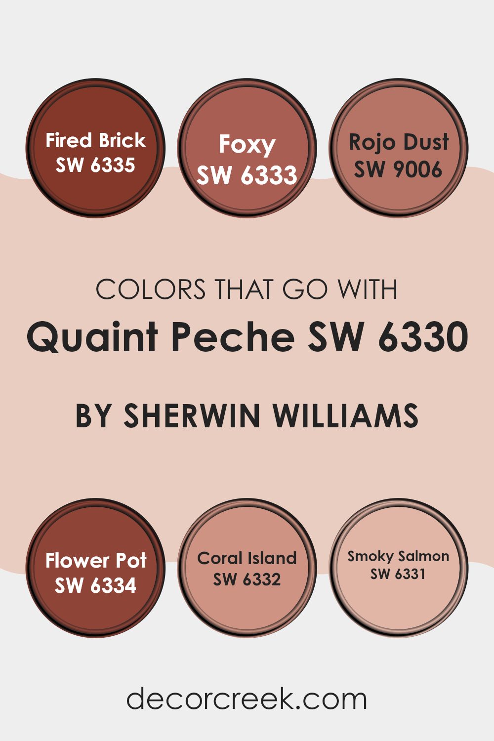
Colors that Go With Quaint Peche SW 6330 by Sherwin Williams
Colors that complement Sherwin Williams’ Quaint Peche SW 6330, such as SW 6335 – Fired Brick, SW 6333 – Foxy, SW 9006 – Rojo Dust, SW 6334 – Flower Pot, SW 6332 – Coral Island, and SW 6331 – Smoky Salmon, play a vital role in creating a harmonious setting. These colors work well together by balancing warm, earthy tones with soft, inviting hues.
Quaint Peche, a gentle peach, is warm and inviting, setting a cozy backdrop. Fired Brick brings a deep, rich red that adds depth and warmth to the palette. Foxy is a reddish-brown that complements the softness of the peach, introducing a sense of calm.
Rojo Dust offers a muted red that blends well with Quaint Peche, creating a gentle contrast. Flower Pot, a more subdued tone, reflects the cozy charm of clay and adds a grounded, earthy quality. Coral Island brings a cheerful coral-pink energy that lifts the mood of the room without becoming too bold.
Finally, Smoky Salmon, a soft, toned-down orange-pink, harmonizes with Quaint Peche for a comforting effect. Together, these colors shape an environment that feels steady and welcoming. Blending these hues creates a natural visual rhythm that is both cozy and chic, giving each room a unified and attractive feel.
You can see recommended paint colors below:
- SW 6335 Fired Brick
- SW 6333 Foxy
- SW 9006 Rojo Dust
- SW 6334 Flower Pot
- SW 6332 Coral Island
- SW 6331 Smoky Salmon
How to Use Quaint Peche SW 6330 by Sherwin Williams In Your Home?
Quaint Peche SW 6330 by Sherwin Williams is a soft and inviting peach color. It’s warm and cozy, perfect for creating a welcoming atmosphere in your home. You can use this color in a variety of rooms to bring a gentle touch to your decor.
In the living room, Quaint Peche can make the room feel more open and cheerful when paired with white or light-colored furniture. In the bedroom, this color brings a relaxing and warm vibe, ideal for restful nights. It’s also a great choice for a nursery, adding a touch of warmth and softness.
For kitchens, it pairs nicely with wooden cabinets and stainless-steel appliances, adding charm without overpowering the room. In bathrooms, Quaint Peche can complement natural stones or white fixtures for a clean, fresh look. Overall, it’s an adaptable color that can add a gentle, inviting feel to any room in your home.
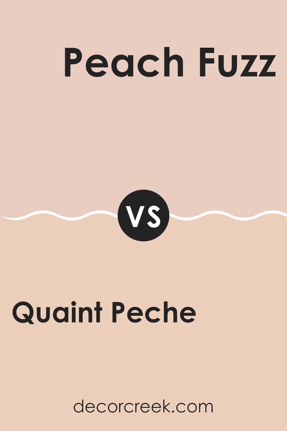
Quaint Peche SW 6330 by Sherwin Williams vs Peach Fuzz SW 6344 by Sherwin Williams
Quaint Peche SW 6330 and Peach Fuzz SW 6344 are both warm, peachy tones from Sherwin Williams. Quaint Peche is a soft, muted shade that leans slightly orange, creating a cozy and inviting atmosphere.
It’s ideal for rooms where you want a bit of warmth without being too intense or overpowering. On the other hand, Peach Fuzz SW 6344 is a brighter, more vibrant peach. It adds a cheerful and lively touch, perfect for creating a sunny, upbeat vibe in rooms like kitchens or playrooms.
While both shades stem from a peach foundation, Quaint Peche delivers a more muted and gentle appearance, whereas Peach Fuzz brings a spirited and lively tone. Based on the feeling you wish to evoke, you can select between these hues to match your individual aesthetic and the character of your environment.
You can see recommended paint color below:
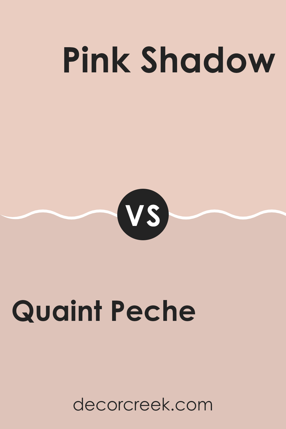
Quaint Peche SW 6330 by Sherwin Williams vs Pink Shadow SW 0070 by Sherwin Williams
Quaint Peche SW 6330 and Pink Shadow SW 0070 from Sherwin Williams are both soft, warm colors, but they provide different vibes. Quaint Peche is a peachy tone with a hint of orange, giving it a sunny, cheerful look.
It can brighten up a room and make it feel cozy and inviting. Pink Shadow, on the other hand, is a gentle pink with a subtle undertone that leans towards a muted, dusty pink. This shade is softer, making it perfect for creating a comforting and gentle atmosphere.
It feels calm and soothing without being overstated. While Quaint Peche brings energy and warmth, Pink Shadow offers a quiet, comforting effect. Both colors are adaptable and can be used in various rooms, but the choice between them depends on whether you want the area to feel lively or peaceful.
You can see recommended paint color below:
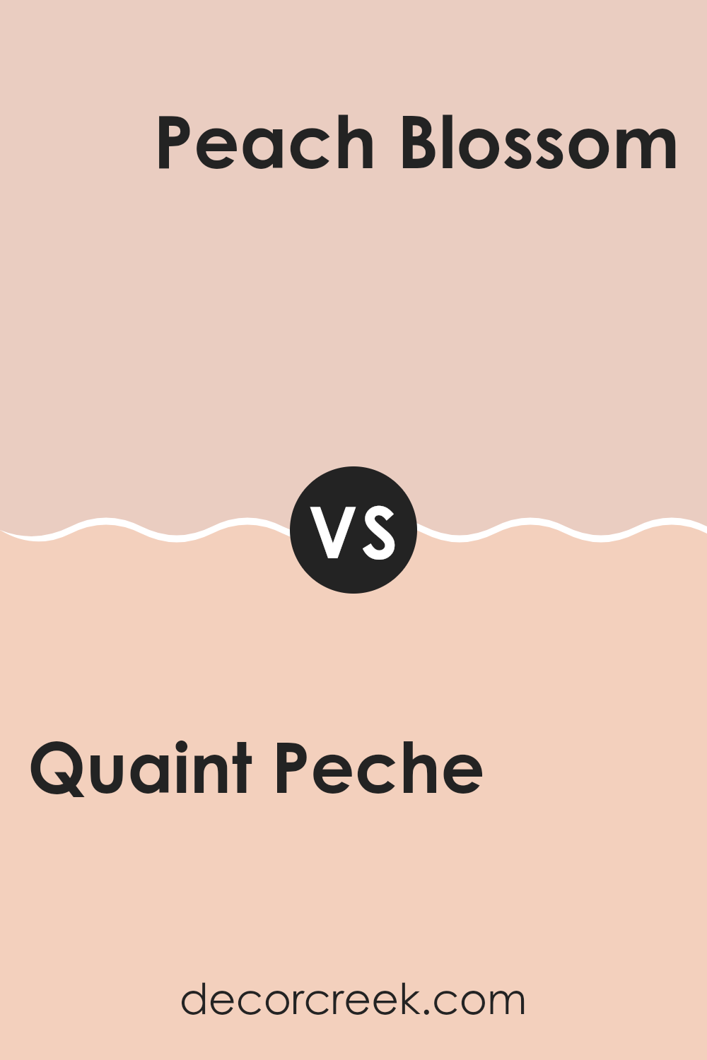
Quaint Peche SW 6330 by Sherwin Williams vs Peach Blossom SW 6624 by Sherwin Williams
Quaint Peche SW 6330 and Peach Blossom SW 6624 by Sherwin Williams are both warm, peachy hues, but they have distinct characteristics. Quaint Peche is slightly more refined and leans towards a more muted, soft peach tone. It provides a gentle and cozy feel, making it suitable for areas where you want a calm and welcoming atmosphere.
On the other hand, Peach Blossom SW 6624 is a bit more vibrant and lively. It has stronger undertones, providing a brighter and more energetic vibe. This tone is ideal for rooms where you want to add a pop of warm color and create a cheerful environment.
Both colors work well in various settings, but the choice between them depends on whether you prefer the subtle comfort of Quaint Peche or the lively energy of Peach Blossom. Whether used in living areas or bedrooms, these colors bring warmth and joy.
You can see recommended paint color below:
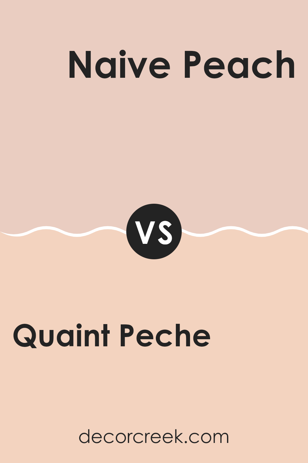
Quaint Peche SW 6330 by Sherwin Williams vs Naive Peach SW 6631 by Sherwin Williams
Quaint Peche SW 6330 and Naive Peach SW 6631 are two lovely peach colors from Sherwin Williams. Quaint Peche is a soft pinkish-orange shade. It feels gentle and warm, like a cozy sunrise. It’s a flexible color that works well in different rooms, bringing a touch of warmth.
On the other hand, Naive Peach is a bit brighter and bolder. It has a cheerful and lively vibe, making it a perfect choice for areas where you want to add some energy and happiness. The difference between the two colors is mainly in their intensity; Quaint Peche is softer, while Naive Peach stands out more.
Both colors can add a sense of warmth and comfort to a room, but your choice might depend on whether you prefer a calm and subtle feel or something more vibrant and cheerful. They are both delightful in their way and can suit various tastes.
You can see recommended paint color below:
- SW 6631 Naive Peach
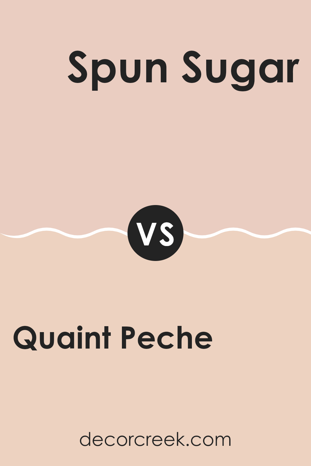
Quaint Peche SW 6330 by Sherwin Williams vs Spun Sugar SW 6337 by Sherwin Williams
Quaint Peche SW 6330 and Spun Sugar SW 6337 by Sherwin Williams are both warm and inviting colors, but they have distinct tones. Quaint Peche is a warm, peachy hue that feels cozy and comfortable, perfect for creating a welcoming atmosphere in living rooms or bedrooms. It has a soft orange undertone that adds warmth without feeling too bold.
Spun Sugar, on the other hand, is a lighter, pinkish hue. It has a delicate and airy feel, making rooms seem fresh and cheerful. With its subtle blush undertone, Spun Sugar brings a light and sweet touch to any room.
Together, these colors can complement each other well. Quaint Peche’s warmth pairs nicely with Spun Sugar’s lightness, creating a balance between coziness and openness. Whether used separately or together, both colors can enhance the mood and character of a room with their distinct yet harmonious qualities.
You can see recommended paint color below:
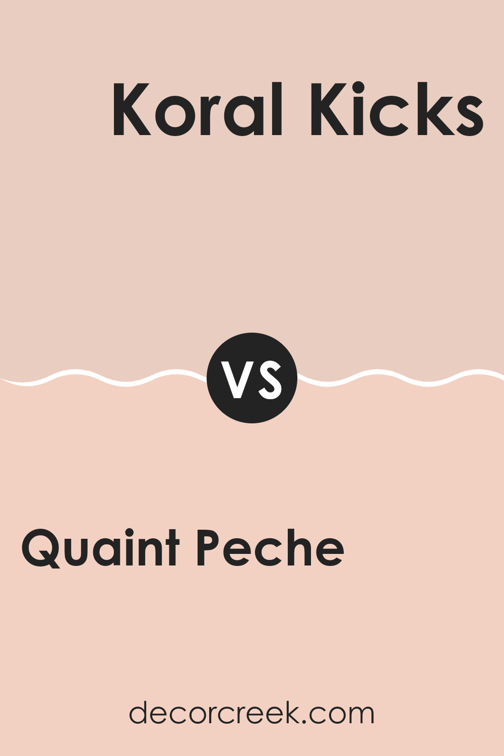
Quaint Peche SW 6330 by Sherwin Williams vs Koral Kicks SW 6610 by Sherwin Williams
Quaint Peche SW 6330 and Koral Kicks SW 6610 are both vibrant colors by Sherwin Williams, but they offer different feels and uses. Quaint Peche is a soft peach—warm and inviting—creating a cozy atmosphere. It’s ideal for rooms where you want a relaxed, comforting vibe, like bedrooms or living rooms.
On the other hand, Koral Kicks is a lively coral. It’s brighter and bolder, bringing energy and a cheerful mood. This color is perfect for areas where you want a pop of color and a playful feel, like accent walls or kids’ rooms.
While Quaint Peche offers a gentle, soothing touch, Koral Kicks stands out with its vivid and dynamic presence. Both colors can enrich a room, but your choice depends on whether you’re aiming for warmth and comfort or energetic vibrancy. They’re flexible enough to be used in various ways depending on the mood you wish to create.
You can see recommended paint color below:
- SW 6610 Koral Kicks
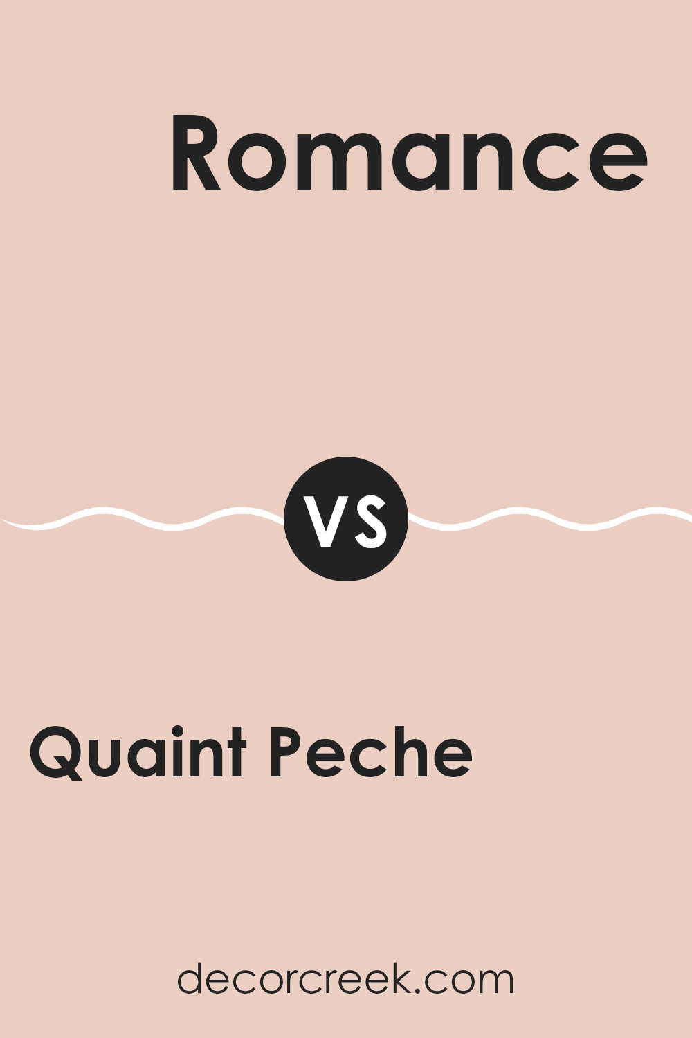
Quaint Peche SW 6330 by Sherwin Williams vs Romance SW 6323 by Sherwin Williams
Quaint Peche (SW 6330) and Romance (SW 6323) by Sherwin Williams are two appealing colors with unique characteristics. Quaint Peche is a soft, peachy hue that brings a warm and inviting feel to a room. It has a gentle, sun-kissed vibe perfect for creating a comforting atmosphere.
On the other hand, Romance is a soft pink shade that exudes a light, fresh, and airy feeling. It’s a more delicate color, often associated with a gentle sweetness and charm.
While both colors have a warm undertone, Quaint Peche leans more towards an earthy, peach palette, providing a cozy and grounded impression. Romance, however, stands out with its fresh and subtly playful pink tone, ideal for adding a touch of softness and lightness. When used together, these colors can complement each other beautifully, with Quaint Peche adding depth and warmth, while Romance introduces a soft, romantic touch.
You can see recommended paint color below:
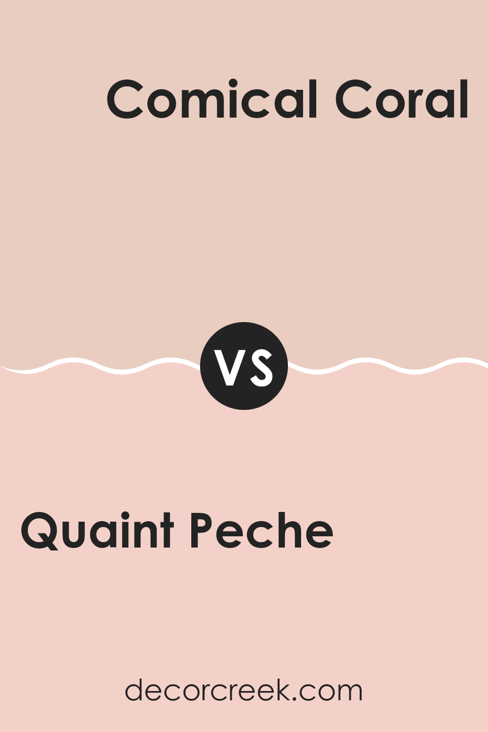
Quaint Peche SW 6330 by Sherwin Williams vs Comical Coral SW 6876 by Sherwin Williams
Quaint Peche SW 6330 and Comical Coral SW 6876 by Sherwin Williams are both enchanting shades with distinct personalities. Quaint Peche is a soft, peachy hue that radiates warmth and ease. It’s a calming color that brings a gentle touch to any room, making interiors feel cozy and welcoming.
On the other hand, Comical Coral is a vibrant and energetic color. This bright coral shade is lively and cheerful, instantly adding a burst of enthusiasm to any area it adorns. It’s perfect for creating a playful and bold atmosphere.
While Quaint Peche sets a calm and relaxed tone, Comical Coral is all about fun and excitement. These colors can be used to coordinate with one another, with Quaint Peche balancing the boldness of Comical Coral, or separately to achieve different moods in your home. They each offer a unique way to renew and personalize a setting.
You can see recommended paint color below:
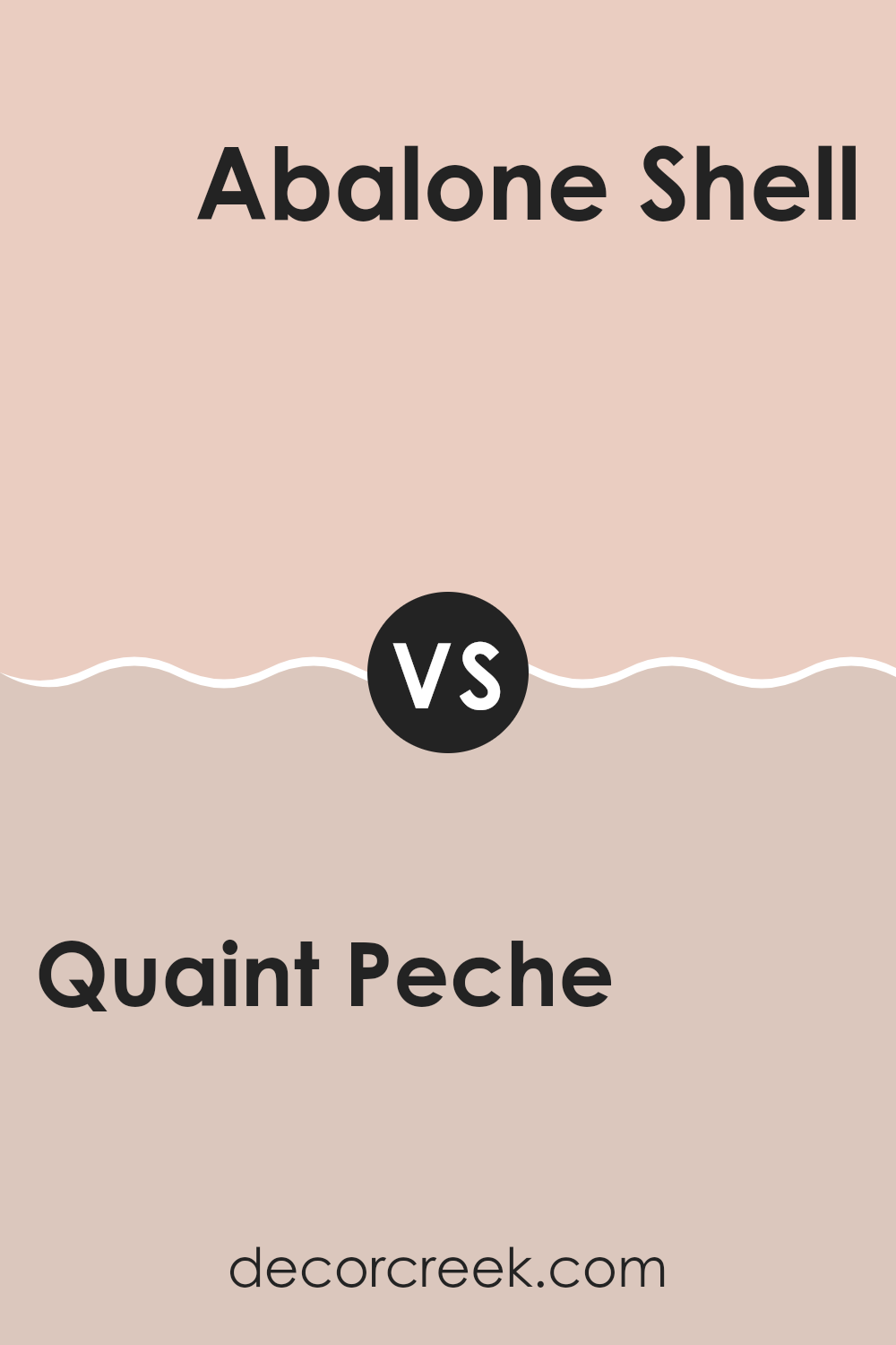
Quaint Peche SW 6330 by Sherwin Williams vs Abalone Shell SW 6050 by Sherwin Williams
Quaint Peche SW 6330 by Sherwin Williams is a warm, peachy shade. It’s bright and uplifting, giving rooms a sunny, cheerful vibe. This color works well in areas where you want a cozy and welcoming environment, like kitchens or living rooms. It pairs nicely with light, neutral tones, creating a lovely contrast.
On the other hand, Abalone Shell SW 6050 is a softer, muted beige with pink undertones. It offers a more subtle and understated look, perfect for creating a calm and relaxed environment. This color is adaptable and can be used in almost any room, making it a good choice for those who prefer a more neutral palette.
When compared, Quaint Peche is more vibrant and bold, while Abalone Shell is gentle and calming. Both colors have their unique appeal, and the choice between them depends on the mood you want to create in your environment.
You can see recommended paint color below:
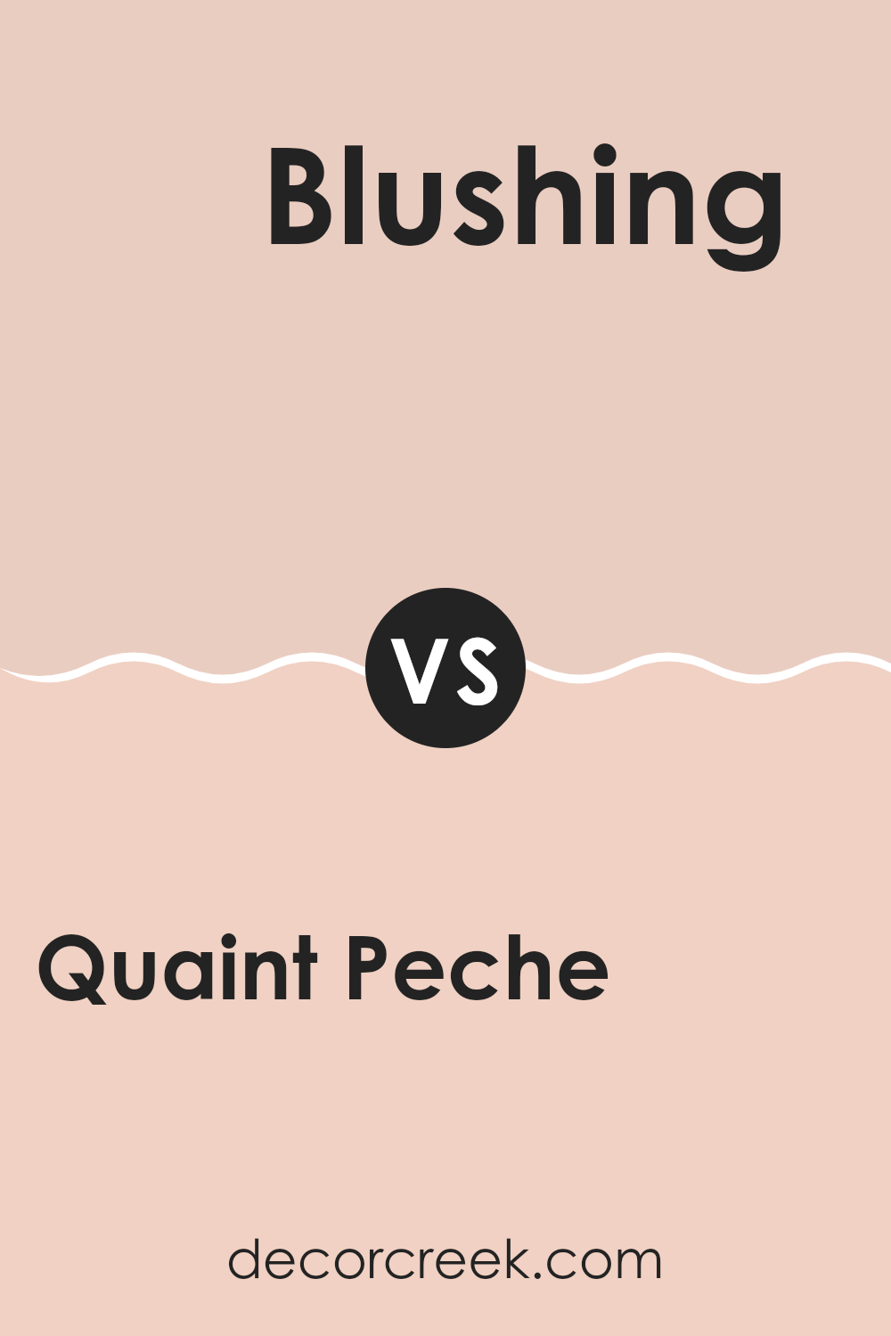
Quaint Peche SW 6330 by Sherwin Williams vs Blushing SW 6617 by Sherwin Williams
Quaint Peche SW 6330 by Sherwin Williams is a warm, peachy color that evokes feelings of comfort and friendliness. It is bright yet soft, making it a perfect choice for areas that aim to feel welcoming and cheerful.
On the other hand, Blushing SW 6617 by Sherwin Williams is a gentle, light pink shade. It’s more subdued compared to the lively peach, offering a delicate and soothing look. While Quaint Peche stands out with its warm and inviting nature, Blushing brings to mind subtlety and softness.
The two colors, though both warm, create different moods: Quaint Peche adds vitality to a room, while Blushing adds stillness. Quaint Peche could be used in living areas where activity occurs, and Blushing would suit quieter zones like bedrooms or a nursery. Both offer unique styles but share a sense of warmth and ease.
You can see recommended paint color below:
- SW 6617 Blushing
After learning about SW 6330 Quaint Peche by Sherwin Williams, I feel like I’ve uncovered the reasons why this color is so special. Quaint Peche is a shade that reminds me of the color of soft peaches, and it has a warm, gentle feel. It’s not too bright, yet it’s not dull either; it’s just the right kind of cheerful.
This peachy tone can make a room feel cozy and inviting. It’s great for areas where you want people to feel comfortable, like a living room or a bedroom. What’s interesting is how this color can make a big difference without being too loud or flashy. It’s a friend to both your eyes and your mood!
When you paint a wall with Quaint Peche, it can give the area a warm hug. It’s like bringing a little piece of a summer day indoors. This color seems friendly and approachable, which makes it easy to get along with other colors in your home. You can team it up with greens, blues, or even neutrals for a nice and balanced look.
In my view, SW 6330 Quaint Peche is like a simple, yet delightful treasure. It’s nice to know that such a color exists to bring warmth and happiness into our homes.
Ever wished paint sampling was as easy as sticking a sticker? Guess what? Now it is! Discover Samplize's unique Peel & Stick samples.
Get paint samples

