I recently came across SW 2849 Westchester Gray by Sherwin Williams, and I must say, it caught my attention for its unique charm. If you’re considering a refresh for your home’s interior or exterior, this color might just be what you’re looking for.
Westchester Gray is a sophisticated shade that manages to strike a perfect balance between distinctly modern and timelessly neutral. It offers a strong foundation for any room, providing a background that enhances decor without overwhelming it.
One of the notable qualities of Westchester Gray is its versatility. It pairs beautifully with a wide range of colors and materials, from warm wooden furnishings to metallic accents. Whether you’re aiming to create a cozy, inviting space or a sleek, contemporary setting, this shade adapts effortlessly.
It also works exceptionally well in various lighting conditions, maintaining its depth and intrigue whether bathed in natural sunlight or illuminated by artificial lighting. Let me guide you through how Westchester Gray could transform your space into a stylish and welcoming environment.
What Color Is Westchester Gray SW 2849 by Sherwin Williams?
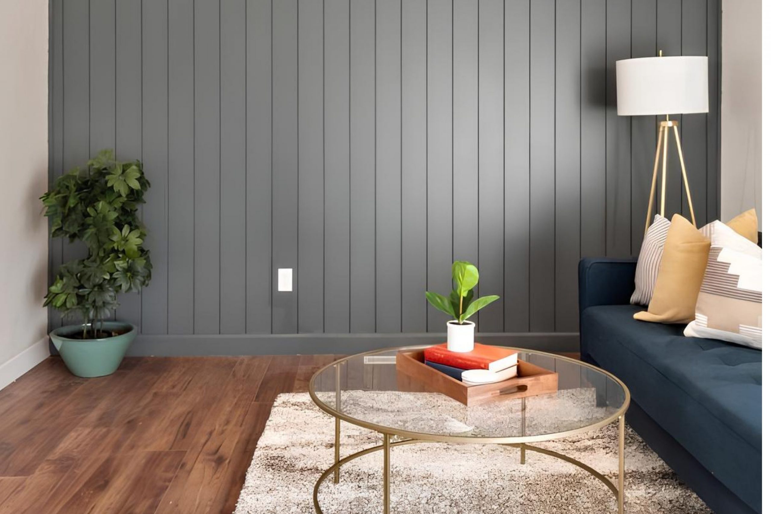
Westchester Gray by Sherwin Williams is a versatile neutral shade that carries tones of deep charcoal with subtle hints of blue. This medium-toned gray offers a balanced blend, making it a perfect backdrop for various design styles and spaces.
It works well in modern and contemporary interiors, where its clean and crisp nature can accentuate minimalist furniture and bold art pieces. Additionally, this color is suitable for industrial and farmhouse aesthetics due to its earthy undertone, which pairs beautifully with rustic elements and exposed structures.
In terms of materials, Westchester Gray complements natural wood, enhancing its warm tones and texture. It also looks stunning when combined with metal finishes like brushed nickel or steel, providing a slight contrast that highlights both materials’ strengths. When considering textiles, this color matches well with soft, plush fabrics such as wool or fleece in lighter shades like creams and whites, which help create a cozy and welcoming atmosphere.
This shade is also an excellent choice for those who like to mix and match different textures and materials, as it serves as a sturdy foundation that supports a variety of layering in interior decor. Whether you’re dressing up a bedroom or sprucing up a living room, Westchester Gray provides a compelling yet understated canvas that enhances everything around it.
Is Westchester Gray SW 2849 by Sherwin Williams Warm or Cool color?
Westchester Gray SW 2849 by Sherwin Williams is a versatile and neutral gray color that provides a subtle, modern look for any room in your home. This particular shade of gray has a balanced tone, making it a perfect choice if you want to create a clean and contemporary ambience without going too dark or too light.
The beauty of Westchester Gray lies in its ability to match well with a wide range of other colors, from bright whites to deep blacks and vibrant colors. This makes it an ideal backdrop for both minimalistic and vibrant decorating styles.
In spaces with limited natural light, Westchester Gray helps maintain a sense of openness and light, unlike darker shades which might make a room feel smaller or more closed-off. Its neutral hue also makes it easy to pair with various textures and materials, whether you’re using wood, metal, or glass, helping to achieve a harmonious look throughout your living space. Overall, Westchester Gray is a functional and stylish choice that can suit many different home décor settings.
What is the Masstone of the Westchester Gray SW 2849 by Sherwin Williams?
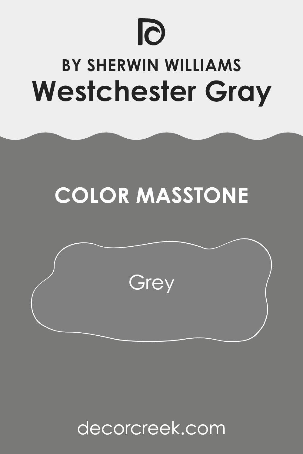
Westchester Gray SW 2849 by Sherwin Williams is a solid, reliable gray color with a balanced masstone that resembles the classic gray (#808080). This neutral hue is incredibly versatile, making it a popular choice for various rooms in the home. Its equal balance of black and white makes it an easy color to work with, as it pairs well with a wide spectrum of decor styles and color palettes.
In living rooms or bedrooms, Westchester Gray offers a calm backdrop that allows furniture and artwork to stand out. It’s not too dark or too light, ensuring that spaces feel cozy without being overwhelming. In kitchens and bathrooms, this color works beautifully with both modern appliances and traditional fixtures, bridging the gap between different materials like wood, metal, and glass.
Overall, using Westchester Gray in your home can help to create a cohesive look that feels grounded and polished. Its adaptability makes it suitable for either accent walls or full-room painting, providing a timeless elegance that complements any interior design scheme.
How Does Lighting Affect Westchester Gray SW 2849 by Sherwin Williams?
Lighting plays a critical role in how we perceive colors. Different light sources can significantly affect how a color looks in a space. For example, colors might seem different under the warm glow of a bulb compared to the cooler tones offered by natural daylight.
Considering Westchester Gray, a versatile neutral shade by Sherwin Williams, its appearance varies based on the lighting condition.
- In artificial light, such as that from incandescent bulbs, this gray will likely appear warmer and slightly softer. This makes it a cozy choice for living spaces and bedrooms where artificial lighting is frequently used.
- In natural light, the color can look more true to its original tone, displaying its pure gray qualities.
The extent of natural light exposure also impacts its appearance. In rooms facing north, which receive less direct sunlight, Westchester Gray can appear somewhat cooler and more shadowy, giving a more formal look. This might make the room feel more enclosed.
In south-facing rooms, the color can come alive with the abundance of daylight, looking lighter and more dynamic. It’s ideal for spaces where you want a lively but neutral backdrop.
Rooms with east-facing windows receive morning light, which is generally bright and warm. Here, Westchester Gray will be cheerier and welcoming in the morning, while becoming more muted as the day progresses. Conversely, in west-facing rooms, the color appears softer in the morning and gains intensity towards the evening due to the warmer tones of the setting sun.
Overall, Westchester Gray adapts itself smoothly across different rooms and lighting conditions, making it a reliable choice for various decorating needs. Deciding whether it’s the right color for a room often hinges on the quality and direction of light the room experiences throughout the day.
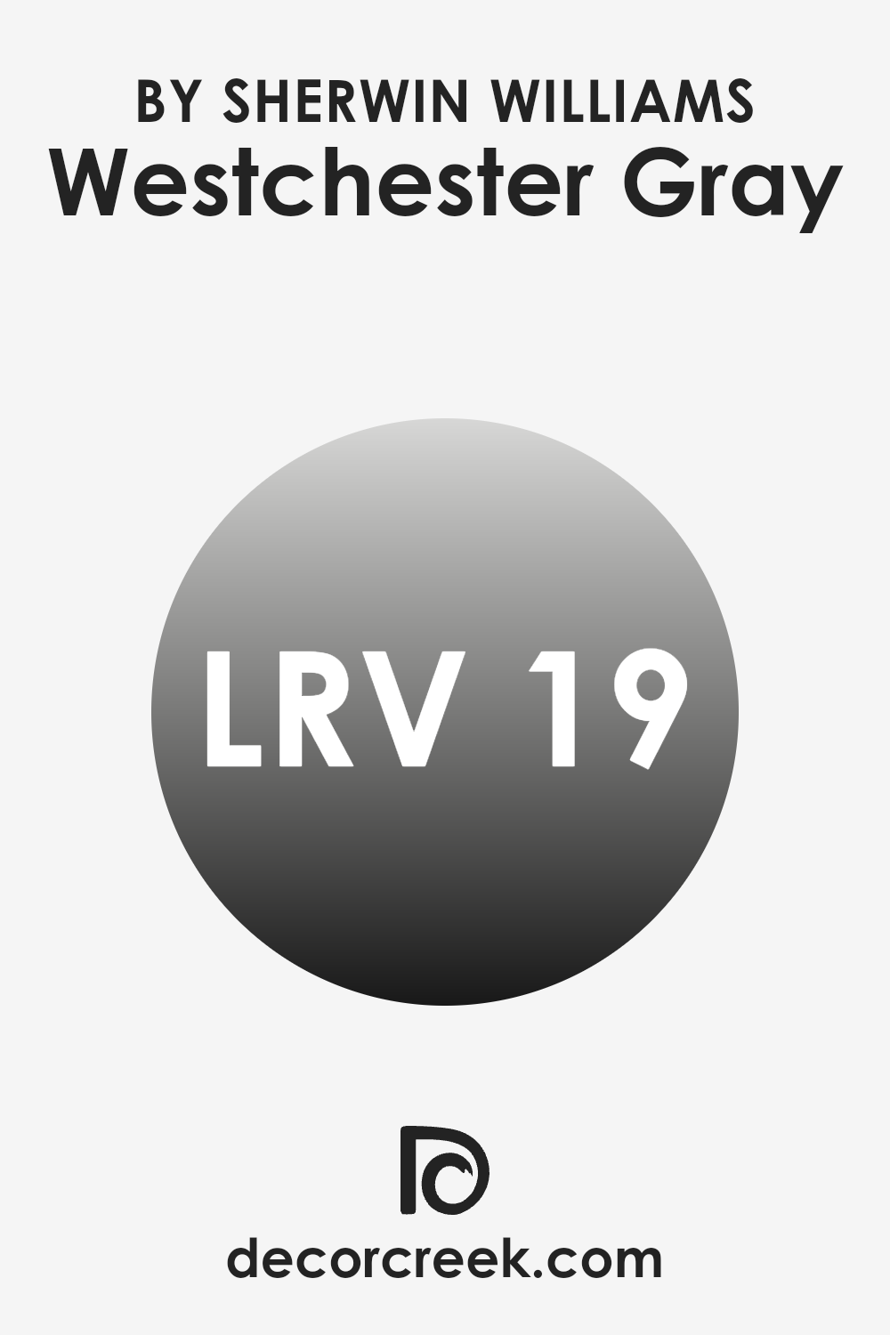
What is the LRV of Westchester Gray SW 2849 by Sherwin Williams?
LRV stands for Light Reflectance Value, a measure that indicates how much light a paint color reflects or absorbs when light hits it. It’s a scale that runs from zero, which reflects no light and absorbs all light (pure black), to a maximum value where all light is reflected and none is absorbed (pure white).
Generally, the higher the LRV, the lighter the color will look on your walls. Light colors tend to make spaces feel larger and more open, while dark colors can make a room feel more compact and cozy.
In the case of Westchester Gray with an LRV of 19.181, it is a darker gray shade that absorbs more light than it reflects. This means it will contribute to a moodier, more enclosed feel in a space, making it ideal for creating a cozy and intimate atmosphere. Such a low LRV can diminish the sense of space in smaller or poorly lit rooms, potentially making them appear smaller.
However, in well-lit areas or larger spaces, this color can add a touch of drama and style without overwhelming the surroundings.
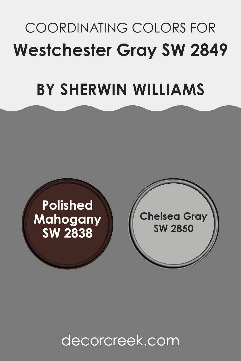
Coordinating Colors of Westchester Gray SW 2849 by Sherwin Williams
Coordinating colors are hues that complement each other well and create a visually appealing palette when used together in decor or design. When dealing with a specific base color, like Westchester Gray by Sherwin Williams, choosing the right coordinating colors can accentuate its characteristics without overpowering it.
Coordinating colors can be selected from the same color family for a more harmonious look or from contrasting tones to create more dynamic spaces. For Westchester Gray, two ideal coordinating colors are Polished Mahogany and Chelsea Gray.
Polished Mahogany is a rich, deep color with warm undertones, reminiscent of finely aged wood. This color works beautifully as an accent, offering a striking contrast against the neutrality of Westchester Gray, making it perfect for features like doors, furniture, or even an accent wall that adds a touch of classic charm to the room.
On the other hand, Chelsea Gray is a subtler option, with a medium gray tone that blends seamlessly with Westchester Gray, promoting a cohesive and downplayed aesthetic. This color is excellent for larger areas or connecting spaces, helping to create a gentle transition between rooms that share a modern yet timeless vibe.
You can see recommended paint colors below:
- SW 2838 Polished Mahogany
- SW 2850 Chelsea Gray
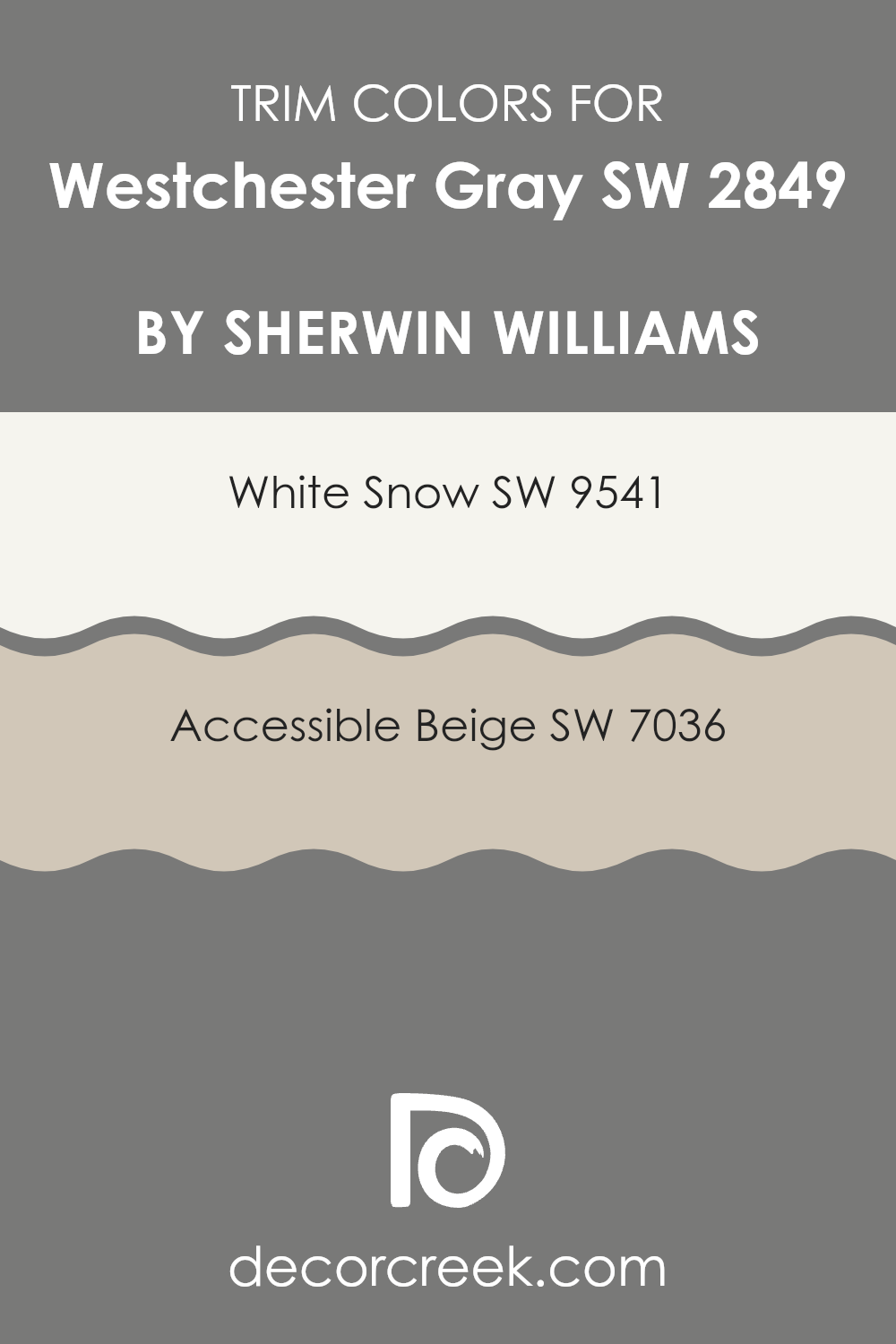
What are the Trim colors of Westchester Gray SW 2849 by Sherwin Williams?
Trim colors are used to accentuate and define the architectural details of a home, like window frames, doors, and baseboards, providing contrast and visual interest against the main wall colors. Choosing the right trim color can highlight these features and help create a polished look.
For instance, a color like Westchester Gray, a warm and flexible gray tone, pairs well with crisp and brighter trim colors to ensure those architectural elements stand out and catch the eye. SW 9541 – White Snow is a clean, bright white that offers a sharp contrast to Westchester Gray, making it a great choice for creating a fresh and inviting look around doors and windows.
On the other hand, SW 7036 – Accessible Beige is a soft and light beige that provides a subtle, gentle contrast with a warmer tone, enhancing the cozy feel of a room without creating too stark a distinction. Both of these colors can complement Westchester Gray effectively, ensuring that the space maintains a harmonious but distinguished aesthetic.
You can see recommended paint colors below:
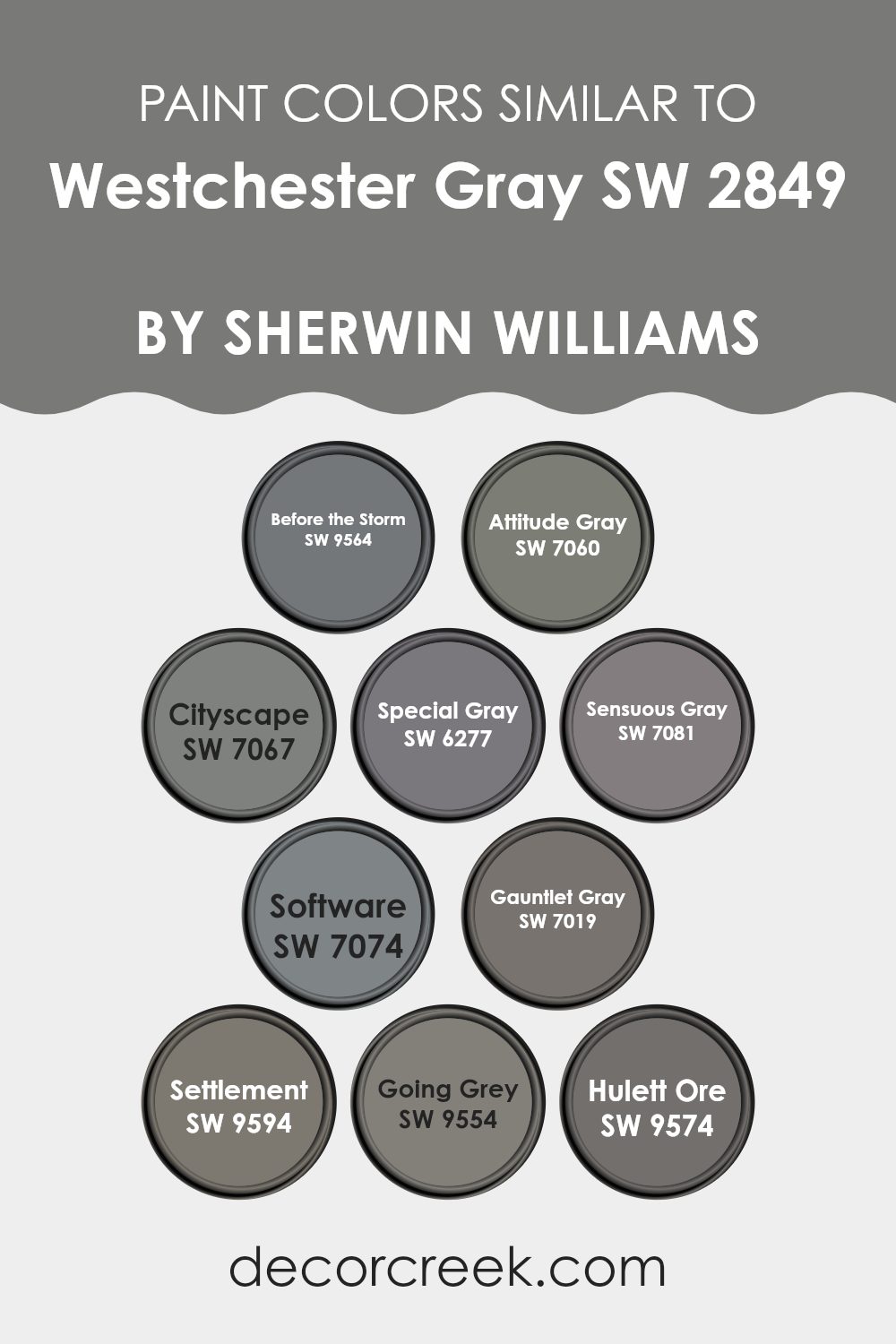
Colors Similar to Westchester Gray SW 2849 by Sherwin Williams
Using similar colors in design projects can create a cohesive and harmonious look that is pleasing to the eye. When colors like those similar to Westchester Gray by Sherwin Williams are used together, they blend seamlessly, providing a subtle variation that adds depth and interest without overwhelming the space. This technique works especially well in achieving a refined and unified aesthetic, as these shades share common undertones.
Starting with Before the Storm, it is a lighter gray that brings a fresh feel to rooms, slightly cooler with a hint of blue undertone. Attitude Gray is darker and more pronounced, offering a striking contrast that still aligns with milder grays. Cityscape presents a mid-tone gray that works well as a neutral base in diverse environments.
Special Gray has depth with a warmer tone, making it ideal for cozy settings. Sensuous Gray offers a dusky, more enigmatic appeal, adding a touch of mystery to the palette. On the technical side, Software is similar to a digital gray, providing a sleek, modern look perfect for contemporary spaces. Gauntlet Gray walks the line between gray and beige, making it extremely versatile for transitional decor.
has a richer, earthier quality compared to the cooler grays. Going Grey is the quintessential middle ground with its balanced gray tone, easy to integrate in any space. Lastly, Hulett Ore adds a unique twist with its slight metallic sheen, reflecting light beautifully and adding a dynamic element to the palette. These colors together ensure a range of options that can cater to various styling needs while maintaining an overall coordinated appearance.
You can see recommended paint colors below:
- SW 9564 Before the Storm
- SW 7060 Attitude Gray
- SW 7067 Cityscape
- SW 6277 Special Gray
- SW 7081 Sensuous Gray
- SW 7074 Software
- SW 7019 Gauntlet Gray
- SW 9594 Settlement
- SW 9554 Going Grey
- SW 9574 Hulett Ore
How to Use Westchester Gray SW 2849 by Sherwin Williams In Your Home?
Westchester Gray by Sherwin Williams is a versatile paint color with a neutral tone that combines elements of gray and beige. This makes it an excellent choice for those looking to add a modern yet timeless look to their home. Because of its neutral base, it pairs well with various decor styles, from traditional to contemporary.
One way to use Westchester Gray in your home is by painting living room walls with it to create a calm, inviting atmosphere. It’s soothing enough to work as a backdrop for both vibrant and muted accent colors. You can also use it in a bedroom to set a calm mood, complemented by white trim and hardwood floors for a clean, crisp look.
For a more unified look throughout your house, consider using Westchester Gray in hallways or common areas. This creates a seamless transition between more boldly decorated rooms. It’s also an excellent choice for exterior use, giving your home a stylish and inviting curb appeal.
Westchester Gray SW 2849 by Sherwin Williams vs Settlement SW 9594 by Sherwin Williams
Westchester Gray is a solid and relatively deep gray color with cool undertones, which gives it a bold and strong presence. On the other hand, Settlement is lighter and warmer. This color appears more subdued and soft, making it easier to blend with a variety of decor styles.
Both colors are versatile and can fit into many rooms; however, Westchester Gray might be preferred in a space where a striking, pronounced gray is desired, perhaps in a modern or contemporary setting.
In contrast, Settlement, with its gentle warmth, is great for creating a cozy and welcoming atmosphere, suitable for living rooms and bedrooms. These two distinct grays can set very different tones, depending on how they are used in space.
You can see recommended paint color below:
- SW 9594 Settlement
Westchester Gray SW 2849 by Sherwin Williams vs Gauntlet Gray SW 7019 by Sherwin Williams
Westchester Gray and Gauntlet Gray by Sherwin Williams are two distinct shades that bring different vibes to spaces. Westchester Gray is a lighter, softer gray that gives a subtle, fresh look to walls. It’s great for making a room feel open and airy.
In contrast, Gauntlet Gray is a deeper shade that offers a more grounded, solid feeling, perfect for creating a strong presence in a room or highlighting accent areas. While both colors are versatile, Westchester Gray works well in areas that get a lot of natural light, enhancing the sense of space.
Gauntlet Gray, being darker, is ideal for spaces where you want to establish a more defined or cozy atmosphere. Both colors pair nicely with a wide range of decor, but the choice between them depends largely on the mood you want to achieve in your space.
You can see recommended paint color below:
Westchester Gray SW 2849 by Sherwin Williams vs Sensuous Gray SW 7081 by Sherwin Williams
Westchester Gray and Sensuous Gray by Sherwin Williams are two distinct but elegant shades of gray. Westchester Gray is a deeper, almost charcoal-like gray which can give a strong, solid feeling to a space. It’s a great choice if you’re aiming for a bold yet neutral backdrop that can complement a wide range of decor styles and colors.
On the other hand, Sensuous Gray is lighter and softer, leaning slightly towards taupe. This makes it an ideal choice for creating a cozy and inviting atmosphere. Its warmer undertones help soften a room’s ambiance, making it perfect for bedrooms or living areas where you want a gentle, relaxing mood.
Both colors are versatile, but Westchester Gray suits modern and minimalist environments well, whereas Sensuous Gray fits beautifully in traditional or relaxed settings. Choosing between them depends largely on the mood you want to set and the natural light in your rooms.
You can see recommended paint color below:
- SW 7081 Sensuous Gray
Westchester Gray SW 2849 by Sherwin Williams vs Before the Storm SW 9564 by Sherwin Williams
Westchester Gray and Before the Storm are both gray colors from Sherwin Williams, but they have distinct shades and vibes. Westchester Gray is a mid-tone gray that feels warm and welcoming. It’s a versatile color that can fit well in many rooms, adding a cozy feeling without being too dark.
On the other hand, Before the Storm is a darker gray that leans towards a softer, more muted appearance. This color is excellent for creating a more subdued and calming atmosphere in a space, making it ideal for areas where you want to relax, like bedrooms or living rooms.
While both colors share a gray base, Westchester Gray provides a lighter, more open feel, whereas Before the Storm offers depth and a sense of intimacy. Choosing between them depends on how much light you have in your room and what kind of mood you want to set.
You can see recommended paint color below:
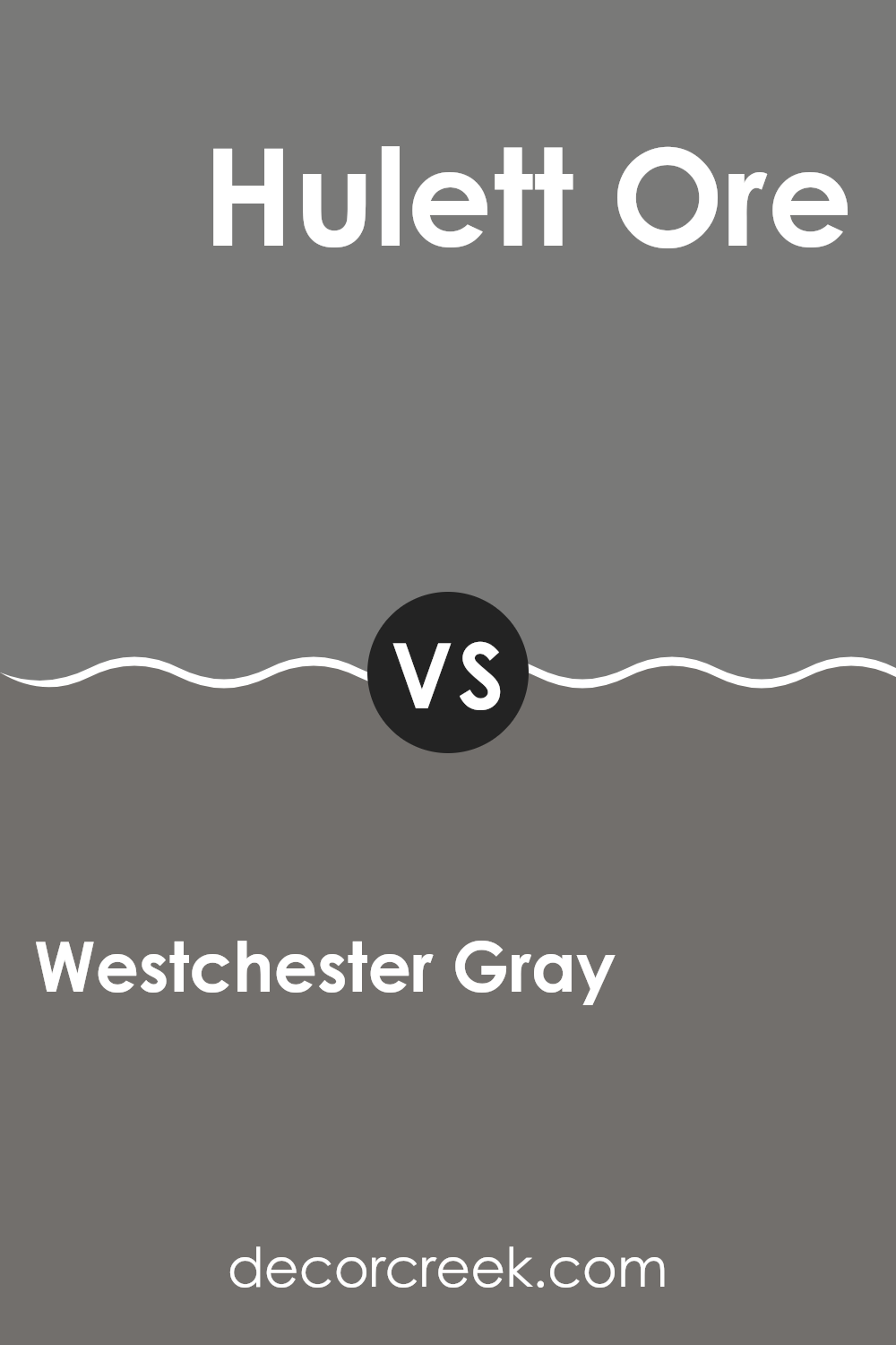
Westchester Gray SW 2849 by Sherwin Williams vs Hulett Ore SW 9574 by Sherwin Williams
Westchester Gray is a subtle and soothing gray shade with a slightly cool undertone, making it a versatile choice for many spaces. It offers a balanced look that pairs well with both bright and muted colors, giving a room a clean and understated style.
On the other hand, Hulett Ore is a much darker color that leans towards a charcoal gray. It provides a bolder statement and is ideal for creating dramatic accents in interior design. Its deeper tone can make small spaces feel smaller, though it’s excellent for highlighting architectural features or furniture pieces.
In contrast to the lighter Westchester Gray, Hulett Ore works well in larger rooms or as an exterior color where it can complement natural outdoor elements beautifully. Both colors offer distinct vibes—Westchester Gray for a light and airy feel, and Hulett Ore for a strong and moody atmosphere.
You can see recommended paint color below:
- SW 9574 Hulett Ore
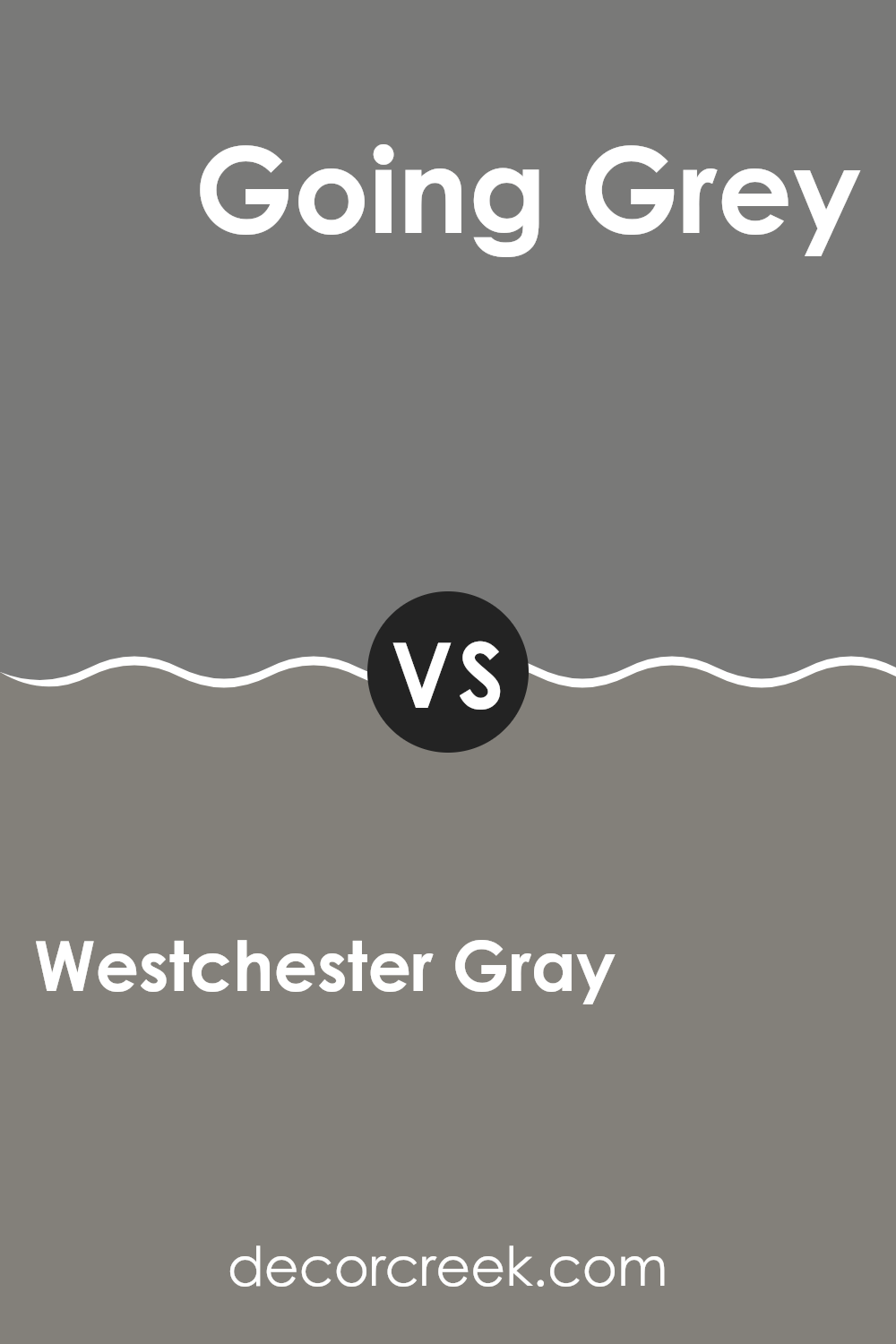
Westchester Gray SW 2849 by Sherwin Williams vs Going Grey SW 9554 by Sherwin Williams
Westchester Gray and Going Grey are two different shades produced by Sherwin Williams. Westchester Gray is a deeper, stronger gray that brings a bold look to a room. It’s perfect for creating a striking accent wall or grounding a space with its substantial tone. This color usually works well in areas that receive a lot of natural light, as its intensity balances well with bright surroundings.
Going Grey, on the other hand, is a lighter, airier gray that offers a subtle and clean look. It’s ideal for smaller rooms or spaces where you want to create a more open and light feeling. This shade is versatile and pairs effortlessly with a wide range of decor styles, suggesting a more modern and fresh ambiance compared to the intensity of Westchester Gray.
In summary, if you’re looking for a stronger presence and dramatic flair, Westchester Gray is the choice. For a lighter, more understated aesthetic, Going Grey is a great option.
You can see recommended paint color below:
- SW 9554 Going Grey
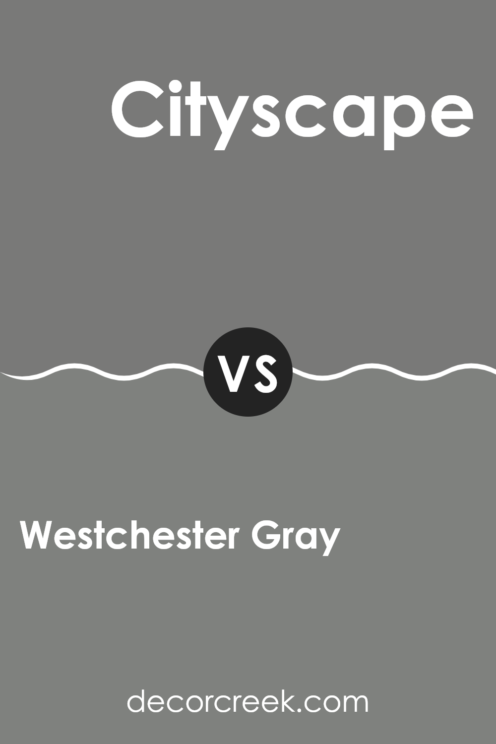
Westchester Gray SW 2849 by Sherwin Williams vs Cityscape SW 7067 by Sherwin Williams
Westchester Gray and Cityscape are both gray colors by Sherwin Williams, but they have different tones and depths. Westchester Gray is a warm gray with a softer and lighter look. This makes it a good choice for those who want a cozy feel in their rooms without the color becoming too overwhelming or bold. It works well in spaces that need a neutral backdrop that still offers a bit of warmth.
On the other hand, Cityscape is a cooler gray that’s a bit darker. It brings a more defined and strong presence to a space, making it ideal for modern and minimalistic designs. Because it’s darker, Cityscape can help create a feeling of depth in a room, making it great for accent walls or areas where you want the color to stand out more.
Both colors are versatile and can complement various decor styles, but the choice between them depends on what kind of feel and contrast you’re looking to achieve in your space.
You can see recommended paint color below:
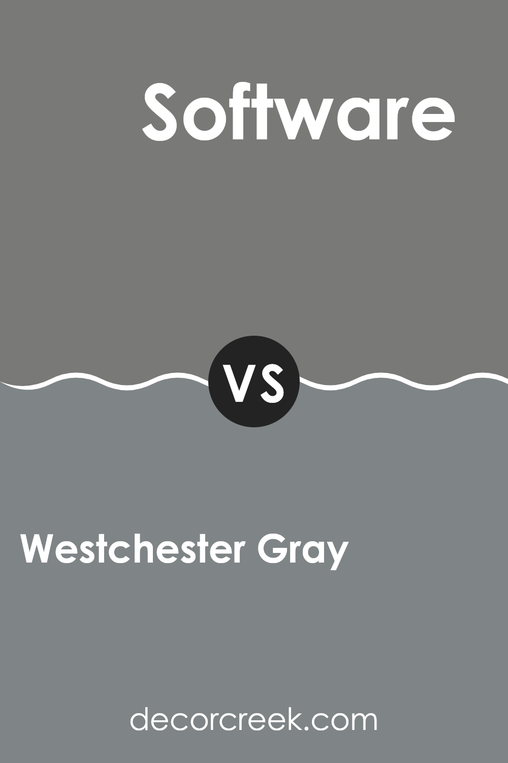
Westchester Gray SW 2849 by Sherwin Williams vs Software SW 7074 by Sherwin Williams
Westchester Gray and Software, both from Sherwin Williams, are two beautiful shades of gray that offer distinctive moods for room settings. Westchester Gray is a deep, warm gray that creates a cozy and inviting atmosphere, making it perfect for living spaces like dens and bedrooms. It pairs well with rich colors and textures to create a homely feel.
On the other hand, Software is a cooler, lighter gray with a more neutral tone. This color is ideal for modern and minimalistic spaces due to its clean and crisp appearance. It works well in offices or kitchens, facilitating a clear, bright environment that complements metallic finishes and natural woods.
While both colors share a gray base, the warmth of Westchester Gray offers a more snug, traditional charm, whereas the cooler tone of Software supports a sleeker, more contemporary look. Choosing between them depends largely on the mood and style you want to achieve in your space.
You can see recommended paint color below:
- SW 7074 Software
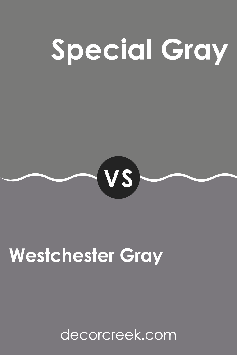
Westchester Gray SW 2849 by Sherwin Williams vs Special Gray SW 6277 by Sherwin Williams
Westchester Gray and Special Gray are two distinct shades from Sherwin Williams. Westchester Gray is a deep, neutral gray with a strong presence that contributes to a grounded and stable atmosphere in any room. It is versatile, working well in various spaces from kitchens to offices providing a solid, dependable background.
On the other hand, Special Gray is a darker, more muted shade. It leans towards a softer, subtler look, making it ideal for creating a cozy and inviting space. This color works well in areas meant for relaxation, like bedrooms or living rooms, where its richness can add depth and warmth.
Both colors are shades of gray but serve different visual purposes due to their varying tones. Westchester Gray offers more brightness and stands out on walls, whereas Special Gray provides a deeper, more restrained aesthetic. Choosing between them depends on the mood you want to set and the specific function of the space in your home.
You can see recommended paint color below:
- SW 6277 Special Gray
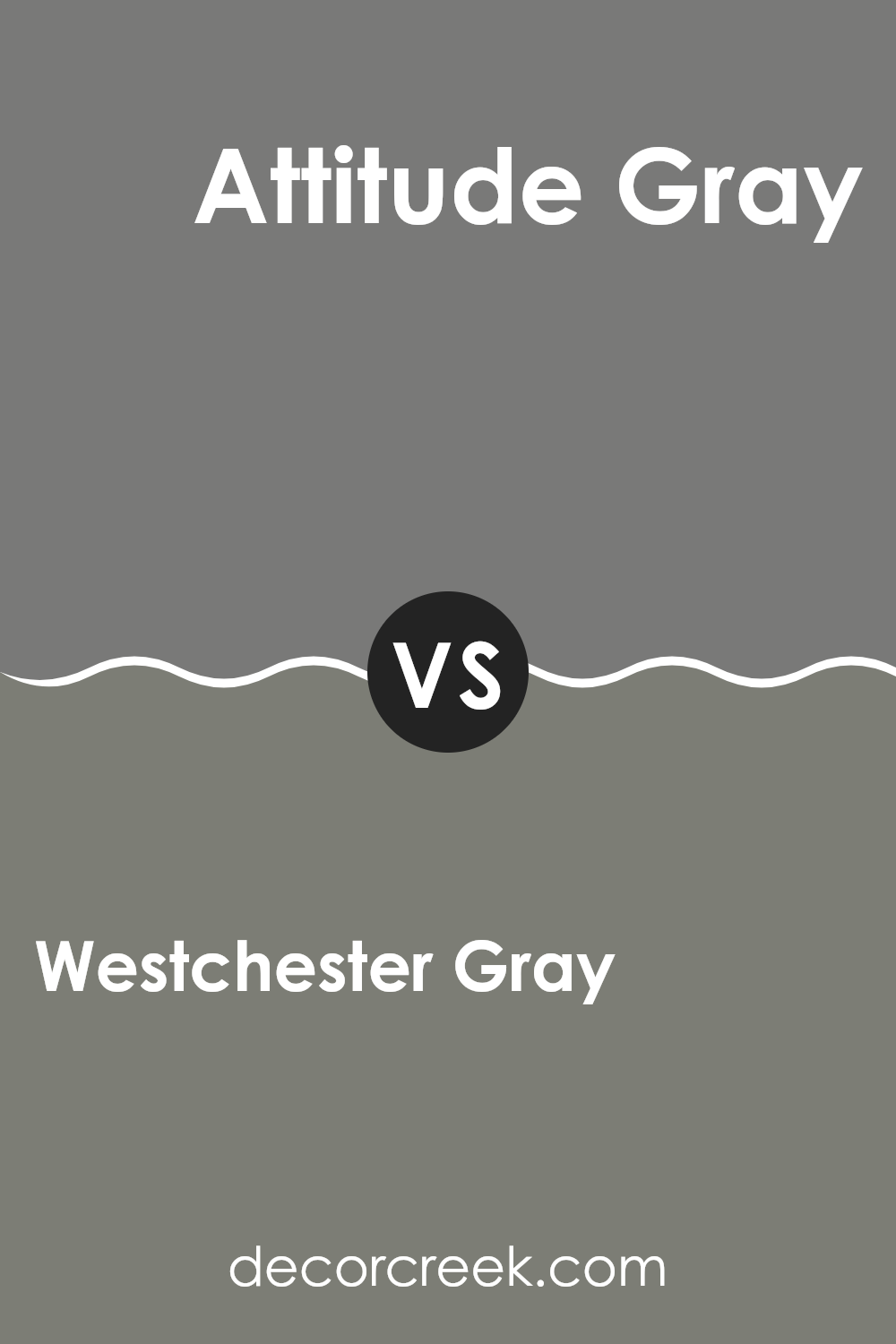
Westchester Gray SW 2849 by Sherwin Williams vs Attitude Gray SW 7060 by Sherwin Williams
Westchester Gray and Attitude Gray by Sherwin Williams are two distinct shades of gray that can give a room very different feels. Starting with Westchester Gray, this color is a medium to dark shade that can make spaces feel cozy and grounded. It’s versatile enough to work in various settings, from living rooms to bedrooms, complementing both modern and traditional décor well.
On the other hand, Attitude Gray stands out as a deeper gray that carries a stronger presence. It has a more pronounced boldness which can anchor larger spaces or highlight accent walls. This shade excels in areas that benefit from a dramatic touch, like dining rooms or home offices.
Both colors pair well with a wide range of decorations, from bright whites to rich woods, and can be used effectively to create inviting, stylish environments. While Westchester Gray offers a bit more softness and adaptability, Attitude Gray brings depth and decisiveness to interior designs.
You can see recommended paint color below:
Conclusion
In wrapping up my thoughts about SW 2849 Westchester Gray by Sherwin Williams, it’s clear this color really stands out as a unique and beautiful choice for any room. Westchester Gray is not too dark, not too light, but just right to add a calm and cozy feel to any space. It’s fantastic for someone wanting to refresh their room without making it too bright or too bold.
This gray color works well in many different areas like the living room, the kitchen, or even a bedroom. It’s like a magical shade that helps all the other colors and furniture in the room look their best. Whether you have a modern style or something more classic, Westchester Gray blends nicely and makes everything look put together.
I found that Westchester Gray goes well with a lot of other colors too. You can pair it with blues, pinks, or even yellows, and it helps make these colors pop in a gentle way. It’s a color that is easy on the eyes and makes you feel relaxed and happy. Plus, it’s pretty cool that a simple paint can do so much to change how a room looks and feels. All in all, thinking about giving your room a new look? You might want to consider SW 2849 Westchester Gray. It could be just what you need to make your room beautiful and cozy.
Ever wished paint sampling was as easy as sticking a sticker? Guess what? Now it is! Discover Samplize's unique Peel & Stick samples.
Get paint samples

