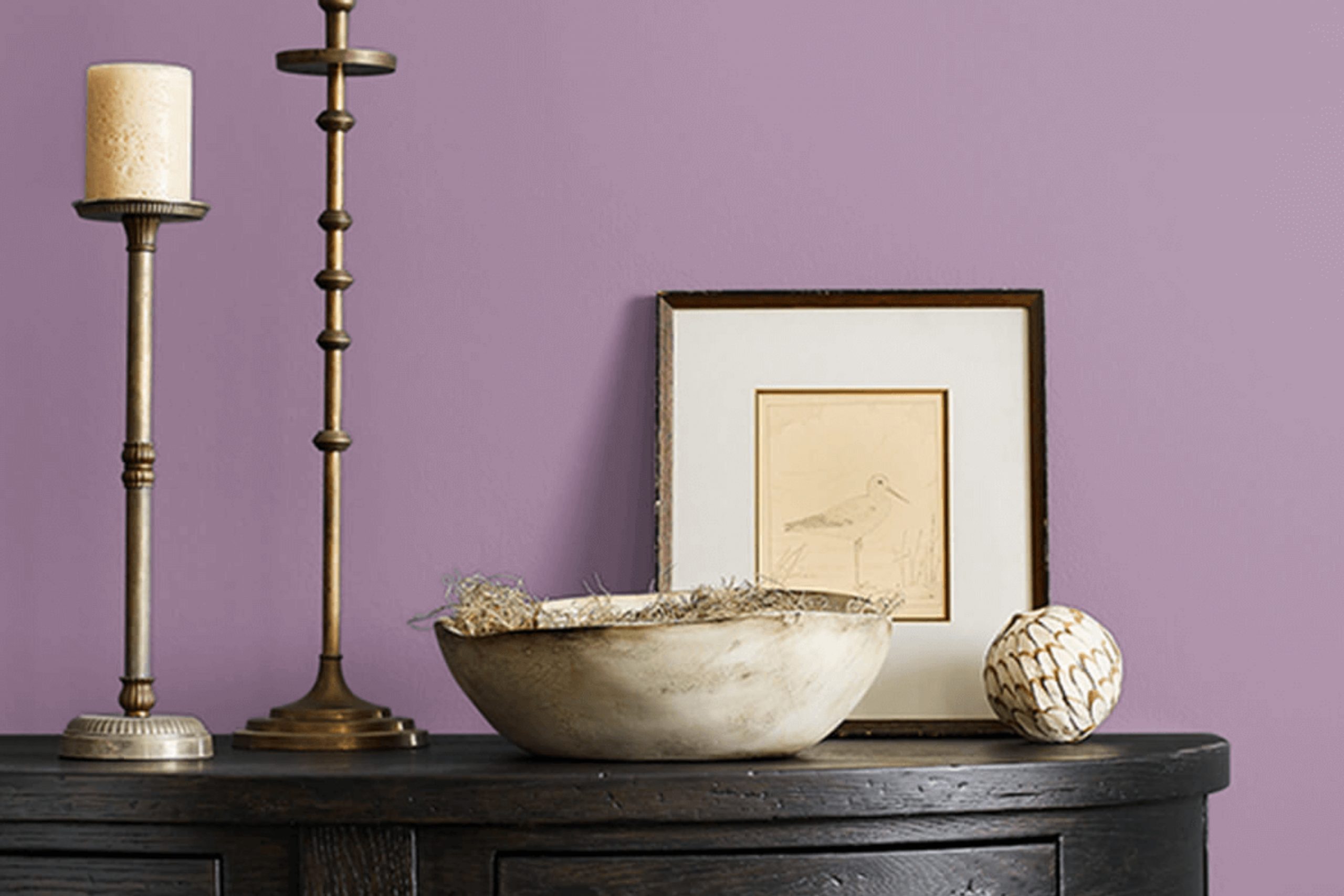
Let’s talk about a color that has quietly stolen my heart: SW 0074 Radiant Lilac by Sherwin Williams. I recently decided to give my reading nook a fresh look, and this shade popped up during my search for something unique yet subtle. Radiant Lilac isn’t just any purple; it has a gentle touch that offers a hint of calmness to any space without overpowering it. It’s a soft, muted hue that carries a hint of sophistication and versatility.
When you see it applied on the walls, it almost feels like the room breathes a light, airy vibe, perfect for spaces where you want to relax or get lost in a book. I noticed that depending on the lighting, this color shifts from a serene lilac to a slightly deeper tone, adding a dynamic character to the environment.
This flexibility makes SW 0074 Radiant Lilac a fantastic choice for anyone looking to introduce a bit of personality into their living space without committing to something too bold or demanding.
Whether you’re looking to touch up a single wall or redo an entire room, this color could be the perfect starting point for transforming the feel of your space.
What Color Is Radiant Lilac SW 0074 by Sherwin Williams?
The color Radiant Lilac by Sherwin Williams is a soft and gentle purple shade that brings a light and airy feel to any room. This color has a warm undertone, making it perfect for creating a cozy and inviting atmosphere. It’s especially suitable for spaces where you want to add a touch of subtle color without overwhelming the senses.
Radiant Lilac works well in a variety of interior styles, particularly in contemporary, modern, and minimalist designs. This color can also add a fresh twist to traditional settings when used as an accent. It pairs beautifully with a range of materials such as light woods, which enhance its warm undertones, and metallic finishes like silver and chrome, which provide a lovely contrast to its softness.
Texturally, Radiant Lilac coordinates well with smooth, matte surfaces which reflect its calm nature, as well as with soft fabrics like cotton and linen to uphold the comfort it lends to spaces. Adding elements like velvet or silk can introduce a touch of luxury and depth, making it versatile for different tastes and preferences.
Overall, Radiant Lilac is a versatile choice that can help create a soothing and pleasant environment in homes, adding a light-hearted charm without being too bold or overpowering.
Is Radiant Lilac SW 0074 by Sherwin Williams Warm or Cool color?
Radiant Lilac is a subtle, soft purple hue that brings a fresh and gentle feel to any room. This color is perfect for home interiors where you want to add a touch of warmth without overwhelming the space. Its light purple tone provides an airy and inviting atmosphere, making it a great choice for bedrooms, living rooms, or even bathrooms.
Using Radiant Lilac on the walls can help to brighten up smaller or darker rooms, as its reflective quality allows light to bounce around the space. It pairs well with neutral colors like creams, grays, and whites, which can help to balance its warmth and keep the room looking light and open. This color also works nicely with natural elements such as wooden furniture or green plants, which enhance its soft and natural feel.
It’s also a very adaptable color, fitting well with various decorating styles, from modern minimalist to country chic. Whether used as a main wall color or just an accent, it helps create a pleasant and inviting home environment.
Undertones of Radiant Lilac SW 0074 by Sherwin Williams
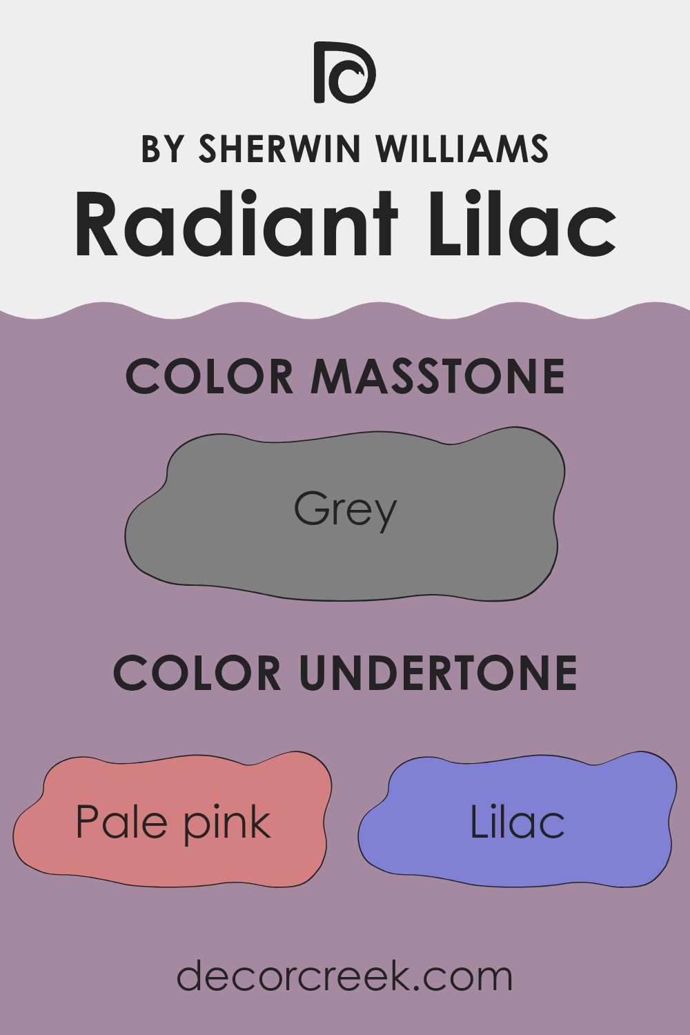
Radiant Lilac is a versatile paint color that contains a complex mix of undertones which influence how it looks in different settings. Undertones are subtle hues mixed into the main color, and they can significantly impact the overall appearance of paint once applied to walls.
This color has an array of undertones including pale pink, lilac, light purple, and more. Each one adds a unique depth and can make the color appear differently under various lighting conditions. For example, in a room with lots of natural light, Radiant Lilac might show its lilac and light purple undertones, giving a gentle and inviting feel.
In another room with limited natural light, the pale pink or light gray undertones may become more noticeable, giving the room a cooler feel.
When using Radiant Lilac on interior walls, the range of undertones can complement a variety of decor styles and colors.
The mint and light turquoise undertones could enhance a space that has elements of green or teal. Meanwhile, its pale yellow and light blue undertones can make the room feel airy and open.
It’s important to sample this paint in the specific lighting and environment of your room to understand which undertones will stand out and how they will interact with other colors and furniture in the space. This careful consideration will help you achieve the desired effect in your decorating project.
What is the Masstone of the Radiant Lilac SW 0074 by Sherwin Williams?
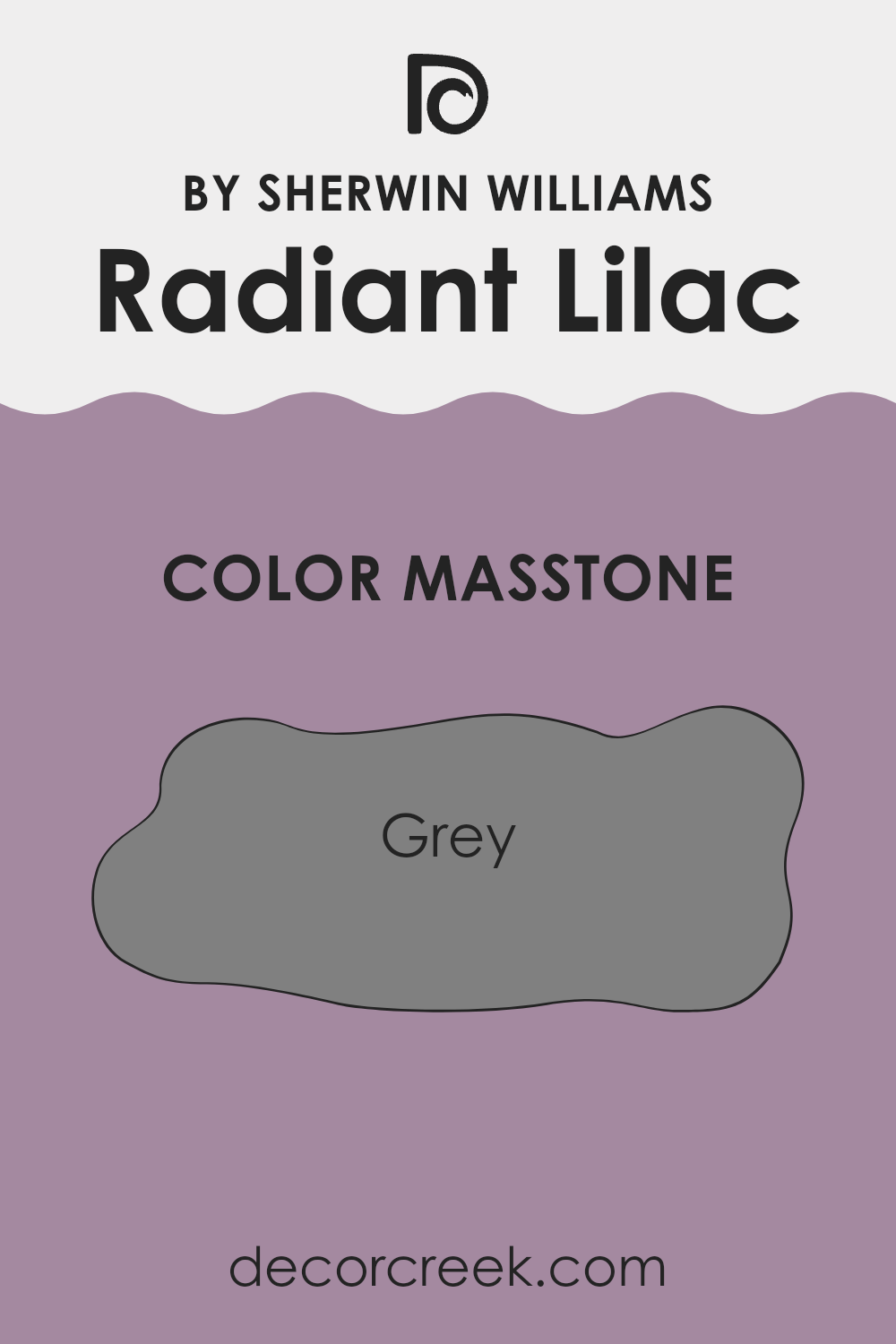
The color Radiant Lilac by Sherwin Williams, when viewed in its masstone or heaviest form, appears as a shade of grey. This grey aspect makes it a versatile choice for home interiors. Grey is widely known for its ability to work well with other colors, ensuring that Radiant Lilac can blend seamlessly with various design themes and color palettes.
This characteristic allows the color to be used in a range of settings, from living rooms and bedrooms to kitchens. Additionally, because the grey undertone is neutral, it provides a calming background that doesn’t overpower a space.
It’s particularly effective in areas where you want a subtle hint of color without overwhelming the senses. Homeowners will find that this particular shade supports a variety of decor styles, from modern to rustic, making it a practical choice for enhancing the aesthetic appeal of their spaces.
How Does Lighting Affect Radiant Lilac SW 0074 by Sherwin Williams?
Lighting plays a crucial role in how we perceive colors. The surroundings, light quality, and the source of light can significantly affect the appearance of a color on your walls. For instance, Radiant Lilac by Sherwin Williams can look very different depending on the light conditions it is exposed to.
In artificial light, such as from LED bulbs or fluorescent tubes, Radiant Lilac tends to look slightly more vibrant. Artificial light can enhance the purple tones, making the color appear richer and more lively. This is particularly noticeable in environments lit by warm-toned bulbs, which can bring out a cozy glow in the paint.
In natural light, the appearance of Radiant Lilac can change throughout the day. Morning light, generally cooler, makes the color look a bit more subdued, whereas the golden hues of late afternoon can warm it up, giving it a softer, more gentle appearance.
The orientation of the room also affects how Radiant Lilac is displayed. In north-facing rooms, which get less direct sunlight and possess a cooler light, Radiant Lilac might look more muted and subtle. These rooms do not enhance the purple hues significantly, so the color can appear more neutral and gentle.
In south-facing rooms, where sunlight is abundant and warmer for most of the day, Radiant Lilac can appear brighter and more dynamic. The warm light intensifies the purple, making it more striking and noticeable.
East-facing rooms see the most change in how Radiant Lilac looks, transitioning from a cooler tone in the morning light to a warmer tone as the day progresses. This can make the color feel refreshing in the morning and relaxing later in the day.
In west-facing rooms, the color experiences strong warm light in the afternoon and evening, which can make Radiant Lilac look vibrant and rich, particularly during sunset when the color can really pop.
Understanding these effects can help in making informed decisions about paint colors based on the lighting conditions in your space.
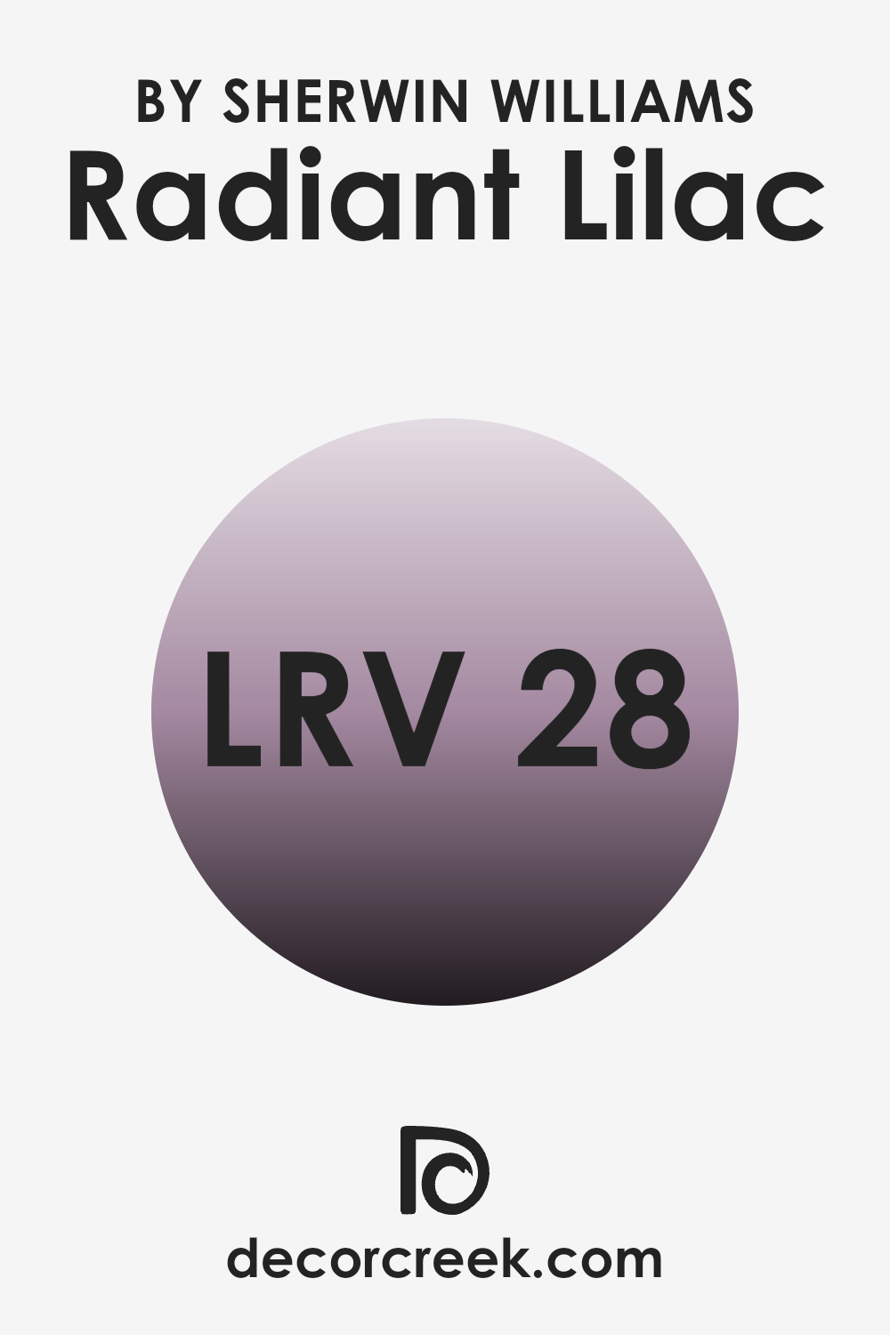
What is the LRV of Radiant Lilac SW 0074 by Sherwin Williams?
LRV stands for Light Reflectance Value, and it represents the amount of light a paint color reflects as opposed to absorbing. A higher LRV means the color reflects more light, making it appear lighter and brighter in a room. Conversely, a lower LRV indicates that the color absorbs more light, resulting in a darker appearance.
This value is crucial in choosing paint colors because it helps predict how a color will look in different lighting conditions. It can drastically change the perception of space, with lighter colored walls making a room feel more open and airy, while darker walls can create a cozier and more enclosed feel.
Considering Radiant Lilac, which has an LRV of 28.251, this color is on the darker side of the scale. It means this color will absorb more light than it reflects, leading to a richer and more profound appearance on the walls. In smaller or less brightly lit rooms, using a color with this LRV might make the space appear smaller and more intimate.
However, in well-lit areas or combined with lighter colors and decor, Radiant Lilac can add depth and interest to the space without overpowering it with darkness.
The specific LRV helps in deciding how it might affect the mood and visual size of a room.
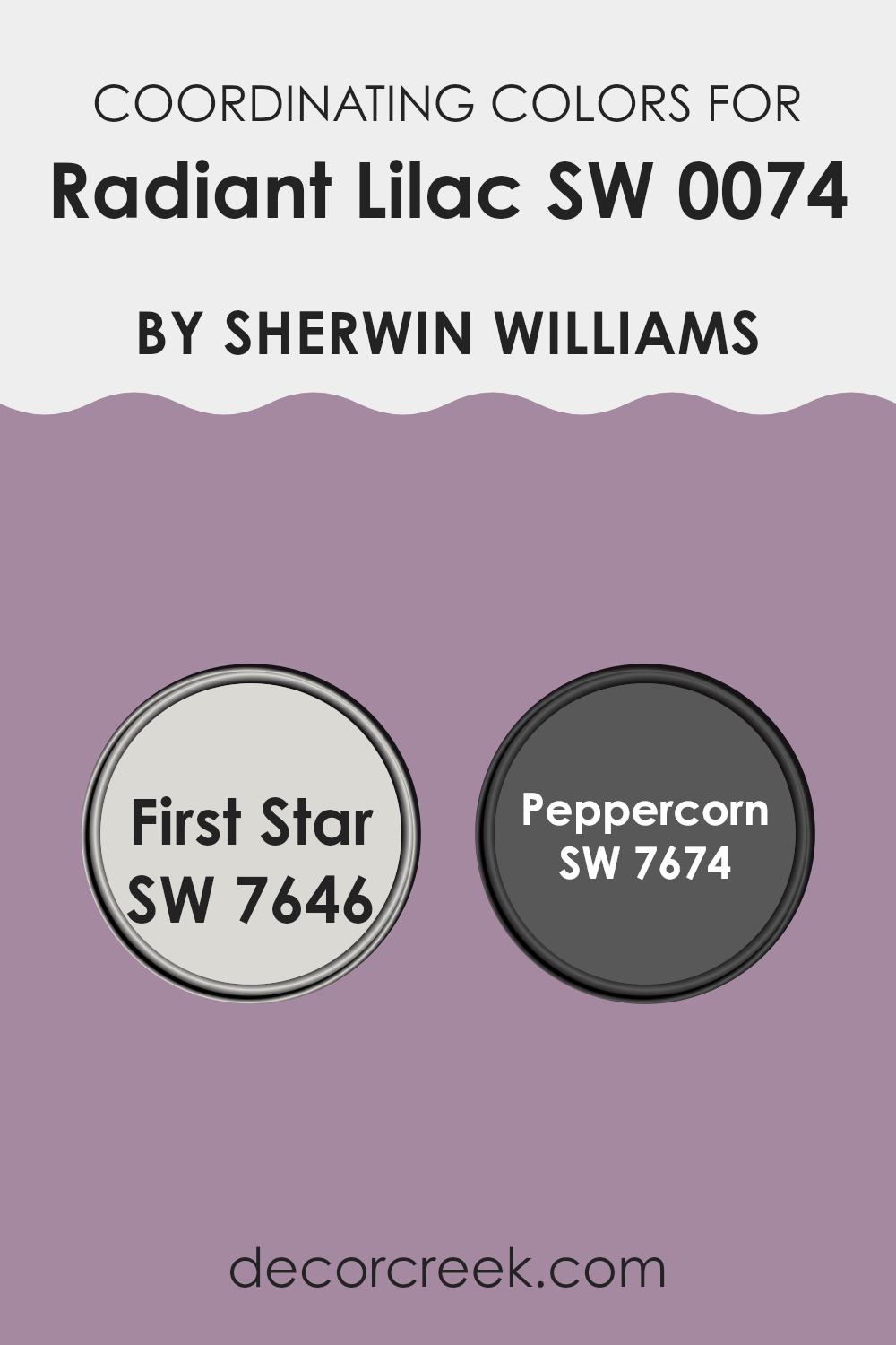
Coordinating Colors of Radiant Lilac SW 0074 by Sherwin Williams
Coordinating colors are shades that complement or enhance the main hue in a room, creating a harmonious and visually appealing scheme. When dealing with a distinct color like Radiant Lilac by Sherwin Williams, choosing the right coordinating colors is essential to balance the room’s aesthetics.
Two such colors that work well with Radiant Lilac are First Star and Peppercorn, also by Sherwin Williams. These colors have been specifically picked to either contrast or complement Radiant Lilac, ensuring the space feels cohesive and thoughtfully designed.
First Star SW 7646 is a subtle, light gray hue that provides a gentle contrast to the more vibrant Radiant Lilac. Its understated quality makes it an excellent choice for larger areas or as a base, allowing the lilac to stand out without overwhelming the space. On the other hand, Peppercorn SW 7674 offers a deeper, nearly black shade that brings a grounding effect to the lively lilac. Using Peppercorn as an accent can add dramatic flair and depth, making it perfect for highlighting architectural features or furniture pieces. Together, these colors work in harmony to create a balanced and appealing color palette.
You can see recommended paint colors below:
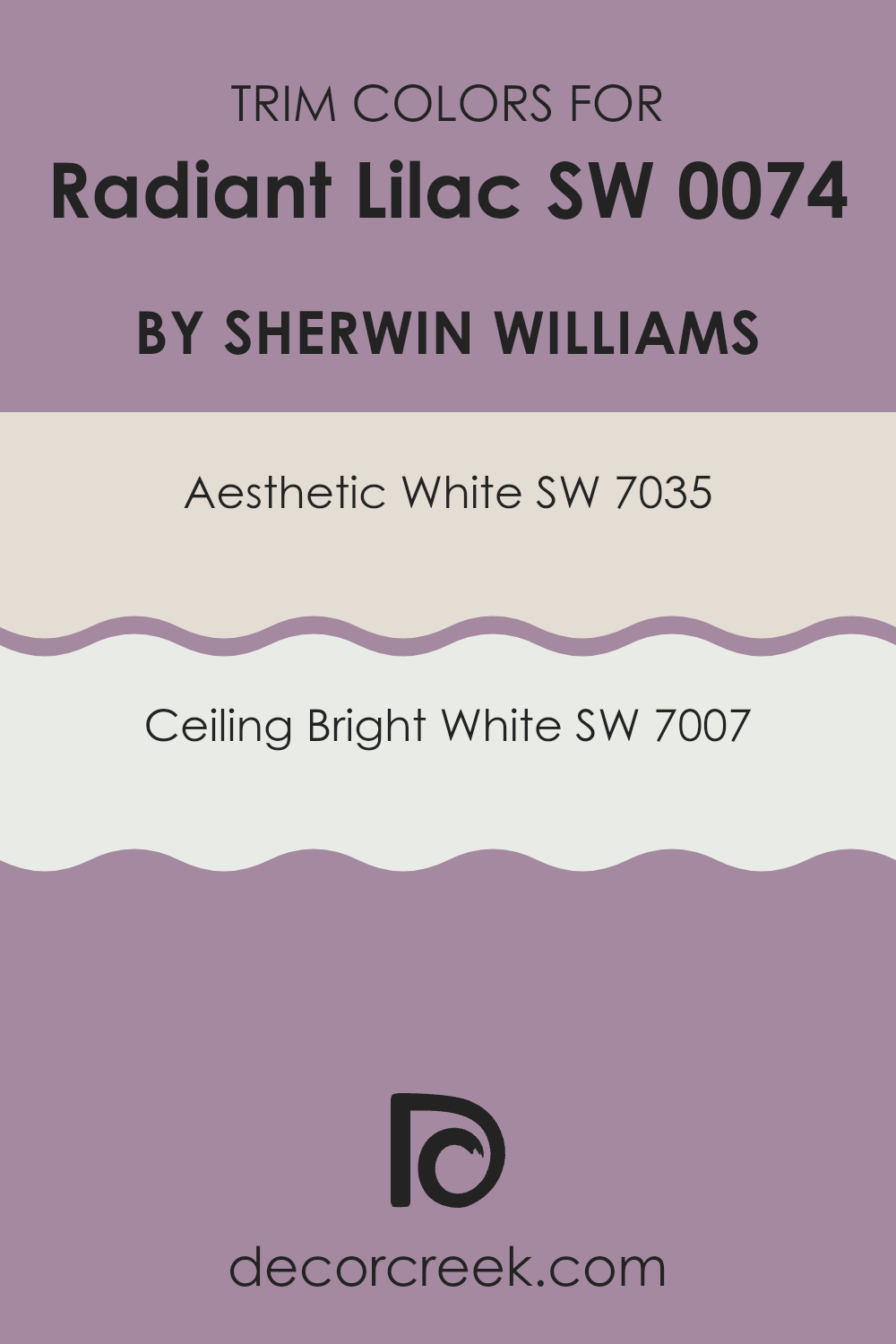
What are the Trim colors of Radiant Lilac SW 0074 by Sherwin Williams?
Trim colors are essential in interior design because they help define and accentuate the lines and edges of walls, doors, and windows, creating clear visual boundaries that enhance aesthetic appeal. Choosing the right trim color can complement the main wall color, adding depth and definition to the space. For a wall painted in Radiant Lilac by Sherwin Williams, using trim colors like Aesthetic White or Ceiling Bright White can be particularly effective. These lighter shades of white provide a crisp, clean contrast that highlights the gentle lilac, making the room feel more cohesive and pleasing to the eye.
Aesthetic White is a soft, understated white with a warm tone that gently complements the coolness of Radiant Lilac, ensuring that the space feels inviting and well-balanced. It works well in rooms that need a subtle contrast without overwhelming the primary color.
On the other hand, Ceiling Bright White is a purer, more neutral white that brings vivid clarity to the edges of a room. This color is ideal for making smaller spaces appear larger and brighter, working harmoniously with Radiant Lilac to enhance natural light and create a fresh, airy atmosphere.
You can see recommended paint colors below:
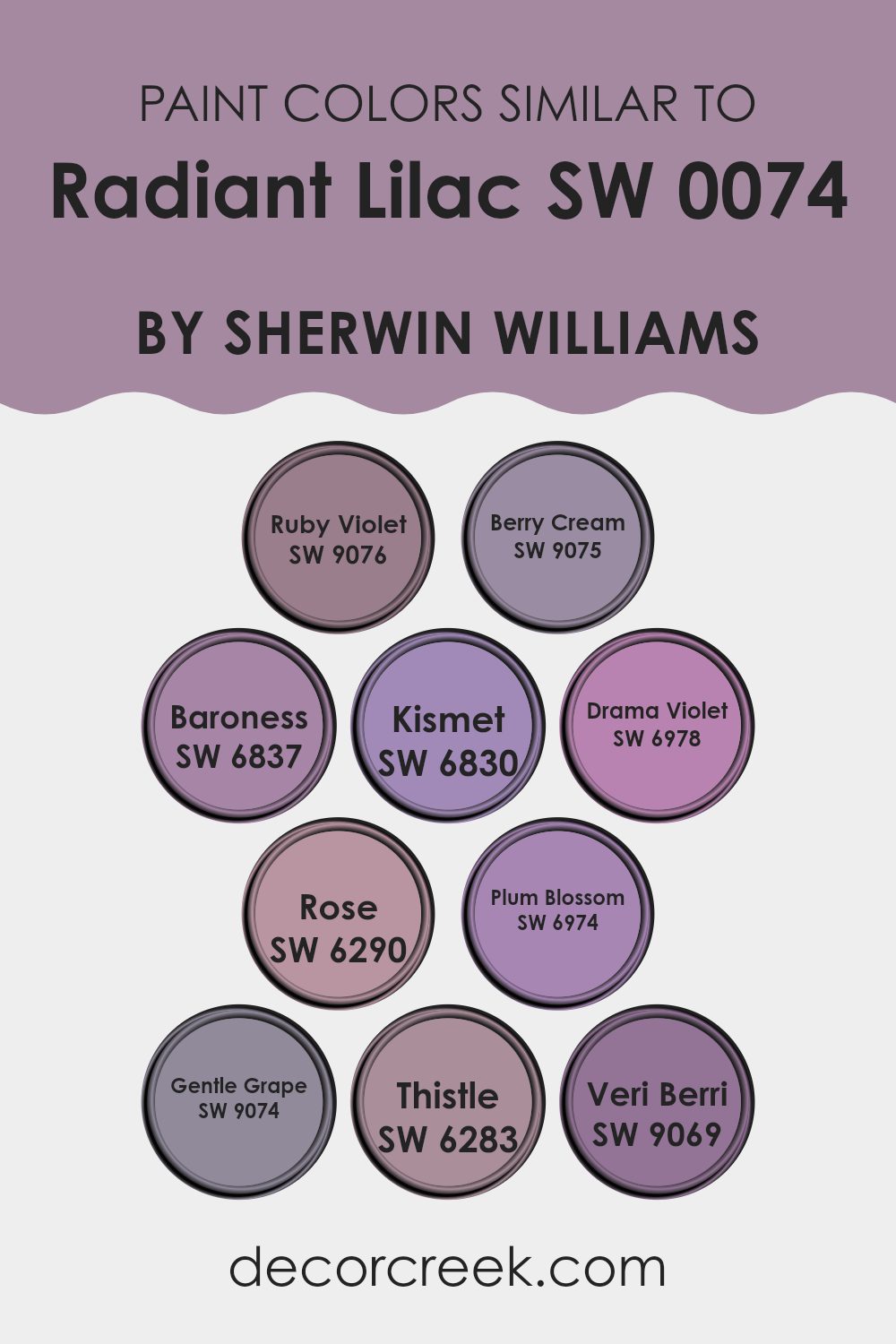
Colors Similar to Radiant Lilac SW 0074 by Sherwin Williams
Similar colors are crucial in design for creating a harmonious and visually pleasing look. By using colors like SW 9076 Ruby Violet, a deep, rich berry hue, you can add drama and depth to a space. SW 9075 Berry Cream offers a lighter counterpart that is soft and nurturing, perfect for creating a soothing atmosphere.
Colors such as SW 6837 Baroness bring a regal touch with their bold, royal purple tones, while SW 6830 Kismet injects a sense of whimsy and fun with its bright, playful lavender. SW 6978 Drama Violet is intense and moody, suitable for adding a statement or accentuating a room’s feature.
Further enhancing the palette are colors like SW 6290 Rose, which has a gentle pink tone that adds a subtle, romantic flair. SW 6974 Plum Blossom introduces a deeper, more mysterious pink, perfect for adding a touch of sophistication without complexity. Then there is SW 9074 Gentle Grape, a muted violet that works beautifully in tranquil spaces.
SW 6283 Thistle is a lighter, almost pastel purple that blends effortlessly with other soft tones, contributing to a calm, cohesive look. Lastly, SW 9069 Veri Berri rounds out the collection with its vibrant, berry-inspired shade, great for injecting vibrant zest into any area. Together, these similar colors provide endless possibilities for creating a polished, unified aesthetic.
You can see recommended paint colors below:
- SW 9076 Ruby Violet
- SW 9075 Berry Cream
- SW 6837 Baroness
- SW 6830 Kismet
- SW 6978 Drama Violet
- SW 6290 Rose
- SW 6974 Plum Blossom
- SW 9074 Gentle Grape
- SW 6283 Thistle
- SW 9069 Veri Berri
How to Use Radiant Lilac SW 0074 by Sherwin Williams In Your Home?
Radiant Lilac is a soft purple paint color that can add a gentle and friendly touch to any room in your home. It’s light enough to make small spaces appear larger and provides a fresh, clean look. For those interested in adding a splash of color without overwhelming the space, painting one accent wall with Radiant Lilac is a great choice.
This technique draws the eye and brightens the area, while keeping the rest of the room neutral to balance the effect. In addition to walls, Radiant Lilac works well on furniture like dressers or bookshelves, giving them a fresh, new look.
This color pairs nicely with whites and grays, enhancing the softness of the purple hue. For a harmonious color scheme, consider using it with green or blue accents around the space. With its light and airy feel, this paint is perfect for bedrooms or bathrooms where a calm atmosphere is desired.
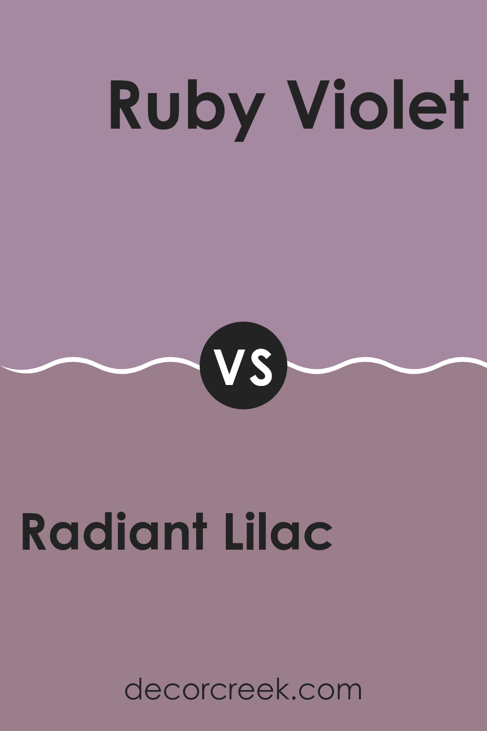
Radiant Lilac SW 0074 by Sherwin Williams vs Ruby Violet SW 9076 by Sherwin Williams
Radiant Lilac and Ruby Violet are two distinctive colors by Sherwin Williams, each possessing its unique charm. Radiant Lilac is a subtle and soft purple that gives a gentle and calming feeling, making it perfect for spaces where you want a soothing atmosphere. It’s ideal for bedrooms or quiet areas in a home.
On the other hand, Ruby Violet has a deeper, more intense purple hue with red undertones, offering a bolder and more striking appearance. This color works well in areas where you want to make a statement or add a touch of drama, like dining rooms or living areas.
While Radiant Lilac offers a more muted and gentle appeal, Ruby Violet is vivid and demands attention. These colors can complement each other well in a space that desires both calmness and energy, depending on how they are used together in decor.
You can see recommended paint color below:
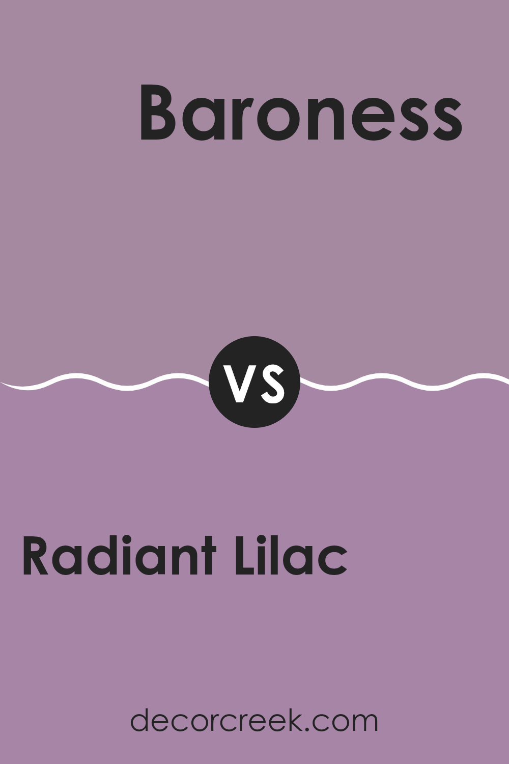
Radiant Lilac SW 0074 by Sherwin Williams vs Baroness SW 6837 by Sherwin Williams
Radiant Lilac and Baroness, both by Sherwin Williams, offer distinct vibes for any space. Radiant Lilac is a gentle, soft purple with a soothing presence, ideal for creating a light, airy feel in a room. It’s subtle enough to work as a neutral yet offers a hint of color to keep things interesting.
On the other hand, Baroness stands out with its bold, vibrant pink tone that can really make a statement. This color is great for adding a splash of energy and personality to an area.
While Radiant Lilac is more understated and might be suited for a bedroom or living room for a calming effect, Baroness could be the perfect choice for more active spaces or a feature wall where you want to draw attention. These hues provide very different moods depending on what you’re trying to achieve in your decorating project.
You can see recommended paint color below:
- SW 6837 Baroness
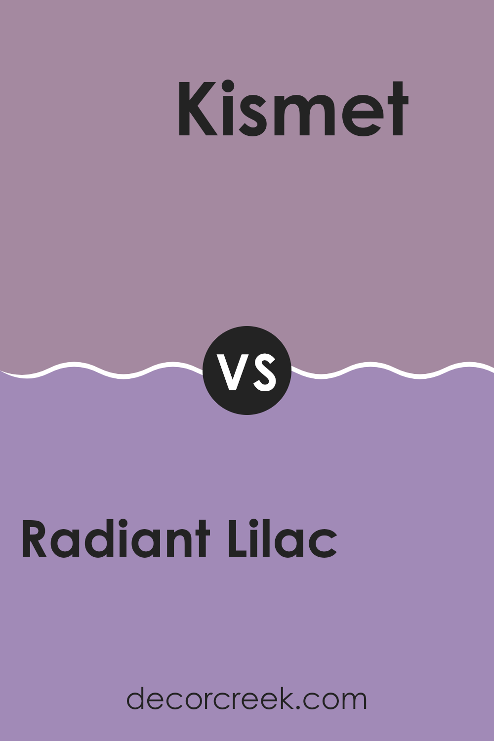
Radiant Lilac SW 0074 by Sherwin Williams vs Kismet SW 6830 by Sherwin Williams
Radiant Lilac and Kismet are both unique colors by Sherwin Williams, but they create quite different moods and visual impacts. Radiant Lilac is a soft, muted purple with a gentle, soothing presence. It provides a subtle backdrop that works well in bedrooms or living areas where a calm, peaceful atmosphere is desired. It’s not too bold but adds just enough color to make a room interesting.
On the other hand, Kismet is a vivid, bright pink that packs a lot of punch. This color stands out and is perfect for spaces where you want to make a statement, like an accent wall or a playful bathroom. It’s much bolder and more vibrant than Radiant Lilac, bringing energy and warmth to any space.
While both colors can add personality to a room, the choice between them depends on the effect you’re after—calm and gentle with Radiant Lilac or bold and energetic with Kismet.
You can see recommended paint color below:
- SW 6830 Kismet
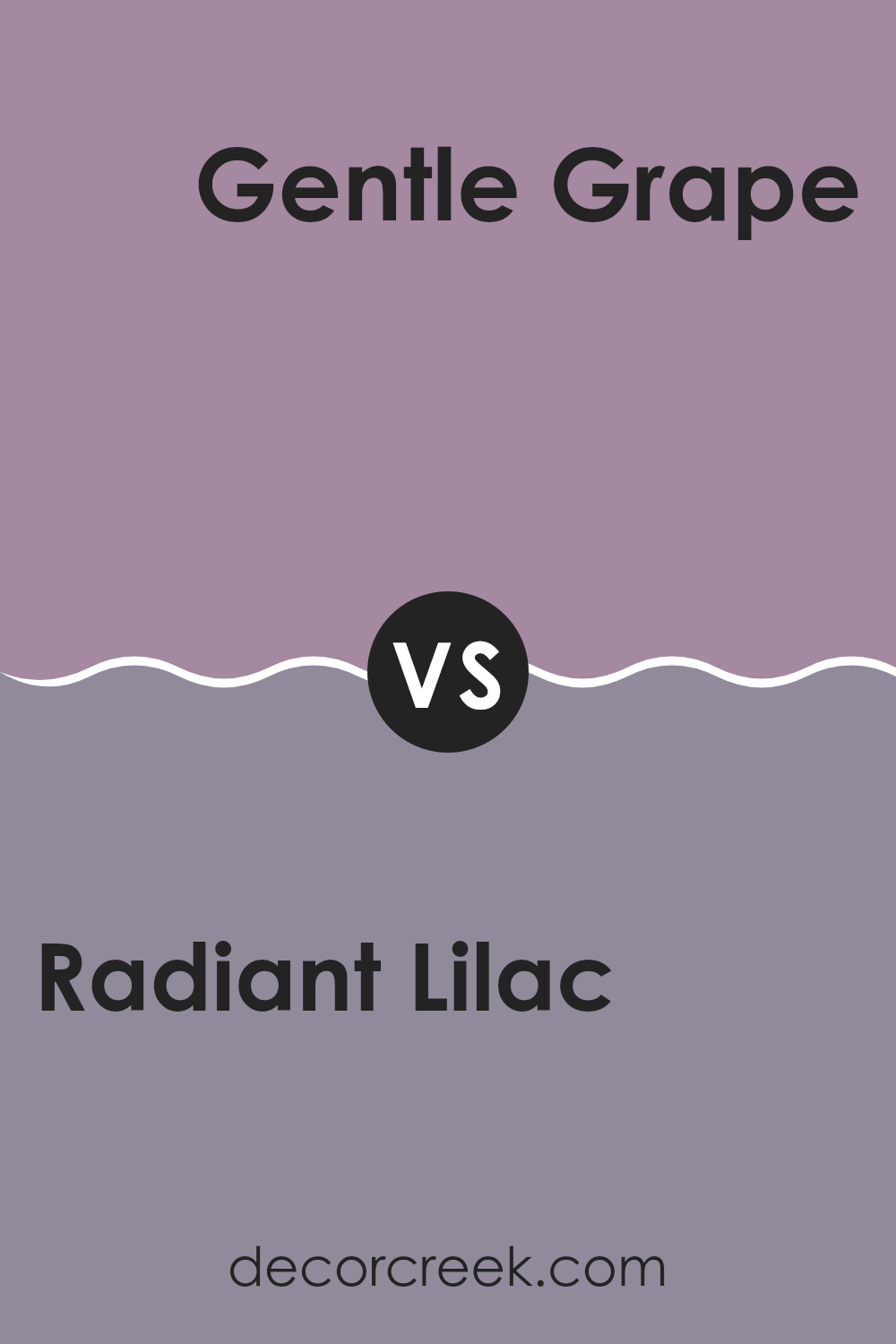
Radiant Lilac SW 0074 by Sherwin Williams vs Gentle Grape SW 9074 by Sherwin Williams
Radiant Lilac and Gentle Grape from Sherwin Williams are two distinct purple shades, each bringing their unique charm to a space. Radiant Lilac is a lighter, softer purple that feels fresh and airy. It’s perfect for brightening up a room and adding a touch of gentle warmth. This color works well in spaces like bedrooms or living areas where a calm, welcoming atmosphere is desired.
On the other hand, Gentle Grape is a deeper, more muted purple. It offers a more grounded feel and can be used to add a sense of depth and richness to an environment. This color is ideal for creating a cozy, inviting space, particularly suitable for areas meant for relaxation or gathering.
Both colors pair well with neutral tones but serve different aesthetic purposes. Radiant Lilac adds a lively, playful touch, while Gentle Grape provides a more traditional, comforting presence. They can be used separately or together, depending on the mood and style you want to achieve.
You can see recommended paint color below:
- SW 9074 Gentle Grape
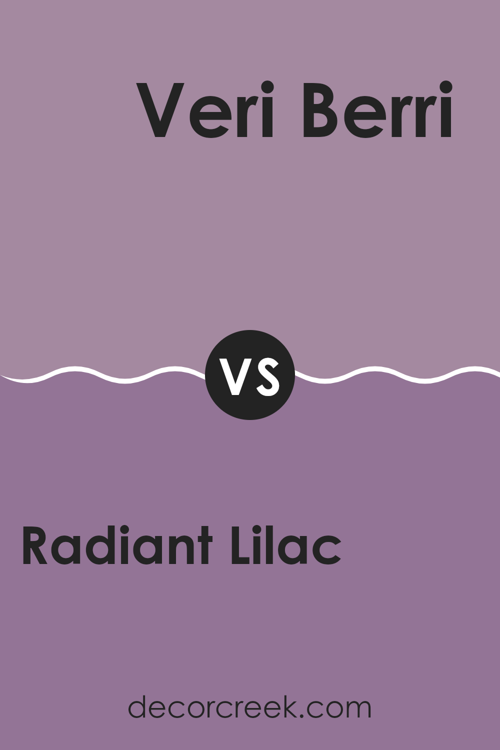
Radiant Lilac SW 0074 by Sherwin Williams vs Veri Berri SW 9069 by Sherwin Williams
Radiant Lilac and Veri Berri by Sherwin Williams are both unique, yet they offer very different vibes for interior spaces. Radiant Lilac is a softer, more muted purple with a gentle feel that makes it perfect for creating a calm and relaxing environment. It tends to spread a light, airy touch throughout a room, making it ideal for bedrooms or places where you seek peace and restfulness.
On the other hand, Veri Berri is a bolder, deeper berry color that adds a strong presence to any space. Its rich, vibrant tone can inject energy and personality into an area, making it stand out. This color could be great for accent walls or decorative highlights where you want to make a more dramatic statement.
In summary, if you’re going for a soothing, gentle atmosphere, Radiant Lilac is the way to go. If you prefer something with more punch and pizzazz, then Veri Berri might be your pick.
You can see recommended paint color below:
- SW 9069 Veri Berri
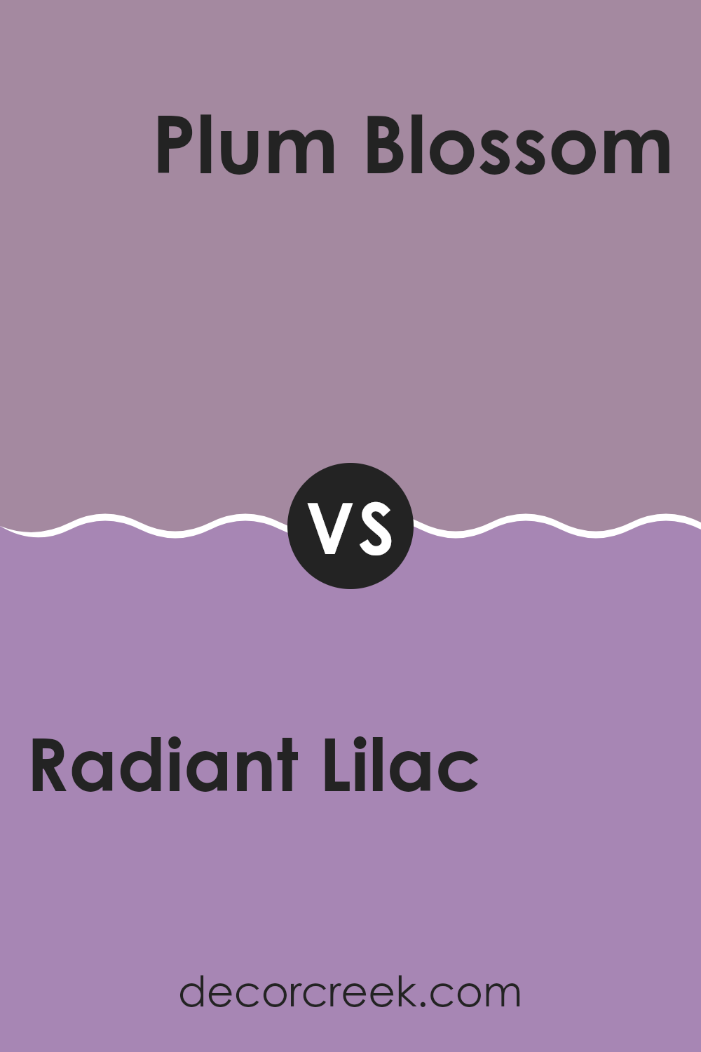
Radiant Lilac SW 0074 by Sherwin Williams vs Plum Blossom SW 6974 by Sherwin Williams
Radiant Lilac is a gentle and subtle shade of purple with soft gray undertones, giving it a light and airy feel. This color is perfect for adding a touch of calmness to any room, making spaces feel open and relaxed.
On the other hand, Plum Blossom is a deeper, more vibrant purple. It packs a visual punch and brings a sense of energy and vitality. This stronger hue can make a bold statement in an area, adding depth and drama.
When you compare the two, Radiant Lilac works well in spaces where you want a soft backdrop that doesn’t dominate, while Plum Blossom is ideal for creating a focal point or adding character to a room. Both colors offer unique possibilities, depending on the mood and atmosphere you want to achieve.
You can see recommended paint color below:
- SW 6974 Plum Blossom
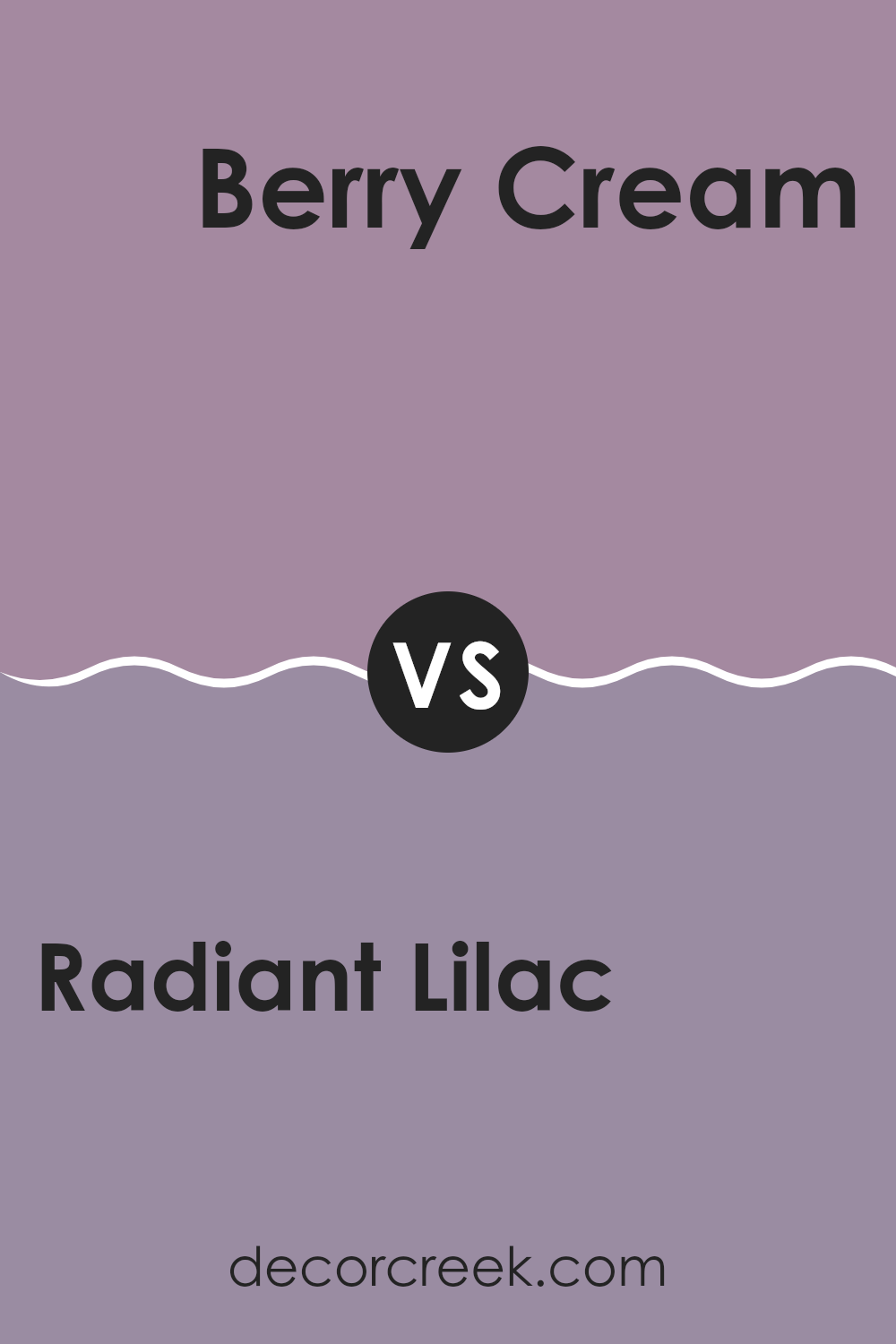
Radiant Lilac SW 0074 by Sherwin Williams vs Berry Cream SW 9075 by Sherwin Williams
The main color, Radiant Lilac, is a soft and subtle shade of purple with a hint of gray. It’s a soothing color that offers a gentle aesthetic without being too overpowering. It works well in spaces that aim for a light and airy feel.
On the other hand, Berry Cream is a warmer hue, blending red and pink tones to create a feeling of warmth and comfort. This color is richer and can add more presence to a room, making spaces feel cozy and inviting.
While both colors are not overly bold, they provide distinct vibes—Radiant Lilac leans towards a cooler, more understated effect, while Berry Cream tends towards a heartier, more enveloping atmosphere. They can both brighten up a room but in distinctly different ways, with Radiant Lilac bringing a calm, gentle touch and Berry Cream offering a more robust energy.
You can see recommended paint color below:
- SW 9075 Berry Cream
Radiant Lilac SW 0074 by Sherwin Williams vs Thistle SW 6283 by Sherwin Williams
The two colors, Radiant Lilac and Thistle, both offered by Sherwin Williams, offer distinct shades that could be great choices for adding personality to a space. Radiant Lilac is a gentle, soft purple with a subtle warm undertone, making it feel cozy and inviting.
It’s a versatile hue that could brighten up a small room or add a touch of warmth to a larger area. On the other hand, Thistle is a deeper, more muted purple. It leans slightly towards a grayish tone, which gives it a more reserved and understated feel compared to the brighter presence of Radiant Lilac.
Thistle could work well in spaces that require a bit of grounding or where you might want to set a more relaxed, muted atmosphere. Together, these colors could complement each other, with Radiant Lilac bringing light and warmth, and Thistle adding depth and calmness.
You can see recommended paint color below:
- SW 6283 Thistle
Radiant Lilac SW 0074 by Sherwin Williams vs Rose SW 6290 by Sherwin Williams
Radiant Lilac and Rose by Sherwin Williams are two distinct colors that each bring their unique charm to a space. Radiant Lilac is a soft, muted purple that can add a subtle touch of elegance to any room without overpowering it.
It’s a light color that works well in spaces meant for relaxation like bedrooms or quiet sitting areas. On the other hand, Rose is a deeper, more traditional pink. It has a warmth that makes it perfect for creating a cozy feeling, ideal in living rooms or areas where conversation and comfort are key.
While Radiant Lilac offers a cooler undertone, Rose brings in warmth, making both colors suitable for different moods and styles depending on what you’re looking for in your decorating project. Together, these colors can also work beautifully, with the calmness of the lilac balancing the warmth of the pink.
You can see recommended paint color below:
- SW 6290 Rose
Radiant Lilac SW 0074 by Sherwin Williams vs Drama Violet SW 6978 by Sherwin Williams
Radiant Lilac and Drama Violet, both by Sherwin Williams, offer strikingly different appeals for your space. Radiant Lilac is a lighter, more subtle shade that conveys a gentle, soothing vibe. It’s great for creating a soft and inviting atmosphere in a room, making it ideal for spaces like bedrooms or quiet sitting areas.
On the other side, Drama Violet stands out with its rich, deeper purple hue that can really make a statement. This color tends to draw more attention and can add a bold touch to any area. It’s perfect for those looking to add some punch or highlight a specific part of their room, like an accent wall or a decorative niche.
Both colors have their unique charm and can significantly affect the mood and style of a room. While Radiant Lilac offers a calm and light presence, Drama Violet brings intensity and flair.
You can see recommended paint color below:
- SW 6978 Drama Violet
Conclusion
As a final thought, SW 0074 Radiant Lilac by Sherwin Williams is truly a special paint color. It’s like the gentle color you see in the sky during sunrise or the soft purple of some lovely spring flowers. Using this color in any room can make the room feel cozy and happy.
It’s not too bright, but not too dull either, hitting just the right note of purple to make spaces feel just right. Whether it’s a bedroom or a living room, Radiant Lilac brings its own unique touch, making ordinary places look pretty without trying too hard.
Plus, it’s easy to match with different colors of furniture and decorations, which is great for creating a look that’s unique to your home. So, if you’re thinking about giving your room a makeover, Radiant Lilac might just be the perfect choice to add that sweet, fresh look.
It’s simple, lovely, and makes rooms look beautiful in a very quiet, happy way.
Ever wished paint sampling was as easy as sticking a sticker? Guess what? Now it is! Discover Samplize's unique Peel & Stick samples.
Get paint samples

