Let me tell you about SW 9076 Ruby Violet by Sherwin Williams, a color that truly stands out. If you’re considering a bold and refreshing change in your space, this shade might just be what you are looking for. Ruby Violet is not just any paint; it’s a statement.
As a vibrant, deep magenta, it has the unique ability to add both warmth and dramatic flair to any room. Whether you’re looking to freshen up your living room, bedroom, or even an office space, this color exudes a sense of courage and personality that can make any area sparkle with energy.
Imagine how it can transform the usual look into something lively and full of life. When used wisely, it complements light furniture and decor, creating a striking contrast that draws the eye and starts conversations. So, if you’re ready for a change that’s both bold and beautiful, Ruby Violet could be your perfect choice.
Let’s see how this vibrant color can work its magic in your space.
What Color Is Ruby Violet SW 9076 by Sherwin Williams?
Ruby Violet, a rich shade by Sherwin Williams, is a vibrant color that brings warmth and excitement to any space. It’s a deep, berry-like hue that combines the boldness of ruby red with a touch of violet, making it unique and full of personality. This lively color can add a touch of drama to your home, making it ideal for a feature wall, dining area, or a cozy nook.
It creates a welcoming feel in living spaces and exudes confidence in more private areas like bedrooms.This color works wonderfully with a variety of interior styles. For instance, in a bohemian decor, it pairs beautifully with eclectic furnishings and natural textures like wood or rattan. It also fits well in modern interiors where a pop of color is used to liven up minimalistic, clean designs.
Additionally, Ruby Violet can be a stunning choice for more traditional spaces, especially when combined with gold accents, luxurious fabrics like silk or velvet, and dark wood finishes that highlight its depth and intensity.The best materials to pair with this color are natural ones that balance its vibrancy.
Think of soft, creamy textiles or smooth, matte surfaces which can soften the boldness of the color. Also, pairing it with reflective materials like glass or polished metals can create an intriguing contrast, enhancing the visual depth that Ruby Violet naturally possesses. Whether it’s a dominant color in your palette or an accent in accessories, this hue brings a fresh burst of energy to any design.
Is Ruby Violet SW 9076 by Sherwin Williams Warm or Cool color?
Ruby Violet SW 9076 by Sherwin Williams is a vibrant, deep pink-purplish hue that can add a lively pop of color to any room in a home. This bold shade works well in small spaces like powder rooms or as an accent wall in larger rooms, where it can draw attention and serve as a focal point. Ruby Violet can also energize an entryway, making a strong first impression as guests enter.
When used in bedrooms, this color adds a touch of playfulness and can be toned down with neutral colors like grays or soft whites for bedding and curtains. In living areas, pairing it with modern furniture and metal accents can create an appealing contrast, balancing out its vividness with more subdued elements.
More subtle use of this color could include painting interior doors or furniture pieces, which allows for a hint of vibrancy without overwhelming the space. Overall, Ruby Violet SW 9076 brings a cheerful and dynamic ambiance to any home setting.
Undertones of Ruby Violet SW 9076 by Sherwin Williams
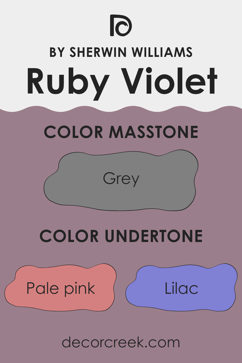
Ruby Violet has a diverse and vibrant palette of undertones that influence its appearance and the ambiance it creates in a space. Undertones are subtle hints of color that can be seen when a color is exposed to different lighting conditions or when paired with complementary or contrasting colors. They essentially are what make a primary color look unique or slightly different in various situations.
The extensive undertones in Ruby Violet, ranging from pale pink to dark grey, make it a very adaptable and dynamic color. For instance, the pink and lilac undertones add a touch of warmth and softness, which can make a room feel cozy and welcoming. When the light hits the walls painted with Ruby Violet, these warmer undertones can make the space feel brighter and more inviting.
Conversely, undertones like dark green and navy may bring a depth to the color, giving it a richer and more intense appearance. This can be particularly advantageous in larger spaces or rooms with a lot of natural light, as the darker undertones will help balance the brightness and prevent the room from feeling too overwhelming.
In interior decorating, using Ruby Violet on walls can significantly affect the room’s mood and style. Depending on the lighting and the colors used alongside it, Ruby Violet can appear more muted with its grey or olive undertones or vibrant with undertones of orange or fuchsia. This versatility makes it ideal for various settings, from bedrooms to living areas, as it can harmonize with different furnishings and decors.
By understanding the interplay of these undertones, one can effectively use Ruby Violet to achieve the desired effect in any given space.
What is the Masstone of the Ruby Violet SW 9076 by Sherwin Williams?
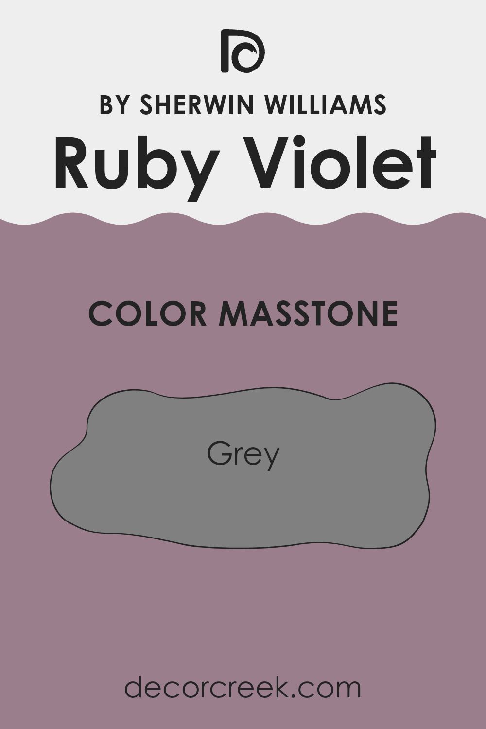
The color Ruby Violet SW 9076 by Sherwin Williams has a masstone of grey, specifically color code #808080. This grey tone provides a neutral and versatile backdrop that works well in various home environments. Because of its balanced grey hue, it easily complements a wide range of colors, from bright and bold to soft and subtle. This makes it a practical choice for homeowners who want flexibility in decorating their spaces.
Additionally, this shade of grey brings a clean and unobtrusive look, which can help to create a calm and orderly atmosphere in a room. It’s a great option for spaces that need a neutral background to highlight other elements, such as art, furniture, or accents.
In rooms like living rooms or bedrooms, where you might want to switch up decor frequently, this grey provides a consistent base that supports shifting styles and trends without clashing. Overall, Ruby Violet’s grey masstone is both functional and stylish, fitting seamlessly into any home design.
How Does Lighting Affect Ruby Violet SW 9076 by Sherwin Williams?
Lighting has a significant impact on how colors appear in any space, altering the perception and mood set by a paint color. The particular color referenced, Ruby Violet by Sherwin Williams, is a vibrant shade that can display varied characteristics depending on the lighting conditions.
In artificial light, the intensity and type of bulb used can influence how Ruby Violet looks. Fluorescent lights tend to emit a cooler tone, making this color appear slightly bluer and less warm. In contrast, incandescent bulbs provide a warmer glow, enhancing the red tones in Ruby Violet, making it appear richer and more vibrant.
Natural light brings its own set of nuances to this color. Rooms facing different directions receive varying qualities and amounts of sunlight, thus affecting how Ruby Violet is perceived:
1. North-Faced Rooms: These rooms often receive less direct sunlight, which can make Ruby Violet appear a bit duller and less vibrant. The cooler, bluish light from the north can make the color seem more subdued and flatten its intensity.
2. South-Faced Rooms: South-facing rooms benefit from plentiful sunlight most of the day, which can really make Ruby Violet pop. The natural brightness enhances the vividness of the color, making it appear lively and dynamic.
3. East-Faced Rooms: Morning light from the east is warm and yellowish, which can brighten up Ruby Violet beautifully in the morning, making it feel open and animated. As the day progresses and the light dims, the color can appear softer and more muted.
4. West-Faced Rooms: Evening light from the west can be intensely warm and orange, which might overemphasize the red in Ruby Violet, making it feel very bold and intense towards the evening.
Understanding these differences can help you decide which room to paint, depending on the effect you want to achieve with Ruby Violet. In conclusion, lighting type and direction considerably affect the appearance of paint colors, adding complexity to your color choice.
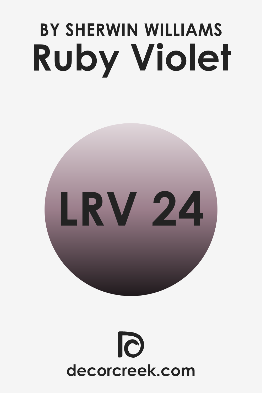
What is the LRV of Ruby Violet SW 9076 by Sherwin Williams?
Light Reflectance Value, or LRV, measures the percentage of light a paint color reflects back into a room. It runs from 0, which absorbs almost all light, making a surface look quite dark, to 100, which reflects all light and appears very bright or white.
The LRV is crucial because it helps determine how light or dark a color will look once it’s on your walls. A higher LRV means the color will appear lighter and can make a small room feel more spacious, while a lower LRV means the color could make the space feel cozy but smaller.
For the color Ruby Violet with an LRV of 23.608, it falls on the darker end of the scale. This means it will absorb more light than it reflects, creating a look of richness and depth that adds character to a room. In rooms with less natural light, using a color with this LRV might make the space appear even darker. However, in a well-lit or a larger room, this color can add a warm, enveloping feel. It’s perfect for creating a dramatic and cozy atmosphere, though it’s important to use adequate lighting to enhance the environment.
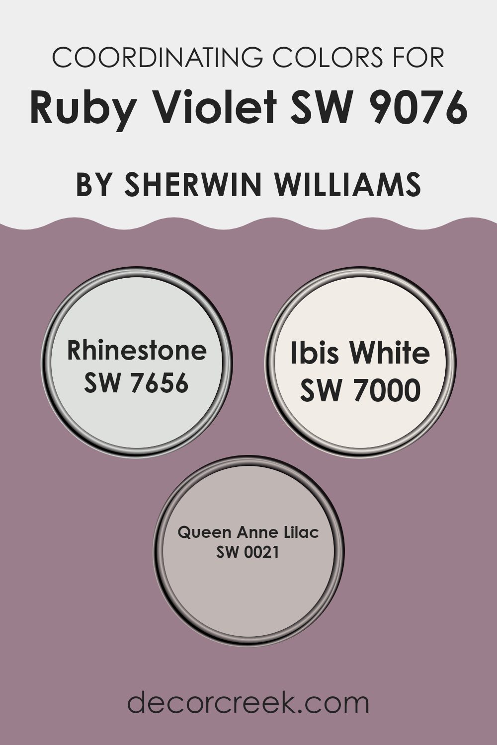
Coordinating Colors of Ruby Violet SW 9076 by Sherwin Williams
Coordinating colors are chosen to complement each other, and they work by balancing visual interest and harmony in a space. When you pick a vibrant color like Ruby Violet, finding the right coordinating colors can really enhance the overall aesthetics of your decor. For example, using a color such as Rhinestone, which is a muted gray, can offer a subtle backdrop that allows a more intense color like Ruby Violet to stand out without overwhelming the space.
Rhinestone’s soft and light tone makes it a perfect counterbalance to bolder hues, providing a calming effect to any room. Ibis White, another coordinating color, is a bright and clean shade that brings a fresh and airy feel, making it great for creating a crisp and inviting atmosphere.
Finally, Queen Anne Lilac adds a touch of mild purple that is understated yet charmingly effective at complementing deeper purples. This gentle lilac helps in softening the overall look and adds a layer of visual interest without competing with the more dominant hue of Ruby Violet. Together, these colors work seamlessly to create a cohesive and appealing environment.
You can see recommended paint colors below:
- SW 7656 Rhinestone
- SW 7000 Ibis White
- SW 0021 Queen Anne Lilac
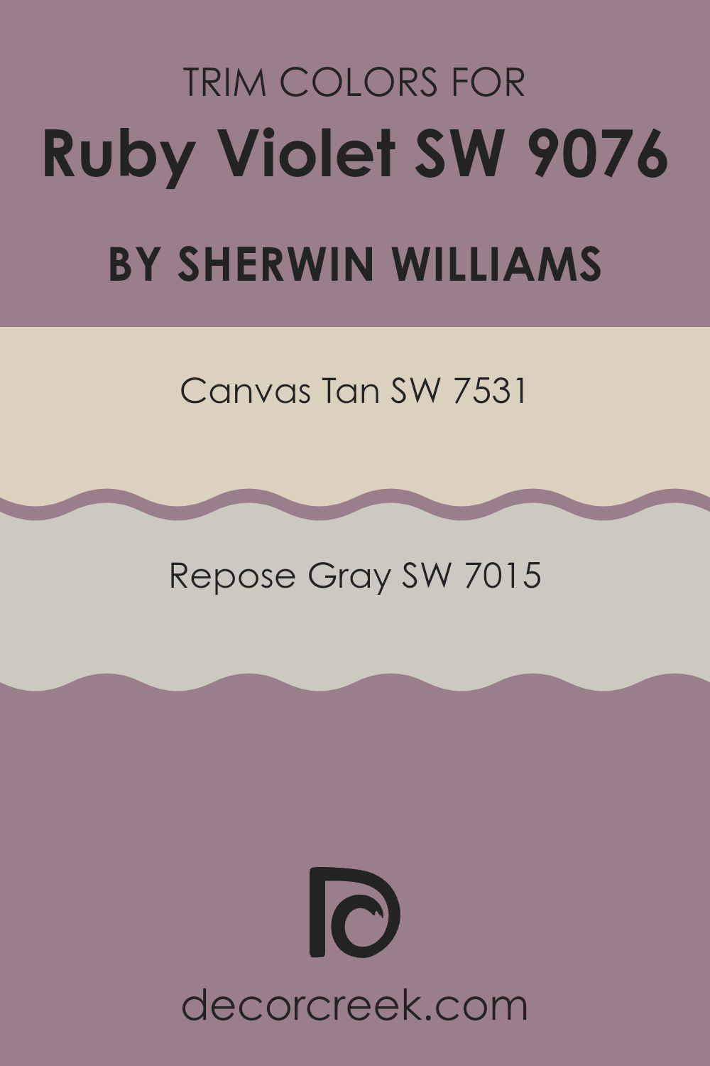
What are the Trim colors of Ruby Violet SW 9076 by Sherwin Williams?
Trim colors are hues used to accentuate or complement the main color of a wall, often applied to elements like baseboards, moldings, doors, and window frames. They can subtly enhance the overall aesthetics of a room, making architectural details pop and providing a polished finish. Trim colors play a crucial role in defining the spaces and can create visual boundaries that add depth and structure to the interior design.
For the unique shade of Ruby Violet by Sherwin Williams, two suitable trim colors would be Canvas Tan and Repose Gray. Canvas Tan is a warm, gentle beige that offers a soft contrast, reinforcing the depth of Ruby Violet without overpowering its distinctive tone.
On the other hand, Repose Gray presents a cooler, neutral backdrop that can balance the vividness of Ruby Violet, adding a contemporary edge to the space and ensuring that the vibrant hue remains the focal point of the room. Both colors support the main shade by providing a clean and subtle framework that reflects a welcoming and cozy atmosphere.
You can see recommended paint colors below:
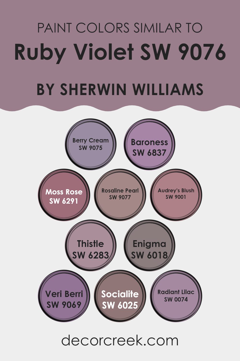
Colors Similar to Ruby Violet SW 9076 by Sherwin Williams
Similar colors play a crucial role in design by creating a harmonious and visually appealing palette. These shades allow for a smooth transition between colors, enhancing the overall aesthetic of a space while maintaining a cohesive look. Each color, consistent in tone, helps in achieving a balanced design that’s pleasing to the eye, making them particularly useful in areas where a subtle or gradual shift in hue can add depth and interest without overwhelming the senses.
For instance, Berry Cream is a gentle and warm hue that suggests softness, perfect for a calming effect in a bedroom. Baroness offers a deeper, yet equally soothing touch, ideal for creating a welcoming atmosphere in living areas.
Moss Rose introduces a slight floral undertone that enriches spaces with a hint of nature’s charm, while Rosaline Pearl adds a delicate, near-neutral pink that works beautifully in light-filled rooms. Audrey’s Blush provides a fresh pop of color, great for energizing a space without being too bold.
Thistle is a subtle purple that lends a unique but understated flair, suitable for enhancing creative spaces. The mysterious allure of Enigma makes it a stunning choice for statement walls. Veri Berri has a vibrant berry tone that can inject life into a dull room.
Socialite offers a refined purple shade that exudes a calm yet playful air in any area. Lastly, Radiant Lilac is soft and inviting, excellent for creating a relaxing ambiance in personal spaces. These similar colors contribute significantly to design continuity, each bringing its own unique but harmonious character to the palette.
You can see recommended paint colors below:
- SW 9075 Berry Cream
- SW 6837 Baroness
- SW 6291 Moss Rose
- SW 9077 Rosaline Pearl
- SW 9001 Audrey’s Blush
- SW 6283 Thistle
- SW 6018 Enigma
- SW 9069 Veri Berri
- SW 6025 Socialite
- SW 0074 Radiant Lilac
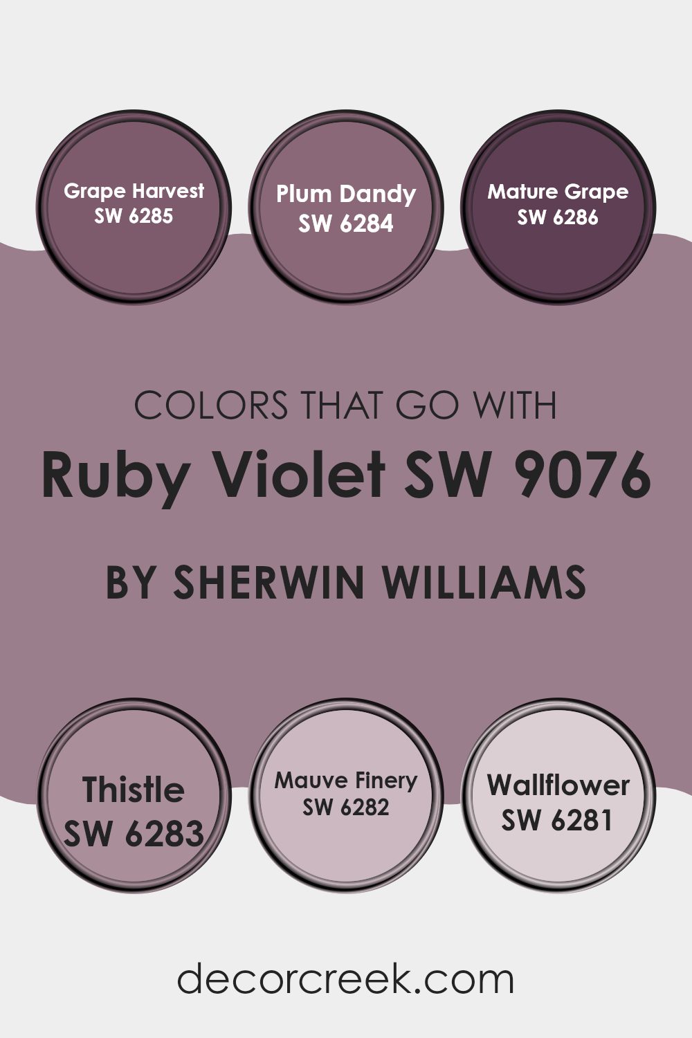
Colors that Go With Ruby Violet SW 9076 by Sherwin Williams
Choosing the right colors to pair with Ruby Violet SW 9076 by Sherwin Williams is essential for creating a harmonious and visually appealing space. The selected palette, featuring shades like Grape Harvest, Plum Dandy, Mature Grape, Thistle, Mauve Finery, and Wallflower, offers a range of deep purples to lighter mauves that complement Ruby Violet’s rich hue. These colors create a cohesive look that can enhance the aesthetic of any room, providing depth and continuity in design.
Grape Harvest is a deep, berry-infused purple that brings a robust and warm feel, perfect for accenting vibrant spaces or adding drama. Nearby, Plum Dandy softens slightly with a lush, berry purple that provides a smooth transition between the more intense shades and the lighter tones.
Mature Grape continues the theme but deepens into a darker, more subdued purple, great for grounding environments or adding weight in lighter rooms. Thistle offers a softer approach; its light lavender tone introduces a breath of freshness and light.
Complementing this, Mauve Finery showcases a pale purple with hints of gray, ideal for a subtle backdrop or calming corners. Lastly, Wallflower shines as a muted purple with dusky rose undertones, providing a gentle, neutral base that supports bolder colors like Ruby Violet. Together, these hues work seamlessly to enrich the environment, making each space feel thoughtfully designed and pleasing to the eye.
You can see recommended paint colors below:
- SW 6285 Grape Harvest
- SW 6284 Plum Dandy
- SW 6286 Mature Grape
- SW 6283 Thistle
- SW 6282 Mauve Finery
- SW 6281 Wallflower
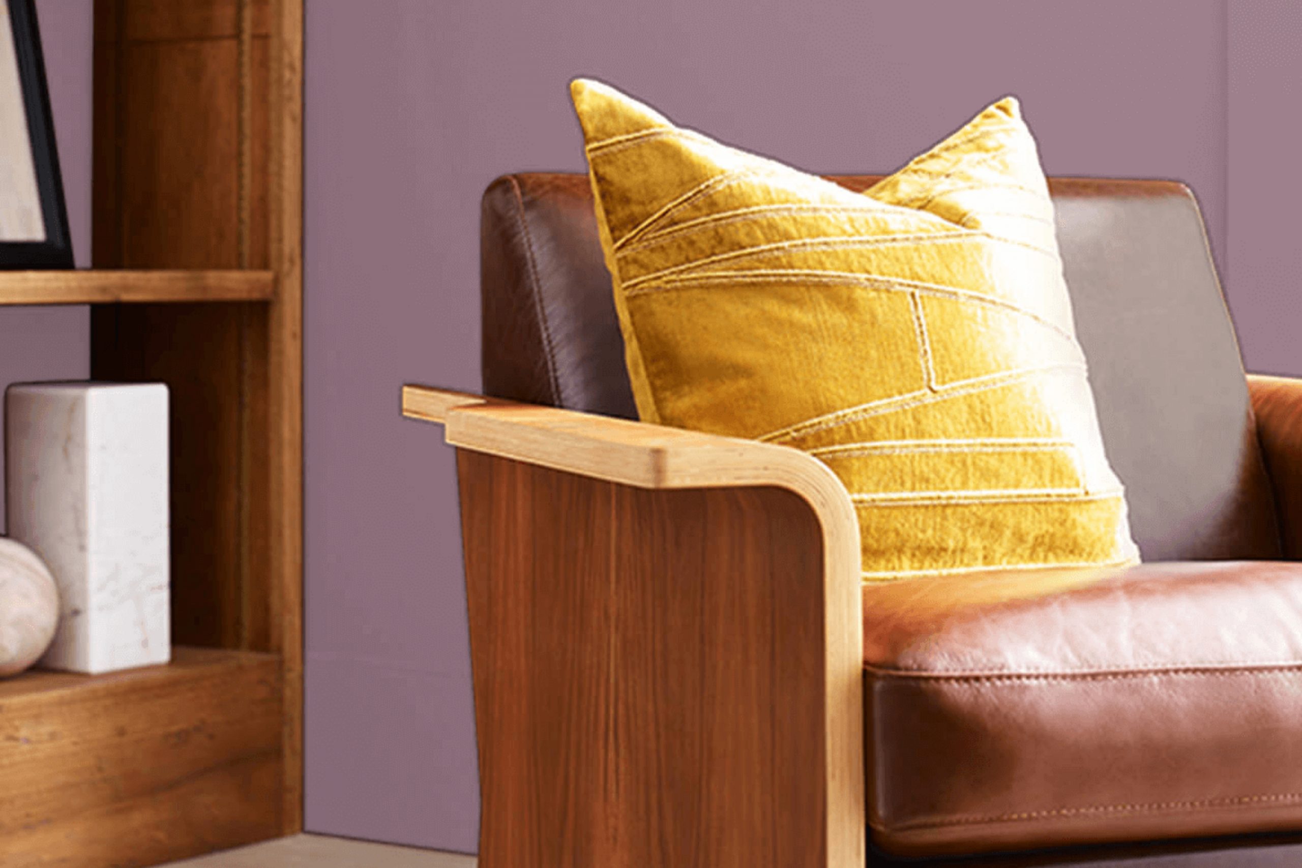
How to Use Ruby Violet SW 9076 by Sherwin Williams In Your Home?
Ruby Violet SW 9076 by Sherwin Williams is a rich and vivid shade of purple that brings warmth and personality to any room. This color can work wonderfully as an accent wall in a living room or bedroom, providing a focal point and adding depth to the space. Pairing Ruby Violet with neutral colors like whites or soft grays helps to balance its intensity and makes the room feel cozy without being overwhelming.
In addition to walls, this color can also be used on furniture or cabinets for a unique touch. For instance, painting a bookshelf or a set of dining chairs in Ruby Violet can inject some fun into your décor and make ordinary furniture stand out.
Lastly, Ruby Violet is great for smaller decorative elements, such as throw pillows or vases, which can tie a room together and add a splash of color without committing to painting an entire wall. Whether you use it in bold strokes or small details, Ruby Violet can help make your home more lively and inviting.
Ruby Violet SW 9076 by Sherwin Williams vs Baroness SW 6837 by Sherwin Williams
Ruby Violet and Baroness are two striking colors offered by Sherwin Williams, each bringing its unique flair. Ruby Violet is a deep, rich blend of red and purple hues, providing a sense of warmth and boldness to any space.
It’s a color that makes a statement and draws attention, perfect for accent walls or decor items that you want to stand out. On the other hand, Baroness is a vibrant, light shade of purple with an energetic vibe. It’s brighter and lighter, offering a fresh and lively feel that can lighten up a room and give it a playful touch.
While Ruby Violet leans towards a more dramatic and cozy atmosphere, Baroness brings in brightness and a sense of fun. These colors can work well together for someone looking to combine deep and playful tones or used separately to achieve different moods in various spaces.
You can see recommended paint color below:
- SW 6837 Baroness

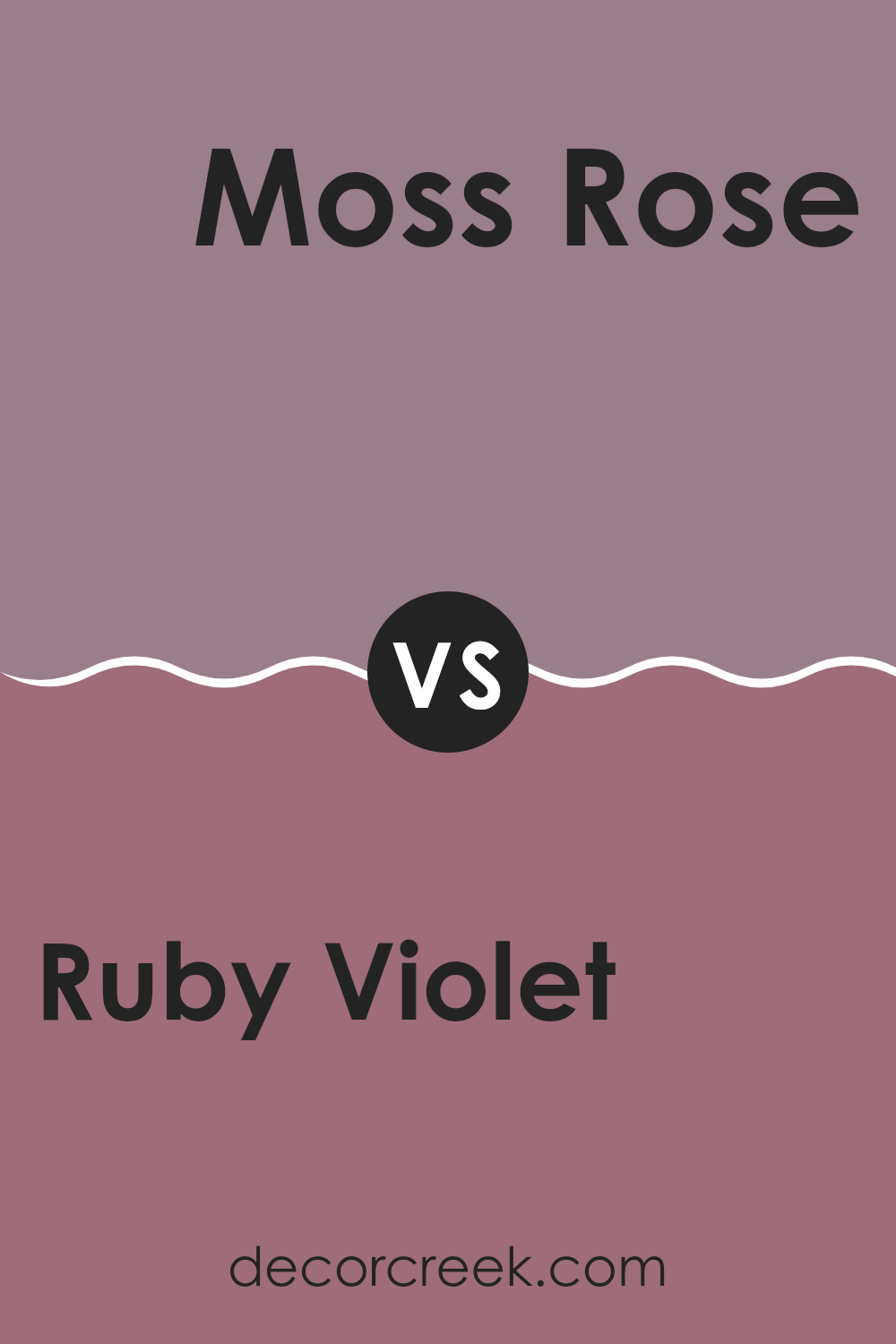
Ruby Violet SW 9076 by Sherwin Williams vs Moss Rose SW 6291 by Sherwin Williams
Ruby Violet and Moss Rose are two distinct paint colors offered by Sherwin Williams. Ruby Violet has a deep, rich purple tone that adds a bold and dramatic flair to any space. Its strong presence can make a striking statement on a feature wall or when used for accent pieces.
In contrast, Moss Rose has a softer, muted pink hue. This color is lighter and provides a gentle, soothing atmosphere to rooms, making it ideal for creating a relaxed and welcoming environment.
Both colors can dramatically affect the mood and style of a space, but while Ruby Violet leans towards a more striking, eye-catching vibe, Moss Rose offers a subtler, more understated charm. These colors can work beautifully together for a lively and warm palette, especially in creative or personal spaces.
You can see recommended paint color below:
- SW 6291 Moss Rose
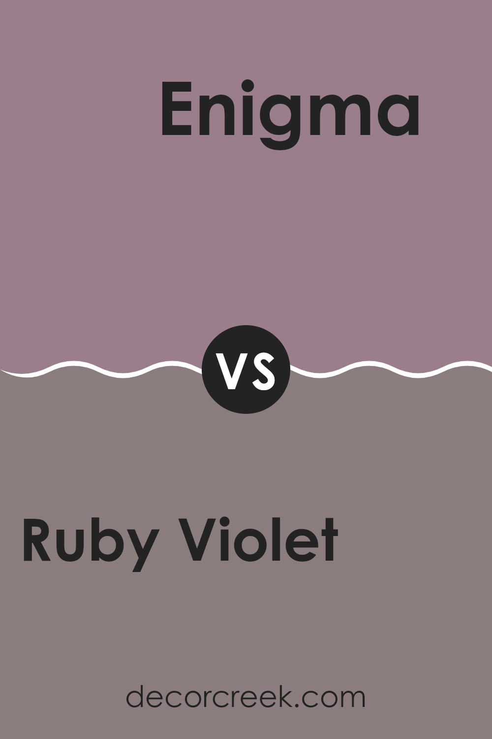
Ruby Violet SW 9076 by Sherwin Williams vs Enigma SW 6018 by Sherwin Williams
Ruby Violet by Sherwin Williams is a rich, deep shade with a vibrant touch that leans towards a wine color. It carries a strong presence, making it a great choice for spaces or accents where you want to make a bold statement. This color can add a lot of character to a room, particularly when used on walls or in large decorative pieces.
On the other hand, Enigma by Sherwin Williams is much lighter and softer. It’s a grayish-purple that has a subtle and muted quality, making it versatile for various decorating styles. Enigma works well in spaces where you want a more understated look but with a hint of unique color to keep things interesting.
Both colors offer different vibes: Ruby Violet is more dramatic and eye-catching, while Enigma is low-key and blends easily with other shades. They could even complement each other in a space that uses Enigma as a base with Ruby Violet as an accent for depth and focus.
You can see recommended paint color below:
- SW 6018 Enigma
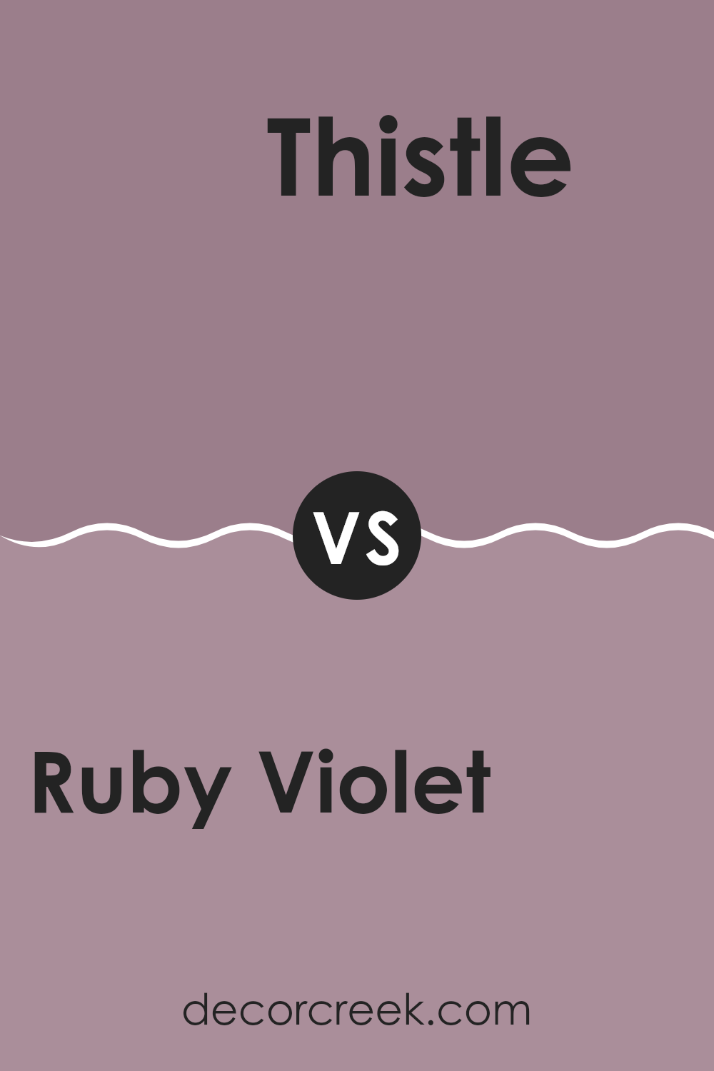
Ruby Violet SW 9076 by Sherwin Williams vs Thistle SW 6283 by Sherwin Williams
Ruby Violet, a rich, dramatic shade, makes a confident statement in any room. It’s a deep, vibrant color that resembles a mix of red and purple, bringing warmth and energy to the space. This bold hue works well in areas where you want to add a touch of drama or to highlight focal points like accent walls.
On the other hand, Thistle is a soft, muted purple with gray undertones, offering a more subdued and gentle feel. It’s a versatile color that pairs well with a variety of decor styles and is excellent for creating a calm, inviting atmosphere. Thistle works particularly well in bedrooms and living areas where a more relaxed vibe is desired.
While both colors come from the purple family, Ruby Violet leans towards a more striking, eye-catching presence, whereas Thistle provides a quiet backdrop, suitable for relaxed settings. Their uses can be complementary, depending on the mood and function of your room.
You can see recommended paint color below:
- SW 6283 Thistle
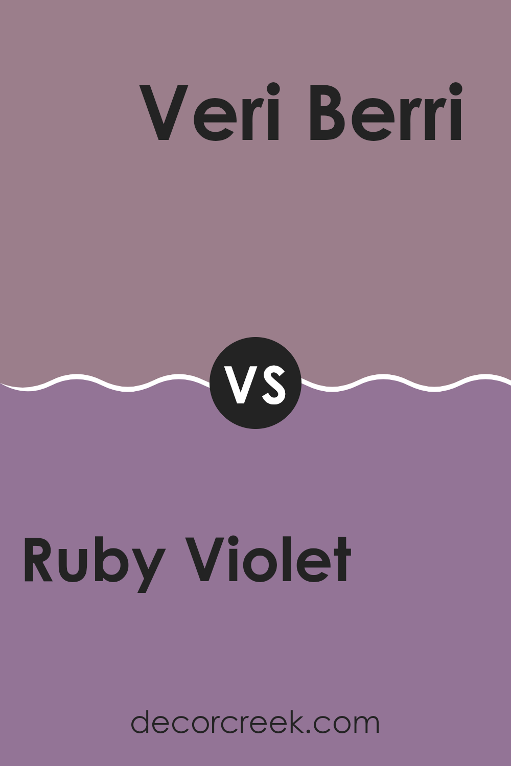
Ruby Violet SW 9076 by Sherwin Williams vs Veri Berri SW 9069 by Sherwin Williams
Ruby Violet and Veri Berri, both by Sherwin Williams, present distinct shades of red and purple tones. Ruby Violet is a deeper, more intense color that echoes the hues found in a lush berry. It brings a sense of warmth and boldness to any space, making it a standout choice for accent walls or decorative elements.
This color can make small spaces feel rich and inviting or give a touch of drama to larger areas. On the other hand, Veri Berri has a lighter, more playful vibe. It’s a brighter shade that blends red and purple, leaning slightly towards a raspberry tone.
This color is great for adding a fresh and lively touch to a room without overwhelming it. It works well in spaces needing a cheerful uplift, like kitchens or playrooms. Both colors provide unique options depending on the desired mood and setting, ranging from bold and dramatic to lively and engaging.
You can see recommended paint color below:
- SW 9069 Veri Berri
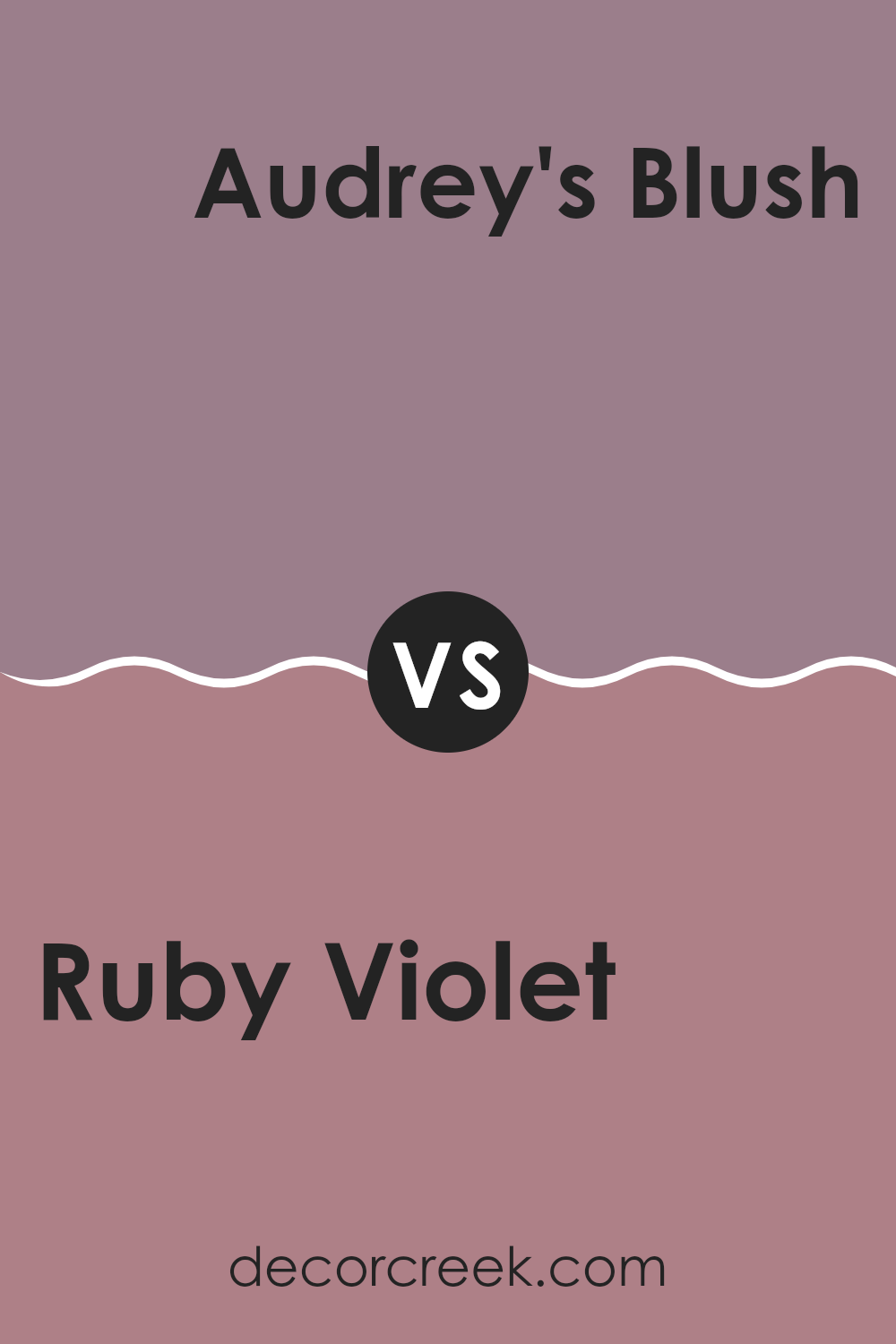
Ruby Violet SW 9076 by Sherwin Williams vs Audrey’s Blush SW 9001 by Sherwin Williams
Ruby Violet and Audrey’s Blush are both colors from Sherwin Williams, each bringing its unique shade to interior spaces. Ruby Violet is a deeper, more intense hue that leans towards a rich plum. It has a boldness that is striking and dynamic, making it ideal for accent walls or areas where you want to draw attention or add depth.
On the other hand, Audrey’s Blush is a softer, more understated color. It is a gentle pink with a warm undertone, perfect for creating a cozy and welcoming atmosphere. This color works well in bedrooms and living spaces where a calm and light feeling is desired.
When comparing these two, Ruby Violet stands out with its depth and drama, while Audrey’s Blush offers a subtler, calming feel. Both colors can beautifully complement each other, with Ruby Violet providing a strong focal point and Audrey’s Blush bringing in softness and warmth to balance the overall aesthetic.
You can see recommended paint color below:
- SW 9001 Audrey’s Blush
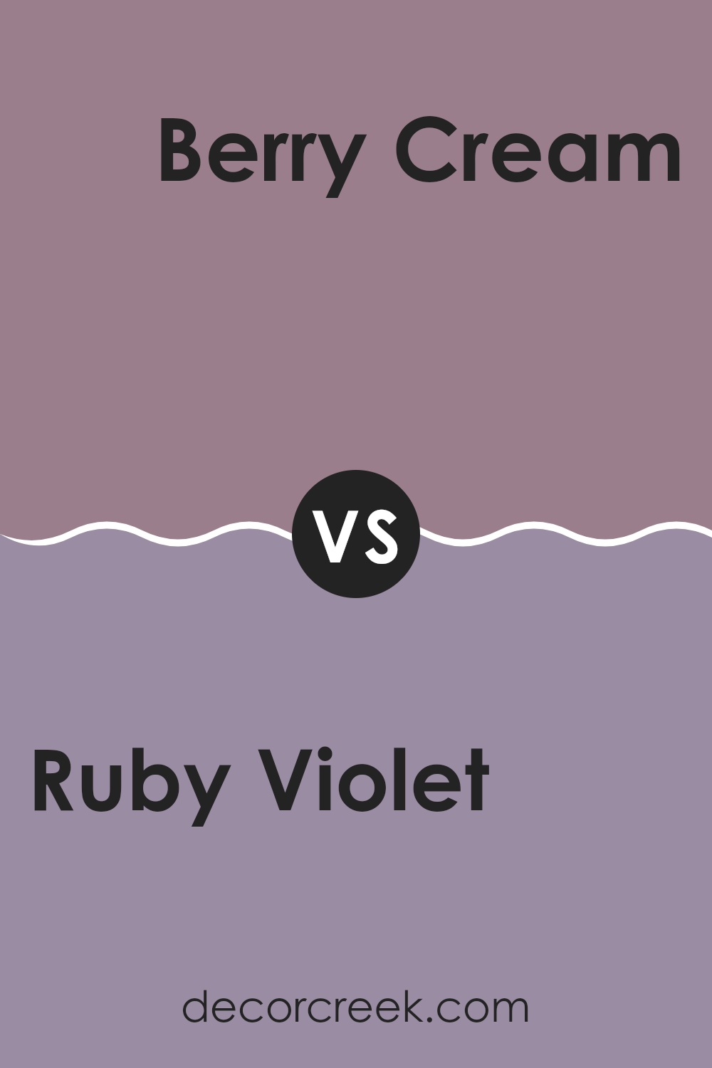
Ruby Violet SW 9076 by Sherwin Williams vs Berry Cream SW 9075 by Sherwin Williams
Both Ruby Violet and Berry Cream from Sherwin Williams offer unique aesthetic vibes, ideal for someone looking to add a personal touch to their space. Ruby Violet is a deeper, more saturated hue that gives off a rich and luxurious feel. Its boldness makes it a great choice for a feature wall or to add depth to a room.
In contrast, Berry Cream is lighter and softer, with a creamier presence that makes spaces feel airy and open. This color works wonderfully in smaller rooms or places where you want to enhance natural light.
While both colors share a red or berry base, Ruby Violet leans towards a deeper purple undertone, making it more dramatic. Berry Cream, however, tilts towards a softer, pinkish tone, offering a more subtle and gentle ambiance.
These distinctions make Ruby Violet suited for bold, statement interiors, whereas Berry Cream is ideal for creating a light, soothing environment. Together, they could complement each other well in a space that aims for both impact and comfort.
You can see recommended paint color below:
- SW 9075 Berry Cream
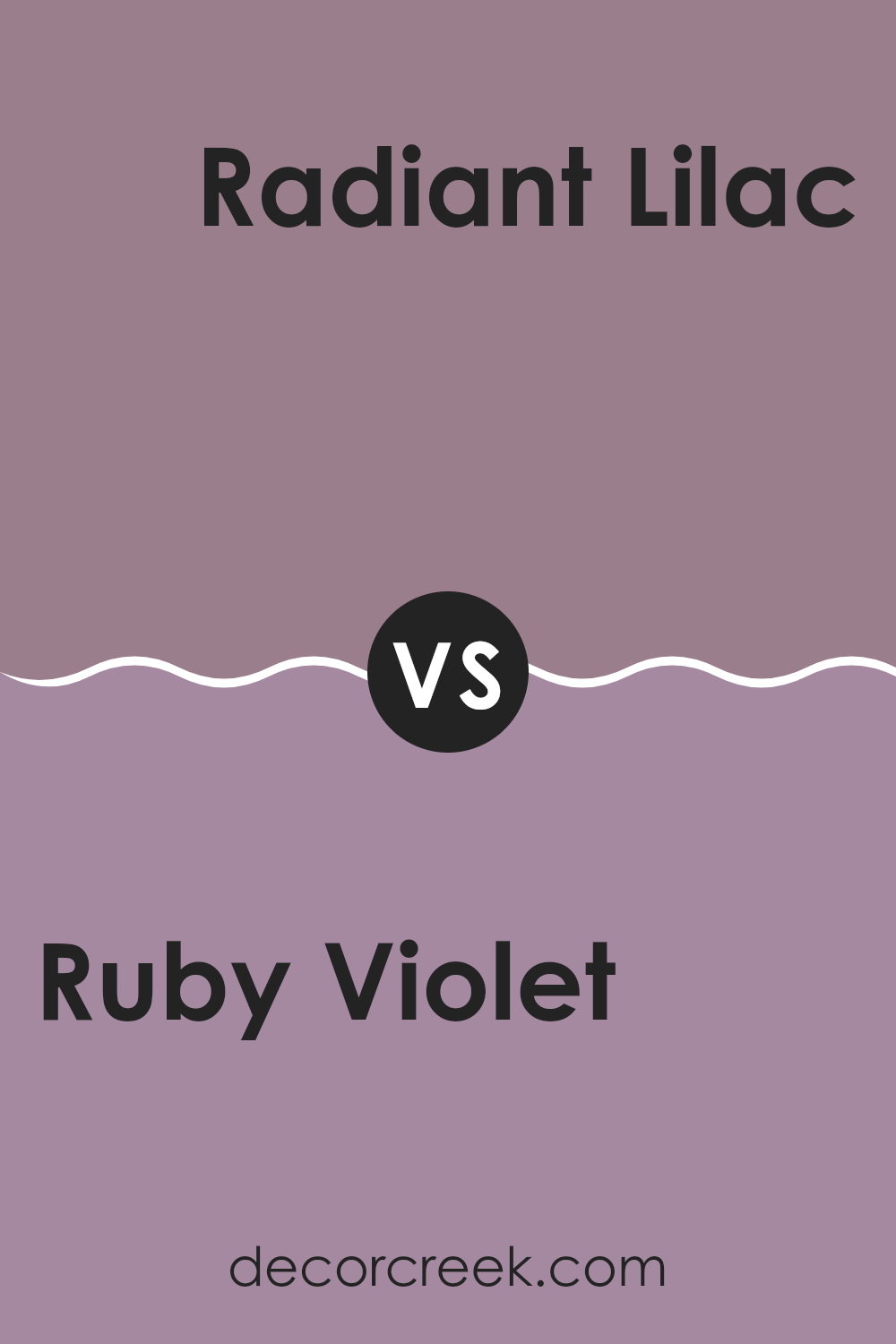
Ruby Violet SW 9076 by Sherwin Williams vs Radiant Lilac SW 0074 by Sherwin Williams
The colors Ruby Violet and Radiant Lilac, both by Sherwin Williams, offer distinct tones that can significantly affect the mood and style of a space. Ruby Violet is a deep, rich shade leaning towards a dark pink or light violet, which adds a strong, cozy feel to any room. Its warmth makes it a great choice for spaces where a bold yet inviting atmosphere is desired.
On the other hand, Radiant Lilac is much lighter, featuring a subtle hint of purple with a more pastel feel. This color lends itself well to creating a lighter, airier vibe, making it perfect for smaller spaces or areas where you want to promote a sense of openness and light.
When comparing the two, Ruby Violet provides a more intense visual impact, likely making it the focal point in a room. In contrast, Radiant Lilac works well as a gentle backdrop or for softening a space when used alongside bolder shades. Thus, while both colors share a violet family link, they cater to different aesthetic needs and preferences.
You can see recommended paint color below:
- SW 0074 Radiant Lilac
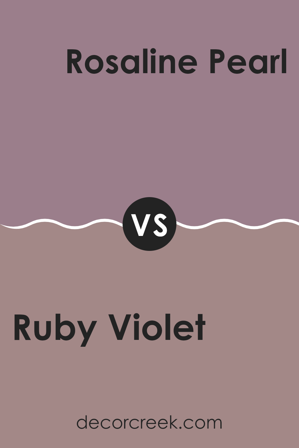
Ruby Violet SW 9076 by Sherwin Williams vs Rosaline Pearl SW 9077 by Sherwin Williams
Ruby Violet is a deep, bold hue that leans towards a rich red with a touch of purple, giving it a vibrant and dynamic feel. This color seems to stand out in any space, lending a sense of energy and warmth. It suits areas of a home or office that benefit from a pop of color like living rooms or creative spaces.
On the other hand, Rosaline Pearl is softer and more subdued. It’s a gentle pink with hints of mauve, creating a comforting and welcoming atmosphere. This color is perfect for spaces where you want to relax, such as bedrooms or bathrooms.
Both colors are distinctly different, yet they share an underlying warmth that could potentially complement each other in a color scheme. Ruby Violet makes a stronger statement, while Rosaline Pearl offers a gentle backdrop, making them versatile for various design needs.
You can see recommended paint color below:
- SW 9077 Rosaline Pearl
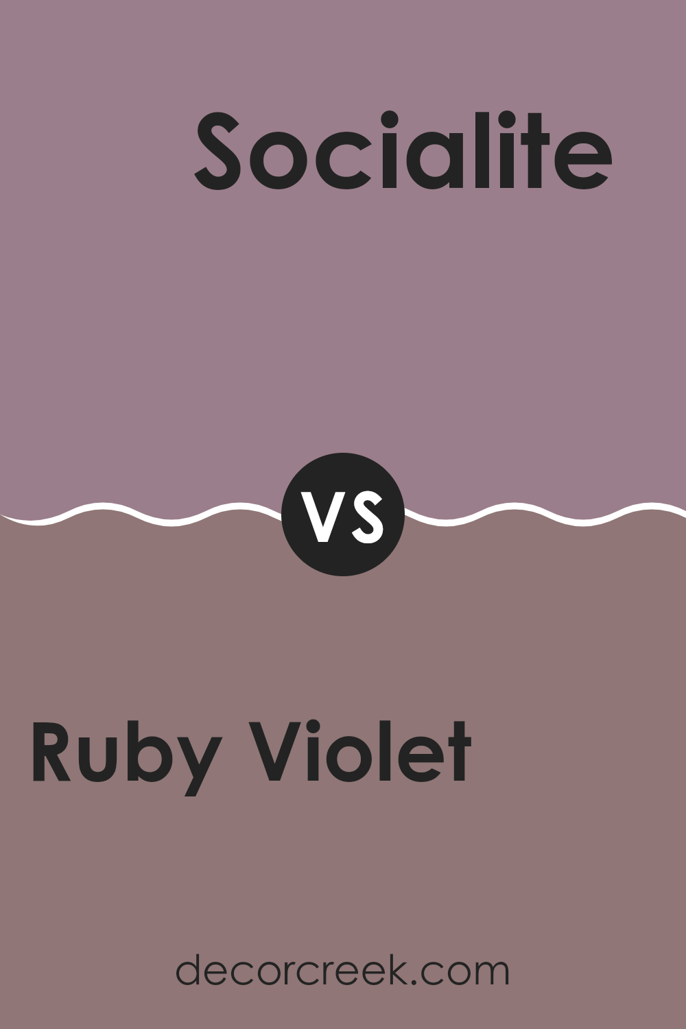
Ruby Violet SW 9076 by Sherwin Williams vs Socialite SW 6025 by Sherwin Williams
Ruby Violet and Socialite are two distinct colors from Sherwin Williams. Ruby Violet is a deep, vibrant shade that leans more towards a rich purple with a hint of red. It’s a striking color, perfect for adding a bold touch to a room or an accent wall. It can make quite a statement and tends to draw the eye, making it a good choice for areas where you want to create an impact.
On the other hand, Socialite is a lighter, muted purple with gray undertones. It’s a more reserved color compared to Ruby Violet and offers a subtle elegance. This shade works well in spaces where a calming influence is desired, blending seamlessly with various decor styles. It’s versatile and less imposing, making it suitable for larger areas or rooms that aim for a softer appearance.
Both colors carry their unique appeal and can significantly affect the atmosphere and aesthetic of a space depending on how they’re used.
You can see recommended paint color below:
- SW 6025 Socialite
In conclusion, SW 9076 Ruby Violet by Sherwin Williams is a beautiful paint color that can make any room feel warm and welcoming. This shade of purple is not too bright and not too dark, making it perfect for those who want a bit of color without going too bold. It’s like the soft purple you see in a sunset or in cozy, fluffy blankets.
Having this color on your walls can make your room feel cozy and comfortable, like being tucked in a warm bed on a cold night. It’s great for bedrooms where you want to relax or for living rooms that need a touch of warmth. Also, this color can help hide small marks or dirt, which is really handy.
Remember, purple is often seen as a royal color, so adding SW 9076 Ruby Violet to a room can make it feel a bit special and luxurious. Whether you’re a kid looking to jazz up your room or an adult wanting to add a splash of personality to your home, this color can do the trick.
So if you’re thinking about giving a room a makeover, consider giving this lovely purple color a try.

Ever wished paint sampling was as easy as sticking a sticker? Guess what? Now it is! Discover Samplize's unique Peel & Stick samples.
Get paint samples

